Transcripts
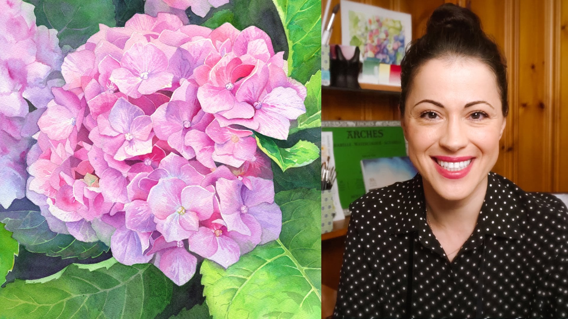
1. Introduction: Painting flowers in
watercolor is pure joy. No other medium captures the
delicate beauty of nature, quite like transparent
layers and vibrant washes. If you want to deepen your
botanical painting skills, orchids are the best
subject to practice on. Their diverse shapes and stunning color
variations make them perfect for exploring classic and more advanced
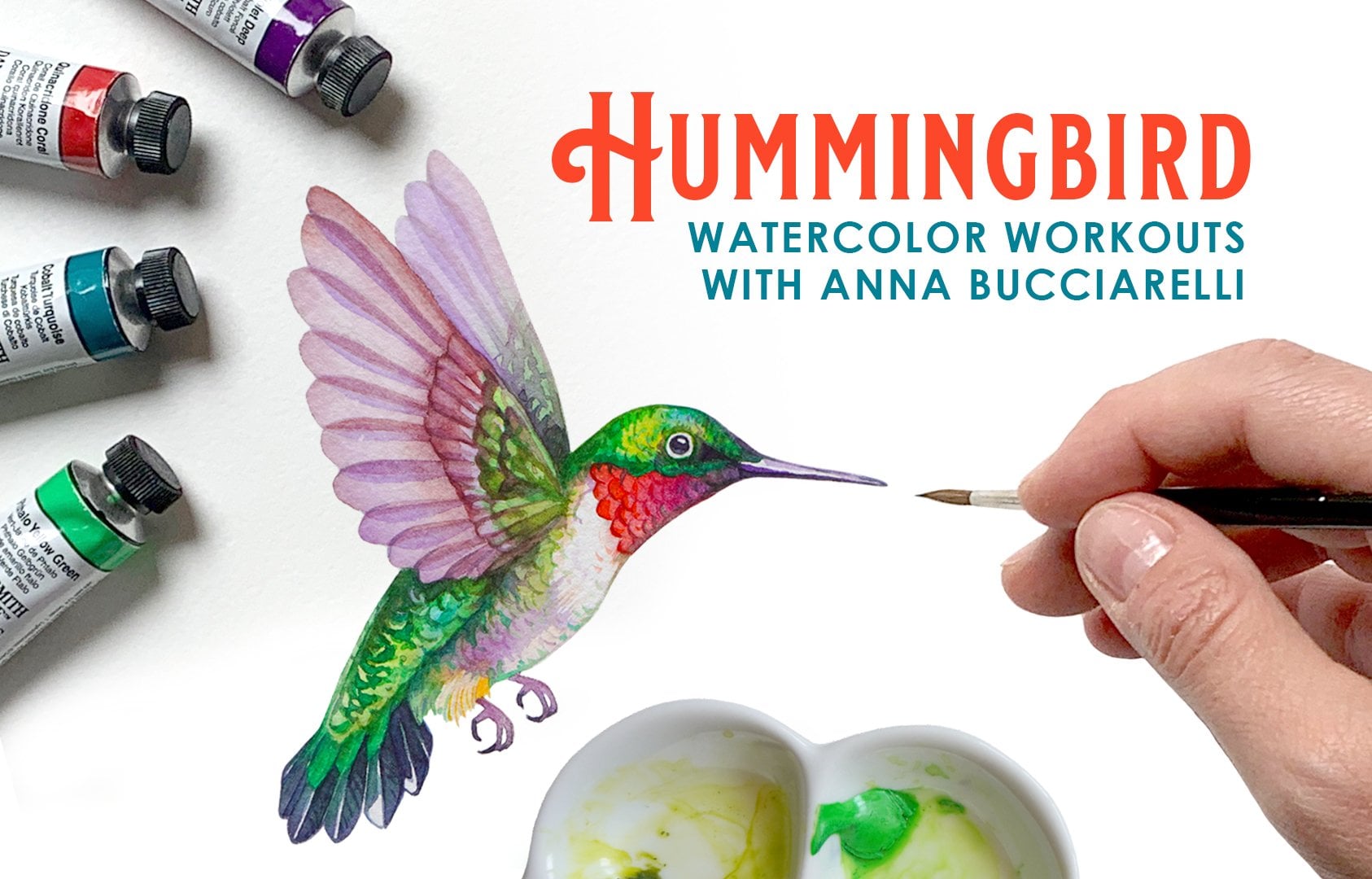
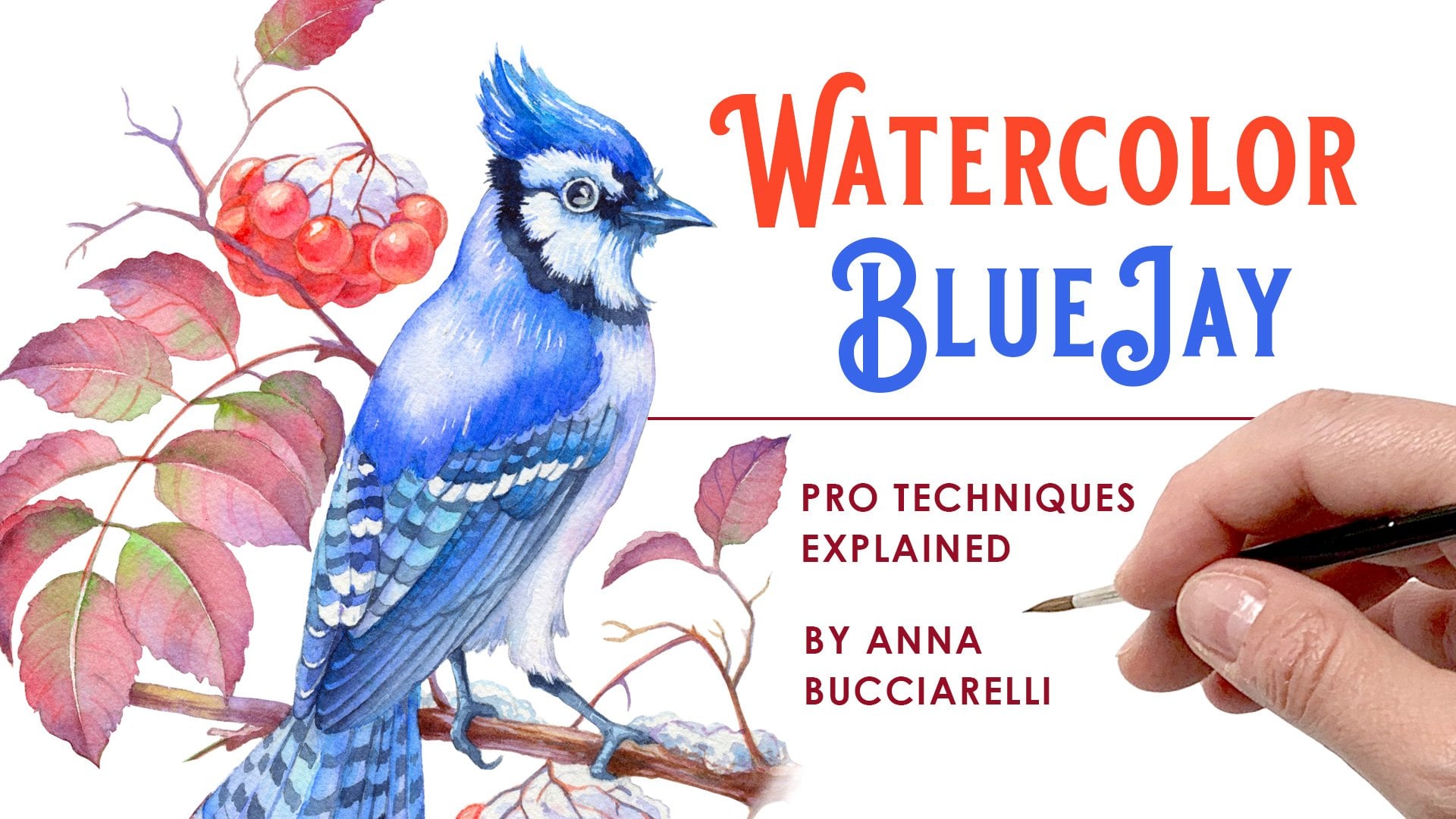
watercolor techniques. Hello. My name is
Anna Bucharelli. I'm a professional illustrator
and author from Canada, specializing in botanical
and nature inspired art. My watercolor flowers
have been featured on best selling book covers and even Canadian silver
and gold coins. My artistic journey
has been dedicated to mastering watercolor
techniques that bring flowers to life. And in this class, I'm excited to share that
knowledge with you. Together, we will paint
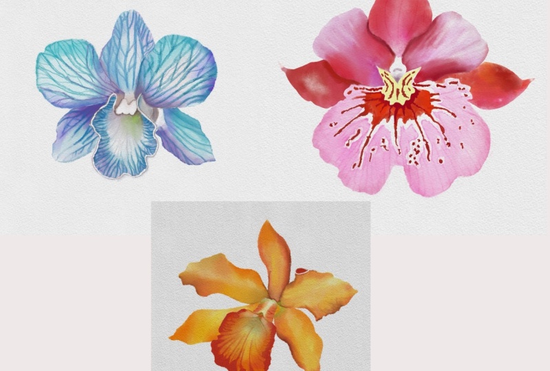
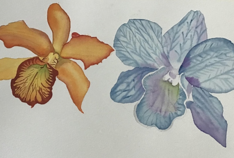
three different orchids, each focusing on a unique
watercolor approach. We'll start with a
warm orange orchid, practicing wet on wet, wet on dry and basic layering. Next, we will move on to a
rich red and pink orchid, introducing negative
painting technique, yellow underpainting,
and petal textures to add warmth and realism. Finally, we'll paint a
delicate blue orchid, where I'll teach you my
favorite advanced wet on dam technique to achieve stunning, intricate
organic veins. This class is designed for
those who are already familiar with watercolor basics and are ready to level
up their skills. You will gain better
control over layering, color blending and vibrancy
while learning how to enhance intricate organic details in your floral work with
some special effects. Part of this class, you
will receive a full list of recommended colors plus
alternative pigments. You will also get
reference photos, step by step images to help you with
planning your layers, and, of course, printable black and white outlines
for easy transfer. If you love watercolor
and painting flowers, join me today as we
explore a variety of watercolor techniques through these three
stunning orchids. I can't wait to
see you in class.
2. Materials: Before we start painting, let's talk about
watercolor materials. I'll be painting all three
orchids on cold pressed, 100% cotton watercolor paper. I prefer cold pressed over hot pressed because it
dries more slowly, allowing more flexibility for layering and blending colors. If you prefer more smooth hot pressed paper,
it's totally fine. It has a smoother surface
but dries much faster. Can use it for the
orange and pink orchid, but you may need to work
quickly to avoid harsh edges. However, for the blue orchid, we'll be using a
specialized wet on DEM technique to create
intricate petal veins. This technique works best
on cold pressed paper, so I highly recommend
using it for that section. Recommend having at least two rounded pointed
brushes, a larger one, size three or four
for big washes, and a smaller brush, size zero or even double
zero for fine details. The most flexible
combination would probably be size
zero, two and four. As for brands, use
What You Love. My personal favorites are
Windsor Newton Series. And escota reserva
for larger brushes, they hold plenty of
water and pigment. These are 100% natural sable. Escoda Cronos, for my size
zero or double zero brush, has a great spring,
making it ideal for tiny details where you don't
need a fully loaded brush. It's 90% synthetic. I'll be sketching by hand
using a three H pencil. I always recommend using 3h4g or higher on watercolor paper to minimize visible
graffiti marks. If you're sketching by hand, you also need an eraser. I prefer retractable
erasers because they offer precision
without damaging the paper. And to save time, you can use the black and white outlines provided in the class materials instead of sketching by hand. Also included in
your class resources or reference photos
for each orchid and step by step
images to help you understand and plan your
layers from light to dark.
3. Color Palette: For the first flower,
the orange orchid, we're going to need a range of warm colors, starting
with yellow. I'm going to use benzo,
yellow from core, permanent orange,
and a little bit of reddish color
called scarlet lake. For the shadows, I'm going
to use peril and violet and some sap green for
some greenish accents. For the blue orchid, we will need some
transparent blues. I recommend a thyloblue. Mine is green shade from core. As an option, you can introduce some decks and purple for
some color variation, and for some final accents, we'll need some green. I'm going to recycle the
same green I used on the orange orchid and some muted yellow
any ochre would do. For the third flower, we're going to need a
combination of reds, from a very cool pmgenta
to warmer coral, some parallel and violet. For the shadows, it's the same one I'm using
on the orange orchid. And if you want to,
you can introduce some fluorescent opera pink. It's a fugitive color, but it's very vibrant and one of my favorites
to add some accents. Of course, as it often
is with fugitive colors, they fade over time, but they're really
fun to play with. So it's a nice optional
pigment that you can also use. So this big collection of
colors may seem overwhelming, but let me assure you
you don't need them all. At least half are optional. If you prefer a more
limited palette, I recommend sticking to the five core pigments
listed above. It's more than enough to
paint all three orchids. For the six optional
colors at the bottom, you can either use the suggested alternatives
I've listed in the class resources or mix your own variations using the colors you have
on your palette. For example, scarlet lake I used on the orange
orchid is very similar in tone to the
warm quinocurdon coral I used on the red orchid, so you only need one of them. Pale yellow ochre I used on the blue orchid is
definitely optional. You can simply use
a diluted version of benzo yellow that I used on the orange flower or use any of your favorite yellows
like cadmium. Instead of using dix ain purple, you can mix magenta
and blue from the core palette to create a beautiful shade of
purple on your own. Yellow and blue from
the core palette will give you a range
of natural greens, making it a great substitute for the premixed green I'm using
straight from the tube. And Opera Pink is simply a fluorescent
version of magenta, also known as pigment red 122, meaning you can achieve
very similar results using the main quinocidon
magenta from the core palette. Ultimately, the specific
pigments you use matter far less than your
control over values, meaning the balance of lights
and darks in your painting. Mastering values is what truly brings depth and
dimension to your work, no matter which
colors you choose, and that's exactly what we
will practice in this class. When you're ready,
let's get started.
4. Process Overview: Before we start painting, let's quickly go
over the process so you know what to expect. You'll also find step
by step photos for each flower in the class
materials to help guide you. Our first flower,
the orange orchid, focuses on layering
wet on wet and wet on dry techniques to build
vibrancy and definition. We'll begin with the
outer petals supplying a mix of analogous
colors yellow, orange and red, allowing them to blend
naturally on paper. Once dry, we'll paint the
central petal segment separately to prevent
unwanted color bleeding. After everything
has fully dried, we'll add another layer
of oranges and yellows to boost vibrancy and introduce
some shadows using violet, also creating some
subtle petal texture. In the final step, we'll glaze the greens and violets
to accentuate details and refine the intricate
patterns on the central petal using
wet on dry technique. This three layer approach is a great introduction to
layering techniques and will be especially useful when painting single colour flowers
like roses and peonies, where depth and dimension are created through subtle
tonal variations. For the blue orchid,
we'll take things a step further by practicing the
wet on dam technique, ideal for capturing
intricate details on the most complex
flowers and leaves. First, we'll dampen
the paper and apply thin colour lines onto
slightly wet surface. Unlike classic wet on wet, this method introduces
a time delay, allowing lines to
hold their shape while still creating
a soft natural fade, just like the delicate
veins of a real flower. Once the first layer is dry, we'll return to glaze
the subtle shadows, enhancing the petal
depth and form. This technique requires patience and precise water control, but it's a powerful skill
for botanical artists, and I hope you enjoy
this practice session. Red and pink orchid has
more intricate details. Great practice for
painting flowers like irises or multi colored pansies. We'll begin with soft wet on wet blends on
the outer petals. As we move to the center, we'll introduce
negative painting, one of my favorite
watercolor techniques, especially for botanicals. Instead of painting
the details directly, we'll preserve the white
of the paper by painting around the delicate white
spots and markings. Since traditional watercolor
doesn't use white paint, mastering this technique
is essential for capturing fine
botanical details. Also have an entire
skill share class dedicated to negative
painting on greenery, if you'd like to explore
this technique further. Next, we'll add some
crisp details using a combination of wet on wet
and wet on dry techniques. And finally, apply
a soft glaze over the petals to add an extra
touch of depth and dimension.
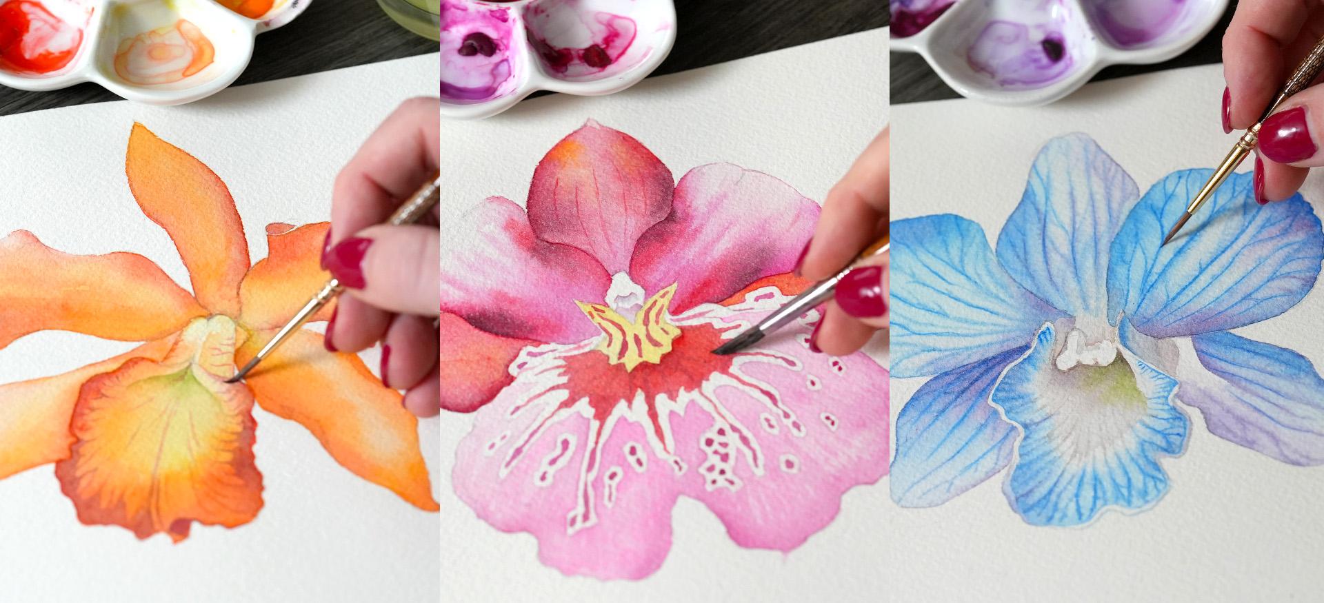
5. Orange Orchid Step 1A: Painting Petals Wet-on-Wet : So let's get started
on the orange orchid. And in the first layer, we're going to create
our map of color using our lightest,
most diluted pigments. You can refer to step by step photos to see
the progression. In this step, our goal is to cover everything with
a very light layer, what I call a map of color. And what you will see me do is start with very diluted yellow
at the base of the petal, and then I'm slowly going
to progress to my orange, again, very, very diluted. If you look at the value scale, somewhere around two or three, not more saturated than that. And all we're doing is creating a very soft blend that's going to dry out
looking quite light. And then we can add
additional details on top. So that's why we don't want to reach full saturation just yet. Keep it very, very light. Once the petal is
completely covered, you can introduce
a little bit of that rich scarlet lake or whichever warm red you're
using around the edges, just with the tip of your brush. Again, not too much. We want to keep this
layer very, very light. So this is the essence
of wet and wet method, a very soft blend,
no defined lines. And we're going to do something similar now on the next petal, I'm going to start with
diluted benzo yellow. You can use cadmium yellow
medium hue from Daniel Smith, for example, A warm
yellow would do. Just keep it very watered down. And notice that I'm
starting to work at the bottom side of the petal because it's
more in the shadow. I'm going to finish with orange. And then continue
bringing it higher and higher until I reach almost towards the
edge of the petal. And then I'm going to
blend with clear water. Now, if you're familiar with different
watercolor techniques, you might be wondering why
I didn't cover everything with clear water first and
then continued with my color. By the way, I'm
adding a tiny bit of scarlet lake right now
just around the tip. And I'm often asked
why I start with diluted color and then add additional colors instead of covering everything
with water first. The answer is, I personally find it very difficult to stay within the edges of my shape when I just start
with clear water, it's really, really easy to
go over your pencil marks and then you're bound to that new shape that you've
created with clear water. For me, it's a lot
easier to start with light diluted color
and then build on that, like I'm doing right now, adding a little bit more
saturation around the edges. Now, that is not to say that you can't start with clear water. By all means, you can pre wet the entire petal with clear water and then
add your color. Again, the only reason I'm
modifying this technique, and I find it a lot
easier to do it this way is because I know exactly
where I'm putting my color, where the boundaries of the
shape I'm working with end. And so I start with this diluted color like
I'm doing on this petal, very, very light orange
and some yellow. And then I'm more
confident adding more saturated color
around the edges, building the shape slowly. This is still wet on wet method. I just start with diluted
color instead of clear water. But again, you can
do it both ways. I just find it easier to start with lighter
pigment first. And so you can see, once again, we have a very soft blend
on the petal in some areas, I've added clear water. In some areas, I've added
more saturated pigment, and we have a very light
coverage on that petal. We're going to let it dry
and move on to the next one. I'm leaving the central element, the orchid lip completely
without any color right now. We're going to do it last, and we're going to do
it after everything else is dry so we can work safely within
that shape without having any color bleed over. So again, on this petal, I'm starting with a
very light mixture of yellow and orange. I've blended with clear
water in the center, and now I'm adding more saturated
color around the edges, still keeping everything
within roughly medium value. So like four or five
on the value scale. An adding tiny bit
more saturated color using now scarlet lake, a little bit more red
around the edges. You can see I'm sort
of just tapping the tip of my brush
very, very gently. And I'm going to
add a little bit of that same scarlet lake. On the petal that
I just painted, it's still wet, so
it's safe to do so. If yours is dry, I
would just leave it and wait until
the next layer. But as long as
your paper is wet, you can continue adding a little bit of color
here and there. And then let's leave it to dry. But Now, at this stage, here, I've created
a small bubble, so I'm just going
to use a tip of my brush to pop it and
spread that color out. At this stage, you can continue on the last
petal on the right. But note that it's adjacent to the other
petals we just worked on. And so you may want to
run your hair dryer here just to make sure that
your color doesn't bleed. As you can see, mine
is bleeding a little bit into the very first
petal that we've painted. It's gonna create a
bloom, but that's okay. A bloom is essentially an area where two adjacent
colour blocks collide. And if one of them is
more wet than the other, then sometimes what you
get is this effect of the pain being pushed
into the adjacent area. And so I'm going to
have to clean it up later on with a damp brush. But for now, I'm just going
to finish this petal. I started with yellow,
progressed to orange, and now I'm just adding, again, more saturated scarlet
lake around the edges. You can see the
bloom is spreading, and that happens sometimes. What I'm going to do
is take a damp brush, so I cleaned my brush, tapped it on tissue paper, and then I'm just
going to kind of blend that awkward
edge a little bit. And then there's a
tiny little element, the back of the petal
that's visible. And so I'm going to paint it
like a solid block of color, leaving just a tiny bit without color indicating
the petal edge. And so you can see the bloom is still spreading, which is okay. I'm going to again
grab a damp brush, meaning there's almost
no water on my brush, and then just gently brush that edge away and leave
everything to dry. When we come back,
we're going to work on the central element, but it's very important to
allow enough drying time at this stage so that we can avoid these blooms
going forward.
6. Orange Orchid Step 1B: Finishing Central Petal: Okay, so now I'm back. It's been a couple hours. If you don't want
to wait, you can just use a hair dryer to make sure all the petals that we've painted so far are
completely dry, and we're working on
the central element. If we reach all the way over the edge over the petals
that we've already painted, the color is not going to move, and we're going to
maintain a crisp edge. So that's why it's very, very important to allow
enough drying time. I started with clear water, and now I'm going to
switch to yellow, mostly in the center
of the petal. And then as I move
towards the edges, I'm going to switch
to my orange. Quite diluted still, and
I'm slowing down quite a bit as I approach the edge so I can follow my pencil marks. And you can go over the edge
just a tiny little bit, maybe just a half a millimeter to make sure there are no gaps. And as I move down, switching to more
saturated orange, that's going to gently blend into the yellow
that we started with. But for the most
part, it's going to remain around the edges. And if it spreads too far, you can again just grab a damp
brush and lift that color. Just like we did with
the other petals, I'm going to finish with my
red color, scarlet lake. H adding it using wet and Tuete technique
around the edges. Working within the shape
that I've already created, just cleaning up the silhouette
with the tip of my brush. And it is spreading a bit aggressively
towards the yellow, but there's still a little
bit of yellow visible. And now I'm going to grab
a damp brush to kind of clean up some of the areas
where the colors spreading. It's a little bit
chaotic right now. So I'm just going
to take my time, make sure that everything has even coverage and
observe the blend. The colors still moving. And just to stop it from
approaching the center, I'm going to drop
some clear water to push it out and then continue adding a little bit of extra color around the
edges, and that's about it. That's sort of the look
we're going after. And I'm going to let it dry completely before we
do the second layer.
7. Orange Orchid Step 2: Glazing Accents Wet-on-Dry: Welcome back. In
the second layer, we're going to glaze
additional color on the orchid petals, increase the vibrancy and add a little bit more
variation in value. So I'm going to start
on the top petal and note that at this stage, my underlying layer
is completely dry and everything looks
a little bit lighter. This effect is called
a drying shift when your watercolors tend to look a little bit lighter after
the water evaporates. And let's get started
with scarlet lake. I'm going to put a little bit
of color around the edge, medium value, and then blend with clear water
towards the center. So the majority of the pigment is concentrated
around the edges. You can also add a little bit of more vibrant orange
wet into wet. I dropped it right around
the tip of the petal. And now we can move
on to the next one. Here we have a very
distinct separation between the top side of
the petal on the bottom. And so I'm just going to glaze a little bit of color
on the bottom half, where the petal is a
bit more in the shadow. Put a little bit around the top edge on the
right hand side. Again, I'm just looking for the darker areas to
put the color on. And then switching to orange. And then eventually clear
water just to blend the edges. I'm gonna continue
with this color on the bottom side of the petal. And then the entire top side, I'm just going to blend with clear water so that
all my colors, all the new color
that I've put on is softly sinking
into the background. So you can see with just a
little bit of extra color, we now have a little bit of
better definition around the edges and the bottom side of the petal is a lot darker. Everything overall is
looking a bit more vibrant. Now, let's do something similar
on the right hand side. I'm going to start
this time with clear water around the
base and the center, the middle part of the petal, basically re wetting the
entire surface so that any extra color I add will tend to blend and move
towards the center. Now we can start
adding more vibrant, more saturated pigment
around the edges, and I'm slowing down, working very, very
carefully around the edge. Notice that every
once in a while I drag my brush along the petal, just kind of creating
a natural vein, always positioning my brush in the direction of the
petal when I do that. So pretty much horizontally. Boy. And that's
more than enough. Once again, we've added
a little bit more color, more vibrancy around the edges. And also, overall, it's now
looking a little bit darker, so the overall silhouette is more defined. I'm
going to move down. This petal on the left is
going to be quite simple, a little bit of orange
around the edges, and then I'm going to blend
it out with clear water. So not adding too
much color here, just a tiny little bit. And that's because
this central element, the orchid lip is
going to be a lot more intricate and I don't want to put too much detail behind it. Let's move on to the last petal before
we do the orchid lip, a little bit of orange on the
darker side of the petal. And then I'm going to
blend with clear water in the middle and then
finish again with the orange around the edge. So essentially, again, I'm
adding more saturated color, more vibrancy around the edges. And then in the center, we have clear water. I finished with orange
around the tip, and now just dropping a little bit extra scarlet
lake on the bottom left. And that's more than enough. Now what we can do is move
on to the orchid lip. And here we really
want to slow down again and focus on these
beautiful color transitions. So starting with
Scarlet Lake up on top, then I'm going to blend
it down with clear water. And then continue moving
down with my scarlet lake. So basically, I want to
create more saturation, more vibrancy around
the perimeter, but I need to move
slowly so that I don't go over the edges. I'm working within
the shape that I've established in
the first layer, so just be mindful of that color spreading towards
the center and blend it as much as you need to so that our beautiful scarlet
lake just stays around the edges and then
disappears into the background as it
moves towards the center. As I move to that top
part on the right, it's a little bit tricky. I want to make sure that
I have a little bit of visual separation
in the top part between all the
different pieces. So I'm just you can see I'm
putting the color very, very carefully in that spot and then blending it
with a clear water. So it doesn't go over the
edge of that curved petal. And then right here where
the petals connect, I'm just going to put a
little bit more color, again, blended with clear water. So the top part of
the orchid lip, I haven't touched yet.
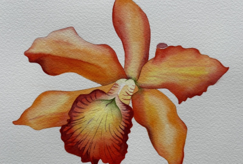
8. Orange Orchid Step 3: Adding Details Wet-on-Dry: So now I'm back a
few hours later. My orchid is dry. We have two layers of color
almost on every segment, and all we have left is the definition that
we're going to add using wet on dry method. I am going to now bring
in my green working very, very slowly, once again, here, it's a very intricate element in the center of the orchid. Going to put down my
green using medium value. So somewhere around four or
five on the value scale. And then I'm going to blend it down using clear water first. And then you can add a little
bit of yellow if you want. We just stick to clear water. Just make sure that that green
is moving down and sinking into the surface of your
paper and not moving too far. So you can see I put
just a little bit of color in that area where we see a deeper shadow and a little bit
of a greenish Q, and then it's sort of
disappearing into our orange, and you can blend it out all
the way towards the edge, either with clear water or a little bit of very
diluted yellow. Now, finally, we can add
some definition up on top. And here, I'm working again, wet on dry on the
segment of the flour that's not touching any
other areas that are wet. So completely safe, adding a little bit of
color on the darker areas. And you can take a look at
the step by step photos to see sort of where I started
and what I'm working towards. Next, I'm going to bring
back the green again and add some definition and shadow around the base of that element. And once again, it's just
a little bit of color, just a hint of green, and I'm blending it out
with clean damp brush. So just a little bit of
clear water on my brush, and that's more than enough. And you can see we now have just a little bit of extra
definition in that area. And now finally, we can bring in our parlin violet,
the brownish color. It's very rich. So
be very careful, once again, not to put
too much on your brush. You can see on my palette. I'm diluting it with
water quite a bit, applying just a tiny bit around the edges on
the very dark areas, the ones that I really
want to accentuate. And then once again,
I'm blending with clean damp brush so the color
disappears into the orange. Perlins are very
interesting family of watercolors,
relatively new pigment. They're very, very
rich, very beautiful. You can paint all sorts of
shadows with these pigments. I love Perlin
violet, Perlin red. Oftentimes, I use Perlin green. For my leaves. It's a
beautiful shadow color, but you have to use
it very, very gently. So just a hint of the pigment around the edge
with the tip of my brush, and then I blend it out. And because it's a violet
color, which is roughly, very roughly on the
opposite side of the color spectrum from
oranges and yellows, it's a beautiful color
to glaze shadows with. So it's practically
complimentary, and it just adds that
necessary hint of depth on the petals so that
they look less flat without being
too overwhelming. And once again,
notice how diluted. I keep it on my palette. I bring clear water constantly, so I'm not dipping it into
the saturated blob of color, just a tiny little bit. And that's more than enough. I'm only going to add a little
bit on top on the petals. And now we can do that interesting tricky
part on the petal lip, the texture, and the veins. And that's going to adds so much visual interest to our orchid. So here, I'm working with
the tip of my brush, and notice here the positioning of my brush is very,
very important. I'm always trying
to add the veins, directing my brush towards
the center of the flower, and then I'm sort of
dragging it towards the edge where I can put a
little bit of extra coverage, just almost like a thicker
that connects to these veins. But my veins are
always going they're pointing towards the center. So by doing this, you're kind of following the natural curvature of the petal, mimicking the organic shape, and these petals will
look very natural if you keep your brush
in that position. Always moving your wrist
around the orchid petal, or you can rotate your
paper if it's easier. I'm just trying
to keep it steady so that your picture
doesn't move. You can rotate your
watercolor block. And just follow along the edge, starting with the tip of
your brush and then pressing down a little bit as
you approach the edge, and then you can just clean up the details again with
the tip of your brush. So you can see that, again, the color is fading slightly, so the drying shift is
present in this pigment. But I'm trying to work with
a very diluted version. It's always easier with
watercolors to start lighter than you think you need to and then add
saturation later on. This way, you can always
adjust things a lot easier and lift your paint if
you're making any mistakes. So I've been moving
around quite a bit, and now I'm approaching
this tricky top part where I'm going to have to rotate my watercolor block,
and once again, because I'm right handed,
I'm just putting my brush down from the tip and then
pressing a little bit, adding these beautiful,
kind of, like, spider veins and
making them point towards the center
of the petal and then connecting them
around the edge. So now we have that
beautiful texture, that definition on
the orchid lip. I'm going to add a solid segment here
where the petal curves. So it's a shadow, painting
the back of the petal, carry that color over
around the edge, and then switch to
my scarlet lake. I still have a little bit of peril and violet on my brush, but a tiny bit lighter. I'm going to add some
stripes around the top part. Again, you don't
have to do too much. I don't want it to
look like a zebra, but just a little bit,
just a few lines there. And then on top of our green, which is dry at this
stage, almost dry. You might add a few lines. Make some of these
veins more pronounced. That's it for our first orchid by using a combination of wet on wet and wet
on dry techniques, we were able to create a beautiful vibrant
flower with some texture. In the next lesson, we're going to get started
on the blue orchid, where we're going to use
a different technique and a different
palette of colors.
9. Blue Orchid Step 1A: Painting Petals Wet-on-Damp: So let's get started
on the blue orchid. And here we're
going to use one of my favorite watercolor
techniques called wet on damp, which is essentially a variation on a wet on wet technique, but it involves a
bit of a time delay, and it creates gorgeous, gorgeous effects that are only possible with watercolor because it's a water based medium. And so we have a lot of interesting textures and effects that we're
going to create. Starting with this
petal on the left, let's cover everything
with very diluted blue. And you can see, I have my thyloblue green shade that I've diluted almost
to pure water, just a hint of pigment. We're going to be working
one petal at a time. So note that I'm just covering the entire shape with my color. And then I'm going to grab a little bit more saturated blue with the tip of my brush, so I'm going to rub it
on the actual blob of color on my palette instead
of using the watery mixture. And then I'm going
to apply it just around the edge to see
how far it spreads. And it should spread about
maximum 2 millimeters. If it's spreading too far, wait 20 seconds before
trying it again. So what you want to have
is this effect of, like, a slightly darker color
around the edges. Then just as an option, you can bring in your purple. I'm using dxs and purple, and you can just add a tiny hint of that color at the bottom to add some visual interest
and a bit of a shadow. Now, let's test the wet on damp. I'm going to grab
my smallest brush, a bit of saturated color, and I'm going to drag a very long horizontal line
just along the petal center, again, seeing how
far it would spread. And it shouldn't
spread far at all. If it does, again,
wait 20 seconds. The surface of your petal
should be damp, not wet. If it's dripping with water, give it some time and try again. You can see the very first line that I've painted
spread a bit too far, and now I'm applying
more and more lines. And they're sort of
staying in place. There's just a tiny bit, a tiny fading happening, but for the most part, you
can still see my stroke. And this timing,
I've been painting now for 3 minutes
and 20 seconds. This timing will depend
on your paper brand, which is why it's important
to kind of test it on a scrap piece of paper
so you can get comfortable. It might take less time. It might take more time, but I usually work with arches paper, and I know that roughly I have 5 minutes to play with as
my water is sinking in. And you can see that
as it sinks in some of these strokes are
becoming less visible. So I might double down
in some areas, again, working with the
tip of my brush, grabbing just a
tiny bit of paint. And because my
brush is so small, there's not a lot of opportunity to leave a big stroke,
like a thick mark. It's just a tiny bit of pigment
on the tip of my brush. So that's sort of the
effect we're going after. And I'm going to repeat
this process again and again so you can see how it
works on different petals. And every time, obviously, the conditions are
slightly different. So there might be different
amount of water that I apply. And so I'm always going to
test first with a few strokes, adjust my timing
and move forward. So let's try this again, and I'm going to
work on the petal that's not adjacent
so that there's no spillage of paint into the area that
we just worked on. Very important. So
we're going to skip a petal and then work
on the next one. And here, again, with
my larger brush, I'm going to cover the entire surface with
very diluted blue. Almost clear water. If you think about
the value scale, it's like somewhere
around value two, almost completely diluted,
just a hint of color. And it's quite easy to see kind of the border of my
working area this way. So I'm not starting
with clear water. I'm starting with
very diluted color. And just like I did
on the first petal, I'm going to bring in a little
bit of purple at the base. This is not wet on damp. This is still wet on wet because the petal
was completely wet. But my water is sinking
in and drying out. So very soon we're going to switch to the wet
on damp method. This time, I think I've put in a little bit of extra
water on the pedal, so I think it's going to
take me a minute or so to get to that stage
where I can do the lines. So for now, I'm
just testing it out slowly working around
the edges, adding blue. And you might feel like your
pero is ready for the veins. Mine is definitely not. And I'm actually going to lift my watercolor block to show you exactly what I mean when I
say the surface is too wet. So it's going to be glistening. It's like, you'll
see the reflection. Let's switch to
the smaller brush. Try again around the edge. You can see the paint
is still running very, very quickly towards the center. So we're not quite
ready for the veins. If I put the vein
down right now, it's going to just
blend. Here you go. This is what it looks like
on an angle, way too wet. It has to be a little bit less shiny for the
veins to work. So let's give it a
few more seconds. And try now. So you can see I grabbed
some saturated paint, and now I'm going to try
and drag the first vein. Yeah, it's spreading quite far. So we're just approaching that time when the
veins are going to be staying put and now I can maybe try
closer to the edge. One tip I'm going to
give you is whenever you have a wet section that
you're working on, it's always a little bit more dry towards the edges because your block of color is drying out from the
edges towards the center. So towards the
edges, you can see the veins are staying
a bit more put. I can see more definition. In the center, it's
probably still too wet. So I'm going to start adding more detailed veins
around the edges, and you can see it's
still spreading. So maybe I have an opportunity to switch to a
different pigment, giving my pedal a bit more time. And this is a very, very tricky predictable process that
takes a while to get used to. So if you don't get it
right the first time, don't worry at all. It will become easier and easier to read these signs as
you get more practice, but it's so worth it because the effect is just so beautiful. So now I'm doubling down
on some of the veins. Again, it's spreading a bit
too much for my liking, but it is getting a bit more sharp with a tiny bit of fading, which is exactly the
effect that I'm after, and it's so much better
than working wet on dry, where the veins would be simply crisp without fading because it mimics that natural fading
that we see in the reference. So I think I'm going to
leave it at this stage. That's more than enough, and we can move on
to the next petal.
10. Blue Orchid Step 1B: Filling the Central Petal: Let's work on the central
petal of the orchid. This is known as the orchid lip. And the reason why
I want to skip to this particular segment
is because once again, I want to avoid any areas adjacent to the
petals that we just worked on. So I'm skipping the three
petals in the background, and I'm going to
apply a little bit of light blue color to the
petal lip, the orchid lip. Leaving a tiny border between this segment and the very first
petal that we've painted. So note that the
petals are not flat. They're not thin, like a
sheet of paper would be. They have a little bit of
weight, some thickness. And so I left a tiny, tiny strip of dry paper between the top part of this element and the very first
petal that we've painted. And this way, I'm also
avoiding any spillage of paint into that area
that we've already finished working on and also creating bit of a dimension on this petal that's facing us. So note that I'm applying
clear water in the center, making sure that that segment stays completely
almost bright white. There's a little bit of
blue moving into it, but I did blend it
with clear water. And now I'm going
to test it out, see if I can add some veins
using wet damp method. Again, I'm switching
to a smaller brush, working just with
the tip of my brush. You may want to rotate
your paper block, so it's easier if
you're right handed, but I'm going to try
to keep it steady so you can see it without
changing the angle. Maybe I will have to
rotate it just for this one segment because it's easier for me to
achieve the stroke. And once again, just like we
did on the orange orchid, we want to position our
brush pointing towards the center so that we mimic the natural progression
of the petal, the way it unfolds,
the way it grows, and apply these lines from the center and then
leading towards the edge. And I'm going to continue
slowly rotating my canvas, just applying these lines. And this time, I got
my timing right, so they're not
spreading too far. If they are, in your case, if you apply some color
and it spreads too far, just give it extra ten to
20 seconds and try again. You want to catch your paper just before everything is dry. And so you can see here it dried out already almost completely. And so my lines are
looking a bit more sharp, so I'm going to try to hurry. You only have a
very small window of opportunity to add
these faint lines, which is why this
is a tricky method, but it is so beautiful. And then I'm going to connect
them around the edge. Continue to rotate
my paper block, and I'm going to double down in some areas now that
it's a bit more dry, some of the lines
have disappeared, so I'm just doubling down. Very, very gently, applying
just a tiny bit of color. So having a small brush
gives you that precision, but also it doesn't
load as much pigment, so there's only so
much color that you can transfer from
the brush to paper. And that's more than enough, I think, for the stage, the center is almost
completely white, and then we have this
beautiful spider web of veins that we've created.
11. Blue Orchid Step 1C: Finishing the First Color Layer: Now, let's move on
to the next petal. And I think I feel fairly safe that the second petal
we've painted is dry. At this stage, you
may want to run our hair dryer here
if you're not sure. And let's cover everything
with some diluted color. You can play around
and instead of blue, add diluted purple
in some areas, just for some variation
in color temperature so that it doesn't look
too flat and boring. And the purple will give
you a little bit of warmth and maybe
indicate a shadow. Note that I'm going
to blend with clean damp brush
towards the base. I'm not going to carry my color all the way over to the base. Blend it, leave
some white there. And then let's see if we can add some color around the edges
and see how far it spreads, testing it out before
we do the veins. Spreading a little bit too much, so I'm going to
give it some time, maybe five, ten, 15 seconds before I
start adding my veins. Feel like, again,
the surface is a bit too wet because I've applied
quite a bit of water. So I'm still waiting, and you can test it again
around the edges, see how far everything
is spreading. And now I think I'm ready. I'm going to attempt the first
line closer to the edge. And this time I'm
not using blue, just using purple
to create, like, a visual separation between
these background petals. They're a different
shape, and they're sort of a different
layer of petals, if you think about
how the orchid grows. So just a slight variation
in color temperature. Oh and once I'm
done with purple, maybe a little bit of
blue here and there. Again, I'm now working on top of the lines that
I've already created. You can connect
them in some areas. You can see in the
reference photo. Some of them are sort of like a tree with a trunk and
then some smaller branches. So just trying to
mimic what I see in the reference photo without
copying it one to one. So it's almost impossible to
capture every single vein, sort of the general look. And the main thing
is, of course, the direction of these veins. So they're following the natural progression
of the petal, and that's how I'm
applying my color. I'm going to turn my
canvas around and make it easier for me to work on the petal on the
left hand side. This one's a bit darker. At least, it looks like that to me in the reference photo, especially as it's disappearing behind the foreground
petal and the petal lip. So I'm going to add much more saturated
purple there at the base. So if before I was
covering everything with almost fully diluted
blue and purple here, I'm going to maybe move towards value three
on the value scale, just a bit more saturated. And more purple at the base
to indicate the shadow. We can even add some
more saturated purple there just as it disappears
behind the two petals. And note, again, I left a
thin white strip around the petal lip that's
facing us because we do see that petal from
a different angle, and we can appreciate that
it's a little bit thick, so it makes sense
to add that border, kind of signaling
that this petal has some weight and thickness,
some dimension. And it also makes it
easier for us to work on a separate segment without
having any color bleed. And as I'm talking to you, I'm waiting for
the petal to dry, letting my paint sink in, and the water
slowly evaporating. So it's been about
2 minutes now, and now I can start testing with some concentrated color
around the edges. I feel like this time I got
the timing almost right, so I can just continue
with my blue. I'm not going to carry these veins all the
way to the tip. In the reference photo, I
see like they're sort of disappearing and the
tip is almost light, almost without any detail. So I'm just going to make sure my veins run all the
way to the base. And here, I started with blue, and I'm going to
add purple on top. Again, I see that segment as
a bit darker in some areas, so I'm using more
saturated color. Maybe some of these
veins I will carry a little bit further and then add some color around the edges. And that's it. So
you can see just a bit more vibrant
and more dark. It will dry out looking
a little bit lighter as watercolors tend to do with the drying shift as
the water evaporates, everything looks a
little bit more muted. And we have one more
petal left up on top. And again, I want to make sure that the adjacent
petals are dry. Mine are. If yours are
still a little bit wet, you can give it some time, maybe step away
for a few minutes, maybe half an hour or just run the hair dryer to make sure that everything
is completely dry. And then let's
start covering the petal with very diluted color. You simply blue or you can add some purple here and
there for some variation. And we want to cover
the entire petal. Maybe applying some darker
color in the center, more saturated, and then blend it out with a clean
damp brushed. So it becomes
lighter at the base. Oh and let it sit for a bit. I'm going to bring
in my purple and start testing around the edges, see how far it spreads. I feel like it's a
little bit too wet, so maybe another
10 seconds or so. So and let's try it again
using my smallest brush. Let's draw a line in the center. And it's perfect now. It's not spreading too far. It's fading just a little bit. As I mentioned in the beginning, this takes some practice, but even within the boundaries of one flower and painting, I kind of get more comfortable. As I go, usually, I start a little bit unsure. I test it out and then
kind of get a hang of it and continue much
more confidently, and you will find
the same thing. After a few petals, you'll get a sense of
how much time you need. You'll be much more comfortable predicting how far the
paint is spreading. So this just takes practice. But once you learn
about the timing and get more comfortable and used to the way
your paper behaves, this will become second
nature, I promise, and you'll be able to
create these lines easily. So here I somehow got
the timing right, and I did a few
vertical main veins, a few branches connecting them. Now, I'm just going to add
some purple up on top, not creating anything new, just kind of marking up
what I've already painted, making it a bit darker. And again, I'm not trying
to capture everything. I just roughly follow what I
see in the reference photo, just trying to
capture the essence of these lines without
counting them precisely. Let's leave everything to dry. Make sure when we come back, the entire flower
is completely dry. Your paper is not damp anymore. I'm actually going to give
it a couple of hours. And when we come back
in the final layer, we're going to apply just
a tiny bit of color to add some definition and
shadows on the orchid.
12. Blue Orchid Step 2: Glazing Shadows and Color Accents: Welcome back. Our
orchid is dry now. You can see just
with one layer of color and using wet damp method. We've created quite a
beautiful background layer that almost looks real, but there is an opportunity to add some definition
in a bit more detail. So we're going to be working on the dry surface right now, glazing some extra
color here and there, adding shadows,
making everything look a little bit more
three dimensional, capturing some of
the extra details that we see in the reference. Might even make some of the
areas a bit more vibrant. But let's start in the middle, and I'm going to mix my
ocher with my purple. Remember complimentary colors. I'm going to create this nice, natural brown kind of a warm brown color that I see in the reference photo and
very, very diluted. You don't want to use a
concentrated mixture, just a tiny, tiny bit of
pigment and a lot of water. I'm going to create
some definition around this stamin
in the center, so you can see I'm just
gently applying that mixture. The transitioning to pure purple as I move to the
base of the petal. All I want to do is
just an extra shadow, and you can see I'm
painting around that element of the orchid
lip that's sticking out. Suddenly, it's a little bit
more in focus because it is a foreground element and we've put a little bit of extra
color in the background, creating visual separation,
enhancing the sense of three dimensional form on the two dimensional paper plane. And you can carry
that shadow color under the stam
again, very diluted. So just a hint of color. And then blend it out
with clear water. By the way, this is
called negative painting, painting around an object. And so we have this
central element that we're painting around, revealing its shape by applying darker color around the
shape, around the silhouette. And then you can just connect
the color to the veins that you've already
created or just blend it out with clear water, so it gently disappears. The key thing was to keep this
mixture very, very light. And now we can introduce
a little bit of green. I see in the reference photo, there's a tiny bit of green
in the center of the flour, and I'm going to
just add a tiny bit. And if you're interested
in learning more about negative painting
techniques specifically, which is extremely
useful for any subject, but especially good
for botanical art. I have an entire class on negative painting on
my scochia channel. It's a really, really fun technique if you want
to be able to create intricate details like veins and paint greenery and flower
petals with watercolors, it's super useful. So
you can check that out. But for now, I'm going to carry my shadow mixture over
to the other side, cover that segment,
and then let it dry. Et's move on to the top petal, and all I want to do is just add a tiny bit of blue where I see some extra shadow and some
vibrancy around the edges. And I'm going to
apply medium value, blending it out
with clear water. So because we're using
transparent colors, everything underneath
should still be visible. Don't use fully saturated color. So medium value somewhere
around four or five around the inch and then blend it down and towards the
center with clear water. I'm going to add a little
bit of purple here. And suddenly the overall
silhouette is a lot sharper. So this is nice if you're working against
white background. It's going to make
everything stand out a little bit more. I'm going to add
that purple again in that darker area where the background petal
is disappearing, then blended out
with clear water. All the colors we're working
with are transparent, so everything should
still be visible under the second layer if you use
the water down pigment. Very, very small segment
around the edge, and then again,
I'm going to blend it out with clear water. Another petal. I'm
actually going to paint it as a
continuous segment. So the bottom of this larger
one and the top of this one, it's the same shadow
so we can connect them and then blend
with clear water. A bit more definition on
the other side, again, using purple and blend
it out with clear water. Here, along the edge, I'm going to add a
little bit of blue. Don't let it spread too far. And a little bit of
purple up on top here. Again, this is what I see
in the reference photo, a bit more shadow,
more vibrancy. And now, again,
I'm going to make my mixture of Ochre
and Dx and purple. Add a little bit of
that shadow mixture on top of the stamin
completing its shape. And let's see what
else we have left. I think what I'm going to do now is just finish the bottom of the orchid lip a little bit of purple there and blend it
out with a clean damp brush. I'm mixing it still
with a bit of ochre, just to add a hint of, like, brown and mute it a little bit. Adding a little bit of
shadow on those elements of the orchid lip
that have a bit of shadow, some darkness there. And then I'm going to draw a very faint line at the
bottom to complete the shape, still leaving a bit of white to indicate how
thick the petal is. And let's see what
else we have left. Maybe just a few
finishing touches to add some extra
value here and there. So I'm going to add
my shadow mixture in that corner where I have
a little bit of green, blend it with clean damp brush, and maybe on the other side, the reverse side
of the petal lip, just a tiny little element. I'm going to add a
little bit of blue just to define the tip there. And let's see what
else we can do. So maybe on this element, just add a bit more of my shadow color around to
define it even further, make it stand out more. So the more dark color you add around the lighter element, the brighter it looks. These are very optional
finishing touches. For the most part,
our work is done. So I'm just looking as I
usually do in the final stage, looking at the reference
photo and trying to find opportunities to accentuate some of the elements that
I want to accentuate. So maybe some of the veins, some of the edges, this
time working wet on dry. So just a few lines to make some of these veins
stand out a little bit more. There's still the
underlying faded line, so I'm just painting on top of it with the
tip of my brush. And to me, that area is
one of the closest to us, and the more crisp
details I add, the more it's going
to stand out. And that's sort of like a
visual trick that has to do with how our eyes
perceive depth. Anything that's
more in focus more detailed will tend
to appear closer. So because the petal is
slightly on an angle, this petal facing us is one of the closest
planes that we see, so just a bit of
extra crisp detail. Completely optional, of course, but I'm going to do
the same thing here, just a couple of lines
on the top half. And maybe in the middle
here, in the center, not along the entire vein, but just in the
center of the petal to make some of these
a bit more crisp. The central vein that
I started with here that's been bothering me for quite some time
since we started, I faded a bit too much and a
few strokes at the bottom. And that's about it. So with two layers of color using wet on damp method in the first layer and a little bit of definition
in the second layer, we've painted our
second blue orchid.
13. Red Orchid Step 1A: Wet-on-Wet and Negative Painting: For our red orchid, we're going to work primarily using wet on wet and
wet on dry techniques, the two classic watercolor
painting methods. And I'm going to start with
this petal on top using very, very diluted warm red. This is my quinocdon coral. And I'm going to prep
the surface by applying very light wash. You can start
with clear water as well, but I prefer to use a
diluted wash of color just to see the boundaries of my working shape a
little bit better. And then at the base, you can finish the petal
with your cooler red. So here I'm just using
quinacordon magenta, and you can see this very
soft blend from cooler, more violet leaning
quinacardon to a warmer red. And then we can start charging more saturated color
into this wet surface. So this is the classic
wet and to wet technique where we add pigment
to wet surface, and it just very softly spreads because we're working on cold
pressed watercolor paper. Eventually, you will see a very soft blend throughout
once everything is dry. And let's leave
this petal for now. We're going to
come back later on and add lots of details. Let's move on to the one
on the left hand side. And once again, I'm going
to use wet into wet method. But instead of starting
with clear water, I'm going to start with fairly light mixture
of my warm red. It was a little bit
more saturated on top, so I'm just blending
it right now, slowing down to make sure that I don't go over
the pencil marks. And I'm keeping
the overall value somewhere around
level three or four, no higher than five, because we really want
to leave ourselves some room to build
the details after. So this one is turning out to be slightly darker
than the first one and maybe a little bit more saturated around the
edges, which is fine. We're working against
the white surface, so I want the silhouette of
the petals to stand out, but I'm not going
to full saturation. So my color is not creamy, it's quite watered down. And I'm not going to add
any additional color here. These petals look quite warm, so the squirrel seems to be a good match for the
reference image. And I'm just going to switch
to the right hand side. Similar petal on the right, essentially a mirror image. There's just some slight
variations in the silhouette. And once again, using
fairly diluted mixture, which you can see on the right
hand side on my palette, I'm just going to fill
the space there's no right or wrong in terms of
doing wet into wet method. You can start with clear water
and then add your color. But like I said,
I just prefer to go in with diluted
color right away, especially when I'm
working against the white background
so that I can maintain a very sharp silhouette and don't go over the
border by accident. On the bottom left, I see a little bit of a cooler
hue in the reference image. So once again, I've added a
little bit of magenta there, and now I'm just
financing the silhouette. Once again, I'm going
to leave it to dry, switch to our next pedal. While the first three
petals are drying out, let's just cover the center with a very diluted
wash of yellow. Again, don't use fully
saturated color. Make sure there's
quite a bit of water. So you can still see your underlying pencil marks
and just cover it very, very gently all the
way towards the edges. You can dilute the
bottom part with clear water just to lighten
it up and leave it to dry. Now we have this large petal,
quite intricate coloring. And here, what you want to
do is grab your cooler red. If you want to continue
with very diluted magenta. If you want to try
this fluorescent pink, it's the same pigment PR 122
in any watercolor brand. This particular variation PR 122 has a bit of
fluorescent feel, and it's much more fugitive than typical
magenta, meaning, over time, it will start fading,
but we will add some regular PR 122 on
top to kind of seal it. And if you don't like
fugitive colors, you can go straight in with
your quinocradon magenta. Whichever cool pink you have on your palette will
work as long as it's closer to blue on
the color spectrum compared to these warmer
petals that we worked on. And what I'm going to do here is working with
my smaller brush. So very precise.
This is size two, sca, so quite thin. I'm going to cover the surface of the petal with very diluted, again, very watered down
mixture of my paint. But this time, I'm
going to paint around these lighter spots, and I have very light
pencil markings there. I'm just going to
paint around them, and this is called negative
painting technique. In watercolor, it's extremely
important because we don't have the luxury in classic watercolor of
using white pigment. For the most part, we're working
with transparent colors, so we can't layer lighter
colors on top of dark. If you were to work with say
gouache or oils or acrylics, you could have
covered the entire petal with pink and then painted these lighter spots
later on using white color. But with watercolors,
we really need to rely on negative painting, meaning painting around
our lighter elements and just filling in the color this way to use the white of the
paper as true white. And here I'm finally going to
bring in my non fugitive PR 122 and just drop it
in around the edges. So this is my regular
magenta. This will not fade. It will blend really nicely
with the fugitive opera pink, and it will give us a little
bit of that extra value, extra dark color
around the edges. And I'm going to continue
dropping it in until my surface is starting to look dry and the
color no longer spreads. Now, I'm going to turn my paper block around
just so that I can reach those tricky spots
and continue using negative painting technique
around these white spots. Notice, again, the
consistency of my mixture, it's very light. There's very little pigment
and a lot of water. So this allows me to keep my values somewhere in the
range of three maximum four, and I also have quite a lot of flexibility when I continue
working on these edges, so they don't dry out quickly, and I can work on
distinct segments and then connect them without
leaving any borders. So it looks more or less as a continuous wash.
And once again, I'm going to mention that if you don't like
fugitive pigments, there's some
possibility that they might fade over time
just a little bit. Although I haven't seen it with quality brands like
Windsor and Newton, I've been painting
for about 15 years. Now, if you don't put
them in direct sunlight, they don't fade that much. But if you want to
avoid fluorescent pink, just go straight with
your quinocordon magenta. It's a little bit less vivid, but very beautiful nonetheless. And just continue filling it in. Turning my paper block again as I go just so I can
reach those areas. I'm right handed, so it's
easier for me this way. Just very gently continue
covering the petal until we have the entire surface covered with our cool pink. And once again, we're
going to leave it to dry, come back later to add more definition and
more realistic details. Right now, I'm just
finessing the border, adding a few final
splashes of pink, and that's it for this petal.
14. Red Orchid Step 1B: Painting Side Petals Wet-on-Wet: When we come back to
the top petals again, let's make sure the spot of yellow in the center is
completely dry because we're going to be painting on the area that's adjacent
to this yellow spot, and we don't want
any color bleeding. So here, I'm going to start
with just a splash of PR 122. Again, you can use
magenta or Opera pink, which is a little bit
more fluorescent. Just very lightly in the
center and then I'm going to blend with clear water
towards the top. These petals have very defined highlights
in the reference photo. I want to keep them lighter. And then the bottom
part, I'm just going to finish with PR 122 very carefully painting
around the silhouette of these yellow
stamens in the center, making sure I don't
go over the border. Here I'm using just
regular magenta. Very, very gently. Again, I'm not reaching
full saturation, but you can see the color is quite vivid and it's
spreading towards the top as expected in the classic wet and
tout technique. And now we can add some details, just a few strokes following the natural
direction of the petal. The tip of your brush, and I was able to
fit in five of them, and then I'm going to
switch to my warmer red and continue building
more saturation at the base of the petal. Just a few splashes. And again, notice that
the colors spreading. There are no harsh lines. You can carry it up
just a little bit more around the
silhouette of the petal. And now we have a
really nice soft blend using a cooler and a warmer red. And let's leave it to dry. Here, I'm going to
go with clear water. I have a little bit of
color in my jar still, so I can now clearly see the boundaries
of my working shape. The water is a
little bit tinted. And I like it that way because
I'm able to see exactly where my wet segment ends and I don't go
over the pencil marks. I'm going to cover
the top part because that's where I want
my paint to spread. The paint always rushes
towards the most wet areas. And then I'm going to grab
my cooler red, my magenta, and then start building some value at the
base of the petal and then just gently helping it spread towards the
lighter top part. And again, you can draw
a few faint lines. Always following the
direction of the petal. So when they spread,
they look very natural. You can observe how the left
hand side is drying out now. So it's very important to not
put these lines randomly, but rather always pointing
towards the base of the petal, and you can increase the saturation of your
pigment closer to the base. Really push it towards maybe
value five or six here. Still not using fully
saturated creamy paint, but just a little bit darker. And then I'm going to gently
go over the top just so that the edge of the
petal doesn't get lost against the
white of the paper. And that's it for this part.
15. Red Orchid Step 2: Wet-on-Dry Accents: Now I want you to switch
to your smallest brush, and let's work out this
tiny little element, the stamin in the center. I'm going to put a
little bit of color. It's a mixture of pearl and
violet and cornocardon coral. And then I'm going to blend with a clean damp brush so that that color disappears into
the white of my paper. Then another cascade. Again, it's half
and half mixture of par and violet and
quinocredon coral. Again, I'm going to blend
with a clean damp brush so that the color softly
disappears into the background. A small element, and just
by adding this tiny shadow, we're able to define now, what I want you to do
is using the same brush and your most saturated PR 122. So your most saturated magenta, let's work out these dark spots on the main front facing
petal in the center. So the reason why I really like synthetic brushes for
this type of delicate, almost decorative work is because they tend
to be more stiff. So at a smaller size like this, you have a lot of spring
and a lot of support, and you can just use the tip
to add these little dots. Technically, any dark
red will work here. If you have something like
permanent lazarin crimson or carmine, any of
these will work, but I'm just trying to keep
my palette more cohesive and streamlined, very
saturated magenta. You can even add
that same peril and violet you want the spots
to be a lot darker. So don't be afraid
to experiment. The main thing is you
want now your value, meaning how dark your paint
is to be a lot higher. So I'm working with,
like, level seven, eight. You can even go as far as nine. So very little water
and a lot more color. And very, very gently. I'm not trying to capture everything I see in
the reference photo, sort of the main silhouettes. And let's not forget up on top, this petal that's
disappearing into the background behind
the front facing petals, the cooler ones that we
painted mainly with magenta. There are also some spots there. And then continue
going to the left. Again, the main thing here is not the color, but the value. So how dark your red is. And we really want
these spots to be red. One thing I want to
mention about watercolor, if you're more familiar
with this medium, you know that it always
dries out looking a little bit lighter after
your water evaporates. It's called the
drying shift and. It's always present
with watercolor. So even when you're using
level 78 in your values, there's still a little bit
of water on your brush. Once it evaporates, it looks a few steps
lighter so you can see right now these spots are drying out looking slightly lighter. And let's not forget
these lines and details on top of the
yellow central elements. So let's just add them in, as well and leave it to dry. Now, to finish our first layer, we need to cover the central
element with some red. So here I'm going to
switch to my warmer red. And I'm going to work on top of that base yellow underpainting, just covering that
entire segment with my coral or whichever
warm red you're using. The wash of yellow underneath
is completely dry, so this is a wet on dry method of painting
very, very slowly. No need to rush here. Let's just cover that entire
silhouette with our colors, still keeping it on the
lighter side so you can see a little bit of yellow
kind of shining through. Really leaning into the transparent nature
of watercolor medium. You can see how
it almost looks a little bit orange now because we have that
yellow underneath. And very slowly, there's no need to rush with
wet on dry method. Just cover that entire
segment with your warmer red. Financing the edges and then just connecting
them to these almost, like, drop shaped elements that extend towards the
edges of the petal. Working very slowly with
the tip of my small brush. And here I'm approaching almost
maybe value five or six, so getting a little bit darker compared to the
initial petal washes. Let's leave it to dry.
16. Red Orchid Step 3: Creating a Vibrant Glaze: I step three, we're
going to come back to every single petal and
work on two things. Number one, we're going
to add additional value, meaning more saturated color
to amplify our shadows. And you can see here, I started with a little bit of parlin violet around the edge, continued with my warmer
quinacridone coral and then blended with a clean
damp brush just to build a little bit of
color around the edge. And the second thing
we're going to do is add lots and lots of texture and detail to really increase
the sense of realism and capture all those additional
beautiful details that we can observe in
the reference photo. So here I'm just adding a
little bit of par and violet. Again, notice the
direction of my strokes, always in the
direction of the pet also from the top
towards the base. And I'm working on
completely dry surface. So the underlying layer is dry, and I'm just building
a little bit of, like, a base of diluted color, just like we did in the first
layer here on this petal, starting with diluted
quinocdon coral, and then adding tiny bit of violet around the edges and
just watching it spread. So notice that I'm really concentrating around
the edges where I see some shadows and a
lot more intensity in the color in the
reference photo. So I'm still not using
fully saturated color, but notice now with
the second layer, everything looks a
little bit more vibrant. And you can add
splashes of yellow if you want to bring in
a little bit of, like, sun kissed warmth, not
throughout the petal, but just certain parts that might be catching a
little bit of sunlight. And again, watch
that color spread. There's no harsh lines here, just a little bit
of a color boost. So let's add another
petal here on the right. I'm going to follow
my map of color, and that's why I like
to call it a map of color because in
the first layer, if you recall, I did use a little bit of
magenta at the bottom, so I'm going to
bring it back again, just boosting it
a little bit and then follow with Perlin violet, outline the tip of the petal, and notice how much more
vibrant everything looks now. So this second layer is really counteracting this
phenomena of drying shift that we talked
about a few minutes ago where your watercolors
look a lot more dull. And again, I'm bringing
in a tiny bit of yellow, adding it wet and to wet in
the middle of the petal, and we now have much
more dimension overall. Now, using wet on dry method, so just some very faint lines using wet paint
on top of dry surface, I'm going to add a little bit of texture on top of
the central element. So just a few lines. Again, they're emanating
from the center, the base of the petal, towards the edges,
always following the natural logic of the organic form
that we're painting. Just a few lines. Again,
the color is diluted, but because now we're working on the third layer in that area, it looks quite dark, so now approaching
full saturation. And in the final few minutes
of this small lesson, I'm just going to add some
texture using diluted magenta. You can zoom in very closely
on the reference photo and notice there's some
faint, darker lines. Again, always following the
direction of the petal, so I shift the
positioning of my hand, and I'm just adding
them with the tip of my brush using
very diluted color, not fully saturated color. But building a little bit of that extra organic texture that we can observe in
the reference photo. Mostly around the edges, and I just sort of
drag these lines out and towards the center
of the pedal very, very gently, just
around the bottom part, adding texture and value and
a little bit of dimension. Now, it's important
to note that I took a long pause before moving on to the final set of petals because
we're going to be working on the areas that are adjacent to the ones
that we just worked on. So just to avoid any kind of cross contamination and
unnecessary bleeds, let's make sure
everything is dry again, and then work on these
two petals up on top. And here I really want
to preserve some of that bright white and the
highlights up on top. So I'm going to work a
little bit differently. I'm starting with just a
stroke of quinacordon coral, and then I'm blending it into the base of the petal
with a clean damp brush. You can add a little
bit of violet, too around the edges just
to enhance the silhouette. But I'm not working with
very wet surface here. So I really want to maintain
control over this blend. And again, at the bottom, I started with quinocidon
coral and then very gently with
some clear water, just making sure that it
fades into the background, but doesn't spread
all over the petal, so the lighter parts
remain very light. And again, I'm going to
add a little bit of violet just to add some contrast
with the tip of my brush. There's not a lot of
water on my petal. I didn't cover it with water throughout or with my
diluted paint mixture. So it doesn't go too far. I just sort of
stays in that area, and you can play around, charge some additional
colors just very, very gently with the
tip of your brush, so there's not a lot
of blending happening, a fairly vibrant,
dark shadow around each side that slowly and gently fades
into the background. So a little bit of a
modified approach. Here, I'm going to
show you kind of a different way of doing it. I will pre wet the entire petal, but because I'm using
such a small brush, there's not a lot of water, and I'm just giving myself maybe maximum 1 minute
to add some color. It's not going to go too far. I'm going to just add
it around the edges. And if it spreads too far, you can lift it with
a clean damp brush. I just want a little bit
of color around the edges without too much blending
and without my color going all the way up into
the highlighted areas. And you can see how now with this additional layer of color, we've added a lot of vibrancy, and this is something
that beginners are often confused about when they
paint with just one layer. How good your paints
are, they always fade, so it does help to add
a layer or two on top. If you really want to
boost the vibrancy, of course, for botanical art,
it's extremely important. So if you don't want
that faded in dull look, second or even third layer
of color will always increase the vibrancy of your work and give
you that extra boost.
17. Red Orchid Step 4: Finishing Touches: The final step is all
about finishing touches. So let's take a look at our reference photo
one last time, see if there are any small
details that we can add. I found a couple of small
details in the center that I missed in the first layers. I'm
going to add those. And one more time, I'm going to go over some of those areas that I want to
that I want to amplify. So once again, I'm
going to glaze a transparent layer up on top. This time, I'm really
going to bring my color to its full potential because
now we have several layers. The drying shift is almost
completely eliminated. And we're able to reach that super vibrant look that we observe in
the reference photo. So I covered the central element with a glaze of Conocadon coral, and I'm quite happy for the most part with how the top petals turned
out with two glazes, but there might be
still a few areas and some opportunities to
boost the color further. So this step is
entirely optional, but I always like to add
this final accent layer. So on the top petal, I'm going to paint a
few very thin lines. Using the same coral, then moving on to these petals that are sticking to the right
and to the left, a very gentle glaze of
coral here up on top. And then on the petal that's
pointing to the left, a glaze at the bottom, I'm going to blend
it with clear water. And then a little bit on top, again very carefully observing
the reference and just adding that extra bit
of detail and shadow. So take a look at the step
by step photos again. See where you're at
with your value, see if there's any opportunity
to boost certain segments, add a little bit of extra color. And the last thing I'm going to do is just a little bit of that same quinocuron coral
around the edges up on top. Just a few gentle strokes
and then blending it with clear water so
that the color disappears. And I think that's it
for the red orchid.
18. Final Thoughts: Congratulations on
completing this class. I'm so proud of you for
taking the time to explore these watercolor techniques and bring your beautiful
flowers to life. I would absolutely love
to see you orchids, so don't forget to post
your finished paintings in the projects
section of this class. And you can also
tag me on Instagram so I can repost and
celebrate your work with. You have any questions, feel free to ask in the
discussion section of this class. I'm happy to help. And
if you enjoy the class, leaving a review means
the world to me. Not only does it help
me as a teacher, but it also lets Skillshare know what you loved
about the class, making it easier for other
botanical art lovers to find and enjoy it, too. If you're looking for more
botanical inspiration, you can check out my other
watercolor classes here on Skill Share and explore even more tips and tutorials
on my YouTube channel. Of course, if you want to dive deeper into more advanced
watercolor techniques, be sure to check out my new
book, 101 Watercolor Secrets. It's packed with insights to
help you grow as an artist. Thank you so much for watching
and painting with me. I will see you in
the next class.
 Anna Bucciarelli, Professional Illustrator