Transcripts
1. Intro to Class: Hello, and welcome to class. If we've not met before, I'm Jen, and I'm so
grateful that you're here. Did you know that you can
paint on wood with watercolor? You totally can. This class will introduce you to transparent
watercolor ground. It's a brilliant
product that lets us watercolor artists paint
on surfaces like wood, ceramics, metal, and
all kinds of things. So let me show you what
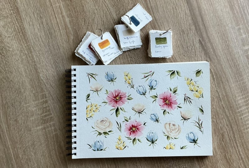
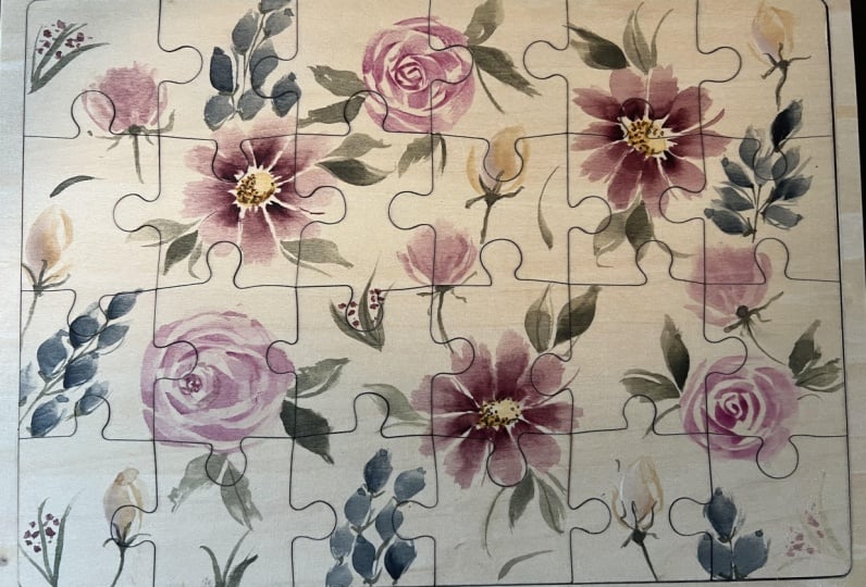
class is all about. I start by showing you all the supplies
you need for class. You'll see some previous artwork I did using watercolor ground. But do you really need it? I think you do and I'll show
you several reasons why. I then share some lessons I learned with the
first puzzle I did. I'll give you some tips on
how to pick your subject, whether it's for this
puzzle or a future project. Next up, we go through the process of prepping
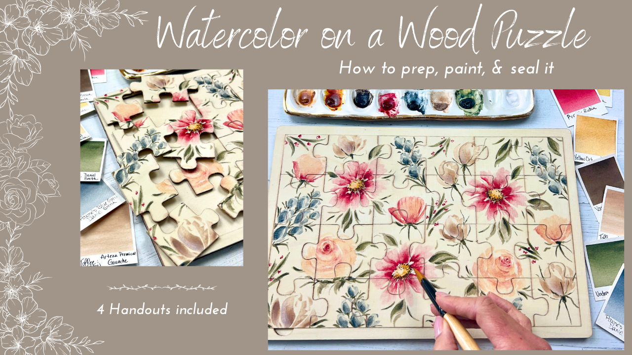
our wooden puzzle. Then the real fun starts. We paint our wedge
brush floral design in real time step by step. This class is for all levels. Some knowledge of
the wedge brush and watercolor is helpful. Feel free to use any
brush you prefer though. I've also included a
few handouts for you. In the end, I show you
how to seal your puzzle and I also give you some
options for your class project. Grab those supplies and
I'll see you in class.
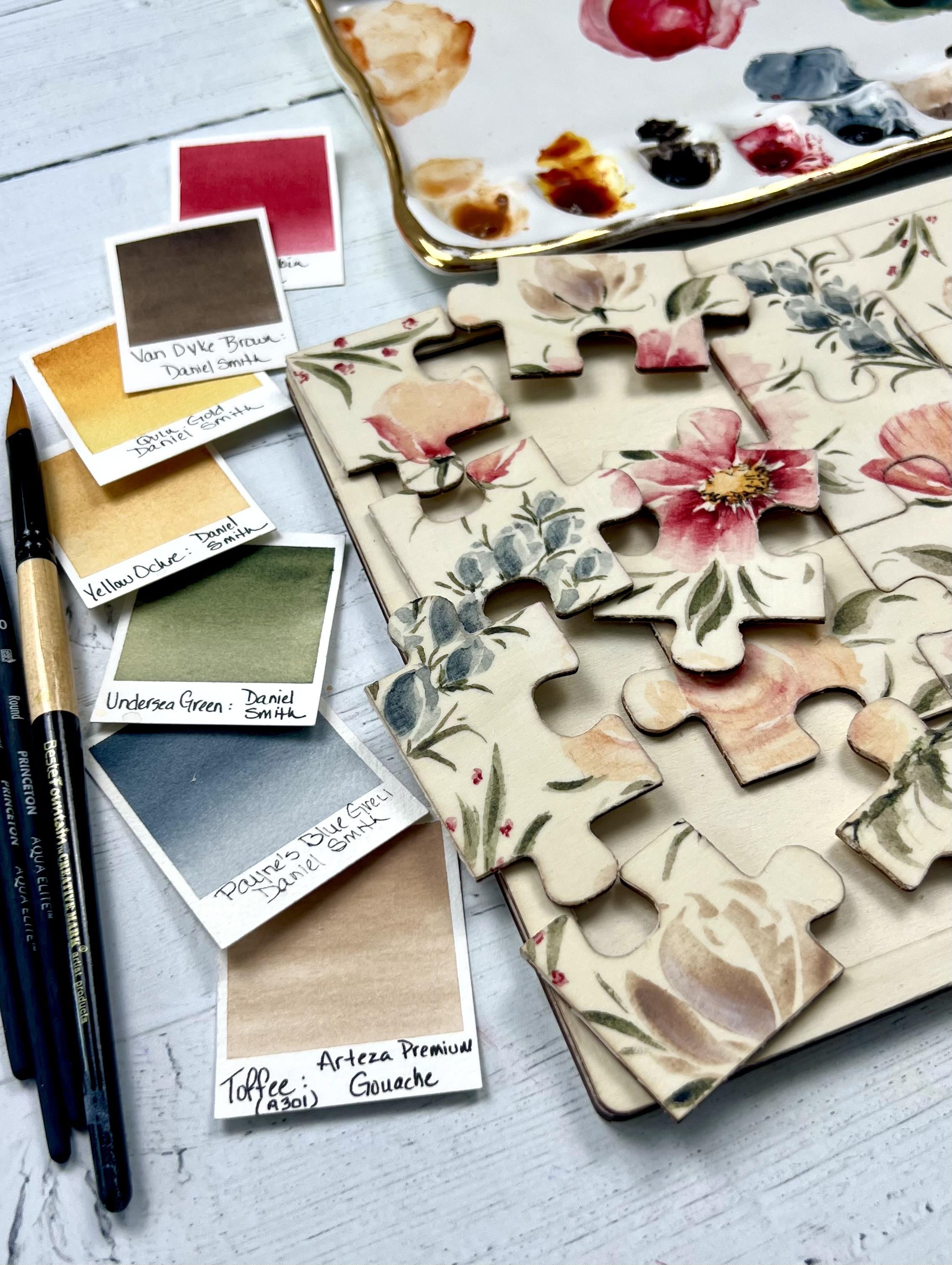
2. Class supplies: Class supplies
include yellow ochre, quin gold, Vandyke
Brown, Pyl Ruben. This one is by Holbein,
Paine's blue gray. I've got toffee guash by tiza. And the only reason I'm using this is I just love this color. No specific reason that
I'm using guash today. And then undersea green,
my favorite green. And we're only using a
little bit of white guash. If you don't have it,
don't worry about it. You really don't even need it. I've got my foam brush
that I'm going to use with my Daniel Smith transparent
watercolor ground. Painter's tape, paper
towel or tissue, either your own sandpaper, or if you buy this
type of puzzle, it does come with
a little square of sandpaper, which
is totally fine. We will seal it today
with Doran's wax, and I just do that with a
white clean handkerchief. I've got water jars
off to the side, a wet sponge, a towel, and then various size brushes, small round brushes, and
then a size ten wedge brush. Don't worry too much about the sizes of these
round brushes, but I have a four, a 3/0, a zero, and a size one. And I'll go back and forth
using those throughout class. And then grab anything
else that you typically use when
you watercolor. All right. I'll see you
in the next lesson.
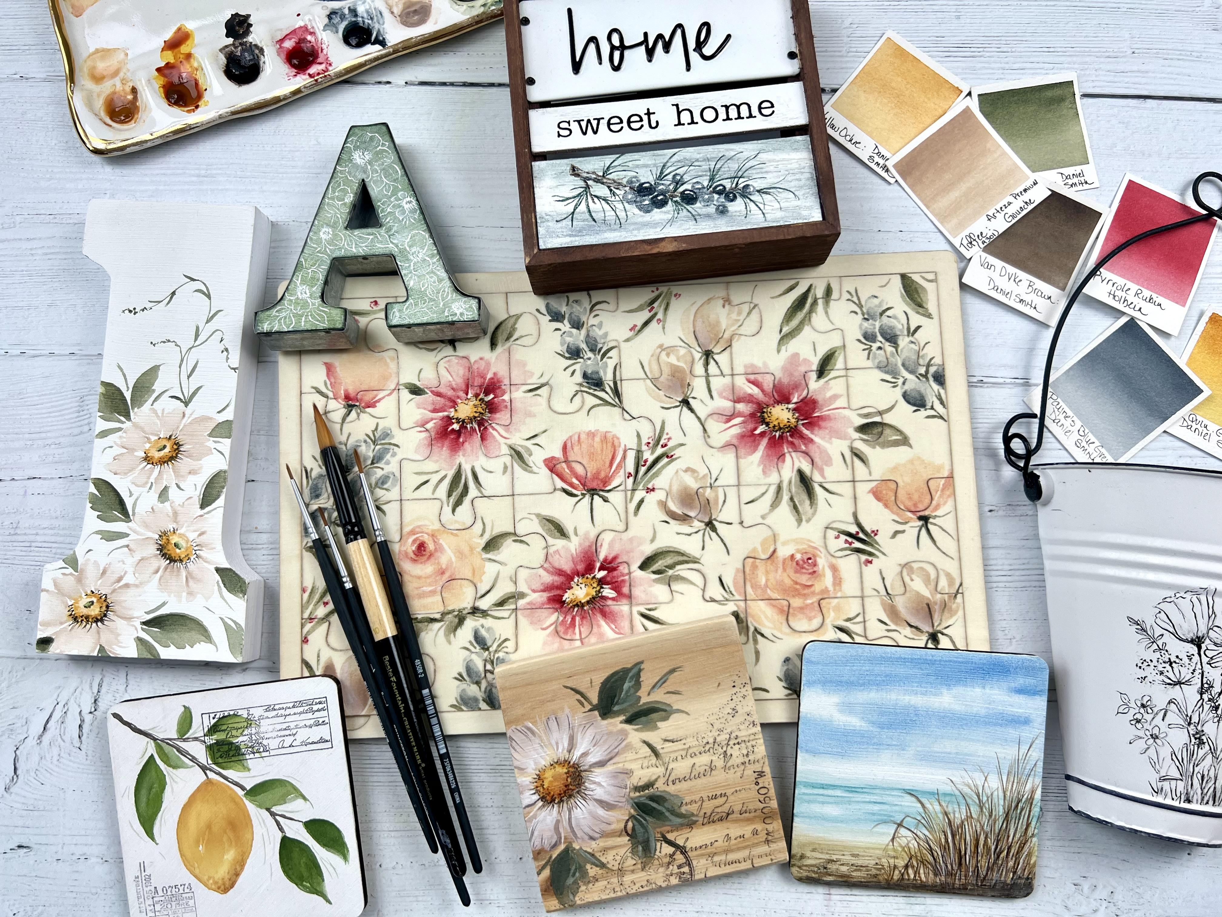
3. Art examples of watercolor ground on wood, metal, etc: Before watercolor ground, us watercolor
artists were pretty much limited to just
painting on paper. Of course, we have a cold
press paper, hot press paper, all kinds of other paper.
But it was just paper. And we had friends who painted
with acrylic and oils, and you see them painting
on all kinds of surfaces, and we kind of felt
left out a little bit. So whoever invented
watercolor ground, thank you, because now we can
paint on things like metal and wood and
fabric and other things that we never could before. And you can still
get the same kind of watercolor bleeds and blends, and it is just so much fun. Here is a small
sampling of things that I have used
watercolor ground on. And I'm telling ya, you're
going to start looking at all kinds of things in your house and in
stores and think, I can paint watercolor on that. And likely you can. So this
metal sign, let's see. This is also a little
metal bucket here. This metal letter A, I used a pen, a calligraphy pen and
bleedproof white on this and put a layer
of green green paint. I can't remember
which kind that was. It doesn't matter, but laid down the watercolor
ground first. I put a green background
on there and use a calligraphy pen to
add the white flowers. This, I believe, is Sumi
ink with a paint brush. I've done a lot of
these a long time ago. I can't remember exactly what
I used on some of these. You can see how you can get
a nice watercolor bleed, a background wash for
these florals. So fun. Coasters are a great size to
start with and to work on. So this one, just
a wooden coaster. I coated it with white
watercolor ground. Paint let it dry, of course, and we'll talk all about
that in a little bit. And then painted right over it, some splatter, added a stamp. We're good to go. Pretty
similar with these, as well. If you know me, you
know, I like to use stamps in some of
my work as well. Can see some nice bleeds
and blends on this one. This one would be fun
for a birthday party or a table number at a wedding or any kind of
things that you can think of. This one I had bought
at home I'm sorry, Hobby Lobby, I believe it was. There was nothing on the bottom
here. It was just plain. When I saw it, I thought, Oh, that needs a little
something extra. So put a little bit of
watercolor ground on that and added a
little holiday design. This is a ceramic ornament. Now, I did tint the
watercolor ground. It was white watercolor
ground and I tinted it with a
little bit of gray, and you get this nice
soft background. Again, sumi ink, but this
one was done with a pen, asumi ink brush pen, same as this charger plate here. Covered this all with
transparent watercolor ground. And you can see some
of the brush marks, if you look really
close on this, it doesn't bother me at all. But just wanted to give you
a quick sampling of some of the possibilities that you could do with watercolor ground. Here is one last one. I couldn't fit in the
screen in the beginning. This was a plain
canvas background. I just had the word hello here. I covered it with some
transparent ground and added some lavender to it. So let's talk about the brands of watercolor
ground, which ones I prefer. Again, this is not a sponsored
product endorsement. There's no affiliation,
no collaboration with any of these brands that
I'm mentioning in class. It's just something I
really enjoy using. And like I said, it will open up a whole new world of
possibilities for you. O
4. Watercolor ground brands: Alright. This is going to
be like herding cats here. I know they're going to
roll all over the place, but I just want you to see
the front of the labels here. I love using Daniel
Smith watercolor ground. I discovered this, gosh, probably a couple of years ago, but it's been around for
quite a long time and many, many artists enjoy using watercolor ground very
regularly in their practice. Daniel Smith has six
different colors. So this is a 16 ounce, and these are the
smaller four ounce. They have a titanium white. They also have a
pearlescent white, which I don't have with me. Mars Black, the transparent
watercolor ground, which we'll be using
on our puzzle, the idscentGld and
buff titanium. All of these are
fantastic to use. My favorites, I would say, just personal preference
would be the titanium white, the transparent, and I do
like using the black as well. It depends on what you're going for, what your subject is, and which one you would
choose best for your project. I typically with these grounds, I use a foam brush
to apply that, and I'll go over all that in detail shortly with our puzzle. Another ground that I thoroughly
enjoy using is by core. It's the light
dimensional ground, and I use a palette knife
for this one to apply. It gives you some
incredible textures, and you can paint right over it. And like I said before, you get really pretty bleeds and blends, but it's so much easier
because it's a lot thicker to apply this
with a palette knife. But I just adore using the
light dimensional ground. When we look at
let me just grab. Well, the white wasn't
dried out a little bit. Sorry. But as you can see, this is quite runny. Reminds me of Elmer's glue
back in the school day. But I'll show you this as
we're doing our puzzle, but just can see
easily why I would use a foam brush to apply this type of ground, and
they're all the same. I do use a little bit of
water to thin it out a bit. Sometimes. Again,
it just depends on what surface I'm painting on. A lot of this is
trial and error. But I went down the rabbit
hole of using this ground, and it is it is just a blast. But this is very
thin to begin with. Sometimes I water it
down, sometimes I don't. Depends. So speaking
of foam brushes, this set, this 25 piece
set would last a lifetime. I believe it was pretty cheap. Either got it at the local
craft store or online, but they're 1 " foam brushes. Certainly, they come
in different sizes, but I tend to work fairly small. This is really a pretty
good size to start with, especially for things like your coasters, your
smaller objects. Of course, I've used bigger
ones for bigger surfaces. Again, just kind
of trial and error with certain things and
make your best judgment. But these coming in
the set, I mean, because I rinsed these out with soap and water after I use them, and you can get tons of use
out of just one foam brush. Why I bought the whole
25 set. I don't know. We just buy a ton of supplies we don't need all
the time, right? So if anybody needs
one, just let me know, and I'll send one out to you. So in the next lesson, I encourage you not to skip that lesson because
I want to explain a few lessons that I've learned on painting on
some wood surfaces, especially one prior puzzle
that I had done before, just a few little tips and tricks that I want
to share with you. So please take a look at that lesson before
we actually start getting into prepping our
puzzle for our class.
5. Do you really need watercolor ground?: You might be thinking, Jen, do I really need the
watercolor ground? This is a practice piece, and I just wanted to
show you what it looks like without treating
the wood at all. It's not been sanded, not been prepped with ground, just taken right out
of the plastic bag. I grabbed my brushes
and started painting. I have painted on other wood
products that actually were pretty good when I did not
use the watercolor ground. I would have to say it
was better when I did use the ground because I could get those watercolor bleeds
and blends that I like, and it just felt
smoother as it went on. So you can see the feathering
with some of these. Not all of them, because
some of these strokes, I was surprised
actually turned out okay and did not
have feathering. I don't want to take my chances, so I'm going to
more times than not put watercolor ground
on my wood surfaces. So this one down here
doesn't look too bad either. This was a thicker stroke, as was this one up here. This one feathered
more than this one. So you're kind of rolling
the dice every time you paint on wood without
it being treated. So if I would lay down a stroke, a leaf stroke, let's
go right here. It does lay down nicely, feels nice going on, but right away, I can see it following the
grain of the wood. And the wood is showing up a little bit more
through this leaf and some of these petals
and other leaves just a little bit
more than I prefer. Now, let me go really
thick on the green, and we'll see what happens. That went down nice, very thick. It's not feathering
over on this side, but I see a little
bit right here. Honestly, I could live
with a little bit, but this is too much, and I don't want to take my chances. And right here, I tried
to do some wet on wet. Didn't work. It just
kind of stayed there, kind of looked at me,
didn't do anything. I was like, Well,
that's not gonna work. So you can take your chances
or you can go ahead and apply the watercolor ground
to your wood surfaces. That would be my recommendation.
6. Lessons learned from a previous puzzle: So I'm walking down my craft
store my local craft store, which is Hobby Lobby, totally
looking for something else, but this caught my
eye, and I thought, you need to come home with me because we could make
something super pretty. And I was so excited
to get started. And the way I work sometimes, I just jump in and do it. I don't always plan
a lot of the time. Sometimes it works
great. Other times, I learn a little bit. So
this one I did learn. I love how it turned out,
super excited about it. But I did not one of my lessons, I did not sand the puzzle, which we will do in class today. It's not a big deal. It's a little bit rough overall. I have sealed this with
the Dorlans wax Um, just looking at it
looks totally fine. If I was going to put this
somewhere in my house, just as a decorative
piece, great. Fine and wonderful. No big deal. But if someone is
actually going to do this as a puzzle, again, it's not like it's really, you know, splintery or
rough or things like that. But just to give it
a nicer feel to it, I would definitely sand it. Now, I've done plenty
of other things like coasters that I
don't sand at all. Feel the surface.
If it's smooth and you think it's good to
go, just wipe it clean. You don't have to wet it,
but just a clean towel, wipe it and get that watercolor ground on
it, and you're good to go. This another lesson, this is just a little stylus I use to pop these puzzle pieces out. So when we do sand
it, obviously, we'll get the corners, as well. But I should have in the beginning popped all
of these pieces out, and just there's one
that's actually over here. This piece, if I work at it
too much and mess with it, part of that wood is
going to pull up. So what I'm saying here is
I should have popped out all of these puzzles and made sure I didn't have any loose, splintery pieces or parts
that were going to fall off. I'm afraid this one, this
little tab right here, might eventually pull off. The other thing, I knew that with working on wood and the watercolor
ground and all that, that the watercolor will
feather out a little bit into the wood fibers and the
grain of the fiber if I don't cover it enough
with the watercolor ground. So I put two water down, generous coats, actually,
not two water down. It was pretty thick. So be aware, again, of what you're painting. And the surface, and another coat or two is
not the end of the world. I would rather have
more coats than not enough coats
because, like I said, that feathering
where your petals might feather out into the wood, it would follow the
grain of the wood, and it's just a total
bummer when that happens. So after the watercolor
ground is on here, you've got to make sure
you let it dry thoroughly, and that might take
two days, three days. It just depends on the amount of coats
that you put on there. I let this one sit 48 hours, a little bit over 48 hours, I think, and it
was totally fine. But I think one of
the biggest lessons that I want to share
with you is to make sure you have enough of the watercolor ground
on your wood piece. After I got done painting this, oh, let me back up a little bit. And I'm just saying
some things now in case I forget to say them
later on in class. With watercolor ground, as it just mimics
watercolor paper, the paint in the water's going
to soak in totally fine. That's what it's supposed to do. But don't be surprised
if you have to add another layer of paint to
pull that vibrancy up. This one I went fairly
dark for me to begin with, and it ended up
being pretty good. I'm looking to see I might have gone over a few things to help bring the vibrancy of the
paint up, but not too much. Just be cautious of that. If you see that your paint is dulling or it
looks dull to you, you might just need
to add another coat. And that's the cool
thing about watercolor. Anyway, we can layer, we can add contrast, and
that's going to give your piece a lot of
visual interest. So after I painted
it, I let it dry for, gosh, probably a good
three, four days. And that's not a magic number. I was just busy
doing other things. And then I applied
the Dorlan wax. I'll go over all
of that later on. But after I applied the Dorlans wax and
I knew it was dry, I buffed it off a little bit, and then I popped these pieces
out, and they were fine. They were fine to pop out. But again, I noticed a couple, especially this
little guy over here. I just kind of struck
me as like, Oh, that might be a
troublesome area. They're a little bit a
little bit hard and sticky, not sticky, but
they just you got to give it a little bit of
umph to get them out of there. And it's not that
the Dor lens wax was sealing it in
and act like a glue. It just covered and I was fine. It's not going to seep down in between the
puzzle pieces here. But I may have considered
sanding the sides a little bit more even after the Dorlanswax was dry and done. And then you can see, See, I just don't prep
things well enough. Here's little
splinters of things. Again, this was a practice
piece, totally fine. We learned from it
and all as well. Let's see. Another lesson. Oh, instead of the Dorlans wax, you could use a
varnish spray, again, I'll talk about that
when we get to ceiling, but it just depends on
what you're going for. And if a varnish spray bothers you and you don't want
to use that totally fine, the Dorlans wax is fine. I love that. I use it a ton. But I would each time
after I painted it, I probably could have
popped these out again to make sure I
was giving them enough, you know, enough gift that if somebody's actually
using this as a puzzle. See, I don't know if
you can see that there. That the puzzle
pieces wouldn't be annoying to them and
they're not breaking apart. But this is the
piece right here. You can see perhaps that
it's split a little bit. Now, what I might do, this is just for me, my puzzle. I could put drop a little bit
of wood glue down in there, seal that up, and we're
good to go. No big deal. I think that's it for just
a few lessons learned. This was just a blemish on
the wood itself. No big deal. But another good reason
to pop all of these out, clean the back of your board. There's all kinds of
little wood fibers there. Just make sure your
surface is super clean. Get your puzzle
pieces back in there, and then prep the surface. So in the next lesson, I'll talk you through a
few little tricks of the trade that I do
when I'm choosing a subject for what
I want to paint.
7. Ideas for choosing your subject: Here's a few things that have helped me in
the past when I'm staring at a blank piece of
watercolor paper or a puzzle, and I'm trying to figure
out what I want to do. First thing is, I grab
some of my old artwork. I've fallen into a pattern of making certain
types of flowers, loving certain color palettes, and I try to build off of
what I've already done. It might not be the whole
thing, the whole bouquet, but maybe I like this
particular filler flower or these little ones over here or very standard flower
that I typically do. I try to build on that. Maybe old artwork
spark some interest in a background wash. Maybe
not even the flowers at all, but seeing this
blue and this green might spark a new
idea or new interest. I went through a little bit of a strawberry phase,
an herb phase, even some carrots, and
something like fruits and vegetables and a pattern on your puzzle might
be a ton of fun. Do maybe adding letters, ABCs or numbers one, two, three, if it's for a child and having little small illustrations
around each one of those, that might be an idea, as well. Another thing that I think
we all do is go down the Pinterest in
the Google Route and just start searching. We all know those
searches can be so overwhelming and so
daunting sometimes. One thing I do like to search on those sites are
color palettes. I think everybody struggles a little bit with color theory in the beginning and then you start settling into a
pattern, like I said, about what your favorites are, what you enjoy working with, whether it's a muted palette, maybe it's something
bright and bold. But if just on some of
those websites you type in floral color palette ideas or just color palettes
for paintings, you'll come up with all kinds of really, really
pretty pictures, but they have the colors listed, at least not by name, but they usually just have the
colors listed there. And even if you're not super
familiar with color theory, you're going to know
what attracts your eye. So build off of that. That is really helpful. But again, be careful
with those sites because they can
be overwhelming. We want to get to the
creation part and not just deep dive
and scrolling. Another go to for me when I'm looking for
inspiration are flower arranging books or just any kind of books that feature flowers. They have an incredible
amount of information, besides the beautiful pictures, but just what goes into
arranging flowers, bouquets and things like that. They talk about the different
elements of floral design. All of that can be applied
to our watercolor practice. One of these, this one here, I just happened to find
this the other day. And I remember looking at this wanting to paint
the whole bouquet. I was struggling with
that, and I thought, Jen, just look at each
individual flower, figure out how to paint those, see what's catching your eye, and try to mimic that. This is a whole lot less stress if I just break
this bouquet apart. Try to get the colors close. If not, no big deal, and then try to build upon what I'm already seeing
in this bouquet here. So take pieces of the
bouquets that you see, things that strike an interest
to you that look inviting, and maybe this one right
here you want to practice. Maybe this little bud is something that's
catching your eye. Don't be overwhelmed by the entire bouquet and
trying to recreate that. Other things for inspiration, if this is a kids theme, a gift, you know, things like animals and
dinosaurs, construction, princess things,
gardening things, all kinds of different
options can be arranged in a really sweet
pattern for this puzzle. Option for puzzles or
anything really is just an abstract of some
sort with big bold colors, geometric shapes with
bright or muted colors. It doesn't have to be
something like this. Shapes, circles, squares,
diamonds, triangles, things like that, and
all different colors would be fantastic for a puzzle. So the options are endless, but they can be
overwhelming, as well. Hopefully, some of these ideas will spark some
thoughts of your own for future puzzles or paintings in general,
for that matter. Alright, let's move on to
prepping our puzzle by sanding it and applying
the watercolor ground.
8. Prepping your puzzle (Sanding): Very nice that with this
puzzle in particular, it did come with a tiny
little piece of sandpaper. I have some of my own
if I need some more, but this really should
do the job because I don't want to be abrasive
when I'm sanding. I want to use light
sweeping strokes, very gentle pressure. Don't use the sandpaper that's
really coarse and gritty. You may have seen some of that where it just
is very thick. That's going to
damage your plywood. And as you remember, even in my first puzzle that I
did that I showed you, I didn't sand it at all, and it really worked fine. But I'm going to follow the
recommendations this time. And when we're applying
watercolor ground to plywood surface, which is very absorbb, they do recommend
sanding a little bit. So just gonna take my sandpaper. I'm going to do the whole
top of the puzzle first, and then I will break out the little pieces and
do those individually. I'll do most of this off camera just because it's going to
take a little bit of time, and you don't really
want to hear all of this sandpaper scratching
back and forth. A little bit like
nails on a chalkboard. But anyway, all we're
going to do back and forth, gently, very lightly, and I am trying to follow
the grain of the wood, but I am just skimming the
surface here. Back and forth. So I would do that, not wipe it down every now and then
and take that outside. I know that some people do recommend wearing a mask
when you're sanding, so that's a consideration, and as always, I
say safety first. So if you have one, it was not a bad idea to put that
on while you're sanding. I would then pop out these
little puzzle pieces. Sometimes they're harder
than others to get out. Like this is going to come
out on one big sheet here. You're going to want
to remember, too, to keep your puzzle
pieces upright. So if you just take them out, bust them apart, and some are face up, some are face down, it's it's going to give
you some headaches, trying to get all of those
back into the puzzle board. But just gently pop these out. Some of them will
splinter a little bit. Like this one right here, you can see some of
these little pieces are splintering a bit. So I would just take
you don't want to now, say you don't want
to pull them off, but have I done that
before? I sure have. But it's best to go
ahead and just take the sandpaper and
gently rub those down. But you're going to want
to take some time and do every side of
each puzzle piece. Not a lot, not
abrasive, like I said, but just give it a couple good scrapes
all the way around. All right, go ahead
and get everything sanded and I will meet you in the next lesson and we will apply that watercolor ground.
9. Prepping your puzzle (Applying watercolor ground): Make sure your
puzzle is nice and dry clear of any debris. And this is just a
plain old towel. It's not wet, but just
making sure it is good to go to apply our ground. I do recommend that you go to Daniel Smith's website and take a look at their information
about watercolor ground. We are just skimming the surface about how
to use this product. They have tons and tons of helpful information
on their site, and I do recommend that
you take a look at that. They also have videos of artwork that people have
done with watercolor ground. As I said, the plywood, that is a highly absorbent wood. So it is recommended to
apply three to four coats, and you're going to need to wait 12 hours at least in
between those coats. So this is kind of
a tedious process and a lengthy process, but it is worth it to
do it the right way. So I'm going to do I'm going to do three
coats on this one. The first puzzle that I
showed you, I only did two. I did not sand it, but the two coats I felt
did work just fine. But they recommend
three to four coats. And like I said,
you're going to wait about 12 hours or more
in between each coat. And then once you have
all of your coats on it, you're going to wait
a good 24 to 48 hours to paint on your surface. So in order to keep myself going and filming, one
right after the other, I did prep a puzzle off
camera a while ago, and I'm going to use that one. So what I'm doing here today, we're not going to paint
exactly on this puzzle, but it's one just
like it, of course. And I treated it exactly
the same with the way I sanded it and the number
of coats that I put on it. I'm going to just show
you one coat today, of course, like I said, because we have to wait
the 12 hours or more. I have a little
bit of water here. You can thin this down. They say no more
than 10%, though. So I a lot of times just work
right out of the tub here. You want to give it a good stir. I am coming to the end of my water or
my watercolor ground. Going to definitely
need to get more. Just as with the sanding, we're going to go light
strokes, light pressure. And a lot of times I will
just go right into my ground. And then I'll pick
a spot to start. Usually, I work top to bottom, and I'm just going to lay down these light
sweeping strokes. Now, I'm covering the
whole thing right now, including this border here. So I'm just dipping
in here straight on. I haven't thinned it out at all. But very light pressure,
light strokes. I have to bend down
even a little bit to make sure I'm covering
all of the area. You're gonna notice
that, oh, gosh, that looks like it's
got a film on it. It looks like I have some brush streaking,
and you're not wrong. It does look like it has
a little bit of a coat, a film over it, but that will soak in over time. Just going back and forth. Light strokes, not pushing. I'm not worried about it seeping down in between
the puzzle pieces because what I will do is once all my layers are
on my three layers, I will pop each puzzle piece out just to give it a little
more give give and take. Now, if I felt like
this was too dry, I could dunk my brush in, and then I might just do a
quick dunk in the water. And then apply it. I could also first dunk
my brush in the water, drag it off the edge, dip it into the ground, and that will thin
it out, as well. I'm not a big fan of that 10%. Like, what really
does that mean? But 10% is a small amount, so I don't want to
thin it down too much. That's gonna change the nature
of the watercolor ground. And I don't want to do that. The other important
thing to remember, I know we get anxious and
we want to start painting, and you want it to
dry, but do not grab the hair dryer or
a heat gun tool to try to speed up the process. That will change the
chemical properties that are taking place between the
ground and the surface. So I can see that
I have not totally yet covered see some
space over here. But if you can tell my
strokes are light and thin. I'm not pushing my brush all the way down
into the ground. I'm just getting it on the tip. And then just lightly
back and forth. But I will finish
this off camera. I do not want this first
layer to be super globby, super thick because I'm going to wait the
recommended time, come back, do another
layer, wait again, the 12 plus hours, come back and do a
third layer, okay? And as a reminder again, we can't paint on this until
a good 24, 48 hours later. If by chance you
don't get to this for two more weeks afterwards you applied the ground,
that is fine. It's okay. It'll be ready to go. Another recommendation would be since there's so
much wait time here, maybe you want to do
four or five puzzles or different wood pieces, gather them all together and apply the
ground all at once, and then you've got all of these surfaces
ready to paint on. We will let this dry. It's actually drying and curing. Curing is the process that
happens after drying. I'm going to do a little bit
more sweeping strokes here. I see some spots that
are not fully covered, and then I'm going to
grab the other puzzle that I already prepared, and then we will start painting.
10. Getting set up: Here's the puzzle that I had prepared earlier,
like I said, same way in regards to the sanding and applying
the watercolor ground. The other thing that I
did after it was dry, I popped these puzzle
pieces out again. I noticed some of the ground had seeped down in there a little bit more than I
thought would happen. No big deal, but I took
either just my finger or that little square of sandpaper and just got that off
around the edges there, and even a little bit around the side of the board
itself, but not much. No big deal, and the pieces pop right
back in, no problem. I'm gonna go ahead and put painter's tape all
around my border. If you choose to not do that
and paint over the sides, I think that would
be a great option. Gonna get this as
close as I can. The first puzzle I did, a little bit of paint
did seep over the edge, may not have even noticed it. It really wasn't a big deal. I didn't even bother
trying to get it off. Remember where that
little divot is. And I just kept mine down here in the lower
left hand corner, which wherever you want it
to be, that's totally fines. But, I mean, if your orientation of your puzzle is
gonna be this way, you know, you pick. No big deal. So far, I've had good
luck with this tape. Sometimes when I use washy tape, it just doesn't just doesn't
work for me as well. Give it a good push
all the way around. For what we're going to
paint on our puzzle. I took my own advice. I looked at old
artwork and picked out several elements
that I enjoy painting, as well as the color palette. Alright, let's get this
started and get painting. A very typical setup for
me when I paint anything, actually, not just puzzles. I've got my palette here and a quick reminder
of our pigments, yellow ochre, quin gold, Vandyke brown, Pyl Ruben. This one is by Holbein,
Paine's blue gray. This is guash, toffee
guash by tiza, and undersea green and a
little bit of white guash. I have either a tissue
paper towel or a tissue. I've got scrap paper, my brushes, of course. I'm using a size ten. I'll probably stick with
that for the whole painting. And then a couple of
these round brushes that I will grab here and there. I've got a size four, a 3/0, a one, and a zero. So options, just a little pipe at to add water to my pigment, and then an extra brush
for mixing the pigment, a towel to wipe my brush on or a wet sponge to
wipe my brush on, and then a couple water
jars off to the side. As we paint the puzzle, I did decide to do a
voiceover for those sections. There was just a
lot of little gems. I wanted to make sure I got
across as I was painting, and you know how it is
when you're painting and talking and trying to do
all the things at on. Sometimes it gets
a little jumbled. I appreciate your understanding, and again, thank you so much
for being in this class.
11. Painting - Part 1: All right, using a
pipette to put one to two drops of water
into each well. We'll get our pallet going here. Let's pull out some of the darker red and we're going to mute it down with
some undersea green, my favorite green color to use. We're not muting too much, but just taking a little
bit of the brightness away. So just go slow when
you're mixing pink, and then do a little swatch test to see if you like
that color or not. That'll work for now. We'll do the same
with the green, and we're just going to
add a little bit of red. Quickly that got muddy. Just that tiny bit of red, it really turned it very
brown, much too brown. Just add a little
bit more green. Do a test swatch and
see what we think. It's not too far off from the
original, but that's okay. Let's work on our peachy color, taking our yellow ochre
and we're going to add a little bit
of the red to it. This is all just
trial and error. Back and forth a
little bit at a time, adding water as you need to. Then do another test swatch and we'll see if
we like that one. Yeah, that one
looks good for now. As we get our three
focal flowers down, I try to place them
in a triangle shape. It doesn't have to be exact. In fact, we don't
want it to be exact. But things that are
in that shape and working in odd numbers are
definitely more eye appealing. I'm just using a
small round brush, laying down a yellow
ochre center and look how easily that
lifts off of the puzzle, having that watercolor
ground on there. Now a lot of times the
yellow ochre will seep back into place and it looks like we didn't lift
anything at all. That's okay. Loading my wedge brush with the liquidy red first and then dipping the tip into the
concentrated pigment. I'm just making very, very typical wedge brush petal strokes around
the floral center. Very light hand, letting the water and pigment
flow off the brush. I'm barely touching my
brush to the puzzle. Move your puzzle
around as you need to. It's going to take
a little bit of time to get your footing in terms of how you're loading your brush and what it
looks like on your puzzle. But don't worry, keep going. We have some time to
correct any mistakes. Even though this mimics
watercolor paper, it's not exactly the same. I like to add these little lines just for a little more interest. Moving on to our second flower. It's the exact same process, but we're going to face
this one towards the right. A drying it off on the
towel as you need to, lift a little bit
of pigment out, and then we're going to
load our wedge brush exactly the same way as
we did the first one. Tap it on your sponge as
you need to and then dip that tip right back into
the concentrated red. Small wiggly strokes as you
go around that floral center. Don't be afraid to
bounce your brush too. Try not to hold it so stiff as you're making
these petal shapes. That's going to give it a
lot more life and character. A couple little lines. I noticed this top petal kind of looks a little wonky to me. Since I have some
red on my brush, I'm just going to fill it
in a little bit there. No big deal. All right. Our third flower third focal flower,
exactly the same. Rolling our brush
in the water red, that's hard to say, watery red, and then dipping the tip
into the concentrated red. If I say it once, I'll say it 1 million times,
very light strokes. Having a light hand
is really key. Even on watercolor paper, not just with this puzzle. A As you can see, I've left a fair amount of space between the petals and
the floral center. I do that for several reasons. The third flower though,
it's a little bit too much, so I'm just going to fill it in and extend that floral center, make it a little bit bigger. Taking my small round brush, getting in some
concentrated quin gold, and we're going to drop that in to the base of these centers, starting to build up
that floral center, making it eye appealing, and pulling the eye inward. Little dots, little squiggles, all we're going for here. You choice on how much or
how little you want to add. We will eventually
add some brown as well to the bottom of the
center, do keep that in mind. Some of these
floral centers will still be wet and you'll
get a nice bleed. If not, no big
deal. Like I said, lines and squiggles,
just something to make that center a
bit more dramatic. Smooth it out with a damp
brush if you want to. Lift out a little
bit more if needed. All right, finish up
these floral centers, and I'll see you over
in the next lesson. Um,
12. Painting - Part 2: All right. Next
up, we're going to work on our peach flowers. We'll get into our mixture
with our wedge brush. These are really pretty
fun and simple to make. I'm going to dip the
tip into the red. We start out with one
wedge Brush petal stroke. Point of the brush to my belly, landing it on the puzzle,
a little more red. I'm going to go right
over this again. That wasn't as dark
as I wanted it to be. Then two swipes of the
brush on either side. I usually go a little bit
heavier on the left side. Add a little bit more yellow. It's looking about the
same as those red flowers. I was going for a
more peachy color. Again, still getting my footing with painting on this puzzle. Same strokes. You can add a little bit of detail
around these flowers too, but we don't want
to add too much. Let's make it even more peachy and drop some
quin gold in there. I'm afraid these are all
looking quite similar in color. I don't always go
right over my petals, but this time I'm doing it. I want to get that peachy color to stand out a little bit more. A lot of trial and
error with this. I'd rather go too
light than too dark. A little bit of detail
around there, but not much. You can easily
wipe that away and lift out pretty easily
on this puzzle, actually very easily, as you
saw with the floral center. Let's do another one, a third one of this
type of flower. That's a pretty good
color, pretty light. But I learned from
the first two, I'm going to walk
away from that one. We can always come back
and do more later. Let's work on our roses. Now, I wish I had
an easier way to explain how to do these roses. But we do start out with just a little bit of s
curves, curve lines. It's going to be
darker in the center. Using my brush as a pencil
and just drawing it in, rinsing my brush to get
some of that pigment off, and then using the side of my wedge brush and
just drawing out some thicker wavy lines to give the impression of
what a rose looks like. My process is the same, but none of my roses
look identical. That's okay. That's what
we want. We want variety. Darkening that
center with a little bit more of concentrated
red and then just barely dropping it in around some of
the curved lines. While it's still wet, just
dropping in some darker red. This is where I could
just keep working on it, and then all of a
sudden, I say, Jen, you're overworking it,
walk away, walk away. But I'm taking advantage of
this while it is still wet. We'll work on our second
rose in the same way. Using my brush as a pencil, dropping in just little marks. That one's a little too watery, dry my brush on the towel
and then leaning the side of the brush thicker and thicker as I go
around the puzzle. Wiggly shapes. Now,
these roses can get out of hand very quickly and they can get a whole lot
bigger than you intend. Watch those strokes as you
move around your rose. Little by little all you need. Dropping a little bit
darker pigment into the center, very light touch. I really do love how
easily you can lift out pigment after having placed
the watercolor ground. Just using the tip of my brush to smooth out some
of these edges. I do forget that I can go
back and make corrections. Let's move on. We'll do
these little rose buds. I'm using top guash just
because I love this color. If I was using it on
watercolor paper, sometimes I do tone it down a little bit
with white guash. But this I'm going to
leave a little bit darker. I'm going to use the
side of my brush again. I'm going to make a pretty hefty side stroke on the left side, leaning my brush
into the puzzle, a hefty stroke there, and then some squiggly
strokes around it. Smaller as I go off to the side and using the tip
and the side of the brush. Slow and steady and
don't overthink these. The best words in art is giving the impression
of something. We're giving an
impression that this is a rose bud or a
flower bud of some sort. We'll make this one it's going
off the top of the puzzle. We're just going to
show about three fourths of this flower bud. Again, working in odd numbers, so we're going to
have a total of seven of these little buds. They're nice little
filler flowers too. I just love this
color. All right. We'll make a bigger one
down here in the corner. All I'm doing to
make this bigger is just extend the
strokes on the side. But again, being careful to not overthink or
overwork these strokes. You'll see once we get
greenery around these, they're definitely going
to look like flower buds. All right. Small round brush, we're going to get into
some concentrated brown and build up some details
on these centers. I know a lot of
people just wait till the end to add some
of the finer details, but I do a little
bit differently. I love to see these flowers come to life and it feels like my whole painting is coming to life when I add some of
these little details. Just like we did with the
Quin goold, little dots, little squiggles, keeping it more concentrated at the base. Very light touch, and it really doesn't
matter what size brush you use for this, but just enough to get some really good dramatic
eye appealing effects.
13. Painting - Part 3: All right. Next up are these cute little
coffee bean floral stems. As you can see, the shape
of these are going to be exactly the same as we just
did with our rose buds, but on a smaller
version, of course, a little swipe on the left
and some detail on the right. These are a lot of
fun to make and these little clusters act
as great filler flowers. I'm going to keep all of these on the periphery
of the puzzle. I can tell the center
is starting to get a little cluttered and
I want to make sure I leave room for our greenery. It's a little swipe on the left and just some
detail on the right. We just build up our
cluster little by little, trying to keep the
base of each one towards the center where we know we're going
to have our stem. It doesn't always work
out that way for me, but we add a little greenery around it
and we're good to go. I am starting pretty light because I'll add
contrasts later. This one here, I've
got a few wet areas, but I'm not worried about
that. I'll soak in. W adding the contrast
on top, it'll be fine. Again, a very light touch using the side of the brush
and sometimes the tip. We'll have a few coming
out from the bottom here. Again, you don't want
all of these to be exactly the same size
or the same in number. I'm still getting my footing
with getting my brush loaded correctly with
the right amount of water and pigment. It's coming along. I'm really liking how this
is turning out so far. Plenty more to go though. All right. We've
got these in place. I'm going to build up the center of these red focal flowers. I feel like there's just a
bit too much space there. I like this look where it's just a little bit more compact. Then we'll pull in some red with this other
type of green stem. This one we're not
going to get to. We're just not going
to have enough room. So I'm loading my brush
with very light pigment. Actually, I don't even need to. I could just do it with
water and then dip the tip into the
concentrated pigment. Then we'll just gradually
go around and darken up these little areas that
are open. Not all of them. I'll leave some still open, but I want to get that
darker red in there just to give these focal
flowers a bit more pop. There are plenty of
times when I'm working on white watercolor
paper and I do leave that extra space there because when I lay down
these layered petals, you can see the
delineation of each petal a little bit better on
the white watercolor paper. Not so much on this
puzzle, but that's okay. The goal here is to get
that darker red center. We did that on the first go
around with these flowers, but there's just too
much space there and I want to close
that gap a bit. Same process here,
and I try not to go over exactly where I
place the first petal. I'll go in between
the petals sometimes. But I'm going to leave
it a little bit open and airy and more I'll leave
some white space here. I won't cover up everything. If I need to go back
and add a third layer, I can certainly do that. But again, let's just go
a little bit at a time. Remember, we don't want all of these focal flowers to
look exactly the same. They're similar, but they've got some differences for sure. I'm just using the tip of
my brush for the most part here and tiny little
strokes one by one, getting it darker just
to make these pop. These have really soaked in, so let's add some contrast. When I add the contrast, I'm only going to go up about half the space that I
did with the first stroke. I'm not covering everything. We want that lighter part
to shine through as well. I feel like this Pain's
blue gray is a pigment that's seeping in a little bit more than some
of the other colors. Not a problem. Just to be aware, we may need to add
even more layers. Just a couple details
with the tip. Mm now that's a good
contrast. I do like that. Since I have a fair
amount on my brush, I can go back into these other clusters and
add even more contrast. You don't have to do every one. I don't want this blue to overtake the puzzle either
or the composition itself. As you can see, we're just building things up
little by little. All right, we'll finish
adding the contrast, and I'll see you in
the next lesson.
14. Painting - Part 4: Okay. The only time
we're going to use white gouache
in class today, it's going to be over these
little toffe flower buds. This is one technique I use just to enhance these a
little bit more. They do have some nice
contrast in and of themselves. But what I like
to do is just add a little swipe of
white here and there, just to give them a little pop. I won't cover all of
the petal strokes. I just think it adds a little bit extra charm and interest. It can be subtle or a little bit more dramatic,
whatever you prefer. A little too much
there, but that's okay. Just wipe it out, wipe
your brush on the towel. Plenty still on the
tip of my brush. All that is good to go. Let's enhance these
roses a little bit. I'm just going to re wet
the area and then drop in a little bit more of the peachy pigment
and some of the red. I felt like these are
getting a little bit lost. It's such a light color on
this yellowish wooden puzzle, and so we need to build
this up a little bit. But I'm using a very,
very light touch. If I go too hard, I'm going
to start lifting the pigment. Then I'm going to rework it and keep lifting and
reworking it again, it's going to be hot
mess. Be careful. Rewetting the area again. Smoothing out some of those edges and then
dropping in the color. So it's a little bit
more on the Quinld side. Just smooth it out with
the side of your brush. As always, light
hand light pressure, darken up that center, pulling the eye inward. A little bit darker
area over here, and then we'll be
done with this one. A couple little darker
areas of contrast. They're just catching my eye. This one here, I just want to make a little bit more peachy, add a little bit
of red down there, and then just take the tip
of my brush and feather that out a little bit and let
some wet on wet happen. But I'm learning from the
other ones, like I said, I'm just overworking some of
these a little bit too much. There I have lifted a
little bit more out. It is a vicious cycle
sometimes, isn't it? You see a little issue, you
try to get in and fix it, and then sometimes it works, sometimes it doesn't is the nature of painting
with watercolor. I guess with any
art medium, really. We just have this tendency
to want to go in and fix things all the time and we need to just walk away and let it go. A little more contrast there, and then now we're going
to get into our green. I'm adding the
undersea green back into that mixture there that
was a little bit muddy. Honestly, I don't
think at this point, the red really did
anything for us. It's basically the
undersea green color at this point, and that's fine. As I start to add the greenery, I'm pretty much just giving
myself some boundaries. I know I will go back in
and fill in plenty more, but I'm just establishing
a boundary at this point. I usually start with the smaller flowers and then work up to the bigger leaves
on the bigger flowers. Mainly using the tip of my brush with these
little ones here. Honestly, I rarely
connect all my greenery. There's plenty of what I
call floating greenery, floating leaves, that's fine. It gives it that nice
airy appearance. With these buds, I have the greenery go up into
the flower itself. That way, it looks
like it's not just sitting on the base
of the greenery. A little bit of
lines in the back to indicate some stems or greenery coming out
from the back there. Trying to look at the
whole composition itself, thinking ahead as I'm painting these little areas of where I'm going to be placing
the larger leaves. Those of course, are going to be around the red focal flowers. When you see the
tape on my brush, when it's facing upward
towards the camera, that's what I call the brushes
in the belly up position. You'll notice that
I do flip my brush in all kinds of
positions and ways, but I put the tape on there to indicate the
belly up position, so you know the position
of my brush when you're watching me teach. I
15. Painting - Part 5: Okay, we're going
to add the stems to these little blue
coffee bean clusters. I'm just using the
tip of my brush. You can tell the position of my brush again by
where that tape is. All I'm doing is
just dropping in little marks and I'm going to give some indication of leaves. I do little shapes under some, but not all of these little
coffee bean strokes. I don't want the green to
overtake the blue buds. Just a few swipes of the brush, and it looks like we have a
floral stem of some sort. Be careful not to extend too
far out beyond the buds. This is really where intuitive
painting comes into play. Don't overthink this, just lay down some strokes and
you're good to go. Remember, we can always go back and fill in
if we need more. Always being aware we've got other flowers around it that we need to
add bigger leaves. Tiny little gentle strokes. I'm going to go ahead
and turn the sound off. If you want to turn some music on while we go
through this part, it does get a little lengthy, but I'm doing the same
thing over and over, little tiny marks
supporting the blue buds. I'll come back in when
we're ready to do the bigger leaves
around the red flowers. Okay. Next up, this is very typical how I make leaves
with this wedge brush. I make one leaf
and then I've got a couple unconnected floating
strokes to support it. I'm using the side
of my brush for my first stroke and then a smaller skinnier stroke
to the right side. I'm just making sure
I have enough room. We use the same type of leaves all the way around
these red flowers. I pull up very gently
at the end of my stroke to get a little bit of
that graceful ending. Lay in the brush, second stroke and then floating strokes. Quick and intuitive. You don't really
need that second stroke if you don't want to. The first stroke you lay down, that looks like a leaf as well. So if you want to just
do that, perfectly fine. Around these roses,
I'm just again, giving some indication
that there's leaves there. I don't have a lot
of room, so I'm not going to take up a lot of space with the green that I'm putting around
these two roses. Wiggling my brush, laying down the paint, not
overthinking it. We'll get back in a little bit and darken up some
of this greenery. And at anytime you prefer to use a round brush for your
leaves, please do so. Now there are some open spots on our puzzle and I'm just going to lay down some
leaf strokes here. These are the long lean
strokes that we're going to eventually add a
little bit of red to it, some squiggles of red, just to pull that color out into the periphery
of the puzzle. I land my brush lightly, then add pressure and then pull up to have light
pressure at the end, a graceful ending
to your stroke. Land the brush,
push and lift up. It says a good spot right here. One stroke, the second
stroke next to it, and a couple of
floating strokes. I'm sounding like a
broken record, I think. Obviously, it's
getting filled in, pay attention to
that open space. We don't want to clutter it up. Is a good spot here. It does get busy on the eye. Again, re evaluate every time you're laying
down a new element. We're going to add
some little red areas just to pull the eye out a bit. I love those focal flowers, but I want to add the
color red and like I said, pull the eye outward
a little bit. These are just squiggles
with a little round brush, maybe indicating some
berries of some sort. Still trying to work
in odd numbers. I'm not counting them per se, but I am paying attention
to the placement of them. Yes, I probably will count them a little bit here
and there as well. I can see that that red
is already popping. I'll add a little more contrast, but I like how it's
looking so far.
16. Painting - Part 6: I wish I would have had a
little more room down at the bottom of the puzzle here to pull in some of that red. It's okay. Not a big
deal. We're moving on. I'm noticing some spots where we'll just add a
couple more leaves. Now is the time that we're
really going to start re evaluating where we need to add some thicker undersea green. We're constantly
evaluating our work. We don't want to
over analyze it, but we do want to take
a good healthy look at it and see where
contrast is needed. When I do contrast, I do it sometimes over exactly what I
already had painted, but not the whole section, usually one or maybe two
and then a couple of the supporting floating strokes around it. It just depends. I may add a brand
new stroke with a more concentrated
pigment on my brush. It just depends. There's no perfect answer and
no perfect way to do that. You just know that contrast is king and we've got to
have some contrast in our paintings to really make
them pop and to really make them more interesting
and less flat looking. I will also add maybe a different color
of leaf altogether. I might have used that blue and really watered it down and
use that for some leaves. I tend to use just green, but I'm trying to pull
away from that and get some more variety of
color with my leaves. I will remind you too if you're doing a
puzzle like this or working on any wood piece and it's for a gift
or a commission, just remember the long wait
time with all of this. As you've noticed,
prepping your puzzle, sanding doesn't take
much, of course, but adding the
watercolor ground, waiting a couple of days for
that to dry, painting it, waiting for that to dry, and then after you seal it, especially with the wax, there's just a long
wait time there. Factor that in when you're
planning future projects. Just a little more squiggles here and there of
the darker green. And I think what's
so fascinating, too, what I might be seeing, you might not be seeing that. What you're seeing, I
might not be seeing that. I think that is so cool in the world of art
that we just all see a little bit something different with each art
piece. I just love that. We are so close to
wrapping this up. I want to do a quick
comparison with a puzzle that I did not cover
with watercolor ground. I think you'll be able to see
some obvious differences. We've got plenty of colors
that are just dull, lifeless, soaking
right into the wood. Some of the colors,
I'm surprised, like the peachy color. That one didn't do too bad. I struggled with it with the one on the watercolor
ground. That's okay. But looking at the feathering, the feathering is what is so noticeable just seeping
into the wood grain. Obviously, the watercolor
ground is the way to go.
17. Final adjustments: Okay, this has dried
for about 24 hours. Overall, I'm super
happy with it. As a healthy analysis, I'll go through my
piece and think, Where can I make a little
bit more adjustment? I don't want to
do a lot to this. I think it's got great color. The cohesiveness of
the palette is great. I love the placement of
the floral elements. I did notice with this one here, it had a few little hard lines because this is the
one I overworked, I think, a little bit, as
I was painting this one. So I just took I
have a size four. Actually, I should go
down to about maybe a size one and just get my
brush wet, clean water. It's damp, and I just went around and softened
the edge a little bit. So since it was wet, I dipped into my red, and then just
gradually add in very, very light touch a few of these lines just to enhance
that one a little bit more. I felt like it was
getting a little bit lost almost like this one here. Not terrible, but
let me show you. Now I will grab a size four. Getting it wet, clean water, tap it on my tissue
a little bit, and I'm just going to very, very lightly add
some water to this. Not covering the
petals perfectly, but if I get back in
my peachy mixture, I can tell it's already
drying a little bit. I can drop a little bit in down here at the base where I want
a little more color. I'm going to tap my
brush on the sponge and just pull that color
out a little bit. This is a little bit
trickier to work on a wood piece when you're
going back over something. It's not exactly like
layering on watercolor paper. I drop a little bit
of the red in there and just let the wet
and wet do its thing. Might be a little bit over here. But my touch with
this brush onto the wood is just super light. If you start getting
in there too rough, you're going to start
lifting your pigment. And we don't want that. I'm just adding a little bit
more subtle color. I noticed some of the brown. I could do a little bit
darker on that, but not much. Mainly down at the base. I'm not going over
everything that I just did. Now, this is a size zero. Gonna drag it on my towel a bit. And then I will pull out some of that brown for a little more added
interest to that center, drawing the eye in. Almost unnoticeable. And I don't want to
disturb the integrity of these petals with the
darker red down here. I do want the eye to be
pulled in because of that red and some
of this dark brown. And I'm doing more at the base and less at the top, if any. We didn't use much white guash. Sometimes with these
focal flowers, if I get too dark on the petals, I'll pull in some
more white guash and just do a couple brush swipes, a couple brush strokes just
to give it some contrast. I think I want to
stop overworking, especially these focal flowers. I'm happy with the color here. I want those to be subtle, a little bit darker
in the center. Some of the blue did seep
down, but I'm okay with that. I don't want to keep
adding darker blue, and then it just gets
too busy on the eye. So I don't have anything
really wet down here. I'm going to take this
tape off and then just let it sit another
24 hours or more, and then we will
get the wax on it, and we'll call it a day. It is a lengthy process, but it is so fun to see the final result and to work on a surface
other than paper. It's just there's
a learning curve, but it is just it's
just a lot of fun. Yes. Okay, looking at my edges, I didn't have a
lot, like I said, that came well, a
couple close here, but I didn't I don't have
any of that seeped out. Not a big deal. If you did, you can take, again, just plain a brush, plain water, clean water, and then
rub some of that off wherever the paint would
be and just lift it out. And you want to do that
before you seal it. Once it's sealed,
it's a done deal. You can't change it.
So be happy with it before you put the wax or
the varnish on your puzzle.
18. Sealing your puzzle: Thing, it is time to
seal up this puzzle. Just like other
artwork that sits around my studio
and looks at me, begging me to add more. I just can't help but
fiddle with them sometimes. There was a spot
up here that was bugging me that was
a little bit open. I just added this leaf here, and then a couple of these little squiggly green
lines indicating greenery. I don't even remember where I added them, but not much at all. And then I did darken
some of the greenery. I saw it soaking back in a
little bit, but that's it. I didn't touch the flowers. I wanted to leave those alone. So let's get this sealed up so I don't fiddle with it anymore. There are many, many
sealants out there in the world that do
a fantastic job. These are just the
ones that I have had success with over the years. Depending on the
look that you want, whether it might be a
glossy look, a mat, a satin finish, that
all plays into it. It also plays into
what are you sealing and what's the purpose of
why you're sealing that. I would say, for the sealants and any
sealant that you use, please do look at
the website and really pay attention to the directions that
they give you. Usually, they're right
on the can as well, but the website has
a ton of information about how to properly use
the sealant that you choose. I would add that I do wear
protective gear over my face, mouth, eyes, just because
this can be toxic. And of course, I do it outside. But I just wanted to add
that because I really do believe safety
first and that we need to be careful with
products like this. Even though I love
them and I use them I do recommend being
very safe with them. I love using Dorlans because I can grab it right
in my studio, grab a cloth, and go
ahead and seal my work. I use it over watercolor
just on paper, and I have done it over
watercolor ground, and so far so good, I've had really good results. I know it can go over guash, oils, acrylic, all other
kind of things, too. So again, please
check the website for all the different ways
that you can use this wax. They do recommend a gloved hand when you're applying this
or with a fine cloth. And sometimes I will do both, put a glove on and
use the cloth, or I'll just use
the cloth like I am today because I don't have
any more gloves with me. So this jar has lasted me, I want to say a couple years. I don't seal all my
work, of course. You know, if you're
putting your watercolor behind glass, you
should be just fine. But anymore, it's the frames
that they have available, the different types,
hanging frames, floating frames, all
that kind of good stuff. We're just able to
put our artwork in some really cool frames
and other things. Reason I want to take a
look at this is you can see some of the wood green coming through the flowers.
I'm fine with that. I'm not worried
about that at all, but you may be able to notice, maybe not so much on camera, but once you do this at home, that the wax will fill in some of these tiny
little nooks and crannies, and eventually you'll
see a smoother surface. Usually one coat of
the wax is fine. And the hard part
with the wax, though, is it does have a
long drying time. With the varnishes, of course, those can be applied a couple layers within a
couple hours of each other, but with the wax, it
might take several days, maybe a week or so, maybe
longer for it to dry fully. So after you've put the
wax on your surface, you can just leave it
like that and let it dry and it'll give it
a matt appearance. Or after it is dried, you can buff some of it off, and it will give you a little bit more of a
satiny, glossy look. I go both ways. Sometimes I
will just leave it as it is, or I might buff it
off a little bit. I did buff off the first puzzle. I think I'm pretty sure I did. I didn't take my notes, but
I think I had said that before. It feels totally fine. It's dry and looks great. I don't know if it's really
a satiny gloss type finish, but it's a really nice
finish. I like it. Alright, so, of course, you want to make sure that
your cloth is clean and dry. And then I just scoop it
out and start applying it. Circular motions lightly
going back and forth. That was a pretty good glob, so I'm gonna spread it out. And I'm going all
the way around. You may be able to see some of these colors pop a
little bit more. Obviously, wash your hands very good after you use a
product like this. I could have on this hand, used another cloth 'cause I am touching the
product right now. I will fully wash my
hands when I'm done. So I've got a pretty good coat. You can tell none of it is
coming off on my towel. The paint is staying put. None of that is being disturbed. Now, I can see a much
softer appearance. Like I said, it's gonna get down in those little
nooks and crannies. I'm just making sure I'm
covering everything. Totally see a softer appearance. It feels like it
is fully covered. I should have said,
too in the beginning. Make sure it doesn't
have any debris on it. And make sure you
don't have any lumps or clumps of that product. It's looking good. Now, once it is dry, I will pop out each puzzle
piece, take a look at them, make sure they're good,
and then pop them back in, and you should be good to go. It'll be your choice if you
want to buff any of it off. You can try a little
section if you want to, or if you like how it looks after you're done with
just applying the ground, then just leave it as is. Alright, I will look at this
again closely off camera. And if I missed any spots,
I see one right here. I'll go back over
it with a cloth, put it away in my studio, and just check it
in several days. I would be interested
in knowing if you enjoyed using this product, if you did it on a plywood
wood puzzle like this or even just watercolor paper and just what you've
thought of that. Or if you've chosen
to use a spray, I would love to get
your input on that. Always looking for information and other artist experience.
19. Class Project: Time to talk about
your class project. But first and foremost, I want to thank
you for coming to class and spending
your time with me. I do hope that you
learn something new about painting on
watercolor ground, making these wedgebush florals, how to seal your work, and hopefully a bunch of
other things as well. For your project, of course, you can make the puzzle like
we did in class or venture out and try some
watercolor ground on any other type of project. Some of the things
that I had mentioned before on metal or
some wood coasters, or even a metal letter. Your choice to have fun
with your class project, and I do encourage you to upload it into the
project gallery. As always, if you have any tips, suggestions, comments, I
would love to hear from you. And if you're so inclined to
leave a review about class, I would greatly
appreciate that, as well. Okay, have fun painting and I hope to see you in
future classes.
 Jen Sweeney, Watercolor, Calligraphy, Cycling