Transcripts
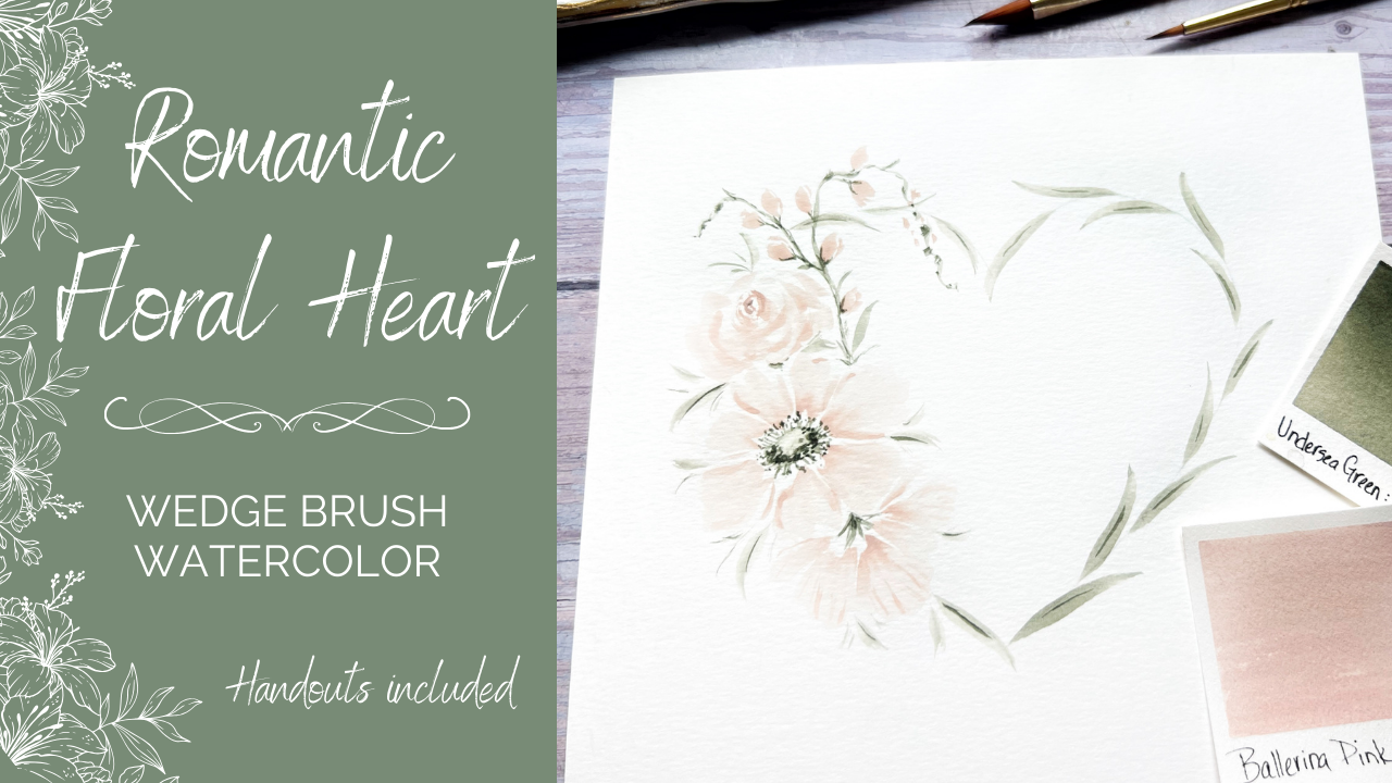
1. Floral Heart Intro: Hello, and welcome to another class featuring
the wedge brush, also known as the petals
brush or the triangle brush. What I have for you
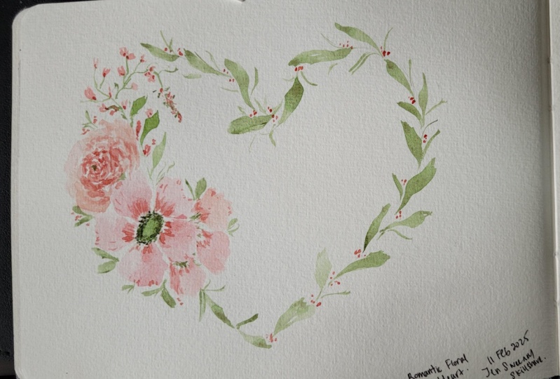
today is an elegant and delicate heart shaped
design featuring soft, romantic florals and simple
but very graceful leaves. I'm so grateful that
you've chosen to be here. Let's take a quick
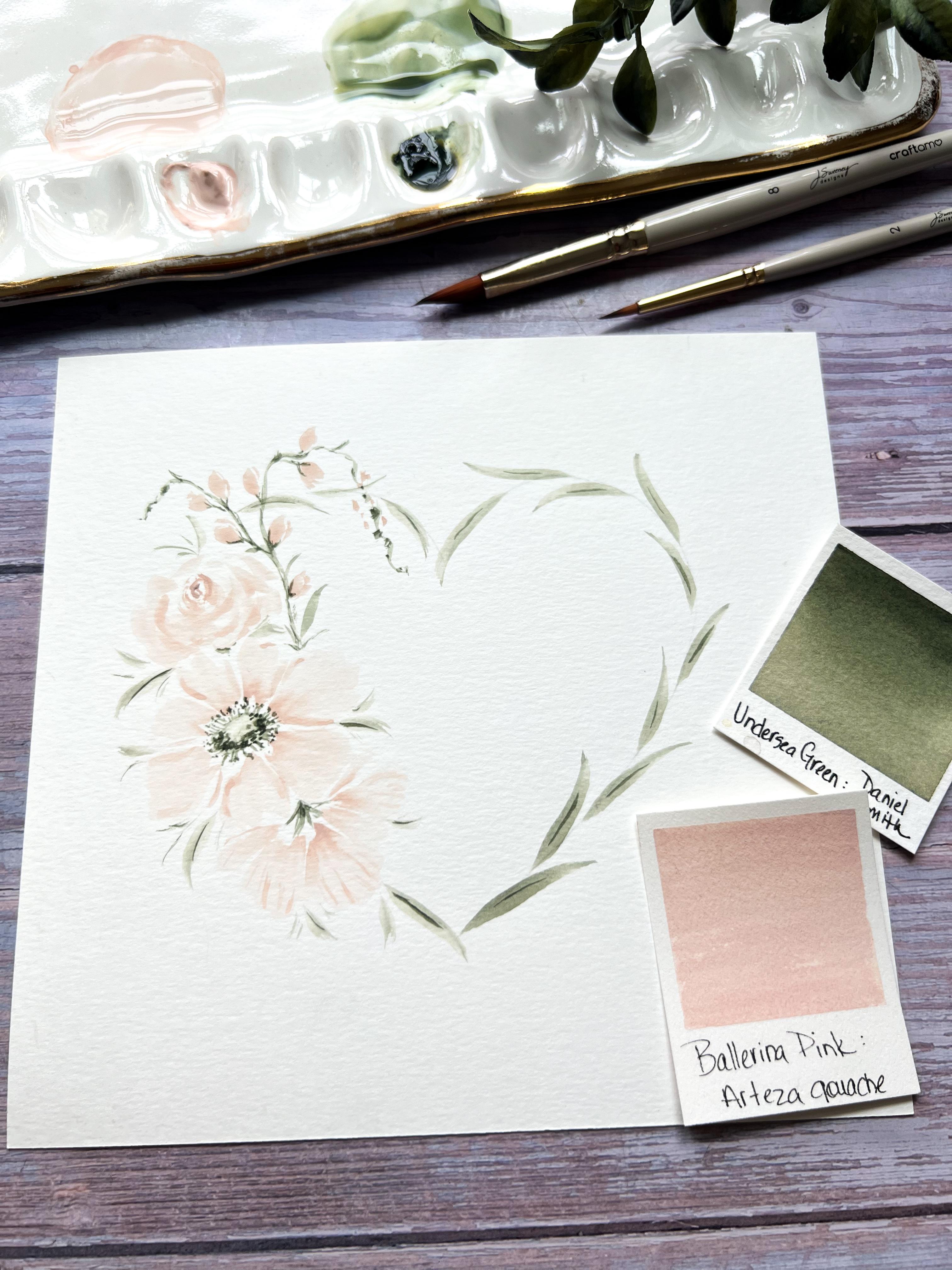
look behind the scenes and I'll show you exactly what you'll be learning in class. Only two colors are needed, a light peachy pink,
and a muted green. Make sure to print
your handouts. You'll find the
heart template there as well as other
important information. No need to have the
exact colors I use. But if you want similar ones, I share a few simple
watercolor mixes that will have you painting
alongside me in no time. To begin with, we do a
quick color check of the very common wedge
Brush petal stroke. The leaves are simple
and I show you exactly how to achieve
these graceful strokes. We first paint our focal flower. No videos are sped up and I
guide you through every step, every element in real time. This class is for all levels. If you don't have a
wedge brush, no worries, simply grab your favorite
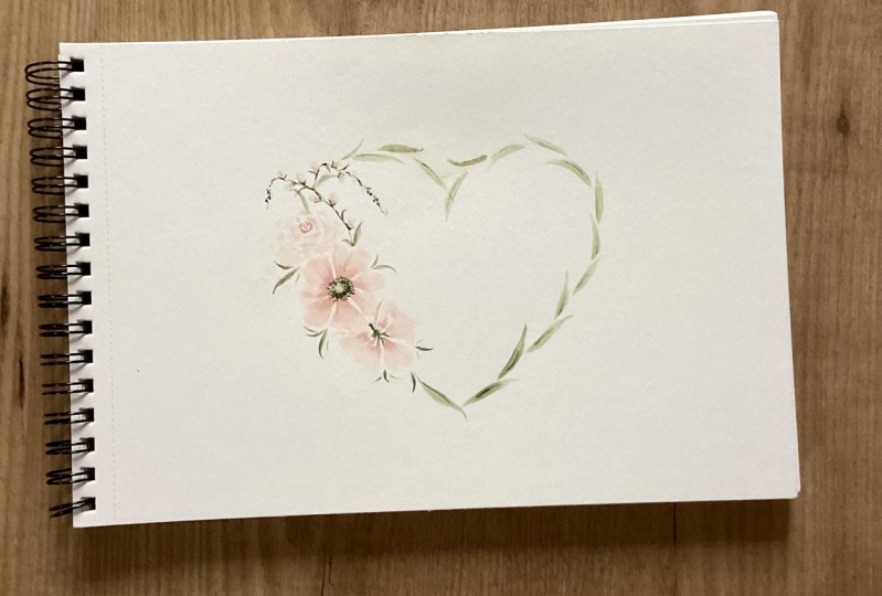
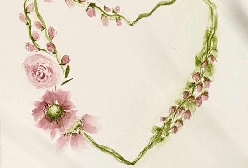
floral brush and follow along. By the end of class, you'll have a fully completed design. I would love to see
what you create. Please upload your artwork into the project gallery.
Let's get started.
2. Class Supplies: One thing I love
about this class, you don't need a
lot of supplies. Just two colors today,
ballerina pink. That's guash by Artisa. And then one of my
most favorite greens ever undersea green
by Daniel Smith. That's watercolor, not
guash. Got my palette. I've got my terrible
looking sponge, which I'm going to change
out for a new one. I've got over here typically how I have my setup.
I've got a towel. I've got my brushes over here. This is my size eight wedge. Got two smaller round brushes, a 3/0, and a two. Not exactly sure which one I'm going to use,
maybe both. We'll see. Pipe to add some
water to my palette. I've got this little stylus, and I use this when I'm transferring an image
onto my watercolor paper. You don't need to
have this. Just use the back of the handle, the end of the handle
on your brush. Use anything else,
not super sharp, but enough that is going to just transfer that
image for you. And speaking of
transferring the image, I use a darker B pencil. This is just a two B pencil. That way, if you
have an H or an HB, you're not scrubbing so
hard on the back there. These bolder blacker pencils
with more graphite or deep darker graphite and excuse me, is going
to work better. I've got some practice
paper underneath my towel. I've got a kneaded eraser. Canson watercolor paper, which
is roughly seven by 7 ". I usually work on a larger
piece and then cut it down. It's just easier to work on a smaller one when I'm
doing a class like this. I've got water jars
off to the side. I've got paper
towels and tissues. Let's see if there's
anything else. I don't think so.
I think that's it. So let's go ahead
and get started.
3. Color Alternatives: Just a few quick color
options for you. I know most people
don't just have alerina pink sitting in their
stash of pigments. So an easy way to
get this peachy, pinky color mixing
water color here, permanent Alizarin
crimson, yellow ochre, both by Daniel Smith. If I just mix these two
together with some water, I start to get this
nice peachy color. I add more water, and I
get this nice light color. Now, if I take a little bit of white guash and add
it to that mix, I'm going to get a
nice opaque color. Still pretty dark,
in my opinion, for what I want for
this design, at least. We're going for soft, romantic, really, really soft
petals on our flowers. So a little bit of white guash, even more white guash, and then watering
that down even more. I'm getting pretty close to
that ballerina pink here. Obviously, you can use any colors you want
for this design, but if you're trying to go for that soft peachy pink color,
this would be the way to go. As for the greens, like I said, my favorite
undersea green. But if you wanted
to mix them up, these are two very
common colors, sap green by Daniel Smith and
Pains gray by Daniel Smith. Just mixing these
two watercolors together, I get this nice, deep, mossy looking,
muted green color, which I absolutely love. Alright, let's get that image
transferred onto our paper.
4. Image Transfer: If I was sitting in my studio
doing this all by myself, I would transfer this onto
a larger piece of paper, maybe move it over
a little bit here, but definitely a
larger piece of paper. That way, it gives me all kinds of wiggle
room around here, in case I need to
shift my design, the flowers, the
leaves, any part of it. I just cut it down after
I'm done with the image. But for today's purposes, going to I have cut
down my paper to the seven by seven inch.
It's roughly that size. You don't need to
feel like you have to get that perfectly sized, but it fits well with
this size heart. So how I transfer this, and I know many of you
have done this before. Easy Psy, and I just cut
this out of the handouts. It's just on copy paper. I have my number two B pencil, and all I'm going to do is just black in the
back of this paper. I'm going to turn it over, use my stylus and
transfer the heart. Now, knowing that I don't I'm not going to
be using this part here, I'm going to probably leave
about this much blank. If you want to do
the whole heart, that's fine and erase it
later, completely your choice. So let's just go ahead
and scribble this. My pencil is more horizontal, and I'm turning my
pencil as I do this. And I'm just going around where the black
line is, of course. Turning my pencil, actually it's using all sides
of the pencil here, and that way, I don't dull
it down on just one side. This is a total guess on
this blank spot over here. But I can easily erase out more, and we're just going for
the image of this heart. We're not looking to
trace it or to use it perfectly. All right. I don't have any
tape right with me, but if taping it down with
washy tape would help you, then definitely grab that. So I'm just going to hold it, take my little
stylus here and do a quick trace
pushing fairly hard. You can see the paper
lifting up a little bit, so I'm going to come
from the bottom, come up and around and met it. I know it's totally wobbly
and I'm not worried about that at all because
it's going to be covered. But I do want this little
part on the end and, of course, where it meets here. Go to hold down my paper.
Let's take a peek. I think that'll work just fine. Lay that off to the side. And then I will take
my kneaded eraser. You can either roll it or
just go around and dab it. Sorry for the shaky
camera when I do this. And also, not that
it matters a ton, but with this Canson paper, obviously, you can
use either side. I'm actually using the backside. It has even less toothiness, which it's very
small to begin with, you know, not compared to, like, the arches, cold press, 100% cotton paper where
it's nice and toothy. This has a little bit, but
even less on the back. It almost is like just
using hot press paper. It's very, very smooth. And with this design,
I'm not going for a lot of or really any
wet and wet bleeds. I don't know why, but
sometimes I just like working on the back side of
my Canson paper.
5. Palette Prep with a Few Practice Strokes: Alright, we got our
ballerina pink here, squeezed out a nice
chunk in this well, pulling some out here
and adding water to it. Remember, we're going
for soft and romantic. It's a good start there. The undersea green. Once my brush, pull in some water pull out some
pigment on this side over here. We want this to be
very light as well. Not a lot of contrast
in this design, and that is by design. I really like the
lighter look to it. So this undersea green
can be very, very dark. If you wanted to add
a little white guash to this, you could
certainly do that. All right, that's pretty
well watered down. I'm just going to do a
little bit of a test run, see what my strokes look like
in the depth of the color. So I'm just rolling my brush back and
forth in the pigment. Here is my filthy sponge. I typically tap it off to get some of that
pigment and water out, and then I just lay down a couple petal strokes
just to see if I like that color or if
I need to pull in a little more pigment to
make it a little bit darker. A lot of it is just trial and error and warming up your hand. Alright, that's
looking pretty good. Do the same with the green. This is very, very
watery. Rolling my brush. This time, I might
just tap it on the towel and then these strokes are made in
the belly up position. The flourish design
is facing up. I'm holding way down
here on the metal feral, either on the crimp
or just below it. My hand is on the table, and I'm just doing a land
press lift type stroke. Lot of water on that one. I'll tap on the towel
a little bit more. Land, press and lift. Land, press and lift. It is good to pick up some speed as you're
practicing these. Just very long graceful strokes. Remember, the lower down
you go holding your brush, the tighter the control
you're going to have. You come way back up here on the handle and try
to do that stroke. It feels really awkward, really hard to control. But there's benefit in holding the brush way back
on the handle there. But not right now. We want a little bit
more tight control. All right, enough
of the practice. Let's go ahead and get
our design started.
6. Let's Start Painting!: Okay. Before I do that, I said, I'm going to get rid of
this filthy looking sponge. So I get these
sponges on Amazon. Come flat like this.
They're amazing. I just dip it in my water. Just off camera here, squeeze out the water. And this is just a
little soap dish. Squish it in there and
we are good to go. The problem I ran into with this sometimes if I'm
dragging my brush, obviously on some of
this dirty color, this dirty color gets
transferred onto my paper, and that is never fun. Never want that. Alright, now I made a big mess over here. Clean this up. Now we'll
get going on our design. So I grab my size two. Whatever size you
want to use is fine, a small round is what
we're looking for. We're going to start
with a green center of that focal flower. Little bit more mixed in here. Sorry, you can't see that.
All I'm doing is just roll in my brush in the green. Super saturated. So
I come over here, dab it onto the sponge. I'm going to start
right about here. It's pretty light, and
that's what I want. Just a very quick lay down oval. I'm going to drag
it on the sponge a little bit more and just
lift out some of it. Don't want to overthink
this center at the moment. I'm going to get back in this concentrated
part right here. It's pretty watery right there. So I'm trying to be careful. All I want to do is just add
a couple little dots here. If it bleeds right away into what you've
already laid down, that is not a big deal. But I'm just adding
a few little dots, more than a few, I guess. And that's that. Now we're going to move on to the petals. We'll finish this up after
we've done the full flour. All right now I have
my size eight wedge. Sure I don't have any
extra color on that. I'm just rinsing it,
dabbing it on my sponge. The reason I dabbed
it on the sponge, I don't want to drag a whole lot of water into this right now. Let's just double check
this one more time. I am going to go a
little bit darker on camera just so
you can see it. So that's not too bad. You've got some options here. You can just roll your
brush in this section, dab it, lay down
your pedal stroke. Sometimes what I will do, plenty of times what I'll do, roll it in this section, dab it, and then get into
that concentrated part, and then lay down my stroke. So we are just
going to go for it. See what we have here, and I typically start on this side. Brush is fairly wet. I hope you can see that. I got a little spot there. It's okay. We won't
worry about that. Let's go a little darker. Just some quick pedal strokes, fairly consistent but
not overthinking it. Consistent in size. Reloading my brush. I do get a little smaller
sometimes on the top here. Might add a little
line here or there, just for some visual interest. Then I leave it alone for now. The challenge is to not
overwork it right now. To stick with basically
the same strokes. But I'm going to do it
down in this area here. It is definitely the
same petal strokes, not this full flower. Turn my paper, load
my brush again, so I do need to
pull in some water, a little bit more pigment here. And don't worry about
trying to be super consistent with every
flower and how it looks. Variety is the spice of life, so that's totally fine.
You want that variety. You can check it on your paper, your test page if you
want to or just go for. We're going to add a
few little highlights after we're done
with all of these. So no worries. Okay, we'll walk
away from that one. Alright, let's do work on
our rose right up here. I'm going to roll
in this part first, dab it on my sponge. But I'm going to get
that tip right into the concentrated pink because that is the stroke I'm
going to lay down first. And I'm using, of course, the tip and just maybe the first one fourth of
this brush on its side. I start with the
center of the rows, do some little bit of marks. Se curve, sometimes
we'll call them or just basically making some
marks around that center, rinsing off my brush, and then just kind of feathering out the
strokes from there. A little bit thick right
there, but that is okay. Leave some white space. Gonna rinse my
brush very quickly, dab it on my sponge. I want my brush to still be wet and have some pigment in it. Then I just start laying in a few little
squiggly strokes. Now, we can clean this up in a bit here.
It is very light. I know that. Tell you what. Let's add a little bit
more while we're here. It is soaking in pretty good. It's hard for me to
see too, actually. All right. Let's
jump up here and add some of the greenery and then these little
touches of pink. I love doing this little squiggly stem of some sort at the top of a lot
of my bouquets. I just kind of fell into
a pattern of doing this, and I really love it. I think it adds a really nice, delicate touch to the pieces. So let's see how about we're
going to start down here. Got the brush in the
belly up position. So I'm using these
little fine bristles at the top, light hand. What I'm going to do is lay down a stroke and kind
of squiggle around. I don't want to go too high
above the heart shape, but just enough to give
it this whimsical look. Let's see. Here I go again, hardly ever using
my practice page. Trying to get
enough on my brush, but not too much. Okay. We'll go for that. Come around to the side here. Come out that way. I'm not too worried about the pencil
marks here right now. If you want to get in with
an eraser, you can do that, but we still are going to add some leaves down around
this edge of the heart. So let's do this. Let's add just kind
of a place markers. Let's just add some leaves. A lot of times I will
leave space here, too. But it's just a real squiggly
kind of some kind of stem. I haven't totally
figured it out yet, but whatever it is,
I really like it. Let's add I'll tell you what. Get some of this pencil mark out here because
I'm going to add those little touches of
pink around this vine.
7. Painting Continues: Rolling my brush a little bit
more pigment on this side. Tap it on my sponge. Let's see what we got here. These are really almost like just tiny little leaf strokes. Tell you what,
we'll use this one. Not as a leaf, but more for this little bid. A little one here. So I'll just tend to take the top part of the bristles and add maybe a couple strokes around this first stroke
that I laid down, just giving it an extra
little umph of delicacy. Starting to get a
little bunched up. A lot of times what I will do is just add dots of pink too, just to pull the eye in and
carry that color through. Alright, so I just
extended this. Forgot to hit record. Just extended that
down a little bit. Now, we need these little
buds to dry completely before I add a little
bit of a base to them. Since I've got green
on my brush already, let's go ahead and
cover the sides with these long graceful leaves using the brush again in
the belly up position. Land press, lift
and press, lift. I want this to be lighter, so I'm going to tap my
brush on the towel. That might be too much. Actually not bad at all. I can tap a little bit more. So I start down
here at the bottom. I just go around the outline. Turn your paper as you need to. So I'm liking that. So let's get this
one right here. So I like how this one comes in just a little bit of a curve
as does this one here, gives it a really nice
whimsical look to it. Super light leaves, not worried about the pencil
line at the moment. Your eyes can just
travel around nicely. You know, that's the
heart shape there. So while we're at it, let's squeeze some
more leaves in here. Don't want to put my
hand in anything wet. We've got a little
bunched up here. So let's just try it this way. We're going to go for it.
Cut through this one. Now, when I have my
greenery over here, we're already pretty heavy
with the flowers themselves. So I'm not going to add a ton of greenery around
these flowers. We want to keep it again,
soft light and delicate. I think I will add one. Little stem right there. Not stem, little leaf. I would suggest
picking up speed as you're doing this and
try not to overthink it. Easier said than done. All right, while we're still
working with the green, just loading my brush
a little bit more. I'm seeing some spots we
need to finish out here. So this, I'm going to just add a little
bit of a stem here. I want to overthink that. We can darken up a
little bit here. Again, we don't want a ton
of contrast with this one. But let's do using
the tip of my brush, using it as a pencil sketching in some of these dark areas. I might go back over something
two or three times because I'm cautious when I do this. A little bit darker there. Darken this up just to touch, add a little greenery there. These guys are dry, so we can just do either a little
line or just like V shapes under
these little buds. It is the tiniest little line. I'll sometimes make one
line a little bit longer. Get a couple leaves
again on here. Tiny little ones. Just the tiniest tiniest
little dark contrast areas to some of these leaves. Since we've got some
darkness up here, I feel like I need to pull
that down a little bit. We're going to
finish that center, so don't worry about that yet. This is the part where I think, should I stop?
Should I keep going? Somebody tell me, what do I do? What do I do? Let's add. We're going to be
brave and just do couple little lines
these guys here. Sometimes I feel
like I fret over something so much and
then by the end of it, nobody notices it anyway. So it's all that
stress for nothing. I think this guy looks
a little awkward here. I had a couple. All right. Let's put our
wedge brush down for now. Grab a size two or smaller, and let's finish out
this center here. So I'll take my size two. I roll that. This is going
to be a little bit thicker. I usually roll my brush
on the sponge like that. Right now, I just want
a couple dots first, and then I'm going
to add some lines. I don't want to go too far. But I'm just trying to deposit
some of that paint right now and then can
pull out some lines. Very faint. Get a few darker dots in there. That's really going
to pull the e in. Don't forget to step back
and take a look at it. If you feel like, Oh,
gosh, I did way too much, wrench your brush, really good, drag it on your towel. You still want it to
be a little bit damp. And then if you want
to get in there and lift some more
out, you can do that. All right. I think that's
it for the green right now. Let's add a few little
highlights to these petals.
8. Final Touches plus a Bonus Tip: Alright, I think for this,
I'm gonna use my size two. I've got a 3/0. I
could use that too. That one's pretty small, but let's just try this
and see what we get. So rolling my brush in the pink, rolling it or tapping
it on my sponge. Might not be much at all, but I tend to just go around
pretty quickly on some of these petals and just add
a few little highlights, strengthen some of
the edges here. I don't always do that and probably are looking at that I didn't even see
what you did, Jen. That's not very visible at all. I like the petals how they are, so I really don't want
to add a whole lot. This one here, if you want to
do a little bit different, we could just do a few
little fine lines. These petals are so light, giving just a little
whisper of a highlight will help add some of that really pretty soft
character to your petals. All right. I don't
want to overwork that. Now, this rose here, I think what I want to
do, looking at that. I'm taking my wedge brush again. Make sure I don't have green. I do have green on that. So no to self rinse
these brushes when you're going
back and forth with your colors cause
if you're like me, you're not always rinsing enough of that
pigment out of there. So I just want a damp brush
a little bit more there. Okay. And so it's just
water on my brush. I just want to soften
this rose a bit. Not even sure if
you can see that, but it just looked like some of the hard edges were just a
little bit too hard there. Now that it's wet, I can just soften the edges
a little bit more. Like I said, this paper is
not great for wet on wet. But to me, it helps
soften that a little bit more and
I can add darker in the center just to really bring the eye
into that area first. Easy to overwork that, for sure. So probably best
to just walk away. One last trick I
want to offer you. So plenty of times
I look at a piece, and I think, Oh, should
I add something more? I don't know. Should I
add something over here? Should I add another
flour down here? My original plan was
to add something here, and then I thought, no, no, no, because I already
cut this paper, it's going to get really smushed and then too heavily weighted. So I'm good with
this. I like this. Very soft, very romantic.
Don't overthink it. But if you wanted to
grab some tracing paper, and then just take your brush
if you're thinking, Well, maybe I should add
just I don't know, some little pinkberries or something on this
side of the wreath. What would that look like? And it just gives you a visual. And then you might think, Well, that's a little bit too much. I don't want to do that.
Okay, no big deal. Didn't waste anything except
one piece of tracing paper. You didn't put it down
on your main piece. Then if you thought,
Well, maybe what if I added I don't know. So bigger flow or some
bigger leaves over here. Is that too much? Should I added more in here? And it just helps visually see. I know I'm going to put
my hand right in there. But if I would add more here, then you're
thinking, Whoa, no, that's too much too much, definitely too heavy because
it's very soft here. It's like it's going
to just tip over here. But tracing paper has saved me a ton of times when I'm just sitting there
looking at the piece, going, What should I do? Should I add more?
Should I not grab that tracing paper and just experiment
with different things. And I would just take four or five pieces
of tracing paper. I usually talk myself out of it, and I just leave it as is, and I'm usually happy with it. But other times, I'm like, Oh, wow, that really helped. That added a lot.
If I wanted to add bigger leaves without
the berries over there, still might be a
little bit too much. Should I have maybe added. I don't know another couple
of flowers on this side. Granted, these leaves
wouldn't be there. But I think the beauty
of this piece is that we just have this side, the focal point, your
eye goes right here, it gradually goes out, and then you've got the soft
leaves on the other side.
9. Class Project: This one was my inspiration
for this class. I did this a couple weeks ago, fell in love with it and thought I could totally make
a class out of this. I'm so happy to share
this with you and I can't wait to see
your class projects. Feel free to change
up the colors. You can make a card. You can
make a standalone piece. You can just do whatever
you want with this design. But please do upload them
into the project gallery. I would love to see them. If you have any questions, concerns, please do reach out. I would love to hear from you, and I can't wait to
see what you create. Thanks for being in class, and I will see you next time.
 Jen Sweeney, Watercolor, Calligraphy, Cycling