Transcripts
1. Welcome Aboard!: Hey, everyone. I'm
Sate Ji Hagede, a watercolor artist by passion, a project manager by profession, and now a proud mom for
my little Princess. In this class, we will
dive into painting a brand new project wherein we'll be painting an
underwater sea environment with a dolphin
nearby the seabed. We will explore how to bring depth and light into
an underwater scene, capturing both the calm blues above and the textured
seabed below. You will learn how to use
simple color combinations, lifting techniques,
and granulating pigments to create a magical
layered composition. This class is designed to
help you gain confidence in painting any of the
underwater sea environments. And the best part
is you can swap the dolphin with any of the
sea creature that you love. So let's pick up
all the supplies and get started with
the class project.
2. All the supplies we need: Before we get started with the practice class and
also the class projects, let's go through all the
supplies that I'll be using. For watercolor paper, I'm going to be using
Saunders water food. This is cold press
and finite green. It is also 300 GSM, which means it has
a good capacity to hold good amount of
layers of water. This is the texture,
how this is looking. You can use any watercolor
paper of 300 GSM size, and that should be good. Next up, with
respect to brushes, I am mainly using silver brush, black
velvet series brushes. One is oval wash brush,
size three fourth, and two are round brushes, 3,000 as series, size
eight and size four. This I'm using
mainly four washes. So even with two round brushes, you should be able to
complete the entire class. Along with this, I'm also using a lineup brush with which I'll be adding some
details which is required. I'm also using a
spray bottle in order to spray water onto the paper. But you can skip this
and use just the brush and water directly
from your tumbler. I'm also using a palette for mixing paints
directly onto this. The colors that
I'll be using for this entire class
series is very limited, which I'll be showing next. So with just one palette, we should be able to mix
everything properly. Terms of watercolor. We'll be using from different brands, but majorly one
main shade of blue, which is cerulan blue. You can use any
brand cerulean blue. I'm using from Mission gold. And for adding
depth to the blue, I'm using white Knights
cadmium red light. For the sand part
within the underwater, I'm going to be using
mainly these two shades. One is bled stone genuine. This is a granulating
pigment from Daniel Smith. You can skip this and use any shade of brown
that you have. And a lavender shade. This is also from Mission Gold. With these two, I'll be painting majorly the underground
part of the paintings. Another shade of blue that
I would be using is from Smike which is
heloturquois shade. Of course, a jar of water and a masking tape
for taping down your paper and a
transparent board to tape on so that it doesn't soak up your water and it
still stays intact. You have gone through all
the supplies that are there. I'll be just fetching
out all these colors that we are using and also go through some of the
basic watercolor techniques and get started with the class.
3. Color swatches for the project: Let us swatch out all the colors that I'll be using
for this class, starting with the shade of blue, which is cerulean blue, and I'm using from Mission Gold, but you can use from any brand. You can see how pigmented
and beautiful this color is, and we are going to use
the same for adding multiple layers on
to our painting. Just with using one color, we'll be able to achieve many different shades
with the help of depth effect and
completing our painting. So this is our major
blue for underwater, which is serlan blue. In order to add some
darkness to the same, I'll be using cadmium red light. Okay. So when I mix blue
with cadmium red light, let's see what's the
color we're getting. We get a darker shade of blue. And this is the blue
that we want. Okay? So adding more. So this is the darker
shade wherever we want of blue that will be using. This is from the brand
white nights, but again, you can either use a darker
shade of blue like Indigo, Persian blue, or you can use the same mix in
order to get a darker shade. Next up is bled stone genuine. So this is a granulating pigment from Daniel Smith for
a shade of brown. You can use Sepia or any other brown as a
replacement for this as well. Next up is lavender. We won't be using
lavender directly, but we'll be mixing
that with blood stone genuine in order to get the underwater seabed color. So let me mix it here
for you and show. And with the different
variations of this color, we'll be using it
in our painting. I'll be guiding the amount of paint to be added
then in there itself. So this is the color
we are looking for. Next up is helo turquoise. Again, this is from Schmiqe and you can use
any shade of turquoise or even peacock green or any lighter shade than serlean for um instead of
this color as well. So that's totally fine if you
do not have the same shade. Not worry, you can use cobol turquoise or any
other lighter shade. Even you can mix this cerulean
blue with more amount of water or a little
bit of green or gradient as well and
get to this shade.
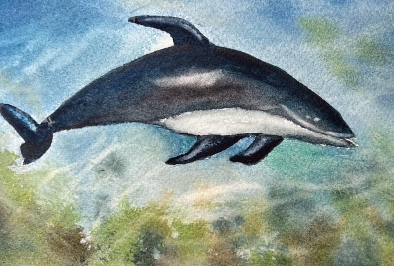
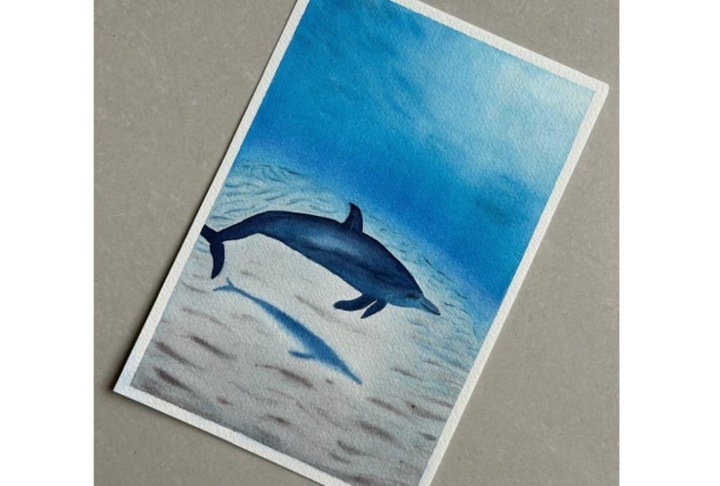
4. Sketch it out: Welcome to the class project. Now, let's begin
with the sketch. I have my pencil and
kneadable eraser here. I prefer using a
kneadable eraser because it helps me maintain
the sizing of the paper. I'm starting with the ocean bed, placing it about one third
from bottom of the paper. This gives us enough room above our dolphin
to swim freely. Next, I'm sketching a
loose circular area where our dolphin will go. This helps me
visualize the space it will take up before I
add in all the details. I have also attached
the reference image, the final sketch of the dolphin
in the resources section. You can refer there as well. Now I'm switching to two x speed for the drawing
part, but not very. You can always
slow it down using the settings in the video. I'm drawing the dolphin's face, nose, and fins, keeping
it simple and light. My dolphin isn't
exactly smiling, but hey, you totally can. Feel free to give it
a little personality or even add your own details. I'm also making sure
to leave some space beneath the dolphin
near the seabed. That's where we will paint
in the reflection later. Sketching it now helps guide
us when we are working with the watercolors because we'll be using majorly wet
on wet techniques. We can directly add in a
smooth shadow rather than making it a harsh
wet on dry shadow. The one third of the paper
that we have divided is the line where ocean bed
meets the underwater space. It's a nice visual break between the world below and playful space where
the dolphin swims. And that is our final sketch. I've kept it very simple and we can get started
with adding all the blues. Also in the next lesson, we will start with
just the first layer and we will build on top of it. See in the next lesson. Oh
5. Background wash: Alright. Now that
our sketch is ready, we are jumping into the fun
part, which is painting. I'm starting by applying clean water with the
help of a sprayer, but you can directly use water. And I'm applying this
all over the paper because we'll be using the wet on wet technique for
this background. I'm using an oval wash brush. This is a three fourth size from black velvet
series by silver brush. It is super soft and perfect for smooth
water application. But if you do not have
the same, not to worry, you can use any flat brush or a mob brush of your choice that holds good amount of water. Make sure to apply
the water generously. We want the paper
to stay wet for a while so the colors
can flow beautifully. Watch for any dye patches
and go over them if needed. Also, no need to
mask the dolphin. We're keeping the color
palette soft and subtle. Now I'm switching to my size eight round brush and picking
up some Cerlean blue. I'm starting right
along the horizon line. That's this little edge where the ocean meets the
seabed in the distance. This area will be
the darkest since it's where the sea starts
to dip into deeper waters. I'm laying down cerulan blue here to anchor that
sense of depth. Next, I'm picking up helo
turquoise from Schmiqe. It is such a lovely oceanic
shade and I'm adding it about the serleon moving towards
the upper part of the sea. Now watch how I'm blending these two colors
directly on the paper. No need to overthink it. Let the water do some
of the work for you. Just softly guide
the colors into each other to create the
dreamy fluid transition. Now I'm just using a
paper towel to gently dab off the excess water
sitting on the masking tape. Sometimes it pulls up
there, and if you leave it, it can sneak back onto the paper and create
unwanted blooms. Alright. Now I'm
going back in with helo turquoise and adding it just below the
horizon as well. This is the area that will
eventually become our seabed. I'm not covering it
completely, though. I'm leaving a few white caps where I will layer in
some browns later. That will help us get that
nice earthy seabed texture. But right near the horizon, I still want a bit of that
blue showing through. That's where the water
reflects down the most. So adding helo turquoise there gives it that subtle
underwater glue. Now, with just a damp brush, I'm gently lifting off some paint from the
top right corner. That is where we can imagine the light entering
our underwater scene. So softening that idea helps create a nice
glowing effect. Next, I'm switching to
a size four round brush and picking up a slightly
darker shade of helo turquoise. I'm using a simple
single motion here. Just press the tip
of your brush onto the paper and lift it
off in one quick dab. This creates those
beautiful soft textures like ripples or wave patterns
moving through the water. I'm starting from top right and pulling it gently
towards the horizon. Once it dries, it gives a very lovely sense
of the moment, almost like water days
shimmering with light. And yes, this is some technique. This is the same technique that we tried in our practice class, so it might already feel
very familiar to you. Now and then I'll be lifting and slightly tilting
the board just to help the paint flow more naturally and give us a
smooth finish on the paper. This little tilt
helps the colours blend softly without
any harsh lines, especially with wet
on wet technique. You will see the pigments
settle in beautifully, almost like ocean settling
into its calmless form. So if you see me moving
the board around, that's why it's a small trick, but it really helps
the watercolors do their thing naturally. Now for the seabed, I'm using bled stone genuine
from Daniel Smith. It's a granulating pigment, and I'm mixing it
with a little bit of lavender to soften things
up and add some character. If you don't have a
granulating pigment, no worries at all. You can mix any brown
like sepia with a tiny bit of black and
then add the lavender. You will still get that
nice earthy tone with a hint of granulation that we're looking
for on the paper. Using different
shades from this mix, I'm starting to
build up the seabed. I'm applying the colour
in soft broken textures. Definitely not covering
the whole area. We want to leave
some white space to suggest the light
reflecting underwater. And just like before, I'm moving the brush in one consistent
direction that helps keep the flow natural and gives the painting a calm,
cohesive feel. It's all about suggesting
texture without overworking it. Let those granules from the
granulating pigment and the brush strokes do the storytelling and settle
it however they wish. Now that the background
wash has settled, I'm going back to the horizon with the same seabed mixture. Using a size four
round brush here, it gives me just
enough control to add tiny fine details right
along the horizon line. These little strokes
help suggest landforms or underwater ridges
way off in the distance, and they add just
the right amount of depth without pulling
too much attention. Keeping the brush light
and the lines soft, you can think it off as a quiet whisper in
the background, just enough of the
ground to be seen. And as we move closer
to the foreground, I'm dabbing the brush with a little bit more pressure to create thicker, bolder strokes. This builds up the texture
of the actual seabed where the sand gets lifted by underwater currents
or gentle waves. I'm not covering it all, though. I'm letting some of that previous lighter
shade peek through. That's where we imagine
light is hitting directly, and the darker parts around it form natural shadows
from the raised sand. It's a simple trick of
using the brush strokes, but it gives the whole base a lovely sense of
depth and movement, like ocean bed is gently
shifting beneath the water. You can also use
different variations of these brush strokes as well. For this class project, I'm keeping it very
simple and using just one level of
stroke throughout. Taking the heloturquoise
mixture and making sure again those strokes near the horizon stays because if they're merging a lot because
of a lot of people, we want to make sure it is
coming again into picture. While the paper is still damp, it is the time to add the
dolphin's reflection. The paper is not completely wet, but it is not completely dry.
This is the perfect time. I'm mixing Cerlean
blue with a bit of helourqoise to get the
slightly darker sheet. You can follow along with
your existing sketch here, but feel free to adjust how the shadow forms based
on your composition. To deepen the tone and to
keep the palette harmonious, I'm adding just a touch
of cadmium red light. It sounds unusual,
but it helps me mute the blue slightly
and keeps everything within the same colour family
rather than jumping to a completely different dark
blue indigo or a black. The key here is to work with very little
water on your brush. That way, the paint won't spread too much or
create a bloom, and we will get a cleaner
reflection effect. If you apply the shadow when the paper is having more water, it will spread and we
will not get this smooth, harsh edge of the shadow. So make sure your paper is damp. For this, you can also do a small patch test and make sure you understand
your paper correctly. Now I'm going back
to the lavender and bled stone genuine mix, but this time using a slightly
darker version of it. I'm adding a few
deeper strokes across the seabed to build more
contrast and texture. It helps ground the
whole scene and gives that nice,
sandy, uneven feel. These darker strokes go right into the lower
part of the painting, especially where the light
isn't hitting directly. Think of them as those
subtle dips and shadows in the sand that make the
ocean floor feel alive. You don't need to overdo it. Just a few soft dabs here and there can really
make a difference. And also, you can
choose when to stop. To refine the reflections, I'm using a liner brush
with just a bit of water, gently lifting some
of the paint from areas where I want
more white space, especially around
the reflection area. I'm removing the
water by pressing the brush lightly
onto the paper towel, which helps lift the color without disturbing
the paper too much. This is the if technique
we practice in the class practice lesson. It's great for creating that subtle reflective
effect thereafter. If you feel your
painting already has enough reflection and you're
happy with the result, feel free to skip this step. It's all about your
vision for the piece. Now with the same liner brush, I'm mixing a darker
shade of helurquoise and serleon to add some fine details for the third time
near the horizon. This is where the seabed narrows and the waves get
a little darker. I'm gently applying
these deeper tones just above the dolphin
towards the horizon. It gives that sense of depth and perspective as the seabed
fades into the distance. Since the dolphin
is further away, we are adding darker shades here and leaving
the lighter browns closer to the dolphin where we want the reflection
to pop more. Um
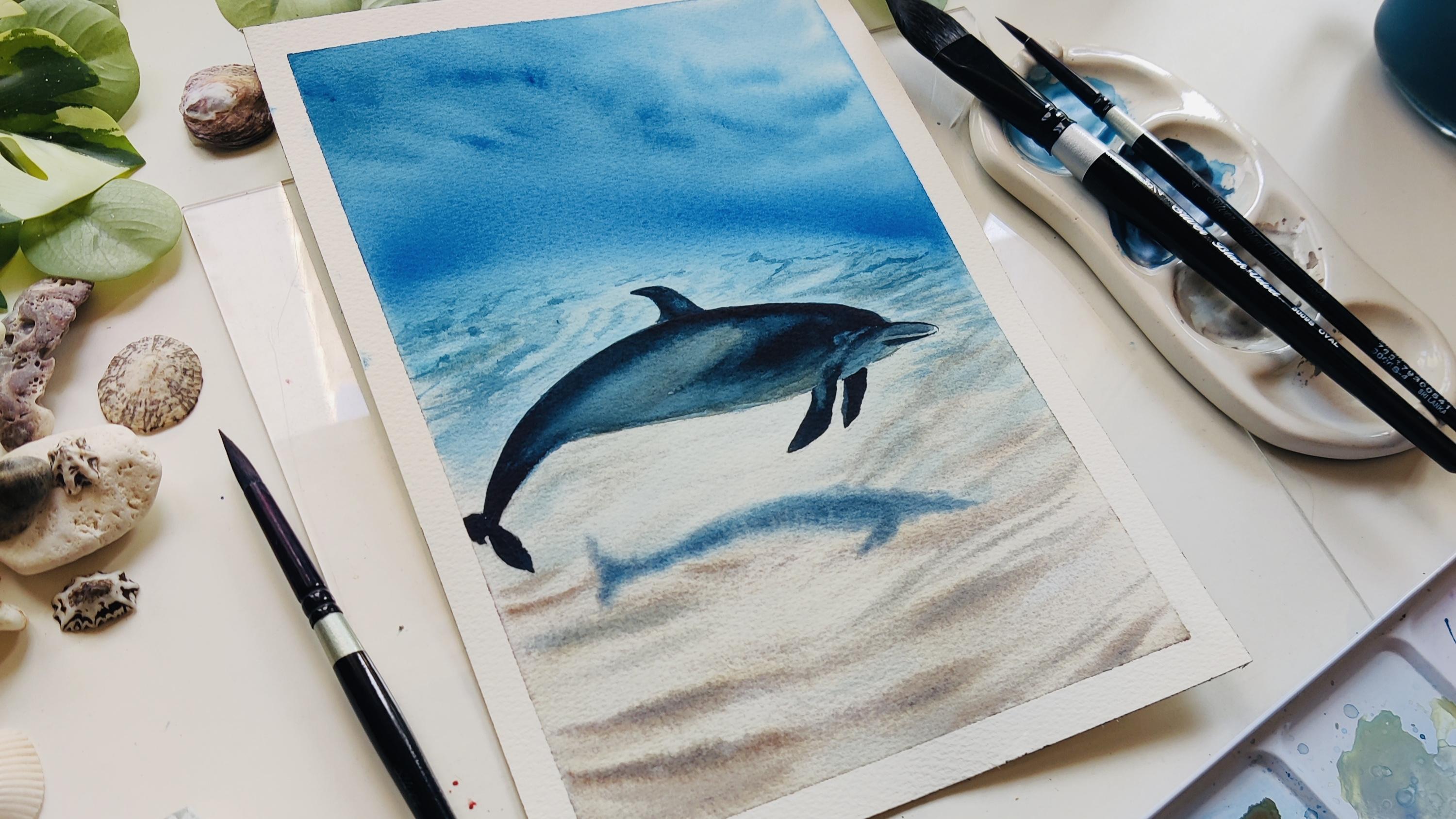
6. Dolphin & Details: Now that everything is
completely dried up, here is how it's looking. You can see how the
bloodstone genuine, which is a granulating pigment, has settled into
the tooth of paper. It's created such a lovely
natural texture for the sand. That's the magic of
granulating pigments. They do their own thing
in the best way possible, giving life to the seabed
without needing much effort. I also really like how the reflection and
shadows have settled in, especially around the area. So with the background
done and dry, we are ready to move on the star of our painting,
which is the dolphin. So let's get started. For the dolphin, too, I'm going in with the wet
on wet technique. I'm using a size eight
round brush to gently apply clean water all over the dolphin just within the sketch lines. Once that's done, I'm picking up some helo turquoise and starting with a light wash
on the lower part of the dolphin's body. Since the paper is wet, the paint will spread softly, giving us that
smooth look once it dries off or once I
build on top of it. Now, I'm taking a bit of cerulean blue and mixing
in some cadmium red light. This mix gives me a nice muted, deeper blue, which I'm using for the
top part of the dolphin. Since this area isn't catching much reflection from the
seabed or the light, I want it to be the darkest. It adds a nice contrast
and helps shape the body. And for the underside
of the dolphin, especially where it's
closest to the seabed, I have also used our
previous mix of brown and lavender that keeps
the reflection soft and ties it with
the ocean colors below. For the middle part of the body, I'm switching to the mix of
blood stone genuine and, um, the lavender
that I told before. This color reflects
the seabed tones, so it feels like the
dolphin is interacting with the water below and
the sand below. The beauty of watercolor
is that you can really play with how you
apply the color and water. It can be loosely done in a
flowy way or more control, like how I'm doing here. So it is totally up to you and how you want your final
painting to come out. I'm adding with multiple layers
of the same colors until and unless I'm satisfied with how the final look
of dolphin will be. Since you're using
different shades of blue and it is watercolors, you have to remember that it dries up three shades lighter. So if I stop at the
first layer itself, the dolphin might be very
light, which I do not want. So I'm adding it with
multiple layers. For the face and nose, I'm sticking with the
same dark blue shade to maintain
consistency and depth. I wanted to feel
like the dolphin is swimming smoothly through the water with the light hitting different
areas as it moves. So for those areas, I have depicting with
different shades of blue, as well as the
reflection from seabed. And with that, I'm switching to a liner brush to add a
bit of lifting again. This time to define the outline of the dolphin
a little bit more. I'm gently lifting
around the face area to bring out the curve and
shape of the dolphin's body. It helps add that soft highlight
and gives it more form. I'm also lifting a bit where
the eye and eye socket would be just to get a subtle separation without
making it too bold. It's those tiny touches that bring life
into the painting. If your paper has
dried up already, you can still add these details later with the help
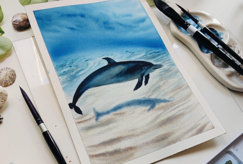
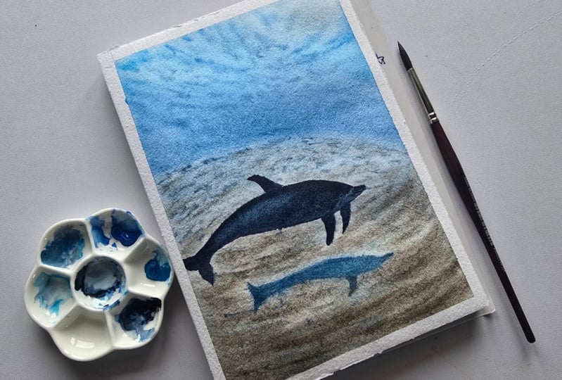
of white quash. And now here is the final look. I really love how
it has turned out. The dolphin may not be smiling, but I like the calm and how the background
has turned out. It is very dreamy and I like how everything
has come together. Now, time to peel off
the masking tape. Honestly, one of
my favorite parts. It gives the painting that clean edge and
a finished feel. And there it is our underwater
dolphin scene all done.
7. Thankyou: Thank you for joining the class and completing the
project with me. Make sure to upload
your project in the project and
resources section so that we can all see
and admire your work. Also, if you have any doubts, do not hesitate to
reach out to me on the discussions or
via DMs in Instagram. Until I come up with something
new the next time, Chiao.
 Swathi Hegde, Watercolor artist | Aqua | Night sky