Transcripts
1. Introduction + Welcome: Whether you're just
getting started on your journey with
watercolor and you're looking to practice essential
techniques or you're a little bit farther ahead and
you're looking for a fun, fall inspired
project to work on, this course is for you. Hey, everyone. My name is Erica, and I'm
a traditional media artist working with a variety of
drawing and painting mediums. I enjoy challenging myself to draw and paint
different types of subjects from landscapes to still life to animals, and more. I have over 15
years of experience working in artistic
and creative fields. After obtaining my BA
in graphic design, I went off to work at
an advertising agency as graphic designer
for a few years. Then I became head
art teacher in a wonderful school
that I worked in for seven years and it was during this time that I started building my own art
business on the side, selling my original
pieces locally, and I also started creating helpful content to
share online for beginner and
intermediate artists looking to develop
their skills further. I am incredibly passionate about continuing to develop my
skills and voice as an artist, but also about helping
and encouraging other artists who are looking to delve deeper into
their own journeys. Nowadays, my days
revolve around creating original art that I sell locally
and share via my videos, and I also teach people
all over the world. In this watercolor course, I am taking you through my entire process for this
fall inspired mushroom piece. Includes a beautiful
bouquet effect. This term bouquet with an H originated from the Japanese
word bouquet without an H, which literally
means blur or haze. The term bouquet was initially
used in photography. It is an effect where
certain parts of the image, whether it's the foreground, the middle ground
or the background is out of focus or blurred. When lights are present in
those out of focus areas, we see them as
these glowing orbs. Painter started noticing this beautiful ethereal
effect they started exploring with their own
painting mediums to see how they could recreate
it in painting. In this course, I share
my favorite way to create this beautiful effect using wash and simple tools
that I have at home. I am sharing my entire
process step by step, starting with my preliminary
pencil sketching process. And in that phase, I am sharing all of
my tips that will help you achieve better
shapes, better proportions, and information that
will help you better utilize your drawing space
so that you can make sure that you're not leaving too much negative space
or empty space around these mushrooms and so that
you can make sure that the mushrooms are nice and large within that picture plane. Then I move on to
explaining all of my favorite
watercolor techniques that I use to bring
this piece to life. From wet on wet wet
on dry layering, and we also bring
in masking fluid to help us block out the
mushrooms so that we can more easily paint that
beautiful background wash that we need for our
bouquet technique. I also explain how to use masking fluid to easily
create grass textures. I also share with you how
to bring in white wash at the end for final detail
and visual texture. I've broken up my process into phases and each phase
has a class of its own. Prepared a few downloadables that go along with this course, which you're going to
be able to find in the Projects and Resources
tab here on SkillShare. These downloadables include
my outline sketch for these mushrooms in two
different sizes so that in case you like to skip over the freehand sketching
phase and simply transfer my outline drawing onto your watercolor sheet, you
can go ahead and do that. If you're just getting
started with watercolor, I would highly recommend
checking out my watercolor one oh one course here on skill
share because in that course, I cover everything that you
should know about when it comes to watercolor as a
beginner just getting started, and I share essential exercises that will help you progress
your skills faster. With all that said,
if you're ready, let's go ahead and
jump right in.
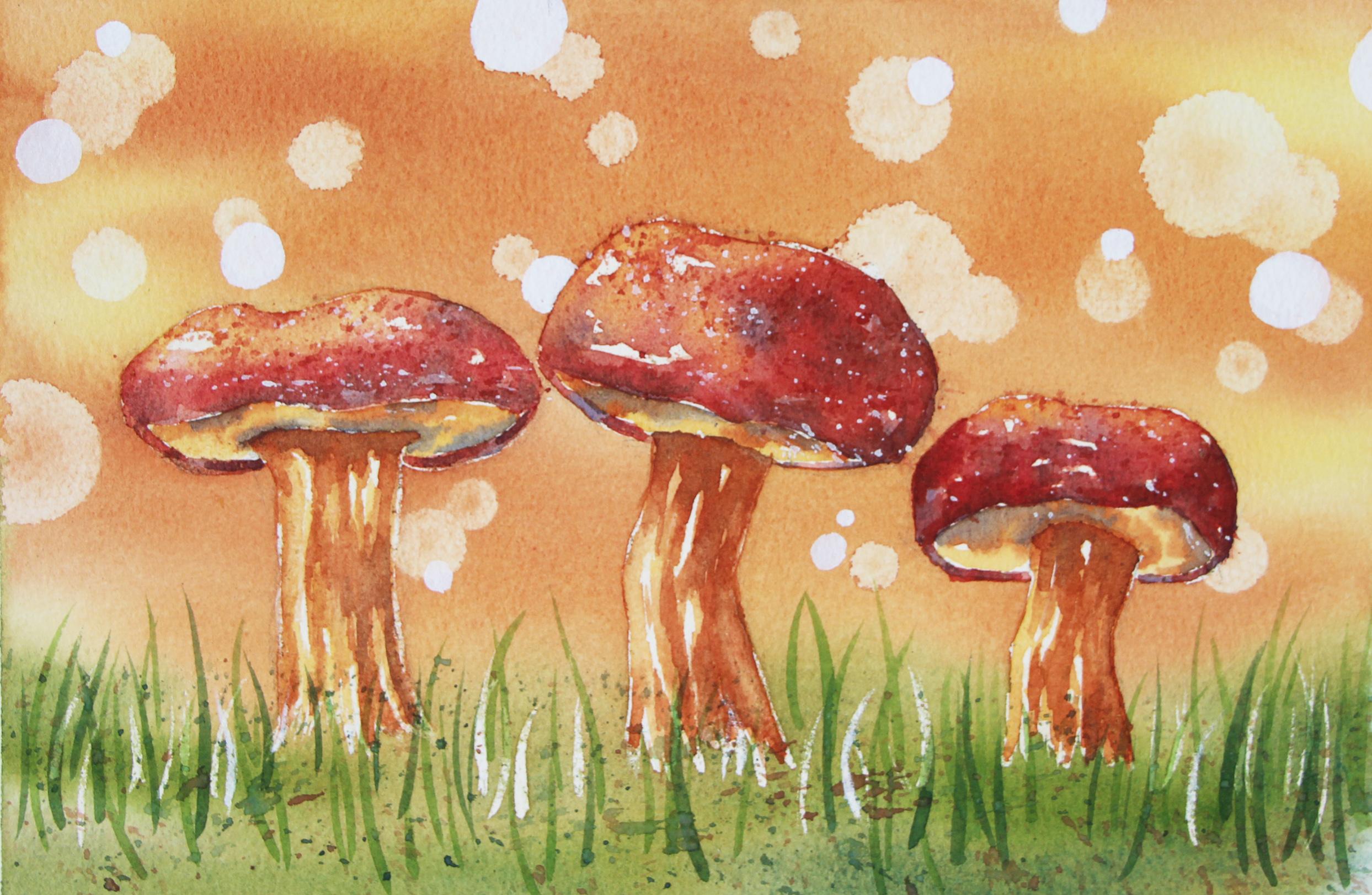
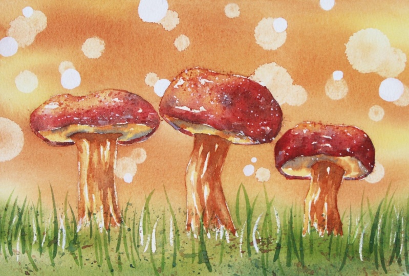
2. Course Project: By the end of this course, you'll have completed a fall
inspired watercolor painting featuring mushrooms and
a beautiful background with a bouquet effect. Throughout this
process, we're going to be practicing both foundational, essential techniques
that you should know, and also more
experimental techniques. When it comes to the
foundational techniques, we'll be practicing wet-on-wet, wet on dry, layering
and glazing. And in terms of the more
experimental techniques that we'll be using
to create this piece, we'll be bringing in masking
fluid to help us protect focal point elements
so that we can paint large washes more easily. We'll also be using
masking fluid to help us easily create
grass effects, and we'll be bringing in white guash for
some splattering, which is going to help us create a beautiful
visual texture. Not to mention,
I'm going to share my favorite technique
for the Bouquet effect. Which is something that
you're going to be able to take with you to future
watercolor pieces. Before starting with
the painting process, I swatch out all of my colors
for you on a scrap piece of watercolor paper so that you can see what they
look like on paper, and you can choose whichever colors you have that
are most similar to mine. I also offer a few
alternatives for paint colors that you can substitute mine with if
you don't have them. But as long as you choose paint colors that
are similar to mine, you'll end up with
great results. There is no need to use exactly the same colors
that I'm going to be using. Post a photo of your
work here on Skillshare, all you have to do is click on the Projects and Resources tab. Once you're in, you'll see this purple button on the right
that says submit project. When you click on this button, you'll be taken to a
new page where you'll easily be able to both upload
a photo of your piece, as well as share any thoughts, experiences, struggles or questions that you
might have for me. Here, you can create a
title for your project, and click on that larger
content section underneath. And if you want to add in
that photo at the beginning, you can go ahead and click on that image icon on the bottom. Find the photo that
you're wanting to share on your
computer or device, select that file, click Open, and it will be immediately added into this content section. Then under your image, share anything that you'd like, whether it's struggles,
questions, wins, aha moments that you might have had throughout this course, anything that you'd
like to share, I always love hearing from you. At the bottom of this
content section, you'll see different icons. One is for formatting your text. The other is to add emojis, the Add Image icon, which we just talked about, and you can also embed link. Free to add in even more
pictures if you'd like. They can be process pictures, supply pictures over
here to the right, we have this preview area
where we essentially see a thumbnail or cover
image for your project. You can go ahead
and change it to a title image that you have created in a more
horizontal format. Or you can just go
ahead and leave it as is and have it just be a cropped section of one of the images that you have
uploaded into your content area. It's up to you.
Once you're ready, go ahead and scroll back up. Click on the green Publish
button and you'll be all done. If you'd like to share your
work over on Instagram, please do just make
sure to tag me at Erika Underscore
Lancaster Underscore Art. I love seeing your
work over there and giving students
shoutouts in my stories, of course, go ahead and tag
the Skillshare account too. It goes a very long way and inspires other students to
share their work as well. Skillshare is a
safe learning space for all of us to continue
growing together. So make sure that you're
using this gallery, and let's all connect
and help each other out. I can't wait to see your work and to help out with
whatever you might need. Let's move on to our next class.
3. Supplies: Welcome to this class where I'm going to
be explaining about the supplies that
I would recommend having on hand as
you're moving forward. I'm going to be
working on a sheet of watercolor paper
from Bao Hong. This paper is cold pressed. It's 140 pounds in
thickness or in weight, and it is 100% cotton. The sheet that I'm going
to be working in is 10.2 " in width times 7 " in height. Because we're going to be
bringing in masking fluid, it is essential that you use quality watercolor paper
that is at least mid weight, meaning it's at least
140 pounds or 300 GSM in thickness or in would also recommend making sure
that it is 100% cotton. If you use cheaper
or thinner paper, it's probably not
going to tolerate the masking fluid
techniques very well, and it can become
easily damaged. I'm going to be using paint from Vango and I'm only going to be using six
different colors. These six colors are Azo
yellow deep, raw sienna, burnt sienna, matter Lake deep, sap green, and ultramarine blue. I will be swatching out all
of these colors for you on a scrap piece of
watercolor paper so that you can see what they look
like on paper and I will provide options that you
can use as substitutes. But you can just see
what they look like and you can just
replace whatever you don't have with
something that is similar and you'll still
arrive at great results. I also brought in a tube of permanent white wash from Windsor Newton's
designers guash line, and I do have a separate
mixing palette for my guash just because
I don't like my guash and my watercolor to
start intermixing because guash is opaque and
watercolor is transparent. I can definitely make
my vibrant watercolor look chalky if I'm not careful. Throughout this
process, I brought in a total of nine brushes, but only five of those were used for the watercolor
painting process. Two of those were used for the gouache that I did at
the end of the process, and the other two were used
to place my masking fluid. I don't like using my
watercolor brushes for my guash for the exact same
reason that I just mentioned, and masking fluid can be very, very tough on those
paintbrush bristles to the point that the masking fluid can completely ruin them. So I would not recommend
using your favorite brushes or any brush that you like
to place your masking fluid. Brushes that I brought
in for the water coloring are my 1 " flat brush, a size six mop brush, and three rounds in sizes
16, eight, and four. The two brushes that I
used for my gouache are pretty cheap multimedia brushes that I've got through Amazon. Those two are also rounds
in sizes two and eight and the brushes that I use to
place my masking fluid are very old and very cheap
multimedia brushes. I brought in a size
four small flat brush and a size zero round brush. Have at least four or five
of my blue Scot absorbent towels on hand because I need some for the
painting process, just to stay on top of
water control and to do any lifting that I might
need to do along the way. But I also need a couple of clean towels to do
my Boca technique. I'll explain more about
how I'll be using those absorbent towels for the bouquet effect
a little bit later. I have a few pieces of scrap
watercolor paper to test out colors and consistencies along the I have my container
with clean water, which I change a few times
throughout this process. Of course, you can
always bring in two or even three
containers of water if you don't want to change
it as often as I am. I have my bottle of colorless masking fluid
from Windsor and Newton, my roll of regular
1 " masking tape, which is what I use to tape my watercolor paper down
onto my cutting mat. I have a few sketching
supplies as well to create my preliminary sketch before jumping into the
painting process. I'm going to be
using an HB pencil so that I can draw lightly, and I have two erasers on hand. One of them is a soft
graphite eraser, and the other is
a needed eraser. I use a needed eraser to clean up and lighten
my sketch before jumping into the
painting process if I find that certain sections
are a little bit too dark, or I have too much graphite just floating around on
my watercolor paper. Also have some scissors on hand and a sheet
of tracing paper, and this is not because
I'm going to be doing any tracing for
my preliminary sketch, but it's for a little hack, a little technique
that I'm going to be sharing near the end of the painting process and just
something that I'm going to be using to do better
splattering at the end. For the bouquet technique that I'm going to be
sharing with you, you're going to need
at least three objects that have a circular
plane to them. This is because we're going
to be wrapping these objects with our absorbent towels
to do a stamping motion. By doing the stamping, we're going to absorb
some paint and reveal those circles that we
need for the bouquet effect. Here are my four objects. I have a couple
of different lids in slightly different sizes, and I also am going to use the flat circular end of a
marker and a drawing pen. All of these circles are
slightly different sizes and it's going to help me get
that variety and sizes in. As I said before,
you'll want to have some clean absorbent
towels on hand. I want to remind you
that I've prepared a few downloadables that
go along with this course, which you're going
to be able to find in the projects
and resources tab. For this one, I have prepared my outline sketch in
two different sizes. One is full letter size and the other one is
slightly smaller. You'll also be able to find
the reference photo that I was loosely inspired by a
photo of my finished painting, which you're free to use as
reference as you're working, a photo that I took
after having placed my masking fluid
and my supply list. Download these files onto
your computer or device, simply scroll down a bit past
any of the class videos. Click on the Projects
and Resources tab. Scroll down a bit to the
Download resources area, and go ahead and click on any of the files that you
wish to download. Alright. Once you've collected
all of your supplies, go ahead and meet me in the next class where we're
going to be talking about the colors that
we're going to be using for RPiece. See you there.
4. Swatching Paint Colors: We're going to be
using a total of six different colors
for this piece. First, I'm going to be swatching out Azo yellow deep for you, which is a warm yellow. Azo yellow deep looks like this. If you don't have
Azo yellow deep, you can replace it with
Hansa Yellow Deep, cadmium yellow, new gamboge, Indian yellow, or any
other warm yellow. Another color that we're
going to be bringing in is a cool red for my cool red, I'm going to be using
Matter Lake Deep. Matter Lake Deep
looks like this. If you don't have
Matter Lake Deep, you can replace it
with Alizarin crimson, permanent Alizarin,
paraline red, permanent red deep, windsor red, or any other cool red. Another color that I'm going
to be using is raw sienna, which is a light
beige golden neutral. If you don't have raw sienna, you can replace it
with yellow ochre. Another neutral that
I'm going to be bringing in is burnt sienna, which is a warm reddish brown burnt sienna
looks like this. If you don't have burnt sienna, you can replace it
with red ochre, transparent red oxide,
English red ochre, or any reddish warm brown. Another color that I'm
going to be bringing into this piece is sap green. Sap green is a warm green
and it looks like this. If you don't have sap green, you can replace it
with hookers green, Windsor green, or
even olive green. Finally, we're going to
be using a warm blue. For my warm blue, I'm going to be using ultramarine,
which looks like this. Whether you have ultramarine
blue or French ultramarine, either one will work just fine. And because we're
primarily using this warm blue to darken other
colors and not by itself, you could even bring in
something like a cobalt blue or even a teeny
tiny bit of indigo. But if you do bring in indigo, indigo is so deep and dark that you're
probably going to have to bring in even less of that blue into your
color to darken it, whereas the ultramarines
are not as dark and deep, so you wouldn't have to add
as much. But that is it. These are all of the colors
that we're going to be using.
5. Preliminary Pencil Sketch: The first thing that we have to do is create our pencil sketch. I'm going to be using an HB drawing pencil and I also have this graphite eraser by my side and also this
needable eraser. I want to make sure to keep my drawing nice and
light so that I can continue erasing mistakes as I go and refining my drawing. I also want to make
sure that I'm not drawing too dark
because that can end up scratching my paper
or making my line work so dark that it'll be visible through my
paint at the end, and that's not the look that
I'm going for right now. I'm creating my
preliminary pencil sketch, I want to make sure that I'm utilizing my drawing
space effectively. I don't want my mushrooms to be very small and I
don't want them to be so large that maybe a section gets cropped off the picture plane or
something like that. It's very important to account for the negative space
around these mushrooms, which are the focal
point of this piece. Now, if you're just getting
started with drawing, I would highly
recommend creating your preliminary pencil sketch in exactly the size
that you need. For that final piece in a
separate sketchbook or sheet of drawing paper and
then transferring your outline drawing onto
your watercolor sheet. I use this method myself when I am going to be
creating a painting of something that's a little
bit more complex or requires very specific
proportions or it's just something that I
haven't drawn for a while. There's nothing wrong
with creating your sketch separately and then transferring your drawing onto your
watercolor sheet. First, I want to start with the mushroom that
is in the middle. As you can see, I'm actually placing that mushroom
slightly off center here. It's not right in the
middle of my picture plane. This is because I want to make sure that this
mushroom over here, which is the smallest one has less space right
here to the right of this middle one than this
larger mushroom that I need more space
for on the left. I'm just going to Go ahead and create my shapes for all my mushrooms,
starting with the top. You can see how I'm
bringing together straight lines to create that overall general
shape for that top there. I'm not trying to
create perfect curves. I'm just bringing together short straight lines until
I get a similar shape. Then I see a little bit
of that bottom plane and then I'm going to bring in that crooked almost cylindrical section here at the bottom, slight taper here at the bottom. Maybe I bring out the section a little bit more
toward the right. I'm not trying to create a
carbon copy of that reference. My reference photos really are just a loose source of
inspiration for me. Going to start with a smaller
mushroom on the right. Something that I do love about this image is how there
are three mushrooms. If you are aware of
the rule of odds, the rule of odds is a powerful
rule or principle that has to do with designing visual compositions that are
aesthetic and interesting, just visually pleasing
for the viewer, something that the
viewer will want to keep looking at
for a longer time, which is usually what
we're trying to do and what we're trying to
create as artists. And what this principle tells us is that it's always going to be best to bring
in an odd number of objects or elements
than an even number. Think one, three, five, seven instead of an even number that can be divided
into pairs like two, four, six, eight, et cetera. This has to do with creating asymmetrical balance
in a visual composition, which is always going to lead to more interesting
results for the viewer. In other words, we're trying to stay away from perfect symmetry. Placing our focal
point right smack in the middle of the
piece or creating compositions that are very similar left to right
or top to bottom. The rule of odds helps us
create a symmetrical balance, which is usually what
we want to create. Getting started with the other
mushroom here on the left, just trying to get in that top portion by bringing together a
group of straight lines. I'm trying to get
asymmetry even within each mushroom because these are organic objects and
organic objects are imperfect, irregular,
and asymmetrical. G to bring this one
a little bit more to the right so that my negative space right
here on this side can be relatively similar to the negative space that I
leave in the opposite side, continuing to draw lightly so that I can erase
mistakes easily. Really observing that reference
photo and noticing what the top planes are for that mushroom and what are the bottom planes
that I can see. For this one over here, I'm going to bring in a little
bit more imperfection in this almost cylindrical
looking part of it so that it's not as stiff and perfectly up and down
like it is in the photo. Maybe I bring this upper
section up a tiny bit, just a couple of millimeters. Going to erase those unnecessary
lines very carefully, making sure that I am
protecting my paper as I go. Erasing this extra
line over here. Any final adjustments? I want to create any
more asymmetry anywhere? Do I want to bring in
some more imperfection? Oftentimes with
something like this, I make things even
more irregular and more imperfect than what
I see in that photo, just so that I can really
enhance that organic look. I I'm not going to be creating a perfect line down here for
the ground because that's not really necessary
and I don't want to be able to see that
pencil line at the end. In just a bit, we're
going to be bringing in some masking fluid to mask out some little
wisps of grasses down here, which are going to lead to
better results at the end. I'm just going to quickly
sketch in a few blades of grass so that I can
understand that all of this down here are
going to be grasses. If you want to
lighten any areas of your sketch that maybe have
gotten a little bit too dark, I would recommend just tapping your needed eraser over those sections and that's
going to help lighten them.
6. Masking Fluid Placement: And with that,
we're ready to get started with placing
the masking fluid. There are two things that
we're going to be masking out. I'm going to be using this colorless masking
fluid from Windsor and Newton and I'm just
pouring a little bit of this masking fluid
into this little lid, which I wouldn't necessarily recommend because
masking fluid dries pretty quickly and
you can be left with masking fluid
along those edges, which can make your
bottle difficult to open. I have these two cheap
multimedia brushes with me. This one is a size zero round and this other one is a
size four flat brush. And I've already coated
those bristles with liquid hand soap
so that I can keep these bristles protected
from the masking fluid. First, I'm going to be using my small flat brush to mask
out all of the mushrooms. I'm just taking a little bit of this masking fluid at a time. And placing a thin coat of masking fluid all
throughout these mushrooms. The thinner your application, the quicker it'll dry. Make sure that you're
not going in too thick. I when I get to the bottom of this semi
cylindrical structure here, I am actually
changing the way that I'm using my paintbrush
and I'm using it more in this position so that the strokes
that I create with this flat brush are more
linear than blocky. You want to use the line, the thin line that the shape
of this brush provides. As you can see, as I make
my way to the bottom, I am thinking of the
texture of grass and the irregularity that that
grass and those plants right there at the
base of the mushroom would create along
that bottom edge. I don't want the bottom edge of my mushroom to be perfectly
straight and smooth because that's not
going to help convey the fact that it is partially overlapped
by plants and grasses. Using your paintbrush in this way with this
position is going to help you get in a
more irregular look down here. That's good. I will be making a photo of um, my masking fluid
placement or what my piece looked like after
the masking fluid has dried and before I start to paint available for you
as a download in case you like to look at it as
you're placing your own, use it as a reference. By masking out our
focal point subjects here, our mushrooms, we're going to be able to paint the background area more
quickly and more easily. This is extra important for this one because we're
going to be bringing in a technique to create a beautiful bouquet
effect in the background. Those beautiful glowing
circles or orbs. We don't want to have
to worry about making our way around the mushrooms
when we're working on that. Almost done with
my mushrooms here. I can tell that this
colorless masking fluid is getting a little bit old. I actually have just a little
bit left in that bottle. But when I first got
that masking fluid, it looked like a milky white
when I first placed it on paper and then it
started turning more and more yellow as it
started to dry. But as I am using
it at this point, I can see that it looks pretty pretty yellow straight
out of the bottle here. Those are my
mushrooms masked out. You can see how I
left irregularity along the bottoms
of all of them. I'm going to switch to my
size zero multimedia brush. I'm just going to
take a little bit of my masking fluid at
a time and I'm going to do some flicking motions
here and there, a little. A little goes a long way. But these will look
like highlights at the end of the
painting process and it's going to help
us communicate just beautiful grass effects
over here at the bottom. I'm just going to go over
some of my pencil lines and you don't have to go over
all of your pencil lines. In fact, the pencil lines
that I created down here are just for visualization purposes, you can add more,
you can add less. There's no need to go overboard. A few highlights in the
grasses go a long way. Just try to create
flicking motions going up. So that you can have a
little bit of a taper as these masculine fluid shapes
make their way up and away. You also want to slight curve and softness to these marks and lines that you're
creating because if they look perfectly
straight or vertical, that can lead to a
lot of stiffness and it's not going to
look very natural, maybe overlap a few of
these masking fluid marks. That is it. That's all I'm going to do. I
don't want to go overboard. I'm going to pour the rest of this masking fluid
back into the bottle, close my bottle tight, and I'm going to wash
out these paint brush bristles before I completely
ruin these brushes.
7. Background: So while the masking
fluid dries, I'm going to be explaining the technique that
we're going to be using to create our
beautiful bouquet background. It's important that you collect at least three
objects that provide a flat circular
plane that you're going to be using to create those beautiful bouquet circles. I just have two lids here. You can see how these circles are slightly different sizes. I'm also going to be using
this flat circular plane of this drawing pen this
flat circular plane of this marker right here. They also offer circles that are slightly
different sizes. I wouldn't recommend going
too large with your circles, but you do want a
variety in sizes, stay within a certain range. These are the absorbent
towels that I love using when painting with watercolor
because they are thin, they are untextured, they
are easy to manipulate. I usually go through two or even three of these towels
as I'm creating a piece and they are going
to make this process easy because since they are
so thin and untextured, I can simply wrap my object
these towels like this, you're going to wrap
it tightly like that and hold it
firmly in your hand. While our beautiful browns and golden colors are still wet, what we're going to do is we're going to do a stamping motion, pressing down the object and the towel firmly to lift
up a little bit of that paint that is until we have a good amount of circles
in the background, going through all of the
objects multiple times. And a huge tip that
I want to provide is every couple of stamps, you open up your towel, you shift your object to another clean section,
and you keep going. Every time you press down your
towel onto your wet paint, that towel is starting to collect paint right
there in that section. So be very, very careful not to continue stamping on
with the same section of your towel because
that is going to lead to painting on color
instead of removing color. And you can be left with a
little bit of a patchy mess. Around 15 minutes have passed since I placed
my masking fluid, so it dried pretty quickly. You can see how yellow
it looks right now. You'll know that your
masking fluid is dry if it feels tacky but no longer
sticky to the touch. There's no residue
left on my finger. I have a clean container
of water by my side. This is my 1 " flat brush, and this is a size
six mop brush. The reason why I have these two brushes with me is because I enjoy doing my pre wedding
with this flat brush, and then this is the brush
that I actually use to start painting in my going to be using the pre
wedding technique, which involves bringing in a little bit of
water at a time from our container and pre wedding our entire watercolor sheet. This pre wedding
process is going to be absolutely essential and instrumental for everything
that is coming up next and for the bulkht technique that I'm going to be
sharing with you to work. But first, before jumping
into the pre wedding, it's essential that we have our color mixers
that we're going to be using prepared and ready to go on do not want to be wasting
time creating more of this color or
that color as we go because things are going
to start drying on us, and if they start drying on us, we're not going to
be able to create that beautiful bouquet effect. I'm just going to be using
the size 16 round brush to create my color mixtures because it's just
what's comfortable. It allows me to go into these
wells easily and take out my paint and bring it on
over to my mixing areas. This is Azo yellow deep, which is a warm yellow, and I'm going to make
a good puddle of azo yellow deep right
here on my palette. Is plain azure yellow
deep with water added in, and I'm going for a
coffee consistency. I don't want my color mixtures that I'm creating
right now to be very watered down because since we're going to be
going in with pre wedding, there's already going to be
a good amount of water on our paper that is going to get added to the water
in the mixers, and that is going to lead
to very pale looking color. I also want a puddle
of plain raw sienna, which is a light,
golden beige brown. Making sure that I'm
preparing a good amount of this raw sienna on my palette
with a coffee consistency, meaning approximately 50% paint, 50% water, and I also want
some burnt sienna over here. Good amount of burnt
sienna on my palette. I also want some green. I'm going to prepare some sap green right
here on my palette. Notice how I am removing all of the previous color before
jumping into the next. Why am I bringing
in the sap green? Because I'm going to
be painting in some green down here in the
bottom section so that I can have a very nice
diffused transition between the grass section
and the background. I also want a tiny bit of
ultramarine blue right here, which is the color
that I'm going to be using to darken my green. I just started mixing the green together with the
ultramarine blue. I'm having a little bit of a
seeping situation going on where my burnt sienna is seeping into my green.
I'm fine with that. Because that is
going to slightly desaturate my sap green, which is really going to
work because this is more of a fall looking palette that
I'm going with for this one. A seeping is fine. I know exactly which
colors I need and I'm just going to be making
more as I go very quickly. I do have to change my water. You can see how murky it is and I want to make
sure that my water is nice and clean
for my pre wedding. Clean water with me. I have my large brushes with
me and these towels right here are not the ones
that I'm going to be using for my
bouquet technique. The ones that I'm
going to be using for my bowhead technique
are right here. I have them somewhere
else in front of me and I'm going to grab
those once I'm ready. But I do want some
regular old towels right here by my side as I
am painting in my color. What I'm going to do is
using my 1 " flap brush. I'm going to take a little
bit of clean water at a time, bringing out a little
bit of water at a time. I'm starting to pre wet my entire background and bottom part of the piece,
where the grasses. I'm doing this gently because
I don't want to start scrubbing over my masking
fluid or anything like that, that can certainly disturb
it if you go in too hard. I'm just using gentle
sweeping motions. Right now, I'm using
vertical sweeping motions, but I like going in with horizontal motions
after I do my vertical ones. And I cannot emphasize enough how important
it is that you take your time with this
pre wedding process if you want everything
else to work. Take your time pre
wedding the entire thing gently until you arrive
at a nice even sheen, all throughout the background and bottom portion
of your piece. Until you see that
nice even sheen, do not start placing
your color until you see that nice even
sheen all throughout. This pre wedding process is going to help us do two things. It's going to help expand our working time before
things start to dry on us. Also because watercolor
is always going to expand and create soft effects
when placed on wet paper, that paper is going to be doing half of the work for us because that is the type
of effect that we want for this initial layer. I'm all done. I see that nice even sheen, no puddles anywhere. I'm going to switch on
over to my mop brush, pre wet those bristles because my brush is completely dry. Then what I'm going to do is I'm going to start over here in the top section and I'm going to start with
my lightest color, which is the Azo yellow. I'm just going to start placing it in a very irregular way. I need a little bit more water, I can tell placing more color in this puddle very
quickly dropping it in. I'm just placing it in a very irregular way all
throughout the piece. That's enough Azo yellow. I remove that yellow from
my paintbrush bristles, remove that excess water, take some of my raw sienna, which is the second
darkest color, I'm going to place the raw
sienna here and there. There is no specific plan of
where I'm placing my colors. These are just colors that I was inspired to bring in by
seeing that reference photo, remove that raw sienna from
my paintbrush crystals, remove that excess water, and going in with the
third darker color, which is the burnt sienna. And you can see how I'm
going in and placing my color and I'm staying away
from doing over blending. I don't want to
start over blending things because that's just
going to lead to flatness. Instead of seeing this
variety of colors, you're going to see just one. I'm going for a range of hue and value all
throughout the piece. Down here at the bottom, I'm going to start
bringing in some of my sap green so that I can start
creating the illusion of grass down here. And then I'm going in
with my darker green, which is my sap green plus
ultramarine blue. Perfect. I'm going to place
this by my side, if you want to explore
tilting your board, angling it toward one
side or another side, things should be wet enough. I have some green
coming toward the top. I want to keep that
in the bottom piece. But you should have
enough water that there is plenty of movement
going on because I did pre wedding and I've been placing more paint and
more water on my piece and I can use gravity to my
advantage when I'm creating these larger washes to create smooth effects
and transitions. If this is something that
you'd like to explore, I would highly recommend it, especially in this first part of the painting process when we are painting in
these large washes. You can see how I'm running my absorbent towel
over the edges of my masking tape so that I can start removing
that excess water. After I've done
this a few times, I'm going to continue
playing around with this. I'm going to place this
down and I'm going to place just a little bit
more color here and there. Things are still
nice and wet and workable because I took my time with the pre
wedding process. I'm going to intensify my
color in certain areas. You can decide if you want to go in with the burnt sienna or the raw sienna or even the
yellow, it's up to you. But I do want to intensify
the color because that way, when I do my lifting
of those circles, it will be more visible
because of the contrast. I'm going in with
more sap green now. If you just have very
pale color right now, when you go in and
lift up those circles, the circles are not going
to be super visible. Just going in with
a little bit more green for calling this done. Great. I have a bit too
much paint right there. A little bit more of this
tilting of my board, which is actually a
cutting mat for me. I wouldn't recommend
using a cutting mat as a backing board when
you're painting with this medium because
it's very flexible. But I'm just playing
around developing these soft effects until I arrive at a nice
range of values, but I'm also trying to
work pretty quickly because if things
start drying on me, I'm not going to be able to
create that bouquet effect. It is time to get started with the bouquet effect before
things start to dry. I have my four objects
that I picked. I have my clean towels with
me and it is time to start. Wrapping my first object, holding the towel firmly, yes, it's starting to
rip over here because of how tightly I'm
holding this down. But there you go. You can see how some paint is starting
to collect there. I'm going to change that
section of that towel to a new one and I'm
going to continue. Going to change to
another object. Going to use this one here. Going to go over this
section that I just accidentally touched with
my finger. There we go. I want a little bit of overlapping as well
as I'm lifting up these circles and I'm
just making sure to place them in a
very irregular way. No patterns, clean section of my towel there,
wrap it tightly. I'm going to use a brush
and I'm going to just lift up some of this
color here so that I can help this look
more like a circle. Or I can just go over this with my same object
that I was using before. See right now, my
piece is still very wet and so when your
paint is still super wet, you're likely going to see some seeping happening
in those circles. But you can either
clean up those circles with a paint brush or by going over them with the same tool that
you are using before. And to do the same thing
with my other object. Here's the slightly
smaller lid. There you go. The wetter the paint is, the more movement
you're going to have. The more seeping in
you're going to have. As your paint starts to dry, you're going to have
less moving around of that paint and less seeping. Going to go in with
my next object before things start
to dry on me. I'm wrapping my towel around the lid of this marker,
smaller circle. I'm just going to
do some stamping. Change to a new section here. Things are still relatively
wet all throughout, especially in this
middle portion. I'm just going to
continue adding in some circles in a
very irregular way. Using a clean section of
my towel. Just keeping on. A little bit of
overlapping, keep going. New section. I'm going to
switch to my last object here. This is my drawing pen,
wrapping this section tightly. A little bit more. As your paper starts drying, you're going to notice
that the edges of your circles become cleaner and smoother because the paint is not moving around
too much anymore, and that is what we want. We want a variety
when it comes to the smoothness of those edges. I don't want to overdo it. Going back to this one
here. Wrapping this lid. If you want to clean
up any edges of your circles, you don't have to, but you could wrap your
towel around your finger and just go over those edges of the circles if you want
to clean them up a bit. At the end of this process, we're going to be going
in with white guash, and we're going to be
cleaning some of these up and even adding
extra circles. Don't worry about
that because you're going to be able to
fix many of those. So that is it for
the background. Let's allow that to dry. And once everything is dry, we're going to be
removing the masking.
8. Removing Masking Fluid: All right, the masking fluid is 100% completely dry and I am
ready to start removing it. I'm going to be using a
combination of my fingers, a soft graphite eraser and my absorbent towel to
remove my masking fluid. If you have sensitive
skin, sensitive fingers, I wouldn't recommend rubbing
over your paper with your skin because this can definitely create blisters
and it can be painful. The masking fluid that I'm using is relatively easily removed. I've never had any
issues with it, but I've definitely heard of other masking fluids that are
more difficult to remove. This masking fluid from
Windsor Newton, for me, has always been relatively
easy to remove. Of course, the more masking
fluid you have on your paper, the harder it's going to be. If you're going to be using
a soft graphite eraser, just make sure that
you rub off all of those dirty eraser
bits that might have graphite on them
before using it. And if you're going to be
using your hands like I am, just make sure that
they are nice and clean and that you don't
have any lotion on them. This can create splotchiness and undesired textures and effects later on when you're
painting in these areas. I continue jumping around
between using my hands, using my soft graphite
eraser and going in with one of my absorbent
towels to remove little bits of masking fluid
that are left on my paper and also to remove
any eraser bits that might have
been left behind. And I just continue cycling
through these tools until all of the masking
fluid is completely removed. So as you can see, my masking
fluid has kept all of these watercolor
paper areas nice and clean for me as I've been continuing on
painting around them. I had no pilling
happening at all, and my watercolor paper
is safe and sound. Something that usually happens when we're using masking fluid, especially when we've
masked out large areas like this is when we
remove the masking fluid, our graphite work
kind of disappears, and we have to go in and
redraw those shapes, those lines, whatever it may be. So that's what I'm
doing very quickly right here with my HB pencil. And as I am redrawing these
shapes and these lines again, I am observing that reference
photo and really trying to understand where
the lightest areas are throughout these mushrooms, where the mid tones are and
where the darkest areas are. I'm trying to notice important
value changes that I want to make sure to make happen as I am painting
these mushrooms. Before starting with
any painting process, I think it's so important
to make time to observe your reference photo and
try to pinpoint lights, midtones, and darks,
because value is number one when creating a
sense of dimension and depth. By having these things in mind, we're going to be able to
paint this more successfully.
9. Mushrooms: First Layer: For the mushroom tops, I'm going to create
a combination of burnt sienna and
Matter Lake deep, which is a cool red. I mix those two
colors together until I get a deep muted red. I'm not trying to replicate that color exactly that I'm seeing in that
reference photo, but I am going to be paying attention to the values present. To create deeper values, I'm going to be bringing
in ultramarine blue. I'm just going to be
dropping that color in and allowing that mixing
to happen on the page. I added a little bit of that ultramarine right here on my palette and
I'm going to be dropping it into
shadow sections while that initial red
layer is still wet. I also want to make
sure that I have some Azo yellow ready for me on my palette
because I'm going to be creating blooms
here and there, especially in the lighter areas. Removing that yellow from my paintbrush bristles
and I'm going to be using the size eight round brush to paint these sections
in my mushrooms. First, I'm going to
be going in with my Matter Lake deep plus
burnt sienna mixer, because I'm going
in on dry paper, I want to make sure that I'm
going in very watered down. Think of a T consistency. I'm painting in this
entire upper portion of the mushroom with this
very pale water down color and you can leave extra little highlight sections by just leaving those
little shapes unpainted. Run your paint brush
bristles over everything a couple of times so that you can then go in with
the same color mixture in a slightly thicker state to intensify and
darken the color in shadow areas and to create
some mid tones here and there. This is the point
that I'm going to go in with some of my
ultramarine blue. I remove that collar from
my paintbrush bristles. I'm taking some of
my ultramarine from my palate and I'm just
going to go in and drop in some of this French ultramarine
into shadow areas. Now that I have that slight
range of values developed, I'm going to remove
that blue from my paintbrush bristles
and I'm going to go in with my Azo yellow and I'm going to drop
in some of this yellow, especially in sections along the top where the light
is able to reach. Have created a nice range of value and hue in
that mushroom top. I'm going to change to a
slightly smaller round brush. This is a size four. I need to paint in those
back sections right there along the left and lower
edges going in with my red. Because these are lower portions which are facing
away from the light, I can go a little bit
darker right away. I placed my red first. Now I'm going in with
my ultramarine blue. I'm just going to
drop in some of this blue in little
sections here and there for a slight range of values even in those
very narrow areas. I'm going to do the
exact same thing for the other mushrooms. I went back to my size
eight round brush, making sure to go in with this
red color mixer very pale, very watered down initially. I'm going to start over here. Paint in that first
layer of color, keeping everything very pale
initially so that I can make my way toward those
darker values gradually. If I don't go in pale and
watered down initially, then I'm not going to have
the opportunity to develop those lighter values that we need if we're going for
believable results. We need lighter values. You can leave little highlight
sections if you wish to just by leaving some little
teeny tiny shapes unpainted. I'm not planning for those. Those are just happening as I am moving along
and painting this. Dropping in more of
my red color mixer, which would be darker mid tones. Removing this red from
my paintbrush bristles, removing that excess water. If you go too dark too quickly, you can always go in to
do some lifting with a clean and slightly
damp bristles of your paintbrush and use those as a little
absorbent sponge. Now I'm going to go in with a
bit of my ultramarine blue, that's a little bit too intense. I'm going to water it down a
bit and I'm going to drop it in into the section that is
still wet in darker areas, getting ideas from
that reference photo, but really not trying to create a carbon copy
of what I'm observing, using the photo to
remind me of things. Removing this blue from
my paintbrush crystals, removing that excess water, taking some of my
azo yellow deep, and dropping it into
certain sections, especially the ones
near us the light. Or that nice range
of vibrant color, hanging on back to my
size for round brush, going back to my red. And for this one, we can't really see these
sections in the photo, but I'm adding them in anyway. Switching them back to my
size eight round brush, back to my red color mixer, and if you need to
make more of your red, you can go ahead
and do that going right in painting
this mushroom top. I try to leave little
highlights as well, leaving them unpainted, going
in nice and pale initially, nice and water down. Going in with a slightly
more saturated, thicker version of the same
color mixture, the red. And applying it in some
areas that I want to darken, removing that red from
my paintbrush bristles, removing that excess water. I'm going to do a tiny bit of
careful lifting right here. I painted in some red
outside of the shape. I wasn't intending to do that. I'm now going in with
my ultramarine blue. I see lots of shadow
areas in this one. Adding a tiny bit more
ultramarine into the mix. This one is lower to the ground and it's being
covered by this one, plenty of shadows in this one. I really do my best to avoid going in and blending my
colors together manually, dropping in a little bit of my yellow remove that yellow from my paintbrush
bristles and going in with a tiny bit of red before
things start to dry on me. You can see how I'm
just dropping it in. I'm not doing sweeping side
to side motions or up and down motions and trying to manually blend
these colors together. As much as possible, I'm allowing that paint
to do its own thing. That's enough. I'm going to switch on over
to my size four round brush, maybe make some of
these highlight shapes a little bit smaller. I'm going to paint in
these back sections here. These very narrow back sections. And going in with a little
bit of my ultramarine blue, drop it in little
sections here and there. That is that first layer
in the mushroom tops. Now let's paint in the almost cylindrical part
of these mushrooms. This is going to be painted
in with raw sienna, which is that light
golden beige brown. We're also going to
be using Burt sienna, which is the reddish
brown that we've been using quite a bit of. We're first going to be going
in with the raw sienna, which is the lighter
color of the two. I'm going to go in with vertical strokes because I know that that stroke
is going to help me create the texture that I see in that photo in this area. Light vertical strokes to leave little sections of that
paper alone and unpainted. And while that's still wet, I'm going to drop in
some of my burnt sienna, which is the darker brown
and I'm going to do the same thing same motions. Just to remove that color
from my paintbrush crystals, remove that excess water, and I'm just going
to do a little bit of lifting here and there. I want a nice range of
values in that stem. I'm going to do the
exact same thing with my other two mushrooms, starting with the raw sienna. Using those flicking motions going down and
sometimes going up. They're more up and
down as opposed to horizontal so that I can get in that visual
texture in the stem. Going right in with
my Burt Sienna and doing the same
motions with my brush. Always trying to think of how I can change the
way that I'm using my brush to not only
develop color and value, but also to help create
that texture that I need. Different brush strokes are going to create
different textures. Applying the burnt sienna, which is the darker color and
the layer that I'm bringing in and darker value areas
that I'm trying to create. Observing that reference
photo and getting clues, ideas, mainly trying to
develop a range of values. And help create a
sense of dimension. Cleaned out my
paintbrush bristles, remove the excess water, and if you need to
go in and lift, reveal a little bit more of that paper, go
ahead and do that. I'm now moving on to
the third mushroom, starting with my asiena
using those up and down flicking motions to help me create some little highlights throughout the stem. Those highlights are going to help me convey that texture. With that first color still wet, I go in with my bird sienna, drop it into shadow sections, and continue using those
more vertical strokes, trying not to cover
those little highlights that I left with
the first color. Adding a little bit
more of this bird Sienna to thicken up this
color on my palette. You can drop it in in an even darker way to develop even darker
values here and there. Now, watercolor is always going to dry lighter than how
it looks when it's wet, so we are going to
be going in with a second layer to darken areas
and add even more detail. For now, let's go
ahead and paint in those bottom
sections in the tops. The colors that I prepare for these bottom sections
are my raw sienna, burnt sienna, and this
is ultramarine blue. I'm going to be using my size
four round brush for this, which is slightly smaller
than what I was using before. I'm going in with
my first color, the lightest color that
I'm going to be using, which is the raw sienna. And I'm just going
to go right in, start painting this area
in with my raw sienna. Going in with my burnt sienna now dropping it in
here and there. Removing these browns from my paintbrush pitles
removing that excess water, and I'm going in with a tiny
bit of my ultramarine blue, dropping it in into
shadow sections. Really trying to stay away
from the look of outlines, especially when I'm going in
with the French ultramarine. Just a little bit more. Doing the same for
the next mushroom, starting with the raciona then going in with
the burnt sienna. Finally, just a bit
of ultramarine blue. Last mushroom, going
in with raw sienna. Then the birtsiena in darker areas that
I want to develop. Finally, a bit of my
ultramarine blue. That is it for that first layer all throughout the mushrooms.
10. Mushrooms: Second Layer: So now that
everything has dried, we're going to be developing a little bit more realism and dimension in the mushroom tops
by going in with a glaze. I'm going to be using
my medium color that I was already using
in these mushroom tops, which is my Matter Lake Deep plus burnt
sienna color combo. I'm just going to be using a coffee consistency and
my size eight round brush. I'm going to observe
that reference photo and notice where the midtones
and darkest darks are, and I'm going to be developing
a glaze in those areas. This is just an abstract, irregular shape
that I'm creating. In this area that I'm looking to darken and I'm just
painting on dry paper. I'm being left with
those sharp edges, removing that color from
my paintbrush bristles, removing that excess water, and softening that upper edge going in with a little bit
more of this color mixture, dropping it in and the
areas that I'm looking to push even more. There it is. Remove that paint from
my paintbrush bristles, remove that excess water, and you can soften the
upper edge if you need to with a clean and only
slightly damp brush. If you feel you need to push these opposite edges
over here at the bottom, you can go ahead
and push them even more with both colors. Just go in with
your lighter color first and then drop in a
bit of your darker color. Just by creating that glaze, you can see how much
more realistic and vibrant this mushroom top looks when you compare
it to these two. I'm going to do the
exact same thing for the other two mushrooms, starting with my
reddish brown mixer. I want to go in with
a coffee consistency. I'm observing that
reference photo, noticing where those
darker value areas are. That is where I am looking
to create a bit of an abstract shape so
that I can darken this area make it even more
vibrant at the same time. Just a bit here. Remove that color from
my paintbrush bristles, remove that excess water, and I can go in and
soften the edge. Notice how abstract and
irregular my shape is. Going in with a little bit
more of this red color, dropping it in while that initial layer that
I just painted is still wet so that I can get
those soft effects. That's enough. Remove that paint from my paintbrush bristles, remove that excess water, making a little bit more of this reddish brown mixture
for my last mushroom. You can see how my
intention was not to cover up everything
with the second layer. I am leaving those
lighter value sections shining through with just
one single layer of paint, the first one that I created. I am just applying more of this red in the areas that
I'm looking to push more. If you go in and
cover everything, you might end up
flattening everything out, observing that reference photo, noticing where darker
value areas are, and I'm applying this
color in those areas, trying to not cover
up at least some of these bright
highlight shapes that I had created in my first layer. But if I do, that's okay. They will still look like
very light value shapes. Painting quickly so that I can then apply even more
paint in wet sections, removing that paint from
my paintbrush bristles, removing that excess water, softening that upper edge, taking a little bit more of my red color mixture
and applying a little bit more red to deepen and darkest sections, even more. Because I'm making
sure to work quickly, I am getting some nice
soft transitions. If things dry on
you too quickly, you can always remove
that paint from your paintbrush
bristles and go in with a clean and slightly
damp brush and just soften. I don't want to overly
darken sections that don't need to be darkened, so I want to be careful
not to do too much. Always remember that when
painting with watercolor, the more layering you do, the greater the chances
there are of arriving at an overworked look and
I don't want to do that. Hanging on back to my size four round brush and I'm
just going to go in. I forgot to darken
little sections in this part of the mushroom
here. There it is. In this one as well,
I'm just going to push some little
sections here and there. First with the red color mixture and then with the
ultramarine blue. Let's do a little bit
more work in those stems. I want to go in and create even darker values
in those stems. What I'm going to do is
I'm going to prepare two burnt sienna
puddles for myself. One of these is plain
burnt sienna and the other is burnt sienna plus a little bit of my
ultramarine blue. I want to create
a dark chocolatey brown by mixing together my burnt sienna and
my ultramarine blue. So it's slightly darker brown. Darker brown. It's a
great brown there. The point here with
the second layer is once again to create
shadow shapes. I have both my size eight round brush and my size
four round brush on hand. I'm going to start
with the lighter color again and I'm going to go in to create shadow shapes. Where it would make
sense that there would be shadows and also, I'm going to create even more of those more vertical strokes throughout that stem to
help enhance that texture. It would make sense
that there would be a deeper shadow right
under that mushroom top. After painting in that
plain burnt sienna, I'm going to drop in some of my darker version that has
the ultramarine in it right here and adding a bit here and
there throughout the stem. Intensifying that texture and broadening that range
of values in the stem. I don't want to do too much. I don't want to overly
cover that first layer. That's enough. I'm going to do the same thing for
the next mushroom. I have this brush in my hand here just in case I want
to change between them. First, starting with
this upper part where there would be
shadow created by that mushroom top and making my way down with flicking motions to increase the
range of values in the stem. Taking some of my darker brown, dropping it into
the highest point here in the stem where it would make sense that
there would be shadow, dropping a little bit more of this dark brown
throughout the stem, removing that paint from
my paintbrush bristles, removing that excess water, and running my clean and only slightly damp
paintbrush bristles over some of these shapes that I've just
painted throughout the stem to soften
certain sections. I'm going to do a
little bit of lifting, maybe with my size four brush. I think I got a
little bit too dark. Doing the same thing
for the other mushroom, starting with my burnt
sienna, plain burnt sienna, first painting that right
under the mushroom top, where the mushroom top would
be creating a good amount of shadow on that upper
part of the stem. I'm doing short
flicking motions going down not trying to cover up
all of the previous layer, but trying to broaden that
range of values in the stem. Going in with my darker brown, adding it into my upper part of the stem to push
out even more. And a little bit
of this down here. Removing that paint from
my paintbrush bristles, removing that excess water, and going in with just a clean and slightly
damp brush to soften edges. Going to do a tiny bit of
lifting with my smaller brush. Don't want to go too dark. Let's allow those
mushrooms to dry and let's do some
work in the grass. I'm going to change this
water because it's pretty murky and a reddish orange and we're going to be
using greens which are opposite to these colors
in the color wheel. I don't want to start creating a brownish or grayish
color in my grass.
11. Grass: And I'm going to start
painting in some grass. This is my size four round brush and I'm going to start
with my lightest green, which is plain sap green. I'm just going to start remember to create light curves as you're doing these
flicking motions, don't create super
stiff looking grasses because that's not going
to look very natural. One thing I would
highly recommend if you don't have enough practice
with this kind of thin tapered brush stroke for the grass or maybe you just haven't practiced
it recently. I would recommend practicing on a scrap piece of paper to make sure that you have the technique down to create those thin, narrow strokes with
tapers at the end, and also to make sure that the brush that you
have in your hand is appropriate for this mark or line that you're
trying to create. Notice how these first
grasses that I'm painting in are quite subtle over
that green background. They're not too dark
or stark looking. I'm adding some over here, more in alignment with the
mushrooms and I'm also adding some down here
in the lowest section. Going in with my
darker green now, we want a variety of
values in these grasses. We want lighter grasses
and we want darker grass. Make sure that some
of your grasses overlap your mushrooms. Don't be afraid to cover those mushrooms
up just slightly. And that is it. That's all
the grass I'm going to be ad.
12. Splattering and Gouache Details: And now I'm going to prepare
to do some splattering. For my splattering, I'm going
to take this scrap piece of watercolor paper and I'm
going to place it right here right around where
the grass portion ends. I'm going to take this size 16 round brush and
I'm going to take a bit of this
darker green that I created just do a little
bit of splattering. Make sure to test out your
splattering technique on a scrap piece of
paper to make sure that the consistency of
your color mixture on your palette is what you
needed to be and also that the brush that you're
using for your splattering is going to help you achieve the
splattering successfully. Color mixer should have a relatively good amount of water in it so that
you can load up your paintbrush properly
and you should be using a paintbrush that has a good
snap to those bristles. Otherwise, you're going to have trouble with
that splattering. I remove the screen from my
paintbrush bristles and I also want to add a
little bit of brown. I'm taking some of
my burnt sienna with a tiny bit of
ultramarine blue. Doing some splattering here
for a bit of visual texture. G to add a tiny bit
more green with blue. Get a nice deep rich green
adding some splattering. Bit more, maybe some brown. I think that'll do it. Now I'm going to be
doing some splattering in the mushroom tops. Here's a little hack for you and this is optional,
you don't have to do it. But here's just a little hack. If you want to get
splattering done in certain parts and you
want to keep protected, everything else, just go ahead and grab a sheet
of tracing paper, trace over those shapes that you want to add the
splattering into. In this particular case, the objective is to add more visual texture just
to the mushroom tops. What I'm doing here is
I'm using my HB pencil to trace over the
mushroom top shapes where I want to add
this splatter into. Then what I do is I cut out those shapes
with my scissors. What I do is I fold a little section near the
center of that shape. I do a little snip there
with my scissors and then I slide one of those blades of my scissors through that
hole that I created, and then I carefully cut
around that shape where I have my pencil lines rotating
my tracing paper as I go. There's one going through the same process again
with these other two, making my little snip, sliding one of these
blades through this hole and carefully
cutting around this shape. There's the second one cut out. And there is the third one. Now I'm going to align these holes that I've created
in my tracing paper with these mushroom top shapes and I am getting ready
to do my splattering. I am preparing this mixture
burnt sienna and Matter Lake deep on my palate making sure that the consistency
is going to be helpful. Using my size 16 round brush, I go ahead and start
with my splattering, using my index finger of my non dominant hand to flick
those paintbrush bristles. Thanks to the tracing paper that is keeping everything
protected for me, I can just rest assured knowing
that I'm not going to get any splattering anywhere else that isn't these mushroom tops. This is the only
place that I want to add this visual texture into. You can do a little
bit of splattering, then stop and lift up
your tracing paper, and then if you feel
you need to do more, go ahead and align it once
again with those shapes, add a little bit
more, lift it again to check on the amount
and so on and so forth. I don't want to go overboard, but I definitely do want to be able to see some
of this texture. The very last thing
that I'm going to be doing is I'm going to be bringing in my white
guash to do a few things. I made sure to
change my water once again before starting
with my guash work. Clean water in my container. I'm going to add a tiny
bit of this water into my Guash because uh is pretty thick straight
out of the tube. I'm using the size
tube round brush, which is also a
multimedia cheaper brush. I'm going to pick
certain circles to paint over you may have to add a little bit
more water into your gouache to have it be
a workable consistency, but you definitely
don't want to add so much water that it
goes on transparent. You want it to be opaque, you want it to
cover up that color underneath so that
these shapes that you paint in with your
gouache end up looking like the highlights, the brightest circles
in that bouquet. You can pick which circles you want to make
your highlights, but don't go overboard. H. And you could even decide to add extra circles if you
want to at this point, add more than the ones
that you already have. But just make sure that
you don't go overboard. I would recommend taking a break every couple of
minutes and coming back to see the
piece as a whole. Because if you go
overboard and you add way too many bright
white highlight circles, you're probably going to get rid of that beautiful variety in value or tone in
these orbs or circles, and that variety
is so important, it adds realism and it makes
the piece more interesting. I'm going to make this circle slightly larger because I have too many very white circles with almost exact same size and it's bothering
me a little bit. I'm always thinking of
irregularity and variety. When it comes to
something like this, I'm not trying to create
a perfect pattern. And making my way toward the left. Just picking the circles
that I want to make highlights and filling them in. Sometimes I need to dip my
paintbrush in my container, add more water into
those bristles and it makes it
easier to smooth on that wash. Or you can also add more water into the actual wash on your palate. Maybe I'll add one
little circle over here. Medium circle over here. If you find that you paint in a circle and it doesn't
look opaque enough, you can always do a second
layer with gouache. Teeny tiny one here. If you want to clean up
any of your grasses, but just going over them with a flicking motion
with your guash, you can also do that
because since we did the splattering
after splattering probably covered up
some of your grass. But I would advise
against going overboard, be very careful not to
add too much guash. Because guash is opaque and we don't want to take away from
the vibrancy of watercolor. Finally, I'm going to grab my
tracing paper again that I had created for my
splattering to add some final guash splattering
to the mushroom tops. I add a little bit more of my permanent white guh
onto this guash palette. I'm going to use this
cheaper multimedia size eight round brush,
moisten those bristles. Water down my wash
a little bit and do some final splattering
in the mushroom tops for visual texture. All right. The very
last thing that I'm going to be doing
is I'm going to do a little tiny bit
of cleanup here because when I was doing my
splattering with my wash, I had a little streak left, and I'm doing some very minimal and gentle
scrubbing very, very carefully in some
of those sections along that streak that I
want to make less visible. It's very important that if
you're going to be doing any minor corrections
on your guash, shapes or marks that
you've created, that you're very
careful because you don't want to start
going in with a dirty brush and
going back and forth because that is just
going to create a patchy, opaque, chalky mess,
and it's going to completely take away
the beautiful vibrancy of your water color. So I just do very gentle, minimal scrubbing with
a clean brush and just a tiny bit of clean water
in my paintbrush bristles, lift up a little bit of that
wash and leave things be. And with that, we're
all done with this fall inspired
watercolor painting.
13. Thank you: You made it to this
point, congratulations. I really hope that you enjoyed this course and that you learned new tips and techniques
that you can take with you to future
watercolor pieces. Don't forget to
post your work in the Projects and Resources
tab here on Skill Share. I can't wait to see
your paintings and to provide any feedback that
you might need from me, as well as to answer any
questions that you might. Don't forget to
follow me here on skill share because I have
new courses coming down the pipeline soon and
make sure to check out all of the free
resources that I am making available over on
my YouTube channel and my Instagram because every
single week I am sharing new helpful and
inspiring content aimed toward artists who are really looking to develop
their skills further. Thank you very much for
joining me on this one. I wish you a wonderful
rest of your day. Enjoy your art practice
and see you very soon.
 Erika Lancaster, Watercolor + Sketching + Artist Mindset