Transcripts
1. Introduction + Welcome: Whether you're looking to hone essential watercolor
skills such as layering for depth and detail
or bringing in masking fluid to help you
protect little complex areas, or perhaps you
want some practice painting black and
white objects, which is always tricky
with this medium, or maybe you simply
love the look of modern expressive
still life pieces. This course is for you. My name is Erika, and I'm
a traditional media artist working with a range of
drawing and painting mediums, and my day to day life revolves around creating and selling art, as well as creating helpful
resources for beginner and intermediate artists
that I share via my website, my YouTube channel, and, of course, my membership site. I have over 15 years of experience working in
creative and artistic fields, first as a graphic designer, and then I worked as head art teacher in a school
environment for many years. Was during that
time that I started my own art business on the
side, selling original pieces, and I also started
teaching artists of all levels and ages out
of my own home studio. After some time, I decided
to take what I was doing on a local level to the online space in order
to reach even more people. I am extremely passionate about getting the message
out there that anyone can develop their
art skills with the right guidance and as long as they are committed
to their practice. In this course, I am taking you through my entire
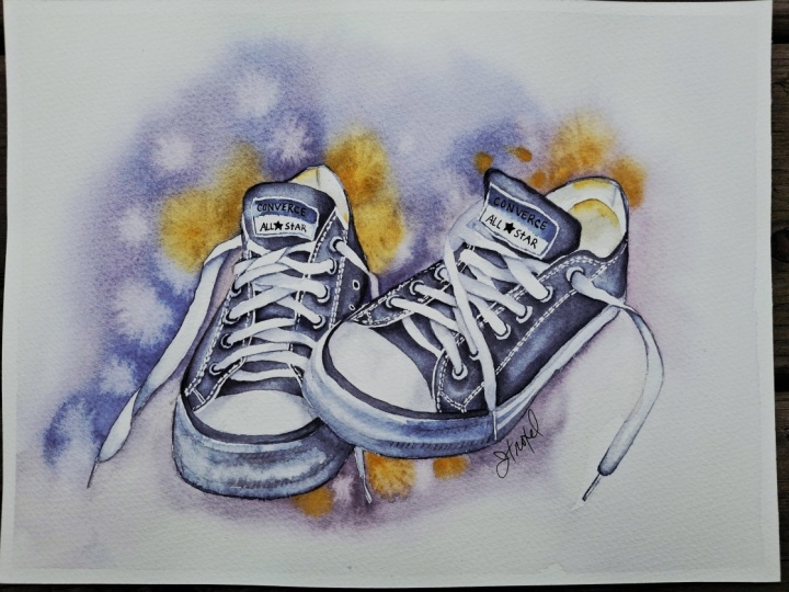
painting process for this modern still life that features a pair of
converse sneakers. Everything from my
initial watercolor washes to layering paint
for depth and detail, all the way to adding in handwritten lettering
in those labels. Before jumping into
the painting process, I also share essential
tips for success. And I also swatch out my
paint colors for you on a scrap piece of
watercolor paper so that you can see what
these colors look like, and you can replace
whatever colors you don't have with
something similar. This way, we can set
ourselves up for success. With this one, we're practicing not only foundational
watercolor techniques such as wet-on-wet, wet-on-dry and layering,
but we're also bringing in more advanced tools and
techniques such as masking fluid and painting a vignette
style background, which involves having
knowledge on washes. And we're also bringing
in the bloom technique to create colorful points of interest and expressive results. And I'm even bringing
in the topic of color temperature and how to shift your color
mixtures to make them either warmer or cooler
depending on what you want. I'll also share
tips and insights into how I use reference photos, but avoid copying everything
exactly as is and what I pay attention to in order to arrive at a result that
is both realistic but still painterly. This course is appropriate for artists who have
been painting with watercolor consistently
at least for a few months who've developed a good amount of water
and brush control. If you're just getting
started with watercolor, I would highly
recommend checking out my watercolor one oh one
course here on Skillshare, because in that course, I cover essential information that you should know about
this painting medium, and I provide helpful exercises that will help you advance
your skills way faster. With all this said, let's go ahead and jump into
the next video, where I'll explain all about the course project that we're going to be working on together.
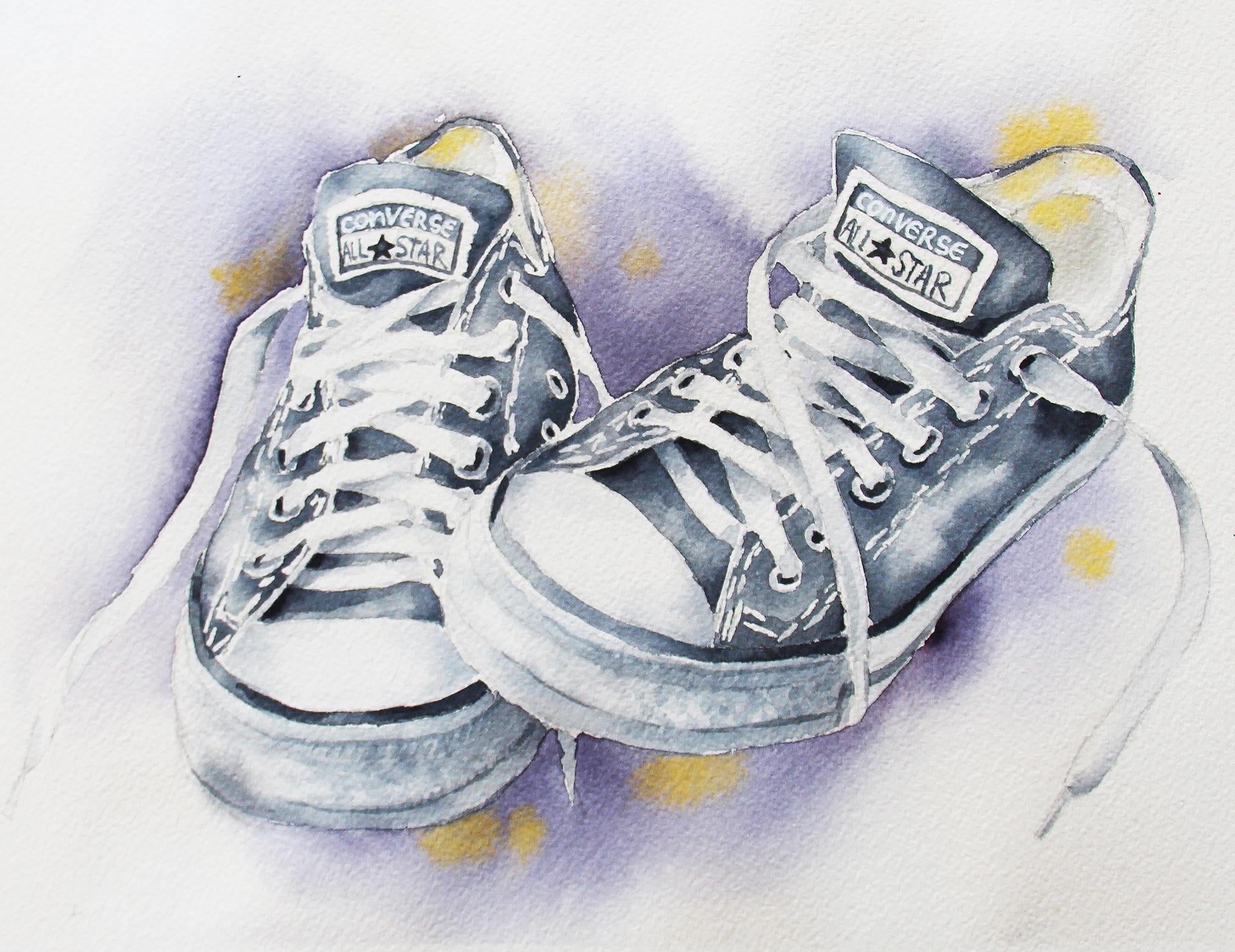
2. Course Project: By the end of this course, you'll have completed
a realistic but painterly modern
still life piece that features a pair
of converse sneakers. As you work through
these classes, you'll be gaining so many tools and insights that will help you succeed with future
watercolor pieces that you may decide to work on. Before working on any new phase, I would recommend observing
how I move through it and understanding what the
objective of the phase is, and then you can go ahead
and rewind and follow along. Don't rush the process and
make sure that you are allowing each layer to dry
before working over it. Prepared a set of
downloadable files, which you're going to
be able to find in the Projects and Resources tab right below any
of the class videos. Simply click on this tab, scroll down a little bit, and you're going to
find a section that is titled Download Resources. Click on any file that
you wish to download, and it will be saved onto
your computer or device. For this one, you'll find the outline sketch that
I have created for you, which is what I would
recommend tracing over as you're doing your transferring onto
watercolor paper. You'll also find the high
resolution reference photo of this pair of sneakers, which is what I would recommend observing as you're
moving forward with the painting process so that you can observe tonal changes, shadows, details,
textures, and so on. Find a photo that I took
after having placed my masking fluid in
case you'd like to use it as reference as
you're placing your own, a photo of my finished painting, which you're also free
to use as reference as you're working and
your supply checklist. To post a photo of your
work here on Skillshare, all you have to do is click on the Projects and Resources tab. Once you're in, you'll see this purple button on the right
that says submit project. When you click on this button, you'll be taken to a
new page where you'll easily be able to both upload
a photo of your piece, as well as share any thoughts, experiences, struggles or questions that you
might have for me. Here, you can create a title for your project and click on that larger content
section underneath. And if you want to add in
that photo at the beginning, you can go ahead and click on that image icon on the bottom. Find the photo that
you're wanting to share on your
computer or device, select that file, click open, and it will be immediately added into this content section. Then under your image, share anything that you'd
like, whether it's struggles, questions, wins, aha moments that you might have had throughout this course. Anything that you'd
like to share, I always love hearing from you. At the bottom of this
content section, you'll see different icons. One is for formatting your text. The other is to add emojis, the Adimage icon, which
we just talked about, and you can also embed link. Free to add in even more
pictures if you'd like. They can be process pictures, supply pictures over
here to the right, we have this preview area
where we essentially see a thumbnail or cover
image for your project. You can go ahead
and change it to a title image that you have created in a more
horizontal format. Or you can just go
ahead and leave it as is and have it just be a cropped section of one of the images that you have
uploaded into your content area. It's up to you.
Once you're ready, go ahead and scroll back up. Click on the Green
Publish button, and you'll be all done. If you'd like to share your
work over on Instagram, please do just make
sure to tag me at Erika Underscore
Lancaster Underscore Art. I love seeing your
work over there and giving students
shoutouts in my stories. And of course, go ahead and tag the Skillshare account, too. It goes a very long way and inspires other students to
share their work as well. Skillshare is a
safe learning space for all of us to continue
growing together. So make sure that you're
using this gallery, and let's all connect
and help each other out. I can't wait to see your work and to help out with
whatever you might need. Let's move on to our next class.
3. Supplies: For this painting,
I would recommend using cold pressed
watercolor paper that is at least 140 pounds or 300 GSM in thickness
or in weight, that is 100% cotton. You always want to make sure that you're using paper that is appropriate for the techniques that you're going
to be bringing in. For this one, we're going
to be using masking fluid. We're going to be
doing layering, and we're also going to
be using wet into wet. So we're going to be bringing in quite a bit of water for
some of these techniques. And not all watercolor
paper is created equal. Even some papers that are 100% cotton don't tolerate
layering very well. I'm going to be using
watercolor paper from arches, and the sheet that you're
going to see me work in is exactly 11 by 8 ". When it comes to my
watercolor paint, I am going to be using four different colors from
St. Petersburg white nights, and these are pains gray
Matter Lake red light, cadmium yellow medium,
and denthron blue. I will be swatching
out these four colors for you on paper, and we'll be preparing
our first color mixtures together before jumping
into the painting process, so no worries at all. And if you don't have one
of these paint colors, you can simply replace it
with something similar. I am using a mixing palette
that has sloped wells. And this is a great
tool for beginners, especially if you're just
getting into developing your water and brush control
because whenever you need to go in with less
paint in your brush or say, just a very, very
small amount of paint for those
very light areas, you can take your paint from that upper more shallow
part of that slope, and then when you
need to go in with more paint in your
brush or darker color, you can take your paint from that deeper area where you
have more of that puddle. Moving on to my brushes, as long as you have something similar to this, you'll do fine. I brought in five
different brushes for the watercolor
painting phases, which were a 1 " flat brush, a size six mop brush, and three rounds in sizes
three, six and ten. I also brought in a couple of cheaper multimedia brushes for my masking fluid placement. I avoid using my
watercolor brushes or any brush that
I really like for placing masking fluid because masking fluid will
destroy your brushes, even if you do coat those
bristles with soap plaque, I'm going to be sharing
with you in just a bit. In time, those bristles will become more
and more damaged. I always have cheaper brushes in my studio for
rougher techniques. And for this one, I
just brought in a size zero detailing round brush
and a size four flat brush. Anything similar will do. Used colorless masking fluid
from Windsor and Newton, and I also sometimes like
having alternative tools to place my masking fluid with on hand whenever I am
bringing in masking fluid. For example, here, I have
a few toothpicks on hand. Sometimes I also
use wooden skewers. I like how these types of
tools allow me to create imperfect broken lines
that are very thin. This said, you can
definitely use a very thin detailing brush
instead of toothpicks. Or if you have a
masking fluid pen, you could also use that. This one, I did trace over my reference photo using a sheet of tracing
paper from Strathmore, and that is what I
used to transfer my outline sketch onto my
sheet of watercolor paper. If you'd like to
learn how to use tracing paper to do
your transferring, I do have a class on this where I share everything
step by step in my watercolor one oh one course that you have available
here on Skillshare, so you can go and check
it out if you'd like. But you're always
free to use whichever tracing and transferring
method you prefer, whether it's tracing paper or a light box or carbon paper
or whatever you'd like. Would recommend tracing over the outline sketch that I'm
going to be preparing for you and doing your transferring
with that and then use the actual reference photo as you're moving along
in the painting process. It is very important to continue observing the reference
photo as you're moving forward and
continue paying attention to overlapping lass, value changes, little
shadow shapes, and so on and so forth. Both my outline sketch, the reference photo and
your other downloadables, are going to be
available for you in the Projects
and Resources tab. I always have a few scrap pieces of watercolor paper on hand, which I would recommend
also having on hand in order to test out colors
and also consistencies. We will be painting
white sections, and that involves
going in with very, very watery pale
color and having scrap paper on hand is very handy to test that
out before going in. I have a few of my blue Scot
absorbent towels on hand, which is what I enjoy using to say on top of water control. Throughout this
process, I'm constantly dabbing the tip of my brush
on my absorbent towel, and I enjoy these
because they are thin and untextured as
opposed to thicker, very textured towels,
which can certainly leave texture on your paper if you go in and
do some lifting. I have my container
with clean water, which I make sure to
change along the way. You're always free to bring in two or even three containers so that you don't have
to change it as often. Can use one container to rinse your brush in
between your colors, and then the other to bring cleaner water into your mixtures whenever you need to water them down or for
gentle scrubbing or techniques where you do need
clean water in your brush. I use regular 1 "
masking tape to tape my watercolor sheet down
onto my black cutting mat. All I do is make sure to run my pieces of masking tape
over my clothes a couple of times to weaken that
adhesive and make it less likely that I'll damage my paper at the end
when I remove it. Wouldn't necessarily
recommend using a flexible cutting mat as a backing board when
you're painting with watercolor because it is
best to use a sturdier, thicker board because
this way you can rotate your board clockwise or counter clockwise as you go to make your process
more comfortable. And you can also use
gravity to your advantage, especially when you're painting larger washes by tilting
your board up and down. Because I am filming my process and how I have my
camera mounted, I kind of have to work on
a flat horizontal surface. So I have gotten used to it. But when I am
painting for myself, I do work on a tilted board. Finally, I am using a
white jelly roll pen. This is from sakura, and its size is 08. I am using this for some of the handwritten lettering that
I'm going to be adding in the later stages of this painting process in the
labels of these sneakers. It is very important to use a paint pen that is
thin and also has opaque white paint that you'll actually be able to see
over your black watercolor. Some white paint pens are
simply not that opaque, so you won't be able to see the white letters at the
end after it has dried. And that is going to be it for the supplies that you're
going to be needing. Go ahead and collect
those and download the files that I'm
making available for you in the projects
and resources tab, and I'll see you
in the next class.
4. Tips for Success: Before jumping into
this painting process, I want to say a few
very important things that will help ensure
greater success for you. To begin, please, please
make sure that you spend enough time creating
a good outline sketch before moving forward. And what I mean with
quality outline sketch is make sure that your sketch
is clean, it's light. Make sure that you
have taken time after doing your transfer using
whatever transferring method, you so choose whether it's tracing paper, like what I used, or a light box or carbon paper, whatever it is that
you used to get that outline sketch onto your
sheet of watercolor paper, spend time cleaning that
up, refining your shapes. They're always
going to be things that need to be refined more. Maybe you need to
do a little bit of cleanup using your
needed eraser, pick up excess graphite. For this piece, after doing my transferring of my outline sketch just so that
you can get an idea, spent an extra 30
minutes refining my sketch once I had transferred that drawing
on my watercolor paper. It doesn't matter what
transferring method you use, it's never going to
transfer 100% super clean, super write and you have to
spend that time refining, doing whatever you
have to do to get that outline sketch ready
for the painting process. Another very important
thing that I want to make sure to say is don't start painting until after you've
taken the time to observe the reference photo fully
maybe take three to 5 minutes, take some notes, really
observe what is going on. Because if you jump straight
into the painting process, and I see this time
and time again with beginners because they're super excited to start painting, and you didn't take time to
observe that reference photo, especially when
you have something as intricate and
detailed as this, most likely than
not, the outcome is not going to be
very successful. So take notes on what are the main characteristics
of this type of shoe that you want to
make sure to bring into your painting or maybe
even enhance in some way. And aside from this,
it's also very important that you
understand how the laces, for example, are
twisting and turning. I made sure as I was refining my sketch that I observe the
reference photo and compared my sketch with the
reference photo to understand what was going
on with every single lace, to understand where the
twists and turns are, where the plane changes are
happening in those laces, making sure that they
are crossing in a believable and it's very important because when you
have something like this, you could end up
adding a shape for a lace that doesn't
really connect anywhere. So you just want
to make sure that you're properly
visualizing everything. Also, understand
these little holes that the laces are
going through. They're not perfect circles, and how much that
ellipse or oval is smushed or more
open really depends on the perspective or
angle of the shoe and the vantage point of
the photographer that took that photo in
relation to the shoe. So don't try to force perfect circles in
these little holes. Try to observe the
reference photo and make that little hole
happen in your drawing, similar to what you're observing
just as best as you can. So take your time with
your preliminary sketch. It's incredibly important and observe that reference photo
before moving forward. It will make all the
difference in the world. Let's go ahead and get started
with the masking process.
5. Masking Fluid Application: I will be coating
the bristles of these paintbrushes as I use them with some
dishwashing liquid. You can also do this
with regular hand soap, place that soap in the palm
of your hand and run your paintbrush bristles
over that soap to coat them completely. And then you can go ahead and
dip those paintbrushes in your masking fluid and mask out whatever area
needs to be masked out. And I also have toothpicks, which I'm going to be
using to mask out some of the white threads in the seams and other little lines or marks that might
need masking out, which are super thin
and super tiny. Of course, if you have
a masking fluid pen, then there is no
need for toothpicks. I will be bringing in a
white paint pen to write the word converse over the black value that I'm going to be creating
right there. I'm not going to be masking out the white converse
letters right here. Those are actually going to
be added until the end of the painting process with
a white jelly roll pen. Alright, so I'm starting
out by masking out the entire rectangular
label in these shoes. For this, I am using my
small flat brush and you can see how I'm going
over the entire label. I'm going to do this in
both of these shoes, and I'm trying to apply my masking fluid in a
thin uniform layer. If you apply your masking
fluid in a very thick layer, it will take longer to dry. The labels have been masked out and now I'm
going to change to my smaller round brush and
I'm going to use this to mask out the metallic rings in
the holes for these laces, and then I'll be moving on
to masking out some edges. We're not going to be masking
out too much with this one because we're going
to be painting these sneakers and sections, which is going to help simplify the painting
process for us. I am doing my masking, I am continuing to observe that reference photo
just to make sure that I'm not losing track of anything or getting
confused with what's what. Because I'm applying
my masking fluid in a thin coat or with a thin coat, it'll dry pretty
quickly and we'll be able to get started with the painting process
pretty soon. If you accidentally place
too much masking fluid or your masking fluid shape
ends up being way too large, just allow it to dry and remove it and place that
masking fluid again. Happens to me all the time. All right, all of the
little metal rings as well as these labels
are masked out. The last thing that I'm
going to be masking is a few of these
little threads, the white seams that I see. I'm just using a toothpick in a sideways position so that
the entire side of the tip of the toothpick is coming
into contact with my paper and I can lay
down those little marks, and I can create those
little horizontal marks more easily with
the masking fluid. It's a double seam, if you will, in the shoe and your little lines that you place don't have to be perfect. You're going to manage to
communicate the white seams, even if your little
masking fluid shapes are not super perfect, but you do want to
make them short. You want to make them
thin. There's no need to be super perfect
and there's no need to try to get in every
single little line created by those seams. Just getting the main idea. I'm making sure not
to scratch or damage my watercolor paper as I am lightly pressing down my
toothpick onto the paper. Definitely don't want
to scratch or damage it because I won't be
able to correct that. I will be making a photo that I took after having placed
my masking fluid available for you as a downloadable
in case you would just like to check to see that
you didn't miss anything. Colorless masking fluid, like the one I'm
using right now, becomes like a yellowish
film after it has dried. It goes on more like
an opaque white fluid, and then as it dries, it becomes more and more yellow. You'll know that
it's dry once it is tacky but no longer
sticky to the touch. In that masking fluid photo that I am making
available for you, I make sure to increase the yellow saturation so that you can see my masking
fluid more clearly. I'm going to switch to
the opposite side of my toothpick because this
southern one is getting to covered with masking
fluid and I'm not able to lay down those little thin lines the way that I like. Masking fluid dries fast and
because it's liquid latex, it dries in little blobs that can make it
quite difficult to continue laying down
those little thin lines. All right, observing my sketch, comparing that with
the reference photo, and just making sure that I have masked out everything that
I wanted to mask out, I'm going to be adding a little
bit of that indication of the inner white section right under the black
canvas, if you will. The inner part is white. So in that photo, I can see that the very
edge under the laces, you can see a
little bit of white under the black
canvas or fabric. So I'm just going to get
in a tiny hint of that. G to grab a new toothpick, little sections of
that white peeping through from under the black. What I'm masking out. I
don't have to do this everywhere along a few of
those edges here and there. That's all I'm
going to mask out. That's it. I'm going to make
sure that everything is completely dry before getting started with the
painting process. I'm going to go ahead and wash these paint brushes because
if I don't wash them soon, they're going to get
completely destroyed.
6. Preparing First Color Mixtures: For this painting process, we're really only going to be using four different colors. In my case, I'm going
to be using Pains gray. You can use something
like neutral tint. I wouldn't recommend
using ivory black or Mars black just because they tend to be
very flat and dull. I'm going to be bringing
in denthron blue. I'm going to use
Matter Lake red light, which is a cool red, and finally cadmium yellow, which you can replace
with something like Hansa yellow medium or Hansa Yellow Deep or new
gamboge anything like that. I'm going to swatch
out these colors individually for you so
that you can see what they look like on
paper and then I'll also swatch out the mixers
that I'm going to be using. This is what Pains
Gray looks like. This is what Matter Lake
Red Light looks like, Indenthroblue looks like this, and cadmium yellow
medium looks like this. You can use whichever
colors you have available that are most similar to these and your outcome
is going to be great. To begin, I'm going to create
the black color mixture that I'm going to be using for the black canvas in these shoes. Mostly it's going to be Pains gray and Pains gray in and of itself straight out of the pan already has some
amount of blue in it. So it's not a flat, dull black like other
ready made blacks. It has a color temperature to it because it's a mixture
of black and blue. But what I'm going to do is I'm going to add even more blue into just a tiny bit of
that indent thrown blue. Hopefully, you can see on screen the difference between
this gray and this gray, which has a little bit more of that indenthron blue in it. The reason why I wanted to do that is so that I can play with color temperature
a little bit more and make that color look a
little bit more interesting. That's the color mixture that
I'm going to be using for the black areas
throughout the shoes. Whenever I run out, I'm
going to make more of that. For the white plastic parts of the shoes here in the front I'm going to be using a very water down version of that
same color mixer. Same thing for the shoe laces. I'm going to be using
that same color just in a very water down state. And for my vignette background, I'm going to be mixing together
my Indent throne blue and my Matter Lake red light
to create a purple. And as you're
creating your purple, you can feel free
to make it more of a red purple by adding more
of your red into the mixture. Or add more blue to make it
more of a blue purple or mix these two colors
together to get more of a middle of the range,
secondary purple. That's up to you
and your tastes. That's a nice deep purple there. I think I'm going to add
in a little bit more blue. I personally like more
of a blue purple. That's a little bit too much
blue. Adding in more red. Okay. And finally, I'm going to prepare a little puddle
of yellow because I'm going to be using
this color to create little colorful blooms as extra points of interest
throughout the piece, just to make the piece a
little bit more colorful. Those are my first
color mixtures. As they run out, I'll
just be making more. I'm going to go ahead and change my water because as you can see, it's pretty murky and then I'll get started with
the painting process.
7. Black Fabric First Layer: I'm going to be bringing in
the size six round brush. It's completely dry, so I'm
just going to cream moisten these bristles by swiveling my paintbrush in my
container of water, and I'm going to
get started with painting in the black sections. We're going to be
painting on dry paper, and we're going to make sure
that initially we're going in with a very pale
watered down version. Of our gray. That we created by mixing together our gray with our blue. You can see how this
is very much a T like consistency so
that I can go in very, very pale with that
initial layer. I'm going to start with
this section over here, observing that reference photo so that I can make sure that I don't accidentally
go over my laces. Dipping my paintbrush
in my container of water and sometimes
I'm just going in with water and my paint brush to soften that color that
I've already placed on paper and to keep the entire
shape that I'm working on wetter for longer for the
step that is coming up next. I'm going over everything. This is this first
layer of paint. Everything is nice and wet and workable still because
I went in with just water in my
paintbrush a couple of times to run my paintbrush
bristles over everything, both to soften that color and to keep that shape
wet for longer. With this initial layer
of light gray in, I'm going to go
ahead and take some of this gray right here, which has a thicker consistency than this gray that
I was using before, more like a coffee to
milk like consistency. I start dropping in
this same gray in a more saturated or
thicker consistency in those darker areas that
I'm able to see in the reference photo
throughout this shape. You want to darken areas
a little bit more, take a little bit more color and make sure that
you're only dropping in this more saturated color in smaller areas that
you're looking to darken. You're not really looking to get the entire shape with
a super dark value because if you darken everything too much and you have
no lighter value areas, then everything is going to look very heavy and very flat. You're looking to create
a wide variety of gray values throughout
every single area that we're going
to be painting in. That is what's going to
make it look realistic. I'm going to do the
exact same thing for all of the different
black areas here. Working a section at a time. Going to go in with my very
water down consistency gray, and I'm going to start
painting in these shapes here, which are smaller shapes, If you go in with
too much pigment or color that is too dark, too saturated, too quickly, remove that color from your paint brush bristles and go back in with just a tiny
bit of water in your paintbrush or
with a damp paintbrush and run those paint brush bristles over the shape
to soften that color. This is this first
layer of light gray, and then I'm going to
take a little bit more of this darker color mixture
and I'm going to observe that reference photo and drop in this more saturated gray into those areas of darker values that I see
there in that reference. Going to clean up this
edge a little bit quickly. Drop in a little bit more of a darker color there because it makes sense that this shoe would be creating a
shadow on this one. I'm going to move on
to the next area. Starting with my
lighter gray first. There is another triangle shape here in between these two laces. Taking a little bit
more of the darker gray, dropping it into there. Sometimes even if
the entire shape looks very dark in
that reference photo, I like creating some lighter
areas in my painting so that I can make
sure that I'm staying away from flatness
and heaviness, especially when painting
with watercolor. I feel that's important. Moving on to the next area, the next little shape, getting that little triangle in. Left a teeny tiny section
there in my drawing. Next shape is this
one right here. I'm observing that reference
photo before painting in my shapes so that I can make sure that I don't paint
over a shoe lace. Making my way up from
here. Let's see. What's going on here. Little gray shape here. I painted a little bit over
the edge of the shoe layer. That's okay because
I'm going to use the exact same
color in that area. That'll be fine.
I'll just separate that out with the next layer. I have a couple of
more shapes to paint and watery consistency first, pale water down color first, then darker, more saturated
color to darken shadow areas. I think that's it. Comparing my piece with the
reference photo. Let's see. Am I missing anything, cleaning up this edge a little. I'm going to work on this
black section over here. I'm going to make a
little bit more of this pale water down gray, adding a little bit
of water into there. This is a much larger shape. I want to make sure
that I'm going in quickly and that I am
running my paint brush bristles over everything a few times as I'm creating
this very light layer so that things can stay wetter
for longer and I can have those nice diffused
out soft effects that I'm looking for
with this initial layer. This is my first layer of gray. You can see how
it's very light and translucent going in
with my darker more saturated gray and
dropping it into shadow areas that I see in that reference photo and
where it would make sense, for example, that the
laces are creating a shadow on that fabric. Starting to develop
that range of values, they're going to help
me create realism. Lighter areas and darker
areas and a wide range of midtons are needed for
something to look realistic. Going to paint in
that tiny bit of black canvas over here
over these shoe laces, there is a little
section of black fabric. It's quite small, and we need to stay on top of water control, especially in small shape. Help yourself with your absorbent towel as
you're moving along. I'm constantly
dabbing the tips of my paintbrush on my
absorbent towel to make sure that not too much
water is flowing down from my paintbrush
as I am painting in, especially those very
small shapes. All right. I'm going to start with
the black section over here first with my
light water down gray. I'm going to paint in this
entire black section quickly, making sure that I'm
continuing to observe my reference photos
so that I don't accidentally paint
over shoe laces and that I'm simultaneously
working quickly because this is again
a pretty large shape and I'm painting on dry paper when we're painting
on dry paper, things are going to dry pretty fast because that
paper is very thirsty. I running my paint brush bristles over
everything a couple of times so that I can expand
that working time for myself. Once I have that nice
light layer of gray in, I'm going to take some
of my darker gray. I'm going to start dropping it into shadow sections
that I see in that reference photo and areas that it would make
sense would be darker. For example, right here where
this other shoe is covering up the section of
that bottom one, little sections under laces. I find that when I am painting a black object such as
this one, oftentimes, especially when it comes to
painting with watercolor, it's a lot about making
artistic choices and taking some liberties because even though we're painting
something that is black, we are using watercolor, and black is the
darkest color of all. And if we just go in
and start painting very thick saturated black all over because we think that that's what
we're supposed to do. Most likely than not, because
we're not bringing in the whiteness of
the paper and we're not allowing that paper
to shine through. Our painting is going to end up looking very heavy
and very flat, and that's not really
what we're trying to do when we're painting
with watercolor. Make artistic
choices so that you are taking what you need from the reference
photo in terms of understanding the structure of what it is that
you're painting and getting ideas from those
overlapping elements to create shadow effects, but don't feel that
you have to go in and paint everything
super black. Also, water cutter
is always going to dry lighter than how it
looks when it's wet. It's perfectly normal if things are looking lighter
after they start to dry, but do know that we're going
to go in with two layers. After this layer dries, we're going to go
back in to darken certain little shadow
areas with a second layer. I'm going to go in and paint in this black edge with a
very water down gray. I went in with a very
light gray and I can go in now and drop in a little bit of a more saturated gray here
and there so that I can have a variety of values even in
that very thin, narrow shape. The last thing I'm going to be painting in
before moving on to the next shrew is the black section of
this plastic right here. I'm going to do the
same thing and go in initially with my water down gray and there's this
black strip right here. Light gray initially, ran my paintbrush bristles over that section
a couple of times, taking some of my darker, more saturated gray and dropping it into
certain sections. I'm going to get started with the black canvas in this shoe. I'm going to start with
this upper section again. Starting with my light
water down gray, going to go in quickly
and I'm going to start painting in this entire shape. Observing that reference
photo, noticing what's what? Going to go in with just
water in my paintbrush now, run my paintbrush bristles
over the entire shape. I can even paint over the masking fluid and
it's totally fine because that masking fluid is going to protect those areas for me. That's that first
light gray layer, taking some of my darker, more saturated gray
and dropping it into sections that
I want to darken. Taking a little bit more and developing a wide range of values even in this first layer. That's enough there. Moving on to another section of this shoe. I'm going to do this one right here and I'm
going to make my way up dropping in a little bit of my more heavily saturated gray. If you find that you drop
in the darker gray and it overtakes the entire shape
or covers the entire shape, and you just want to go
in and do some lifting to add dimension
back into the area, remove that color from your
paint brush bristles and go in with a clean and
slightly damp paintbrush and use your paintbrush like a little absorbent sponge to
pick up that excess pigment. Got it. Making my
way up from there. Don't ever stop looking
at your reference photo. F layers in. Ving that paint from my paint brush bristles. I think I dropped in way
too much water in here, just doing some
quick cleanup here, dropping in a little bit
more my darker gray, lighten that a little
bit too much when I went in to fix my
little mistake. This is the shape that I
want to paint in right now, teeny tiny shape, and feel free to switch to
an even smaller brush. If you're more comfortable using a smaller brush for some of
these very small shapes. Okay, continuing
to make my way up, observing that
reference photo first. This section right here. If you go into your
laces or some of the other parts of your shoe as you're painting in these
sections with this gray, that's fine, especially
if it's just a light gray because those other sections are also going to be painted
with the same color. You will be using the gray in the laces and you will be
using the same gray over here. It's really no big deal, especially if you go in
with a very light gray. Make sure that you notice it
though, because later on, you can fix that mistake
as long as you notice it, make it less noticeable with subsequent layers that we're
going to be developing. But don't think
that everything is ruined or lost because you go over a little section that
you weren't supposed to, especially because again, it's the same color that we're using
in the laces and outside. I'm going to do my work
right here in this area, starting with the
lighter gray again. When we're painting
on dry paper, we have to keep it moving
and keep it flowing. Whenever you need to reload, jump right back in, pick up
that bead, and continue. Otherwise, you can be left with sharp defined edges and texture
where you didn't want it. I quickly paint in
that first layer of lighter color and then while that first
layer is still wet, I go ahead and drop in
a little bit more of the same color in a thicker consistency to
darken certain areas. Running my paintbrush pitles
over everything a couple of times Now I can go in with my slightly
more saturated gray. I'm going to be working
in this section first, right here, and then I'll be
doing the section over here. Starting with my
lighter gray first, water down light gray, observing the reference
photo before moving in and painting quick but
carefully. Careful but quick. That's that first layer there, going in with a slightly
more saturated gray, dropping it into sections
that I want to darken. Going to have to make more
of my gray in just a bit. Lifting up some of that color. I'm going to make
some more of my gray, Haines gray, bit of
indent thrown blue. Water down a bit.
I'm going to take my paint from the edge
here or that first layer, and then from the puddle down
here for the second layer. Dipping my paintbrush
in my container of water and just
extending this color, softening and going
over the entire thing. It's just water
in my paintbrush. This is a pretty large shape that we're painting
in right now, probably the largest
of all in terms of the black sections
that we've been painting. So as you make your way back towards the back
part of the shoe, don't forget to keep coming back to the bottom section
where you first started. Because if you
just make your way towards the back and you
don't keep coming back, by the time you reach the
back part of the shoe, the back edge,
that front section is already probably
going to be dry and then you're not going
to be able to get those soft diffused out effects when you drop in
your darker gray. Okay, so everything is
nice and wet and workable. Going to go in with my more saturated gray
starting here at the back. Adding a little bit of
shadow under the laces. A I'm going to add in a very thin line there, starting with a pale
translucent gray. Then taking a little bit of my more saturated gray and dropping it into
certain sections. I'm now going to paint in that black strip in the plastic section the
same way I did over here. As always, I start with my
lighter water down gray and make sure that
I notice what I am painting before going in. Come back to where I started, keep that wetter for longer. This is a very narrow shape. Make sure that that
first layer is quite light, T like consistency, taking a little bit more
of my more saturated, heavily pigmented
gray and placing it in shadow sections that I see in the reference photo
so that there can be a variety of values
even within this shape. All right this black plastic
strip continues over here. But if I paint it right now, I can run the risk of
creating back runs into this section right here that I just painted because
this is still wet. I'm going to be
skipping that for now. I'm going to allow
this to dry before painting in that black
strip right here.
8. White Plastic + Laces First Layer: In this phase, we're
going to start by quickly painting the inner
parts of these shrews, and then we'll move on to
working on the first layer in the laces and the
white plastic sections. It makes sense to
tackle all of this at once because we're using
very similar colors, and we're also working within that same mindset
where we have to make sure that these areas appear white or
like an off white. For the visible inner
parts of the shoes, I do want to go in with a warmer gray than the gray that I am using for the outer parts of the shoes. So all I do is mix
together some of my pains gray and a little
bit of my cadmium yellow, which warms up the gray. I want to play with
the temperature of my grays and just have a little bit of a
difference there. So as you can see,
this gray definitely looks a little bit warmer and
the more yellow you add in, the warmer it's going to get. I'm going to go in with my size six round brush and a very water down version
of this warmer gray. I'm not going to paint
the entire shape, just sections of
it because this is a white part of the shoe. I just want to create
a little bit of a shadow effect here. I'm going to leave plenty of that white paper shining
through right there. Run my paintbrush bristles
over everything with just water darkening
certain little points with a little bit more
of this warm gray. And while that's still wet, I'm going to rinse out my brush, take a little bit of my
coffee consistency yellow, and I'm going to pop it right
over the gray while it's still wet touching the tip of
my brush on that wet paint, the yellow travels
down the bristles of my brush and
pushes out the gray, creating this beautiful,
bright, colorful bloom. You can add them
wherever you want, but don't go in
and try to blend. I'm going to do the same
thing for the other one. This is a much larger
shape over here. I'll start with just a bit of this warmer gray and start in this area where I see most
of the shadow in here. I'm going to remove
this color from my paintbrush crystals
and I'm going to go in with a clean and
slightly damp paintbrush and just soften these edges, and I'm going to drop
in a little bit more of my cadmium yellow into certain little sections in a very irregular way to add a
little hint of color there, an extra little pop of color. That's all I'm going
to do for those areas. I'm going to fix a
little section here, which should be gray. Soften the edge. Everything is dry here so I
can go ahead and paint in this black plastic strip that
is right below the fabric. Same thing that I
did with this one over here and this section
of this one over here. Go to make sure to start with my light grayish color
mixture in a very water down consistency.'s a bit of color
in my paintbrush bristles and observing that
reference photo before going in, so important. I'm going to paint in that
strip that I was missing. Yeah dropping in a little
bit more saturated pigment here and that's enough. I'm going to switch to
my size ten round brush because I'm going
to be developing some very light gray values in the white plastic
sections of the sneakers. Then to dip my paintbrush
in my container of water. Again, this is my
size ten brush, it's larger than the brush
that I was using before. I'm going to start with a very, very watery te like
consistency for these white plastic sections because these are white parts. Whenever it is that
you're painting white with watercolor, it is so important that you A, make sure that you
go in with a very, very water down translucent color initially and that you're only darkening certain sections gradually if needed, and B, that you leave plenty
of that white paper shining through because when we're painting with this medium, it's the whiteness
and brightness of the paper that is going
to stand in place for our highlights and it's
watercolors translucency or transparency in combination
with the white paper underneath that helps us
develop our lightest values. I'm going to start here
with the shadow section that this shoe is
creating on this one, and that's the safest
place to start for me because if there's going to be any
shadow in this area, it's going to be here and
perhaps a little bit over here. And everything else is going
to be very, very minimal. G to remove this color from
my paintbrush bristles, remove this excess water, and I'm just going to go
ahead and soften any edges, maybe even soften the
color a little bit more. And now I can consider going in with a little bit more
color, especially here, or that she is creating
a shadow on this one, and that's about it. That's all I want to do. So you can see how I left plenty of that white
paper shining through. And once that dries, it's probably going
to look even lighter. I'm going to do the
same thing with this plastic section right here. And when you observe
that reference photo, it looks almost like
a flat white value. And it's important that we use our artistic
license a bit when it comes to something like
this because we can't leave this entire shape
completely flat white. I'm doing the same thing that I was doing with
the previous one. Started with a very
light translucent color, then removed that color from my paintbrush bristles and went back in with just water on my paintbrush to soften
that gradient and then dropped in a little
bit more of my deeper, more satrooted gray only in darkest areas that I'm looking
to push a little bit more. You can see how I left plenty of that whiteness shining through, but now it looks a lot more realistic because at least I've developed some amount of light
gray values in this area. I do want to mention that it's important to bring in your
artistic license whenever you feel that you could do something
that is going to improve the composition as a whole or the level of three DNss
that you're going for. If you're going for
three DNS, that is. Even if you can't
see somewhat of a range of values in
the reference photo, because maybe the
reference photo is overexposed or underexposed, or maybe the whiteness of the object or
even the darkness of the object is just causing or creating some flat looking area, whether it's completely white or completely black or
whatever the case may be. When working with watercolor and really any painting medium, it's really going to be
up to you to not make that section look flat to bring some dimension
into that area. Sometimes we need to bring in artistic license and our
understanding of the structure, the three D structure and the light situation
that is going on to create at least somewhat
of a range of values in those very light areas or
those very dark areas. Because when it
comes to creating a drawing or a painting, if we leave any area
with a flat value, whether it's a
completely flat white or a completely flat black, or any mid tone, really, in between
white or black. If the shape is quite large, which this is a relatively
medium size shape. If I had left that white, that would create flatness
and it's going to distract and take away from the level of realism that I'm trying to
develop everywhere else. Don't be afraid to bring
in your artistic license, and whenever you see a flat area where there's only one
value all throughout, I would highly recommend bringing in your
artistic license and at least developing somewhat of a range of values
in those areas. Especially if you're
going for you know, mid to higher levels of realism. Just doing some gentle
scrubbing right here with a clean and slightly damp
brush to soften edges there, and I am done with
those sections. I'm going to go
ahead and start with the white plastic down here. Same thing goes for this. I do have a little section of blast stripe here that I'm
going to be painting later. But first, I'm going to
paint the entire white area, it's my intention with
this initial layer to just start developing somewhat
of a range of gray values, light gray values, maybe
down here where this shoe is creating a shadow on this I deepen and darken
a little bit more. But again, these
are white sections. We have to be very careful to
go in very pale initially, make our way towards
darker values incrementally and really
only where needed, and of course,
that we're leaving plenty of that white
paper shining through. If we don't do that,
we run the risk of these sections looking
gray and not white. Still going in with my size
ten round brush and a very watery gray I'm going to start
with this one right here. Starting in the shadow section, there's no way of going
wrong if you start there. And then just pulling a
little bit of this color out into the lighter sections. I really just loaded up
my paint brush bristles once running my clean bristles over what I just painted in. You can see how I left plenty of that white paper
shining through, especially in this side. Near the light, I'm going to go in and pop in a little
bit more of this gray, especially in
shadow sections and darker areas that I'm able to see in that
reference photo. After I painted in my gray, I rinse out my brush
and I go in with a clean and only
slightly damp brush to soften edges and transitions, focusing on developing those general shadow shapes
to create a sense of form in this front
part of the shoe and really ignoring smaller
details and textures. I'm going to leave it at that. I'm going to allow it to dry. So all of those little
textures that we see there in the photo for
that section of plastic, I'm going to be adding
a hint of that, but later after this
first layer has dried, that I see as texture and
texture follows form. If you get the form
in write a sense of three Dness via the
development of values, then you're already
over halfway done, especially when painting
with watercolor. The little diamond shapes that
I see there, little lines, all of those are textures
and I'm going to be developing with a second layer. That's going to be
done very loosely. Just as a hint, just to describe the texture
to a certain extent. I'm going to do the
same thing with this one over here and be careful if you're
going to paint this because this might still be wet. If you go and paint down here, you can get some backgrounds
happening here where this new paint that
you deposit in this area bleeds into this
which you just painted. Of course, you can
always allow that to dry if you're scared
of that happening. I'm going to start with this
back section over here. There's no way that I can
go wrong starting back here because this is the section of the show that is furthest
away from the light. I know that I can
start developing some gray values here and
I'm going to be good. Go to make my way towards the light sections
and really think of these shadow shapes
that I'm creating as abstract, irregular
shadow shapes. Running my paintbrush
bristles over everything a couple of
times very lightly, especially those sections
where I want to drop in a little bit more color
so that I can get those nice diffused out, soft, wet-on-wet effects. That's it. If I add any more gray or
cover up more of that paper, I can run the risk
of these parts of the shoe just not looking white and I
definitely don't want that. Doing a little bit
of lifting with just to clean a
slightly damp brush, which you can always do whenever you feel you have gone in with way too much color or
way too much water, do some lifting that's going to lighten
up things for you, soften that color and add
dimension back into that area. I'm going to leave
that to dry and I'm going to start my
work in the laces. I'm going to create
a little bit more of my bluish gray and
the laces are white. So everything that I was
just explaining with the white plastic parts
still go for the shoe laces. For the laces, I'm going to
switch on back to my size six round brush as these are more narrow kind
of complex shapes. But the same technique that I've been doing all along
still applies. Bring a little bit out
from here and take a little bit of color
from this section of my palette so that I can
go in eye and light. I'm going to start with
this one over here. I'm going to make my
way towards the right. So when I have a shoe lace that is twisting and there's
a plane change, I see those as separate shape. I see this as a
shape separate from this and this as a shape
separate from this. That is always helpful for
me. I see that shadow there. Once I've applied enough color, I remove that color from
my paintbrush bristles and I soften that
transition there, just watering my paintbrush. Instead of taking more color, sometimes I just use that same color that
I have over here, which helps me soften this. I bring some pigment out into this other shadowy
section over here, if I want to darken a little bit more of
that shadow shape, I go into my darker gray and I just add in
a tiny bit more I'm going to switch on over
to painting another shoe lace because if I paint this section here or this section over here, I can get some bleeding happening right now I'm
not looking for bleeding, so I remove that color from my paintbrush bristles and I am using my watery
color mixture again, I'm going to try
to make as much as possible my way
down from the top. Of course, I'm going
to have to skip around because I don't
want to get any bleeding. But as much as I can, I'm going to try to
make my way downward. And for many of these
shoe lace sections, especially the ones that
are closest to the light, not the ones that are
under other shoe laces or kind of under the canvas
section of the shoe. I may not have to paint at all. I want to make sure
that I'm leaving some sections of shoe lace
unpainted and that I'm really just focusing
on darkening shadow sections where those
laces are covering each other up or where it would make sense for me to
add a shadow in there because maybe it's going
into the little hole or maybe it's being covered by other
sections of the shoe. Those are the sections that I am adding a light gray value into. So again, it's all
about bringing to mind the structure
of the shoe, the three Dness of what it is that you are
painting or shading in. You don't ever want to stop thinking about the three Dness. You don't ever want
to stop thinking of the three Dinss of whatever it is that you're
painting and how things are overlapping and
things like that. I'm going to go right in and
paint this one over here. This shoe lace is being blocked by this shoe this shoe is blocking the light from hitting this section of this shoe lace. So I can be a little bit
more free with the level of saturation there and go in with a little bit more pigment as
opposed to the other areas. I'm going to paint in
these little sections that I was missing before. This section that I started
with is already almost dry because I painted on dry paper and just be
very light handed, especially in those
sections where the light is able to
reach the shoe lace. I'm going to paint in a
tiny bit of gray there, which I haven't painted
in and that's it for that first layer of gray in the shoe laces for this
sneaker on the left. It took me around five, 6 minutes maybe to paint
in that initial layer, and I was observing
the reference photo, getting clues from
the reference photo, but also really had in mind the three dimensional structure of what it is that
I am painting, how things are overlapping, keeping that light from
hitting that section of the shoe lace or
whatever it is underneath. And all of that is super
important to have in mind if you're looking
for believable shading. I have plenty of that white
paper shining through so that I can really communicate that these are white shoe laces. I'm going to do the same
thing for this one over here. I need to make Marv
this water down gray. Just added a tiny
bit more water into that I'm going to start
with this section here. This plane for this shoe lace at the top is facing
away from the light. Then the darkest section of this shoe lace
here is down here, which makes sense because
it's curving over and down and this section of the shoe lace is
away from the light, whereas this is facing
towards the light. I remove that color from
my paintbrush pitles and that's all the pigment
I'm going to be adding here. I'm just going to be
softening that transition. And if I remove that color from my paintbrush bristles
after painting a gray section in and I go back in and I notice that I still have gray
in my paintbrush, I dip my paintbrush in my container again to
remove more of that color. You can also go in with
your absorbent towel while that paint is still wet and lift whatever excess color you have placed on paper while that paint is still wet and
you're going to be able to lighten it back up or at least do some amount of
lifting of that color. Apply a little bit
more gray right here. Going in this one here, noticing what is the darkest
section and starting there. Before starting to paint
any section of shoe lace, observe that reference photo and notice if that section of shoe lace is facing towards the light or
away from the light. Moving on to this one here. This section right here
is the one that is being covered up
by this shoe lace and this part of the shoe. I'm going to start there, to remove that color from
my paintbrush bristles, remove the excess water. And go back in and
soften that transition. I'm going to go back
to this one here, which I couldn't paint before because I had just
painted in this section. I'm observing what's going on with that section of shoe lace. See a shadow section
there and I'm understanding where there's
that twist happening. I think I made the twist
slightly different in my sketch to the photo. That's okay. Softening the edge. These are very small shapes, continue helping yourself
with your absorbent towel. Notice how frequently
I am touching the tip of my paintbrush to my absorbent towel
whenever I feel there's too much water
in my bristles and I'm starting to lose control or I may start to lose control. I use my absorbent towel. Going to darken this
section of shadow. We will go into the
shoe laces with a second layer to darken
some shadow section, so don't feel that all of your values have to be developed with this
one layer of paint. Be patient and just know that we're working
in layers here. If for some reason your
shoe lace shapes that you created in your outline sketch are a little bit
different from the photo, that is okay, but make
sure that you have in mind what would happen there in terms of
shadows and lights. The light and shadow areas that you develop
throughout that shoe lace, they have to be consistent
with the rest of the painting. Softening the edges here. Taking a little bit
more of my gray. And all I'm missing is
this part over here. I'm going to take a little
bit more of my gray, water it down a little. Then there is a twist here and
there is shadow down here. I remove the color from
my paintbrush bristles, remove that excess water, dab on my absorbent
towel and soften, soften here, pull a little bit of that pigment down so that all of this is not flat white, especially because this is
away from the light and then add in a little bit
more pigment and if you see any darker value areas that you want to quickly darken, before allowing this first
layer to dry, you can do that. Soften this a little
because this section was almost dry when I
dropped in this color, so just softening a bit there. Do a little bit of lifting here, got a little too dark, that color expanded
out way too much. All right, so this is
the first layer done in my white plastic sections
and the white shoe laces. I'm going to go ahead
and do a little bit of cleanup work right here, take advantage of the fact
that everything is pretty dry, just fix the edges of this black narrow shape before moving on to the
next part of the process, which is going to
be the second layer in the black sections. So I'm going to switch on over to my size three round brush, dip my paintbrush in
my container of water, and you can do this too if you have any sections like this, but make sure that Everything
is dry if we're going to do any lifting and scrubbing
for correcting purposes. So all I do is I go in with a clean and
slightly damp brush, and I gently scrub over that section that
I want to correct. And I dab with my
absorbent towel. I would only
recommend doing this gently maybe two or
three times max. If you continue doing
this more than that, you can run the risk of
damaging your paper. That is enough for
me right there. It's enough correction. I dip my paintbrush in my container of water again
and I'm just going to do the same thing for
this part in the bottom. Where I went out of the shape
that I wanted to paint. Tiny bit more, just twice. I went into both sections twice to do gentle
scrubbing and that's it. That's all I'm going
to do. You can see how I managed to
correct that area. Now things are looking
much better with just a couple of gentle
scrubs and lifts.
9. Black Fabric Second Layer: Now it is time to push those darkest areas
in the black fabric. This would be layer number two. With this layer, you're really
only going to be adding those abstract
irregular shadow shapes in sections of darkest shadows that need to be pushed more. The intention here is
not to cover all of the beautiful value
development with your grays that you've already
done in the black areas. It's just to deepen and
darken the darkest sections. For this, I'm going to be using both my size six round
and my size ten round. And for this part
of the process, I'm going to use this gray
color mixture right here that is slightly more saturated
and thicker, if you will. I'm going to start with
this shoe over here. I would recommend just
using the paintbrush that you're most comfortable with depending on the
size of the shape, size and complexity of
the shape, I should say. I'm just observing
that reference photo. Noticing where the
darkest shapes are. Sometimes I am especially in this area here filling in more of that shape
and other times, especially with the outer
sections of the shoe, I'm going to be just darkening certain sections
of those shapes. Go to make more of this
color mixture real fast. Blue and pains gray, more pains gray than blue, especially at this
point where I'm really looking to push
those darkest areas. Dropping this in a little. This is too black.
G to add more blue. Popping it into certain
sections of shadow, darkening a section right here. Because we're painting
on dry paper, we're getting those
defined edges around these shapes
that we're painting in. Whenever I want to soften, I remove that color from
my paintbrush pitles, remove that excess water, and soften that edge. Softening this edge here, darkening certain
sections over here. Opposite to the light, this upper section down here. Removing that color from
my paintbrush bristles, removing the excess water, and softening the edge. Darkening this section where this part of the shoe is
creating a shadow on this one. That's about all I'm going to be darkening for this upper
section of the shoe. Darkening certain
sections over here, start with the bottom. Where's the other shoe
creating a shadow on this one? Again, I know that we see almost a black solid valley or tone of throughout this
area in the reference photo, but I don't want to create
a solid black shape. That's going to lead to
heaviness and flatness. What I am doing is
thinking of where sections would be creating shadows on other sections, darkening there. And then leaving the
previous layer shining through in other sections where the light might
be hitting more. Here a little bit of a shadow. That's enough there.
Less is more. This part of the shoe is actually facing
towards the light. I'm going to leave way more
of this previous layer that I've already
created shining through when compared to this one that is
opposite to the light. I'm just going to be
adding a little bit of shadow under the shoe laces. Remove that color from
my paintbrush bristles and just softening those edges. That's it. Can I do a
little bit of lifting here. I'm going to do my
second layer in this shoe and I'm going to
start in this section here. Some of this section is
able to catch the light because of how this
shoe is on this one. This part over here, it just would make sense that
it is receiving some light. So I'm not going to
darken everything there. Then this section
here is in shadow. I can even go over
that shoe lace because I'll be darkening that section a little
bit more later. Softening any edges
before the paint dries? As I am doing my softening, if I notice that too much of that paint is starting to collect in my
paintbrush bristles, I immediately remove that
paint from my paintbrush, and I continue doing
what I'm doing with a clean and only slightly
damp paintbrush. It's important to see
what's going on on paper and to just acknowledge
how much paint is getting collected in
your paintbrush bristles when you're doing any moving around or any softening of your color that has
been placed on paper. Is especially important
when you're painting white objects because
you might end up pulling or pushing
too much of that gray and all of a sudden
you've covered up your entire shape with gray. I'm going to continue
darkening those shadow shapes, making sure that
I'm continuing to observe that reference
photo as I go, sometimes painting in two
shadow shapes at a time, other times only one. And then softening those
edges wherever I need to. It's not necessary to always go in and soften your
edges by the way. Softening Little shadow shapes. Essentially, the more layers you create with each
subsequent layer, your shapes that you're painting in gets smaller and smaller. So in that first layer of paint, you're painting the general, and then you allow that to dry and then with the
next layer of paint, you're only darkening
certain areas. And if you need a
third layer of paint, you allow the second layer
to dry and you only darken little teeny tiny
shapes inside of those mid tone shapes that you developed with
your second layer. The more layers you create, the more you have to
be mindful to leave those previous lighter value
layers shining through, and you have to be
more deliberate and only darken the
sections that need to be darkened because if you
go overboard and cover up your previous layer completely and you don't think about value, that's probably going to lead to a flat heavy looking painting. That's really what
we're trying to avoid, especially when we're
painting with this medium. I'm going into
this section here, which is away from the light. Removing that color from
my paintbrush bristles, removing that excess water, and softening. Again, softening. Adding more gray into my
mixture to thicken it up and to use it in a
thicker consistency to darken certain spots. Darkening here, a
little teeny tiny bit. Darkening a little
shadow shape that I hadn't painted before in
between a couple of shoe laces it is time to work on this opposite
side of the shoe. Removing that paint from my paint brush bristles,
softening the edge. Remove paint, remove that water, and quickly softening edges. Hopefully, you can see how even in this part of this shoe, which is opposite to the light, I still am leaving. That previous layer shining
through in some sections. I didn't go in and just
darken everything. More paints gray,
more ind thrown blue. This color mixture is a
little tiny bit too thick. Water it down a little bit more. Always bring to mind the values that you're
trying to develop, whether they are mid tones
or darkest dark values, and make sure that
the consistency of your color mixture is appropriate for what
you're trying to do. If I continue painting, I run the risk of
covering up all of that previous layer and
I don't want to do that. If I cover up that
previous layer, things are not going
to look glowy anymore. My painting is going to look flat and heavy and
it's not going to have that glow that is so
particular to this medium. We really need to bring
in the paper if we want to have that glow effect that's so particular
to watercolor. I'm going to go in and just
add a little tiny bit of darkness in some
sections here and here. These very narrow
bits at the back. And that's enough for that. Did I darken everything that needed to be darkened
here? Let me see. I'm comparing my painting
with my reference photo. I think I'm pretty happy with how things are
looking so far, so I'm going to
allow that to dry. Alright, so I want to
go ahead and darken certain little sections within the black stripe in
this plastic area. So what I do there is I use the same gray in a
thicker consistency, and I just drop it
into certain sections, allowing other
sections to remain lighter with just that
first layer of paint. That's enough. Just
going to soften here a little, soften the edges. I'm going to darken a
tiny bit over here. Okay, so it's
finally going to be time to remove that
masking fluid. Before I remove
my masking fluid, I have to make sure that
everything is completely dry. I'm going to leave this sitting for around ten to 15 minutes. Things should dry pretty fast because we've
been painting wet on dry and so I'll be right
back when everything is dry.
10. Removing Masking Fluid + Painting Labels: Everything is completely dry
and I'm going to go ahead and use my fingers to
remove the masking fluid. If you don't want to
use your fingers, you can use something like
a rubber cement pickup or a clean rubber eraser, or even a little dry towel,
something like that. I just like using my fingers. My hands are always super
dry and I made sure that they were nice and
clean before doing this. You can see how as I am
removing the masking fluid, all these clean white
shapes are revealed. Your hand should not hurt when you're removing your
masking fluid, by the way. Don't press down too hard. I know that some masking
fluids adhere or have a stronger adherence
than others. I've never had any issues with this one from
Windsor and Newton. So if you're having any
issues with removing your masking fluid or
ripping your paper when you're removing
your masking fluid or things like that, I would highly recommend maybe
investing in a better one. I'm going to take my HB
pencil again and I'm going to trace over the
pencil work or add it in again so that
I can see all of the letters and the
design going on. I would highly
recommend doing the same if for some reason you can't see what
you had drawn before, just add it in again. You want to have those
shapes that you're going to be painting inside
clearly defined, and the star is also going to be important to have
sketched in correctly. I also very lightly add
in the letters, though, this top smaller
rectangle that has the word converse on it is going to be completely
filled in with gray, so I'm going to cover them up. Alright, using my size three
round brush, and my gray, and I'm going to
start filling in this smaller
rectangle at the top. Even in these rectangles, I want to make
sure that there is a value development in them. Meaning I'm not going in with a very flat black looking color. I want some lighter sections
and some darker sections. Do a tiny bit of
lifting with my towel. At least I have some lighter
areas and some darker areas. Gonna do the same thing
with the other one. Painted in. Remember
that we're going to be adding in those white letters on top with a white paint pen. Trying to incorporate
some slight curves into this rectangular shape
because obviously, from this point of view, and because the label is attached to the tongue
of these sneakers, we don't really see
a perfect rectangle. And so I want to avoid going in and creating a
perfect looking shape, which would lead to flatness. Adding a little bit of a gray. Making sure that I
have lighter areas and darker areas in this
dark rectangle. I'm going to paint in the
little teeny tiny stars. And if you want to switch to an even smaller brush than
the one that I am using, which is a size
three, by all means, go ahead and switch to a
smaller detailing brush. Kind of have to hold
my breath there. You can even do some tests on a scrap piece of
watercolor paper. Before adding your stars
into your painting, just to check if the paintbrush that you're
going to be using for this is good because sometimes we don't notice that our paintbrush has a little splayed bristles
or something like that, which makes these little
details impossible to paint. Doing a little bit of
scrubbing and lifting here. I just felt that area
was a little bit flat. I'm going to allow them
to dry and if later they look a little bit too dark
or too stark looking, I can just go in with a clean and slightly
damp paintbrush and do a tiny bit of scrubbing to soften little teeny tiny
parts and make sure that they don't look like a
completely flat black star. Using my size three round brush, I'm going to add in the
outline here in the label. Trying as much as possible to go in with one single stroke. Because if I go in
with multiple strokes, it'll look feathery.
11. Holes, Metal Rings, Shadows + Details: Okay, we're going to be doing a few different
things in this phase, but for the most part,
we're going to be using our gray again, in
different consistencies. I get started by filling in
the holes in the metal rings, using my size three
round brush and my gray in more of a
coffee consistency. These holes are quite dark
in the reference photo, so I can go in with a thicker consistency
right off the bat. It's the negative shapes that
I am painting in, right? The whole section that
we're able to see in between the metallic
ring and the shoe lace. So visualize where
the shoe lace shape ends and where the whole begins, and what negative shape you would be able to see
in between that. Times you're not
going to be able to see any of that hole. It depends on how the lace
is positioned over it. For this kind of
thing, I find that it is very important
to continue observing that reference photo because
when we stop observing the reference and we just go by what our brain
will tell us to do, oftentimes our shapes end up looking way too perfect
or way too patterny because that is what's easiest
for us to draw or paint. Our brain and our hand
will continue reverting back to doing things in the easiest way if
we're not careful, by continuing to observe
that reference photo, we are reminded of
those little nuances, those imperfections, those irregularities that
are actually present. Once you have filled in those
very small negative shapes, we're going to go in with our gray color mixture in
a very water down state, and we're going to add a
little bit of a very light gray inside of the
metallic ring shapes. We don't want to leave
the metallic rings completely white. So all I am doing is going into those ring shapes which the masking fluid
had been keeping protected for us
and just filling in a portion of that white
with a very light gray. Think of it as a
crescent moon shape, making sure to
leave little teeny, tiny sections of paper unpainted so that these can look like
metallic rings at the end. Metal is smooth and
highly reflective. So leaving little teeny, tiny, bright white shapes is
going to be important. Also remember that
these little rings have a slight curve
structure to them, and consider darkening any
shadow areas at least lightly. I'm doing this very loosely, and I am simply trying to have at least a couple of values, even in these very small shapes. Then with the very
same ideas in mind, I simply go in to develop very, very light gray shapes in
the seams and white threads. At the moment,
these small shapes that the masking fluid had been keeping protected for me
look completely flat white, and I know that that is going to take away from the realism. I'm very loosely just adding a little bit of gray
here and there so that some sections can look white and other sections can
look like a lighter gray. And then it is time to do
a little bit more work in the white plastic sections
in these sneakers. So I'm continuing to use
my size three round brush, and I am painting in this
black stripe that we can see in this lower right edge for the sneaker on the right. I wanted to make sure
before I painted this black stripe that that
white section that I had already developed some
light gray values in was completely dry so that this black shape
looked sharp and defined. Once I was done
there, it was time to darken some
dark areas and add a little bit of detail in the plastic section in
the sneaker on the left. I still have some
shadow areas to push. And as I mentioned before, I want the detail in these areas to be very
soft and minimal. And so the first thing
that I do is I use my size ten round brush to re wet
this area with clean water. Do it gently because you
don't want to start scrubbing or reactivating that paint that you have
already placed here. Then I switch to my size three round brush and I
start by applying my gray in a coffee consistency in the darkest shadow area
that I want to push more. Then I do a little bit more
layering with this gray in smaller shadow shapes that I also want to add
greater contrast in. I want to develop that sense
of form in the general before I move on to the smaller details
and plane changes. I continue to
sculpt this part of the shoe by continuing to
develop that value range. Going darker and darker as
I go and making sure to keep lighter value areas
free of any more layering. Once I'm done, everything
is still wet and workable because I
did that pre wedding. So this is when I start thinking about texture techniques, and I just want
to subtly hint at those little diamond shapes
in this part of the shoe. So what I do is I approach
this with very soft blooms. Remember the bloom technique
that we were using with the yellow in the
inner parts of the shoe. That's essentially the same
thing that I'm doing here, but with my gray. I'm taking a little bit of gray in coffee consistency from my palette and just
touching the tip of my brush to that wet paper, and the paint comes down, creating this teeny, tiny bloom. I'm continuing to visualize that curve for the
front of the shoe, and I'm creating my blooms, having this curve in mind
or following this curve. But still within
that, I have a lot of variety and softness in mind. I'm not trying to create
any specific pattern. I just want to subtly
describe this texture. And I also don't
want to do too much because if I just continue
adding more and more blooms, I can risk making
this area too dark or just making it look gray as opposed to the
white that I want. Once I feel I've done enough, I allow that paint
and that water to settle on the paper
for a little bit longer. Because I want to create the
next series of blooms and marks on paper that is
damp and no longer as wet. This way, my paint won't disperse and move
around as much. There are different
degrees of wetness that we can work with when
painting in watercolor, and it all comes down to
how much movement you want or how blurred or how
defined you want those edges. In the meantime, I do a little bit more work
in the shoe laces. In this phase,
you're going to see me continue to jump around the piece and developing darker shadow shapes
wherever I feel I need them. Because we're in the last phases of this painting process, it's good to come back and see everything as a whole
and notice if you have enough contrast
developed for the sense of depth and realism that
we're going for here. Watercolor does tend to dry lighter than how it
looks when it's wet. So it's always good to come
back and see everything as a whole and notice if we need
to push some darkest areas. And then I go back to the front plastic part of the shoe that I was
working in before. This area is still wet
and workable since I did my pre wedding and was just working on it
a little bit ago. And now that the paint
has settled a little bit, I go in and add a few more blooms with a
thicker gray here and there, especially in the darker
shadow area I know that this will lighten even
more as the paint dries. And I want some of that
texture to remain visible. Okay, so I'm all done there. I'm going to allow that to dry. And in the meantime,
I go ahead and do a little bit more
work in the laces, really pushing those
darks this time, going in with my gray in more of a milk consistency almost and softening edges whenever I feel the edge is
too stark looking. I simply remove that paint from my bristles and go in with a clean and only slightly
damp brush and run those bristles along the edge
that I'm looking to soften. This said, not all shadow
shapes have to be softened. It's good to have
a combination of soft edges and sharper edges. You can see me do some lifting to pull up some
lighter values in this front part of the
shoe that I feel have darkened a little bit too much or look a little
bit too flat to me. And right here, I pop in a
little bit of my thicker gray on the light side of the
shoe because I don't want that entire section to
be super, super light. And then it's time to
move on to the next shoe. I am doing the same work
throughout the laces, darkening some planes
opposite to the light source, and wherever I feel I need a bit of a darker shadow shape. It is important that both shoes look like they
have the same finish, the same range of values developed at the
same level of contrast. You don't want one
of these shoes to look like it is
unfinished, right? In the very last phase
of this process, we're going to be coming back to seeing everything as a whole and noticing if there are
any darkest dark shapes that we need to push
a little bit more. When we're striving for
higher levels of realism, especially when working
with watercolor, it is helpful to
allow everything to dry completely
and then come back and see how things are
looking and notice if we have developed that range
of values that we need for higher
levels of realism. Many artists allow
their paintings to dry completely and come back to notice if there's
anything that they want to push the following day. I avoid working on
the front part of this shoe until the front part of the other shoe
that we were working in before is completely
dry because I want to avoid creating backruns and having uncontrolled
bleeds right now. Once I think that other
section has dried enough, I go ahead and change to my size ten round brush to do my pre wedding in
this area once again. I'm going to be using the
same techniques here, making sure that I'm
focusing first on larger, more general shadow shapes
that I think I need, and then moving on to describe some of this texture subtly, wet into wet so that I can get some soft effects before
adding sharper details on top. Watercolor is all about timing. So if you feel like
this area is too wet, then I would allow that water to settle on your paper
for just a little bit longer before
starting to develop your shadow shapes and
your little blooms. Because if you go in when
your paper is too wet, the paint is going to move and expand and cover up
a lot of that paper, probably more than you were
initially anticipating. So we want that paper
to be wet and workable, but not sopping wet. Paint in a little bit of color just to see how much
movement there is. And if it moves way too much, just allow it to settle for
a minute. Then try again. Using my size three round brush, I start painting in
some gray first in those larger plane changes that I want to make sure to
develop darker values in. And then once I'm happy
with how that's looking, I start using more
texture techniques, more of those little teeny, tiny blooms that are
going to help me convey a little bit of that texture in the
front of the shoe. Notice how I am leaving
plenty of that first layer shining through plenty of that paper left alone unpainted. And I am focusing more so on the shadow side opposite
to the light source so that I can have
plenty of lighter areas in the side that is
facing toward the light. Once I have expanded
that range of values and develop some
of that subtle texture, wet into wet, I'm
going to allow that to settle for a little bit
longer, and in the meantime, I'm going to do a
little bit more value work throughout the shoe, noticing if I need to
darken some sections in those holes around the rings, in the shoe laces and so on. Alright, a couple of
minutes have passed, and the paint and
water have settled a little bit more on this front part of this
shoe on the right. So I go in with more of a
milk consistency and start creating more blooms on the shadow side with
this thicker paint, really paying attention to how much that paint is expanding and trying not to
overly darken sections that I don't want to darken. You can always go in
to do some lifting with the clean and only slightly damp bristles of
your paintbrush. At any time, you can go in and use your paintbrush as a
little absorbent sponge. Alright, it is finally
time to work on that handwritten lettering
in those labels. I get started by painting in the all star words in the
lower section of the label. I am using my size
three round brush, making sure that just the tip
of my brush is coming into contact with my paper as I am tracing over
my pencil work. Of course, if you
for some reason can no longer see
your pencil work, I would recommend
going in and drawing those letters again
before painting them in. I'm making sure to only take
a small amount of paint from my palette as I continue tracing over these letters
with the tip of my brush. I don't want to accidentally
start bringing out too much water and paint
and start losing control. I do want these letters
to be sharp and defined. I would recommend
allowing that to dry before adding in the word on top so that you can avoid smudging those letters
that you just painted. Once everything is dry, you can go ahead and
switch on over to your white paint pen and
start drawing those letters. I go over a few of
these letters more than once so that they're
a little bit more visible. And I do come back at the very
end to go over everything one last time just
to make sure that the word converse
is visible enough. Whenever I don't have
any clear pencil work to work over or trace over, I make sure to start
with the letters that are right in the middle,
which in this case, are the V and the I place
those first right in the middle so that I can
make sure that I have enough space for the letters
on the left and right, and then I go ahead and
add in the other letters. This helps ensure that I'll have enough space
for all my letters, but also that everything will be centered the way
that I want it. Once I'm done with the labels, it is finally time to
add in some detail wet on dry in the front plastic
parts of these shoes. Now that we have developed
some values underneath, some sense of structure, and we have also
created some subtle, soft texture wet into wet, we're going to go ahead and
add some sharper detail. I am using my gray color mixer and my size three
round brush again. Paying attention
to those patterns present in the photo
in these areas, and I'm going to
describe them loosely. I do want to make sure that
all of the little lines, marks shapes that I paint in wet on dry are not
super stark looking. When we're adding little lines and marks like this
in watercolor, especially with a
darker color like this, things can very easily
start becoming very dark, very distracting
and very overdone. I want this detail to be visible but subtle and I don't
want to overdo it. I keep things subtle doing
a few different things. Firstly, I make sure to go in with a water
down consistency. Tea or coffee consistency, it depends on how dark the initial layers in
this area are for you. But try to think of
that next darker step and what consistency you need
to create those lines and marks in such a way that you don't have a high level
of contrast between your background that you've
already created with those initial layers and these new little lines and
shapes that you're adding in. There is a lot of contrast, then those lines and marks are going to be incredibly
distracting. Think of that next
step in value. Another thing that I'm
making sure to do is to avoid covering up
this entire section with lines and marks. As you can see, I'm mostly
adding these final details in the shadow sides of these front portions
of both shoes. It's very easy to go
overboard when we are developing texture and going in with little lines and marks. Less is more when we're
working with watercolor. So I am choosing to only
add this texture in the shadow side opposite to the light source or
in shadow areas. And the last thing
that I do is I soften my lines and marks by rinsing my paintbrush after I
have painted them in and going over them with a clean and only
slightly damp brush. Just very gently using
just the tip of my brush, sometimes using the same motion, the same kind of brush
stroke that I use to paint that liner mark or using a
gentle scribbling motion. And that helps
soften that effect. So you can see how I'm
getting ideas from the actual design in
the reference photo. I see those short diagonals and then those little diamonds, and then very short vertical
lines underneath that. I'm describing those patterns subtly and in an
imperfect way, as well. Avoiding overly controlling
these lines and marks and making things too
drawn out and too perfect. I'm looking for things to
be imperfect and loose. Right there, I finished painting in those initial brush strokes, and right now I'm going in to soften them with a clean
and slightly damp brush. After softening those short
verticals at the bottom, I'm going to go ahead and add in some other types of marks
in the middle section, and then I'll go ahead and
soften those, as well. Alright, that's it. That's
all I'm going to do. I don't want to overly
describe things or overly darken this
front part of these shoes, which I want to make look white. The final thing
that I do to close this phase is I go over the word converse with
my white paint pen just to make those letters a little bit more clear and defined. It really helped
to allow this word to dry completely and
then coming back over it. You might not have
to do this at all. It all depends on
how your labels are looking so far and
whether you're also using a white paint pen or perhaps decided to
paint in these letters with a very thin brush and white wash or whatever
you have on hand.
12. Vignette Style Background: So it's finally time to paint in that colorful vignette
style background. For this, I'm going to
prepare a nice juicy puddle of purple by mixing together
my blue and my red. As I said in the beginning, you can use a reddish purple, a bluish purple, or a secondary kind of middle of the range purple,
whatever you prefer. I also prepare a little puddle
of yellow so that I can pop in some colorful blooms here and there as
I'm moving forward. Make sure that your
puddles have more of a coffee or a
milk consistency, even because we're going to be using the pre
wedding technique. So there's already going to be some amount of
water on your paper that is going to be added to
the water in your mixers. And if you go in with
paint that is too watery, your color is going
to appear too pale. We're going to be
pre-wet a section at a time and then painting
in our color in that area, and then we move on
to the next section. In a vignette style background, what happens is that
the more concentrated, darker color closer
to the subject, closer to the middle
of the piece, and then that color
dissipates or creates this gradient as it moves away
from the central subject. Very little to no color should reach the edges
of your masking tape. Along the edges of the piece, the paper is shining through and becoming
part of the painting. Alright, I'm going to
change my water so that I have clean water in my
container for my pre wedding. For this part of the process, I have both my 1 " flat brush and my size six
mop brush on hand. I'm going to be doing my pre
wedding with my flap brush, and then I change
to my mop brush, and it is my mop brush that I am using to actually
paint in my color. Alright, so I'm
getting started with this background section
in the upper left, and I'm just taking a little
bit of water at a time from my container and
gently smoothing it on all throughout this
upper left section. Carefully making my way around the shoe laces and
these upper portions of the shoe so that none of this background color
that I'm going to be applying next gets
into those areas, making sure that I'm pre-wet all the way to the edges
of my masking tape, even though I'm not intending for my paint to reach all
the way to the masking tape, I'm still pre-wet
everything so that my paint has enough space to expand and create that gradient. I don't want to pre-wet just a very small section
because if I do that, when I paint in my color, it's going to expand, reach that edge, and then
I'm going to be left with a sharp defined edge when
I want a soft gradient, a soft transition where the color turns into the
whiteness of the paper. So make sure that you always pre-wet more than
you think you need. Provide that paint space to expand and create those
beautiful organic effects. Also, make sure that you take your time with
your pre wedding. Go over your background
section that you're working in multiple
times gently, of course, because if you just
go over it once, things are going to start
drying way too quickly, and you're going to be left with splotchiness and
undesired texture. You want to make sure that
that section that you're going to be working in has that nice even sheen throughout it before starting to
paint in your color. Once I saw that even sheen all throughout this area
in the upper left, I changed to my
size six mop brush, loaded up that brush with a
good amount of my purple mix. And as you can see, I'm
starting by applying this color nearest the
sneaker here on the left. I'm very carefully
painting around the laces and the other
parts of the shoe. And I'm avoiding placing any paint past this
area at least directly. I don't have a specific shape in mind as I am
applying this color. I'm allowing that
background organic shape to take form on its own. Once I feel I've
placed enough color, I remove that paint from
my paint brush bristles, remove that excess water, and I'm going in with just a clean and
slightly damp brush and manually softening that
gradient, that transition. Pulling a little bit of
paint out and toward the upper left in order to
create that soft gradient, that soft transition
that I want. I'm trying to continue to visualize this
space that I have pre wedded so that
I can continue working within this wet area. I don't want to start
pulling out color into areas that I
haven't pre wedded. If you want to intensify and darken the color
around your sneakers, you can definitely
do that by applying more paint right around
them along those edges. Just make sure that
you don't apply paint farther away
from the sneakers. Because if you do, if you continue adding more
and more paint, you can get rid of that
gradient effect or accidentally have color reach the edges of your masking tape, and that wouldn't be a vignette. Alright, I'm pretty happy with how things
are looking there. I'm going to leave things alone. Once I have that purple in, I rinse out my brush. I take some of my milk
consistency yellow, and I pop in some yellow blooms over that purple here and there. It is very important that you don't start blending
the yellow with the purple because
yellow and purple are complimentary colors
in the color wheel. And if you start blending, you can start creating mud or desaturated colors when we're going for bright vivid
colors in the background. And that's the same process
that I'm going to be following as I make my way
around the background section. I switch on back to my 1 " flat brush for
the next section, and I start pre-wet that
area very carefully, making sure that I'm not
wetting the laces because I don't want any purple or yellow to get into
the white laces. As you're doing your pre
wedding for the next section, you want to be very
careful that you don't touch the edge of the
previous section, especially if it is still
wet because if you do that, you can start creating back
runs and splotchiness. You can always allow the
previous section to dry completely and then work on the next if you want a
little bit more control. By the way, I'm leaving those smaller negative spaces in between the shoe laces dry, and I'm going to be
painting those later. I finished with the pre wedding, I switched on over
to my mop brush, and I'm getting started
with my purple here. And placing the majority of that pigment right here
nearest the objects. That's more than enough. Going to remove that color
from my paintbrush bristles, remove that excess water, use my absorbent towel
and do any lifting that I might need
to do if I notice that that paint is
expanding out way too much, helping that paint expand out, maybe pulling a little
bit out so that I can create those
nice soft transitions. Going to remove that
purple from my bristles. I'm going to take
some of my yellow and I'm going to pop
some yellow in there. Switch on back to my
flat brush again. Going to work down here now. Same exact thing here. Make sure that you go over everything multiple
times gently. And this is the largest area that I'm going to be
tackling at once. I am pre-wet all the
way down to the edge of this shoe lace on
the farthest right. And I'm going all the way down to the masking tape in
the central section. Really take your time with
the pre wedding process. I cannot stress that enough. It is especially important in this section because
it is larger. If you just go over things once, certain sections will start
drying on you pretty quickly. And you'll have trouble creating those soft effects
that we're after. Switching on over
to my mop brush, taking a good amount of
this purple and dropping it into these innermost
sections here. Okay going to remove that color from my
paintbrush bristles, remove the excess water, use my absorbent towel and same thing that I've been doing with the
other sections. I can lift up some excess color. If too much is expanding out, I can help that color move out and create a softer gradient into the whiteness of the paper. Right here, I think I have
too much water ipigment. I can clean up edges a
little bit more taking my time with this
process and I can take my time because I
did the pre wedding. When we're painting
large areas like this, it's important to
use larger brushes, but if you want to
have a smaller brush on hand in order to clean up edges more carefully or any sections where you need
a little bit more control, feel free to have a smaller
paintbrush on hand. But switch on back to the
larger one as soon as possible. It's important to always choose paint brush
sizes that are appropriate for the size of
the area that we're painting. I just added some
more of my purple nearest the objects to intensify
the color in that area, and I'm going in with a clean
and slightly damp brush to soften edges, trying to create a
softer looking gradient and also doing any
lifting that I might need to do so that
not too much color actually reaches
the masking tape. I'm going to drop in some of my yellow all that
purple is still wet, be careful when you're
dropping in your yellow or any complimentary color to the one that you've
already placed underneath. You definitely don't
want to start blending the two colors together because that's going to
lead to muddiness. Complimentary colors
mute each other out. If you continue moving
around that color too much or trying to blend things when you have two
complimentary colors, you might end up creating
undesired muddiness. For these areas, I'm
going to make sure to switch to a smaller brush. I'm going to be using my
size ten round brush here. I think it's a good
size for this area. And the process is the same, but obviously this
shape is much smaller. A depending on what happened for you over here, you might want to
paint lower or higher. For me, I want to make sure to bring my color down until here, because if I just
leave it over here, it's going to look weird
because on this side, the color comes
down to over here. I'm going to make sure to
pre-wet into this area here so that that color that I'm going to be placing
has space to expand. Into more or less
this area here. All done there and start
dropping in my purple. That's enough. Remove that color from my paintbrush bristles, remove that excess water, and lift and soften
the edge as needed. Just add in a little
bit more blue and here, tiny bit more red. Make sure that whenever you're creating more of your purple, it's a similar purple to
what you were using before because if you are using a very reddish purple and then you go in
with a bluish purple, that's going to look
quite different. Which is why having a scrap piece of watercolor
paper on hand can be very, very helpful so
that you can test out those colors
before going in. Gonna be adding a tiny
bit of color over here. I think I want this right
edge of this shoe left alone, just with that white
background there against it. So using my mop brush, I go in a little bit of
purple nearest the shoe. I think that's all the color I'm going to be adding there. I remove that color from
my paintbrush bristles, remove the excess water. Went in with too much
water softening there. Popping in a little
bit of color here. All right. I'm going to pop
in a tiny bit of yellow. I want to make sure that all
of my little yellow blooms are very irregularly placed
throughout the background. I'm all done with the
large background sections. I'm going to switch on
over to my smallest brush, my size three round. All I'm going to do for that little area there and
that little area there is I'm just going to go right in with a little bit of color. Purple color. I'm just going to go in with a
little bit of my purple, going to carefully paint it in. And then after I've painted
in that first layer, I want to go in and
darken a little bit more with more color,
I can do that.
13. Final Details + Refinements: All we're missing are little
details in the shoes, and you might not even
have to do these things. It all depends on how
your painting process has gone so far and how
your painting is looking. I'm going to go in to add
in some final details and definition in the front
plastic portion of the shoe. This is my size
three round brush and my gray color mixture. Create a subtle hint
of a line there. Making sure that the
lines that I create have a line weight
variation to them. Notice how I'm not
reaching, you know, from one edge of this shape to the other
edge of this shape. I'm painting in the
line in sections. Certain sections of those lines are thinner and other
sections are thicker, and they don't reach all
the way to the left edge. This is important
in order to stay away from an outlining look. In realism, we have no outlines. So make sure that you're
not creating outlines anywhere or very stark
looking, distracting lines. These are actually shadow
shapes, not lines. All I'm trying to do here is add a little bit
more definition, and I'm going to be doing final pushing of
darkest dark areas. A softening of stark
looking shapes, anything like that can be done at this point
in the process. Finally adding more
paints gray into my gray color mixer and doing final pushing of
darkest dark areas. We're going to be all done. Going in and creating those abstract irregular
shadow shapes, removing that color from
my paintbrush bristles and softening the edge. Notice how loosely I'm
going in at this point. If you see any smaller
white shapes created by the masking fluid
that still feel a little bit too stark looking to you and you
want to soften it, you can go in and do
some gentle scrubbing with a clean and
slightly damp brush. Do a little bit of blotting
with your absorbent towel, and that should soften
that effect, as well. In this phase, you
really want to come back and see
everything as a whole and ask yourself if you have
the detail that you want, if you have the level of
contrast that you want, and also make sure
that both sneakers look like they have that
same level of finish. Doing a little bit of scrubbing. My purple got into the
shoe there a little. Continuing to jump around
the entire piece and pushing some final
small shadow shapes. By this point, we have developed
a wide range of values from very lightest areas to
mid tones to darkest areas. And this is incredibly important
for realism and depth. Darkening sections of
this Black strip here. Because we're painting
on dry paper right now, you're gonna be left
with sharp defined edges around these shapes that
you're painting in. So if at any time you
want to go in and soften, you can do that with a clean
and slightly damp brush. However, I would avoid
softening every single shape. Not all shapes need
to be softened. Okay, I do not want to
overwork the piece, so I'm going to go ahead
and leave it as is. If you have any little shapes created with your masking fluid that might look a
little bit too stark, remember that you
can go in and soften them with a clean and
slightly damp brush, or you can go in with a tiny bit of very translucent
gray and very loosely just create a bit of a light gray value
inside of those shapes. Adding one final shadow shape underneath this shoe
lace right here. And with that,
we're all done with this modern watercolor
still life.
14. Thank you!: You made it to this
point, congratulations. I really hope that you enjoy this course and that you learned many new things that
you can take with you to future watercolor pieces. Don't forget to
share your work in the Projects and Resources tab. I can't wait to see your work and to help out with
whatever you might need. Whether you have any questions, you had any specific
struggles along the way, or you would like my
input on anything. I'm always happy to help. Make sure to follow me here
on Skillshare because I have many new courses coming
down the pipeline for and also make sure to check
out all of the free resources that I'm making available
over on my YouTube channel, my Instagram, and, of
course, my website. I share you posts and videos every single week and you
won't want to miss them. Thank you so very much for
joining me in this course. I wish you a wonderful
rest of your day. Enjoy your art practice and
see you very, very soon.
 Erika Lancaster, Watercolor + Sketching + Artist Mindset