Transcripts
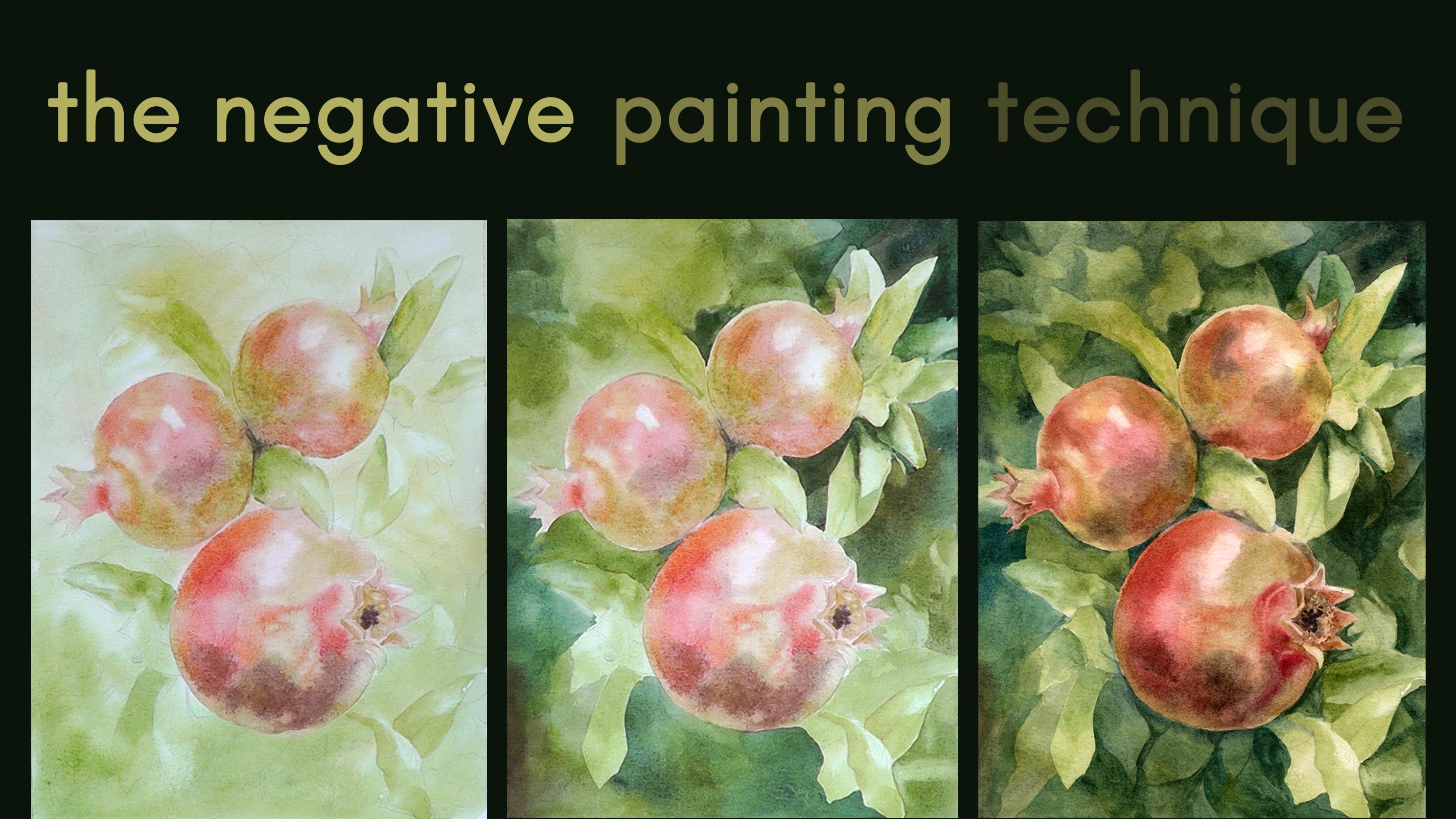
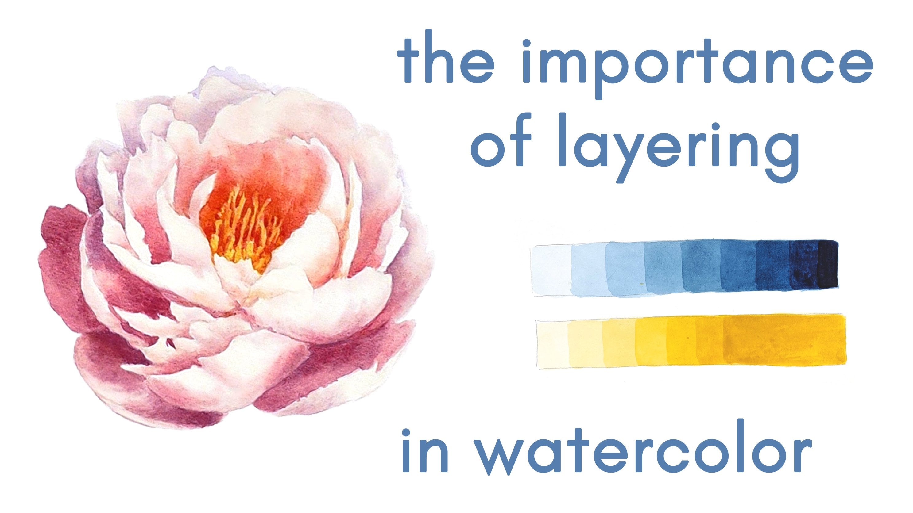
1. Intro: Hi, welcome to the sixth class of watercolor masterclass from beginner to intermediate and eight classes long course that aime to teach you the fundamentals of watercolor painting by make you focusing on one important aspect of it in each class. So by the end of it, you'll have an extensive knowledge of this fascinating medium and you'll be able to make beautiful paintings. Today, we'll see what's the negative painting technique and why we should use it. In the last class, we explored layering, following the rule of progressively adding darker layers to our subject. And that was also the case with our landscape in class number three, where the details and the elements we were adding, were always darker than those in the background. But how can we do when the object is lighter than the background and not just the backround, but all the other elements behind it. Well, that's where the negative painting technique comes in handy. It's not an easy one because it's not very intuitive. because to render an object we need to paint around it, just like we did for our pistils last time, do you remember? The more we added layers to the background the more they took shape and dimention. Those paintings you are seeing right now are made with these technique. And look how rich and deep they are like the objects are immersed in an atmosphere that is peculiar to that painting. So we use the negative painting technique to create this effect. And if you practice it enough, you can really make a leap forward in your painting skills. Our main project for this class will be a section of a pomegranate three. I know it looks complicated, but I'll guide you step-by-step and I'm sure you'll reach a result that will please you. So let's get start it.
2. Project: As you can see, we no longer have plenty of exercises because at this stage is more useful to deal with a big project. So we'll start with just one technical exercise to understand what the negative painting technique is. And then we'll focus on this intricate subject, which is of course divided into sections and I'll explain everything I do so you can follow along without any problems. You can post your final drawing in the project section. Remember that practice is key for learning.
3. Art supplies: This is just a recap on the materials you need for this class. But if you want a longer explanation, I made it in class number one, art supplies, which and why. First thing you need is paper. It must be watercolor paper. And my advice is at least 300 gsm. I like the XL canson cold pressed watercolor paper. For the brushes, 3-4 rounds, synthetic brushes in different sizes will be enough. But you can explore other shapes or types of bristles if you want. Any basic watercolor set will be fine for this class. I am using Sakura Koi, the set of 12 colors. And if you prefer tubes, they are totally fine too. I suggest you to have a ceramic or plastic palette to mix your colors in, one or two jars of water, paper towels, and an hair dryer, to speed up the drying process.
4. "Negative" layering: This exercise will make you understand in an easy way how this negative technique works. We're going to layer a single color like we did here. But this time we're not making a rectangle but concentric circles. And what we do here is again, start with the lighter value like before, but I'm not just painting my subject. I am painting everywhere. Again, we need to dry between the layers. Now and here is the particularity of these technique We don't paint with our next value only in a particular spot but everywhere except what is in the foreground, which is going to be a little circle in the middle, to make it stand out we paint around it. And the hard part is to to be quick enough and using a wet paint to fill all this space pretty evenly. Again. Now, what do we want to separate from the background behind our light one? So again, everything except those two objects. That's how we create the illusion of depth. And I go on like this. And you see how every layer looks like it is a step forward from the other in a very natural way. And we'll see how to apply this technique to an interesting and realistic subject.
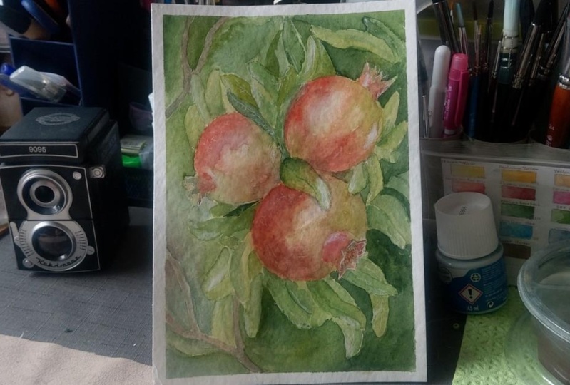
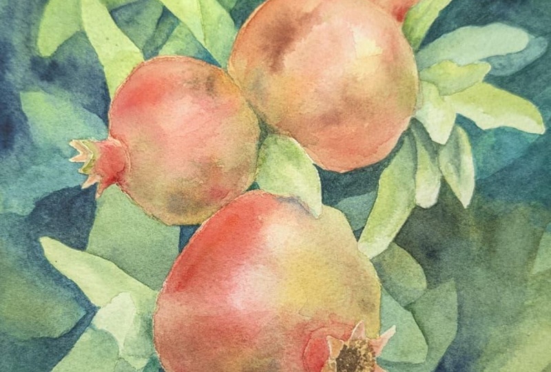
5. Pomegranates - drawing: For this long study, we'll use this picture as a reference and we'll see how to make the most out of the negative painting technique. As usual, I start with a sketch and I establish the bigger shapes, which are the pomegranates. And then I add all the leaves. If it's too intricate, I can simplify it and decide to include less leaves than those in the picture. - - Like in the last class, I want a clean drawing. So I spend some more minutes to refine it and make it more minimal. I don't want sketchy lines. The impression of this drawing now is chaotic because all the leaves are at the same level. So it's quite messy. But the point of using the negative technique is to push some of them in the background and in general establish and make clear wich leaves are more visible and closer to us and which are like in a shadow. And that's how we create depth and interest.
6. Pomegranates - "regular" layers: My first layer will be wet on wet because I want to start establishing my colors. I don't want a flat even wash or any sharp edges between the colors. So don't worry about the color flowing over the edges of the objects. Just don't use any dark colors. Middle values are good and place the colors pretty much where they need to be. But again, we'll layer it so much that you'll able to adjust and fix any mistakes. And I think that even if some red goes on a leaf, for example, is not a problem, it actually makes it interesting and vibrant. But you'll see what I'm talking about as we go on with this painting I use the lifting technique as usual to preserve the highlights like on the fruits and on some leaves that have direct sunlight on. In this phase, I want to paint the more in-depth my pomegranates that are the focus of the painting and for this we're not using the negative painting technique. We paint as usual by adding more intense colors. And I do it wet on wet. I'm using some oranges, red, and muted green. So pay attention to all those shades of warm colors and make them blend into one another. Here I can see the more saturated red of all composition so take in mind things like that when you place your colors. As you can see, I painted the main round part of the fruits first and then I continue with the little crown. Always paying attention to the highlights. Here you can see that there are hard edges between the pointy parts in the foreground and those on the background. So I start by painting only one part. For the rest of it, I'll wait for it to dry. Here, every triangle is quite small and divided from the rest. So I don't need wet and wet. I can go wet and dry and make hard edges. This part is quite complex, so try to observe it well. I'm making a dark center and more ochre color around it. I'll make it more detailed in a further layer. I just need the base tone for now. Do the same for the leaves in the foreground. I want to make them less flat by adding some shadows and intensifying the colors before to start with the negative technique. There is not just one way to use negative technique and I'm proceeding like that to make it more digestible, easier to follow for those of you that never used it before. But more advanced negative painters don't usually do this step of "regular" painting, they jump into the negative technique and distinguish the shapes, the objects just in a final part. So for the demonstration, I thought it was better to show you this way. But let me know if you'd like an advanced class about this technique because it's so interesting. I really love it.
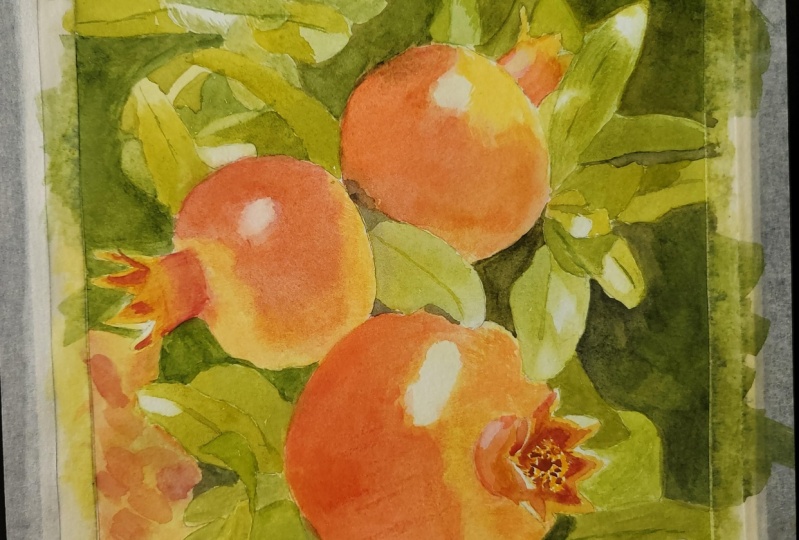
7. Pomegranates - starting with the negative technique: Okay, at this point, we can start to use today's technique and shift our focus to the depth and the atmosphere instead of the accuracy of the single leaf or color or detail, Ok I start with that area and I put some dark in order to enhance the leaves that are in the foreground. So I mix some dark green, blue, yellow, and burnt sienna. As you can see, there is a little leaf in the shadow. So afterwards, I'll put some dark green again to make it stand out from the general shadow that I'm painting now. And I soften the edge with the moist brush. It's important to keep in mind what to avoid. Don't cover the leaves that aren't inside this shadow for example. And again, I don't want a flat color, so I'm adding a yellowish green to also make it lighter going down. And now I just blend it with a wet brush to make a gradient. If I go over some lights, I can always lift some paint away. with a moist brush Here I want to enhance those leaves, so I avoid them and paint all around them. Up here there's a dark value up to here. And I always decide before to put my brush on the paper, what to avoid and where to paint. Here, I don't want such a hard edge, so I wet it and let the color come into the shape. In this area, there are leaves, but they are in the shadow, so I don't avoid them now, I'll do it in the next layer. At this stage, I'm only painting around the leaves in the foreground, going over the others. I know it's scary, but if you cover your pencil marks, don't worry, you can draw again later when it's dry. This is darker so we can already make it like that. I go on with this gradient. Now it's a mess, but trust me, we'll make it work. Ok here’s a darker color, but it gets warmer here So this is not easy to do. I mean, changing the color white painting and at the same time remember to go around some shapes. But it’s all a matter of practice. I don't follow the reference image exactly like here I want the background to stay green. I don't want to introduce different colors. Well, look how this negative background layer has dramatically changed it already. This is the typical effect of this technique. You can clearly see it. But if we want a realistic look, we can't leave it like that. We don't want a silhouette look. So to make it more realistic, we need to add more shadows to those foreground leaves. I want soft shadows. So I wet this group, but I avoid this little light leaf here. Now I need some sharper shadow, so I dry it and use the wet and dry technique. Small brush to make those defined shadows over here. And I often soft it out with the other brush. Now they look less like cutouts and more like natural elements. Let's do the same for this other group over here. I want to push this leaf back. Every time I lose a shape like this, I can "carve" it out again by darkening the background.
8. Pomegranates - more negative layers: I can't see my sketch anymore, but don't worry, we can draw again now, it's possible to draw over the dry paint. Just be delicate. So think about where your leaves are and paint the negative space. - I think that it's important to balance soft edges and hard edges when painting negative for a natural look. Up here, it's very intricate. So I take in mind which are the main leaves and the rest can be simplified or even invented. Taking the reference more like an inspiration. I'm carving that leaf out and about other highlights that are behind it I've decided not to do them because I don't want to put too many points of interest in this painting that is already complex enough. I don't want this part to be distracting. So it can be beneficial to turn all these details into more generic and blurred shapes of color. And wetting it, and creating some leaf shape by always painting the space between them. It's normal to take these decisions along the process because in my opinion, it's important to follow the development of the painting and learn to understand what is beneficial for it and what's not, despite our ideal image of how this painting should have looked. Learn to listen to your painting and trust it. Again here like we did on the right, we need to place some shadows on this group of leaves to make them more realistic and less of a silhouette. By creating those shadows behind the pomegranates I make them stand out.
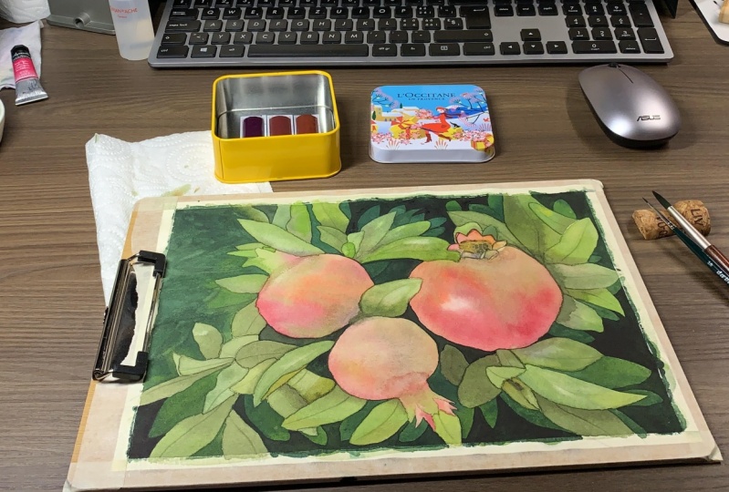
9. Pomegranates - refining the painting: Now it's time to make another layer to make them more realistic and vibrant. I'm being careful to not darken them too much though. I just want to refine them. This part here is bigger than it should so as you know already, I'm going to paint around it to redefine its shape Those shadows around the pomegranates, need to be more visible so I'll make them wet on dry. I'm adding details, especially on those parts that are hard to read. And another wet on wet layer For the others two pomegranates. I could get going like that adding layers and details. As you can see, there are some areas that are more detailed, others are loser. But it's nice to have this variety. And I prefer to keep it relatively simple because this was already complex enough. And the focus of this painting is the negative painting technique, which I really hope is more clear to you now, not only how it works, but how and where you should use it, what it adds to your painting. In this demonstration, you saw how the background became more and more rich and dynamic indeed. So I really hope that you give it a go, even if it looks hard and it is. But I'm sure that with the experience that you have after the previous classes, you will get there.
10. Bye!: That was all for today. I hope you like this very interesting technique that is useful not only to make your paintings look more dimensional and complex, but also because you'll start to think differently in a more advanced experienced way when painting. Let me know if you liked it and what are you inspired to paint with it. And I'll see you in the seventh class where we'll talk about texture and lightning effects. Happy painting.
 Shamila Boffo, Teaching drawing and painting techniques