Transcripts
1. Introduction: Watercolor is a unique medium
and has been on playground for many artists over time because of its
unique properties. Light, light, fastness,
transparency and liftability. How about exploring all of these properties
in one single class? Guys, I am Dana Ten artist instructor,
mother, skillshare, teacher and brand owner of
Fibrin Parcels where we manufacture and make sketchbook
artist right pains as well as giveart classes E people who are joining
me for the first time. I go by the name watercolor illustration dot
letter on Instagram. Most of my articles
are displayed there. You can also find me on my Youtube channel by
the name for the Corona. I give out videos every
week to the class, we are going to
touch upon one of the most important topics
which is water control. Along with all the
other properties that I have stated earlier, We are going to understand
how much optimum water should be used in seven
different kind of landscapes. Get a moody as well
as misty effect. This brings me to the
major discussion point, how to differentiate
between a puddle of water and how to have that
optimum amount of water on your paper that will not allow your colors to
move a lot within the paper and stay in the basic aspects
which we want our pad. Start with our basic materials, what all we need to
complete this class. Then there are seven days
we are going to follow. Each day is going to come with its own set of techniques
as well as color. The organization of the lesson is an increasing order
of difficulty level. But you can start
out with any day. As each of the days
car real time videos, we can follow along
and paint with me, all the watercolor
enthusiasts who wants to enjoy the flow of water
and water colors. Let's come and enjoy this
glass and paint our heart out.
2. Flow of the Class: Let's understand a simple
flow of the class. We are going to start out
with our materials required. Every day is going
to be a challenge. Day one starts with the
lowest party level, and it's a painting with Mooc. As we progress with day
two, day three, day four, I'm going to not only
include various colors, but also tell you how to
work with analogous split. Complimentary and
different kind of colors do follow along with
me from day one to day seven. Do not go by the length of the class as it might
be a bit overwhelming. Each and every day is
covered in great detail, so you can select any
day as your day one.
3. Materials Required: Let us understand
all the materials which we need for
completing competing. The first would be our water. First, you need
two jars of water. The second is going
with 100% cotton paper. The third would be upper colors. The brush set would be important and major thing that we need for completing
all these paintings. The rest are which I'm
going to discuss next. You already know about
all the supply size. Just give you a rough
brief about what I'm using in this
particular painting. I'm going ahead with an
five size arches paper. This is not the exact size, it's a nine to 12 inch pairs. Five size is half
of your four size, and hence it is
way more smaller. Let's have a look
at the exact size of the painting that
we are going to do. This is approximately six, and then I would go ahead and check eight inch into six inch, that's the I have
gone ahead with. You can also select
the same size or five size is also good to go. I will say 100% cotton Tus paper is something that I have
always gone ahead with. This is 300 GSM
and we really need 300 GSM or else the heavy
washes will not be possible. This is basically a
pack that I have. You can go ahead with even
bigger blocks of paper, put it in to the exact
size that I've told you, and then do your
painting on top of it. This is a very important thing. It is microlic board. If you are painting along with paint, you
will need a board. As this board is
very important for sticking your paper to
the surface as water is the only agent we are
going to use for sticking our paper to this
acrylic bar color. Exactly what are
the colors you will get to know from the painting, but I would give you
a input about this. This is a custom palette that I made for
myself and it has various shades which I use
for most of my paintings. You can also go ahead
with pants if you have, or else even squeeze out
paints from tube like this. I do not have this neutral
tint within this palette. Hence, I piece out from, from the cue for the Neutrot, you need two jars of water. Two jars of water is the most important thing which you need for all paintings, one for fresh supply and another for washing
your brushes. I have a ceramic palette. You can go ahead with any
other palette of your choice, though I would be teletingbout
the colors, et cetera. But having a palette by site
is always a great idea. This is a really
thick brush that I'm going to use for
many of my paintings. Six Neptune brush
from Princeton. You will see a
variety of brushes, but frankly, you do not need a, you just need one
thick brush brush like this, the Vinci Casino. A thin brush would
be very handy. Either you can go ahead with squad zero size brush or
else go ahead with quaye. There is nothing that's
written anymore. It six brush that
I've been using, it's been many years
that I've used. Even the written
part has gone out completely as an extra. I do like to keep the Vinci brush if I
am blending in colors. Casino brush brush, these
are all round brushes, is 1.5 inch Princeton brush. I don't need a masking
fluid by my side. I'm going here and using the Winsor and Newton
art masking fluid. Always, always tip your brush in a soap before you use
your masking fluid. I have this coda with me. I will be using I
would be dipping my brush into this and then
only picking up the colors. Picking up the masking fluid, And never pick up
the masking fluid directly from this jar. Always pour it in any kind
of a ceramic pallet and then only use it because if you
just again pour it back, all the soap that was there
on the brush will get into it as well as it might react with the masking
fluid that you have. This masking fluid
may not last long. It happened in one
of mess and in your masking fluids or I'm very particular about using the masking fluid
in the correct way. The most important thing tissue, we will use it in various
occasions and that's one of the reasons
have issue by a side. I've already told you about the I have made the smaller cars for a reference and these are great when you are
referring to the colors. You can also make a few of them, otherwise we are
also going to keep her sketchbook very
handy for ourselves, where we are going to
try out all our colors. We are going to try out what or techniques
we are learning. This is a sketchbook
from vibrant parcels. It's arches, 185
GSM that I need.
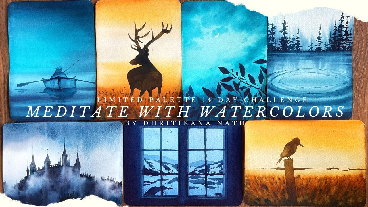
4. Day 1 Solitude Techniques & Color: Super excited to start
with our day one painting. I have kept the painting
absolutely simple. It is all about working with one single color that
is neutral tech. You can go ahead check each and every value that
we are going to create. Next along with it, we are going to use
the same values in our painting for folly
and misty mountains. The name of day one is
solid values is one of the very basic concepts
that we need to explore in watercolor
techniques over here. Today we are going to the values for one single color
that is neutral tint. I will just go ahead and draw a very simple outline
where we are going to go from the darkest value of this neutral tint to the lightest value while
we go towards the bottom. Let's start with
our darkest one. I have taken freshly squeezed
out paints into my palette, and now I'm going ahead with my darkest value which has
less amount of water in it. I will just go ahead
and apply it on to give me the darkest
value of this color. It's always great
to go ahead with freshly squeezed out paint to get the darkest value orals, you might have to just spray some water and moisture paint before you go ahead
with the color. I'm going ahead and
adding lighter shade of this into my value part over. This is like a value
card which can help you to explore each and every
color as you progress. I'm adding more water, applying it on my schedule. I've already added one
more shade lighter, adding water, you can see how the colors are
becoming more and more light. As we progress, this is
one more shade lighter. Now you can dip your brush
in water and just go ahead and get a shape that
is one more shade lighter. Last shade is all about
whatever we had in our brush. We are going ahead and
adding it on the paper. This is the whole value
scale that we have created for my particular color that is neutral t.
Let's understand, what do we mean by puddle
of water and what is the optimum amount
of water that you need on paper for
creating a painting? Now let's go ahead and take a very thick brush
like this one, and we will apply a layer
of water on our paper. Don't worry, it's a
bit brownish in shape, but that's absolutely okay. My brush, I think, had some paint which is okay. No issues. Now you observe water on the
sides and they're moving. Now, these are mainly known
as your puddles of water. If I apply a new
color on top of it, it will move a lot where it can even
give you backgrounds, which we really don't
want in our painting. See how the colors
are moving here and there it will be all over the place in case
you want to create a painting where you want a controlled approach for water. This is not exactly the
way you can move along. Wherever you add water, you will see that
it will move a lot. What I usually do in this case is going ahead
with a flat brush of mine and applying a layer
of water like this. You have way, way, much better control in
this case because it's an even amount of water that you have applied
on the Cole surface. Now, when you try to
apply the colors, you have to first see how much water is
there on my paper. If there is a lot of water, do not go ahead and apply
your colors because that will not give
you good results. This is the optimum amount of water that's shine that I see. Now, I would go ahead and
just start blind my puddles. You will see that I'm getting
the optimum amount of colors for the sheets that
I need for my painting. Even if I move my sheet a lot, the colors will not
move in this case. Okay, I have added the
colors till the end. I'm moving my colors a lot. You can see how this puddle
is reacting over here. This is moving so much. Whereas you can see how
beautifully the moving on the bottom part water is doing its work and we have got
a beautiful outcome. This is all you
need in your data. We will go ahead and
start with our data next. In that case, I will
really tell you more about the colors,
mixes, et cetera. You can also go ahead with any other shade
of your choice. Like you can also
go ahead with O. If you do not have a flat, I think this would be equally misty and nine spect
that we can get. This is one of the alternate
colors that can be used.
5. Day 1 Solitude Painting: Day one, and it is
painting one wet on wet is more like an experience as you grow old in your
watercolor journey. You will understand that
wet on wet can create a lot more magic on paper than you can really create
with wet on dry. I have started this journey
about five or six years back. And still I would
say water color has been a beautiful journey where I'm learning
more and more. All I have come
across is lots and lots of accidents when you
are doing a wet on wet here. Today, we are going to
apply a lot of water on the back side of the paper as well as on the front
side of the paper. Both sides will
be completely wet and we are going to
create mist and fog. Through this class, you
are going to frankly learn everything about mist and fog in various kinds of landscapes. So that's the major idea and that would be the
flow of our class. As you all know
that it is always an incremental order of level. We are starting out
with quite an easy one, where we are just creating
a simple, foggy effect. I'm going ahead with
my thickest brush and applying some colors. This is really light wash up colors as my brush is really thick and it can
hold a lot of water, just applying some random
colors here and there. You have to also be very random as you progress
with your water colors. And this particular painting, don't think much, it's
all about creating fog. Fog is also natural
and it is random. It will appear in a few places, it will not appear
in few places. Some of the hills you
will be in a position to see and some of the hills you will not be in a
position to see. We are working with one single color that is neutral tent. You can go ahead
with Eagle Black, Mars black, or any
other lamp Black. Whatever is available with you. Many of you might also
want to use blue. I would say one of
my favorite sheets of blue isn't on three blue. Or else you can also go
ahead with crucian blue. Another important
color is paints gray. If you are someone who loves color in between
blue and indico, it would be paints gray. Another color would be indico. So these are the shapes
that can be used if you do not have neutral tent
available with yourself. Why I have chosen
this particular one as our first painting because there will
be a lot of water, puddles of water which you might like, which
you might not like. We will be experimenting a
lot and going ahead with a bit of a easier painting in the first floor
would be helpful. Okay? Adding more and more
paints here and there. Some of the areas
on the lower side, of course, would be darker and on the top side
would be lighter. Whenever you are painting, you have to keep
this in mind that the top carrier will
be lighter in shade. As the mountains are par, away from us, we will
see it more blur. Whatever is closer to us, we will see a much
more darker value. I'm moving my acrylic
boat here and there. Acrylic boat really helps my paper to stick on it for
a longer period of time. And it will keep
my paper wet for a longer period of time
compared to any other surface. That's one of the
reasons I always, always say that get an
acrylic boat for yourself if you want to ace your
wet on wet techniques. I will remove my extra
water onto my tissue. As you can see over here, I do tilt my boat towards the
right and on the tissue I will put all the extra water now for can be in any direction. That's something I
would like to tell you that you cannot frankly control. You cannot even control water. What we can do is with the flow, if my water is
flowing downwards, let it flow downwards, but the darker
area is downwards. It's better if your water flows sometimes from downwards
to upwards and let's from upwards to
downwards because that way you want to keep your
top area more lighter. Because the bottom area is more darker for this
particular painting. Yes, there can be
various paintings where it can be darker
lighter depending on which area you are concentrating
on going with some more of the spots here and there and dropping
in a few dots. It's absolutely fine if you are even getting any
cauliflower effect. Once your paper is
completely dry? I think those are things
which we cannot control. We can just clear out the areas which has water on the
side of the paper. That's all we can
do on our own rest. I guess it's all up to how water wants to make its
way through this painting. For me, this looks
really dreamy and moody. Now, I would let the paper
dry off completely and then add three
layer of mountains. All the three mountains
will not be seen equally. It is pretty uneven. You can go ahead and do a rough sketching as I
am adding right now, orals just go with the floor
and paint along with me. That's absolutely fine. I always like to lay
a framework, I mean, with the help of my
pencil and then only go ahead with the painting
part that helps me to gain more confidence
rather than just going directly with
my brush shots. It's just the way that
I have learned though. If you are becoming more
and more confident, you can directly go
with your brush paints. I would leave that
decision up to you, how you want to play
with your watercolors. Watercolors is,
frankly, a playground and you can play as
much as you want. For the Foreground Mountain, we will have a small
tree and that's it. We are going ahead
and adding that tree, few branches here and there. And once we have
added those branches, we will just add a few
drops of our paints on it. Blending the colors will
not be much of an issue at this stage because we have already applied
the darkest value. Then once we have applied
the darkest value, we will blend it with
our blending brush. You can keep always a bigger blending brush by your side for
blending your colors. That would really help
you to have a very, very smooth blend
with the background. This is something that
always, always keep in mind. If you see, I am using the tip of my brush
to blend the colors, and I will pick up any extra colors or
extra paints wherever I feel has gone into the painting or blend it with some
more clear water. I have two jars of water
always by my side. One is clear water
and another one is where I usually wash my brushes. That's how I go about
it for my paintings. Blending might appear a very
simple and easy technique. When we are learning, we always love to learn more of difficult techniques
progressing in our journey of watercolors. But frankly speaking, most of the easy things teach us a lot more than the
difficult techniques that you learn in future. These easy techniques can
really help you to ace through your watercolor paintings at a big medium or even
as an advanced artist. Okay, I guess this is it, and let's continue with
our painting part. Some of the areas
are more darker in this particular mountain and some of the areas
would be lighter. I will continue with
my blending process and I will blend, blend it. And blend it till the colors of my background and the water that I've had it right
now become similar. Why I say that they
should be similar? We do not want
that The fog looks different or the
mist that you're painting over here looks
absolutely separate than the pole of these mountains
which are coming out. Now this is from my
experience that I have seen some of the areas are completely not seen because of the clouds or
the mist and fog. And some of the areas
of the mountains are always seen
whenever you go to any regions of
Himalayas or you go to hill as well as
if you can even see, see this kind of phenomena
during the autumn and Winter season where it's
pretty cold and chilly, you will see that the
far off things will become more plur and in some of the areas fog is
more and some of the areas it's a bit
less all those things, of course, we will
keep in mind as. Is a natural phenomena. And I have told you earlier
also anything that appears naturally will be more random
compared to what we do. Like buildings,
buildings will have a particular shape size,
architecture, et cetera. Whereas trees will not have
any shape size, et cetera. They will follow
whatever way they see. They just want to
reach the sunlight and they will grow any shape
size that they want. That's the specialty of working around with nature and how much you are
influenced by nature. I would say that always, always try to observe nature. Nature has so much it will automatically give you
so much more in terms of the understanding and how
you should progress with your painting and
how much you can get influenced from nature. I really can't tell you what extent I am influenced
date from nature and how much it has changed my painting and how
much I have grown as an artist because of what I observe and
what I see in nature. One of my early learnings
during my school days, I would say when I was taking these art
classes in school, it was to observe. Baa teachers told me, the better you can observe, the better you would be able
to paint during that time. If of course it did not
strike me. I was very young. I mean, 56 students, you really don't get
the depth of it. But as you progress
with your journey, as you become more and
more mature as an artist, you get to realize that that's where the whole of
the beauty lies. That whole of everything that
you do lies. It's magical. The space which you get to feel and understand when
you start observing things, when you get to realize that, how much they can add value to the content that you create
or to the work that you do, makes a lot of difference
to you as an artist, as well as to the
spectators who observe your work going ahead and
just blending it further. I usually, what I usually do
is just blend it and ***. But some of the areas I
do even like to wet it, that the painting looks more organic and the paints can flow. They can get a
better area of flow. That's one of the
reasons I would just apply water in some of
the other areas too, though you might not
feel the need of it, but still let us do it. I can tell you it will add a lot more beauty
to your painting. Having said that, I think
some of these spaces, which I feel are a lot more lighter while
we paint the fog. Initially, I would like to
make it a bit more darker. Go ahead and first applying the darkest value
on the right side, and then again blending it. See, water will get absorbed slowly and
steadily by the paper. If you are in a region
where it is more drier, I would say that your paper will not remain quite for a
really long period of time. And hence, you might
need to apply water at regular intervals or go for
washers as I did over here. It's absolutely fine. You just need to know how and when exactly you
have to apply water. That's all rest. Everything I think will fall
in line applying some of the darker values even
for the fog area. While we are going
towards the bottom, you will see that
I'm applying it towards the bottom
area over here. As I blend my colors and
take it a bit below, just above the mountain
which is closest to us, we will apply some of the
darkest value of the fog. Now that is because our way, the darkest value is coming
up and we want to have the same colors almost over here as well as towards
that particular area. Okay, blend it. And blend
it with the background. This important. I'm even adding a bit
of the mountain on the left side so that there's a continuity which
you can observe. Even on the right side, you can see that there
will be a continuity. Beauty always lies
in how you want to see it and how you want to
even add it in your painting. Some of the areas you have
to create, the depth. Depth can be only created
when there is a contrast. For us, it's a lot about values. I know that you guys
already know a lot about values and we have
also discussed it in our technique section. But when I discuss about values, all I want you to understand. As you go deeper or as you go more and more towards
the bottom area, your values should become
more and more darker. And if you have this one
single thing in your mind, I think the rest or the whole of the painting
will fall in place. I really did not want
to create a hard edge. That's one of the reasons
I'm using my flat brush just to make this particular
area more softer. If you are someone
who is like me, you will understand
that the beauty of this whole painting
lies in the softness that we have overall
created now with our water, as well as the colors,
everything moving, flowing and nicely
creating its magic. It's like the water is dancing and you are letting
it dance on its own. The pigments are flowing. It's something that
I have always, always loved and I love to
explore it in that way. Only it's the last mountain, the foreground mountain, and that one is the darkest of all. I'm going ahead with
my darkest value right now and adding my mountain, of course it's darkest. So go with the darkest value that you think
will work for you. Whether it be blue, black, whatever color you have
taken for creating the mist as well as the backgrounds, it's
absolutely okay. Go ahead with it and keep creating creativity
is most important. The painting is very important. Rest everything will happen
and it will flow on its own. Do not worry, you just
have to be at it. As I always say, you will make it happen only
when you start paint things. So pick up your paints, brushes and always
paint your heart out. That's all you can do. I know managing time can
always be difficult, but still just adding that one small single aspect
to your daily rife or routine can really
change a lot in terms of even the
balance that you strike. It gives so much more
happiness to me when I paint and I really
miss it when I don't. Not as my profession, it was never initially
my profession, but even as an artist
or even as a person, I love to paint my heart
out and see something creative or paint something
more creative from my heart. It's the creativity that gives
me so much of happiness. I hope that it also does to you. Continue adding some drops
of water in the bottom area. We are just creating
some texture in our mountain as
well as it would help you to show that
foggy effect that we have already created in the top part of
the mountain rest. Once this part as dry, we will go ahead and start
adding our tree now. That's the last part. To be frank, the
tree is solitude, which means that there's
a single tree as well as there's a single bird that we're going to add into this painting, though it might appear, why have I given it or
done it in that way? But this whole painting, I want it to be simple
yet interesting. And it is all about strength. Strength of one single color
and how much beauty add. So why not a single tree and a single bird for the
top area? That's it. Let's go with that thought and continue with our painting. This is my escoda
optimobrushny of, you already know about it. I have been using this brush
for many, many years now. Most of my classes have
seen me using this brush. Many of the students
have seen me already using this brush for
a longer period of time. I don't know. Now,
I think it was the sixth size of the
optimal brush from Escoda. If you are ever thinking about
investing in a good brush, this is one of the brushes that you can always look forward to. For me, I love to go ahead with a good and nice tip brush, and this brush is
really comfort for me. Some brushes are
your comfort zone, and this is one of them, which has always been
my comfort zone. Going ahead and adding
a few branches, I usually break it towards the top and keep adding
more and more branches. As we progress and
go towards the top, go ahead and make the Stem on the trunk of
the tree more thicker. Again, this is at a distance, you will not observe a
lot of detail in it. Keep it simple, easy, as I always say. Then add a few leaves. Once you are done with the whole of these
stems, et cetera. Those leaves will add the strength that you
need in the tree. For the a few drops of colors here and
there. And that's it. Use the tip of your brush. Tip of your brush is something
that I always say that you should use it for your
watercolor paintings. It can really create so much of light beauty as well as
happiness that you usually see. Once a painting is over, you can really feel that
this brush was standing by me and I could complete a good painting
with the help of it. Yes, brushes are important. They are one of our best
friends in water color journey, any of the other mediums
that you are using. I think brush is very important. Going ahead and I would do
a rough sketch of my word. Once I'm done with the
rough sketch of the word, then I will go ahead
with my painting. I think few more of the
lines are important for our smaller areas of the stem as well as I will make the tree
trunk a bit more thick. That's also there rest. I guess. I'm pretty happy with how it
has turned out and how it looks on the top right side. We will make the bird as
I've told you earlier. Also I will do a rough sketch. I'm a person who is a
bit more conservative compared to many
others you might meet. Though I like to
always let loose. But let loose with a small constraint of having a framework
in place that really helps me to guide through
my entire painting and get a desired result that
I have always thought about continuing with my bird. Now, once this bird is done, I would have a fun
look at this painting. Super happy with how
it has turned out and how the whole of the
thing right now, once you're done
with your day one, which was more to
go with the flow, we will go ahead with day two. There is a bit of a
learning in terms of what is your vanishing point, as well as how do we paint
our defender fields. Let's gear up for day two now.
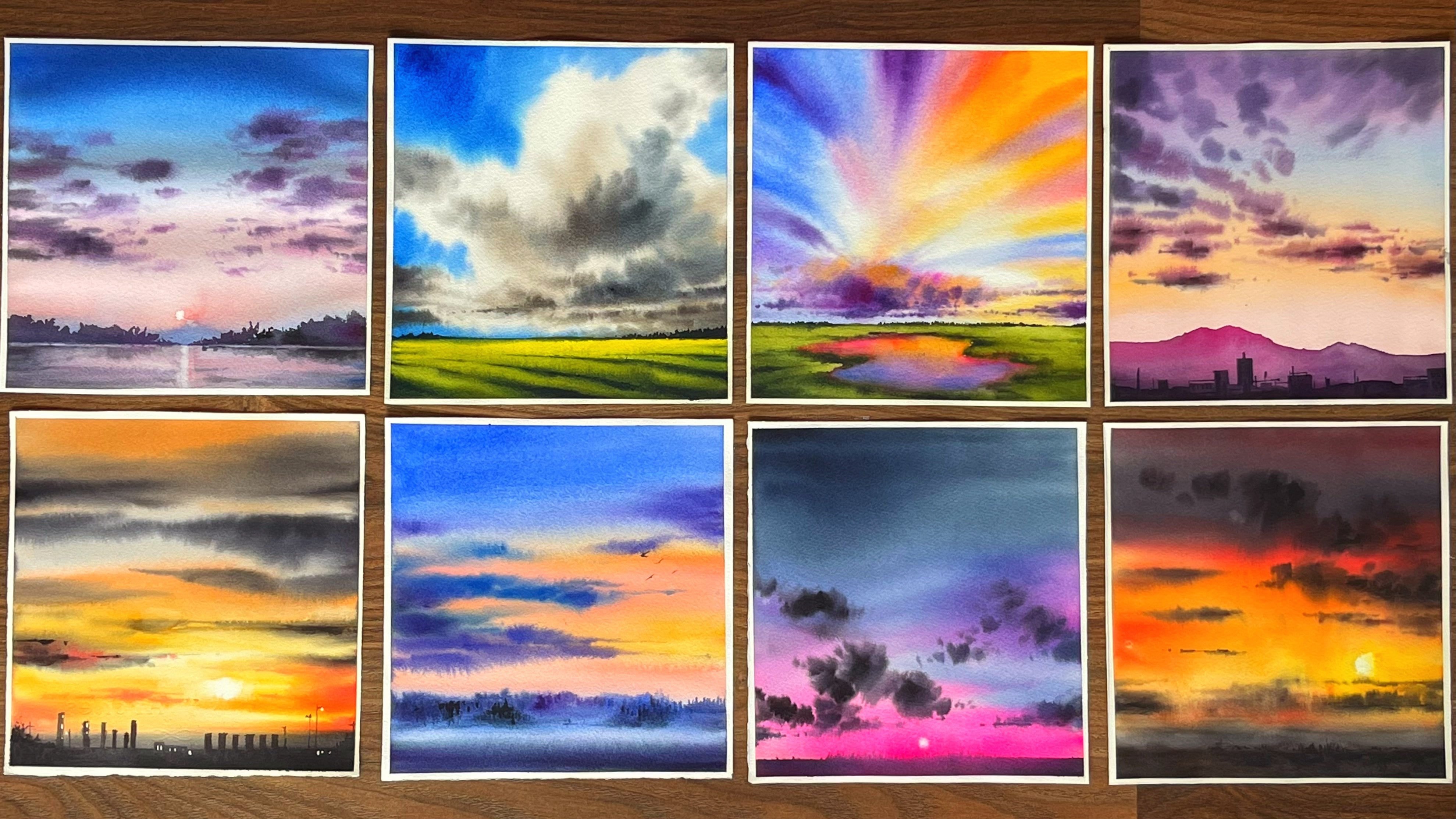
6. Day 2 Lavender Love Techniques & Colors: Sunsets are my favorite
through this painting, we are going to use
multiple colors to create the sunset along with it. We are also going to
understand basics of sketching like line as
well as basing point. What I will do is
I will just make a small square box over here as well as I will make a small square
box over here. Not exactly square. It
is frankly rectangular. We will drop in a few p. This is majorly to understand our
horizon line vanishing point as well as the rule of hours. Now these are basic and
very important concepts in our painting schedule. And you will get to understand
how it is so important when we work with our
watercolors or line over here. This basically differentiates
my sky with water or land. This line, which is
differentiator of both the sky and
your water or land, is known as your prison line. A very important
concept when you go ahead and understand
your water colors. This is a basic line that you need for most of your paintings. And therefore, this
is something that you should keep in your
mind while you pick. The second concept is
all about dividing your paper in an approximately
nine equal halves. I will not say that it has
to be nine equal halves, but yeah, we need somewhere
close to nine equal halves. Have tried my best to get
the nine equal halves. Your subject should
lie somewhere here. These are basically
your focus points. These are my focus points. This is also known as
the Rule of thirds. Say that you don't place your subject just in the
middle of your painting. You will either place
the subject on the left. You will either
place the subject on the right or somewhere here, here, here, and here. Either above or below
is the concept. That picture, though
there will be deviations that you
might find over here. But this is one of the
major important concepts. Let's go ahead and understand
our vanishing point. We will directly go ahead
with watercolor and understand this
because I want to re, teach you how we work with
this aspect with watercolors. Rather than going
ahead and again, doing it with watercolors
to it over here itself. Now it's a simple concept. We will go ahead
and take Fencil, draw a few lines. Now all these lines have to
converge to one single point. That single point is known
as your vanishing point. Now, where all can your
vanishing point lie? Your vanishing point is
not lying over here. It lies somewhere over here. All the, it lies somewhere here. You will see that all the lines I'm meeting it somewhere here. It can lie anywhere
on the paper, it can lie even outside the
painting that you are doing. You will see in my lavender painting over here,
the vanishing point. He's lying somewhere outside. It's not lying within the paper. And that's a very, very
important concept. You do not need to make your vanishing point lie on
the paper, can lie anywhere. Even outside of painting, I am going ahead and applying my ultramarine blue towards
the top area of the sky. This is a very dry and rough one because I have not applied water and this is wet
on dry that right now I'm doing My surface
is dry, absolutely. And I'm going ahead with
my wet car on top of it. Let's go ahead and
apply some maple yellow where we are
towards the water medium. Equal amount of water
and equal amount of pigments at every
place off the paper. I'm going ahead with my burn Siena now and
applying it in few parts. I will start from the
bottom, apply it. I can see that there is a lot of water that has gone
into the painting. We might need to go ahead and
just freeze out some water. I can just take off
the extra bottle, another with my darkest
value of brown. Again, applying it from the
bottom area towards the top. We'll go along the line and try to add my darker
value of shades of brown. The darkest value of brown, which is more or less
the bendik brown moving along the lines that
we have already added. If you are not happy
with how it is out, just pick up your colors on the tissue and then
start applying it again. I have also this concept in
many of my other classes, but since many of you do have
doubts about this concept, and this is the major
important concept which you need to understand. Therefore, I would like to
iterate it again and again. All I'm working right
now is wet on wet. I am not going ahead and adding any wet on, dry, wet, dry. What happens is I
will get darker lines and that's what I don't want at this stage
of my painting. I would keep it absolutely
soft and subtle. All our paintings
are absolutely. That's one of the reasons
I have just done it in the way which you
can understand rest. It's more to do with the
sketching which you will get. It's a very simple
sketching and I have gone ahead and made
it really simple. As you progress, you can see how easily they are
moving into each other. The colors, as
well as the lines, they all will converge
to one single point. Let us understand all the
colors which we need for completing this beautiful
Levendar field. I am keeping a
spread of my colors. This is more to do with colors which are
close to each other. Which means that they
are analogous colors and they lie close to
each other on your color. We, if you see one
is ending yellow, then is net yellow
sending orange quinan. You can also keep, think if you need composed violet is
one of the other colors. These sheets are almost
close to the ones that we have on this particular paint. For my windmill, I will go
head and keep Bernanke Brown. You can also keep ultramarine
if you don't have ink down. When you mix your ultra
maline with your ciena, you will get a shape that is darker then you
can also apply it. Your painting post
is my Indian yellow. I will apply a bit
of finding yellow, then I will apply a bit
of my Naples yellow. Let's see, how do they
react with each other? They react pretty well. Then I will give some
amount of my orange. You can see that all the colors
are pending pretty well. Going ahead with quad coral, this is a beautiful
shade from Daniel Smith. You can also go ahead with compost coper to add one more
shade, something like this. Then we will go
ahead with purple. Finally, if you are wanting to add some more darkest
value into your painting, either you can go ahead
with your green screen or else you can also go ahead with neutral tent in three blow. These are the sheets that
we are going to apply. Always try the colors on your graph paper before you go ahead with
your final painting. This key is going to be your At.
7. Day 2 Lavender Love Painting: Day two. And it is painting
to painting missed in various different landscapes is something that I
have always loved. And this is day for you guys. I am super excited
to share the whole of this sketching as
well as painting. Many of you are already aware that I do a lot
of wet on wet and wet. But the most important aspect of any painting stands
at the base level, which is majorly the drawing. So what we have done is
we have got a small line. First of all, it is around
7 centimeters in length. Along with it, I have marked about 1 centimeter on the left as well as 1
centimeter on the right. From the top it's about
1.5 centimeter and while at the bottom it's
around seven centimeter. That's what I've to
seven to 8 centimeters. You can keep in your mind
while you are drawing this, I will just add a few
lines towards the top. And once I'm done with the top, I will go towards the
bottom area for me. Whenever you are painting
a lighthouse or windmill, the most important aspect
is to draw a middle line. Now that is usually my baseline, on top of which I start adding all the other
lines that are important. Always keep the left side of this middle line exactly
the same as the right side. They both should be equal, as this is a structure which is manmade and whatever
engineering that usually we do always are equal in
size, shape, et cetera. If you are making houses, then you need to that in mind, you have to have equal size on left as
well as on the right. You are bound to do that
in this particular way, only if you are of
course painting nature, then it is pretty random. And once you're painting nature, you will exactly get to
know how random it is. I will show you over here. All the nature paintings is random as they have
their own kind of mist, the background which is
majorly in the sunset time, you will see that the mist has done so much of
magic in this painting. All the plants or all
the background trees that you watch have become
really blurred and wet on wet. We'll do all the
beautiful things in this particular
painting, okay? Going ahead and adding two more lines on the left
as well as on the right. You need to add this. And once you have
added these lines, we will go ahead and make
other few smaller structures. Now, this is a windmill
and we need to even add different
wings, I would say, of the windmill, or you can
say the fans, of course, of the windmill
that has to move, otherwise you cannot
generate energy. This is usually seen in many of the older places of Europe or in many other areas
where you do have. The windmill now
is very different than what it usually
used to exist earlier. Even in Netherlands, et cetera, you can find tulip fields, the windmills, et cetera. All of this, of
course, is existing. And that's one of the reasons whenever I go ahead and think, I usually take the inspiration from whatever is
already existing. I do a lot of changes to any reference
picture that I have in my mind because I really do not want to associate to the reference
picture that I have seen or I do not want anyone else to come back
and say that again. You have exactly painted the way it is in the
reference picture. That's something which I always, always keep in mind
while I do my paintings, whether it be watercolor, whether it be any of
the other medium. Going ahead and
adding these lines, now these lines basically add
perspective to my painting. And they are originating all from the left and
going on the right, you will see that
they all are meeting to one single point which
is outside the paple. This is the whole
of perspective. Now you all know how I have worked with perspective
through my other classes. If you haven't gone
through the other classes, please go ahead and check out the vanishing point in
some of the other classes where I've taught exactly what and how the vanishing
point works. Now in this particular painting, I have told you that this
is outside the plate. We do not need to worry. You need to just see
that all these lines converge to one single point
that is outside of it, Adding some of the trees
for my background. And this is going to be absolutely in a very,
very light manner. I'm going ahead and adding the trees form my
background mist. And you know that usually mist occurs during
the winter season orals, even when the colors of
the trees are changing. That means your days are becoming more and more
cold, colder, that is, in the autumn or from autumn
to winter when we are moving between seasons as well as in places where
there is water. Now, water can really
generate a lot of mist. Or even in the mountains
where you will see a lot of water pouring down or you'll see the clouds creating all
the beauty of the mist. They do have a lot of auty in itself and I feel
that mist in various, I would say that each and
every mist that you paint in our different landscape has
a different feeling and it conveys something absolutely
amazing going ahead and adding the fans of
this particular windmill. Once we have added these, then I would go ahead
and make a few lines. It is a very easy
way that I just had more of shading areas
which are pretty dark. Whereas I leave it, as I would say, more lighter. Once you are moving
into the spaces that we do not need to
make more and more darker, I add some of the darker
lines you have already seen, as well as you will see
even in future painting, where we are going to paint
one of the water falls. We have rocks and
some of the areas of that particular rock I have
added in darker values of my pencil continue
to just darken the lines that I have already added as one point perspective. Or you can also say that this is the vanishing point that we
are adding towards the right. Most of you already
know about it. If you are not aware of
even the rule of thirds, I would say you have to go
through Rule of thirds. According to that, I will never place my subject in the
middle of the paper. I usually try to place it either on the left side
or on the right side. I usually keep my corners
also pretty boring. These are a few things that I usually follow in
most of my paintings. Let's continue with
the sketching. It's basically just
sheeting a few of the areas and adding
a bit of irregularity towards the bottom
part of the window because that particular part does have some crosses and all adding the fence towards the left side as we
have added ready on the right side detailing of a small hot light
structure on the left again. Then once it is done, just clear out your page to
have a wholesome look at. Hope your sketching
has turned out. Adding a small horizon line in the background above which
I am going to add my trees. Now this horizon line
is very important. It really separates
our land from the sky. Always, always keep
a horizon line in as many paintings as you can. If you have sky, then your land, or sky or water, this becomes a very, very important aspect in any
kind of these paintings. In the meantime, do wet both
the sides of your paper. This is very important for
a wet on wet painting. Now, wet on wet
painting is something where we will be using
water to our advantage. Continue to add water even
on the side you draw, so that the water is evenly applied on both
sides of the paper. As well as this water is
really going to help us create that misty and beautiful wet on wet effect which we
are looking forward to. And frankly, I am
looking forward to it. Like anything, I have picked
up some of my Naples yellow. Naples yellow is one
of my favorite colors for sun set kind of a painting. I'm adding a bit of a yellow, but I'm really happy with it. I might go ahead with Naples
yellow again and take off all this extra Indian yellow that I've applied earlier. I think naples
yellow is something that makes you fall in
love with the painting. It's subtle, nice as well as if you are even
working with blue. The advantage of it
is that it would not react with the blue to
give you the dirty mixes. Now for these positive aspects that you see in the painting, it's important to try
your colors beforehand on paper that you
have by your side, rough paper, and then only go ahead with the
final painting. Now, why I say this often, because many of you have
complained in the past that the whole painting
did not exactly turn out the way I have
told you, et cetera. That's the reason of this extra caution that
I'm giving right away. Okay, Going ahead with
my Quinacrodone coral. This is a beautiful color. It's in between the orange as
well as the compost opera, which I'm using now. And then some purple. I will
play with these colors on the top half of my sky as well as I will take
it towards the bottom. Super happy with so much of water that we have
on this paper. It might appear a bit
tough at this stage. If you are just a beginner, it might be how I'm using such a thick brush and
it is around size ten. You can go ahead with
a thick more brush for doing this painting. You will see that the beauty lies in the wetness
of the paper, the better you have or
the paper is more wet, easier it is to work with it. And that's one of the
reasons I always say, go ahead with 100% cotton paper. Even 185 GSM or a 200 GSM, 100% cotton paper cat give you a lot more than what
you can expect on a cellulose paper or else even a paper that is 300
GSM but not 100% cotton. Please, please do go ahead with all these paintings only
on 100% cotton paper. I know I am iterative
about this process, but yes, the final results
are going to be good. Only when you have the
correct paper by your site. Correct colors by your side. Correct colors doesn't mean that you need to have
the same palette. But an artist's great color
would be really helpful. When you are doing a
wet on wet method, what happens is the
colors really go to shade lighter than it
appears right now. You are also going to
witness it as we progress. I am using the tip
of my brush for adding the background trees. It is good to continue with it, and you do not need
to worry even for the middle part where we are exactly going to
draw the windmill. It's there for us
in the background and there is no need
to worry on it at all. While I am not very
happy with this guy, I've got a few line
like structures. Blending is very
important and hence, I did go ahead and just take off all the background
bushes that I did add. We can of course add it
till your paper as well, so no need to worry at all Adding some more of our
work. Acrodone coral. This is beautiful
color and I have been seeing how much beauty it adds in any kind of
painting that we do. Whether you talk about your florals or you talk
about your landscape, I have been using this
color everywhere possible. I have this one
single palette that I always use for most
of my paintings. It's not that I do not go
ahead with any other palette, but this is my favorite
palette for my paintings. Going ahead again with the
Quinacrodone coral and then we will continue adding some amount
of pink and purple. Another question is,
why do we mix colors? This is very important
at this stage. If you continue to
mix your colors, you will have various
values coming up in various areas of the painting and that
becomes really very interesting in any
watercolor kind of painting. Okay, continue with
somewhat darker values and take it one or two
drops here and there. Even on the left,
you have to continue adding all of these
darkest values. That is a mix of your purple
as well as your pink. Go ahead and add
some of the purple, the purple that you
usually observe. I'm using is bright
valet or else you can also go ahead with
any of the other valet. The only request is if you add a bit of any blue shade that is either your age gray
or else if you add some amount of
your indigo in it, you will get a darker
value that might be needed in few of the areas
of this background bushes. Continue adding it and
adding some more line. I would even lift off the colors from few of the areas
wherever it is necessary. So I will even do
that at this stage. I'm frankly, very happy with how the painting
is turning out. We will add some lines
towards the bottom. This is basically the line
that I did tell you earlier. They all converge to one single point known
as vanishing point. I'm going with the
free hand along with the lines that we did add
during our drawing process. To be frank, I cannot see
much of lines at this stage. My pencil is drafting pencil. And sometimes I do feel that
this drafting pencil really doesn't work much when I need the darkest
values to be seen. Anyway, I am pretty okay
drawing these lines because I have done it pretty much earlier also and I'm
pretty well versed with it. But if you are someone
who is not aware of this, I would like you to use a
bit more darker pencil. Maybe a two B pencil
will be good, or else at least an HB pencil rather than a drafting pencil. I like to keep my graphite marks low on my watercolor paper. That's one of the
reasons I always use these kind of
drafting pencils. I do not usually get any graphite marks on the paper as watercolor is
a very transparent medium. And we really don't want any of the graphite
marks to be seen. Now I'm going ahead and
clearing out the area just below my bushes of
the background, that is the trees
in the background. Then again, I would go back
to the vanishing lines. I would say the converging lines that move to a vanishing point. Now, these lines are really, really important
for this painting, because for the bottom
area, we only have this. We are not going ahead
with any of other details. And hence, while you
paint to make sure that this really
shows our fields, you can see that this can
be any kind of field. It's just the color
palette that I've chosen. It can be a floral field. It can be a field where
we have the greens. Just the color palette
remains for the sunset. Okay, adding somewhat
darker values towards the bottom of our beautiful and the nicest of the windmills that we
are going to paint ever throughout this painting, we have only done wet on wet. Now, what is exactly the
wetness of the paper? You already know
we have done it in the mature techniques
section and I'm just using the tip of my brush to add this smaller and beautiful
details to our painting. This is majorly the grasses, or you can say this is majorly the plants that we
have for our background. I'm going to add more of this On the other lines too
that you observed, I will mix a bit of my paint scray or else
you can also take Inigo into and then continue adding it
slowly and steadily. Now this is more of a
meditative process. All I can say, I just go and add it and then
see what water does. Water is a huge
player on its own. We frankly do not need to
do much in water colors. As I always say, water
cups earlier than colors. If you know how to
play with water, you exactly know how to
play with your colors. Okay, I will add more of longer lines while I am towards the left
side of these lines. And while I go
towards the right, they will become smaller and thinner because that's
how you see perspective. Anything that is closer to
us appears more bigger. And whenever they
go away from us, it becomes more
and more smaller. Continue working
in the same area. In the same way as you see this or as you see me
working over here. And then add a smaller to as you progress towards the right
side, continue again. On the other lines too, it is pretty iterative. And I say that many of
you might feel that, okay, why it's so much of
iteration in this process. But frankly, this is
the only way out. We do not have any other
way to work through this. Adding some more depth in
the left out spaces and try to make it look
like beautiful fields. That has been my idea always, that if you even give me
a blank piece of paper, we need to make it beautiful. As artists, we have the responsibility
of doing or showing off our creativity on a white sheet of
paper. Here you are. You have so much to work on. You are already observing how beautiful this wet
on wet method is. Continue to work on it. You can see that I'm lifting out the colors from the
bottom area of my tree. I did allow these
first dry up a bit. Right now, my paper, it's not very wet
but it's still wet. I will not say
that it's not wet. Now, since we have
been working for about five to 7
minutes on this paper, you can easily see that
in some of the areas they might become
more and more dryer compared to the other areas. Yes, While I say that, to make sure that your
paper is not completely dry it up when you paint on it. If your paper is drying up, just let it dry off completely. Again, apply one layer of
water with very light hands and then start doing this
whole of the process. I'm of course, the
arches 300 GSM paper, I have told you that
you can also do it with 185 GSM paper that might
need two to three washes. This I am actually doing within the one wash that you
observe or we might have to go ahead and apply washes in few of the areas
which are drying up. Adding the darker value of
purple towards the bottom area of our beautiful bushes that
we have in the background. This is majorly to add depth
towards the bottom area, you will see the bottom
areas are darker compared to the top area that you can always find in a picture
that you paint, et cetera. Okay, Going ahead and adding some more bushes
towards the left side, because I can see
that water has done its work very well and the
bushes are completely gone. We need to go ahead and
again add it on the left. We are going to go ahead
with a beautiful color, as usual, acrodon coral. I love to use this color for
all my sunset paintings. And this is another one which
I am in love with right away even doing it
for this painting. Now, there are usually a few colors that all
of us do get back to, and this is one of those colors where I do get back
to very often, whether it be a
floral painting or whether it be any of
my other paintings. As I've told you even earlier, going ahead and
adding some more bits of purpl and then
cleaning up the space wherever it is necessary
while you observe me cleaning up a lot of space
towards the bottom area, because that really shows
the mist as well as the fog, which usually prevails on
autumn or a winter day. Now, the whole idea of this class was majorly
to depict our autumn and winter season as we have the colors of the trees as
well as the weather changing. And I really wanted to add
that even in our paintings, this wouldn't have
been possible without, I think our brush and
watercolor paper, this is one of my
favorite mediums to show all the
beauty that we have. In any kind of painting, you can see I did
splatter out some. Water on the paper. Now, my paper is semi wet. Now, semi wet is a condition where you can say it is damp, but it is no more having
a flowing kind of water. You can see that the whole of this smaller dots have
now dried up completely. We are now going to go ahead
and paint our middle part. That is the beautiful windmill. Okay, starting with our brown
now I will go ahead and add my lighter value of
brown, which means burn. And slowly steadily, I
can add some amount of blue as well as purple
to make it darker. I always say this, whatever
colors you have already used, you should always go ahead
and use the same shade. Even for the darker values. It's not important to use
CPA or any other darker brown to create
the darkest value of brown that you really need. I have mixed my paint spray with the burn sienna and
got a darker color, but in case you are
getting greens, because some of the pain
spray do have a lot of blue. And if you have any kind of
yellow in your burn sienna, it might turn a bit
on a greener side. Yes, in those cases, you might go ahead and just
mix any of the other shades, maybe neutrotint
or any of the CP, et cetera, to create the
darker values of the brown. I'm going pretty slow
in this process. As you can observe,
there is no hurry. Take your time and understand
your complete painting, then slowly add the colors. Use a blending brush to blend your bottom area
with the background. I use a pretty thick brush
for my blending because this is an five size paper,
approximately. Not exactly. A five size paper is a
bit smaller than that, but still it is a
good sized paper where I can use
this part brush to create the u spell as the fork and help me blend
the colors pretty quickly. I'm adding a very dark
brown color now for the top of the house part
that is on the left. Go ahead with Nike Brown. Or you can also go ahead
with any other Brown of your choice that's
available in your palette. Or else you can
also mix a bit of your ultra men into the
brown that is existing. And then create a darkest
value that you want. Once it is there, just blend it with the blending brush
or with some bottle, it is just mixed
up with the mist. Now that's something which I always say when you
are painting mist, everything needs to
get blurred and the blurring effect you can only do with the help of
your blending brush. Okay, you can use any kind of brush, of
course, for your blending. It can be a round brush, it can be a flat brush. Any brush is workable
for blending. Either you can go ahead with the same dark brown
color that was already existing on your brush or
else with any of your paints, grey or black color, so that you get a
darker brown shade once you start applying
on the wet surface. Now the paper is
still wet and it will remain wet for a
longer period of time. As we did apply water on
the back side of the paper, just the way we applied
on the front side. Now the back side of the
paper really helps to keep the paper wet for a
long period of time. I'm to go ahead with
my darkest value of brown at this stage. And this darkest value
of brown is going to create lots and lots of
beauty into this windmill. Why I say this?
Because the paper is still wet and my colors
will flow automatically. I do not need to do much. In this case. I will try
to keep one of the sides a bit more lighter and the
other side a bit more darker. That's all I need
to work on though. During the mist, it's pretty
much a dull day and we cannot show the light and
shadow effect very well. Exactly the way we usually show during the days where it's
a lot more sunny and nicer. Having said that, we will
try to still keep it a bit darker on one end and another
side a bit more lighter. Because light and shadow really helps to ace your painting to, to another level
altogether, I would say. Rather than just
making it a very simple flat wash in an area. Flat wash is good when you
are just starting out. But as you progress in your
journey of watercolors, we have to move on to more of blending as well as mixing
of colors on the paper. Mixing of colors on the
paper can really help you to get various shades
just on top of the paper, rather than doing
it or mixing it on the palette and getting
it on top of the paper. So your first stage when you're starting out
with watercolors is going ahead and sing your flat wash. Once you're
done with your flat wash, you can go ahead and understand. On the blending techniques. Once you're better with it, you can start mixing your
colors on the palette. And then the fourth
stage is majorly working with mixing of
your colors on the paper. That's how I have realized the whole of the
watercolor thing works. And I am just trying to
even teach all of it to you guys so that you don't have any issues
while you figure this out. Because it's been a
really long journey for me to figure
everything out on my own. But I want to simplify
things way more for each one of you who is going ahead and
observing this class, okay? I guess this is it. I am pretty happy with how
this blend has turned out. We are not going to
change to a great extent in terms of the colors, shades. We are going to keep it limited. At this stage though, the whole of the painting is
not a limited color palette. It is one of my
favorite palettes that I always go ahead with. And you will see quite a lot of paintings that
we have done with this palette in this
particular series. So yeah, a lot more coming up. And just go ahead
watch the other days. It's all available, so
just check them out. I think you will also fall
in love with the other days, equally the way you are or
being in love with this one. Always remember, whenever you are working
with watercolors, the loose and soft approach needs to be mixed
up with a bit of your hard edges to practically show the painting
in a better way or give, I would say, mileage
to your painting. Because some of the places
needs to be defined and that you can when
you add the herd, which is just the
way we have added the fence as well as
we are going to add in the similar way the blades of this windmill particularly,
we are going to do that. Once that part is done, then we will mix up. First I'm adding, you will see this light brown
color on top of it. I would go ahead with
my dark brown color. That's how I always go about in terms of
the painting part. This light brown is the base
and the dark brown would be basically the color
that I would add for defining all the blades
that I'm adding right away. When I add the lines
of these blades, you would see some of them
are absolutely broken. I do not want to go ahead and add all the lines in
a way that they are not broken or they are
absolutely parallel and you can see everything because
I told you already, it is missed and the mist will not allow you to see everything. Well. As well as
for watercolors, the more you leave it. A combination of your loose
as well as your hard edges, it would be the finest possible painting
that you can create. Each and every blade
that I'm adding to this particular
windmill is done in exactly the similar manner
which you observe me painting the first one in the similar exact way I would be doing the second
as well as third. So you can just follow along
and paint along with me. We are almost and we are about to finish
off the painting. Believe me, this is one
of my favorite paintings. It will take you really
less amount of time. Leave it as loose as possible
and just go with the flow. Enjoy the momentum. I'm telling you the soft and
the beautiful flow of water, along with the colors that you observe in these paintings. I don't think that
you would be in a position to absorb it
on all the other classes, at least that I have given. So there are only a
few classes where I have frankly let
loose everything. And this is the class
where you should let loose yourself
and go with the flow. Let water color do its chop. You just enjoy and understand
a bit about colors. Understand the nature of your
colors, the flow of water, the flow of your colors, and let water do its chop. Understand how much
moist your paper should be and how the
colors should flow. There should not be
much of puddles. If there are puddles, your colors will flow more. So this is more to do with
control of water that you have and I think you will
see through all of it. Okay. Keep adding
a few more lines and details wherever it is needed and then you will go ahead and have a fun
look at our painting. You can see some of
the cauliflower effect on the right hand side. But still, is it
really important to understand that why these quliflower
effects are coming, or is it really hampering the piece or the joy that we get from this
whole of the painting? I think it is not actually
changing anything. In that case, we can
let it go and we can let things just
take its own way. Continue with the painting. I hope that you I
hope you are also enjoying whatever we until
now add some more lines. As usual, you're breaking most of the lines we
are not trying to add. Absolutely. Just the
way we observe in any architectural
painting or drawing. I guess this is it and now
is the moment of truth. Whatever you have got to
be proud of yourself and just know that you have
nailed your painting. This is a lot that you have
worked on and you do not need to think much while you continue with your
journey of watercolors. It will take some time and
you will get a hang of it throughout all these
years of watercolors. One thing that I've
learned is that you have to be proud of whatever
you have created. Because it takes
a lot of effort, as well as understanding, to create something and
you guys have done it. So you should be
proud of yourself and do not forget to submit the projects in
the project gallery. I am really waiting
for each one of them. Let it dry off completely and
then remove the painting. We will go ahead
with the next one.
8. Day 3 White Swan Techniques & Colors: Here we are going
to tackle one of the most difficult and
dreaded subjects painting, ripple water and a swan in it. Along with it, we are
going one more step ahead and creating the reflection of the span into the rippin water. The background is
all about creating that misty and
beautiful pine forest with a lake flowing
in front of it. Today we are going to
understand two basic concepts. One is creating ripple water. Another one would
be going ahead and just taking off all
the extra over here. Because I want an even wash, you can see a shine. I don't want any
puddles on the paper. I will let the water in a lot on the sheet because we really don't want any
puddles in our painting. Okay, going ahead and applying
an even coat of wash, then we'll go ahead
and apply some blue. You can go ahead with any blue. I would choose from any blue just flat wash that I would add on
the background follow. Okay, applied this flat wash. I would start out with
another simple thing. That is, we'll work
with our darkest value. And let's go ahead with some
paints, gray or indigo. For the wattom part, what I would do is I will let
my colors and let the water move all settling
town at one place. If something like this happens, you can always go ahead and pick up the colors with the
help of your tissue. I will take one of my
darkest value now, then start applying it is making a few straight lines to make it look more like tree. Okay. Whenever you want
to pick up colors, just go ahead and
pick up the colors. Do take it off on a tissue. Wash your brush
again. Come back. Just wipe off all the extra
water on your tissue. And then again, your brush is ready to pick up your colors. You see how beautifully the
colors are getting picked up. I'm picking up from a lot of areas and I'm making
it a bit more dry. As you can see, head with
my test value again, lies some drops of it here, while my bottom will give
more like a misty effect. This would allow me to create some darker trees
towards the top area. The bottom area will remain
more misty and foggy, so misty and nice. You can see the complete
effect how it is coming, how in few of the places I
have lifted out my colors, and in few of the places it is. As such the way we want, the darkest value exists. That's it for our
lifting out technique. Let's go ahead and
start applying a clear wash for
our bottom area, where we are going
to paint our robs. You can see that there
is some amount of granulation in my color. That's because I'm using
a French ultramarine and it has some amount of
transulting factor in it. One of the reasons
I just thought to keep this as my
background color. Going ahead with my donstering, what we usually do
for our ripples is whatever be the broader ripples they would be
towards the bottom. When you go towards the top, they will become more thinner
and thinner like this. I have to allow my
paper to try off a bit or else I will see the colors and
moving into each other, which I don't want
for any of this part. Let's try off a bit and
then we will go ahead and apply the darkest value and create the
rifles that we want. Another way to clean
up the area where you really don't want your
colors to move around, Use a platfor to
clean up this area. Again, I'm going ahead
with my darkest value. That is my pain screen. I did wait for a while before
I'm going ahead and you can see that the less movement of water on the paper
compared to what it was. So again, I'm picking up
some paints and adding it towards the bottom, medium. Okay, I will also add some evolve like this
and let it dry off. You'll have more
broader ones towards the bottom and less broader ones as we go towards the top. I will add some smaller
lines there and that's it. Understand all which you need for completing
the painting. The lightest value that
taken as ultramarine. But you can always go ahead
and pick up the colors like your royal blue or else you can also
go ahead with Ta. These are the other two lighter
sheets that you can use for adding a lighter
value to your painting. Then you can go ahead
with Trained Three Blue, which is either of this you can use it for the
darkest value. You can use any of these. It can be composed valedic
or a neutral tampico. It can be even paint screen. These are the kind
of alternate colors that can be used
for this painting.
9. Day 3 White Swan Painting: Three. And it is painting three. Today is another new day, and we are starting out with
a new composition for me, First important part is to actually define
our horizon line. I never defined my
horizon line in the middle of the whole
of the sketching. Either it is a bit
lower than half of it or it is a bit on the top. I go by this proposition that it should not
be in the middle, as well as the whole of
the swan that we are going to add in this painting should not be also
completely in the middle. That's how I go about it and I guess this would
really help you. There is a golden rule of
thirds where you have to actually divide any paper
into nine equal halves. And then at the intersection
of each of these lines, you will see where is
basically your focus point. This is a very, very
important rule, and if you can really follow it, I can tell you it's
going to do wonders though I have actually
marked my line a bit below. But while I paint, you will see that the
bottom area has become more broader and the top area
has become a bit smaller. Now, these kind of changes can happen when you
actually go ahead and do your final paintings or do your final edition of
the subject, et cetera. Those things can always happen and you should not
think much about that aspect. Okay, going ahead
and making an L. Now the L that I'm going
to make has to be big. And I'm taking it from the right and
moving it to the left. This is also
perpendicular angle type that you can go ahead and add. I will then make
one small oval over here as well as I will make
two to three ovals more, which you will see how I do
the whole of the drawing. I usually try to break it in very small and easy steps that none of you have any
difficulty in following it. One aspect of your painting
is to have a good framework. And a good framework
comes up when you have a good
sketching by your side. If you have a good sketching, it becomes way more
comfortable for bigger artist, anyone to go ahead and
do the final painting. Though many of you
might be also going ahead with a free hand
rowing, et cetera. But for this painting, since we are working
with more beg nurse, so I just thought to go ahead
and give a complete break through of how I do all the sketching edition of the swan then whole
of the painting, it is step wise and sll
as it is real time. So you do not need to worry, just follow each and every step and you will
get the final painting. Absolutely. In an amazing way, I have captured it, a way that is easier
for you to understand, but you can always go
ahead and try on your own. Whatever reference
image you have by your side for your swan is actually a span from
the side that you see. Of course, you can go
ahead and use any kind of reference image of your
choice to work through that. Okay, I have done my first oval and you can see now there is a
second big oval. Now these are bigger
ovals that we are doing for defining
the body of the swag. When I already have
two ovals by my side, what happens is I just need to join a few lines and that's it. We are already having another framework
for us to work with. It is way more easier this way to have a final good
sketch for yourself. I guess if you try this, you would be able to
nail it for sure. Okay, once this part is done, we will cope with the
lowest bottom part of my swan and we will extend it towards the
bottom left side. Because the swan is
floating on the water, the bottom area would
be a bit more broader. That means it would be longer. And you will see that
it is more darker. Also, while you go
towards the bottom, because of the shadows
at this stage, you will notice that your duck is summer, so great extent, which means that we
are not going to see the entire part of
the body of the duck. And hence, some part might
look a bit disruptive to you, but believe me,
that's not the case. You can go ahead and keep adding a few lines for chewing the
floating part of the tuck. And when you add your shadows, or even the reflection, you will understand exactly how the whole of the
piece comes together. Okay, having said that, I will go ahead and start
adding a few lines. These are basically to
denote the places where exactly the darker
values will hit my swan. This you can go
ahead and take out all the extra profit marks that we have on this
particular swan. Once this part is done, we will go ahead and start
with our masking fluid. Now, masking fluid is
very important for this particular painting as the complete background
needs to be really, and my swan is really masking, cantar becomes very,
very important. I will draw out my reflection a bit for the swan into the water. Though this is not
of much use when it really comes to the actual
part of the reflection. But still, let's keep
it for our reference. The reflections are
really going to be dark. And that's one of the reasons, even when you paint water, the area becomes so dark that this might not
be of much use. But sketching is
always a framework. As I say, having something by
your side is a great help. Okay? I guess it's time to
just mark the horizon line. Now, this horizon
line is basically going to help you
to define where exactly the pines will be as well as where you need
to paint your water. Okay. Great. I have
already masked out my swan and I have applied water on
both sides of the paper. I'm going ahead with my color, and this is my ultramarine
along with it, some amount of royal
blue or bright blue, whatever you want to say. It is basically a
really light blue from the brand white nights. And I add it with this shade to get a color that you
observe right now. Okay. Going ahead and adding the color on the top
part of the sky area. Going with a gradient wash, you guys might have already
done gradient wash. It's not a flat wash
that is going from the darker value
while you come down. It is basically
the lighter value. You keep on adding
the lighter value as and when you come closer and
closer to the horizon line, you can go ahead
with the same color towards the bottom
because it is water. And even in the water, we are going to add
the same color going ahead and again drating
the same process. There is nothing much different at this stage
that I'm going to do. It's just the blue
color that I will keep adding to my water
area, even of the swan. Once you have added these lines, the whole of the swan
can float very easily. Yeah, basically what
happens is then your water is pretty much
real now and it has ripples. Water is usually of three kinds. What I have seen one is like having a lot
of motion into it. Now if it has a lot
of motion into it, then you frankly can't get
much of your reflections, et cetera, in that case. The second type is
your rippled water. What we are going
to paint over here, I have added a bit of my
purple into the shade. Along with it, you
can also go ahead with another blue
of your choice. Maybe Bart or On three, whatever is available
for me. It's on three. You can see adding it
with a bit of purple. Some of the spaces, I'm
keeping it as white. And rest of the spaces, I'm adding this blue. The third kind of water? Yeah, what we were talking
and getting back to that, the third kind of water
is basically calm water. Calm water is something that's pretty difficult
to to be frank. Why? Because the whole of
the reflection is absolutely falling in the same way on the calm waters as
you observe it. It's like you're painting, um, a replica or a mirror image. Painting a mirror image is
not so easy in any case, I will not say that that
is a very difficult, but yes, it's not a very
easy way to go about it. I'm going now with the
darkest value of the blue. It is majorly my dontrine blue. Or else you can also go ahead with some amount of
your purple mixed with dontrine blue to get a shade that looks
like on the left part. Even mixing some orange
with your dontrine blue will give a wild a
shade that you observe. Once you have this shade
available with you, just start adding it
on the water area. It's sent to mark the
horizon line and then head and paint our trees
for the background. I will go with a
very simple motion. You can see that my cloud
or the paper is still wet. That's one of the best reasons that I have and I can literally work with the painting
very well at this stage. I'm going ahead and
adding the colors. Over here, I will be alterating the values to a good
extent because altering the values really helps
the painting to come live and it becomes
pretty much more real. Going ahead and adding
more and more colors. As you can observe, I am just making some random motions
towards the top area. That is it what I'm
going to do and I'm cleaning up
some of the spaces, whatever is needed. Rest. Let's go ahead and now paint
exactly the way we want. It is very much about
creating mist and fog. You all have done it
earlier, and believe me, there is nothing new except the fact that we
have to clean up the edges to a great extent because
some of the area we need to show in the white
kind of shade. Of course, your watercolor
is a transparent medium. And that's one of the reasons your white paper will come
to your use to a great, if you're using the
white of the paper, what happens is that it really gives an edge
while you paint. The white really helps you to show the mist
in a better way. And you do not need to apply
any ash or white color that many artists might be using
for their paintings if they are working with any
of the opaque mediums. Okay, going ahead and
adding some warm misty, I did allow this paper to practically become
absolutely dry, and then now I have applied
a very thin layer of water. Once I have added
this, I would go ahead and start adding small, small lines like this
and some dots to show my trees, all the pines. While you see me
painting these pints, the only one important
aspect that I kept in my mind is not to get overboard
with the whole process. We are just trying to
add some lines and it's all wet on wet that
we are adding over here. I am just making a few of the brush movements on the wet surface which
makes it look more dull. The color that you are using will fade away to
a great extent. The whole idea is
to show the mist in a better way and that you can only show once you
have a wet surface. Mist usually does a very
simple thing to our eyes that it blurs whatever
we are trying to see Because of that blur, we need to also add
it to our painting. I hope you guys can also see what exactly we
are trying to do over here. I do alter the values
to a great extent, some of the places
you can see in darker shades and some of the places you will
see in lighter shades, the whole of the
area is still wet. And that's one of
the good reasons that I can still
paint on my paper. If you are facing any issue
in terms of the wetness, I would ask you to go ahead and add some more water with the
help of your flat brush. This whole exercise needs to be done on 100% cotton paper. You should not be using any other paper
for this exercise. I know that the whole painting will not turn out as you want. This is my only request through all the seven days
that you are painting, do not go ahead and just use
any kind of paper for these. We need paper which will stay wet for a longer
period of time, and that's what you should
also look forward to. Okay, adding some more lines. And you can see my
brush movements. Sometimes I'm keeping it at
an angle of 45 to 50 degrees. And sometimes you can
see that my brush is absolutely perpendicular
for making the lines. I have a good control
over this brush. That's one of the reasons I'm using this particular brush. I would always ask
you to go ahead with brushes which is good for you, which means that you have a better control over
those brushes rather than going ahead
with brushes where you are trying something
new, et cetera. Okay. Adding some of my water again over here,
because the paper, I think, got really
dried off while we came towards the bottom area and the colors were
not blending well. We really needed
to blend it well. You can see I'm already working at least four to 5
minutes already into it, and still the paper is great. I can work on it. Now is a very important time we are going to lift
out some of the areas. This lifting out practically helps to blur the
pines in a better way. Another way of observing whatever is there in the
background and making lighter and darker
tomal values as you will not find all of it
in darker or lighter, or any particular
one single value. Again, I'm ordering
the value if you see to keep it more organic in
shape, size, et cetera. For the front piles, you can add some lines you
can do or you may even skip. I would leave that up to you, just that the vision
should be lower. And that's what I have
always kept in my mind. I have mixed two colors. One is Indnthrem blue and
another is my orange. Now you can also
go ahead with any of your dark violet
colors for this, adding some more
ripples into the water. Now, ripples is a very, very good concept that I
would say many of us know or many of us are aware and unaware of that now
was rippled water. Now rippled water is basically various smaller mirrors
that you can see. The reflection will be
in a way that each of these mirrors will reflect the image that you
see on the top. Now, water doesn't have a
color of it now since this is more to do with a day that
is not having any sun. Hence, the color of the
particular swan that you see in the water
might be way more darker than what you can expect. Most of us might think that
it should be in white, but it is usually not in white. It is usually in shades of blue, and you can see that
reflection into the water. Another aspect of
while you paint the reflection of the
bird into the water is to not have same image that you see
on the top of the bird. If you have the same
image, it is calm water. If you have a moving water image as the image has to also shake and I will show
you exactly what we do. But right now I am just adding some shadows just
below the bird. I just below the san
that we have. Yeah. Let's continue
with this process. Once done, we will go ahead with the removing of the
masking fluid first, or else you can also go ahead
and paint the reflection. And then finally, do your bird. My paper is completely
dry now and it's the correct time to start
adding the shadows. Or you can say,
this is practically the reflection that I was
talking about till now. For the swan that
we want to add, I'm going ahead with a
movement that is not constant or it's not consistent
with the shape and size, exactly what you
see for the swan. I'm going a bit differently. I'm trying to add the shades, or you can say the darkest
value of the color. Towards the middle point and then leave a few
spaces in white. And again, I would
do that while we move towards the bottom area. This is done in a
manner which will show that there is water
and water is rippled water. There is no constant
particular shadow that you see in this case. Okay. So I guess that
was my intent and I think that you can actually go ahead and paint it along
with me. It's simple. Movements, do not think much while you go
ahead and paint this. Some of the areas, of course, I'm leaving and then adding the lines in some
of the other areas. This is absolutely fine. You can also continue with it. Now, rippled water.
The ripples are not consistent throughout
the entire part. So some of the areas, if you are making in lightest value that
you observe over here, it's perfectly fine in some
of the areas you can do. In the darkest value, I do remove a bit of the colors and then again add it back in few of the areas. Okay, continue with this
process and once it is done, add a few lines here and
there just to make it more consistent with the
process of rippled water. And showing the rippled water. I guess this is
it which I wanted to teach in this
particular part. We will go ahead and
then paint our swan. Now the swan is of
course, masked out. You have to let this area again, dry off completely before
you work on the swan. Do not try to work on the swan. If your paper is not dried off, that's something you
should always remember. Clean up the areas or
you should always, always clean up the areas of the swan that you
have masked out. Now with a damp tissue
that will allow you keep the paper white
as the swan is also white. That is really
helpful in this case. Okay, Add some lightest
value of brownish color. I would say you
can also go ahead with bond or if you have that, you can mix a bit of
yellow occur into your CPR and get a shade that looks similar
to the one that I'm using. Blend it with a blending brush and add some of the darker
values towards the bottom. You will see how
I keep adding it. I would leave this portion to you because I know that
you are going to really, really love this
part altogether. I also love painting this part as it was
more about blending, adding the softer values. I did not frankly add a lot
of my lines at this stage, which means we are planning to keep the swan also equally soft, just like the way we
did for our pines. Except a few areas like
the beak and the eye bag. You have to add some
hard edge rest, all the other parts is going to remain really soft and nice. Okay, let's continue
with our painting. The paper is wet. We have a damp brush and I'm super excited to continue
working through it. I don't have much to
explain over here, so you can just
paint along with me, sir. Time to work on
my favorite part, which is majorly the peak. I will go ahead with Seneliar
orange for this part. You can go ahead with
any other orange that's available with you. If you do not have an orange, you can always make that orange with the help of your red, as well as some
amount of yellow. I'm adding a small
and beautiful eye for this an so that it
looks absolutely organic. Now, let it dry off after this and have a final
look at the painting.
10. Day 4 By the Lake Techniques and Colors: The four is all about using
your complementary colors. How about split? Complementary. Okay.
Here we are going one step ahead where we are going
to use one set of colors. One is your yellow and another would be the orange
on the dark side. I'm going to use neuro neutro. De is usually a mix of your
black as well as purple. It's going to give me an absolute contrast
in our painting. I've already mentioned about the colors and how you are going to split complementary
colors for this. These are usually
the four colors that yellows and orange,
naples yellow, neutrotint. You can choose two out of them, that is naples, yellow,
orange, and retrotin. For getting the colors soils, you can also use this, usually split complimentary colors. You will take the color just on the opposite side
of the color wheel. We will take a warm as well
as a cool shape that we get. I usually split the
yellow into two, the various shades, that is
naples yellow or orange. You can also go ahead with
the Indian yellow and senil. Those are the kind
of shades that we are going to
use along with it. Let's understand what are the
techniques for this part. There is less
amount of technique because the technique you
have already learned, The most important
aspect that I'm going to tell you is all about
the masking fluid. I'm going to use your bins
nutrient masking fluid, pretty thin and run. You can see it from the
whole exercise over here that it is pretty
thin and running. First of all, before you use
any kind of masking fluid, always, always shake it
and then only take it out. Usually they have this tendency to settle out in the bottom. I usually shake it and then
only pick up a small amount. Either it be on this, either it be on a palette. Usually you can use a
Porcine palette also to take out your masking fluid. This is one way of masking. Another way of masking
is using a masking tape. We are going to
exercise both of them. One is using a masking tape where we are going to
mask out this area. And another would be using a
masking fluid where we are going to mask out this
area along with it. I would even tell
you how do we blur out these areas while you paint. But first, what kind of paper is suitable
for a masking fluid? 100% cotton arches. Paper is what I'm using. Whatever paper you use, first check your masking
fluid on top of that paper, whether it can be easily or not. I will use my masking
fluid eraser to pick up from the place
this masking fluid. But before I even pick
up my masking fluid, since there is some amount of paint on top of
this masking fluid, I usually erase out the place of the masking fluid and then
only pick up my paints. That's how I go about my
masking fluid painting. And you cannot pick up
your masking fluid, your paper is completely dry or else you might just rip off
some parts of the paper. All colors will move
it here and there. Those are the aspects. The second part is all
about using a masking tape. Now there are 23 aspects. Now what happens in
a masking tape is sometimes the colors
move over there. Sometimes what happens is that some of the
places the color spin, which is usually not the
problem with masking fluids. But removing your
masking tape is way more easier compared
to your masking fluid. Many papers do
accept masking tape, though they may not accept masking fluid exactly
the way it is. Before I use the masking fluid. I always dip my brush in my Escoda soap and then only go ahead by
dipping my brush, my masking fluid and then
using it on the paper. I wash it at regular intervals. And then again, I
have to dip it in my solution in a soap solution, or you can use an Escoda soap that I usually use for
cleaning my brushes. And use it over here for
applying my masking fluid. That's how I preserve my brushes or else you cannot
preserve your brushes. I think this is I wanted to tell you about
the masking fluid. Let's go ahead and start
out with a painting.
11. Day 4 By the Lake Painting: It is painting. You all have been working
with so much amount of water. So in a way, I would say that's like a really generous amount of water that we have been
working around with. Another painting
where we are going to work around with a lot of water. This is a sunrise painting and the major colors that are going
to dominate this painting is Naples yellow and
your paint scray, if you have a paint scrap
blue in it or else you can go ahead with Neutritant
and your Naples yellow. Those are the two colors that's really going to dominate
the whole of the painting. I'm going ahead and adding
my sun towards the top area. And once I have added the
sun towards the top area, I would go ahead and
add my bushes in the, a bit below the middle. You know that I have
already added my line. Now this is basically the line which will define my horizon. The definition of horizon is
always important because it will help you to differentiate between the sky and the
line. The sky or the water. Whatever you think is
important at this stage. If you are define
your water and sky, horizon line will
do that for you. It becomes way more
easier if you can define your horizon
line in your paintings. Secondly, I have
just used right now my rose maybe brush as well
as I've gone ahead with my, this cota, so really helps
me to protect my brush. And then when I pick up some of my masking fluid on my brush, it will not actually
ruin my brush, which it already did earlier. But having said that, I know that brush do get ruined if you are not
regularly dipping it in soap, water, or sub solution,
or using a soap. These kind of things do happen
and it's absolutely fine. I'm using a pretty old brush of mine and that's the
rosemary brush. I'm applying water on
both sides of the paper. I can only do this once my
paper is completely dry off. That is basically the area which I did use to protect my son. So if you are going ahead
and using a masking fluid, make sure that it's
completely dry before you go ahead and apply
water on both sides. Once I've applied water, I'm going ahead with
a really thick brush, just the way exactly we did
for our first painting. A lot of, lot of
water that you have. We are going ahead with a mix of my Naples yellow as
well as the yellow. Yellow is a bit
needed at this stage because it is going to help you to create that environment of the sunrise or else you can
also give it at sunset. But for me, sunrise looks. So let's go ahead and
create the sunrise. As I always say, sunrise and sunset palettes
are quite similar. You don't need to think much. But I really wanted to create a contrast in this
particular painting. That's one of the reasons
I have chosen the colors, which is one that is
absolutely dark and one that is absolutely light
in and around the sun. Try to make it a
bit more yellow. And then people go ahead
with some of our orange. You can also add some of your red if you don't
have the orange. And then mix it with maple yellow to create a
color that looks exactly similar to the one I have on my palette
on the right. Go ahead on the left and just mix your colors.
Blending your colors. H is very important. You can always tilt your paper because it
is on an acrylic board. An acrylic board is movable, so go ahead and give it a nice tilt so that the water helps to move
the colors here and there. It will automatically
blend on its own. We don't need to do much
of work at this stage. Once the area in and
around the sun is done, we will go ahead
and start applying the yellow color towards the
area just below our sun. And then go ahead
with our paint spray. Now the paint spray
that I've used becomes more on
the greener side. I really did not
like it, and hence, I went ahead with
my original color. That was the neutral tint. Now the neutral tint doesn't
have any blue in it, and that's why once
I have added it, it did not react to give me
any color of blue or green. I really wanted to avoid any
muddy mixes at this stage. That really helped me to sail through this painting
pretty easily. If you want to try these colors, do try these colors on
a separate piece of paper and then come back to your painting
and check them out. It's a very important step. As always, I say that every step in water
colors is important. And at this stage, what happens is if you choose your colors without
much of thought, it might give you
the final colors that might not even suit you. The color of the top
area, which is the sky, will get reflected in
the water and I will go ahead and start applying the
same colors into my water. I am going ahead and blending the colors till the top
area, just below the sun. I have applied some amount
of naples yellow initially, and then going ahead with my orange a bit towards
the water area. Okay, let's have a look
at our beautiful color, which is majorly myeutritent. I have been using this color for quite some time
now and this also doesn't react with
yellow to give me a really bad or bunny mix. It has a bit of valet, but that really doesn't change anything in terms of the shade or doesn't
give any bad mixes. You should be aware of
the colors that you are using in any kind of
painting that you are doing. That's one of the
most important steps. And before you even just go
ahead and mix the colors, know the pigments that are there in that
particular color. Sometimes what happens
is we have the colors on our palette and we are just
going ahead and adding, or just refilling those tubes. The places there
are tins, right? So we will keep refilling
it with the tubes. So sometimes we
are not aware of, okay, what we did refill
or we do not recollect it. It's always good to
just squeeze out some new paints onto your
palette in that case, and then go ahead
with the painting, or else there's a property
that you might miss out or might create a
bit of an issue. Okay. Some more, blending
with some orange that I really want
for this area, and then blending
with some water. Do you know the fluidity of watercolors is something
that I have always enjoyed. And this fluid nature makes
its whole experience, makes this whole experience absolutely unique
for each one of you. The whole of the painting
is done in a way that we are utilizing
the complete paper, and there is no edges also that we are leaving
out along with it. This paper stays
wet for a really, really long period of time. And as we are moving or as we
are working more and more, you will see that I'm
adding more and more depth as well as adding more
pigments into it. On the first floor,
I never went ahead and made it really, really dark, because that's how any big no should work
with watercolors. You should not go ahead and make the whole painting
absolutely dark so that it becomes tough for you to work through it later on. Okay, great. Let's continue
with our painting and then add some more darker values in few of the areas
wherever it is needed. I'm going ahead with
my thickest brush. You can use a 1 " two inch, 1.5 inch brush,
whatever is available. You can also use a Hark brush. I think this is a
Princeton brush. And I'm very happy
with this flat brush. I've used it over
years and it has remained exactly the
way you see right now. Okay, Clearing some
of the spaces. This white space
that I always create for showing the small amount of mist as well as
fog is very important in every kind of watercolor painting that we are
doing in this series. The series is not only about flow of water colors
or just flow of pigments. It's also about how you can work through different
kinds of landscapes. And every landscape
is unique in itself. Every landscape has
a story of its own. Every landscape has something
unique to offer you. Initially, when
we were learning, it was all about simply
creating the fog, mist, et cetera in
our first painting. The second painting went on to set a bit more where we have added our fields as well
as a small windmill. The third painting,
where we actually did a beautiful swan in water. And the fourth painting
is again about water, but it is all about different color mixes that
we are adding and how we are creating this kind of a
foggy effect along with it. I will also teach you
not only to just have a clear white space of the area which
you have masked out. Because many of you
have complained to me that once you start
removing the masking fluid, it turns out pretty dirty, the area that you have applied the masking fluid,
I will give you. How you can actually keep
it absolutely clear. As well as there will be some
use of our masking tape in this painting so
that we can really get a few spaces even after
applying our first layer. Saying what I suppose as
being the base layer, we will protect a few spaces in our second layer by
adding a masking tape. That's the idea. Let's go ahead and continue
with our painting. And it is going to be
an absolute delight. I can tell you, I
can see the colors. Colors that you
observe right now will become at least one to two shade lighter once this
paper dries off completely. Be aware when you are applying the colors to go one
or two shades darker. If you are going ahead with
your artist rap pants. If you're going ahead with
only your student rap paints, then you might have to go ahead
with layers to create it. Okay, adding some more areas, clearing up some of the areas, and creating the mist
wherever it was necessary. You can see a pure blend of
colors in the bottom area. And this pure blend
really gives me so much of happiness when
I have a look at it. Not only it's about
the happiness, that also adds a lot of
warmth in the painting. Yellow, actually,
yellow, orange, this all really
adds that warmth. And this color of darkness that has more to
do with your neutral tint. Add that cool wipe
to this painting, which we really need it, okay? You can see a very nice mist
that is just below our sun. I would leave it at this
stage and I would remove the cap on which my
boat was tilted. You can always tilt your boat. That would help you to go ahead and have a nice flow of water from the top
towards the bottom. Okay. Clear out some spaces, create the white
wherever it is needed. I do it a damp clear keep
a tissue very handy. Go ahead and clear this brush on the tissue exactly the way I do every time you
clean up this area. Once this part is done, I would allow the paper to
dry off and then cut out a few small strips
of my masking tape. And then apply it on the paper exactly the
way you see over here. I'm going ahead with some
clear water and again, applying it on the paper just for not only to add
the wetness on the paper, but also to add the
colors for the mist. Now one layer of color we have already added
for the background. But there is another
layer of color that I want to add
for my foreground, or you can say for the foreground force that
we see in the foregrounds, but not exactly the foreground. I would say it is a bit at
a distance comparatively. It is foreground
and hence we need to go ahead and add
that on the painting. Okay, time to do it. Once you have applied
a clear wash of water, we will start out with our beautiful shade
called as neutritent. Sometimes you may
see me using more of the bigger brushes if
I want a pure blend. Now when I don't need an exact blend and I
want more darker shades, it's good to go ahead with thinner brush than what
you have already applied. Keep a blending brush by your side that would help
you to blend the colors with the background and create the effect of the
mist in a better way. Okay, I'm using the other brush now for my blending the colors, and slowly I'm going ahead
and adding my background. Now the colors that I'm
using is pretty dark. As you can observe, it would blend and once it becomes drier, you would see or once a
paper dries off completely, you will see that the
color is way more lighter than what you observed
right now on the paper. You might always think that how much water we should
go ahead and add, forgetting the exact way
that you observe right now. Now something that
I've learned over time is that once you
apply the water, and if your paper
is 100% cotton, 300 GSM arches Saunders, these kind of high end paper, you may wait for
three to 4 minutes that would allow the water to move anymore on the paper and settle down at the particular place where
you have applied it. If you are using a flat
brush to apply your water, it will not stay wet for
a longer period of time. Whereas if you're
using a round brush to apply water that holds more water or it will keep the water more on the paper surface for a
longer period of time. That's how my experience has
been and that's how I have learned that if I'm using a flat brush for applying a
very thin layer of water, I need to work quickly and let the colors move at that
point in time only. Whereas if I'm going ahead with a round brush and applying
generous amount of water, then I can wait. Or I have to wait for four to 5 minutes before the
water gets absorbed a bit. Or it doesn't move much and the puddles
don't look like that, My colors will flow
left, right, center. Okay. Going ahead and
applying a darker layer, just in between the places where I have applied
the masking tape. Now, masking tape is
equally good masking fluid. So that's what I wanted
to show it to you. That always you do not need to work around with
a masking fluid. You can also work around with a masking tape exactly
the way I am doing. I've gone ahead and added a bit of orange and
then I'm now going ahead and adding a bit of my
neutritant into the orange, the color of the bushes needs to get reflected
even in the water. I am doing the
same over here and applying a bit of the
neutral tent here and there. It's a very regular
kind of thing that I have been doing
in most of my paintings. And adding a few lines at
this stage really helps to define the painting
in a better way. Always, always remember that
wetness is most important at every stage for a watercolor painting where you are applying a lot of water. Now, if you know exactly
that at this stage, you will go ahead
and paint on it. I think your whole painting
will come in place. You have to go
ahead and wait for a few minutes
before you just add your paints on the paper
when you are going ahead and adding so much of water on the back as well as on the
front side of the paper. That is something which I have learned over these years of my painting experience
when we are doing a complete wet on wet kind
of a painting and wetter, wet is the most beautiful way of adding colors
to your painting. Frankly, I'm not going to touch much on top of the area where I did
apply my masking tape. Just a few lines here and there. And then we will
go ahead and add some more lines towards the top area wherever
it is necessary. It's always a good
idea to remove the tape once your paper is dry, but I guess if it
is masking tape, you can still take a
chance and remove it, even at this stage. I did take a chance and remove it because I wanted to see that whether the whole
painting is coming together the exact way
I wanted it or not. That's one of the reasons
I yeah, remove it. At this stage, I am just
blending the colors a bit more. So these kind of accidents
will happen if you are just going ahead and
moving it before time. And we have to cover it
up with the colors or a few lines for the water
area here and there. I think that will always keep happening when you're
working with watercolors, some of the happy accidents
are supposed to happen, and if they are not happening, then frankly you are not
going with the flow. If you have to go with the
flow and love your journey, I think these accidents
continue to happen. We will continue to
overcome it as we progress, just adding some of my
water on the bottom area. And then we will go ahead
with the reflection. This might be something new that before even I create my bushes, I have created the reflection. I exactly know where
I have to create the small grasses that we
usually see growing in water, here and there, when it is
more of like a standing water. It's not like there is a lot
of movement in this water. Yeah, some plants
do here and there, and we have to
keep that in mind. Once your paper is wet, then only you can do this. For the reflections. I am trying to keep it as
soft as possible. I will go ahead and
let this paper dry off before I have to apply
the darker value. Or you can say I have to make the bushes and the plants that
I want to show over here. One thing that I want to tell
you is that always clear the area which you have masked out the masking fluid
with a damped issue. And then use your
brush or I mean the removing fluid
remover or eraser in a way that you're just
picking up a bit of it and using your hands to just to take off the
other bit of it. If you keep on erasing
it at the same place, what happens is that
there might be some lines because the masking fluid does have some amount of
colors on top of it. And those colors will
appear in the white space, which we really don't want. I'm going ahead
with some yellow, as well as with some
orange to create the sun wherever I think that I want to
keep it more white. I've just removed
the excess colors with the help of my thick brush. Any thick brush you can take or any other brush that's
available with you, you can use it for
doing this part some more orange, for
the warmth of the sun. As I would do one
more small exercise, I will go ahead and use a flat brush just to
blend the color of this neutral tint with the orange that you
see in the sun. Now, why do we do this exercise? Now, this exercise
you may even skip, but what happens is
if you skip that, there will be a hard edge
which we really don't want. If you don't want
that hard edge, then I guess this is
something that you can try out and I'm
pretty sure about it, you would be very happy once
you see the final result. You have to just go
ahead use a damp, clean brush to just blend the colors with this
particular space. All of this can only be
done on 100% cotton paper. Believe me, you cannot do it
on any of the other papers, whether it be a mix
of your silos or not. 100% cotton, your paper might rip off because
of the masking fluid. So be very sure of the
paper that you are using. That's something I have
always said a lot of times in most of
my other classes to paper is the fundamental
of a watercolor painting. If your fundamental is strong, your final results are
going to be great. In case you are unable to frankly have a good
fundamental for your painting, then the whole
painting might not come out exactly
the way you want. That will always remain as most important and the first step
for a watercolor painting, going ahead and starting
with upper bushes. Now it's a very loose kind of a painting where
we are not going to define a lot in terms of what we are making or how we
are making, et cetera. It's just going with some of
the lines here and there. And just adding it on
top of the area where we have created the reflection of the grasses into the water. You can see that this
particular painting is done with a limited palette. And limited palette
actually helps me to get rid of the tension in terms of what colors
I should add. How the, if I will get the
correct color also or not, the muddy mix should not affect
my whole of the palette. So there are a lot
of things that really like which goes on in a person's mind or at the back end of
the artist's mind. And you can get rid of all
those tensions in this way. I do believe the idea
that the whole of the painting process
should be stress free and it should be lit. You can add all that
happiness and lit into a painting when you don't have much to think about
when you're painting. If you continue to think
about your colors, your mixes, et cetera, it becomes really difficult
for anyone to work on with the painting or with paintings that you
observe that way. It really, really
difficult task. Okay, adding some more
grasses here and there. And once it is done, we will just blend it.
Blend it and blend it. Blending is something
that I have learned will take a
while and you cannot do it just on the go or on the first day, you
will not learn it. That's one of the
reasons we have so many projects in this
particular class altogether. I did not want you to
wait for all the days. All the days are there
available for you. You can select your day. You can select the techniques
that you want to learn. Because every day comes with
its own set of techniques that we have used in that
particular painting. Yes, go ahead, learn that. Yes, you would be good. All the paintings are easy. It is just a bit of time
taking classes, that's all. And they are short
at different angles so that you can get
a complete view of how to do this whole of the painting in a very
simple and easy manner. I think I would
go ahead and make some smaller grasses
here and there. And then again, blend it with
the background blending. Of course, blending. I've
told you so many times how important it is and
how important it is. I have been stressing on it more than I think
it is required. So yes, just follow it. And you can change the brush to add the thinner
lines that you want. For the grasses over here, always add a few thinner lines. It is a mix because
randomness is constant for nature painting and that's what you should always go
ahead and even add. I'm going to add a few small
breaking lines here and there to show that the water has some
ripple effect in it. That's it. And we are going to do it with the darkest value. That is our neutral tint. Now this neutral tint, of course I've told you is
from Winsor and Newton. But if you do not have
this neutral trint, you can also go ahead
with mass plaque. As I've said also that it is a good
replacement the color, but do check it how
the colors react with the yellow and
the orange that you have applied
for the top area. Or else it might be
difficult for you to control the colors or the mixes might not turn exactly
the way you want. Some more lines and some more beauty that we continue to add
into our painting. It's a small and easy
process. It is time taking. As I always say, water colors is easy, but the drying time
is a bit more. Let it dry, let it cool down, let it just enjoy the time
that you have in your hand. Enjoy a cup of coffee
when it is drying up, or come back to it
the next day you will have all the love and
happiness coming up. Believe me, if you take
breaks when you are painting, that's the best thing
you can do to yourself. That way you not only give yourself some time
to as a breather, but it is also good. You can step back, realize
if you have done any kind of mistake and if you want
to change those mistakes. If you want to go ahead and change something
in the painting, you can do, you
can add something. You can even pick up the colors if you want
with the help of a dam. All those things can be done in a very simple
and easy manner. That way adding some more
lines towards the top area. Two, I'm breaking these lines because I don't want
a constant flow. It's a rippled simple
effect that I want to show. Never overdo a painting
once you are done with these lines to stop it and come back to it
after a minute or two. See that if that is enough or do you really want to add more. Overworking is something that
many of us do and it would create the problem of
sometimes is more. And I go with this idea that is, go ahead and just leave
it at this stage, let it dry and
have a look at it.
12. Day 5 The Monument Techniques and Colors: We have already used
complimentary colors. How about using now
some analogous colors? Analogous colors are
practically the colors that lie just close
to each other. Hence, I'm going to use yellow, orange, red, burn sienna, and dark shadow brown to create a whole monument where you
will see misty background. We are going ahead and
creating the background. Now my background is
going to be very simple. I will go ahead with any brown or any kind of darker value. Then we will see how water will create its
beauty on this space. Now we can go ahead and do a simple blend to
like over here. I would can go ahead with some CPA or when
I came brown and create the darkest value
towards the bottom. I'll just change my brush. Now, this holds gallons of water and I don't want to continue holding
so much of water. I've changed my
brush and this is my more brush that is size zero, more rush from the Inc. I have used it earlier also, but just giving
another idea about it, you can even go ahead with the darkest value like pain
spray or anything like that. And towards the bottom, let your paper dry off. After this a bit, you have to wait till
the paper becomes damp. There is this thing where
your paper will become damp. It should not be wet. You see how the paper
is, how the glazes, you have to wait for
two to 3 minutes to make it bit more damp. Till then what we will do, we will go ahead and apply the same thing
towards the bottom area. Now the dampness
that's there on this. Now we can directly work on this piece just by
adding a bit of salt. Because we are going to create the salt effect towards
the bottom area, I would go ahead with some salt. What usually happens in a
salt is that the colors will move from that particular part and go to the other spaces. This particular area
will not have salt. Now you see how the
dampness differs. This has more water. This has been more or less water here. The water is still moving here. Water, which is moving
because I gave it some time to rest now, will go ahead and just not allow the colors to
move into this space. Go with some clean water
and allow to splatter. You will see that you have
created some beautiful marks. Now I really wanted to show the difference between
this water splatter and the difference when you are
creating splatter bit more. Okay, Now this is
one way of creating texture and this is another
way of creating texture. I would let this paper dry off before you go ahead and see
how the water has created, or what water has
done to this space. You want to have one
more set of splatter. You can see that again, the paper has changed. The shine has become way
more or less right now. Still we can work with it
because the paper is wet. Let's go ahead and
splatter one more time. Let's see my cash. See how the colors move. You can actually
keep working till the papers at this stage where there is a very
light shine, it's wet. Now this part of the paper is more wet compared to this paper, and you have to just
charge that part, and then you're done over here. The softness that
I get because of the splattering is different
than what I get over here. Here, we do not splatter,
we have added salt. Hence, the salt
will do its work, the soft will not be. As we get over here, I always prefer doing this, but you can also try out sort if you want in any of your
future projects and paint. That's one of the reasons I wanted to give you
this comparison. You have already
created texture. Let's look at all the colors. This is more to do
with analogous colors. I would take yellow,
siniliar orange. You can also go with
red if you want. Then is my bona
brown and Neuro ten. These are the shades
that I would go ahead with for creating the
whole of the painting. You can even avoid neutral
tint if you don't want to, you can go directly with always go ahead and try your
colors before you use it. In your final painting, I'm going ahead with my yellow
and trying it over here. Then I would mix my orange. You can also use some red, because anyways, red will give you that beautiful
orange which you need. I would leave that
decision up to you. I'm just going to suggest you the colors
that you can use. Some amount of quina coral. If you want to pink in the
colors of the sunsets, then I'm going ahead. Beautiful burn cena,
some vendi ca brown. Or else you can also
use CPR along with it. The last color
would be nutritint. I don't have this on my palette. I would use it
directly from my tube. It's absolutely fine as such. Just to know the
colors that you use. This is color, the shades that you are going to use in your final painting. These are the shades that we're going to use
one after another.
13. Day 5 The Monument Painting: Five. And it is painting five. D five painting is something which is not only a level up compared to the
D four painting, but it is more to do with the structures,
architecture, et cetera. And hence it is closer to the
one that we did on day two. We are going to draw
two smaller structure. This structure is
majorly going to be our main focus
area in our painting. Hence, I'm not going
to place it just in the middle of the painting,
as you always know. I would go head with
a line which is around three inch
and I would divide the line into one a two
inch and one a two inch. One a half inch will basically denote the
bottom part and the rest, one a half inch is going
to be the top part. I am going with a very
simple and easy flow. On the left I've
taken 0.75 inch, and on the right I've also
gone ahead with 0.75 inch. Then I would just
add a simple line as of me adding it over here, just to add a straight line. If you are unable to
draw a straight line or if your hands are
trembling, you are shaking, you are not sure of
how to go about it, please use your scale to
add the straight lines. It's absolutely fine
to use your scale. As I always say, scale is always great for any kind of painting
that you want to do. The more you are confident
with your drawing, the better would be
your final outcome. That's one of the reasons whenever you are
working with scale, I do not stop you. I always say whatever resources that are available with you, please use them for
your own benefit. I would go ahead and make three small half circles
on the top area. And then on the left side also, I would not exactly three. I mean two are already seen, so we will add just two of them. Like this is going to be
really small semicircles that we are adding and go ahead with the top
area after this. My style of painting for this particular one will
be absolutely lose. I'm going to work
more wet on wet. This means that we are
going to use a lot and lot of water or a really
generous amount of water, which you might have already used earlier in the
other paintings. In a similar way
only we are going to also complete this
particular painting. The important part in this painting is that we
have a bit more structured, I would say architecture
for the painting. I have two small
architectures that I've added to the painting and that really is the
focus of the painting. So the colors that
we're going to add over there is the major
dominating colors. Of course, it's a sunset
or sunrise painting. Whatever you want
to say, for me, this would more look
like a sunset painting. But I would leave that decision up to you. What
you want to call. I would be going ahead
with colors like your warm shades,
yellow, orange, red. Or you can also go ahead
with pinacrodon coral. And the last one would
be brown or adding some ultramarine in it to get the darkest value
of brown orals. Go ahead with any kind of neutral tint to create the darkest value of
brown that you need. In the meantime, let's go ahead and complete the top area. Whenever I need to add a
tomb kind of structure, I usually create a small circle, and then my circle is more
tilted towards the top area, which means that only
a bit of it lies below the line that you observe
me adding over here. You can see it very well
that only a part of it is downwards and most of
the other part upwards. That's how I go
about my sketching. Now, this is how I have
learned to sketch, but you may have your
own way of sketching. I think there's always some good amount
of takeaway when we sketch is basic framework. As I always say, if you
are struggling a bit, even with the
sketching, let it be. Let's struggle.
Because we want to have a good sketching
by our side. It would really help us to have a good outcome in
the final goal. Continue with the
sketching part a bit more, and once it is done, we would go ahead and
add some windows, even on the bottom area. Going to be really simple. I would just mark
the windows a bit more darker as it would
be in the darkest value. No point just leaving
it like that. What happens is when we
apply a lot of water, the whole of the
graphite mark goes away. And sometimes I need to think and figure out how I'm going to add these graphite
marks again or where exactly I need
to go ahead and paint. Painting becomes very
tough in those cases. Are aware where exactly the graphite mark was and
where are we going to apply. So yes, having said that, we are going to go absolutely in a simple
and easy manner. I would again add one more
long window because each of these arcs that we have added will have one
window around it. We are going to add
even smaller windows, and there would be one door that I'm going to
add in the middle. It's simple, easy, and I think all of you can
nail this sketching. We have gone really simple with our sketching in most of
the areas except the swan, which I try to break as much
as possible for you guys. Even the last painting is
going to be a bit tough. It has two cows who are grazing. It is the winter season, you can say the autumn winter, both mixed season,
that you see the mist, fog, you can see
very well there. You might struggle
a bit initially, but I've tried to break
down each and every part of the sketching into
simple simple steps as you even observed over here. I will even add
another small house like structure with a
small tom on the top. It is way more smaller than
what we have already added. So there should not
be much of a tough. I would say it is
not as tough as you might have found
the initial part. Okay. I would again
change or shift the camera so that you can
have a thorough look at it. Do not worry if you are right now only observing,
you can observe. Stop yourself when the camera moves and then you can draw. I would leave that up to you. It's always good to
first go ahead and have a look at the painting
at any speed of your choice and then go ahead with the final
sketching and painting, because it's a great idea to just observe how
everything moves around. Every artist or every
instructor has their own way of progressing with watercolors
and their individual step, hence, just following a bit. Going with the flow may be
a bit difficult sometimes. Sometimes it's a very, very easy painting,
so you can just nail it at the first floor. It's a good practice to observe, see, and then start with
the drawing and painting. That's how I have been
always going about it. I still learn from
many artists and I do see many videos about how
they mix their colors, how people work through
the flow of watercolors. How to do it in one
single session. The whole of water
colors, all of it. Yes. Having said that, we will have our individual way and you might have your own way. I will not deny it, but observing and then going ahead with the final painting
is method to follow. Okay, adding some trees
for my background and I'm going to add some
background bushes too. I'm adding a simple line to show where I want to add
the background bushes, but maybe a bit more below than what I have
marked initially. Going ahead and erasing some of the paths which is not needed, then just adding
the graphite mark. Again, I am now going ahead
and changing my camera. Now you can see how exactly
this has turned out. I'm adding a small
square on the top, again, the circle, as I
did tell you earlier. Going ahead with it, making the tomb like structure and then adding a small
line on top of it. This is an easy way to
always make your circles. When you have a Dom
like structure, then this is a very, very simple way to go about it, rather than going with
any of the other ways. I am just adding a few
windows over here. Again, these are three
smaller windows. Once this part is done, let us just erase any extra
graphite marks that we have, and then apply water
on both sides of the There is an acrylic board, which I have at my end. So it becomes pretty
easy for me to stick the paper to the acrylic board going ahead with
my Indian yellow. Indian yellow is one
of my favorite colors, and I mix it with a
bit of naples yellow. Naples yellow provides me
with the softness that I need in this painting
along with it. The brightness of the painting comes from the Indian yellow. Naples yellow is a bit
more dull compared to the Indian yellow color that
we are adding along with it. We will go ahead with
our sineliar orange. I go with my lightest
value initially, and then mix it with one
more shade darker value. That is my orange, though This orange
will turn much more darker than what you
observe right now. But it's good to always go in steps rather than
jumping the step. And then when you want to
come back in water colors, it becomes really tough. Some more yellow and maple
yellow on the top area, I think it has turned way more orange than I
would have thought, just mixing it with some
more of my Indian yellow. Blending it towards the bottom. I'm using a round brush. You can also use a flat
for doing this process, but I am so much
into this brush. Or you can say this
brush is one of my comfort zone,
kind of an area. And that's one of the reasons
I have been using it. For many of my paintings
and all my paintings, you can see that I have been using the Vinci Casaneo brush. And if you ever get a chance, you can go ahead and just
invest in this brush. It is going to give
you way more returns. I would say it's one
time investment. But the final outcome that you get with this brush
is super amazing. It can hold so much
amount of water. I would say it can
hold gallons of water in it altogether. And still help you get
the colors that you want on the paper very quickly because of the water
that it holds in itself. Going ahead with
Quacrodone Coral, if you do not have this color, please go ahead with red
that is available with you. I have permanent red with me, but I just love the mix
of the pink as well as the red that I get in this beautiful shade
of Quinacrodone coral. Blending it with my Burn Siena. And then I'm going ahead
with my CPR orals. You can also go ahead
with Bendik Brown. I would leave that
decision up to you. I would be also using
my Umber while I do the painting of this
part of the structure, architectural structure
over on the top, I think many of you
can relate to it. I have of course, this exist, this architecture
and it's from Russia. I would leave it up
to you to guess. You guys know it. I know, but still Yeah, I would leave
it up to you to guess it. I am going ahead and just blending the colors
on top of the paper. As I've told you initially too, that blending the colors on the paper might appear
a bit tough initially. But believe me, this gives
one of the best results in any watercolor painting
compared to if you just blend the colors
on your palette. I directly use the
colors from the pants. But the basic reason
for using the colors directly from the pants is
that this is the first layer. And the first layer, I am controlling it
way more than what I could initially because
of the simple fact that the first layer is
having a lot of water in it. And we can add more water to make it go lighter and lighter. I do clean out the edges
every time I paint. That's very important
to clean out the edges. Cleaning up really helps you
to have a better outcome as well as it would
help you to avoid the cauliflower effect that
many of you are aware of. If you are not aware
of what happens is that there are
backgrounds which means that the water moves into the paper even if
it is not required. Yeah, so that's the background which we do not want
in this painting. I have a lot of space
which is really dark, which would be very, very
dark towards the bottom. I am happy keeping
my edges very, very simple and easy. You can see all the corners of my painting be very simple. That's how I love
to keep it simple. Easy, as well as more boring. I want the whole focus to be on the architecture or to be
on the monument itself, rather than it being
anywhere else. I have taken some amount of my neutral tent and I'm adding the colors towards the bottom
area as well as I am just. Making straight
lines, lines here and then a few dots that it simple. We are trying to make the
colors absolutely random. And on the paper I'm
mixing all the colors. I'm not mixing it anywhere else. I'm not very happy with
the brown towards the top. So I'm just applying
some orange to blend it a bit more
into the background. You can keep blending
the colors till you are satisfied until
your paper is wet. That's something you
need to always observe. Keep working on the
paper till it is wet. If your paper is
not wet anymore, you should not
work on the paper. Stop it there itself and go ahead with
the drying process. Once the paper is
absolutely dry, you can again re wet the paper and start
with your painting. This is something that I
have learned over the years. Never work on semi
wet kind of a paper. If you're working on a
semi wet kind of a paper, what happens is that
you will have lots and lots of hard edges
that you don't want. The whole of the painting
should be soft and nice. And the same
approach I will also keep for all the
paintings in this series, I will keep the middle
part just below the architecture as
well as the monument. Way more al, because that is the part which has
lot of fogy effect. And you would see exactly
where the fog settles. That area looks way more compared to where
there is no mist or fog. Mist and fog is something that I never used to paint earlier. But over the years, I have learned that
mist and fog can really create a lot of
magic in your paintings. You can practically learn
how to paint mist and form. Then you can not only
paint any nature painting, you can also paint any kind of street or any kind
of window painting. All of this can become
way more easier for you. For the tree part,
I've just taken a bit darker value
of my brown and then I have gone ahead with a really dry brush to
add those brush strokes, going ahead with
the darkest value, and that is my Neutro T. I am dropping in
one or two drops of neutritth here and there, and even adding a few
dots here, and that's it. I am not thinking
much while I do add these colors to my painting. Small, small lines, small, small dots, and that's it. We are going to keep
the randomness intact. We are not going to
change it much over here. I would even splatter
some clear water, and then we will allow this
part to dry completely. Before we go ahead and start adding the colors
to the top area, I will take some burn
number and a mix of my burn and how
for this area. And then I'm going ahead
with my size three, the wins brush to add this color to the background or basically to the foe ground. I would say this
not the background, this foe round of
the monument part. And then taking it
towards the bottom area. I would make some amount of
my ultramarine even into it. As the ultramarine really plays a great role when you are
working with watercolors. It gives that kind of granulation which we need
for any kind of a monument, architecture,
building, et cetera, as there is a lot of
wearing air that we all observe whenever there
is a old architecture. And this granulation really helps to depict that
in a better way. While I go towards the bottom. I have tried to keep it more
darker with the granulation of the ultramarine working
for me positively. And then I'm going
ahead with some of my burn siena
towards the top. Again, just blending it with some amount of my ultramarine
while I go to the bottom. Now this is a simple process
and you can also do this, even blend it with
some burnt umber. If you have the color
or else I think burn ciena is also good
enough to work with it. I will go ahead and use a
blending brush to blend the colors while we go
towards the bottom. This is very, very important. I always have two jars
of water by my side, one for washing my brush, and another for just adding the clear water
whenever it is necessary. Exactly the way we did now. Sometimes a large brush
can come to your rescue. Like anything, if
your paints are still moving and you do not
want your paints to proof, you can go ahead with
a really thick brush to blend your colors while you go towards the bottom area. Again, I'm adding some
amount of my Burn Siena for the top area of the
monument on the side. And then blend it with my blending brush
wherever it is necessary. Whenever you are going
towards the bottom. Anyways, you have to blend
it with the blending brush. If you add ultramarine
into the brown, it will automatically start granulating on its
own and you will get colors exactly the way you observe on
the paper right now. Okay, great. I am very happy
with how it has turned out. We will go ahead and just add one more shade darker value
towards the left area, basically shades of brown
that I want to add over here. Once this is done, we would go ahead and
just add some more brown towards the top part of the
architecture over here. There, of course, needs to
be really dark and we will just add some amount
of our ultramarine. Or else you can also work with the neutral tint that
we have on the palette. When your surface is semi wet, that is, your colors
are not moving a lot. And you use your thin brush to add a few lines
here and there. It really gives a beautiful
edge to your painting. And that's what we are going to do in part of the painting. Our paper is still
not dry completely and our colors will move
if we add it on the paper. It's a damp kind of a
situation that you observe. It's not completely dry, it's not completely wet. It is semi dry
state or else it's damp state where
we can work with the colors as well as still have a good outcome with the softness that you
need in this painting. I really love to
explore the softness all ways that we have in any kind of a
painting like this. You can also observe it well in this particular area or
this particular parts of the painting where I'm
using my damp paper or a semi damp kind of paper
and it's completely wet. Not completely dry and still we can get a beautiful
soft outcome. Of course, when the
whole painting is done, you would be in a position to
see it in a better manner. We will finalize our windows on the top area along with
it for the tube area. We would go ahead and again
add some more ultramarine, or else you can also add the neutritant,
as I've told you o. Now, sometimes these problems do happen and these
are happy accidents. I pick the color up and
then just go ahead with my almost and some
colors on it to create the effect that I
wanted for my windows. Okay, great. Let's
go ahead and add the colors for the top part. While we work on the
top area of the Tom, it has to be with
the darkest value and I want to have
more control over it. So I'm using my thinnest
brush that is size zero and then leaving
it like that. Okay. Just creating
a clear blends. With the help of my thickest
blending brush that I see, my paper is still wet. That's one of the reasons you
can see the colors moving. And I'm also just blending it with the background
or with the colors that we have already added on top of this area, adding some lines. Now, these lines are basically
going to denote my trees. They are absolutely
random lines. Just the way I did add
with my graphite mark. These are thin lines. I am only going to use
my thinnest brush, that is my size zero brush
for creating all of it. Yeah, you can also use a bit more thicker brush if you have more control
over the tip. But at this stage, I
really did not want to take any chance with
the painting anymore. The whole painting has
turned out so well, and hence taking a chance
and not creating the bushes well will really give
painting a complete novo, which I really,
really did not want. And hence, I went ahead with
my thinnest brush to have way more control over these thin thin lines
that we want to add. I did alter the value
to a great extent. If you see some of the areas, I did apply some lightest value. That is, with my burnt
umber burn, Siena, and some of the areas I
did go ahead with a mix of my neutral tint and burnt umber as well as a
few of the areas. You can only go ahead with your neutral tint If
you mix up your colors, that would really help you to ease through the painting
in a better way. Because some of the trees
will be a bit more lighter, some of the trees will
be a bit more darker. They are at a distance, they are closer to
you, some of them. So always try to do a
mix of it that makes more sense and that actually holds the
randomness together. I will keep blending
the bottom area of this tree even with
my blending brush. Now the blending brush is
very important at this stage. And adding some lines
here and there will really help the
painting look great. Okay, going ahead and
adding a few more lines. I am adding a straight line. I'm adding a curved line. So that's all I go ahead
and add in this painting. I'm creating more
and more trees. This is more of an
iterative process. I would just stick to the music. You can create these trees, and once this part is done, we might have to
go ahead and make the background bushes bit
more darker that we will see. Once this part is done, we will decide on that part. I'm adding some amount of
burn sienna on the part. Again, for this monument
piece you can see because the background which
we did add for our background bushes can be seen within it and I
don't like that fact. Going ahead with a
very simple wash and then bleting it as we
go towards the bottom. I will again go ahead
and blend it a bit more. Let's continue with our
blending process then. We will just add some of the darkest value as
I did tell you earlier, for our background pushes, it looks really dull. And that's one of
the reasons I would just add some more
darker value, U. As you see that we are
working with a lot of water. That's one of the reasons sometimes even when
we add the colors, they appear really we have to go ahead with darker value and with a smaller brush so that we
can take some concentrated amok To create the
bushes that we need, I would apply a clean
layer of water, even on the left side
and do the same process, apply some amount of gumbert of my value and that
is my neutritent. You can go ahead with ink
brown or even you can go ahead with a darker value
like paints gray, et cetera. My pain spray has blue in it and that's one
of the reasons I did not use my pain
spray for this painting. I am taking it a bit
towards the bottom. And then I again blend it
with my blending brush. I hope you have
enjoyed the painting. If you are painting
along with me, do not forget to upload the projects in the
project gallery. I'm waiting to see
each one of them. Secondly, the whole of
the painting that you're going to do tomorrow has more
to do with adding people, et cetera, into a painting, but in a very simple
and easy manner. So let's go ahead and start
with our next stay now.
14. Day 6 Soft Sunset Techniques & Colors: Let us understand all
the techniques that we need for six today, I'm going to touch upon
a very simple aspect of how you can use your brushes to attain the
kind of design or the, I would say shape, size, et cetera, which you would
like in your painting. Now we are going to draw
two trees over here. One of the trees I would be
using my Optima brush from, I would be making
some simple lines over here. Smaller, bigger. Of course. I would be
changing the size, shape, et cetera, get the
leaves of the trees. And then I would draw
the trunk of the tree. We will see how this brush and the next smaller fan
brush can be a bit different while you
paint your tree and how the fan brush makes your
tree looks more fuller. This is a practice exercise
here, I would say. This is very, very important
for everyone who just wants to know how much brush is important in your painting. If you have various brushes, what happens is that you
work becomes a bit more easier compared to have
lesser number of brushes, then the work is a
bit more tougher. See all the other techniques, whether it be lending, whether it be creating ripples, then how do we even have
our sun masking, et cetera? We have touched upon
everything possible. But the importance of a brush still remains
in your painting. Though I have not touched upon this subject
much in my past, in all the other classes
that I have given. But overall, with time, as you improve as an artist, I think this is one of the things that you
have to look into. I would be using my fan brush. I will make it a bit more drier and see how I'm
getting these lines. I will just pick up some
more of these colors. It's simple burn sienna. And now I will start
making these lines. These lines are very simple. It's pretty dry brush. I am again dipping
it in some water, taking off all the extra
water from my brush. And again doing
the same process. The process remains same, but this whole of the tree
looks much more fuller. Whether you are making a
palm tree or coconut tree, this tree will be
much easier for you as most of the strokes are taken care of by the fan brush. It's just some amount of
additions that you have to go ahead and do in terms of
your lines, et cetera. Though you need two
of the brushes, that is your round
brush as well as your fan brush for
completing this whole part, I do always leave out some of my loose lines
here and there. These loose lines
are great, in fact, they look great when you
are working on a painting, as it gives that loose
effect in your painting, which we always want. Now, this whole of the
tree looks more fuller and nicer me as my understanding
what I have seen, if you can experiment with
more kind of brushes, I think your final outcome
may also differ accordingly. And hence always keeping yourself open towards
using new brushes, colors, paints, paper, everything can help you to improve your
watercolor process. Okay, I guess this is it
that I wanted to show you. Let's go ahead after this and see what all other colors
that we are going to use. Though the colors
for day six is quite similar to day two
that we have used, at least the sky
and the background. You will see more of our
Naples yellow, Indian yellow. Some orange compose
opera purple. Which can be done with the blue but a different of course, we have to go ahead
with one sub green, then one of the forest green, for the browns and
for the dark brown. I have used my nutritive. I would use the nutritive
even for the human beings.
15. Day 6 Soft Sunset Painting: The six. And it is painting six, watercolor is magical,
as I always say. Today's day is going to
be unique in itself. We will be using
all the learnings that you had earlier as well as the techniques that we have
learned in the last section. Overall, I think
that this is one of the most important
paintings where you get to learn how to
use your fan brush. Though there are two ways
of using your brush. One would be creating the palm trees with the
help of your fan brush. Uh, palm trees, coconut trees, whatever you want to
just go ahead and add. The other one would be by using a round brush
for creating these trees. There's a bit of a
difference I will not deny, but I think the outcome looks
fantastic for both things. You do not need to worry, just go with whatever
is available with you. I have taken a coin size sun, and coin can be your own
currency that you are using. I have just masked out
that area with the help of masking fluid and
let it dry off. Then I'm going ahead and adding a horizon line just
below the horizon line. Added one more line which is majorly going to
be my foregrounds. Going ahead and
adding three trees. Now, trees are something that
this particular painting will have a lot more impact in and around it.
Why I say this? Because there's, that
is just adjacent, or that's just in
between these trees. There are three palm trees. I placed them towards
the right side, whereas the subject or I
would say the two people who, whether you can
say it's a sunset, sunrise, I would leave
that decision up to you. I am more concerned about the scale of the people that
you add in your painting. They should look more
organic for that. What I usually do as a trick is if I am placing something
more on the foregrounds, they are taller and longer compared to I am just placing them in and
around the tree. You will see the size
would be more smaller. That's all you need
to keep in your mind while you add these
people in your painting. See, adding people is a good but yet a very tricky
aspect of watercolors. It's not that I have done or I am doing it in
all my paintings. Having said that, if you are not adding people or any kind of
subject into your painting, it looks very flat. We don't want to keep our
paintings flat because all of you have already neared
all the paintings to date, which is the first
five paintings. They have not been a cakewalk. I'm pretty much sure about it. You guys have your own
struggles while you paint. I have mine always. Every artist has got their own creative journey and every creative journey will
come up with its struggle. Do not worry or do not think much when you
have these struggles. It's going to happen
for everyone. I guess that is it. You need to keep in
mind and let go. I think some of the paintings where we
hold on very tightly, don't think much, just
let go of your fears, whether it be your fears, whether it be, if you
haven't performed. Well, just let go
of things then. Start off with a fresh mind. Start off with a net, I'm
pretty sure about it. Every painting over here is real time and you will
be in a position to name each one of once you are going with
that open mindset. Okay. I guess it's time
to now add my people. I'm drawing a very small circle, I would say not exactly a
circle, it's oval shape. And then adding the body of
the people along with it. I will even add simple
clothes to them. Of course, they are farmers and they are
returning from the farm. It is a scene from
Bengal itself. Here there is a good
chance of wearing Ungi or, or the stuff by the
people who are farmers. I mean it's a natural
thing for people to wear these kind of bottles in India and therefore
towards the eastern side, of course, it's more worn. That's one of the reasons I
wanted to keep it like that. Going ahead and adding a line which shows the tools
that they are carrying along with them going
back home or just running right away in the morning
for doing their work. Adding hands, this is simple. Easy. It's just that
I am trying to. Be a bit more precise
with my graphite marks. This is the darkest color
that we are going to add. You do not need to worry. Go ahead and even shade
the body if you want. I have shaded most of the areas, even in the trees where I'm going ahead with
the darkest value. Because once I apply the colors, it really doesn't matter. And the graphite marks
usually goes away as there are heavy washes that we are
going to do in our painting. Going ahead and working
on my second person, again, it's going to be
a very simple process. One of the legs is going
a bit in the front and other what is in the back. That's how I go about it. And then add the tool, of course, in his hands. Simple. Easy. There
at a distance. You do not need to worry much. Sunset gives you a lot of opportunity to make
it darker in value. Again, you do not need
to worry much about the light and shade that you're going to add
in the painting. I did miss out on the hand
for the second person, so let's go ahead and add
the hands along with it. I would even add a small
basket in his hand because that is what
he needs. Work. They can be even
construction workers, they can be anything. For that matter. You do not need to worry about what
it is or how it is. Just add people
into your painting. This is going to be the
first, but believe me, it's going to be very simple
and easy when you add them. Okay? Adding the
horizon line again, a bit more darker
compared to what we did add earlier or else it's usually a bit difficult once you apply heavy wash to figure out where we have exactly
added our horizon line. These small small things
really helps me to keep myself reminded of the fact that exactly here I have
placed my horizon line, here is my foreground and these are my
trees, these are my. I am just finalizing a bit
more details on these. People know one thing, when you are doing a framework, it is your basics. The better you do
your framework, as I always say, the outcome
would be even better. I keep this whole thing
always in my mind. When I have to work
with water colors, I applied a lot of
water on the paper. You can see both sides where
I've applied a lot of water. Going ahead and applying
some maple yellow, then orange and pink. Though initially, I thought
I would be going ahead with brown or darker
shade of neutritant, something like that, to
allow the contrast to come up exactly the way we did our
split complementary color. But then all of a sudden, when I added all those colors, I was really not happy
with how it did turn out. Immediately I changed my mind. I picked up the colors as
you know that you can go ahead and pick up your
colors whenever you want to. Then you can see that
I did add pink and it really turned out
the way I wanted it. Yes, there are mistakes
that we all commit if we know exactly
how to change it, or exactly how to edit the stuff and how the water
works in water colors. I think many of our
mistakes can be rectified. It's just that we are
not aware of it and we just feel that we will not be in a position
to change it, or we will not be happy
with how the outcome is. But this particular painting
really proves the fact that even if you have applied the darkest value of
neutral diintIan, not exactly the darkest value, but amounts to all
the three colors. The darkest value is neutral
tint that I've added. You can still take
away that color and go ahead and
add the pink color. Because if you go with your broad brush and a lot of what happens is
these colors will move away as there is
already a lot of color on the paper along with it,
there is a lot of water. Also, water will do its work. We do not need to think much when there is
water on the paper. Water is going to
be our best friend. And water colors. If you can really treat
it as your friend, believe me, it's going to treat
you back way more better. Go ahead and treat
it as your friend. It will come back and treat as if it is rewarding
you at every moment. This. I really took
out some time and thought that what would be the best outcome
that I can have. And I was really not happy with how the Brown was looking. We have already done this, a combination earlier though. It's not that it
will not look good, but still I just thought
that it's good to go ahead with the Quinacridon
Coral something, maybe your compose opera and then have a final
look at the sky. Sky is something that should
be according to your liking, at least for these paintings, because there's a lot of space that is
occupied by the sky. If you do not like
what you have painted, you might not like
ending up your painting. Having said that, I always
keep these 23 things in mind. When I am going ahead and adding my colors while I go
towards the horizon line, you will see that I will
create a bit of a gap because there the
fog meets your land. Usually the time where
fog meets your land, you will see that there is a misty and foggy effect
that we usually see. And these paintings really
turn up dreamy as such. Clearing out again a bit
of space here and there. And you can see how simply
this painting is turning up. I'm super excited to
have a final look at it. Each and every part of the painting looks
so amazing to me. I'm clearing up all the edges because if I don't
clear up the water, then there will be
backgrounds on my painting. What happens is the water comes from outside and gets
into your paper. It will cause a quality
flower effect and this whole soft effect
of the sun that we have. Sunset that we
have will go away. Going ahead with
my greenish yellow and adding it towards
the bottom part. Once we have added
the greenish yellow, you have to go ahead and add some of the darkest value
for the foregrounds. I am clearing up some of the spaces as I did
tell you earlier, to give the misty
and foggy effect. Clearing up the space just above the horizon line is
an iterative process, and we will continue to
do it with a damp clear. You have already
done it in most of the audio paintings and we
will use the same technique, even in this painting, for completing our most
misty and dreamy kind of landscape, adding some compose opera. And then we will go
ahead with some amount of blue or purple in
the background to give the darker value of the colors for our
background area. That is majorly to
do with our trees, et cetera, that usually
exist in the background. I love to mix my colors
just on the paper. Once I have added my ink, I would go ahead and apply some amount of purple
or blue into it to give me 23 different colors that would
automatically come up. That's one of the reasons when you mix your colors
on the paper, allow the colors to
move into each other. They will create their own
beauty and you do not need to by with the whole of the
painting getting in place. I will use the same
pink that I have on my brush and allow the colors to go ahead and move into the space which is just below
the horizon line post. That while we are
painting our foregrounds, it would be more of the
darker value of green. You can go ahead and use a forest green or else you
can also use some amount of blue into your green and get a shade that looks similar to the one that we are
applying right now. I have my palette always
pretty handy with myself. When I paint, you might feel that you are unable
to see the colors. One of the important reasons
I name the colors at the binging is something that is similar to the
ones that I'm using. You can use even
in your painting. I continuously tell you
about the sheets that I'm using or the alternate
colors that you can use. It can be also used as various alternate colors even
in your future paintings. And that's what I am always,
always excited about. The learnings that you have can always be used anywhere that you want to go ahead or anything that you want to
go ahead and paint with it. Adding the darkest
value of green. Now, the darkest value of green of course is forest green, as I did tell you earlier, and the paper is still wet. Now, when the paper is wet, the colors that you apply will practically become
more like bloom. I will not say that they will
absolutely become bloom. They will move into the background color
that already exist, because of which it would be a very soft and simple blend that we see as a final painting. And that's one of
the reasons you see all of these paintings. So soft and nice, as well as pleasing to our eyes, compared to if we add
a lot of hard ages. What happens is that the
painting, of course, looks good, I will not deny, but that softness moves away. I have kept keeping the whole of this thing in mind
that we have to create the paintings
absolutely soft, so there are only few images or there are only few parts of
the painting which has hard. All the parts are
done in a way that they don't have any
kind of bandages in it. Adding some more blue to the painting backgrounds
till my paper is wet, my hands always wants to work
on something or the other. But this blue is really
looking beautiful. And I am just blending it bit with the pink that I have
towards the background. I will go ahead and use
a bit of my damp rush to just blend the colors
that we have already added. This is my blue color
which I have added, and it looks so amazing when I see it now
into the painting, splattering some
water, You already are aware of how to
splatter the water. You can also use
salt at the stage, but I feel that water can
do defined amount of work. My paper is not very wet, and hence my colors will move from the area where I have
splattered the water. Once the paper, we
will go ahead with our top area where we are
going to paint our trees. I will be using my small fan
brush to do this exercise. My work around with this
brush is very simple. Just make a few marks
and once it is done, go ahead with a blend off your neutral tent
as well as some of your brown to just take it a
bit towards the middle part. It's a very simple
and easy process. Now with the fan brush, it becomes more simple. That's one of the
reasons I was telling you that you should
use a fan brush for making your palm trees or even your coconut
trees or any kind of trees that has a lot of leaves, but you want to paint, it becomes way more easy. I The hole of the bunch, towards the middle part, the start adding
it from the middle towards the area where my line meets basically
in the grounds. I will add it, but while
you add to the ground, near the ground, it
has to be lighter in value as that area
is completely white. You can see because of the
fog and mist and hence our tree will also
become lighter in value compared to what
you usually observe going ahead and adding a
few more leaves towards, towards the bottom nu of this first tree that
we have painted. I always try to reduce
my work and a fan brush, if it can do my work, then I would be more than
happy to use it for completing my parts of the painting
that it really needs. Small things can always
simplify your job. I'm not saying that you need to have this for
completing the series. We will go ahead
with another way of painting where I'm
going ahead and just adding the lines for the palm trees with the
help of my round brush too. If you are someone who doesn't have this,
absolutely fine, you can follow those steps and just use it for
painting this tree. While I go towards
the bottom area, I have used more of my burnt sienna to make
it lighter in value. Second, the thing that I want to always tell you is blend
your colors on the paper. Which means that start with the neutral tint and as you
go towards the bottom area, it could become the
brown that we want. We will go ahead with
the same process even for our second tree, and then take the lines
towards the middle part. Once we have added these lines
towards the middle part, I would go ahead and again, from the darkest value
to the lightest value, painting the whole of the tree, of the bark of the tree. If you have to say
the stem of the tree, the main trunk of the tree, is very important
that you need to, while you go towards the bottom, I've already told you that
you need to add the brown, but even near the sun, you have to see that the
colors to appear a bit more lighter because of the
strong rays of the sun. And that's one of the
reasons in and around it, you have to also apply
some amount of brown. I am to add my Bon Siena
around the sun area where the colors become a bit more lighter as
the sun is very, very strong at this area, even while we go
towards the bottom, we have to make it
more and more lighter. I am using the mix
of two colors, which is majorly my neutritant. Another one is my burn scena. You can go ahead with
even and burn scena. I would leave that
decision up to you. I usually don't
prefer using black, and hence, you just see that I add more of these
browns and neutritentt. We are onto our last tree now, and I would go ahead with my round brush to
paint this tree. I am even making the leaves with the
help of my round brush, only this is a smaller
one, I just thought that. Let me show you how you can
do this with a round brush. Okay. Time to add
some darker values. While you go towards the top
or towards the top of the, basically the tree that we are adding see some loose
lines that you do. And then just towards
the middle part again, we will do the same, some of the loose lines and take it towards
the middle part. Again, few more loose lines and take it towards
the middle part. That's what we are going
to do even with our rod. Use the tip of your brush for
making these smaller lines. They are small broken lines and going in one
particular direction. They do follow a direction. That's something you also need to follow for
painting this tree. I'm pretty happy with
my trees and now it's time to work a bit more into the
foregrounds as well as we have to paint our people. Now the people will be done in a very easy and simple manner. Who don't worry much
as I did tell you earlier that the colors will
be darker in this space. A mix of your neutral tint and brown is all you need for
completing this part. I guess we will just
go ahead and apply some more darker greens
for our foe grounds. As the colors have become way more lighter than
what I thought, it sometimes does happen, it's not that always you get the desired colors and
the desired blend. There are a few happy accidents. If something like this happens, you can always go
ahead and apply another layer of only one thing that would go away with this is the texture that we have
created for our foregrounds. It is away completely, but yes, more like a blur, kind of an effect that
we will get in it. When you need to add the
darkest value of green, sometimes you can also go ahead and use a bit of your blue into the painting and you will get the darkest value of
green which you want. I usually do the strict in many of my paintings and
I love to share that even with you all time to paint our people. I'm taking a mix of my burn, Siena as well as
nutrient that I have. Going ahead and just
adding the colors. This is a really zoomed out view that you are having right now. We will continue to work
on our people Now as the people are really
small in size shape, you don't need to worry much, melt you, paint them. But in bigger paintings where you have more
detailed people, you might have to
go ahead and think about painting people
in a better way. We will have more complex
paintings also coming up. You do not need to
worry on those aspects to going ahead with some
of my darker shade of brown and then adding it
in the first person who is going back home or going
in the morning for work, that's what going
with the second one. Now I usually load
my size for brush with the paints and then
go ahead with my painting. This is more to do with comfort. You can see that this
brush is my comfort brush, and I'm using this brush for actually adding colors
in these areas. Comfort brush, in a way, it has got a nice tip. I can fall back to it
at any point in time. I can add thin lines. I can add broad lines
even in smaller spaces. It works great. It's by
the Vinci round brush, I think it's casino. You might have to go
ahead and check that one. But yeah, it's a amazing you can see how the colors are two
different colors over here. One is more darker
and one is lighter. They move into each other and create such
beautiful blends. Even in smaller areas, they create amazing blends. I will blend the bottom
area a bit with the colors or just add some damp
brush marks over here, which is majorly to blend the colors even with
the background. Pick up your masking fluid and I usually pick it up
with the help of my masking fluid removing. Then I will add a bit of my
yellow and orange into it. It's a very simple process. The right side, I
will keep more white. And the left side only, I'm going to add this color. This is one of the
paintings which I wanted, not only myself to
experiment with, but even you guys
should experiment with. As this can teach a lot as
well as you can use it, even anywhere in your
future paintings. You do not need to
think much when you go ahead and use
all these techniques. Okay, let's have a final look at how this painting
has turned up. You have used a bit
of orange and did blend it with the
background of the sun. I can't wait to show
you the final day now. That's one of my favorite date. But let your paper dry off and have a final
look at this one.
16. Day 7 Grazing Techniques and Colors: Understand all the
techniques that we need. 47. Let's look at all the colors which you
need for this picking. I'm not going to explain everything about the
techniques because we have learned all the techniques
in our last six lessons. Let's go ahead with the colors. I would go with
my Naples yellow, Indian yellow for some parts
of it, Sineliar orange. You can also go ahead with quacrodone coral.
Keeping a bit of pink. Quinacrodone coral is good. Compose op, just like pink, you can go ahead and
use it for our cow. I would use some
amount of my burn. Siena, you can see here. And Blkbra, those are
the shapes that I'm going to use for screen
for my background. You can also go
ahead with a bit of your sap green Neutro tent
I have kept if we need the darkest of the values and
sometimes they love to add a bit of my blue
into the background. I have kept on three blue
for the same purpose. You can use any other blue
that's available with you. All the colors are
given over here. You can choose your colors from the palette that's
already available with you. You do not need to use these
colors that I'm using. I would love to name each
one of them so that you get to understand what I
have used for my painting.
17. Day 7 Grazing Cows Painting: Day 7.0 this is
page number seven. You are almost going to
complete the whole of the CDs. I'm super excited. As well as you know
that we are going to use almost the similar colors that we have used earlier. It's only the green shade
that we would be adding on. I'm going ahead
and adding a few, making a few basic lines for adding two of the
cows in my building. Yes, many of you might think, oh my God, it is so difficult. How can we add the cow? How can we actually
sketch a cow? But believe me, if you go ahead with some basic
lines and structure, as I'm doing right now, I think you would be in a
position to nail your cow. Let's have a close up look at how we are going to
add these lines. I'm going with very light
hand graphite marks. You would observe
that I am adding a few lines and strokes
of pencil here and there. I'm not defining
anything at this stage. It is just a few lines
and then slowly, steadily, we will start
with that definition. Now, since there are
two cows side by side, we are going to add both
of them first together. This is just like a
rhombus that I've added. You can also do the same. You already know the
size of the paper, and if you are planning to do it on an A four sized paper, you can also go ahead and do
this on an four size paper. And accordingly,
you should change the size of the subject. I would say that any
size is good to go, but at least, I mean, an A five size would be
great for starting out. Anyone who is starting out, five size is the best. Whatever you want
to paint on it. I think five size
gives you a lot of opportunity to play with it. Now I am defining the cow
that is on the left side. What I'm going ahead with is from the top I'm taking
towards the bottom, I am going ahead with
my drafting pencil. Here again, I'm not going to go together and
make all the lines. Whereas while I was going ahead and adding
these initial lines, I was going pretty straight. And with broader strokes compared to now when
I am finalizing it. I'm making it smaller
and slowly, steadily. I'm working through it.
Every painting is special. Every painting has something to learn in terms of
whether it be sketching, whether it be
finalizing your draft, or even doing your
final, final painting. Blending colors, making the fog. I think this particular
painting has it all starting from the sketching
to how you paint a soft sun, going over to the
beautiful crowds of green, and then finally the cow, which is also done pretty softly compared to what you might
observe as more hard edges. I love to keep every subject of mind pretty
soft, easy, simple. So that the whole painting, once it comes together, makes us go absolutely
soft, nice. And that beautiful feeling
from within, I would say, I always that way there are four legs of a cow and you have to define all
the four legs. Well, I'm not saying
that you have to define each and every
bit and part of it, it is a bit at a distance. And that's one of the reasons, even if you are not
going to go ahead and detail every bits and parts of it, it's
absolutely okay. We can do the final finalization even with our painting part. This has more to do with adding curves at various
places. That's all. I don't have anything much in mind while I go ahead with it. It's a simple stroke, simple lines showing
all the four legs of my cow and then a
tail in the back side. If you haven't done any kind of animals or you have
never painted animals, I would strongly ask you to go ahead and check out
my older class, meditate with
watercolors for 14 days. And there are two
specific paintings, one about painting a deer and another about painting a bird, where we are exploring
the deer as well as the bird we are sketching
and panalyzing it. These two cows are also
on the similar lines. You can say that
both of them are practically an extension
of what we did earlier. And if you have already painted
that particular series, this one should be easy for you. Okay, let's continue to work on our count Now I'd like
to have a close up as well as a far off view
because the far of view helps me to understand
how big it is on the paper. As you are having a
very close up view, you exactly don't know how much the whole subject is occupying
the space on the paper. I'd love to keep the
sites pretty boring. As I have told you, even Aldo, every painting that
we have done till now has corners of the
painting absolutely boring. In fact, the whole painting
is somewhere within, within the scrers or within
the middle area somewhere. Or maybe the lower half. I will tell you
exactly the rule of thirds which says
that you should place it at the intersection of the three lines.
That's there law. So when you divide
the paper into nine equal halves at
the intersection, you should always try to put your subjects so that the
focus lies over there and the whole tension
of the painting is actually focused in that
particular area itself. The whole painting comes to
life through that way only. And we have been following
this golden rule. Very often though, I will
not say that there are no diversification from there or there is no
deviation from there. Of course, there would
be deviations and you can always go ahead and
experiment on your own. But this is one of
the golden rules that many of the artists
have been following to date, and they have got immense
success in the process. I do have a small request. This particular
painting, you should observe on a bigger
screen rather than only observing it on your mobile
or any smaller devices. Now, if you observe it on
an ipad or on a laptop, you would actually
understand each and every single step
that we are adding in this painting is very important for this particular
part of the painting. Okay, I guess this is it. I am not going to actually go ahead and change a
lot more from here. Just a bit of it here and there. And then we will start out with adding water on
both sides of the paper, doing a small and
beautiful soft sun on the top left hand side. And then slowly adding some of the bushes
for the background. And the four grounds would
be absolutely simple with greens and greens
can be of your choice. For me it is always sad green, then yellow green as well as some amount of
dark value of green. Before we start out
with the painting, I would like to mask
out my whole area of the cow because the cows will be in dark
and light values. If I don't mask out, what will happen is I
need to take care of the backgrounds
in a broader way. That is, I have to
really take out the time to not allow the water to
get into this cow area, and that's one of
the reasons it's easier for me to mask out. Then do it in case you do
not have a masking fluid. I can tell you. Go ahead. Use a masking tape and mask out the smaller areas or
else leave it ***. Just don't allow the
water to get into your two cos. That's something that you should
follow for this painting. Once your paper is
completely dry, then only apply water. Do not be in a rush
to apply water or else the masking fluid
will not settle well. And you will figure out a lot of difficulties when you
remove your masking fluid. There are a lot of
rules that I have been following when I am
using masking fluid. And I will give you the
typsentrics that I have learned. Not only these rules, but also the centric that has
really helped me to a, through this masking
fluid difficulty. Because I have been using for about five to six years now. There are a lot of small, small tip centric that I
have picked up on my way. There have been lots of difficulties that you
guys have always told me. Like whenever you're
trying to remove the masking fluid from
a particular area, once it is dry, you get these
dark marks on top of it. Why do you get and exactly
how you can avoid it? I will tell you
during this session, going ahead and adding some red. This is my permanent red
that I have on the palette. But you can go ahead with
any red that's available. You, frankly, do not
need to add the same red that you observe right now
in and around the sun. I am again, going ahead with
some of my Indian yellow. Indian yellow is one of
my favorites that I use, whether it be a sunrise, sunset, or any kind of
watercolor painting, wear this kind of
a moody effect, I would like to add. Okay, going ahead and adding some orange towards the
bottom area and taking it towards the bottom
part of the cow. Now the top area where I
have the horizon line, I would take the colors
still that much, I'm not going to
take it below that. And now is the time for
Quinacrodone coral. This is one of my favorite
colors that I have been adding in many
of my paintings. If you see this is
one of the colors, that's my favorite date and
it has really helped me. Whether it be a watercolor
painting where we are making roses or we are
painting with flowers. We're painting grounds, we're painting sunrise,
sunset, everything. This has been a real key
element into my watercolors. If you are ever trying
to understand or trying to give expensive
watercolors or try, I think this is one
of the watercolors that you can always go ahead and buy for yourself in
case you do not have this. Do not, Do not worry. Go ahead with a mix
of your pink and red. I think that should
work for you. Okay. Adding some yellow. When I am blending it towards the bottom area where exactly my horizon line is
in and around it, you should know that we
are going to add the mist. I would remove the cap so that my paper lies
flat completely. As of now, I go very slow with my painting
because the paper has a lot of water
and I can really play with the water that's
existing on the paper. I would say it's
more like puddles. Initially it was
more like puddles, but now it has settled
down and has moved down. Gravity will do its work. That's one of the reasons
you should always place tape or either a small elevation just below the area where you have
started the painting. I mean, just below the
cycrlic sheet that would really help
you to ace through your painting and let gravity do its job rather than be
always trying to change it. I'm using my arlene yellow. You can also go ahead
with greenish yellow. You can go with yellow green
any color of your choice. Now, I'm going ahead
with my yellow, green, green and the darkest
value of green to get the final colors
on the grounds. I am not going to, of course, change a lot over here
because I know that the whole painting doesn't need a lot of work
for the background, even for the foregrounds of this particular area where
my cows are grazing. I do not need to go ahead and add small every
detail that we need here. We will leave the details. We are going to do majority of the details only on the cow. That too, I'm going to make
it as simple as possible. Simplicity is the key. As I always say, more simple your paintings are, the better would
be your outcome. Final outcome is something
that's only dependent on. The more simplified way you
actually see a painting, the better you can finally see
how the painting turns up. Why I keep my painting simple. Now, that's something that
many of you have asked me. Initially, when I
was starting out, I tried to complicate
a lot of things. But over time what I've realized is even if you are painting
a complicated subject, you should simplify it into
basic shapes and sizes, just the way we did
initially for our car. And then you have to concentrate
on only a few things that you want your spectators to see or identify
in your paintings. Like here, it would be the
two car who are grazing on the ground and the mist that's
there in the background, that's what we are more or
less thinking about and rest. All the other things
will be sop, simple, Easy just to give
a look and feel as if they do only exist somewhere in the
background and the foregrounds, even for the ground area, will remain absolutely simple. We will just add some amount of Some amount of
water on top of it, platter, some water
greens, et cetera. Adding some texture for the ground that textures,
or something of course, which always I have loved, I do textures in a
simple and easy manner. Again, as I say,
simplicity is the key. And I've been iterating
this word again and again because I know that we have this tendency from within to
complicate a subject, To complicate the painting
that we are doing. When we progress,
or only when we are into a painting for long enough, we get to realize that few things are
supposed to be simple. And you can also do
it by only looking at a few basic things and just ignoring all the other
noise in and around it. Now, why I say these are
noises in and around it, just like how we want to take the most important things
from whatever we learn. There are so many
things that you might have learned during the initial phase of your
schooling, et cetera. But we are doing specialization
only in one single thing. When you specialize, this is more to do with specialization. And here we will
only pick up the best or the things that
we'll like for ourselves. Okay. Going ahead with some of my quinacdone coral and you can also go ahead
with compost coopera. Those are the two colors. Mixing it with a bit
of my purple and then adding the
background bushes. Now the bushes, I've
kept it more in purple because I really
love that color. You can also go ahead with
brown as another option. But this whole
combination looks so beautiful to me that I could
not avoid painting with it. Once I have added the
colors for my bushes, I could again clean up the
place in and around the cow or around the horizon
line that is already added into the background area. There is a graphite mark
that you can observe. If you cannot observe
the graphite mark, you are either
working with very, very light graphite
pencil just the way I do, or else know that towards
the bottom area of the car, you have to go ahead
and clean up that area in case the graphite
masks are not visible. Okay, I'm blending
the colors a bit more and I see a beautiful blend of the background that is your purple into the
pinks for the bushes. A bit more of either You can use Indico over here or else you can also go ahead and use paint
screen for this part. It is majorly for the purplish color that we want to add into
the background area. Why I added a bit more darker
value in and around it, because my car is going to be way more
lighter and I guess that's one of the good
ways when you have a contrast color then
your depth is much, much better in your painting. So yes, that's all was the
thought process while we did add a bit more darker color
into the background area. I'm blending it always because
till now my paper is wet. As I did tell you earlier, go ahead and work on your
paper till your paper is wet enough to add the colors or
to take on the pigments. If your paper is already dry, then it would be difficult
for you to add the pigments and it would give a
qualflower effect and a few hardadges, which we do not want in a
soft painting like this. I'm going ahead and applying some of my darkest
value of green as well as I did splatter some of the clean water
into the painting. We can again do this splatter, that should not be a problem. It's just that going ahead and adding the darkest value
is very important. I did splatter, I
would say in advance, but splattering always
is a good activity. I just love splattering
water and it gives so much of a texture
and beautiful background. Or did it in one of
our fifth painting, you will see how beautifully
for the foregrounds we did splatter some water
into the red and brown and it gave us some
beautiful texture too. Okay, that's it going with
some red and just blending it. I don't know why I
did take some red, but it did work out
well for this painting, so I did apply it towards the middle ground
for our grass part. I'm adding some browns for the foreground area of
the grassland part. And then just applying
it in a bit of space. Or you just apply
it very randomly, not covering the
whole of the area. Clearing up the space, wherever it is necessary,
as the paper is. And you can see that the colors were moving
into the white space, which I want to keep white. Of course, I'm not saying
that it is absolutely white, but I want to keep
it a bit more white, removing some of the
colors from the area, and then just using my damp, clean brush to do this exercise. Every time I clean up
the area, I wash it, I remove it on the tissue, and then again, get
back to this part. This is one of the most
important tips to actually get a clean area just below the masking fluid or just the area where you have
applied the masking fluid. Always, always up
the space where you have applied the masking fluid
with a clean, damp tissue. That would really
help you to not get a dark or bad outcome. When you remove
your masking fluid, what happens is the colors sometimes move into
the white area which you have already masked out with
your masking fluid. If you don't clean up the space, then that would get into
the white and you will get some muddy colors
which you really don't want to see on the
final painting. This is a great way
to go about it, adding some darkest
value of greens now. And then I would go ahead and even splutter my clean water. Yes, now it's the time I did once and now I
will do it again. Okay, let's go ahead and
this is the moment of truth. You will get a lot of textures. I'm using my round casino brush zero for doing this
part and then we need to let it dry off
before we go ahead and start with small part of the cows. Okay. I guess till my paper
is wet enough and I'm going ahead and against
splattering now this time. Any water of your choice, I guess it really
doesn't matter. Let it dry again before you go ahead and remove
the masking fluid. Because we do not really
want our greens to get into the colors of our pool. Okay, cleaning up the space, I will always check
whether the paper in and around my cow is
completely dry or not. Now, as it is completely dry, I pull off the masking fluid with the help of a
masking fluid eraser. And I'm trying to just pick up the masking fluid with
the help of my fingers. You can see that this is
a pretty easy process. Sometimes when we try to
do it with the eraser, the colors may move in or
something like that may happen. Hence, I just try to use my fingers to remove
the masking fluid. Okay, we'll do the
same process for the other cow to it's time to work on our most
important subject and these are the cows that
we are going to paint. I'm going ahead
with my burn scena for this area now
as it is sunset, so we will not be
in a position to see the absolute white
and black color. It would be a bit more
darker than what we usually serve the whole of the cow's body is
usually what I see is some black spots or is
they're complete white? They're complete black. They can be in color
of your choice, but let's just select
some black spots on white cow wherever. Is evening time.
You will see that the colors are a bit
different and usually they are a bit more
darker than what you can see in the sunlight
or during the daytime. Hence, I'm going ahead with
burn Siena for both the cows, at least while I do cover
the body of the cows. And once I have applied
the burn Siena, I would go ahead with
Smo darko shade. And that particular Daco shade
can be either your burned arber or else it can be
also your Bendik Brown. Now these are the options of the colors that you
always have by your side. If you are not
having this color, you can mix a bit of black, or ultimately blue, into
your bun Siena that's there. And get a shade that is a bit more darker than what
you have already applied. You will see that the
whole real time video is pretty slow at this stage. We do not want to fast
forward our process. Let's go very slow with the
painting of the subject. There is less of effort
needed right now. It's just that we have to go ahead in the white space that we have preserved
for the cow. The major work, I
would say was when you did start with
your sketching. The sketching was a
pretty difficult task for many of you who
are just starting out with watercolors or are not that great with
the sketching part. But I did break it up
into really small, small points, so I guess you
have already made that part. And right now, it's a way more
easier aspect that we have to concentrate on only
the darker values and lighter values that we need to keep in our mind for creating the depth into the subject
that we are going to paint. I'm going ahead and mixing
my colors on the right side, which is majorly putting some amount of black
into the brown or burn Siena and then getting a shade that you can
observe right now. Let's have a closer look at it. How we continuously apply
the colors on the cow. The legs of the
cow look so nice. And I'm so happy that we
did try this painting and I'm so happy for
each one of you who is even giving
this painting try. I know you guys will nail
this painting completely. But still, there are one or two important basic
points that I would say, do not fear while
you do watercolors. That's the only thing. If you fear watercolors, it's not going to turn up
exactly the way you want. If you go with all
the confidence, I know you will be
in a position to nail everything that
you paint, okay? Touching my brush
in a few places and then adding the darkest
value on our legs. That is the legs of the
car that you are painting while we paint our cows, all I can say is I have
applied generous amount of water and there is not
much to think about. The darkest value is towards the legs and the bottom area, and the lightest value
is more towards the top. That's all I have kept
in mind and that's what goes in when I'm
adding the depth. At this stage, there's pretty less to practically discuss. And hence, I would
just leave it. I would leave it and let you
guys paint along with me. There's really less things
that I need to tell you. You guys already know about it. Only one small thing, either
you can use a size two or a size three plush
for working through these smaller parts of the car. Let us now start working with our second cow. It is still wet. That's one of the
reasons whenever I'm applying the colors on top of the area of the cow's body, it will automatically move. You do not need to worry, but in case you are not truly
confident at this stage, you can finish off the first cow and then move on
to the second one. I've applied some small patches of the darkest value of brown. It is pre, so you can
easily see that there are black spots on the
body of the C. Uh, I do retouch a lot of areas. If I need to pick up the colors, I will use a clean, damp brush to pick up the
colors from there, and then go ahead with
a thin brush to add the darkest value in any of
the space where I think it is necessary time to do a dealing in a way that it is more softer rather than
giving it hard edges. I would just blend it with my blending brush in case I'm not happy with
any particular area. I would clean up that space. You can how I keep cleaning
up the area with a dam clean, going ahead and adding a bit
of a darker value and then again doing the same on
the other leg of the car. Towards the bottom
of the other cow. I am adding a bit of a
darker value as usually, you can see that
the bottom area, they have meals, et cetera, which is a bit more darker. And they walk, yeah, it is more dirty
compared to other parts, hence we are also showing it in the same way
in our painting. I was really not very happy with how the left side
cow turned off. And that's one of the reasons
to go ahead and just apply a bit more darker value over
here compared to what I did a adding a bit
more darker value. What happens is I'm just
trying to define the leg. The other leg is actually
on the other side compared to what you
can also over here, it did not look good. It was all not so well
defined and hence I just did a bit more whatever
was possible from my end, we continue to add details at small intervals
in very small way. Whatever is possible,
you also be at ready to do all of it
in your own paintings too. Detailing is good, but we should exactly know
where to stop. I know that I need
to stop over here. That's our final look at it.
18. Conclusion: I hope you have enjoyed painting all these
'70s along with me. If you did follow along and
have done the projects, do upload them in the
project calories so that I can go ahead and give
my valuable feedback. In case you are there on
social media like inst gram do tag me as watercolor
illustration letter. I would be more
than happy to share back all your paintings
on my stories. Lastly, if you have
like anything about this class where you did
create such beautiful mist, as well as soft
effects of fields, then monuments, et cetera, do give me a feedback. It really helps me
to motivate myself. As well as create classes
that are of your liking. Have you painting guys and see you very soon in the next class.
 Dhritikana Nath, Watercolor Artist and Instructor