Transcripts
1. Introduction: have you looked all over for that perfect watercolor brush to use in procreate? Yeah, me too. I never found it. Hi, I'm Kristen and I searched high and low for appropriate brushes that make my lettering on the iPad look like riel watercolors. I didn't find any, so I decided to make my own. And I want to show you how easy it is to get this look. I'm going to take you step by step through each of these brushes, and by the end of the class, you will be able to create a realistic looking watercolor lettering right in your iPad. This class is perfect for you. If you have some knowledge of lettering as we won't be covering how toe letter, but rather how to amp up your current lettering game. After enrolling, you'll have access to my watercolor brush pack for procreate, which includes brushes, watercolor, paper, texture and even the color palette. To get you started, we'll be covering everything from how to make it look like the colors are bleeding into each other, like real watercolors and even how to get that textured look that's so unique. Toe watercolor paints all you need for this class is your iPad, your apple pencil and the procreate up. So grab those and I'll see you in class.
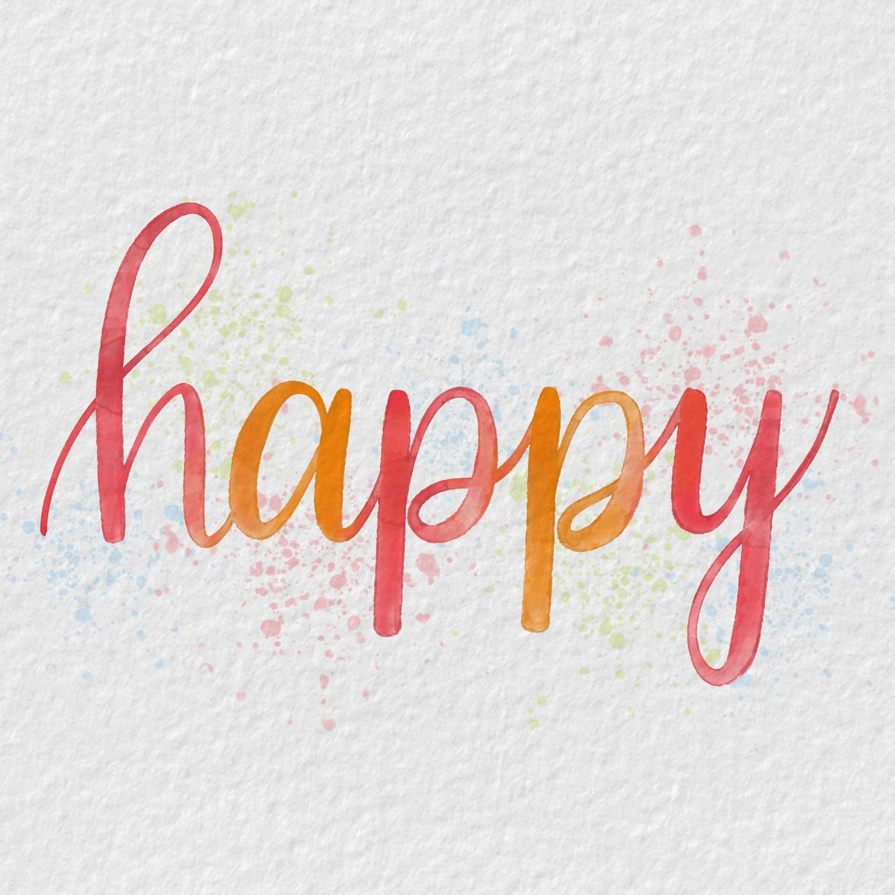
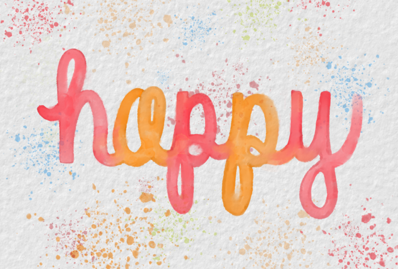
2. Let's Get Real: thank you so much for enrolling in my water collar lettering class. I'm so excited for you to be able to amp up your lettering game before starting. You want to download and import the procreate brushes that come with this class if you need help. I have a video tutorial in the handout to make brushes that had a realistic look. I had to play with the real thing. So here I'm using a current hockey water brush filled with tap water. Some doctor Ph Martin's watercolor hydrates paints, and I'm just going to play around on some £90 watercolor paper. I began just by making some marks on the paper to see how the ink ran out. Um, the thick and thin lines that you get when you use pressure, how the colors bleed with each other when you add different colors or extra water, extra pigment, all of the different properties of that makeup watercolors, even something like adding a highlight by removing some of the pigment with just a clean, wet brush like this is one of the benefits of using a watercolor that I wanted to be able to add in my lettering as well. So when I was making my procreate brushes, I wanted them to act like real colors, riel watercolors. And to get that look, I needed to look at what gives watercolor lettering, its unique look that's so highly sought after I even had fun playing with flicking some of the pain onto the paper and making some splatter effects just by tapping the top of my water brush. Okay, so now that I let that sit in dry for a bit, let's take a look at some of the features of water color. If you look closely, you can see it's very blotchy. It isn't one consistent color. You can kind of see the texture of the paper through that. So I wanted to add that in my brushes as well, you can kind of see all of the random, blotchy spots you can see where it bleeds, how the colors go from one letter into the other letter next to it, and you can kind of see where the water pools. There's light spots, darker spots. The edges are a little bit darker. Um, there's places where there's it's a little bit lighter because watercolor always dries lighter than what it goes on as, and there's some more dark edges. So we're going to include all of this in our watercolor lettering by using these brushes that I created for you guys. Even the funds splatter and with the splatter. What I wanted to capture was the randomness of them, how they're some larger, some smaller, some more faded and muted out than the other colors. So some of the colors are a little bit darker and brighter, so I captured all of these elements for you in my procreate brushes.
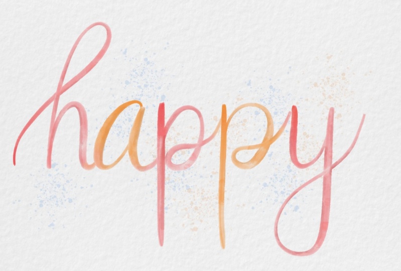
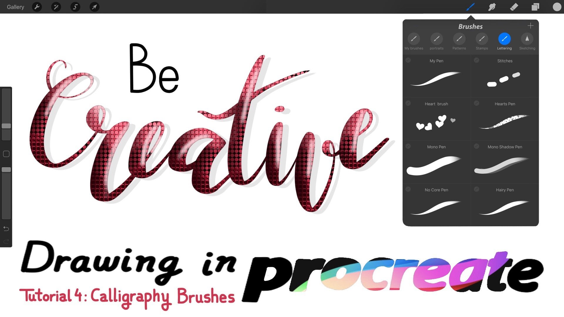
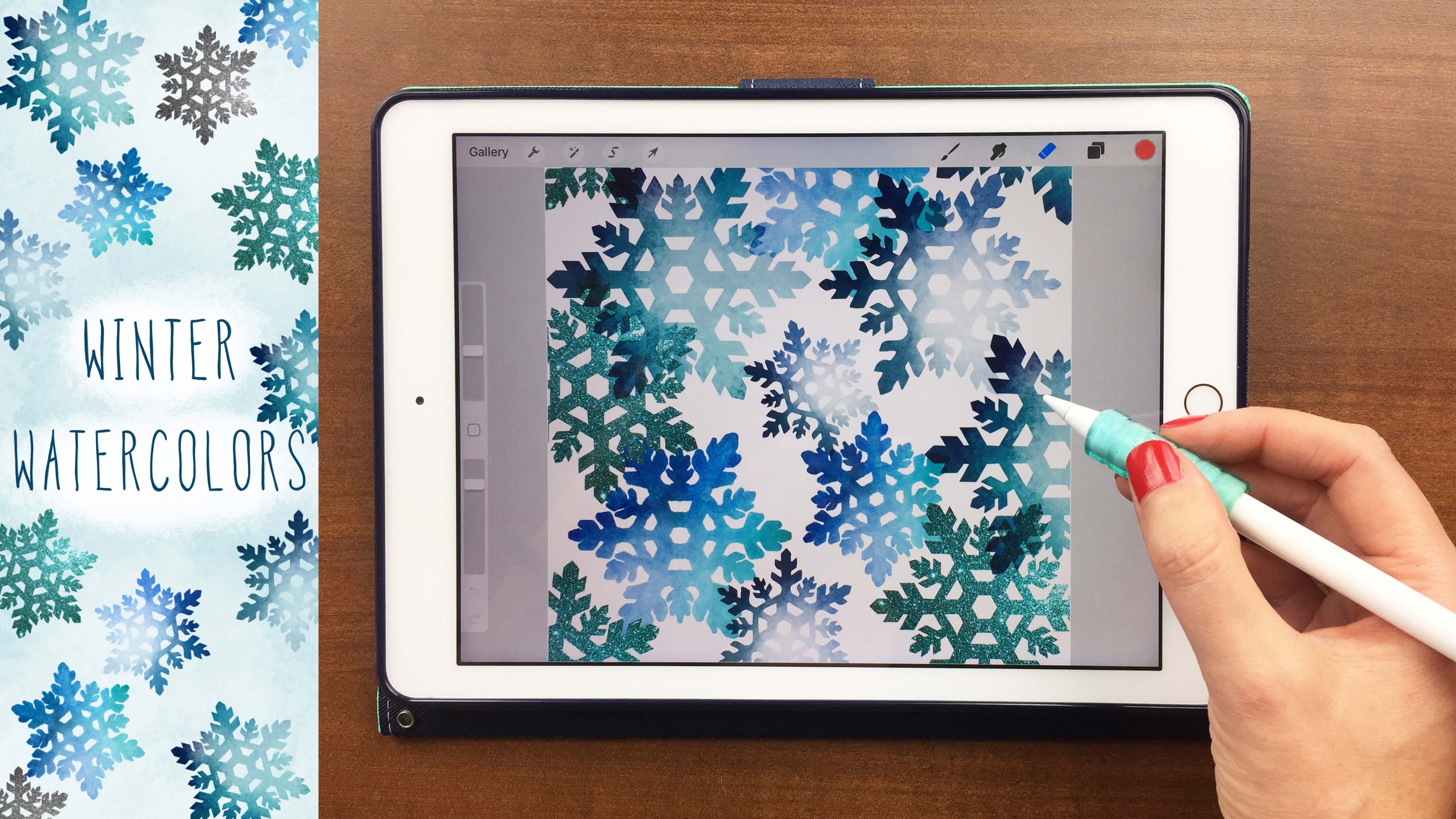
3. Lettering Base Color: Now we can open our procreate APS and in the campuses. I just opened a blank square canvas. You can use any size you like for your work, whatever you choose and before going right into the watercolor lettering. I personally like to do a little rough sketch. So I have something kind of mapped out for myself before I get started. And here I'm just using a grid brush. It's the one that comes with the procreate app, and I like to do my blue and then just name the layer. So I know which layer is which later on. And then I use a pencil. Teoh, make sure I'm in a new layer. I'm gonna name this layer sketch. You don't have to name your layers. That's just a next step I like to take because some of these layers could be pretty light. And then I might accidentally delete them, thinking they're blank later on. So I like to just kind of map out where my letters are going to be to make sure I like the spacing, the height, the consistency and that sort of thing. And then if you go into a layer and top On the end, you can lower the opacity, and now we're ready to start with our water colors. Included in your downloads was a happy color palette that I created for you that I use in mind. You don't have to use these. This is optional, but I am going to use this for the class and then go into your brushes and choose the 1st 1 It's called water colored brush and on a new layer start to just trace over your pencil sketch. Now, this is where I like to choose a different color. You can keep it all one uniform color, or you can mix it up, which is what I like to dio. So I'm going to choose the orange and make my second letter and then go back to the pink and just have alternating pink and orange letters. You can include mawr if you like less if you like. That's totally your personal preference. However you like to do it, and you might notice with these brush pens that as you make the letters, you're losing the pigment and that is mimicking the watercolor brush. If you pick your pen up and put it back down again. It's a ziff. You dipped your watercolor brush back into the paint's. Okay, So once you are happy with how that looks, you are done with the base color letters, and now it's time to start smudging those together. So now we're going to use our smudged to bleed brush, which is the number to brush. And we want to know where the letters are connected. We want to have them bleed into each other to give it that true watercolor. Look, I'm gonna deal, not delete duplicate this layer and turn off the lower one. And I like to do this just to keep an extra copy. So I'm gonna alfa lock that layer by two fingers, swipe to the right, and then you'll see a little checkerboard in there. That means it's doubtful locked. So anything you do is just going to happen to that. What's on that layer now? The smudge to bleed brush. I named it that to remind myself not to use the brush to use this much tool. So tap on your smudge tool and go in to find that brush again. And when you find it, just tap it to select it, and then you can go when you can change the size of rapacity if you like, and just start working one of the colors into the other color. So here I'm just going to push some of the pink into the orange. You can do the opposite if you like. You could move the orange into the pink. You can go in different directions. If you like. It's up to you. Just have fun with it and be random with it, because water colors are really, really random. Now, if you're working on a quote or a saying or something, that has more than just one word where you would have words underneath it, wherever your letters are touching. Like if this the bottom of the P was touching another letter below it, you'd want to smudge there as well. I even intentionally tried to make my letters touched just so I can get this really nice effect now for our third brush. This is actually going to be an eraser, so I've named it erase toe highlight. So I'm going to first duplicate the layer we're just working on, and you can see it made a little bit darker. So what we're going to do is just choose the eraser tool again. Find that Number three brush for our two uses our eraser, and we're just going to go in and erase some of that second layer that we added. You can move the eraser, um, the size up and down, depending on how thick your lines are. You can change the opacity if you want a lighter highlight or eraser, and this is supposed to mimic the effect of how watercolor dries. It will dry, lighter, and it will also where there's more water used, it's going to be lighter and have highlights. You can also use this erase to highlight brush. If you want to actually make highlights in the win and erase some of your ink, it's it's sort of. If you remember in the beginning we were using a clean, wet brush toe lift some of the pigment off. That's what this step is doing. All right. Once you're happy with your highlights and erasing, then we're going to move on to brush number four, which is to create some dark edges. So you're going to choose the number four brush called Dark edges and click on your, um, color dot to bring up your color palettes because these are our base colors or a mid tones , and we're going to create some darker shades of this some shadows, so just tap. I like to top right underneath it. Go back to the orange, do the same thing. Just bring it down a little bit to make a little darker and tap right in there. You can do the same for blues or greens if you're using those, and this is creating a darker, shadowed color for us that we're going to use on the edges now. If you're using a large size can this, you might start to run out of room for layers. So this is the point where I like to start to merge down and I'll just tap on the layer, merge it down to the one below it to give myself room, because I do like to work in multiple layers for this step. You want to choose the selection tool and make sure down at the bottom. It's on automatic and then just tap anywhere on your word or phrase, and it's going to select that so then you're going to add a layer on top of that. Choose your darken edges brush, and you might really have to zoom in for this step. But now I'm just going to lightly go along the edges and dark and some of those up. You might not be able to notice it right away, but it's going to make a huge difference in the ends. This is the part of doing this process that takes the longest, So I am just going to speed this up for you. Now you might be able to tell I'm not trying to be perfect with my lines, because again, watercolor is so unpredictable, you might have thicker, darker edges in one spot thinner in another. You might not even have any dark edges at all on some of your letters. So try to be again random as you can, and just have fun with it. And don't worry about mistakes at this point. I also like to work one color at a time, so I do all my pink letters first, and then I'll go in and do all the orange letters first. And then if I have more colors, all work on those individually as well because it's just easier than going back and forth and remembering which color in in which one comes next. So here I am actually creating a new color for this one. P because it wasn't quite pink and it wasn't quite orange. So I just pressed and held my finger to get a new color that was already on the campus. And that turned out okay, So once you're happy with this, you might want to unsolicited it. I like to zoom in to kind of see what the final effect looks like. And at this point, you can merge it down again, if you like, with the others, and then we'll move on to our bloody brush.
4. Watercolor Textures: Now that we have our base lettering down with color, we're gonna add some texture. So I'm selecting the blotchy brush and then go into the layer tap, select and then tap your words so that selecting that word create a new layer. Make sure you're in the right brush and then just tap. And this is a stamp brush, so you're kind of stamping on the blotchy texture when you're again. I work color by color, and you can choose the base mid tone color or the darker color for this step. But because this is already pretty light, I like to stamp on the D mid tone color that we started with. Then I go and do the same thing with the orange, and you might want to play with the size of this because you don't want all your blotches to look the same so un select. And I like to zoom in again to see what it looks like when you're happy with that. We can move on to the next brush, which is the water pool brush. So here I'm going to try a lighter color than my mid tone. So I select my mid tone and just move the color down to a lighter, brighter color and tap that right into my palate. So I haven't and I'm just gonna go ahead and do it for the blue and green. Also, just so I have them on starting with my pink. I'm going to just select that, create a new layer, make sure I'm on the correct brush and just happen again. You can play with the size and the opacity. This is pretty transparent. So I had to tap here a couple times to be able to see anything. So me turn up capacity on that, and then one tap will kind of give you that water Pull effects. If you're not happy with the lighter color, look here. You can always go in and try the darker color and see which one you prefer. Sometimes when you get the little water pools, it will make your pigment later. Sometimes it will make a little bit darker so you can play where I'm a both and see which one you prefer. And I'm just tapping in random areas, changing this size and the position of where I'm placing it in the letters and then I'm going to Whoops. That was too big. I'm doing it with the orange as well. And just like before un selected to see what it looks like. And when you're happy with it, we can move on to the paint splatter brush. But before I do that, I just want to go in and merge down that layer. We just made into all one layer. And then I'm going to create a new layer and let me move this layer up on top before we do our splattering. And here again, you can change the size. This is just one large paint splatter where you can make several smaller ones. Now, if you remember in the beginning of the class, when we were looking at the realistic paints bladder, we noticed that there were some larger, some smaller, some darker and some more, um, transparent and lighter colored. So we want to try to recreate that with our brush stamps, and we're going to do that just by playing around with the sizing and the opacity. And the more you stamped, the more concentrated it's going to be now to get the splatter underneath the letters, just drag and drop that layer below the letters, and it's going to look like it's underneath. But you're still going to be able to see through and see some of that splatter so you can duplicate you are words, and that's going to make it a little bit darker. I'm just going to duplicate it several times, but then you can see I lose all of that texture that we just created. So I'm going to delete thes, and instead what I'm going to do is turn off that lay or create a new layer tap. Select, tap your words and then down here at the bottom, select the invert. Now that's selecting your background instead of the words. Now, when you tap your paint splatter brush, it's going to just be on the background, and you won't be able to see it through the words this time. So I'm just going Teoh go through and changing up my sizing. Just randomly add some paint splatters by using the colors that are in my color palette when you're done, un selected to see how it looks, and I'm not quite happy with this because I think the paint splatters a little overbearing , so tapped the end and you can turn down the opacity of that layer to get it where you like . But right now I'm just going to turn it off because I'm going to show you how to add the paper texture. Now you want to choose black is your color, tap on the paper texture and then just tap on. There we go on your campus and now its added in the texture of watercolor paper for you. Now, if you zoom in, you can see that you can see the texture through the water color paint. You can also tap on the end and select multiply, and that will make the paper texture even more significant. Now I'm going, Teoh, go back in and add in my paint splatter layer by turning that on, and I'm just going to select. Multiply on this so you can see the water text. I'm sorry, the paper texture through the paint splatter, and when I'm happy with this, I'm going to click on my wrench Select Save image and it was saved to my photos. And now I can share this and uploaded in the Project Gallery
5. Class Project: your challenge or class project is to create a lettered word or quote and give it the realistic watercolor look using their procreate brushes included. You may use any word or quote of your choosing and then upload a photo of it to the Project gallery. You can also tag me on social media. I'd love to see what you create. I hope you enjoy creating your project. Please let me know by leaving a review or hitting the thumbs up.
 Cristin April Frey, Procreate Lettering & Doodles