Transcripts
1. Intro: Hello. Welcome. My
name is Louise. I'm a Swedish watercolor
wildlife artist and art educator. I first discovered
watercolor a few years ago, and it helped me
heal from burnout and also start a whole
new life as an artist. And nowadays, I help
other people do the same. In this class, we are painting three little insect
paintings together, and I will share with you my
exact process step by step. Everything from
drawing up the sketch, mixing the colors, putting down the watercolor
layer by layer. Creating this nice, abstract, looking background and putting the finishing touches
on your painting. I will share with you all of the tools and
materials that I use, how I use them, and walk you through my thought process
all the way through. Insects are just fascinating
subjects to paint. Their beautiful colors, their
weird alien looking bodies. And they really lend
themselves well to painting these quick little
paintings that you can finish in just
half an hour or so. By the end of this class, you will feel more confident in the process of making a watercolor painting in
this particular style, and you'll be ready to apply
it to another subject, whether that's another insect
or an animal of some kind. And you will have one or two or three beautiful
little paintings that you can put in a cute
little frame and put on your wall or maybe give
away to someone you like. I welcome you to a nice,
relaxing painting session, and if you're ready to jump in, I will see you inside the class.
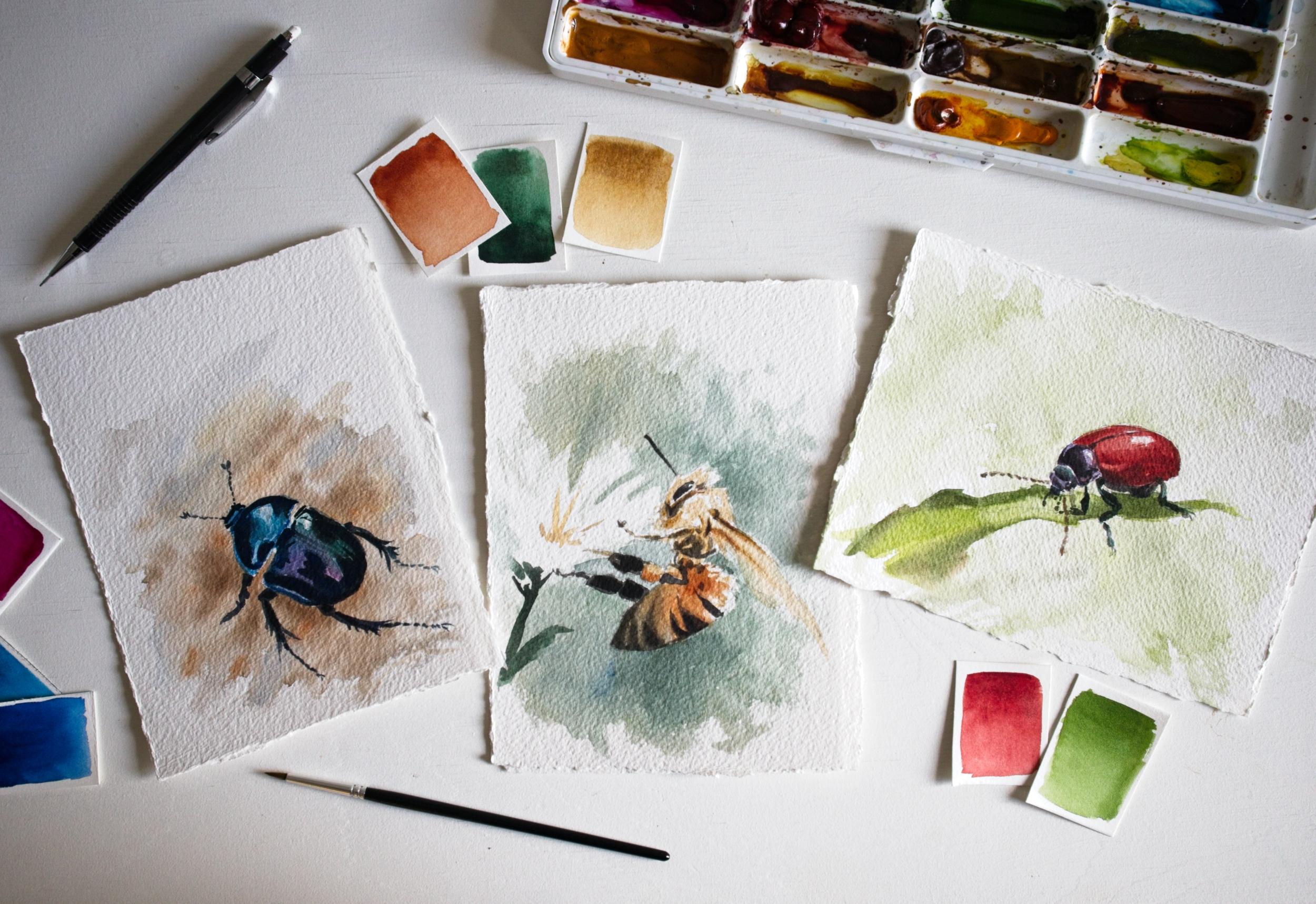
2. Class Project: For this class, we
are going to paint three little insect
paintings together, a blue beetle, a red
beetle, and a honey bee. And I'm going to
walk you through the sketching and
painting process of these step by step and share my process as I'm painting my decisions and all of the tools and materials
and techniques that I use. If you want to, you can paint
all three of these insects, or you can choose
just your favorite one and use that as
your class project. Reference photos that I use
here are from unsplash.com, which is a free library of high quality royalty
free photos, and they're all
downloadable below. I've also included scans of my sketches. You
can download them. You can print them out and have them beside
you as you draw. And you will also
find a list of all of the tools and
materials that I use, including all of my colors. Recommend watching each
video from start to finish and then follow
along one step at a time. Or you might want to watch
the entire class first, and then tackle
your class project, that's entirely up to you. All of the demonstrations
are in real time. Nothing is sped up or cut out. I am a fairly fast
painter, I think, so if it takes you a bit longer or quicker,
that's totally fine. Just go at your own
pace. There is no rush. If you have any questions
throughout the class, you can ask them in the
discussion tab below, or you can send me an email, and my email address will be on my About page that's
below this video. If at any time
during this class, you feel an impulse to maybe use a different color or
include more details, maybe remove some details or
whatever else it might be, I invite you to
follow that impulse. You don't have to
follow exactly what I'm doing. And if you feel frustrated during the
painting process. Just know that that is very
normal with watercolor. This is a very difficult medium. It's a lifelong practice. I've been doing this
for five years now, and I still make mistakes
all of the time. I mess up a lot of my paintings. I even make mistakes
throughout this class. That's part of the process. So much of learning
watercolor is about getting to know the
behavior of this medium. And the behavior of your particular paper
and paints and brushes. And that only comes
with time and practice. Many of the techniques
that I show you in this class can take months
to get the hang up. Like controlling the amount of water on your
brush, for example. So don't feel disheartened. Just relax, be patient
with yourself, be kind to yourself, and most importantly, enjoy
your painting practice. If you're ready, let's jump in and talk tools and materials.
3. Materials: Let's talk painting materials. So this is what my
workspace looks like. It's not a huge desk at all. It's a pretty tiny space, which is what I love
about watercolor. I said, you don't
need a lot of space. And I have my
little papers here, and this is Arches, 640 gram paper, so you can
see, it's really thick. It's not going to buckle at all. It can handle a lot of water. It's almost cardboardy
and it has, like, this, I think
it's quite rough, but it's just cold pressed 640 gram paper that I have
torn into these little pieces. Then we, of course,
have our paints, and this is just a custom, like an empty watercolor palette that I bought a few years
ago was from Paul Rubens. And I have filled it with
my favorite tube paints. And these are a mixture of Windsor and Newton
Professional watercolors and Daniel Smith watercolors. So I have my blues, my greens, my reds, my earth tones, my yellows, some black, some white gouache. I won't be using most
of these colors today. I will just tell you what color I am using
when I am painting. And what I love about this
palette is that it has this really big mixing
area that I can remove. And there are many variations of these kinds of palettes.
They are inexpensive. I like having plenty of
space to mix my colors. And since we are painting small, we won't need lots of mixing wells because we will be
using so little paint. So just putting our
little pools of paint on this on a flat surface
is going to be just fine. I, of course, have my water,
two simple containers. I have a small one
that I like to keep as clean as possible. And then I have this larger
container for, like, rinsing out my brushes, like, fully rinsing them out. And this is a piece
of dish cloth that is wet but not sopping wet. I've just rinsed
it out and, like, squeezed all of the water
out because I don't want my brushes to get too dry. So if this was to be dry, it would just be sliding
all over the place, and it would be hard for it to absorb the water and the
paint from the brushes. I use it to dab out excess water from my brushes
and also excess paint. I also, of course,
have a roll of tissue paper or toilet paper or whatever kind of
paper you want to use. But this is more for, like, completely drying out the
brushes or I can even use it for testing the hue of
the paint if I want to. And also to fix mistakes. As I'm sure there might
be some mistakes. During the painting process, there always is. That's
completely normal. Tissue paper is awesome for that because you can
use it to just dab. Uh, on the painting and suck up the paint and even get almost, like, the white of
the paper back. And then, of course,
I have some brushes, and the only ones I'm going
to use for these paintings, since they are really
small, is this. This is a number 12. It's an Escoda and it's
just a simple round brush. A synthetic brush, and I like that it has this
really fine tip, but can also hold
a lot of water, and I like that it's kind
of it's a bit bouncy. I like that about
synthetic brushes. So it's a preference thing. But I can get a lot of
precision with this, and it's just right for this kind of tiny
little piece of paper. And then for my finer details, I have just a tiny little brush. This is just a really cheap, simple, fine liner
brush that I got with. I think it was a set of
watercolor pencils, actually. I get a lot of
precision with this, and it's also a synthetic brush. So it's really stiff and it maintains its fine
tip really well. And then for my sketches, I'm just going to
be using, like, a regular little pencil. I like these. Like, they're just
sticks of graphite with some thin plastic
casing around them. And I also have
mechanical pencil, I have a needed eraser, which is good for just when you want to
lighten up your sketch. Not really good for
erasing fine details. That's why I have
this little guy, a fine tip, mechanical eraser. It's entirely okay if you
don't have all these things. Just use whatever you have, use the paper, you have
the paints that you have. You don't have to use the
exact hue that I'm using. Just pick something as
similar as possible. Yeah, that's it for materials. So let's get started.
4. Blue Beetle Sketch: We're starting off with
the Blue beetle here, and our first order of business
is to draw up a sketch, a really simple sketch with
just the right amount of information so that we know what we're doing
when we're painting. And the way I approach all
of my sketches is to always start with something super
basic and refine from there. So I start by squinting
at my reference to get the main gist of the basic shapes
and angles that I see. Here I'm looking at the angle of the beetle in the picture, and then I transfer
this line to my sketch, and then I measure
out the length of the body where I want
it to start and stop. And then the relative size of the upper and lower
parts of the body. And then the general
shape of the beetle, which is a kind of egg shape. When I have my simple
basic shapes in place, I start refining my
edges a little bit more. This is eye measuring, and it's the most
critical skill to learn as an artist if you want to be able to draw accurate sketches. Eye measuring is a collection of tricks to use when looking
at a reference or a subject, such as comparing
the lengths and sizes of different parts of the subject to one
another, like I just did. It's squinting and mentally
simplifying what you see so that you can filter away the noise and get the
basic shapes right first. And what I'm doing here is
looking at the negative space, the shape of the
background around the subject to help me
get the shape of this leg right because often the
shape of the background can be much easier to get right than the shape of a
limb, for example. I also mark out where my brightest highlights
are going to be. That's where I want to keep
the white of the paper. And sometimes also where
the darkest shadows are, the more of these
decisions I can make now, the more I can relax during
the painting process where I won't have the same freedom
of fixing mistakes. So that's my sketch. This is the level of detail
that I prefer. I know where everything will go, but I can always refine the exact shapes and details
later on as I'm painting.
5. Blue Beetle Background: Since this beetle is much
darker than the background, I'm actually going to start by laying in a background
wash first. And this is because I
don't want to have to paint around all of
these little legs and antenna and risk re wetting the paint there and having it bleed out into
the background. I'm choosing some Raw umber, this lovely muted beige color. Some burnt sienna, a
rich reddish brown. These warm colors are going to nicely complement the cooler, darker tones of my beetle. And that's a good trick
when choosing your colors, having a mix between
warm and cool. And to mix them up and
get a more neutral gray, I'm adding some
ultramarine blue. I don't want the background
too saturated because, again, that's going
to steal away the focus from the beetle. And also, it's just a matter
of personal preference. I prefer more muted colors in my backgrounds as it makes
it look more natural. I like to be super simple and abstract with
my backgrounds. Really just drop in one or two or maybe three
colors and swish them around. To give an impression
of the environment, but not spelling
it out completely. I want the subject to be the clear focus,
not the background. So I'm starting with wetting the paper around the
subject with clear water. And so I will have some
areas where I can just drop in some color and
have it mix on the paper. If the paper were to
be completely dry, I would get sharper edges
to my brush strokes, which I don't want in
this particular case. And then I drop in some
cooler tones first. And then gradually
add more color. Watercolor always fades
and lightens as it dries. So these colors won't be this
dark and saturated later. And if they do dry too light, I can always add a second layer with more color
depth if I want to. But this is it for now. I'm going to let this dry
and then come back to add the first layer to the
beetle in the next step.
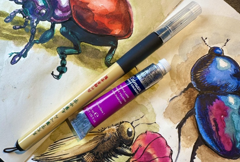
6. Blue Beetle Layer 1: I'm going to go ahead and mix up the colors
for this beetle. Since we're working
ourselves up from light to dark with watercolor, I start by identifying the lightest parts of
these colors that I see. And I see a kind of a primary blue color somewhere between
cool and warm blue. I see some purple,
I see some pink, and this beautiful, cool, bluish green over here. So I'm going to mix
up a blue by adding some ultramarine and then
warming it up with sal blue. Also adding in some black so I can darken my colors
when I want to. Some Jadeite genuine
by Daniel Smith, which is a nice cool green. And I'm cooling it down a bit more by mixing it with my blue. And this is
Quinaquidrone magenta, which is a vibrant pink color. And mixing that with a dark blue will give me those
dark purple tones. And I can also use
the magenta alone for that more pinkish
spot on the beetle. Okay, so here we go.
Starting with the blues. Painting around the
highlights I've drawn out. Okay. I'm adding some green to the upper part
of the lower body. And then some purple
in the middle. And then leaving some pink over here where I can see
it in my reference. And I see that I can
immediately drop in even more color here
because I know these will dry lighter and
look a bit faded. I know that I will need to add several more layers of paint to get this beetle as dark
and vibrant as I want. So that's enough for this layer. I'm going to let this
dry and then come back to deepen those
colors even more.
7. Blue Beetle Layer 2: So now we're dry, and I'm
basically going to just go over the beetle
again with darker, more saturated mixtures
of those same colors. And this time, what
I'm focusing on are the mid tones
and the shadows, laying all of those in
while still leaving my highlights and
leaving some room to soften these edges
with a damp brush. H. Okay.
8. Blue Beetle Layer 3: All that remains now are
those darkest darks, which also includes the
legs and the final details. This time, I am only going to
work with black or a very, very dark blue and really
punch up the shadows. This is what's going to make
those highlights really pop. One of the most common
mistakes I see and make myself in watercolor is not being brave enough
with the shadows. Since watercolor is a
transparent medium, we often need several layers and really dark saturated
color mixtures to reach the level of contrast that's going to make our
painting rich and vibrant. This is also where
I'm going to add some more details to communicate the
texture of this shell, these thin little
lines, for example. So I'm switching to my smallest brush now for
the legs and antenna. It. Trying not to overthink my brush strokes. I want them to look
loose and spontaneous. And I can do that with
confidence because I have my pencil sketch
underneath as a guide, but I can also add to it by
looking at the reference a little closer and adding in little details
where I see them. And finally, adding
some extra blackness and refining some edges. And my beetle is done. I'll see you in the
next lesson where we'll start working on Be painting.
9. Bee Sketch: So would this B, I'm starting my sketch the same way
I did with my beetle by identifying the
most basic angles first and getting the size
and the placement right. So here I can see this V shape of the upper and lower
parts of the body. I'm making use of negative space to determine the angle
between these two body parts. And then the simplest
shapes that I can see, which is the round shape of the upper body and this long oval shape
of the lower body. There are a lot of little confusing details in this image, and so I'm trying
my best to filter away some of them and just
add the most prominent parts. The simplest version
of those parts. I can't make out the exact
shape of the head here, for example, but I can see
the exact shape of the eye. So I'm adding that and leaving the rest a
bit diffuse for now. I don't have to spell every
single part of this B out. It's still going to read as
a B in the final painting. Also marking out these
tiny little highlights that I want to make sure
that I leave white, getting the angle
of the wings right. And the wing is also a
part of the reference that's a bit diffuse
and hard to make out. I'm not even going to try to
spell that out in detail. I just want the
general gist of it, especially the part close to the body that is more
clearly defined. Now that I have the
wing marked out, it's easier to eye measure
where this arm is going to go. Another eye measuring
trick I use is starting with the shapes that are the
easiest for me to make out. So with this leg,
the one part I can easily grasp is this
bright orange shape here. And so I look to
determine where it sits in relationship
to the lower body, and I draw that in first. And then I build the rest
of the leg around that. I use it as my anchor point. Since these other parts of the
leg are going to be black, I can draw that in so I won't make mistakes later
on when I'm painting. Here's another instance when looking at the negative space, the space of the
background helps me get the placement
and proportions of this other leg, right. And now that the legs are there, I can determine if the rest of the lower body is proportional.
Is it long enough? And in this case, it
is, but in many cases, I might have needed to lengthen that part a bit to
keep the proportions right. Sketching in some of these markings because
I don't want to have to make those decisions on the fly later on
when I'm painting. This will be the darkest
part of the bee later, so I won't see my pencil
lines through anyways. And now I'm evaluating, do I like this sketch? Is it accurate enough? Is there any more
information that I need? Is there some I can take away? So I'm cleaning up some
of my support lines, especially in the
areas I know are going to be the brightest
in the painting, tidying up and making sure my lines are clear
and easy to read.
10. Bee Background: Okay, time to mix up some
colors for this painting, and for the first layer, I look at the brightest colors
I see in this reference. And that's the yellow beige of the upper body and these more amber tones
of the lower body. I'm using the same colors I used for the background
of the beetle painting, so Raw umber and burnt sienna, my favorite earth tones. I also want a nice, cool, muted green for my background. So I'm using my Jadeite genuine again and darkening
it with some black. And also desaturating it. I'm muting this color with
some of that Burnt sienna. Burnt sienna is a
very red earth tone, and red is a complimentary
color to green. So mixing those two
colors together is going to neutralize them and
make them more grayish. I won't be going this dark
for the background, though, so I'm diluting it to check what it looks like
when it's more transparent. And I am happy with that. So let's start laying
in our first wash. What I'm going to do here is
called negative painting. That's when you paint
around your subject, painting the negative space of the background to carve out
the shape of your subject. Since these upper parts of
my B are really bright, almost white, the only
way we'll be able to make them stand out is
with a darker background. This is a tricky
skill to master, but it's made much easier
with a pencil sketch. So here I am just laying in some abstract background shapes
around my pencil sketch. Going darker in some places, especially the places where
my subject is really bright, deliberately messing
up my brush strokes to not get too tight
and controlled. This is something I have
to force myself to do being a perfectionist
control freak. I have to remind
myself that the point of the background is just to set some tone and atmosphere. And the more I overthink it, the more blotchy
it's going to look, and that will steal the focus from the main
character of this painting, which is the B. I don't
have to worry about painting over the
darkest parts of my subject because those
will be black anyways. I don't want any white
edges around them, and same with this lower part of the body, which is in shadow, and I can actually see some of those green tones there
in the references. So adding some of
that background green will make my subject blend into and sort of harmonize
with the background instead of looking like a
sticker that I slapped onto it. Adding some more water, adding another nuance to my green to make it
come alive a bit more, making it warmer
here at the top, where the sun is
shining, and then cooler on the bottom where
there's more shadow. I'm also going to
negative paint around this flower to just sort of hint that there is
a white flower there. The flowers not the main
focus of the painting, and I don't want to get
carried away by it. So just a few loose
brushstrokes will do. Adding a bit more
darkness and saturation. Blending it up a bit. Wiping my brush on my damp
washcloth and then using it to lift out some paint here and controlling
my edges a bit. And that's it. That's
my first layer. Now I want the background to dry before I add the first layer to the bee because
otherwise it's going to bleed out into the background,
and I don't want that. So I'm going to let this dry and then come back to it
in a few minutes.
11. Bee Layer 1: Alright, now for the
first layer on this B, I'm going to loosely put
in this raw umber at the top of the B and careful
to leave a lot of white. That's one of the tricks for this more loose and
expressive style of watercolor painting, not filling the entire
paper with paint, leaving some white and giving the impression of
texture and highlights. So I add this color in everywhere that I see
it in the reference. And then as I move on, I switch over to
my burnt sienna, and adding it everywhere
I see that color in the reference and still leaving some white highlights to pop against the background. Okay And I'm going to stop there and let this dry. In the next up,
it's time to add in the shadows and the details. It
12. Bee Layer 2: Okay, so time for
layer number three. I'm going to use only
black this time, but a more diluted
black at first. So I'm squinting
at my reference, and that will tell
me where that black needs to go without trapping me into overthinking
each brushstroke or getting caught up in details. Okay. And then I'll gradually thicken
up my black and emphasizing those parts in the reference that
are the very darkest. So these legs down here, for example, and the
tip of the lower body.
13. Bee Layer 3: And for some final flare, I'm going to put in some of
that yellow in the flower, really just a few brushstrokes. That's going to be just
enough to sell this as a flower for the viewer without stealing the
focus from the bee. And actually, let's add
in a stem, as well. Just a few
brushstrokes of really dark green, not overthinking it, not trying to copy the
reference exactly, using it to balance up
the composition a bit. And for a few final touches, I'm adding some background to the left side of the flower, refining that edge a little bit. Putting in some
details, I'd forgotten. And punching up the
background a bit more and the places where
I want my subject to stand out even more. At this point, I'm not looking
at the reference at all. I'm just looking
at my painting and doing what I think
will look good. Finally, subjective, of course, there is no right
and wrong here, and you will develop
your own taste and your own instincts
for this with practice. And now, finally, punching up those legs with some
really thick dark black. And I almost forgot the
antenna. So there we go. My B is done. I'm going to step away
from it now before I get tempted to go in and
fiddle around even more. So much of watercolor is
knowing when to stop, and I would rather
stop too soon and let the painting rest for a day
than risk overworking it. And that's also a skill that you will learn
with practice. So I'll see you in the next
lesson where we will kick off our final little watercolor
bug painting. And
14. Red Beetle Sketch: So with this beetle, I actually want to include
this leaf that it's sitting on because otherwise it would sort of just
hover in thin air. So in order to
place this beetle, I'll first need to place this
leaf shape on the paper. And I do this by, again, squinting at my reference and finding the angle of this shape. And once I've done
that, I can more easily place the general
shape of this beetle, this kind of half moon
shape on the leaf. And here I can immediately
see that I placed it too low, so I'm adjusting for that. Like And then finding the larger shapes of the
upper body and head. And what helps
here is to imagine the subject as a set
of geometric shapes, finding the central line. And then building the
shapes around that. Working out the angles and
the lengths of the antenna. But. And now for the tricky part of sorting out these legs that are a
bit weirdly shaped. And once again, what
really helps is to look for the
simple lines first, simplifying the shapes
and refining them later. And this is where negative
shapes really help a lot. If I can get this shape right, I'll have a good starting
point for the next leg. And there's another
negative shape over there. I would like to keep this little highlight of
the background there, so I'm marking out this
little triangle shape. And also roughly where I want to place the brush
strokes for the leaf. I'm not aiming for a complete
copy of the reference here, just a loose representation, an abstract shape that gives
the impression of a leaf. Now, for the highlights, I want to make sure I keep
this little glare over here and this larger highlight and maybe
also this glare here. I want to keep those parts
of the paper untouched. Yeah, that's as far as I'm
going with this sketch. I don't feel like there's any more information that
I need to start painting.
15. Red Beetle Layer 1: So let's mix our colors. Starting with this bright
green of the leaf. I'm choosing plain old
Sap green for this, but I'm adding in
some bright yellow, and this is Hansa yellow
light by Daniel Smith. You could also use something
like lemon yellow. And then I want a darker, more muted version of that same green for the
shadowy parts of the leaf. So I'm mixing in
some burnt sienna just a little bit at a time. And then some ultramarine
blue to cool the green down. That's another good trick
when mixing up shadow colors. Usually shadows are a bit
cooler in their tone. Cleaning up my brush and
then choosing my red. I want a warm kind of
primary red for this. The one I have here on my
palette is called Deep scarlet, and it's by Daniel Smith. Alright, I am ready
to start painting. I'm going to start by laying in the shape of the leaf.
Brightest color first. And then dropping in the darker green where the
leaf is in shadow. Again, trying not to
overthink my brushstrokes, not worrying about the
colors mixing on the paper. I want no sharp
edges here because that's going to draw attention away from the main character. Okay. And then the lightest version of this red that I can see, keeping it very diluted, painting around my highlights. And knowing this will
dry a lot lighter, I'm dropping in some
more color right away. I can see that I lost a bit
too much of that highlight. So I'm going in with some tissue and just dabbing it away. As long as the paint
is wet and the color is not too staining,
this works really well. And then just a bit darker
on some parts of the leaf. All right, so time for
this layer to dry, and I'll see you in a few
minutes for our next wash. Uh,
16. Red Beetle Layer 2: This is all dried up,
and now I want to add the first layer on the upper
parts of the body and head. So this upper body has a
really deep purple hue. So I'm putting down
some ultramarine and then dropping some
of that magenta into. And for the head, I can see some blue green tones
in my reference. So I'm taking my cool green, my ja dite genuine
diluting it to see if the color matches. And
then putting that in. I'm also going to paint a first layer on
the legs with this because I can see those
same shimmering green tones there in the highlights, and I can let that shine through later and just
paint black around them. Adding in that purple and Okay. Keeping a fine little
dry edge between that and the green so they
won't pull into each other. There's also some of that purple on the
front of the head, though, and here I do want
it to blend into the green. So I'm just dropping that in and letting it touch the
edge of the purple, leaving a little
bit of white for the highlight on that eye so it doesn't
disappear completely. That green got a
little bit too dark. So I'm using my smallest brush damp but not completely dry and absorbing some
of that paint. And now I'm deepening this red, but leaving the top of
the shell a bit lighter. And to blend it together, I'm cleaning my brush and
taking most of the water out of it using my damp washcloth so that when I blend this edge, I can get a bit of
a dry brush effect and create some texture. And while this paint
is still damp, I actually see a detail
I would like to include, and that's this slightly
brighter highlight on the shell. So I'm using a damp brush and carefully taking some
of that paint away, dabbing it away on my damp washcloth and just gently carving
out that highlight. You can do this when the
paint is dry as well by using a wet brush to re wet the paint on that area and
then dabbing it off like this. Now I'll let this layer
dry and then go back in to deepen all of these
colors some more. It
17. Red Beetle Layer 3: For this next layer, I'm going in with a
really dark purple. I've added a lot of black to it, and I'm painting in
this upper body part, leaving just the area
around the highlight. Also adding the very darkest
parts of this red shell. And deepening the
colors on the head. Okay. Painting in the antenna. I can see some red in there
in the reference photo, so I'm creating this
very diluted mixture of my red and muting it
down with some green. And then the legs and
the final details. Now I'm just using black with maybe a little
bit of green. And I'm trying to
leave a little bit of that cool green from the first layer shining
through in some places. Deepening those blacks
as much as I can. And putting some final
bits of shadows on the antenna because
I can see that they've dried very light.
18. Red Beetle Background: Now, I could have left this
painting right as it is. This feels more like
an illustration to me, but in my other paintings, I've added more background, and I want this one to look well together with those
other two paintings. So I'm actually going to drop in just a really bright wash of green around my beetle to make it feel more
like a painting. So I'm diluting this
bright yellow green and dropping in some pools
of colour around my subject. And I'm really careful not to re wet the edges of this red shell. I don't want it to bleed
out into the background. So I'm keeping a fine edge
of dry paper between them. And then when I'm happy
with this abstract shape, I can go ahead and drop
in some darker greens to get some three dimensionality
to the background. Pushing the paint around, messing up my edges. And creating the impression of other leaves of grass
in the background. And now I can feel myself
starting to overwork it. So I'm forcing
myself to put down the brush and call this
painting finished. And there we have it. All
three insects are done. All that's left to
do now is sign them. Put them in frames, and pat ourselves on the back
for a job well done.
19. Final Words: So you've made it to
the end of the class. I really hope you have enjoyed
spending time with me. I hope you are happy with
your little insect paintings. They will probably not
look exactly like mine, but that is not the goal. Your paintings will
be unique to you. Your style, your preferences, the materials you use, and a lot of other factors. If you want to, I would love to see your finished paintings. You can upload them under the Projects and
Resources tab below, there's a button
called submit project where you can upload images of your final painting or paintings and get some feedback from me and from other students. I also invite you to check
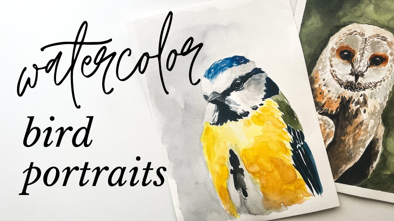
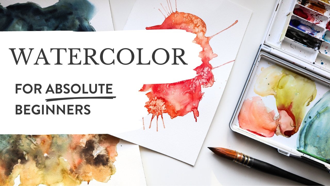
out my other classes. I have one watercolor course
for complete beginners, where we only work with
abstracts to sort of get to know this medium in a very gentle non
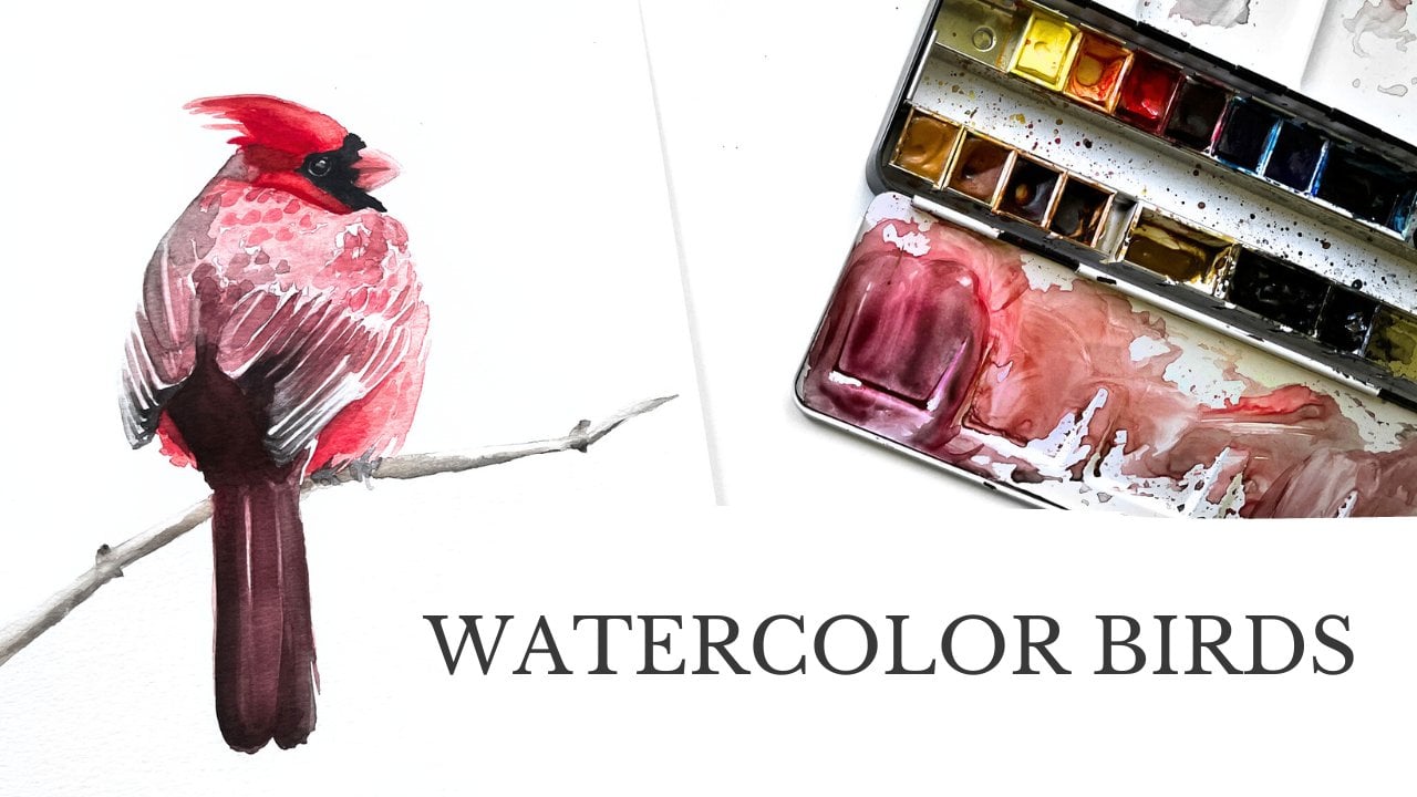
intimidating way. So if you felt like this class was maybe a bit too difficult, maybe that's a great next step. I have another one with birds, which is my favorite subject. It's called watercolor Birds. If you want to stay
in touch with me, the best way to do so is by
subscribing to my newsletter. That's where I share behind the scenes for my
creative practice. I share tips and resources and also update you
on upcoming classes. And you can find
the link to that in the about section of this
course or on my teacher page. And if you enjoyed this class, I would be very grateful
for a rating and a review. Thank you again for
spending this time with me. Happy painting, and maybe I'll see you in another
class in the future.
 Louise Stigell, Artist, writer & creative coach