Transcripts
1. Introduction: Hi there. I'm Luis. I'm a watercolor artist and
an art teacher from Sweden. Welcome to my watercolor
birds series. My classes on how to paint
birds in watercolor. Birds are my biggest passion and my very favorite
subject to paint. They are beautiful,
they're colorful. They have a lot of personality. And there are so many
birds to choose from, you will never get bored. And they can actually
be pretty easy to paint once you get
the hang of it, which is what we're gonna
do in these classes. We're going to study
the anatomy, birds, so that we can
draw more accurate sketches for our paintings. And then we're going to practice capturing the beauty of
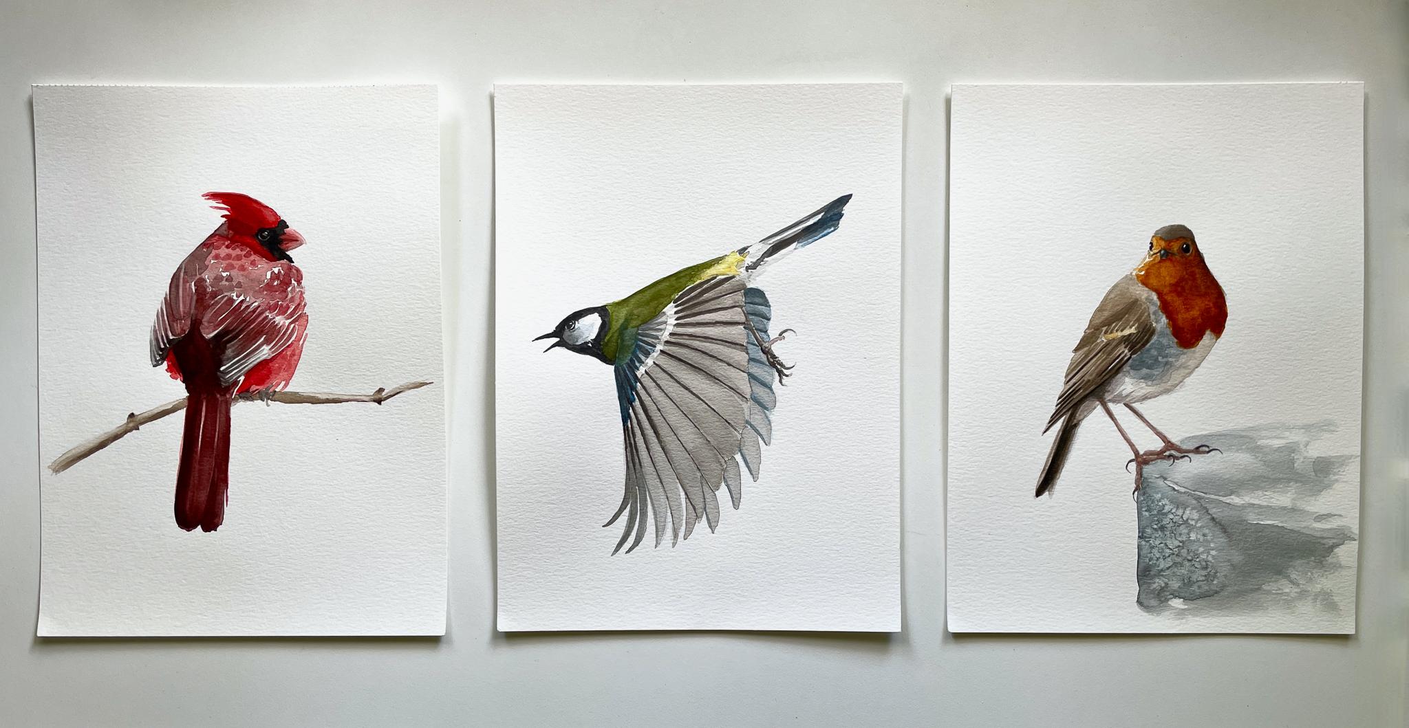
birds in watercolor. In this first part
of the series, we're focusing on songbirds, these smaller garden
variety birds, if you will. More specifically,
we're going to paint a European robin, a Cardinal. And the great tip, I will
show you my process and technique for capturing
birds from different angles, from the front and from the
back and seated and flying. We'll look at some
basic bird anatomy, what to look for when
we're sketching, and how to get the proportions
and the angles, right? And also how to draw the
trickier parts of birds, like the wings and the feet. Then you will learn
how to identify and select the right colors
for your painting. How to build up your
painting in layers. How to paint shadows
and highlights. How to achieve vibrant but
natural looking colors, and how to get your bird
to pop out of the page. These classes are
most suitable for intermediate watercolor
is because it helps to have a basic understanding of color theory and sketching
and watercolor technique. But if you're a beginner and you're like a bit
more of a challenge, You are welcome as well. My aim is for you to
become more familiar and comfortable with drawing and painting birds from
different angles, as well as more confident
with your watercolors. So if you're ready to paint some birds, Let's get started.
2. What You'll Need: So what do you need
for this class? I'm guessing you already have some version of these
things already, but let's just do a quick run through starting with water. Of course, I like to
use two water jars, one for rinsing cool colors
like green and blue, and one for rinsing warm
colors like yellow and red. But you could also
use the one for the first rinse and the
other for cleaner runs. As for brushes, I primarily
use round brushes in my work. Here I have sizes 61216, although I will mainly use the two smaller
ones in this class. And you'll also occasionally
see me using a flat brush, I think gets size ten or 14. Then of course, we
need some paints. I use Winsor and Newton
professional watercolors. This is a set of £12.5 that I've added a
few colors of my own to. But you can use any basic set of watercolors for this class, as long as you have
the primary colors like red, green, yellow, and blue, some black
and preferably also some earth tones like
burnt sienna and sepia, then you're good to go. And I'll talk more
about how to match and mix colors later
in this class. I use a damp
washcloth to dab away excess water and paint without drying up my
brushes too much. You can also use paper
towels for this. And I recommend that you have some of those
at hand anyways, because they're very
useful for trying out colors and
erasing the mistakes. As for watercolor paper, I'll be using this
for the class, Canson XL, cold pressed, fine-grain watercolor
paper and A4 size. This paper is affordable
and decent quality. You want a thickness of
at least 300 GSM or a £140 or the paper is going to buckle and
tear weight too much. It's always best to use a 100% cotton paper for
watercolor painting is just a lot more
workable and it makes the painting experience
much more forgivable. But cotton paper is expensive
and we don't want to be too fearful of messing up just because we're using
expensive paper. So the decision is yours. If you're comfortable with
good-quality cotton paper, then use that otherwise, cheaper paper is just fine. We're here to practice. Some tape can be handy for
holding the paper in place. The more water and
paint you use, the more useful it can be
to pre-stretch and to tape the paper down to prevent buckling and warping
as you paint? I normally don't use it
since I don't cover that much of the paper surface and
I don't use a lot of water. I'm going to use it for
this class however, but that's just
so the paper will always stay in frame as I work. You will also need a pencil and eraser for your sketching. I use an HB pencil or
lighter or most of the time. And I really recommend one
of these kneaded erasers, really versatile and they don't leave residue
on the paper. And that is all, that
is our workspace. You will see me use a few
more items in this class, like sea salt for
creating texture and a white gel pen for
creating highlights. But these are not necessary
and they're totally optional. In the next lesson, we will dive into some
basic bird anatomy while I show you the
sketching process of these three birds.
3. Sketching the Robin (front view): Alright, so let's get
started on our sketches. And as I draw, I will explain what I look for in the reference
photos and just some basic bird
anatomy that will make birds easier to draw and paint. And we're starting
with a front view or a three-quarter view from
the front with this Robyn, of course not all anatomy is going to be visible
in every photo. So when this bird will just
focus on the parts that we do see before we get into
any detail though, our first task is just to place the bird roughly
on the page, right. We need to make sure
that it's the right size for the space and that
it's nicely centered. That's what we want. And that the whole
bird is actually going to fit onto the page. So what I like to do is just do, I measure the length
of the entire body, whichever part is the
longest or widest. And this also helps me find the angle that the
bird is tilted at. There's usually a
line that runs from the top of the head all
the way down to the tail. I look for the
relative lengths of the tail as opposed to
the rest of the body. And then I place a loose
oval shape for the body. And then a smaller circle for the head just to have
something to build off of. Then I start carving
out the angles. And at this point of the sketch, this isn't really a bird, it's just a set of
shapes and angles. It's like a geometrical
model of a bird. Maybe the more you can forget what it is that
you're looking at, the easier it's going to
be to draw it, honestly, because we have a lot of
preconceived notions in our head about what something
is supposed to look like and that
includes birds as well. For example, we
might believe that a bird's head is round, but in this case,
with this robin, we can see that it's actually
kind of square-shaped. And the same goes for the eyes. They are usually not
perfect circles, especially not from this angle. And the perspective
makes it so that the left eye is barely visible. It's just a little sliver, and the right eye is
very oval shaped. The beak seen from this view is just the tiny little dots almost we can see
its length or shape. So what's most important now is to just get the placement
of these features, right, and we can always
refine them later. Now you'll see me drawing in some more anatomy
and formed shapes, the feathers of the upper back, this is called the mantle. All of these body parts and groups of feathers are
going to affect how the light hits the
bird and it's going to create subtle changes in color. So here I'm trying
to compartmentalize the different areas of this
wing into simpler shapes. I'm especially making
sure to mark out the areas that I
want to leave white, like these little
wing tips here. It's easy to get carried away and forget about that
as you're painting. And even if you can lift some
color out after the fact, you can never get the
white of the paper back. I would always rather
paint into little than too much at this point because it's easier to add color
then take it away. Adding some help
lines for myself just to let future me know where
the wing feathers are. Because I'm going to
want to paint them differently than the other
parts of the back here. Then I'm refining the
shape of the body. Two straight lines for the legs, making sure their
angles are right. And looking at the shape of
the space between the legs, this negative space,
as it's called, really helped me a lot here. Making some corrections
to the face, making sure the eyes are
level with each other. Just a few lines for the tail. Marking out another area
of different color, which are these darker
gray feathers here. I want to know exactly
where to paint them later. Now, the feet to
bird feet can be tricky in the
beginning because we usually haven't
studied them before. And so we have a lot of
preconceived notions of what they should look like. But once we have looked
at their anatomy and practiced how to simplify it, That's going to be much easier. Songbird feed most often have three toes in the front and
one at the back of the foot. And the middle toe is slightly longer than the adjacent tos. Bird feet don't curve
around twigs or branches, just like our hands. They have joints
where they bend and other places where they
don't bend at all. These front toes have knuckles, but this back TO it
doesn't bend at all. It's straight. And the only part that curves is the
claw or the nail. And as we can see, the nails grow from the tops of the toes and the curve
and downwards like this. I like to do just
the bare minimum when it comes to
painting bird feet, since they're not usually the main focal point
of the painting, they just need to look
accurate and proportional. So now when I'm
drawing the feet, I'm simplifying their
shape as much as I can. We have this straight line for the leg and then we
have the main joint of the foot and few
lines for the toes. And for context, I'm blocking in this surface that the
bird is standing on. Adding in a shadow shape for the right side of the
head that's in shadow, our eyes are naturally drawn to areas of high
contrast in an image. And in this Robyn, I want to draw the eyes to the face where one side is in the light and the
other is in shadow. And now I'm making some final
adjustments to the face. I'm moving the beak
even higher up, which is characteristic
of these smaller birds. Their faces are a bit
squished together and the eyes are sitting on
the same line as the beak. A trick for drawing beaks
from the front like this is to imagine them
as little houses. There's a triangle shaped roof and then a square
shape underneath. It's not always going to
look the same in all birds, of course, but it's a useful simplification to build from. So that is our Robin sketch. Now let's move on to sketching
birds from the back.
4. Sketching the Cardinal (back view): This bird is very
round in this picture, so I'm starting
with a round shape, just the center, the
bird on the beach. And then I start carving out the overall shape of the wings. It's very easy to get
carried away here and confused by all the
details that we handle that by
squinting at the image and just simplifying what
we see into larger shapes. So at this stage, all I'm seeing our
geometric shapes and I tried to get them
as accurate as I can. Marking out the feather
groups, Here's the mantle. Here are what's called
the scapular feathers. The secondary feathers. These are the ones
that are closest to the body when the wings
are stretched out. And these longer ones are
the primary feathers, those that make up the
tips of the wings. And in here we have
some covert feathers. They're smaller and
they sit on top of the wings and they often have
various markings on them. And then we have what's
called the rump and the upper tail coverts that overlap
the tail feathers. And then the tail which is
tucked in in this photo. So it's like a fan
and let's fold it in. You can usually see one or
two of the tail feathers on the top with the rest of
them stacked underneath. Here we have the auricular
or the cheek feathers, as I like to call them. They are tilted
slightly upwards so they usually catch
more light and often have a lighter color, which is why I find it
useful to mark them out. Just indicating some
toes on this one. No need to complicate things. Then we have the nape of
the neck and the crown. And on this bird we have some longer feathers
on the crown. All birds can raise the feathers on their crown to look
bigger and fluffier. But on the cardinal we
have this beautiful crest. Finding the direction
and angles of the beak. Cardinals have a pretty
thick and blunt beak. There's this downwards curve of the upper mandible leading
into the corners of the mouth. Where does the I sit in relation to the beak and
the corner of the mouth? On some birds, it's
more close than others. And this is an important
detail to get right, as well as the size of the eye. If the eye size and the
placement is even slightly off, the whole bird is going
to look a bit weird. But if we get it right, it's going to make the bird more accurate and recognizable. And then refining
the wings a bit since they're the focal
point and this bird. So I'm paying extra
attention to how they look and how they
stack on top of each other. Having a few of these lines
here is going to help me later as I'll explain when
I'm painting the wings. But for now the sketch has all the information that I need in order to start painting.
5. Sketching the Great Tit (in flight): Let's move on to the final bird, and that is this
flying and great. Drawing birds in flight. It gives us a few
extra challenges. The first one is
placing the bird on the page or the Canvas. And in order to do
this and not have wing tips or tail
feathers being cut-off, we need to really simplify the overall shape of this bird. So I'm starting with a
general line of direction, like the central
line of the bird from the tip of the beak
to the tip of the tail. Then I tried to find the line of the wing and the overall
shape of the wings. This can take some
adjusting since we often want to draw everything
bigger at first. Or we place it in
a way that doesn't center the burden
nicely on the page. Usually this takes a few tries for me before I get it right. But once we do, the rest
will be quite simple. As soon as I have this
basic structure in place, I can start to add
some more geometry like the angle of the feet
and the shape of the tail. The different parts of the wing, which are going to be
easier to identify here. Scapular feathers, covert feathers with a lighter markings blocked out so that I won't
forget about them. And then the secondary feathers. Here, I'm taking a break to draw in the head
because I don't want to have to rest my palm on the primary feathers
and smudging them up. While I draw the head, I'm going to remove that little seed or whatever that is
in the bird's mouth. And I'm just going to
leave the beak open. And then we have
the characteristic facial markings of the grated, making sure that I get the
eye size and placement right. Then I go on to draw in the primary feathers and the rest of the
secondary feathers. Here I'm actually
counting the feathers, making sure that I
get the right amount. And that's because it's
going to look more off here. If I have too few or
too many wing feathers, I can get away with drawing a few lines more
or less in a wing that's folded up
because it's not gonna be as noticeable as it is here. Make sure to trace each line of feather all the way up
to the base of the wing together angles write these long primary and
secondary feathers. They don't always line
up perfectly with the covert feathers
because they sit on top, they overlap and sit on top of the primary and
secondary feathers. But I often like to simplify my paintings by
pretending that they do. I'm not aiming for photo
realism in my work, and I often draw and
paint birds slightly more symmetrical or simplified than they are just for the
sake of aesthetics, as long as they still
look realistic. Now I'm adding some
shadow shapes and blocking in some
highlights on the tail. I want to show the shape
of the tail by indicating this dark space
underneath and the way the light hits the top
and the side of the tail, marking out those
yellow feathers at the back that are
actually some of the breast feathers that are
sticking out and you can even see them through the
secondary feathers here. A bit more refinement
on the wing. And then moving on to the feet. You can see that my initial
placement of the feet are way off and so
I'm moving them, moving them up and
then drawing in the simplest version of this feat that I
can get away with. Then finally adding in the
feathers of the other wing. You can see in this photo
that the back wing is bluer and it has less contrast and this
front wing that's in focus. And that's because
the back wing is in shadow and further away from us. And we can see the blue sky
through the wing feathers. This is something that I'll
emphasize in my painting later on and to give that
sense of three-dimensionality. Okay, so that's it for
the anatomy lessons. We have our three sketches. We are ready to start painting. Let's meet up in the next lesson and start working on our Robin.
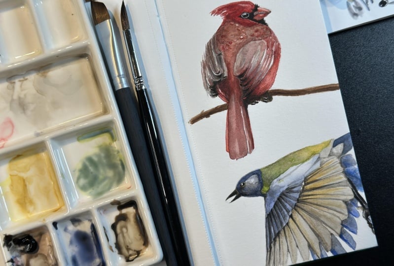
6. Painting the Robin, part 1: It's time to bring
out our watercolors. There are two popular methods
for painting birds or painting anything really in watercolor that I
have come across. And that's working well for me. And I will demonstrate
both to you in this class. The first one is called the
shadows first approach. And that means that we
use are first layers of color to paint in the
shadows with a shadow color. And then we add
what's called the local color on top
of that later. The local color is
the actual color. That's something has like the orange feathers
on this robin. But as we can see on this photo, the side of the bird
that's in the light has different color than
the side that's in shadow. And I like to emphasize the contrast between light
and shadow and my paintings. With this Robin, I'm going
to start with the shadows. First. There are several
schools of thought on how to paint shadows
and watercolor. And the approach we choose a
comes down to personal taste and how realistic versus
artistic we want to get. My preferred method varies and to be honest, I'm
still experimenting, but a common technique is to use complimentary colors
for the shadows. As you might know, complimentary
colors are colors that sit opposite from one
another on the color wheel. So red and green,
blue and orange, yellow and purple
complimentary colors tend to look good
next to each other. And when they are mixed, they kind of mute each other and become a kind of
grayish brown color. So for this class, let's
just keep it simple and work with two of the most commonly
selected shadow colors, which are blue and purple. I'm choosing a light
purple for this bird and I'm mixing it with a lot
of water to begin with. And then I'm painting
in all of the areas of shadow that I can
see in this photo. Watercolor lightens as it dries. And so I'm going back in and
adding more where I see fit. It can be difficult to see where the shadows are
and a photograph. And if you struggled with this, you can try to convert
your reference photo to gray scale and maybe enhance
the contrast of it as well. That's going to
make it easier to see getting the shadows right as such a big part of the
job and it makes the rest of the painting almost
disappointingly easy. Sometimes. Now that I'm starting to feel satisfied with my shadow shapes, I am starting to mix my colors. And I'm always starting with the brightest version of a color that I can
see in the photo, the very brightest spots, the highlights, I'm going
to just leave white, but for the rest, I'm starting light and then gradually building up
the colors in layers. I'm painting in one area and while I'm waiting
for that to dry, I'm working on another
part of the bird. I tried to use as
pure colors as I can and not mix them too much. So here I'm using burnt umber. Be careful around the edges of a wet area if you don't want the colors to spill
into each other. If you think the color is too dark or too saturated
when you put it down, you can always go
back in with a clean, damp brush and Soga
most of the paint, which is what I do here
to make sure that I maintain the highlight
on the back of the bird. Remember where your
light is coming from and stay
consistent with that.
7. Painting the Robin, part 2: Now I have the brightest version
of my local colors down, and it's time to go in
and deepen the colors. I'm choosing a burnt sienna for the shadowy parts of
the face and breast. And CPR for my dark browns. I am careful when I
paint the wings to leave a few streaks of light shining through to indicate
the texture of the wing. I don't paint in every
single line or shape of it. I just want a few well-placed
highlights and shadows. Our eyes will fill in the rest. Then some indigo for the
gray feathers on the breast. I prefer indigo over gray or black because
I think it looks more vibrant and the bluish tint goes well against the warmer
colors like this, orange. Remember those
complimentary colors? Then as soon as my
wings have dried, I'm going in again using
the same dark brown color, but less diluted and mixed with a little black this time
to deepen the shadows. I'm focusing the darkest
shadows to the right and keeping it lighter to the left where the
light is coming from. Some even stronger and burnt sienna for third layer
on the face and breast. A touch of even darker
indigo underneath. And now it's time for the face. Using a slightly
diluted black here to paint in the eyes and the
underside of the beak. Leaving a tiny highlight on
the eye is in the light. Yet another R1 or
the burnt sienna, really pushing those contrasts. This is how you get vibrant
colors in watercolor is just layer after layer
after layer of color. Darkening the brighter feathers of the body since
they're in shadow. Then I'm actually adding a highlight on the
other eye as well. Because I don't want
it to disappear completely into the shadow. I'm using a white gel pen here. Now I'm erasing all of
the visible pencil lines. It's very important
to let everything dry completely
before you do this, I've ruined so many
paintings because I'm impatient and I end up
accidentally smearing the paint. Then finally I paint in this surface for the
Robin to stand on. And I'm doing so
very roughly with as less detail as possible
because I don't want this to pull the attention
away from the bird. I'm experimenting with throwing some salt on here as
the paint is drying. And what that does
is it soaks up the water and creates
this nice texture. It's a great way to make
something look less smooth and a little bit more
organic and interesting. And as it's drying, I'm adding some final
details on the feet. Then my robin is done.
8. Painting the Cardinal, part 1: Alright, so let's practice painting a bird from
another angle this time. The first thing I do here
is to dab away as much of the pencil lines as I can while still being
able to see it. This is where the kneaded
eraser so useful. I especially make sure to
erase the areas that I know are going to be brighter
like the upper back here. Because if I put a lighter, more transparent
layer of watercolor there than the pencil lines
will be visible through that. And I won't be able to
erase them afterwards. There's nothing
wrong. Of course, with pencil lines being visible
in a watercolor painting, it can look cool, but this is just my personal preference. This bird, I'm going to show another approach to build
up the painting and that's working with local color only and building
from light to dark. This is the method that I
most often use simply because it's very straightforward and sometimes that's all I need. There's not a crazy amount of shadows and highlights
going on here. If there were, then a Shadows first approach
might work better, but this cardinal is pretty
evenly lit and I'm just going to paint what I see
and adjust along the way. I start by identifying the local colors that
I see in this bird. The different shades of red
on the head and the body and the tail of a gray
tones on the upper back, on the mantle, and the
black details on the face. I'm noting where the
brightest highlights are. The upper part of the beak, the upper part of the eyeball, the edges of the wings, and where the darkest
areas of shadows are. The face, the underside
of the wing tips, tail, especially the part
that's underneath the wings. Then I'm selecting my colors and I'm starting with
this bright red, which is Winsor
red, in this case, a warm red, usually a watercolor palette will
have two different reds. There's a warm
red, which is this brighter, almost orangey red. And then there is a cooler red, which is usually something
like alizarin crimson, something more towards
the pink side. So I'm selecting my warm red here and I'm painting in all of the areas that
are this color. Then I'm mixing my red with
some black in this case and diluting it to get that more washed out color of the
upper back and wings. Just like with the robin, I'm working from
light to dark and I'm making sure not to
paint in everything, but to leave out little specks
of white just to indicate feather texture and give the painting that loose
look that I like. Being careful to leave those bright highlights on the edges of the wings as well. And then adding some darker
tones and blending them in. I do this by dabbing away the
excess paint from my brush on this damp kitchen towel
and then doing my blending. If your brush is too
wet when you do this, then it would create that
infamous cauliflower effect, where the water pulls out and creates a stain that
pushes away the paint. If the brush would be too dry, then not much would happen. And if you rinse the
brush before blending, then it might just remove
the paint more than blended. So you want some of the
colors still in the brush, but most of the water taken out. Okay, so now that my
wings have dried, I'm going in with
the dark red and I'm hitting the darkest areas first when my brush holds
the most paint. And when the brush
is crying out, I'm taking that opportunity to blend the color upwards
where it's lighter. Here's a technique
for erasing color out that's already dried
or is semi dry. In this case, just take
a clean and slightly damp brush and use it to
draw the highlights back in. I'm using a flat brush for this because it helps
me keep the lines really crisp and
straight in-between. I wipe the brush on
some paper towel. The more damp your painting
is than the dryer your brush needs to be to soak up that color and not
leave any stains. And if your painting
is completely dry, then you might need to have
more water in your brush. It's time for another
round of paint to deepen those colors and create
some shadows like before. I'm starting with the bright
red and then mixing in more black as I get to the darker
areas of the wings and tail. Adding in the feed real quick, just keeping it really simple since you can't
really see much of them. Anyways.
9. Painting the Cardinal, part 2: Now I'm creating some
subtle highlights here by taking out some of
the color with a damp brush, the same way that
I did on the tail. You can absolutely go from dark to light and watercolor
in this way. And there are plenty
of ways to correct mistakes and to
change your mind. You will learn with practice when those techniques
work and when they don't, because they do create
different looks, a highlight created like this looks different
from a highlight created with the
whites of the paper by leaving, leaving paint out. And usually I'm using a combination of both
in my paintings. Time for the face. I'm painting this in knowing that I will
go back later when the paint has dried
and pull some of the blackout in some places. But I am leaving this little paper whites
highlight on the eyeball. While I'm waiting for
the phase to dry, I'm adding some more
contrast to the wings. If you squint at this photo, you will see the big
difference in color between the upper part of the bird and the lower part of the bird. So I'm realizing that
I need to darken this part some more to get
the contrast that I want. And I want a lot of
detail on the swings since they are the focal
point to this photo, our eyes are naturally
drawn there. Some even deeper
red on the face. Now I'm also pulling
out some of the black to add more
definition to the eye. Birds have this ring
around their eyes that's usually lighter or darker
than the actual eyeball. So pulling some of
the color out here, it helps us better see the
size and shape of the eye. I'm also lightening the middle of the eyeball to
make it look more 3D. If we study this photo up close, we see that the darkest
parts of the IR, the lower half of the eyeball
and the outer rim of it. And that's often the case since these parts of the eyeball or more deep set and this
is the part that's sticking out and therefore
catching more light. Okay, time for a final
run-through of color to really push the vibrancy and the
contrast as far as I can. Let's not let this bird
hover awkwardly in mid-air. Let's add a branch
for it to sit on. I'm basing this loosely on the photograph and keeping
it as simple as possible. And with that, our
cardinal is done. Let's move on to the next
lesson where we will paint our flying greeted.
10. Painting the Great Tit, part 1: This burden does
have quite a bit of shadows and highlights going on. The light is hitting
it from this angle, which casts these
parts in shadow. And I really want to capture these contrasts in my paintings. So I'm going to start with
the shadows for this one. Since I can see in the photo
that the shadows are blue. They are actually
the blue sky being reflected through
and onto this bird. I'm choosing ultramarine
blue as my shadow color. Starting with a
very diluted wash. And painting in all of the
shadow shapes that I can see. Again, squinting at the
photo helps me to simplify the image and better
see where the darkest and the
bluest areas are. And now I'm darkening the
areas of most shadow, the underside of the
tail and the shoulder. And also adding some details. That's it for the shadows, I'm ready to move on
to the local colors, starting with this yellow of the body that's peeking
out from under the wing. And then the green of the back, starting with the lightest
and most vibrant green that I can see in this photo. Some gray for the
shadows on the tail, some grayish brown for the feet. For the face, since
it's in shadow, I'm going very dark right
away on the beak and the eye. And these markings, leaving just a few highlights on an around the eye to
distinguish it more. Then I'm moving on to deepen
my colors and shadows. I'm dulling down my green a bit with the help
of some red here. This is a great way to D saturate a color to
make it less vibrant, you just add a little bit
of its complimentary color.
11. Painting the Great Tit, part 2: For the wings, I'm going
with a neutral beige. In the photo. There's a lot of color
shifts and you can even see the yellow or the breast
feathers through the wings. But if I were to add all of this information to my painting, it would likely just
look cluttered. So I'm simplifying the
colors here and I'm choosing a uniform
color for my wings. I'm going in and I'm adding these edges with a darker brown. Keeping a darker here towards the back with a
secondary feathers. And I'm blending my
lines with a damp brush. And then towards the front
with the primary feathers, I want a thinner and
more crisp lines. So I'm going for my
flat brush here. You'll notice that
these wing edges are darker and slightly thicker closer to
the body and they sort of taper down
towards the tips. So I'm not painting
these lines all the way. I'm just blending them
outwards and downwards. And I'm further darkening
these wing tips and the front because I like their shape and I want to draw the eye there. And then a final
layer where I deepen my shadows and I
intensify some colors. Here is my version
of this great it, even though this was the most
complicated one to draw, it was actually the quickest
and easiest to paint. But now I'm hoping that you are inspired to paint
some birds yourself. So let's meet up in
the next lesson and talk about your class project.
12. Class Project: Okay, it's time for
your class project. Your task is to make
a watercolor painting of one of these three birds
that you've seen me paint, whichever one you prefer, and for extra credit, you can paint all three of them. You can find the
reference photos under the projects and resources tab. And there you can also
download my sketches. You can print them out,
you can trace them and you can just skip
the whole sketching part if you want to focus only on the watercolor part
of this class, I wish you lots of fun
with this project. If you want to share
your finished painting, feel free to do so. Just go to the Projects
and Resources tab and click the Create
a Project button. Thank you for spending
time with me. I hope you enjoyed this class. I hope you are happy
with your birds. You feel more confident
with your watercolors. Check out my other classes for more sketching and
watercolor tutorials. And if you want more
inspiration for me, I also have a YouTube channel
and a free newsletter, and you can find
links to both of them on my teacher's page. Thank you once again, and I wish you lots of happy painting.
 Louise Stigell, Artist, writer & creative coach