Transcripts
1. Introduction: Hello, and welcome to
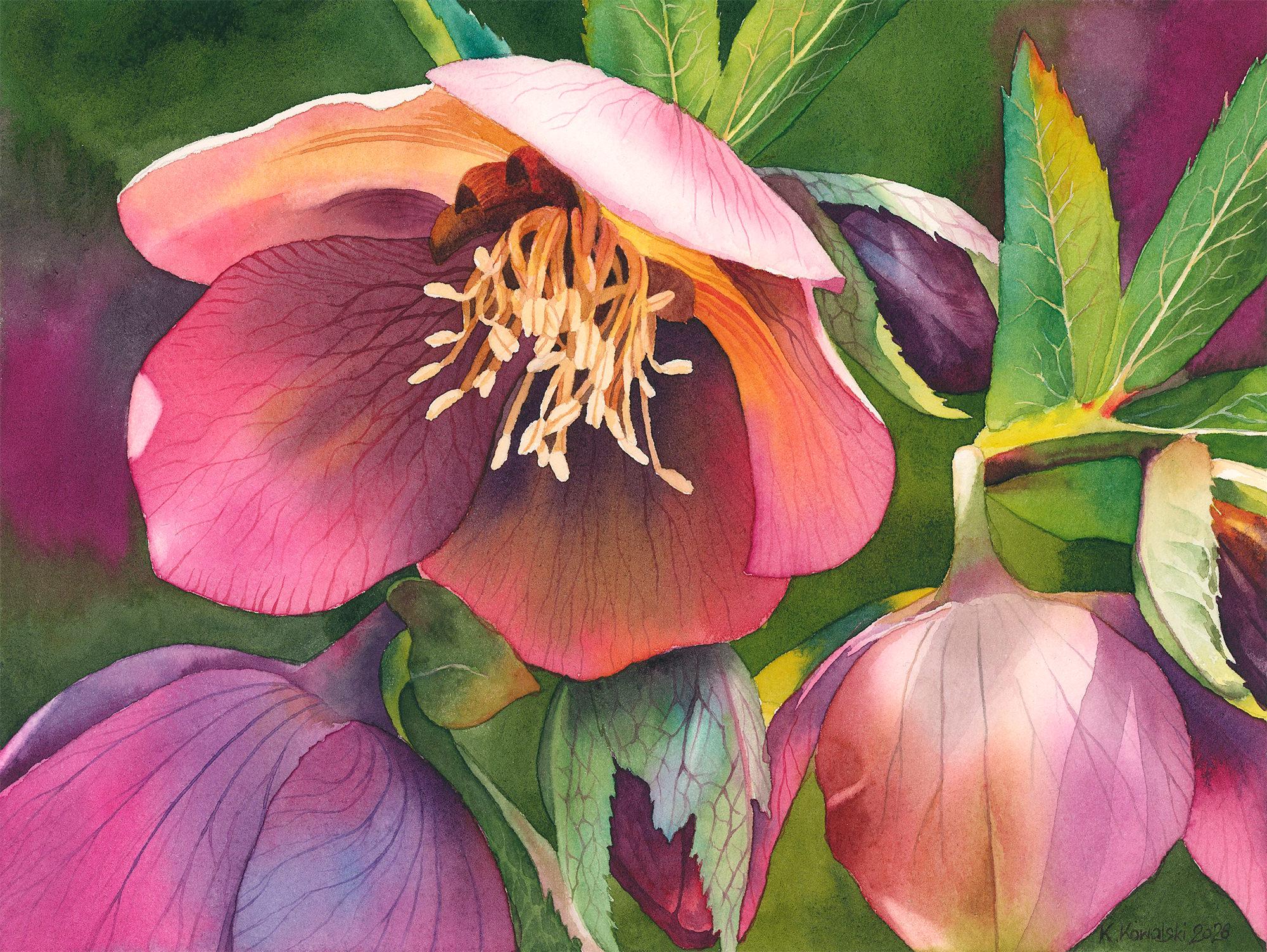
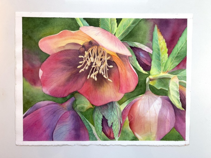
this alibar tutorial. In this class, I'll guide you step by step through painting this gorgeous flower full of deep purples and
rich lush greens. This project is a bit more
on the advanced side, but no matter your skill level, you're very welcome
to give it a try, especially if you're in the
mood for a gentle challenge. Be exploring beautiful
color combinations and learning how to mix those deep dark purples
alongside other bold, vibrant tones that bring
this flower to life. You'll also get
plenty of practice with the wet on wet
technique which we'll use throughout the petals to create soft
transitions and depth. It is a more demanding painting
that asks for patience, a bit of precision and
some courage with color. But if you take your time
and stay with the process, I'm sure you will feel really
proud of what you create. There are so many
beautiful details to enjoy along the way, the delicate veining
on the petals and that lovely contrast between the light stamens and the
darker center of the flower. It's one of those
paintings that takes time, but is incredibly rewarding to see it slowly come together. Show you step by step how to approach a more complex
subject like this. Of course, it could
be simplified, but in this tutorial, we'll slow down,
observe carefully, and focus on building our
painting with intention. We won't rush, take it
one layer at a time. To make things easier
and more relaxing, I've divided this tutorial into smaller parts so you
can move through it comfortably and
at your own pace, gradually building the
painting section by section. I hope you're feeling inspired
and excited to begin. Gather your supplies,
take a deep breath, and let's start
painting together.
2. Project and Resources: I've prepared a selection
of helpful resources for your project available in the project and
resources section. You'll find a PDF file with the supply list I used
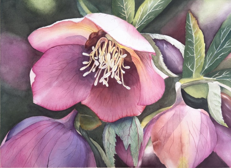
for this painting, along with a reference photo and an image of my finished
artwork for guidance. Line drawings in various sizes are also provided so
you can print and transfer them onto
your watercolor paper in the size that best
fits your needs. Additionally, there working
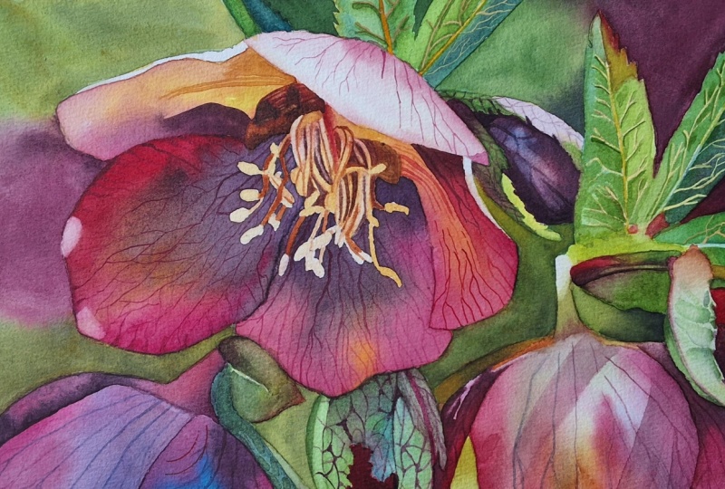
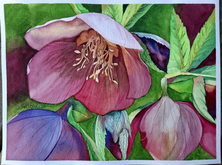
progress photos to help you follow the process and
focus on specific areas. Feel free to explore
these materials and use them to create your own unique and
beautiful painting. Please share your
final painting in the projects and
resources section. I also encourage you to
take the time to view each other's work in the
student project gallery. It's always inspiring to
see what others create, and the support of
your fellow students can be incredibly comforting. Don't forget to like and
comment on each other's work. Lastly, I highly
recommend watching each lesson before
you begin painting. This will give you a clear
understanding of what to expect at each
stage of the tutorial. If you find this class helpful, I would greatly appreciate it if you could leave
an honest review. Your feedback will help me
improve my content and assist other students in
deciding whether to join this class.
Thank you in advance.
3. Painting Plan: Before we jump into
the painting process, let's take a moment to look at the subject as a whole and
talk through the plan. I think we can all agree that the color palette in the reference photo is
absolutely beautiful, and that's what immediately
drew me to this flower. The combination of deep
purple, soft pinks, and those juicy vibrant
greens is just stunning, and I knew it would translate wonderfully into a
watercolor painting. Dark purples are
especially striking. Even though achieving
rich deep colors in watercolor can
sometimes be challenging, in this case, I felt
quite confident about it. I immediately thought about
using mixes with paints gray, especially combinations
of magenta and Alizarin crimson with Pains gray to create those
deep velvety tones. I've been wanting to explore these color combinations
for a while, so this felt like the
perfect opportunity. Lighting in the
reference is also lovely with bright highlights
and strong shadows. This kind of contrast makes it an ideal subject for watercolor. When I looked more closely, I noticed there are quite a
lot of intricate details. At that point, I had to decide how much I
wanted to simplify. Simplification can mean not only painting things
in a looser way, but also removing elements
that aren't essential. This case, I chose to
keep quite a lot of the detail because I felt it
would really be worth it. I wanted this to be a
more detailed study, something where we can
slow down and really enjoy observing and painting all those beautiful structures. At the same time,
I still wanted it to feel like a
painting, not a photo. So while I didn't simplify
much in terms of detail, I did simplify the composition. You compare the reference photo with the finished painting, you'll notice that I removed
the out of focus flowers in the background and
also the dried stamens resting on the petals. I felt these elements weren't
necessary, but of course, if you like them, you can absolutely include them
in your own version. Help visualize the
final composition, I opened the reference photo in the Adobe Fresco app on my
iPad and experimented a bit. I removed the background and painted a simpler one digitally. I tried a few options, including lighter
backgrounds, but in the end, I chose a darker one. Darker background really
helps bring out the light in the petals and it creates a stronger contrast with both
the flowers and the leaves. Repeating some of
the main colors from the flower in
the background also helps to keep the
color composition harmonious without distracting
from the main subject. Next, I thought
about masking fluid. I often use masking fluid around the edges of
the main subject so I can paint the background more freely, but not always. In this case, I filled the
negative spaces in my line drawing with a flat color first just to clearly
see the shapes. This helped me notice
that the background areas between the petals and leaves
are actually quite simple. Because of that, I decided
I could comfortably paint around them without
using masking fluid. However, the stamens in the
center are a different story. If we tried to carefully
paint around each tiny shape, it would interrupt the flow, especially when working with soft wet on wet
washes on the petals. So here using masking
fluid makes perfect sense. It allows us to paint
the petals freely and confidently without
worrying about preserving those small details. So in this painting,
the stamens are the only area where I
will apply masking fluid. After making these decisions, I spent some time planning
the entire process. What to paint first,
what comes next, which colors to use and
how to build the layers. This planning stage can
sometimes take quite a while. And in this case, it
took me a few days. Once I have a clear
plan in my head, the painting process becomes much more relaxed and enjoyable. So here is how we will approach this painting
step by step. We'll begin by applying
masking fluid to protect the stamens and then
start with the background. Next, we'll paint the
leaves in three stages, an initial layer, a second
layer to deepen the colors, and finally the details. Then we'll move
on to the sepals, following the same
three step process. After that, we'll
switch from greens to purples and paint the
buds in two stages. Then we'll begin
working on the petals. First, we'll apply a base
layer to all of them. After that, we'll deepen the
colors working in two rounds so we can paint alternate petals without disturbing
previous layers. Once we have a solid base, we'll add the beautiful
veining and finer details. Finally, we'll remove
the masking fluid and focus on the statements, the most delicate
and intricate part, and bring the whole
painting to completion. As you can see, there are
quite a few steps involved. So this is a wonderful
opportunity to practice patients. Take your time, and I
promise it will be worth it. Intentionally divided the
process into smaller parts so you can follow along comfortably and take
breaks whenever you need. You don't have to finish this
painting in one sitting, and most likely you won't
that's absolutely okay. This is not a race, and there
is no pressure to rush. Let this be a calm,
enjoyable experience, a chance to slow down, focus, and spend some meaningful
time with your paints. Try to think of this as a
longer, more immersive project, a chance to practice
your techniques, build confidence, and simply enjoy the process of painting. And just for this time, allow yourself to step away
from everything else. Let go of distractions, let go of pressure, and focus on this quiet
creative moment. I hope you're ready now
because in the next part, we'll begin by applying
the masking fluid.
4. Applying Masking Fluid: Before we begin
applying masking fluid, I like to gently lighten the pencil sketch using
a kneaded eraser. A kneaded eraser is
soft and flexible. You can shape it into a roll and lightly move it
over the drawing. It lifts excess graphite and softens the lines without
removing them completely. Especially like to do this when I'm painting lighter areas, and here I'll focus mainly
on lightening the stamens. For masking, I'll be using
Windsor Newton masking fluid, which has a yellow tint. Instead of working
directly from the bottle, I pour a small amount
into a cap from an old bottle from masking fluid just
enough for what I need. Also keep a small
piece of soap nearby, which is very important when applying masking
fluid with a brush. For this step, I always
use an inexpensive brush. Masking fluid can be
quite harsh on bristles, so I usually keep a few cheap synthetic brushes
just for this purpose. Also use a separate
small container of water for rinsing the brush. I never use my main
painting water. I start by pouring a small
amount of masking fluid into the cup and then
immediately close the bottle. This helps prevent
it from drying out and keeps it
usable for longer. I also avoid dipping my brush
directly into the bottle as it's less convenient and exposes the fluid to
air for too long. Before picking up
the masking fluid, I dip my brush in clean water and gently
rub it on the soap. This creates a
protective layer on the bristles and helps prevent them from
sticking together. And don't worry the soap won't affect your paper
or paint later on. Now I can dip the brush into the masking fluid and
begin applying it. Take your time here and try to stay within
the pencil lines. This is a small area
with intricate details, so it does require
a bit of precision. It's worth being careful because once the masking
fluid is removed, the edges will be very visible, especially since
the stamens will be surrounded by
much darker tones. The class materials, you'll
find an illustration showing exactly where I
applied the masking fluid, which should be
helpful as a guide. There's no need to
rush this step. It's the only place in this painting where
masking fluid is really necessary unless
you decide to also mask the edges of the
petals and leaves. If you would like
to do that, this is the moment to apply it. Once you're finished,
rinse your brush thoroughly in water and
clean it again with soap. This will keep the bristles
in good condition. Without soap, the masking fluid will dry and stick
them together. Now leave the masking fluid to dry completely and naturally. Once it's dry, we'll move on
to painting the background.
5. Background: The masking fluid
is now completely dry so we can move on to
painting the background. Before I start and also from time to time
during the painting, I like to lightly mist my paints with clean water
using a spray bottle. This helps to soften
them and makes it easier to pick up more
fluid workable color. Let's begin by
preparing our mixes. For this, I usually
use a flat brush, just a simple inexpensive
synthetic one. It makes it much quicker to
pick up larger amounts of paint from the wells and transfer them to
the mixing area. The first mix we'll prepare is quinacrodon magenta
with paints gray. I'd like to mention that
my quinacrodon magenta is made with PR 122 pigment, which is a very bright version. Some paints from
different brands have the same name
of this color, but they are made
with P V 19 pigment. And this one tends to be
slightly darker and more muted. So if you would like to
achieve similar results, make sure that you have
the pigment PR one, 22. This mix already
gives a deep purple, but I would like to
shift it slightly. So I will add a touch of
permanent lazaren crimson. This moves the
color a bit toward the red side and creates a
really rich, beautiful purple. For the greens, I will
use a mix of green gold, paints gray, and Windsor
green yellow shade. This will be my base green. I can easily adjust it, adding more green
gold for a warmer, lighter tones or more paints gray for a
deeper darker green. I'll start painting
in the upper section where we have two small
background shapes. Then I will move down
along the left side, and after that, we'll paint the right side from
top to bottom. I'm going to rotate
the painting slightly to make this first area
more comfortable to reach. It's a small adjustment, but it really helps
with control, especially in these
tighter spaces. For this part, I'll be
using Size six brush. I'm painting wet and dry here, simply filling in these small
areas with a dark green. Now, I'll switch to a
si ten brush and move on to the larger background
section on the left. I'll begin with the green and then gradually
transition into purples. You might notice that I'm
continuing to work wet on dry, which isn't my usual
approach for backgrounds. Normally, I prefer wet on wet for softer, smoother
transitions. And if you enjoy that technique, please feel free to use it here. There's absolutely
nothing wrong with that. This time, I chose wet
and dry for two reasons. First, I knew that the
flower itself would take quite a long time to paint because of
all the details. I wanted to keep the background relatively
quick and simple. Wet and dry is faster
because we don't need to apply an
initial layer of water. And the second reason is that it's easier to achieve
darker tones right away. When we paint wet on wet, the additional water layer dilutes the pigment and
once everything dries, the colors may appear
lighter than expected. That can mean adding
another layer later. Here, I wanted to reach
those deep tones in one go. Of course, the trade
off is that wet and dry can result in less
smooth transitions. You might notice some
slight inconsistencies, and that's perfectly okay. I don't mind that here because the flower will naturally
draw most of the attention. On the left side, I transition
from deep green into a rich purple and then into a cleaner
quinacredon magenta. Even though the colors
look quite dark, I'm still using a good amount
of water in my mixtures. This helps keep the
paint wet for longer, making it easier to blend and create smoother transitions. Today is quite warm here
where I'm painting, so the paint is draying quickly. I know that might create
a few uneven areas, but I'm happy to embrace that. Also using purples
and magentas in the background to echo the
colors of the main subject. This creates a nice connection between the flower
and the background, making the whole painting
feel more cohesive. The purple in the background
can also sadly suggest other flowers in the distance without needing to
paint them in detail. Next, I'll paint the smaller
sections at the bottom, and then move on to
the upper right area. Here again, I begin with green and then
transition into purple. I try to place some purple
between the leaves, so later we'll have
a beautiful contrast between the green shapes
and the background. Once all the sections
are filled in, we'll leave everything
to dry completely. And when the background
is fully dry, we'll move on to
painting the leaves.
6. Leaves - Initial Layer: The background is now completely dry so we can begin
painting the leaves. I'll start by cleaning the left side of my
palette so I can prepare fresh colors and so you can clearly
see what I'm mixing. For this stage, I think a size eight brush will work very well. For the greens, I've
decided to use a mix of transparent yellow and
Windsor blue green shade. The reason for this choice is that the leaves
contain a range of hues from warmer
yellowish greens to cooler, more bluish tones. You can even notice hints
of blue in the sepals, so this combination helps keep everything harmonious
across the painting. I like to create a small
color range on my palette, a balanced mix of the two
colors in the middle. More blue added on one side
and more yellow on the other. This way, I can easily pick up the exact shade I
need at the moment. I'll start with the
leaf on the left. You can see that it has
two distinct color areas, a more yellow green on one side and a cooler
bluish green on the other. To keep these colors
clean and fresh, I'll first paint
one side and then come back to the other
side once it's dry. I'll begin by picking
up a mix with more yellow and
applying it wet on dry. While it's still wet, I'll drop in a bit more of the middle green to
create a soft variation. Now I'll move on
to the next leaf, and here I'll apply
a similar color on one side and gently introduce a slightly richer green
along the central vein. At this stage, we are simply establishing the base colors. There's no need to
focus on details yet. We just want to cover all the leaves with their
general green tones. Here I'll start with the
middle green and then introduce more transparent
yellow along the edge. Transparent yellow
is a beautiful, glowing color that mixes
very well with other colors. If you have it, I highly
recommend using it. If not, you can create
a similar effect by mixing a cool yellow
with a warm yellow, keeping the mixture
slightly on the color side. For example, you could mix Windsor yellow with
Windsor yellow deep. As I paint, I'm trying to leave the central vein
unpainted for now since they are quite prominent and we'll define
them more clearly later. To create a darker green, I'll mix transparent yellow
and Windsor blue green shade with something darker. Here I'm using a bit of purple, but paints gray would actually
be an even better option. I'll continue applying
these base colors across all the leaves
always observing the shifts between
warmer and cooler greens and trying to preserve
the main veins. This is a wonderful exercise
for both observation and color mixing because there's such a variety of
greens in the leaves. But remember, color accuracy is less important
than tonal values. Even if your greens don't
match the reference perfectly, what really matters
is whether they are light or dark enough
in the right places. When working on
this initial layer, whether it's leaves, sepals, or later the petals, it helps to imagine that there are no shadows
and details yet. You can even squint at your reference to
simplify what you see. We're just looking for the
overall general color. Think of this layer as a
foundation or a color map. It doesn't need to be dark. We'll build depth gradually in the next layers for now
focus on identifying whether an area leans
more toward yellow or blue and adjust your
mixes accordingly. Once the first layer is dry, I will come back to
the initial leaf and paint the second site with
a cooler more bluish green. I'll also paint the small
leaf at the bottom. I just needed to wait
a moment for the area above to dry slightly
before continuing. To speed things up, I'll
gently dry this layer with a hair dryer and then finish
the last remaining sections. One of them is more yellow, and for the final area, I'll mix a lighter green with
a subtle touch of purple. Now we have the base layer
applied to all the leaves. Let everything dry completely, and in the next step, we'll begin building
the second layer.
7. Leaves - Deepening the Colors: This part will be very
similar to the previous one. We'll be using the same colors, but the goal is
slightly different. Now we want to
deepen the colors. That means making
them more intense, more saturated, and
in some areas darker. You might be wondering
why we didn't do this in the first
layer straightaway, and that's a very good question. Of course, we could try to
achieve everything in one go. But the effect would be different, not
dramatically different, but enough that I much prefer building color
gradually in layers. Because watercolor
is transparent, a single layer always allows some of the white
paper to show through. This can make the color
appear lighter and less deep. But once we have a base layer, adding another transparent
layer on top increases the richness and depth
because we're no longer painting directly
on white paper. This is why building color
with layers is so effective. It takes a bit more time, but it's truly worth it. Another advantage is control. With each new layer, we can gently adjust both the color and
the tunnel values, making small refinements instead of trying to get everything
perfect at once. For this stage, I'll
be working wet on wet. And I will explain why as we go. I'll start by applying a thin layer of clean
water to a section, and then I'll drop in the color. There are a few reasons why
I chose this technique here. First of all, it's gentler
on the previous layer. By working on a damp surface, I can softly introduce
color and let it spread naturally without disturbing
what's already underneath. If I work to wet and dry, I would need to move
the brush more, which increases the
risk of lifting off or disturbing
the previous layer. The second reason is that it creates smoother transitions. The colors blend more
naturally on a wet surface, which helps unify the area
and soften any edges. And finally, it helps
refine the overall look. This layer not only
deepens the colors, but also subtly smooths out any small imperfections from the first layer giving
a more cohesive finish. The difference between the
first and the second layer might feel quite subtle, but that's completely normal. We're building everything
gradually, depth, color, and form step by
step without rushing. Once you finish, leave this
layer to dry completely. You can use a hair dryer if you would like
to speed things up, and when everything is dry, we'll move on to the next step
and finish the leaves. Y.
8. Leaves - Painting the Veins: This part will take
a little more time because now we'll
focus on adding the veins and making final adjustments to bring the leaves to a finished stage. I'll begin with a
size four brush. Take a moment to look
at each leaf again and ask yourself if there is anything you can
refine or improve. For example, in this first leaf, I feel the bluish green
could be a bit deeper, so I'll quickly apply another layer wet-on-dry
to strengthen that color. Now moving on to the next leaf, we'll start working
on the veins. First, I like to clean and
refine the central vein. I do this by running a damp brush along
that vein to gently reactivate the paint and then lifting it out
with a paper towel. This helps to smooth the shape and make the
vein more defined. For the smaller secondary veins, lifting would be
very time consuming, especially since we're using staining colors which
are harder to remove. So instead, we will use a much simpler and more
controlled method. But first, I'll quickly clean the central vein on
the next leaf as well. Now, I'll mix transparent
yellow with a tiny touch of Windsor yellow deep to create
a slightly warmer yellow, and I'll use this to tint the veins so they don't
remain pure white. While I'm here, I will also add a small subtle shadow
between the leaves. Next, we'll move
on to using guash. I'll be using Windsor Newton
permanent white guash. I'll squeeze out a small amount just a little is enough and place it on a colored surface so I can see the
color more clearly. To this white, I will add a bit of Windsor yellow deep
and burnt sienna, creating a very light
warm yellowish brown. This will be the
color for our veins. I'll start with my
round size four brush, but I quickly realize it's a bit too large for such fine details. So I'll switch to a
size zero liner brush. A liner or a rigger brush has
very fine pointed bristles, which makes it perfect for painting delicate
lines like veins. Working with gouache at this scale can be
a little tricky. Finding the right consistency
takes some practice, and it's also worth
remembering that gouache dries slightly darker and more transparent than it
appears when wet. Because of that, you
may need to go over the veins more than once
to make them visible. Usually adding a
bit more white to the mixture helps
them stand out. In this painting, the
contrast is quite subtle, so the veins won't
be extremely bold, but you can gently
build them up. Take your time here.
There's no need to rush. This stage really benefits
from patience and precision. After painting the veins, you can also enhance
them by adding very subtle shadows alongside them using a slightly
darker green. This not only makes the
veins more visible, but also gives the leaf a
more three dimensional feel. You'll notice how
fine this brush is. It almost feels like painting
with just a few bristles. It's perfect for this
kind of detail work, and we'll use it again later
for sepals and petals. I'll repeat the same
process on the next leaves. First, refining
the central vein, then painting the smaller veins
with the gouache mixture. On this leaf, I'll first
use burnt sienna to paint the veins and then go over it with the
lighter gouache mix. I also notice a touch of
red at the tip of the leaf, so I'll add a bit
of quinacrodon red. Well, I will actually
exaggerate it slightly to create a
subtle pop of color. And Now I'd like to deepen the bluish green here. I'll apply the color
between the veins, which will also help the
veins stand out more. For this, I will switch
back to my size fush and then add soft shadows
along the veins as before. I'll repeat the same steps
on the remaining leaves. You may notice that
as gouache dries, it becomes less visible, so I continue layering lighter tones to gradually
build up the effect. At this stage, we can also introduce a bit
of extra texture. I'll use a slightly darker green to add a few irregular
organic marks, very subtle just to give
the surface more interest. On the small leaf in
addition to the veins, I'll also deepen the shadow
with a darker green. Now, I'll use a scrubber
brush in my case, a size four Windsor
Newton galeria brush to gently soften
one of the edges. I dip the brush in water, remove the excess, and
slightly rub that area. Then I leave the paint
with a paper towel. This creates a softer,
more natural transition. Next I'll add a brighter yellow, and this time, I'm
using Windsor yellow. I can also see a few
reddish accents, so I'll again use quinacrodon
red to enhance those. I would also like to darken the leaf below the
stem a bit more. I'll begin with a
mix of green and purple and then deepen it
further with a darker green. Finally, we have two small
leaves at the bottom. On the heart shaped leaf, I'll start by painting
the central vein. Then add a touch of
quinacradon red, at the tip and soften it. Since this leaf
sits in the shadow, I'll deepen it using a
mix of green and purple. Here, I'm not too concerned about matching the exact colors. My thinking is very simple. It's green leaf, so I use green. It's in the shadow, so I make it darker and I add purple to connect it with the
surrounding colors and to naturally mute
and deepen the green. On the last leaf, I'll create an
interesting texture using simple irregular
brush strokes. With a darker green, I'll paint small organic shapes, leaving the gaps between them. This creates a subtle
but beautiful texture. To finish, I will apply one more layer on the
curled side of the leaf, nothing complicated,
just slightly deepening the tones using
the same greens and purples. And with that, the
leaves are finished. And
9. Sepals - Initial Layer: In this part, we're going
to paint the sepals. They are truly
beautiful elements, especially the one
at the bottom with its lovely range of colors
and intricate veining. It may look complex at first, but you will see that
it's actually more manageable when we
take it step by step. For this step, I'll be using a size six brush to apply the initial layer
to all the sepals. I'll begin with a
yellowish green, a mix of transparent yellow with some leftover
green from my palette. I like to start with the
lightest, brightest color, and then gradually move into greens and finally into purples. We'll follow the same
approach as with the leaves. This first layer is simply
about creating a color map, placing the main colors
in the right areas. There's no need to worry about strong contrasts
or deep tones yet. We can gently suggest them, but the main focus should
be on establishing the overall color relationships and preserving the
lighter areas. For the next seple, I'll start with burnt sienna and then transition into
green and purple. At the tip, I will return
to transparent yellow. This sepal catches
a lot of light, so I'll keep the overall
tunnel value quite light. Now moving to the
sepals at the bottom, I'll begin with a green mixture made from transparent yellow, windsor blue, green
shade, and paints gray. There are actually
two sepals here, but I will treat them as
one larger shape for now. This area is a bit more
complex in terms of color, so take your time observing. Green is the base, but there are also beautiful blue tones, so I will introduce more
windsor blue in those areas. I'll also bring in some purple, mainly quinacrodon magenta and let these colors blend
softly on the paper. When the purple meets
the green or blue, it becomes more muted, which works very nicely here. I especially like adding
it along the central vein. Don't worry if the purple seems to disappear at this stage. The green layer is still very light and will dry even paler. So we have plenty of opportunity to strengthen
those colors later. That I think this is enough for this
section for now. While we are here,
let's also quickly apply base colors to
the stem on the right. Since it's a small area, I won't create a
separate step for this. I notice a bit of red, so I will use quinacrodon
red on one side, and then a touches of dark purple and green
to complete the base. Remember, this initial
layer is just a foundation. If you know you'll be
adding more layers later, there is no need for
this one to be perfect. The next layers will refine
and improve everything. What matters is that
we cover the white of the paper and establish a base
for richer, deeper colors. Now, let everything
dry completely. You can use a hair
dryer if you'd like, remember to let the
paper cool down before moving on
to the next layer.
10. Sepals - Deepening the Colors: In this part, we'll apply the second layer
adjustment layer. Now we'll deepen the colors
and strengthen the shadows. The goal here is to prepare the sepals for the final stage, which will be the veining. Before we add those
final details, we want to make sure that the tonal values and shadows are already
well established. Begin with the first sepal using the same colors as before
and the size six brush, I'll start at the
top with purple, then gradually transition into
green as I move downward. What I'm focusing on
here is the shadow, so I'm shaping it based on
what I see in the reference. Within the green areas, I can also introduce slightly more bluish
tones to add variety. And in the darkest shadow areas, I'll deepen the color
with a richer purple. Now I'll move on
to the next sepal. Here the shadow is stronger on one side of the central vein, so I'll begin by placing
the darker shape first. Then I'll gently build up the
surrounding shadow areas. As I apply the green, I'll soften the
lower edge so that only the upper part of the
shape remains more defined. This helps create a more
natural transition. And here a quick
note and apology, my camera stopped
recording for a moment. So what you see now is after
a few minutes of work. I've added more green shapes and also painted the central
vein with purple. I'll continue by adding a bit more burnt sienna at the top and a few
additional green shapes. These simple soft shapes help suggest the ribbed
structure of the sepal. I'll also drop in a few darker green accents
to reflect what I can see in the reference and
finish this area with a touch of yellowish
green at the tip. Next I'll mix more of my base
green, transparent yellow, winds are blue, and pains gray, and use it to add a
small shadow nearby. I'll also go over the stem
again to deepen the colors. On the left side, I will
reinforce the quinacridon red, and on the rest, I will
build up the green. Near the base, I will add a deeper darker purple to
strengthen the shadow. Now for the final seple, I'll begin with a
darker green on the left side where
the deepest shadow is. This time I'm adding
more paints gray to my green mix to
achieve that depth. I'll leave a small gap for
the lighter vein area, which we'll refine later. The edges may look a
bit sharp for now, but we can always soften them afterward with a damp
brush or a scrubber brush. As I continue, I'm using
the same colors as before. But because we now
have multiple layers, the tones appear richer
and more intense. The white of the paper is no longer influencing
the color as much, which gives us that deeper look. While painting, I keep in
mind that there is a shadow cast by the flower across
the upper part of the sepal. So in that area, I'll make sure to use darker color green. I'm also introducing a
bit more windsor blue and quinacredon magenta
in this layer to enrich the color variation. For the deepest shadows, I will mix green with some of the dark purple already on my palette and apply
it selectively. I'll finish this seple by gently balancing the greens
in the lower area. Now I'll zoom out for a moment and look at the
painting as a whole. I notice that the shadow on the first sepal is still
a little too light, so I'll go back in and deepen it slightly with another
layer of green and purple. Since the surface
is already dry, this is a good opportunity
to make that adjustment. And that completes the stage. In the next part, we'll focus on the beautiful final details, the veining on the sepals. M.
11. Sepals - Painting the Veins: This is my favorite part
of the entire painting. Now we're going to add those beautiful delicate
veins to the sepals. There is something really
special about this stage, the way the purples interact
with the greens and blues and how these fine lines suddenly bring
everything to life. They add so much
character and elegance. For painting the veins, I'll be using assize
zero liner brush. These lines are very thin, so having a brush with a fine, sharp tip is essential. Whatever brush you're using, make sure it comes to
a really good point. Try to keep your lines delicate. If they become too thick, we can lose that refined
intricate effect. For the colors, I'll
mainly use purple tones, but I will also
introduce a bit of green here and there so the pattern
doesn't feel too uniform. I'll be looking at the reference photo
for general guidance, but I'm not trying to copy
every single line exactly. Instead, I aim to recreate the overall feel of the pattern. There are three
key things to keep in mind while
painting these veins. First, keep the lines very thin. Use a brush with a fine tip and start with light
delicate strokes. You can always thicken
certain areas later, but it's much harder
to fix a line that is too thick
from the start. Vary the line with subtly. Let the lines taper towards the ends almost like her lines, so they feel soft
and natural as if they gently disappear into
the surface of the sepal. Emphasize some intersections. Slightly thickening
a few intersections, make the pattern look more organic and visually
interesting. While working here, I will also make a few
small adjustments. I'll deepen a shadow on the left sepal and soften the edge using
a scrubber brush. I'll also use the scrubber
brush to gently soften a few hard edges and lift some paint to create
subtle highlights. These small refinements
can make a big difference. On the left side, I feel that the area is
a bit too light, so I will quickly
glaze over it with a warm light green and dry
it with a hair dryer. This is a good
reminder that we can always adjust and
refine things as we go. Now I'm ready to
begin the veining. I'll start with a
very light purple, just to map out where I
want the lines to go. Once I'm happy with
the placement, I will go over them
with a stronger color, reinforcing selected areas and slightly thickening
some intersections. At this point, my
pencil guidelines have mostly disappeared
under the layer of paint. If you prefer, you can lightly redraw the
veins before painting. But I actually like
working without them. It allows for more freedom, and the lines feel cleaner
without visible pencil marks. On the right side,
I will begin with the central vein and then at
the smaller branching veins. Notice that the main vein
isn't perfectly straight. It has a natural, slightly irregular flow
which adds to the realism. For the main vein, I'm using
pure quinacrodon magenta. It creates a beautiful contrast against the greens and blues. I'll also vary the tunnel
strength of the veins. Some sections are darker, especially at intersections
while others remain lighter. The lines also vary
slightly in width. All of this helps avoid a flat uniform look and instead creates a more
lively organic pattern. Once the veins are in place, I like to zoom out and look
at the painting as a whole. This helps me spot any areas
that might need adjustments. Here I noticed a small area that needs a touch more green, and I also added a bit more burnt sienna to
the sepal on the right. This is one of the advantages of working in
transparent layers. We can always refine
and improve as we go. And with that, the
sepals are finished. In the next part,
we will move on to painting the deep
purple buds. And.
12. Buds - Initial Layer: In this short part, we'll apply the initial
layer to the buts. I'll be using a size six brush, and I will start by cleaning my palette so I can mix
fresh clean colors, and so you can clearly
see what I'm using. For the main mix, I will combine quinacrodon magenta with
paints gray and then add a touch of permanent
lazarin crimson to shift the hue slightly
toward the red side. This will give us a
rich deep purple. I'll also play some pure
alizarin crimson and pure quinacrodon magenta on the palette so I can easily
reach for them when needed. And at the bottom,
I will keep a bit of Windsor blue
green shade as well. I'll begin by applying
Windsor blue in the middle of the but where I can see
a subtle highlight. Then I'll switch to
the main purple mix and paint around that area. Since the blue is still wet, the colors will blend
softly on the paper. Toward the tip of the bat, I'll introduce more
Azaren crimson to bring in a slightly
warmer reddish tone. Once the main colors
are in place, I'll pick up a
more concentrated, darker purple and add it to
the deepest shadow areas. Here I like to use a gentle dabbing
motion with the brush. This allows more pigment to
be released exactly where I place it rather than spreading it out with a
regular brush stroke. It's a very useful
technique when you want to build depth and intensity
in specific spot. On the bat on the right, I will also introduce
some yellow. I'll start with transparent
yellow at the top, then transition into
Alizarin crimson and finally into
purple at the base. You might notice a small
detail I missed here. Just below the sepal, there is actually a
darker section of the bad that I didn't
paint at this stage. I only noticed it
later while working on the petals and ended up treating it as a part
of the flower instead. If you prefer to stay
closer to the reference, you can include that
darker purple area now. But honestly, it's
such a small detail that it won't affect
the overall result, especially since it becomes less noticeable in the
finished painting. For the final bad,
I'll begin with lazarin crimson and then at
purple in the shadowed areas. Overall, these buds
are quite dark. So even at this initial stage, we can aim for
relatively deep tones. The layer will dry a bit later, but it will give
us a strong base, and the final colors will
appear richer and more vibrant.
13. Buds - Adding Shadows: After applying the
initial layer, we now have a nice
base to work on. In this part, we'll
deepen the dark tones and finish the bats with a few
small adjustments and details. You can already see
that even though the colors looked
very dark when wet, they appear lighter once dry. That's because the white of the paper still shows through. To achieve richer,
deeper colors, we need to build
them up in layers. So now I'll go back in with the same dark purple mix and focus on strengthening
the deepest shadows. Try not to overwork
the surface here. It's best to use as few
brush strokes as possible. This particular purple mix
is not highly staining, which means it's
easier to disturb the previous layer
even when it's dry. So work gently and place the
darker tones with intention. I'll also add the darker purple
to the bad on the right. First, I lightly suggest the
structure with a few lines, and then I deepen the shadows. On the bottom bat,
I'll begin by painting a few lines to indicate the separation
between the petals. Then I'll apply a darker
tone this time with a bit more Alizarin
crimson toward the lower part and finally deepen the shadow just
beneath the sepals. I'll briefly return to the
previous bat and apply a thin layer of lysarin crimson
over the yellowish area. This warms it up and shifts
it slightly toward the red. But in a moment, I will lift a bit of paint to bring
back some of that yellow. Now I'll dry
everything thoroughly. Once the layer is
completely dry, we can make a few
final adjustments. For lifting
highlights, I will use my regular size six brush
rather than a scrubber brush. I dip it in clean water. Remove the excess
on a paper towel, and then gently
activate the paint before lifting it
with a paper towel. This creates very soft
subtle highlights. Now, I prefer using a
regular round brush here because these colors
lift quite easily, so there is no need
for a stiff scrubber. A softer brush is more gentle on the paper and creates more delicate natural
looking highlights, which is exactly what
we want in this case. I'll repeat this process
on the other bats as well. After that, I'll zoom out and take a look at
the whole painting. I noticed that one of the
sepos looks a bit too pale compared to the others and
feels slightly unfinished. Even though it's similar
in the reference, I decided to add some veining to bring it more in line with
the rest of the painting. Now I'm much happier with
how everything looks. Take a moment now, take a deep breath, and maybe
take even a short break. And when you're ready, we will move on to painting the petals.
14. Petals - Initial Layer: Now we'll begin painting
the main flowers. In this first step, we'll apply an initial layer to all the petals with
one small exception. At this stage, we'll introduce those beautiful
warm glowing tones that will bring a whole new
quality to the painting. If you look at the work
in progress reference, you can see that we'll be covering most of the
petals with base colors. While leaving a few
small areas unpainted, such as the latest top petal and some of the
thin curled edges. Even just observing
that image gives you a good idea of the
direction we are going in. I will still guide
you, of course, step by step and show you
exactly how I approach it. First, I'll clean
the left side of my palette to
prepare fresh mixes. I'll also change the
water since we'll now be working with
brighter, cleaner colors, especially yellows,
and we don't want them to become dull from
leftover pigments. Because the petals are larger and we want
to work efficiently, I'll switch to a size ten brush. Let's prepare the main
colors, quinacredon red, quinacredon magenta, transparent
yellow, burnt sienna. I'll keep my purple
mixes on the other side of the palette so they are
still easily accessible. For the petals, we'll
be working wet on wet to achieve smooth transitions
and soft gradients. I'll begin by applying a
layer of clean water to the first petal on the left and slightly
into the next one. There's no need to wet
the entire flour at once because by the time
we reach the last petal, the surface would
already be dry. It's better to work in
smaller manageable sections. I'm also avoiding the
thin curled edge. This area will remain unpainted to preserve
that highlight. I'll start with
transparent yellow as it's the brightest
and cleanest color. While it's still
wet, I'll introduce burnt sienna and then gradually move into
quinacudon magenta. Now I'll move into
the second petal, and here I will use a mix of quinacrodon magenta
and quinacrodon red. This creates a beautiful mid
red tone that we can easily shift either more toward
magenta or more toward red, depending on the area. As always, I apply a
water layer first to keep the surface wet and allow the
colors to blend smoothly. The third petal has
more brown tone, so I will begin with
burnt sienna near the center and then introduce magenta and
red toward the edges. This will be much darker
later, but for now, we're just establishing a base and covering the
white of the paper. On the fourth petal, I'll also begin with
transparent yellow, then transition into
quinacradon red and magenta toward the edges, leaving the curled
edge unpainted. You may notice that I'm treating these petals as one
connected area. Even though they are
separate shapes, it's perfectly fine at this stage if the colors
blend between them. We'll define the
individual petals more clearly in later layer. Now let's move on to the flower at the bottom left corner. Here I'll need a clean, pure quinacrodon magenta, so I'll prepare a
fresh space for it. I'll also use Windsor blue, which I still have
on my palette. I'll begin by applying
a water layer over the entire flower,
including the stem. The water isn't perfectly clean
anymore, but that's fine. It's still okay for this stage. Make sure the surface
is properly wet. It's better to have slightly too much
water than too little. Now I'll start applying color, beginning with a strong
quinacrodon magenta. It's a very vibrant,
powerful color. While it softens
slightly as it dries, it still remains one of the
most intense cool pinks. When combined with Windsor blue, it creates a more muted purple. Because Windsor blue
has a green bias, the mixture becomes
slightly subdued, which works beautifully here. It also helps us maintain color harmony with the
rest of the painting. For the last flower, it's helpful to prepare
all the colors in advance. This one includes a wider range. We have here magenta,
quinacredon red, lizarin crimson,
purple, burnt sienna, and even touches of green. On the side petals, I will use a mix of
red and magenta. On the main petal, I'll
apply lizarin crimson and burnt sienna on one side and
the purple mix on the other. In the green area, I'll use a mix of transparent
yellow and windsor blue. There is also a strong white
highlight on this petal, so be sure to
preserve that area. You can gently suggest a
soft shadow if you like. But at this stage,
it's more important to keep that highlight
clean and light. This is also the
moment when I realized something felt slightly
off in my painting, but I hadn't yet
noticed that I missed a small dark purple area
of the bed earlier. If you also left
that area unpainted, you can go ahead and fill it now with the surrounding
petal colors. I'll correct it
in the next step, but it's a bit easier
to do it at this stage. And that's our initial
layer for the petals. Now let everything
dry completely, and in the next
two parts we begin deepening the colors and building more depth
in the petals.
15. Petals - Deepening the Colors Part 1: In this part, we'll begin deepening the colors
on the petals. I say begin because I've divided the stage
into two parts. In this one, we'll focus
on these four petals, and in the next part, we'll paint the remaining ones. The reason for this is simple. At this stage, we want to create clear separation
between the petals. And since we'll be
working wet on wet again, the paint will stay
wet for a while, so we need to work on
alternating petals. This way, we avoid touching
areas that are still wet and prevent colors from flowing unintentionally
between them. Before you begin,
make sure you can clearly see the edges
of your petals. If needed, gently redraw them. I focus mainly on the outer edges rather than
the internal vein lines, as I don't want those pencil
marks to remain visible. Just like with the sepals, we can improvise
the veins later. My palette, I still have the same colors from
the previous layer. I'll just mix a bit more
burnt sienna and refresh my mix of quinacrodon red
and quinacrodon magenta. I'll start with the first petal. Looking at it, I can see that it could use a bit more
pink and brown, so I'll begin by
applying a layer of clean water and then
introduce those colors. This petal also has
a darker shadow with a sharp edge because
I'm working wet on wet, I won't be able to create
that crisp edge right now, for now I'll simply deepen the colors with burnt sienna and the red magenta mix and gently introduce a bit of purple
in the shadow area. I Now moving on to the next petal. This one is quite dark with strong brown tones and more red and magenta
toward the edges. I'll prepare two darker mixes. Burnt Sienna with pains
gray for a deep brown, and quinacredon magenta with windsor blue and pains gray
for a rich dark purple. I'll apply a generous
layer of water first, making sure the
surface is evenly wet. I don't worry too much about getting right up to
the pencil lines. I usually leave a tiny gap and then pull the
paint toward the edge. Now I'll begin with
the brown mix and then introduce the dark
purple near the stamens. Where these color meet, they create a beautiful,
deep, complex tone. Around the middle
part of the petal, I will use a mix of
red and magenta, and I can also
drop in a touch of transparent yellow
for added variation. Keep your paint mixtures fairly fluid so they don't dry
too quickly on the paper. Once the entire petal is
covered and still wet, we come to an important step. I'll pick up the
dark purple and use a gentle dabbing motion to place more pigment
near the center. This dabbing technique releases more paint exactly
where you need it, allowing you to build those deep rich shadows without
overworking the surface. You can see that when
I tilt the painting, the paint is still moving. This tells me that the
surface is nicely wet. I'll take advantage of
that and add a bit more of the dark purple and some
additional red magenta mix. Instead of blending
with the brush, I will simply tilt the painting to let the colors flow
and mix naturally. While this petal is settling, I will prepare color
for the next one, a mix of quinacuin magenta with a touch of purple
or windsor blue. After applying a water layer, I'll paint this petal
using that mixture. Now, let's move on to the
last flower in this section. We'll use the same
colors as before, but because we are layering, the result will be
richer and more intense. Before adding the paint, take a moment to check
your water layer. The surface should have
an even high shen, no dry patches and no
larger puddles of water. If you see water collecting on the edge when you
tilt the paper, just use your brush to redistribute it over
the whole surface. Now, I'll begin applying color. On the left side, a strong mix of red, magenta, and brown. On the right, more magenta. In the middle, burnt sienna, and at the bottom, some green. I'll also introduce
a bit of green in the upper area and gently
pull it toward the stem. Again, I will tilt the painting slightly to help the
colors blend naturally. Once the paint stops moving, leave everything to dry. If possible, let
it dry naturally. It usually results in
a smoother finish. But if the surface
starts to lose its shen and you would
like to speed things up, you can also use a hair dryer. In the next part, we will repeat the same process on
the remaining petals.
16. Petals - Deepening the Colors Part 2: Once the previous
layer has dried, you can really see how
much depth we've achieved. Because we've built
up two layers, the white of the paper is
no longer showing through, and the colors already
look much richer. In this part, we'll focus
on the remaining petals. Before we begin, I'll
prepare a bit more paint. Let's quickly go over
the colors I'm using. Quinacredon magenta and
quinacredon red burnt sienna mixed with paints gray. A purple mix of magenta,
winds are blue, and paints gray,
and I will also add a touch of lysarin crimson
to that purple mix. As before, I'll be
working wet on wet, so I'll start by
applying a layer of water and then
introduce the colors. While applying the water, I'll carefully avoid the
highlight area on the left side. I will leave a small gap so that I can preserve a
crisp edge here. I'll begin with quinacrodon
magenta shaping that highlight first so I don't
accidentally lose it. Then I'll apply magenta on the opposite
side of the petal, gradually transitioning
into a mix of magenta and quinacrodon red. As I move closer to the center, I'll introduce a
darker purple with a sarin crimson and finally use the deepest purple
right near the stamens. So While the paint is still wet, I will build up the intensity
by adding more pigment, more magenta and red, a touch of burnt
sienna in the center, and deeper purple where
the shadows are strongest. The dark area near the stamens is especially
important because it creates contrast for the lighter stamens in
the center of the flower. As I gently tilt the painting
to help the colors blend, I'll also add a small touch of transparent yellow mixed with burnt sienna in a couple of spots just to introduce a
bit of warmth and variation. On the next petal, I'll begin
with a mix of yellow and red and then transition into
magenta toward the edges. This petal also has a sharper, darker shadow that we won't
fully define just yet. We'll return to it later
once this layer is dry. Moving on to the next petals, I'll continue with
the same approach, applying a water
layer first and then adding color into
the wet surface. Here I'll begin with a
darker purple to establish a clear separation and
shadow between the petals. On the petal on the right, I want to deepen
the color further. I'll add more purple
in a couple of areas and introduce a touch of warm
orange on the right side. I'll be careful not to
cover the blue area. I want to keep that visible. For the deepest shadow, I will use the purple mix. If needed, I will quickly mix a fresh batch using magenta, Windsor blue and pains gray. I also want to strengthen
that blue area, so I'll prepare a clean mix of Windsor blue and apply it there, letting it blend naturally
with the surrounding colors. So Now moving on to the last flower, here I will start
with the side petals. And actually, in this case, I'm working wet on dry
instead of wet on wet. This is because I need to
preserve a sharp edge, and this area is also small enough that I don't need
a full water layer. I'll use red and purples
in the darker areas while leaving some lighter unpainted sections near the top. I'll also introduce a bit
of yellowish brown there. On the opposite petal, I'll begin with the same
warm yellow brown and then transition into dark purple and finally into a mix
of red and magenta. This is also the moment
where I fully realized that I had missed that
small dark area earlier. I ended up painting
it as a part of the petal rather than the bad above. But as you can see, it
still works visually, so there is no need to
worry too much about it. And that completes the stage. Now let everything dry completely and get ready
for the next step. We'll be adding smaller details before moving on to
the final veining. Who
17. Petals - Adding Details: Before we begin painting
the veins on the petals, we need to make sure that the
petals are fully prepared. This means finishing
all adjustments now because once we
add the veining, it becomes much more
difficult to go back and change anything without
disturbing those fine details. So in this part, we'll
go over each flower and complete anything that
still needs refining. First, I don't want to leave the upper petal completely white. Now that everything
around is painted, we can safely add
some soft shadows. I'll apply a light
layer of water and then introduce
very diluted magenta, reds and purples, mainly along the top and
sides and the edges. I'll keep the center lighter as that's where the light
hits most strongly. Next, I'll return to the left petal and paint
that shadow area. I'll apply a bit of
water and then add a purple mix with lazarin
crimson into the darkest part, gently blending it outward. I'll repeat a similar process
on the petal on the right, first in the warmer
orange toned area, and then in the
darker purple shadow. Now moving to the flower
in the bottom right, there are a few small details I would like to refine here. First, I will add a bit more green to the leaf
in the background. This is a small,
less important area, so there is no need
to overwork it. Just a touch of darker green in the center and a lighter
yellow green toward the edges. Oh another detail is the subtle fold on the
left side of the petal. To create this effect, we simply paint soft shadow
above and below that area, leaving a lighter
gap in between. This contrast creates the
illusion of a fold where the lighter area appears to be higher and catch more light. This is also a good moment
to add cast shadows. I wasn't sure at first
whether to include them, but I decided to add them just a bit softer than
in the reference. I'll begin with a very
light diluted purple to map out the shadow shapes. Once I'm happy with
their placement, I'll deepen selected areas
with a slightly stronger tone. Finally, we'll take
care of the stems. Keep this simple,
just a bit of green, some darker purple for depth
and softly blended edges. There's no need to
overwork these areas. On the flower to the left, I'll also add a few
touches of magenta and deeper purple and
even a small hint of yellow on the
petal for variation. And that's everything we need to do before the final stage. Now we are ready to move
on to painting the veins.
18. Petals - Painting the Veins: This part will really transform your flowers and bring them to life by adding the veining. It may take a bit of time, so it's a good idea to set aside around an hour and
enjoy this process. Before we begin
painting the veins, I'll make a few small adjustments
using a scrubber brush. I'll start by softening the hard edge around the
highlight on this petal. O Then I'll smooth out the edge of the
shadow on the stem. I'll also lift some
paint to create a stronger highlight on the
left side of this flower. Here I want to clean up the white highlight
on the curled edge. I accidentally went over
it earlier with some red, so I'll gently lift that color. I'll also create
a small highlight at the bottom of this petal. And I slightly lighten
the tip of this one. These small refinements
help prepare the surface before we
add the final details. Now, I'm ready to begin
painting the veins. I'll be using a size
zero liner brush. I'll start with a soft
mix of yellow and brown and use it to place a few very light lines
on the first petal. In Then I'll switch to a mix of quinacrodon red
and quinacrodon magenta and begin building the
veining on the main petal. I usually start
in a random spot, just something that catches
my eye in the reference. At this stage, the lines
are very light and subtle. I don't want to go
too dark right away. Instead, I build them gradually, strengthening
selected areas later, especially closer to the center. Since my pencil lines
are no longer visible, I'm simply using the reference as a guide and improvising. The key idea is that the veins should be
thin and delicate, becoming slightly
thicker and darker toward the center and tapering
as they move outward. You can also use the veins to create the form of the petal. For example, by the particular
shape of the veins, we can suggest how the petal is curved or
bent along the edges. I will repeat this process
on the other petals. Some lines will be
barely visible, others a bit more defined. But overall, they
remain fine and subtle. On the right petal, I'll begin with a
reddish tone in the warmer orange area and then continue
building the veining. In the darker sections, I'll switch to a deeper purple so the lines remain visible. On the upper petal, I'll quickly add and dry a soft pink layer first and
then paint the veins on top. I imagine the veins
radiating outward from the center in
a fan like pattern. For the flower in
the bottom left, I will prepare a
slightly brighter purple using a fresh mix of
magenta and Windsor blue. Here, the veins are a bit more noticeable and some of
them lean toward blue. I'll start by placing the
main most prominent veins. These help establish
the structure, and then I will add finer
secondary veins in between. I will repeat this on
the adjacent petal, paying attention to how the
pattern changes slightly. The veins for more rounded
flowing shapes here. Again, both the width
and the tonal strength. Keep the ends very fine and soft and allow some areas to
stand out a bit more. In the last flour, the veining is more subtle, so I will only add a
few delicate lines. Here, I'll also deepen a small shadow along one
side of the central vein. I'll use a slightly
brownish tone and gently blend it out. I repeat this softly
on the opposite side, being careful not to overdo it. Finally, I will add a few more finishing
lines where needed, and that completes the stage. I hope you found it
enjoyable and that it felt more manageable than it
might have seemed at first. Once you're ready, we'll move
on to painting the stamens.
19. Stamens: In this part, we'll
finish the painting. This is probably the most
intricate and detailed stage and also the hardest to describe step by step because the process
is less structured. But I will guide you through
the key ideas and decisions. And with the help of the
video, reference photo, and finished painting, I'm sure you'll be able to follow along. And remember, you can simplify
this area as much as you like and add as many details as you feel comfortable with. I'll begin by removing
the masking fluid using my tried and tested rubber
masking pickup tool. And now we are left
with a bright white, scary shape, which can feel a little
intimidating at first. And to make it
less overwhelming, the first step is to tone it down by applying a
very light base color. For this, I will mix
a very pale wash of burnt sienna and
transparent yellow. Apply it across the entire
area using a size four brush. The tips of the stamens are
lighter and more yellow, while the area closer to
the center is a bit darker. So in the upper parts, I will use more burnt sienna, and I will even introduce a
touch of red near the center. Once that's done,
I'll dry everything, and then we can begin
adding the details. Just to give you an idea, this stage took me around
half an hour to complete. So take your time
and don't rush. For the details, I'll
switch to a size zero, liner brush, the same one
I used for the veins. I may also return to the size four brush for
slightly larger areas. In terms of colors, I'll continue using the
light yellow brown mix, burnt CNM, and the darker browns created with touches of purple. When working on such
a complex area, it's difficult to
follow a strict plan. I usually begin with the
shapes that stand out the most and gradually build
everything up step by step. For example, I start by painting the darker spaces
between the stamens. These are easy to identify and
help define the structure. I begin with a light brown. This gives me more control and makes it easier to
adjust if needed. If I make a mistake, it's easier to remove
the slight brown than a very dark color
if I use it now. There are also a few larger elements around the statements. I will use my size
four brush to block those in more quickly
with a light brown tone. H. This is also where we can actually use a little bit of
negative painting. For example, instead of filling this whole small area
with a dark paint, I can imagine that there
is a stamen that has a color of this lighter brown that I used in the first stage, and I can paint around it. This creates the illusion of additional statements
without having to paint each one individually. You can repeat this technique in different areas to build depth, complexity, and to add more
statements in the background. At this point, the
shapes start to become clearer and the area
feels less overwhelming. Now I can begin
deepening the tones. I'll go back into the darker spaces with
richer browns and purples, refining the shapes and
strengthening the contrast. I'll also continue using the negative painting technique where it helps define
additional forms. Next, I'll use a light brown to draw fine lines
between the stamens, helping to separate them and
suggest their structure. I'll also add very subtle
shadows along some of them. The anthers, the small
rounded tips of the stamens, often have a line running
through the middle. So I will include
that detail as well. I'll continue adjusting the
tunnel values gradually, deepening some
areas, and refining others until everything
feels balanced. Then I will switch back to my size four brush
and use a mix of transparent yellow
and burnt sienna to add slightly stronger shadows
in selected statements. Closer to the center, I may also introduce a bit of red as I can see it
in the reference. Finally, I will work on the
small surrounding elements using darker browns and reds to refine their
shape and edges. I will let that
dry and if needed, deepen the tones further. So As a final touch, I'll add a few small touches of transparent yellow here and there to bring a sense of warmth and light back
into the statements. And with that, the
painting is complete. You can now sign
your work and remove the masking tape to
reveal those clean edges. It's always such a
satisfying moment. This has been quite
a long journey and definitely a
challenging one, but also a very rewarding one. I'm really happy with
the final result, and I hope you are too. Take a moment to appreciate
what you've created, and I hope you also feel a bit relieved
that it's over now. Congratulations.
In the final part, we'll briefly summarize what we've learned throughout
this tutorial.
20. Summary: Congratulations on completing
this hellebor painting. This was a more detailed
and layered project, and I hope you not only
enjoyed the process, but also feel proud of
what you've created. Let's quickly recap the most important
things we explored. We started by analyzing
the reference, simplifying the
composition, and planning the entire process step by step before beginning
the painting. Instead of trying to achieve
everything in one go, we worked in multiple
transparent layers to gradually build richer and
stronger tonal values. We explored mixing deep purple, vibrant greens and warm tones, while keeping the overall color palette cohesive
and balanced. Used both techniques
intentionally wet on wet for soft
transitions and smooth gradients and wet on dry for sharper edges and
stronger darker tones. By dividing the painting into smaller parts and
working step by step, we made a complex subject feel much more manageable
and less overwhelming. From veins on the leaves and petals to settle
textures and shadows, we learned how small
details can bring a painting to life
without overworking it. Most importantly, this project
was about slowing down, observing carefully, and
allowing the painting to develop gradually with
patience and intention. Thank you so much for
painting along with me. I hope this project help you build confidence
with the layering, color mixing, and working on more detailed
botanical subjects. Take what you've learned
here and use it in your future paintings and most importantly,
enjoy the process. Happy painting and hopefully
see you next time. Bye.
 Krzysztof Kowalski, Watercolor artist