Transcripts
1. Welcome!: Hello and welcome to my studio. My name is Rachel broad wall and I'm an art teacher here on Skillshare. Handmade greeting cards are thoughtful reminders of love to let family and friends know you're thinking of them and they're so fun to make. In this class, I will demonstrate step-by-step how to create the greeting cards that I have designed. And I also give tips on how you can easily create your own designs or modify the ones I provide to you. Each design comes with a free template that you can download, print and then transferred to your watercolor paper. The supplies are very simple, but I also recommend lots of fun, optional supplies to make your cards sparkle. The designs in watercolor techniques are simple enough for anyone, and I emphasize embracing imperfections and happy accidents so that the process is enjoyable and the final product is uniquely your own. So grab a cup of your favorite beverage, heck, even if it's not currently autumn while you're watching. And let's make some fun, cute greeting cards. I really hope that you'll join me in this course. And I want to let you know right off hand that if you have any questions or need further clarification on anything that you can post your questions in the discussion section of this course. I also want to encourage you to post your projects in paintings in the project section of this course. And I can give you feedback and you can also let me know there if you're struggling with anything in particular, and I'm happy to help. I also want to let you know that I have several Skillshare courses that go all the way from the fundamentals of painting up into more intermediate and advanced techniques. So I encourage you to follow me here on Skillshare to get notifications about new courses that come out and check out my catalog of all the courses that I have in place here on Skillshare. All right, let's get painting.
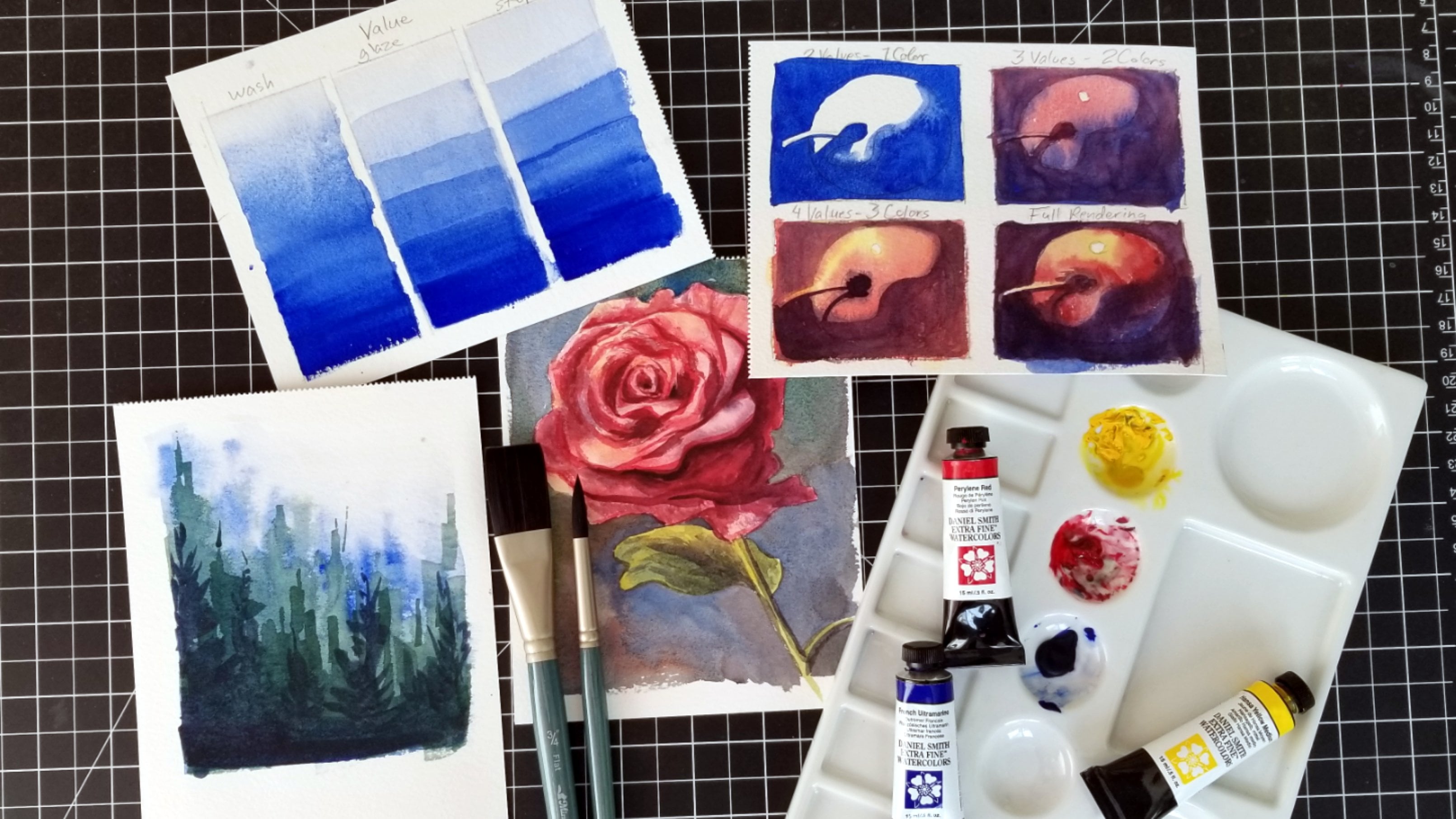
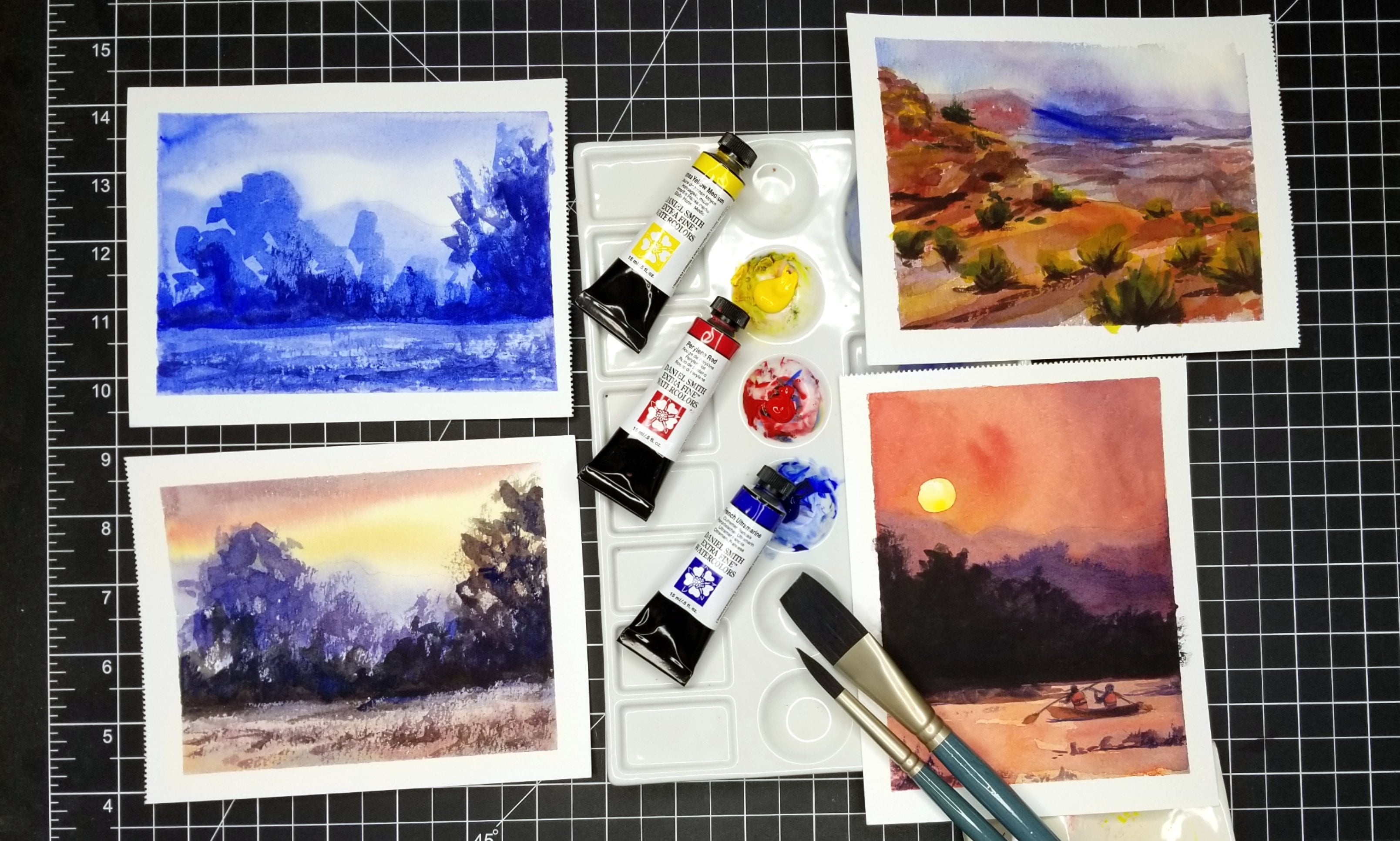
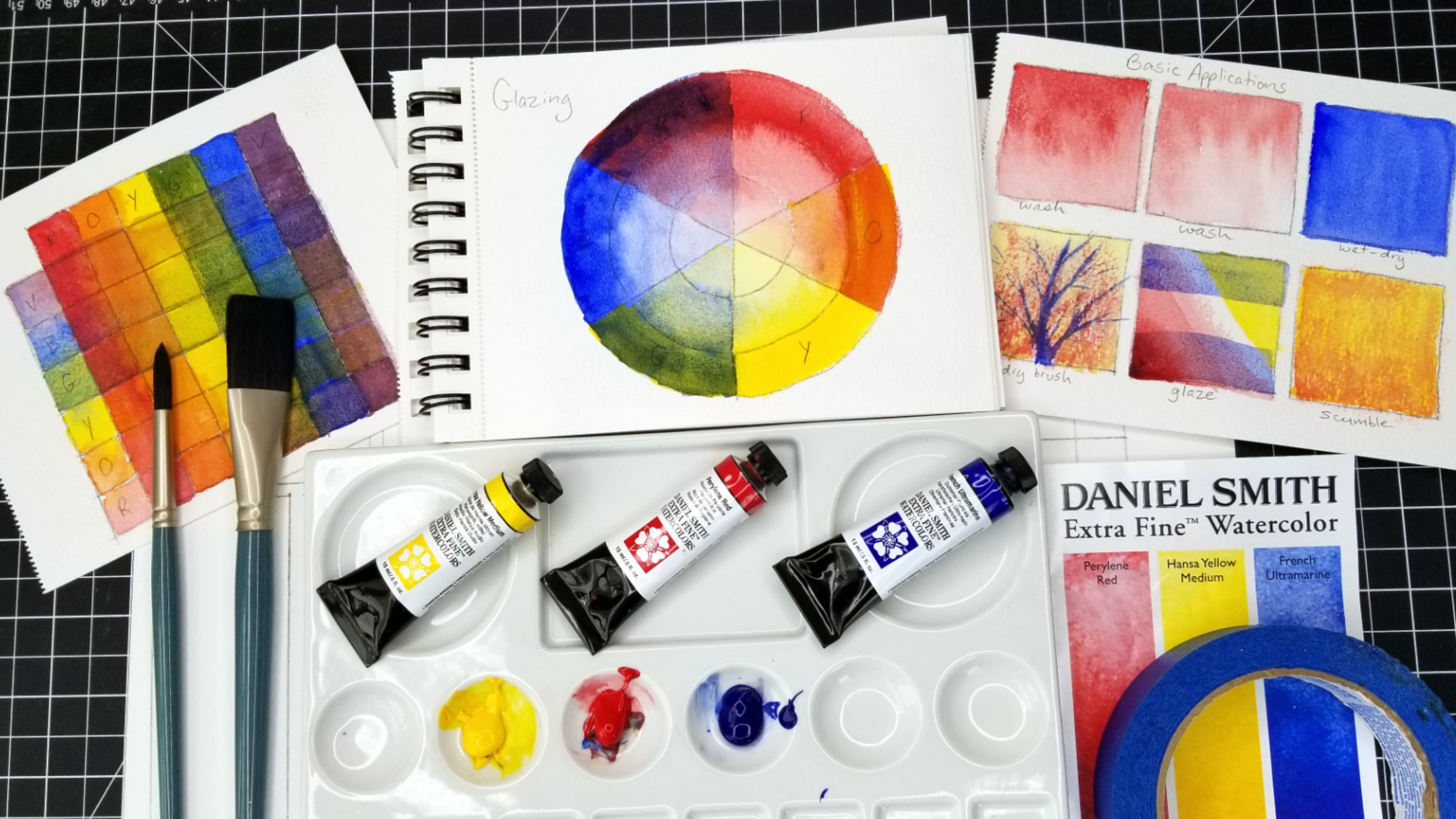
2. Supplies: In this first video, I'm going to go over many of the supplies that I'll be using in making my watercolor greeting cards. However, in the next video, I'll show you the bare minimum supplies that you'll need. A lot of these are extra in there, nice if you have them around, but you shouldn't feel like you need all of these in order to make a really nice greeting card. So the first thing I'm going to show you is this special watercolor medium from Winsor and Newton. This is called iridescent medium. And this is something that you can mix into any watercolor paint to make it iridescent, give it a little bit of sparkle. It's really nice to use and it's not too expensive. So it's just nice to have around for little projects like this. You just want to make sure to shake it up whenever you use it because it does subtle a little bit. And I'll be using this for just one or two projects. The next thing that's nice to have around is just a few colored pencils. And I definitely won't be using these extensively. And mostly when I'm doing watercolor and I use colored pencil with watercolor, It's just to add a little bit of accent or different textures to the pieces. So even if you just have a couple colored pencils around, it can really add a lot to your watercolor cards. The next thing that I like to have around, and I'd say that this is more of a necessity. This is masking fluid. So this is for blocking off areas that you don't want watercolor to go. Maybe you want to keep the paper white or you just want to protect something. So you can use masking fluid or drawing gum. It goes by different names and to just make sure that you shake it up. And this is also masking fluid. However, it comes in a container that has a very fine tip, as you can see here. And I'm just going to open this up to show you what it looks like. But this allows you to use your masking fluid and a little bit more of a controlled manner because it comes out of this little tip. And this is basically like a big needle that's hollow so that the masking fluid comes out? No, it's still not something that is perfectly controlled. I think anytime that you're using masking fluid, you should expect imperfection. So whether or not you have something like this to apply your masking fluid and don't expect perfection. This little needle here are actually just goes inside that hollow tube just to make sure the masking fluid does not dry up inside that tube and cause a blockage. So that's really nice to have. Now these are some of the other tools that I use for applying masking fluid. The most important here is the toothbrush, which I actually won't end up using in this course. But it's nice to have two spatter on masking fluid to get a little bit of texture or you can brush it on. It's important to use brushes in toothbrushes that are inexpensive because MapKit masking fluid does ruin the Brussels. This is a silicon applicator. I think that this is primarily used for like carving into clay. But it's really nice to dip into your masking fluid and then you can apply it. Again. It's not going to be like a perfect application. It's going to be a little bit rough, but that's totally fine. This is another masking fluid applying tool. I can't remember what it's called. But if you look for masking fluid application tools on Amazon, you're going to find this and basically you dip it into the masking fluid and you can adjust the width and then you can apply it. I'd say this is probably what will give you the most nice lines. Of course, you're going to want to have some cutting tools, so some scissors. This is a little exacto knife with a nice sharp edge. Just be careful with it. And of course I also have a box cutter. I mostly use this for cutting thicker paper, not to make really fine cuts or anything like that. But I will be using this to trim down some of my paper. These right there, so I don't cut myself. All right, So of course it's always nice to have an eraser, especially if you're sketching with pencil a little bit. Here are some other colored pencils that I might use, as well as my mechanical pencil. These are mostly things that I might use to block things out or sketch things in very lightly. Sometimes I like to sketch with a red colored pencil, but mostly I'll be using my mechanical pencil. I also have a variety of pens. This pen is a white Jelly Roll pen, so it's nice for adding details in whites on top of your watercolor. It's not super bold, but it does do a good job. And these Micron pens are really nice for watercolor because this is waterproof ink. So you can use this ink and then you can use watercolor on top and you won't get any smudging anytime you're using ink, it's really important to test whether or not it's waterproof. I will also be using a couple of different dip pens. The one with the black handle that nib on it will make a really nice thick line. And then this one right here will make more of a thin line. And I just really like to use dip pens. You definitely don't need to use that. You can use Micron pens or really any kind of pen as long as you know whether or not it's waterproof. With my dip pens, I'll be using the Sumi ink. Sumi ink is not waterproof and that means that I will not be able to lay down the ink and then do water color on top. I'll have to do the watercolor first and then add the Sumi ink on top. And mostly I'll be using that just for like accents and details. Of course you want to have some paper towels around lots of them. And then for paper, I have some variety of card stock paper here, and I just chose neutral colors. I thought that fits well with fallen. It really kind of fits well with anything. So I don't have any crazy colors here, but I do have a nice variety. Don't really have any plans ahead of time of what cards these are going to go with. But, you know, I'll just kinda make that decision as I go along. So the next thing I'll show you, of course, is the watercolor paper that I'll be using. This is Fabriano watercolor paper. It's their studio watercolors. So it has 25 percent cotton. It's not 100% cotton, meaning it's a little bit more affordable than 100% cotton then for projects like this, I really like this kind of paper because it kinda eases my mind. I don't feel like I'm going to go through a lot of expensive paper. And I don't mean cutting it up and gluing it, speaking of glue, I'll be using this PVA glue and this is pH neutral, but really you can use any kind of glue, I believe for your cards, I think most glues, as long as you make sure that they're acid free and archival, you're not gonna have any issue with whichever type of glue you happen to have around. Of course, I'll be using some masking tape just basically to fix my watercolor paper onto my surface so that it doesn't move or buckle too much. Have a variety of brushes here. These are all synthetic squirrel hair brushes, which I really like. I like that they're synthetic. They're not made out of real squirrel hair, but they work very similar to squirrel brushes, meaning that they hold a lot of water. So this is called Mimic squirrel by Creative Mark in case you're interested, they're not too expensive. But definitely don't dip these into your masking fluid because masking fluid is going to destroy any bristles that it touches, even if you try to wash it right away. Just don't do it. Next, I'll go through the colors that I will be using. Now, there's more color on my palette then I'll actually be using. I wanted to keep the palette very simple so that you can have just a couple of colors and do all these cards. So the first one here is French ultramarine blue. This is by Daniel Smith as well, all of these watercolors B. And so this is part of my basic palette. The next one that I have by Daniel Smith is perylene red. This is a nice primary red. So you can mix a lot of difference varieties of colors with a primary palette like this. And I believe that these three Daniel Smith colors all came in a set. So this is Daniel Smith's primary set. This is hansa, yellow medium. So this is the yellow out of that primary set. And these are the colors I'm going to be using primarily these other colors I'll show you are on my palette from before. And I'll use a couple of them, but not all of them. We'll be using this one. It's an iridescent copper. So it's very pretty and I'm just going to be using it to add some accents. So it's definitely not something you need. And you could even just use that iridescence medium I showed you earlier to kinda get the same effect. I won't really be using this color, but I'll show it to you anyway. It's a nice, earthy tara rosa color, so it easily could be incorporated, especially into a fall themed watercolor painting or these cards. So it's nice to have around, but I will not end up actually using it. And then the next one I don't think I will end up using is this few shite genuine by Daniel Smith? It's also kind of iridescent. It's not a very strong color. And I think it could certainly work for these cards, for this theme, but I don't think I'll end up using it. I also like to have around a little bit of whitewash. This happens to be by a Winsor and Newton, but I actually like M Graham, wash a lot better at just reactivates a lot easier. All right, so another important thing is transfer paper. Now I'll be including templates that you can trace from. You can just download those from the project files. And then you can actually transfer the designs directly onto your watercolor paper with transfer paper. Now if you don't have transfer paper around, There's other ways of doing it, like using a light source or putting your paper up against a window. But for transfer paper, you'll just turn it upside down and transfer of the design right onto your card. And I will actually show you that in more detail later. This is black carbon paper that you can get at any office supply store. It's really inexpensive and it lasts forever. Just be careful with this paper because when it's brand new, it's going to give you really, really dark lines like darker than what you would get from just using a pencil directly onto your paper. So light pressure is necessary. And then of course you're going to need some water handy. Can't forget that for watercolor. And yeah, that's basically it. So now don't feel intimidated. We're going to go through the bare minimum's next.
3. Essential Supplies: And now let's go over the very bare minimum supplies that you'll need. And it's not too much. The first thing is just some glue. And honestly you really don't even need glue if you just want to use your watercolor paper as your card and just fold it in half like a card. However, I like to save my watercolor paper as much as possible. And so using card stock and gluing the watercolor paper too, it is a nice way to save paper and add a little bit of a nice frame around your painting. The next thing, of course, is going to be some masking tape. This is handy anytime you're doing watercolor painting. And I also think that having some masking fluid or drawing gum handy is really great anytime you're doing watercolor. It's not something I really want to use a whole lot because it's messy, but it's good to have around. Of course, you're going to want to have at least one brush. Any kind of brush will do something to apply your masking fluid that you won't easily ruin. And any kind of pen, just know whether or not it's waterproof. And of course, a pencil to do a little bit of sketching and transferring. Of course, you'll want to have watercolor paper doesn't have to be the expensive 100% cotton stuff. Mine certainly isn't, but at least a 140 pound paper, I would say. And then a tool to cut things. So either a knife or some scissors. And then of course you'll want some paint, but you really only need the primary colors. So as long as you have a blue or red and a yellow, doesn't matter which brand, it doesn't matter which colors. But learning to mix all of your colors from the primaries is really a great way to get into watercolors and to not feel overwhelmed with too many options. So honestly, for beginners, I would say stick to the fewest colors that you can. Of course, you need some water and some paper towels. And that really is it. You can make a lot of nice cards with just a very few supplies. And I think with that, we're ready to get started.
4. Preparations - Cutting & Folding Paper: Now I like to do some of my prep work ahead of time, so I'm going to go ahead and cut and fold my card stock paper. And then I'm also going to cut up some of my watercolor paper. I decided that I would like to make my cards a pretty standard size. So I'm going to cut my card stock so that when it's folded, it measures five inches by seven inches. My card stock paper here is 8.5 by 11 inches, which is pretty standard for the card stock that you buy at the store. So I just need to trim it down a little bit. So in order to have a card that's five inches by seven inches when folded, I'm going to measure one side, as you see here, to be seven inches. This is going to be my long side when folded. And I'm gonna go ahead and just trim this off. And I really recommend being very careful if you're using a box cutter, make sure that you don't have fingers have hanging over the edge like this because when you pull down that blade, Oh, it hurts. Trust me, I may have done that in the past, something I probably won't ever do again. So go ahead and just be of course very careful and slice off that side. So now we have our seven-inch side ready to go. Now, for the five-inch side, we're actually going to measure ten inches so that when it's folded in half, this side will be five inches. And then I'm gonna go ahead and do the same thing and just trim this edge off right here. Trying to make everything as even as possible. But if you end up with some edges that are a little bit off, don't worry too much about that. I'm going to show you later in this video how to fix that. All right, so I'm just going to remove those scraps. And now to make sure that I can get a really nice clean fold, I'm just going to score the center. So I'm going to measure at the five inch mark on the top and then the five inch mark here on the bottom. And I'm going to use my box cutter knife to just very lightly score my paper so that it folds really easily in cleanly. But of course I don't want to cut through the paper. And so because I know my blade is very sharp, I really am not applying any pressure at all here. I know that's kinda hard to see in the video, but it's very light and you should just be able to barely feel your score mark with your finger. After you've done it. Mine felt maybe a little bit weak, so I'm just going to go very lightly over it one more time here. And you can see how that makes it very, very easy to fold my card. Now this is basically the process that I'm going to do to make several cards here. My cards, of course, are going to be five inches by seven inches. You don't have to make them that size, but I do feel like that's a really nice size for finding on envelopes and forgiving to people. And it's also not too small for your actual painting. So I'm just going to go ahead and do a whole bunch of these here really quick. And that just makes it easy for me to be able to just focus on the painting when I finally do get to that part. Now once you've gone over all your cards, you might find one like this that is a little bit on, even like here on the corner you can really tell. So I'm going to do is use my ruler and my box cutter knife to just trim that off to make it appear like it's a little bit more even so I want to keep it folded, keep it very flats. And I want to turn off the least amount of paper possible so that I don't change the size to noticeably. So you can see it was just the tiniest little bit of paper that needed to come off in order to even that out. And now that we have all of our card stock cut up. And by the way, if you want to just use watercolor paper to fold in half and not use card stock, then that would basically be what you would do with your watercolor paper and then you wouldn't have to go and make separate cuts for the watercolor paintings themselves. You would just paint directly onto your card if you were just going to be folding your watercolor paper in half. So this paper here is nine inches by 12 inches, so it's a little bit larger. The card stock, but my measurements are basically going to be the same. I'm going to cut the watercolor paper here to be five inches by seven inches. And what I'll be doing is I'll be using my masking tape to create a nice edge around all of my paintings into fasten them to my surface so that you don't get too much buckling. And then when I have the painting finished and I take that tape off, I'm just going to trim those edges. So even though the paper that I'm cutting right now, I'm cutting down to five inches by seven inches, which is the same size as the cards themselves. Once I trim down the final paintings, it'll be just a little bit smaller than the card. And that way I'll be able to center of the painting onto the greeting card in a really nice way that frames the actual painting and allows that card stock colors who create a really nice frame and color accents. So I hope that makes sense, but as I go along with the actual watercolor paintings, you're going to see exactly what I mean. So I recommend going ahead and just cutting your watercolor paper to the exact same dimensions as your card stock if you chose to use card stock. And with this paper instead of folding it in half, I'm cutting it in half. So I'm actually going to be able to get to watercolor paintings out of each sheet of paper here. So you can see these are now cut down along their short edge. And so now I just need to measure the long edge. So the seven-inch is what I'm going to be measuring outright now I've already done the five-inch sides and then I went ahead and cut those in half. So now with each of these halves, I'll just measure out that seven inch mark and go ahead and slice off that extra bit of paper. And then you'll see here when I line up the watercolor paper with the cart, it's the exact same size. But I'll be trimming these edges so that you can actually see the border of the card stock around the painting. And then we'll go ahead and finish up this other half right here. And just keep in mind too that these little scraps here, if there are about this size, the size of say, a bookmark, keep them around because these make really good gifts as well. I'm going to go ahead and just cut a few more sheets of my watercolor paper. And then I'm going to show you in the next video how to transfer the templates onto your paper.
5. How to Use the Free Templates: Now I'm going to show you a couple of different things. The number 1 thing of course being how to transfer the templates that I've provided to you onto your watercolor paper. But I also want to talk to you a little bit about making your own ideas for your cards. So you can see here that I printed out just some nice fonts, some nice lettering from my computer to kind of get me started on designing my cards. Now, don't worry, your templates aren't going to look like this. Your templates are going to be a much neater and easy to work with. So something like this is what you'll find in the downloads that accompany this course. So you can go ahead and you can download those and you can print them right off onto your computer. You can even change the size according to how big you want the design to be, how you would like them to fit onto your cards. And so you can just print them off and get going. But I do want to show you how I kinda think about making cards. So here we are back at my desk. And what I have here is just some printer paper, copy paper that I've cut down to about five inches by seven inches. And this is what I'm going to be transferring my drawings onto to kinda create templates for myself. And then I will use that sketch to transfer over onto my actual watercolor paper. I try not to do too much sketching directly onto my watercolor paper for projects like this because I do want to keep them pretty neat. A lot of times when I'm doing a watercolor painting, I don't mind having all this sketchiness, but for a card, I think it's nice to keep it a little bit neater. So you can see that my copy paper is about the same size as the watercolor paper that I had already cut for myself. So five inches by seven inches. And the first design I'm going to be creating in front of you here is the little coffee cup. And what I want to do is actually have the coffee cup cut out of the watercolor paper. And then I'm going to kinda paint an abstract design behind it and then just kinda glue the coffee cup on top of it. But what I need to do here is get this lettering onto the coffee cup. So I had done a little quick sketch of a coffee cup, coffee cut here, and the lettering just barely fits on there. So for my final drawing, my final design, I need my cup to be just a little bit larger than the lettering so that I don't have to go back to my computer and change that font size. I'm a little bit lazy, so I want to just kinda work with what I already created and print it off from my computer. But yeah, I like to just come up with a few phrases and find some nice fonts. These are all just from your typical word processor. So there nothing really special. And I like to keep my cards looking very Italy and loose. So I'm not going to worry too much about having perfect lettering, but it is nice to at least have something to go off of. So what I'm doing here is I'm just kinda working on the size of the cup. I decided to make the handle a little bit smaller so it takes up less space. And I'm just going to fortify some of these lines that I like and want to keep. And then down at the bottom I'm going to try to just make it a little bit wider so that the lettering fits on there a little bit better. This is my black carbon paper. Have placed it in between my two sheets of copy paper here, face down. And then I'm just going to apply pressure. And then these lines will transfer to the other sheet of copy paper. Now this is just part of my kind of idea making process. So I still will have to transfer this design onto the watercolor paper itself. And then I'll cut it out. So you can see here that it transferred pretty nicely, but I forgot that little oval right here. So it's a good idea. Before you remove the tape, make sure that you take a look in everything has transferred over that you want. And I decided to kind of fix the shape, appear a little bit too. Okay, so now I have a little bit better sketch of the cup itself so that I can transfer the lettering right here onto the sketch itself. And that will basically be the template that you are able to download. So you don't have to do this all piecemeal the way that I am. So now I'm going to just go ahead and put down my lettering. I'm going to fit it there just as best as I can. I think probably what I'll end up doing to make that thankful fit a little bit better as just pick the tea a little bit smaller than what's printed. Oh, I've got to make sure that I can slip my carbon paper underneath before I tape it all down. Sometimes I forget about that. Okay, so now I'm just going to go ahead and use some pressure to trace the lettering onto my copy paper. And I know that it's easy with lettering to feel like it needs to be absolutely perfect. But I really encourage you to kinda use the font and the template as a starting place and don't worry about little imperfections that are naturally going to come when you're doing little projects like this. I honestly think those little imperfections give it a lot of character. And in the end, if you stick with it and you don't get too caught up with those little tiny mistakes. I think that you're going to see the big picture when you're all done and kind of just appreciate how it looks over all. It has that nice handmade quality. And I mean, that's kinda the whole point of doing it this way. If you wanted a perfect, flawless card, then you would go down to the store and buy one. But it just maybe doesn't mean as much and it's not as fun either. So now that I have my lettering traced onto the copy paper, this is essentially a template here. It's still not perfect because you can see that the oval I created as just a little too large, I'm actually going to go and correct that a little bit. Make it a little bit smaller here. And I'm actually going to be cutting out a separate oval because I'll paint that like it. So it looks like it has some coffee in it. And you'll kinda see as I go along with the actual painting process, which is mostly going to be occurring in the next video. This is just kind of to get started and to show you how you can use the templates to transfer onto your watercolor paper. So this is my watercolor paper that I'm placing underneath the templates. I'm going to go ahead and line these up. And then I'm going to use some tape to hold them in place. And this will enable me to keep everything in line as I use my carbon paper again to transfer the design from the template paper, which is the copy paper here, onto the watercolor paper that is underneath it. And this time instead of the black carbon paper, I'm going to use this red transfer paper. It's not as dark. And so this is mostly what I'll use as a transfer designs from the template onto my watercolor paper. It's also easier to erase than that black carbon paper. The only downside with this transfer paper is that it just doesn't last as long. I find that the carbon paper, I can use it over and over and over again. And even when it's all scratched up, it's still really works very well. But with this transfer paper, it doesn't endure as much, but I feel like it's a little easier to work with on your final art using this just because it's a little easier to erase. Now I don't have to transfer the lettering on. Okay, so now I'm going to transfer the lettering onto the cup. And then on the final are I will be going over that in ink. So again, not being perfectionistic, the more times you go over the lettering, the more it's going to start just kinda looking like something handmade rather than printed off of a computer. And again, I think that that really adds to the charm of the cards. So just embrace that and don't worry too much about it. Okay. Now we've got the lettering finished and it fits on there pretty nicely. I'll probably make the template for you a little tidy or so. It's not such a tight fit with the lettering on the mug. So now I'm just going to use some scissors to go ahead and cut this out. Because again, I'm going to be creating kind of an abstract background for this card and then taping on, sorry, gluing This cup of coffee on top so that, that abstract background design just kinda shows through it a little bit. This is going to be a very simple and easy card. And now I'm using an exact dough knife to cut out the center of where the handle is so that I have a little bit more negative space. It's nice to have a variety of cutting tools for sure. Now you can see with my eraser, I'm leaving a little bit of a ghost of that transfer just enough to go over with my ink so that I know which letter I'm actually doing by don't want the red transfer to show up too much. And you could go over it in ink and then erase the transfer lines. But you just want to make sure that you wait good amount of time so that your ink can fully dry and you don't end up smudging the ink. And in fact, what you're seeing here is my first attempt at creating this cup. I did end up smudging it somehow later. And so all I did was I ended up flipping this cup over and doing the lettering again on the other side. So what you'll actually see in the card making video that comes next is my handle will be over on the other side just because I ended up smudging my ink a little bit. The easiest fix rather than cutting out a whole new coffee cup shape was going to just be at a flip that over and redo the lettering and also my lettering here. You know, sometimes when you're just getting started and you're a little bit fresh and not quite in the mode of doing things. It might look a little bit rough at first, which of course is fine. But a lot of times I find that the second go around, especially when I'm just getting started, is a lot better than that first attempt when I'm feeling a little bit rusty and maybe not as familiar with my tools right off the bat. So there's no shame in needing to kind of start over. It happens to all of us in usually the second or third time's a charm. So that is basically going to be it for this little bit of the project. But you can kinda see how you can use these templates that I'm providing to you to easily transfer over onto your watercolor paper. If you have like a light box or something like that, you can use that if you don't have transfer paper. But transfer paper is actually very inexpensive and again, it lasts a long time, so it's something that really handy to have around a few can. Now we're actually going to get started making this card.
6. Eat, Drink, and be Thankful: All right, so we're going to continue on and we're going to make our first card. This one is going to be very simple and easy. It's kind of just a way to get yourself warmed up, kinda get into your water colors and just play around a little bit. So I've gone ahead and just dropped a little bit of water into the three watercolors that I'll be using for this project. So just my yellow, red, and blue. And the first thing that I'm going to do is I'm going to give myself a little beverage here and we're going to mix up a nice neutral color. So this can represent coffee or hot cocoa or maybe some chats. He, so I started with my blue, added some red to make a violet. And then I added just a little bit of yellow to tone that down to make this a really nice neutral colors. Who represents, for me, I guess maybe this is a little bit of coffee, so I want to keep it fairly light here, so I don't have a lot of pigment in there. Now. Maybe you drink your coffee black, which I do too sometimes. And so you might want to have a lot of pigment in your mix so that you have a really dark value. I kinda went in mind something in the middle just to look a little bit interesting. And so all I'm doing is just dropping this pigment in and I'm going to then set it aside and just let it dry, let it kind of, you know, spread around and flow and just dry the way that it's going to dry and not really worried too much about that. So I'll just set this up here for now. And then I can go ahead and get started on the actual background part of this card, which is going to be very, very simple, kind of abstract. I'm going to add maybe just a few floral elements into it, but for the most part, it's going to be very, very simple. So I'm going to just tape off the edges and I will end up trimming off all the white edges on this card in the end so that the color of my card stock may card can kinda just frame around everything that I create here. So I have just a colored pencil here. And colored pencil is really nice. You can use it either on top of your watercolor, which I often do, and I'll be doing that a couple of different times throughout this course. But you can actually also use it behind your watercolor. Now, I'm just using a black colored pencil here. But if you were to use a white colored pencil, it would form a little bit of resistance there so that when you would go over it with your watercolor, some of that white would show through. It won't be super strong, but it might be something that you want to play around with. And as I said, I am just adding a few little floral elements, keeping them very simple, kind of abstract. These are not really based on any kind of actual flowers, but this is just to add a little bit of decoration and even just a little bit of texture. Because otherwise with my watercolor, I'm going to keep it very, very loose. And I'm going to be doing a lot of wet into wet technique for the background colors. And I also happen to know that I want the color of my background to be fairly dark because I want to add some white steam out of my coffee cup to make it look like it's really nice and hot and steamy. So I know that I need kind of a dark background in order to create the contrast that I need to achieve that. So I'm not going to concern myself too much with these background decorations. And these declarations are not something that is in a template. I just encourage you to kinda doodle around. And quite honestly you don't have to do any of these little doodles for your card. You could just go directly in with watercolor painting and not really worry about drawing any of these elements if you don't want to. Because one thing to keep in mind is that I'm going to be placing that coffee cup cut out on top of this background. So a lot of it's going to be covered up anyway. So if you do any doodles, don't spend too much time on them, don't worry about them too much in mostly put them around the edge if you actually want them to show up. You can see that I left the center relatively blank. So now I'm going in with just my first wash of watercolor and I'm gonna keep my color scheme for this one really simple as well. So mostly violets and reds and red violets. And this is just my first layer, so I'm keeping it fairly light at this point. But then I'll build on top of that to make it darker. Right now I'm just dropping things in. Mostly I would really like for all of this to kinda just naturally dry. And if you have the luxury of time, I would say just allow it to sit and dry. But for me, I needed to kind of Move it along. So I'm using a hairdryer. And you'll see that by using my hairdryer actually knocked my coffee cup down and had to go get it. But also you can see that it moves the water around a lot. So if you don't want that to happen, if you want your, your watercolors who kinda dry in a more natural way, just allow it to sit. But since I'm putting another layer on here, I wasn't too concerned with that. So I'm going to add another layer here just to kinda darken things up, enhance the color a little bit, choosing just maybe a few spots to allow that lighter background to show through. But I know especially up at the top of my composition where I want to add in some steam. During the last phase of this project, I know that I need to have that relatively dark, so I had to drop in quite a bit of pigment up there, kept it kind of a nice deep violet. And I do want some color variation instead of having it all just one color. So it's got kind of violet at the top and the bottom and then in the middle just nice splashes of red. So I'm going to go ahead and dry this again with my hairdryer. Hairdryer is always, of course, nice to have around when your watercolor painting, depending on what you're doing, it's not always the best option. I would say for this project, I think it might have looked a little bit better had I not use my hairdryer, but sometimes you just gotta do what you gotta do. Have a little spot on this coffee cup that stayed a little bit wet, so I had to wait for that to finally dry. So you can see that this is all dry now, so I'm going to flip it upside down. This is just my PVA glue. And I'm now going to glue my coffee cup onto my background. And then you'll see that those backgrounds decorations, really not so important. I do think that they add a little bit of nice texture and detail, but they're certainly not the focal point of this card and definitely not meant to be. So don't worry too much about all of that. So I've got my coffee cup glued down and I'm gonna go ahead and just trim off all of these edges here with my box cutter or utility knife, whatever you wanna call it. And now this will be kind of framed by my card stock. And now the last step of the actual artwork is that I'm using a white colored pencil now to add some steam. And using colored pencil on top of watercolor, I think is one of the best ways to just add a little bit of texture and some visual interests into your watercolor pieces. And what I especially love about white colored pencil on top of watercolor is that it really does kind of create a nice ghostly or steamy, smokey look because it remains a little bit transparent. It doesn't completely cover up the watercolor background. So I think that this looks really nice. And I'm always looking for ways to incorporate a technique like this into my projects. And that's really it for this card. Now, all I have to do is glue my card onto my card stock and this project is complete. So again, this is just my PVA glue. Once I have it glued on, I'm going to place it under a book so that it will dry very flattened. The corners won't curl up because that's always a risk. And now that it's on the card, it just feels more complete. And I think it looks really nice. I will show you guys a quick little close-up of this projects. I hope that you enjoyed it. And now we are ready to move on to the next project. So I will see you there.
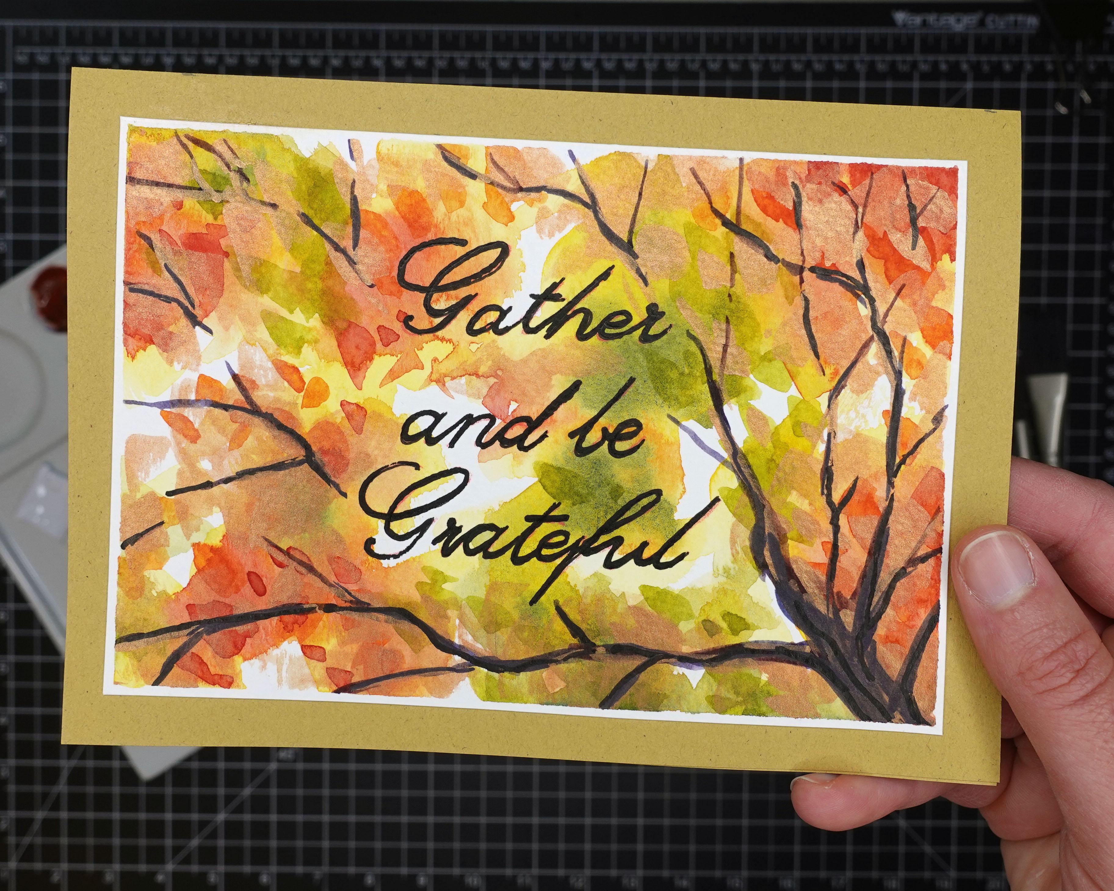
7. Gather and be Grateful: This part is going to be a really easy and simple card. And yet I think very beautiful and effective. I am going to start out without any kind of sketch or anything. I'm just going to start painting my background. But you can go ahead and transfer the template on to your paper ahead of time if you want. And you might want to just so that you can kinda get the leaves to match up with the branches that I drew, but that's totally up to you. I'd say that the most important part about the background, and basically these are going to be leaves just very loose and abstract. Make sure that you leave some whitespace, a little bit of negative space because that will give the appearance of a sky kinda showing through the leaves. And you also want to start out very light, so add a lot of water into your mixtures. I typically do like to start out with just some pure yellow because a lot of times it's difficult to get pure yellow into your watercolor painting if you kinda leave it for. Last, if you put down a bunch of other colors which might contain yellow, it can make it really difficult to make any kind of pure yellow really show through. And I think it does add a lot to the fall characteristic to have some nice bright yellow. So you can see that I'm working wet into wet here and I'm just gradually adding a little bit more read into this very watery mixture and then just dropping it in. Again, I want to maintain some of that nice, bright pure yellow. So as I go along, I'm being a little bit more sparing in my application of these oranges and reds, just so I can make sure to maintain some of that yellow. And then I'm just dropping in these oranges and reds into the wet yellow and just flooding the pigments kind of flow and mix and mingle, not really going to manipulate them too much. And then just a little bit of green can be very nice to. For this painting. I am really going to try to keep it very light and airy. I definitely want to have some nice bright colors, but I don't necessarily want the background to distract from the texts that I'm going to be putting on top. And here again, I'm using a little bit more of a vivid bright red, but I'm being very, very sparing in where I place it because it can easily overtake all of the other colors. I feel like having just a little bit of green in there. Really is a nice counterbalance to some of those reds and oranges. Adding a little bit more yellow into the green here. And here you can see too, that even with this green that is a little bit more concentrated, it's not quite as diluted as it was before. But I'm not putting it everywhere. I'm just kinda dropping it in here in there. And because everything is still wet, it's just creating a really nice soft blended effect. As it settles in. I feel like you can sit down and do a whole bunch of these cards, make them all just a little bit different. I think that that would be really cool. And I'm just going to dry this up with my little hairdryer here. And I'm not quite done applying paint just yet. I'm going to add a little bit of texture in here as well. I'm going to start thinking about where I want to place my text. You can place it off to the side, like this kind of up in the corner. But ultimately I'm going to decide to center my text. And again with the template that I've created for you, it already has the branches sketched in and it has the text already in the center. But you could always change that if you want to. And you could also change the branches. You could just use the template for the text if you wanted to place it somewhere else. And then depending on how you've laid down your background and your leaves, you might want to change how you do your branches. So I went ahead and they transferred my text on just so I can make sure to not put too much texture right under the text. And I'm going to just ink these in with one of my Micron pens. These dry really fast so you don't have to worry too much about smudging. And also I know that this ink is waterproof. So if I do end up going over the ink with some of my watercolor, it will not impact it. But ultimately I'm just kind of putting this in here for now so I can see it because I want to add some texture to the leaves, but I want to avoid the areas right behind the text because that might make the text kind of hard to read. So this paint is going to be a little bit more concentrated. And I'm just kinda dabbing it on here and there. And I started out with green, but I'm going to shift around through the reds and the oranges and even the yellows. And I don't want to overdo it. I don't want it to be too busy. I'm really trying to keep my mind on the fact that I want it to be nice and light and airy. But I do think that adding these more vivid strokes of paint does add a lot to the overall composition. And there I'm really going in with some bold reds. And you can really see how the reds and the greens just kinda compliment each other and kinda bounce off each other. And that's one of my favorite things about fall colors is all of the complimentary color schemes that you get through nature. And so I really want to emphasize that in my card. And again, I feel like you could just line up a whole bunch of little five by seven watercolor papers and just kinda go through them like kinda like a factory line, I guess. And just do a whole bunch and make each one a little bit different. Overall, it would be kind of the same design idea by each one would be unique. And I think that would be a really cool idea if you needed a whole bunch of cards. So I'm gonna go ahead and dry this again. And for this one I'm actually going to be using my iridescent copper. I feel like this is a really nice excuse to use a special pigment like this. And again, the iridescence copper is just a watercolor. It's by Daniel Smith. And it adds a really nice sheen. And I'm just going to be using this for accents when I'm applying it from the angle that you're seeing it, It looks very strong, but it's actually very transparent. And when the card is complete, and I pick it up and I kinda show you, you'll see how shimmery it is. And you can pretty much apply something like this everywhere and not worry too much about it. Overwhelming everything. Because like I said, it is very transparent to actually. But the way that the light is hitting it right here makes it look like it's really covering things up. But this is just a nice accent. And this will probably be about the last application of paint that I apply for the leaves anyway. Because they don't want to cover up all that iridescence with other colors. All right, so now I'm going to start in on the branches. And again, I'm kinda doing these branches just out of my head and making them kinda work for where the clusters of leaves are. So you can do it that way if you feel comfortable. Otherwise, feel free to use the template that is provided, either to transfer it directly onto your paper or just even as like a little bit of inspiration. Because I know that branches can be a little bit tricky. My trick for painting branches and trees is always to use kind of, you know, rather than curved lines, using lines that are a little bit more straight. But Jaggard, I feel like you pretty much can't go wrong if you do it that way. Now some people like the look of kind of curvy lines for branches. I think that, that makes it look a little bit like, you know, illustrative or fantasy or something like that. And so there's nothing wrong with that. It's just kinda what you prefer. Definitely adds a whimsical touch to it. And I went for a little bit more of the realistic approach here. So whatever you prefer, all right, say embrace it. I'd say maybe one thing to keep in mind if you're doing your own branches and just making them up, It's really easy to kinda go overboard. And you don't want to do that because you don't want to distract from the text. And now while I'm thinking about it, I guess I wonder with the script that I used for the text, I think maybe you using curvy lines for the branches might distract away from the curves of the text. I feel like the straight jagged lines kind of compliment to the curvature of the text. So that might be something to keep in mind too. Of course, you could always use a different font, different text for your card ideas. But that's just something to keep in mind when you're thinking of different design ideas. Think of different elements that will complement one another rather than distract from one another. I started out with my branches with more of a light wash. And just like when I was doing the coffee in my coffee cup, it's just a combination of red, blue, and yellow to kinda get this neutral brown, earthy color. And as I progress, I can go darker and darker. And now I'm just adding a few accents of the iridescent copper. And again, I know from this angle it looks like it's just obliterating the branches and covering them up. But this paint really is quite transparent. It's just that the light and the angle that you're seeing, it makes it look like it's really covering things up. And I think it's cool even if you just have one tube of a pigment like this, like an iridescent pigment from Daniel Smith. They have a lot of cool pigments and it can feel like very difficult to pick just one. But if you do manage to pick just one or two, they really do come in handy. And they last a long time because they're just not pigments that you're going to use a ton of. In normally, I don't add the iridescent pigments into other mixes, but I decided to give it a try this time. And I think that the other pigments do kind of overwhelmed the iridescent pigment. But it wasn't too bad. It was kinda cool to experiment with anyway. As I'm working on this, I definitely am noticing that the font that I used and the ink that I use to ink it in is just not really standing out. It really should be more of the focal points. So I know that I'm going to have to go over that again with either a paintbrush dipped in ink, or with my dip pen that has a larger nib. It's kind of a cartooning nibs, so it creates much thicker lines. So this is my cartooning nib hearing. You're going to see how much thicker is. But if you even have just like an old watercolor brush with a fine points, you can dip that into your ink and get really nice thick lines. Definitely you would want to practice on a spare sheet of paper before applying it to your card because it can be a little bit difficult to control. But at the same time, I really encourage you to embrace the imperfections of making your own cards and kind of embrace the character that you get from. Maybe even some of the marks that you make an error or mistake. Those are totally fine. And honestly, when people in, even when you come back to look at it later, It's really not noticeable. Or it just adds a little bit of individualities here piece. So now I'm gonna go ahead and take the masking tape off and cut off the white edges so that I can then apply this to my card stock. And for this one I'm going to leave just the littlest bit of white edge around it. Feel like that will kind of create a nice almost double frame with the card stock in the background and then that little bit of a white edge. And you definitely want to be careful if you're using a dip pen and ink the way that I did because with that amount of ink in a nib that applies things very, very thickly. It can take a little while for that ink to dry fully. So that's why I was just dabbing it very lightly to make sure that all that ink had settled. And don't be fooled by how fast this went because you may not be able to notice when I'm actually making a cut in the video and allowing things to dry a little bit longer than it actually appears in the video. All right, so I've got my glue applied to the back and I picked a card stock that really compliments the iridescent copper accents that I added. And then once I have this in place, I'm going to give you a close up look. But I really like how this card turn now and it's so easy. Again, you can just line up a whole bunch of these and kinda play around with the background on all of them, make little variations. And it's always going to be a success. So here you can see that iridescence and how it really doesn't cover anything up, but it just adds a nice sheen. So I hope you enjoyed this card. Let's move on to the next.
8. Autumn is Here!: This is another really easy card that ends up being very effective. So I hope that you enjoy it. Of course, there's a template for you to download if you would like. But here I'm going to be just kind of creating it from my little sheet of sayings with different fonts. And this is going to be a case where the font that I printed out just ends up being a little bit too big. So I'm going to show you how to work around that. And again, this is all about just having fun and being very loose and letting go of perfectionism. So That's exactly what I'm going to be doing here. So you can see that this actually does fit onto my five by seven paper. However, I realized after I did this initial transfer that I wouldn't really have any space around the edges to put masking tape. And therefore, I wouldn't be having any space to cut off so that the color of my card stock would be kind of framing around the painting itself. So I really needed to be able to make this text smaller. So rather than redoing it or going back to my computer to make the font smaller, I'm just going to try to mimic that text as best I can. And you know, it's kinda fun and it allows you to give a little bit more of your own personality and your own touch to your card if you end up needing to kind of free hand something. So, you know, it's not going to be perfect the way that it comes off of a computer. But we don't really want our cards to be like that. We don't want our cards to look like they were printed off of a computer. So I encourage you that if you run into any issue like this, go ahead and just give it a shot and see how it ends up. Now one thing I did to kinda help me along was I used a ruler to create a baseline just so my texts wasn't, you know, cricket or skewing too much. And I think that that was good enough to kinda help me along here. So now that I've got my texts sketched in, I'm gonna go ahead and I am going to do my inking now. I am using my Sumi ink here, which is not waterproof, meaning that I cannot go over this with any watercolor or else my ink is going to smudge. But for this design, all of the watercolor work is going to be below the text. So I didn't really need to worry about that. Just always keep that in mind and always know what the properties of the ink that you're using. If you don't have a waterproof ink, you just need to make sure that you're not going over it with watercolor. You can always apply that ink on top of your watercolor, which I will be doing on this card just a little bit to add a little bit of detail and definition. This card is going to be really fun because we're going to have a bunch of pumpkins, little bit different shapes, sizes, and definitely colors. So I'm sketching these in, but these will all be available for you on the template that I created for you in the project files. So feel free to download that and use your transfer paper or a lightbox to transfer these shapes. But I would say to try to keep your transfer lines relatively light. Because the watercolor that we're going to be doing is all going to be very loose. And we're going to just allow all of these pumpkins to kind of blend together, allow all the colors to kinda emerge. And then only later we'll kinda add some definition to distinguish them from one another. And that makes this project really fun. And very low key. I'm just wetting the paper towel here to clean off a little bit of space on my mixing pellet because I wanted to be able to make sure that I have some really good clean mixes that I can work from. A lot of times they won't really clean my palette off, especially in between projects like this because I can reuse a lot of those mixes. But just like when I was doing the card with all the leaves in the background, I kinda wanna make sure that I can start with my purest and brightest colors first. With pumpkins, it can be easy to just really overdo it on the orange. So I encourage you to keep in mind that pumpkins do come in a variety of colors. And I'm going to just be kind of shifting around these mixes a little bit to help distinguish them, but I'm allowing all of the different colors to just merge together. So the color I applied to this green pumpkin, I'm allowing that green to kind of flow into the orange of the pumpkin below it. So I'm definitely not treating this like a coloring book by any means. I'm really going to just let all of these colors kind of flow and merge together. Right now I'm keeping everything very light and watery. And it'll go in with a little bit more vivid color later. And keep in mind too that even with like your oranges in your greens and colors like that, you can shift them. There's not just one orange or one green. So you can have an orange that's more yellow, or an orange that's more red, one that's right in the middle. And same with your greens. You can have a green that's just kinda right in the middle, or kind of a yellowish green or even a blue-green. And I didn't really leave any white pumpkins in here. But I'd say if you wanted to do a white pumpkin, I wouldn't leave it completely why it may be, but just add a few details to it in the end and then leave most of it white. I decided to go ahead and have kind of a grayish blue pumpkin in the center just to kinda break things up because I know that there's just going to be a lot of orange and green in this composition otherwise. But over on the left you can see how all those colors are just kinda merging and flowing together. Don't try to keep those away from each other. Just really embrace that property of watercolor and let things kind of flow the way that they want to. In the end, you're going to be really happy and surprised with the results that you get. In two, you can kinda mix all three of your primary colors. And that's gonna give you kinda some browns and neutrals. And that's going to be really fun to play with to. And even when you're working within a pumpkin shape, you don't have to keep it all one color. You can see the one I'm working on right now started out as more of a reddish orange and then I merged it into more of a yellowish brown. And for the stems I'm using kind of a neutral green, keeping those just a little bit darker, but again, letting that color from the stem just flow right down into the pumpkin itself. And don't overthink your mixes. It can be really easy to try to plan this out. I would say don't, don't really do any planning. Just kind of use your mixes and add to them, you know, add a little bit of yellow here, add some glue and just kinda shift your colors gradually as you go. Don't think it over too hard. And again, use different colors within the same pumpkin shape. That makes it really fun. And I don't know, that's one of my favorite things again, about fall is just all those shifting colors, all the complimentary colors. So just kind of allow yourself to explore all of that. On the template, you might notice that some of the stems have like little swirly lines. So I write here, you can see him kinda going over those with paint with a very fine tip, but you don't necessarily have to do that. You can just add paint to the thicker part of the stem in then that little curly part can just be ink if you want. So at this point I'm gonna go ahead and dry this off. I don't want to overdo it. I don't want to add too much paint into this first stage because I do really want to keep this very simple and lights. So now all I'm going to do is use a little bit more vivid colors to add a few little accents onto each pumpkin into start distinguishing one pumpkin from another. So here you can see that I have mixed up a green that's a little bit more concentrated. It's not quite as watery and I'm just adding a few little texture details onto the stems. For this stage, you might want to just make sure that the first layer is totally dry. Of course, there's nothing wrong with letting your colors bleed together. That's what that first step was all about. In fact, when you're adding little details and texture though, you might not want that quite as much. And really I'm applying these brighter, more vivid colors very, very sparingly. Just again, to add a little bit of texture, a little bit of definition and detail. So here you can see I'm starting to add some of the texture of the pumpkins. And I'm going to use a lot of like broken lines. I'm not going to add every striation to every scene, gold pumpkin, but I do just want to give the impression of form and texture and detail on each one. And it doesn't really matter what color you use. I mean, with a green pumpkin, maybe I'll use more of a more concentrated green color to add these details. And maybe on the orange ones, I'm going to use a more concentrated mixture of oranges. But really it doesn't matter too much. And after this step, you really could just call it good because I think that this gives enough individual character to each pumpkin while still allowing all those colors to be merged and blended together. I think that you could kinda just call it good at that point if you wanted to. We'll be doing a little bit of ink detail once I have all of these little watercolor details completed. Here, you can see I'm even using more of a violet color even on my orange pumpkins, Just to add a little bit of contrast and complimentary colors. And I didn't really use any of my iridescent color here, but I definitely think that this could be a good opportunity to use some of that. And I'm sure that you can find the excuse to use that iridescent color in really any of your cards. Or if you have some Era doesn't medium, you can just overlay it on top of colors or you can even mix it into your color mixes. But I would say with those iridescent colors, if you do choose to get some of those are used, those just don't overdo it. Use them as accents and not, you know, as kind of a crutch for your whole composition. And I want to just remind you to keep it simple. Don't overdo it, don't overthink it. The more colors that you add to these, the more you're going to make things start to feel brown or muddy. So if you want to keep everything really bright and vivid, just make sure that you're not going overboard on details. Keep on really, really simple and apply them relatively sparingly. I think a lot of times, especially with watercolor, less is more for sure. So let's go ahead and get this all dried up. Now I'm just going in with my eraser on this ink ink spin sitting there now for a while so I know for sure that it's dry. And I'm just going to pick up some of those light little pencil marks, especially because that part of the cart is going to remain white. If I was applying watercolor there, I really want it and worry about the pencil marks. But if you have to do any erasing on your IQ parts, just make sure that your Incas had lots and lots of time to dry. Now I have my dip pen and I'm just going to add a few details. Again, I don't want to treat this like a coloring book, so I don't want to just completely outline everything. I'm just adding a little bit of contour around the pumpkins, kind of an impartial manner. So I don't want it to be a complete contour. And then I'm using the ink also to kind of accentuate the swirls on the stems of the pumpkins. And as I progress through something like this, I am really limiting my subsequent application. So think back to that first initial wash. It was kind of an all over a very light loose wash. And then when I started adding details in with the more vivid watercolor, I applied it to fewer and smaller areas. And now that I'm going in with the ink, I'm going to be applying even less because they don't want to wipe out all the characteristics of the watercolor. I really want to maintain some of the spontaneity of those. And so I really want to only apply ink and a few select areas. So now I'm gonna go ahead and just remove all of that tape in, trim off the excess around the edges so that I have some space around the card to get the framing of the card stock behind the design. And for something like this where the background is a lot of white, it really adds a lot to have that colored card stock in the background framing the design itself. So I think that that really adds to it. And this time I just went with a nice neutral brown color. I felt like that was a good accent for all these oranges, and greens, and grays and neutrals.
9. Hello Fall: In this section, we're actually going to be making these two cards, both from the same very simple template. The template is just this hello fall just a little bit of text. And the background that we're going to be creating while the two backgrounds are just going to be really abstract, fun, colorful backgrounds. Now the reason that I'm doing both of these cards simultaneously is because I'll be using masking fluid on both of those. And in my experience with masking fluid, I tend to get really impatient in waiting for it to dry. So it's really nice to have another project that you can switch over to while you're waiting for the masking fluid on one project to dry completely. And I do just want to emphasize that it's so, so important to allow your masking fluid to dry 100%. You can certainly use a hairdryer to help speed it along. But typically what I would say is to either have another project to go work on while it's drying because masking fluid, depending on how thickly you apply it, it can dry kind of on the outer crust of it and still be wet in the center and you just don't want to run into any issues with it. You definitely do not want to end up getting your watercolor brush bristles into any wet masking fluid. So it's good just have another project or to have something else that you can get up to do so that you don't get impatient and then maybe think that your masking fluid is dry before it really is. It's better to wait longer than to take your chances rushing into it. So you can see that the design that I'm creating here is just a bunch of, I call these kinda rainbows. So a bunch of overlapping rainbows. I don't have a template for this, but I encourage you just to kinda doodle around. And I'm going to show you two different abstract backgrounds for this card design. But you should explore with different things that you might do. You know the, the message of hello fall. It's kinda nice and simple and minimalist. And I think that there's a lot of really cool ideas that you can overlay that with just to make it look really kind of Sheikh and cute and simple and minimalist. So have a lot of fun with that. And, you know, it's just one of those things I think you could come up with a whole bunch of different ideas and create a series of cards just kinda of around that one theme of this very minimalist queue message. For my masking fluid. I just pour a little bit into a cup next to me. I don't like to have my entire container of masking fluid sitting around with the lid open because masking fluid as it's exposed to oxygen, That's what makes it dry. So I don't want to have my container of masking fluid open. Now a couple things to note on these cards. I am not necessarily going to be taping them down because I'm going to be switching in-between these two jacks. So I'm going to be moving them out of the way when I need to. And another thing to know is that instead of these being five by seven, these are actually five-by-five, so they're cut into squares. Actually did that on accident when I was cutting my paper. So again, you know, part of watercolor is embracing those happy little accidents as Bob Ross would say, and just kinda going with it. So I felt like these designs than it really needs to be on that five by seven format. I'll still end up trimming these down at the edges. Just so it fits a little bit nicer onto the five by seven card stock that I had cut. So now I've got all of this masking fluid applied to my overlapping rainbows and that needs to dry. And you can see if you look in my container with the masking fluid, the part of the masking fluid that's turning darker blue is the part that is drying a little bit faster. So if you pour some masking fluid into a company, let it sit, you may have to get rid of it and then pour yourself a little bit more. And that's just to be expected. I fresh and up my water here and now I am ready to get started. And I've actually let this sit for quite awhile. I know in the video it seems like I just let it sit for a couple of seconds. But in reality, I got up and I worked on some things around the house and then I came back to it. So as I apply the color, it's going to be very similar to how I have been applying color in the initial stages of my other couple of cards I've done so far. I'm just keeping it very loose and bright and watery. Started out with kinda some nice bright yellow that I'll try to maintain. And now I'm going to start adding in a little bit of orange. Now, since these are kind of rainbow shapes, you might want to paint them kinda like rainbows, like paint the little stripes. But I decided not to do that. I wanted all the colors just to kind of merge together and to let those white striations remain. And those are going to be pinned at the structure. And everything else is going to be very loose, but I'm kinda sticking to the fall theme of colors. So yellow, orange, some red and even some violet, I think, makes some really nice fall colors. And now I've dried that with my hairdryer. And I'm going to do a little bit more work on here. And you can add details like I'm going to if you want. But I also think that the slope would look good just as it is if I allowed it to dry a little bit longer and remove the masking fluid, it's going to be very light, but I think that would be very effective with this design. I decided to go in with some bolder, more concentrated watercolor and just add a few lines, some dashes here and there. Nothing too complex, but kinda just to add a little bit of contrast and interest to the design overall. And I'm kinda sticking to the basic colors. So when I go over those lighter violet areas, I'm using a more concentrated violet. When I go over the reds, I'll use a more concentrated red or orange, yellow, not so much because it's kind of difficult to get a more concentrated yellow that really shows up. But I'll also be going over this a little bit later with ink to also add a few more elements of interests. But really the idea here is just to kinda let loose, don't think too hard about it. You know, keep it very simple. Don't overdo it. And just have fun with it really. Now here I'm even actually going in with some green. I didn't have any green in those initial wash phases that I did, but I decided that the best way to add a little bit of detail to the yellow areas might just to be going over it with a little bit of yellowish green. And I think that that ended up being a really effective and adding a nice touch and a nice contrast, everything else, because a lot of the other colors, of course, are very, very warm. In green is kind of a warm color, kind of neutral, not really warm or cool, but I do feel like it adds a little bit of balance overall to the color scheme here. All right, so I'm just kinda looking this over, trying to think if I should do anything else, but ultimately I think that less is more here. So I'm just going to let it be. And I really need to let this sit and dry even more because even though the masking fluid has been drying for quite a while, the paper is still going to be damp and soft from other watercolor applications. So I'm just kinda seeing how this is going to look where I'm going to place it. Thinking about maybe making the card itself a little bit smaller to match the format of the piece, but I think I'll just keep it five by seven. So I'm just going to set this aside, let it dry, not going to remove the masking fluid until everything is really, really dry. I'm going to go ahead and get started on my next piece. So I didn't add the hello fall to that first one just yeah, I'll do that after I removed the masking fluid. But for this one, I'm gonna go ahead and transfer the Hello Fall font onto the watercolor paper. And then I will be kind of designing around that. So I'm going to tape it in place so that it doesn't shift around while I'm transferring. And again, don't worry about this looking to perfect. Mine definitely doesn't in the end, especially after I go over it with ink. It looks very, very hand-drawn and not at all like a font off of a computer. So I'm just going to use my transfer paper here to transfer this font on my watercolor paper using just some pressure and my mechanical pencil so that the red carbon goes through. And again, this transfer paper is really, really easy to erase if you need to. It's much easier than the black carbon paper that you get at the office store. But for this design, I won't really need to be doing any erasing because my background is going to be pretty colorful. I'll just lighten this up a little bit. I want to still be able to see the lettering that I don't need it to necessarily be so bold. Should be good enough. But really ultimately, I don't think I would've needed to erase at all. It's just kind of a habit for me. Now this brush I have here, this is a old, old brush, so I don't care if it gets ruined by the masking fluid. And I would say use a brush for your masking fluid if you have nothing else but just make sure it's a cheapo brush that you do not mind disk Guarding once you're finished with this because I know that some other artists somehow managed to get masking fluid out of the bristles of the brush. I've never personally been able to do it. So I usually use those silicon tools or I use my special tool that I got from Amazon. Or I'll use that fine tip applicator that I have. For this one, I really liked using a brush because I feel like it gives it a nice rough and thick texture to it. And that's what I want. I don't want this to necessarily be too neat. And in fact, I'll end up adding even more masking fluid to kind of fill in all of the circular shapes like on the a and the o, the E, the L's. So that I can keep those white throughout the design because this design is going to have a lot of different color on it. So maintaining a little bit of white for contrast, I think is a really good idea. Now I'm going to start doing the background design. All I'm doing here is I'm using my fine tip applicator to apply masking fluid in long vertical lines. They're not perfectly straight, they're not perfectly, you know, perpendicular or anything like that. So I'm really just being very loose with this design. Doesn't need to be perfect. And you can see that even with this applicator, I get globs here in there if I don't go fast enough. So with masking fluid, I don't think you're ever going to get a perfectly straight line with no variations. So I think it's good just to be able to embrace that. Now I'm going to be going over the whole card with these kind of Chevron zigzags. But I'm not making them line up perfectly because I want to have a lot of variety. So there's going to be a lot of variation in the way that I apply these. But basically I'm applying them in diagonals in-between all of these vertical lines so that across the entire composition there's going to be zigzags. And here you can see I'm filling in all of the little loops in the text so that I can keep those whites. Again with a design like this, having a little bit of whitespace maintained really helps to keep the overall design from looking too busy. So I think that that could easily happen. And as I was working on it, That's really what I was most worried about. Some other design ideas that you might want to try would be like using your masking fluid to kind of outline some feather shapes or some leaf shapes, or maybe even just some polka dots. Keep it very simple and very abstract. But the idea here is to kind of have these whitespaces over which I'll just be kind of going wild with the color just like I did in the other card with masking fluid. All right. So now I've got all my masking fluid applied. And of course I need to make sure that it is completely dry before I do anything else, especially the areas where I filled in the loops of the lettering. Those can take some time to really dry. And it's important if you're going to be applying color all over the place to make sure that those dry. And now it's been awhile and you can see that they are dry because they've darkened and color. Also, if you touch it, it should feel a little bit tacky. And if you press down, it should be pretty firm throughout the entire thickness of that masking fluid. If it's soft or if you press down and it's still wet under there have been, you know, that it's not ready for you to start painting. Now I'm just reactivating all of my colors because it's been a little while and everything is kinda dried up and I'm even reactivating the colors I haven't really been using too much of. I initially decided to start out with my iridescence, copper, and just mix it into the screen to see what would happen. But I felt like the effects really wasn't that amazing. So ultimately I'm just going to save that iridescent copper for a little bit later and not mix it into my other pigments. I'll just again use it to accent different areas on this composition. So again, I'm just kinda going in with some washes and letting everything merged together and being very spontaneous, kinda sticking to of course, the fall color palettes of some greens, yellows, grays, oranges, and reds. And just gradually shifting the color as I move across this piece. And on this card It's not the square format, this is the five by seven format. And you can see obviously that I didn't tape it down, but I still will trim the edges once I get done. So I'm not too worried about these edges. I just know that those are going to be trimmed off so that I can place it on the card stock and have the card stock kind of framing the little composition. And when you're applying these washes, again, don't try to control how they kind of merge together. Just let them blend in flow on their own. And you'll get some really nice combinations in those areas were different colors meet that are really surprising and beautiful. Now while they wait for the five by seven card to dry, I'm gonna go ahead and remove the masking fluid from the first card. So you can see it comes off relatively easy, especially if you let it dry. You don't want the paper to be softer example, all because that will end up actually ripping the paper as you remove the masking fluid. Removing masking fluid, you know, it's it's not too bad, but it's definitely not my favorite thing to do because the texture and it kinda makes a little bit of a mess. But now you can see all that whitespace really showing through. And I'm gonna go ahead and transfer my hello fall onto this composition as well. So you can see there's really nothing new going on here. Just using my transfer paper once again, it's going to be really difficult to actually see this transfer, but especially from the angle of the camera, I should say, but from my angle I can, I'll be able to see the transfer well enough to go over it with ink. So even though it's red and a lot of the composition has reds and violets in it. It really isn't too big of a deal. And it looks like I just need it to darken up a little bit of that. And now this is my Sumi ink and you can see I'm actually using a brush to apply this rather than a pen because I know that with all of these designs in the background being kind of busy, I need my lettering to be very bold and thick so that it stands out. And again, I'm not worrying about having my lines be perfectly even or anything like that. I'm really kind of embracing the handmade quality of this design. I'm letting all the variations just kinda show on their own and kinda stand on their own. And I think that looks pretty nice actually. But I'm not quite done with it yet. I'm going to fiddle with it a little bit more. So I'm hurrying this piece along with my hairdryer here so that I can add a few more details. And now I'm going to be going in with my iridescent copper and just adding it to different parts of the composition. Not keeping it in-between these lines or anything, but I don't want to overdo it, so I'm trying to just apply it here and there throughout the entire composition. And of course, from your angle, maybe it looks like it's kinda covering up the colors a lot. But when I show you later, you'll see that this really has a nice transparent quality. And it just adds a little bit of depth and interests to the piece overall. Now I'm back to the square piece and I'm going to actually be using my iridescent medium a little bit in here, just because I haven't used it in a while. So all I'm going to do is use my watercolor brush to kinda lift some out of the container and apply it over to my palette. Because I don't want to just have my container open as I go. And with this iridescent medium, you can mix it directly into your pigments. But what I will do is just kinda overlay it on top of the colors that are already there. And again, just like with the iridescent copper, it just is very transparent and adds a little bit of sheen and shimmer. So I'm not going to apply it everywhere. I'm going to be relatively sparing with it, but it's just a nice detail to add to a design like this. Some of the areas, if I add that shimmer on top of the ink, I'll have to go back over that with more ink because I feel like it distracts a little bit. But I don't know. I mean, it might look good if that's what you like, you know, it can kinda be overlapping on your text too. So I'm going to use the dryer to just kinda really push these along because they're both just about done. As I said with this one, I'm just going to go over the lettering with a little bit more ink. Not going to use that brush again for the ink, but I'll just use my dip pen just so that shimmer isn't, you know, kinda distracting away from the message. In here you can see I'm going over the rainbow shapes with my pen, just adding again some lines, some dashes here and there. Don't want to overdo it. Don't want to distract away from the Hello Fall lettering. But I feel like it just adds a little bit of detail and interest overall, definitely not necessary. I have a tendency to kinda wanna push things to the limit, which is, I would say maybe a bad habit, but sometimes I don't regret it. And this is one of those cases where I don't regret it, but it's definitely a risk that you run. You know, I think you always have to be making that decision of do I leave it here or is there something else that I can add to it to really bring it to life? And it's just a balance. And, you know, none of us really knows the answer. It's about experimentation. And again, just kinda letting loose and let things happen. Now that design is basically done. And now I'm going to finish up on this one. Now again before you can remove the masking fluid, it's so important to make sure that everything is completely dry. I would say or describe it as bone dry because any dampness that remains on the paper, if you start rubbing your finger to remove this masking fluid, it's going to rip the paper. And that can be so frustrating. So, you know, again, make sure that you have something to distract yourself so that you give these pieces plenty of time. Too subtle and dry. B, you can see now that I'm removing the masking fluid that this design is really coming to life. When you're working on things like this, it can be a little bit hard to visualize how they're really going to look once the masking fluid is removed. So I would say, of course again, there's always that risk that things aren't going to turn out quite the way that you planned or envisioned. But it's definitely always worth giving it a try. So now you can see that the Hello Fall has a lot of whitespace and I'll, I'm going to do is kind of trace with my pencil the general shape of those letters again so that when I'm going over it with ink, I don't have to do too much guesswork. I'll just trace over my pencil lines there. And again, this is my Sumi ink, so it's not waterproof, so I wouldn't have wanted to do any of this work before I applied the water color or even the masking fluid. Because if you put masking fluid on top of ink are on top of watercolor, it'll tend to kinda lift up what you've already laid down with your anchor, your watercolor. And then you'll end up having to go over it again anyway because the masking fluid when you remove it, it does tend to pull things off the paper. And even though I sometimes end up thickening my ink lines, I always start out with more of a fine line and try to assess whether that's good or good enough or not. In cases like these cards, I feel like the background design is pretty busy and so I'm going to probably need to use bolder lines for the text to help it to really stand out because that message should really be the focal points. But on this piece, even though it's a little bit busier, I won't be doing any ink work on the background design at all. So that will help the lettering to really stand out a lot better. So now you can see I'm using my cartooning nib to kind of make the lettering a little bit more bold. So it stands out a lot better. I could also use the brush, but I definitely don't want it to be too thick because then I might lose that whitespace around the lettering and I feel like that's a nice detail to maintain. Now that I have these designs done, I can finally get them trimmed up and then placed on their card stock. Just trying to think of. What colors of card stock I want to use for each of these. I know I want to use black for one of them. I'm just not sure which, but I think that probably I will use the more golden color for this little square composition. And again, since it's five inches wide and I do want a little bit of the card stock to frame around it, just going to trim off a little bit on each side. Just so I get a little bit of that framing effects from the card stock. So I'm just going to place it right here in the middle. It can also trim down the actual card to make the sides more even around this kind of odd shape. But I actually don't mind it. So I'm just going to keep the card the same format that it already is. And I'm just going to glue it here. And just a reminder too, that with all of these cards, after I apply the glue and finish them up, I actually go set them underneath a stack of books so that they can dry completely flat in the edges. Don't start cutting up. I'm probably applying too much glue. This glue is really, really strong, so probably didn't need to apply as much as I have been, but that are safe than sorry. I say. So that's looking pretty darn good if I do say so myself. And again, if some of the glue starts coming out from behind your watercolor paper, don't worry too much about it because it's going to dry pretty transparently. But when you set it under your books, you do want to remove any excess glue so that your card design get glued to your stack of books or whatever you're putting your card underneath to make sure it dries flat. So here I'm just going to kinda remove a little bit from all four edges so that it is nicely framed on my black card stock here. And I'm just estimating. I do want to make sure that my hello fall lettering is relatively center and I don't mind if it's a little bit close to the top of the composition because I feel like that gives it a nice weightlessness kinda feel. And you can see that my vertical lines are not completely parallel with the edges and that's okay. It's just something that I would notice. And if you're working on your own, you're going to notice a little detail like that, but other people are not going to be bothered by it, so don't let it bother you. I decided to take a little bit more off the bottom. So then I'll just go ahead and finish gluing this up. So both of these pieces have some nice iridescent accents to them. And I think that, that just gives it a little bit of interests in depth that is really enjoyable and fun. So if you have things like that, or even if you have a little tiny bit of glitter or something, just a little something to make it feel more special, can go a long ways. So whatever you have, feel free to experiment with it and just have fun. Try different designs for your backgrounds. And just have fun playing with patterns and colors.
10. Happy Halloween: Now, I think it's time for us to make a spooky, but Q. Halloween card. I already have my template sketched out here, but it's very light as you can see. The one that I'll be providing for you in the downloads is going to be much easier for you to see. So in this project, we're actually not going to be using quite as much watercolor as we have in the other ones. Or at least I won't be, I'm going to be using a lot of ink because I want this to be a really nice, dark, spooky Halloween card. But I'm going to talk about how you can get by if you don't have any ink that you can dip a brush into, you can actually just use water color and mix it up in a very concentrated viscosity so that you have a lot of pigment. And if you mix your blue and your reading, you add a little bit of yellow, you can get pretty close to black. It may not be perfect, but it's going to do the trick. So that's what I would recommend kind of practicing with practice mixing up a really nice dark, blackish color with your watercolors if you don't have any ink. But I will actually be using some India ink in this project. And I'm going to be using a lot of masking fluid again in this project. So it's going to be one of those where you might want to have another project that you're working on in the meantime so that you can kinda distract yourself while the masking fluid is drying. I was going to be going grocery shopping actually, after I put the masking fluid on this card. So that's what I was able to distract myself with to let it dry. And as you'll see a little bit later, it even still didn't dry all the way just because in one part where the pumpkin is, I applied it so thickly that it just took a really long time for it to dry. And typically with masking fluid, it doesn't take that long to dry if you apply it in a relatively thin manner. So I'm basically just transferring my template onto my watercolor paper right now as you can see. And everything here is very, very simple. So it's a very simple skeleton. And basically I'm going to be using the masking fluid to mask out all of the bones and also the lettering. And those are going to be the only parts of this card that have watercolor on them for me. But again, I will talk a little bit about how you can actually use watercolor for this whole entire project if you don't have any ink. So I have just about gotten this all transferred, Arne right here. And it's basically a stick figure for me, but in the template that I'm going to give for you, it's going to be outlined a little bit more. So it's not just going to be sticks. So now I've got everything transferred on and I'm going to go ahead and shake up my masking fluid. You can barely see that I'm shaking it up. It's a little bit off screen here. But sometimes masking fluid if it's sitting around for a while, it does start to settle. So it's important to shake it up. So as you can see here, this is my fine tip applicator. If you don't have this, you know, if you have a cheap old brush laying around, that's totally fine. But you can buy these bottles on Amazon. They're relatively inexpensive. You can either get them with masking fluid in them. But I actually think that I bought mine empty and then just added some masking fluid that I already had to the bottle and then you can reuse it over and over again. So it's a really good bye if you're going to be doing a lot of masking fluid, it does make your life a lot easier. But of course, you can use any other applicator or an old brush to do all of this as well. But you can see how thickly I put it on this pumpkins. So I'm going to let this sit needs to pretty much completely dry before I can do anything else. Okay. And just like that, it's nice and dry. Now there actually is one little spots on the pumpkin that isn't dry, so I'll just work around that. This is actually India ink. As you can see, I have this little jar labeled. This is not my Sumi ink. India ink tends to be very waterproof and so I can apply this ink all over the card, let it dry completely, and then I'll still be able to go over it with watercolor without worrying about the ink blending and smudging into my colors. So I'm just using an old watercolor brush here and just dipping it directly into the ink. I'm keeping it nice and thick and black. Because I want this to just be very, very dark. Now as I'm doing this, I'll just remind you that if you don't have a jar of ink that you can just dip a brush like this. You can definitely work around this and still get some really interesting, nice dark spooky colors. Just by playing around with your watercolor mixing skills. And being able to mix blacks and neutral colors is something that I talk about in my watercolor for beginners classes. There's a series of three of those. And so if you need some tips on working from this very limited palette, I actually use the same very limited palette for those classes as I am in these videos. So if you need some tips on doing that, I encourage you to go check those out here on Skillshare. Now I had to be a little bit careful around the pumpkin just because there is a little bit of that bottom corner that the masking fluid just to have a chance to completely dry. So I'm taking a little bit of a risk by trying to work around that, but it ended up working out. All right. So no big deal. But that masking fluid does have to dry completely before I can remove it. So I could have either just waited a little bit longer, which probably would have been the safer option. But either way, I'm going to have to wait for all of this masking fluid to dry completely before I can remove it. And of course, the ink also needs to dry completely. So I'm covering everything up here. Of course, with the masking fluid. Anything that's under that masking fluid is going to be white when I remove the masking fluids. So even though I'm applying this black ink all over the place very, very liberally. I'm not worried about losing those details that I've already masked out. So that should do it for the aim. There might be a few little spots that I missed and I might touch those up and a little bit. But really it's not even something that is worth worrying about. It's totally okay if you miss a few spots. I think that that actually lends a lot again to that feeling of it being very handmade and special. And you'll be able to see two when this card is finished that when this ink dries because I applied it so thick and I didn't water it down. It has a nice glossy sheen, which I really like, makes it a little bit difficult to photograph, but it looks really pretty in person. So here you can see my ink has had a chance to dry, and also my pumpkin has had a chance to dry. So I'm gonna go ahead and very gently start removing this masking fluid. I did end up getting a little bit of the paper tearing under the masking fluid as I worked on it. Sometimes that happens. But again, if it's not too much, then it's really nothing that you need to worry about. It can change the way that the paper accepts the watercolor when you apply it to a piece of the paper that gets ripped a little bit. But it was such a small little piece in this instance, just right at the bottom of the pumpkin, that it wasn't anything I was going to worry about. So now you can see that everything I masked out is remaining nice and white and there's just a few areas that I need to touch up, especially the hand that's waving the thumb and the fingers got kinda emerge together with the masking fluid. So again though, when you're doing your masking fluid, don't worry about it being too perfect because you can always go in with your ink and kinda touch up those areas if you mask out something to larger if you're masking fluids started running together to get the ribs. I'm just adding a few little marks. Right. They're not trying to be anatomically correct by any means, of course. But I have that all drawn out for you in the template so you don't have to worry too much about that guesswork anyway. And I'm just separating some of the lettering that ran into this leg bone. And then I'm going around some of those bones just to kinda touched them up a little bit. In the part of the paper here, that rift, I'm actually going over it mostly with ink anyway. So I don't have to worry too much about the watercolor looking a little bit strange in that spot. Because the ink should pretty much cover that up. So I need this ink to be completely dry even though it's waterproof. If it's damp at all, it's still going to run into the watercolor. So that's really the only thing that you have to be careful about if you have India ink, just make sure it's super, super dry before you start applying the watercolor. And here I'm just using a micron pen to add a few details to the pumpkin in the bones. And I'm wanting the pumpkin to have a nice jacket lantern face, which of course is already drawn onto the template that I've provided for you. And the Micron pens are waterproof ink, this brand specifically. So if you have a different brand of pen just tested on a sheet of scrap paper, go ahead and put your ink down and then let it dry for a little bit and go over it with watercolor to see if it's waterproof. If it's waterproof, it won't smudge. If it's not waterproof, it is going to smudge. So if you have a pen and it's not waterproof, then that's really not too big of a deal. All you just wanna do is make sure that you add all of your ink details after you've applied all of your watercolor. And I'm just. Adding some detail to the teeth on the skull here. And you can see that I actually made a mistake on the nose. If you look closely, the nose is kind of a little bit too big. So I'm going to fix that later. For the jacket lantern, I'm starting out with just some bright yellow on the stem and where the light will be coming out of the eyes, nose, and mouth. And this will give kind of a nice impression of candle lights. And now I'm going to start going in with my orange. I'm going to keep it nice and light at first. Then just like with my other card with all the pumpkins, I'm going to add in some details after I apply this initial light wash. And if this orange starts running into the yellow where the eyes, nose, and mouth are, that's totally fine. I think that that actually just makes it look a little bit more natural and interesting. So here I have a more concentrated mix of an orange with a little bit more red in it too. And I'm just going to kinda drop it in here in there. Everything is still wet and so it should all blend fairly nice. But I don't want to completely cover up that lighter orange and just want to add a little bit of color variation. And then I'm going to mix up just a little bit of green over here. Have to reactivate my books. I haven't used it in a little while now. And then I'm just going to add a little bit of this green detail to the stem here. Now of course, with the bones, I'm just going to leave those completely whites. I might do a little bit more work with ink to add a little bit more detail, especially on the skull. But otherwise that part is pretty much done. So this part really is very light on color aspect. And it's more about the design and kind of that nice dark rich ink. And here is kind of a violet, reddish violet. I'm just going to kind of create a little bit of shadow. I feel like adding this complimentary colors. It's very complimentary to the yellow. And so that helps it look a little bit more illuminated because it's a complimentary color. I definitely don't wanna go overboard and end up with a violet pumpkin for sure. So just added that to a few areas very, very sparingly. So right now what you're not seeing, unfortunately, it didn't make it onto the screen. But I have a tube of my white gouache. And I'm actually dipping my brush directly into the tube rather than squeezing out the gouache because I just don't need that much. And I added it right there where the nose had kind of become a little bit too big so that I could separate the nose from the rest of the jaw. So just know that I was using a tube of white gouache and I applied it relatively quickly. So now I'm going to go ahead and add some color to the lettering here. And you can choose to make your lettering just all orange or vary it a little bit in some way. I decided to kinda do the same as what I've done with some of my other compositions here. And just kinda shift the colors around. Doesn't necessarily need to be this complicated. It's just something that I personally enjoy doing. I've kinda find that very therapeutic to watch all those different colors just kind of blend together and to not really think too hard about it. And just kinda let things happen and add pigment to my mixes and then just drop it in and see how it looks in the end. So right now it's kinda hard to really get a good feel for this card just because the way that the light is hitting it adds a lot of glare on to that black ink. But once it's all finished, I'll show you a close up and you'll see that it's actually a really very effective card in person. What I'm doing right here is I actually did squeeze out a little bit of whitewash and added a little bit of yellow to it just so I could brighten up those yellow areas. I felt like they just weren't glowing quite as Mencius I wanted them to. So going back in with some white gouache mixed with yellow really helped to brighten that up a lot. And then in here I'm going in with my micron pen again on the skeleton just to do a few more little touch ups. But again, the template that I made is based more on the final card and not so much on my initial sketch so that all those details will already be there for you. All right, So finished with all of the painting on this card. And I'm gonna go ahead and add it to this black card stock. Felt like I needed just to add a few little touch ups here in there before I could really call it done. This is just me being nitpicky. None of these changes are really that substantial. Just darkening up some of these areas with the ink. All right, and that's finally going to do it. So here's how it looks close up. I really kinda think that Xin is very cool and those colors shifts are very effective and subtle. And I think overall, this is just a really fun little friendly card for Halloween.
11. Happy Thanksgiving: All right, So I think that we are ready for a nice queue and colorful thanks, giving card. So here's the template that I've created for you. Now, this card, while it may look kind of detailed and complicated, it really employees many of the same principles that we have already used for the previous cards. So in this video it's going to go a little bit more quickly. But ultimately, what we're going to be doing is doing a lot of wet into wet color shifting to make these leaves really nice and vibrant and to really emphasize those fall colors, while also having a really nice range of colors. And that helps it look so colorful while kinda staying true to the colors that we think of as being fall colors. So here you can see I've got my transfer ready to go. And now this is kind of important because I don't want any of my watercolor to get into that center area where my lettering is going to be. So I'm going to go ahead and add some masking tape to that whole block where I don't want any watercolor. It would be really, really difficult to just kind of try to avoid that area without blocking it off. So I think the easiest way to handle that is just to add that masking tape and then we'll do that lettering last. So here I am going in on these leaves. Now, you could maybe add some flowers to this design if you want. I decided to keep these all very leafy, but I still don't want them all just to be green. So I'm going to be doing a lot of colors shifting. But just like with the card that had a lot of those pumpkins, I really want to use a variety of colors and to just kind of let them shifts and flow and merge into one another because they think that that is such a beautiful feature of watercolor that it can do that. So as you work through the actual watercolor applications, let those wet colors just kind of come together on their own. Don't try to control them too much. All I'm really doing is adding some pigment to my mixture is just to kinda shift the color. So that again, like my greens, maybe I'll want some of my greens to lean a little bit more toward yellow. So there's going to be more yellow in the mix. Or maybe I want more of a true green. And so it's going to be a bit more even between blue and yellow. Or maybe I want to have some blue greens for a little bit of contrast to all these warm colors. And then same with your oranges and your rads and maybe even a little bit of violet here and there for some contrast. But don't think too hard about the colors again, and don't treat it like a coloring book. You know, you don't have to have just one color per leaf. You can have a largely if that has multiple colors dropped into it and they just kind of merge together. And I think that, that makes it look very beautiful and natural and interesting. So I really encourage you just to have a lot of fun with this. Don't be too precise, don't worry if you make a mistake on a leaf here and there, I definitely dead. Honestly. Nobody's ever going to know the difference between the top and the bottom. Tried to kind of have a lot of variety of color again, but that doesn't directly mimic the colors above. I made the leaf design so that it's not symmetrical. So I think that adds a nice organic feeling to the composition overall. So I think we have a tendency to kind of mirror things. So I would say just be aware if you start mirroring the colors that you see directly above the bottom portion, just so that you can keep that variety going and have a lot of natural interests with your colors. See, you can see here that all the colors I'm applying are pretty simple. I'm not going to fidget with them too much. I'm not even going to go back in with much detail. Maybe a little bit of that red violet here and there just for contrast. And it's a nice complimentary colors who? A lot of these fall colors. But ultimately I'm going to be going back in here with both a pen. So I'll be using, I think I use my micron pen for this one, but you can use any ink if you're going over your watercolor. And then I also come back in with a little bit of colored pencil. And I chose a nice kind of deep red colored pencil, which you can actually see right next to my composition here. It's kind of a red violet. And it adds a really nice texture. And I feel like it adds some subtle. Interests to the piece overall. And I know that from where you're looking, you don't even really see the effect of the Incan, so it might not even really be necessary. It might be a step that you just end up skipping. I think though that adding a little bit of colored pencil can make it look just a little bit interesting without it being too obvious that you went over it with a pencil. And it also helps to kinda define all of these shapes a little bit more. Especially if you end up having some rough edges, which I definitely did. So I'm just kind of adding some accents here and there. I'm not just going outlining everything by any means. So now I'm going to remove this tape. And really the last thing I need to do is just to add in my lettering. And as usual, I'm going in first with kind of some thin line work with my little micron pen. And then just like with all of my other cards so far, I end up deciding that I like the thicker lines instead. Now you can see here that I'm just doing a lot of the horse or I'm sorry, the vertical lines. And then I'm going back in and doing some of those horizontal lines. And that's just something that when I'm doing lettering, it helps me just to kinda stay more consistent if I do all of the vertical lines and then I'd go back in, do those horizontal lines just because I find that if I change the position of my hands who frequently I end up getting less consistent line work. So that's just kinda my own little personal quirk. Something to explore though, if you find that that happens to you. And now I've got the lettering done and I decided that this little space in between happy and Thanksgiving was a little bit blank. So I'm just adding a little bit of a leaf detail here with my micron pen. And I'm going to do is just drop in a little bit of water color here. Nothing too complicated, but I feel like this was just one of those nice little touches that I didn't plan for. But it just felt right and it worked in the end. So I definitely always encourage you to embrace those little opportunities as you see them. All right, so that is basically it. I'm gonna go ahead and remove the tape and get it trimmed up. This is a card that maybe takes a little bit longer. So I would say you might want to just scan it. If you want more than one of these, if you really like how it turns out, scan it and then print off some cards from a printing company or maybe a local printer that you have. Because I feel like this would be a really nice one to send out to family members. You can see I have a lot of color on the back of this because I was just kind of experimenting and playing around and I don't like to waste anything. So I went ahead and use that paper for this project and it just ended up working. So here's the final piece. It's really cute, very simple, but it looks very complex. So I hope you enjoyed this.
12. Thank you!: Thank you so much for taking this course. I really appreciate it. I really hope to see your projects in paintings in the project section of this course. And again, if you have any questions or need further clarification, please feel free to post any questions that you have in the discussion section of this course. And remember to check out my catalog of other painting courses here on Skillshare, you'll find a lot of information and I'm always adding new courses, so be sure to follow me. And as always, happy painting.
 Rachael Broadwell, Fine Arts Teacher