Transcripts
1. Intro to Watercolor for Beginners: Bell Pepper: Hey there, my name's gate I, a watercolour artist and illustrator Thank you so much for taking a look at my glass. And in this class, it's going to be a class for painting watercolor cover. We're going to be doing a watercolor illustration of the pepper, not the identical photo realistic part in this class. And we will be using mostly the glazing techniques. I will guide you step by step through the process helps catching and layering your first wash and until the last wash and then as well. I love adding my gosh on top of my illustrations. So I will show you how I do that. I will be doing many more classes like this one for different food illustrations, and I will hope to see you in my other classes as well. I will see you in the next lesson by I will be doing many more classes like this one for different illustrations because food is something that I really like. And, um, so maybe it's going to help you on your journey to develop your own style. So we'll start off with the bell pepper and the next food items will be following soon I will see you in the next lesson where I will show you all the art supplies I'm using. And then we will start by sketching.
2. Art Supplies: So let's talk about guard supplies. I will be using watercolor paper. This is the cancel watercolor paper. It's cold pressed, so it has missed extra to it. And it's very nice for your practice practice sketches or for your paintings, because I find the quality of newspaper to be quite nice. And most importantly, it doesn't matter if you use any other water, go to paper. Most importantly, look at the weight of the paper. So it has to be at least 100 £40. Um, then what's the paint? As usual, I'm using my simile, border core paints and I will be using the following colors. Um, so this is great to be the main color of my pepper. And it is Elizabeth Crimson. Yes. So this is the color of the pepper that I'm gonna be painting it in. And then I will also add some touches at the end. With my good record on red, it's going to be like a bright addition on the top of old layers that we will be doing for the shadows. I will be mixing in some stay low blue, and it's gonna create that deep, violent color that I would like my shadows to have, But you will see that on the successive lessons on and I will see you there. And now we're gonna sketch our bell pepper.
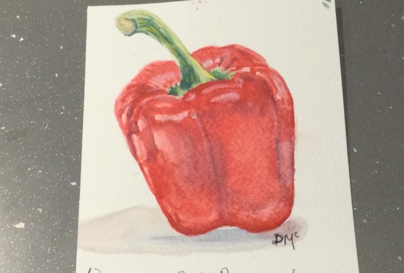
3. Bell Pepper Sketch: so to start off, we weren't going to draw the basic shape of the pepper. So I have it around here on my page want to put this year, and I'm looking at the shapes. I'm not gonna draw each curve, get just looking at the shapes how the pepper has built. That's got leaning slightly to one side. And I like that. I'm gonna keep it this way. So this is the shape off the paper. How it is then remember that we're not reproducing identical copies off the photograph. We are interpreting them as we see the bumper ourselves. So here I know that in the middle, I think that's gonna make it recognizable is gonna be the pit. I think it's called a bit. So the stock, it's gonna come up off here, and it kind of goes here and curbs a bit like that. It's going to take if you measure it just with your eye sight, you can see that the stock is almost half of the pepper, so I'm quite happy with that. I'm gonna draw in now the curbs as I see them. So I see there's one here and it goes overlaps this one, and then it comes into this curve tied behind here. Then it goes all the way around and kind of goes inside here. And then there's another curve here and another one here. And I see that out of here comes another one, and this creates this edge of the pepper. Comes all the way down and here with curves like this, and over here have one side that goes slightly over and the other one. There's another small one here, but I'm just gonna trace it in, and I'm quite happy with my bell pepper as it is. So here's while I see that, let's work of it on the stock. It kind of goes here this way, and then it gets wider by the bottom, Um, this way like that. And then that has thes green based here. So what have you with my pepper? And now let's look at where we put our highlights. So I see that there's quite a lot. It's light enough with such it's gonna let it up a bit, so when I go over with my paint, I can't see it. So what I see is that here there's quite a highlight here is not as white as the main highlight, but there's one here. Then I see another one he year and over this edge there is another highlight. That kind of goes into this one because here like that, then from here, another small one over here. And then there the highlight all the way over here that it goes like this. This is where our like to sports are gonna be. I see that there's a highlight in the back of the proper as well. Here. We're not reproducing it perfectly. Or just making a sketch of the bell pepper with a water color. It would take us hours. And now we're story. Produce it perfectly. And there's a later part here and here and lots of lots of glazing, in fact. And then it kind of curves This letter, which kind of curves here and goes out. So we have a very like part here with the darker part inside here and at the bottom, we have this gun over bomb she going on here, It's gonna be night. Just let not as late as the main highlight and another highlight over here and the other one here kind of creates this shape. So this is our bell Pepper sketch. And in the next lesson, we're going to go over its on and paint. See you soon.
4. Bell Pepper 1: Hey, guys, welcome to the next lesson. I'm just letting in a up my sketch just so that when I paint over it, the pencil strokes don't come. It's pronounced as they are now, because otherwise we won't be able to erase them. So I'm using my kneaded eraser as usual. It doesn't ruin the tooth of the paper. And it's really good for lightening the pencil strokes. So I'm quite happy with my pencil sketch of my bell pepper. And now I'm gonna use my number eight and the water so you don't have to go on the precise red. I'm just gonna be using a mix of all my reds. I'll have the Reds in my description because I lost my paper with all the names of the rents for the Cinelli brand. So I think I like this shape the most. It's gonna be right base built up urban. I'm just gonna add some brighter red to it, just pinkish red. So I'm gonna make a very light mixture off the paint, so it's gonna be all first wash, and I'm gonna pass over all the bell pepper, except for the lightest, wettest areas. So I'm gonna go here. This is the only highlight that's gonna be very white. And this one here. So the rest of it, I'm just passing over with a very light wash. And these, of course, the ones on the edge here they're quite light. So passing over my bell pepper over older, not white white highlights who? I have some with your drops here. But it's fine studying more water and became my same wash. Okay? And I'm going all over the paper. So even where the highlights are, they're the ones that there are on the bell pepper. They're not gonna look as bright white, and it's not going to make it look so fake. Let's say, even though we have it as a sketch, still wanted to look a bit more realistic to here. There's quite the white highlight. I'm gonna leave it quite so notice I'm leaving. Only this this and these two highlights White passing over here is well with my latest wash . So I'm trying to make it kind of afloat layered wash. But if it has different colors, like different shades of red around the pepper, it's fine because we're gonna be glazing over it, and it's just gonna give that interested pepper. So now this is dry
5. Bell Pepper 2: What I want to do is I'm gonna start on one side and move from there. I see that I have a very dark red on this side of this light highlight. And I'm gonna Leo a thin a very translucent wash again over. And I see that there's another highlight over here. So I'm just passing over the edge is always pay attention to your reference photo. I'm just passing over the parts that are near the highlight but are not. There are not on the highlight itself. So we're leaving the latest highlights alone for now. Then I said that there is quite a dark spot here and on the edge around here as well and leaving the highlight alone here just leaving it like this. There's a bit different in here as well, so you can see already that the shape is kind of coming out of it. So we see that there is dark red over this edge here on the the very, very edge of the pepper here as well. And just to give it some depth or also near the stop here, gonna make it like this. So this is connected. Okay. Quite happy. now. And here again, we have the very dark part that goes kind of inside pepper here and like that. So we kind of already start giving it the shape. And I see that here on this side there is like it's like creating lines, creases, obit in the paper itself. I'm going to do just similar thing. Not identical, but very similar to the belt Booker, how it is on the picture. And again the line goes through here and there's quite a light area here Gonna pick up more paint. And I noticed that there's a highlight around here, so I'm gonna leave it be and just had another player of red here. I smoke now, too, but and now at the bottom, there's this shadow part going on now. So I'm gonna draw it in, painted in Sorry and is going to give it a sense of shape to the bell pepper. So here again, I'm going in and on the passing over all of it. Just as I see that there's kind of created a shape is the paper. The surface is smooth, but it's at the same time, a bit bumpy. And here I noticed that there is the curve. So the top of the curve there is of darker part and against light here and now, between the two highlights here, there's gonna be a darker red again. So just create the contrast. So whenever you add more contrast, is gonna look more authentic. So then I see that there's this edge happening like that over here. I got over there. Highlight here. Just gonna lift out the color. It's very easy to fix while you still have your paint wet. You can just left out the color on and here again, we have this darker part going on like that and it goes all the way here near to the highlight. Just have been work over here. So I'm quite happy for with this for now. I'm gonna delete my washing bit and add more shape here because gonna fault. Oh, I have some speck of paint here. Took a take it off now so it can just gives the sense of shape to the bell pepper like that . Just gonna some water on it. Think Can you have you had more paint here to make it darker? So this part is a bit lighter, but not as dark as the top, but the water. Okay, now we can dry it out again.
6. Bell Pepper 3: Now, the next wash that we're gonna be doing is gonna beat is gonna cover even less area. Because if you noticed, we covered with the first wash, almost the whole pepper with second went a bit less And how we're going to intensify those darks with governing even less area. So starting here because I see that this red is quite dark and again this corner here it's very dark as well. So by deepening in these areas, we're going to give it more contrast, more sense of depth. At the same time, we don't pass over all of it. So we create more variety of lights and darks. So again, this when I see it quite dark as well. I'm just looking at the darkest parts of my belt pepper right now and this is very dark because it kind of folds into the pepper inside. And there's not a lot of light there E can take over the spec. I think it came from my big brush speck of paint from the paintbrush. And here we have this on the top of this curve goes like that it gets darker here as well, and then it goes into this here. There's again dip. And it goes in between these two highlights. Here we leave a bit lighter area because there is a little lighter here. You and weak over the sport. Make it seem Rounder. Notice how I'm moving my brush this way. It's kind of caressing the pepper from the stock, how it grows until the bottom and he really this highlight There was a highlight here. Gonna create it now even though I passed over it. But it's fine now. We create this line here a swell. I'm kind of happy with this. Were new. I'm gonna add a bit more shadow here. And, of course, at the bottom, as I see it at the bottom, it kind of goes because it curves in on itself. That creates the shadow of the bottom and again here and taking lighter washers now than the ones I used over the darkest part. And I'm passing over, just created, like give it a sense of types of it more. And I see that here there's gonna be the lighter part and then the pepper curves. I've been using very light washes to grade these kind of two walls with pepper goes all the way up until here. Just gonna use some water. Just move in and out, okay? I think I'm happy for with this wash again, I'm gonna drive out.
7. Bell Pepper 4: Now that this Wasit washes dry, I'm gonna take a darker red from using still the same color. It's one gonna take up their feel good. And I'm gonna even less water this time. I'm gonna have these lines here to make it even deeper. Okay, this is goes here and again, a besting over even less surface area than I did in the beginning. Creating these lines. I'm gonna just smoothing it out into this side. There's no highlight here. And just gonna I had a bit of color here just to create a smoother transition because said that it has a huge the friends like a line there taking The doctor went again, and I'm passing over this side here. This gives it a shadow on and the darker line here and now I'm going to smoke that it out into the highlight. And again I'm passing at the bottom. It's quite dark. I'm gonna even use another color. I think there to give it here in the more even a higher contrast discuss movement it out. Just plain water on Dhere. I can see the thats part is a little darker, quite dark here. And let's add a bit more shadow here in the use a diluted wash over here just to unify the pep reports because there was too white a soon as well. So white. But not this White House theater highlights. Okay, so I'm just gonna pass with clean water over these highlights so they don't stand up that much cause we can use some white wash afterwards. Just gonna do a likely Or here. So now I'm gonna dry it again.
8. Bell Pepper 5: So for my darker mix, I'm gonna use the same red in the Arabic of blue into it just tiny but bright blue. So it creates this dull purple that is gonna be perfect for my shadows. And I'm gonna pass over the doctors parts over here. But and here this color's perfect because it's gonna compliment the proper as it is on and is gonna add more contrast. Just adding a bit in the water, too. Pull it out. Put into this highway, dear, you're here. Okay. And again here we have thes darker parts, shadows on decide. And of course, under this highlight. Because if we had this ridge here under the highlight above swot, it's gonna create more contrast on more interesting about. But they're not making it too dark in six time, then the shadows like that. Then, of course, there's this part. It's very dark here. I want to emphasize it, and it goes old away around like that. And on this side we have this. But there was shadow here. So we have this dark work pepper now, and we can start with the stock
9. Bell Pepper 6: I'm gonna make so my yellows and blues to make the dull green color, and I'm gonna add a bit of a walker to it. So this is the perfect color for distant. And I'm going to start by the hearing in the lines on the stock itself because later I want to pass over with my lighter green so I can kind of unify the whole. So I'm creating these lines just with my paintbrush, and I see that here it goes darker. So I'm writing a bit more blue to the mix I'm taking. I'm gonna take a but makes great and added to this mixture. So to make it darker, this is gonna be even more pain screen. So this is gonna be the Paynes Grey underside, and it kind of goes around across the lines as well. Just gonna have lines here. And I said that there is, like, kind of a shadow created here and on this, like the very base of the pepper. And here and here it goes kind of inside of it as well. So now I'm gonna let it dry over with later. Green a yellowish green. I'm gonna get him using the same girls and lose. And I'm gonna pass over it to unify these colors. Gonna make it look as if it's one whole thing. And here is gonna I think, like that going on. So I'm gonna unifying these colors like that. And here's my stock. I'm gonna drive.
10. Bell Pepper 7: so I'm gonna let the stock be for now I'm gonna take a break Red Is that what my well, proper to look livelier but conduct gonna take my break red and I'm gonna pass my break bread over the shadow areas My word the most intense color is so to make it look brighter and livelier And this red is gonna give it a bit of life because it got a bit dull was the blue that we added Got a bit dull I'm gonna end this bright red You would be here and connect Told her highlights was, well, not passing over all of it. It's okay if we go over the highlights. I think I missed many highlights. Now, I'm lacking a lot of highlights, but we're gonna use our white wash, so don't worry. So now here. I'm gonna do this. That is quite likely now. Okay, so now it looks a lot brighter, And they're really happy how it looks more red here in these parts way. So now we have a lot of variety going on, and now I'm gonna take my white wash, but taking my wig wash and with the wet gosh I'm gonna pass over my highlights. So I see the highlight. Go here like this. And then there's this one here, the little one that we lost over here and on this edge. Take more paint into this. That kind of goes, That's okay. Flooded into my read of it, I'm gonna give it a sense of kind of a direction towards the bottom of the paper. More blush. I will deal. Use it a bit more for those lighter highlights. So maddening about the light here to fixed. I'm gonna use my sick paint over these highlights here, the widest parts. And there's this highlight over there that we lost altogether. But the pilot going on here and a bit of a highlight there. I'm gonna just don't with my white even more. And on those thin highlights, like the very transparent highlights there we go. And over here. Okay, so this gives us a bell pepper woods, a shape that we can really recognize. And okay, this is a quite strong highlight in the year like that. There's thunder stock as well. So just looking. If I missed any highlights at all, I am using a very thick wash to give those white white highlights more relevance. And I see that there is this light highlight over faint gonna lift it up. Not a problem over here. That kind of goes around this way. So I think I'm kind of happy with my bell pepper as it is, and I'm just gonna add some more stripes onto the pepper itself onto the stock of the pepper. And I feel that there is this edge over here like that and we go here. And then there's the bottom, the very bottom here. I think it's good we don't need to have any more to deal. I think it's good as it is. Just maybe a bit off darker shadow at the very bottom of the bell. Kupper. He's gonna make it almost purple, I think, mixing my bright red, just intensifying the very shadow and also the port over here because it's quite dark, dear, those years trying not to lose any Carlin's anymore because they're gonna be the last touches
11. Your Project: Thank you so much for taking my class. I really, really appreciate it. And I really don't see overall covers. Maybe you have a different approach. You add something to because I am a huge fan as well. So I would really like to see your interpretation on. And I also would like to know your thoughts. So did you have any suggestions? Who are? Did you have any other ideas for future classes? I would love you to leave you for just leaving a message. I hope you learned a lot from the first lesson until the last one. And I am really looking forward to seeing your bookkeeper spin the project section. I will definitely look each one of them on. I will be doing many more classes food. So stay tuned and watch his face. Thank you so much again on. I will see in the next class. Bye.
 Katia Kot, Children's Illustrator