Transcripts
1. Introduction: Welcome & What You'll Learn: Hi, I'm Flavia an illustrator
and watercolor artist. I create inspired
but everyday moments from cozy food illustrations
to surfing patterns, and also host in person creative workshops and
leaf painting events. I had the joy of
collaborating on different creative
projects, and recently, I wrote an illustrate and published my first
book in Spanish, a very special milestone
in my journey. In this class, I will guide
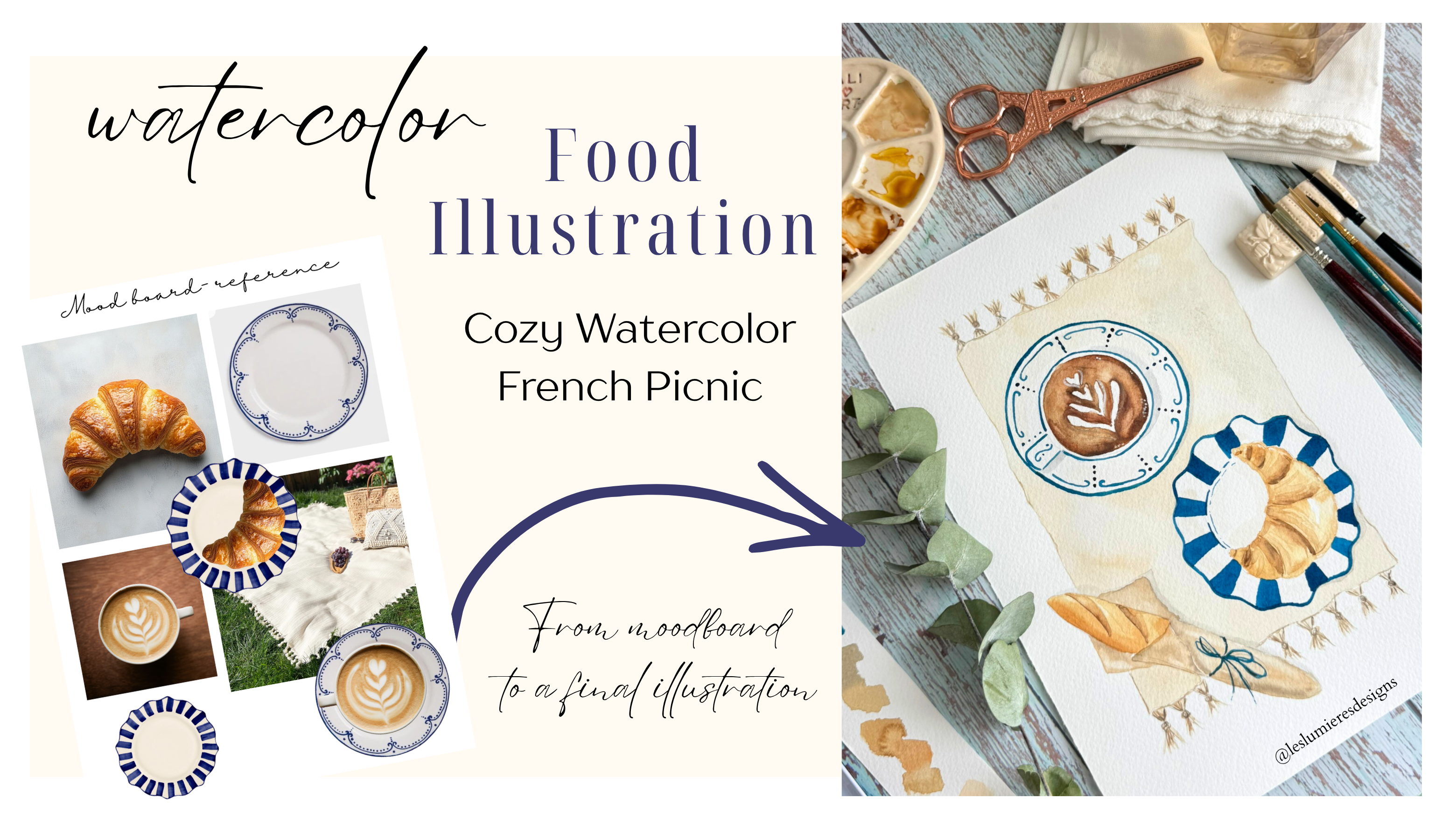
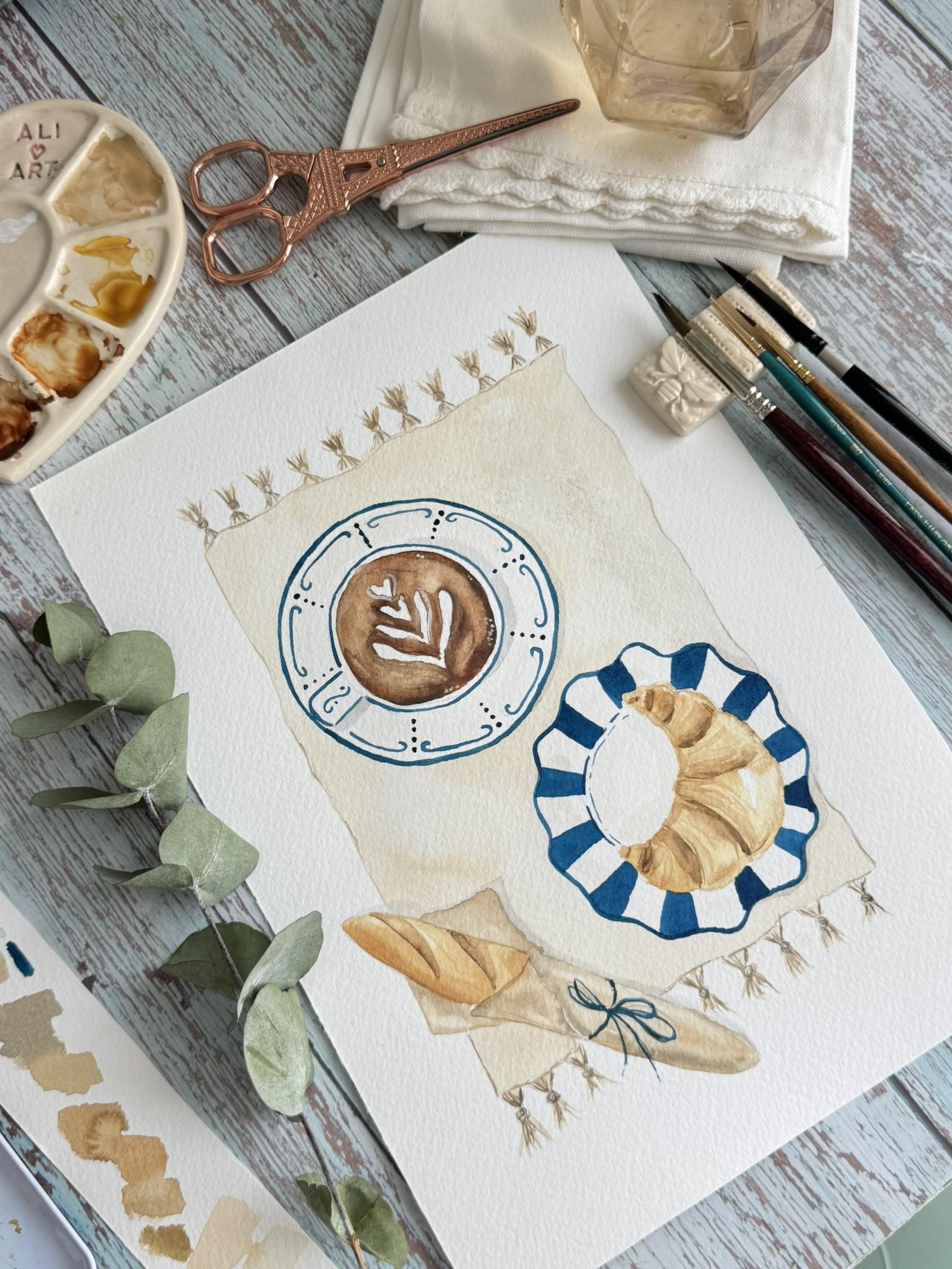
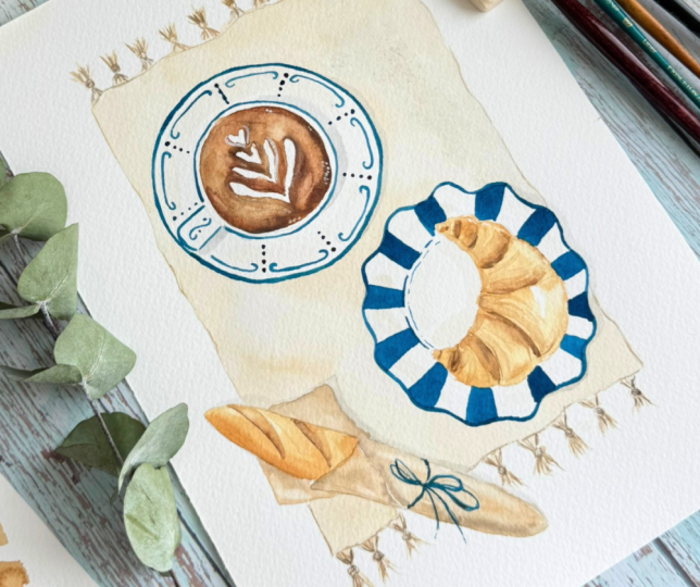
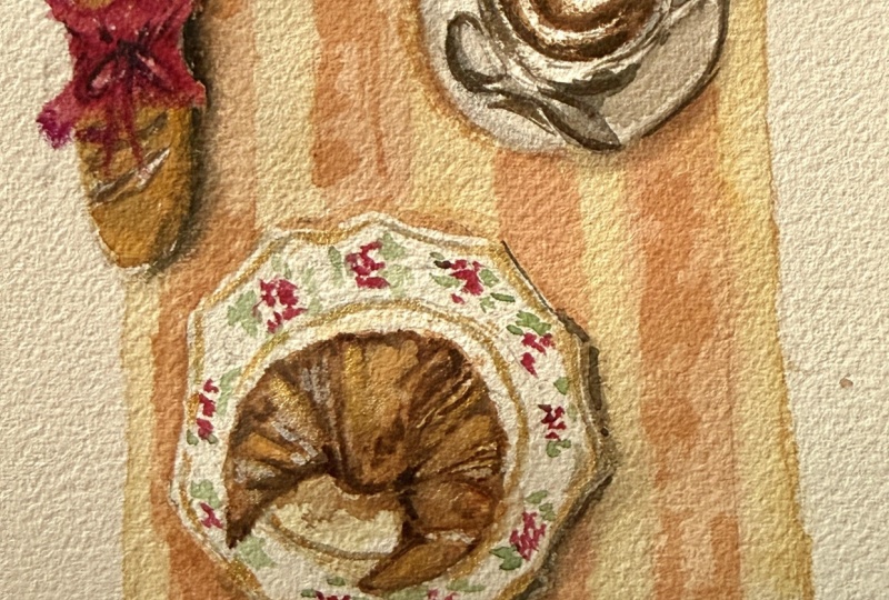
you step by step to paint a cozy French picnic
sent in watercolor, including a croissant, coffee, baguette, and decorative
vintage plates. This class is designed to be relaxing and beginner friendly, while also helping you
to build confident when watercolor techniques
like soft washes, layering and adding depth. I will also teach
you how to create your own composition using
simple inspiration methods, so you never feel stuck when
starting a new painting. By the end of this class, you'll have your own
finished illustration and hopefully feel more inspired and confident to keep painting. See you in the next
lecton where I will show you the
materials we will use. Mm
2. Materials We'll Use: You can find the
PDF and printed. And here also, you
will find the PDF. The mood board reference that I use, the drawing template, if you prefer to go through a window or trace
it in the light, or in the next lesson, I will teach you how to create your own mood board and
your own illustration. Also in the PDF, you
will find the materials, but I will tell you now also, and all the steps by step
if you want to print it h. So for this class A, we will A four watercolor paper. In this case, I use lesion, 300 grams cold
press, 100% cotton. It's a beautiful paper, you can use or any
watercolor A for paper you have cold
press is much better. And then we will need some
towels or paper towel. Water, I usually have
two glass waters. Watercolors that I use
this art philosophy, fans, blues, brands
we will need, or if you have it in tubes, we will need a arsienaO and any bronze you
have pins gray, white color, blue colors depends also on your
own illustration. And also to add the details of the coffee mug for the
foam, we will use wash. Also we need a pencil for
the relistration, an eraser. The brushes we will
use are round brushes, number four, a small one like number one or
two or a liner. Also, I like to have paper like this to do the test
of the colors. And you can have a
ceramic palette, plastic palette or
use here to paint. I usually like to mix my colors, but as you prefer. That's all what we'll
need for this class. And, of course, if you
like your favorite drink, and we'll start.
3. Inspiration & Composition: You know that moment
when you want to paint, but you don't know what, so you get distracted and leave
it for the next day. So before starting painting, I want to show you a
simple way to find inspiration and create
your own composition. This is something I always do when I don't know what to paint, and it really helps avoid
the blank page feeling. We will start creating
our mood board in taking some
inspiration from inters. In this case, I want to paint a food illustration
with vintage plates. So I will search for vintage
plates and save them. You can search for things like picnic aesthetic,
croissant, coffee. You don't need to oversing. Just collect image
that you like. It can be colors, textures, upsets, anything that
you see and inspire you. Save all the image you like. In this case, I'm looking
for a Cappuccino, but I just want the mac. No with the plate
because I want to have a more beautiful plate
like Ssn Bitish. I will save this that
I really like it. And then I will serve
for a croissant. I'm looking at curve croissant. It will nice on a plate
and nicer to paint. Also, then I will start
looking for a picnic mats, a picnic bag with tassels Also, I want to
look for baguettes. I'm looking some
baguette with rap paper. I feel in a picnic mug
that would look nice. I love this one with
the blue ribbon. It's a nice inspiration. Now, bring all these
image into Canva. You can create a
simple mood board by placing the image together. Remove the background. And arrange them and group them and start moving around to start visualizing
the composition. For example, I can
place the crossat on a play move the co here and slowly build scene or build something that inspired me to start
an illustration. This step is very helpful
because you can see how everything works
together before starting. Once I'm happy with
the composition, I use it as a guide
to create my sketch. You don't need to copy
every scene exactly. Just use as inspiration. For example, in the baguette I love how the blue on shows here. But if you prefer, I also include a printable
drawing template for you. So if you want, you can skip this step and go
direct to painting by tracing the template you find
in the PDF in resources. I really recommend trying
this process at least once because next time you sit down to paint and you
don't know what to do, you have a tool to get started
instead of feeling stuck. Now that we have our idea
and composition ready, let's move on the next
step and start painting.
4. Painting the Picnic Mat & Tassels: In this lesson, we
are going to start painting the picnic
mat and the tassels. First, let's mix our color. I'm going for a soft beige tone. If you don't have
a ready made base, you can mix a little
yellow oak or burn sienna with white
and plenty of water. Take a moment to test your color first until you find the
perfect shade you like. Very transparent. I'm using the R philosophy
complexion palette, which already has some
beautiful beige and sand tones. But feel free to use whatever
watercolors you have. Just need plenty of white, like brown color
and a lot of water. Now we will start
painting the mat. I like to begin from one corner and paint
in one direction. Either from top to
bottom or bottom to top. This help keep the
wash smooth and even. I will speed up this part a little so it doesn't get boring, but take your time here. There is no rush. As you see, I'm using a round brush number four of silver vervet because it has a nice fine
tip which helps me painting around the
baguette and the plates. And small tip for a
smoke background. Make sure you are using
enough water and try not to let any edges dry while
you are still painting. This will help avoid hard lines
and keep everything soft. Now, while the t is
still slightly wet, we can start painting the
tassels using the same color, but with more water, begin adding the tassels
at top and bottom. With your brush, create small vertical lines to
represent the threads. Once you are happy with the
base, let everything dry. Preparing more concentrated
paint of brown yellow oak. And you can add also
a touch of pinray. Add some details with the fine brush with
this darker mix, gently define some
of the thread and add a bit more depth
to the tasers. Add all the details you need
in the mat like lines and continue adding the details of the tasers on the
other side of the mat. If it's easier for you to turn around your
paper, like for me, I like to turn around my watercolor paper to make
the details extra careful. And continue this step. You will find enjoyable to
paint every line of this part. And this is for this step. In the next lesson, we'll
start painting the crossing.
5. Painting the Crossaint & Baguette: Let's paint the croissant. I'm using a yellow ok
with a touch of rum and plenty of water to keep
it soft and transparent. Before you start, take
a second to look at your croissant shape and imagine where the
light is coming from. Or check the photo reference. This will help you decide
where to leave the highlights. We can start
building depth using more concentrated mix like
burns and a bur Amber, beginning adding shadows to the curve section and in
the folds of the croissant. Look at the reference picture and check where are the shadows. Take your time here and
build the color slowly. It's better to add
layers little by little than to go
too dark at once. Add some shadows of round in
the border of the crossing. Check the reference
picture and slowly create the depth in each part of where
the croissant folds. A little dip is to leave
some small white spaces, especially on the top
of the croissant. This will help create a natural light effect and make your croissant
look more realistic. Now we will let it dry before
adding the final litters. Smooth on the bague. We will use the same
color like a mix of brown and light ochre.
With a lot of water. Also add a bit more color in some areas to create variation. Baguetes are never
perfectly even, and that's what makes
them beautiful. Keep everything loose and soft. No need to overwork it. Using a slightly
darker brown and shadows along the botted
edge and underneath. This will help give it volume, and that is for this step. In the next lesson, we will continue bringing the
illustration to life.
6. Painting the Coffee: Mm hmm. Now we are going to paint
the coffee inside the cup. Start by preparing a
light wash of burn Siena. Or if you don't have it, you can use any brown
with just a touch of red. We are looking for
a warm coffee tone. If you have a latte
art like I do, we want to keep
those areas white. So instead of
painting over them, gently paint around the shapes. That's why I'm using a smaller round brush size two or three. It gives you more control
in these little areas. Take a more concentrated brown and begin adding darker tones, especially near the outer
edge of the coffee. This helps create
that natural depth, since the liquid is usually
darker toward the size. You can use the photo reference
to check the latte art. A small tip, try to move your paper around to
have more control. I like to turn my paper
around when I'm painting. You can also drop in a few small touches of dark
brown here and there and let the watercolor
blend softly on its own and creates
its own mashing. Or you can blend some areas if you prefer to
have more control. Take your time with this part. Take a minute to look at your painting and see if you would like to add
any other details. I think I'm going to add a
little drops of water or white paint around the latte art to create these foam bubbles. Now, we will let
this dry completely. And that's it for
the coffee base. I will see you in the
next lesson where we will continue adding more details
to our illustration.
7. Layers, Details & Shadows: Now that our first layer
is completely dry, we are going to start
building more depth and making the croissant
look more realistic. I'm using my own
brush number four and a more concentrated
brown mix. Begin by adding darker lines along the follow
of the croissant. Follow the natural shape
and keep your lines soft. We are not outlining,
enhancing the form. Then with exactly
more watery means, start adding thicker, softer brush strucks to create shadows and suggest the
layers of the croissant. A little tip, take
a moment to look at your reference image
and notice where the darker and
lighter areas are. This will help you
decide where to add color and where to leave
some spaces lighter. Remember, leaving some areas unpainted is what creates
that beautiful light. Keep adding more
concentrated brown, where the croissant layers fall. This adds depth and realistic. Trust the process and enjoy it. You will see a beautiful
result at the end. Now let's move to the
shadows inside the plates. Use a color similar
to the picnic mat, but with more water and add very soft shadows
inside the plates. This will give them
a bit more depth and make them feel less flat. Don't worry if it
looks very subtle. Once we add the
blue details later, we will see this effect. Next, we will add the main
shadows to the composition. I'm using a very watery
mix of paints gray, and I will start adding
shadows under the cap. I like to keep all my
shadows on the same side. In this case, on the right to suggest that the light
is coming from the left. I'm adding also shadows
under the handle of the cap. Take a moment to look
at your composition and check where you like
to add the shadows, always in the same direction under the plate of the coffee. And then I will move to
the croissant plate. To be very subtle and realistic, use a lot of water. And then also I will paint the shadows under
the baguette paper. This small details
really helps make everything feel more realistic
and beautiful later. We will leave this
to dry and we will move on the wrapping
paper of the faguet. I'm using a light brown tone, or you can mix a bit
of white with brown and pins gray to create
a soft neutral color. Try to choose and make a
color that is different from the faget so they don't
look or blend together. As you paint, you can leave some pigment with the clean
brush to create highlights, and in another area drop a bit
more color to add texture. Now, we will let everything dry. And in the next lesson, we will continue painting the
lovely blue vintage plates.
8. Painting the Vintage Plates: Mm hmm. Now we are going to
paint the vintage place, and this is one of
my favorite parts. Small tip before we start. I like to keep a small piece of paper next to me
to test my colors. You can use scrap paper or even recycle paper from
other illustrations. Begin choosing a mix
of blue that you love. I'm going for a darker blue, but you can choose
any tone you prefer. It's a great moment to
add your personal style. It's where everything starts to feel more detailed and unique. I recommend swapping
to smaller brushes in this step like number one
or two will be perfect. So you have more control
for the details, and I'm going to start making a line around the coffee cup. Take your time with this step. There is no need to rush. You can turn your
paper as you go. This really helps when painting round shapes and keep
your lines more natural. If you are following
the reference, you can use it as a
guide for the patterns, but feel free to create here. You can design your
own patterns at dot lines or little decorative
elements as you prefer. Here on the screen, you can
follow also the plate that I'm taking inspiration from
it to paint my own plate. This is your piece,
so enjoy the process. And remember, the lines
don't need to be perfect. These small imperfections
are what give your piece that beautiful
hand painted charm. We are almost finishing
the illustration, which is very exciting. If you have been painting a log, I would love to know
how it's going for you. Are you enjoying the process? Is it feeling relaxing for me
so relaxing to paint this? Also, always remember to have your own cup of coffee or
tea next to you to enjoy. Or I'm from Argentina. So always I have
matte next to me. At this point, we are really starting to bring
everything together. Now let's move to the
plate under the croissant. For this one, I choose a curve
plate with simple stripes. I just love how it looks. Start by painting the base shape and then add the stripes
using the same blue. Keep your lines soft and
slight it imperfect. That's what gives its hand
painted vintage feel. Take your time finishing all the details
and step back from your painting every now and then to see the
full composition. Sometimes a little distance helps you notice what
you want to achas. And don't forget to upload your project in the
project section. I would really love to see your painting and how
you made it your own. You can also share how you
felt during the process. Was it relaxing fun? Did you learn something
new in these classes? Your feedback really
means a lot to me and helps me improve
to future classes. Take your time
finishing your plates, and I will see you
in the final lesson where we'll add
some last details.
9. Final Details & Turning Your Painting into an Art Print: We have arrived at the final
itails of our painting. These are the small touches that really brings
everything together. I'm using a very small
brush number zero, one, or liner to paint the ribbon of the baguette
with the blue color. And the funny details for the white foam of
the cappuccino, you can add a bit of
white dot with wash or white acrylic or
even a posca pen. And now our watercolor piney
illustration is finished. Before we end, I want to show
you a simple way to take your artwork step further
if you have Canva. Let your painting dry and you can scan it or
take a picture. Then you can open Canva and pour your image and
remove the background. Also, you can edit your image, adjust the color if needed, at brighter, more white. Depends on the scan or
the picture you have, you can adjust to be better. From there, you can add a simple rectangle
in a soft color. Something warm or neutral, it could work really nice. You can also add little
texts, for example, bonhu Choose a font you like adjust the colors and arrange everything
in a balanced way. And just like that, you have a beautiful R print. You can download it as PDF. And then you can open
in PDF, print it. You can choose the size
you want to print it. Always choose the
highest quality. And even if you have
a photo paper or a thicker paper that
you printer can print, it will be so beautiful quality. Then you can frame
it for your kitchen or even give it to
someone very special. Thank you so much for
being part of this class. I would truly love
to see your work. Don't forget to upload
your project here in the project section and
share your experience also. You can add a title
of your painting. Upload a beautiful picture. And then you can also leave
a feedback or review. It really helps me a lot. And if you like to see more
watercolor tips or classes, you can follow me here on Skillshare and be the first to know of the upcoming classes. Also, don't forget
to follow me on Instagram at Lelmer Design. Thank you again, happy painting.
 Flavia Les Lumieres Designs, Watercolor & Gouache Illustrator