Transcripts
1. Introduction: Hi, I'm Flavia. I'm from Argentina, but
I'm living in Budavi. I'm a watercolor
artist illustrator. And today, I will
teach you how to paint some beautiful,
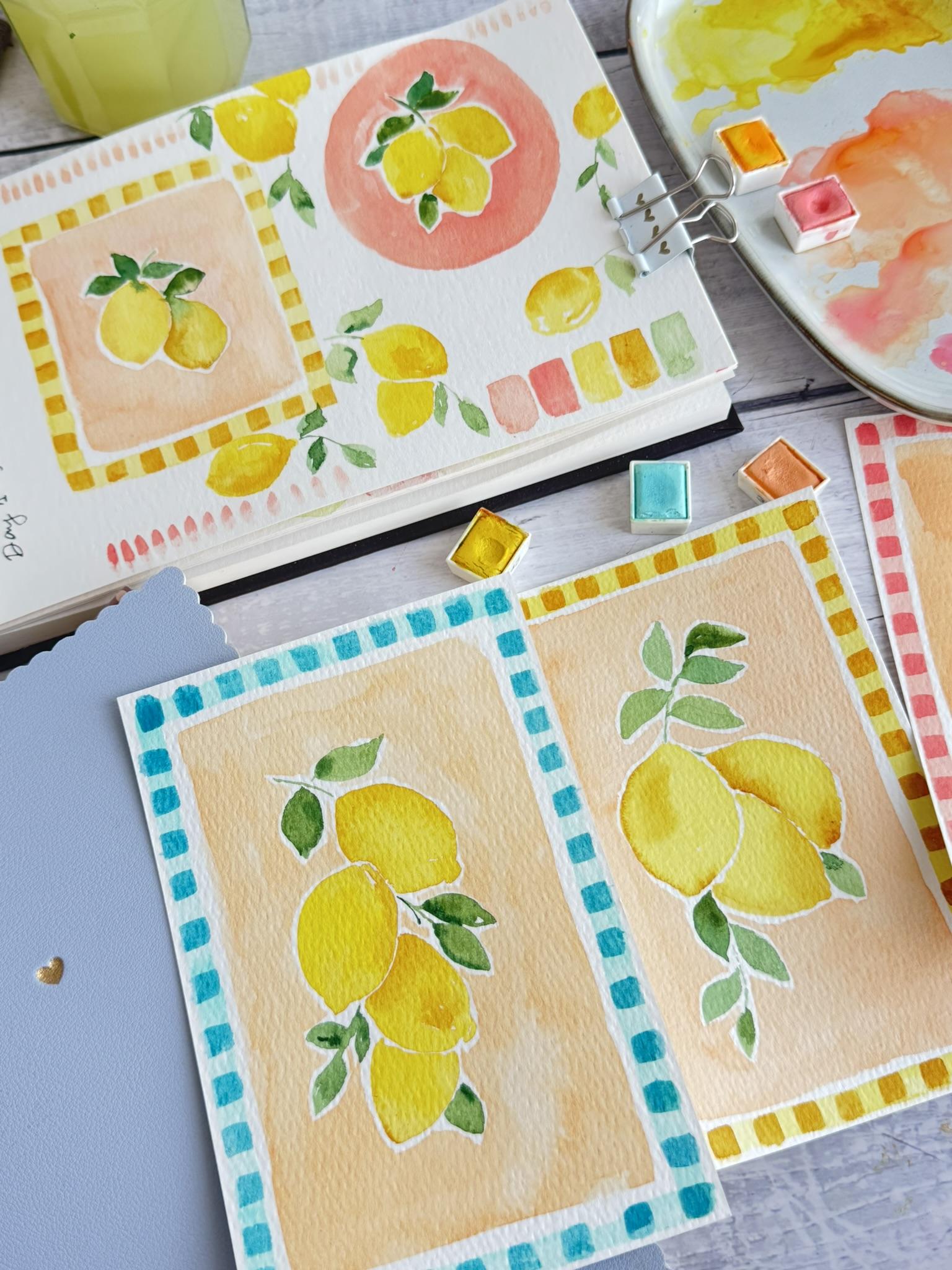
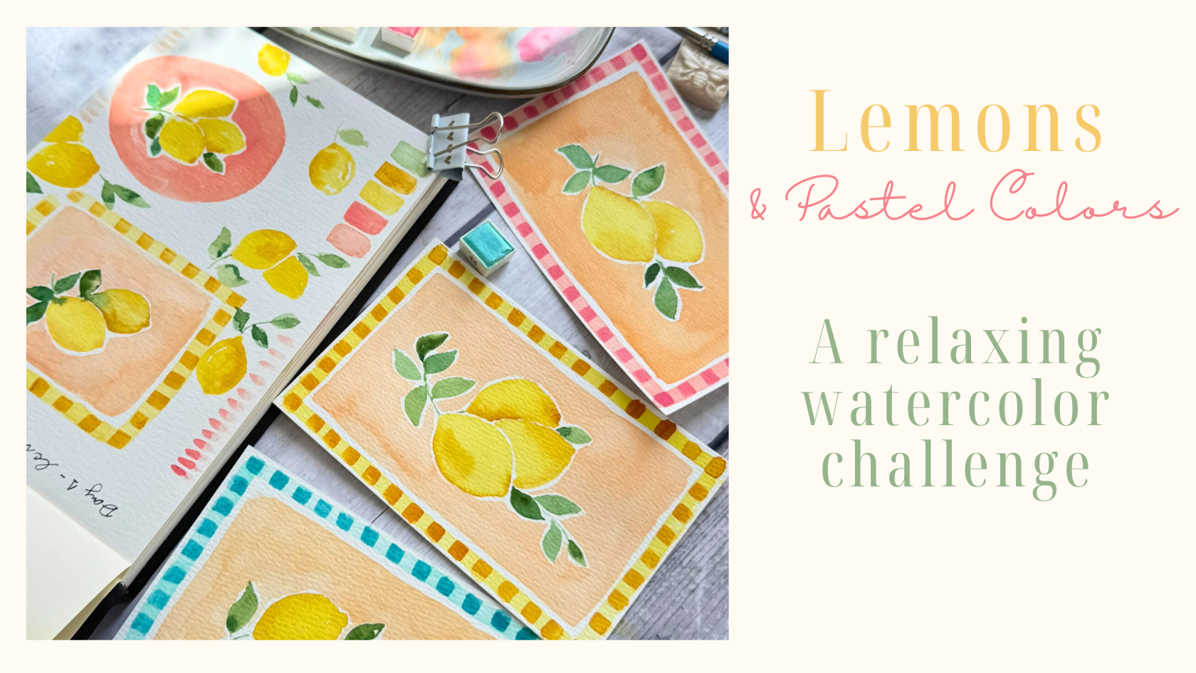
fun colourful lemons. Paster colors like this
with the fant borders. Then you can frame
it and give to your friend for your own
house, for your kitchen. It's a lovely idea. And you will see it's
very fun and easy, and I will give you a lot of tips and secrets of watercolor. So I hope you can
join this class, and I would love to
see your project. I will let you know all what
we learned in this class. In this class, I will
guide you step by step through a fun and relaxing
watercolor short. You will learn how to
prepare your materials. What do you need for this class. You will learn how to mix beautiful pastel shades without having
pastel watercolors. And losing up with
the warm up exercise. I will also show you why
keeping a sketchbook is such an important part
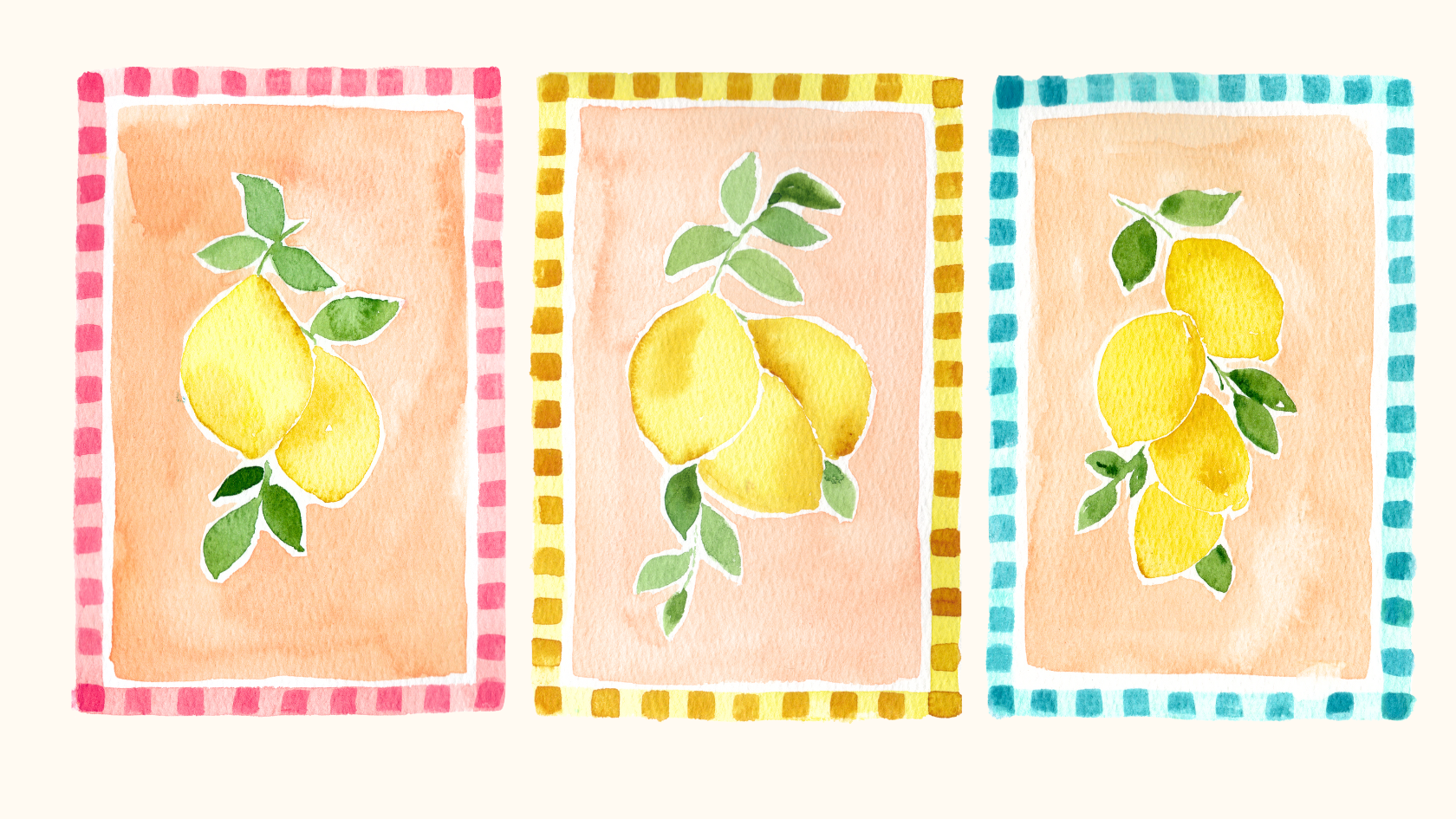
of the creative process. Then we will paint three
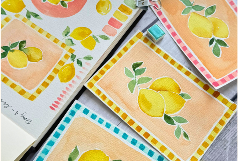
charming lemons cards together. First, the soft
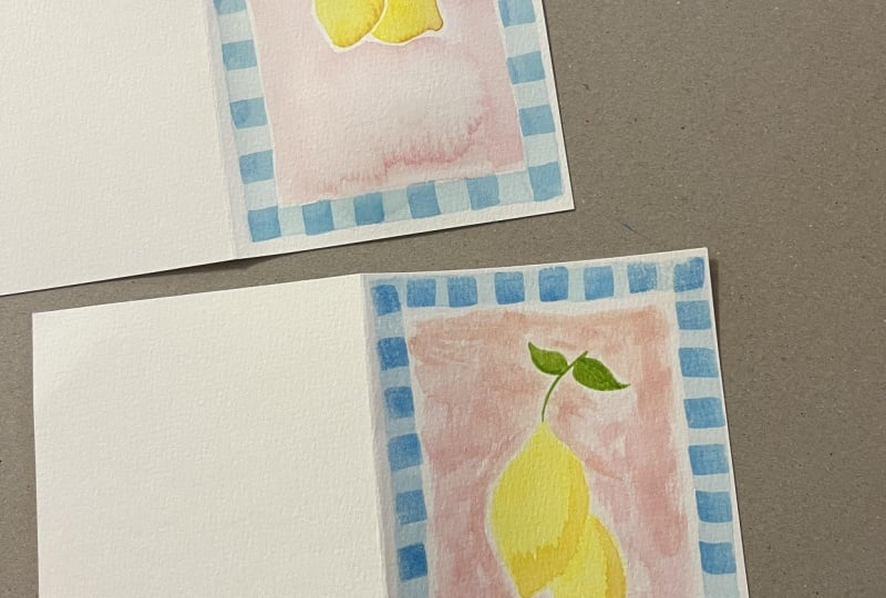
pink border card, then a sunny yellow border card, and finally, the fresh
blue border card. By the end of this class, you will have to create
three lovely pieces of art. Perfect to give frame
in your kitchen or keep as part of your
creative practice. Let's get started. So
2. Materials we will need: The materials we will need for this class are very simple. First, you can freak
out your papers. This is 300% watercolor papers, a mix of cotton and
cellulose. You can get it. I got it in 15 by
ten centimeter. You need three pieces to create these three beautiful
plastic color frames. Then of course, you need a glass of water or even if
you need to two, one dirt and clean. A ceramic palette or a plastic
palette like this one. Also, if you want to put a
masking tape or washi tape, to create a white
frameron or you just scan paint straight and
non leave white border. Then we use for this
need flat brushes. It can be this chisel
blender, number six, or a shader, number six, to create this border. Then we need a round brush. I will use silver number four or a synthetic
number four brush. And also to paint
the background, you can use a flat figure
like number eight could work. A piece of paper or a
towel to clean your paint, and then the colors
fans or tube colors. In the next lesson, I will show you how to create
a pastel colors.
3. How to make your own pastel colors: In this lesson, we will learn
how to mix colors to create beautiful pasta shades for
painting these lovely cars. To start with our first cars, we will focus on painting in
yellows in different shades. Most watercolor sets
already include a few variations such
as lemon yellow, a light yellow or a
more bright yellow. You can use any brand you have. Just look for similar shades. Ideally we would using two treat tones like a
bright lemon yellow, softer or darker yellow, and if you have a
touch of yellow ok, yellow oak is perf for adding
constraint and shadows. For the background will create a soft peachy tone
like a salmon color. I will be using a mix of
color from art philosophy, but don't worry if we don't
have the exact same ones. I will include the full list of the colors I use
in the PDF guide, so you can recreate the background with
what you have at home. Most likely, you already
have similar shades like Alysa and Crimson and white to create this salmon peach color. The key is to mix a touch
of white with your color. Just remember in watercolor, using white paint doesn't
make the color lighter. It makes this pastel effect. To create our peachy background, I will start by mixing a little
bit of Alizarin crimson. First, I will show you
the best color I'm using. This one is number 31. It's already beautiful
shade on its own. But then I add a bit of
pink and some white. I can create several variations. It all depends on
the tone you prefer. For example, I also like to add color number 129 to the mix. If you want to be more peach, you can simple a more pink. This creates a beautiful
base for our background. But don't worry if you don't
have these exact colors. I will teach you how to recreate a similar shade using what
you already have at home. I'm sure you have
Alysa crimson or a red color and then white water color with
a touch of yellow och. Look how it started turning
into a peachy color already. You can keep adjusting derisions until you find
the tone you like best. If you prefer more pinky shade, just add a little more
Alysa in crimson. But even if you don't
have this color, you can try mixing a regular red with
white and yellow oak. With a little experimented, you will get the similar colors. You can also use the soft pink to paint
the border of the car. We will paint. If you have
the pink water color, feel free to use that, or you can mix your own
in the same way. But adding more red and white, you will get a different
pinks and *******. Keep pratting these color
mixes at home is a great way to create beautiful custom
pastel tones for your cars. For the blue border car, you can use any blue you
have like petaloblue, cerulean blue will
work beautiful. To turn it into a pastel shed, just remember this room
use a lot of white colour. Even though my eruulan
blue is almost ready, I can still create a
lovely light pastel blue by mixing with white. This soft tone is
perfect for car boiler. You can also experiment
with adding a bit of green to your blue to create
a turquoise shade. For example, we
first try with sub green with a touch of
blue and plenty of white. But if you want more
vibrant turquoise, try adding Hawkers
green instead. Look at this tone. It became
a soft turquoise blue, perfect for a pastel palette. By mixing white
into your colors, you can create endless
pastel variations. If you're afraid you might
forget the combinations, it's a great idea
to write them down. For example, to
create this color, I use blue, I write, white, sub green or erleublue, lidia, white, I will write
down the colors I use. Another great idea is
to have small swatches on square pieces of paper and
write your mixing recipe. That way, next time you want to recreate a specific shape, you know exactly
how to get it and you don't have to repeat
all this process. Let's say you want to recreate a color salmon or something
more light or skin tone, you might miss cademm yellow
with a little bit of orange. Try different combination at home and explore
your own palette. I'm sure that with the
colors you already have, you can create a
beautiful variety of soft pastel tones and see
you in the next lesson.
4. Warm-Up & Loosen Up: sketchbook practice: In this lesson, I will
give you some tips, how to lose up and enjoy
the process of watercolor. Actually, these lemon scars
will not come up live if I didn't use my daily
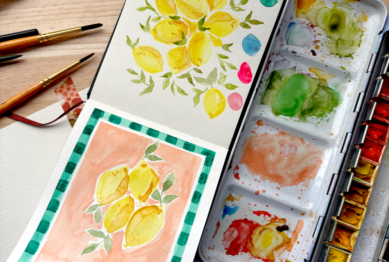
sketch. I will tell you why. This lemon scar, the idea came because one day
I was losing up, doing some loose lemon painting, just using a pastel colors. And then I started
painting the lemons, then the border came up. Then the straps, the
lines, the color, and after I visualize and I have the idea to create
these beautiful cars. I recommend my students, or I write in my watercolor blog that you have a
watercolor sketch, where I usually don't
show to anyone. It's just practice, especially practice things that we feel is complicated and we
feel to use big paper. So this is the idea
to keep practice. Or just look, make some colors. So I will show you what
usually I do or I will do to start my sketchbook or
colors if I sell lemons. I will prepare. Lose
up before I want to paint some severe or I
don't know what to paint. For example, will say
war in this I say lemons or flowers or
hibiscus flower or parsley. So I will choose my colors, and I will just
loosely pint without any pressure or without
any previous idea. So what I will do is just pin
random lemons. Any shapes. Just relaxing. Missing color, see how these colors will put
together, different shapes. What if I add some shadows
here, what will happen? Or only I can trust the color. This is lemon yellow. This is more like
a cat me yellow. I yellow ok, I will also put
the color palette amusing. I will play around in
different shapes, size. I just play around. It's too many. I would
play and make it bigger. How to put sheds in one side, like how my colors
react to the paper. I will also take my towel and maybe play to leave the color in one side, how it's looking. What if they touch each
other. Play around. Then maybe I will add some greens next If I want you to look
more, that's the color. How will do the leaf. This green I like or
this leaf I don't like. Maybe a deck mode kind of green more pink more translucent. Usually, if you don't sing about the difference some music, you prepare your
favorite being Imitate. I like children. Matt know it. Just play around. For example, I have this
color here to create a background The beauty of watercolor is to learn to give it time
for yourself to explore. Because if we don't do mistakes, we can not learn and
don't be too hard on you. Like how it will look with. Okay. Blue background. In this lesson, in this class, I choose the peach color, but look how nice sauce is
with the blue background. I would like to know
if any of you you try the card with the
blue background. Even not to be. Look, even
though this is very beautiful. You can try different brushes. For example, any brush you have at home and you
never try it, maybe. What here. When you try to do this every
day with different subsets, you will come up with
great spot painting. Line here, H my brush
just touch the paper and I'm sure each one of you have your own tale of making lemons, for example, lemons are very easy subject because
they can be each one unique. You can even fix it. Try to practice how to use your Drop colors. Maybe now this blue
is dry so I can use a darker blue like I have here maybe
and practice to do this. I mean, here, I can
put more darker. So I can learn also here
if I want to do a frame, the background has
to be very light, so it shows more when I do this. Now for the yellow, I use
yellow och. Like darkech? No. So practice and show your daily practice
in your schedule. See everything can be something
different your practice.
5. First Card: Lemons & Pink border: Welcome to the first car
of our lemon series. We are starting with two lemons
with a soft pink border. First, I will place
the washy tape or the skin tape
around the edges of my ten by 15 centimeter car. This step is optional, but it gives the final
piece a clean frame look. Perfect if you'd like to
pop up into a frame later. Now with a flat brush or a chisel blender
brush number six, like this one, we
will start painting the border in a pink
color for this first car. But you can use any patel
pin you love or mix your own using the techniques we learn early in the
color palette lesson. And we'll start with
the lower border, painting from left to
right, then move up. Also, I'm painting from left
to right in the uppers. Make sure your washy
tape is firmly pressed down to avoid any
color bleeding underneath. If you are left handed, you might prefer starting on the opposite side
for better control. Start from the right instead. You can adjust the color and put more water or more
color as you like. Remember to let the border dry completely before
moving onto the lemons. Now for the lemons, I'm switching to a rum brush. I'm using a silver
velvet number six, but you can use any rum
brush size four or six. I'm going to prepare
three shades of yellow, a very light lemon yellow, a mid tone, like
a cadmin yellow, and then like a deeper
yellow, like yellow oak. Here comes the fun part. We are painting the
lemons free hand without sketching first. Try to embrace the looseness
and freedom of watercolor. But if it sketching helps
you feel more confident, feel free to sketch
it lightly first. Remember not to press
so much the pencil. This is your creative time, so do what feels right. I begin by painting the shape of the first lemon with
the lightest yellow. Then gently drop some met tones, and I will start taking some yellow oak to add depth and shadows on
one side of the lemon. And I will start lifting some of the color on the
other side of the lemon. Now let's paint
the second lemon. Close to the first one,
but without touching it. Although a little over
light, it's okay. I can create a very
nice blending effect. I'm shaping it with my brush. I can adjust the side of it. And also, I will add some
dark and shaded part under it behind the first lemon
and on the corners. Now we will continue
with the leaves. Or that I'm using
two shades of green, one very light and one dark. I will painting very loose
with expressive strucks. Don't over sink it. Just
let your brush dance. And remember, the
colors and nixing I'm using are listed in the
PDF under resources. You can easily refer
to them later, but any green shades you
have at home, it's fine. She enjoy this process at this moment to paint very
loose and nice lemons. And also the color pastels, they make them look so
bright and natural. Now time for the background. I'm using a soft salmon pitched, which is art Philosophy
color number 31, mixed with a little white. And also I add a
little bit of pink. I'm using a flat brush
number eight for this. Adjust the color as you like if you want lighter or more dark. When applying the background, work quickly in one direction to avoid uneven drying
all cauliflor effects. Start from the bottom
and moving up. Carefully brushing around
the lemons and leap. I like it to leave
this wide space between the background and
the lemons and leaves. Use the thin edge of your
brush when painting near small areas and leave some white space to keep the
composition light and fresh. You can adjust the
color as you go. I decide to add the touch
more pitch for warm. And also, you can work in both the diection at the
same time right and left. To avoid dry, remember
to add water, to keep it wet and keep
working in both sides. Now we will start to paint
the decorative border using a flat brush or a chasel blender with
the dark pink shade. This step is super
easy and satisfying. I love to do this
square like a stump. Using the shape of your brush, leaving some space
with each one. You will love this
part. Let me know. It's easier to do these squares and moving to the side
of the washi tape. You will see this part is
more difficult because I don't want to paint over
the white space between them. But if you tape
your art in a bore, you can move it around. Leave it completely dry. And now the most exciting part, removing the washing tape, I always love this moment. It's so satisfying to reveal
the clean crisp border. I hope you are enjoying this
process as much as I am. See you in the next
lesson where we paint the lemons with
the yellow border.
6. Second Card: Lemons & Yellow border: We will paint our second
card with the yellow border. First, we will place washy tape around the edges of
the watercolor paper. This step is optional, but if you want a
clean white border for more polished
or frameable look, I recommend using the tape. To create the yellow border, I'm using a flat brush
size number six. I will use a bright yellow
from our philosophy. This one is number 43. You can always test your colors on a
scrap piece of paper. I found out that 43
alone is too bright, so I will add a
little bit of number 42 to soften shell a little. When you have adjusted
the color that you like, start painting the border
from left to right. If you are right hand side, if you are left hand side, you can start from
right to left. The square shape of
the flat brush make it easy to create a
clean even warner. Now, I will switch
to my round brush. I will use silver black
velvet size four, and I will paint three
lemons inside the frame. I will use the same
yellow as before, but also I will prepare a
few more shades like lemon, yellow, cat miu,
yellow, and yellow ok. Mix the colors as you
like to have a lot of variety and to add
dimension to the lemons. As always, we will start with
the lightest color first. I'm not drawing any outlines, just painting directed
with the loose style. It's easier this way and keeps the lemons looking
natural and fresh. To begin, paint a circle, then add a little
B shape at the top and the bottom to give
this lemon shape. Once the base layer is down, you can start adding some
of the other yellows to add shadow and depth
like a yellow oak. Now, continue with the second lemon,
just below the first. I recommend leaving a small
white gap between the lemons, so they don't blend
together too much. Enjoy this process and paint
the lemon in a loose way, and you can adjust the size
or the shape with the brush. Also you can add some shadows
behind with a yellow oak. Then we'll start painting
our lemon behind these two. It's like a half lemon showing
like it's behind them, so we add more shadow
with yellow oak. To leave some paint
and create highlights, you can use a towel
or paper towel to gently dab the lemon
while it's still wet. I did that here on the first lemon to create
a soft light effect, and also on the second lemon
and a small area on the sur. Now we will continue
painting the leaves. You can prepare a few shades
of green on your palette. I love to mix greens
and create new tons. Use the tip of your
brush and start painting the leaves in
a very loose style. Keep the struck light
and expressive. Just press and leaf, allowing the brush to
create natural shapes. You can drop different
green toes here and there, especially while
the paint is still wet so the colors
can blend beautiful. I like placing leaves
in different direction. It brings a sense of
movement to the composition. If one leaf doesn't come out the way you
like, don't worry, you can either soften or balance it out by adding
another one here. I decide to add one coming
from behind of the lemon. Now I'm happy with my leaves. And once you are happy
also with your leaf, who will move to the next
steps, the background. Now for the background, we will use some soft peach tone we create in the
previous lessons. I will use a flat brush number eight and a mix of art
philosophy colors. I've chosen a peach color
with a little bit of white, and I will add a
little bit of pink. Remember that all the
colors I use will be listed in the PDF so
you can follow along. O. You can always test your mix
on a scrap piece of paper. I really love how
this color looks. Slight, fresh, and less beautiful with the yellows and green. I will keep this one. Making mechently
applying the wash around your lemons and leads. If you prefer more
intense background, you can add darker colors in some areas by
adding more pigment. A tip is to use plenty of
water to keep the look soft. I also like to leave
a thin white border around the edges to give
the car a clean finish. H. Once you are happy
with background, leave it to dry completely. Now that our border is dry, we will add the
small yellow squares to create a fun stamp
effect in the borders. You can lose a flat brush number six or a chisel
blender number six. I prefer at this time the
chisel blender because it's shorter and make it easier to create how you mix the pigments. Test your color on a separate
piece of paper if need. If it was too dark, just lighten it with
water or adjust the mix. This time I'm using a slightly lighter yellow than
the previous card. That's what I love
about watercolors. Each version can have
its own personality, depending on how you
mix the pigments. We'll start by using
the shape of your brush to stamp little squares
along the edge. Leaving space between each one. It creates a so playful border that feels like a post stamp. If you want your corners to be full squared like I wanted, try to plan ahead because at
one and it's their together. You can add more pigment
for darker bolder look or keep light
if you prefer. I love this step. It's very relaxing. Just take your time. Et everything dry completely before moving to
the final reveal. Oh, this is the
most exciting part to remove the washing
tape. I love it. But if you are feeling a
little impatient like me, you can gently bloil on it
or use a fan to speed it up. Start peeling the washy tape from the side you painted first. Slowly reveal the
clean white edges. It is so satisfying to see how crisps and
kat borders look. You can really see
the difference between a car where
you stape and the one where you don't version
has a beautiful frame look, but they are both beautiful. And also, I make
variation of color. In this one, I made a
softer light colors, and the other one has more
vibrant and intels valet. Which one do you like more? I think they're both beautiful
in their own weight. I can wait to see your cars. Don't forget to share
it in the project.
7. Third Card: Lemons & blue border: O we will start painting our third car. First, we'll place the washi
tape all around the car. For this project, we will need a pastel blue tone
like this car. I will be using a turquoise
blue like Oisin blue, turquoise blue CerullianO
from our philosophy, could be number 44. Any blue you have in hand like cerulean
blue or fetal blue, just remember to
light it by mixing it with white to get
this lovely pastel look. You will find the
exact color number I used list in the PDF. I am preparing my blue palettes. Testing the colors. This one is number 44
from art philosophy. Once you have the color
ready, take your brush. I will be using number
six chisel blender or any flat brush you have. We'll start painting
the border with the light blue color we made. I like this color because
it's already ready, but remember, you can
add white to your blue. Let's paint the
border until pressing down and the brush
moving along the edge. I start painting always
from left to right. Continue like this till you paint all the border
from the car. Now let's move on to the lemons. As usually I will be using
different shades of yellow, like lemon yellow or number 43, 42 from Philosophy, lemon
yellow from Windsor and Newton. Use whatever brand you have. Just pick a few lemon
vibrant yellows and you can add what if you prefer
to make it also pasta. In this card, the last one, I paint four lemons. I will start painting
the center one. We are not drawing
the outlines here. Just go straight with your
brush and paint an oval shape. Start by laying down a light
wash and then slowly build in shadows by adding more pigment or a
touch of yellow oak. Now, let's paint
the second lemon. Little bit about the first one, using the same approach, layering, blending,
and adding constrt. Keep it loose and fun. Just drop the pigment and let the watercolor do its magic. If you have yellow, use
it to deepen the shadows, especially in the areas where
one lemon overlaps another. Be careful not to let
them touch too much while the pints still wet to
keep the edge crisps. For the lemon in the back,
I start with yellow oak to give the effect of being
behind with more shadow. Then I clean my brush and soften the edge with a bit of clean
water to blend it down. I like to leave, as
I told you before, a little washing space
between the lemon. It helps define the
shapes and add a little fresh airy feeling
to the composition. We will move to the last lemon. The one that is behind them all, will paint like a half lemon. Now let's move to the leaves. I'm using three
beautiful shade of brim. You already know
from our Philosophy, number 123, number
96 and number 60. I like to mix them together and get some variation
in tone and depth. To paint the leaves, use the thin tip of your brush. Start with the light
delicate line, then press a leaf to create the classic leaf
shape. Keep it loose. This all is about flow, having fun, and non perfection. As you go, drop in different green shades to
add contract and dimension. Let some areas be darkened
and others light. It makes the lips feel
more alive and dynamic. If you accidentally drop in
where you don't want it, like I just did with
a bit of green, don't worry and don't panic. Just dave it off gently with clean water and a towel
or the magic sponge. It was wonderful. Add a few more leaves
where you feel they need. Some below the lemon,
some's on the side. Trust your eye and
your instinct. I'm observing that since I
start a bit hot on the car, I feel like it needs another leaf low to
balance the composition. I will just drop it in
bit of more color here. Live it dry and we'll
continue on the next steps. Now, for the background, we'll create this soft
peach color mixing ins. If you don't have, you can use Alcarin crimson with yellow oak. I would like to mix color and discover what
color will come. I will test it in paper to try to get the
same like more dc. I can use more. This color, I really like this col Put more. This color number 31 from RFs. Alright. You can either use your Rum brush or you
can use a flat brush. Check what is easy for you. Because I made many lemons in this one and I have
less space like before, I will use my ram brush. Just keep a white space
between the blue lines. And also, give it
a lot of water. Oh, I touched the green. Oh, this was not in. I always try to wash both
sides at the same time. Trouble the dry and lift marks. We put monic of. I'm touching the lids. I painted too many legs in this one. I'm using my small brush. These cards are very
easy but notice to do give some card. Oh. Make sure your light blue
border is completely dry. Now we will add a
fun detail using a darker turquoise shade to
create the stem like border. I'm using a turquoise blue,
but if you don't have it, you can easily mix your own
by mixing cerulean blue or any blue with a little bit of white and a touch
of hooker's green. That will give you a
nice turquoise tone. Once you have
prepared your color, use a flat brush and
press it down to create little square shapes along
the edge of your card. Think of it like decorating
dish of a post stamp. Remember to leave a
small space between each square and use the shape of your brush
to keep it consisten. As I told you before, if
your car is tape bore, this step will become much easier as you can move
around and rotate. But if you like me, tape it on the
table, don't worry, you can move your hands around. I recommend starting
from the side with the washy tape that usually gives a cleaner straight edge. Continue this pattern all
the way around your car till you have a beautiful
frame and enjoy this process. Oh and now the final reveal
the most exciting part. Let's carefully
remove the washi tape to reveal our last card. This tape is always so
satisfying. What do you see? You will see how the clean edges give it a professional
polished look. Have you seen the
difference between the car where I use
washi tape, another one, where I painted without it, but both versions are
beautiful in their own way. It all depends on your style and the final purpose
of your artwork. I hope you have enjoyed
painting with me. I can wait to see your
all three cards together. Don't forget to share it
on the process areas.
8. Congrats on finishing the class!: Hi. This is the
end of the class. I hope you have enjoyed it. I hope you learned a lot. You have fallen, and I would love to see your
lemosH they turn out, which color you choose for the backgrounds,
for the borders. Did you love the pastel colors? Please leave all your picture of your artwork in
the project side, and please leave comments
or any question you have. Also leave a feedback. I would love to know what
you see about the glass.
 Flavia Les Lumieres Designs, Watercolor & Gouache Illustrator