Transcripts
1. In this class you will learn...: Hi, this is Lara, and welcome to my class
Watercolor plus Inc. In this class, you will unlock your creativity
through watercolor plus ink doing spots and using calibrated
markers or yell pen. First, you are going
to do a catalogue of shapes that you will use
to do an astra painting. Then you will do a
botanical illustration. It's very easy and beautiful
to use as decoration. Then we will do a illustration with black and white markers. The doodles are a
very funny exercise that can be done with kids. In the last one, you will recognize shapes in
watercolor spots. All these exercises will help
you to warm up your hand. For the final project, I recommend you to do an abstract painting
with watercolor and ink. See you in the class.
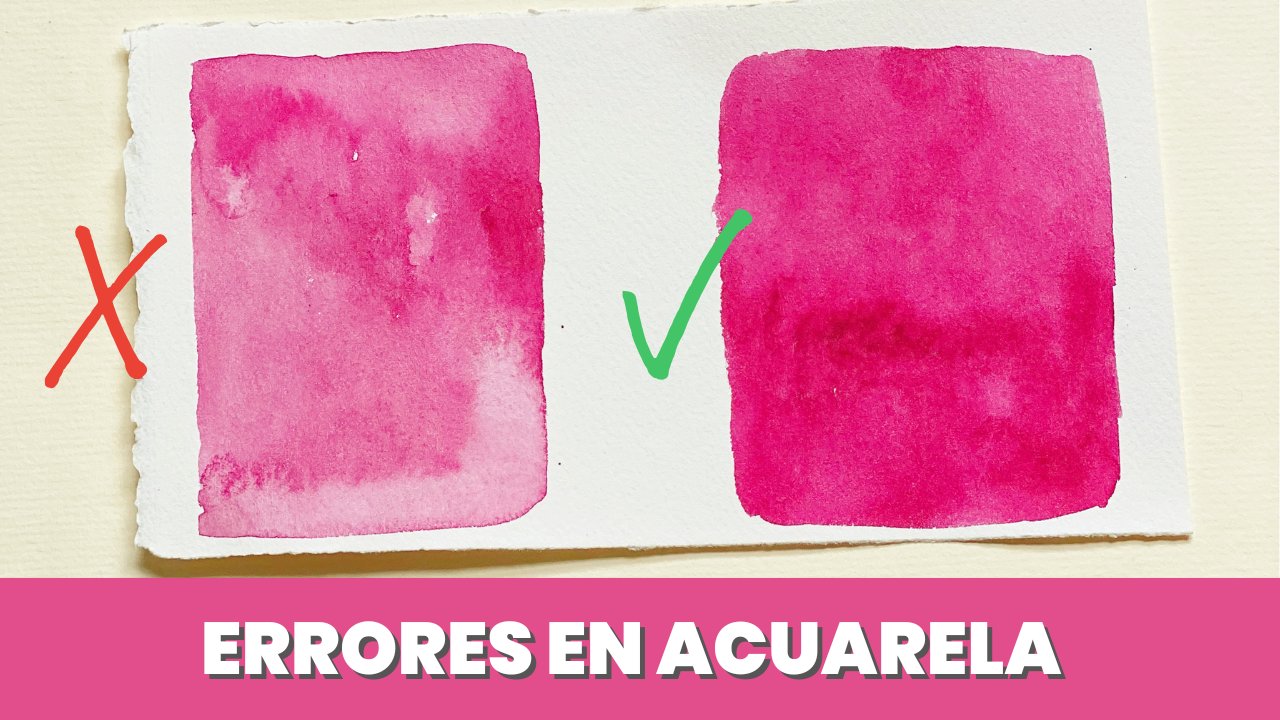
2. Supplies: Now we are going to do a review of the material. Regarding the paper. I always recommend to use 100% cotton paper. Then the brush is our referral of synthetic hair of size 2 over 0. These are the watercolors that I'm going to use, but you can use your own ones. And absorbent paper and two containers with water. One to clean the brush and another to collect the clean water. We are also going to use some white ink markers and others with black ink. These are calibrated markers. Their brand I use is Micron and Staedtler. It doesn't matter one way or another because actually it is the same mark. The important thing here is that the ink is waterproof. I have several markers of different sites. The deep can be 0.50.2 and so on. I like to have several sizes. This is a Posca marker, is an acrylic marker that has a different deep. Then I will show you how to use this type of marker. For the whites, we have three options. One is a Posca marker. These has a different IP, but it is used as the black one. You have to shake it. And Denmark is not an upturn that I like very much because it's not usually very opaque. So I usually use our white helping from the only bulb brand. And I will show you later how I use them. Another update on that I like is wash. I will say that of the three chapters, It's the rest because it's super opaque, but also is more difficult when it comes to pulling lines. I'm going to do one proof of how these markers will paint on the surface already painted with watercolor. First, we have to shake the pen and then we can paint. As you see, it's quite opaque, but sometimes it does not behave in this way. Another obtain is the white helping. We are going to draw here a few lines. What happens here is that sometimes it leaves some groups through which the deep basis, so it does not look very good. What we can do to avoid this is to hit the band first event. So sometimes it also does, is strange things, but the line is finite that the one a Posca can make. Now I'm going to use the black Posca. These has a different tip. So do use it. You have to shake it and then you have to press the tip. Just follow the instructions, read that deep so the ink comes out to the surface. Then we pull the lines. You have to be careful with the texture of the paper because sometimes the ink jumps to the sites when making the lines. That is why I usually prefer to use calibrated markers, both the micron and a Staedtler. The bad thing about these markers is that sometimes the ink doesn't come out or doesn't flow at issued and it's not as opaque as the black Posca. The best is to have both of them so we can change it according to our needs.
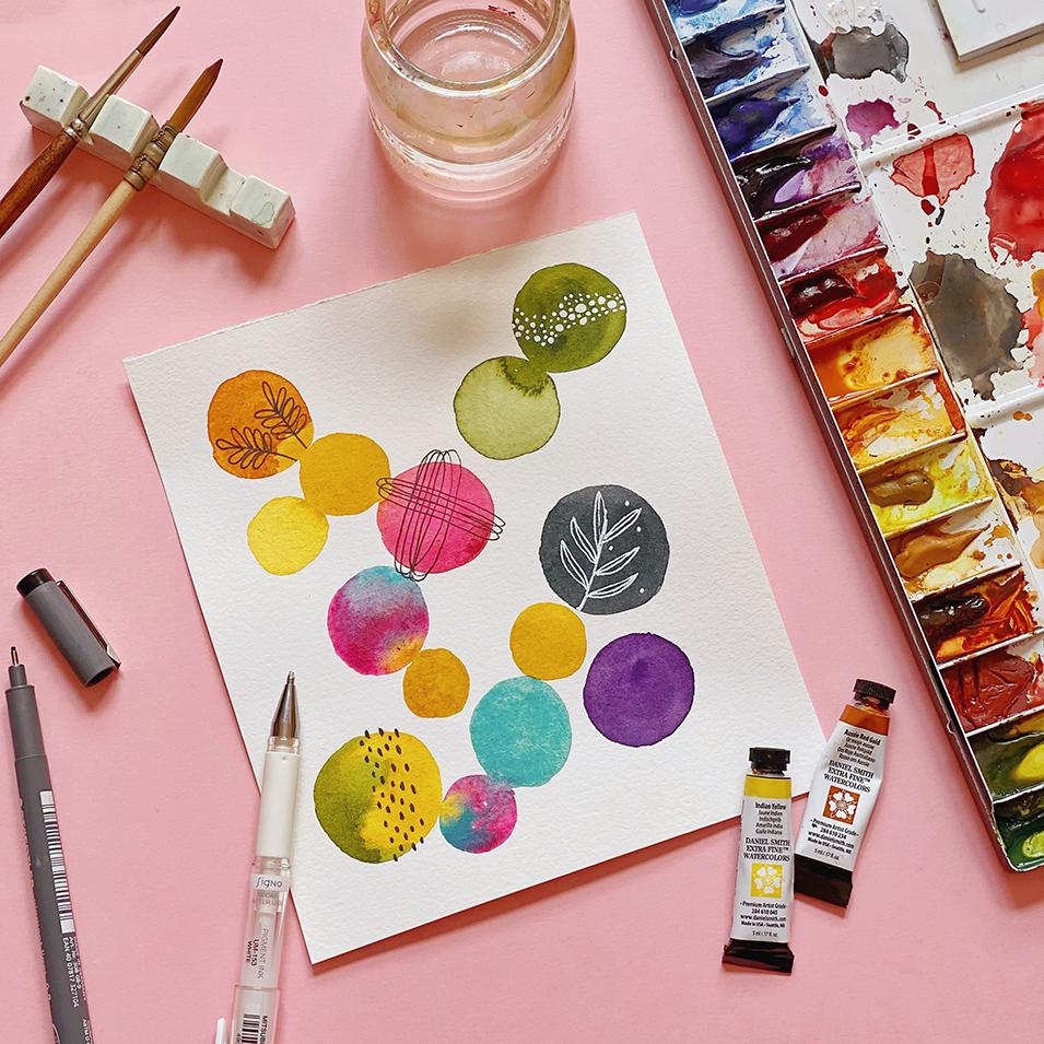
3. Shapes Catalogue: The first thing we are going to do, isa shapes catalog that we can use. In this type of research. You can let yourself be carried away by appropriation. But if you are not going to do it this way, It's better to keep a record to be able to control it every time we paint. I'm going to show you an example that I have already painted. In this case here, I have paid in some circles, I have been done some botanical elements and some lines. So we're going to start with our catalog of shapes to take them into account. The idea is that over time, you will not need to use this register. We will only do this at the beginning. Then you will be clear about which shapes you are going to paint. And you won't need to consult it. For example, I have done it, improvise it on my sheet. But if you want to do it quickly and not be thinking about we are going to paint. It's better to have a record before. For example, we kinda start painting circles and other funny shapes as the dashed lines. Another thing that I usually like to paint a lot are the circles with shapes around. Here. I'm going to paint a circle. Unlike some planets around it, it can also be dashed. Lines are lines as if they were this arms race. Options are infinite. The best thing is, start painting on inspirations comes to your waist on ideas as you go through these warm up exercises. And then you want to consult this catalog of shapes. But I think at first it's a good idea to have it because sometimes we get a stack and then we don't let flow our watercolors and our creations. In this example that I'm going to show you, I have made some of these shapes. As you can see. I have made some concentric circles that we can also add to the catalog. I have made some circles, triangles, hearts, so you can see how you can apply it later in your projects. Another record that we can keep is leaves and flowers. This is a little more complicated and I recommend you to try to draw the leaves and flowers yourself. So you will have your own catalog. If not, you can copy some of the elements that I'm painting here. The leaves and flowers that we paint by ourselves. We have our personality and we all have a way of growing. So I think it's a good idea that you do it on your own pace. You can copy it from real photos or you can also be inspired by Pinterest. You don't have to do all the catalog in their first date. We are going to use them in the following exercises. As I have told you, it's not necessary that you do the same ones that I did. So now we are going to start experimenting with watercolors. Ink.
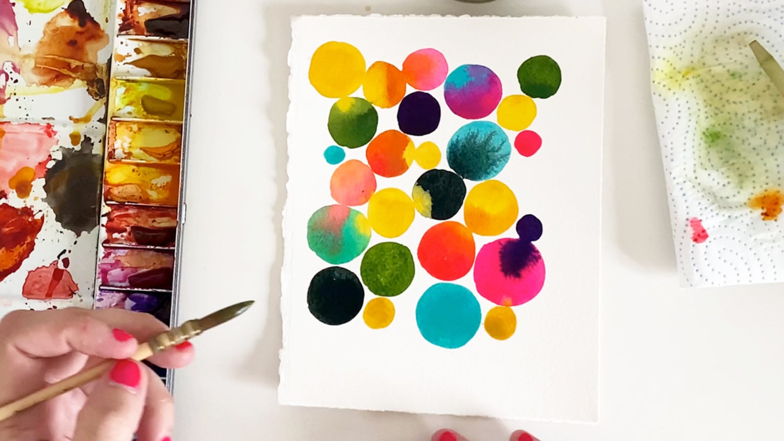
4. Abstract illustration: In our first exercise, we are going to make an abstract composition. I'm going to show you some of the examples that I have made. We can make circles or more elongated shapes and then draw any motif inside. We can also do several circles together or make a series of spots of different colors. In this lesson, we are going to do one very similar to this one, but with more circles. If you like more any of the ones you have seen here, you can also do it that way. I like the circles because you are going to see how the watercolor flow from one circle to another. I think it's a very beautiful and relaxing effect. So I'm going to do it that way. I will use the same color palette as this one. That would be a yellow with different shades if we add water. And orange, sap green, indigo, purple, a neon pink called opera pink and turquoise cobalt blue. I don't follow any order. While painting, I just look and think which color will look good. The base of this illustration is yellow, which is the color that I'm going to use the most. Try to join a circle with the previous one. So you can see how the water and color are exchanged between one and the other. They don't have to be perfect. You can also use more or less water. You can even go including water once painted, because that way gives you some characteristic shapes of the watercolors. In the next minute, I will continue painting this illustration. So you can go forward if you want to continue with the explanations. Now, we are going to draw the shapes with the calibrate that marker and the white gel pen. We are going to use as a reference, the catalog of shapes that we have painted before. I usually use that white gel pen when the circle is dark to make it contrast. And don't use it in the lighter colors. It's not necessary to paint all the circles. I'm going to do only a few, but you can do it as you want. What I tried to do is find a balance. In this first circle. I'm going to paint the dashed lines on dark backgrounds. I like to use the white gel pen. I'm, I usually draw leaves. The pen has been closed for a while, so I'm going to test it to see if it's working correctly. I'm going to place the drawings as if they were a zigzag from the top to the bottom. I have already finished my illustration. But if you want, you can draw in more circles. Or even all circles.
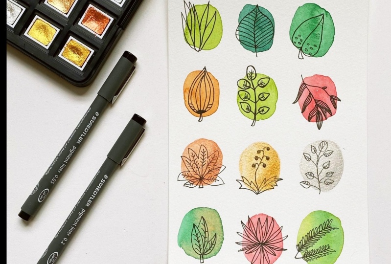
5. Botanical illustration: T. In this lesson, we are going to make a
botanical composition. I'm going to paint
several circles in four rows of three circles each. I will be using
several colors like many shades of green
and pink orange, and maybe a metallic color
like copper or silver. This green color is from
the White knights brand. It's a pastel color and
it's very beautiful. I test the color
on another paper to see if the
consistency is correct. The next color I'm going
to use is an olive green. Turn into dark. You can
place the circles by eye, but keep in mind to always
make three circles per line. It's not necessary
to copy my colors. If you don't have much
idea of color harmony, you can follow my class
watercolor color theory. I like so much this color is an olive green
from Bangkok brand. One of my favorite colors is also the sired gold
front Daniels meat, which is the range that
I'm going to use now. As you can see, I'm
using several greens. You have to be
careful when choosing the green colors as some are very dark and can
break the harmony. It's better to test the
colors before painting. This pink is also from the
pastel range of white nights. One color that is
to have is green, as is a basic green
that we can use. The colors that I usually like the most are
from Daniels meat. This yellow is Azo yellow. I use this color in almost
all my water colors because it has a very
beautiful golden color. I never paint directly
from the pan. But in this case, I want to
make very pigmented circles. What I do is put a drop on the pan and then
collect the paint. What happens in the
golden water colors is that it's very difficult
to get the consistency. So I have to use
very little amount of water to collect
the pigment well. The next screen
that I'm going to use is a color
called bamboo green. It's a very intense green. Let's try it first in this paper to see
if it convinces me. I don't want to
paint more greens at the beginning of the row, so I put it in the middle. Following color is a hansa
yellow also by Daniel Smith. It's an orange yellow. Last color is a mix
of white nights pink with a magenta color to make
a slightly darker pink. Okay. Now is when we can use the catalog of flowers and leaves that
we have made before. We can go from paper
to illustration. As I don't have many here, I'm going to improvise more shapes so later
I can copy them. In this exercise, I'm going
to use the black marker. If you have painted
a dark circle, it's better to use
the white marker because the contrast of white
in attack is always better. These illustrations are
very nice to decorate, but I have already done
a few before this one. It's better to do a
few ones before to warm up the hand and
then make a final one. The idea of these exercises
is to relax and inspire you, please do not feel
under pressure. I'm going to leave the
video with music in case you want to continue
copying my drawings. If not, you can go to
the next exercise.
6. Trees illustration: In this lesson, we are going to paint at
risk illustration. These tend to a lot, so let's make one of
these two compositions. We can do it with a black and white marker or some shapes with a
white marker inside. We are also going to use the white Posca marker
for this exercise. Later, we will see
how it's used. The lines made with
Posca are SCA, so we are going to use
both this and the Y pin. For this exercise,
we are going to make different shapes doing
like bushes or threes. To make them different, I'm going to use two colors
for each tree or bush, starting with an orange
and yellow color. There is no reason to
do perfect shapes, but try to make them different. The idea here is that we have a good time while we and paint. For the next tree,
I'm going to make an elongated shape
and use two colors, the green gold and
the sub green. Always try to put the
dark color at the bottom. On real trees, the
shadow is on the bottom, and the light is on top. If you don't want
to do it that way, it doesn't matter because we are not making a
realistic composition. You can even do it
only in one color. I have done it like this to
make it a little different. Now I'm going to
make a tree a little more elongated and
use a pink and Amagenta The pink that I always uses the opera
pink or bright opera. We can also create
our own greens. For example, with this
turquoise covalt and a yellow, I can make a very
different green. The last push will be the
same as the first one, painted with orange
and burn Sienna. To make the trunks of the trees, I'm going to use a
stdler marker with a thick tip copying it from the reference
that I have here. The line is so, so I'm going to go over it with
the Posca marker. To use it, you have to shake
it and then press down with the tip so that
the ink comes out. For filling the trees, we can take out or catalog
again and copy the shapes. For the first push, I will paint concentric circles. For the second tree, let's do another type of trunk
with the Posca marker. As the bottom of
this tree is dark, I'm going to paint it in white. As you may know,
you have to shake it and then test
on another paper. If the ink doesn't
come out properly, you have to shake it again. In this tree, I'm just going
to paint some branches. I don't need to use
my catalog of shapes. The exercise itself is
not very complicated. I'm going to leave the video in case you want to
copy my designs. At the end of the video, I will show you how you can
complete these little trees. I'm going to put a little feel here under the trees with
the color green gold. Just paint a very
big meted base and going until the rest
is to your liking.
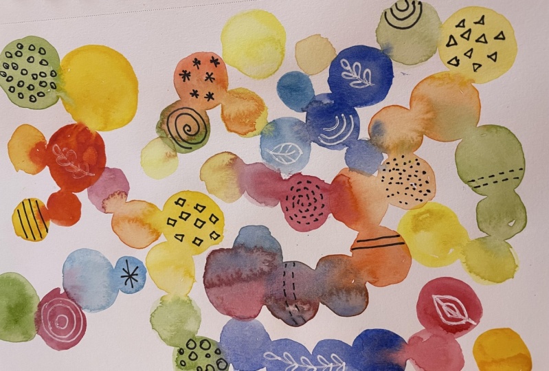
7. Doodles: In this less so, we are
going to paint doodles. It's a very simple exercise that we can even
do with children. They are watercolor
spots painted with ink in the
shape of animals. For example, a B or ai. In this exercise, I'm going to do the
elements separately. I'm not going to make
a final composition. You can do it by your own with the elements that
you have painted. The paper is son AquarelL. Cellulose paper because they are test and don't need
to use a good paper. To draw the bees, you
just have to make some spots in the
shape of a circle. I'm going to make three spots to make three types of bees. When the drawings are dry, then we will draw the
lines of the bees, the tail and also the wings. While we let it dry, I'm going to paint the
shape of the cheek. For this, we will make
a drop shaped spot. What I have done here is
paint it into colors, but you can paint
it as you want. Let's do two cheeks, one looking to the left and the other looking
to the right. Finally, I'm going to draw another circle and
turn it into nail. But you can make more spots
and invent other animals. To paint the piece, I'm using
the calibrated markers. What happens is that
sometimes the ink dries. I'm also going to use the posca if the
lines are not okay. Paint this little
piece. It's very easy. First, you have to paint three lines that are
the lines of the body. Then you paint the eyes
and a smiling or sad face. Also, draw a line as
if it were the tail. Try to paint the three
piece different. For the cheek, I'm going to outline the drop shape
with this posca, which is a little thicker. The funny thing is to paint them looking at
different places, Also make the eyes and
wings in a different way. But basically, the shapes
are always the same. Draw some shorter
legs, another longer. The eyes, the, some
hairs on the tail, and others on the head. In the last shape, I'm going to draw a snail. Let yourself be carried
away by improvisation. One of the cons of using posca is that they
take longer to try. So be careful not
to drag the paint. Let's go to do another exercise with the spots in
the next lesson. You will see that it
will be very fun.
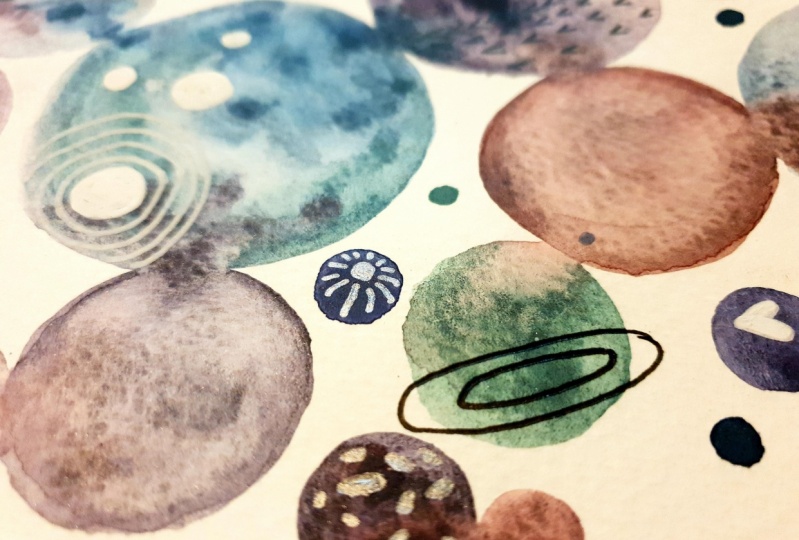
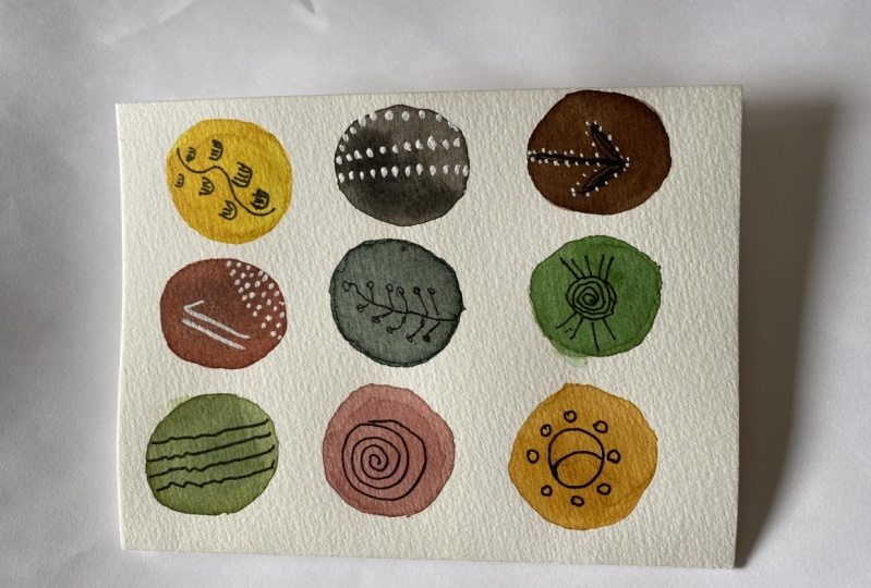
8. Improvisation: For this exercise, what
we are going to paint is some meaningless stains
without thinking about it with poorly defined shapes. Imagine that you are little again and you look
up to the clouds. You see recognized
shapes in the clouds, an airplane, a flower, a snail, a herd, a dragon. We are going to do the same, but with watercolor stains. This exercise may take time
because I have thought, well, what I'm going to draw
before recording the video, but don't worry if it
takes you more time. Make sure that the stains
are dry before painting. The first stain I'm going
to do is the Magenta. It reminds me a
bit of Mario Bros, so that's what I'm
going to paint. This is a very free exercise, so you don't have to go
over the wall stain. You can leave caps and paint. In this blue stain,
what I see is like a head with his nose, his legs, and his spikes. Okay. This one reminds me of a meteor
falling to the earth, so I'm going to paint the
meteor and like fire. To emerge in shapes, it's not necessary that the paper is always facing
the same direction. You can turn the paper to search for shapes in other directions. The orange one reminds
me of b with flowers. This yellow is a bit
difficult for me. So I think finally, I'm going to draw a fish. The olive green doesn't
tell me anything, so I'm going to turn the paper. I think I'm going to draw a
kind of rabbit or a mouth. The purple one, I
don't know why it reminds me of Mary
Poppins with her hat. You don't need to
have drawing skills. The idea is to be a little
more creative, don't worry. Sometimes we obsess that only realistic drawings are
drawings that deserve worth. But what we have to
do is art that tells us something that generates
feelings and emotions. For the final project, try to make an abstract painting with water color and ink. See you in the next class.
 Lara Fernandez Muñiz, Watercolor artist & Content creator