Transcripts
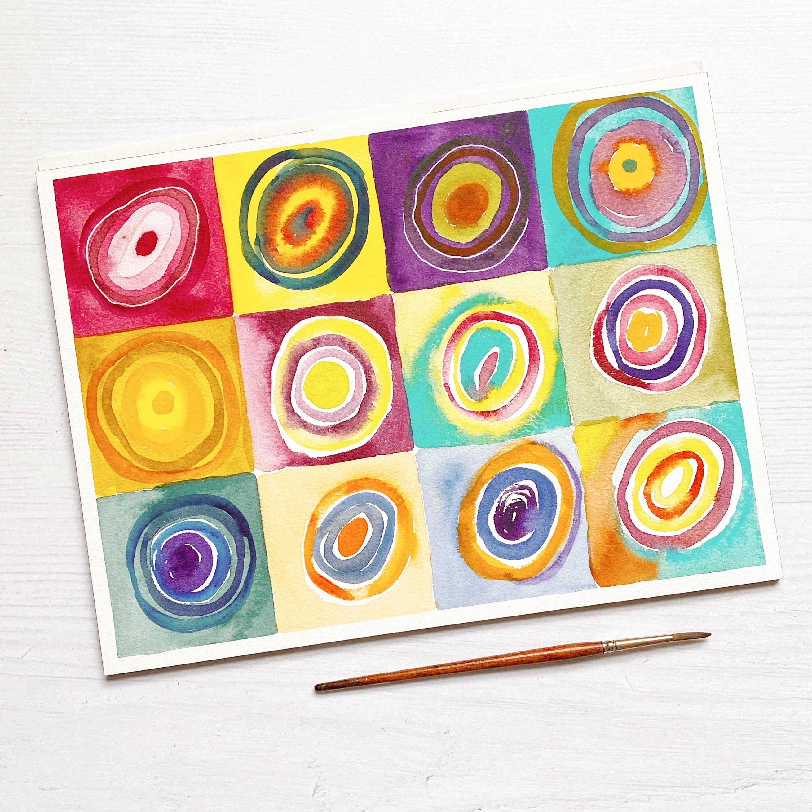
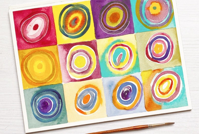
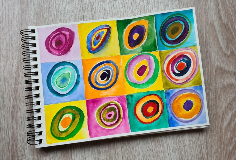
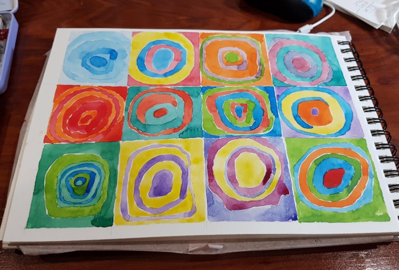
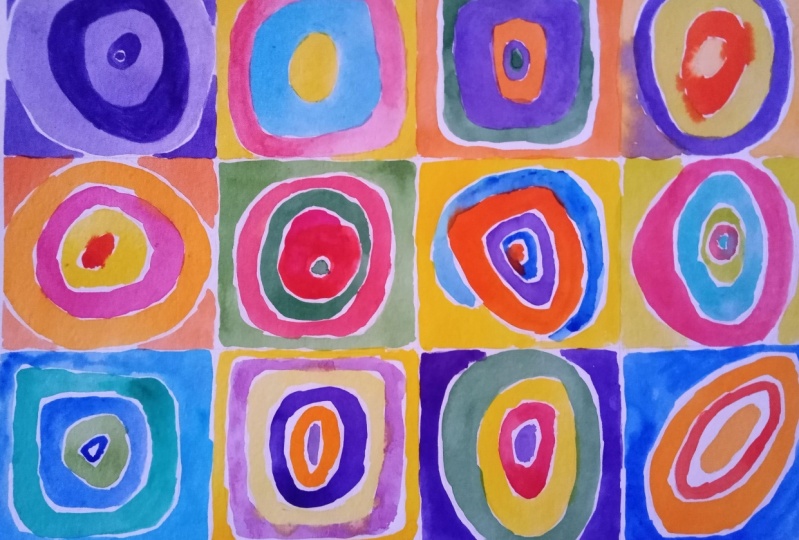
1. ¿Qué aprenderemos en este curso?: Hello, I am Lara and I welcome you to my course Theory of color applied to watercolor. In this course we will do very, very simple exercises, so you can do it from any level, even with little knowledge of watercolor. In this course you will make a color wheel with the three primary colors yellow, magenta And blue. I will tell you about the properties and qualities of color through some very simple exercises. You will know all the types of harmonies that exist. And how to create a mixing chart from the colors you currently have in your palette. For the final exercise we will do a color study like the one Kandinsky did in his painting Squares. and concentric circles. You can take the course if you use other media, but there are certain particularities in watercolor, because its way of lightening colors is water.
2. Materiales: In this course we will use two containers for water, a brush. It doesn't matter the size, although mine is Raphael size 4. In watercolors I advise to have at least 10 colors, but the main ones would be yellow, magenta red. and blue. To better control the water I advise you to use a dropper and also a mixing palette. We will use a 4-H pencil, a compass, scissors and a ruler. I recommend using a paper that is 100% cotton. At least for the mixing chart and some things you want to keep for practice I advise you to use a paper that is at least a percentage of cotton. This one has 25 percent and is quite good, and if not, what you can do is to use cuttings of leftover paper you have.
Recorders, they are Peleus get Diane's over the other.
3. Creando la plantilla del círculo cromático: You can make your chromatic circle any size you want. I have done it in these smaller ones because as I want to keep it, it is easier to handle, but you can use any format you want. In the downloadable templates you have the templates in two sizes. We take a compass and make a radius of five centimeters. Press. And we make the circle. Now with a pencil. I usually use a 4-H. because it doesn't mark much We make a line from side to side. And now another to cross it. To make the twelve parts we take the compass again, we put it at the end of the line and we mark. And we do the same at each end of the lines. We already have the circle divided into 12 parts. Now we are going to make the cheeses. Always cross one end with the other, passing through the center of the circumference. Now we are going to make a smaller inner circle. I'm going to make it from half of the previous one. It would be 2.5 centimeters. And now we have the finished the color wheel. Let's delete these lines and we'll be done.
4. Entender los pigmentos de las acuarelas: The pigments that make up our watercolors are important when mixing colors, because depending on the pigments they contain, the resulting mixtures will be different. We are going to mix the magenta Quinacridone with three different yellow colors. The first color we are going to use is Indian Yellow. A Daniel Smith color that is super cute. We are going to mix it with the magenta and see what kind of orange comes out. The next yellow we are going to use is Mijello's Lemon Yellow. The third color we are going to use is Hansa yellow by Daniel Smith. It is a rather yellow-orange color. As you can see, depending on the yellow you use, you will get one type of orange or another. all oranges are beautiful, but they have their particularities. In each tube you will find the pigments contained in each watercolor. This one, for example, has a PR 202. This yellow has two types of pigments PY 97 and PY 150. It is from Mijello, has a PY3 pigment and this one from Daniel Smith has a PY65 pigment. In the resources you have a link where you can consult all the pigments and their meaning. On the label you can check other things such as the lightfastness, which is the resistance of the watercolor. to light if it is transparent or semi-transparent and also the permanence of the color After having dried.
5. Pintando el círculo cromático: For this exercise I am going to use the three primary colors and the three secondary colors. For the blue I am going to use this ultramarine blue. This one is lemon yellow, which is also supposed to be the purest primary in theory. For the red color we will use a magenta red. This is quinacridone magenta. As for the secondary ones, the green I have chosen is bamboo green, but you can choose any green that you see that is neutral, that neither tends to yellow nor tends to blue. Pure orange I don't have to use this orange yellow, which is quite intense. And Violet, since I don't have many, I'll use the Bright Violet. As I mentioned before, I will leave in the resources a list of color names are those that can most closely approximate the pure colors. There is variety and you may have some from the list. I'm going to use watercolor from the tube and what I usually do to mix it is use this dropper because it's more easy. LI will do it on this ceramic palette in the shape of a flower. I will place the primaries here and the secondaries here. Let's think of the color wheel as a clock and set the yellow one at twelve o'clock in the morning. Now we are going to count three from the one we painted. One, two, three and the fourth. There we would place the next primary. At four o'clock in the afternoon we are going to put on magenta red. And at 8 p.m. we are going to put the ultramarine blue. For secondaries, for example, here between yellow and magenta would be orange. Ebetween magenta and blue would be violet, and between blue and yellow would be green. If you are going to make your circle with the primary colors, you would have to mix the colors that are close to each other. and in the middle place the secondary. As I told you before, I'm going to do it directly with the colors of the tube, so I'm going to start with orange. We begin with orange. Now Violet. And here would go the green. Before painting the tertiary colors, make sure that everything has dried well, because if not, at the paint the new colors mixed with each other and you will ruin your circle. I'm going to take advantage of the colors I have in the palette to make them tertiary. I'm going to take some orange and add it to this yellow. And the tertiary color would be called orange yellow. Try to make this color an intermediate between the two on the sides. Now we will paint the color red, orange. We add magenta to orange. For the red violet color we will do the same and we will do this for all the colors. And so we would have our color wheel finished. You may wonder why I have made it different from the commercial color wheel, and it is because I think it is easier to memorize the position of the colors. If we see it as a clock in which at twelve o'clock noon is the color with more light. Yellow would then go until four o'clock in the afternoon with magenta as the last warm color. And so, from five o'clock on, it would be the cool colors. As it gets dark.
6. El círculo cromático comercial: I'm going to teach you the basics to learn how to handle the commercial color wheel. Here would be the names of the colors or shades. There would be red, red orange, orange, orange yellow and so on. In the windows you can see the colors resulting from mixing these colors with other colors. For example, red, yellow, white or black. Remember that in watercolor we do not mix with white, but we use water. In this part we have the tonal values that the colors can reach, that is to say, their degree of luminosity. The back part will help us to know the harmonic relationships between colors. Let's put an example this arrow indicates which is the complementary color of blue, that would be the orange. The isosceles triangle indicates the complementary division. In this case, in blue would be yellow orange and red orange. The equidistant triad are the colors that are equidistant on the chromatic circle. For example, blue, red and yellow. There are also the complementary doubles. You select two colors and their complements in the form of a square or rectangle.
7. Propiedades del color: el matiz: Hue is the name given to a color that distinguishes it from other colors. Let's make a review of all the shades. The primaries would be yellow, blue and red. Secondary would be orange, green and violet. And between a primary and secondary, in that conjunction would be formed the tertiary colors, which is the yellow green, blue green, blue violet, blue violet, red violet, red orange and yellow orange. These would be the shades in the chromatic circle. Let's do a test with the colors I have here. Let's pick a color and see what its hue is. Let's take, for example, this yellow. This yellow is called Hansa yellow and it's actually an orange yellow. This color is called Aussie Red Gold. It's by Daniel Smith and as the name suggests, we already know it's going to be an orangey red. This other color is a Holbein color that I like very much, it is called Leaf green. This color is a green, but it has some yellow in it, so its color with its shade would be yellow. green. You can try to do this exercise with the colors you currently have in your palette.
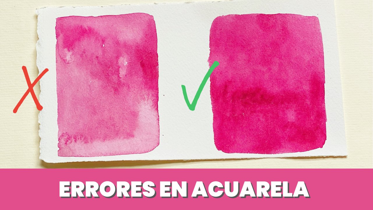
8. Propiedades del color: el valor tonal: The tonal value is the degree of lightness or darkness of a color in watercolor. Grad f or the Bushehr on color, color Blanco, color. We do not need to use white to lighten a color. That shows you some say Blanco colors, pastel. In fact, if we use white, the color will pull towards a pastel shade. Water is needed for lightening. Why Secure Score is So I'm going to choose the violet color, which is the darkest. But you can choose any other color. covered by muscles. We are going to use the dropper, as it is the easiest way to control the amount of water. Poiseuille's law must fascinated by the controller, our data. Then there's cafe Law. If you don't have a dropper, you will have to do it a little by eye. This is the darkest color we can get in watercolor, with very little water. I would have Now we are going to add a little more water with two drops. a mass out. The color is much lighter than the previous one, so let's keep adding more water. We are back to pour two drops. Well, I've had four. As to lighten this color I would have to be pouring a lot of water. I'm going to do it in a separate pot. You can try lightening this color in more steps and see how many steps you get. For example, it could be up to ten, twice as many as we have done now.
9. Ejercicio práctico del valor tonal: Why is the tonal value important? Let's see it with a simple exercise. I have printed this photo in color and black and white. You can download it in the resources section. Here you can see the light tones. Here the mediums and here the darker ones, the darkest on the scale would be this one. The medium color would be this one. And the light one More or less this would be it. Let's draw this mushroom, but with a black color and its shades. I have already drawn it, but you can make a simple drawing or trace it. Also, I'm going to leave a space because we'll paint another one in color later. The first thing we are going to do is to delimit the shadows in the drawing. There's a shadow here, so I'm going to delineate it in my drawing. We are going to skip this detail and I am not going to draw it. And now I will limit the shadows on the top. To reserve the fungus spots we could use a masking liquid like this one. But if you don't have it, you can do it by hand. How am I going to do it. Let's give a first layer to all reserving only the spots. Now let's paint the shadow of the mushroom foot and blur with a little water. The slat part of the mushroom is in darkness, so let's shade the whole thing. Now we're going to reserve the lighter colored areas and the rest we're going to paint. So that the edges are not too hard, I'm going to blur with a little water. Let's darken the color a little bit. I usually test on a separate piece of paper to see if the color suits me. We are going to continue painting the shadows of the plates. I'm not going to continue along the mushroom foot because otherwise the colors will be mixed, so I'm going to continue along the top part. No need to be too careful with the spots, as we are doing a test. Remember that in order not to have very hard edges you have to blur with water, but don't use too much water. water because you can spoil the drawing. I think this part didn't get dark enough, so let's make it a little darker. Take a look at the original drawing and darken the parts you consider appropriate. Let's keep darkening the foot, as it's very clear, as you can see, this is a layered job. We're going to keep layering and we're going to keep darkening the mushroom. To blur the edges. Remember that you can wet the brush, but then it will discharge the excess moisture on a cloth. You can continue doing as many coats as you see fit. I think it's missing a little bit here. So I'm going to do the last layer. Now I'm going to do the final touches, where I think it needs a little more darkness. To highlight the spots on the mushroom cap, let's apply some fairly pigmented watercolor underneath. to give it shadow. And with these details we will have finished our mushroom in a grayscale.
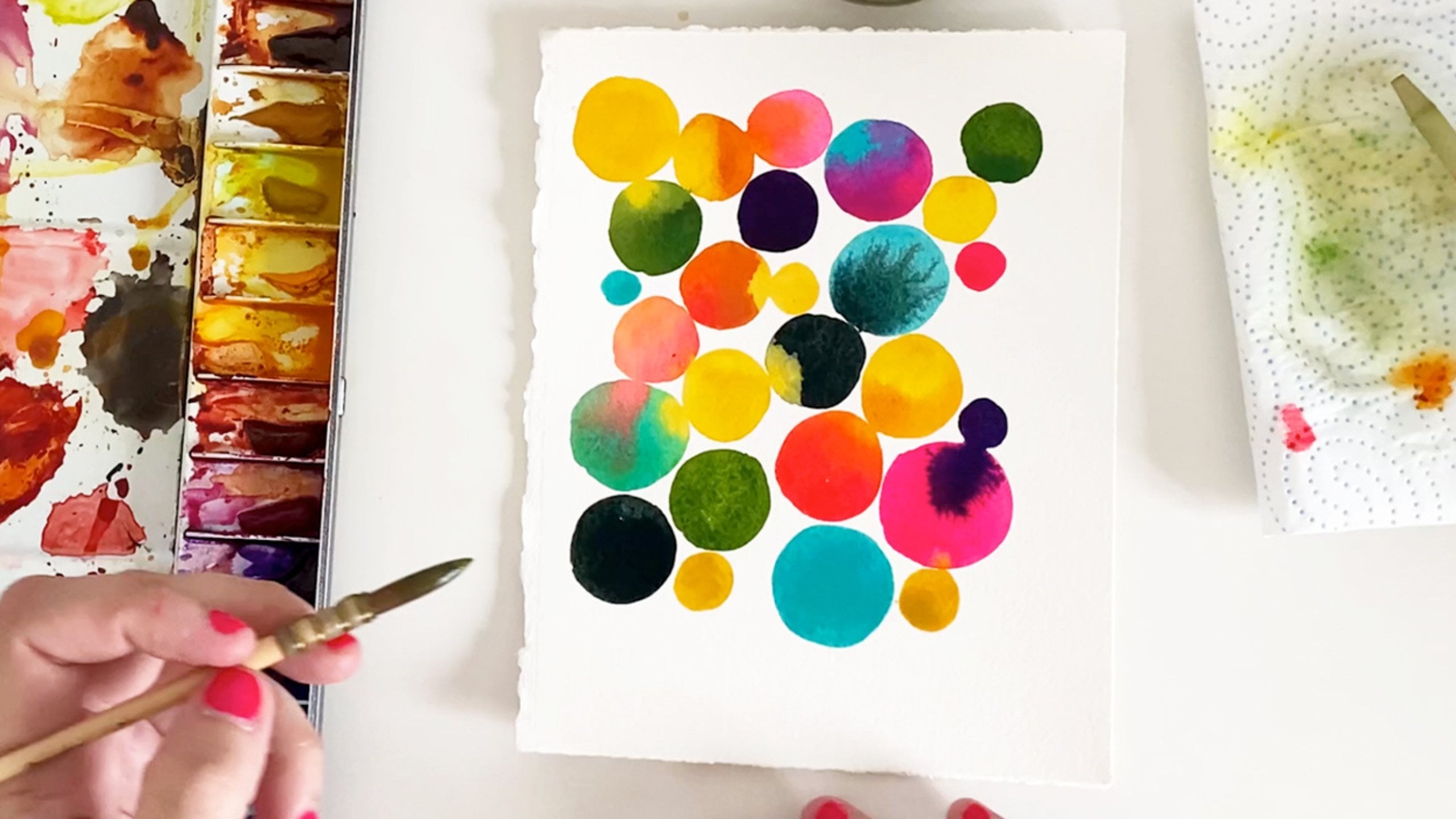
10. Propiedades del color: la saturación: Saturation is the purity that has a hue, a saturated color is a vivid or intense color. to turn off the intensity or saturation of a color. You have to darken it by mixing it with its complementary. If we take the color wheel we made before, we can use the yellow with the violet. Orange with blue or green with magenta red. No need to use a good paper for this exercise. Any paper you have left over from something else will fit. Let's paint the first circle with yellow. For the next one we're going to add very little violet in the yellow, because violet is a very strong an darkest color. So with a little bit that we throw in it's already going to quickly expand into the yellow. We do the same thing again. And as you can see, the color is more and more muted. Keep doing these steps over and over again until you see that the color is as dull as possible. To saturate a color, you have to use its complementary. These are the steps I have done to get from yellow to a muted or neutral color. We could keep doing steps and turn the color into its complementary. Let's do the same, but using the black color. I'm going to use Daniel Smith's Neutral Tint because it's the blackest color I have. Be careful when mixing the black with the yellow, because with a pinch of it we can darken it enough. I'm going to paint the first circle yellow, here i soiled the yellow color unintentionally. But since I haven't mixed it yet I can use it. Now we have to repeat the steps, as in the previous exercise. Make sure that there is always a color change here. I'm not getting it, so I'm going to pour pigment directly into the mix for black. It's very watery. More interesting colors are always going to form when we use the complementary color. The black color will change the hue of the colors. Here we got an olive green color. Therefore, to paint shadows we will use the colors mixed with their complementary so as to more harmonious compositions. In addition, it is always convenient to use saturated colors with other saturated colors to give more richness to your compositions.
11. Breve resumen de las propiedades del color: Now let's make a brief review of the color properties. This is the orange color, or what is the same, orange is its hue. To lighten it, what we do is to pour water on it. What we're working on here is its tonal value or lightness. To darken a color remember that we don't use black because it changes the hue, but we use its complementary color to darken it. You can do an exercise of converting a color into its complementary, in several steps. We would call this saturation or intensity, or turning off a color when you want to replicate a color. Remember to find its hue, turn it off with its complementary, and find the degree of lightness with water.
12. Cualidades del color: la temperatura: On the color wheel, the lightest color is going to be yellow and the darkest color is going to be violet. We are talking about the luminosity of these colors. The warm colors are the colors ranging from yellow. Up to violet red and cool colors are the colors ranging from yellow, green to violet. So let's paint them. These six colors that I just painted would be the warm colors, which are yellow, yellow, orange, orange, red, orange, red and red violet. I will now move on to paint the cool colors starting from violet to yellow green. And these would be the cool colors yellow green, green, green blue, blue, blue violet and violet. There are two colors that we can say that they are the poles of cold and hot. It means that these colors are always going to be cold or warm. And these colors are blue green and red orange. No matter what colors we put near them, they will never change their temperature. I'm going to show you now with an example, what it means that a color changed its temperature depending on of the color next to it. This exercise is called hot and cold contrast. We are going to paint the color violet and we are going to put cold colors next to it. As violet is already a cool color, there is not going to be any variation in its temperature. But what would happen if we add warm colors around the violet color? Well, the violet color will acquire a color that will look warm to us. This is called contrast of cold and warmth.
13. Los colores neutros o apagados: To get neutral colors what you have to do is to mix a color with its complementary one and in that one range of colors there will be a whole infinity of neutral colors. They are also called muddy colors or muted colors. For example, we are going to use the yellow color and we are going to mix it with its complementary, which is violet, and from there we will get a neutral or muted color. Any color that we mix with its complementary is going to give us a color of this type, but playing with the quantities of the mixtures. We will find a great variety of saturated colors. As I don't want it to seem that I have a little obsession with yellow and violet, which is the one that I use in all the exercises. Let's try red and green now. I'm using magenta red and sap green according to the colors you use. You can use one neutral color or another. It may seem that all these colors are the same, but if you look closely you will see that they have some differences. shades. Remember to test using different amounts of each color to see what kinds of colors may appear. But what happens when we mix the three primary colors? Well, the color that emerges is a black color. To get this black color you will have to mix the primary colors in the same proportion. So now you'll see that I have to mix them several times to get to black. To know better your colors, I recommend you to make the choice in which we do a chart of mixtures.
14. Cómo conseguir tonos piel: Let's take a look at what the shade of a Caucasian skin tone would be. In this case it would be the orange red to which adding a little white would make this type of skin color. Let's do it ourselves in our palette to get an orange red. We are going to mix an orange color with some magenta. This color now we are going to have to lighten it using some white. You know that the white in watercolors what it does is to pastelize the color a little bit. We're going to keep throwing white until we find a shade we like. This tone already looks a little more like what we are looking for and if we want to lighten it, we can always use the water now. To darken the color we will use some blue. But be careful when you use the blue, because it will darken this color immediately. So, pour it little by little. Another way to get this light skin color is to use the ocher We also have to add a white color to it to impastel it, as we did before. As you can see, the result is quite similar and we have saved ourselves from doing a mix.
15. Ejemplos prácticos del uso del color: Let's do two oranges now. In the first one we are going to use only one color and in the second one we are going to use several colors to see if there is any difference in these compositions. In the first layer we are going to give a rather watery orange-yellow color. Here I have too much pigment, so I'm going to lighten it with a little bit of water, because it has to be a fairly transparent layer. In the next layer we are going to use an orange. I use an orange red color called Aussie red gold by Daniel Smith. Now we would do the shadows and we can think about how we're going to darken these shadows and we would use the color orange a little bit more pigmented. In the next layer what we would do would be to continue pouring orange a little bit darker this time, at this time, to these by now you will have realized that no matter how much more orange we spray, it's not going to change much our composition. Now we are going to paint another orange using more colors, although in the first two layers we would do the same. Now, to shade, we could mix orange with its complementary. Or we can also use a brown color, as I am doing now. Once dry, we could paint it with another brown a little darker. Here are the two oranges together. You might like them both, but the one with the most richness is the orange one on the right. We have used several colors. Let's try to make the shadows with an orange and its complementary color and let's see the result. To do this, we have to add a little blue to the orange. You know that if we mix two complementary colors, the resulting color is going to give a neutral color, so it will come out a kind of brown, which is the color I used before to shade the other orange. As you can see, the result it gives is much more interesting than if we just used orange. If you remember the tonal value exercise we did earlier was with this mushroom. Now we are going to do its color version and we are going to use several colors. We're going to look at what colors the mushroom is and we're going to replicate it on paper. The idea is the same because this mushroom will have its midtones, its dark tones, its light tones. But you would say this mushroom when you visualize it. Well, this mushroom is red and white and maybe it's got some orange in it, but if you look closely, here we see a white color. Above we see an ochre or orange color, a darker brown color. Here's a red. There may be a darker red mixed with violet. There is also an orange that there are white colors. For the mushroom foot, then I'm going to use an ochre color. For the shadows on the blades I'm going to use a slightly more pigmented ochre, though then darken it. We'll see. For the hat we're going to give a little light orange as a base. I have given it a base with a yellow orange color and now I am going to make the next layer with a yellow color. already more orange. For the foot shadow we are going to use a slightly more pigmented cree. These weird edges are formed because I have poured a lot of water, but since we are going to paint it red on top, it doesn't matter. The next color we are going to use is going to be a mix of orange with magenta red. Now we are going to darken these shades with a darker brown color. Now I'm going to add the red and it's going to be a scarlet red. I'm going to add another coat of ochre to the foot, because I think it's still missing a little bit of tone. In the darker areas, the red is mixed with violet. So that's what I'm going to do. I'm going to do a red until I find the color, which I think is the one that comes in the picture. The shadows I think should be darker, so I'm going to keep darkening with brown. As we dry I really like the red that's left, so I'm going to give it another coat of red on top. Now I'm going to give the shadow under the spots and I'm going to do it with a red color. We can do a little bit of shading on the foot. With its complementary color, with a little bit of blue. And finally, to give a little shade to the spots. I'm going to use a gray. And we would have finished our full color mushroom.
16. Tipos de composiciones armónicas: Let's make a review of all the harmonies that exist. The first one would be the monochromatic one, we are going to choose a color and we are going to paint different tones of that color. The color I'm going to choose is going to be red. Remember that in watercolor we lighten with water, so we are going to make different shades playing with the water. We could even desaturate the color with its complementary. If you notice, this is what we have learned before about tonal value and saturation. Now let's do the analog compositions, analogue. It means that two or three colors are close in the chromatic circle. So I'm going to choose blue, green, green, green and yellow green. Let's try another analogous composition. We are going to do it with him. Red, red, purple and purple. The next one is going to be the equidistant triad, which are three colors that are equidistant on the circle. chromatic, such as the primary colors yellow, blue and red. Let's try another triad. In this case we are going to choose the secondary colors orange, violet and green. This type of harmony, formed by an equilateral triangle, is called an equidistant triad. Complementaries are two colors that are opposite each other on the chromatic circle, as can be be yellow-green and red-violet. Let's do another example. Other colors that are complementary are yellow orange and blue violet. Next would be The complementary doubles you choose two colors. And your two complementary colors you would do in the form of a square or a rectangle. I'm going to choose orange, yellow and blue and violet. We're going to pick four other colors in the shape of a square. So it was orange in yellow, green, blue and violet red. This is called complementary doubles and would be in the shape of a square or rectangle. Let's make another one so that the colors don't look so similar. Let's choose red, yellow, orange, green and blue. Violet. The following are the split complementary would be to pick a color and pick the colors that are adjacent to its complementary, it would be yellow, blue violet and red violet. Let's do another test with another color. We choose a color again. And the adjacents of its complementary, in this case we choose the orange and its adjacents of the complementary. would be blue green and blue violet. Let's do one last test. I'm going to choose another color. I'm going to choose red and its colors would be blue green and yellow green. These would be the split complementary and it would be formed by making an isosceles triangle.
17. Dónde encontrar inspiración: A place where we can find inspiration. It's on Instagram, for example, this profile is specialized in movie color palettes or. series. For example, in this photo of Scarlett Johansson we can see all the colors she has. Another place to get inspired is on Pinterest. Here we also have palette ideas, but we can also look for other pictures that don't contain the palettes and look for what colors and what color ratio it has. There are other pages like a splash where you can find free access photos. For example, in this one we can see its browns, greens, yellows, ochers in nature. You will always find inspiration, because the colors of nature are already harmonious. For example, in this photo we can see the use of all the secondary violet, orange and green. Also books are a source of inspiration, for example, this one of watercolor and color. We can see different compositions according to their colors. Also suggestions of colors that we can use in our landscapes. They can also include explanations about watercolor techniques, but they don't only have to be books. that talk about color. You can look for watercolor inspirational books, or picture books, or nature books. or books of scientific studies. Really, anywhere we can find inspiration.
18. Elegir los colores para el cuadro de mezclas: In this section we are going to make a mix chart. Here you can see a mixing chart I made with 25 colors that took me a lot of time. So we are going to be one of ten colors. If you have less colors, then you can make it smaller and if you have more colors, I recommend you to choose only ten so that it doesn't take you too much time. I'm going to show you what colors I have chosen to make my mixing chart. The names of the colors are Hansa Yellow Aussi Red, opera Pink, quinacridone magenta, bright Violet, ultramarine blue, cobalt blue, cobalt turquoise, bladder green and a tan sienna color. I have chosen these colors so that more or less all the shades of the chromatic circle are represented. The yellow is an orange yellow, but it is a very nice color. They're orange, very bright. He operates Pink. I like it very much because mixed with other colors gives beautiful shades. Quinacridone magenta is the primary color. Violet is the secondary color. I like to have two blues because one is very dark and one is very light. Turquoise is a very nice green blue. Sap green is my favorite green and sienna for having a brown. Now let's put the names in the first row and in the first column so that they match on the first column and first row. In the first square we will put the same name and so in the second and so on. To make this template you have to see how big you want your squares to be. Mine are one by one centimeter, so they are a square of eleven by eleven, because you have to add a row to put the names of the colors. Remember to put the names in the same order, both in the row and in the column.
19. Pintando el cuadro de mezclas: For this exercise I recommend you not to use a paddle with wells, but a flat surface, because it will be easier to mix all the colors that we have to do. I'm going to do it in this one that I have in metal. Here I have all the colors in the wells and I can mix it in the center. I'm going to use an eyedropper to activate the color, because you know it controls the water better. I'm going to use Hansa Yellow, which is the first color I've chosen. We will paint this color in the box where the row and column names match. In this case it would be in the first square. Now we are going to mix the original color which is the Hansa Yellow with the color in the next one. row. That would be the Aussie Red. I'm going to take advantage that the color is activated to paint the box where his name matches. And now is when we will mix the two colors and we will paint the box, the box to paint is where the names of the two colors converge. Be careful when you are painting, do not paint close to the other colors you have painted, because if they are not dry they will melt. In this square also converge the two names in order not to repeat the mixture. What we do is to put a mixture rinsed with water. If you don't feel like doing it, you can also leave the space blank to make it faster. What I do is to pour the mixture and then pour some water. apart with the brush to spread the color. Let's continue with the color of the first row, which is Hansa Yellow, which we will now mix with opera Pink. I'm going to take advantage that I have to activate the color to paint the box corresponding to its name. From now on the procedure will always be the same. Let's mix the color we have in the row with the color we have in the column. Now I'm going to continue to paint the first row so that I can follow the reference and at the end of the video I will give you my conclusions. This would be our finished mix chart. I recommend you take a look at the colors and see which ones you like best. I especially like the ones formed when opera Pink and also cobalt blue are mixed. or turquoise blue.
20. Cómo pintar una carta de color: In this exercise we are going to make a color catalog in an original way. I have done it in the form of a circle or circumference, but you can do it in any way you want. Rectangular, square, circular, as you see, to make them exactly like mine. Let's make a circumference whose radius is two centimeters. We cut them out with scissors, although if you had a circle die cut it would be much easier. To make our catalog we can look at the table of mixtures that we have made in the previous one. exercise. For example, a color that might catch my attention is this one, which is a mix between purple and red. and opera Pink. We are going to paint the circumference leaving a little margin so that we can write the names of the mixtures. When I know we will be able to write in the margin that we have left the name of the mixture, for example, this is a pure color. But if we make a mixture, we can put below the two colors that make it up. For example, the mixture of these two colors gives rise to this new color. Now let's try another color. I'm going to grab the mixing box again and look for another color I like. One of the colors that I also really like is turquoise blue, so let's paint an new circle with this color. You can also make a catalog with the colors you currently have in your palette. It does not have to be with mixtures. I'm going to show you all the colors I have painted for my catalog and I'm going to order them as if I were by their position in the chromatic circle. I have chosen these colors like this because each one belongs to a shade or color of the chromatic circle. For example, yellow. I've done some shades of yellow, orange and orange. Red. The purple red. And the violet, the violet blue. Shades of blue, blue, green, green, green and green yellow. One way to save your colors can be with a scrapbook album like this one I have here. It's a special mini album I had for Instagram and it's from the brand We are memory keepers. But there are a lot of albums and formats you can use to save these colors. Once the colors we have painted are dry, we can write their name in pencil. This was a mix of violet with opera Pink and I'm going to write it as is in the margin. This color was not a mix, so I'm going to put the name of its color, which is turquoise. I encourage you to make your own catalog with all those colors that you like the most.
21. Cómo configurar tu paleta: Let me show you how I have it configured in my palette. These are all the watercolors that I currently have and I have decided to put them in these wells, at this metal box, because before I used to use a ceramic palette where I put the watercolor and mixed it. with water, but it made me waste a lot of paint, so I prefer to have it here, in this box of metal where I put the watercolors and let them dry for a couple of days. I've set them up a bit in order, as they are in the chromatic circle blue, violet, red, violet, red, oranges and browns, yellows and then greens. And in this other part I have put the colors that I find special and that I think I'm going to use as opera pink, this cobalt blue and some special Daniel Smith colors like lunar blue. What I have done is to choose two shades of each color. On this side I have 15 colors and on this side I have 5 colors and I have two greens, I have two browns, then I have other yellow shaded colors, I have a red and a magenta, I have a violet, various blues and an indigo color. You can use this configuration as a starting point, but then you can vary it. When you see that you have never used a color, you can replace it with another color.
22. Ejercicio final: Let me show you how I have it configured in my palette. These are all the watercolors that I currently have and I have decided to put them in these wells, at this metal box, because before I used to use a ceramic palette where I put the watercolor and mixed it. with water, but it made me waste a lot of paint, so I prefer to have it here, in this box of metal where I put the watercolors and let them dry for a couple of days. I've set them up a bit in order, as they are in the chromatic circle blue, violet, red, violet, red, oranges and browns, yellows and then greens. And in this other part I have put the colors that I find special and that I think I'm going to use as opera pink, this cobalt blue and some special Daniel Smith colors like lunar blue. What I have done is to choose two shades of each color. On this side I have 15 colors and on this side I have 5 colors and I have two greens, I have two browns, then I have other yellow shaded colors, I have a red and a magenta, I have a violet, various blues and an indigo color. You can use this configuration as a starting point, but then you can vary it. When you see that you have never used a color, you can replace it with another color.
 Lara Fernandez Muñiz, Watercolor artist & Content creator