Transcripts
1. Class Introduction: Ink and watercolor is
fascinating technique. And I fell in love with
it ever since I saw for the first time the beautiful
paintings by Beatrix Potter. I have been practicing this
technique for quite awhile. And now I would like to share my knowledge with
you in this class, which is perfect for beginners, but also for more experienced
watercolor artists want to try ink for
the first time. I will explain my
techniques both for ink and for
applying watercolor. First, I will explain my inking and
watercolor techniques. Then I will get
you step-by-step, or in this case layer by layer, by showing you how to apply each layer watercolor to give form to your
flower painting. We will then refine the
painting with a final details. And I will also
explain how to use the darkening mix for
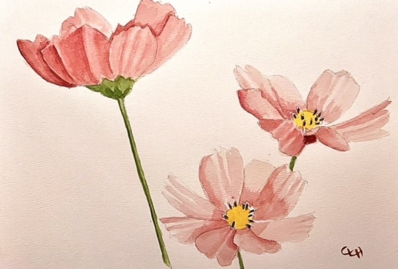
the shadow areas. We will be using cosmos
flowers as reference. And I will provide you with
the reference images and the tracing in case you
would like to follow along exactly what I'm doing. Since this class
is more centered on the watercolor
and ink techniques, I won't go into details
about drawing the flowers. But if you have
difficulties during, you can always use the reference images and the
tracing I provide you with. By the end of this class, you will have acquired
new skills and techniques that you
will be able to apply to your future paintings. So if you're ready,
let's get started.
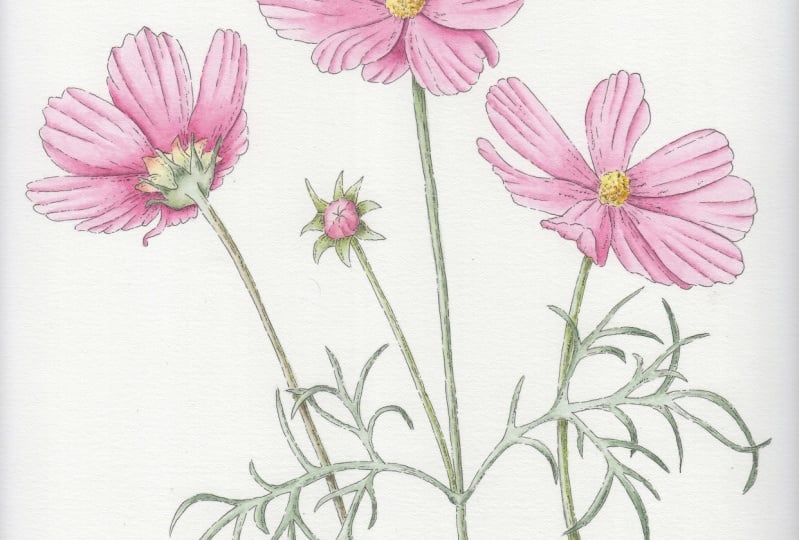
2. Class Project: The project for this class is to paint, ink and watercolor, flower composition,
hopefully a cosmos, but you can choose if you go
like this type of flower. I chose this because
it's quite simple to do. And you can choose to paint just one flower or the
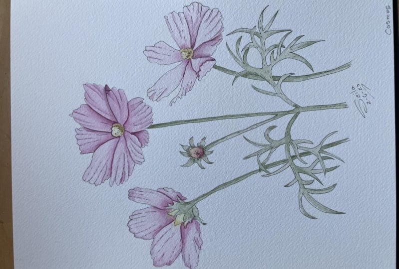
entire composition. I'll leave that up to you. In the class downloads, you will find the
reference images for the composition I did, but also additional
images in case you want to try a
different composition. You will also find the tracing and the pictures of the ink, the ink and watercolor. Just for a reference for you. Don't forget to post images of your paintings on
the project section. And I'm really
looking forward to see your versions
of this painting.
3. Materials: You won't need too many
materials for this class. So here I have the
tracing for the cosmos. And you can do just the
one flower like this, all the flower with the leaves. You can add to the bud, or you can do all three. If you feel like trying it. I give you the option. You don't have to do the
composition as it is. And you will find this
in your class downloads. And then you will
need some paper. And here I have Fabriano
statistical paper, 300 g. And it's hot press. And you can use a cheaper
paper if you like. But just be aware that
the results might not be as well as if you
use the good paper. So you won't need a lot of
paper for this project. So I would advise you to use some nicer paper as you can get. And then you will need, Let's put this on the side. You will need brushes. Brushes are a matter of
personal preference. And I have an old
toothbrush for color mixing because otherwise you're good brush and I get ruined. So that I have to
actually have a smaller one for picking
up as molar quantities. And then the bigger one. And then these are some
brushes that I use. So the row number one. So when you buy them,
what exit gate? Let's put this on the
side for the moment. So these are all number one. When you buy them, just be aware that there
might be differences according to what
make you, you choose. So the first two, Winsor and Newton, and this
one is Rosemary encode. And between the
first two there is a difference because
they are both CD27, both Winsor and Newton. But the middle brush is a miniature brush and the
first one is a normal CD27. So as you can see, there's a difference
in in the hair. Designs are shorter. The many-to-one. So I like these because I like to work quite a lot
with dry brush. So these are quite
good for that. But this is a personal
preference and you're going to have to try different brushes and
see which one you like. This is a number three,
again, miniature brush. Quite a bit shorter, but
they hold a lot of water. The brushes, then you will
need pencils and erasers. I have mechanical pencils. So there's different types
of mechanical pencils. This is a 0.5. I'm pencil here, and these
hold quite a bit bigger. I'm pencil inside. So it depends which one
you like to work with. You can use just a
normal so as well. And you can use, you should have an eraser, but you can use just a
normal eraser as well. These are quite good for erasing small details and you
will need a palette. This one is one of a kind, broadly was made to order, but you can find in shops pallets which are
just like this, like that. And whichever one you will
show a shape you like to work with would be good if it's a ceramic palette
rather than plastic. Because I find it
you can mix better with a ceramic palette
and they don't stain. The plastic palette
tend to stay. But if your budget
doesn't allow it to, then plastic will be alright. And then you will need
the pains, of course. So you won't need all of these. These are a lot of pains. I don't use all of
them all the time, but I've accumulated
over the years. So I will give you a list of
the pains that I will use, but you don't have to
use exactly the same. And of course you will need some ink pens because we're going to do
ink and watercolor. I have here different makes. This unit I think pronounced. And you can have
different sizes. So this is 0.03, quite small. I'm not sure if you can see it, but it's very, very
thin for small details. And then I have the microns, 0.1 and 003 as well. I quite like the microns. And of course you can
use a dip pen and ink. But if you're just starting out, probably these ones are better. And even better if it's
not completely new if you've been using it because then the income be
so strong the line. But if you've been
using it, don't worry, you just have to practice
a very light hand. And then you will
need water jars, one for rinsing your
brush and cleaning it, and one for diluting the paint. And of course, some cloth or paper
towel to dry your brush. And then I would advise you to also keep a column mixing book, color, mixing recipe
book, as I call it. And this one, this is
actually from another class. But I keep this for my
color experimentations. And I have some
templates and I are some pages where
they're just not down. When I find a color for, let's say here I painted
a tulip and iris. And these are the
colors for the leaves, the flowers, and so on. And I just write down the initials of the
colors that I use. And you can use your own method. But it's important
to keep a record of the colors because
sometimes you want to paint the same
thing and sometimes the colors are good for
different things as well. It's a similar green and e.g. and you can change just slightly the concentration
of one color or another. And so it's important
to add this record. Oh, okay. So I think
this is all you need. And once you have all
your materials gathered, we can move on to
the next lesson.
4. Watercolor Techniques: Before we start with
the actual flower, I just wanted to show
you the technique I use. I have another class where I go in depth into
different techniques. But for this flower, I mean, my favorite techniques is
actually painting wet on dry. But I will show you the wet on wet technique as
well because again, is something very personal. So I don't want to tell you, you have to paint this
way when you might be more comfortable and happier to when you paint
in a different way. So we show you the
techniques you need to try them and then decide
which one you like best. For the wet-in-wet, we need
to wet the paper first. And this one here
is Arches paper, 300 g hot press. So it's quite smooth. And I'm just putting a layer of water just all over the petal. And you should be able to, maybe to see, there you go. So it needs to be shiny and there's a party or
that is already drying. So you shouldn't have water pooling on the top but
it shouldn't be dry either. Okay. And then once he starts drying, you just pick up the paint
and start dropping it. So I usually start
to where there is a shadow or the flower, the petals, whatever it is, is in shade so it will be
darker and just drop the color. You can turn the paper
because it makes it easier to work from inside towards
the outside perimeter. And then with the same
brush you can rinse it and then sort of go in-between where the paint is and
when the water still is. So would the area
without the paint. And you can just
go like this with a brush or you can wait another brush
and tap it on there, a paper towel and just
use the other brush to sort of make this
a transition here. Okay, So until it's wet, you can still a drop a
little bit more color. When it starts to drain, is actually starting to dry now. So it becomes a bit more difficult and then
it should be left alone. Okay, And just going to use a damp brush to transition here. And once you start drawing, you shouldn't touch it anymore. And if it's necessary, you can add a second layer. And this layer is
quite dark because I just wanted to
show you on camera. I wanted to make sure
that you see it. But normally I will
start with a light, lighter color as well
because it's easier to add more layers and make the
transition even his mother. Okay. My older way of working
is by using a wet on dry. And when you do this, just make sure that your lines, your pencil lines are
very, very faint. But otherwise you
wouldn't see these here. So I'm going to apply the color. And again, normally
I will start with a with a lighter color. But just to show you on camera. So I'm going to play a
good amount of color. And then with
another damp brush, I'm going to make
the transition. And it will depend
on your brush if you rinse it and then tap
it on the paper towel, or if you if it's just
enough to do this, it depends on how
much water it holds. And again, you can play with
this until it's still wet. But then as soon as it
starts to dry like this one, it's best to leave it. And then anything
that you need to do. More. Than this, you just have to wait until it dries completely. So once the paint
is completed j, we can just apply
another layer of water, just being careful not to
disturb the paint underneath. So very lightly
without scrubbing. And then again is the same. Principles should be
there should be a sheen. We're not pulling water. And then I'm going to
use the bigger brush. I'm going to apply
another layer. And this time I'm going to bring a little bit
more to this side. So that to give it
a little bit of color on this side as well. And as you can see, we
have this nice transition. And if it's a larger surface, I would either use a bigger brush or the
wet-in-wet technique. If it's a smaller surface, I prefer the
wet-on-dry technique. With a larger surface, you might have a little bit of problem with the paint drying. Um, today is a bit, I'm quite a hot day, so, um, the paint
dries quite quickly. So this one here I'm going to do again wet-on-dry just to
keep it the same technique. But you get more or less the same result up
to a certain point. Okay, So I'm applying the paint up to here and
then it reads the brush. I'm tap it on the side. And then I just apply the
brush on top of the paint. Then rinse it, tap it on
the side, and apply it. And just be careful
that there's not too much water left in the
brush because otherwise, we'll be doing the
blooming so-called key. So as you can see,
this is the technique. So try, try them both, Um, but again, I would
advise you or wet in wet, if it's a larger area, um, and start with a light color, this is quite dark because I wanted to
show you on camera. But start with a
very light color. And I play, build the color, applying more and more layers. Because if you start too dark, then it will be more difficult
to correct any mistakes. And also, it might be
too thick the paint. So when you apply the
second a water layer, you might pick up the
paint if it's too thick. There's one more thing I want
to show you, this flowers, they have ridges in the petals. So he makes this sort
of light and shadows. And to do that, I basically pick up the color. So maybe slightly thicker, but not, not really sick. So the consistency
of milk, let's say. And then you do a line. So a line. And then with a dump brush, you make a transition like that. So you touch the tip of the
brush in-between the paint, the applied, and the dry paint. So let's do that again. So I'm going to do
it from this side. I have a light
pencil line in here. I'm going to apply the paint. Damped brush. Touch the tip in
the previous paint. Okay. So as you can see, it creates a sort
of shadow in there. And it looks like this
flower as some ridges. I'm gonna do it here again. Pick up some paint. The worry if it's, the line is quite thick because
when you put this brush, it will make this transition and newborn see the
thick line anymore. You would just see the
color I'm transitioning. So you will see this
shadow basically. Again, be careful
that you don't have too much water on your brush. Okay? So this is the basic
technique that I'm going to use for the cosmos later on.
5. Inking Technique: In this lesson, I'm going
to talk to you about a little bit about my
technique for inking. And I have here some
drawings just to show you. And here there is a selection of pen that go from the smallest one I have
003 all the way up to 0.6. And the brush. For this type of painting, I like to use this Maupin,
the zero-zero three. Now I'm going to just
show you how I do this. So this here is basically something that I
took from this painting. And it's this bird here. And normally what I advise
you to do is to follow the contour lines
of your object, whatever it is that
you want to paint the contour lines or
explain it to you. Let's say you have, let's pretend this is an apple. Need to live. But the contour lines will be the lines going
across like that. So the longitudinal lines, I think these are so like this. And then also the
lines going this way. So these are the contour lines. So in this case, the, the bud is sort of rounding
at the sides here and here. And the leaves as well, they are quite straight along. The contour lines
will follow this. So let me show you here. So for the contour itself, I would advise you not to do
a straight line, continuous, not straight but continuous
line because we'll look a bit like a coloring
book type of field. So another thing I
need to mention, this, pencil lines are
really, really dark. You need to keep your
pencil lines very light. But because I wanted
you to see on camera, I made them quite dark. So that's another thing, but I'm going back
to the contours. So what I do is I
put my pen down. And then every now
and then I just lift the pen and live a small gap. And sometimes I lift
the pen and then do a couple of dots. So this way it mimics a
little bit the dip pen, because the dip pen is not as continuous as
this type of paint. And also it doesn't look like a coloring
book type of thing. So everyone then keep your hand light and
just lift the pen. Not too much that it
looks too broken, but just a few times you need
to practice this a and C, whichever you prefer, but I
wouldn't do it too often. So here again, so every
now and then just lift the pen and then
maybe do a few dots. And it could be easier for you to draw going
towards yourself. Or if you find it easier
to draw going that way, you can always move the paper. So e.g. I. Can move it this way. If it's easier for
me to go this way, I find it easier to
usually come towards me. So like this. Okay? And then thus the flowerpot,
this yellow part. Alright? And then for the lines, I don't like to do too much ink. And when I do this type of work, because I like it that
you can see the ink, but it's shouldn't be the
protagonist of this painting. The protagonist is
the watercolor. So yes, you have the ink lines, but it's not a work of crosshatching or
anything like that. I'm going to do some lines
and for the insight lines, you keep your pen, your hand quite light. Don't press too hard. Try to keep your hand relaxed
and just do the lines that follow the contour. Like this. And not too many. Probabilities is enough. And also try to do a
few more if you want, whether it's the, the shadow. So here e.g. I. Will do a few more
but not too many. Okay. And then sometimes
I do this sort of, um, mark, so
something like this. And I'm going to do
it in a larger scale. So I can show you. So it's basically a sequence
of small curving dashes, something like this, but
made in a very small scale. Okay, and this gives
you an impression of a darker part but also texture. But it doesn't make the work
to heavy as if you do like hatching and crosshatching and becomes too dark for
this type of work. And then here is the same thing. So keep your hand light. It's a series of broken
lines for the leaves again. So it's going up like this. And try to alternate. So don't do sort of
lines like this. Try to alternate where
the pencil comes up. Dependent mean. So some delay this. And then to give the impression here
that this is curving, we can follow again
the the contour line. Okay? And then maybe here.
6. Inking Technique - Extra Examples: The same thing for this leaf. So this is sort of this
leaf here and here. So I'm going to do
the contour again, same way you can turn the page. And then here, this
leaf turns like that. So if you want to
add some lines, they should go, they
should follow the contour. And this spot here, there is a shadow
caused by this part. So maybe there are a few more
lines, but not too many. Then again, is a matter of
following the contour of the leaf and keep your
lines sort of broken. And just about barely
touch the paper. Okay, and then let's
put this away. For our flowers. I'm going to do one
petal here. Same thing. So every now and then just
lift the pen bit of a gap and then something like that. And for the center, Let's get to flower here. So the center is not around. It's a roundish shape. But as you can see, goes in and out this
little flowers, they're not completely circular, so don't do a circle, but do something like a small shapes like
this going in and out. And then there are
the dark parts here. So you can sort of
do some of them. And then it depends on the state of the
maturity of the flower. This one here, as you can
see, it's quite different. So this is sort of starting to grow in forming
this little dome. So you can do a little
kind of marks like this. So it will be so flight that and this
will give the idea of this, this flowers, this little dog. You can use this for texture when you need the sort
of texture like this. So we will fix your marks. And if we take the
pencil marks away, just makes sure that
the ink is dry. And now you can see
there are gaps in here, so it's not a continuous line. And you can see this of
texture that will show when you add the yellow for the center and for the leaves. If you decide to do
the leaves as well, because you don't have to,
you can just do one flower. These ones are quite
small, fine leaves. So you can see this
has gotta just one, but they're quite small so you can't really
do too much here. Again, the contours are
always the same sort of technique where you lift
the pen every now and then. And then for the insight, maybe you can do a little
tiny marks here and there to give it a little bit of a impression of a
shadow, maybe somewhere. But you can't really do too much because the leaves
are quite small. So something like that. In the next lesson, we're
going to start inking the actual drawing
of the cosmos. As See you in the next lesson.
7. Inking the Contours : Before we start inking this, I just wanted to show you that
if you have a pen that is not completely new and is
a bit going a bit dry. It might be actually
better for you if you are just starting off this
paint Nevada for awhile. And it's a bit die. So not completely, but it will be easier
for you to make a mark and not being too strong when the pin is not
actually brand new. Of course, if you don't have a pain already,
don't worry about it. Just keep your hand
light and try. Do some practice and it
will be fine as well. But in case you have something already lying around that
is not completely new, then you might find it
easier to work with that. Okay, So this is the drawing
I'm going to work with. I have done all three of the flowers and I
will do all of them. But as I said before, you don't have to do all three of the flowers and you don't
have to do the leaves. If you don't feel confident, you can just do one
of the flowers, e.g. this middle one,
or even this one. And you can add things
as you progress. You can just do it. And you will have a little, nice little painting
to frame at the end. Okay, so I'm going to ink this and it will be the same
as I showed you before. The same process as I showed
you in the previous video. And it's basically a matter
of following the line, but not as a continuous line. So something like
that for a sample. And of course you might like
more or less of these gaps. I quite like it when
there's a few like this. And I'm going to speed up the process because we
already talked about it and it will be a bit
boring for you to watch me doing this
normal speed, I think. For this center, again to just two little marks that are not continuous,
continuous line. Then I would do mark
here and there. Just to show the texture. And one good thing to do, I just started with
a middle flower, but it's ideal to start. I mean, depending if you're left left-handed
or right-handed. For right-handed, start from
the left towards the right. Because now I can put
my hand on top of this. I mean, it's probably
a dry already, but it's always a good idea
to start from the leftmost. And of course, if
you're left-handed, start from the other side. But to avoid putting my
hand on top of that, I can always add like
a sheet of paper. Then it's always a
good idea to rest your hand on something
is some tracing paper, some just normal paper. Because your hands as the natural oil of the skin and when you put
it on the paper, then it might interfere when
you add the watercolor. If you put your like oils
from the skin in there. Which doesn't sound very nice, but that's the way it is. Okay, I'm going to
carry on with this. Alright, so now that
we have the contours, we can proceed with the inside
of the flowers and stems.
8. Inking the Inside: Now that we have the contour, we can carry on with the
inside of the flower. And it's the same technique
as I showed you already. So where the folds
of the flower, you can just
highlight these ones. So do that first. And again you follow the
direction of the petal. Then I wouldn't
do too much more. Here. Maybe. Some lines here where there is a
little bit of shadow. I always think of
the light coming from this side because
I'm right-handed. So maybe a little bit here and then give it
a bit of that texture. And this is another
technique that you can use. So you sort of put the
pen down and flick it. So without going too slow, you just put it down in flick. And you want to practice this. But if you keep the
pressure for longer, it will do a longer flick. If you lift the pen Alia, it will be shorter. But I like the technique
I showed you before. This is just a lifting
the pen instead of the flicking Here in there of this little marks. And as I said, I don't want to do it too heavy on the ink. I think this is
just about enough. And what I want to do here, and for the stoke
is the same thing. So broken lines, a bit more here because it's in
shadow. Not too much. Then just barely,
barely touch the paper. And then every now and then
you do the little marks. And of course the bigger
is the the touring, the more details you can add. That this is quite,
quite as more during. In a way, it could be better
because you don't have to worry about too
many details. Okay? And then as I said, you can just do this and the worry about
the other flowers, but I'm going to do all of them. And then I will see you
once this is finished.
9. First Watercolor Layer: I have here the finished
drawing with ink, and I have erased
the pencil marks. So make sure that the ink is dry and do that before
you eukaryote. So I'm going to do
this middle flower. And I have the colors
here which I prepared, and they need to be reactivated. So if you have color paint
left in your palette, you don't need to throw it away. You can just reactivate
it with a bit of water. And this color here. I'm going to show you
here in my recipe book. It's basically this one here, so it's Permanent
Alizarin crimson and Helios purple and
Haley's purple, if I remember well,
is from Sennelier. And I will give you some other
paints that you can use, some of the mix if you
don't have these colors. But also if you want to do your own cosmos and you
want to mix your own color, it would be actually
better for you to do that. You don't have to follow
exactly what I'm doing. I'm just going to show
you my techniques. Okay, So I'm going to, as I was saying,
reactivate the color. And then I have, I usually have a more
diluted version as well. Because for the first layer, I'm going to do a very diluted
a layer for the petals. So I'm not going to start dark. I will always start very light. And I have the reference images. So as these ones here. And I will add this
to your downloads and also a few more images
for you to use. If you'd like to do
a different flower. Okay, So I've just placed
the image is in front of me. And you can print
them if you like. If you want to use those. You can print the
images next to you. And basically, I'm going to try this color to see
how strong it is, still a bit strong. So I'm going to add more water. Okay. Something like that already. It's quite good. And make sure you mix it well. And then I'm basically
going to apply the color. And I usually start where
there is a bit more shadow. But this is such
a light layer of color that it doesn't
really matter too much. But I still follow the
contour lines of the petals. So I won't go this
way, but this way. So I'm just going to do
this for each petal. And at the moment it
doesn't matter if you go over the other
petal because we're going to apply this layer
all over the flower. And I will speed it up a little bit because this is
all the same process. You just add the paint. And I might use the actually slightly bigger brush for this. Okay, so that was the flower. Then. I will do the same thing with the
start and the center. And I'm going to reactivate
the green as well. But this time I'm just going
to use my mixing brush because this could also
be a bit harsh on the, on the nice brush. That sounds like
a tongue twister, harsh on the nice brush. And then again, you need a
diluted version of your color. That's why I like this
palette because you can have the more dense
color in the well, and then you can
dilute it in here. For this, I'm going to use the smaller brush because that's quite a small surface. And be careful. This color has dried
or it's dry enough. Because otherwise, if you
touch with all the color, the width color, it would
just mix and blend together. If you mix the red
with the green, you will have a
brownish color as well. So we don't want that
for our nice flower. And if you see that this
might be a bit still dark. So I'm going to dip
my brush in water and then a sort of a
diluted a little bit more because I just want a layer of color covering the
during and the moment. But I don't want it to
be strong, too strong. And some of these, um, cosmos, they have actually a kind of
reddish color on the Stokes. I'm going to do the same
thing with the leaves. Okay, So I'm going to
do the leaves as well, but you don't have to do
them if you don't want to. And I will add the little
bud too so we can add the green in here as well. Just being careful
not to put my hand on wet paint. Hopefully. Maybe it did. And try not to have too much
water in your brush paint. Because otherwise it
might make a big puddle. We don't need a huge amount
of water in the brush. Then to add a little
bit here, the sepals. Then I'm going to reactivate
the yellow color. And I'm going to add
some water as well. I'm pretty good in this world because there's
some red in here. So I'm going to make
it light as well. And then do the base
wash for this center. I'm doing a sort of
stippling action. Okay? And then I'm going to add the light wash to the centers or the bud is
a bit darker than this, but I can add a base wash of this color the same as the petrol and then
make it darker. Always make sure that the
layer next to it is dry. And just lift, lifting
a little bit of color here to make it quite light
because of the highlight. But this color is
going to dry even lighter than it
is at the moment. So that was the first layer. This is how I start normally. And then the next step
will be to add the shadow. I'm just going to show
you is this flower here. So there are shadows
on this side. And here because the
petrol goes upwards, this was taken outside. So there's not the same sort
of shadows that you can have when you're working
inside with a control light. But more or less, I always
work as if the light comes from the right,
from the left. And in here this is, the splitter is going up, so there's a bit
of shadow there. The sun was more or less on the side when I
took the picture. But I might add some shadows where you can see here just to
make it more realistic. And also you have to be careful to add a
shadow underneath. So this petal is on
top of this one. So add this dark shadows
here and here for sample. But I will show you this
in the next lessons. So as we add more layers, we will shape the
form of the flower. Okay, So I see you
in the next lesson.
10. Second Watercolor Layer: Now that the first layer is dry, we can carry on with
the second layer. And I have gone ahead and
done the other two flowers. And if you want, you
can do this as well or just carry on with
just one flower. And I will put the
video at the end of the class with the
complete process. So I'm going to carry on with this flower,
the center flower. And I have here a
reference picture that I took some time ago. And I will follow this but also add my
own shadow because, um, as I was saying before, this is taken outside. So the light was quite diffused. So we have some
shadows but they're not very defined. Some of them. And actually one thing
I wanted to show you, if you have a
reference picture and you're not sure about
where to put the shadows. You can always edit the picture either on the
iPad or on your computer. And go into the
saturation and go all the way down and turn the
picture black and white. And this will show you exactly where the
shadows and highlights. Whoops, where the
shadows in a later. So this will help you
quite a lot when you're, when you're adding new color, I'm going to leave
it as the original. And let's move it
to the side a bit. So I will start my second layer. The color is a bit thicker, a bit stronger the pigment, but it's not too thick still. So you shouldn't, shouldn't ever worked with
very thick color anyway. So I'm going to start
for sample this time where they were, this should be a shadow. So somewhere here where
the petal is on top. And then when my
second damp brush, I'm just going to create
this transition here. Maybe needs to be a bit more larger. Then you just basically make this soft transition like that. So let's do it in here. This petal is underneath. So I'm going to put a
stronger color here all the way up to this point and then the light would
hit the pedal there. So with a damp brush, I'm just going to make the
transition here on this side. And this is basically how I do the darker
and lighter areas. So there's another petal here. This petal here is
underneath this one. So let's just load your
brush and add the paint. Then with the second brush. Just a play the transition. And you can rinse the brush if you see that it's
picking up too much color. But makes sure you don't
have too much water left on this brush. Otherwise, he would sort of make a kind of
cauliflower effect. Okay. And then there is another sort of shadow
area around this side. And then we can add
a shadow down here. Make sure this doesn't, the paint doesn't dry because otherwise you will
have a sharp line. So you have to be a
bit fast for this. Okay? And then in here, so we will have a little
bit of a darker area here. So I start from the darkest area and then a width the brush
diet and with a dump brush, just apply the
transition like this. And let's see a little
bit there as well. Although here is,
it's not as much because here we have
the light coming. But just a little bit to show that this is under
the other petal. And don't worry
if you think e.g. that here I should
have been darker because once it's
completely dry, we can always apply
another layer of color. A glaze is called. So a very light color like
we did at the beginning. And it would darken
the whole petal.
11. Third Watercolor Layer: So that's j and the colorful, this should be a bit thicker. See if I can put it here. Again, not overly thick
but a bit thicker. And it's still the
same technique. So let's see. We
have dark area here. And this will give you
that idea of a 3D effect. As soon as you add the shadow, you can see that this petal
on top is kind of lifted. So down here is quite dark too. And you can only make this color dark up
to a certain point, then you will need to use, I mean, with layers. Then you need to darken this color that you're using
for the very dark shadows. And I will show you
how to do that. Alright, so underneath here
we have a little bit of a shadow in here as well. And you don't have to
do this all at once. You can do a little bit, didn't do the
transitioning here, and then do the next bit. So it fits along petal. You don't have to
do it all at once and get panicky because
the paint is drying. Okay? And then for
the sort of folds, I call them bridges sometimes
but the folds of the petal, we can do the same thing. So pick up the color
and Mr. this one. So decide where the
light is coming from. And this bit here is
probably curving like that. So here there will
be a shadow and you do I'm not all of it. But you you stop before you
can do halfway through. And then with the brush. When you do the
transitioning effect, it will carry on that line. Dump this brush again. And let's do the
same thing here. So we stop around there
and then transitioning. And as you can see, you can see the line down here now because the brushes dragging
the paint there. And maybe a little
bit here like that. And you do the same for
the other petals as well. And you can always apply
a little bit more. If you feel that it
should be a bit longer. This slide in here, we can apply it on this side. And this means that
this is actually going like that. This
petal, the petal. So as you can see, it gives you that 3D effect. So I'm going to carry
on with the rest of the flower and speed up
the process a little bit.
12. Using the Darkening Mix: So when you basically, you can't make it darker
by adding more layers, you need to darken this color. And a good way to do that. Many people say to add
the complimentary. But if you add the complimentary
to read which is green, you will get a brown. And let me see if
I can show you. You can add a little tiny bit of green to make this darker. But as soon as you
start adding green. So like this, maybe this
color is a bit late, but hopefully we show. So it's gone a bit darker. But then if you want to add
more and make it darker, it will start turning brown because this
is a, or even gray. So as you can see, it's not a pleasant color because this is a mixture of
the primary colors. And if you mix the
three primaries, you're gonna get a
neutral where as I call your order,
gray brown color. And I have a class
about mixing colors. But here, I'm just going to
actually use this mix here, which is a darkening mix. And I can show you
the marketing mix, which is this gray here, is made with Winsor blue, green shade, quinacridone,
magenta, and lemon yellow. Which is basically the same
colors for this green. But the only difference is that you have
different quantities. So you add more,
more blue, more red, and more yellow, and
you end up with a gray. So to darken this and just
going to put a bit more here. And then I'm going to
reactivate this color. I always have some of these
kind of mixed in my palette. Always add tiny bits at a time. Because otherwise you
might get too strong of a color and then it will be almost
impossible to go back. And as you can see,
it's made it darker, but it's kept the red
underlining color. So he hasn't change
the color to brown. This is a very important tip. So as you can see, it's
dark but is not brown. It's a darker shade of the I keep saying red
because it's in the reds. Sort of real, but it's a magenta type of
color and it's darker, but it's not brown. So this is a really important
tip for color mixing. And then e.g. we can apply this in here, which is very dark. And you can talk a little bit before where the
darker colors stopped. So e.g. if we apply
it this area, apply a very thin line
and then transition it. So be careful with this. Darker colors. Don't
make it too dark. Apply it a literal the time. Then we can do the
same thing here. And maybe around this area
because this petal is folded. So it will be a
bit darker there. And a little bit
in this area here. If you want to make it darker, you can apply a
second layer of this. So as you can see, it's darker on this side and a little bit
lighter on this side, which looks like the light
is hitting this side. And I think this is
okay for the petals. Um, what I normally
do is to finish the painting and then
they'll look at it for a day or so, or
even half a day. But if you leave it
one day or a couple of days and then go
back to it and look at, look at it again. And then you will
see that there are things that needs
to be adjusted. So I'm going to carry on
with all the flowers. And then we will look
at it and decide if we need to add any more details.
13. Final Details: Here we have our
finished painting. Well, it's not exactly finished. You could leave it like
this if you want to. But I would advise
you to as I said earlier to leave it for a while and then go
and look at it again. There are little details
that need to be finished. For example, in certain places, some of the darker pla, the shadows need to
be strengthened. We can do that with
our darkening mix. If I reactivate some of
this color and get some or this darkening mix and make
this quite a bit darker. Then we can go where
the shadows are stronger and make
it a bit darker. And this really lifts the petals when you add the darker
shadows underneath. I'm using a brush from Series seven miniature
brush from Winter in Newton, you can use a small brush
doesn't have to be miniature. There is also, for example, this one here is
a Da vinci brush, which is a zero and is
quite small as well. For details, these are best. Then just add the shadows, very close to the petal. So that it forms that little bit of
a darker shadow that lifts the petal a bit. I'm going to add
some here as well. If it's quite thin, you don't need to to do that
transition with the brush. Then maybe a little bit here. This is almost like a
dry brush technique where you pick up just a little bit of
color, not too much, and you use your paint
on the dry paper, and you almost use it as
almost like a coloring pencil. I just going to add a bit here. Very light touch, very small
amount of paint that you put down and you will get
those little shadows. I'm going to add
a little bit here where this part of the flower casts a
little bit of a shadow. You can strengthen a
little bit some of these. I wouldn't do it on all of them. Maybe the biggest ones where
there is a bit more shadow, and maybe a bit here. You should do that with the petals and also
with the stoke. The darkening mix I
told you about before. You can use it with
a green as well. I'll reactivate
some of this green. Then we'll add some of
the it makes it darker. It's a really great mix. I use it all the time. I might have added a bit more
bit too much water. There was a little
drop on the brush. You can always leave this
to dry a little bit. Of course, it means you
have to wait for it to dry. But if you think it's too paint, you can always double
it on the side of your palette or a little
bit on the paper tower and then do the same darkening for the stork as well
where there is a shadow. In this case, it will be
on the right side for me. And there is a tiny little
bit of a shadow on this side. Almost you can see it, but it's there because if
you look at a cylinder, when the light shines
from the left, there will be a tiny
little bit of a shadow on the left as well because
it's going round. Just do this for
the entire stoke. Then we have the
highlight in the middle. And then might make it
a little bit darker. Little tiny movements, just
gently touching the paper. Maybe I can add a little bit of this darker color
in here as well. Again, using the I just saw maybe a
little bit here. You basically do this for the entire or the
entire composition, if you've done all of them. For example, here, you
can add some of the mix. Because this side is in shadow
and for the green as well. In case you want to do
the back facing flower. I just wanted to show
you quickly how I did these sepals here. I think they are called
sepals, those ones. I have a bit little
sepal in here. I'm going to add.
Basically what I did here was to add a diluted yellow. So as a first layer. And then there is
a little bit of pink on the top. While it still, the
yellow is still wet, you add a little bit of
the pink on the top, and a little bit of the
green at the bottom. Here you can add
the darker green because it's going
to be diluted, and then you lease the brush
and you tease the paint. I will mix with a yellow, and it will create this
transition as well. Then you can strengthen the color with other
layers as well. Of course, the penta
mark needs to be very light if you're
not using the ink, otherwise you will
have the ink there. That's how you do it. Then once it's dry and
you're happy with the color, you can always go back with the gbrah technique
and for the brush, I can show you
once more in here. You just pick up some
color, not too much. If you're not sure if
there is too much, you just take a little bit of scrap paper and just do
some lines like this. Then when you're happy
that there's not too much paint in your brush, you just do these
little movements. Like if you had a pencil, really, and it doesn't look
like you're doing much. But if you notice, we have strengthened
this shadow here. You just paint like you
had a pencil in your hand. Just a little tiny movement. When you build up, this
is a long process, it will take time to build up. If you're happy
with this result, you don't have to do
the dry brush at all. But if you want to try it, you can even do this again on a separate piece of paper and then try the dry brush just
to see if you like it. But it's basically that pick up As you can see
here, it's quite dry. Sometimes I add a little
tiny drop of water but very, very small because it
shouldn't be too watery. At this point, it
should be quite dry. Then use your brush
as you use a pencil. That's I think the best
way I can describe it. And this will make the final
work much more smooth. But as it is, it's fine and you can frame
this and enjoy your painting.
14. Bonus - Complete Painting Process: Bearing
15. Final Thoughts: Congratulations on
completing the class. I really enjoyed sharing
with you my tips and tricks for watercolor
and ink painting. And I hope you have learned new skills that you can use
for your future projects. Your next step is to complete
the project and then post pictures in the project
section because I would really love to see
your beautiful artwork. And then after that,
just keep practicing. Choose another simple flower, like a crocus or another flower. That is not too complicated. And keep practicing your ink
and watercolor techniques. Please remember to hit the Follow button
here on Skillshare. So you will be notified as
soon as I post a new class. If you like, you can check out my profile to see my
other watercolor classes. If you'd like to keep in touch, you can follow me on Instagram
at category anti-art, or you can check out my website
category and the art.com. Thanks again for taking
my class and I'm looking forward to seeing
you in my next class. Bye.
 Katia Galante, Botanical Artist and Illustrator