Transcripts
1. Class Intro: Hello, I'm Daniela Mellen, an author and artist. In today's class, abstract painting leading lines, will create three paintings using watercolors based on a simple three-step prompt. Today we'll explore using lines to lead the eye, balanced the painting, and add interests to areas in our composition. Classes focused on subtle colors, gentle shapes, and the introduction of using lines in artwork. Because lines will not only direct the eye, but introduce an original element to our art piece. We'll use basic watercolor supplies and subtle and gentle earth tones to create these intriguing works of art. And to help you with your composition. There is a prompt overview download that contains ideas to inspire you, as well as a brief explanation of methods used in class. We'll mix dusty pale colors that are reminiscent of nature's landscapes. And then use bold lines to add contrast and draw the eye around your piece. So gather your supplies and join me today.
2. Class Supplies: So here are the supplies that we're going to use for our abstract art leading lines class will use basic watercolor supplies, which include pigments and brushes. And I'll include the specific brushes as well as pigments that I use in the class supply list. I have the prompt overview sheet which you can download. It has our three-step prompt and we'll go into detail more in each of the classes. We'll do three paintings today as well. And so each painting we'll have something just a slightly bit different, a new technique that maybe you might like one more than the other. I have my six by eight watercolor paper, and then the rest is completely optional. So choose what you're comfortable with. Here, I just have a backing from a pad of watercolor paper. It's just that hard card stock and that's what I'm going to adhere my paper to when I paint, and that step is completely optional. To do that, I just use some painters tape and we'll go over that more in an upcoming chapter. I also have some particle board pieces here. And I use those just as I use the cardboard piece. Now to make our lines. We can use pigments from our watercolors and a small brush. So feel free to use that method, but there are other methods you can use. I'm going to use a calligraphy pen today and just some ink. You can use a marker. You can use pencils. It's really up to you, or a gel pens even work well. In the next chapter, we'll go over adhering our watercolor paper to our board. And again, that step is completely optional.
3. Adhering the Watercolor Paper to a Board: So when I adhere my paper down to my board, I'm doing so to prevent the buckling and I can prevent it even further if I was to mist my paper with water on both sides, just a gentle wetness and then taping it down, holding it in place. What I'm going to do though is I'm going to tape it down dry. And I'm doing this because I want those nice sharp borders now to prevent my paper from ripping as much as possible, even with the removable painter's tape. I adhere to some fabric. First, in this case, I'm using just my drop cloth here, but I can also use my pant leg. And that makes it just slightly less sticky, still effective, but slightly less sticky. And since I use the one-inch tape, I get a nice sharp one inch border. And so just keep that in mind when you're using your tape and choosing a size paper for your painting, it will cut down the painting size drastically. So I put my tape down, I just burnish it lightly a couple of times more so on the board just to lightly burnishing on the paper. And then I put all four pieces down. Now you could get a little more technical and only put the piece halfway covering your painting. That's totally up to you. But I like the simplicity of just using the natural borders, the natural straight edges of the paper and the tape. So here I've attached the tape to my cardboard backing that I'm using as my board. And then I just fold down any excess tape or tear it off just so it doesn't get in the way while I'm painting. I have another one that I did on the board, the little MDF board. It's the same procedure. In the next chapter, we'll start our first painting.
4. Painting #1: Adding The Background: So the first step in all three of our pieces is going to be to select the composition that we want. For the first one, I'm going to make a very simple composition. I'm going to have a dominant shape, my single shape. And I think I'm gonna make this up top somewhere around here. I'm going to have a less dominant shape over here. And I might add a second piece as well. To make this a little different than the others though, I want to make a background. But one thing I want to consider as well before I start my painting is the colors I'm going to use. They're all going to be very subtle. Earth tones or the like. And I think I'm going to go with some really dusty pale colors. And for this one I'm going to use lots and lots of very plain colors, blue, blues and greens and grays. I'll put some water on my brush and I'm using a large number six brush and I'm going to wet my piece. And I'm just going to wet all the background, which is clear water, very generously. Going to give it a moment to absorb into the paper. After I'm sure that I have that nicely done covering all areas of this piece. Then I'll mix a color. I think I'll start with a very pale gray. So I'll take a little bit of this Payne's gray. And again, I want nice and subtle colors. And I'm going to mix just a little Prussian blue in with that just to tinge it a little. And I'll just play with the colors until I get the color that I'm looking for. And then I'm going to add a little more water because I want it to be nice and subtle. And no, I don't want my piece to all be monotone and seeing color, I want there to be variation. So I know I'm going to have my dominant piece up top and my West dominant pieces, elements on the bottom. And I want there to be overlap with these gentle colors. So I really have a darkest swatch in the middle. And really it's just about playing with what you wanna do for a background. I'm adding a lot of pigment everywhere. And it's very lightly toned pigment. I don't want brushstrokes and I don't want any harsh edges. And then I'm just going to dab a little more intensity, kind of in the center here. And I'm almost making a diagonal line, but it's not a straight line. It's kind of hourglass-shaped. I think that's interesting because it's a nice light color. I can go back in, move it around and play with it some more. And it's a nice subtle color. So I can rinse my brush, shake off some of the water, and then just better a little bit of the water. And that gives an interesting effect. At this point, I need to let this completely dry before we start our next step of this painting.
5. Adding the Dominant Shape: So nearly first layer is dried and it took a little longer than expected. But that's only because I really saturated the paper. So when I feel it, it's dry to the touch and that's good enough for me. I'm going to mix my next color and remember I'm gonna do my dominant shape, and I think I'm gonna do it somewhere up top here. I want it to be or not organic shape. And by that I mean, I'm not trying to make a square or a rectangle or really any angles. They're all going to be arches and arcs and just gentle motions. And I'll repeat that until I find a shape that's pleasing to me. So there's a little bit of intuitive painting to this. I'm going to mix my color and for my background I have a very subtle bluish-gray. And so I'm going to take a little of that bluish gray that we have. It's still on my palette and make another puddle with it. And I'm going to mix some dark green in with that. And then I'm going to take a little bit of Prussian blue and mix it in with that. And I'm just playing with it until I get a color that I like. So I have a deep green. Hear me add a little more Prussian blue, a little more deep green. And just a little bit of this Payne's gray. And that gives me a kind of a dusty color. And now I'm just going to create my dominant shape. I want my shape to also go off the page a little bit. So if my shape was here, I'm starting it like this. And because I wanted to be my dominant shape, I also want it to be my largest shape. So I'm just going to continue to create that shape. Make it a little bit bigger, maybe even a little heavier at the bottom here. And then I'm going to come back in with my pigment and really emphasize a certain area on it to make it more intense with color. And that creates a little contrast and adds an interest just to that one particular shape. Going to take my brush, wet it at a little more pigment of that green and that Prussian blue. A little of that Payne's gray. Still little water. And I'm just going to really emphasize that outline. I just play with this until I have a shape that I like. Could it come back in, really emphasize some spots of color? I like the way this kind of naturally gravitated towards the side there. And I'll add just a little up here. And again, making that bottom a little heavier. When I'm happy with that, I'm going to stop. I'm not worrying about letting that dry yet, but we're going to take a quick pause and then we'll come back and make a non-dominant shape in the bottom.
6. Adding the Non-Dominant Shape: So my top shape isn't dry yet. At this point, I can go in there and decide if I want to add a little more pigment just to really intensify some areas or just leave it as it is. And I can also spatter water in there just as I did on the background here, to create a subtle effect. I'm going to leave it for now, but I'm going to work on my non-dominant shapes. So I have the green and the blue here. And now I want to make more of a blue. So I'm going to take that Prussian blue and set it down on my palette with a little Payne's gray. And I'm really emphasizing the blue aspect as opposed to the gray, which would be the background. So I'm going to take this and now I'm going to create my non-dominant shape. And I think I'm just going to kind of reflect over here. Just like that. I have a nice sharp shape, nice line. And I'll just review that right on the edge to make that work the way I want it. Dabbing in a little more pigment. And I'm going to dip my brush in water. So I still have the original pigment on and just carry that to the end of the paper. And I get a nice gradient here. So even though this is a single shape, it has a lot of interest in it. I might want to add another shape, but I know I don't want to introduce it to this wet shape yet. I don't want the colors to blend and overlap without definition. So I'm going to let this dry completely both our top dominant shape in our little non-dominant shape.
7. Evaluating the Piece and Adding Spatter: So now my elements have dried here, and I want to just take a look at this and take a step back for a moment. I'm really love these colors. This is very Caribbean, very subtle to me. So I really like this. I'm not sure I want to introduce another piece, another element here. I still am going to add my lines. So I think I'm going to leave this painting as it is here with my painting. Before I add the lines. What I do, do though, is when I'm adding my lines, I'm going to consider where I want to draw the eye. Now there are a few ways you can use lines in the paintings. You can use it to balance the painting. So I can use the, make some lines on this side balancing the large S and the dominant shape. I can use lines opposite it in a way where it draws the eye to it so it will curve around. I can use my line to connect my shapes. So I have a few ways to play with that and use the lines as a tool. I can also use the lines in a way that add weight to a very empty area of the piece. So this would be my most empty area. But I really like the way it flows, kind of like a river. So I don't think I want to do that technique. So this is really just playing with things in your head. I think I want to do something that kind of continues to mirror each side, but plays a little more role and the dominant side. So to do that, I'm going to add a little spatter before I add my lines. And I'd like the spatter because this is so clean. I think the spatter might break it up a little. Gonna take my large brush again. And I'm going to mix some of this Payne's gray and I'll just mix it in with that last color, blue we had can even pull some of this other color here. So I'm getting a nice rich color. It load up my brush, and then I'm just going to spatter and I think I'll just spatter up top here and a little bit down here. And I don't want it to take away from the piece. I just wanted to add a little bit of interest. I'll let the spatter dry and then we'll come back and add our lines.
8. Adding the Lines: So now that my spatter has drive, there's less likely a chance that I'll smudge it. And because I used a diluted watercolor, some of the spatters are very transparent, which is kind of an interesting effect. Some are a little more opaque. Now to make my lines, I can either use that Payne's gray and a sharp pointed brush. You can use a pen or it can use a calligraphy pen and ink, just a dip pen. And I think that's what I'm going to do. So I'm going to pull my piece to the side here and I'll open my ink. Now I'm just going to dip my pen into that ink. Now. Because this is a dip pen and this is watercolor paper, there is some texture and some, it'll fight me a little, but that's okay. That's just something I'm going to understand going in and I'll deal with it. So I'm just going to dip my pen, the tip of it here in this ink. And then I want to decide how I want to make my lines. I'm going to start by making a line here and I'm not going to go parallel to the shape. I'm going to intersected. And I don't want the line to be a straight line. And again, I'm still working on just angles. And some areas, I'll make it a little sharper than others. And I'll pull that pin just along until I can connect those lines. And again, it's more intuitive where I'm just doing what I feel. And so then I have a line there. Some areas are thicker than others and I really like that interest. So I can go back over, fix any spots that I stuttered or hesitated with. Make any a little thicker. Just like that. Now I want to add some to the bottom here. And I kind of wanted to reflect in a very general sense, this top shape. Again, I'm not going to go parallel to my bottom shape. Going to come around dipping my ink. And then to add just a little more interest, I'm going to add a second line on the bottom here. And I'm choosing to add the second line on the bottom because I have a lot going on up top. And I want to just add some other interests to the bottom piece here. Again, I'm just going to go over intersecting all my shapes. I'm bringing my line. Now I can play around with this further and add some dashes or dots. Enhancing the spatter in some places would just some little dots from this pen. And that's the intuitive play part. I'm going to let this dry. And after it's dry, I'll remove the tape. And we'll do that at the very end on all of our paintings.
9. Painting #2: Adding the Shapes: For our second painting, we're going to use similar techniques with just slight variations. So the first thing I want to do on this one is I'm not going to paint a background. I'm going to let the white of the paper be my background. But I am going to choose three colors because I think I'm going to have three shapes this time. We use blues and greens before, and I think I'm going to use some yellows and purples this time, but I want to keep them very subtle. So I'm going to take this deep yellow and I'm going to mix it with a little yellow ocher. That warms it up and makes it very interesting color. Cadaver, my brush in water, and I'm going to mix just a little sepia in with that to tone it down instead of the Payne's gray that we used to make our previous painting colors dusty. Vendor take some of this purple, put it on my palette. And again, I'll add just a little sepia to that. And again at tones it down very nicely. Then last thing, but it takes a little this Cyrillic in blue and deep green. So I get a nice turquoise color and I'll play with those until I get the color that I'm looking for. And once again, a little sappy, it goes in with that as well. So I'm going to add water to this color and I'll start with this turquoise color. It's a beautiful color. Wanna add one more brush full of water. And then I want it decide where I want to have my dominant color. So I'm going to have it over here, the bottom section. And I'll just play with that kind of making just a shape around here. And I'll fill it in with the pigment. As you can see. It's not as vibrant as it is on the palette. It's a very dusty color, very pretty and earthy. Going to make a few changes to the shape. I don't want the curves to be quite so dramatic. Just a little scallops here. Just like this and I'll let this dry. I'm going to leave the color on my palette because I'm going to add some layers to that after it dries. Going to clean my brush, I'm going to pick up this yellow. And I'm going to have this yellow shape be very skinny and just kind of go the length of the paper. I still want that blue to be the dominant shape in size. But I do want to add this interesting color here. And I think I'm going to actually extend that out a little further down. Again, continuing to just add the color and the pigment as I go. I want to add a lot of pigment to the edge. Just like this. Now I have that purple on my palette, but I don't know where I'm going to put it just yet and I don't want it to muddy the colors I do have. So I'm going to let it dry on my palette and I can re-wet it and use it as needed. I'm just going to clean up a little of this yellow here. I want this to be a smooth transition of a shape. Again, depositing a little more pigment as I go, maintaining that softness and those earth tones. And I'll let this completely dry before we add our next layer.
10. Adding Layers to the Elements: So now our first layer has dried. I want to go in there and add a second layer to this bluish turquoise here, as well as using our purple. It's going to take my large brush and pick up that turquoise. And I'm going to mirror the shape, but make it a little smaller. So I'm going to reflect those curves and just fill them in creating second layer. So it kind of resembles waves along a beach. We're going to make a little more of my paint here. So I'll take the cerulean blue and the deep green little sepia. And again, play with that until I get that color that I like. It doesn't have to be the same one that we made the first time. Just close. And again, I just want to add those colors just to intensify this next layer. When I have that shape done, and I'm happy with it. I'll just let that dry, clean my brush and I'm going to pick up that purple. So I want to add this shape somewhere here. And I think I'm going to have it overlap with this earth tone here. I have to be careful because purple and yellow will mud, muddy there. When they're together, because they're opposite of the color wheel. But I do think we can create a nice effect nevertheless. So I'm going to add a little more intensity here to the top of this purple. And I'll let this layer completely dry. I want to come back and I think I'm going to add a third layer here of this turquoise see green.
11. Adding A Third Layer to the Element: So now we're layer is dried. We have some beautiful contrast here. Again with using all really subtle colors. I'm going to come back in with my brush, re-wet what we have left of this little turquoise color. And I'm going to make one more layer. Again echoing that shape. Come in, just dab it on, get a little more intensity right on that border. And it's very pretty. And I want to look down here and I really like this purple element. Think I'm going to echo just by making one more layer of that purple. So I'm going to mix some more purple on my palette with a little sepia. And I'll take that and I'll just bring that color around. Again. I'm trying not to muddy that yellow underneath. It's beautiful and transparent. And I like that we can see the layers and the progression. Again, this is the intuitive part where you just add things that strike you at the moment. So happy with how that looks, I'm going to let that completely dry and then we'll come back and add our lines and maybe some spatter to this one as well.
12. Adding the Lines: So now to make my lines, I'm going to make my lines first this time. So I'll set aside my paints. And then I decide what I wanna do with my lines here. I think I'm going to make some line here that kind of reflects this shape. And while I intended this to be the dominant shape and in size it is the dominant shape because this has combined images. It's very striking and this intersection really draws your eye. So I think I'm going to have maybe a habit goes this way. The line's going to come up and around. Again. I'm going to use my dip calligraphy pen here. And I'll start maybe here. And I'll try and bring this line very gently down and across the paper, sort of in an L shape. Just like that. It's kind of interesting. We have a lot going on over here and not much here. So I have to figure out what I wanna do their thing. I'm going to add a very jagged line that just kind of combines the two shapes. And I think I'm just going to swing it through here and around. Come off my paper and then pull it back up just like that. And I like the way that looks. I'm going to add another line. I think I'm going to stick with it here, very thin line. So I'll dip my ink and then a very thin line. Just like this. And I like the way that looks. And I do want to add a little bit of spatter, but I want it to be very light spatter, not big drops. So I'm gonna take my smaller brush, dip it in this Payne's gray, really loaded up. And then very gently tap here until I get some little drops. Just like that. We'll let this dry and again at the end we'll do the unveiling.
13. Painting #3: Painting the Background: So for our third painting, I want to add a background similar to the one we did in the first painting. But for this painting, I'm going to stick to traditional earth tones, browns and oranges. So I'm going to make my background color a very subtle mix of the oranges and browns. Put some water on my palette, a little sepia, and then a little of this vermilion hue. And I'll add a little more until I get the color I like. And then I can dilute it until it's nice and subtle. I'll rinse my brush, wet my background. I didn't really clean my brush very well, but that's okay because I'm going to use that same color for that background. So I really saturate this background really well. I have a lot of water here. And then it's going to take my paper towel and just lay it on top and gently press it down. And now I'll come in with that pigment. And I'm just going to spread it around. Looking to create a nice gentle background. This nice soft color at warms up the paper. Again, adding as much as I like, knowing that it's going to dry even lighter. And then I'm going to load up my brush and just spatter some. The whole background is wet, so these spatters won't stay, will just be little areas of interest. Creating nice soft blends. I'll let this layer completely dry.
14. Adding the Shapes: So now that my background is dry, I want to add my shapes. I'm going to use my large brush. Put some water on my palette. I'm going to add some sepia to that. And I have a nice rich color here, very earthy. Going to add just the smallest bit of deep green to that. And that'll just change the color ever so slightly. And now I'm going to create my dominant shape. Going to create a shape. Think it's going to start here. Maybe not be the entire length. And just kinda billow out. Again. I want the nice curves. Again, continuing to add the pigment while it's all wet so we don't have any lines. And then I can refine the shape. Maybe even make this even more gentle shape. Come back and pick up more pigment and add it across. And because the shape is taken up so much room on the paper, I know that it's good to have some overlap with the additional shapes later on. So right now I'm just carving out that shape, get those nice edges. And I want to add a few little shapes besides. Good, take some of this yellow ocher down on my palette and mix it with whatever remains. And then with my large brush, I'm going to add some shapes. Just going to pull that color across. And it'll come up top here. And maybe have this color just like this. Again, I can go back in, introduce even more pigment. Just for some variation. I'll do it down here as well. Sharpen up any edge here. And I'll let this layer completely dry.
15. Adding Additional Shapes: So now that our shapes are dry and could add another layer of shapes as well. Again, I'm going to stick with my big brush. I'm gonna take some more of this vermilion hue and want to mix it in with that color we have remaining on our palate. Again, I gave it just a little more of that orangey color. And now I'm going to decide how I want to do this thing. I want to overlap here, although I do like this little shape. So I'll turn my page around and I think I'll overlap here. I'll have my shape come around and down. Completely covering that shape in the background. Very subtle. But I like the way this looks and I like this color combination. And then I think I want to add a little bit of a shape over here. I think I'll maybe just have it come up and back down. Maybe drag this one out, just like this. And again, add a little more pigment. I'm going to let this layer completely dry. And then we'll come back, re-examine our piece and add our lines.
16. Adding the Lines: So now our pieces have all dried. Going to set aside my Watercolor pigments here and examined my piece. Now even though we painted the background, there's very little bit of the background showing through. I still think it's very effective and it creates a nice feeling, nice tone on tone on tone here for our painting. So now I have to figure out what I wanna do with the lines. There is overlap on these paintings and I like that, but I want to connect this side to this bottom piece. Think I'm going to have some lines come down from here and fall into this element. So again, I'll dip my brush. You can use your marker or gel pen as well and create this line. It's such a contrast to the shapes we have, the colors. And it's very intriguing. So there I have the line. Could just create another line. And I'm just going to break it off from this line here. So I'm going to come around, make it very thin, and then pull it down just like that. So that adds an interesting piece and the area where it connected. Just want to emphasize that I do want to add a little bit up top here. I think I'm going to draw some of this empty space as well. So we'll just start here and just pull that line down. Like the way that looks good. Add an intersecting line to that. Just like that. I'm very pleased with the way this looks. I do want to add a little spatter, but I want it to be very subtle. I have a lot going on with this painting as it is. So I'm gonna come back in with my Watercolor pigments and my very small brush, going to pick up some of that Payne's gray, really load the brush with it and then create very fine spatter. Just a little bit over here and a little up top. And I chose those areas to break up the piece. I think I want to add just a little down here. And these spatters are so much tinier than the other ones. It's true spatter instead of drops. And I really like the way this came out. I'm going to let this dry and in the next chapter we'll come back and unveil our paintings.
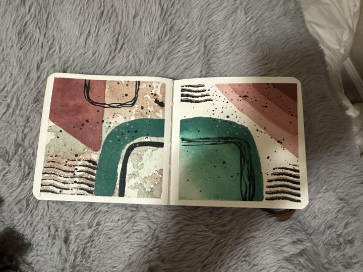
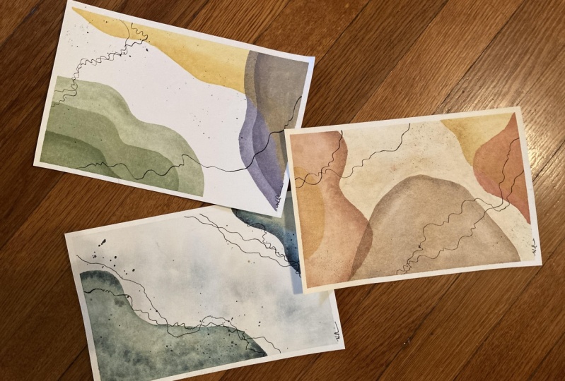
17. Class Wrap Up & Variations: So now we have the finished painting and I'm going to just remove the tape generally. If you feel the tape is sticking and you want to almost guarantee that you can remove it without tearing. Just use a hairdryer. Heat up that adhesive so that it becomes a little more pliable and you should be able to get your piece off very easily. And there we have our first piece. I remove the tape on the others and I'll speed that up just so you can see the process and we'll see what we get. And then we'll take a look at our finished work. So there we have three of our finished pieces. We have the lines that intersect, contrast and break up the piece, as well as those subtle earth tones behind it. It's kind of a very interesting effect and we know the difference before we added the lines and the addition of the lines. Again, we used all subtle colors and I think that really played a hand in that sharp contrast to those leading lines. Wanted to show you a few variations as well. And the reason that I like to have this border on this particular painting, because it's abstract. There's really no horizon line or no borders. And so I think that this white border around the piece is very effective. Here I have a similar painting that I did using lines and earth tones and soft colors, but without that border, the pieces a little chaotic and overwhelming for me. And yet it's possible to do that and make it very effective at the same time. And here I have essentially a bookmark sides piece. I have my lines and then I have my interesting colors. Again, very subtle, very neutral, earthy. So it really depends on the look you're going for. I also have some variations on the paintings we did in class today using the same techniques and on a larger scale, which is always fun. So for our first painting where I have three elements and they even use similar colors. I have the graduated sizes and the effects are very interesting and very different. And I can make this on an even larger scale, like maybe a mural size. And I think it would be most effective as well. It's that contrast and the way that the eye is drawn, following these lines and the little speckles here that breaks up the pristine background. For our second painting in class today, I use these beautiful, which are my favorite colors. And I created those three shapes essentially with one just slightly larger than the others. Here I did it in similar earth tones and yet different colors altogether, and I got a different effect. One is more water and strikes images of water and reminiscent of the ocean and the Gulf. And this one is more of a desert. So it's funny how color can affect your mood. And those lines are interesting as well, because it's a desert, it makes you think of cracked earth. Whereas because this is water, it makes me think of little streams and capillaries. And lastly in class we had our earth tone painting with strict traditional earth tones. Right here reminds me of boulders from maybe Red Rock Canyon. And over here I did the same thing, but I left a lot of it pristine. There's just a bunch of contrast here and here with the spatter and the lines. But then I have that soft pristine painting over here. So you get very different effects. Using the prompts from class. I hope you'll try your hand at one of these paintings. Feel free to combine techniques or combined prompts to make your very own original artwork. Thank you for joining me today. Please be sure to follow me here on Skillshare to get notified of future classes and please consider leaving a review.
 Daniela Mellen, Artist & Author