Transcripts
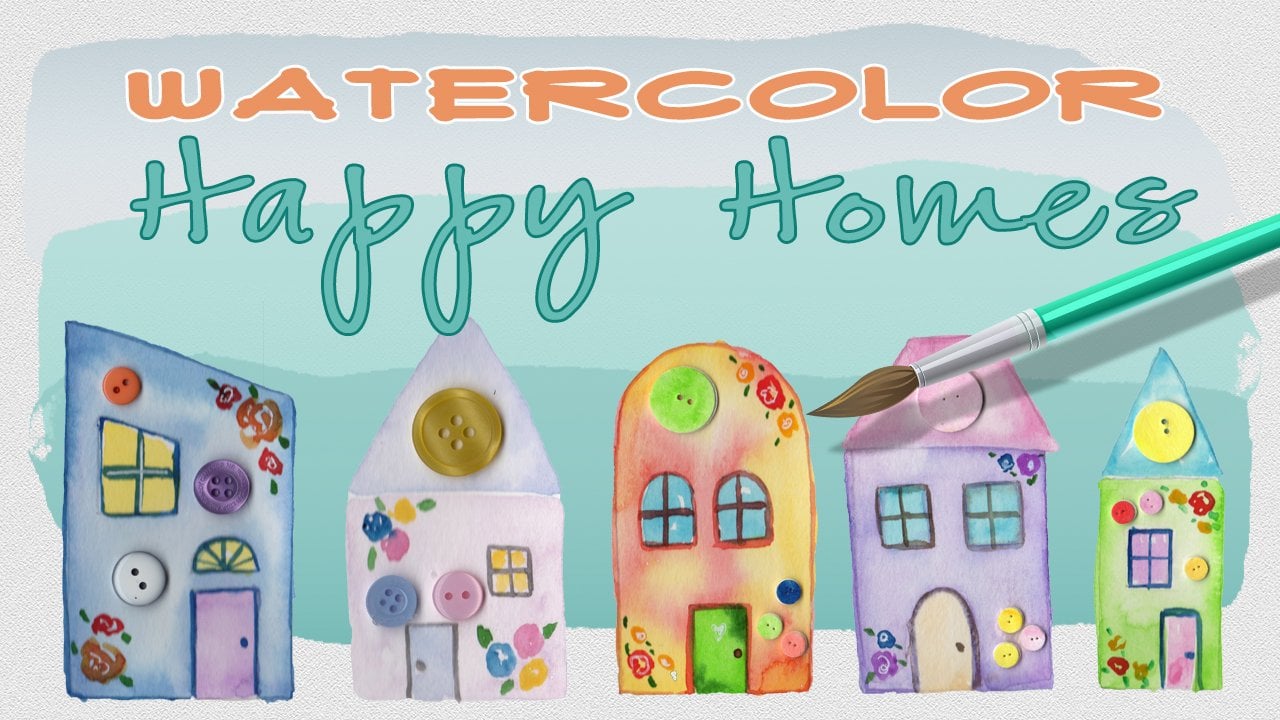
1. Class Intro: Hello, I'm Daniella Melon and author and artist. Thanks for joining me for today's class on creating a watercolor index page using brushstrokes and floral Leinart, this class is geared towards beginner artists with a focus. I'm getting a feel for mixing watercolor paints, then adding layers of line art with a waterproof marker. It's a quick and fund project that it's open ended with lots of variations and use is the beauty of water color. To create a mood for your class project, start by sketching a pencil grade onto your paper. This step is optional and helps to add broad boundaries to our page. Then we'll add simple splotches of pigment, mixing shades to achieve a beautiful color blend. Once dried well, Adlai, our images to our peace I've included a downloadable template that you can refer to for ideas and inspiration. I've included a lesson on creating these easy flowers to make the painting relaxing and fun . When you're done, you'll have gained experience in combining colors by intuition. By varying the selection of colors, you can create different moods and patterns on your paper. Try your hand at creating a watercolor index and take a photo of your artwork and posted in the project section. Be sure to follow me here on skill share to get notified of future classes. Please consider leaving a review and thanks for taking the time to join me today.
2. Class Supplies: the class supplies for our water color index page class includes the template, which you can find in the project section, and this is just to refer to. There is no tracing of these objects, although you can if you want. They are created to size that. I'll demonstrate, but they're very simple Leinart drawings, and we'll go over those in the chapter when it comes time for the demonstration purposes, I have an eight by 10 piece of watercolor paper £140 I'll show you how to make that simple three by three grid, and you can also do it in a watercolor journal as well. And so that's what I have here. I have my favorite paintbrush, and I don't need a very large or very small brush. This is the number eight brush. I have pencil and an eraser, a straight edge to make my grid, which I will erase afterwards so you can skip the great if you want. I find it results in a better image. If I do have the guidelines for my own use, I'll use a white gel pen when my images air dry, and then I'll just use a waterproof marker to make my Leinart. And here I have different sizes. Um, I have a thicker one felt tip, and I have a thinner one here, and it's not fine, but it is much thinner than the one. I'd say it's somewhere about 0.5 point eight. I have my water color pigments. Use any colors you'd like. I'll demonstrate some in class and in the class supply sheet. I'll include a list of all these things as long as well as the colors that I use in class. I also have my water jug. The next chapter will start by making our grid on our paper.
3. Making the Grid: because this project is so forgiving and it's somewhat abstract and it's somewhat rough. Um, our measurements are not precise and they don't have to be. And that's kind of the beauty of this project. So you could use any size paper you could use square rectangle. Really small, really large. It's up to you. I'm gonna do a three by three grid, which means I create two lines up and two lines down, just like a tick tack toe board. And so to get that, I want the measurements to be fairly even. They don't have to be precise. Like I said, because this is 10 inches across. I like to measure in centimeters just to make my two lines, so I just want to, um, it's a little more than 25 centimeters 25 a half. So I'm just gonna go and measure eight centimeters from the bottom of my paper and then eight centimeters from towards the inside. It doesn't produce exact sizes, but very close, and I'll do the same thing up top. So I just make a light line eight centimeters in on both sides, and then I just very lightly connect the lines. And I'm not trying to go to the edge of the paper because I don't have to be that exact. Flip my paper over and I'll do the same thing here and because it's 20 um, centimetres, I'll go just a little more than six, maybe six and 1/4. And I'll do six and 1/4 in Azaz well from the side. And they'll do the same thing down here and again. These are just rough guides, and I'll connect those lines. So there I have my my grid. While I have it here, I'll just erase some of the pencil marks on the edge because I'm not gonna need them. And in case I do get paint on it, Um, sometimes the pencil marks don't erase when the paint covers them and they will be erased afterwards. So I'm just gonna do that if I use a odd size or a different size than here, Um, I made my grid, and then I didn't like the way this looked being completely larger in the center. So I just do a line in the center, and when it's my painting is done, I'll erase it. So this is a very forgiving project. You can make the sizes of the grids however you want. You could mismatch them or match them. I just like the way it looks where its precise and neat in a row. The next chapter will start our painting.
4. Choosing Colors: to make her color selection. We need to know a little bit about color theory. I'm pretty sure we're all versed on the primary colors. There are three of them, and they're not found by combining. Other colors is basically the rule of thumb, and the three of them can combine to form other colors. So that's just red, yellow and blue. And then when you combine those colors, you get the remaining colors the orange, the green and the violet on the color palette. Though watercolor palette, you'll have those colors in tubes that you can purchase if you don't want to mix them. From there, there's the complementary colors and using your color wheel. The complementary colors are. Just pick a spot on the color wheel and in the exact spot. Opposite of that is the complimentary. So for read, it would be green and yellow. It would be violent completely opposite. Now, when you combine primary colors side by side, each color really pops. There's when their colors don't run into each other. They really make them stand out in a lot of contrast, but when you combine them wet on wet, they neutralize each other and they form some short sort of brown or grey shade. The last thing that I think is important to remember when you're selecting your colors is basically just the rule of thumb. Warm colors vs cool colors, So warm colors are the reds, oranges and yellows. Think of a fire. It burns warm, hot and in the cooler colors think ice would be greens, purples and violence. That's just a rule of thumb. So now that we have a basis in color theory, we're gonna move on to intuition. So when we paint, we're gonna pay by what feels. Right now, they'll be some flops, and there'll be some episodes of greatness. And so what we're trying to do is just practice and paint to find more episodes of greatness. So here we have our grid. This is just a smaller version of the one we drew onto our paper, and what I won't do is create some possibilities here. There are two things to think about when we start our painting. One is the overall page and using each grid as its own block so we can alternate patterns. So here I just drew the Mount and named each pattern with a letter, so the 1st 1 will be leery. Alternate. So the main five squares 1357 and nine will be one color, one pattern, and the other four will be a different one, the most basic one to start with, the will be the all being the same pattern and will have separation by this the boundaries for each pattern. We want to use 2 to 3 colors, and that's really where the intuitive painting comes along. So well. Hold aside, creating the overall pattern for now and just work on coming up with some various colors to use for each of the blocks. And to do that, you want to create a mood. And by that you go by what appeals to the author of this piece, the Creator. If you were a designer, your job would be to create the mood for someone else based on what they their instructions or their requirements. But for an artist to start with, it's good to create your own mood, and then you can go from there and build on it. Each time you create something, you learn what you're going to do next and how to create, recreate what you just did. So for each square, what I want to do is just put some spots is down, and I'm just gonna make one square here, for example. And I'm gonna use 2 to 3 colors, so I'll start with yellow and I'll just drop in some yellow. Now I know if I add purple to this, where the purple touches the yellow, the color will mud because they're complementary. And if I use orange or green because on the color wheel those of the neighbors to yellow go get a nice little blend. So I'll take a little green. And I'm just gonna drop it in spots because the pigments wet. It should run and blend as it dries. And so I'll just move that around, and that's a very appealing color. It's bright and happy if I want to. I can drop in another color, 1/3 color and maybe just a tad bit. So right now we'll say 50 50 yellow and green. I'll add a color that's a neighbor to the to the green, and that would be a blue. So let's just drop in a little bit of this blue just in spots just for some interest. So there I have one square that I want to add to my grid. So if I was making this on the grid, I might put this on those five squares we talked about or in each square for our first layer of our project. Over here, I have some just meters, another grid where I'm gonna just try to colors. I'm gonna put them side by side, and then I'm going to combine them. And this helps with my intuitive painting to see you know how it really looks. So I'll start with this yellow orange, and I'll do that in a couple of squares here just to get a feel for it, maybe four. And then I'll just drop just some areas here of that same color, my mixing box. And now I want to combine it. I'm curious if I combine it with this this plane yellow, which is more cool. I don't get a lot of contrast when it dries. It might have a different look moving along the color wheel, have a little orange here. And if I combine that, I get another look. Kind of like that look could take some green and combine that. And I used a cool green and a warm yellow so that may or may not work. It might turn muddy. And then lastly, here, I'm going to use a blue, and we'll see what look I get from there. So using that same color, I'm going to switch to a different yellow. This is gonna be that cooler yellow that we use right here. And I'll do three of those as well, gonna jump right to a red, see what that gives us, And I'm gonna switch to maybe this bright green so I'll put some yellow down and a little more yellow here is Well, drop some of that break rain in. And then over here, I'll add some dark blue. So now we have some interesting color combinations over here on the right hand side of the page. I'm gonna just do a fume, or I'm gonna speed up the process so you can just see the results. I'm using greens and some violets. So with the greens, I combined them with a lighter green with a darker green Ah, later, green with the cerulean blue and a lighter green with the dark blue, the Prussian blue. I really love the way these colors form various shades of turquoise. With the violet, I added the violent and then I added a few more colors. I combined it first with the red, so I got a violent red, then a combined it with the Prussian blue to get a beautiful deep violet. And then I combined it with the green, really, Just to find out what would happen again. This is how you experiment and get the feel for what colors you like and what colors you like to use. And I would go through any of the colors that I'm drawn to, combining them to see what the results would be. From here, I can start creating these big squares, and then I can work on the patterns for the big squares. And when we start, our painting will go over. This is well and make our decision. The next chapter will actually do are painting onto our grid
5. Painting: now to start doing are painting. This is the fun part. Um and it's kind of a loose style. So if you're somebody who likes really precise images, this might not be the project for you unless you want to test out of your comfort zone. But it is a fun one. So what we're gonna do is choose our color palette and it could be anything as simple as I'm just gonna put whatever colors I want on the paper. Or it could be very precise. Like, I want to select three or four colors and I'm gonna use So today I'm gonna still like three colors. I'm gonna make some puddles of water on my palette Gonna add light pink. This is a brilliant pink right to one of them. I have plenty of pigments, no, make another little puddle of water and I'm gonna add some more brilliant pink, and I'm gonna add some Crimson Lake to that, and that gives me a nice contrast. So I'm gonna do this and I'm going to do the odd squares. So I'm just gonna take a wet brush and just make a splotch of water inside the grids on the odd squares and I'll just do the top three for now that I'm gonna take my light color, which was just that brilliant pink. And I'm gonna drop it in, letting it run onto the wet paper and the wet spots that we made again. Nothing here is very precise at all. Except I'm trying to stay within my box that we sketched out in pencil. I'll come in because this is a nice light color. I want a lot of pigment, and I still want some of the paper to show through. So I'm not looking for an overall colored an image or solid blob. Then I'll come over here with my deeper pink and I'm just gonna deposit spots of that inside the wet color. And again, I'm doing the same thing. I'm not trying to color anything in and saturate the entire area. Then I'm just gonna be a little rough and drop in some spots on kind of the dry area of the paper. I'll tilt my image with the color run, and then we'll come back and do those bottom two squares. And by doing this, having a somewhat of a pattern on my paper. It makes a nice, cohesive image. I'll go back in, and as my color dries, I can see that that pale pink is very light. So I'm gonna go in just a positive a few more bits of color here, even letting some drops for my brush fall in spots. Once I have my brilliant pink down, I'll go in there with that crimson lake blend and just deposit some color there, not trying to match the images. I'm just trying to get ah, cohesive, um, image so that they all look that they're the same colors. Now, I'm gonna choose my next color for my remaining squares. So because it was a nice pink, I'm gonna go in here with a blue, so I'm gonna take this cerulean blue, you know, make two spots on my palette, two spots of my palette take a little Prussian blue and then I'll come back in here with just a little bit of this Veridian Hugh. So now I have two shades of blue with my lighter shade. I'm gonna do the same thing I did the first time, except I'm gonna go right on dry paper. I'll just do two boxes picking up that color to pick up a little more of this color that I'm gonna makes a little more of that. So I had the cerulean blue and the variety in blue. Just a few more dollops of that. Then I'll pick up just a little bit of his darker color cause it's so bold, and I'll splotch that in just in certain areas. It's kind of a fun look. What? And then I'll finish with these two pieces, so I add my color to my blank area. Come in with the deeper color drop that in, and I can come in here and add a little more, and I could do the same thing over here just to get a little variation, and I want this to completely dry.
6. Floral Line Art: So now our final image has dried and we now are ready to add our Leinart. So I'm gonna wait to erase the lines and whole after I'm done. There are a couple of things I could do with the lines if I want to keep them. And I can always just erase them if I choose not to. I'm gonna start just with my waterproof marker. Um, here, my waterproof pen. And I'm gonna make the flowers. You could decide to make one flower throughout the entire box through each box. You can alternate. You can just add whatever flowers you want, or you could modify them as well. So you could add one flower, say this one and then change it around by altering the pedals, adding a leaf and changing the vein ing. And then at the end, after we have our our basic Leinart written down on the page, you can go in and fill in and embellish it further. So I'll start with this one. It's very simple. I just basically make a circle in the center of my box for the center of the flower. And then I just make long pedals and I like to alternate. I go around, um, kind of like on a clock, So I'll do the 12 63 and nine and then I'll just add them in between again. The beauty of this is that they don't have to match. They don't have to be perfect, and you can just go with what you want for that. So if you would like to match them, if if that's your challenge to yourself, go right ahead. So I just add them. Try and make all my lines connect. And if I think I need another one or another two here and there, I add those in Azaz. Well, then I just take a step back and look, um, I mean, I'll add some leaves here just like this, and I think I'll just add one leaf for this one for the next flower. This is my favorite one. It's a very simple one to Dio. We think I'll do it in the center. I just make a tiny dot in the center. I start my flower the same way, and then I just make rounded edges very loose pedals, and I'll just do that around the flower kind of overlapping. So the 1st 1 is complete, and then the rest are just partial flowers where they're hidden from the folds. The pedals are hidden beneath one behind it. If I want to go in here, I can make it another row. We're only gonna see the top of it. I just love how that looks kind of like pne. It's just a beautiful flower. And then from here, I like to add vein ing. So I take a vein and I'll either go right from the center to the center of the end of the pedal or I'll just do it on the third and I'll just make a curved line and then I double it . And so I start in the center of the flower and I just make a line and then I make a parallel line to that. I think it just gives a little interest. Then I'll come back here on the back pedals and do the same thing. And I think that curved line adds a little dimension over here. I'll work on this flower. I'd like to make a big base, and then I make a line kind of parallel inside of it. like a concentric circle. And then I go and I just make these pedals and these pedals don't touch. So I started the base, go out and then it's pullin and I modify the size and the shape as I like. I like to come in here and just make either a fill it in or I make little stripes on the center for this flower. It's very similar to the ones we've done. I make my centerpiece and then I'll just make the up top, and then I make a rolling line. So again I go straight lines in a rolling line, straight line and a rolling line, and this is just fun, repetitive, and I just do it until I don't wanna do it any longer, or until I get the look that I want. The contrast of the solid black against the beautiful background that we create is is what really is beautiful about this project. Do the same flower up here making my pedals. Then I'll come over here. Good to do this flower over here. We just make a center and then I make a big round pedal and then I curve one side. You can alternate sides. You can always curve the same side. That's the beauty of this project. You can really tailor it to your own, and it can develop as it goes along. I'll do the same thing over here, and then over here, I'll make this one. It's very similar to this, except it's much fuller and I just keep adding pedals. After I had my first road done, I'll add some more to the back. Now I can add a pattern to my flower, my pedals here so I could make a line still doing all of them. And that'll make cross line on one side of that, and again, it just gives some interest over here. Think I'll add some dots right into that skinny part that we did. And this is where it really varies. Toe whatever. You'd like to dio do the same thing over here, and then for this one. I'm gonna come over here, make a small circle and then just for the heck of it, kind of just modify it. I'll make four long pedals and then I'll just make a few smaller ones in between. We'll make some leaves behind it just for some fun. I'll race these marks. I could go over them with Marker if I wanted to create a border. But I think I'll just erase them, and then I can take my gel pen and add any highlights that I want. Think I'll just fill in just to unify the piece off, filling all the center ones with a little bit of white here and there. You could add more patterns, leaves what have you. So there we have our completed piece in the next chapter, I'll show you some variations on this basic theme.
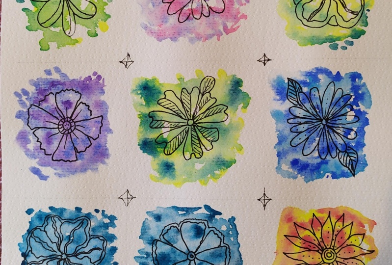
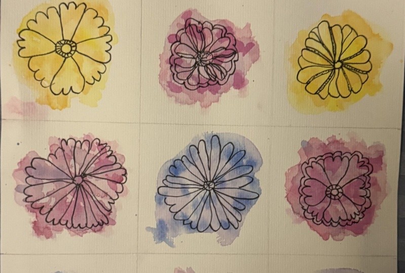
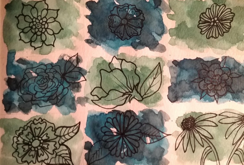
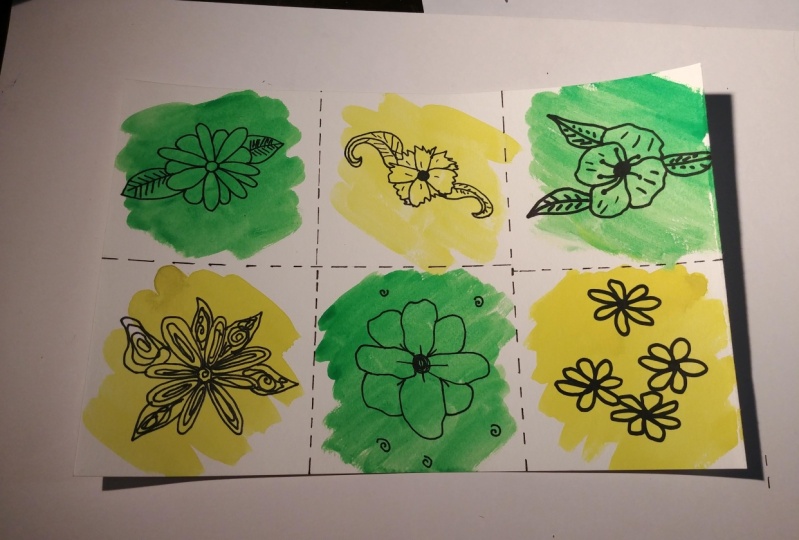
7. Variations & Class Wrap Up: So here's our completed image. We alternated the colors. We had blue and greens, and then we had pink and crimson lakes. And then we put the Leinart over it when it dried and highlighted with some gel pen, and then added Just a few little patterns here and there, some simple lines or dots. Nothing very complicated to get a different look. But using the same technique, I you have this work to show you again. The colors are different, they're more darker, Um has deeper blues as opposed to the green, and then it has the yellows. But the thing that really makes it stand out is the thickness of the Leinart is completely different in this one, and it gives a different mood. Then I have this one where the line art is very fin, and it creates more of an elegant effect. Also, the colors are very feminine, and it produces a different feel. Here I have a piece. Were I to my marker and I created a border, and then I outlined using our grid. Each panel here within our peace, very interesting. Look, you could also just do a small painting that's a single piece as well I have. This pace is well again a modern take a little different take on the grid instead of creating a solid line. I just did the border and then this central grid and I didn't use a pattern for the colors . I just went very intuitively whichever colors that interested me at the time. Really Just playing around. I have a lot of spatter. It kind of contrasts nicely with that closed image of our Leinart this very open, loose watercolor And lastly, you can use your art journal is well or even a book. I did the same procedure, made my spatters of color, let that dry, and then I went over it with a marker creating my Leinart. I also added some texts to each element Just words that reminded me of plants growing in nature. And here we have our original image again, I hope. Youll try your hand at one of these watercolor indexes and post a photo of your work in the project section. Please be sure to follow me here on skill share to get notified of future classes and please consider leaving a review. Thank you for joining me today.
 Daniela Mellen, Artist & Author