Transcripts
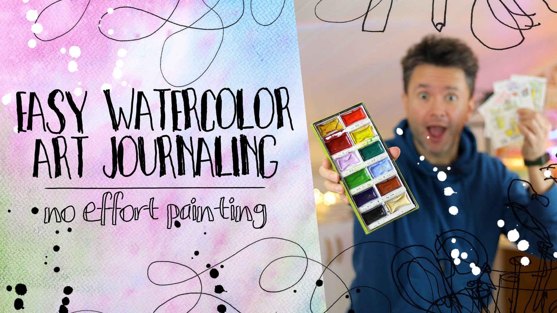
1. Intro: You heard of watercolors and you probably
heard of lettering. And I'm pretty sure
you heard of water. It's pretty essential for life. How about water lettering? Hi, my name is Patty,
but you can call me fat. It's easier and autocorrect always things. My name is Faye. I've been painting
with watercolors for over 12 years from the
times I was a copywriter and I've been
teaching people that everyone can do what
I do since 2020, you know what the
pandemic started. You remember those times.
Thanks for this class. You will easily create
your own fonts. Get a better understanding
of watercolor and how wet on wet
technique works and be able to use the
lettering techniques on your other projects like
your sketch journal or use the wet-on-wet
techniques on your paintings,
transferable skills. Plus, you will have a
gorgeous poster on you. I'm super excited to
teach this class because it's easy to do and the
results are phenomenal. On top of that, It's a
very relaxing practice. At the end of a long day, you can totally wind down playing with some
water like this. This class is for anyone who's looking for a creative
way to do lettering, you can be a beginner or
advanced Hand Lettering. The unexpected results of this
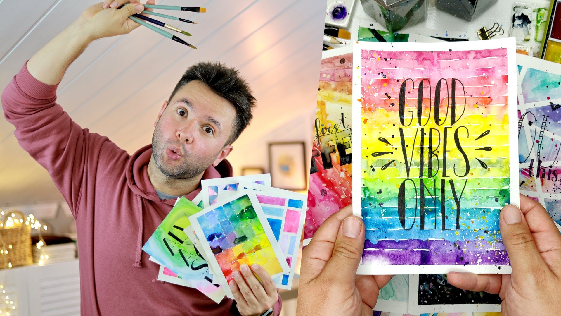
technique is for everyone, you will need watercolors, two cups of water brushes, pen, and watercolor papers. This is an easy and quick class. I know I don't make those often. I will tell you a few things about Lettering and the style, and then we will
get right into it. Nothing is sped up so you
can paint alongside me. Timing is crucial
for this class, and the length of this
class emphasizes that fact. Once we start water Lettering,
there's no stopping. Your class project is simple. I will pick a code and paint it and you will do the same
and share it with me. That's it. I can't wait to show you what to Lettering and
see your projects. Jack has been working
on something too. Let's see Jack,
what you got there. That's interesting. Helped me. What I tried to say
2. Class Project: People, it's summer again. I love so much, but
it's not in the Arctic, not in the studio on
the bike outside. That's what I love summary. On the beach where
I'm half-naked, nothing a hoodie,
but I have somebody. That's why no sleeves. Let's adjust the first
thing, the hoodie. I didn't ask you
guys because I had this hoodie like I think I
bought two years ago when I was in Haldane in Turkey
and I didn't don't get a chance to wear it
because it's sleeps, but it's a hoodie and it's either too hot
or it's too cold. So, but I do it's perfect for this summer class because
it's a summer class, it's June, end of June now, and it's very hot,
hence, no sleeves. Your class project is easy. I said it a lot. Just paint with me
a code. Let's it. First, pick a quote, one of your favorites
or one from my list, which you can find it in
the resource section. Shorter 3-4 word quotes work better than the longer
ones. Just so you know. Pick 3-4 colors you wanna use. You can copy a color palette
from one of my paintings. Write it on the
paper with water. Yes, with water. Don't worry. I will show me everything.
Start dropping paint until you think it's done. Don't overdo it with the brush. Let the paint do its thing. Now. Let it dry.
It takes awhile. No. Really go for
around, come back, shower, cook, eat, taken
up, and come back. Give the final
look with the pen. Oh, 0.4 or bolder works better. A nice bold line. Again, you can copy
the style from one of my examples and share it in
the class project gallery. Let me and everyone else
admire your creation. This part is very
important sharing because it shows how good my classes to
the other students. And that helps me a
lot as a teacher. And also if a tree
falls in the forest and there's no one to paint
it and put it on Instagram. The debt three really fall. The answer is yes, but don't
forget to share it. Alright?
3. What Kind Of Letters?: Jesus, let's take because
if from my coffee. Jack, did you see my new cup? Show me because
I'm a top teacher. Here it says, if you are human, created, I think I will
add here except Jack. What do you think?
I put my Mac here? I should like it. Here we go. Let's quickly talk about letter
shapes and forms. Since I'm going to use
brush to form my letters, what I'm doing in this class
might look like calligraphy. I mentioned this in my previous class about Hand Lettering, but let's go over this and remember again to avoid
any coefficients. Lettering is the Art
of drawing letters. Calligraphy is the Art
of Writing letters. Typography is the Art
of using letters. So for Lettering, we
can use pen and pencil, we can sketch, we can
plan and execute, and then color are creations. With calligraphy, people
use special pen or brush and it's done
in one go. Sketching. What we will be doing here is standing right
between the two, but I think it's still
counts as lettering. I use a brush and use clear
water to form my letters. So this looks like calligraphy. But later I take a pen and
go over the painted Letters. And in this point, I can totally change the
form of the letters. I can make it safe while the paint letter is
not and vice versa. So when I look at
the final artwork, in my opinion, this
is the Lettering. We do things in
this reverse order. So the elusiveness of water, unexpected nature of Wet
on Wet Watercolors give us a chance to make mistakes and
paint our Letters loosely, which is a difficult
thing to do. Later. These marks, we created our suggestions Of
Letters on the paper, and we depend, we
either follow what they offer or we go in a
different direction. And altogether we have
a mesmerizing poster. But it doesn't matter
what we call it. We don't follow any rules. We make up our own roof. You can do whatever you want. I'm only here to inspire
you. That's all. So what Kind Of Letters can
we make with this technique? Since we are using a brush, usually we have both letters. But you can make them on the thin side or
on the bulky side. I like big, bulky
chunky letters since it gives more chances for the
wet-on-wet technique to work. You can totally
copy of my fonts or even the anterior-posterior from the code to the color Palette. Totally fine. In fact, I encourage
you to do it. I enjoy making letters
that Arctic on one side and tin on the other.
You should try that too. When it comes to
making your own fonts, like making taller, thinner forms or shorter, fatter fonts. It's
totally up to you. You can make them wavy, getting bigger, getting smaller. You can change
three parameters to come up with all
different fonts. You can change the dimension, you can change the
style or you can change the filling to make
entirely new font. When you're forming
letters out of water, only the dimension and
the style matters. The feeling is the subject
of watercolor and the pen. You can find out much, much more about this topic and how to make your own fonts. In my previous class, everyone can draw letters. So for this class, I pick the code to
motivate it further. You can do it because I really believed that you can check was supposed to bring me water, but he's been gone forever. You asked me a glass of
water and I'm back in 2 s there. Welcome back. Check how was your trip? The class is called
literally water Lettering. We can do this without
water. Where is the water? You're fired?
4. Color Palette: Now we're going to talk about
the color palette first, because once we start painting, it's very important
that we don't stop these projects much dependent
on time management. Once you put the water there, you need to know what you're doing and what
you're going for. It's a good idea that
you know what colors you're going to use rather than do your lettering with water. And then you try to decide and your Letters starts drying on the paper and you
can't see them anymore. That's why when I'm
water lettering, you can see me adding
with my brush, picking up water and adding to the previous letters
that I already made so that they wouldn't dry. And then I will just go into Painting straight away,
at least this way. When I pick paint, I'm picking more
water, of course. So as I'm adding to the letters, they don't try any longer. They just get more and more red. So it's a good idea to know what colors you're going
to use for this Painting. I'm going to use combination
of colors that is here. Cadmium orange, cadmium Scarlet. This orange and red. Addition to that will be
the cherry blossom paint. These are the three main
colors I'm going to use. As an accent. I'm going to use this
row space and purple. So these three colors, actually this is my wife told me once that can you do me a
Painting With this question, I was like really pink and orange and they start
gonna look good. And she said, yeah, trust me, she's very good with colleagues. And I did a painting, actually, might be,
one of them is here. And I was very impressed
with how these three colors, red, orange, and pink. And I'm going to use that, but this purple will add a bit more contrast
where it's needed. And this rose Bache will make it lighter where
it's needed again. And that will be completely, I will make it up as I'm
going you and you'll see, I see a patch of this to light. I will add some more
purple and I will see a patch that is two mixed up. Maybe read this to taking over the watercolors
and I'm gonna, I'm gonna get
epitope Roles page. These two colors are opaque. This pink and rows page,
they are not see-through. So that's why they
are more heavy. And when you add in a
wet-on-wet situation, it really, they really pushed the other colors
and you're going to see that effect as well. That's why this is good to practice this kind of
wet-on-wet techniques. So you will understand better in a more controlled environment
in the form of a letter. Later, you can use the same
technique for your paintings. And yeah, so this is
what you're gonna use. But it later when I, when we look at
some other examples that I did for this class, you will see other color
combinations as well. And I will put something in the resource section that
you can pick as well. So that's what you're gonna do. One more thing I want to
mention before we go, I have two water containers. Normally, this is dirty and clean water that I wash
off the paint here, so it's lots of pigment
mixed up in here, so it looks all dark,
grayish, reddish. And this one is usually clear. But I've been using
this for some time, or maybe like ten
paintings or something. So it's not so clear. It is EBIT Monday. I kept it this way specifically because when I
added on the paper, on white paper, the Clean Water
is very difficult to see. I'm unable to see with
a reflection of light. That's why I have an additional
light or just over here, you can see that
I'm casting shadow. It's going but I kept this
dirt voted a little bit dirty, so maybe it will be
more visible for you. That's what I hope. This way it's a little dirty, but in general, there are
two water, clean water. I washed my brush here, pick up water from here, then I pick up paint. Okay. So that's how we're going
to roll and this side. So if you are ready, I'm ready. Jack already. Jack is also ready with a glass of
water in his hand. There's not going to
use check anyway. So let's go in the next part, you're going to start water
Lettering. See you there?
5. Water Lettering: Welcome back. Now we're gonna
do the water lettering. But before that,
I wanted to show you a page from my notebook. Before starting the
water Lettering, starting to put the
water on the paper. It's a good idea to know what you're going to do
in terms of lettering. As you can see, I went
through variations of how I can write my saying,
you can do it. And after trying
a few variations and few different types
of fonts and let drinks, I decided on the one
at the very end. That one side is
thick and heavy, the left side and the
right side is thin. And I'm going to try to do that with water and see what happens. So it's a good idea
to make sure you know what you're
going to before you start putting the
water on the paper. Okay. Now we will do the
water Lettering. This part also. I did it without the voiceovers while painting
because like I said, this is a
time-sensitive project. I thought I would be
struggling to keeping the Letters Wet and talking
to you at the same time. So I did it separately. Now, I'm doing the
voice-over over it. As you can see, I started with my dirty clear water
like I mentioned, you it's more visible things so that when you do
with clear water, it would less visible. But when you are with the
paper in front of you on P S, difficult recording
things is difficult. In real life, it will be
easier. I promise you. I'm trying to replicate what
I decided on my notebook. This kind of lettering
that's one side is thick and heavy on the left
and the right side is team. I think it looks really
FUN and modern display. And I'm trying to replicate
that with water on my paper. The reason we do like this is because water is not as
easy to control like a pen. And this way, it allows
us to let go of it a bit and paint loosely
and end up with these beautiful Posters For
our Wall or for a card, maybe for a loved one. So now I put the Y and 0 and T to C. I just draw
the shape and drop, dropped, a drop of voltage into the shape and it's
suddenly filled up. That's how it works. You
just kind of draw with your brush lightly
and then drop it of water and it just fills the area and it
stays in the place because that's the property,
property of water. That's, it has the
surface tension at the molecules of water
holds onto each other. That's why when you drop
a voltage on the desk, it's takes this round shape because molecules are
holding onto each other. And we are using
this while painting. This way. I'm dropping drawing the shape
lightly and then dropping a bit more
water just like I did. And it just fills the space and doesn't go further than that. I did one more drop,
as you can see. Now I'm drawing the letter
C. It's not perfect. And did you see in lightly connect to why that
is also important? Because we want these
are coloring later. We want to the pains to run from one place
to the other end. These tiny connections between the letters allows that and it looks really
FUN at the end. Now I'm drawing the letter a. Again. On the left It's thick
and on the right is thin. Various needed. I'm picking up extra water with my brush and
dropping it there. Look with more water. I dropped and I connected
a with a tiny bridge. And now I'm drawing
the letter N, tick on one side. Adding extra water. I picked also this style because when you are
doing these paintings, It's good to use chunky fonts because it gives you a bit
more place to play with. Later around me. Can
I add the paint? You will see it will
become more reasonable. From this angle. N is not easy to see. I can see that I'm struggling to see to
be honest, but it's there. And look, you are starting to dry and I added extra water. That's also important.
You need to keep an eye on your first letters. As you progress down, they will start soaking
into the paper. You have to keep
going back and adding extra drops of water with your
brush to them if need be. Also if you are using a
paper that is not too thick, like 200 gram, it might there might be a bit of
bending and bending. Water might go one sites pool. You can see on letter
Y that is pulling on the left and
because of the door, so you need to keep dropping
water and keep watching your first letters so
they want dry before you start putting the
paint on the rise, all the progress is gone. So we need to hold onto these loose shapes of water until we get
to them it paint. Now I'm doing the do in here. I decided to make D and all overlap for reasons of spacing, let's say to fix it because
you has three letters, can have Letters and
do it together with one space between them like
more like five letters. Kind of space. Did you see I just dropped a
bit of more voters to N and C. So I decided D
and 02 overlap. And I also gonna make, now you're going to see letter I really snuggling
to the letters T again to conserve more space
and make it fit under the, you can see that there's a gap. Now I'm drawing the
letter T. It's almost. So letter D is also drawn. Now you can see I was saying
letter N is not visible, but as it gets soaked
into paper rabbits, you can see better. And I put the eye very
close to the letter T, almost under the roof of T.
And this way, I don't know, this is how I decided to do my typography and
I'm happy with it. You can, depending on
what you're gonna choose, you can do differently. So this is the motoring part. Water Letters, water
Letters, water Lettering. And we will just move on to the colors straight
away. There is no gap. I just divide it because it needed to be separate lessons. And we're going to move on with the color straightaway.
See you there?
6. Coloring: Welcome back. We will go
right back into the coloring. While our letters are still. We talked in the color palette. My colors I already decided
prior to my paintings, I'm going to use cadmium orange, cadmium Scarlet, and
cherry blossom pink. And as an accent, I have two more colors,
purple and roles bag. And I started with
the orange one. I'm not doing anything
special with my paints. I just spray them, likely to make them Wet. I think it's called
to activate them. I don't know what that means. And then I'm dipping my
brush into water and making it very nicely covered with paint
with lots of pigment. And then I just start dropping paint into the Wet
letters on my paper. Let me a visit from my coffee. It's very hot and
I'm drinking an is that because like I told
you, this is a voice-over. Now I switch to Scarlet,
Cadmium Scarlet. The thing is here
in this painting, especially picked this way. I'm, I don't have a plan. I'm just going with how I feel. I look at the letters and the
overall page and decides, I'm going to drop a
bit of orange here, a bit of orange there that
I'm going to drop a bit of red here and move
on with deadlock. I'm just doing by I I'm just looking at deciding where
it needs to go, running. It needs paint and
I just call that, then you have more paint in
your now I switch to paint. You can see this is
what I was saying. This pink is opaque and it's very heavy pigments
when you drop it to see how it runs through the other colors
and it pushes them. Because it creates a very
dense area and it just moves into the less dense
regions of the water. This allows you to create very nice flowing
looking paint paintings and in this case, Letters. But the same technique
you can use for your paintings as well later. Because this pink is, this opaque colors are so
heavy and pigments they, when you load your brush
with the paint and drop it, it just it just pushes all the other colors and makes
them flow into each other. And I'd like to survey. And as you can see, there are tiny bridges I
created between Y and C. And C, an, a, an, OH. This allows the colors to go
between the, those letters, even though they are not
adjacent but or an a, they are in separate lines. They all is on the top line and this a
is in the middle line. But I created these bridges so the paint can move
freely between them. Now I switch two rows, Bache, and this is a light color, so I'm using it to Kind
of balance it out. If I see somewhere that is too dark or there's
too much contrast, I dropped this page. This page is also like the pink, opaque and very heavy. So it pushes the
other colors as well. You can see now it's
doing its work in D, moving into the air. And this way you'll
get a feeling. How do wet on wet
technique works? The paper is wet. The letters are Wet. Literally water sitting
on top of letters. The water is sitting
on top of the papers, so it's waiting for it to drop the paint.
The paint is wet. So this is where the Wet on Wet. The term comes from. And now I moved on to purple to add more
contrast because it looks a little light with the pink
and the beige coming into play and this purple in places. I'm trying to see
the letter form. Is it really visible
because the paint always dries less saturated than
it looks when it's wet. You might like how it looks. You might like how
it looks when sweat. But once it's dry, it might be a bit
disappointing because it was looking so nice and vivid
than not. It's not anymore And I'm using this purple
because this is Wet on Wet. When I dropped the paint is just dissolves into
the other colors and so don't be afraid at all these colors too strong and it's going
to ruin my painting. It's just they're
flowing into each other and create one final
look altogether. And one other thing is if you
notice that with my brush, I'm not doing so much. I'm not mixing them. I'm just dropping my pain, maybe dragging dragging
it across a little bit. But after that,
paint is doing is something that they are
mixing by themselves. Pigments flowing from where it's more dense to
less dense area. Again, the pin came back and I'm letting it
do its own thing. And that's what I really allow with the
wet-on-wet technique. I'm not playing too
much. It's my brush. A bit more coffee, and we are almost at the end. You can see all the letters are very nicely colored
and visible right now, I'm only looking
for final touches, like if it needs a bit more purple here or a bit
more pink in here. But overall, it looks okay, maybe a bit more with the roles. And pink. Yeah, I'm
getting more pink. This could be an example. Look, I'm using now my brush because the end was coming a bit short and I brought it through same level at the bottom as a. And this is an
example of me using my brush to help For
the letter form. But in terms of the colors, I'm trying to just dropping
where the paint is needed and then it's just running
away and doing its own thing. Now I'm dropping a bit more
rows Bache and this dN0, a bit mixed up at the moment because there
is overlapping there, but we will tidy
that up with the pen and you will see how
it comes in handy. Of course, you can't do
Painting without one thing. I always say, what is it? Splashing? You have to
splash around a bit. You have to break. That's all beautiful whiteness around your letters and splash. But I usually do,
is I pick two of the colors I use in the
paintings of the main colors. I did a bit of orange there, and the second
color will be pink. And, but again, this
is another rule. You can use all the
colors you want. You using your painting. You can use different colors than what you picked
it for your letters. You can use white or
you can use black for great contrasting splashes. And I also do diagonally, like if you notice, I did upper-left
and bottom-right. But you can do as much
or as little you want. You can try and see. One other thing I do here, you see oil pastel and it
has a nice flat bottom. And I use that to
splash a bit more. This is for, to make the let, to break the letter
shape a bit more and make it explode from the
letter form they created. And I do this in the
parts where it's really lots of water
and paint pulling. And I'm gonna do
one more on why. Because there's a
nice pulling off pigments and creates splash. And this way, it will
look better when the, when we let it dry and family
put the pen around it and create the letter shapes. Gonna look like letters are exploding outwards and
it like that effect. And you will see that later. Now the hard parts
letting it dry, it still takes long time, but I like to let
it dry naturally. So we will see I also
record the time-lapse of the drying process for this to 3 h or 3 h and my
phone battery died, actually, I couldn't do it. But now you can see
how it looks once it's dry and when it was wet. I will see you in
the next part. By
7. Finalizing with Pen: Hello guys. I thought
I would give you a little sneak peek
from my office. This is my desk. This is where the magic happens. And at the back you can see
some of the artwork I did for this class and my little
farm stand for recording. It's a total mess. Jack was supposed to
tidy up but you know how he's and yes, I'm
talking about you. So let's go let's get on
with it. Let's do the pen. Now our Painting is
dried and I'm going to use this pen micron or point. Not all 0.4 or for fairly
thick pen, not like oh, 0.1. Because I think it helps to make the lines more
visible and more contrasting. And I like it more than
using just all 0.1. So the thing is, the, are Painting
essential done. It can be this can be it. You can just put it on your
wall NCC and it's done. You, you might totally
feel like that and that's totally fine
if you choose to do that. It looks beautiful. And I'm sure you will feel this way too
about your paintings. But this construct and
with the pen in this part, you can break this construct. You can build upon
that constructs. You can change the bit, you can bring more
structured all you can. You can fix some of the mistakes which we will talk
about it in a second. Or you make more mistakes with and it will make
it even more unique. So it gives you more possibilities that
you can add texture to it. You can give shape
to your fonts. If it's not, For example, set if you can make
it a serif font or you can paint it as
safe and not use it, make it san-serif it your pen. You have more possibilities. That's why I like the end
results like this and we all have a look at more
examples later after this. So as you can see, I made
than the paint was pulling, I made splashes using my oil pastel here
that I made a pump. In here. It worked very well. I like these explosive
effect here. And in here it work
also very well. But in here it made my you, in the work you the
letter you kind of mixed up it looks
like a or D. Now, I have a chance to
actually fix this. My pen. Now I'm going to outline my Letters to make
them more visible. But while doing that, I'm not gonna be very precise. I have an idea of how
it's gonna look like and I'm gonna hold my pen not
very tightly from here, but all the way from here. So my hold will be loose on the pen and I want to make some
mistakes basically. So now let's go. And I'm gonna go like
three times over every line to make it really stand out. As you can see as when I put this Y here with the contrary, that suddenly this splash, it still has this splash effect, but the letter is back. So I use my pen to fix
the mistake in here. Let's say I'm trying to be as loose as I can be. For example, here I haven't specifically a bit
on the inside. I want this to look
very light and loose. And now I'm fixing
this. You did. I messed up in the painting process when I was trying to make
nice splash here. And here's you. And sorry, I was checking my laptop if
it's recording my voice. Now Can you see first I made them more angular line here on the letter C. Then I
didn't like how it looked. So on this part I made
it look more rounded. And then here I, I did the same. So when you have the pen, you have more options. Now the letter a, I want this one coil
inside as well. So it's all these
lines together. It makes it really
give a nice effect that kind of like 3D. It made, it adds more to it. For example, here on
the right side of Ann, I will show you in a
second, but I mean, I specifically went outside the paint because it was too thin when I look at you here. And this whitespace left between between the lines and it looks like a
highlight actually, that is kind of
getting the light from the right-hand
side and shiny. And you can use this
to your advantage. The same is happening with a, there is a bit of white inside
the black counter here. Now you can do here is to be able to
workout the spacing. I may do. Oh, go behind the
I will try to keep that. Now. All comes from here
and it continues here. You can do it. Again. I'd the splash here. So now I'm bringing back
the shape of the Letters. And the splash
still looks great. But letter is more
red ball. This way. You can totally go ahead and
add more to it like you can. Outlines some of the splashes. Again, I'm holding the pen
from the top very lightly. And I'm not trying to
make perfect lines. I want these paintings to
be very light and loose. That's why we go ahead and paint with water
like we can't quite see so that we make mistakes
and the letters, shapes are loose because
usually it's difficult to let loose and paint loosely. But this process
helps us do that. Okay, now we add some
splashes as well. And now what's
left is, I'm sure. And for this one, I think I will add some lines
that they start very close. Then they get separated How should, over
from here we said maybe it's originated this
ripples from here and this one, Let's do it here. To end from top-left. Again, I'm not doing these
according to anything, just I pick a corner. It looks to my eye
and I go for it. Okay. Okay. Now, last parts. Who can do it's and to finish off this pattern, I want to add some dots. For this. I'm starting
from opposite of where I start the line pattern and against more dense where I start and then I make it
more and more scarce. Now from this than again, I'm not paying
too much attention, but I have a rough idea of what I'm going
to do and then I just go ahead and do it. Okay. We're almost there And you came from
there because it's almost like how these dots and lines look and how much
it adds to the design. Okay, Now that's also done and I'm thinking there's anything else I
would like to add. But I think that's it. I think
I'm happy with this one. I will show me with other
Examples that you can also add 3D on the site to make it stand
out even more from the page. But I think with this one I'm, I'm happy how it looks like. This is the hero of this class and It's good to add
is rather simple. You saw how I did the lines. I didn't pay particular
attention than just went around it over it and nothing has to be
perfectly straight. In fact, nothing should be
straight, I think. Otherwise. It doesn't look organic, it doesn't look real,
it looks artificial. But on some other examples, I will show you what
else you can do for these patterns and we will have a look at it
in the next part. So I hope you enjoyed
this project and I'm looking forward
to see or test
8. Other Examples: I've been telling you
we're going to look at other Examples. For this class. I try a few different
variations. And here we are. This one I went, as you can see, all green. I used, I think, sap green, sap green, deep lime
green and lemon yellow. And then later with the
pen, as you can see, I did a bit of 3D on the, on all of the letters actually. But I for the left-hand side, I made them darker
with extra lines. And for the right-hand side, I left them empty
and then I added some dots for added texture. This one, happiness is an
inside job. It like this one. Very happy that I used the orange and yellow so I
wanted to keep this warm. And for the top, I made the
letters with the pen serif. And in the middle
there is a bit of a fake calligraphy style. And four here, I only used black marker to create
a 3D Kind of dept, but not too much. It's made the There's standout and similar style
is on this one as well. Never give up. I want to
keep this one more clean. And just on the right-hand
side with the brush pen, I added additional
line, black line. And it looks like from the bottom-right corner we
are looking at the letters and it gives this
3D effect and it makes the letters pop
from the white page. And as always, some splashes. This one, take it easy. I, as you can see, to fill the type of reifi, I used arrows on the right. And I wanted to make this
one starting with a red in the center and going
outside towards purple. So like a rainbow but starting in the middle
and spreading outside. And then with the pen, I put the letter
shapes and I added some bubbles for extra Bolinas. This one, but first, coffee, it like this one. And I did it in the style
of calligraphy first. And the bottom, letters are like more blocky coffee and some dots and some
lines for texture. And it's really came together
with the pen in my opinion. And there is a bit of
extra splash there by the water was pulling. This one seems so happy to
make create your own sunshine. I knew from the
beginning sunshine I wanted to yellow
than I thought, how could I make a gradient? So I made from blue to
purple and towards yellow. Then I added some wavy
lines in the Create. There is also 3D going on, a bit of texture in
the, your own part. And for the sunshine, there are some dots I
usually like using dots. I use all 0.8 very
thick pen for that. So there are more visible. Follow your heart, your heart. This is also one of
my favorites and similar color palette
to the one we made, but more pinkish reddish
than the orange, this one. And I added extra textures
to all the letters. And when you look closely, actually there is
nothing special, but in the total, it gives more character
to the letters. This way. This is what I've
been telling you to Shorter 3-4 words work better. I like this saying, but it took too much time
to put all the letters and it was a pain in the US to keep them Wet by the time
I was reaching the end. So keep it simple. 34 works is better to
do for your typography. And easy, like this
one, good wipes, only three letters, so I
made them feel the space. I use elongated shape. And then I made it look like some sort of a line was
wrapping around the letters. And I really like this look, I kept it throughout the
entire thing because this good wipes on
the me. It looks so. And you can see there
are some splashes as well from the letters. This was, I think the
first one I may made for this class and I'd like it
and it's kind of my motto, keep it easy, make Israel. And I, with this one, I wasn't, I didn't really
have a plan in some parts. I put some 3D in
some parts I didn't. And there are some
bubbles going on and lots of splashes around. I also put some pen on the splashes and I like
to overlook way too much. This is one of my favorite, fake it till you make it. And also another one
of my life mottos, I made the Letters blocky, but kind of pick and
chunky and long. And I also tried
to make them fit. Snug. Snug, which do you see how I
is close to the T and L is on the top of another L
and M&A is overlapping. Then I wrap some lines around the letters and
also added some dots. This one, this is also a
possible scenario for you. I liked it so much as it was. I decided not to add pen. So this is also an option. You can just keep it as it is. If you look at it and think it's done, sometimes it's done. There's a nice splash
that on the E. And I decided to keep this one as it This
one day at a time. And I did like the color palette very similar to the
one we did today. Minus the purple. This one, I may or may not
have been high when I did it. I'm not going to
tell you which one, but I wanted to make some letter shapes that they are not actually
letter shapes. I wanted to look alien. And at the end, I really
liked how it looks and I made it the general
look for the class. I used it in the intro and outro, so I'm
sure you noticed. And this what is this
doing here, Jack? This wasn't supposed to be here. I don't know why
you put it here. This is jacks creation. I don't know what he's
trying to say here. And letter shapes are not too bad and the colors are actually like it's a very
vivid, I will give you that. You made it nicely blocky helped me like four letters on top
and two letters. Not too bad. I like it. So let's it and I will see
you on the conclusion by
9. Conclusion: Conclusion people, let's
conclude this class. And this is it. I hope you enjoyed this crazy
way of making new letters. Thank you for watching
and being created. These clusters wouldn't have
existed without fear of UCO, you are making me emotional. Wow, lettering with water. Maybe when you first
saw the title, you thought it was crazy. But now we know that we can first write our lattice with
water and color them later. This way we can end up
with fun looking fonts. Once it's dry, we can use our pen to give its final shape. We can emphasize certain
characteristics like serifs or fix the mistakes
we did with watercolors, or make even more mistakes to create even more unique artwork. If there is one lesson
you're going to live here with after this class. I hope that lesson will be that there are no rules
when it comes to art. You can draw the letters, you can sketch to that test. You can paint the left,
you are the boss. Everyone has a different way of getting to the
final destination. This is one of the ways
I do lettering and I find it highly
entertaining and relaxing. I hope you will use
these techniques in your future projects. Paintings, posters,
or your sketch on. Speaking of future projects, don't forget to share
your creations. Class Projects are very, very important and they
helped me be a teacher. You can pick anything from the list or one of your
own and create a poster. But what we learned here today, I can't wait to see them. Also now, I tried to
share every class project and review on my
Instagram account. There are a lot of them. So make sure that your
Instagram account is connected to your Skillshare so I can find you and mentioning, speaking of Instagram,
you can follow me there. My Instagram handle
is fab works and I'm there all the time.
It's kind of a problem. Speaking of following, Don't forget to follow me
here on Skillshare. This way, you can
find out as soon as I publish a new class
and I can reach out to you with
important stuff like what color hoodie I should
wear for the next class. Or your mind is like,
how about the review? Speaking of reviews, don't
forget to leave a review. Jack, warn me if I said, speaking of too many times, reviews are the most
important tool. You have to show how much you appreciate my classes so I
can continue to make them. Thank you for watching and
being creative with me. The world needs more
people like you. And don't forget, keep it easy. Make it real. By Jack does not fire you. I'm super excited to, to, to, to, to, to, to, to. It's easy to do, do, do, do, do, do, do, do, do, do, do. Okay. Again, faith. Faith. Okay. Okay. A weird way of drinking coffee. Yeah. More presentable way. Thanks for the coffee.
And thanks for democracy. Hey, Jesus, I'm against a team
like JQuery is the makeup. We don't have one. I think I will use the ice bucket again. Maybe some of you remember in
my feet in the ice bucket, I can make it safe while the painted letter is
not, and vice versa. Jesus. You could say bless, you can take a sip
from my cold coffee since I don't have I
don't have an assistant. These classes wouldn't
have exist without you. Off you go. They're
making me emotional. I don't know if I'm
going to use it, but probably the you
don't know this, but I'm not really good
at acting in there. I was trying to act
like I was crying. Could you tell summer baby? This also, but you can use
your paintings to cool. The class is literally
called water. Lately, we can't do this without water.
Where is the voltage? And then don't laugh
when you say, I know. I know. Okay. Don't miss me and
fix my favorite. Oh, that is finally. Welcome back. How was your trip? The class is literally
cold water lettering. You can't do this without water. Where is the water? You're fired. You're fired. And how much did you
meet up next to me? I have to tell me you missed. I know, but Thank you. I thought I missed the
line or something. I know it will it will do. I am melting here. Stop the video
 Fatih (fab) Mistacoglu, watercolor storyteller