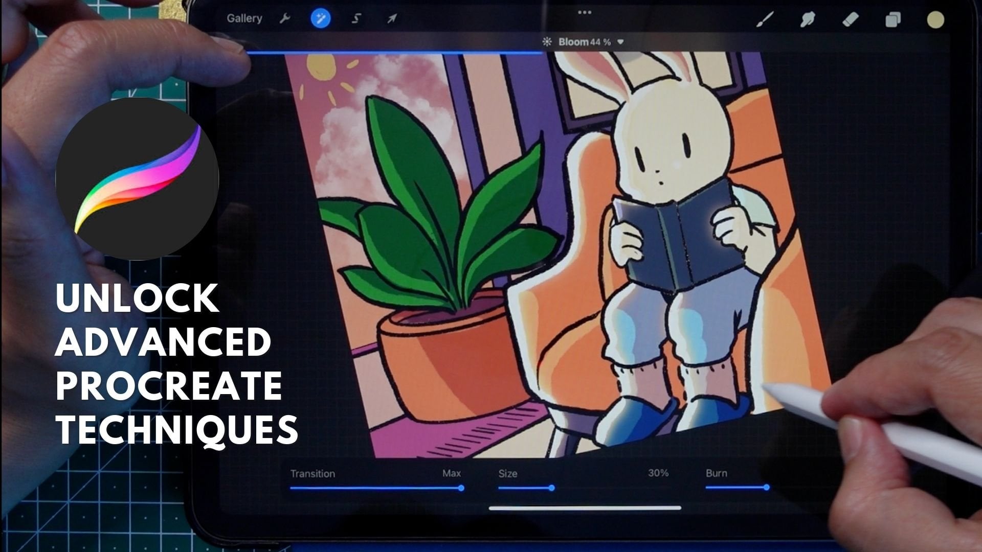
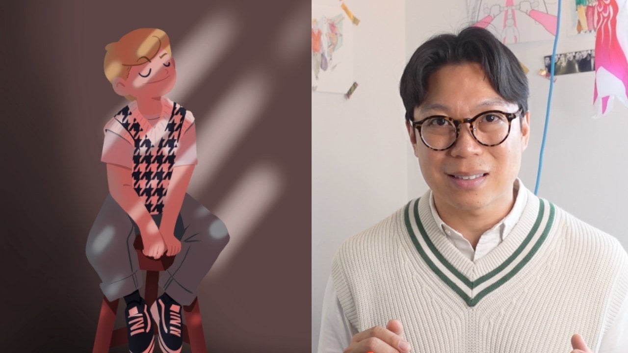
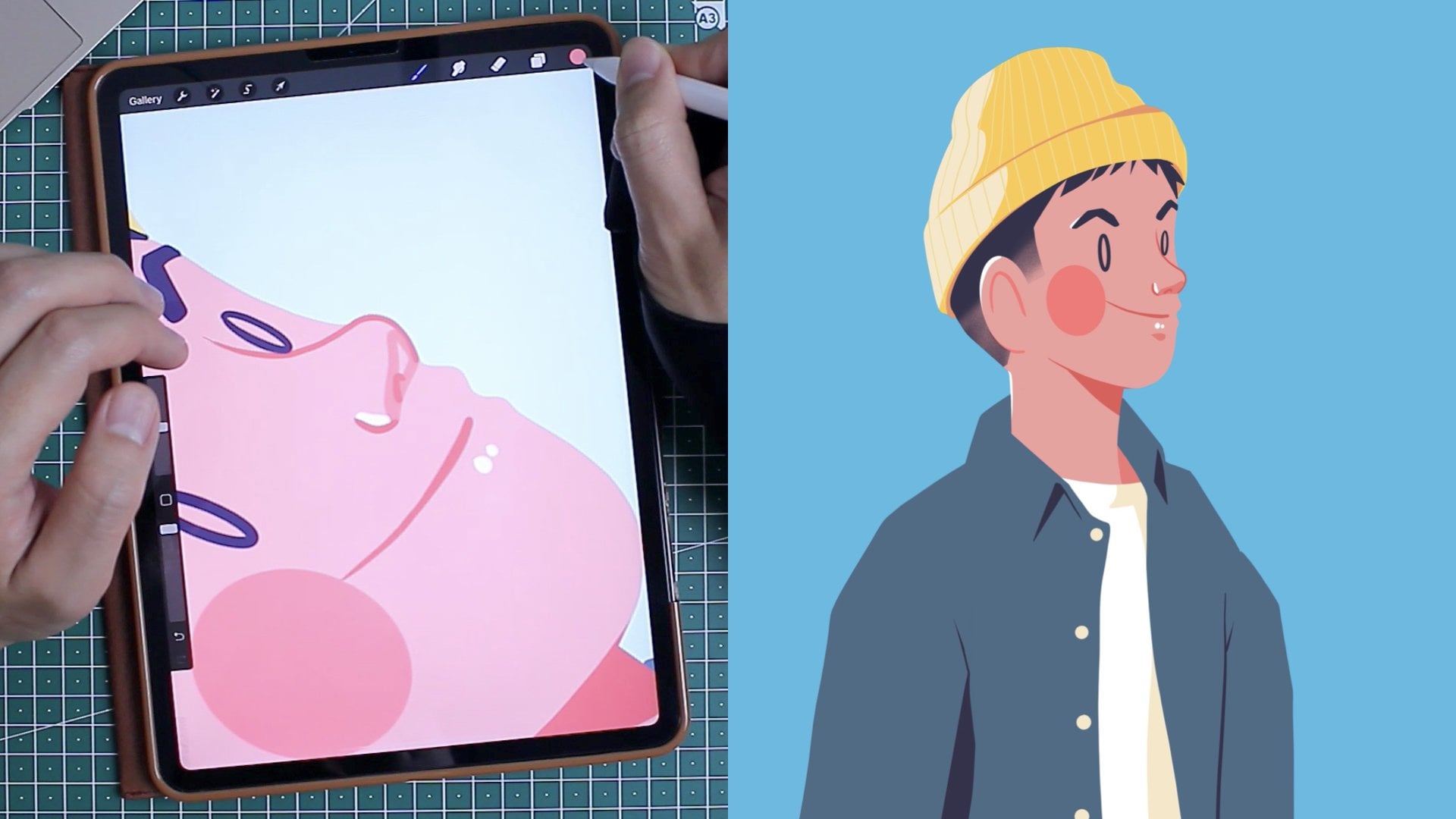
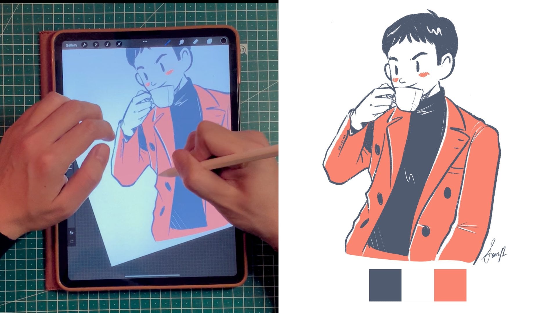
Transcripts
1. Introduction: Hold on. Are you stressed? Do you feel like you're rushing through your own life? Well, this may be the class for you then. Hi, I'm Simon. I'm a digital content creator and illustrator, and I'm currently living in Copenhagen, Denmark. I love to draw simple illustration depicting sweet moments and snippets of my life, and I use clean lines and the harmonious color palettes to do so. I recently bought a new iPad Pro and embarked on a new journey called my 100 days of happiness. This was a great way to get out of my creative rut and fall in love with drawing once more. Now, it's your turn. I want to challenge you to draw your own seven-day gratitude journey using Procreate. Procreate is an excellent tool to experiment with a myriad of different medium without feeling the guilt of wasting material, time, or money. Throughout the next seven days, you will be learning different drawing fundamentals that are super useful to you as an artist. Each day, we will build up on the skills previously learned, challenging you to use new brushes and learn new techniques, not to mention that by drawing regularly, it's just like everyday practice. You will improve your drawing skills and gain confidence in your own personal style. To make it easier, I've created a seven-day prompt and worksheet to help you along the way. You'll translate your daily events into strong sketches, which is the foundation for any drawings. With your Apple Pencil, you will learn to control its weight and pressure to create varied line and textures, and you learn to give your drawing some depth by adding shading and confident lines. Just a little secret, I do StreamLine to help smoothen my brushstrokes. Using StreamLine is just like using training wheels, except for your caffeinated, shaky hands. By the end of this class, you will not only have acquired a building flux to illustrate your days with strong, confident lines, and harmonious color palette, you will also have learned better ways to express yourself and be more present in your own personal life. What are you waiting for? Take control, and be the protagonist of your own life again.
2. Your Project: Welcome back to another video lesson and here, we're going to discuss about the project. Now I'm super excited to tell you a little bit more about the project so you can get started with your visual journaling. As this is a seven-day visual journaling project, I want to provide you with a couple of references and templates in order to make your life easier. I really hope that you find the resources I provide useful. On the Project & Resources, you can find a couple of documents. The first one is a color palette sheet. In order to make your life easier, I selected a few colors that you can use for the project. In the future video lesson, I'm going to show you how to save them directly on Procreate so they are easily accessible. The second document is the list of prompt for the next seven days. They include the colors that I suggest that you use throughout the seven days as well as the different brushes. Third is the completed list of all the seven-day of gratitude that I've done. I hope that you will find them useful in order to inspire you throughout your own journey. Fourth is a class note. I've received a lot of positive feedback from you guys finding it's super useful to have a PDF with all the key lessons. You can find them on the project and resources. Finally, five is the template for you to complete. In the next video lesson, I'm going to show you how to use it, how to upload that specific template on Procreate. But it's available here, you can see that there are four big square. The first one asking you what day it is, the second square asking you how are you feeling, the third one focusing on what made you feel that way, and lastly, a blank canvas for you to enter any type of notes. I've decided to have this format with four little squares because I find it and many artists find the same, that a blank piece of paper is very, very intimidating. So having prompts and having little squares to fill up makes it more digestible as a challenge. For your project, you can submit one of any of those visual journaling day. The reason why I say one is because I understand that this can be a very personal project and you might not want to share it with the world. Since each day and prompt come with different levels of difficulties, I encourage you to submit the day that you feel more comfortable with. Whether you feel more comfortable sharing Day 1, which is a simple sketching, or even Day 7, put on a piece of paper everything you've learned from this class, which ever you find the most comfortable sharing with us, please do so. If you feel confident enough, you can share all seven days. That's also fantastic. I also encourage you to interact among each others, and like and comment on the project of your fellow classmate. Because I can assure you, it can really brighten someone's day to receive a positive feedback. I am convinced and you can do it, and don't you worry. In the next video lessons, I am going to walk you through for each of these days so you can complete very proudly your seven-day of visual journaling gratitude. Well, now that I've talked about the resources that I'm providing you, I'm going to talk about the physical materials and the right mindset that you will need in order to complete this project. I'll see you in the next video lesson. Bye now.
3. Materials: Hi, everyone. Welcome to a new video lesson where we're going to cover the type of materials that you will need in order to get started with your visual journaling challenge. Here are a few pieces of material that you might need in order to help you through your mindfulness practice. Of course, they're not must have, but they are probably nice to have items that you probably have lying around the house. The first item that I recommend that you have with you throughout today is a little notebook and a pen. This is really great whenever throughout the day you have an idea of what you'd like to draw later on to write it down. Second useful tip is to take picture throughout the day. You don't really need a camera, but just your cell phone because, hey, everyone has a camera in their pocket nowadays. It's great to take pictures throughout the days if you think of something that you would like to illustrate and those picture can also act as great references tutorial illustration. Lastly, kind of super important to have since this is a Procreate class, but get an iPad and iPen and the Procreate software that you can download on the Apple store. What I really like about Procreate is that it's a onetime fee software. It's not based on subscription as of today, and it's quite simple to use. What I really like about the iPad and the iPen is that the iPen is also very sensitive to the touch. When you start sketching and drawing, you can see that your line will change based on the amount of pressure that you put on the tablet. For an iPad, if you have the budget, I would recommend you to get an iPad Pro, well, simply because an iPad Pro will allow you for more layers and as you will see in the future video lesson, layers are super important when you draw on Procreate. I got the 11 inch iPad Pro, and one of my regret is not getting to 12.9 because I think it will be a much better size in terms of Canvas to start drawing freely. But of course, I understand that it is expensive, it is a big commitment, so get whatever you feel comfortable with. Also, since I have an iCloud subscription for additional space, I didn't feel the need to get the iPad with the most storage or space, since I only use this for drawing and not for other apps. Here are my few tips regarding the material that you should get. It's also important to have the right mindset when you're going to start a visual journal. For me, for example, I like to start in the evening right right dinner. Let's say around 8-8:30 PM, where my mind is a little bit more relaxed and I sit down and I start writing and drawing, reflecting on my day. This is part of my ritual. By having a ritual, it really helps you stick to your habit. I also like to dedicate a specific room where I can start drawing and not be interrupted. I do not recommend for you to draw in front of the TV, or on the couch, I always try to draw on the table sitting on a chair properly. Now I know that not everyone has the luxury, let's say to have a separate room if you live with a lot of people in your family, and/or if you have a smaller apartment. We don't have a big apartment, and I try to just reserve the bedroom as my little sanctuary when I start creating and developing my visual journal. When you're sitting down, drawing and focusing on your visual journaling, remember to use reference photos, to use your iPad and start drawing and reflect on your day. Now we've discussed about the materials that you will need, let's jump into the next video lesson where I'm going to give you a quick overview of the Procreate interface so you can start getting comfortable with it. See you in the next video lesson.
4. Procreate's Interface: Hi everyone. Welcome to this new video lesson where I'm going to give you a quick overview of the Procreate's interface. If this is your first time on Procreate, do not feel intimidated. I'm going to give you a quick overview of the tools that I find are the most important to know as a beginner. We're not going to cover everything because I think that Procreate is a huge platform with a lot of possibilities, but I really want to give you enough information so you feel confident to dive right into it and start your first challenge. Once you open Procreate, you will see a blank sheet of paper. Along the edges, I'd like to divide it into three different type of menu. Now, the top right menu is the most important, and I call it the painting tool menu. This is the one that you will use throughout the class, through out any illustration that you will start drawing. In first position, you will find the paint. The paint gives you access to all the different brushes over there, and buoy, there are a lot of brushes, so please do not feel intimidated. By default, Procreate offers a wealth of brushes and I think that it's very safe to say that you will find something that satisfies your needs. Do not worry too much about downloading or looking for new sets of brushes. Let's focus on the brushes that are already available. Now, throughout the seven-day challenge, I will introduce you to four type of different brushes. Brushes are really meant to have fun and to experiment. The second one is the smudge tool. The smudge tool is very similar to if you are painting and you decide to blend a little bit that you are using your finger to do so. You can use the same brush library in order to create that type of effect as well. The third one is the eraser tool. The eraser tool also allows you to use the same brushes that are presented in the paint or the smudge tool. An eraser allows you to just erase whenever you need so. Quite explanatory. Fourth one, super, super important one, and that's the layer one. If you press on the plus button, you will create a new layer. If you want to lock that layer, you can simply swipe left. Duplicate will duplicate whatever is on that specific layer or delete if you don't need it. What is really cool with layer is that you have to imagine them as some type of transparent sheet of paper that you put on top of each other. Whenever you have a lot of layers, that means that if you make a mistake, but it's on one specific layer, you can delete it altogether and it won't impact your work underneath. That's why it's so important to have an iPad that allows you to have a lot of layers. Finally, the last one is color. That's the round dot. If you click on that, you'll be able to see the palettes that are available. By default, there are a few palettes that are available, but in the future video lesson, I'm also going to show you how to sample color and save them on a new palette. On the left-hand side, you will see a sidebar. Now, the first bar, if you toggle it up and down, you will increase or decrease the size of the brush that you're using. The bar underneath allows you to change the opacity of the brush that you're using. For example, if we toggle it all the way down, then we won't see anything that we're painting because the transparency is at zero. If we toggle it all the way up, the opacity is at a 100 percent. In the middle, you will find a quick menu setting that we're not going to tackle. But in the future, if you have your favorite shortcuts, you can include them here. Underneath you have a Undo button. But if you just use your two finger, you'll be able to undo quickly, so I basically never use it. Finally, there are a couple of advanced features that I'm going to skip through very quickly. But I think it's just good to know about them and not focus too much about them as well. If you click on Gallery, you will go back to your normal gallery setting where we have all the canvas or your illustrations. You have the action tools that allows you to import different reference images or export your drawing. The adjustment setting allows you to create a lot of cool effect once you're done with your illustration. You can test them if you want. It's the selection tools and it allows you to select part of your illustration. The last one is the transform tool that allows you to enlarge, modify parts of your drawings as well. Now, I hope that you feel a little bit more confident about the toolbar and all the different functions that are available. As I said, the most important ones are the ones on the top-right menu. Definitely those one. The painting tools that you'll be using when you're drawing and also the one on the left-hand side, your sidebar that will allow you to increase the size of your brush or decrease the opacity. Yes, really focus on the different type of brushes and being able to create lots of layers, I would say these are the one that we should remember. In the next video lesson, I'm going to show you how to import the template for your seven day of happiness challenge and also how to create a canvas size that make sense for you based on the project that you want to create. Well, see you in the next video lesson. Bye now.
5. Set Up Your 7 Day Project: Hi, everyone. Welcome to this new video lesson where I'm going to explain to you how to import the template for your class project. You can find a project template under Project and Resources and saving on your own personal drive. For me, it's easier because it's saved on my iCloud, then I can directly import it into my iPad. But I'll show you how. First, let's see how to set up the canvas properly. For this specific exercise, I created a canvas of 2,550 times 3,300. To create this canvas, it's quite easy. You're going to press on the plus button, on the top-right right. Here, you'll find untitled canvas. I think it's always good practice to type and find a name for everything that you create. We're going to call it Documents. Now we enter the width, 2,550 by 3,300. Number of DPI, I like to set it for 150. We don't need to go above necessarily because it's not meant for printing, in my case, at least. You will see depending on the size of your iPad, the number of RAMs that it has, the number of expected layers that you can have. That's why it was my recommendation to always, if you have the money, to invest on an iPad Pro as it will allow you for more RAM and more possible layers. Remember, layers are your friends, because the more layers you have, the more creative you can get and also the more wiggle room for mistake you can have. Now, under Color profile, I'm going to take RGB and then P3. As mentioned previously, RGB is for anything that's digital, and CMYK is for anything that is printing. But these are all advanced setting. But in this case, I happy with RGB P3, and we're going to skip time-lapse property and canvas properties. Now, Procreate automatically creates a new canvas and opens it for you. If you want to go back to the gallery view, you just press "Gallery". Then just double-check. If you press on plus, again, now you will see your new canvas named Documents, for example, created there. Let's go back to the new canvas that has been created and import the project template. On the top-left corner next to gallery, you will find a wrench icon, and this is the action tool. If you select the action tool, you will find, Insert a photo. This will guide you directly to your iCloud gallery or your iPhoto. Now, I previously saved my project template in my Apple gallery. Here it is. I select Insert photo. There it is. Then, if you swipe left quickly on the layer, you'll be able to lock it. Lock means, by mistake, I won't be drawing on it. It's always good practice to do that. Then I press plus again, and I create a new layer on top of it. There it is. This will be my day one. If I go back to gallery, I can also easily tap on the untitled artwork and call it Day 1. You can repeat this by selecting Day 1, duplicating the canvas. Now I have two Day 1. If I drag it on top of each other, I create a stack. If I tap on the stack, I can rename it and call it, for example, seven-day challenge visual journaling. A stack is like a folder. It means that all my relevant documents will be stacked together. What's really great is that now, if I tap on the stack, I have two days, Day 1, Day 1. I can rename Day 1 to Day 2. Then select the other one, duplicate it. If I do it seven times, now I have all my seven days line up and ready to start. Now we've created a folder or a stack with seven documents that are ready to be used in order for us to start our visual journaling journey for the next seven days. Congratulations. In the next video lesson, we're going to select and sample the colors from the color palette I provided so you can easily reuse them throughout the process. We'll talk to you in the next video lesson. Bye now.
6. Prepare Your Color Palette: Hello again and welcome to a new video lesson. In this video lesson, I'm going to show you how to sample the colors that you can use for your seven-day visual journaling challenge. In the previous video lesson, I showed you how to create a stack where you can put your seven-day template. Let's go back to the stack in order not to get things confused and select Day 1. Now that we are in Day 1, I'm going to import a photo again. This time we're going to import the color palette template. The color palette template is available under my Skillshare class, under project and resources. In the same way we've imported the class project template, this time we're going to do the same, but with the color palette. We're going to save the color palette in our phone gallery and then import it into Procreate. Then press on Insert a Photo, select the color palette. Now you have the color palette in your canvas. Let's press on the color dot. Go to the last panel called palette. Press on the plus button because we're going to create a new palette. So let's create a new palette and then find a relevant name. For example, we will call it Skillshare class or 70 gratitude, which are fits. Here you can see that you have the space in order to create the swatch that you want. Now, let's go back to the canvas. Select with your index finger the color that you want. Touch it and you will see that by holding it, a color will appear. You will sample the color. Click on the color dot. You can either tap to color and tap it directly into the swatch. Or in case you want to make sure that you have the right color, go to value. Then under hexadecimal, you will see a series of six strings. All digital colors are a series of six numbers or letters. In the case of pure black, it is 6 times 0, so 000. You can see here that the color I selected is black because its a decimal number is 0000. White is always 6 times f so f, f, f, f, f, f. Got it. I'm going to repeat this for all the other colors, for the five ones. This dark blue. If you'd like to double-check it, you can always check the hex value. Seems accurate. Instead of sampling it like this, you can always press on values directly and then start typing the hex number. In this case, it will be 84B9, C for Charlie, F for foxtrot, and there you go. I find the sampling version much easier to do it. After repeating this several times, you have your color palette ready. Now, if I leave and I go to gallery and I open, let's say Day 3. You will see that my palette is still there and I can easily access it. That was my little tip on how to sample and save colors into a swatch and have it available whenever you want. In my next video lesson, I'm going to show you how to do the same, but how to save your favorite brushes. In this case, we're going to save all the brushes that we will use for this specific project. All right, we'll see you in the next video lesson. Bye now.
7. Get Your Brushes Ready!: Hi again. Welcome to this new video lesson where it's all about brushes. In this video lesson and in this class in general, we're not going to talk about how to import brushes from other artists or from the Internet. I think that Procreate already provides a wealth of very good, very high-quality brushes and we can play with. This is where we're going to focus on. Just introduce you to the different categories and the different brushes. I narrow it down to four different categories and four brushes that I'd like you to use throughout the next seven days. Like we did in the project template and like we did for the color palette, this time we're going to upload the project prompt. That's because the project prompt describe very well for the next seven days, two different brushes that you will need. It will be four brushes plus one modified that it's a small modification, but it will also teach you how to modify your brushes a little bit. Let's import to seven-day-prompt. Click on the range tool, go to Action. Insert a Photo, expecting again that the photo has been saved on your eye gallery. Let's select the two pages. You'll have to do it one by one, but I select the first one, then I select the second one. I can always rename it, prompts 1, and the other one we'll call it prompts 2. Click on it. Rename. To be honest, I'm only renaming it because you're watching me right now. Usually, I'm a little bit lazy, but I think it's a very good habit. You have to always name your layers so they make sense. Good practice. Again, I have a favorite tab where I put all my favorite brushes and the one that I tweak a little bit. For this exercise, I will recommend you doing the same. Go to the Brush Library and then if you toggle down, you will find the plus button. We're going to create a new library where we're going to put all our favorite brushes for the next seven day, at least. Good exercise and then let's call it seven days. Not super original with my title and then you can drag it with your finger where you'd like it to be placed. Let's go to the sketching brush library. What I really like about sketching brushes is that it really feels like using a pencil on a piece of paper. It's a good way to get initiated with Procreate. I can actually take the Procreate pencil and drag it into the new folder, and then I'll take it and drag it to seven days. The next brush that we want is the technical pen. We're going to find it under Inking. Tap Inking. It's like technical pen and then you want to put it under Seven Days. The third pen is chalk, which is under calligraphy. Select it. Look for chalk, grab it, and put it under Seven Days. Next one is spectra under Painting. Select it. Spectra is here. Drag it, and there you have it. I have the four brushes I will use for the next first four days. Let's go to page 2, prompt 2. We see technical pen, a 100 percent streamline. This is something that I really like is the streamline of a pen. If the streamline is at zero percent, it means that whenever you draw, you're not assisted. When your streamline is at 100 percent, it means that you are being guided or you have helping hand to help you smoothen the lines. In the same way, when you're learning how to bike, it's like biking, but with assistant wheels on. This is a brush I really like actually. I use it a lot just because I think there are a lot of very smooth lines that makes really good drawings. It is more difficult to do it because you need to be very confident in the lines that you want to draw. But I just really wanted you to get more familiar with what streamline is. That's why I challenge you to create or to draw with a technical pen with a 100 percent streamline. This economic pen has a 100 percent streamline. If you go to the brush studio again and you press on about this brush, you can change it and call it, for example, technical pen, a 100 streamline. Done. Now that you have your seven-day template under one stack, you have your color palette ready, you have your brushes ready, it's super easy to start and get going for the project. Before that, I want to show you a few of the gesture that I really like to use when I'm using Procreate in order to save you a little bit of time, and then let's get going. Thank you very much. I'll see you in the next class. Bye.
8. Gestures & Shortcuts: In the future video lesson, you'll probably see me draw and use this glove. There's a hair, damn it. In this video lesson, I want to talk to you about gestures and shortcuts that I think are really good to know, even as a beginner in order to feel more comfortable with Procreate and to draw faster. Little gestures are super important. Now in this video lesson, I'm not going to show you how to customize or create your own gesture. Instead, we're going to focus on the ones that are already available on your iPad as defaults and teach you what they are in order for you to get more comfortable. The first gesture that is super useful is to use your thumb and index finger to zoom in or zoom out. I think this one is quite intuitive and also whenever you need to zoom in on the specific part of your drawing, you can just simply use those two fingers to zoom in or zoom out. If you pinch and release very quickly, you'll see that you'll get back into your default canvas view. You can also pinch and twist your illustration as you please. This is very good because sometimes when you draw, instead of turning the sheet of paper, well, let's turn to canvas instead. Now we know that there is a Redo, Undo button on the left-hand side of the canvas., but I never use it. Instead, I use this shortcut. I think it's my favorite and throughout my illustration, you'll see me doing it a lot. If you tap your iPad with two fingers, you will undo the last action that was performed. If you tap with three fingers, you will redo it. So undo, redo. Quite simple, super useful, saves you tons of time if you know this one. Whenever you want to delete the content of a layer, you can also use those three fingers and swipe it very quickly, left to right. This motion will allow to delete everything that's on that layer. That's why it's also good practice to work with several layers in order to know what to delete and separate your layers in a way that makes sense. Whenever you draw a shape or a circle, if you hold the pen long enough, you'll see that your circle, for example, will become a perfect round circle. Quick shape allows you to rectify your shape that you hand-drawn. That's a great tool that I like to use to straighten my lines or clean up my circles. Now let's talk about layers. This is also a super useful one. Using your two fingers, you can merge your layers by squeezing them together. If you want to check the opacity or change the opacity of it, you have to tap them gently with your two fingers and then swiping left to lower the opacity or right to increase the opacity. Opacity means transparency. If your opacity is zero, it is completely transparent. If it's 100 percent, it means we see the image at 100 percent, and if 50 percent, it means that it's a middle. It's a little bit more transparent than it was before. Well, I hope that you find those little gestures super useful. I have no doubt that those shortcuts will save you tons of time while you're drawing, so start using them, and also during the whole process when you see me drawing, now it will make more sense to you. Well, I'm double-tapping along with those two fingers or redoing a lot because as any illustrator, it's a process to create an illustration and there's a lot of mistake involved along the way. I'll see you in the next video lesson where we're going to start our first day prompt. See you at Day 1. Bye.
9. Day 1: Sketching: Hi, everyone, and welcome to Day 1, where I'm going to guide you through my first day of illustrating with the first prompt, which is using the Procreate pencil brush. The whole objective of this exercise, the technical aspects of this exercise is really for you, first of all, to get the feel of how it is to draw on Procreate using the iPen. You see also that there's different pressure that's available to it. I think it's a great exercise to actually start with a sketching brush. Let's start sketching. We remember that we've already created our different templates. It's quite easy. I just need to go to Day 1 and I have my scene already laid out for me. I can just create a new layer on top of the template and start drawing. In the previous lesson, I've showed you how to save your brushes in a specific folder for the next seven days. These are all the brushes that we're going to use and they're all available there. Otherwise, you can always find your brush under Sketching and then select Procreate pencil. Of course, you're allowed to use any of the Procreate pencils for that specific exercise but I just thought that this Procreate pencil actually has such a nice feel to it, and that's why I picked it for you. It's one of my favorite out of all the bunch of sketching brushes. But let's get started. Let's just create a new layer and start drawing. Today is Day 1. I'm starting to sketch Day 1, I'm actually really bad at lettering. I'm not really sure why I decided to start lettering and not have to commit to it for the next seven days. But I think we're all learning together. I think it's a free fun exercise. I need to remember that to put the shadows here and there, especially when it's 3D, to give this 3D effect. I think it's good to focus a little bit more on the different pressure, the different way to use a pencil brush instead of focusing too much on embellishing with color because that's not the purpose of this exercise. Now I felt like doing a little quick autoportrait. I'm going to draw myself. You can debate that maybe the way I draw myself doesn't really look like myself, but it's just my style. It's just how I like to draw myself with those really long vertical eyes, and big smile, and little button nose. Just drawing my little spiky hair, short cut. It's okay to use words throughout this exercise because I think that I love the drawing board really be enough to explain how you felt. I'm just writing that I feel inspired. I'm hopeful that I'm going to get back in shape because, hey, first run of the year. Drawing a little peace sign. You can see that when I'm drawing the little peace sign, I'm actually creating a new layer and drawing in on top of the body. That's where I'm grouping it. It makes sense for me because then I can easily start deleting the lines underneath without interrupting the hand. I zoom into this section, what made me happy. I'm going to draw myself running. Actually, today was a good day because it was warm enough to go for my first run of the year. If you don't know, I actually live in Copenhagen, Denmark and the temperatures are not super warm all year long, I would say. I just got really excited about going on a run. That's the one little thing that made me happy today. Drawing a quick sketch. Sometimes I'm not super good at drawing without any type of references, unfortunately. I know I told you that it's always a great idea to take pictures whenever possible, and you are allowed to go on the Internet, and look for reference photo if that helps you draw. In my case, I'm just going to wing it and draw it without a reference image. Please don't mock me for the way it looks. You can see here, what I did with the back leg. I think it's actually the right leg, I am moving it a little bit. That's one of the more advanced feature. I didn't really necessarily want to talk about it, but it's something that I do use and I find it super useful. What you can see is that, for example, if you draw it on the separate layers or if you actually selecting using the lasso tool or the select tool, and then pressing on the transform tool, and make sure that you want something selected on the transform tool, that it is under uniform, meaning we're not going to change its proportion. You can start moving it around, changing its direction, enlarging it. I find this super useful because a lot of the time, our proportions are a little bit wonky. It's a really quick way to correct it. Then I'm just going to journal a little bit. Like I said, it's a good exercise. You say that, hey, today was actually a very warm day. Feels like it was our first warm day of the year, and it was actually warm enough to go outside and start running without being uncomfortable for the first 10, 20 minutes. I had a lot of fun. I actually did a 5K. It's a good start to get back in shape. I found that working on my 100 days of happiness, something that really made me happy are those little achievements, those little micro success. For me, getting out of bed or deciding that instead of watching TV, that I'm actually going to go out of the house, and run a little bit, and do a little bit of exercise is highly rewarding. That made me happy because I did something good. Once you're done, you can always export the image by pressing on the Action tool on the top left corner. I'm just going to save it as JPEG and then it usually saved directly into my iPhotos. In this first day, we used the Procreate sketching brush, which is I think, super fun. We also got familiar with the different type of pressure that the pen has. Finally, we also looked a little bit on how to use the select tool and transform tool in order to change or modify proportion of your illustration. I hope that you had fun with Day 1 and that you know that this part of this exercise is not to become a master of Procreate overnight, but we start drawing and get comfortable with it. I'll see you in Day 2. Bye.
10. Day 2: Inking: Hi, everyone, and welcome to Day 2, where we are going to draw together for your second entry of your visual journaling. Among all the other inking brushes offered in Procreate, I personally really like the technical pen. This is the one I picked for you, but it's a personal choice, if you want to try another one, you can go to the Brush Library and look at the different inking brushes are available. For today is I'm just going to start doodling today. It's not super nice, but it's day 2 let's make it flowery and fragrant, add some weird waves. I'm not really sure why I'm adding this wave. Today I got a package online and it was a couple of moisturizers and beauty product I personally use. I was quite happy to receive it through the mail. It was just a little treat for myself, but I think it's really important to self-care and self-care could also mean to care of your physical appearance or take care of your skin. That's what made me happy so it make me feel beautiful. Then for how I feel I'm going to cheat a little and actually use the Procreate pencil brush that I used last time. One of the reason that I love using the Procreate pencil in combination with an inking technical pen is that whenever you are drawing we usually sketch before we do the inking or the line work on top of that. That's why we're going to do this on as well. So for I feel I'm going to draw myself, but I'm first going to sketch with the Procreate pencil on a separate layer sometimes I do have difficulty drawing hands like everyone else so do not mock me for that. Once your sketch is ready, actually what I'd like to do is to lower the opacity. Create a new layer, and just start drawing on top of the sketch layer. Look at those long eyelashes. You'll see a lot of time when I'm inking, I'm trying to create a better looking lines that I start tapping along with my two fingers. If you watched the video about the different shortcut, that is to undo so that's why it disappears. I'm going to undo. You can see with the eyebrows, for example whenever you create a closed shape, make sure that actually it is closed and there's no opening. You can simply drop the color into it so you just drop it with your pencil and leave it for a few seconds and there it is. I do the same with the hair, my jet-black hair. If you want to color it properly, you can simply drag it to the right to increase your color threshold or to the left to reduce it. Now, for the products, you can see that what made me happy is I received those products so I'm going to do the same thing. Use a sketching brush, which could be the Procreate pencil in this case, and start sketching. Then I know the opacity of this specific layer by tapping with two fingers and dragging it down towards the left. Now you can see that I create a new layer on top and I start inking or lining it. It's a little bit challenging. I'm more of an organic Illustrator and I find it really difficult to create geometrical shapes but I really want this exercise to be more of a sketching than focus too much on everything being perfect. This is a jar of beauty. It's just a moisturizer. This is not a sponsor caused by the specific beauty company I'm not going to write the brand of it. I also bought some really nice sunscreen because I know it's cold in Denmark, but it's still very sunny and you need to protect your skin. I'm adding a nice bottle of sunscreen. I'm adding the sun so people know that it's a sunscreen and adding those little exclamation mark to say, "Yey." Now I am journaling and writing what I did. Today I splurge on a sunscreen and moisturizer, and I'm ready to protect my skin and make it glow and enjoy the beautiful weather outside. Happy face. Today we've combined our learning from Day 1, which is how to use a sketching brush and it is super useful because it really mimics also the way we draw in real life. Whenever we want to draw something, we usually use a pencil and then we put a marker on top of it and the pencil allows us to make mistake and play a little bit and the sound of position and the marker is used in order to create something with more confidence. The benefit of using digital art is that we have different layers where we can actually superimpose them on top of each other. I think this was the big learning from this lesson is that different brushes serve different purposes and also that taking care of your skin is very important. I'm glad that you follow along for this second day of your journal entry and I'll see you in the next one. Have a good day. Bye.
11. Day 3: Calligraphy: I think by Day 3 we are starting to get accustomed by the whole routine. Let's just dive right into it into our Day 3 template. If we look at our prompt today, I will be asking you to use three different colors, white, black and a copper reddish color. I think it's going to be really fun because today we're going to use a calligraphy brush and it's one of my favorite. Again, it's called chalk, and it really looks like a piece of chalk that you use to draw on a board. With that being said, I want you to do something a little bit different today and actually, draw on a black background. This is what we're going to do today. In order to create those black background, I'm actually going to use our template and put it as reference. Reference is a really cool way to color. By making a illustration, a reference layer, it allows you to color within the lines of this illustration, but in different layers, so then you don't end up coloring in one specific layer and it gets stuck with one flattened image. You can create separate layers on top of it and drop your colors. Now, we're going to use the chalk brush under calligraphy. The reason why it's my favorite is that you will see that chalk actually when you press on it, has a streamline of 43%. Now, when we talk about streamline, it's like a guiding hand in order to draw and to smoothen the lines. I think today's a good day to start exercising with streamline and to see how it feels like. With the previous brushes we use, the sketching and the inking pen, they had zero streamlines. Today with a streamline 43%, you will see the difference. In the first square, I'm going to write Day 3 and you can see how smooth it is. I've also decided to spell out three, since it's a calligraphy brush and it looks much nicer. This is probably one of my nicest lettering because Day 1 and Day 2 were horrible, and Day 3 is actually much nicer, so I'm quite happy with that. Now I can change the color and draw a little heart. Today my partner and I, we did something silly and we actually rented those little swans that you see in the middle of the lake to enjoy it ourselves. I felt very childish doing it, but it was such a fun activity and I knew that I had to draw about it and tell you guys about it. This is why I'm going to draw today. I'm using a sketching pen, but this time I'm going to use the white color. If you've seen in the previous video lesson I can access all the colors in the saved palette that we have. I'm going to pick white and same principle, I need a little bit of guidance. I'm going to sketch a little bit first and then create a new layer on top. I'm not sure if you're familiar with drawing with negative space. I think it's a really fun exercise. It's a little bit outside of the box. This is the way I'm going to do it today, drawing white on black. If you want this is your visual journaling. You can tackle the task however you want. I just thought it would be cool to show you how to do it in the opposite color, especially because it's a chalk and just thought to be a little bit cheeky with it. The big sunglasses because of course it was sunny today, adding a little bit of shade underneath my chin and this time, it means that I'm not coloring it since the background is black. Using the eraser tool also is a great way in this specific instance, you use it as a brush. The great way with the eraser tool is that it allows you to use the same brush library as to paint. You can basically use it in this case as if it was a paintbrush, except that it erases. But I'm coloring with it or I'm creating my nose by erasing it. Same principle, you can use the left panel in order to lower the brushstroke of the eraser and lower the opacity if you have to. I go to the third panel and I'm going to draw a big swan because this is what we did today. The reason why I'm coloring the swan like this and not dropping the color is that the chalk is a little bit jaggedy line. It's not ideal to just drop color in it. It's still possible, but I don't really like it and I thought it would be a little bit nicer to color it the old-fashioned way. You see a little bit of the texture on this one. Here I'm going to use the eraser tool just to clean up the swan and add a little bit of details. This is also a cool exercise because we are working with three different colors. This is a good way to tackle limited color palette. We went from two black and white illustration to now, three colors. You'll see I use the eraser to a lot in order to sharpen my edges. Super useful for that and also to create my face. Yay, I'm smiling. Now in this specific instance, I think the orange or rusted color is a good way to put a little bit more of accents to the scene. Here you use the eraser tool to add details to the swan so the wings. Finally, I can summarize what we've done today by adding a little bit of texts and saying that today was really a beautiful day and it was super fun to just spent an hour on a big swan in the middle of the lakes in Copenhagen. That's something I always wanted to do. I didn't really have the courage to do it because I just thought that we would look stupid and silly. But it was really enjoyable to act as tourist in your own city. There you have it. Today we use the chalk brush, which is a calligraphy brush and the cool thing is that it has a little bit of a streamline, meaning that this is probably your first experience using it. Second, we use three different colors. You created an illustration with limited color palettes and we've also learned how to use the eraser tool as a way to sharpen our lines. We've covered also very quickly how to use a reference layer, but I'm going to dive a little bit more into it in the next video lessons. There you have it. I hope you appreciate this specific day, Day 3 and that you actually have done something silly today in order to just have fun and let loose. Have a great day and I'll see you in the following day. Day 4. Bye.
12. Day 4: Monochromatic Painting: Hi, everyone and welcome to day 4. We are in for a treat today because we are using monochromatic colors which means we're using a darker blue, a medium blue, and a light blue. I think that it's going to be super fun for you to get accustomed to using colors and actually using a very limited color palette. I'm super excited to use a monochromatic color palette for this video lesson, you can find the color palette in the color palette swatch that we've created specifically for this class. If you've missed that, you can actually go to a previous video lesson where I show you how we sample all those colors based on the color palette sheet that I provided. But of course, you're welcome to use any colors that you want. These are just prompts that I am suggesting for day 4 and the ones that we're going to use today together. Also, I thought it would be a great way to use a paintbrush. Paintbrushes are super fun because they are mimicking a different type of paint medium but without all the mess and also the expensive cost of using them. Which the beauty of digital art is to help you use different type medium and try them but in the comfort of your iPad. Today we're going to use the spectra painting brush which is available in your brush library under painting. If you also saved it in your personal favorite brushes, it would be there. What I really like about spectra is that it has this opacity and you can see that it is very sensitive to the tip of your pen. You'll see that if you put a lot of pressure on it, it just flows. It just feels like it's painting bleeding on a piece of paper. I really like it. I'm just going to start. As you can see, the light blue against a white background, it's really difficult to see. What I'm going to do is I'm going to duplicate this layer. Use the transform tool just to move it a little bit. Now I'm going to select it and then drop the dark blue in order to create some type of three-dimensional illusion. I'm just going to color it a big blue circle behind. This is my day 4. With this very blue marine monochromatic color palette, I want you to draw something that's related to water, obviously. I live by the sea and I actually went for a swim today and that really made me happy. I feel like a champion for actually jumping in the sea. The spectra brush doesn't have any streamline. If you remember, a brush with a high streamline, correct your lines and smoothen it out. A brush we have zero streamline basically it's very similar to sketching or drawing or a piece of paper. It's great for sketching. In this specific instance, I am going to stick to the spectra brush but I'm just going to lower its paintbrush size and that you can find on the left side panel. Reduce the size of the brush and I'm going to use that really light blue in order to start sketching. Once your sketch is ready, on top of it you create a new layer. I'm going to use the dark blue, very dark blue to start doing my inking line, still using the spectra painting brush. But you can see that since a has zero streamline that my lines are very authentic, I would say very jaggedly, not so confident but that's the purpose of the exercise. We want to stick to that. I usually like to color in a layer underneath actually the lines so this is what I'm doing. I'm going to use the white of the paper to actually be my skin tone. The light blue will act as a shadow. Why are we like it, it really looks like a watercolor. If I want something to be a little bit lighter, I just don't put as much pressure. For example, you can see that the hair has a variant of darker and lighter shades to it. To create the sketch, I actually use the spectra brush. I pick a blue color on the different layers. In order to do the inking, I still use your spectra different layer, layer on top actually, and I use a darker color. Here's me doing cannonball ball the sea because I don't know how to dive properly. Actually, for this specific exercise, it's super fun to see that you can use the spectra to create the sketch, the inking, and also beautiful background. Very dreamy watercolor-like background. I think it's a great and versatile brush; one of my favorite as well. This look and feel has a very pen-and-ink type of watercolor sketch. I think it's really nice and it's super fun to draw. Also it allows me to draw without thinking about creating something that's too perfect. The lines are still jaggedly. I really like it. I think it's fun. The color palette is super fun also. I think you can achieve a lot with monochromatic color palette. Try not to rely too much on colors. Something that I really like to use with those paintbrushes is to change the opacity instead of changing colors all the time. You can do that on the left side panel under the brush stroke. You can see that I lower the opacity here and the real looks as if I'm adding more water and clouds. It's subtle but it's cool. I'm just writing about my day that it was super fun and nice and warm and it was a great experience to just jump into the harbor, something that I do from time to time. Spectra not a calligraphy pen. You can see that my handwriting is even worse than usual so it's not the chalk brush but it does the job for this exercise. I don't know why I am just drawing a big blue circle or square behind for fun because I want to add more texture and the spectral brush is super good to create those types of texture. What we've learned today is that by using one brush and limited color palette, we can do quite a lot of thing. In this specific instance, we were able to sketch ink color with one brush, three different colors. Also, if you use the brush sizes and the opacity of the brush to your advantage, you'll see that there's a lot that you can do in order to diversify your illustration. I think I'd like to give you those up of exercise to limit you because with limitation you become more creative. By using, let's say, one brush and three colors, you'll see that you can do so much and that you actually don't need 64 different colors in order to make an illustration. It's actually quite the opposite effect. It's super intimidating, I find that to draw with too many colors and actually too many brushes. Since this is a visual journaling exercise, I think that this is the right amount of tools that you need and will diversify them as we go along. This is it for day 4. I hope you had fun creating a monochromatic image. I can't wait to see you tomorrow for day 5. I'll see you soon. Bye.
13. Day 5: Clean Lines: Hi everyone. Thank you very much for being here today. I'm super excited to start talking about Day 5 and to guide you through your fifth visual journaling entry. I hope you had a great day. I've been trying to not draw about a activity that I've done, but about food. Even though eating maybe is an activity, but a specific type of food is something that makes me happy. That's what I am going to draw about today. Remember, for this specific video lesson, I think that I really want to focus on clean lines. We don't need any fancy color so we are back to using only one color, black on a white background. On Day 2, we used a technical pen with zero streamline, and in this specific video lesson, we're going to use a technical pen with a 100 percent streamline. That's a technical pen that we've modified and to see how we've modified it, you can see our video lesson about creating or selecting your own brushes for this lesson. Streamline is a function on the brush that allows you to create smoother lines. That means that when your streamline is at zero percent, it is very similar to drawing on a piece of paper and normal like without any assistance. When your streamline is at a 100 percent, you get a lot of assistance in order to create very smooth, confident line. I want to throw a challenge your way today and ask you to draw with a modified brush at streamline 100 percent. It is more difficult, I'm not going to lie, because you need to know exactly what you want to do. But I think that the final product is very, very nice. I think that you guys have been so good in this Lesson 5 that maybe you are up for the challenge of drawing with a 100 percent streamline. Just as a quick reminder, in order to change or modify a brush, we go to the Brush Library, we select a brush that we want, in that specific case is the technical pen. Now I like to always duplicate my brushes before I actually alter them. I think it's good practice to not mess up the default setting of the brushes and then rename that. In this case, it will be renamed Technical Pen, a 100 streamline, or something similar. Once you tap on the duplicated brush that you want to modify, you can see here that we have streamline so you can toggle it all the way up or down. In this case, we're toggling all the way up to a 100 percent. All the brushes are available, you can go to the 7 Days, or whatever you called that brush library that we created together, to access the modified technical pen at a 100 percent streamline. Now just a quick note that there will be a distinction between the technical pen, the original one that is zero percent streamline, and that's what I'm going to use in order to do the sketching, and we have a technical pen that I've modified with a 100 percent streamline and that's what I'm going to use for the inking. Let's start with the initial phase on the separate layers, which is the sketching phase. Since we've covered sketching in previous video lesson, I'm just going to fast-forward this phase a little bit. Of course, you need good foundation, and that means you need a strong sketch in order to have strong lines on top of it. If you need reference photo, just go ahead, Google reference photos. Use your camera throughout the day to take pictures that you can use as reference photo for this specific exercise because I think it's much needed. Here, I'm drawing that today is Day 5. Now I start tracing the letters, what's really cool is that the technical pen is a great pen in order to fill in color. Now I can just simply drop the colors for each letter. Then I can draw myself being happy from having had some food. Today, I was actually wearing a cap, so that's why I decided to add a cap to my character just to make it a little bit more authentic on the events of today. Now, let's draw the illustration of me eating one of my favorite food, which is ramen. You can see I'm just being cheeky, I decided to have my tongue out and one eye open, one eye closed. I don't know. We don't do this in real life, this type of silly face. But it's a cartoon and it's a visual journaling entry. We can draw ourselves the way we want to be perceived. To be honest, drawing my hands holding a bunch of noodle with chopsticks was a little bit difficult, so I needed to rely on a couple of reference photos. I'm really sorry because while I'm drawing, I'm not including any of my reference photo. I was actually looking at a photo on my phone while drawing and not on my iPad. I usually don't do that but I thought it would look nicer while I was drawing. But I want to be a little bit more transparent and to show you a way to actually properly import reference photos so you can use them while you're drawing. The best way to import a reference photo is actually to go on the wrench tool, Actions, go to the second tab Canvas and then toggle Reference. Go to Image, and here you'll be able to import an image from your iCloud library. Once you do that, you'll have a little reference photo pop up. Now, if you put your finger and you leave it next to the horizontal bar, you'll be able to move the window as you please, and then if you take one of the corner, the down corner and start dragging it down, you'll be able to increase or decrease the size of the window. Of course, ramen is not ramen without an egg. Something that's really cool also is to use the clean lines to really play with the different brush stroke. Remember on your left-side panel, you have the possibility of increasing or decreasing the size of your lines. It's also very powerful with a simple black and white illustration to use line weights in order to tell the story. For example, I used very thin line weights for the noodles strands and thicker one when I have to do the bowls or the outside of the character. Now I can just write my text. I don't really recommend writing your additional note with a brush that is a 100 percent streamline so you can use the default technical pen if you want. I just want to say that today I had very good ramen and I was very happy for it, and that food makes me happy. I just needed something that was warm, and brothy, and in large quantity. Ramen really made by day today, that's why I decided to draw about it. This is definitely the day that took the most time for me to complete because in order to create clean and confident lines, well, you need to have a sketch that's very solid, a good foundation of a sketch, and then know exactly where you're going to put the line, which line where you're going to put, and also where are you going to put your shadow and light. That's why it looks pretty cool, but at the same time, it's a lot of work. This is not really a beginner exercise, I would say, but now you know a little bit more about streamline and if you've completed it, please, I would be really interested to see your clean line because I think there's so much confidence about having an illustration with clean lines. We are approaching the end. Tomorrow is Day 6, and I can't wait to see you there and to do another visual journal entry together where we are actually going to use clean lines. Again, I know I'm just piling on the amount of work on you, but we're going to color it this time. Because I have to admit, I feel a little bit bad that this illustration is only black and white, I'm not going to color it, but it looks very fun and very encouraging to color it. That'll be for tomorrow where we'll have a brand new illustration with clean lines and a limited color palette. Well, see you tomorrow. Bye.
14. Day 6: Coloring Within The Lines: Hi, everyone. Welcome to Day 6 of your virtual journal entry. Today's a little bit more of a challenge. Again, I know I'm always challenging you, but I hope that you appreciate that. We're going to sketch, we're going to create clean lines on top of it. But now the fun part is that we're actually going color. Last time I made this illustration that I really like, and thought it was a little bit of a pity that I didn't color it. No worries, I was saving the coloring for today, Day 6. Today you're asked again to use the technical pen at a 100 percent streamline, and we will also be using the Procreate pencil for sketching. Today we're going to use five colors, three of the colors are the same that we used for Day 4. They're the monochromatic blues, and two additional orange colors. They're are complementary colors, meaning they're a mix of cool and warm colors. They're at opposite end of the spectrum. But I think that it would be a really nice color palette to introduce you with now that we're adding a little bit more color as a challenge, and especially for this day where we are going to color a clean line illustration. For sketching, I am using the appropriate pencil tool, I think it's a great one to start with. I'm just going to lay out the foundation. Today is Day 6. Actually, you know what? Let me fast forward from the sketching because you know how this works and I'm going to meet you with the clean lines. Now you can see that I'm using the streamline at 100 percent. I am simply tracing the sketch that's underneath. I'm tracing my days, today is Day 6. This is a very similar style that we used previously for Day 5. I didn't already tell you what I'm going to draw about but I feel zen, let's say. Today my partner and I went to the SPA and it was really a good way to feel centered and zen and relax. The cherry on top of that is that we got an ice cream cone at the end of the session and I thought it was just so amazing. I love ice cream, so I think that's why I want to implement it in my illustrations. You can see me with a nice face mask and my towel wrapped up like in a band or something and two cucumber slices on my eye. Of course, this didn't happen, but I didn't know how to draw myself being in a SPA, so I decided to characterize this, and I'm holding an ice cream. I'm just writing about my day, how relaxing it was to be at the SPA and how nice of a treat it was. Also that ice cream, so if you want to make me happy you just buy me an ice cream cone. It doesn't take that much. Now, when I wrote my notes for this specific exercise, I use the brush pen under calligraphy brushes. Brush pen also is a pen die I really like. I didn't put it in the prompt, but I think that if you want to try another calligraphy pen on top of the chalk one, the brush pen is pretty awesome. It still has this consistent look of the technical pen, but it's more made for handwriting. Now that we have our clean line illustration, we can jump into the fun part that's really specific to that day, the technique that I want to show you and it's how to color it using what we call reference. Now, Reference allows me to use a specific layer as a reference in order to color it. But instead of coloring on the same layer, I can create layers on top or below and it's going to use a reference layered or the layered label as a reference in order to color. With all those really nice line, we could simply drop the colors within those dark blue lines. But the problem is that if we change our mind, it will be read difficult to work in one single layer and the beauty of working in digital art is really to have several layers. That's why it's great to use one clean line, merge it as one clean line layer. I often like to duplicate all those layers and merge them together and use that specific layer as the reference layer, so the clean line layer is our reference layer and we can start adding different colors on top of that. In order to assign a specific layer as reference, simply tap on it and then select, "Reference." If it becomes annoying, you can simply tap on it again and remove "Reference." You will see which layer is identified as reference as it will be mentioned bright underneath the name of your layer. For example, you can see that when I drop that nice peachy orange for writing days, it is saved on a separate layer. That's my tip and I am guilty of not doing it properly, but make sure that you close your line properly if you're going to use Reference to drop your colors. Now it's always a little bit difficult also with the limited color palette to find the right color for your skin tone. I was hesitating to use an orange for my skin and I actually like having this blue skin a little bit better even though it's a cooler tone. It works well. In order to show people that I'm still human and warm-blooded, I decided to add little orange cheeks. I also wanted to challenge myself and use different color for each square. For this one, for example, I will be using the dark blue. You can see sometimes the Reference doesn't work really well because I didn't close my lines properly. In case the Reference doesn't work, you can always just trace your border. I usually like to retrace the border by creating a layer right underneath and start creating the border underneath the line. If you watch my other classes online or saw some of my illustrations, you'll see that I like to have a consistent light source on the top left corner of my illustration. I have a tendency of doing it also just for this project, so this is where I'm going to put the shading around the headpiece that I'm wearing. That's because I'm using a real light blue for the headpiece, so I'm going to use a darker blue to create the shadow. The color drop threshold can be adjusted by simply holding your finger and then sliding all the way to the right or to the left. Now, if you drag your finger all the way to the right, you will reach 100 percent color drop and the color will just overflow. But be careful because if you reduce it too much, you will see a lot of jaggedy line between the line and the color that is in the shape and it's not very nice. Trying to make sure that you go all the way to maybe 80, 75, depending on the shape that you have. But just enough that you don't overflow the color outside of the shape. It's perfect if you use an inking brush, a technical pen brush. But it's not so good if you use a sketching brush or any brush with texture because you will have little gaps and you will find that the color threshold will be very jaggedy. For best results for coloring, remember to use a pencil that is clean, like a technical pen, not one that has any type of texture. Second, make sure that you create a shape that loops perfectly, meaning that it doesn't have any gaps are opening. Third, whenever you drop your color, just pay attention whenever you drag it all the way to the right to stop before it overflows. You can keep an eye to see when it actually looks good because a lot of the time I don't see it and I don't zoom in enough, but I see that there's often a white line separating the initial line and the color that is dropped inside, and that's not very nice. In this video lesson, just as a quick summary, we reviewed how to use reference in a way to color illustration. We've also tackled the topic of color threshold to understand how to properly close a loop and drop a color in it. Also, we draw an illustration with a limited color palette, an illustration that has cool and warm tones. I'm so excited tomorrow is the final day of your seven-day challenge, and I can't wait to put everything that we've learned together as a quick summary review class, free-for-all. Draw whatever you feel like it. I'll see you in the next video lesson. Bye.
15. Day 7: What We've Learned: Hi, there. Welcome to the last day of your visual journaling challenge, Day 7. Congrats, this is your last day and I can't wait to share what made me happy today. Today is a summary of what we've learned so far and we're going to use four different types of brushes in one illustration. It's a little bit of a free for all I know, but each brush that we've learned about serve a specific function, and that's what I want to review today. We'll be using a sketching brush, a inking brush, a calligraphy brush, and a painting brush. On top of that, we'll be using six colors. All those colors are available on the prompt sheet, but we've also saved them in our assigned color palette swat. They consist of three cool color, two warm color, and white. With that being said, let's get started, and let's dive right into our last day together. First of all, you know the drill, we will be using the Procreate pencil tool in order to sketch. I will skip today's number, we know it's number 7, but I want to use a calligraphy brush later on to play with this. Let's just skip it for now and let's just jump into sketching, I feel. Today, I feel great and specially because I'm so grateful that you've been with me along the seven-day challenge along the way, and this is finally the last day, and we've done it. There's something that we can be proud of. I feel very accomplished and that's why I'm going to draw or sketch myself with my hands up in the air. What made me happy, well, after creating all these classes and those video lessons, I actually took some time to relax. I spent some time just watching TV and being on my phone and having a huge cup of hot chocolate. That's what made me really happy is basically not having to do anything. I think that's really a luxury. I sketch a very basic Day 7, and now I'm going to use the chalk brush in order to create those really cool, thick line and to draw Day 7 in a very stylized or maybe as stylize as I can be because lettering is not my forte, but I enjoy doing it and that's what this class is all about. Having fun and being grateful. Now I'm drawing a big seven in bright orange, and I'm going to use a darker blue to write day. Because I wrote day on a separate layer, layer on top, I'm just going to erase a section of it to make it seem as if it's looping around the seven. The top of seven. This is something that I've done previously, but I'm going to duplicate those two layers. Move them a little bit off key, and I'm going to add a color behind it in order to give them some type of a three-dimensional feel to it. I'm just going to add finally some darker blue just so we can see it a little bit better. Now I'm going to use the technical pen at 100 percent streamline to create another complicated, clean line illustration. But I know it's very time-consuming. It's very difficult. If you want, I encourage you use the normal technical pen or even use the spectra brush because we've seen that the spectra brush can act also as an inking pen when it's in a darker color and also at high opacity and smaller stroke size. Here I'm just drawing myself being very happy that we've finally done it. Now I'm doing another line drawing. It's me with my huge hot chocolate and enjoying a nice evening, doing nothing underneath my blanket, and I think these are my favorite type of evenings basically. Now I've added a new color for this exercise and it's white. I'm going to leave my skin as white and put some orange patches here and there to show where the shadow would usually be. Now you can see that I'm using the reference technique to color this illustration, and sometime also I fail at looping properly. You'll see that I'm toggling between reference and not reference. Hear you can see I'm coloring the mug, I'm no longer using the reference because I've messed up with not having proper lines established. I'm just creating a parameter with the technical pen and then just dropping it. This is the fun part, is when you use the spectra brush and you just create additional texture in the background. I think that's super fun. I start with the light blue and then I just layer on the other blue and another blue on top of it. You see that quick motion just to make it look very fluid, very organic. I repeat the process just to increase the opacity of the background. Finally, as an add to our Day 3, I decided to make the background completely dark and start writing in white. Why I'm so happy that I've completed this seven-day challenge visual journaling with you. I hope that you're happy and you feel comfortable using the four different types of brushes that I introduced you to, which are sketching, inking, calligraphy, painting, and a special one which is a modified brush with a high streamline. In this case, it's a technical pen. Congratulations on completing the seven-day visual journaling challenge. Great job. I really hope that you've learned a lot with Procreate, and that you've got a lot of the foundation to make you feel comfortable to start drawing. I know that there are different levels of difficulty throughout the seven days and I really hope that I was able to push you a little bit outside of your comfort zone, but not too much that you feel intimidated. As I said before, if you don't want to use a specific technique or tool, this is only a prompt sheet, so you don't have to go and do everything the same way I've done it. But I just wanted to show you my project and I hope that you found the whole walk-through very useful. Thank you so much for watching and see you in the next video lesson, where we're going to do a quick wrap up of everything that we've learned throughout this class. It's going to be a lot of fun. All right, see you. Bye.
16. Final Thoughts: Congratulations for making it to the finish line. Now that you've completed your seven-day of gratitude journaling, I hope that you find more mindful and centered throughout your day to day life. By now, you are probably more familiar with using the Apple Pencil and knowing what type of pressure and weight to apply in order to create those beautiful, confident line and smoothed textures. Through daily practice, you are probably an expert by now, knowing how to interact with Procreate's interface. You know how to create your own color palette and save your favorite brushes into their own library. Now that you've completed this class, I would also highly recommend for you to go and continue using Procreate, have fun and look at the different brushes that are available and see what type of other medium they would mimic. Finally, let's talk about your storytelling skills. You've been able to translate a moment from your day into a beautiful sketch. This sketch is the foundation of all illustrations. You've learned to build layers on top of that initial sketch to create a beautiful clean line colored art. Remember that all of these different drawings that you've acquired throughout this class, throughout constant repetition will translate into different medium in your art practice. Remember to be proud of what you've accomplished and to upload at least one of your visual journaling entry to the project section. You can also brighten someone else's day and write a nice common in one of their visual journaling entry. Also, if you have any questions to me or to your fellow classmates or comments about this class, please don't hesitate to put them in the discussion section of this class. You can also follow me on Instagram at "simondesigns" if you want to continue seeing happy moments of my life, illustrated. If you decide to share your project with your Instagram followers, please make sure to tag me and I'll make sure to give you a shout out. If you like this class and want to learn more about Procreate or mindfulness, please make sure to follow me on Skillshare so you get notified anytime there's something new. Thank you once again for taking this class and I hope that you've enjoyed just as much as I enjoyed preparing it. Most importantly, thank yourself for taking the time to sit down, draw, reflect on your day and creating beautiful seven visual journal entry. Have a great day, everyone and we'll see you in the next class. Bye.