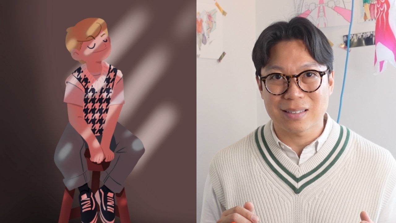
Transcripts
1. Introduction: Keep drawing characters
and leaving them on the plain color block because you're too afraid to
tackle backgrounds. Well, it's time to change that, because in this advanced
procreate class, I'll guide you on how to create cozy backgrounds that will take your drawings
to the next level. And for those who don't
know me, I'm Simon. I'm an illustrator,
content creator, and top teacher
here on Skillshare. And I also love drawing cozy animation on Procreate
and Procreate dreams, and I'm here to help
you elevate your work. Remember that creating a cozy
and inviting drawing, Well, it's not just about
your drawing, it's about using
the right tools and techniques to set up
the perfect mood. And you'll learn how to choose a right color palette,
master perspective, and explore different
rendering techniques such as gradient map, blending modes,
and bloom effects. It's easier than you think,
because I'll guide you through my personal drawing
process from finding inspiration to creating
a fully colored scene from the coziness of your
bedroom with a character. And here's the bonus. You'll also get access to
your nearly 100 page PDF that summarizes the entire class and include call to action exercise
sheets for your project. Plus, you'll get
my procreate file that you can download and work from so you can
better understand how I layered my different drawing. This class is perfect for you, procreate artists who want to explore advanced techniques. And by the end of this class, you'll have the skills
and confidence to create professional quality
illustration and tell a richer visual story
with more context. So if you're ready to elevate your drawing
skills on Procreate, click on the next
video, and let's go.
2. Your Project: All right. So let's
talk about your project because throughout this class, I'll guide you step
by step in creating a beautiful two point perspective drawing and along the way, you'll learn some advanced
procreate techniques for rendering and
working faster. You'll also have access to your nearly 100
page PDF document, allowing you to learn
at your own pace and a procreate template
file to work from. You can download
the procreate file under project and resources, where you'll find my
step by step file to start building from and to easily access it from your iPad, I simply move the downloaded
file to my iCloud folder, so I can access it from my
iPad and load it on Procreate. So your project is
to complete one of the ten call to action
sheets in the PDF, such as showing your
pallet, moodboard, sketches, and final drawing
because it's a process, and the sheets are marked with a green
bookmark in the PDF, making them easy to
find and indicating when it's your turn
to take action. For your convenience, I'll
also included them in the procreate file
separately so you can easily export them as JPEck, and upload them as
part of your project. Our goal together is for you to learn a few advanced
procreate tips, and this will result
in a cozy drawing with a strong sense of perspective
and effective use of light. So if you have any
questions along the way, please use the
discussion section. And on that note, let's
get right into it.
3. Some Cool Brushes: Brush brush brush. Procreate is packed with
really good default brushes. And in this lesson, I'll introduce you some
of my favorite brushes at no extra cost nor download as they all
come with procreate. And to start, here are my
five most used brushes that I use every day from
sketches to clean lines. Okay, so dry ink has a rough texture edge that mimics the look of
traditional ink on paper. It's excellent for creating nice lines when
inking my sketches. For me, it really
adds a touch of organic texture to
the illustrations, adding a tactile feel
to your drawing. So one of my favorite. Technical pens offer
precise clean lines with no texture or minimal. It's like using a technical
drawing pen or a fine liner. I think it's idea for detail linework and inking
for consistent crisp blind. I also use it quite a lot. The monoline brush features is uniform in its thickness
throughout the stroke. The fact that it doesn't offer
any variation in width is perfect for creating bold graphing lines
and consistent shapes. Okay, so spectra is
a refund one to use. It's a brush with a soft
gradient like effect, and it creates a dreamy
and atmospheric look. It has a soft diffuse edge, and I think it's really
ideal for adding soft gradients and
blending colors smoothly. I use it mostly for background, especially if I need
to cover a white area, and I think it really creates
a nice sense of and light. Another texture brush d like is the chalk brush because
the chalk brush mimics the texture of
traditional chalk on the blackboard with a
greedy and grainy edge. It's really great for adding texture and roughness
to your illustration. I think for me, it's perfect
for sketching, texturing, and also creating a tic
vintage feel to your artwork. Also, if you'd like to add some really cool textures
to your background, you can use all of
these special brushes. Some additional brushes d rely like are the elements Cloud. I use it whenever I want to add clouds into the background. Elements. Water, if I want
to create water waved, or realistic,
elements. Driven snow. This one is great if you want
to add speckle of snow into a night sky, organic
paper daisy. I use this one whenever I
want to create foliage and also the shadow that come from a foliage on
the warm Summer Day, luminant spokolte, add a little bit of
galsen blur to these, and it really adds
depth to your drawing. And to keep all these
brushes in check. Here's a quick tip
on how I keep them organized in one easy
to access folder. All right. So let's tap
on the brush icon in the top right corner to
open the brush library. Now, to create a new brush set, we're going to on
the plus icon in the upper corner. This one. Once you tap on it, this will create a new brush set folder and ask you to name it. Now, you can name it anything. I usually name mine
favorite brushes. You can see that I already
have a folder named favorite. So this one will just be a demo. You will see that your brush set is completely
empty at the moment. So to add brushes
to your new set, go to any library
that you'd like to. And drag it into the new
brush folder or set. You can see the green plus sign means that the brush set
has been duplicated, so you can still find it under its original
brush set as well. So if I move a brush
set from sketching, it will still be
available in sketching and in the new brush
set favorite brushes. And you can repeat the process
as many times as you want. For me, here's the list of my favorite brushes that
have also been modified.
4. Brushes’ Streamline: All right, guys,
Streamline is one of my favorite feature inprocriate. Because streamline
really helps smooth out your brush stroke
by stabilizing them, and it reduces wobbly and
jaggedness in your line. So it makes your stroke appear
more fluid and consistent. It's like biking with
training wheels on. However, too much streaming
might restrict your movement and it makes your
brush not natural. So I'm going to show you how
to adjust your stream line, whether it's for
sketching or for creating precise fine lines. Okay. So let's tap on the brush to open
the brush library. In the brush library,
we're going to select the brush that we
would like to modify. So tap on the brush of your choice to open
its brush studio. In this case, it's dry ink. On the left hand side, you'll navigate to the
stabilization settings. O Under stabilization, you'll see a slider
label streamline. Here you can adjust
the slider to increase or decrease
the streamline effect. I usually keep my streamline
around 25% when inking because too much
streamline can also makes your line lose
your organic feel. I also recommend duplicating the brushes by sliding
and picking duplicate. This is in case you
don't want to alter the default brush and have
different version of it, such as a dry ink streamline at 0% and a dry ink
streamline at 25%. Oh.
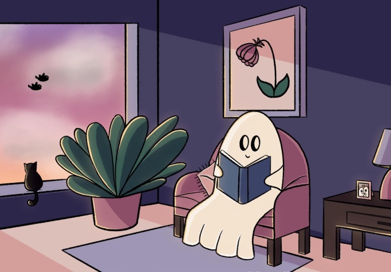
5. Imagining the Scene: So everything starts
in your head, and this is where
we start to build the foundation of
our cozy background. And before we dive right into finding inspiration
from other images, let's take a moment to establish the elements that will make your scene more personal and
unique to your own taste. Number one is cosy objects, because one of the major sort of inspiration that I look
at is lofi aesthetic. And the style is often
associated with a sense of nostalgia for a simpler time
before the digital age. So whenever drawing
an indoor scene, I always like to add the following element
in my drawings. So, for example, a seat, such as a cozy chair or a bed, somewhere to sit on,
some green element, such as house plant,
like these ones, a personal object,
such as a painting, a window, and a main character. Next, I think about the mood, and I use color and
lighting to convey a specific emotion
or time of the day, a sunrise or sunset, and this can really add
warmth to your drawing. Part three is a lighting. So I usually always place my light source
on the top left corner, and you can experiment with several lighting sources
to add depth and interest. So, for example, I sometime
like to add a candle light, the globe from a cell
phone or from a window. And all of these
can create a warm, inviting atmosphere
to your drawing. And now let's talk
about the protagonist. I think it's really important
to add one main character, at least, because this will add a focal point and make the scene more relatable
to your viewer. Okay, so here are some
points you consider because when sketching
these initial ideas, it's good to have a
streamline of 0%, to reput down on your Canvas
your spontaneous thoughts. And I also think to
envision your scene before looking at other
artists image is super important because
then you can make these initial idea and
creation closer to yours.
6. Finding Inspiration: Now it's time for finding inspiration for
your color palette. And personally, for me, a
great place to start is by looking for color
palette inspiration on Pinterest or Instagram. Now, these platforms
are filled with talented artists that can
re spark your creativity. And by visualizing
your own scene prior to looking
for inspiration, you will also have to control
into what comes out of your own personal
head as opposed to being too influenced by
other people's illustration. Because I know there are so many talented artists out there. So I usually search for terms
like low fi color palette or cozy color schemes to
find a variety of options. Another resource
for color palette I can recommend is
going to coolers.co, where you can browse and search for different color palettes. Now it's your turn.
Let's take a moment to reflect on your personal
artistic preferences. And I'm going to ask you
three simple question. So what type of drawing
style are you attracted to? Do you prefer realistic
and detailed art or maybe simplified or even
style az drawings like anime? Then which color palette
catches your eyes? Are you more attracted
to, let's say, vibrant and bold color palette
or soft and pastel hues? For me, personally, I think it's muted and earthy
tones, I prefer. And then what kind of story do you enjoy depicting in your art? Do you like creating scenes of adventures and
explorations in nature? Or do you prefer cozy
intimate settings like a snug bedroom? Now, by understanding
these preferences, this will help you create a scene that feels
uniquely yours, and it will resonate with your own personal
artistic voice.
7. Sketching Your Background: Okay. Now it's time to refine your initial drawing and
put it into the Canvas. So let's start with
the background and all the cozy element
that we talked about. For your brush, remember
that sketching is all about intuition
and feelings. And it might take
some time for you to know which brush
fits your style. But experiment with the different brushes
that we discussed. And remember that for sketching, I would recommend a brush
with 0% streamline. As I'm sketching, I'm thinking about the rough idea of what we've discussed when we
are imagining the scene, and how to put all of these ideas down on
paper or on the canvas. So I'm thinking about cozy
and personal objects such as a big sofa chair for character to launch
on, a fluffy carpet. A bit of green is
always a nice idea, so I'm going to include
a nice tall plant. A frame artwork to show
some individuality for our character and a nice, large window to show the
contrast between inside and out. Well, before moving on, now you now have a rough
sketch for your scene. And at this stage, it doesn't need to
be perfect because we'll clean up the line and
adjust your perspective next.
8. Drawing with Perspective: Okay, so if you're not a fan
of drawing in perspective or you don't really understand
how it works, I got you. Here, we will focus on
two point perspective. That's a technique
in art involving two line diverging into
separate vanishing points. But let's time out a little bit because I'm going to help you
understand what that means. So when you draw using a
two point perspective, you start with these
two vanishing points on the sides of your paper. That means that all the lines
of the building, trees, or anything you draw will go towards these
vanishing points and will appear smaller and smaller as they go
towards these points. Note that these vanishing points are always on the horizon line. For a deeper perspective
that means more dramatic, if you place your
vanishing points closer together to the
center of the Canvas, everything will be squish, and it will create a more
dramatic perspective. And for a wider perspective, drag your perspecting points far off the canvas
on either side. Now let's set up the
perspective grid together. Tap on the wrench icon in the top left corner to
open the action menu. Under the Canvas tab, Tuggle on the drawing guide. Tap on edit drawing guide, and this will open the
drawing guide menu where you can set up
your perspective grid. Select the perspective option. This will allow you to
create a perspective grid by placing perspective
points on your Canvas. Whenever you tap on your canvas, you'll place your first
perspective point, and you can do this
up to three times. This will create multiple
vanishing points for more complex perspective. And by holding the
vanishing points, you can also move them and
delete them by tapping again. You can, of course, customize
these guys on Procreate, and these guides are meant to help you in your
drawing process. In the top banner,
you can change the color of each
vanishing points guide, its opacity and its thickness. Okay, using
perspective correctly is a crucial part
of your drawing. And if you're not a
fan of perspective, don't worry. I wasn't either. But a good tip is really to use the perspective grid and
assist feature on Procreate. So the Toggle Sis is
here to help you. First, we will use your
sketch as a reference, where you draw a quick
sketch of your background. Pinch all of your sketch layers
into one to flatten them, and then with two fingers, slide left to lower the
opacity to 20% or even lower. You can also lock
the layer to make sure that you don't
draw on it by mistake. Having a perspective
grid is great. But what if you
could make sure that your line always follow
the perspective lines? Here's how. Once your
perspective points are set, you can activate the
prospective assis by tapping on the layer you want to draw on and select drawing assist. This will enable the
assisted drawing mode, making your strokes follow the perspective
grid automatically. Start drawing your
background element, and you'll notice that your line snap to the perspective grid. This help maintains a consistent perspective
throughout your illustration. Also, don't forget to toggle up the Sss on and off if needed. To help you, I've also
included under resources my simple perspective
sketch with color coded
guidelines of a room. To walk you through
it, in this example, you can see that the
teal lines convert to the vanishing points in
teal on the left hand side. Now the magenta lines convert to the vanishing point in Magenta
to the right hand side.
9. Drawing Curves in Perspective: Okay, now you're able to draw straight lines in two
point perspective, but that also means that you're
only able to draw boxes. Well, in case you want to
draw circle or curves, I'm going to show
you how to do it. And in this specific example, I'm going to help you draw
a nice vase for this plant. So surprise, surprise, it all starts with a
board, and here's how. Based on the established
vanishing points and horizon line, we're going to draw
a three D rectangle that we also called a cuboid. This shape will help us draw circles and curves
in perspective. And this cuboid will be the
solid foundation for vase. So let's focus on the horizontal
planes of the cuboids, meaning the top and the bottom. We're going to draw
small lines on each of its side to define the middle
point for each segment. From the middle point, I'm going to draw a circle that will touch each of
the four points, one circle on the
top horizontal plane and one circle on the
bottom horizontal plane. This might be a bit difficult
to visualize at first, but this will come
with practice. In this case, I draw a squash oval that stretches towards the
vanishing points. You can also hold the
shape on to correct it. So then you get a
perfect circle. Heck if the shape
looks correct and make any small
adjustment if needed. In this case, I will expand the top circle as
I wanted to create a bowl shaped vase where the top is wider than
the bottom circle. So a good tip to master more
complex shape is to practice drawing circles and creating tubes within different
box shaped objects.
10. Drawing Your Character: Now, it's time to
draw your character, and remember that
your character is the focal point of your drawing, the protagonist, and it will just give life
to everything. Before drawing your character, there are a few things that we need to take in conserration. The first thing is
the horizon line. Now, the horizon line is the horizontal line that represents eye level
to the viewer. So if any object is
above this line, you can see the bottom of it. In this case, the cloud is
above the horizon line, and when you can see
the bottom of it. On the other hand, if an object is below the horizon line, you can see the top of it. In this case, you
can see the top of a chair, the sitting area. Now it's time to place our character within the
setting of our scene. Meaning we have to
adjust the proportion and angle to match the
perspective lines. This will give the scene a
cohesive and dynamic look. To simplify this task, I've already drawn the sofa or the long chair where the
character will be sitting on, but with simple cuboid shapes. And you can work with the
file under resources. Taking consideration
the vanishing point, you can see that the left arm of the character will be
closer to the viewer. Hence, I'm going to draw
it a little bit larger. The right arm is
further away from the view and will be
smaller in comparison. So remember our horizon line. Well, whenever you draw people are things below this line, their belts or hats
will look like their curve because you're
looking down on them. The lower they are,
the more they curve. But whenever you draw people
or things above this line, their belts, our hats, will look like
they curve because you're looking up at them. And the higher they are,
there they will curve.
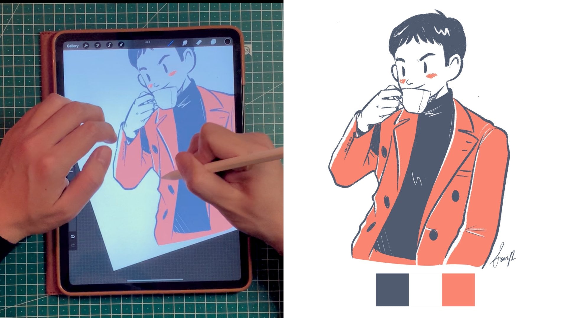
11. Tracing Clean Lines: Okay, so let's focus on refining our sketch
with clean lines, and we'll use a pen with
a slight stream line. For me, it's around 25%, and we'll also ensure consistency of the
thickness of our brush. So to make sure that the
outer layers are around the same width and
the detail lines are on the same width. Now, remember that
in Listen four, we discussed the
importance of streamline in creating smooth
controlled lines. For clean line work, we'll use a pen with a slight
streamline modification for its 25%, and this setting
will help us achieve smooth fluid line while still allowing for some
natural hand movement, meaning that above 25%, I think you'll feel a
little bit too restricted. So the first step is
to select your pen. For inking, I also
recommend using the technical pen or
the mono line brush. Make sure you adjust
your streamline. As a quick summary, you can adjust your
streamline by tapping on the brush to open
the brush studio, then navigate to stabilization. I will adjust my streamline
to 25%, and that's it. To keep your line consistent, it's important to
save your brush size. So this is how I do it. I set my brush to
the desired size using the size slider on the
left side of the screen. And then to save the brush size, I simply tap on the plus sign on the size window pop
up. And that's it. The way I use the brush side is that I have a set
size, let's say, to create the contour
of the character, and then another
smaller brush size to draw the detail
area of the character. Oh. Okay, so once you're happy with
your clean line work, you're ready to move on on the next phase of your project. And if you're interested in
a lineless aesthetic, well, you're in luck
because you can check my lineless illustration and procreate one on one growing
with colors and shape. Trust me. It's a
really good class with a lot of very valuable tips
to compliment this one.
12. Creating Your Color Palette: Remember when we were looking
for inspiration, Well, once you find an
image with colors that inspire you, save
it to your device. I'll then show you how to import these colors
into procreate. You can do this in
two ways by importing color from a photo or by
manually selecting them. Okay, so this is how you create a color palette from
a photo on Procreate. First, we're going to tap on
the color picker icon that's a circle on the right hand
side corner of the toolbar, and this will open
the color panel. Now, make sure
that you are under palette on the bottom
menu of the color panel, and we're going to tap the plus icon on top and
select new from photos. Then your photo
library will be open, and all you have to do is select the photo of your choice. And by default,
procreate imports up to 30 different swatches
from a single photo. So I like for my
color palette to be limited 5-7 swatches, so I'm going to
show you also how to select individual colors. Now, let's manually
save our swatches. So we have an imported photo. First, let's create
a new color palette. To create a new color palette, tap on the color picker icon. That's the circle again on the
right side of the toolbar, select palette on
the bottom menu, and tap the plus icon and
select Create new palette. Again, it's good practice to
name your palette as well. Now, go to your picture
and long press on the desired color in the photo until it appears
in the color picker. Now, tap on an empty swatch and the palette you've
created to save the selected color and repeat the process for each color you want to add to your palette. You can also slightly
modify each colors and save them by using
the bottom menu under coolor you can do so using disc classic harmony value and dragging them
under the palette. Before you move on, take
some time to fill up the color palette section of the project template
because this will give you a solid
foundation to set the mood of your drawing as you being creating your cozy
background scene.
13. Creating a Gradient Sky: To make our drawing dream here, let's create a nice gradient
evening sky. And here's how. With your limited
color palette handy, it's really easy to find a nice gradient to
integrate to your drawing. So what we're going to do
now is we're going to tap on the selection tool that's the S shaped icon and choose
the rectangle option. I'm going to draw a rectangle
that covers a third of the desired area and apply
it in the same layer. So what I'm going
to do is on top, I'm going to put the
darkest color in the, a middle color, and at the bottom third,
the lightest color. And also, feel free
to move, modify, stretch your gradient area to better fit your illustration. And with all the combined
colored layers selected, I'm now going to tap on the adjustment menu and
choose the Gugen blur. Now you can slide your finger stylus to the right to increase your blur until you achieve a smooth gradient effect
between the alter colors.
14. Coloring With Flat Color: Whenever people ask me, what's my favorite brush, I'm often tempted to
say the Lasso tool. And although it's not a brush, I use it a lot to
color my drawing in combination with clipping
mask and reference layers. Using these different
techniques to color will help you color like a pro
and within the lines. And this is the fun
part because it's like coloring from
a coloring book, except your own clean lines. First, using the Lasso tool. To do so, I tap on
the selection tool, that's the S shaped icon, and it's located on
the top toolbar, and I choose the
free hand option to make a custom selection. Should draw around the
area that I want a color, and this really helps isolate specific part of the illustration
when I apply the color. Once the area is selected, I choose the desired color from the color panel and I drop it in the area that's
not in the Zebra line. And you can swap
your finger right to ensure that the area is
filled properly as well. In this specific instance, I use the lasso tool to create the outline for the
rabbit in white, the sofa chair also, the plant, and this really helps
me to color them at a later stage using clipping mask or even
reference layer. O Do you see how I create a rough outline
with the Lasso tool, but the color doesn't bleed? That's because we have a
clipping mask underneath. By bleeding, I mean color spilling out of a
designated area. Throughout my coloring process, I use clipping mask and lasso tool in combination
most of the time. To create your own
clipping mask, tap on the plus icon
in the layer panels, to create a new layer above
your base color layer. Now we're going to
tap on the new layer and select clipping mask. Clipping mask will constrain the new layer to the
pixel of the layer below. And this is a good way to apply different shades on
top of flat colors. So use your brush you paint
on the clipping mask layer, and the color will only appear within the boundary
of the base layer. And this will prevent any
bleeding from happening. So, for example, the
outline of the bunny has been created
with the lasso tool, then filled with a white color. And on top of it, I'm starting to add
clipping mask to color different
section of the bunny, such as the book, the
T shirt, et cetera. Oh. Before using a reference layer, make sure that all your lines in your line work are
properly close. Sometimes you'll see
that if you drop the color and it bleeds to
the rest of the canvas, this is usually because
the reference layer is not closed properly. But if your lines seem
to be closed properly, there's something
that you can do to help prevent that bleeding. So whenever you drop the
color into the shape, you can move your finger left or right to change
the color threshold. The color drop
threshold will control how much your color
drop feel bleeds into and over the edges of your w. And to activate
the color threshold, you have to drag the
color button over the area you want to feel,
but don't release it. After a moment, the color
drop threshold will activate, and you can see that
you can adjust it by sliding your finger to
the left or to the right. If you move your
finger to the right, the color feels
more of the shape, and if you move it to
the left, it feels less. Now, using a reference layer is a more advanced technique, and if not done properly, can be very frustrating. But I'm going to show it to
you anyway because I think that it could be super useful to color different areas
in a very quick time. So what we're going to do is select your clean line layer. And if we tap on it, we're going to choose reference. This will allow you to use the
line art layer as a guide. So now we're going to create a new layer beneath
your line art layer, and this will be
your color layer. It's always good to not draw on the reference layer directly, your line art, so you can modify your color
at a later stage. Select a color from
the color panel and drop it into the area
that you want to feel. And the reference
layer ensures that the color stay within the line. But here's a big caveat. Make sure that the lines are properly close when
dropping a color. Otherwise, it won't
feel properly. Tap on the line art again
and select remove reference. This will prevent the
reference settings from interfering with your
drawing process later on. So I know there was
a lot to cover, but now all areas of
your drawing are filled, and you have a flat
color drawing.
15. Using Blend Modes: So bland mode is determined by two layers combination
that are blended together. So it affects how the color and texture of the layer
interact with each other, and it gives different results. There's different algorithm
to make the base layer, so that's the original layer
with the bland layers. That's the layer on top. And this can create various
effects such as darkening, lightning, increasing cont, or even adding special effects. There are different ways
I use the blend mode. For example, I use it for
shading and highlighting. This is a great way to
enhance shadows and highlights by blending
colors more naturally. I also use it to add texture. So I overlay
textures or pattern, and this doesn't obscure
the underlying image. And also for color adjustment, because it's a great way to
change the overall tone and color balance of an
artwork using blend modes. And now I want to share
with you five examples of bland moz like, and I use often. The first one is multiply
where you darken the base layer by multiplying
it with the bland layer. There's also screen. This lightens the base
layer by inverting the bland color and multiplying
it with the base color. Overlay combines multiply
and screen to increase the contrast and it's making dark areas darker and
light areas lighter. Color burn increases the
contrast by darkening the base layer to reflect
the bland layer color. And finally, darkens keeps the darkest path of both layers. And I would say that
you're not required, not at all to know each and
every bland mold by heart. But with experience,
the more you draw, you'll see that you'll
gravitate towards your own favorite ones as you
develop your own technique. So how do you use the
bland mode in Procreate? First, you select the
layer that you would like to apply the
blending mode to. So you tap on the layer
in the layer panel, and then you open
bland mode option. Tap on the n icon that
sends for normal, and this is usually your
default blending mode. Now that your bland
mode options open, you can select the one that
you would like to apply to. You will see the effect in real time as you scroll
through the option. So that's a great way
also to at a glant, see what you're looking for. A quick tip is that after
selecting a blend mode, you can adjust to layer opacity by tapping it lightly
with two fingers, and this will allow you to fine tune the
blending mode effect. So remember that by sliding
to your left hand side, you decrease the opacity and by sliding to your
right hand side, you increase your opacity. By using blend mode, you can create complex and
dynamic visual effects. And it's also super fun, especially if you
pair them with mask. But I'll show you how in
the next video lesson.
16. Darker Tones and Shadows: With what we've learned so far with the different bland mode, I will show you how I personally
create darker tone to my flat drawings with the help
of gradient maps and mask. But first, let me explain to
you what a gradient map is. For example, if you have
a black and white image, a gradient map is like putting a customized rainbow color
over that dull picture. The gradient map
changes the color of your picture
from top to bottom, and this follow the
color of your rainbow. So if your rainbow
goes from red to blue, the picture color will change
smoothly from red to blue. And it's really a great way to see the variation
for your drawing. So how do you use
the gradient map? I use gradient map
in combination with the multiply blending mode to add darker tones
to my drawing. So first of all, make sure that all your flat colors are
in one single layer. If not, make sure
you flatten them. Now duplicate the
layer and put it on top of the original
flat color layer. Select the new layer and go to the adjustment menu and select
grader map from the list. And this will open the
grader map settings. Now you can choose a
preset gradient or create your own by tapping
on the gradient bar. So adjust the colors and position that suits
your illustration. If you decide to create
your own gradient map, you can slide your finger or cells to adjust the intensity
of the gradient map. You can also
customize the color, change them to your
preferred color palette. Tap done when you're
satisfied with the result, and I'm usually happy with the default venous setting
as it's usually my go to, so I'm not going to create
my own customized one. After applying the
gradient map to the duplicated flat color layer, set it to bland mode multiply, and this will enhance the shadow and add
depth to your colors. Now, with two
fingers I tap and I adjust to around 50% opacity, so it blends smoothly with
the base color underneath. You now have darker colors visible due to the
multiple blend mode. Underneath this
layer, you'll still have your original
flat color layer, and to reveal the lighter
colors will use a mask. Instead of simply multiplying my duplicated base color layer. I like to use a
gradient map to add a little bit of
warmer tone to it. But you could simply duplicate and multiply your
base color layer. Now you have darker colors visible due to the
multiply blend mode. And underneath this layer, you still have your
original flat color layer. That means that the original
flat color layer is lighter, and to reveal the light color, will we use a mask. For this exercise, imagine that your light source is on the top left corner
where the window is. So we will make our light source consistent throughout
our drawing. Okay. So tap on top
of the new layer, that's the gradient map
one, and select mask. You will now see a white canvas as a thumbnail in
the layer panel. White shows a part of the
clip layer that are visible. And if the thumbnail
is fully white, you can only see that layer. Meanwhile, black hides a
part of the clip layer. So if the thumbnail
is fully black, it's as if that
layer's visibility was off or it didn't exist. Then to reveal the
lighter layer underneath, which color should you use? So I'm going to use a black bruh to hide part of
the darker layer, revealing the lighter
color underneath. So I focus on the left
hand side light source and paint on the left side of the character where the
light would hit them.
17. Bloom and Adding Dramatic Lighting: In my opinion, this is
an optional technique. I think your drawing
looks amazing so far. But why not play with Bloom? Bloom adds a gloat image, and it stimulates
the effect of light scattering through a
medium like fog or dust. And this can really create a dramatic atmospheric
lighting effect. On a new layer, draw a thin yellow line where the
light hits the character, and remember that
our light source is the window on
the left hand side. While this layer is selected, tap on adjustment menu and
select bloom from the list. And this will open
the bloom settings. Now you have to
adjust the size of the bloom effect by sliding
your finger or styles. Larger sides create
a more diffuse glow. Adjust until you achieve the
desired dramatic lighting,
18. Animate On Procreate Dreams: If you want to take your
skills even further, I can highly recommend you try animating your drawing
with procreate dreams. And you're in luck
because I have a brand new class called
Procreate Dreams for beginner, Animate your drawings
for social media to really help you
do so. Check it out.
19. Final Thoughts: Congratulation. You've made it till the end of this class, and I've really enjoyed
walking you through my personal drawing
process from visualizing an idea to bringing it
to life on the iPad. In this class, we've
covered a lot. So let me see, we've
selected brushes, creating a color palette. We explore perspective. We Drew clean lines, we
added flat colors. We experimented
with blend modes, mask, and also the
use of bloom effects. And I'm sure I'm forgetting
a lot in between. But also remember that
you can always revisit the provided PDF to review
any lesson at your own pace. And as a final call to action, you can review the checklist
and make sure to upload any of the ten call to action
sheets, including the PDF. Please do also leave a
review because your feedback really helped me tailor future classes to
better fit your needs. Finally, if you enjoy
this class and you enjoy my work, let's
stay connected. To see more of my
drawing Journey, follow me on Instagrad, YouTube, and Tik Tok, Ding Whoops.
Ding, ding, ding. Thank you so much for
watching for sending your project and also
for leaving a review. And remember, stay creative. Bye and see you next time.
 Simon Ip, Digital Illustrator