Transcripts
1. Introduction: Hello, my name is Jesse LeDoux. I've been in Illustrator
for over half my life, creating work for
large corporations, tiny record labels, and just
about everything in-between. Throughout my career, I love
exploring new ways to work, trying different mediums,
different types of projects, different ways to
approach those projects. You do something
for long enough. You find ways to make
your job easier. Working smarter, not harder. I found a simple
streamlined process of starting a project and procreate and ending with print ready vector
files in Illustrator. As much as I love
drawing on paper. Using Procreate as an efficient
way to get the job done. And while procreate has
a lot of advantages, it lacks the print
ready capabilities of Illustrator that
my clients require. This class is a technique. I'll guide you through
my process for producing print friendly vector files in Illustrator while
having the benefit and ease of drawing
by hand procreate. This class is best for intermediate professional
illustrators who already have a good understanding
of Procreate and illustrator and are now
looking for ways to work more. So if you're ready to spend a little time
taking these classes, to end up saving
you a whole lot of time in creating hand-drawn, print ready vector
illustrations. Come along and I'll
show you how I do it.
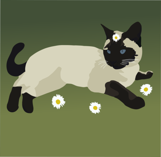
2. Graphic Style: To start out with, this
approach worked really well for me because my work is primarily large blocks
of color and line work. If you use textured
elements in your work. This approach can also
work well for you. It just requires an extra
step in the process of pasting your textures
inside vector shapes. That one. If your work is primarily
Bolden graphic, this is going to work
out really well for you. You don't have to have the
color work out either. That's easiest in
Illustrator anyway. We'll start by building your
composition as a series of grays and wait to start
coloring when we get into, it helps to immediately
start building with color. That works just as well. If your work is primarily
detailed line work, it's best to keep your
images as a tiff and use the following approach for colored elements behind
your, your line. If you go to vectorize
the line work, it probably won't look as
good as if you kept it. However, if you block in
color behind the line work, this class can be
helpful for you.
3. Procreate Setup: To begin, let's go to Procreate. When I create a new
Procreate file, I always tried to create a
file size as large as I can. As your file size increases, your number of layers decrease. A larger your drawing is. The better than Fidelity
when we go to vectorize. But remember, the more
complicated your drawing is, a more layers you'll
want to have. If you know how many
colors you might want to use in your final art, it could help determine
how many layers you may want to have. I like to have
between 510 layers for each color I'll use. And because things rarely
turn out as planned, I also like to have an extra couple of layers to play with. Just in case. For this one, I'll create an image size that is 3 thousand pixels by 3
thousand pixels square. So find that balance
which works for you, and create that file.
4. Drawing: So I start out by just doing a rough sketch of
my competition. For this. I like
to use a pencil. It feels rough,
just like a pencil. After I finished my sketch, I start to work on the block. If you already have
a good idea of what colors everything will
be, you can use those. But if it's not a problem, if you don't, you can just
use the shades of gray. It's all going to be the
same amount of work. Either way. When it
comes time to vectorize. What is very important
at this stage is that all these elements that you're creating Do not touch. You want to make sure
you use different layers for each element and
make sure that you have a clear space
between each element. And don't forget to draw
the white elements. For these, I like to use a color that is maybe a five per cent gray or very
pale yellow ones as well. I can draw these two things on the same layer because
they don't patch. But I'm going to want to create
a new layer to draw them. The snout, because
that will touch these, can also be helpful to keep light colors
on the same layer. So even though the eyeball doesn't touch the
snout or the ear, since I'm going to have
that be a different color. If you have the layers, you might as well put
it on a different layer just so that you can keep all like
colors together. Here I'm drawing the, I said about 15% black just because I don't
want to be a pure wipe. Since the school
will also be white. I can also do that
on this layer too. Now, this tooth right here
is going to go behind. But I will be doing that
in Illustrator anyway. So you can, you can get
your layers out of order. Finding, erase the bottom. Square corners. Hi, again, that can be in
front of it because I'll get it in the right layer. When I go to Illustrator. There will be times where
you'll run out of layers. If this happens, you can either
delete the sketch layer, heard of that, or you
can merge layers. If there are things
that aren't touching. I could merge the land
bumps here and the teeth. I could merge if I if
I really needed to. Just, you just need to
make sure that nothing touches as your merchant. And if you really get stuck, you can duplicate your file and merge layers in a new file and continue
building on that new file. But this is going to, juggling
between the two files is going to make your job a little bit more difficult
and confusing. So try to avoid
that when you can.
5. File Transfer: Once you're finished
drawing your elements, it's time to get your procreate
file ready to transfer. I frequently duplicate
my file and work from the new file just so I can preserve the first
one for reference. But you do you, when preparing
your elements to transfer, its most helpful for your
colors to be pretty dark. This means that you'll
want to make sure that you re-color your light
colors to be darker. There are many different
ways to do this, re-color brightness adjustment. But what works best
for me is just to do an alpha lock on the layer and recolor it with
a very large okay. You'll also want to
delete your sketch layer. After all, your elements
are relatively dark. You can export your file as a PSD and transfer the
file to your computer. I prefer to AirDrop
mine to my laptop, but you could use Dropbox or whatever file transfer
method you prefer.
6. Photoshop Export: Okay, Now that you've beamed
your PSD to your computer, open it up in Photoshop, set the image to grayscale. Make sure you don't merge, and then delete any
unnecessary layers. The background, I think it's the only thing that
I really don't want. Next, export your layers
to separate tiff files. I prefer to create a new folder so that
they're easy to find. Once part of automated.
I'd like to open up. Awesome. Simple.
7. Time for Illustrator: Now you want to open up Illustrator and create
a new document. I'm going to set my image
size at three thousand. Three thousand
because that's what I did with my procreate file, but
really it doesn't matter. Next, drag all of
your artwork by it. Layer files into your document. All the files should be the
same size and dimensions. You can you can check
this by flipping and Dickey line mode and making sure that
they're all the same. If all looks good, you can start converting the linked files
into vector elements. To do this, to select
the top image. Go to image trace. There are all these presets. I have one set how I like it. And I will show you settings. Basically, I just like to have most most everything
maxed out so I can get just all the bumps and wiggles and it doesn't
smooth things out too much. But if you'd like to have things smoother than you
can, tweak these. One thing that is very helpful
is to click Ignore White. So that way if there's a
white elements in your file, it's not going to show
up as a vector element. It will only be the, the dark, the dark elements that will
show up as an element. Span. And click the X. Going through. You have vectorized everything. And you'll know you've gotten
everything by either if you click somewhere on the image and it doesn't select
an image anymore. It means that
everything's vectorized. Or you go into
your links palette and see if there are anymore. So at this point, everything is vectorized and also
everything is black. So at this point, I want to blow this
up so that its size. One time. For the most part. Having your layers palette
open is helpful at this point because it can
help you go in and see. Just navigate your
file a little easier. So at this point, all of
your elements are black. And now you just need to
go in and start selecting things and turning them the
color that you want it to be. And things that it's helpful to start with
the big things first and also the order in which, you know, things are like this. The background horizon line,
I know is in the back. So that's an easy one
to start out with. Just a little bit better. I want to ask things
are out of order. You can either navigate that
through the layers palette. What's easiest for me is just cutting it and then paste
in front or paste in back. It can also be helpful to flip back-and-forth and
key line and make sure that you're grabbing
all of the things that you want to grab and nothing gets lost
behind a layer. So from here I'm just
organizing all the elements. Some things I want
to keep group, like these front teeth, but I wanted to remove the active from that group so it can go behind the school. And just starting to
organize your file. This process is really no
different than if you were to draw all the elements
in Illustrator. Sometimes if you have something with a lot
of pieces like this, it can be helpful
to move those into their own layer and lock the other layers so that you can just
easily grab them. And then group those. And then once you have
them, grouped them back into normal layer
that you're building. And all of this is really just personal tastes,
however, works best. You don't always have to draw things exactly how
you want them. In procreate. You can just, I knew that
I wanted these clouds, but I just drew them where
I had room in Procreate. Because I knew that I could reposition them exactly
how I want them. In Illustrator. It's always helpful to always go back to the
key line to make sure that there isn't any little
detail that you missed. So now that you've colored
all the elements and reorganize them within
your layers palette. In the correct order. You're done. Your procreate drawing is now a fully vector image ready
to send to your client. Now, a lot of you could stop
here and be completely done. However, some of you may want to add
texture to your piece. This is really easy
to do once you have your primary
illustration as vectors. Let's quickly go through how to incorporate texture
into your piece.
8. Extras: Now let's go back to
our procreate file. You can duplicate the file if you want to preserve
your native copy. If you're short on layers, feel free to flatten your layers since we won't
need them anymore. Now, create new layers and add your textures over
the areas that you want. I always like to
go a little beyond the area that I want
the texture to be in. Just to make sure there's
enough room when placing the texture is back in
my Illustrator file. After I've drawn my textures
on different layers, I'll essentially
go the same route, export as a PSD, save my file two layers, import them into Illustrator. But then instead
of live tracing, you'll want to just paste your textures inside the vector
shapes that you've made. You can also use this
method if there are additional vector
elements you want to add to your initial
illustration, just draw them where you want them and then follow
the same steps. Export as a PSD, save the layers important to Illustrator, and
then live trace it. So what I have are, I'm going to be exporting these three layers of texture and bringing
those into my file. Now I open it back
up in Photoshop. Delete all the layers
that I don't want, which is most of
them export files. So you may want to
import all color images. You may want to import
grayscale images. What I'm going to want to
do is use bitmap tests. So I'm going to
take these files. I like to blow up the
resolution much larger. Then once I've made a
bitmap tiff out of it, I save and I close. Do the same here. With this one. I had to two different
pieces on the same layer. So I'm going to want to isolate those just so it won't
be as bigger the file size and make
it easier to use. So I'll just copy, create a
new image, then paste it in, and then place your
image files in. Then once you have your
textures and resize things really small,
which is coffee. And then I like to
paste it inside a separate shape just so that fits its own unique element, but copy that element. He stood in front
of the texture. Select all. Then make a clipping mask. Then once you have that, I like to organize them
right on top of each other. You can go in and change the texture or change the
color of the texture. Mask. Just paste same image
into two elements. And there I am. I'm done. What started out as
a procreate drawing is now a fully
vector illustration. Well, not totally
fully vector because I have those linked tiffs, the texture tests, but it's a print ready file that I
can send off to my client. But it still has
that hand-drawn feel like with using Procreate. If I were to do this
in Illustrator, the entire drawing
would be very clean. And unlike just having a
little bit of roughness there, it gives it a little, it gives the illustration
a little warm, and it feels a
little more natural.
9. Conclusion: You've done it. You've successfully turn your
Procreate illustration into an Illustrator file
that is sure to make your client or any preprocessed
people much happier. I hope you've found this
process is helpful as I have. As always, processes can
always be improved upon. This is the best way that I've found that everyone has
their own ways of working. If you have suggestions that
you have found helpful, I'm sure other people will
find them helpful as well. Please share them
in the class forum, and also please share your projects in the
project gallery. I love seeing what you create. And occasionally I'll,
I'll try to offer tips or suggestions when
there's something that I see that may be
helpful for you. Lastly, if you haven't
taken my other classes, follow me on Skillshare and go and check those out. Thank you.
 Jesse LeDoux, Illustrator, Artist, Designer