Transcripts
1. Using shapes to hack your character design: Hi there, I'm Ben, an illustrator and a
production artists. In this lesson, we're going
to explore how to shape language to better communicate your ideas and your characters. These are deep
psychological secrets that those simple are incredibly effective
and leveling up your character and
production design. If that sounds like fun to you, then I'll see you
in the next video.
2. Shape languade 01: In this video, we're
going to learn how to best use shapes
and shape language to better communicate what
you want to your audience. So all shapes are made
of three elements. You have curve's lines
and then you have angles. Or you can think of it more
easily with triangles, rectangles, ovals, or circles. Since she even the
most complex design is made up of these
three elements. And each one of them
psychologically will affect your audience
in different ways. So this may seem a bit strange, but let me explain how shapes can affect
your psychologically. So here to abstract shapes. Now these shapes are characters. So one of these characters,
it's called Bobo, and the other one
is called Kiki, without their names
written down. Which one do you think is which? So if you guessed
that this one is bulbar and this one it's
Kiki, then you're correct. Like 1990, 9% of the people make that choice regardless
of culture, of the upbringing of their age, it is a universal thing. We associate a key,
key sharp shape, sounding shape with
this and the Bobo, a round shape with this. So knowing that shapes have a psychological impact
on your audience, let's go over what
the basic ones mean. So let's go back
to basic shapes. Circle is very soft,
gentle shapes. There are no hard edges for
you to cut yourself on. It's an inflating it
very pleasant shape. Triangle is its exact opposite. It's sharp. It's a cutting shape. It's very uninvited, but it's a lot stronger than the circle. And then lastly, we
have the rectangle. The rectangle
represents stability. It's the foundation block. Lots of complex shapes. The more square, blocky design, whether it'd be a
character vehicle or basically any
physical object, the closer to a
rectangle or block, the more solid it is, or at least the more
solid it appears to be. So let's have a
look at an example. So these are both cars. Both of them have doors, front window, four wheels,
engine block upfront. But you can tell just
by looking at them, which one is the more sturdy, even though this car
you can see does have a block in there because it
has all these gentle curves. It feels a lot faster and a lot less hardy and substantial. Say this one, which is
made up of these huge, very blunt blocky
shapes and naughty, knowing much or anything
really about engineering. You can instantly tell
just by looking at them which one you would
want to take off road. Which one is going to
fair better in a crash? Which one is the tougher, but also which one is
the faster just from the placement of the
blocks on the design. So next we're going
to have a look at some existing character designs and see how they're shaped. Language informs the audience of their character just
by looking at them.
3. Shape dynamics simple 2: So starting with some
things simple here, the characters from the film, The Emperor's New Groove. Now these designs are brilliant because they're just so simple. Just by looking at them, you know exactly what kind
of character they are, even if you've never
actually seen the film. They can also be very
easily broken down to their most simple shapes
and still be recognizable. So let's quickly
go over each one. So first of all, we have Pancho, who is
the hero of the story. As you can see, he's made of a ferry,
find rectangle. But he has these quite
soft edges to him. You can tell that he's
very strong and reliable, but also that he's very
caring and questioning fighting character
from the soft curves that makes the outer
parts of the body. He basically has no real
sharp edges to him, as opposed to the villain who's pretty much entirely
made of sharp edges. She almost looks
like you would cut yourself on these hard, spiky just to her. And also she has a very
thin but very stiff frame. You get the idea that she's somebody who likes
to be in control. Sorry. She's very upright,
She's very stiff. Then you have Emperor Cusco, who's kind of a mix of the two. He's known, lying near, as sharp as you smell,
like, his chin. She's quite pointed. It comes to a little bit
of a curve at the bottom, but he's a lot more fluid. That change color to blue, super Morrison, see, he's gone. I'm much more fluid shape, which shows that he's quite a relaxed, carefree character. He's not quite as
stiff as he's map, but he's also not as sturdy
and reliable as puncher. For these kind of loose curves, you get very much the
impression of a character who is quite carefree but
also quite unreliable. And then finally, we have good old crank who is
ease my right-hand man. He's probably my
favorite character. Now. He starts off working
as a henchmen. Soon he's a bad guy. He has this kind of core here
which tapers downwards in a much more triangular shape than the block that
makes up pantry. And he has a few sharp edges because he starts
off as a bit of a bad guy that kinda make him
a little more threatening, or at least a lot more capable, forceful than a
character like Pangea. But as you can see, he has some of these more soft curved
elements around here that kind of soften up
his character to show that even though
he's meant at first, blush, at first look at him
to be a bit of a brute. He's actually not
that bad of a guy. So now that we've seen how these simple shapes make these
quite simple characters, let's show off this technique with a simple cartoon character. Starts off with, we're going to work with quite a basic brief. Use the different
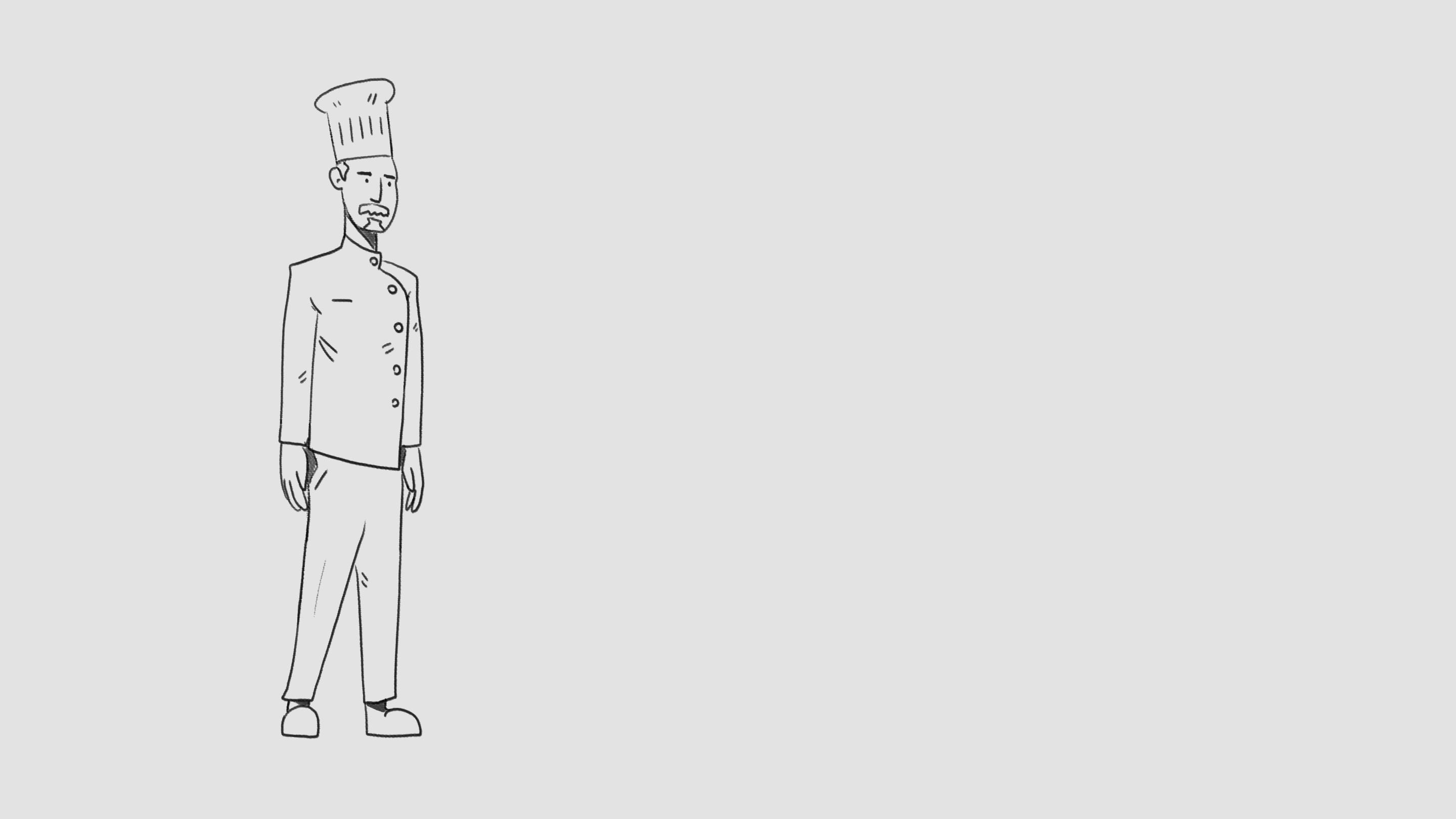
shape languages to change how characterised, perceived by the audience. So what I've got here is a chef, just a simple shift character. You can copy this one. We'll do one more or less near and style doesn't
really matter. If you are following along
just very middle of the road. Honestly, kind of a bit boring. He's has a solid core here, but it doesn't really say much, not a lot is said
with this character. So it would sink. Proof designs
kind of boring as I said, tell me much, but we can
change his proportions. So that's changed his
proportions to make a new character out of this brief be a little
bit more interesting. So let's start off with
taking this shape, but let's make it
a little rounder. And same with his nose, this brand often nose
and even the mustache. Like the mustache is quite
square in the initial one. But we can round it off
to make it a little, a little softer, a little
less than the chef hat. And same with the shoulders. We can round off the
shoulders and the arms. And not making huge, but we can make them
quite pigeon chested. Make his chest hair a
bit more well rounded, curve lines there with the material with pull the legs, we can make them a
little buggy. Yeah. So yeah, we have pretty
much the same character, but see how just
changing a few decisions here and they're picking him predominantly out
of rounded shapes. It changes how you
perceive them. Changes. His character might seem light. And let's try again. Same character, but
like let's take all of these shapes and
make them a lot sharper. Biggest head entirely
out of sharp points. Shop mustache. We could even extend
the beard, poked out. Shoulders. That bike, bareback. Much things start to look like an evil is a very sharp elbows. Let's give him a very
thin, very straight chest. And now you see we have the same character done with three different
priorities as to shape. And you can see even with
a very simple character, that we have drastically changed your perception of
each one psychologically. So just by looking
at them, you know, more or less what they're
going to be like, what you can expect from
them as a character. Now, although these
characters are very simple, the same lessons apply
to characters that are much more complicated
and subtle, but their shape language, which I'm going to go over next.
4. Complex shape language: Now the characters from
the game Overwatch, another great example of shape language being used to tell a story for
each character. Now, I'm not going to go over every characters that
would take forever, but I'm going to go over
a choice selection. So I'm good to go over
the three main types of characters in the game. Salt tank in Halo, and how different the
shapes can be while still conveying information
to the audience needs to understand
the character. So let's start out with reaper, who is assault character. Now this design may
look a bit complicated. There are lots of details and smaller shapes that
make up the sign. But if you look for
the big shapes, you see he's made out of
the triangular shapes. There's these substantial block, however, here in the torso. It gives him a very sturdy look. But then all the way
through his design, or hard triangular
shapes and very hard, blocky, very brutal shapes. That could be a very aggressive, but also very sturdy
type of character. And these triangles
repeat over and over and over and over and
over throughout the character. A very forceful and they're
very aggressive and sharp design that you instantly
see when you look at. And the opposite, I would say, is this character may, whereas prefers made of
entirely hard and sharp shapes. Maze entirely, almost
completely made out of soft curves shapes that then
sit on a pretty sturdy coal. And because she's
a little shorter, she's quite stocky in
her overall shape. You can tell she is a lot
more defensive than rephrase. It has also forward motion in his design is very
pointed quite literally. And forward focusing. Hers is much more stocky, a lot more defensive looking. So you can see that
elements are supposed to go towards her and then she's
supposed to block them. And that's just from a
gameplay perspective. But if you look how she's
a very sweet round face. Her clothes of very bulky
but also very soft looking. You can tell that
she's a lot softer, nicer than say, this character. So next we're going
to go on to the tax. So let's start off with Zara. Zara is a little bit like me in that she has
this very solid, stocky core and
this very stocky, very rectangular overall shape. And she has a lot of soft, rounded elements to the design. However, if you look
ahead proportions, she's clearly a lot
bigger than me. Also, what's interesting
is that even though she has a lot of ground
elements on her design, there are also, I'll
also these kind of, I wouldn't say sharp
but definitely harsher elements that kind of permeate the design
that are a little more, a little more aggressive, but not quite as
aggressive as they say an a tag character. So the effect is a no
nonsense and the aggressive, but ultimately quite a protective character
so on who gets across this attitude of someone who is very kind but also
very protective. Whereas if you look
at the other tank, road hog, we get a very different sense
for the character. So obviously Here's design is dominated by this big circle. Here. Overall shape is Lakes
area, that big block. It's very sturdy, but as
I'm sure you've noticed, in his design, it's covered
all over these very, very sharp shapes
that just kind of peppered throughout
that fiery much delineate him as a much more aggressive and possibly more
vicious character than say Zara or may see, you can tell that even
though he's a big block, he's there to be defending
or at least taking damage. He's not a defender like Zara. He's a lot more aggressive, a lot more vicious. And it's by including
these very, very sharp angles like these intensely sharp edges and shapes that get across his character so that they're very different
from each other, even though they
serve the same role. And now lastly, for the healers who are by
and large the smallest, lightest characters,
as I need to be quick and hopefully
not get shot. So first of all, we have mercy who is kinda
archetypical healer. And you can see a large
part of her design. This is very stiff shape here. She's very upfront. And this gives her
a very sturdy, but also quite delicate
fields for the character. And then it's softened by
these more curved parts of the design that show that she's
quite a caring character. But that is dominated by
this very no-nonsense, very straight rectangle
here in the center. Caring but sensible vine from this very upright and
very confident pose. Then contrast that
with another healer, Moira, who again is
the same but opposite. This very upright pose. It's very straight. But you can see that her
body is a lot more fluid. And that shows that
she's a little less dependable than Mercy is. This shape gives the impression
that she is a little, possibly it was
more self-centered, maybe a little
quicker on her feet. And much like road hog, even though she's a
healer for character, is once again kinda covered in these very sharp
little pinprick shapes that delineate that she is possibly a little more
duplicitous than mercy here, even though they are more or less filling in the same
character roles in the game. The effect of the
small sharp shapes also delineate a more
aggressive character trait. And so by mixing these
shapes together, you can tell just
by looking at that, She's an attack healer. So now we have a better
grasp on shape language. Let's design a character using these more complicated
shape relations.
5. Knight shape exorsize final: Okay, so now we've got a better handle on Shape
Dynamics and shape language. Let's design a character
that's a little bit more complicated than the
chef we were drawing earlier. So I'm going to start
off with a night. Now, normally I would insist on drawing from reference
for this type of thing. However, because of my job doing a lot of historical
videos and projects, I can more or less draw
night in my sleep. Now, we're going
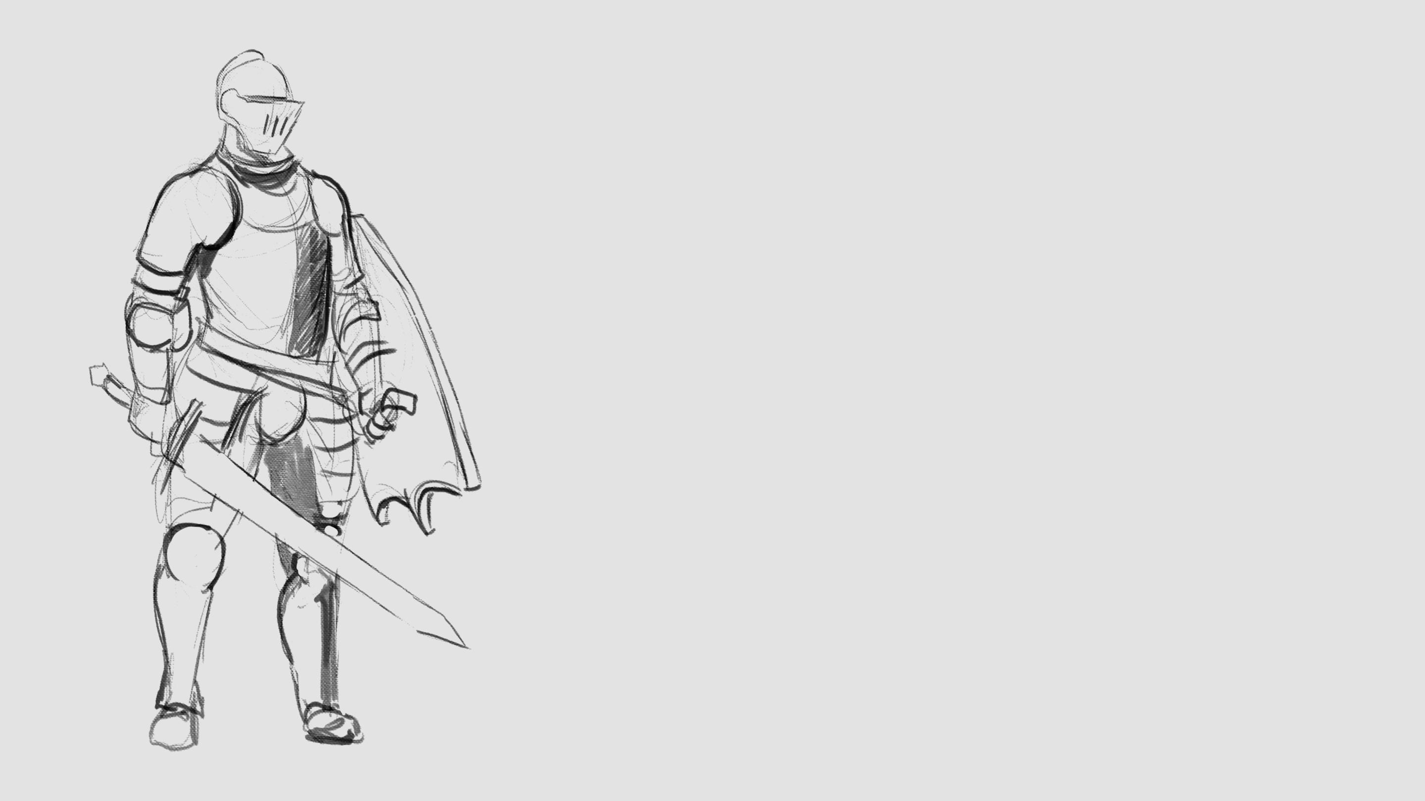
to start off with a knight That's quite
middle of the road. As I said earlier with the chef, We want this guy to
be kind of dull. Not saying anything
particular with the design, but it's something that
we can then use as a jumping off point for
our other two designs. Where one of them is going
to be a lot rounder, defensive looking and one
that's going to look a lot sharper and it's going to work up a lot more
aggressive looking. But they're all going to share more or less the same structure as I'm going to define here. Starting night. And you can either
follow along with me or you can design your own nights. But the most important
thing is that you do a design which is
quiet middle of the road, like this is a good
mix of shapes but nothing that's two distinctive. So what I'm going to do now, done with more shading here, just to give it a
bit more definition, is I'm going to take this layer and I'm
going to duplicate it. Once again. Duplicate it again. Now we have our three
identical nights. And then that means I can start messing around with this guy. It's gonna be a bit
more definition with salt though it looks
a little floaty. Start out, just rounding off a lot of the main
areas of the chest. The Coltrane here,
just to give them a little bit more of a
rounded steadiness. Same thing with the
face mask here. I think I'm going to have
it a little bit square, a little less sharp. The fight up. The eraser tool.
Again, just going over the main parts of the design and making them a little
softer, a little rounder. And also putting
small elements in the design that are circles
that this is all on those, but this is a less than, so it's supposed
to be on the lows. So you can have repeating patterns are repeating
elements within design. And I think I'm just
making it a little wider. So lots stocky
than the base one. Just defining this circle
shape a bit more now. And I'm just going to repeat
it on the shoulders here. Stretching mouth makes
him a look blockier, makes him look a
lot more defensive. And then they do the same
here with the leg armor here, just making it a lot
thicker and not making it taper as much
towards the feet and also making the feet
a bit bigger to show that he's a
big, heavy dude. And he'd need a solid foundation here for him to walk on and not look like he's
about to stumble over. Now, I'm thinking I can
make him look a little bit more sturdy by adding a source of cloth
skirt type thing like a banner or something
like that over one side. And that will further, given a more blocky shape as well as rounding
out the chest here. And then we can just
fill in the back here to make it look darker
to show that it kind of goes around the back and around the, his left side. Definition here. Already just with a few quite subtle changes, we've already drastically
changed the overall shape and the kind of attitude
that you have with this quite basic
night character. And we didn't need to drastically redesigned
him from the ground up. We just needed to
take what was already there and then just
move it around. And I'm just going to take
tickets transform and just to make the shoulders
and little bigger here. Because that further accentuate that fridge cockiness that he has to make him even broader at the shoulders.
Here really is. Very defensive looking,
heavy looking dude, rather than a more agile, aggressive attacking
type character. And something else you can do, just go through this here
with his belt buckle. This is a little
more subtle than say the shapes on his shoulders.
I'm on the chest. But just little
touches like that can actually quite
drastically in form, the message that
you're sending with the character design is the
same as what I said with the, with the Overwatch characters. Sometimes it's small. Eating patterns and
shapes can really help overall with how your
character comes across. Here on the helmet.
I'm just taking the angles that are already there and just extend
your editing them. So just really pushing the visor forward and on the shoulders doing the complete opposite as what I did with the the more rounds
night by making all of the angles much sharper and
actually taking away some of these round shapes and replacing them with
more angular ones, giving him more spikes
and things like that. Nicole duster look for
the gauntlets here and then shuffling up the
elbow protection. This overall gives him
a much less friendly, a lot more aggressive
outline and shape language. So again, here, hold runs, just getting rid of
those, those round edges. And the same here with the
sword that just taking the areas here and making
them a lot sharper. And the same here
with the Greeks. Shove the leg protections. I'm just going to go
into just completely erase the round edges and replace them with
these much sharper ones. Already. He's looking a lot more
aggressive than the other. Now I'm going to do is
I'm just going to go walk the walk the entire thing. I want him to be a little
bit more broad shouldered by one to be tapered
a little bit more. So he looks a little lighter, a little less stocky
than the other night. And you can totally do this with sketches like It's often, you think, Oh, if I
use the warp tool, we'll just look really weird. But oftentimes you can
get away with a lot, a lot more than you think. And again, with repeating
patterns have got the triangle facing
downwards across the chest. Just a little
engraving essentially. But again, that
repeating pattern, repeating shapes,
the sharp edges, the triangles, really helps get across this much
more aggressive, a lot less defensive
looking design. It's going to need this up here. And again with the circles on the defensive round night
and put some triangles here. Always kinda looks like
the nose of a skull, which again makes him look a
little bit more aggressive. Less of a goody, goody two shoes, like
I'll rams night. Small curves and some
more sharp edges to the edge of the
Coltrane's here. Then with the gold cut, which is the part of the armor
which protects the neck. Just going to sharpen that
up a bit as well and safe. The shield can just make
these little sharper, less organic as well. So a mix of round
organic shapes, but also these very hard, more industrial
shapes definitely helps him feel more brutalist. Smoke definition. We put metal spike that
now they think I'm eating. I think even with his feet, I think that looks a
little less defined. So on the days, get rid of them and
put in some more to find more sharper
edged ones here. Again, a bit like
with the belt buckle, that the smallest things can
actually do quite a lot to change your
audience's psychology when looking at your
character design. It doesn't always need to be the big sweeping shapes like with the Emperor's New
Groove characters. That can be lots
of small details. I'm just going to make him
a little thinner as well, just to really hammer home
how different hears from our round night,
especially Guys sharp. Put them all together so
you can easily see them. Bring them together.
And yeah, there you go. We have our three nights taken from a quite basic
one on the left. And then applying shape
language to round night. Now sharp night,
we have two very different takes on the same
brief, which convey very, very different emotions and very different characters
traits and also much more distinct
character traits than the wood from say, the original there on the left. If you've enjoyed this video, nice comment like in a review would be absolutely appreciated. If you'd like to see
more of these videos, please subscribe to me. And if you really
want to help me out, then if you can reference me, is the reason why you wanted
to subscribe to Skillshare. That will be
absolutely brilliant. Also, when you've completed this course and you have
some rocks or show off, please put them in the comments. I love seeing people's work. Also, if you have some questions on
illustration or digital arts, or you'd like me to
review your book, please don't hesitate
to send me a message. I'll be sure to get back
to you as soon as you can, but until next time, I'll
see you in the next one.
 Ben Tobitt, Illustrator and Animation Director