Transcripts
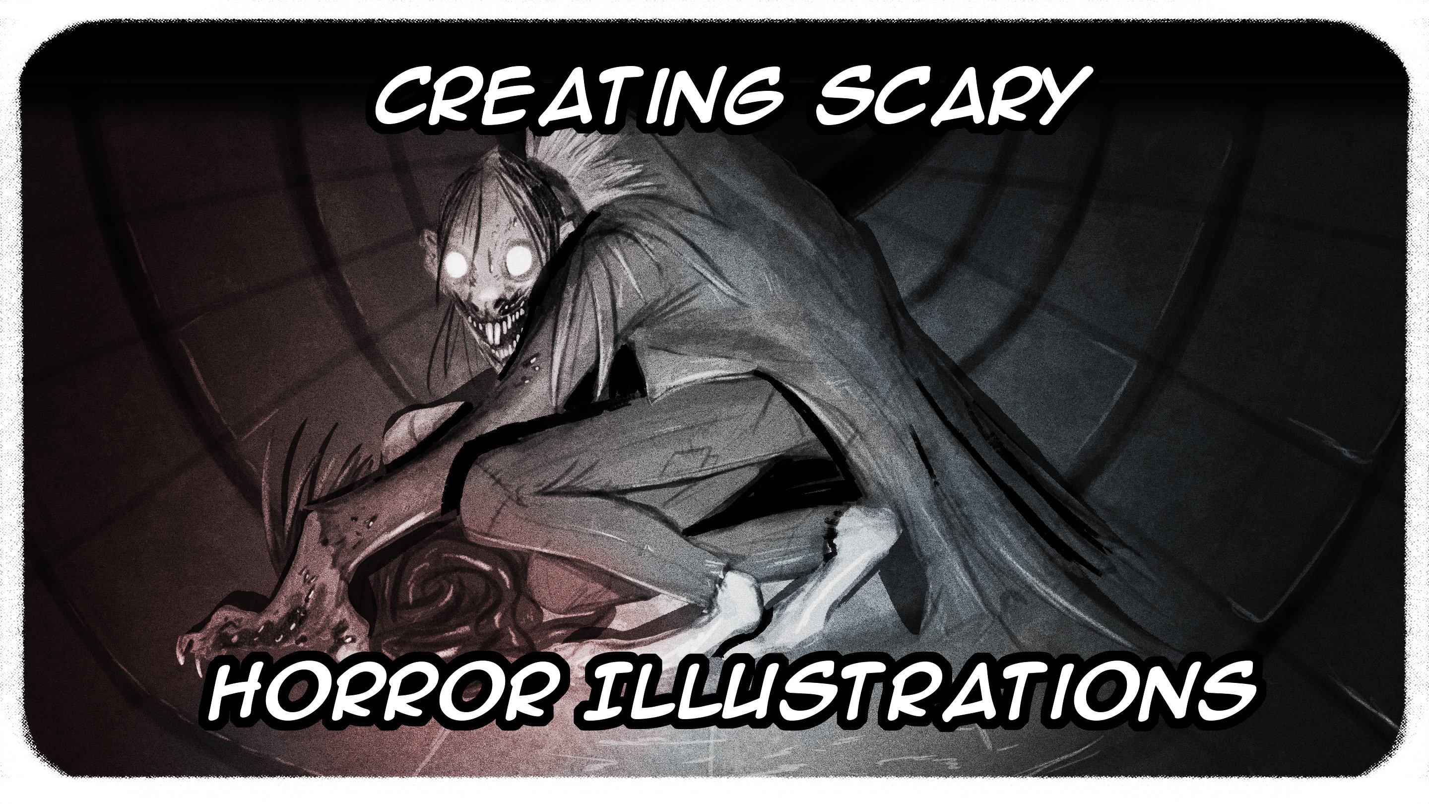
1. Create your own found footage monsters: Hi there, I'm back and I'm an illustrator and
production artist. In this lesson, we can be making spooky found footage
illustrations. We're going to go over how
to source your photographs, how to prepare them with
the art of photo bashing, and how to design an integrate your creatures to
make them look authentic. If that sounds like fun to you, and I'll see you next video.
2. Picking your photograph: To start, I'm going to go
over where you can find some interesting photographs
for your found footage, illustration and what's
best to look for and just kind of go through
some of the ones I found. Obviously the best
pictures you can find are the ones that
you take yourself. That way you have
much greater control over the composition. You can take them with
a flashlight or with the flash of your phone
or a camera at dusk or at night or any really
time as long as you have a good grasp of the maintain the spooky in your
shot needs to look like the photograph
was taken offhandedly, but if you looked back, there was something
in it that's, is hidden in the shadows. Or if you want, you
can just grab images of a Google or images on Flickr. It's fine as long as you don't plan to sell
them in any way. These are just for fun. So they went break anybody's copyright. Important thing is to
have a good sense of staging where you want
the monster to be. So these are some of the
ones I gathered together. Mature mix of
photographs I've taken myself and one of the
Zofran off the Internet. So let's just have a nice
sort of feeling of presence. And if I have a
feeling of drama, so I like this one
because it's very misty with the snow and the fog. And this, I thought it'd
be another fun one, something huge looming
in the background. And these ones I've
taken off of YouTube, just to screen caps
of found footage, pieces that people upload
or from those sort of YouTube channels where
they love to put the red circles
in the thumbnail, kind of not Chris shot. And then it's like it
breaks red circled like there's something
here, something here. And it never is like your watch hours and
hours of these things. You'll never see
his spooky monster. You'll never see a ghost. But you can if you put
your ghost in there. And that's what we're
going to be doing next. So something to look out for and the composition of
the pictures is, as I said before, we
want to look a little offhand because that makes
them feel more authentic. A lot of these
because the screen grabs from somebody's stream. So I have chosen a nice composition so you can
see all the lines follow. So this area here, we want to see something here. And we can, but it also means we can put
something in here. This little extra scarier, something a little
bit more hidden. Whereas I'd say a
not necessarily bad but definitely very
uninteresting shot would be this one where all the lines again
almost completely. So the center, you're
expecting something here now and then to make
this little special, just have something here
or poking out here. That way you kind of
trip help the audience. But in general, you want
to have a sense of shape, a sense of drama in the
picture for you to work with. Now this is something
that is very important in the compositions for when you're doing your
own illustrations. And the fun thing of what
I'm gonna be showing you is that even if something
is static photograph, if it's not quite living up to what you want
the image to do, you can very easily manipulate it and still retain that feeling
of authenticity. So what we're gonna do is
bring this start off with a very simple illustration
and then work our way to more and more complicated and more
advanced methods. And we'll be going over
that in the next video.
3. Setting up the background: We have our images. I'm going to pick
one out, which I think would be fun to work with. Have a sudden look at
some of these ones. These ones actually
all came from an abandoned more than America from this guy on YouTube who structured a GoPro to himself and just kind
of explored around it. And it's just these
amazing shots, like you can see in
the composition. There's so much tension here, so much blank space here, because the environment is a tiny devoid of natural light. Which means the light
from his flashlight makes these fantastic kind of strange effects on
everything around him. You have a wash of light hair. Then the little pinprick
of light here and here where it's shining
off of the glass. And again, you have a lot of
tension within the shots. You have these areas here
which are very light, but then it gets progressively darker until it becomes
this inky blackness. Anything could be hit. I could put a little red circle here and say ghost cited in
abandoned mall. And if you squint, maybe there's something there. But what I'm to do is
I'm going to pick, like, I quite liked this one
because the first quote, a bit of drama in
the compositions of foreground, middle
ground background. Because there's a fair
bit of blur here, definitely in parts of the
feeling of movement and the thoughts helps it feel like the picture is more scientific. It wasn't staged,
it was screen grab, which is what you want
or photograph that was taken rice at the last second. So what we're going to do is we're going to
go to Photoshop, setup a new image. I'm going to bring
up the image size so you can see, well, I work at 2880 by 1620. This is essentially
ten ATP doubled. So it will look good
even if we shrink it down 300 pixels per inch.
And you can just copy that. They wanted to take
this track over here. She going to crop that down for the moment and just salts out so that we
can actually edit this. And then y always like to do, just drag it down
to the plus here. This is that we always have a backup just in case anything what's
happened, nothing is. But now what I like to do is separate the foreground
to the background. Some people work straight
onto the image like this, but I actually quite like to have a good amount of control. Now, we could use the lasso tool and just
crop this out like so. But it's a little rough for
something that's this close, the camera is a little
bit more farther away. I wouldn't worry so much, but it's quite close. So I wanted something
a bit more refined. I'm going to Control Z. Again. What we're gonna do
is press this button to make a mask layer and then using
SAS to use the hard round. This section. And we're just gonna
do is we're going to mask out this door section. Just been a little rough, but a lot more concise than if we were just using
the L2 tool and then soft round for this to match the softness of the
blur on this section. Make it a little bigger. I doing this because I'm
thinking of having something here so that you have
the lines leaving here, which is where you want
the audience to look. Just to fill in this section hertz, it selects everything. Going to work in a little
more into this section. Now we just press this button. Again. Boom. We call that selection.
So we're gonna go select, right-click with the Magic
Wand Tool select inverse, and we're going to delete this. Now. We can have something here and it won't affect
this area upfront. And then we'll send
means that command U. We can make this
darker if need be, or brighter if we wanted
to make it really stark. But I'm just gonna leave
it as is for the moment. And then y likes you to do is using quite a bright
color or white, as long as it's not black. Select flexor,
pencil tool or wife or whatever brush utilized
to use to draw with. And it's just super loose
destroy something in. So we have the lines since you have the
composition coming in here. So you want something
around here. Just for this very
simple illustration. I feel like you can have something like the
head is. He here? We're knocking into
detail just yet. In fact, we're not
doing any anything. We're going to be designing a creature with
more sensitivity. In the next video. This is to make sure that what you design actually
looks interesting. Or more people who draws
straight into the photographs. What they end up doing
is he's very blobby kind of mushy designs which
aren't that interesting. Whereas if you give
yourself the space to work on the kind of Zeit you want that will fit
the composition. You'll find you'll have
a lot more freedom and each port you come up with will be just a lot
more interesting. I'm just going to draw
a very simple figure. I kind of figured out I wanted to vaguely humanoid figure
here in the corner, just slightly cut off. And this could be
a man or woman. It doesn't really matter. Nobody wants to think that. Actually what I might do, the stretch oral
kind of spindly, ultra large figure, almost
like it's striving towards, towards the camera to give
you a sense of real menace. See, yes, somebody just simple. We can just make this black. Now we know roughly this is
It's going to look like so we can then work with this into
a more interesting design. And I'm gonna be going over
that in the next video. I'll see you then.
4. Drawing the creature: Okay, so we've got
background and go kind of rough outline of
where we want monster to be. If you've seen my lesson on how to create horror illustrations, horror characters, which I
highly suggest you do because I am going to go up for some
of the stuff in that video. But in very brief, essentially easy trick is to avoid the temptation to go very aggressive
with the creature. You know, this is
supposed to be a key, slightly shocking
illustration rather than something from
an action video game. You don't want.
Here's my angry eyes. My big slowly big slide
that Smiley mouth. And can I use my huge
Resident Evil ON clause? That's not particularly scary. Real life. Certainly that was coming in. I be pretty scared. But it snot going to give
the right kind of feel, the right kind of sense of
menace that he wants in, unlike what we trying
to accomplish with this new layer over
this loose sketch here. Well, I thought would be fun,
would be to take this pose, then pick a theme, and then just run
with that theme. One thing we could go with
some blank stare, eyes. Finally, sketch, but then
maybe just add some more. If this guy had like horrible
long set of muscles. I'm not also, I should say your pipes come
down to the face, making looked quite industrial because you call this
quite long flowing figure. Then using that as a theme
for the rest of the design. He's made of. Since she ports and tubes. Just using the sketch to inform
where all this stuff is. Obviously you can do
whatever you want. I'm not gonna tell
you what to draw. But if you're following along, that's perfectly fine too. Because something you
often see these kind of produced urban legend
creatures is they have quite kind of silly names, kind of things which
people make up online or for the titles of
things like newspapers. This really could be called
something like horrible to man or pipe man was
something like that. If you think of it like that, then becomes a little
easier to kind of come up with things like this. Then you can, you know,
still having fun, you can start making
up a story about, about this and about this
creature of what kind of law, what kind of backstory
do they have? This part of experiments
which were going on? He look at the
amalgamation of rubbish that's that's built up
and it becomes sentience? Or is he just a guy? He's just a guy who
really loves his tubes. I put some of these ports
for more tubes in here. Plus pupil center,
not like holes In. Increase its design. Its English is
quite off putting. For whatever reason.
These horrible, cheap like fingers,
small to use, just dangling down behind him. Going to bring the opacity down the additional
sketch a bit. Now, see where I need to be more specific for improving the
details such as they are. But this should
highlight, if anything, the importance of doing a very
loose sketch layer first, because this means that all the hard work of the
pose is already done for me. Like I've already done that. I can just use this as a
guideline for our I put the details rather than working straight into
them and resulting in, could end up being quite a, quite a boring pose
or quiz stiff pose. Whereas because just
taking the time to do that extra
layer, that means. Kept also thought forward momentum of the creature
with a character, but without sacrificing
details, if that makes sense. It's just the thing of making sure you
have the foundation. Fuel drawing first.
Just a nice sketch. Even if it's just super rough. Even if it's just going to copy from a photograph or
whatever, it's all good. Then when you work over that, you can then have a
lot more fun with the details and they then
become social load-bearing, if that makes sense, you've got the hard work done
ahead of time. And that means you
can have fun with the details rather than making. And I taught design
out of details. Because something
that I used to do as a younger artist
and I see people doing sometimes still is in assessing the little details that you want in the altar sign. And then doing a kind
of connects the dots where one detail leads to
another, leads to another. And then you then get is quite
a stiff kind of buoyancy, unimaginative, but
definitely quite a stiff, quite an energetic image where you can see it's been
a case of connected adults, one thing to the other, and any kind of sense of movement. And the sense of life is
diminished unfortunately. But again, this isn't
something wishes case of. Well, you know, if you do this, then there's nothing for it. Just means that you need to do a very rough, loose sketch. First of the pose
and the intent. And then you can go over that
with your secondary sketch. It's all good. Because I knew this arm here isn't going
to be showing up. Just a little rougher with that because I know
it's gonna be cutoff, but I do like to make sure I
have at least something that just in case just in
case I change my mind, wants to move this guy around. You didn't really want
to cut yourself off and give yourself
no options if you do want to change it later on. Cool. I'm reasonably happy
with this guy so far. My add some more later on. Just tidy up some of
these little bits. Let's see what he looks
like in the extra drawings. Welcome to do is just
tidy up this bit here. Let's make it all kind of tight. Find some of these loose edges. Just because I'm lazy.
Essentially, we're gonna fill in this character
with a paint Phil. And I didn't want to
have to do that by hand. Just closing it in. C. It's pretty good. The left and a little
better get the hip here. But that's fine because I can
just steal this up. Cool. Tell me one more gap here. Fine. It says select the outside
and then the plus up heirarchy, slip that everything. Yeah, I get the Select, Modify, Expand, expand like to right-click on the
mouse, on the pen. Selected first new layer below. It's got a very dark
gray below door area. There he is kind of peeking out. Let's just move them
around the world. I didn't mess up this area. Fell by n. It's cursory save. We got the very start of
gross looking creature. And we call him
situated in the area. But he looks very much like
a cartoon at this point, and that's not what
we wanted to look, at least relatively realistic. I'm going to go into
more of the details of how to shade and how to light
this guy in the next video.
5. Rendering the creature: We've got our creepy dude here, but he's not really sitting inside the composition
very well. Still tell he's a drawing in the finite details
of the line out. And then we're gonna go on
to the paint in general, we know that the light
source is coming from this direction around
here being the focal area. So any light is going to be
going in this direction, and this will then inform the
shadows on the line work. So with this in mind, we can start adding
little details and little shadows around
where they wouldn't speak. I find just little details, little bits of shadow in
the line work can really help a drawing gaining
more 3D field. And these are just going
to be like little shadows. I'm not going to be doing
huge sweeping statements. They still help to inform more detailed
pass the painting later. Because especially
with paintings like open-ended be doing later, they are going to be very
purposefully overdone in terms of textures and filters
and things like that. You didn't need to be too
precious with the line work. You don't need to make
sure that it's all perfect because it's going to start to disappear into
the background. They are already in
Santa look more 3D, still looking really
quite cartoony, but you can see where the light is hitting him
from this direction. And what we're gonna
do this weekend to make that more succinct. Create new layer, right-click, bring it down to click Mask. Now this is quite an
important aspect of these paintings is that you should always,
especially as possible, to use the color picker tool
here to pick a color from the actual environment
in order to make for your painting look like it
fits in that environment. So I'm gonna go here
for quite a light area. She can, as you can see,
it's actually more of a purple area it knew to expect. And then with the
creating tools that circle and fill the
second color being black, I'm going to give
them a bit of color. It looks kind of
right. That looks good to get ten control. You just bring that
all the way down. Then I'm gonna take then
in the second worries, CC well, I don't know
where I want the eyes to be and just get rid of
this layer for a second. Just go in here to
talk them off for now. Because I want those
to be quite clear. And it's really
sought to come along. It starts to fit more, is looking slightly
less like a cartoon, but we still have
some more things to do to make it a realistic. And keeping that in the next
video. I'll see you then.
6. Final rendering: Welcome back. What we're going to start now, stuck doing some highlights on our creature and won't
like to do with that. It's actually not work underneath the line up
actually on top of it. And again, we can color
pick from around here. So it's less than natural. Same with the pencil tool. I recommend any kind of small paintbrush that has at least a little
bit of green to it. I get a little bigger
and then bring the opacity and the flow down just to make
it a little softer. These ANCA really hot highlights
just yet and just work in where do you want to collect
the catching our design. There we go. We're
already sought to work in over two at the
top of the painting, using the pipes as a starting
point and then working outwards and using
the photograph itself as a guide
as to how much, how much liked
realistically be reflected. If you're not entirely
sure about this, if you're not sure how much light you should be
doing or you find that It's coming up at even
that's absolutely fine for you can do is say, I've done this all
at the same value. So I'm just going to duplicate this together just
to prove a point. This isn't a particularly
realistic way of lysine the creature. But if you're still quite new to illustration of this kind and aren't quite
sure where to start. You can just do everything
less than flat like this. It's absolutely
fine. Now what you do is just click
this button here, create a mask, then go
from white to black, then go over to
the gradient tool. And then just do this. The mask, which is this
soft ramp shape here, will essentially do
the work for you. The highlights a stronger here
where the light is hitting it and then getting slowly more and more diffused
as he go alone. That's just a nice little
trick to help you out if you're finding that
the illustrations that you are doing for
the creatures coming out, coming out a little bit
flat. Just get rid of that. Now what I'm gonna do, come on to new layer. We're going to use
our fill tool. It's going to make a plain gray. 100 hundred twenty four
hundred twenty five doesn't really matter as
long as it's a middle gray. Fill. And go to Filter
Noise and add noise. Then all the way up uniform. You don't want
them on the tactic unless you're doing a
monochromatic painting. Click Okay. Now I'm going to go down
to set this to overlay. Then that gives us the image to this very stark kind
of run down look. But as the look of a low resolution picture and this amount of
film grain over the top of your illustration
will actually do wonders in blending one
element into the other. Because it helps hide a lot of the small details and the
consistencies that you've already made and will make the illustration blends better into the rest of the painting. But it can only do so much. You still need to have
relatively semi realistic, I'd say start to make it
look like it fits in. This one is getting there. It's not quite there yet, but putting them to
continue to work on. So I'm just going to
bring the opacity down a bit quite so extreme. Then what I like to do is select all the layers,
but in a folder. And now what we're gonna
do is make a new layer. Right-click on it to
create clipping mask. How long would you next
is given for the moment. Essentially render out
the rest of the image. Let's just do lots and
lots of little details, little touches here
and there to make it feel a little more realistic. And I'm doing it in the play
it over the top so that I'm not totally reliant
upon the line work. I'm just going to paint over the top and make some
more bold decisions. Then if I was to be
doing everything underneath the line art layer, this will also help me paint
over the line up without feeling like I'm making
too big of a risk. And because this on
a separate layer, you can just change it. Or they said south again, without feeling that you need
to make everything perfect. The highlights and
just work my way back. And he's already son to look more placed within
The paintings. What we can do now, its color from white to black. Right-click to get
the grading tool, we're going to put a really
aggressive ramp here. We'll have our ramp here. And then we're
going to go down to overlay just a
really blow it out. Just play around with how much of the creature
you want to show off. I think that's good. See if we can bring it down
just a little bit. Really the sort of things
there's no hard and fast rule. All you need to do is just have a good eye for what you
think for your picture. It looks the best. So I'm thinking somewhere around
ear. That's looking good. Now, something that I'm not too keen on is these green axis. They are part of the
original picture, but I think we can do
better without them. I think they're
distracting a little bit. So what we're gonna do, we're gonna get the lasso tool. We're gonna do is
just select them, delete them, or you can lose him because
this slide is here. Then we can go to edit
content aware fill this thing and it should automatically
make a perfect fill in. It hasn't hair, but we
can still walk around that marshy layers
back down together. And then just with
soft soft brush, anyone you like, just
color pick and then just bring it right down. Walk your way through to make
it a little less jarring. Ever hands looking at k. There you go. Look at better. Another thing you can do. God, where the motion
blur. On this section, we can do, see what
it looks like. Let's track these down, duplicate them,
merging together. Let's put a little bit blur, filter. Blur, motion, blur. The camera's going
left to right. That's a bit much. Let's just bring it
down to about five. And already it's looking a lot more naturalists
looking at all like it's part of the image. Now another thing we can
do is go to New File. The same dimensions
as the original one. But let's make it a
**** a lot smaller. Make it 60% smaller. This will make
sense in a minute. We take all our last copy them controls Command C and Command
V. If you're on a Mac, then really scrunch it down. Now what we can do is give it a nice Dutch angle
this way or this way. I think this way is
better because it looks on menacing and forth. A Dutch angle allows us to make it look a little bit
even more unprepared. Like this isn't a
professionally shot photograph, and also it thinks are
slightly skewed like this. What happens with
when you see angles which are slightly askew is they are inherently slightly
off putting and therefore very
helpful if you want to make a spooky picture. You don't want them to be
especially nice to look at and thin with the
smaller resolution, you can see that a
lot of the details of the drawing which can easily be seen in this
high-resolution one. This super fork ADHD size are a lot more kind of
smoothed out in this version. Therefore, making this look
a little bit more realistic. Let's have a look what
that's gonna look like. Turn this into a clipping mask
with a ramp just for him. Make it really dark. It may be too much, but it might not see. Hopefully again. Yes,
we can quite nice actually gives him
over at the mall. Definition. While I might do,
is just go in and just gently erase some of the light catching hair on his pushy Clem was pretty
gross, disgusting. Just to help lead the eye up to these nasty eyes up
here. There we go. We've got quite a simple
found footage illustration. And something I
didn't talk about is when you're doing
these kind of creatures. And easiest mistake
is to just have them front-and-center or just
have them hiding a corner. Whereas some of the best ones, the creatures
slightly cut off in this case by this
door frame hair, in other cases by an
object within the shot. And this just lends it a
little bit more authenticity. It makes it feel a
little bit more real, less staged, if
that makes sense, another thing you can
do, she's quite fun, is take all the layers, drag it down, merge them. Then with the rectangle tool. Just a couple of
these just at random. Try and keep them quite
thin, if you can. Then holding the button
above the Control button, I don't remember which
one is the error. Then slide them across. Give it give you
an illustration. A very role of found footage, but highly damaged
found footage. Look, this maybe what you
want for you, maybe not. It doesn't matter because
it's all on the same layer. I'm going to save this. Let's call him tube. Save. And there we go. We call first and
simple illustration of found footage. Look. And if you want to
just play about with this image and this
technique, go ahead. I'm gonna be going over more complicated techniques and more complicated methods
in the videos to come. So you can stop the video now and just work
on your own or you can continue watching for
some more advanced methods. Either way, I'll see
you in the next one.
7. Level 02 Mist monster: Okay, sir, we made an illustration of a
spooky guy in Tours. Now we're going to transition to a giant creature outdoors. Now this is going to require
a few different techniques than the illustration
we did before, but it's more or less the same. Now, I've got this photograph of this quite innocuous
looking area, but it was really
quite nice and misty. Anything that we have around here is gonna be quite
covered up by the midst. But what we want
to do is separate the sky from the foreground. Now, that is a message you can do with this on the new
specialized sweat of Photoshop, but duplicate the image. Let's get rid of that
one behind select sky. And it's okay if we were to
delete this is done quite, quite a good job at separating
out the far background. But it's really messed up
the tree and it's really messed up where
the Voc comes in. But all is not lost. Because there is a
method that we can use to mask out this front
area from the sky. That's to make ourself a mosque. And we're gonna do that by
duplicating the original hair. And they go to command you, bring the saturation
way down and then go Command L to pick up the levels. And we're really going
to crush these levels together so that the foreground, especially this tree here, are really distinct.
Press Enter. Once again, select sky. And as you can see,
it's selected. The computer thinks is the
top. That makes sense. It's delete that. Said again, just to
make sure he gets it. Now it's looking a
little bit rough for only do is just duplicate it. A bunch of times. These labs. Again, what we can do is
duplicate this layer, put it on top of our mask. Clipping mask should
have happened. It's done correctly. There we go. We can put
wherever we want behind it. It still looks more
or less what we want. This tree could be
a little harsher. Those duplicate this
layer a few more times. Once again, that, yeah,
that looks much better. Smash these together. Just keep it simple. And then we call ourselves, unless you have us
to draw something, something huge, following
and a half hair, Let's have a creature
kind of moving this way. Taking up this space. Just going to do the kind
of random set of shapes. Kind of big dynasore
looking creature. What we call come on. You bring the
lightness way down. And then we've got
a very loose sketch for anything this
might look like, well, it might be fun to
have it look like it's covered in
vegetation and such. Hollowed out stomach here. Just to make it look
a little unnatural. Move this leg and
it's not too bad. My bringing him in the
little super-duper, huge. Once again, just going
to use this sketch, figure out the how is fine. But with this one, because
it's quite far away. We're going to do a
slightly different method than we did with our
horrible tube man. I am still came to
our new sketch. Something else a little neater. This guy looks like
salt with a dark. Let's pick a color hits
and match the background. Do single, set, clipping
mask to the original. And then it's gonna
come on. You got to colorize similar
kind of blue. Just raise up a bit. Because we're gonna be getting
rid of this sketch layer. Eventually. Something which some people do when making these massive
creatures for found footage is they tend to put too
many details in them when those details
realistically would be lost at that distance. And it breaks the
immersion more or less. What I'm gonna do
is stop painting in a much softer brush than
what we did the two men. Can you use this one? This is quite a nice versatile brush. Once again, just picking
from the environment on the layer that's clipped
to the original spring. Just going to slowly
work in shadows. As you can see this on top, on top of the line work, because the line work is really unnecessary for this
kind of illustration. The good from the top. For now. Just to complete
obliterate that line work, It's still using it for the
color picker for reference. Because we have objects
which are this far away, especially on a very misty day like when this
photograph was taken, you really do start to
lose a lot of the details. If this was a
particularly sunny day, this was very far away, would even start to
take old blue hues as the water in the atmosphere
gets thicker and thicker, the farther away you are. Let's stop. And I want them they're pretty happy with the
way he is looking so far. Like this chicken
emotion into one layer. If this opinion, like, we can always just erase
it. Back up again. Because I want to give this
kind of a shocky Look. I'm being very consistent with
the length of the muscle. Whatever is coming off this guy. The fingers want to make
everything quite uniform. But if you just add in extra long areas that
would clump together, it becomes a lot more natural looking, which
is what we want. We want this to look at
least semi realistic, even though the image itself is supposed
to be ridiculous. It looks like it's getting, I'd like to start new layer. Then soft round. Just select some of
this faulty area here. Just really, really walk in. It's bringing the opacity down. We can work more ups this way. Really blend this guy
into the environment. Even bring this opacity
down a little bit. Now as you can see here, this, this area here could be a little darker because it
stopped to interfere. You get these white
outlines a little. This happens isn't a problem we can do is create a new layer. Right-click on it. Good
answer. Quick Mask. Let's just select quite a dark
brown, reddish brown hair. And then just work
that into this tree. Just make it a little
bit more real. Let me give it that we
call the humongous dude. I think he can be
a little better. Let's command saturation, a
little bit of his likeness, but more just of a hearing
aid seems like he's far away. The further away an object
is, the lighter becomes. I felt like some
of these details there center of
distracter, little. Like them. They can smile lights, not too many though, because this isn't a
particularly sunny day that this photograph was taken. We didn't want too much
contrast, as I said, when people make
these illustrations of the kind of
megafauna crypted, the mistake they put
in too much detail. And that kills the illusion that what you're looking
at is very faraway. Lock that so it can
go to the edge here. We won't be working
more with a suggestion, suggestion of shapes,
rapid definition. In fact, duplicate, really
immersing them one. Give me the lock as well. Let him out a little
bit too much. I think that's a rhyme apply. Play around with the crop. If we weren't quite
like the original. See what this looks like. I think this might work if
he was a little smaller, if he was less center of
attention, if that makes sense. In height and find the
best on this tree as well. Having the tree in front really helps sell the idea that this is a photograph that was taken
without any forethought. If you have something in front partially concealing
the creature, then it gives the image more
fitting of amateurish NAS rather than taken by someone who was caught
the camera on the tripod, they set up the sharp,
everything looks great. The creature is smiling for
the camera and service week, and that can be fun, especially if you're doing
more of a silly illustration for four ones like these
where you're trying to get an air of authenticity. These little mistakes actually
lend it more authenticity. Then reduct Fermat, skin. For green on 25126, whatever mid-level gray
Filter Noise Add Noise. Overlay. Quite high. Yeah, I
think that's good. There we go. We've got our cool
megafauna creature here. Partially obscured,
looming absolute the mist. And you can do these
with almost, I think, photograph of a landscape
with a nice horizon line. These work especially
well if you have several layers of
depth to the image. So quite lucky with this one because have
advanced foreground, middle ground, and then
quite faraway background. But you could very easily have something
behind these trees. It's just something that
is behind this rich hair, especially with the
MIS coming in lens. It unlawful lot more
mystique and the ability to go really big with
whatever you're painting. But try it out with any kind of a photograph
that you have. You get better through
experimentation and just mucking about and
finding out fairly, as I said in a loss of
my previous videos, once you get rid of the
idea of FPGA image being precious and everyone needing to be perfect the first
time you find, you can just have a
lot more fun than you will improve as you go along. So we call it one more video, which is the more
advanced version, where I am going
to be going over an image shot in the woods. And that means a
lot more masking and a lot more photo manipulation
to get what we want. But if you feel like you're
up to that challenge, I'll see you in the next video.
8. Level 3 Woods monster: So now we would try something
a little more difficult. But I'm going to Silko through it step-by-step so that you can still follow along. I have these images I
found on YouTube of guy recording is hike
through the woods at night. And some of them,
which is fantastic, especially for the kind of image that we're
looking to create. And I particularly
liked this one. There's a lot of drama here. We have the pathway leading up. You know, you have the area here is where we
stick a monster. But I felt it was a
little too staged, and I thought it'd be
fun to take one of the slightly less
interesting images and kind of bump it up to
make it as good as this. I also really liked this one. But I felt like the
kind of trails off here could be good
is if we take some of these images and mash them together to make a new
image over the top. So I'm going to take
this one, duplicate it. Because I like this area here. That could be fun to
have over the top. On this side, I'm just
going to make it across. Obviously, temp one. Let me write this so we can
just very roughly get rid of that tolerance
set to fairly low. It's just five. Get rid of as much
of this as possible. But it still looks quite rough. Not being too precious with this because I'm going
to make it blurry again so that a
lot of these kind of reflecting edges just
gonna be removed anyway. So you didn't need
to worry about them? Because it doesn't need
to be super-duper. Perfect. We're not making a legitimate photo manipulation. We're not trying to
legitimately fool anyone here. It needs to look
absolutely perfect. Just as long as you know, as
long as when you look at it, it still looks legit, soft, round just to feather
out this area here. Blend better, see
what that looks like. To make this launcher
crop this image as well. Obviously the temptation is
to go and brush like this. Do the whole thing like this, that would take that
would take forever. No one's got the time for
that and really sought to lose energy on the image. Let's, let's walk through
some of my other lessons. Keeping your energy up, keeping me the interest
in what you're doing. It's very, very important. If you can keep that, then you'll be in a
better, better space. Is going to go to the transform. Because I think we can have these come in a little further. Luckily, it's already
quite blurred. So we can be quite, it can be quite rough with it without looking too strange, but it feels like
negative area here. I think what we're going to
have creature, creature here. Poking out by felt like we could have a little bit more
further, your chair. Let's see what else we
have in our collection. It's got these trees here. Let's add them. I'm just going
to roughly stick them in. Lasso tool. Just very roughly cut out what I know are
not going to be using. Bring the command needs, bring that saturation
down just a little. Then we can erase
further the soft round, just like nip away
the edges here, just to blend it in to this photograph to help it
match the blurriness hair. Going to duplicate this and get the filter
blur, motion blur. Just blurt out a bit more. And then once again,
the soft round like a medium opacity
on the layer I suggested erase
away that close to the middle because he can see this static with this is moving. And I do that a little
more heavily here. Just to cover up some of that
roughness around the edges. When then what we can
do to kind of help blend it all together.
White, black. Create a tool, circle, all that, all that I found. And just put it in quite
a harsh right now, we could keep it set here
to overlay all the kids, such it's a multiply. And then just play around
with it until we feel like getting the desired effect. These little bigger. Now as you can see, we've taken an existing
photograph and we've changed it considerably by mashing together several different photographs
to make a brand new image. And this is something which allows concepts
are sessile or production artists do
for illustrations that I make for films and video games and TV
and stuff like that. It's a really fun, really quick. A way of creating a
background out of photographic reference
without having to do everything
by hand yourself. And when you're doing stuff
like this easily helps if you're taking photographic
sources from the same area. So lucky with these ones that they were all
from the same video. So they have more
or less the same, they have more or
less the same colors. They've come from
the same forest. So you don't have anything
that looks to innocuous. Everything looks like
it's from the same place. Nothing stands out. But it's taken what
about 1015 minutes for us to get this for us, it would take forever
to hand paint this, just gonna get rid of some of these dark areas showing up. Yeah, I've started
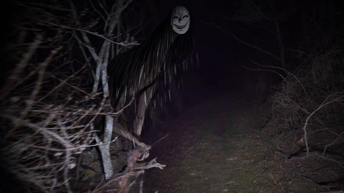
our creature hair, kind of like the idea of a face painting hair and then
quite a long strange neck. Probably make it a
bit bigger actually. Like it's looming
out of the pathway. That's before going to
take this loose sketch. I'm going to do a title
sketch over the top of it. Would be fun to have quite
a horrible D-ring face. Guidelines here. Almost like it's
got a horrible kind of mosque like smile. I can keeping,
keeping in mind that the light is coming
from this direction. During the heavier lines, the heavier shadows at the top. Mean. I come around to painting this kind of hard work in the
area will be done already. Something just incredibly
creepy about these social don't like faces. Not quite sure what it is. I'm sure somebody
clever than me will be able to say why they
kind of unsettling. I think I quite like the hair. Um, I have that. Continue down. A theme. Make it slightly more difficult to
coloring later on. But someone says
it's just worth it. This one because it's kinda
leaning outwards this way. Want to put a little
weight on this arm here, be supporting the
rest of the creature. Know what I mean by
that is that you can tell a lot of balance
is being put here. Keep it quite stiff. Then that means we can have better contrast with this arm in front where it's a lot looser. Voltage up here for if you never show about drawing hands, always drawn on the palm first, just as big block like this, and then put the
fingers in afterwards. This a little further up. Just to really contrast guys telling in the
gross character or this, all the squares hat might
make him tail here, made out of there if this fall him up in the
final image or not. But like I said
earlier, the T guy, sometimes it's nice to
just make sure you have the entire thing
because then you're not bound to arbitrary areas where you've cut yourself
off just to save on time. And if you change your mind, she can always just
change it back again. Gross. My old trick. This, I'd have to sorta
all these extra things, a little extra areas. And no, That's just
not gonna happen. Is got a fresh layer, nice bright color,
nice hard round. Just going to fill in the main parts of the body
here on a separate layer, of course, math see this
on the sketch layer. Every strand of hat. I am going to just
do the main body. We are going to be doing some
stuff with the half later, but thats with another trick
that I'll explain shortly. Behind. Sorry. I'm just going to cut
that out fairly quickly. Save this around, see, next the best like that that could really
affect from now. Then. Let's pick them up. Skin tone, I'm thinking
initially, maybe. In these darker ones, because I want the
face to be quite pale. Get rid of artifacts here. Lock this layer, pick this one. Kind of face area here. Already. Sunset spooky, like
chalky texture, brush. Going to pick some other colors. Bringing the opacity way down. The quite gentle with this. Then just go over some
of the darker areas. May be thinking thick
while I've been tight. Now why don't I
pending ball detailed in the head and you're right. But all things indicate time. It's kinda top of the sketch layer and start
putting it a few details. Actual pencil, brush. Just got back from having
just get rid of some of these flying knots. Scarier than ever so slightly. Given some horrible teeth. Sure about the eyes. I might take them out later, but I might keep them in. This pump them face
be Colt by the light. Extra sharp areas. The same for the hands as well. Now, let's select
all three of them. Three hotlines, put
them into a folder. Then scrape out of
this is about at well, the Golson means I can have a nice easy clipping
mask on top. So now I can be a lot more easy breezy with pulling on the highlights
and stuff like that. I had to worry
about keeping until the lines because clipping mask, we'll make sure that
happens for me anyway. To stop eating the occasional
highlight here on the hair. Again low down because that's
where the light source of B as she around
these areas here. And the clipping mask is
great because it means that I can't color
outside the lines. Means I can make my ramp
here just to really make sure that mic mixture on getting my sauce of having everything
in those in that folder. Make sure it really
blends in with the area. Again, we put that one group because I feel like
this is a mask, so I'm going to
press this button. That means everything
we've drawn this area is dependent
on the mask. And then getting down to
black, one would do so. I'm just going to bring
the opacity down. So when I see, but
this tree is because I want this guy to be
behind this tree. And then with kind of a key, keep it to this pen here. Can go in and erase. Mask again, this isn't on the
main, permanently erasing. And even the illustration. I'm just going to get
these limbs of the tree. Essentially you're going
in front of the creature. I satisfied with the position of the creature in
the illustration. Unfortunately, these
trees are quite blurry. But then that just means that when let's apply
the creature out just a little bit to compensate. Looking bad. Gonna get rid of that entirely in the shadow that's being
cast here by this rock. Because it's just gonna
be your tree anyway. But that doesn't mean because we can see
that shadow there. We know we should put
some shadows here to make it really blend in
with the environment. Bring away back up to the top. And then this is
very likely feather the edges a little
less and less crisp. Just switching these
exact motions. Textured brush, cool. Let's go. Its base layer, new layer. We've got heart creature
here going behind the tree. But now let's put in some
more shadows here around this area to make it look a
little bit more convincing. Do the same for the creature. Come in. Just add some
shadows from the tree. This prompts Not
quite it for me. Then before we go any further, let us see what it looks
like with the green affects. Putting that layer,
Filter, Noise, Add Noise. Tail. It's already looking
pretty horrible. Especially see the way that the grain has kind
of evened out. These details looked
quite harsh without poem, has now been softened
and made for homogenous. And sometimes he did want that. Sometimes you want the
image to look quite crisp. But in this case, we're trying to, let
me spooky monsters. You want these to be
subsumed by the texture. And then that way
the whole mistakes don't feel quite so prominent. But something of notice is that I feel like this area
here could be lighter. This area here, the hands
could be a lot better. We could fix that. This could change this from
multiply actually to overlay. And I think that
looks a bit better. Let's bring it down so
it's not quite so harsh. I think what I might do
is duplicate this layer, set it back to multiply. Then just just to center, it's mostly affecting this
area here and I'll smash their face and the
hands. Much better. You can get mad doing lots of layers,
looseness of effects. But sometimes it's nice just to keep it relatively simple. And I kind of like
the way this one's come out to another. Let's make it a lot smaller. Let's make this 40%. It command C and D. Actually looking kind of nice. Then bring these in
a bit more focused. And then let's duplicate this
photo with the creature. Right-click on that
and merge group. Just hide the original one. And then just fairly, very slightly, Let's
put it at blur on it. That's kind of my Schindler. Kind of angle. 13th, way too much. Feel like too. Yeah, that feels
that feels good. That feels like it fits
into the rest of it. These about sometimes I can happen when you're
resizing layers. What might be fun? Not quite sure if
this will work, but when they were known, unless we find out these
layers altogether, traveling down to the
K1, merging together. Just hide things
from my perspective, just moving them a little bit. So it really feels like there's creatures looming out because the original angle picture was looking downwards
towards the ground. But we want to give more
of sets of minutes. I might do that. Original background, Edit, Transform,
Transform perspective. Kind of changing a little bit. It becomes a little
bit more leaning, a little bit more menacing. And then you can play
around with filters, scan guilt, photo filters. I don't usually use these a lot. But sometimes you can
find that they help add kind of weird sense
of authenticity in the sense that I didn't think they look
particularly good. But again, you'll try
and to get the look of an amateur image rather than one which has been
professionally staged. And sometimes he's kind
of extreme filters can help with that feeling of authenticity we've
been talking about. It's kind of interesting. Let's really quite nice. Blue magenta. Bring this down a
little bit more. Yeah, I think that looks good. I'm going to be leaving
some of the pictures in the lesson folder so you can mess around
with them yourself. And this lesson isn't
quite over as you've probably noticed from the
length of the videos. But what I'm gonna be doing is something a little
different in that I've got a few more ideas
for some other images, some other illustrations that
we can do with this theme. However, I feel
like I've gone over at least all the major points of which four I could teach you. The next few videos aren't
really going to be a lesson. We'll just chill Hangout where you can just
watch me go through the process with some nice music on and you can follow
along if you want to, or you can just watch them in the background as you make
your own spooky images. Obviously, when you're done, I would absolutely love to see you post them
in the comments. I'd love to see what
kind of spooky, creepy creatures you
make for yourself. If you enjoyed this lesson, I would really appreciate a rate and review after you are done, as it helps me make better
videos for you to enjoy. If you really
enjoyed this lesson, then feel free to subscribe to my channel so I can keep
making more videos. This also lets you
message me with your arts or I can offer advice
if you feel you need it. I hope you enjoyed this
video and this lesson, and I'll see you
in the next one.
 Ben Tobitt, Illustrator and Animation Director