Transcripts
1. Class Intro: User flows of flow charts are really important part of design process because inside of user flows, you're going to define how your users are going to move through your app or website and what are some steps that are going to take in order to achieve the goals that you or your clients set, you can define one part inside of your app or website that your users are going to take. Or you can define multiple paths that multiple users are going to take at the same time. And by doing that, you're going to determine the number of screens or pages you're going to need in your project and how much time you are actually going to use and need in order to complete this project. Hey designer, my name is Alex and in this Skillshare class, we are going to talk about user flows, why they're important, how to create them using Adobe XD. What are some differences between different user flows and how to use them in your projects. I am a digital products creator and so far I have created or a 500 design products. I'm also a course creator and so far I have created or 30 different courses with over 50 thousand students enrolled inside. In this class, we are going to discuss what our user flows, different types of user flows. When are they used? Creating task flows using Adobe XD, working with wire flows in Adobe XD and how to use different more complex templates. And finally, how to share your flows with your clients and developers. Your class project for this class is to create a task flow using the template I provided. Simply open the template in Adobe XD adjusted however you want n simply upload that image to our class projects. I can't wait to see what you guys can create. By using user flows, you are going to determine the total amount of screens or pages that are needed for this particular project. And also you are going to create optimal routes for your users that they can take. Also, what you can do is improve the likability of conversion because you're going to optimize your users experience before you actually get to the design stages of your project. You can use them with new products to define your paths that your users are going to take. Or you can use them with existing products to refine those bads and to create ideal fats. So I really look forward to seeing you in class and let's create some user flows.
2. What are user flows: User Flows, all flow charts as they're sometimes called our parts. Your users stake when using a product, they display a complete part your user takes from the entry point, right, all the way to the end point when they finish their journey. There are many different parts your users can take depending of how they got to your product. For example, if that website or a landing page or something like that, maybe they got to that landing page when they clicked inside the link in your e-mail or if it is Shoppe page may be a product page or something like that, maybe they got to it by visiting our campaign you had on Facebook or Instagram or something like that. Maybe they clicked on a link inside of a YouTube video and guts to that shop page. Or if it is an app, maybe they installed that app using a link or direct download from a store. And then when they installed in that app, and maybe they opened it up and got to the splash screen. So user flows have our simple job of directing all of those paths in such a way that it's logical for your users and super easy to understand and to optimize them in such a way that they have as few clicks as possible to achieve those goals, depending of who your client is and what your product is trying to do. Those goals can be to either purchase a product, to book a service, to download, a freebie, to sign up for an email newsletter and so much more. So your goal as a designer by using these user flows is to create these optimal flows and optimal paths that your users can take to do those tasks in such a way that it's simple as possible for them to understand and as quickly as possible for them to solve N2 guts to their end goal, your clients goal is to increase conversion, for example. So by using these user flows, you are going to get a step closer to that improved conversion by reducing the number of clicks, for example, that your users have to take in order to achieve those goals. By using user flows, you are going to determine the total amount of screens or pages you are going to need in this stage of the project. And that in turn is going to save you a lot of time later when you actually get to the design stages of your project because it's going to improve your understanding of this project or role. And therefore, it's going to speed you up even more in this stage of the project, you can even let developers know what's going on. And you can even show them and these flowcharts, and we're going to talk about that in the later stages of this class. But that's the whole point of this process, is to understand this project are lots better than to just start with the design because that's a really wrong approach. Because you really need to start with these user flows in order to understand how many screens, how many pages you are going to need later on when you get to that design part of your project. In the next video, we are going to discuss what are some different types of these user flows and how they are used. So I'll see you there.
3. Different user flow types: There are many different types of user flows depending on what you're trying to solve in your project and what you're trying to accomplish. But basically there are three main types which are used overall. And then from those three main types, there are many different types that you are going to encounter during your design career. And those are task flows via flows and user flows. Desk flows are what the name suggests and they are showing how the user interacts with a certain task by clicking on the same entry point in getting to the same entry point and the same end point, all of your users are going to do the same journey. And therefore, this journey is going to show one simple task. For example, signing up for our e-mail newsletter or purchasing the product, or booking a service with you or something like that. All of those users have to complete that same task. That task has many different steps in between depending of how complex the task is. And therefore this task flows are used for that. They are not used for other complex things. For example, different entry points, different exit points. But the whole point of task flows is to focus on a single task and to optimize that user part in such a way that they have the least steps as possible to complete that task, then we have wire flows. And these workflows are actually combination of these task flows and basic wireframes, and that's why they are called wire flows. And the whole point of them is to show different user journeys throughout your product and different entry points in different exit points. However, they are not too many details inside. They're just there to show all of these different parts that your users can take. So the whole point here is not to get too detailed, but to show to your clients, to your teammates and to developers as well. Many different parts that your users can take. But to use at least some details to show how those screens or pages can look like. And then to use arrows, for example, just to show what are some different parts that your users can take. And then finally, we have user flows themselves. They are actually combination of task flows and wire flows. And user flows actually show all of the different flows that your users can take, all of the different parts that they can take. And they're actually combination of task flows and via flows. What I mean by that is they are combination of these two elements. And I'm going to show you that in later stages of this class. And basically they're showing everything. They're showing every single entry point, they're showing every single exit point. They are showing all of the multiple parts of that your users can take right and wrong parts. They're showing alternative paths and all of those things, so they're as detailed as possible. So depending on what you actually need on this project and depending on where you are in the design stages of this project, you are going to use one or the other. Sometimes user flows are actually your best bet because depending of how your project is going, depending on how the feedback is going, how the research is going, it, they're much simpler to change, they're much simpler to edit. Then if you're just starting with task flows and there they're adding wire flows later and then using user flows at the end. So perhaps User Flows is the best way to do so. And when do we actually use this user flows? We're going to discuss that in the next video. So I'll see you there.
4. When are they used: User flows are used early on in a project right after all of the research and user personas have been completed. As he said previously, they are used to determine the amount of screens that you are going to need and the logical order of those screens or ordered dose pages and how your users are actually going to interact and move through all of these different pages. And then you can discuss that order and all of those flows with your clients and with your developers or a teammates to achieve the best possible result and the best possible optimization before you actually move on to the design stages of this project, they are used to create intuitive and enjoyable interface so our users find our product, our joy to use, and they're also used in order to increase conversion rate, as I mentioned before, because by using these user flows, you are going to determine early on in this design process, when your users are going to click or buy or purchase certain things inside of this process rather than later in the design process, which in turn is going to make the design process are lot easier to do, a lot easier to create. Because you've determined all of these things in your user flows. You can use them to create new products, or you can use them with existing products to refine the parts that your users can take inside of that product and to increase the optimization or conversion or wherever the goal of this project is. So as I said, they can be created for new or existing products. And they are really useful when you're creating components which later you're going to use in your design stages of this design project because some components are majorly used, like navigation, like footers and inside of this stage of your project, you can quite easily determine what's going to be located in debt navigation or footer. You can also use them to create something called hero images for example, or sliders or different components like DOS. And then later on you can easily scale or rescale those components, whether if you need them or not later down the line in your project. Finally, there are really great way to show to your teammates, clients, and developers your ideas about this project. All of these different paths that your users can take. Because validation in this part of the project is really important because as I mentioned multiple times already, it's going to speed up your design part of this project are lot more because in this part with these user flows, you are going to determine all of these important details. And then later on, design is just going to be much more easy and much more enjoyable process to do because it's just a creativity exploration rather than dealing with all of these complex tasks that users have to solve. Now speaking of user flows in the next video, we are actually going to create user flows using Adobe XD. So I'll see you there.
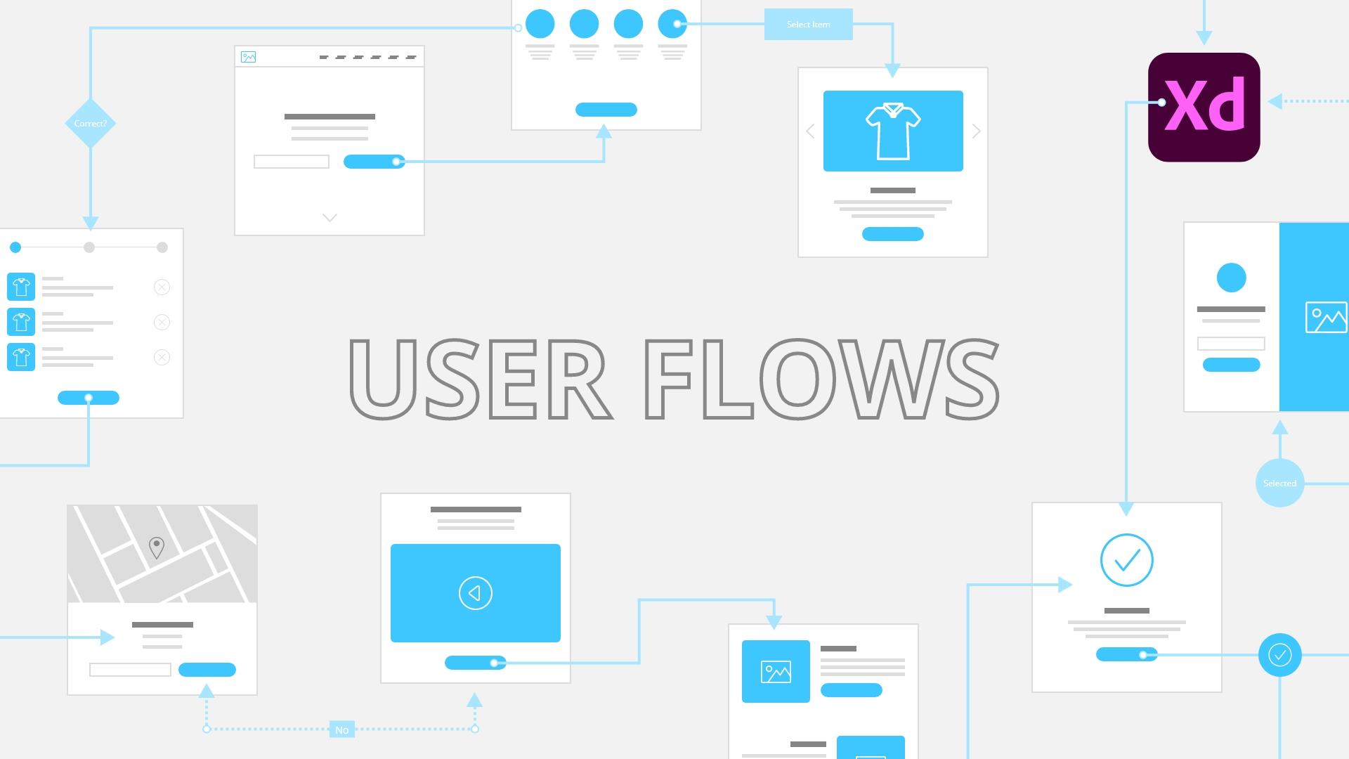
5. Creating user flows in Adobe Xd: There are many different routes that your user flows can take. There are many different shapes that you can use, but there are some basic shapes that every designer Are there should understand. They're basically the standard in the industry for decades now. And they're really quite important to know, especially if you're working with remote teams. If you join an agency later down the line or if you're already working in an agency and tried to establish are certain language that everybody can understand. So in this video, I'm going to show you a template. You are going to be able to download this template and to explore it more and then to build upon this template. And later on in the class, I'm going to show you some more complex templates which you can actually get if you want to, and then expand upon these basic templates and simply build upon them. So here is that template. It's called task flow elements. And if you want to get this template simply downloaded from the class files, and then you can open it up in Adobe XD. So what we have right here are all of the elements, all of the components. So we have entry, action, process, decision arrow and negative arrow, and these are your colors. So entry point color, white color, which is basically the color of the text everywhere, and steps color. If you want to change these colors to your client's brand, for example, you can simply right-click. You can copy this or you can edit and then simply change this color however you want. As you can see, they're going to update in real time. You can base your hex code right here. If we want to end, then it's going to update to that hex color that you've chosen. So let me go back a little bit. So as I said, this is the really basic bare-bones template and then you can build upon this template. So if we zoom in a little bit too, all of these different elements, I'm going to show you what all of them are and what all of them do. So first of all, we have entry, and this is the entry circle, or the entry point is usually shown as a circle, but you can show it in many different ways that you want. None of this is actually standardize. This is just designers in the industry using all of these elements and templates for decades. And then simply come up with all of these different solutions. So we have entry point and that can also be the exit point. So entry point, if you remember from the previous few videos I mentioned, can be, for example, a landing page of your website or login screen of your app or whatever else. The entry point where the users actually entry your design, your product, your mobile app, your website, whatever it is. And then after that, we have action. So users can click, users can browse, users can assert, users can type all of those different things are actions. Actions can also be, if you click the next button inside of your app, for example, to go between different screens. Or if you clicked a certain icon, for example, Arrow to go left and right, or if you swipe to use the pagination action circle is just there. And I'm going to show that in just a second with this really basic template which I found online and just recreated it using these elements. So all of these elements are, have created for you guys and you can simply download and use this template. As I mentioned. Next, we have process. So what happened after we completed the certain action? So did we went to a specific page? Did we go from, for example, small image to full width image difficult to the next slide, did we purchase the product? Did you go to the checkout page? All of those things really matter inside of the process. So you have to write that down in order for you to understand as a designer, or if you're working with a teammates or with developers or with client, you have to show them this process. Next up we have in this diamond shape, which is the decision. So basically that means if the user have committed to saying yes or no to a certain process or a certain action. What I mean by that is when you get to our checkout page, for example, and you want to purchase a product, this can be yes or no decision. So yes, I want to purchase the product and then you go to the checkout page, you go to the payment pages, so on or if no, if I click No, Where does it take me? That's why this diamond is really important and it's usually referred to as decision diamond. And I'm going to show you how new edit all of these elements to in just a second. But next up we have arrows. Now, these filled-in arrows, as you can see, we have two types. So these filled-in arrows are basically step arrows. So they move users from one step to the other. And then these arrows are basically what I labeled them here. Negative arrows in is when user say, says no, or when user cannot complete a certain task. For example, if the search but cannot find anything, then this no arrow appears and it takes them to a next step or to the previous step or something like that. So basically that's why these arrows are used. Now if I unzoom just a little bit, you can see this flow. And basically I took inspiration online and unjust recreated using these elements. Because user enters here, they are greeted with a welcome page or a welcome screen, for example. Then from that, they can select a task. The task is selected, and then they can move forward. If it is correct, then they can move forward to the details page. If it's not correct, then this, if they click no, for example, it's going to take them back to the select tasks. So this node can be concrete button when they click no, or they can be, that can be an X. For example. They want to close the pop-up or however you structure your layout. Basically, the point is the same. They can either go forward, So yes, or they can go backward. So no, that's why these are used. So then we go to this details page, for example. And from details page I can click the search klutzy to go to find something. And then when a commit to search, I can search items. If I didn't find any items, it's going to, it's going to show no items found. So in this case, I imagined it to be a next icon. So for example, no item is found, and then you can close to complete a search once again or To item is found, goal is completed in this particular case because that's the goal of this item. And then you can click Order. And this is your exit point, so ordered. Or if I don't want to order, maybe I can click no or cancel or something like that. And it's going to take me back to this details page. So you can just see from this really quick and easy example how useful these flowcharts are. This is basically a task flow which I mentioned previously because it's just showing a single task. In the next video, we're going to discuss some more advanced templates and some more advanced steps that you can take when you're creating these flows. But basically, this is just a really basic bare-bones template. Once again, you can download it, use it in Adobe XD and exploited. And I really encourage you to build upon this template, to add more pages, to add more screens and so on. And one thing which I didn't show you is, for example, on this task right here, I want to zoom in and let's say instead of select task, I want to do something else. You can see it's Open Sans, so it's free Google font. You can now load it on Google fonts and Adobe fonts, whatever you are using, completely free. So what I did right here is I included the padding. What I mean by that is if I click right there, you can see that the padding is enabled on this component. So if I double-click right here, I can type something, for example, make this more visible and you can see how the box expense. So basically in this case, I, if I go back, I used 20, as you can see right here, spacing between all of my elements. But you can use tan, you can use five. You can even overlap these arrows. So if a position is right here, you can see how nicely it overlaps with this step. So you can really do whatever you want. Also, when you're dragging this components, simply drag it right here. I want to change your double-click inside, for example, entry point or whatever like that, or exit point, whatever. You can position it here, you can make it to be in a center by selecting these two elements, position it like this. Or you can simply delete it. You can do that for all of these other elements which are showed you. And finally, for these arrows, because these ones are quite simple, you can double-click inside. You can hold your Shift key position this arrow right here. And then you can click and position this shape right here if you want to make this arrow shorter, for example, if you don't want it to be this long for whatever reason. And also for these arrows, if I go to my Layers panel and open them up, you can see so negative arrow, we have the label, which is this no label inside which you can also change if you want to. For example, negative OR no option, or this isn't an option or whatever you want to write. And then we have left, right arrows and we have this arrow line in the middle. So what can you actually do with these? You can click on the left arrow, for example, hold the Shift key and move it closer. You can do the same with this one, or if you want to, you can even move them further apart. So let's say like this. And then you can click on this center and simply extended like so. If you don't want it to be like this, then you can simply click on the arrow and you can adjust this so you can see that we have the border color, which is this color. And then we have the stroke width, we have the dash width. So basically the width between all of these different dashes, you can adjust whatever you want to achieve a certain style that you are after. And basically this, the whole point of this template to help you out in this exploration process. So as I mentioned in the next video, we are going to discuss a little bit more complex templates. I'm going to show you where you can get those templates, which are actually mine, and then what you can actually do with them. So I'll see you there.
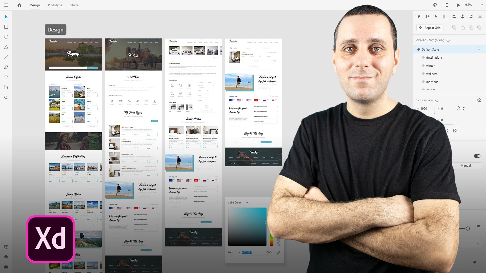
6. Working with flowcharts in Adobe Xd: In this video, I'm going to show you some more complex templates. These templates took months to create. And these templates are actually some which me and my team created in the past. And you can get these templates, links that are going to be in the PDF with discounts because these are premium templates. And I'm going to show you how all of them are created. Hold them look like in Adobe XD. You can get them if you want to. If not, you can create your own however you like. So here is my website call web donor, dotnet. Once again, link is going to be in a PDF and this is the first template which are going to see called flowy. And you can see you have 108 screens, 128 elements into different papers. So you can use these papers if you want to align your flowchart and then printed out later to show it to your teammates, clients, or developers. So if a scleral just a little bit, you can see how some of these elements look like. And we're going to explore them in just a second inside of Adobe XD. But basically, that's the gist of it. There are many different of these elements and these papers and we have wire flow flowcharts and these are a lot bigger. So we have HOT 100 components in total. So 200 screens to a 100 elements and two papers once again, and this time we have light and dark version, so you can even explore that. And you can see they are adaptive what's included. So you have three different file types, Photoshop, Sketch and XD. While in this one We have Photoshop and sketch files. But because XD is created by Adobe, you can simply open up a Photoshop file. It's going to work perfectly well inside of XD because it's integrated to do so, pixel-perfect components, free Google fonts are used wherever you find fonts. And if you purchase these directionally video tutorials for both of them included inside and organized layer structure. You're going to see that in just a second. These are the papers for printing both US and A4 size if you want to. Unlimited variations and you can see how some of these elements look like. Now, if I minimize this and go back to XD, this is the task for ROD. Show you, you can see how basic it is. But if I show you, for example, flowy, you can see how it looks like. So I actually combine these three. So let me actually move this a little bit closer. So these are web elements, these are mobile elements, and these are all the additional elements. So if you purchase these, they're going to come in three files, but you can combine them in one file in XD, as you can see right here, you can simply double-click to change this. So these are mobile elements, for example. And what can you actually do with these elements? So you can quite easily come right here to your artboard and create an artboard which is 1920 by 1080 for example. And let's say that I want to start with a login screen. I can copy it, I can paste it right here. And let's actually change this to this color. So let me actually, let me actually grab our nice light gray color just so you can see a little bit better what I'm doing. And then I can start with this arrow, for example, right here. So copy it, paste it in right here. And perhaps I can position it right here. So when my users click on this button, where is it going to take them? Because this is a login screen. Perhaps, as you can see, we have different categories right here. Maybe we're going to jump into e-commerce and perhaps I'm going to go to this and then this. And then let's see maybe this screen as well, like that. Control C jumping right here, control V to paste them all in. And I'm going to do in this. So for example, they're going to come to this screen right here. And then I'm going to duplicate my arrow Control C Control, or Control D, whatever you want. And then for example, if they click a, position it on top. If you click on this product, for example, or right here, and we have different arrows right here. So if I actually deleted this one, I can use this arrow for example. So you can see why these templates are important. Because you can actually work a lot faster when you're doing this. So if a Control X, Control V position and right here, and when the click right here, let's say that that's a button. And you can do the same thing which I showed previously. So you can extend these if you want to. And let me actually extended to right here. I can actually jump to this screen. So you can see that this is not inline with all of these previous task flows because this is a much more complex user flows because as you can see, we have two buttons, so they can click Cancel, for example, and we can actually duplicate this arrow. I can actually flip it around, for example, just to show you what that could look like. So perhaps I can position it right here. Maybe I can nudge these two upwards a little bit. I can position this down to here. Maybe they can click right there. And then this arrow is actually going to take them to this first screen, for example. You can even flip it around. And then you can position these elements. I'm going to show you that in just a second. So Control D on this one. And you can position it or right around here, then you can extend this. And perhaps this might look a little bit boring, but it's really important to understand this user flow. And from here on, for example, if they actually do click on this blue button, where does it take them? And let's actually take this just to make it a little bit simpler to navigate their way around. So I'm going to move this to here, maybe like this, and then position this a little bit inward. I'm going to delete this one. So you can see how quickly this is to actually create. Then when they click on that blue button, maybe they can come to this screen. And from Dan on, let me actually position this arrow all the way to the top, right here. Position it here. And then I can actually click right here and move this like this and reorganize this in just a little bit. Perhaps this is our confirmation screen or whatever, we can call it like that. And then when they click this blue button, they can actually go to the purchasing page and they can actually complete this step. Now, what we can do with this one is we can actually combine them with the original task flows which I showed you. So for example, I can use this entry circle. And then just excuse me because I have a lot of these open. I can position it right here and I can move it. You can see it's linked because it's actually an instance from a different component. So I can right-click right here and I can make it local. And then what I can do is actually jumping select both of these like so, and hit Shift control and reduce it a little bit. I can also reduce my texts. So maybe 10, something like that. Then we can use it like an entry point right here. But you can also do is use these. So for example, this is our home, maybe that's our entry point control C. And then I can, instead of this entry circle, I can make it look a little bit interesting by positioning these. So I can position this to be my entry circle. And for example, I can use this color if I want. I can change this icon. If I want. I can even change the color of the icon. Simply click right there, you can do whatever you want with these. Also, what you can see right here are all of these different mockups, which are basically dare just as shapes. And then you can use these mockups to show, for example, this is a view of a mobile app and I can use this simple mockup, may be positioning it right here on the top, maybe write some texts right here. Move all of these elements down a little bit, like so maybe and then write right here. This is a look of how the mobile version is going to look like on, for example, Android or iOS or whatever you want. Or I can use all of these other ones. So browser, laptop version, desktop version, whatever. Then if the step is completed, we can use this one for example. So let's position it right here. And I can actually position it in the center of my arrow like this. And then I can actually use my main color, for example, to see that the step is completed. Or I can position that right here, right around there, enlarge it if I want to. I can even include a border to it, whatever I can use a drop shadow on it on this background. Like so I can position in there. So whatever your style for this particular user flow is, then you can implement that style using these templates. And you can see in just a matter of minutes, if you're not talking as I am, you can obviously create this in a lot shorter period of time. So this was flowing if we're jumping right here, just to quickly show you a Web Elements of wire flow, flow chart. And you can see how many different elements we have right here. And you can obviously create components from these elements. You can change their colors. So for example, I want to change the color of this header. I can position it right here. Or if I want to change the color of my background completely, you can change it like this. And obviously if you have colors like our 3D show you in this default template like this. So if you have created your colors, you can simply apply that color to that element. You're going to work much faster that way. But if you don't, it's just fine. You can jump in right here and change the colors even of this. So for example, this can be, I don't know, a bright red or whatever. And then this can be the same color, so I can select it like this and you can see how that looks like. So obviously there are a lot options included here and all of these elements are the same. You can see we have many different arrows included inside. From one entry point to many exit points. You can do whatever you want. You can use danger, you can use a refresh. And I really encourage you to use your own icons. You can use these left and right icons for the steps if you want to. But basically you can see how these look like. They have much more details included inside. Rather than these which are shown you previously for the task flows. So basically, you have two options. You can use this version which is extremely light, or you can use this version, which is much more complex, but these are not final layout. These are just to convey your ideas much better to your teammates, your clients, your developers. And the benefit of this is because you have multiple entry and exit points, multiple flows. So for example, if I go to the one we created using flow v, So like this, I can create, as I mentioned right here. So we have these two arrows. For example, we have a close button right here, for example, where does that close button takes us, it takes us back to the login screen or to this screen. So you can just imagine you can create these multiple flows, complex flows and same like a template I'm giving you for free. You can jump in right here. And you can simply adjust all of these elements and make them smaller. If you want to apply a different color, you can do that too. So you can use whatever color you want on these. And of course, because there are many, many, many of these different elements divided in categories of promo testimonials, team, blog, e-commerce, and so on. For both mobile and desktop version, your workflow is going to be much faster and your delivery time is going to be much faster. And once again, the benefit of using these is your clients are going to understand you're much better than if you're just simply using something like this. This is a fantastic starting point. But if things need to be a little bit more complex, for example, like I show you right here. So you have to create multiple flows, obviously like in every single app right here, then I really recommend using our premium template like this because it's really going to improve your workflow dramatically. And it's really going to allow you to work much faster and to show your ideas to your teammates, clients or developers, which they are going to understand. Because especially with clients showing them something like this is not going to make them really easy to understand. But showing them something like this, for example, it's going to make them understand it much better because they're going to recognize at least some of these elements rather than just showing them and these blank shapes like circles and squares and diamonds and stuff like that. So that was a really quick look into these premium templates. Once again, if you want to get them with a very big discount, links are going to be in the PDF. You can simply click those links and simply entered that discount code which I'm going to provide you and then get them and use them in XD, you can see how something like this can improve your workflow dramatically. You're still going to get that basic task flow for free, of course. And you can download it and use it. But if you want to up your game, if we want to show your ideas into best way possible to your clients, teammates, and developers. Then using these premium templates are going to improve the workflow massively. As you saw, you can change anything, you can adjust them however you want. You can work as fast or slow as you want. You can use all kinds of different colors, all kinds of different shapes and icons and stuff like that. So if you want to use something like this, once again, I'm going to give you the links and discounts in a PDF and you can check them out. In the next video, we're going to talk about how can you share something like this with your teammates, clients, and developers. So I'll see you there.
7. Sharing your flows: Sharing your user flows is really important part of the whole process because it's going to really allow your clients, teammates, and developers to understand your thought process behind all of this. And it's really going to make the discussion much simpler than to simply do this and then simply tell them in words or something like that. So in this video, I'm going to show you a few practical ways that you can use in order to show these to your clients and developers. So first one is, and I created this for my premium templates which are showed you. So boat for a flowy which you're seeing right here, and for wire flow flowcharts. And you can open them up if you purchase these, which I mentioned in a previous video. These are these papers. So this is A4 size, this is US letter size. And you can simply open these up as you work and align all of your elements right here, and then simply print out all of these. You can select this. You can hit Control or Command E inside of XD, and then you can select PDF right here. Then you can hit Export and it's going to export this print ready PDF. You can print it out and then you can show it to your clients. Or if your clients are working remotely and you're not within their reach or something like that, then you can simply share these PDFs with your clients and then they can print this video south and then leave notes onto those PDFs. Or even better, you can simply align them right here, and then you can click right here in order to share this with your developers or clients. How that works is you can simply click right here. And it's going to generate this public link. And then you can give it a name right here. For example, let's say Webflow element or wire flow for a website or something like that. And then you can show it right here. This is the link name, and then you can simply copy this link and then you can share it with your clients. They can then in browser, leave your comments right here, and then you can simply change how this User Flow looks like within your XD and then come back right here inside of the Share tab. And then simply update that link and then come back and share that link once again with your client. Client name, project name, deadline, number of website pages and number of app screens is what's really important and what's really going to determine how much you're actually going to charge at the end of this project, or how long the project is going to take. Because usually, especially freelance designers are charging by the whole project. So they know, for example, from conversation with the client, if the client has existing project or something like that, they'll really know how much they're going to charge by gathering all of those information. But if not, you can simply work in stages. So you can charge for this exploration and user testing, user research phase. And then after you completed this, you're going to know by simply using these user flows, how many screens you're going to design later, how many website pages you're going to design. And from death number, you can then make an educated guess and charge debt amount of money to your client. So that's why sharing is really important in this phase of the project. Because you're going to easily know by using these user flows how much money you are actually going to charge to your clients. Now, this is one of the methods and then you can follow this template, especially if you purchase these or if not, you can simply use something like this. So let's say that you created this. You can give it a name right here, so double-click and call it whatever you want. So for example, novel flow. Of course, this is going to be much cleaner when you actually are creating it. You can hit Control or Command E. And then instead of PDF, you can select a JPEG or a PNG. You can hit Export and then you can send it to a client that way. Also, what you can do is you can connect these pages. So let's say that this is port number 1, this is our port number 2. You can go to prototype mode, connect them, and then you can simply share that prototype, as I mentioned right here, and then copy that link and share it with your client. Now, advantage of using something like this inside of Adobe XD directly is because you're not wasting paper. You're not wasting your time. You're not wasting their time. You can simply share one link. They can access that link, comment on that link, come back to you with their changes. You can change it inside of XD, update the link, send it over again, and then they can leave the new feedback until everybody is satisfied. And then after that, you are going to start the design process with a clear instructions from your clients, with clear understanding from them and developers as to what has to be done inside of this project.
8. Class Project: Your class project for this class is to create a task flow using this template which I provided. Now you can position these elements however you want, but what I would recommend is to delete all of them and then simply use these main elements, whatever you want, you can click, drag and drop onto your page and then simply position them in such a way that it makes sense to you. You can change all of the text inside. And what I would really encourage you to do is to change these colors inside and then adapt them to your ideal client or two imaginary client or whatever you want, and then simply upload that to your class project. What you can do is after you align all of these to the page, you can select it, hit Control or Command E exported is either PNG or JPEG, whatever you want, hit Export. And this simply upload that image to our class project. I really look forward to what you guys can create. And that's why I'm giving you this template in order to practice, simply open up in Adobe XD and follow these instructions from this class. And I really can't wait to see what you guys can create.
9. Outro: So there you go, You have reached the end of the class. I really hope that this class helped you in understanding what user flows are. Why are they useful and why are the really important part of the design process and how using this user flows can help you finish your design jobs a lot faster and with better integrity, with better planning abilities, with better skills in order to optimize your users flow in the best way possible. Thank you once again for watching. I really hope you find some value in it. In a really hope you're going to apply some of these tips and techniques are used, some of these templates which I'll show you in your future work. Thanks again for watching and I really hope to see you in some of my other classes. Take care.
 Aleksandar Cucukovic, Improving lives, one pixel at a time.