Transcripts
1. Class Intro: Hey designer and my name is Alex and welcome to this Skillshare class on website design in Adobe XD. I'm the founder of web doughnut, where we create design probes for creatives like cube. I'm also a teacher, and so far over 30000 students have enrolled in my classes. In this class, we are going to design a website for travel agency. And we're going to cover how to start with the design brief and explore our target audience and explored the market, the competitor analysis and see what they are doing and what we can improve in our design. Create a mood board to determine the style and direction of our projects. Draw wireframes on paper to explore the structure and put ideas from our head on the piece of paper. Then we're going to import those drawings to Adobe XD and create wireframes and share them with our clients to get feedback. With that feedback, we are going to move on to design and add color, images, icons, and more. With the design in place, we will add animations and interactions to give the client better feel of the user flow and transitions. Then create responsive design and adapted to work on different screen sizes, from desktops to tablets and phones. Finally, we will share our files with clients and developers using different methods and techniques. Anybody can follow this class, but because it contains some more advanced techniques and animation, basic knowledge of Adobe XD is required in order to follow this class without any issues. By the end of this class, you'll be able to design complex website layouts in Adobe XD using advanced organization and animation techniques. Your Skillshare project class for this class is to use one of the pages, or if you want, you can even design or four. I urge you to use your own images, maybe use your own icons and perhaps even use your own colors just to spice things up a little bit, follow the techniques and follow the guidelines from this class to come up with your own design. Then post that design to your class projects for me and everybody else to see. And I'll be glad to provide you with the feedback. So if you want to improve your skills and productivity, save a lot of time on iterations and changes and create designs faster. Then I'll see you in class.
2. Design Brief: All right, so the first lesson we are going to start this class with is with the design brief. And I would always recommend that you guys start with the design brief because that way you can get as many details as you need to get started working on your projects. And it's always best to do that before you start working on a project because that way you can ask your client as many questions as you want and as you need to get the better picture of a brand, of a project or what they need. So I'm going to show you our template which you guys can use for both personal and commercial projects. And I'm going to give you their template eats Adobe XD template and you can obviously edited as much as you want. So here it is that template, right here you have brief essentials. And right here we have our brief. And obviously our brief is the thing that we're going to be focusing on in this video. But you can also explore brief essentials and learn more about all of these. Basically, these are just the questions you're going to ask to your client to get a better picture of the brand itself, to get a better understanding of what they need from this project. So here we have the filled-in brief. Once again, you're going to get an empty template which you can feel with your details. But here we have this filled in brief with the company profile. It's called Traveling website design. And you can see that the deadline is April 6th, 2020. One company profiles, so gravelly is a travel agency located in Belgrade, Serbia. They have partners around the world and their specialties combining travel to great locations with tools and exploration of local culture and cuisine. The mostly focused on group tours, but have options for individual tools where they're providing everything from tickets, hotel, food, tours, all in one exclusive packages. Their trips last between three and 14 days and they're trying to focus to air travel as much as possible because it saves them a lot of money. Enzyme in-between tours. They have ten full-time employees, so small company here and have freelance agents working with them from around the world, from tour operators to accommodation owners to Carrying Services. Main point of this project is to attract more users to their website and order a time, close physical stores, and move everything on line. Mobile app design is possible in the future. So basically what we have right here are some key and important features. Number 1, they are really not that big of a company. They only have 10 employees. They only have one location in Belgrade, Serbia. And their main goal for this project is over time, they want to attract as many people as possible from other parts of Serbia and also from other parts of Europe to their website so that they can book these strips. And because their main focus is on air travel, it's much easier for them then to expand to all these other countries and later on throughout the entire Europe. And expand our workforce by simply using the air travel instead of the bus. Because if you want to travel by bus or by train, you have to physically be there. But with the airplanes, you can book airplanes to go from any airport in the world, basically to your desired location. So let's say that you have, for example, 20 people who want to visit Greece and are from Ireland, for example. Then you can book a custom trip in Ireland to go to Greece. And they can be the tour operators guiding through and booking all of these services. So that's basically it for this section. Let's now move on to the next section. And in the next section we have project or real. So project is focused on a redesign of their current website, which looks dated and far too complicated to use user experience or their current website requires immediate change in order for users to have better experience while on the site. Text disclosure and images are old-fashion and entire design does not speak well with target audience. Then trying to reach project is going to consist of research, wireframes, design and deliverables to the client. And their main problems at the moment are attracting more people to the website. And when they are, they're converting them to users because many reached the website but leave before they convert to being the users. This is the main objective because curricular they're doing that all in store when people visit the location. So it's agent's job at the moment. They're trying to move as many things online as possible. So once again, you can see right here from this project or you what they need. And I would really advise you guys to speak with your clients and get as many details as possible because all of these details that you see right here I got I'm speaking to the client. Simply ask them all of these questions. You can follow these questions from this design brief, or you can devise your own questions, which I would actually encourage you to do, because not all projects are the same and you're not going to be required to use all of this information for all of your projects. Because sometimes you're just going to have one landing page project and sometimes you're going to have a website with, for example, 50 or 100, 100 different pages. And obviously for that website that big you're going to need much more details and much more information then for that one singular landing beach. So below we have goals and objectives. So as we said, main goal of this project is to attract more users to the website by having the great user experience making them stay and book the trip. So once again, you can see the pattern right here and they want their users to have great user experience to book the trip and move as many things as possible online, basically to avoid people going to their physical store. Goals of this project is to track people with great offer and take them away from competition. And once they become a customer, making them stay one by upselling them other services and offers like tourists for example. Objective of this project is to decrease the bounce rate by 30%. And bounce rate is basically these people visiting the site and leaving before they commit to a purchase or booking the trip or something like that. The first six months, once the site goes live, additional objective is to convert 15 percent more people in that time in combination with their marketing strategy. And they will launch along with this site. So once again, they want to decrease this bounce rate, increase the number of sign-ups, number of booking of trips. And they also want to do this in conjunction with their marketing tactics. So for example, devoted to book our radio commercials, they wanted to book TV commercials. They want to use online marketing tools such as Facebook and Instagram marketing. They want to create, for example, YouTube clips. And what they want to do from all of these efforts is to attract people to their website, which we are going to design. And then possibly convert 30% more people in the first six months of this effort. So pretty straightforward goals, but really hard to achieve. And that's why we are here to try to convert as many users as possible through great design. Below we have target audience. So you can see age is from 20 to 70. So quite a big age range because this is a travel agency and they have something for everybody. They have some trips that younger people might prefer. The have some fighter Away trips with older people, which they might prefer gender or 40 percent male, 60 percent female. Because from their research usually 60%, all of them are female because females are usually the ones who are booking districts for their husbands, for their brothers, for their boyfriends and so on. Country of residence currently just Serbia. But as we said, they wanted to expand city of resonance Belgrade because they are their workplace, mostly lower-income jobs with small business owners as well, especially freelancers, especially for further away trips such as, for example Thailand, such as for example Indonesia cowboys, stuff like that. Because those niches are far away from Belgrade, Serbia. Media consumption habits. So 60 percent Instagram because denote this by how many followers they have and how many traction they attract and all the social media. So that's why they put them on a piece of paper like this. Damp percent is on Twitter and 10 percent is on tiktok. Daily habits, social media consumption, deliver commute, eating healthily, and working out in the afternoon. Finally, we are reaching these two design requirements. They want to asset dementias, resolutions to be in desktop, smaller desktop, tablet and phone. And these are the responsive resize resolution. File formats are Adobe XD as the main project file, SVG for the icons because they want to scale them later and use them in print, for example. So SVG is the way to go here. Png and JPEG images, obviously B and G for the images without any backgrounds. And finally, beer for design brief and additional project recommendation, design brief. Is this what you see right here? So you can simply jump right here. Hit Control E, select instead of PNG, select PDF, select your destination because I don't have this and simply hit Export. That's why it's going to export as a PDF. And then you can share this PDF with your client so that they have this design brief as well. What do we have next is file formats. So as we said, all of these require quality palette provided on request. So they provided a color palette and we're going to use it. But I'm still going to show you how you can use the moodboards to generate your color palette and work your way around at with your client. Image assets to be included, provided on request and associate Copy document provided on request and communication we incorporated throughout the project because we need details of these destinations to be provided to us. Finally, we are reaching the budget and the schedule and budget breakdown. So total is ten K, five K before the start of the project and five key upon completion, timeline breakdown. So obviously you can have your own timeline here, but here is how mine usually works. So a project timeline is three months additional time for revision and asset changes for the developers. So that's a plus, but that plus is also going to be a charge. Additionally, for example, you can give one revision for free while you're working, or you can give two divisions. So for example, one after the wireframes and one after the design, and then every single illusion after that is going to be charged more. So I would always recommend that you do this because when you set your boundaries with your client, then they're going to be more focused on your design. And then they're going to give you more quality feedback. So therefore, not wasting your time and not wasting their time as well. So therefore, you have to be objective. You have to tell them straight before you even turn on Adobe XD. When your machine basically, you have to tell them all of these prices. You have to tell them the timeline. So therefore they know what they're getting themselves into. So if we jump right back here, you can also change this timeline so you can see the Planning, Research, audience design presentation, that division, and finally delivery. So this is my timeline and obviously you can change it to whatever you want. You can change the dates right here to how much each stage of the project is going to take you. You can change this to your name or your website and this should be your mail instead of mind. Finally, I just want to quickly show you this. You can jump inside right here and change all of these things so you can change the color if you want to. I didn't want to create any kind of components right here, as you can see, any kind of colors. Because I wanted it to be as easy to edit for you guys as possible. Perhaps you want this to be, I don't know, some kind of hover effect. Perhaps you want to create this to be 3D. That's why I didn't want to edit this any further. And that's why you guys have the full option of editing this template. So basically debts it for this video. In the next video, we are going to jump into competitor analysis. We are going to analyze some real websites and I'm going to show you what's wrong with them and what we are going to try to achieve with this website project and what we're going to try to avoid by learning from these mistakes from our competitors. So I'll see you there.
3. Competitor Analysis: In this video, we are going to start with a quick competitor analysis. We are going to analyze song competitors in this field. And what's most important of all, logo competitors, because this business wants to compete locally with local businesses. So therefore, we are going to explore what they are doing right and also what they're doing wrong. So that we can try to avoid using that in our own designs. So what we have right here are all of these websites. They are in Serbian, but I tried to translate them to English here in Chrome using right-click and then translate to English function. So apologies, if you see some Serbian and you don't understand it, but basically, we're just going to focus on the design and usability, so it doesn't really matter. So we're going to start with this one. You can see obviously boxed layout and all of this empty space, so not adjusting really old debt. Well, you can also see that you don't know where to focus. So we have this menu, this menu, this menu, we have these menus, we have these images, these images. So where should I focus? Simply guide me through this website. And this is all because these businesses stink and you're going to notice that this is kind of a team here, debt. And the more information they tried to cram, the battery is going to be for depth, which is obviously not the case because users of these websites are basically the same as users of all of these other websites. Which basically means that they just want to reach to their offer and they just wanted to get what's right for them and simply move on with their lives, seem like with all other websites online. So therefore, these websites are not that different from all of these other niches and all these other categories. So therefore, guide your users through your website and showed them piece by piece so that you can entice them to click in to go to these other sections of your website or of the other sections of your page. So therefore, what we have right here is not that good. Also, what I noticed throughout all of these websites is topography is extremely small, which is difficult if you remember that some of our target audience goes all the way to 70 plus. So therefore, they might have some difficulty reading all of this text. Also, as you can see, this slider is not working all that well because I cannot change anything. It's simply working by itself. I have to click right here, which is not obvious from the first place. Therefore, when you're working with sliders, make it as obvious as possible for people. Where should they click to go to the next image if they want to go at all. Here we have all of these different categories divided. And I don't think that this works all that well. Let's check it out for a responsive. And responsive works well up to the point, but you can see straight away here they're just using these boxed layout and all of this empty lost space here on the right, you can see all of these images are not scaling correctly, map is not scaling correctly, footer and so on. So therefore, I would just, if you have to use box layout to use it, but makes sure to scale it properly. Get started with responsive design. And you can see right here with the social media icons, simply take them out of here. Make sure that they are either here or inside of the footer. You can see how much space you have right here. So let's move on to the other one. And this is one of the bigger ones right here in Serbia. So they have the same mistakes but the fixed some of them, like for example, you can see that we can actually click on these pagination dots and move between our sliders. And they also have this right here so we can choose whatever we want and we can click on the Search. And it takes us where it takes us to this random page, the search. You can see search results. So it just takes us right here, but I just want to click and show the search bar so that I can enter my details and you can see that they don't have any search details right here. So you have to go through all of these and then click Search, which basically avoids the point of having this search. Maybe you should just have a button instead of this icon. Once again, we have this confusing navigation. And when I hover right here, you can see that it covers this bottom part. So when I hover, you can see that I cannot click that bottom part, I cannot see it. And that's really big problem. But when I click right here, you can see that I still can't see all of these, but this covers this. So it's just a massive headache using this navigation and it's much too complicated, as well as this section, once again, all of these colors screaming at me really tiny fonts. There are no images. So for example, this boardroom, how, what it is, how does it look like? Is it r c, is it a mountain? Is it? I don't know, contrary, resort to what it is. Also these images right here, adjust that images so they are not banners or dan going to scale reasonably, or at least if they're scaling down mixture with your designers to create, for example, three or four different additions of these banner images so that you can use them in all of these different sections because here they are. And when I start resizing, you can see that these banners are staying the same and this text is really difficult to read. Once again, what we have right here is navigation has disappeared and this top section disappeared completely. Once again, we have this which is fine. This is great when you want to save much space. This is also good. But once again, this confusing. So let's go with Serbia. And you can see that this just stays right here, so it's just too confusing. This navigation. Once again, images are not that great. You can see images are not scaling here. So why? And they have hover effects. So notice this is the mobile version, but they still have hover effect. How is going to hover when you hover your finger over it. So this should really get that fixed. Also, you can see images are not scaling to size. You can see all of this text. So blue and black on red and white really does not work that well. Once again, empty space with just show you that this is done by an elisa designer or by somebody who doesn't know what they're doing all that well. These icons are way too big, but at least they have some great footer and they have these payment options, which is always great. And finally, they have social media icons right here and back to top, which is always great. So once again, they do something's good, but a lot of these things not so good. So let's move on to this one called Big Blue. And they have some information done well like this, for example, as I said, this navigation is much better. So let's go with summer Cherokee. You can see that this navigation works really well. They also have a search bar which is great, which expands, which I have to commend them. And finally, what they do. But you have to click on it to close it. Once again, why cannot just click somewhere else and it's going to close. But it doesn't matter, at least the habit, this is kind of a nightmare with all of these fields. But once again, at least they have them. They also have this, but at least they don't have as many colors as these guys. So integers have basically three colors. Blue, which is the name of the company in which is fine, goes on with the brand. They have two versions of black color, for example. They have this golden color, for example, and they have these frames surrounding it. At least you know that that's a section by itself. They have these images, but what I don't like is these by donations and these sliders moving at their own pace. You can click between all of these. It's going to change, which is great. But once again, too much of these and R would just separate them into different sections and make the users click if they want to. Because like this is just distracting. If I just leave it right here. You can see it's working like crazy in a background. So I don't really like that. Here they have these images, which is fine, but I will just make them a lot bigger because you can see this empty space left and right here to have these images, which is good. And I really like their layout, so they're using the space of wisely and not just stuffing these images where they can find they have Best Buy's board destination. And you can see this list which is great. They have brands that they worked with or working with still. And they have this photo which is not all that great, but it can't pass. And finally, e-mail newsletter, which is great so you can sign in with. Finally they have right here at the bottom, they have something like a logo, and they have these social media icons, which is great and back to top icon here, which is not older, visible, but at least they have it. Let's see, on resize. As you can see, it works really well. Stays on brand. This is easily readable, but once again, these actions, these images are scaling terribly. You cannot read them anymore here. So what does it says right here in this red section, or have really no clue. And you can see once again that the sections are not all that good. This is terrible. You should scale properly and not like this or why don't you just scale images and put them on top of each other or simply use these sliders as they really like to do here. And what we have right here are d's. So why don't you just use these arrows for all of these? I really don't understand. And finally, what we have right here is these images on once again used as they are, they don't scale correctly. These forums once again, so you will have two screens. So why use some of this? While this section actually scales really well. Footer scales really well. Forum and social media icons back to top is still right here. And let's check out the horror. See if they switched it off. Let's see. I think they actually did. I like these guys which didn't turn the power off. You can see right here, I think dated for the mobile versions, which is great. And finally, let's move on to this website, which is for younger people and younger audiences. So you can see straight away here that they used some, a bit different techniques then all of these other websites which I showed you, you can see that they have great big texts right here in the middle of their image. They have arrows left and right, which is fine. Simply use them and let me choose what I want to do. And they have pagination right here. They have nice and simple navigation with great animations. And you can see, if I hover right here, it doesn't cover all of this area. It just covers what it needs to cover. Below that, they have all of these great cards which work on Howard really well. And they have separate hovers for a background image and for the button itself. They have clear on top right here, which I really like they're using video. So as you notice, none of these previous websites used video. They just use images and they're using video to entice younger people to basically purchase from them because they are mostly focused on younger people, Andy's party trips. And you can see right here, these cards are looking really great, but once again, scale them up and fill in the rest of the space. They have a quote right here, but I would just use at least a banner, for example, the entire width of your website and perhaps you as a travel image to inspire people with this quote because that's what quotes supposed to do on websites like these. So perhaps use a banner image with the quote in the middle. We have some France which is great, subscribe, which always stay right here, which are really like, but there is no button right here. So once I enter my e-mail should have press Enter. What should I do when I'm using mobile? So just think of stuff like debt. Then finally they have this great and awesome footer. I really like it. It's quite simple. So here it is their destination and their locations, or they have their phone numbers, they have their e-mail address, they have different destination. So in this other city called graduates, and they have separate phone numbers for that city. And you can see the websites of their local partners. And finally, social media icons right here. Chat does currently unavailable, but at least they have the chat, which none of these other ones and do. Finally, when I click on top, you can see how that looks like and basically that's it. So the main point of these explorations is to understand what your competitors are doing. Tried to copy good things, but obviously adjust them for the brand you are working for and try to avoid bad things like I showed you right here. So for example, really small topography images that don't scale well, really small tapping points. So when you're working with responsive design and users need to tap somewhere, make sure that those buttons are big, make sure that the text is readable. Images are clear and make sure that you're communicating your message the best possible way you can so that your users understand you from the get-go. And as soon as they get to that website.
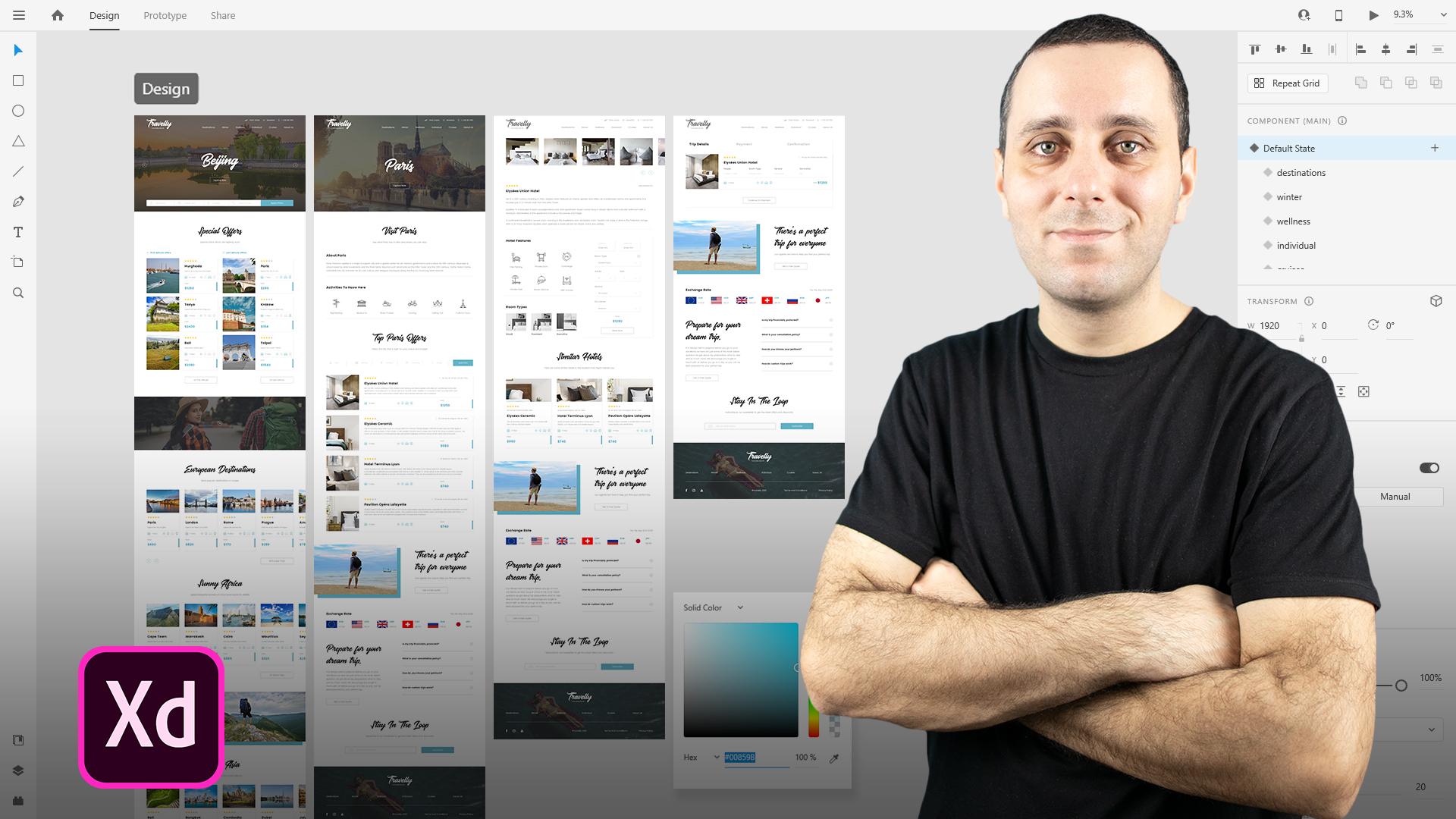
4. Creating A Mood Board: In this video, we are going to create mood boards for our project. And moodboards are basically Derek, just to get you in the mood as the name suggests. And basically they're there for you to explore possible color combinations, possible moods, and that these images are using to get yours in the mood. And basically that's why they are called moodboards. Now you can use them for yourself. You can use them in a digital format or you can create, for example, something like a four or US letter size and print them out later and showed them to your clients. And obviously you can always export them as PDF, for example, and send them to the clients that way. Now mood boards can be as elaborate as you want or as simple as you want. You can include, for example, something like two or three different images or you can use, I don't know, dozens of different images. You can use different logo combinations depending on what you're working on. Because we were working on a website project, for example, we can include different navigations. We can include different for us and stuff like that to get in the mode. So I'm going to show you some templates which we sell at web Donald, which is my company. You can get these templates at a discount and I will leave the discount in a PDF. Simply click on those links and discount will already be applied. And just for the ease of use for you guys, if you want or if not, you can simply create them easily in Adobe XD. Let me quickly show you what I mean. So here is my websites, web, Donald Duck net. And you can see that we have Products section. And inside of that product section, we have all of these different products. And if you choose mood boards, this is how they look like. So we have this mood board. And you can see it comes in Photoshop and XD file format. It comes in a four-letter dimensions. And basically this is before and this is the after. You can see how easy they are to use. You can sample colors. You can include different images, and these are the different sizes and you can see how many of them we have. Simply browse our products section. And I will also leave the link in the PDF to these ones which I'm showing you, so you can easily navigate it. These are the Instagram ones and obviously they are square ones. And there are these rectangular ones for the stories. If you want to use them, you can see how they look like and how they can look like. On Instagram, we have social media ones which are basically the same thing. And obviously because XD natively supports Photoshop files and opens Photoshop files, you can easily open up any of these files because once again, XD supports Photoshop files and you can see how they look like. And obviously we have square ones, we have rectangular ones for the Twitter and Facebook. And we also have DES wants for Pinterest, and you can obviously use them for Instagram Stories. And finally, we have these ones which are for the print. And in these ones, I think sketchier sketch version is included as well. But as I said, you can easily open up your Photoshop file, which I'm going to show you in just a second. And this is how they look like. And you can see illustration right here of if you print them out, you can use them like this and you can comment on down with your clients. So when you open them up in Adobe XD, disassembled, they actually look like. So basically. I got here to the homepage and created an art board of sand AT by 1080, you can see right here. And I simply went on and opened one of these moodboards. And you can do that here from the homepage. And you can simply open up from your computer or you can browse XD file and you can open the file like that. This is the file which I opened and it's one of our products. And you can see right here we have image icons. I'm simply going to hi them and do the same for the logo. I'm going to click on my logo and I'm going to use my client's logo actually formed for this project. Here it is. And because I don't think it's going to fit and I don't take it scales nicely, which it doesn't. I'm going to simply hit Control E and export it to my desktop. Let me quickly choose it from here, select folder, and I'm going to export it as PNG. Then I'm going to remove my logo from here, and I'm going to look into the right here, simply drag and drop it inside as a PNG so I can easily scale it down if needed. I can simply position at right here in the center. You can also select these two click right here and then right here to make sure it's in the center. And because this is the object, you can easily change its color and then you can do whatever you want. But let's not focus on that right now. Let's instead focus on these images. So I went ahead and downloaded some images from enlarge or elements. And just going to double-click right here and position it right here, for example. So I can always go in and flip it for example, like that. But I don't think that works really all that well. But let's just leave it right there. Or maybe we can drag and drop this image inside. I think that works much better. And we can always flip it around because our logo is on this side. And we can use that first image on this one, for example. And I think that works much better because you can see the person in frame here. I can always drag and drop another image inside. And as I said, these images are used just for our inspiration. And they are used and just sorted. We can see the colors and in terms of colors, for example, let's double-click right here on our login once again, and I can sample the color from the sky, for example. And maybe I should use darker one from this blue. And you can see how that looks like and the colors themselves. You can simply click this swatch and you can sample some colors just to get a general idea of these colors. And let's go from the darker blue. Let's sample some lighter blue like that. Let's use our AN or something in-between, perhaps something like this, earth color. Maybe, maybe we can use something like this and then switch them around. And you can see how extremely simple this is to navigate. And perhaps we can use one darker color. Let's use, I don't know, maybe this one. And this basically that's our moodboard done. And obviously you can play around with them as much as you want. But let's just leave it like that. And you can also switch these around. You can double-click on this image or you can simply click and then extended to here to change the order layout. If you want to, you can do that for all of these images you can see simply click and extend entities basically how these mood boards work. Now because I have my color scheme for this project and I'm going to show you that in a second once we start with the design, I'm not going to use any of these colors particularly, but you can just imagine that you can use competitors images to sample some colors. You can use previous works by your client to sample some colors, and then you can use those colors into your design. Obviously, you saw that this logo is white and they're using the white and the dark version of this logo. But basically it doesn't have any color inside. But if your client's logo has color, obviously you're going to end up using that color. Simply sample it this way. And once again, if you want, you can get these products from our website. And I'm going to leave the links and discounting the PDF of all of these which I showed you. But if you don't want to simply jump inside of Adobe XD, create one of these. You don't have to use 1080. By 1080 like I did. You can use 1920 by 1080, you can use even smaller. You can include bigger amount of images, more images, less images, do whatever you want with this. This is just for your inspiration. And obviously you can share this with your client who can jump inside of here and export this one, for example, and then share that with your client and they can see and approve or disapprove of your color choices. So basically, these are the moodboards and how they work. You can play around with them. You can include all sorts of different images inside. You can include different logos. You can include, for example, business cards depending on what you are doing, you can include all kinds of different images. You can even include gradients. You can do whatever you want with these. As I said, these are to get you in the mood. These are to get you to understand what you're working with and who you are working for, and therefore, move on with your project much more easily. In the next video, I'm going to show you how to set up this file because we already started with this mood board. I'm going to drag and drop our design brief inside. And I'm going to show you how we are going to build this file later on and what we're going to do next. So I'll see you there.
5. Project Setup: All right, Let's now go ahead and set up our file. And this video is going to be quite a simple and short or just wanted to quickly run through how I usually set up my files. You can use the same setup, but you don't have to. You can use your own setup if you want to. I just want to show you what I am using. So here we have our design brief and as I said, you're going to get these simply. They're going to be located inside of the zip file, unzip that file and use them for your own personal or commercial projects. Basically, I'm going to select them, hit Control or Command C. And I'm going to close this file, and here is our moodboard. I'm going to simply Control V right here. And what I'm going to actually do is move them right here on this side. And for example, position them to be somewhere around 100. I think it's good, and move this end to be 100. So basically what we have right here are brief essentials, are brief and mood board. And basically we're going to build this file from here. Adobe XD by default positions it in the center, but I usually like to move this up a little bit just to give myself a bit more vertical space or somewhere around here. Now what you can do is you can, for example, li your paper wireframes right here and you can move to here for your Adobe XD wireframes, then design right here, den Export, prototyping, whatever you are doing next, perhaps even app design, then you can move on down and down. But what I really like to do is simply move these files up to this top left corner of the file. So therefore, uh, have much bigger realist screen real estate right here. And what I also like to do is save the file locally as well as the Cloud document. So what that allows me if for some reason Adobe XD crashes and Cloud document is saved, but my local document isn't with the latest changes. Therefore, I can simply pull up the cloud document later, save it out to my desktop. For example, if I need to edit this file later without Internet connection while I'm on the move in my local coffee shop wherever. So therefore, I really like to have those two options. So both Cloud document as well as my local document, and that's basically it for this video, I'm going to hit Control S. And in the next part we're going to focus on paper wireframes. I'm going to show you why they are important. We are going to draw wireframes on piece of paper. And then later on we're going to jump back to this file. We're going to bring those paper wireframes in Adobe XD just for our reference. And then we're going to move on later to some real wireframes in Adobe XD, which we are then going to turn into designs, which finally we're going to animate. So I'll see you there.
6. Paper Wireframes 1: Alright, so now we're going to start creating paper wireframes. And we're going to start with the structure itself. But before we do, I just wanted to quickly run through what you need for this process. Basically, you need any kind of paper. You have Rhine line around your house or your office, and you need any kind of pen or pencil. You can even use colored markers. You can use rulers, but I like to do things free hand just because it makes it a lot quicker for me to put the ideas down on a piece of paper. Because this process is just a starting process. Later on we're going to bring this into Adobe XD and elaborate on the elements themselves under design, position, scaling and so much more. So this is just the first part of this process, is get your ideas down on a piece of paper just so that you can flush them on a piece of paper and then you can get started later. Inner, there'll be extreme or your other favorite tool of choice and start creating dead-weight. So the first thing which we are going to create in this process is the structure of our page like that. So I'm going to actually start with the navigation itself. So I'm just going to quickly do something like this. So you can just imagine that this is the outline of the website itself. So we are going to start with the logo here. Then we're going to write in destinations. And users can actually click on these destinations at indicate to take them to any of these destinations and debts they have on offer. Next, we're going to write in winter for winter tours. Then we are going to have wellness for wellness doors, individual. And this is the page where users can booking individual trips. They can choose whatever they want. So they can choose from plane tickets to accommodation, to food, to all of these things which they are going to see there. So activities and excursions and so much more inside of this individual beach. We're going to have cruises. And you can see I run out of space. And finally we are going to have about us. So this page is actually going to run up here, so don't let this line distract you. And finally, we are going to write in plane tickets here. Like so. Then we're going to have newsletter. And we're also going to have phone numbers, so 123. And we can also have these icons here. So for example, I can have a plane icon here. I can have an e-mail newsletter icon here. And also I can have a phone icon here just so that when we scaled this down later, we can actually have this be on this. Let's see. We have the icon and text on a big screens, and we have just the icon itself on the smaller screens, especially for this phone number. So users can actually tap there and it could take them to that particular screen. So that's it for this first video. In the next video, we're just going to start with the homepage itself. So we are going to moving forward, just use something like this. So perhaps we can create something like this for navigation. And you can always go back. And I really encourage you to, for all the projects that you do to break this down just so that you know what your navigation actually looks like so that you can always go back to it and see for which pages you are designing for.
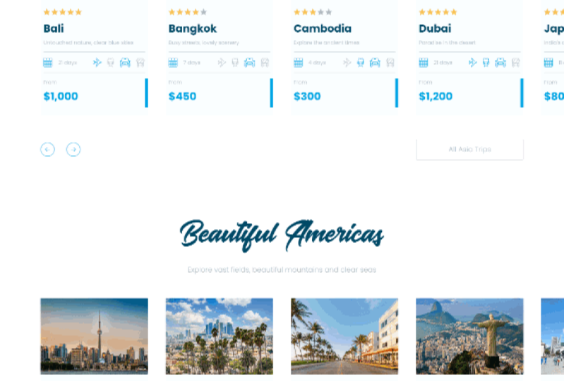
7. Paper Wireframes 2: All right, so now that the navigation itself is finished, Let's now move on to this part, which is actually going to be our homepage. And because homepage is going to be extremely long, I'm going to create, for example, two boxes like this. So once again, if you want, you can use the ruler, but I don't really like using the rulers because I think they slow down. So I can just create an outline like this. So what we can get started with is what we created previously. So this is going to be our logo. This is going to be our navigation. And we also have these right here at the top. So the first thing which we are going to create is the hero section like this. And perhaps we can create arrows to go left and right. What we discussed in the examples which I showed you. And perhaps we can create text right here. And let's say that maybe this is the Beijing location. And maybe we can put to the button which says explore now. Like so. And they can tap on this button to go to the Beijing page inside of the destination. So you can already start to see how all of this is going to tie down with one another. What we can create right here, and this can be the part of the hero image, or it can go down below the hero image itself depending on the size for which you're creating for is we can create these selectors. So let's see, maybe we can divide this into five parts. So 1234, and this is going to be fifth one. And this first part can be, for example, destinations. And let's create an icon like that. So and destination's next up is journey type. So maybe we can create an icon leg does So journey. Next up we can have activities. So perhaps icon of a person walking to VTS. And finally, we can have search. And once they tap on search, this search bar, Kim for example, extend all the way to here so it can cover all of these additional fields. And finally, we can have a button for Apply. And it can apply all of these filters to here. So let me quickly to zoom in just a little bit so you can better see what I'm doing right here. So you can see that we have all of these right here. Next up, what we can do is, for example, we can create some kind of different sections. So perhaps we can create a section called special offers here. So special offers, like all of these other websites have. And here we can have, for example, first minutes. And here we can have a last minute like that. And for both of them, we can have these different cards. So let's create one card and one card here as well. Of course, we can have the icon here, for example, of o'clock, and we can have a scene one here. And what we can create in these offers is we can, for example, include an image here. So let's drag it out like this. And you can use different markers if you've wanted to, just to indicate that this is your image. Next up, what we can create here is. Stars. And we can create, for example, from one to five or whatever else. And with these stars, what you can do is you can present the location itself or you can present the hotels themselves. So depending on what you're actually showing right here. So if you're more below our stars, what we can create is some sort of description. So let's use, for example, Paris here and around here. And we can create additional description here. What we can also include is, for example, seven days or 14 days. And perhaps we can include some different icons here. So I see, and just to indicate that, for example, you can travel to their destination using the plane, using the train car or bus or something like that. And finally, we can create a price here. So let's see 1250 and let's say 930. And finally, we can create an icon here on the right. And perhaps with these we can create different separators like this. So we can include different divider lines or something like that. Just to break up, these sections are a little bit more. And here as I said, we can include just an arrow icon, which we can trigger on hover. Once they hover, they can tap there and they can go to that particular destination. And we can, for example, do these sections times four, so four in total, for example, just to save ourselves some bit of space for drawing. And we can, for example, use two buttons. So C All and see all. For example, see your last name and see all for us. First minute offers, not firstName. So first minute and last minute, see all first minutes, see you all last minute. So we can do something like that. What we can do below is we can include another section. So you can see what I'm doing right here. I'm simply breaking this page into different sections just to keep the visitor's interests high as much as possible. So what we can do right here is include our play button to indicate that this is the video. So we can position it like so. And we can, for example, either use the autoplay function like I showed you in one of the examples, or we can either show them display icon itself and let them play this video itself. So let's move on. And for example, for the next section, we can use different destinations. So let's use European destinations like so. And we can, for example, include a separate description right here. And we can use times 4, four continents. So we can use European, Asian, African, and American destinations. And inside of the American destinations, we can, for example, include North and South America. And then perhaps we can even divide them a little bit better, just so that we give our users the choice. So they can choose straight away, where do they want to travel and work to which destination? And inside of these, we can, for example, include four different cards like this. So these cards are perhaps the same as these ones, just a rotated vertically. So this is where we can use Adobe XD, these advanced functions like stacks for example, and responsive resize as well. So what we're going to do right here is include images like this. We are going to include the rating here. So I'm just going to use one star because basically we are going to use exactly the same layout is this one. Then we're going to use Paris, Rome, London, and Berlin, for example. We're going to use the description of that location. So as I said, exactly the same layout as this. It's going to be seven days with the icons. Seven days icons here. I did. And we're going to include the price. So let's use 100 River just to save ourselves a bit more time. I did, and we're going to use the arrow icon on hover. So this icon is not going to be visible unless the hover. So it's just going to show when date actually hover. Below that. What we are going to create our arrows, they can go left and right if they want to. And finally, we can include a button like this to see or so they can see all destinations, either European or Asian, African, or American destinations. So as I said, we can, for example, include European below that we can include African destinations. And then we can break out these sections by including something like an image. So let's include, for example, right positioned image like this. Maybe we can even spice it up by adding a background color like this. And we can even point out and say color like Dad, just so that we know what it is. Or if you're sharing this with your clients or teammates. So Daikin know what it is. So we can put it right here. And for example, we can write something in like book, your dream trip with us. Taxed right here. And finally button, which says get a free quote. So free quotes like that. And they can get a free quote for any kind of these individual trips, if you remember right here at the top from the previous video. So they can get a free quote for that particular trip of what they choose from. Next, we can include, for example, Asian and American troops below. Then what we can include is a completely different section which says, for example, our top destinations. We can include left and right arrows here. We can include our short description here. And finally, we can include, for example, three cards, this time. So we can go with the layout like this and you can see what I'm doing. I'm simply breaking up the layout. So we are not using like these websites which I showed you. We are not using exactly the same layout for all of the sections on our page, we're using different layouts. So here we are using cards positioned like this. Here we are using cards positioned like this. Then we're breaking these sections. And here we are using three different cards, exactly the same layout, but just positioned differently. So what I'm going to do right here is extend these down a little bit. So for example, my leaves, this can be, let's say Tuscany. And this can be Aaron or Paris again, just so that we can have something. We can include text and say something like from and price right here. So 998, so price 1, 0, 0, 0, 0, and price 700. Just so that we can say from indicating that they can change what it says right here on this page. So what we can do next is I'm simply going to move on to this empty part of the page because as I said, this is really a longer page. So what I'm going to do right here is do exactly the same thing. So extended all the way to here. I'm simply extended all the way down to here. And let's say travellers love us. Text right here and here, we can include testimonials. So perhaps we can include an image right here. Let's see, name. Some testimonial and traveled to Paris. Which is important because now you are increasing the chances of selling that destination. So for example, if some destination is really hot and people really want to go to it, then perhaps sharing it right here inside of the testimonial with real people who actually traveled there already is going to show and give a bit more interest to that destination. So let's go with 0, one of four. And we can use arrows right here, so left and right. And with these arrows, we can create them as components in XD, and then we can use them throughout our design. So what we can do next is perhaps break up the layout one more time. So let's see that I can include three cards like this. And this can be like so, so menstruating Mansuri style. So for example, wellness. And let's say from and the price 998. And this can be an image in the background. So I'm right it image width, for example, the color overlay, or eight or something like that. We can say cruises here and skiing here. For the winter travelers. And for example, from 908 and from 998. So exactly the same thing. These are images with the color overlay. So you can see right here, I'm simply breaking up the layout and making this page look. A bit more interesting to the viewers. For example, we can writing partners like these websites have description and for example, a logos right here. So these are logos I debt. And maybe we can use exactly the same layout we did right here, but simply switch it up. So image, color. And then here, for example, writing, there's perfect trip for everyone. A bit of text and call to action, which says get a free quote. So we can use Adobe XD and stacks, and we can, for example, create this layout and simply copy and paste it to here, to this section and simply switch the order of these elements inside. So what we can do next is give users and exchange rate, for example, because that's really useful, especially if you're traveling to other parts of the world and you're not using your currency. So exchange rate, let's say like this. So three or four we're going to see later inside or foreign design programs, we can include us the Euro, and for example, British bound. Then we're going to see what it is right here. So USD and how much is word in your own currency? So let's go to the next section, which can be, for example, Q and a. So I can create another section here. So prepare for your dream trip. And a bit of text right here and bottom with contact us. I did. And here what you're going to do is create a question that we're going to use a plus icon and we're going to create an answer like that. And with these, we can break them down. So q plus divider, q plus and the wider. So here, what they can do is actually tap on this plus icon. It's going to open up this section. Then it's going to turn from plus to minus or two acts. Maybe we can rotate it and then once they tap there, it's going to close and they can open one of these additional questions and they can learn more about the topic. Or alternatively, they can simply click Contact Us button right here and get in touch. And maybe we can write, stay in the loop. A bit of text right here. And we can create an email opt-in form right here. So email and a button which says subscribe. And we don't want it to be too prominent, but we still want users to come here and to subscribe. Finally, what's left is the footer itself. So perhaps we can include a logo right here. We can include nav items. So I'll sees me a bit of time of writing them down actually. So destinations, winter wellness, individual cruises about us right here, spread it across the page. Perhaps we can include a divider. So nice and simple divider like this. And we can, for example, include social media icons. So Facebook, Instagram and YouTube for example, or LinkedIn or whatever the agency actually has. We can include the original copyright right here and here we can write in terms, for example. So dairy herd, this is our look at our homepage. As you can see, it's going to be really long, but it's going to display all of the crucial elements inside of it. So here we have these sections which we are going to copy, we're going to reorganize. You are going to reposition a little bit. Perhaps we can create a default component and then relocate it and reposition it in different ways that we can create additional child components from that main component. So it can be really useful to us throughout our design. We can simply copy and pasted and perhaps we can create additional element to it. So there we have it. In the next video, we are going to actually see what happens when users click on one of these destinations. So I'm going to show you how you can create that following this exactly the same strategy.
8. Paper Wireframes 3: Now let's go ahead and create a destination beach. And you can even write here, so this nation, right that. And let's create a quick outline like we did with the homepage. That NO is like to leave this part blank because I always have something to remind me. So either had to share something with other designers in the team or with my clients or with the developers. So it's always handy to have something right here or even yourself if you're creating these wireframes and then coming back to them in couple of months time or something like that. So what we're going to do first is exactly the same like we did with previous examples. So this is going to be our navigation. Perhaps we can include a hero section and let's say that the users stepped on a Paris offer on the previous page, which was the homepage. So we can write in something like CT of love, Paris with this nice big font and perhaps a button which says explore now. And perhaps when the tap this Explore Now button, it can then take them to the next part of the page, which in this case would be an informational part for this particular location. So we can write something in like visit Paris. We can include a description here. So about and then text about it, activities. And then we can, for example, include different icons here. So icons. And these icons can be something like sightseeing museums or because it's a Paris maybe River Cruises, cycling, eating God places to see something like that. So below that we're going to have top Paris offers, which stand out from all of these other offers, either in terms of price or in terms of popularity or whatever else. And here we can include all of these different filters that users can choose from. So we can have five of them, for example, and perhaps a button here at the end. So let's go with six. So 1, 2, 3, 4, 5, and then 6. This can be applied. And let's see, maybe we can switch them by price, duration. So let's use a calendar icon here. Activities. So once again, in this person walking or something like that, excursions. So let's go with a sign icon. So left and right for example, sometime I did. And finally a rating. And then I can even write something like this. So rating excursions, activities. And this is duration. And this is price. So what we are going to then have our hotels who correspond well with these filters that you've chosen right here. So we can have exactly the same layout, but a bit more elaborate, because here we have additional information, including inside. So what I can do is create a card like this, which spans the entire width of our website because we have a lot of space right here. So what we can include an image right here. Then we can include a rating here at the top. And we can say hotel name. We can include address right here. Like this. Perhaps we can even include a website somewhere around here. So we're going to see that once we start designing, this can be the description and then 14 days. And these can be the icons. So I see n and these icons can be the same as on the homepage. So for example, how can you get to this hotel? You can either fly, varchar, go by train or by car or something like that. And then we're going to include a price. So 1290, for example, from and here we are going to have that same horror effect with the same arrow. So that's why I'm saying you can create one card and then elaborate more from there. Then we can writing something like type 4 or something like that. And we can have, for example, Load More button below it or something like that. Then we can actually use sections from the homepage. So I'm going to actually use this. So there's a perfect trip for anyone. More tax free. Quote. Then we're going to have exchange greet. My dad. And you remember, I simply included three different boxes indicating the USD euro and for example, British pound. And they can go left and right and scroll and see all of these currencies. And then we can have Q and a section here. So Q and a to speed things up a little bit, I'm not going to draw it because it's going to be exactly the same as on the homepage. So here we can have stay in the loop and we can have those two fields. So subscribe email. Finally, right here at the bottom, instead of drawing everything, we're going to have the footer. So there we have it. We went ahead and prepared this page. So as you can see, it's quite simple, It's quite easy. Next up, we are actually going to create a page which leads us when they click on one of these offers. It's going to take them to dedicated hotel page. And on that page they can explore additional features like for example, what hotel has to offer, what to rooms have to offer? What amenities are included inside of the rooms like Wi-Fi, air conditioner, mini fridge, and so much more details. So we're going to play around with that in the next video.
9. Paper Wireframes 4: All right, So next page, as I said, is going to be selected offer. So let's write it up right here. So selected offer. And I'm going to create an outline. So the same like I did previously. But we're going to do something similar to the homepage because we are going to have a lot of these additional sections here on the page. So first things first, we're going to show to our users images from this hotel. So that can either be a hotel room or how the hotel itself looks like. So let's start with our logo and navigation. So same like recreated for all of these additional pages. And let's create something like 1234 or five different images. And that we can include here. And we can include, for example, left and right arrows so users can scroll left and right through these images. And as I said, this can be either off a hotel room or the hotel itself. So let's start with the hotel information. So let's start with a rating. So let's say this is a five-star hotel. Hotel name. For example, we can include a website right here. And we can include, for example, a description of this hotel. So when was it built? How long does it take you to get there and stuff like that. So moving down, we are going to include hotel features like that. And we're going to divide this section into two sections. Because right here on this side, we're going to have a sticky section, which means that this section, which is going to be roughly this BIG, is not going to move. And inside of death section, we're going to use what all of these other websites actually used. So we're going to use information like check-in, check-out, room type, how many adults, how many kids and stuff like that. So let's go ahead and create that right away so it doesn't distract us from all of these other services. So check-in, check-out. We are going to have a room type. And for example, we can add a plus icon so they can choose additional right here. So they can go with one room, tombs, three rooms, stuff like that. Then we're going to have something like adults. And they can choose 12 or three kids. Same things. So don't type name. Then we're going to have service. So let's say all inclusive. Excursions. And these can all be dropped down, for example. So don't say kids, adults. So these drop-downs are going to allow us to have more information included. So in excursions we can write in museums for example. And finally, we can have total. So 1290 for example. And we're going to have a nice big button sing book now. And reason. And this is going to be like this, is, for example, this can be a sticky menu as I said. So this section can be scrollable section. And once they actually start scrolling on this section, they can see all of this different information included inside. But this section, which is going to be sticky section, is going to keep up with them no matter where they scroll onto this page. So as I said, hotel features, we can include different icons. Then we can include a room types. And for example, we can have two or three different rooms, so I don't own one. I want to add on three. And these can be images of these rooms down below dat. We can have something like an amenities. As I said. So we can include different icons. So for example, for air conditioning, for a mini fridge, for a bar, Wi-Fi, stuff like that. So we can have below available services, for example, services. And inside of DAT we can include, for example, either bread and butter, bed and breakfasts. So I CAN and B, and B or, and then description. And here we can have something like all inclusive and description. And you can see when you start adding up all of this information is going to be really long. So on. Therefore, it's really useful to have this sticky part of your page. For example, Dan, below that we can include something like trip plan. And let's see d one and then description, the two and then description and moving along. How many days you actually have any strip. So we can fell below that available excursions. And we can have different icons for different excursions which are actually available. So I can, for example, and divide in this page like this. Just so that we know that this is actually scrollable area and this is the fixed area. So we can have something like, I don't know, maybe about hotel or something like that. So let's go with about location. And for example, we can include a map of that location and then description right here below. So we can say something like price includes and we're going to actually put that here so I don't have to write additional section. So price includes, and let's bring this in like this. So the arrow right here. So price includes. And then we can put additional text about what's included inside of the price. And for example, we can write in something like cotton own terms of services or sometime that are promised me. Inside of that agency can see what's included, what's not, and for example, what is not included. And then they can write in debt there as well. Basically, apart from this one, they scroll down, it's going to be exactly the same. So let's move on to this section on the beach. And let's actually write something here. So when the scroll down past this part of the page and pass in this, actually, what's going to greet them is exactly the same setup as on the previous page. So what we're going to have an image with a color, perfect trip with scription. Quote. Then we're going to have exchange grades with these three. And you can see right here why I am using pen and paper because you can clearly see how quick this is. And there is no way that you can do this quicker in any type of software rather than just writing down on piece of paper. That's why I love people who are framing so much. Here we're going to have Q and a. So exactly the same section as on any other beach. Stay in the loop. And as usual, we are going to have e-mail with an email icon and subscribe button right here. And finally, we are going to have full term. So dairy herd, this is RPG. So once they click on the destination was the choose which destination they actually want, then they can go to this page which is going to give them all of the additional information about the hotel did they need to know about? And from here, from this sticky section which has book now, they can click on the book now at, that's going to take us to the next bead ritual going to design and create, which is the payment page. And inside of that page we're going to actually breaking down to three different pages. So it's going to be much simpler for our users and much faster for them to check out, to pay, and to go the separate way.
10. Paper Wireframes 5: So as I said, the next page and final pH for us is the payment page. So let's create it really quickly. So let's jump ahead and create this outline. But rather than creating this outline as a whole, as I said, let me quickly writing payment because the navigation for it is going to stay the same. And that. So seem like we created it. And here what we are going to create is, for example, trip details. My dad. And we want to create a fully white background because we don't want our users to be distracted and to leave this page because we actually want them to complete their order. So that's why we are going to do something like that. Payment. And finally, confirmation. And this is either a selected and these two are grayed out or this is darker. And so they can really see it really nicely and these can be great out. So inside of the trip details, what we can create is some sort of card like we did previously. So image, then we can include a rating hotel. And then we can include, for example. So the same information like we did in that card. So this can be an destination or address. And here we have all of the information that the users have chosen. So for example, people too. And for example, plus one, which is for the child at home type, which is, for example, the room number one and go with that sort of number one service or inclusive. And finally, excursions? Yes. And they can agree with the agency about these excursions. So perhaps maybe we can have a divider here and let's say 14 days. Same icons like we had, and total of 1280 for example. And that's basically our first step. We're going to have the next step, which is to payment. And that's what we're going to create now. So that's why I said, just imagine this as a section. So let's move it along down here. So I'm going to have the same thing. So trip and details, payment confirmation. And now the payment is actually going to be selected and these two are going to be in grayed out. So it's going to be quite simple for users to navigate because they basically have just one section and we're going to animate it later in XD. To change between these three different sections. So for the payment itself, we can have, for example, cardholder name, cardholder name, and we can have field here. So name. Then we can have card number. And we can have a number right here. So 1, 2, 3, 4, 5, 6, 7, and so on. We're going to have expiry dates. So when does the cart expire? And 12 to 24, for example. And finally CVC, which is the number on the back of your card, so 123 and or B width, PayPal for example, or any other option that the agency is going to support. We're going to have P Now button right here, which is then going to take them to the confirmation page, obviously. So now let's go ahead and write this down one more time. So troop details, payment and finally confirmation. And for the confirmation, Let's select it. And here we can have an AACN, which is a short for Icon. Your trip has been booked. Main dat. And here we can have two lines of text for example. And then we can have two different buttons like that. So back home, for example, with the home icon in here, we can have a PDF icon, for example, download receipt. Because for example, maybe you should show this receipt in your agency or at the airport or stuff like that. Or perhaps when you arrive at your destination at the hotel. So perhaps they need you to show them there. So that's why download received is really useful. And you can also print it out as a PDF for example, or stuff like that. So you can bring it along with you on your trip. Below all of this information, as I said, just imagine this as a single section. So below this single section with three different areas inside of it, we're going to have normal stuff like we did on previous pages. So we're going to have an image with the color and perfect trip, right? The text. Quote. We're going to have exchange rate. And we are going to have these three. We're going to have Q and a subscribe my notes. So same section, so serves web e-mail box and finally footer, right here at the bottom. So there we have it, and those are our wireframes. And if I stretch out and reach out and get my other wireframes and debt we created during these few videos. So here we have selected offers. Here we have a destination. Here we have our big homepage, and here we have these pages that we created. So overall, you can see how quick this process is, how fast it is. You don't need any fancy equipment. You don't need any fancy thickness and grading of paper. You don't need rulers, you don't need any kind of markers, special pens and pencils and whatnot. You just need the regular, old, plain piece of paper. You need a pencil or a pen, whatever you choose. I chose this black one just so that you guys can see it better against the white piece of paper, but you can choose anything you want. Now the next step for us is you can snap a picture of all of these wireframes, then bring the picture to your desktop and simply drag and drop it to Adobe XD. Or if you have a scanner like a hub, you can scan these pages individually and then simply save them as images to our desktop, and then simply drag and drop those images to Adobe XD so that you can use them as references. You don't need to do that if you're not sharing this with your clients, but if you are sharing your file with the clients or with the developers or teammates or stuff like that, then it's really useful to have that option inside of Adobe XD, just so that you can either remind them or remind yourself about these ideas that you have on your wireframes. And That's the key feature right here in key takeaway from this paper wireframe process. These are just ideas. So all of this, which I created during this process are just simple ideas. So nothing has to look exactly the same like this. And for example, some of these pages are not going to look like this. We are going to divide them and change them a little bit later on when we start creating. But that's the whole point. This is just so that you can flush your ideas down on a piece of paper really quickly, faster than you can do on any software. And then bring them inside of Adobe XD or your favorites author and then start working from there. So that's basically it for this section. In the next section, as I said, we're going to bring this into Adobe XD. You can use your phone to snap a picture of each of these, bring them from your desktop to Adobe XD. Or if you have a scanner like I have, you can simply scandium and then save them to your desktop and bring them to Adobe XD. So I'll see you in the next video.
11. Importing Paper Wireframes: All right, so now that our paper wireframes are finished, as I said, you can use your phone to snap a picture and bring it inside of Adobe XD like that. Or if you have a scanner like I do, you can simply scan them and bring them to your machine and then drag and drop them in Adobe XD. And that's what I'm going to do. Now. Why should you do this anyways? Well, in just in case you want to share this paper wireframes with your clients, with your teammates, with your developers just to get some quick feedback. Those kinds of things rarely happened because these are usually just for you to flush some ideas down on a piece of paper that you have in your head as explained in the creation process. But just in case some of those people actually want to see these wireframes. And to give you the first feedback on the layout itself, then you can share them like that with your clients, teammates, or developers. So to get started, what I have right here is that file that we created previously, and I'm going to simply select my images from the desktop, drag and drop them inside and you can see how they look like. So let me select them like this and let me drag and position them like this. And let me zoom in just a little bit closer. So let me separate them by a 100. I'm going to separate this one, then this one. This one, and finally this one. And let's quickly run through them. So what we have right here is our navigation. And this is going to be quite useful for us. Just when we get started, we have the homepage and you can see and remember that this was that long page that we created with all of these various different sections. Then what we have is the destination screen. When they're going to go, when they click one of these and go to this destination screen. From here they can choose the offer if you remember. So selected offer, and this offer is going to be obviously for the hotel with all of its features. Finally, once the click booked and choose all of these options, it, they're going to be taken here to the payment screen where they're obviously good to complete their payment. So that's it for this part of this class and this section of the project. Next section is going to be actually, we're going to start creating wireframes here in Adobe XD using these as our references. So that's why we created them in the first place. Just one final thing to note. If you want, you can keep these in paper form. If not, you can simply tossed them away and have them right here in Adobe XD once again, if you want to share them, because it's quite easy to share them, simply select one click Control E. You can select the destination, you can choose, for example, PNG or JPEG, whatever you want, hit Export, and then you can simply share them with your client. Or alternatively, like you did, you snapped a picture with your phone, you brought them inside or you scan them like I did. And then you can simply send them those scans and they can provide the feedback on debt. So basically, as I said, these are just the ideation process. These are there to flush some ideas down on a piece of paper and now comes the real part with wireframes in Adobe XD. And I would always encourage you, if some of those people didn't ask you to send them these paper wireframes then obviously start with the feedback in the via framing part of the process in Adobe XD, because you can actually share the link with your clients and developers and they can start analyzing your designs right away. And then they can provide the first feedback on the first draft, right? Dare, because it's much simpler and you can always make those links clickable. You can always include some interaction, some animations there, while you cannot do that, because these are just the paper wireframes. So as I said in the next section, we're going to start with wireframes in Adobe XD. So I'll see you there.
12. Project Resources: Before we jump into the design and start working on it, I just want to quickly mentioned resources, because every single project that you're going to create, you're going to need some resources. And in this project and in this class I'm using premium resources from Envato elements. You're going to get these resources inside of the file so that you can use them for learning purposes, but you are not allowed to use them in any kind of personal or commercial projects because you will have to pay for them. I believe the link down in the PDF to this collection which I am using. So in case you want to explore Envato elements in, in case you want to use them for, for example, your portfolio design or for client work, then you will have to purchase these items. But in case you just want to use them for learning purposes, just to follow along this class, that's fine. But please don't share them around because you do not have the license. And this is really important to understand because if somebody catch you using these items without a license, you are risking a possible lawsuit. So just keep that in mind. Now, I want to quickly show you this collection, what's included and what can you download in use from Envato elements. So here is that collection I was talking about. As you can see, I'm using one premium fonts and I'm using one free font. I'm using Poppins from Google font as a free font. And I'm using this buck soda from Envato Elements, which is of course a premium font. You can also go ahead and download bigger versions of these images, for example, from here. But you're going to get this watermark on top of all of these images. So let me open it up. You can see that you're going to get it right here. Now this is really crucial and why I'm using Envato elements for all of my premium work. You can see that they mentioned right here. So almost six K in size. And also the collections are really huge because you can get these awesome collections with these images looking quite similar because and that's the mean key point why I'm using a premium resources or the free resources. With premium resources, especially with images you are getting these collections. Then you can use collections from the same photographer which are photographed in the same environment using the same lighting, using the same equipment on the same day. So these images look extremely coherent. They look like they belong to each other. Rather than using all of these random images from free websites like Unsplash for example, ending up with your website looking on coherent and looking inconsistent and really amateurish. So with these resources, your designs can end up looking premium because you're using them from the same photographer as I said, in this extremely high-quality. And the same thing goes for the icons, for example. So if I scroll all the way down to here and go to the last page of this collection, you can see how many they are. You can see I'm using these premium icons done by this same guy or person or company, whatever, this round icons. And you can see that these icons really do look like they belong to each other. You can see that all of them look like a part of the same collection which they are. So they are looking extremely premium. And if I open some of them up, you can see all of these file types in which they are coming in. So you can really pick and choose whatever you want. And you can see that all of them are created in these exactly the same dimensions. So 1906 with 96, which makes them extremely simple to use. And as you're going to see throughout our design, we're going to use outline versions as well as the colored versions, which once again, you're not going to get with any of these three icons. Same thing goes for the illustrations. Especially if you're using something like andro, which every single designer on the planet looks like it's using right now, just because it's free. Don do that. If you want to make your designs look polished and professional, make sure to use these premium services such as Envato Elements. You don't have to use it, but I really like it because unlike something like a huge weight, for example, wheat Envato elements, you're not getting download daily limits, so you can download as many items as you want wherever you want. But with something like, UH, for example, they are limiting you to something like 18, perhaps four or eight items a day. So what happens if that item is not a good fit, for example, which happens a lot. And you're going to see that once you start designing, then you're stuck. You have to wait for tomorrow to download and to use something else. But with Envato Elements, you can simply download the entire website if you wanted today, and simply use it in your project. When it comes to licensing, it's extremely simple to use. So let's say that I want to use my own Ds icons. For example. I simply click the Download and I can simply type in right here. For example, travel, a travel agency, which is this project. I can simply click on it, hit Add and download, and that's basically it. Inside of this download. When you get to your downloads right here, you're going to be covered with a license, so you can share that license with your client. And they are covered just in case they have to use these items anywhere else online or in print for a quarter, whatever else. So you're getting that license covered for yourself as well as your client, which is another great thing about Envato elements. And not just damn but premium services in general is you are covered with a license, but when you're downloading these free items, you'd never know if somebody else downloaded the premium item, for example, gave it away for free, and then you're risking that lawsuit. So just make sure to familiarize yourself with all of these different licenses and items. As they said, You're going to get all of these items which we are using inside of the design. But just make sure to use them for learning purposes. Just to follow this class. If you want to use them anywhere outside for your portfolio, for your client work, you will have to pay for them and license them for yourself, like I just showed you right here. One final thing I wanted to run through before we move on to the design is I want to show you what's included in Envato elements itself. So you can see right here all of these different categories. So stock video templates, music which I'm using for these classes, as well as my YouTube channel, sound effects, graphic templates. You can see UX and UI kits and there are thousands of them to help you speed up your workflow. Graphics presentation templates, photos, fonts, arrows, web templates, and more categories. Now when it comes to photos, they have their own photos, which are this one basically. But you can also go to the website called 2020 for 50 million additional photos on top of all of these photos here on Envato elements because they own that website. And inside of more categories you can see CMS, templates, WordPress, 3D, and they also have their e-books and classes. So basically that's it when it comes to the licenses, when it comes to these files and what I'm using for a day's class. So now you know, once again, you can use these elements which are included in the file for learning purposes only. So you can follow along this class and you can create all of these elements. But in case you want to put them in your portfolio, or even worse, in case you want to work with your client, you will have to purchase them. Or you can simply use this layout which we created in this class and simply add on your own images, your own icons, and your own elements to it so that you can use it for that purpose. So let's now move on.
13. Creating Style Guide: Let's now move on to the wireframes in Adobe XD. But before we do, we quickly need to finish up few things. First of all, we need to create a style guide. And the style guide is great because inside of it, there will be collection of images, of icons, different colors, fonts, font sizes and font combinations, and every other element that you want, for example, buttons, sliders, everything else can be inside of that style guide, which is extremely useful both to you, your teammates because they can simply copy and paste those elements from that style guide to your clients because they can easily glance at all the elements that you used in your design. Finally, and most importantly to your developers, because they can easily a glance and export from there if they want to. But you're going to get to export features later. And I'm going to share with you a few ways that you can share your files with your developers. But this is just one of them and this is just one of the options which is available to you in Adobe XD. Now before we move on to the style guide and to the actual wireframes in Adobe XD. I just wanted to quickly share with you the other products that we have on a web donut. And we also have UX, UX kids, which are basically wireframing kits and you can use these to speed up your workflow. Now, you don't have to use these for this particular project, but you can use them for your own projects in the future, both personal and commercial, if you want to know. I'm just saying that this is just an option for you if you want to, but it's not mandatory for this class. So what we have right here are all of these various UX kids. And also we have UI kits, which basically are the same thing but with Included real texts and width included images inside. In us kids usually this is just a dummy text and usually be included something like Lorem Ipsum text or something like that. But inside of the UI kits, there are some real elements. You can get this with a subscription or if you want even better deal, I might suggest that you go to my own personal website. And by the way, I will leave the links to everything going speaking about in the PDF and you can access it with all the discounts which I previously mentioned. And here you can see that everything is in one place. We have courses and we have membership. And of course these packages are much better. Then by simply visiting my website. You also have a 30 minute coaching call every month with me. You also have private Facebook group. So if this is something that interests you, I met, urge you to check it out and to get all of these products in all of these courses for yourself if you are interested, of course, I also have a YouTube channel and I will link it in that PDF as well. You can check it out if you want some additional content, but if not, let's quickly move on to Adobe XD. And I want to show you what is included inside of the style guide and what we're going to use. So here we are in Adobe XD, and as you can see, this is where we left off the previous video. So basically we have design brief template. We have this mood board and we have paper wireframes. Now before we move on to wireframes in Adobe XD, a useful thing to have is the style guide. It's not mandatory, especially when you're just getting started with these projects. Obviously. A lot of the times you don't have the colors, you don't have the fonts, you don't have the icons, you're just going to get them. But in this case, because I already have this project created, I'm going to start with the style guide. Now, style guide is ever evolving thing. So as you move on through your project, as you get more and more resources inside, for example, images, different backgrounds, shadows, different icons, then you're going to fill in this style guide much more. But to get started, you can start with simply using typography, for example. So whatever typography styles that you have, whatever typography colors, you can simply include them inside. And obviously you can create something like components in Adobe XD so that you can easily change them later and updated style guide in real time. So once again, what we have right here is this Adobe XD document. I'm going to jump inside my document which I already created and hit Control V, Control C to copy it and then Control V right here to paste it inside. And as you can see, there are some glitches here. So let me undo that couple of times and let me jump in. Let's see libraries. And let's jump inside of here and create 1920, our board. I don't know why it keeps doing that. So let's actually duplicate this one. And by doing this, I'm going to position it right here below. Into jumping, call it style, go like that. Then I'm going to jump inside my layers panel and remove all of them, including VG. Then I'm going to jump in right here and give it 1920 by 1080, for example, layout. Let's use a gutter width of 68. Think it's going to be fine. Here. I'm going to lower down deep obesity of these grid lines to turn maybe even to eight. So it's not too distracting for you to watch. I think that's good. And now I'm going to jump in. First things first, I'm going to actually use a background color for this style guide instead of white, just so that you can see all of these other icons which are not, which are not going to stand out. So I'm going to simply copy and paste all of these elements in. Here they are. And basically that's it, that's our style guide. These are the icons which we are going to use. So basically these are all the icons which I share with you in Envato Elements collection. And basically you can use these icons or you can use other icons that you find online. Basically, it's all up to you what you want to do. As I said, you have to follow the rules about the licenses so you can use them just strictly for learning purposes. You cannot use them for any kind of client work. Both personal and commercial projects are forbidden. Strictly use them for learning purposes. And let me actually jump inside of here. And let me go to Envato Elements. And You can go to my items just to show you that collection once again, so you are going to be able, as he said, to access that collection link is going to be in the PDF file and simply access debt collection and browse through what I have included. So basically this is that collection, as you can see right here. You can browse through all of these different images. And you can get these illustrations, you can get these icon packs. And basically what I've done is you can see it in the washing machine right here. And if I switch back to our original file where it is, Here it is. So you can see that I took some icons from those packs and basically paste them in right here. What I also did is use the logo. We have the default state and we have the dark state, which is this date, and I just move this right here so you guys can see it. What we also have our states for these icons. So we have the default state if we zoom in really closely, because this is the SVG icon, you can see how beautiful it is and we also have the outline. So perhaps we are going to use default state. Perhaps we're going to use the outline state. I just went ahead and removed from this color from the original icon to get this outline state. And you can see that we have outlined States for all of them. Now, one last thing we're going to do before we actually start creating wireframes in XD. I'm going to jump in right here to my components. And what I'm going to do is basically select all of them are right-click and make glocal because they are currently connected with my original design file that I created first. But I want to make them local and to apply them right here before we actually move on with the design any further, what actually want to do is to sample some colors. So what I'm going to do is drag a rectangle like this. So for example, three columns wide. I'm going to make sure to round the corners just a little bit, just so that we can stylize it a little bit. And we're going to use this as a white color. Then let's actually use the text. Put it right there. And let's say plain wipes. Like debt and willing to use Poppins for this one and choose Poppins 24, I think. I think that works. Well. He 6, Let's move it to, for example, 60. I did Control D. Make sure that this is right aligned and we're basically going to use the hex code. So let me quickly copy and paste the hex code from the original document. And this is just a hex code for this white color. Make sure it's 40 because I don't think it's necessary to be at 60. And let's jump into our layers panel and call this color swatch like that. And I also like to organize them. This is color obviously. Put it right here. This is plain wide, this is right here. And finally, let's group all of these Control G. And I'm going to call them icons. This is going to be logo, obviously. And later on, I'm actually going to export this logo, which is SVG file at this point, but I'm going to export it later. And a drag and drop two more PNGs right here because we need to scale it down. And if you remember from the example I showed you when I start to scale it down, as you can see, because these are three elements. They don't scale too well. So that's why in smaller sizes we're actually going to use PNG instead of SVG. So let's now move on and use some other colors. So let's position it right here. Color swatch, you can obviously use it a bit grid, but I'm not going to, I'm going to simply use it like this. Oops. Let's position it like this just to fill in our grid really nicely. So the first color we're going to use is mainly blue. Like that. I'm going to hit copy from the color itself. And I'm going to actually colored in right here. Now, I can click on this swatch and I can add it as a component, or I can simply go right here where it says Colors, click right here and call it plain white. Like that. I can jump in right here, add this one as well, call it main blue, like that. And then I can move on. This is going to be hover and blue. And let me quickly copy it from my original document. Obviously, you're going to work your way around these files. They simply either selecting them from your actual logo, from your actual document, from all of these icons from this mood board that we created. So basically are going to work your way around these because I already created them. And to save ourselves a bit of time, I'm actually going to simply move on and create them right here. So we're going to call this dark text or even better black text, or call it almost black. I'm actually going to copy and paste in this text clip right here, paste and I'm going to add it to my colors, almost black like that. And now because we've filled in all of them, Let's duplicate them before that DoubleClick and extend our artboard. This is what I was saying. So obviously you are going to have this artboard be big as you need. Let's give it a space of 80 down. And let's see, perhaps now I can move on to dark text. Maybe. Let's paste it in right here, and let's paste it in right here. And let's call it dark gray. Like that. Let's click right here, click right here. Change its name to dark gray like that. And we're going to call this mid gray for example, or light gray however you want. And obviously these names can be used as color tokens later by developers. So light, because it's much easier in code to see these colors then to use them as they are right here. Finally, what we're going to use the sample some colors. So I'm going to sample the color from this star that you see right here. So I'm going to call it star orange, just so that we know where it is from and what is it used for. So click right here and there it is. Click to add it, rename it to star, orange, like that. And finally, I'm going to add one more color, which is basically just going to be sampled from some of these and we're going to use it later as a basically support colors so we can use it for something else and call it plain know, peach color like that. Paste in the hex code and you can see why I gave it that name. Finally, let's quickly add it to here. Change its name. Derek habit. And finally, what we want to do at this point is group them all. Let's see. So let's put these four on top. Like so. Let's see, this is the first one and this is just my OCD. You don't have to do this, but I really like to keep things organized and nicely positioned. So I'm going to put this here, put this here, there we have it and group all of them and call them colors. So there we have it, We now have our colors, we are able to sample them. We're also going to use this Poppins and one other font, which is the premium font. And you can get it on Envato Elements collection if you want to. If not, you can, obviously, as he said, find some free fonts to correspond well with the premium font which I used. But if not, as I said, you can simply find it here in this collection and then use it if you want to. So that's it for now. We are now going to move on to creating wireframes in Adobe XD. And I'm going to show you how we can turn these paper wireframes into some wireframes which you can actually share with your clients to get some proper feedback on.
14. Creating Wireframes In Adobe Xd 1: All right, so now that the style guide is created, let's move on and actually start creating our wireframes in Adobe XD. So the first thing I'm going to do is click on my artboard, jumping right here, click on this 1920 by 1080. And finally it passes on, onto here. First things first, just so you guys can see this, let's lower it down to eight, so it's the same as this one. Let's jump into something wide like 60 for example. So that makes her, to wit bigger, which is the width between our columns and column widths, a lot smaller. So it's actually easy to work with. And let's double-click right here, call it home beach. And the first thing I'm actually going to do is extended all the way down. Because if I jump inside of here you can see the page is going to be extremely huge. So let's jump in right here. And the first thing we actually want to do is include an image. And let's see. We can, for example, champion and create 1920 by 1080 rectangle like this, 1920 by 1080 and position it. Let's see here and here. Let's remove the border and let's give it a proper name. So let's say for example, hero, IMG. Let's leave it like that. And let's give it a color of dark gray, for example, or even better light gray, just so that we can see what we are doing. And let's indicate that this light gray, for example, is the image color morning on. So let's actually now jump right here. And as I said, you can use it from here, all of these style guide elements. Or you can simply jumping right here, find the logo, drag and drop it inside. Which is what I'm actually going to do. And I'm going to move it, for example, 40 from the top, like debt. Now the first thing I'm going to do if I take you here to our wireframe, you can see that we have two-level navigation like all of those websites do, but we're going to do it in a much cleaner way. So we are going to have this stop, which is going to say, for example, plane tickets, newsletter, and the phone number. And this bottom one is actually going to be our navigation itself. So let's jumping right in there and let's see, for example, I can drag that plane tickets icon and I can actually jump inside of here. Plane tickets icon. And I need two more. I need newsletter. Here it is. And this is why it's important to name your layers once again. And finally phone icon here it is, and drag and drop it inside. Now what I'm going to do is jump to here, select all three of these and simply organize them better like that. Make sure all of them are below Logo and simply click right here just so that they are ordered nicely and that they are in line. Finally, I'm going to move the right here for now, and I'm going to actually use the text tool, click right here. And I'm going to write in plane tickets. Make sure it's from the left. And let's see, we're going to use Poppins. And let's see lights like dads and maybe 18. And let's also give it a color of white. I can simply close this and I can see Lee use plain white for this one. I can position it right here. Let's see, for example, I can give it a distance of c. For example, 28 think is going to be fine. So like that. And let's select these two. And I simply moved him out of the way for now, jump back to my layers panel, hit Control D one more time. I'm going to move disk to be 20 as well. Make sure it's lined up it is. And duplicate it one more time and position into right here. And now I'm going to simply do induce plane tickets going to go below newsletter. And finally, I'm going to select these to move them to here. And let's see. This is going to be our phone numbers superclass. You can just write in some imaginary for number one. So 1234567890 for example. And let's see. I can, for example, make sure they are, they are going from the right, so right aligned. And the first thing I'm going to do is actually add it to my character styles. So we have it, Poppins light 18 here. And let's now move on and explore and Ds more. So 20. And let's see, maybe we can give these to be 40. Unlike induce, so 40 and this is going to say newsletter, like debts and simply move in this icon in a little bit more like dues and give it to 20, which is fine. Then finally, I'm going to position these plane tickets to be 40 as well. Just make sure. And it, sometimes these icons are not that great, so we're going to get these half pixels, but that's fine. You can simply group it. Correlate plane tickets, newsletter, and finally phone like that. And let's see, we can call this secondary nav. If I can spell it correctly, and I can even include these bottom dashes like so. And finally, what I can do is put it in a stack and as you can see, Stack organized it correctly. So now if you want to move them, you can do this. Or you can simply hold your shift key and simply extended however you want. And then for example, if I position this secondary nav somewhere around here, I can click right here and extend this like this or hold shift. And it's going to extend and move them like this. So I think it's really nice feature to have in this stack in Adobe XD. And finally, let's position them to be 40 from the top. So let's see like that. And by the way, I'm holding Alt key or Option on a Mac just to see where I am with my spacings. So let's now move on and add our main navigation. So let's see what we can do with it. Let's write in destinations. And for it, Let's see maybe we can use pop in slight but 24 for example. And let's also give it a white color. And let's also add it right here. And let's see, we can position it to be right aligned like this, which is fine. Let's see destinations 24 light, that's fine. Let's see winter. More with right here and see wellness. This can be individual. Because if you remember, and that's their key selling point, and they want to sell these individual trips as much as possible. So that's what we are doing right here. We have cruises, and finally we have about us. Now finally, for this one, let's see. What we can also do is move it to here and move this to be 80. Does move this to be 80. And it'll be as these helpful because it's, it's showing us all of these navigation or barriers. So it shows us distances and shows us with where everything is in conjunction with all of these other elements. And once again, here is my OCD because I really like to organize stuff. So let's call this main nav. Like deaths positioned just right here. Let's see. Death can be positioned, for example, to the bottom right here. And we have 47 distance between these two, and that's fine. Our navigation is completed. And let's see maybe we can add this and quality, for example, primary navigation like that, because that's our navigation throughout our design. Now let's move on and add some more elements to our page. So what I'm actually going to do is locate my arrows. And I can always use this search. So rows, we have a left arrow, drag and drop, right arrow, drag and drop. And I'm going to jump in right here, select these to make sure they're aligned correctly. And I'm also going to use the rectangle because this is going to be our hero section with the slider. Use that rectangle. Select these two. Click right here, make sure they are in a center. Then delete this rectangle because we don't need anymore. Finally, for this left arrow, I'm just going to align it with our grid line like that. And do the same for the right arrow. So simply more right here and align it like so. Next thing I want to do is use my text tool. Click. For example, explore, mystical. And let's give this, let's first close this. Let's give it mean blue. Make sure it's from the center position at like dirt. C. For example. Let's see. 24 light is good, so we're not going to change it. I think it's good. We can leave it like that. But next thing we're going to do is duplicate it. But for us position in a center, duplicate it. And let's call this B gene, for example. And now I'm going to actually change the font so we can this one, what I'm going to do is jump into debt premium fonts and change it to debt. So I think it's called nimbus corner. Bucks soda. Here it is. And I'm going to change it to be 200. So really huge. I'm going to use almost black color. And let's see for the distances between these two, I don't know. We can, for example, make sure that they are aligned correctly because we have enough of the space between them. And finally, what's we are going to do is include a button inside. So let's see. We can drag a rectangle like this and we can do it two to four weeks, 70, for example, make sure it's in the center. And let's see, we can give it a rounded corners of five. We can remove the fill color actually, we'll leave the border n, but we're going to keep it be at white. And let's see, for the distance we can, for example, position it to be 40 from our texts. Or even more. Resemble AT, I think that works well. And finally inside of it, I can jump in, copy and drag this text typing explore. Now, we can make sure it's white. And let's give this btn, small BG, for example, Data Explorer now. So make sure it's in the center like this, and make sure that this button text is center aligned like it is. And finally, I'm going to actually hit Control D and call this BG and small color like that. And let's see, for example, I can include the color. And this one. Well, let's see even better hover color because we're going to use Herakles little later. And actually I'm going to remove the border and lower down the obesity all the way down. So I'm going to group all of them and call it hero button like that. And I can always hit Control K to make sure I create that as a component. And we are going to deal with components a bit later, but I just want to show you what's possible right now. So let's organize this a little bit better. I'm going to position this right here. Let's call it hero text, like that. And let's see. Position it. Dare, I think that's fine. Here. The only thing is, let's deal with the spacing a bit. So do it at same credit for the arrows. And it basically it for our hero section, it's completed. Now what's left to do for us is to include that bottom navigation here it is. So this donation journey activities, search and apply for the bottom. And that's what we are going to do next. But let's leave that for the next video because this one is almost 15 minutes long and I don't want to bore you too much. But basically what we did in this one is we are finished and completed our setup and we finally went to an added all of these different components. I forgot to add the text for this one, so I'm going to quickly add it right here. And as you can see, we're now continue to build this style guide and to build our oral file because we are, uh, later on when to add these texts to our style guide in all of these different weights. But I'm going to show you that later when we actually finish up the design and finish up the style guide itself.
15. Creating Wireframes In Adobe Xd 2: Let's now move on where we left off. And let's create that bottom section, which is this one right here. So let me jump in right here. And what we're going to do first of all, is created that outlines. So let's drag it across all of our columns. But just make sure I'm outside of my hero text because I wanted to be separate. I'm going to move it all the way down to here. A hero text is going to go below our navigation. Same as with the arrows. Let's group them, call it arrows like that, and position it right here. So what this is going to allow us is to create that bottom section and we're going to call it the bottom now for example, annelids give it a name of bottom now BG for example. And let's see, we can keep this a width, but let's increase it to, for example, 1640. Yeah, let's keep it at 640 because that's the oral width of our grid. Like debates actually 1644, sorry. So let's remove the border and for the height, let's go with 70. So same like with this button. And let's see for the distance we can use something like 60. So 1, 2, 3, 4, 5, 6. To be distant from this bottom edge. What I'm actually going to do also is hit five just so that we have rounded edges like with our button. So same thing right here. And what we are going to do is use those other elements. So let's jump inside and let's see what we can create first. So let's see, destinations is going to be our first one. Well, let's see. We can use this to nations. And let me change that really quickly to pop things. We're going to use a light once again. And we're going to use 18 this time, like dots. And we are actually going to use a light gray, I think. And that's going to work quite well to make sure that both of these are centered like that. And I'm also going to use this pin icon right here. So let's see where it is and why I cannot see it. So let's check it out right here. See where it is. I'm not sure why I cannot see it. Let's try that one more time. So Pin icon curators and make sure it's light gray, for example. Or actually, let's locate in that other one here it is. So destination I can sorry, I picked the wrong one. Like dad for example, let's see some distances between them. Perhaps I can include them to be at 40. So 1, 2, 3, 4 and destinations we can also position to be 40 like that. And let's jump inside our layers panel and quality destinations like that. Finally, what we can do is control D position at right here. This can be Journey type, but instead of center aligned, Let's keep it left aligned. My doubt, it's called this journey type like that. And let's so it should be around like that. And let's see what we can do here is replace this destinations icon with Journey type Python. So here is simply drag and drop it inside because this is the component is going to update in real time. Simply nudge deaths are 40 to the right, and that's basically it. Control D to duplicate this one, move it down. This is going to be activities like that. My dad select this icon, click and locate activities and drag and drop it inside. Make sure that this is 40. So 1234? I did. And as you can see, names are updating as they should and changing because we changed these icons, hit control D on this one, position it down. This is going to be searched for trips like that. Dairy cow it, and use this one and search for trips. Let's see, we can use this search icon like that and make sure that we are 40 like that. Finally, what I'm going to do is duplicate our bottom. Now BG hit Control and D, and I'm actually going to create a button. So let's call it apply BTM. And let's see, we can give it a width of 36, 6 like that. And let's give it the main color like that. And finally position it to here and line it up with our grid. What I'm also going to do is use Poppins 24 Lights, simply type in something like apply filters. My dirt mixture is center aligned it make sure it's Poppins 24 center. And let's see where it is here is, make sure that these two are in the center. And finally, what I'm going to do is make some changes to hear because I don't want these two corners to be rounded. So I'm just going to jump in right here and see top-left breed to 0. And bottom left, which is this one, bring it down to 0. So we have these two flattened and these two rounded. Finally, make sure they are in the center. Dr. Control G. And hit Apply btn. And there we have it. We have completed this. Now inside of our design section, we're actually going to jump in and organize these a little bit better because I still wanted to give enough space for all of these. And we are going to position them later actually and include some dividers when we get to the design stage later. But for now, actually, you know what, maybe I should deal with dividers straight away. So it's much easier for us to actually work on them. So what I'm actually going to do is jump in right here and hit paste on one of my dividers, which I previously created. So you can see width is one, height is 70 as it is with this one. This is the fill colors. So basically the color we already have. And what I'm going to do is actually make sure that that divider is, for example, I don't know, one hundred and one hundred, for example, pixels from this one. Like dead. It Control D. And make sure that this is 40. Then use that divider. All right there. Make sure that this is 40 as well. Make sure that this is 100. Finally, make sure that this is 40 from the divider as well. And we still have enough room right here. So there we have it. Let me quickly pause the video so that I can organize these dividers and don't bore you too much. So what I've done is simply included these dividers into their folder just not to bore you too much. Finally, let me quickly group all of this like so. And let's call it, for example, bots on now. Because we have primary nerve, we have bottom now on, let's see, maybe we can give it something else. Now, let's keep it at bottom now and move on. Now we're going to move on to these sections which are basically going to be the same. So we have special offers. We are going to have some text below. So let's create that really quickly. Here we are. So let's type in special offers. I dirt. Let's jump inside almost black and let's give it a bus coda that's positioned right here. And let's seem perhaps we can even lower it down to 120 and add it right here. And let's see what we can do with it. Maybe position it to be 150. Like that. Be sure it's in the center and let's quickly organize these. So this is going to be top section. All of it. As special offers are going to go right here below Control D. And let's see, for this one what we can do is use Poppins 24 lights like that, but just keep it light gray for example, or dark gray. That's good. And I simply added right here and make sure to organize it just a little bit better so that you know what you are doing. Make sure it's center and center aligned. And let's actually copy and paste the text from the original document just so that we can keep things up a little bit faster like that. And let's see. We can call it, for example, section title, my dad. And we can use it throughout our design. So what we're going to have right here, our first minute offers and last minute offers. So let's go ahead and create that. Let me duplicate this right here. Position it somewhere around here, make sure it's left aligned and let's use something else. So let's see for that text perhaps I can use 24 bolt. See what it is. Here it is. And let's use the mean blue color, left aligned. And let's call it first minute, first Control D. And select that last minute offers. And let's include those icons inside. So let's see. I have my stopwatch where it is. So let's actually typing stopwatch icon. Here it is. And let's see, I think it's clock. And there it is. So clock icon, so for first and last minutes, and let's select all of that. And let's start with this one position it right here. Make sure that this is in the center and make sure that they are, for example, 20 from each other like that. And group it. And go back to here, call it first, needs offers. And do the same for this one. So make sure it's 20. That and group bids and offers my debt. And that's fine. Position triad here. And what I'm going to do is select these two clips right here. And let's see, make sure that they are 80, for example, from this text. So 1, 2, 3, 4, 5, 6, 7, 8. Holding my Shift down. And section titled just go below. And because we have 12 columns, this section is going to be six columns wide. This is going to be six columns wide, so make sure to count six. So 1, 2, 3, 4, 5, 6. It's this one. They're Harut and this is already to the left. So what we're going to do first is actually create that card that you saw. So offer card, which is this right here. So let's jump inside and create that. Quickly. So I'm going to make sure that it's six columns wide like this. 1, 2, 3, 4, 5, 6. And there it is. And let's give it some dementia. So 79 to with 39, one like that. And let's drag it to here and call it offer card. Did you Dario and let's see. Give it a rounded corners or five. White for the fill color is good. Let's give it a shadow of 55 and sound. And let's see, for example, we can make it be 5%. For example, just so that it's nice and light like that. And let's see, we can also position it from our text to be 40. Like that dairy herd. Now we're going to create an image, so Control D. And for this image, let's remove the shadow and let's bring in the color. So let's close this and let's use light gray because that's the color we used. So let's see for the height 39 one, it's fine, but for the width three, 66, I think it's good. And let's see for these edges, so for the top right, we are going to use 0 because it's this one from the bottom right here. Actually also going to use zeros. So it is like that. Now what I'm going to do is actually drag that star icon. So here it is. And I'm actually going to use a repeat grid. Let's see 2345. And that's fine. Let's see between our stars are simply going to have the distance. Or for example, for pixels to something really small. Or maybe I can use five like that, which is fine. It's simply jump inside of here and close our repeat grid just to the edge. Go to the ungroup grid. Control G for the stars and quality rating like that. And you know me, I like to organize knees. So really quickly just organize them as they are from left to right. And you can notice that all of these stars have two states, which is the thing I created as well. So this is the original star and this is the gray startups. So you can show, for example, four-star rating, three-star rating by simply switching on the gray state, which is immensely helpful, obviously, to increase your speed. Let's unzoom a little bit. I'm going to position right here. So Offer Card, IMG like that. And let's see. We can, for example, position these to be 60 here. And let's see 60 like that, which is fine. And we can, for example, positioned them to be 20 from the top. Like that. And now let's deal with the texts. So let's see we can fit t typing for example, or under. And just so that we have some real texts to work with. And let's see, we can use something like 36, bold, left aligned. And let's use almost black color just so to differentiate it from all the rest of them. Added to hear, position it just below. And let's see for the spacing we can use 20 from our stars, Control D. And let's see below, we can use Poppins 18 light. Here it is, but just give it in this dark gray color. And let's see, maybe I can give it a distance of ten. It doesn't need to be too much. And let me copy and paste that text in dairy herds. And what I'm going to do next is actually create a divider. So let me quickly copy and paste my divider inside of here. There it is. And this divider, three hundred four hundred six. This is the color, this is the size. And you can create this divided by simply using the line, click hold, shift, their habit and you can change the color here. There we have it. This is our divider. Now let's move on and Control D position of here and make sure it's left aligned 24 days, for example, that this trip lasts. And let's see, Poppins 18 light. That's fine. Let's now bring in the calendar icon inside. Like that. Let's see. Maybe I can make it to be 20. From here. I know that. Let's make sure that these are centered like to R. And maybe 20 distance between them is going to be just fine, which is right here. That's great. And what I can do is call it days and group it and quality like that. And let's move it in below a rating. And let's move the writer. And there are gada and the text move below the rating as well. So now we have this organizational pattern. And what I'm going to do is drag and drop a few more of these icons. So first off is the plane, then it's the train, then it's the car, and finally it's the bus. And you can see that all of them have non available and default state. Let's keep them at default state for now not available. It's basically same thing like with the stars, just a gray color to indicate that it's not available to choose from. Let's position right here and make sure they are all lined up correctly. We need to do is once that and let's see, distance between them can be something like 28. Think it's going to work just fine. So let's quickly organize them that way. So first things first, let's align this icon right here. And let's position this to be 20. Positioned is to be 20 as well. Then finally displaying icon to be 20 as well. And I can quickly organize them like so. And very Howard Control G, I'm going to call it the transportation by that. And move it just right here where it says days and when to use a NANDA, do wider. Make sure it's 20 down like that. And finally, I'm going to use this once again, depend from like, let's see 18 light, that's fine. Control D one more time. And let's see, Poppins, 36 volt. We can use it for this. So 1250 for example, let's see Poppins 36 bold, the main blue like that. And finally we can move it be for example, San down below. And this can go 20 from this right here. And we are 24 down, we are 20 up. And we can always select them and organize them a bit better, which I'm going to do actually now. So transportation, select these to move them all the way down, which is going to be our price. So hit Control G. My dad, this is going to be our divider. Transportation days, NEW either sorts call this middle my dad. And let's see, we can call this info. There we have it. This is our organizational pattern basically. So what I'm going to do is use, for example, stack for these. So I can include a stack like this. Just make sure it's this one. But what I can actually do, let's change that. I can use a stack for these ones like that, just so that I can increase the spacing between them, decrease them when we start working with responsive resize. And it's going to be much simpler to do. So let's call it middle. Because this is going to be our default card and we're going to copy and pasted throughout our design basically. So let's deal with that. And for the price, let's just leave it as it is. So let's quickly organize it and let's group them. This is going to be, as we said, offer card. Like Dad, we have first and last minute offers and we have section title right here. We are at 40. So what we can do is actually use the repeat grid. One final thing that I forgot is we are going to actually add the arrow right here, the bottom. So let's use this. Let's call it rho, Vg. Let's position it all the way down to here. Let's move it down to here, for example. Make sure it's right here. And let's see for the size, let's go with width of 82 and height of 98, for example. Like that. Put it right here and we are going to get rid of our border. Let's see, we're going to give it the main blue color. And let's see, perhaps we can use mosque. So Control D. And let's see for the width we can go with ten for example. And make sure it's right here. And all of this is going to make sense in just a second. And let's see, I'm going to simplify and a right arrow here is drag and drop it inside. Make sure it's centered. And I'm going to simply select them. So let's find my right arrow. Here it is right here. So we have this, which we're going to call Mask. And this which we are going to call, Let's see, arrow BG, which is fine. Select all of them, hit Shift Control M. And just this section is going to be left, right here. And we can call it arrow. So this can be, for example, our default state and we can later on Included to be our Horace state for example, just to expand this section so we can see the entire arrow. And this can be the default state, just so that we can see this section. So now, now that the offer card is completed, what we can do is use the repeat grid for example. Or you can simply Control D on this one. Control D. Select this to three Control D and place it right here. I'm going to pause the video here and organize. And now that it's finished. So from here to here, this is going to be the last one. What we're actually going to do is move on and I'm going to add these buttons. So for the bottoms themselves, Let's use our rectangle tool and let's go with three columns wide, for example. And let's see, we can call it, for example, big button. And this is going to be btn. And Biji, like that. We are going to use colors, so same setup, so BTN be big color. So without any border, with the fill color of hover like that. And we're also going to use a text and all. First, maintenance. Poppins 24 light is what we can use. Which is this one? Yep. And just put it make sure it's blue. And for these two, we are going to have it be at five like that and make sure that this text is selected as well. This is going to be like so. And this is going to be gray at first. So dark gray. And then we're going to move on and add it to be white inside of our hover color. So Control G. Let's see, and we can call it big and btn. And let's see. I can position it just below these three right here. So all first minute, Let's see, perhaps we can position it to be a T like this. Let's see. Actually, what I can do is use this in a normal state and give it height of one like that. But just make sure it's all the way down like that. And they're hit Control K and then give it a horror state, like deaths. And this is what we said, 72. Actually it should be 70. So let's go to the default state. So 70 that this should align up and this should be right here. And just make sure it's there. There. We have it inside of the horror state. Here it is right here, simply extended all the way up to 70. And increase in obesity in this is going to be, let's see, white dairy herd. And we can quickly test it out by hitting this preview button right here. And when I go all the way down and hover, you can see how our button looks like. I'm actually going to jump in and edit in that Hero button as well, which is this one. Hero Texts Hero button default state, their reality in the default state, we are going to have this be at height one for the color. And simply position it to be on the bottom edge. And we're going to create a horror state like that. Inside of the horror state, we are going to extend it to be 70, increase the opacity Dairy Herd. And now if we hit preview, and there we are. When we hover, you can see it looks really nice and coherent. And also this button works fine. Now finally, because we have this second button, which is our big button, what I'm going to do is actually simply hold my old key, position it right here. Make sure it's all the way to the right, like it is right here. And move it right here. I'm going to also do this. So last minute to here, first minute here, and then group these. So first minute. And I'm going to group all of these columns aliased limits like that. And there we have it, our section is completed. What I can do now is quickly create a video section right here. And for this hero image, I don't know why it didn't go into our top sections, so let's move it inside of there. Their reality. And I can actually make a copy hit Control D position and outside position it right here. Make sure we are, let's see 150 for example. We are saying like what is right here. And let's see, we can call this first section special offers because we have that. Let's group all of it, hit Control G. Call it special offers like that. And we're going to call this, for example, video, backgrounds or promo video, even better. Promo video. And let's see for the height for it, Let's go with 600. We are still at 150. I'm going to locate the play icon. Play icon here is right here. And I'm going to actually select these to make sure Play icon is in the center. And if I hit preview one more time really quickly, what you're going to notice that actually created a hover effect for Display button. So I just simply added some motion to it for the icon itself and display inside. I made it a bit bigger. And I also criteria, you have the opacity of 0 for the background color. And on hover, you have the opacity of I think, 50 or 60 or something like that. So basically those are the things that you can do with your icons just to spice things up a little bit. We can give this a name of promo video for example. And let's now move on to the next section, which is going to be for destination. Am going to pause the video here and come back to you in the next video because you can see there is a lot to be done right here. And, but once again, these cards look really similar to these cards which we just created. So perhaps we can use them and edit them in such a way that we can organize them better and reuse them right here. So I'll see you there.
16. Creating Wireframes In Adobe Xd 3: All right, Let's now continue where we left off. And as you can notice, this page is taking us a lot of videos to complete because it's really huge. And if I take you back to our paper wireframes, of course it's the biggest one. But as soon as we get all of these main components, you're going to notice not in, not just in this design, but throughout your designs or roll, some of these components and elements are going to change, are going to add up and you're going to end up reusing them all the time. So that's why the first page always takes a lot of time to complete because you are then going to move on to all of these other pages. Now as I said, we are now going to start with these destinations and we're going to start with these cards. So basically we're just going to use this one and reuse it. So first things first, let's actually jump in right here. Hit Control C on the section title control, reposition it right here. And I'm going to use my Shift key and move it all the way down to here. I should actually do next time, use it above and then move it down below. So basically we are going to be at 150, same like with these ones. And instead of special offers, we are going to writing European destinations like dirt. And I'm going to simply copy and paste text from my original design like that. And there we have it. This is our section title once again. Now the first thing which we are going to do is copy one of these cards. So hit Control C, Control V Eden and simply move it like that. I should actually do that the first time. So now let's actually positioned them. So maybe we should position it at 80. So 80 hold my Alt or Option. You can see it's at 80, which is fine. And now what I'm going to do is actually called this destination card like that. And what I'm going to do is actually narrow it down to here. Make sure it's 36, 6 like dirt, and make sure that it's, for example, 690 in height like that. For the image, let's see, we can call this destination image like that. And for it, let's see, 36 six is good, which to 60. But now we have that same issue once again. So we're going to have to round up a top-left and top right edge. So top-left, top-right, five, and these two we're going to keep at 0. Now finally, let's use all of our information and arrow as well, so all of it, and make sure to move it right around here. And let's see. Now I can actually move it 40 down. So 1, 2, 3, 4 lie dead. And let's see, this is where our destination current ends, which is fine. And basically that's it. The only thing which we are going to do is, for example, move all of it, excluding the arrow, so it's going to stay where it is. So move all of it 10 pixels to the right. Like that. Just so that we give ourselves a bit more spacing. So what we are here, we are at 43, so we can round it up just a little bit. So three pixels up, for example, source 6, 8, 7 is going to work better for us like that. Let's see, We are at 40 and that's fine. This is 40 from here. So let's see, this is 20, this is 20, this is 40, which is fine, you know, is like to round my values and down to the decimal point because it's much simpler Dan, to move on and create more. So let's call it destination, like that. And let's leave all of them at gala because it's much simpler and faster for us to do. As I said, you can use the repeat grid. I'm not going to, I'm simply going to hit Control D. Control D One more time. Control D. And you know me, I'm going to keep them organized like this. Let's see, this is our first one. Move to the top. Second, 1, third, 1, fourth, 1, That's fine. And we're going to have that button right here. So big button, drag and drop it into here. Position it here. And let's see, maybe we can more width to be at 80, like debts. And instead of first minutes, we're going to write in all Europe, trips like that. They're going to make sure it's centered. Jump back in. And we're going to make sure it's positioned in the center double-click Control C because I want to copy this text. Move on to the horror estate and Control V inside. Make sure this is centered as well. And make sure it's located in the center. So now it works. One of n you hover as well. So I'm going to move it down to here. And let's call these control GIL. It's called him CTs. Because these are going to actually be cities. And we are going to make sure that we use horizontal scroll later, but for now we're just going to keep it as it is. Finally, what I'm going to do is use those arrows once again. So left arrow and right arrow, Let's see. And perhaps they can even jump inside of here. And let's see, there they are. But we're going to create them to be with blue color like this. And I'm just doing this to save ourselves a bit of time. So drag and drop them right here and make sure that they are in the center. So arrows and big button like this, dairy are, so we are at 80 still from the top. And basically these arrows are exactly the same as these top ones, but today just have this blue color inside. And if I click on my left arrow, you can see on the hover state, the only thing which changed is the size of the arrow inside and also the opacity of the color of this circle. So that's basically it. And you can get these arrows from the project file and see how I've done that. Once again, I'm just doing this to increase the speed at which I create these videos. Control G and we're going to call it the European destinations. So let me actually copy and paste that from my original document. There we have it. Now below that we are going to have another section, so Control D and make sure we are at 150. Once again, double-click right here, extend this, move this down, and we're going to call this sunny Africa. My dad. Let's see. I can actually jump in like that and let me copy the original text and paste it in right here. So signing Africa, and as I said, we're just going to leave these destinations for now. Because we want to move on to the next section of our page, which is actually going to be booked your dream trip. And if I take you right here, you can see book your dream trip. This is the text free quote, image with the color background. So let's work on that really quickly. Like this. So let's start with the image itself, for example. I can position it right in there. And let's see for the image, let's use something like 930 with 560. And let's see, we can go without any border and for the fill color, we can use that same color once again. So let's see. We can position it to be right here and Control D one more time. And let's position this down. So this is going to be blue, main blue, so that colored background. And for its dimensions, Let's use 930, width 560. So basically the same thing. What I'm going to actually do is positioned in 40 pixels down. So Shift 1, 2, 3, 4, and let's see onto 34 from right to the left as well. And let's give them names. So this is going to be a dream trip, IMG, and this is going to be dream trip and bg color, just so our developers know what it is, Control G discipline to be our image. More it all the way down. And now let's work on our text. So for our texts, Let's write in something like book, your dream, trip with us. And for the text and size, Let's go with this one. Let's go with left aligned, and let's go with something like this for now. Position is somewhere around here, Control D. And let's see what we can use. And below, we can use Poppins light 24 and dark gray like that. So I'm just simply copying the text from my original document and I'm going to make sure I am at 40 just to increase our speed a little bit. And finally, we are going to use that big button once again, drag and drop right here, position at right here. And let's see, maybe we can position this to be at 80, just to give ourselves a bit more space. And inside we're going to write in and get a free quotes and make sure we are in a center C position to be in the center. Click dairy haircut, and go to the horror state, paste center. Like that center, center dairy habit and default state. What are surely can do is edit my main component, which is this one. And I can jump in here and make sure that my text is centered. I can jump into my horror state, make sure that my text is center aligned. And therefore, every time that I copy this component, like I did right here, for example, it's going to be centered so I don't have to redo it all the time. So there we have it. This is going to be text. Let's see, for example, I can make sure that it's in the center of our image like that. And just on top and dairy herds. So what we can do is ungroup it, call it content, and then give it a stack like that, just so that later on, when we want to switch places with them, for example, solid say I want to move this image to here. You can see how easy that is to do, or even better if I want to use a stack like this or to reposition them like this, you can see how simple areas for our layout and it's going to help us immensely. But let's put it in another group just so that we know what it is. Book, your dream trip. And let's give that a section that name L, it's now more one. And what we are going to have our two more of these sections. But first, let's see where we are with the spacing. So let's see. 150, narrow it. And I'm simply going to use these to hit Control D and position them down like this. Position, all of them down. This first is going to be called mystic Asia. And second one is going to be called Beautiful Americas. So let's actually used text for my original file. Find at. So as I said, this meant to be a mystic Asia. Let me quickly copy and the original text. Paste that in right here. And finally four. And this is going to be called Beautiful Americas, like that. And let me copy and paste in the original text in soap. The next thing which I'm going to do, which is going to save us a lot of time or later, is you can see we have all Europe trips. So I'm going to jumping right here, call it all African trips. Jump into the horror state of African trips. And Depakote. And now we have to do that for all of these. So all Asia. And I know it's tedious, but it's going to save us a lot of time later when we actually start designing. Because a lot of these elements are actually going to end up looking all ready of America. And let's see, maybe we can add an S or all America's drip. There. We have it, our state and their dairy herd. And that's basically it for this section. And let's see, maybe we can add another section. Yeah, Let's add an under section for this video and then we're going to move on to the next one. So we're going to add this section, basically one. Once again, we're going to have these cards and we're going to have these arrows. So our top destinations, and we are going to have another text below. And then we're actually going to add these two arrows, which we already have today, right? So let's now move in an ad and dose. So what I'm actually going to do is double-click inside Control D, move it outside section title position, it's somewhere around here. And let me actually jumped inside of here. And let's see. I can make sure it's left aligned. Let's see. We can write in something like our top, this Nations. And I can jump in and change this text, make sure it's left aligned. Position it to the left. There you go. And I can jump inside of here. Use Control D with the arrows and simply move them out of this section and make sure that they are in a center, for example, here and moved to the right, right there. Because these have the tap points, I will simply nudge them to the edge. And tap point is basically just an empty square so that you can use your animations later. So what you can do is simply drag an area where you want your users to tap and simply hide both the fill and the border. So it's much easier than for them to tap it then to tap on the original icon. So we're going to keep these two and let's now move on. And I'm going to actually take one of these cards. So let's use this one. Control C, control V. Make sure I move it down position to right here. Destination card. Yeah, that works fine. Let's go with AT once again. So something like this. And instead of all of these information, what I'm actually going to do is I'm actually going to drag this to be four columns wide and drag this to be four columns wide as well. What I'm going to do is leave this text inside, so I'm going to remove the rating. I'm going to rename this to text like that. And I'm going to make sure that both of them are centered, aligned like that. I'm going to get rid of this middle section and I'm going to get rid of the arrow as well. I'm going to leave the price as it is, but I can simply positioned them in a stack, make sure they are like that. And let's see for these, maybe I should positioned them to be at 40. So something like this. Let's see. I can make sure they are at 40. Once again, this text goes from the left. This text goes from the left. So whatever you type in right here is always going to stay in the middle. So let's now move on and position it in the center position this text in the center as well. Make sure this is properly in the center, like so or you can actually position them outside. Click right here, then right here. And then simply select these two hit Control G and make sure they are called the text once again. So what I'm going to do is give this the name of the Maldives, for example. And I'm going to give this a bit more texts. And I'm also going to make sure that it's fixed in size. It's much easier than to scale this text and move it down and to include all these additional information. So what I'm going to do is give these the spacings of 40. Like this. Make sure that my text is 40 from my price. Then I'm going to make sure that my price and all of my information is 40 from the bottom, like it is right here. And finally, I'm going to make sure that this is a bit narrower because I don't need this height solid S5 and S6. There you go. And now I'm going to use this information. 234 dairy Herat, It's 40 from the top and let's quickly check. So our image is going to be 260 in width, which is fine. And Terry habit, we have our destination car, which is 80 from the top. Control D, make sure to create a copy Control D to create a copy, and there we have it. So let me quickly organize these. Let's select all of them. Hit Control G. Now let's call it locations for example, like that. And there we have it. The only thing which is left for us to do is obviously make sure that this is 150. Same like all of these other ones. Long array right here. And I'm also going to extend this a lot. And clearly you can see that this is the reason why this video is actually taking so long to create is because of all of these additional sections that we are keep adding in, adding in and narrow seems to. And basically, so that's it for this video, we're going to continue where we left off in this, in the previous, in the next video. And we're hopefully going to finish up this first page.
17. Creating Wireframes In Adobe Xd 4: All right, Let's now continue. And the next section which we are going to create is actually testimonials. And if I take you right here to the testimonials themselves, you can see you. So traveller loves, love us. And this is another text. We're going to create this section with the arrows, so you can clearly see that the arrows are appearing once again. So let's first things first, actually copy this section at the top or even vary because its center aligned, we're going to use this section. So Control C, Control V, and position it all the way down to here. So 150 locations, we have it. So I'm actually going to copy and paste this text in just to keep things nice and smooth and fast. There you have it. So the first thing which we are going to do is create that card. So let's give it some dimensions and when to use, let's see, 10 8000. I think it's fine in the center. And let's see, perhaps I can position it to be 80. And just so that we have some consistency, we're going to keep it at five. We are going to remove the border, include a shadow of 55, 10. And let's see, we can use five. So basically same settings as for all of these other cards. So that's basically it for that. Let's call it testimonial card. My dad Control D testimonial image. And let's see for the image we can give it a width of three 66. And let's see. We can, for example, leave the top left and bottom left at five, and these two are going to be at 0. So basically just these two. And let's give it a color just so that we know what we are working with. There we have it. And let's see, let's give it some name. For example, James Martin. Sometime that make sure it's left aligned. So let's see 36 bold, which is fine. And let's give it a distance of 60, for example, from this image. My data basically aligned to this great line Control D. And I'm obviously going to make sure to copy and paste this because I don't want to bore you this is going to be, let's see, this color is going to be Poppins 18 of this. And let's drag and position and actual testimonial inside so I don't bore you with it and let's give it a distance of 40, like that. And one final thing, I'm going to Control D Once again and writing the destination where they actually trolled. So traveled to Oregon. And this is going to be our main blue. And let's see, for example, 40 straight from here and make sure that all of these are centered with our image. There you have it. Let's now quickly organize them like this and like this. And this going to be text. Position it below our image. And let's see testimonial card. I did. And what I'm going to do is use these arrows once again. So make sure I select them from here, control C, control V, and position them all the way down to here somewhere. And let's see, I can line them up with my card actually right here. And let's see, I can actually create those numbers. Solid C. For example, I have, I forgot to remove the shadow from my image, and that's why it's showing double shadow. So let's create that text 0, 1, and ash and 0 for, for example, warpings 36, bold is fine, just this color, make sure it's left aligned mix should position right here. And finally, let's position it to be 80, for example. Like this. Make sure that our arrows are in the center. Or simply use this. Check it out AT and there we have it. We're going to deal with this text a bit later. So we're not going to deal with it now, once you actually get to the designing part, I'm going to create multiple cards and then we can play around with it and edit. So let's see, we are 80 from our icons, which is fine. What's called it testimonials. My dad. And let's actually move on to the next section, which is going to be, if I take you right here, this section. So we are going to have these three cards in a sort of Mansuri grid. And we're going to give a soul wellness cruises and skiing. So let's deal with data really quickly. And let's see, we can call them, for example, trip categories or something like that. So let's see for the trip categories, I can create these three cards. So let's do that now. Like that. Let's give it, for example, troop category. Current I did. And let's give it a width of six columns. 3, 4, 5, 6, which is this, which is fine. And let's see, for the height, let's go week to 420, and let's go with five. And let's use all of these same settings. So 55, 10, and let's give it the background shadow, opacity of five, which is fine. Then I'm going to make sure a duplicated trip category card image. Because the image is going to be on top like that. And we're also going to add in a color overlay later. But I can also add it now, but I'm not going to because I'm not going to bother you with all of these details. We're going to leave it for the design itself. So let's see. What we can do right here is actually copy this text. So the price control C, control V, and make sure that I dragged it all the way right here. And let's see. What we can write inside of here is starting. From, and you can obviously see the advantages that and using under responsive resize and stack gives us because it's much simpler to align and add and change all these changes. So 2450 and let's see, I can, for example, position that to be no 60 from the bottom. Let's see. So somewhere around here, let's say. So 40 and 40, which is also fine. Let's move it here. And let's see what I can do is select this text, for example, Control C, Control V. Make sure it's somewhere around here, position it just above our price. And let's see. We can make sure that it's white there. And let's see, we can position it to be 20 and align it. Make sure it's left aligned and align it to the left with the price itself. And let's see, we can use something like a wellness and dairy herds. And let's give it true. But you embed a call it a wellness trips. We're going to do Control D, make sure that this is down. Let's see, maybe we can give it a 60, something like that. And we're going to call this one cruises. My dad and say that we want to change that to 240, for example, like that. There we have it. And let's also make a duplicate that's going to go on this page and jumping right here. And make sure that we extend these to the top. And let's see by how much. For example, we can make sure that it's height of, let's see, 900. Like that. They're Harut. And here we are going to writing, skiing. And starting from something smaller like a 40 centimeter that they are heard and position descend down. Skiing. And this is going to be Wellness. This was going to be cruises, which is fine. What we can do is group these three trip categories. Make sure we are at 150. Let's see 150 we are, which is fine. Then what we can do is create another section title Control V. Makes sure once again we are at 150, position it all the way down. And we're going to call this our partners. And I went to copy in the text, paste it in. And what I'm actually going to do is jump inside and copy and paste the partner logos, which actually used, because these are just some dummy logos I found online. And obviously you can use something like Envato Elements to find more professional logos. Or even better if you're working with the actual client, simply ask them for their logos. What I did right here is, you can see that I used the horizontal scroll, which is going to be obviously useful later on when we start scrolling between all of these. So basically, let's call this section our partners, for example, dairy habits. And what I'm going to do next, if you remember from our wireframe, we have another section which is exactly the same section as this one, just flipped around. And we're going to do just that. So hit Control D. Sure it's 150 and position all the way down. So what we are going to call this is perfect trip for anyone. And we're actually going to jump inside of the content, switch it around like that, and make sure it's left aligned like that. And now we can work on this additional content. So let me copy and paste the text inside. So the more you get a query quote now stays the same. But this is basically the advantage of using this. But what I want to do is really quickly add the image to here and then nudge this 40 to the right. Like this. And simply, for example, align my text with my grid line. You can see it right here. So basically 16, three, just so that I have a bit more space to play around with, make sure it's 150, it is. And every habits. The next thing I'm going to create is exchange rate. But I'm, I'm not actually going to create it. I'm going to copy and pasted, position it in place. Make sure it's right here so aligned to the grid. And I'm actually going to explain to you how I created it so you can play around with it if you want to. Dairy herd. So basically text is going to stay exactly the same it is. So popping 36 bold, this is 24 light. But in terms of these, so for the currencies, what we have are euro, USD, great British pound, Swiss franc, ruble, and Japan for the yen. So that's what we have right here and how I created them. Well, simply, if you check in right here, you can see that the euro is 120, wheat 80. So what I can do is jump outside of this. So 120 with a two and I can remove the border. And what you can do is jump into here to your plugins. And you have a plugin called UI logos. You can click on it. And what you have is country flax. Now what you need to do is create, let's see how many. So it's simply based it in one single country. But if I go back, use the repeat grid, for example, create this many. This many. I think it's something like 294 or something like that. So ungroup grid and try now you can see 126 shapes. So basically you can use any of these. And if I switch to my layers panel, you can see that this is the Mongolian flag. If I click on this one, this is Finland, Mexico, this is Slovenia and so on. So that's how I created these ones. I'm not going to bore you too much so that we can increase the speed at which we work on this. So in the next video, we're actually going to finish up our creation process because we have this Q and a, which is going to be a bit difficult to create. An Ananda going to bore you with it in this video. But finally, after that Q and a, the only thing which is left for us to create, if we check right here. So here is the Q&A. So we have the text and the button on the side. These are going to be a bit tricky to create. And also we have the subscribe and finally we have the footer at the bottom. So I'll see you in the next video. And in the next video we're actually going to finish up this first page finally, and then move on to the next page.
18. Creating Wireframes In Adobe Xd 5: All right, Let's now go ahead and finally finish up the work on our homepage. And to do that, as I said, let me weekly zoom in. We have this Q and a section, which is going to be a little bit tricky for us to create, but nothing too major. So what I'm going to do is actually use this. So I'm going to hit Control C and copy this text because it's perfectly placed to use in this section. I'm going to position it right here, more it all the way down below. And to save a selfsame bit more time, what I'm actually going to do is copy and paste in the text which I have already created. I did. And make sure that I moved my button right here to 80, for example. And let's check it out. Yeah, 18, Katie is fine and just leave it like that. So the tricky bit right here is this one right here, which is going to be questions and answers. So first thing which I'm going to do is actually use my type tool click right here and says something like, is my troop nationally protected? And for it, Let's use something like Bop is 36 bold, but I'm actually going to change it to 24 volt because I need a bit smaller text to fit in right here. And I'm going to add it to my character styles and simply more it right here below my 36. And just sort of it's nicely organized. What I'm also going to do is make sure it's six columns wide. So 246, so 123456. There it is. And I'm also going to include that icon, which is this one so close icon. And later on when we start animating, it's going to actually animate itself. So it's going to go from plus 2 close to x. But we're going to deal with that a bit later. And as you can see, we just have the default state because we don't need and after state. What I'm also going to use is a divider. So I'm going to copy and pasted right here. Once again, the width is 702, color is this default. One size is one, and I created it by simply using this align tool. Let me go back and I'm going to drag and drop all of my layers are right here. So what I'm going to do is basically add another text. So let's see. What I can do is use resemble pop in slide for that one. And let's see position into right here. Close icon can go on top, so somewhere around here. And let's see, we can use, for example, Poppins 24 and lights, which is this. I'm going to paste in that text. And let's see, for example, I can position it to be 60. So like this. And let's see, I can, for example. Position my divider to be 60 as well, like this. Now let's check it out. It's fine, Everything looks great. Analytes now ungroup it, hit Control G. And this is going to be, is my trip protected, for example, like that. And what I'm going to do now is basically use these same elements, but basically move them around a little bit. And I'm going to close them and I'm going to show you later what I mean. So first things first, let's create them. So I'm going to hit first, make sure that this is to the top like it is right here. Hit Control D to duplicate it and make sure that this is 60 as well like this. Here it is. More, it's down below and I'm going to call it cancellation policy like that. And I'm going to simply copy and paste the text from my original design. Let's see, Just so I don't bore you too much with it. And move this divider to be 60. Like that. They're Harut. And I'm going to duplicate that one, move it to be at 60, like that. Let's see. The next one is partners like that. So let me let me quickly organize my original file because as I said, I am copying and pasting from debt. So let's see how do you choose your partners like that? And then let's see partners. We can copy and paste the text in. And let's move this divider in one more time. So 60 is, you can see Adobe XD is smart enough to organize whatever you need right here. So let's finally move on with another section. And this is going to be called, Sorry, how do custom trips work? And finally, I'm going to drag in this one and finally move this to be 60 as well. So like this. And basically what we are going to do is we're going to organize them a bit better. So first things first, I'm going to call this costume trips like that and know that we have all of our sections. The default section is going to be, all of these answers are going to be closed. So we have to edit all of them for our default section. And I'm going to create a component. And later on we're actually going to move on and animated There's component and create additional states once we actually start with our design. So the first things first, I'm actually going to move this to the top tool right here. And positioned on top, for example, make sure it's at the top of my text, like it is right here, so make sure it's 60. And finally, I'm going to lower down to your basicity of the text itself. Next, I'm going to do that for all of them. So let's, let me show you another one and then I'm going to pause the video. So divider goes on top and make sure that it goes right here. So just make sure that you align it with your text and make sure you are 60 from here. So like this and then lower down you basically you can hit 0 on your keyboard to times. And, uh, let me pause the video and do these two and then I will come back to you. Or I saw not that that's completed. We have to organize them a bit better because now you can see that they are disconnected basically and they just sit here in the empty space. So we have to organize them a bit better. What I'm going to do is eyeball it. So lining up somewhere around here. Make sure it's 60 and do the same for these two other ones as well. So make sure that our eyeball it ended, the top edge of the text goes with the bottom edge of our lines are right here. Make sure it's 60. And finally do the same for this last one. So actually I think a guarded the first time narratives like that. And there we are. That section is completed. So what we are actually going to do now is we are going to put it in the section. So custom trips. So Let's call it the common questions, for example, like that. And I'm going to hit Control K to create a component because this is going to be the default state of our component. And later on you're going to see once we animate them, the first state is going to be financial trip. And it's going to show the text dividers going to move down and everything going to be animated. This is going to rotate. So you're going to see that later on when we actually get to animating our our elements are designed and everything else. So first things first, I'm going to group this and call it contents. And then Khan questions is going to be the name of our sections. So once again, common questions. And for the content, I'm going to use the stack. And stack is going to be like that because later on we might want to move it like this. So that's why the stack is really useful. Let's position it right here, organize it a bit better. It works fine. Let's see where we are. So we are really far off. So 150 dairy habits. And now let's create that other one. So Control C, Control V. And for this section, which is going to be our newsletter, newsletter section. As you can see, we have the text, bottom text, email and subscribe. So really quite simple to create. And let's first things first position to be 150. I'm going to copy and paste the text to speed things up a little bit. Then we are going to copy and paste in the text below, sustained a loop. Subscribe to our newsletter to get the latest offers and discounts. Move this down below, make sure this is 150, it is. So what I'm going to do is create an input. So for the text input, Let's see, I can use my rectangle tool. Go from here. Somewhere around here. Make sure it's 76, same like all of our other buttons. Or 79 2 is going to be. So let's call it input. Vg is going to contain the border and fill no shadow. And we're going to leave the edges straight like that. More width all the way down. Use the text tool and use something like enter your email address. Their habit. And for this one, let's see what we can use. We can use 18 lights, for example. And let's see, I can create it with this color, for example. Make sure that these two are selected. Make sure that the email text goes in the center. But I'm going to do is search for e-mail newsletter. Here it is. Simply drag and drop it into position. And I'm going to make sure to close this and to change its color to this. Dearie, how it, and I think it's a bit small. So what I'm going to do is transform it a little bit. Make sure it's, for example, 42 with 31. Nat works much better with our section. Make sure it's in the center. It is. And finally, what I'm going to do is make sure it's 40 from this search. So 1, 2, 3, 4. And I'm going to do the same for desk texts, so make sure it's 40 as well. There we have it. And now let's move this down, ungroup it, and let's call it text inputs. I dat. And we will need to create our button. So what we can do is let's see. Maybe we can use that top knowledge create actually another button. So let's go like this. Let's go with 70. Make sure both of them line up correctly. And let's see what we can do. We can call it, for example, Apply button or big button or something like that. So apply btn because it's going to be the action which uses, so I'm going to take in this case to subscribe. So let's see for the width 36, 6, height of 70, which is fine. I'm going to use five all around. I'm going to remove the border. Use this mean blue as our color and finally hit T. And I print something like subscribe. Make sure it's centered, aligned. And let's see what I can use. For example, Poppins 24 lights, make sure that it's white like that. And then I'm going to select these to make sure that they are in the center like that. See. And I can call it, for example, Subscribe button. And straight away we can create it as a component Control K, and we can add a hover state. And the only thing which you are going to actually change inside of the horror state is the color of the button to this hover color like that. So basically once they hover, it's going to stay like that. Next thing, I'm going to position both of them in the center like that. And let's see, maybe I can make sure that they are at 60, for example, like that. And I'm going to make sure to call it input. Also make sure you are in a stack because later on we might want to do something like that. And finally, we might want to scale down this text input to something like this so that we can line them up correctly on mobile size, for example. So that can do that much more easily. Make sure it's in the center. And finally, from the texts, we can give it something a bit bigger like 100. And we can call this section newsletter like that. And finally, let's now move on to footer and finish up this first part of our design. So let me first extend this all the way down to here and make sure that this is 150, it is. So for the footer, I'm going to drag a nice big rectangle, make sure I don't have any border. So I'm going to call it the footer image. I, that I'm going to make sure it's this light gray so that we know it's the image. Make sure it's in a center, no border, that's fine. And now let's give it some dimensions. So for the height, let's go with the 632 that, and make sure that we are 150. Double-click right here so that we can close off our page correctly. Zoom in all the way in, and simply make sure to close it older like for XD to have this option to cut down. But sadly it doesn't have it, so we have to deal with it. Now. Let's do logo, drag and drop it inside. Make sure it's in the center, like that. Position into somewhere around here. Let's see. Now, I can basically use all of those top elements. So what I can do is drag this down top sections, primary nav, main nav. So I'm going to use that hit Control C, Control V. And I'm going to make sure it's all the way down, make sure it's in center like that. And now what I can do is simply divide them into two sections, for example. But before I do, let's increase the spacing to 100 between them and the logo song like that. And let's see. This can be a 24. First things first, let's select them all and make sure that they are left aligned. Like this instead of right aligned. So I'm going to position and the destination here. And because let's see, 1, 2, 3, 4, 5, 6, all of them can be two columns wide like that, like that. This can go right here, this can go right here. And then finally, this about us can go at the ends, right here, and right here. What I can do then is divide them into left and right. And I'm doing this just for the responsive purposes. So the writes, and this is going to be left like that. And I can call it main nav for example, and simply use the stack feature just so that later on I can do this and resize them further if I need to. And I think it's much simpler to do this than to bogged down with all of these other elements. So let's select the logo, Let's select our items, make sure we are at 100, so I know that. So VR. And finally, let me use my divider one more time. I'm going to paste it in right inside of here. Position it in just below our main nav. And you can barely see it because it's this light gray color, but let's use the white color just so that you can see it much more easily. And it, Let's position it not at 100, but rather at 80, for example. Something like this. I think it works fine. And then finally, I will simply copy and paste my Watson texts. Paste it right here. Make sure I'm all the way down to here. And I'm going to make sure that all of it is white just so it's visible. And we can change it to a light gray a bit later. So let's see, maybe we can position to be at 80 glider, make sure we are right aligned. And finally what I have are these social media icons, which I'm going to place in a right here, make sure I am here. And let's change them to be white as well. I that move them and finally, positioned them to be right here and aligned with our texts so we can do this, align them, make sure we are at 80 and we're 76 now. So we can actually increase this four pixel down if we want to. So what we can do is hit Control G called this, bought some info just so that we can have it. And we can also use the stack here. And what I also can do is, for example, group all of these elements from here to here. And call it, for example, footer info. And I can put them in a stack, is going to put them in this stack. And what this is going to allow us to do is basically extend or collapse them however we want. And it's going to keep the consistency and it's going to be much faster for us to edit it later. Finally, control G for discipline quality footer. And one thing I want to do before I leave you is bottoming for icons, Control K, Control key and Control key for this one, just so that I can add them as our icons. And before we go, I'll drag and drop that into here. Where are icons and see how it home icon is our last one. I'm going to zoom in just a little bit. Jumping right here, facebook, Instagram, YouTube, all of them are right there. Now, I'm going to position them to be all the way down. I don't know why XD does this. Because I pasted it down. I don't know why it shows them to be right here, so it doesn't really matter. Positioned and right here makes sure that we are 80 from here as well. I think there were 80. Let's check it out. So let's see from this to this we are at 80, so use these 38080. And finally, with this YouTube icon AT as well organized now once again, so they go like this. Terry have it. We have completed the design finally, for this Adobe XD wireframe. And you can see that the page is really quite big. And know before I leave you, I just want to hit a quick preview and see what we created so far before we move on to the next page, once again, hit that Play Icon, enlarge this. So what we have is we have this nice hover effect. There, we have it. And the thing we can do right here is a lower down the opacity of this frame in the background. So let me do that right now. So I'll look into Hero button. Here it is. And inside of the estate, what I can do is simply lower this down to 0, for example. Just so it's much more pleasing to the eye. And now once I hover, you cannot see in that overall background shapes or it looks much better. Apply filters. And these work because as I said, already created them, so that's fine. You can see this works well. It looks lovely. This works well. And the spacing between all of these sections works really well. So you can see that all these icons are hovering and changing. All of it looks good. We have some issues with this right arrow, but we're going to fix it later in the design stage. But basically we have all of them lined up beautifully and it works really well. It all of these, as you can see, right arrow simply refuses to shine. This looks great. This works really well. We're going to animate this later and, and basically it's going to expand to here. So that's why I put it right here to the top. This works well. So you can see the horror is looking great, and this works really great as well. So basically that's it for this video and this first page, obviously, these next pages are going to be much smaller in content size. So basically they're going to be much faster to record and to create. So I'll see you in the next video where we are actually going to work on this destination screen. And we're going to move on from there.
19. Creating Wireframes In Adobe Xd 6: Okay, Now that the homepage is finished, Let's move on to this donation page. And before we do, let's quickly check what we have right here. So we have the same navigation, same setup, same home hero image, just spit out the slider. It's going to be just one image. And then we have that a section title and then we have about location activities and all of these different icons. And finally, we have this section which is going to take us a bit of time. We have this current times 4, which is going to be quite similar to the ones we already have. And then these sections at the bottom are basically exactly the same as they are on the home screen. And this is what I was seeing in a previous video. It's going to take you a lot of time, especially with these longer pages, to get to the same structure that you're going to use later in all of these other pages. But once you do, it's going to improve your speed and increase your productivity dramatically. So let's quickly head on over. Click right here. I'm going to hit Control D to duplicate this one. Then I'm going to move it down. I really don't know why it keeps doing this and paste it in right here. Solids hold Alt and position at a rate here. Then I'm going to call it a destination. Like so. So the first thing I'm going to do is get rid of this and bottom navigation. So let's open it up and bottom now is going to go, arrows are going to go. And let's change this. And let's call it, for example, city of love. And let's change this to Paris and explore. Now button is going to stay the same. And if a hit preview right here, you're going to notice that these animations are staying the same and the work exactly the same. So as I said, we're going to keep this hero section. So the section title, let's ungroup this. Ok, so for the section title, let me quickly go ahead and copy my text from my original document. So visit Paris. And let's be Steyn this, so see what Paris has to offer and where you can state. So the first thing I'm going to do actually is go ahead and delete this and delete to do so that I have a lot more space to play around with. And the next thing we're going to do is create that About section. So I'm going to use my Tiki click right here to type in about Paris. And let's see what we can do. Left the line, that's fine. Let's use Poppins 36 bold for example. I think that works well. Now let's see what we can do right here. Let's position it somewhere around a 100 for example. So let's see where we are. 100 and we went to position for a year or once again, make sure it's left aligned as it is right here. So I'm going to make sure I duplicate this one and I'm going to use 24 irregular. Then I'm going to create a fixed size text box. I'm going to extend it all the way to here. And let's see perhaps three or four lines, something like that. And let me go ahead and quickly copy and paste some information about barriers. And there are two things you can do in these cases. First thing, you can narrow down your box to the edge of your text until it disappears and then bring it back like this. Or you can use auto height and it's going to automatically adjust the height for your texts as soon as you start aligning it. It's going to do this, which is fantastic. And it's going to basically act as a responsive paragraph of text. So that's why I really like that. And that function of Adobe XD, we're going to keep auto height, as I said, annelids group this, Let's position it in the group. Know about Paris and he has section title. And we're going to keep it like that. Now the first thing I'm going to introduce right here is this divider. So simply use your line tool like that. And let's see, perhaps we can use that lighter color for the border. So a light gray here it is, because we don't want it to be too intrusive, we just want to keep it quite simple and minimal. So let me position it to be 40 from my texts. So 1234. I did. And I'm going to call this divider. I'm going to duplicate it and I'm going to position this one inside of my section title, so inside of here. And I'm going to bring this next one down a lot to somewhere around here. So what I'm going to do next is duplicate this text control D down. So why did I duplicate it this? Sorry about that. I should've duplicated about Paris like that. So more with outside analysts see, perhaps we can position it 100 from our divider. It's counting from this text, but as I said, just from the divider, then divider is there. And right here we are going to write in activities to have here like so. And then I'm going to position some of those icons that I showed you earlier. So these icons, because these are the activities icons. So what I can do is simply jumping right here. So sightseeing, museums, River Cruises, cycling, eating out. And this one. So I'm going to simply copy them. Jumping right here and bass stem in. So next thing I'm going to do is for each of them, I'm going to jump in and use the outline version. So as he said, I did this because icons are usually coming either in outline or in colored version. So what you can do if they are coming in colored version, which I would recommend you guys to download, you can always jump inside and a lower down the opacity of that color. Create additional components, date or an instance like I've done right here. And then you can show to your client or your teammates dose two options so that they can choose. And also you can use these two in different kind of scenarios. So to organize them better, what I'm going to do is create a rectangle. You can use the shortcut key or quick right here. And then I'm going to click and reposition this one. Select my rectangle, click right here, then click the rectangle, drag it here, click this one right here. Select both of them just to make sure that I am in the center of these two columns because I want columns to take up two spaces each. So let's select this icon like that. And then I'm going to position this one and drag out this one to here, dry out this one to here, line and up. That's fine. There, we have it. So that's basically it. Now, let's organize them. I'm going to move them down below this, and I'm going to nudge them up a little bit. So let's see, perhaps I can position them to be 100. So let's line them up like this. Let's check out 100. That's fine. So the next thing we're going to do is duplicate this text position down here. And what I'm going to do is use Poppins 24 light for example. So up Let's see data on, but just use and deaths text. And let me jump in, copy and paste and the text from my original document. And let's see, perhaps I can position it to be 40. So somewhere around here, I think it's fine. Control D and then you can type in museums. Make sure it's in the center control D River Cruises, Control D cycling routes, and finally, cultural tours. Now you can speak with your clients and let them know that for each destination that they have. For example, in this case, on this child website, for each destination that they have, we can, for example, create additional icons. So let's go 40 I this, we can create additional icons. So this is totally I fell or Eiffel Tower in Paris because this is barest works well. But perhaps you want to include some kind of different icons, then you can speak with them and see if they are interested for something like that. So what I'm going to do is select these two and call this folder sightseeing. I'm going to select these two position right here. Museums closes some more and out. And this is going to be cycling. 18 note. And finally this one which is cultural tourists position right here. Now I'm going to pause the video and the only thing I'm going to do is simply ordered them so the icon goes to the top. And now that I've done that, as you can see, the icon is on top, text is at the bottom. Let's quickly go ahead and organize in debt. So what we can call this section is activities. So I'm going to group the divider activities and all of these folders solids first group Ds, call them activities and I'm going to group everything else and call it activities one more time. So now let's move on and I'm going to duplicate this section because if you remember a right here, what we have is this, then this, what we created with ICANN stopped Paris offers. So that's what you're going to create next. So once again, use the section title. And I don't know why this divider went into here. Let's see Where is about Paris, the air. Let's organize these things just a little bit. So it should be inside of here. So section title should be at the top about Paris and then divide there should be inside like that. So section titled Control D one more time. I'm going to position it right here. I'm going to get rid of all of these sections. I'm going to leave just a bottom part because we are actually going to use it. So from here all the way down to here, and let's see, perhaps we can get rid of the partners. Let's see what we created right here. So we have this then exchange rates. So, yeah, let's get rid of the partners and just leave in these sections at the bottom end, they're going to be exactly the same ones we've finished these ones. So the first thing which we are going to do actually is jumping right here and position is to be 150. Like this. Because I want to keep the same distance from here to here, but these can stay at 100 as we did. So I can group all of these. Control G and writing visit Paris. And this section title is going to go down. So what you're going to write in right here is top barris offers like so. Then I'm going to jumping and paste in this text, like so. So let's group all of this, Control G and call it bottom info. And we can also hide it or simply hold a Derrick just so that I know later I can bring it all the way down to here. So what we're going to do next is create those categories. So those options that users can take before they choose their hotel. So for the price, duration, activities, excursions, aerating, and finally, apply filters where it is. Here it is right here. So price duration, activities, excursions, rating and apply. So we're going to create those. And because there are six of them, what we can do is simply create a button. Two columns like that. And let's see what we can do with it. So the first thing is, let's see, Let's start by dimension. So 22 For a width 70, we're going to leave the white colored, remove the border, but include the shadow of 55, 10 this time. So quite a bigger one. And then what we used to and make sure it's five. So let's go with this and you can barely see it, but that's fine. And let's also around the corners and down to five, which I think it's good. And let's bring it to 100 from here, so shift and 10 times, which is fine. Now what I'm going to do next is typing price like that. I'm going to use Poppins 18. I'm going to make sure it's left aligned and light gray position into right here and make sure it's in the center. It is dairy herd. And I'm simply going to locate that dollar dollar sign. So let's see what it is there. It is. Simply drag and drop it inside. Now let's see. Perhaps I can position that dollar sign right here in the center. And also make sure that it's 40. And the price is at 40 as well. Like so. So let's see, I can, for example, call this input BEG. Or let's see, drop-down BG. Because later on when we start designing, we are going to include some different elements. Do that, it's going to drop down as I showed you in the first video of this class. So let's call it price. Now let's go ahead and create some copies. So Control D, position it here, control the position and here. And before we move on to further, Let's rename them. So second one is going to be duration. Turn one is going to be activities and duplicate it. So this one is going to be excursions. And finally, in this one right here is going to be rating. And for the end, simply duplicate it and call it button on Apply Filters lithium there yet. So the next thing I'm actually going to do is start on my button because it's the simplest one. Let's start with this. Apply filters like that. Removed the dollar icon, btn, BG, my dad. So this is going to be main blue. We're going to get rid of the shadows. And simply for the apply filter, let's use white. Simply makes sure this is in the center like it is. And I'm going to hit Control K to create a component. I'm going to create a horror state. The only thing inside of the hover, what's going to change is the color of the hover itself, so light blue. And now let's go ahead and work on all of these. So as we said that this is going to be duration like that. And for the duration, Let's find it. Let's see. So let's see calendar. Think it's this one. Let's just see it is 0 into position and right here. And I'm also going to make sure that it's changed color to a light gray. Let's see. So 40. And let's change this to 40 as well. Like that, which is fine. Next one, activities. We're going to select my dollar amount icon, located my activities and drag it and drop it inside and see 40. And this is 35. So 1, 2, 3, 4, 5, dairy herd. And this next one is going to be excursions. Locate my icon and drag and drop it inside. Let's see, We are 40 from here. Yup, And here we are 31. So now we are at 40. And finally, this is going to be our 18. And for the rating scale, it's located that star icon. Here it is. And drag and drop it inside. I'm going to make sure it's in the center like this. And then I'm going to make sure it's 40 I can use, and 33. So let's go like that. And the final thing I want to change is this. So I'm just going to use and D outline. And for the outline, I'm going to use this color just so that we go and have some consistency with all these different icons. Dario it. And now let's actually make sure to organize these a bit better in call it filters like that. So we have top section, which is sorry, section title, which is this one. We have filters. Visit Paris is this section right here. And finally, now we need to design these cards. So let's check them out. You can see we have the image right here and we have the rating, the name. We have address right here, and then we have basically the same information as we did before, times 4. So let's jump inside and create debt. So what we can do is actually use discipline. So we can copy this off record. And drag it right here, pasted in, positioned right here, and see Maybe we can, yeah, I think 100 is good way to go. So what we can do with it is I can click right here and drag it. As you can see, responsive, resize does extinct, but not really all that good. So what I'm going to do is first rename this to hotel card. And here called this to hotel card vg, because once you export it later, obviously it's going to be a bit different. So we can actually select the arrow and the hotel card and simply scale it. And those two are going to basically stay the same. The next thing the image is going to stay the same. This is going to stay the same. The name is going to stay the same, but we are going to actually get rid of this, this divider. So second divider, let's remove it. And this divider is going to extend basically all the way to here so that we have enough space. So two here. Then what we're going to do is actually I can get rid of that stack. So let's see, in the middle of this stack, let's get rid of it. And what I'm going to do is actually move my price to somewhere around here, for example. So I give myself enough space when this icon expands later, which is fine. And what I'm going to do next is actually move the days. So first gets rid of this group altogether. Now let's move down to the center of our text like so. I'm going to leave the days here and I'm going to actually use the transportation selected from here to here, for example. And then use that and that to make sure it's in the center. Get rid of the rectangle, and there we have it. So I think that works well. Now the next thing I'm going to use my divider selected from here, make sure it's 40. Like that. I think that's good. And one final thing I'm going to do is actually use this text for the auto height. And let's see, I'm going to copy and paste the text from my original document. And then I'm going to extend my height to somewhere around here. I think it's going to work well. And let me wrap the text around so that we have a bit more room to play around with. And if we check it out here, it's 46 actually. So let's see what we can do. Maybe we can move that in four down six pixels. So like that, here we have 26 and let's check it out here we are at 24, which is fine. So yeah, we can leave it like this. Actually. The last thing I'm going to use is this texts Control D. Make sure it's completely outside and make sure it's auto width. So what I'm going to do is jump into my original document, copy and Let's see, based in the address. So I'm going to jump back into the info. And I'm going to make sure that I line it with my stars like this. So it's in the center. And let's see, I can, for example, make sure it's 60 from this right edge, something like that. So I'll make sure it just, it's right aligned. So when a change all of these addresses later is going to expand to the left. And one final thing we want to add is in that location icon. So this pin icon, drag and drop it to here. Make sure to change the color to this. So now let's see, perhaps I can make sure it's 20 from here. Like so. Then the last thing I'm going to do is group these to call it location, position it. Yeah, let's leave it at rating, but I'm going to use the stack. So later on, for example, you can imagine that let's say that this is the first street at 24 corner. You can see that the icon stays 20 pixels from here, and it's scale. So no matter what you are typing in right here, it's going to expand. It's going to keep its distance from the text. Basically the same as you put it inside of the stack right here. So that's how we defined it and I think it looks good. So let's move on and duplicate them. So I can actually change this to the actual hotel name like that. In here. We can change this to, for example, 14 days. Like so. I think that works well. And what I'm going to do is use my repeat grid and create four of these. And I'm going to ungroup the grid. Sure that this one comes on top. This is the number 2, this is the number four and this is the number 3. There we have it. So the last thing we're going to need in this section to finish it off. So let's first group all of these sections. So let's see. We can, for example, quality hotels, because all of these are going to be hotels. So let's select all of this. So we have section titled filters, hotel cards, Control G. I'm going to call it cartels, and then simply put all of it into the group, into the stack. And let's see right here. I'm going to actually not. Let's, let's do that later when we reach the desired state because I'm going to show you why. It's great if you have stacks enabled. So it can really help you reach your responsive design efforts later. So let's see 150, like so. And I'm going to right-click Ungroup this or you can simply leave it in a group because we are going to copy and pasted later into all of these other pages. So I'm going to round it up. Once again, I really hate that XD does not have this option to round up the bottom edge of your design. But basically that's it. We have finished this page. It took us a little bit less than den the previous page because we already have all of these elements. The next one is going to take us a bit more because we need to create all these scrollable sections. But as I said, because we have all of these elements already created, it's going to be somewhat simple to create, so it's not going to be difficult. But this last one, it's going to be really simple. So that's it for this video, and I'll see you in the next one.
20. Creating Wireframes In Adobe Xd 7: Let's now move on to the next page which is going to be selected offer. But before we do, let's quickly check it out. So here we have, instead of the hero section, we're going to have the white section. So we're going to change the overall color of our navigational items to this really light gray color that we're using. We're going to have some images right here with some arrows, Nan, rating, hotel name and website with the description. And then below we're going to have all of these different hotel features which are going to take us a most amount of time. And we're going to have this section right here which is going to stay put and it's not going to change. I'm going to show that and how we're going to achieve that. And also we are going to have this section which is going to be exactly the same as with these previous ones. So to get started, I'm going to simply make sure that I use my Alter Option key, zooming and call this selected offer. Then I'm going to jump in right here and make sure it change my logo too dark. And then let's see, I can use my main nav and I can change these items to dark gray. Make a jump in right here, change all of this to dark gray. Click right here, and then delete this and click right here, delete all of this. So basically we are now left with this section. So it's going to read much more, much better on the image. And then before. So what I'm going to do is create an image. So to get started, I'm simply going to draw one r, which is three columns wide. I'm going to right-click and paste appearance just to show you how it looks like on the original image. So what we have right here is 55, 10. So basically the same shadow like we did a US before. Five is the corner radius and the size is 36, six with 305. So I'm going to call this carousel image number 1. I'm going to make sure to select this control C. And I'm going to also make sure to call it o it up because we're going to use images later in the design process itself. So let's see. We can position it to be somewhere around, I don't know, 100 for example, or 80. Perhaps it's good. I think AT, works well, but let's do it at 100, just to give us a bit more breathing room between the navigation and all of these different images. So let's see, we can create, for example, six different images. So what I can do is ungroup this one and call them carousel images. So make sure I move below my top section like this. And then I'm going to make those duplicates. And the reason I put it in the group is simply because when you are in a group, you can put items outside of your artboard to the base board. They are not going to move at all. They're going to stay put right there. So number two and this is number three. So this is going to be number four. And you can see I'm simply using the same distances between all of them that are used. So our gutter width, if you remember, for our artboard, is 60. And that's what Adobe XD uses as spacing. So it's used one more with 60 and that's going to be imaged in number 6, like so. So the next thing we're going to need, those two arrows, solids, find them. They are in each of these sections. So let's jump inside of here control C. And I'm going to make sure that I learned them up right here. So I'm going to use a, basically a distance of think, sixties going to work quite well. So let's see. We're getting 60. So once again, because of this tap points simply Niger arrow to here. And we're going to make sure that we position it 60 over here. Right? That carousel images are completed like that. And of course for this next section, we're going to basically copy and paste these other sections. That's why I copy this page because this fits in perfectly with what we need. I'm going to get rid of the section title. Here. I'm going to actually enter the name of the hotel. I am going to jump in and copy and paste the information from my hotel like so. And then I'm going to make sure to move both of them just above my divider. Put that right there. And we're going to call this about hotel. So, so what I'm going to do is get rid of this bottom section and just put it outside. So let's see. Perhaps I can write this in right here. Ungroup this one. Have my above hotel section there and I can make sure it's 100, so like that. And finally, what I'm going to do is also I can put it in a stack if I want to, but I'm not going to do that. I'm not going to bother with all those details. I'm going to simply use this and I'm going to use the texts from myLocation. So this and the text, Let's see, Control D and Control C. Control D. So I'm going to use these two. You can hit Control X if you want to. To cut them outside of this section. Jumping right here to this section control V. And what I'm going to do is simply use my rating, position it right here. And let's see, for example, I can make sure it's 20 because I don't think it needs to be much higher. And make sure that this text is nicely aligned to our grid. Then I'm going to make sure this is in the center. And I'm going to simply use the dummy website texts like so make sure it's right aligned once again. Make sure it goes all the way to here and Terry habit we have are about hotel section. Now I'm going to position it at 100 like that. And here we are going to have debt section which is not going to move, but this section is going to move salt. Let's quickly get rid of this because we are not going to need it. We are going to need all of these. So let's put them right in. So from here to here. But some info. And one more thing I'm going to do is simply extend this all the way down to here, just to give myself some more space here than here, because we are going to need that space. So the first thing I'm going to do is position this to be 100 from here. And inside of here, I'm going to write in hotel features like that. Then I'm going to get rid of this divider or even better, I can simply move it down to somewhere around here because I want this section to be narrower. I want it to be six columns wide. So 2, 4, 6, I wanted to end right here. So I'm actually going to grab my divider, click and hold the Shift key up to here writing so 1, 2, 3, 4, 5, 6. Yeah, that's fine. Simply extended to here. Now, we're going to use that divider a lot throughout our design. So let's quickly move on and design this section. And then in the next video I'm going to get back and design in this right section because it's going to be quite tricky at times. So what you're going to do is actually use these activities, put them in a stack click right here. And actually no, let's, let's leave them outside of the stack. For now. I'm going to use these three. Position them right here, make sure this is in the center. And then what I'm going to do is use that rectangle trick once again. So use it up to here. Make sure it's two columns wide like it is. Select my cycling. Then click on it one more time and use my eating out. Position it right here and use cultural tourists like that. Now I'm going to get rid of it. And now I'm going to start with changing all of these icons. So the first thing which we are going to change actually is free parking. Next thing is private gym. Next one is concierge. So because these are hotel features, this is what you have inside of the hotel itself, not inside of the room. That information is going to come a bit further down because you have to choose your rooms. So what we have right here is Wi-Fi access. So let's go ahead and change all of these as well. So this is going to be free parking and I'm going to pause the video here, so I don't bother you with renaming all my folders. Okay, now that I've done that, the last thing which we need to do is switch these icons around. So I need to locate them right here. So I have to find my free barking. And let's see what it is here it is. So simply drag and drop it into the place of the previous icon and make sure that you position it in the center of your text. Use the outline version and move on. This is the private gym, so here it is. Make sure it's right there. And what I'm going to do is actually measure. So I at 40, I need to be 40 here. Like this and use the outline version. Next up more 12 concierge, drag and drop it and see 23, 40, use the outline version and Jumpin right here. We are at private pool. So it's located here, it is right here. And this is really the neat feature of Adobe XD. I really like how they've done it, because you can easily switch around between all of these different icons at any point. So a room service like that. Use the outline, make sure it's in the center. And then finally for the Wi-Fi icon. Here it is. But I first have to select my icon here. Let's check it out. So cultural tours icon, this is going to be Wi-Fi icon like that. 40. Just make sure it's in the middle of that. So there we have it. We have finished this section. You can see how simple and easy that was. Now the last thing I'm going to do is actually make sure that these three at the bottom are 80 from the top. So let's do that now. And if we check it's 85. Now it's 80, which is great. And something doesn't align great with the stop icon solids quickly check that out. So I'm going to do this with my free parking. For some reason it doesn't align. And it's better to fix that now, then later inside of the design stage, this concierge. Now let's actually, while we are here, checkout these bottom ones. And there are some slight alterations to them. Because sometimes when you change these icons is going to alter your position just slightly. So dairy habits, this is now complete and we can put these icons and see perhaps 100, something like that. Yeah, Let's see, we can use the divider and position it to be 40. Like that. In there we have it. This hotel features section is done. Like so. Next up we're going to have a room types. So I'm going to duplicate this section, move it down. Let's see, perhaps they can position it to be 100, like that. And I'm going to call it as a set, our own types. Now I'm going to get rid of these activities, but I'm going to leave the divider in. What I'm going to do is use those same settings for the images. So once again, two columns wide, something like this, then would see we can have five Without border shadow, so 55, 10. And we can use that same 5% obesity. And what we can call this is, for example, an OEM type image one. I'm going to position it right here. And let's see for the distance we can go with 40 for example. And let's quickly go ahead and change its name so you can see it's like so. And let's now go ahead and add some texts. But for example, I can even duplicate this one, position it down to here. Let's see. We can use I don't know why it these are all out of order. Let's check right here. I think that's fine. So perhaps so we need to change it to here as well. Sorry about that, but better safe than sorry. I say, that's fine. Okay. So let's move on here. And as I said, we are going to have a room types. So first things first, I'm going to use Poppins 24 bolt like this and make sure it's dark gray. Let's see 24. 24 bold. Okay, and let's see light gray. Dark gray works fine. Let's call it small. And let's see for the distance we can put it at 20. So right here. And then Control D to duplicate it. And I'm going to use Poppins 18 for this. And I'm going to use the same dark gray to improve keep, copy and paste this text. I'm going to auto height it and position it to here so it scales really well with this one. So cool. Like dad wanted privacy and that's fine. And position that to be 20 as well. Let's quickly organize it so small when two or down at all types. So here it is. This is going to be small at all. Control D to duplicate it, positioned right here and Control D position is right here. This second room is going to be called President. Then this last term is going to be called executive. Like so. So for the President. And we're going to also copy and paste text from my original design. It's not like this run-time image. Number two, I'm also renamed this because it's going to be much simpler later when you get to export them. And I'm going to show you that later when we get to the exporting part. So executive, once again, things you can do while you are designing, do them because later on they're going to pile up really quickly and Daniel going to be really stuck. And don't know where to find the time to finish up all of those chores. So what do here, right here are the room types. And now I think it's the good time to save out this file. So hit Control S, or as I said, if you used it in the cloud, it's going to save out automatically. So basically, once it hits Save, what I'm going to do is duplicate this section and move it down to here. Position it down to here. And I'm going to call this room are many t's like so change this to a room. Yes. Like so. The first thing is air conditioning. And let me quickly go ahead and copy and paste all of these. This is going to be kitchen. So these are obviously the things which are located in the room itself. Cable TV. This is going to be safety lock. And finally we have microwave. Like so. So now I'm going to pause the video so I can rename my folders. And now that I've done that, let's quickly go ahead and change all of these icons. So once again, I'm going to select them and let's see air conditioning. So that's why it's always useful to save out all of these icons. So you have air-con, I can drag and drop outline. Let's see, We are at 40 kitchen is next, but as always, I forgot to select it. So kitchen. And there you go. It's 40 outline washer hotline and make sure it's in the center with our text. Like so. Thanks Dawn is cable TV. So TV that 40 outlined safe to lock their haircut outline and make sure it's in the centralized data. Then finally we have this microwave icon. Once again, make sure it's in the center and I'm going to actually leave it right here. You can see it's 62 word kind of looks like it's in the center of these, so I'm just going to leave it there. So once again, just quickly eyeball it makes sure that they are all in the center of. A dare grid lines, which they are thankfully here. And I'm going to close all of them down really quickly. Like so. And basically deaths it, the next section is going to be available services and basically going to be just some basic text. So let's see what we can copy. We can, for example, copy this section right here. So Control D, physician at are right here and make sure that you go ahead and delete the rating for example. And in this, and I'm going to position it all the way down just above our bottom uniform. Make sure we are at 100 like we are like dirt. And when to call this available services like dirt. And I'm going to also make sure to get rid of this divider. I'm going to use a divider from here, positioned here. Make sure that I put it somewhere down around here, for example, because this section is going to be a bit longer. So what we're going to do right here is, let's see. We can use that icon. First things first, let's duplicate this. Let's call it a bed and breakfast service. Let's see Poppins 24 light, but I'm going to keep it auto width to this. And let's see, this is going to be Poppins 18 to somewhere around here. Let's see. I can keep it at this. So six, I can position here and simply around up my text where we are to hear function dinner up, concierge, service is limited there how it then finally, for example, we can keep it at 20. Something like this. I think it works well. But instead of Poppins 24, I'm going to change it to 18. So until I did dark gray. Now let's see. I think that works just fine. So once again 20 and what I'm going to do here is include the debt icon. So let's see where it is. If I actually brought it in, I did breakfast icon, I'm going to bring it right here. Position is right here. And I'm going to make sure that these two are at 40 and went to make sure that this is at 100. My text just so did I have enough space to play around with it? And one final thing I'm going to do is make sure that this is outlined. So breakfast icon, we're going to call this section available services. Then I'm going to position this here and qualitative bed and breakfast like that. I'm going to make a duplicate of it. I'm going to move this bottom part down. And let's see. For example, I can make sure it's 40 to something like this. And what I can do is call this all inclusive service. Like that. A little quickly, go ahead and copy and paste my text in to my desk. Finally, I'm going to move this divider down and when to make sure it's 40 once again. And that's basically it for this section, simply rename this to all inclusive service like that. And I can close this section and move on. Next one is the trip plan, but I'm going to pause. I'm going to stop the video here and we can continue in the next video just so that I can organize things a little bit better, but we don't have too much more information down there. What we have is the trip bland and we have available excursions. We have location, price includes N cancellation policy. So that's it for this video, we are going to now move on to the next one.
21. Creating Wireframes In Adobe Xd 8: Let's now move on with the next section, which is going to be trip planned. So I'm going to hit Control D on this one. Make sure I'm the same distance. So on 100 position down here and call this trip plan. Then inside of here, and let's call it trip. And this is basically going to be d one. This is going to be in D two to 13 for example. And we're going to create one more day 14. Before we do, I'm going to get rid of these two icons like that. I'm going to make sure that these are at 40 from each other like that. And I'm going to set make one more final copy for here. So 123. This is going to be day 14. Like that. Then I'm going to move all of them basically to be at 100 from here. Like that. And as I said, is going to be one. This is going to be the two, 13. And this is going to be d 14 because let's just imagine that this service has lasted for 14 days. I can quickly go ahead and copy and paste some of this text. And finally one more. I did. Let's now go ahead and organize them a bit better. So once again, make sure that this is at 40. And I'm using real copy right here just so that we don't waste too much time later in the design because wireframing section is going to take us actually the most time. So now that that's completed, we can move on to available excursions. And for debt, we're going to need a section with icons. So hit Control D. I'm going to call it available excursions. I'm going to move it all the way down to here and make sure it's 100. And this is going to be museums, River Cruises, cultural tours, and balloon rides. This is going to be city exploration. And finally, camping trips. And because you saw this process already a few times n You see what I've done? I'm going to replace all of these icons and I'm going to rename all of these folders and then I'm going to come back. Okay, so now that I've done that, we can move on to the next section. And the next section is going to be quite simple actually, it's going to just contain a map and a hotel location. But before that, let's quickly check and see if our divider is at 40 here. See it is, which is great. So available excursion, I'm going to move it all the way down here. And for this one I'm going to use actually is this section. So good Control D, because I'm just going to need a few things from it. Or actually perhaps even matter. We can maybe use this one because it already has an image. Yeah, let's do that. So your cellphone bit more time. Listen to her right here. And the next one is going to be called as a set hotel. Alkylation. Wind to move it all the way down here. And if you're wondering how all of this is going to work, don't worry, once we've finished these sections, I'm going to explain. So as we said, this is and hotel location like dad. And for this, I'm going to use, Let's see, Poppins 24, but I'm going to use a regular. Let's find in the right here or pins 24, not light. Actually. Light is kind of good, So applied to use dirt. And what I'm going to do is come back to here and remove and DCE 2. I'm going to put this outside of a group and I'm going to use these and move them down a Dutch. Then for our map, I'm going to use 7, 9 to week 3, 0, 3. So it's nice and big. And finally, I'm going to put this text to be 40. It was the divider as well. Sometime this then for our texts, I'm going to use this one. I'm going to simply stretch it out to here, which works just fine. And finally, I'm going to simply write in red here about location. And for this, what you can use is a plugin. So let's see what I have right here. I have this plug-in called fancy maps. And what I can do is enter allocations of resemble Paris. I can click right here. And then once it's false Paris, you can style it. So you can choose a map like this. You can choose a map like this, and you can zoom into the city level, something like this and hit Apply map. It's going to work its magic. And as you can see, it's going to locate that one. The trouble is you cannot pan. So perhaps you can zoom in just a little bit more to get rid of the Paris sign and then hit apply map. And it's going to get rid of the Paris itself. So I can jump in right here and find my pin location map. Here it is. I'm going to drag and drop it right here. And I'm going to call this map image. Autumn map and BG, whatever you want to call it. And I'm going to put it in a group quality map. And I'm going to call this text for example. And just to keep things organized a little bit better. And that's basically it. The next two sections are going to be basically the same. They're going to be all about the text. So to save yourself a bit more time, Let's quickly copy and paste them in right here. And I'm going to drag them here just so I don't bore you. But basically as you can see, these sections are exactly the same and look exactly the same as all of these other ones. And just let's see, this doesn't work for us. So we're going to change this to pop is 36 bold. So price includes, is going to be four pins, 36 volt. So like this. And we're going to move it up like so. This is going to be 36 bold. Move it up like so. And let's see. We can move this down to 100 and down to 100. And basically these sections are completed. As you can see. What I'm going to do is actually group all of them. So I'm going to call it a trip information, for example, because it contains all of the information about our trip. So about our hotel, about where we are staying, about the room types, about all of it. So cancellation policy and about hotel and just below. So from hotel features to cancellation policy hit Control G. And as I said, I'm going to call it a trip information. Now what I'm going to do, and if you're wondering how we're going to actually scale down and how all of that is going to look. It's actually quite easy because we're just going to use scroll groups in Adobe XD. So let's say that I want to keep it, for example, from just put it in a group first. So this one vertical scroll. And you can of course choose where you want it to end at the top, I just wanted to end somewhere around here, so just above my hotel features. And at the bottom, I wanted to end just around here. So I want people to see that they are rooms and there are these names or the rooms, but they can also move down further. And you can always make sure that to extend this or to narrow it or do whatever you want. I'm also renamed to trip information. So if I hit preview where I hear and drag it right here, if we scroll down, you can see it stays right there. So it's going to be nice and big section. And the next section we're actually going to design is this section right here at the right. So this section, as you can see, users can easily scroll down, easily navigate while this section is going to stay put, It's not going to change and it's going to improve the sales and massively, because they cannot scroll past this part, they had to scroll through this part. They can see this and then it increases the potential of them actually booking the trip and actually using that feature more rather than simply skipping it Going to the next page. So what I'm going to do is move this bottom information because we have now finished with it. And I'm going to move with right around here, for example, and cut this page to roughly around here so that we can move on to apace closer to us. So let's see. Perhaps it can move this to something like this. See where we are. So we are at 95, c 100. Now we are at 150. So now if I hit preview just to show you, Here it is. So the can still see this section right here. And they can interact with it. But this stays the same and this stays put. So that's what we were designing for and that's what we were aiming for. A bigger conversion and a bigger stay at these sections and hopefully a lot more sign-ups and a lot more bookings. So that's it for this video. In the next video, we're going to come back and design this section which is going to be full of fields in forms. It's going to be quite tedious. So I'm going to leave it for the next video rather than including in this one. And I'll see you in the next one.
22. Creating Wireframes In Adobe Xd 9: Let's now go ahead and design this sidebar. And to do that, I'm going to use my rectangle and make sure I'm six columns wide, like so. I'm also going to use those same settings. So without any border and when to use shadow. So 55 zone, basically the same shadow. And I'm going to make sure I'm 5% at opacity. And I'm going to call it sidebar BG. I'm also going to put it just below my trip information, so it stays right here to the right. What I'm going to do is recycle some elements and use them around. So the first thing I'm going to use is that big button. And I can go right here, search for big btn, drag and drop it right here. I'm going to close this. And before I move on, I'm going to use and price. So let's see if I can grab this price control C. I can jump in right here. Control V, I can position it right here, and I can jump inside my folder, drag it right here. And let's see where is that big button here it is. And drop it right here. I'm going to write in book now, change this to 1290. Before I move on, let's quickly see if we are at the right track. We are. Let's change it inside of the horror state as well book now go to the default state. And these two I'm going to make sure are in the center. So first let's center align them inland and let's center position them like this. So the first thing I'm going to change is the distance. So let's actually group them, make sure they are in the center. Big button. Make sure it's in the center as well. And for it, Let's make sure it's 40 down. So let's actually select these two quick right here, 1, 2, 3, 4. And then do the same for this one. So like deaths. So here we're going to have all of these fields. And let me show you that really quickly so you can see right here. So we have check-in, check-out, the wrong type, adult service, excursions and total. So basically the same information that we just designed right here. So users can simply select from these offers right here on the left. They can select and they can apply those offers here on the right. Finally, that's going to update the price in real time. And then they can click book now button, and then they can move on to the next page, which is going to be the payment page, and we're going to design that next. So the first thing I'm going to use is this. So I'm going to use this price, for example, I'm going to jump in right here. Click to based. And I'm also going to position that to be 40 up, like so. And then I'm going to move it just above my price. So that's going to be called excursions. And I'm moving from the bottom up because we are going to change some elements a bit later. So first things first for debt excursions, what we want to do is call this the input vg, for example. But even better, Let's leave it at dropdown BG because it was like that. First thing I'm going to change is the widths of 500, eight, I'm going to change that 70 is going to be for the height. So that's fine. And let's simply use that arrow icon. So let's see, down arrow, I'm going to drag and drop it in place. Was it? It wasn't. And drag it to here. Here it is. And I'm going to move it aerates around here because I'm going to remove this dollar sign. We're not going to need it. And I'm going to make sure that this is 40. And it's going to say all inclusive, for example. Because debts, for example, the option that users have chosen. And then I'm going to make sure that this arrow is 40 from the right. So 1, 2, 3, 4, like that. Once again, make sure all of them are in the center like that. They are. In one final thing, I'm going to select the sidebar AND excursion, make sure they are in the center. And finally, make sure they are 40 from here next up when I duplicated, so Control D and position it up. As you can see, it's going to be like that bug before we move on. What I need right here above is the text itself. So I'm going to use, for example, that Poppins 24. So I'm going to duplicate it. And let's see, make sure it's, for example 20. And I'm going to make sure it aligns with my input. So my dropped on BG, I'm going to position this here on inclusive, just ordered them up a little bit. This is going to be, as I say, Poppins 24. So let's bring this down. Poppins 24 lights. Make sure it aligns and make sure it's 20, like that. And finally mixture, it's this dark gray color which it is all inclusive. And we're going to call it, sorry, that should be excursions. And this is going to be museums. So excursions. Museums, which is fine. Once again, just a quick check up before we move on. That's great. This is 40, that's fine. Now service is what's going to be next. So once again, make sure we are at 40. This is service. And I'm doing this because when you duplicate Adobe XD puts it on top. Because I already know my layout, I already know how it looks like. I'm going to go from bottom up. It's much simpler that way. So service. And here we are going to write in all inclusive, like so. And then Control D. I'm going to put it right here. It's going to say adults. And we're going to write in two like that. And for this one, because we want to make it half the size of this one, solid C, we can put it to be, so dropdown BG, we can put it be two to four for example. So it's just half the distance of the original inlets. The Perhaps I can do this. No changes. Let's try it now. There it is, 1, 2, 3, 4. There we have it. So we have adults to Control D. And I'm going to move this, call it kids. This is going to be adults like that. So this is going to be kids. And let's say one for example. So just one child is coming along with their parents. So let's line it up with this one and all its line this up with this one. So we have the distance of 60. So this is the distance between our gutters. As I explained previously. Once again, we are at 40 here, so that's fine. I'm going to duplicate this one, move it to the top like so. Position it up for me. Sure, it's 40 and this is going to be at home type like that. And a room type is going to be president on, for example. Because these people need their room because they are traveling with children. So with one child, in this case, the room type. Finally, what we want to include right here is that plus icon. So let's search for it. I think it's called close. Yes, it is. Simply drag and drop it into here. I'm going to close it. And then I'm going to located right here. So a room type here it is. Close icon, put it inside and make sure it aligns with this. A dome type text like that. And also make sure it goes all the way to the right, like this. As I said, we have the tapping point inside. So close icon because it's rotated, it gives us this illusion that it has tapping point. So basically debts it. Now the only thing which is left for us to do is to create that booking up top. So for the check-in and check-out, finally, we are going to create dat. So to do that, I'm going to duplicate one of these. So let's use our adults, for example, because we are going to have two. And let's move it up like that. Like so. And let's see what I can change. For example, I can delete this. I can jump inside of this. And I'm actually going to change that later and include different animations inside. But for now. Let's quickly included, so I'm going to change the height to 118, like that. And then I'm going to move it 40. And let's see, we are at the distance of 18 from the top. So perhaps we can even increase the size of this overall background. Or we can decrease these distances to be 20, or we can play around with it a bit later. But for now, let's just leave it and see where we are. So we're going to call this checking my DAT. And inside of check-in, I'm actually going to get rid of the dropdown arrow. I'm going to call this, check him. Control D. I'm going to position this known and for example, 22nd of March. So when he when he want April 2021. And I'm going to also change this to dark gray just to differentiate them a little bit more. And let's give them a distance of 20, for example. And book them in like so. And make sure we are 40 from this edge, which we are. So that's our check-in. And we also have to design a checkout. So I'm going to quickly duplicate it, make sure our light it up like this. This is going to be checked out. And let's say it's 28 of April, for example, and call it a day. I'm going to design a calendar later and just quickly show you how I did it. But before we do, I'm going to quickly leave it here. So basically this determines how long people are going to stay here actually. So basically, the longer people are staying inside of the hotel, obviously the bigger the price is going to be four to the room itself. So therefore, when they update this information, it's going to update the price down below and also the amount of people, sorry, the number of people which are coming to this room is going to determine obviously, how many beds do they need, room types or how big the room is to get started? Excursions. If they don't have any excursions, Dan, they can choose none, for example, and the price is going to drop. You get the oral idea. So one final thing I want to do is increase the size of this sidebar BG actually. So what I'm going to do is use all my elements. Put them here, 1, 2, 3, 4 down. And then I'm going to line up my sidebar BG like this. Use the button, put it 40 down and then bring this down. Because I don't know, like Matt, you can use mat if you want to. Now finally, that's that completed. I'm going to group all of them, call it sidebar. And obviously we are going to create this later to be drop-down menus and to be all sorts of different things. But for now, let's just leave it as a said in because we're going to keep it as it is. One final thing I want to do is line it up with this. So we'd hotel features. So we can then line this up with this section right here, so both of them stay exactly as they should. So when I hit preview and when it jumps right here, you can see that this is going to stay put right around here. And obviously developers can fix it in place. So just imagine it's right here and this entire section on the left is going to scroll down and users can obviously see all of this information before they hit book now button. So let's close that. And the section I forgot to bring inside of here is if a show you. So we are going to have similar hotels, which we didn't include here inside of this section, inside of the paper wireframe. The similar hotel section is basically there. Just to give you some other options because this agency is working with all of these different hotels. So obviously they don't really care. As soon as you book something. They, they really, they are getting their money back so they don't really care if your book this hotel or any other hotel. Obviously, the more expensive the hotel is, the more money they're going to get. But they are daycare obviously to for you to book anything rather than nothing at all. So what I'm going to do right here is jumping right here, hit Control C. I can copy this section. Let me close all of these things down. Control V, move this right here. And I'm going to make sure this is at 150. From this. I'm going to put it just below my sidebar. I'm going to type in similar hotels like that. And just without two t's and just one. And I'm going to copy my text in. And what we are going to do right here is basically use the same ones for the location. So same ones as right here for these cities. And would use Control C to copy one of these. Jumping right here, hit Control V. And let's see, from there on we can move on to be 100 for example, like that. And this is going to be Hotel. And obviously, I'm going to change it a little bit because I just want to include three different hotels for example. So let's extend this to here. And let's see we can, for example, let's see, let's say that I want to move these days. So these days, all the way to here, for example, to be 10 pixels because all these above information are 10 pixels as well. And then because this is in a stack, I can simply extend it to be all the way to here. And then I can move on my divider on the bottom to be the same width as this one and do the same for the top dividers or something like this. And obviously because I'm going to need to include a bit more information, what I'm going to do actually is in collude a stack for this entire section. So let's move on down to here. And this entire section is going to be the stack. So what I'm going to do now is actually use that information for the address. So in this one, I'm going to actually copy it. So hit Control C. And I'm going to jump in right here inside of my stack and put it right above here. So Control V, I'm going to put it right here. I'm going to make sure it's left aligned. And let's see, perhaps I can make it be 20. And then put it right here and then make sure that these two are 20, as you can see, because we are in a stack, everything is scaling really nicely. So I'm going to make sure to include this information and I'm going to just make sure it's 18. I'm going to cut it to auto height and I'm going to bring it back to somewhere around here. So it cuts our texts really nicely here. And then I'm going to bring it down 10 more pixels. So we have a lot more space right here. I'm going to copy the name of the hotel. 24 Days. Let's say this is going to be actually 12 days like that. Now because that's completed, let's increase in the space like dad. And finally from let's see something different. So in 1960, for example, for this particular case, and this is going to be price. That's it for our hotel. Now let's make two more copies. So Control D and this going to be Hotel. And finally hotel in there as well. And we can even given them names if we want to solve hotel one, hotel two, and finally hotel three. Group all of them control G. This is going to be hotels. And finally, we can now bring this bottoming for in and bring it to 150. Dark like right here. Close off our artboard all the way to the footer bottom. So all the way to here and there we have it. This information in this page and sections are completed. As you can see, sometimes it's going to take you a bit of time to complete. Sometimes it's going to be much simpler to complete. But by using these advanced techniques or like a scroll groups and like Scroll points and a width, all these fixed elements, as you can see, you're going to get really nice page, especially if you already know how your layout is going to look like, how all of this is going to look like with just a few animations. You can now go ahead and share this with your client. And they can simply scroll through with their arrow keys on their keyboard left and right. And they can provide you with some first and basic feedback about this layout, about these colors, about the topography, about the sizes, do they like the style of these icons? Little like the style of these backgrounds, shadows, and all of these additional elements that can provide a feedback. And they can say to you, Do they like it or not? So that's it for this video and this page. Finally, in the next video, we're going to move on to this final page, which is going to be our payment page. And we are hopefully going to complete it in one single video. So I'll see you there.
23. Creating Wireframes In Adobe Xd 10: Let's now more one end design our payments green, which is going to be our final screen for our wireframe. I'm going to simply Hall my alt key and drag to duplicate it. I'm going to call it a payment. And the first thing I'm going to do is actually delete this and delete this, delete all of these sections except for the bottom section. So same like we did for all of our pages and I'm going to leave it here for now. Next, I'm going to group it up to here, Control G and call it Watson painful. And just leave it like that for now. Now, what we're going to do right here consists of three parts. So trip details, which is going to list all of the details that the users have booked right here. It's going to consist of payment. Who are users who are going to be able to choose their payment method. And finally, it's going to be off conformation, which is going to be off confirmation screen. And they're going to be able to confirm their choice. So the first thing which we are going to design is the card which is going to hold or all of that information. So let's see. We can put it somewhere around 100 pixels. So basically the same as width here. So just to keep the consistency, I'm going to copy and paste this section and then align this assertion. So there we have it roughly around 100. And I'm going to make sure and dead discard. So let's call it a payment. Can be g. I'm going to move it right here. And as we see, it's roughly around 100, is 774 in height like that. And we can use all of the same information. So five without shadow, 55, 10, finally 54, the opacity. Next, I'm going to type in three details like that. And I'm going to change it right here. First of all, I'm going to choose, let's see trip details. I can use Poppins 36 bold for example, by that. And I'm going to align it like this and like this. And then I'm going to move at 40 down. So 1, 2, 3, 4. And I'm also going to move it for the a from the left to the right. So 1, 2, 3, 4. Next up, I'm going to duplicate it. Position this one right here. I'm going to call it payment like that. And because we have 12 columns, we're going to make sure that this is like this. So this takes up four columns. Basically, this payment is going to take up four columns n. Finally, if we duplicate it one more conformation. This is going to take four columns as well. So 1, 2, 3, and 4. Now confirmation embayment, we're going to lower it down to a light gray. And we're also going to organize these things just a little bit better like this and going to more often down like so. Because trip details is the one which is selected, payment is going to come next and finally, confirmation. So let's use information from our hotel card. So this one, I'm going to close it, position it right here. Make sure it's somewhere around here. And let's see, perhaps I can move it to be let's see. I don't know. I'm thinking something like 80. I think that's going to be fine. So 12345678 from these, that's fine. We're going to quickly aligned some of this information and quickly get rid of some of them. So we have the hotel, we have a destination, we have the rating, we have the hotel image. Let me move it down like so. But here we're going to change all of these other elements. So first of all, we're going to include information like people, for example, how many people are inside a, how many people are actually booking this trip? So let's quickly go ahead and ungroup this information. So I'm going to leave this, but I'm going to get rid of this. So for DAT, let's use something like two adults plus one child. And I'm also going to click right here so I can move it like that. He could control D and let's see, perhaps 20. But first, let's change it to 24. And let's see, we can make this darker, I can make this lighter, just to differentiate it a little bit. And let's see, I can move this to be 20. For some reasons. Sometimes it gives me these half pixels. So I don't know why it's doing that. So let's see. I can move this to be so early. I think it's going to work well. And then we can move these sections to be 40 down. And then we can move this to be in the center. Let's see. I can use this and I can write in total. And let's check it out like this. I can put it in a stack, can use a stack like this. And I can make sure it's in the middle. So 26 and it's 40 from here, it's 56 from here, let's see, 41, so it's 40 down, but 27 from here. So let's use this position right here. Let's leave these icons of where they are. And we can, for example, get rid of this. And then can put this right here, 1, 2, 3, 4, 5, 6. So it's basically exactly the same as this one. I'm going to simply extend. This two here and this is the beauty of these layouts because they're quite simple to change. They're quite simple to work around. And we're going to type in people right here. And I'm going to group this, call it people. Then I'm going to use Control D because we are going to have four of them. We're going to allele one column empty and go right to here for example, and collect this. I think it works well. So this is 18 to 24, which is fine. This is going to say wrong type. So don't type. And it's going to save president room. So basically, whatever we have selected right here in the sidebar, we're going to simply make sure to confirm right here on the payment's screen. So I'm going to duplicate this, make sure it's right here. So I have 1 empty column. This is going to be service. And service is going to be all inclusive. Depth. And finally, we are going to have one more right here. And we're going to call this excursions. Now, I'm just going to type in. Yes. But you can speak with your client if they want custom excursions right here. So for example, museums, hiking, sightseeing. So all of those things with three dots at the end for example. So let it cut right here at 60 from the right. I'm just thinking that yes is quite enough for this section. And I think it's going to stand up quite nicely. So now that we have all of this information, what I'm going to do is basically use this. So we have this hotel card. I'm going to jump in right here and use my big button and drag and drop it in place. I'm going to close this, go back to my layers panel and I'm going to position it right here. Make sure that it's in the center like this. And let's see, perhaps I can make it and be at 14 down. So let's first position it like this. So 1, 2, 3, 4. What we have right here is 94, which is basically fine. Perhaps it would be better to have it at 100, but I think it's fine like that. Perhaps we can cut to this card to six pixels maybe. So let's see, we are at 39 one. So I don't know. Maybe, but we are at 40 here. So let's just leave it like this and let's not play around with it too much because this is basically the payment section. So we're going to have hotel details and then we're going to have card information. So let's first change this button to continue. Took payment because the payment is the screen, the screen section we're going to design next. So continue to payment. And what I'm going to do is basically duplicate this button. I'm going to group these two. I'm going to call it hotel details. Like debt. And basically what I'm going to do is I'm going to hide that. And I'm going to design the card information or later. But before a hide it, I just want to quickly draw Indies which are guidelines. Because I basically want to keep the consistency of all of these elements and I want all of these elements to be in this ballpark like a right here. So hotel details, I can now simply hide them. And we have this button which is going to write in pay now, For some reason it's bugging, so let's check it out. I don't know why. It does. Don't really know why it's not showing. As you can see, we have a bug right here. So when I switched to hover, you can see that nothing is changing. So let me quickly save my document and come back to it because there is obviously some kind of a bug with an Adobe XD. So or perhaps it was changing this. So let's check it out. Yeah, it was changing this button so it wasn't a bug. So let's bring this in and went to writing are here, continue to payment. And let's see if it stayed the same here. Yes, it did. So I'm going to actually lower down the opacity but hide it so it doesn't show it all in here. I'm going to write in pay now. So now it's good and sometimes these things can happen and you're going to notice that later on, once we actually get to animating stages of our design. So it's going to be quite tricky to navigate your way around, but we are going to simply hide all of these elements. So you can just imagine that users are going to click payment. They're going to come to this screen. So let me even indicate that here. With this, I'm going to hide this. So here we are at the payment screen. What we need independent screen are some card options. So let's use these. And when to use this service, for example, because it's nice and white. And let's bring it right here. Control V. I'm going to place it somewhere around here, are roughly so we are four columns wide, for example. Let's do this. Yeah, We are four columns wide. So I'm going to say current folder name. And now let's use some random name like JSON miles and is going to be older name Control D. I'm going to position this one right here, but before I do, I'm what to remove the drop-down arrow because we don't need it. And instead of drop-down BG, this is going to be input vg because it's going to be inputField in place. Like so. And this is going to be card number. So card number. And let me quickly. Copy and paste my car number here. So here it is. Now I'm going to duplicate this one once again and make sure I am at, let's see, I think 40 is going to be quite fine. So let's see, yeah, 40. Let's keep the same consistency like this. So this is going to be expiry date like that and when to be something like 12 months of 2025. Think that's good. So expiry dates, I'm going to move it down below my car number and finally move this bottom one around to here. And this is going to be C VC, which is that back off your code. So CVC code. And let's give some random number like 1, 2, 3. And finally, what we need right here is the option for them to pay with PayPal, for example. So let's quickly jump inside, duplicate this, and drop it around more with right here. And what I'm going to do is actually use all of them. And it simply makes sure that they are in the center like so like this. And finally death dx, which we duplicate it. I'm going to position it right. Therefore now I'm going to make sure it's at 18. It's this or or pay with PayPal. Make sure it's centered align, make sure it's like that. And I'm going to make sure it's on the line. It's 62, but it doesn't really matter because we can bring it down later or we can increase the size of them so you can do whatever you want, but I'm just going to keep it like that. So we're going to group all of them, bring them down. I'm going to call this current for mation like that. And now the next step for us is the conformation. So the conformation is going to be really quite simple. So it's just going to have two texts and it's going to have one of these icons, but it's going to contain two different buttons. So I'm going to make a copy. Once again, make sure I bring my button inside. Switch places like that. Double-tap to lower down to 0. This is going to be our big button and we're going to actually change it a little bit and make another copy. But before we do, let's quickly deal with this section. So what I'm going to need is your trip has been booked text. So it's weakly typed it in. So your trip has been booked like that. And I'm going to make sure it's 36 bold. Sometime that I'm going to position it in the center. And that, and of course you can imagine that this is the confirmation screen. So in the center, your trip has been booked Control D. Let's move on down and let's use this to be 18. I'm going to drop some text in, make sure it's gray. Now let's see. What I can do is for example, mixture that they are 40. Like that, make sure it's in a center, this is in a center like that. And I'm going to make sure it's somewhere around here. And let's now quickly include that icon. So the icon I want to use is det of a globe. So let me quickly find it right here in this so world traveler icon. So I'm going to position and dare me sure it's in the center. Use the outline version. And let's see, perhaps I can be at 80, somewhere around here. And let's quickly actually set this up to here so that we have enough space so that the basically it for this section, the only thing which is left for us to do is to design these buttons. So I'm going to include an icon inside. But before I do, I want to make sure to change this to left align. I'm going to writing and download received. Because they are going to be able to download receive obviously. And I'm going to type in PDF icon, drag and drop it into place. Then I'm going to position it to be inside like so. Select it and this side and these two, the center it is. So once again, I'm going to actually mixture to put it right like this. So 1234. Let's see if that's wide enough or too. Let's see, because all of this too good to be in the center. We think that looks fine. So what I'm going to do is hit Control C for both of these, jump into my horror state, Control V, I'm going to delete pay now. And for these two, I'm simply going to turn and dam to white like that. Then we're going to go back to default state. And I'm going to actually make a copy of it, position it right here. And on this copy we are going to write him back on. So users are going to be able to jump back from this button, home icon, drug and replace in this one. Like so. I'm going to make sure that I am at 40, which I basically am. But let's check it out one more time like that. And I'm going to close this. Select both of them, and make sure I am in a center of my button. Like aren't simply put them in a group and make sure they are in center on group that group, and simply hit Control C to copy them. Jumped to the horror state Control V. I'm going to delete these two, bring these two and make sure they are white like. So. Go back to the default state anterior, we have it. So the last thing for us to do is to group this information to, to just created alongside our icons and alongside our two buttons. So there we have it. This is going to be the text for easier organization, obviously solids and group them and call this conformation like so. I'm going to lower it down to 0 and when to bring this back 100, which is fine, and this is going to be 0. I'm going to bring this back and bring it up to 100 trip details. I'm going to put it to black and conformation to this light gray. Final thing I want to do is actually grouped all of this. So I'm going to call it simply payment. And we're to bring in my bottom information in. And let's see where we are right there. So 1, 2, 3, 4 as bringing to 150, which is fine. And let's close off our, our board finally, to finish up this page, obviously, later on, I'm going to animate this section and I'm going to make sure that these animations are nice and smooth like you saw in the first video of the introduction of this class. So basically we are going to animate on tab between all of these different states. But basically that's it for the wireframing section. As I said, it's quite a bit long for this particular project because we have bunch of these elements on this page and on this page. So that's why it took us so long to create that. In the next video, we're actually going to start with the design itself, we're going to start with and navigation because it's quite complex on this project, as is all with these other elements. We're going to start with it. And then after we finish it, we're going to move on to design of all of these other sections. And I'm going to show you some really complex and interesting interactions. So I'll see you there.
24. Adobe Xd Bugs: Adobe XD has its bugs here and there, but the team is working hard with the regular updates. They're making updates to the software every single month. Sometimes those updates are just some minor bug fixes, but sometimes there are some major overhaul updates like you saw in, like you are going to see actually in the middle of this class when they updated the UI. So we went from that hamburger menu to the top menu like their head on a Mac for years, basically, sometimes you're going to see some glitches and you're going to see them throughout this class. But just understand some of those glitches are on my end because I'm using recording software on top of Adobe XD. I am using two windows of Adobe XD at same time, both files are huge. I'm using audio processing for this microphone. So it is a process naturally to the video. So therefore, all of those different options are making an effort on my machine. And therefore, you are going to see some bugs here and there. When it comes to bugs on your machine, you shouldn't see any bugs as long as you update Adobe XD regularly. So wherever you see that these updates available, make sure to update it and make sure to have it to be at the latest version. Therefore, there is a good possibility and a good chance that you are going to avoid these bugs. But like any other software out there and not just Adobe software or any other software. They are going to be some bugs here and there. But anyways, Adobe XD, in my opinion, is still one of the best tools in its class, especially for UX design, because you have all of these different options in one tool. So few bugs here and there are not going to determine the back from XD and all of its features and functionality. So therefore, I just wanted to let you know that you're going to see some bugs here and there, especially with saving, especially with data entry and especially with texts. For example, you're going to see some bugs in this class with, for example, a folder renaming or folder structure renaming, copying here and there. But I tried in the edit to fix all of those mistakes. So you're not going to see them as much as you probably would if you are here with me and working with me on this project directly. Also in some cases I'm changing my mind. So as designers, we're trying always to get the best possible solution for our project. And in this case, I'm changing my mind about the UX few times. So therefore, I'm making some changes and therefore XD is trying to keep up with me all of the time. So just be aware of that. You're not going to see that all that a lot. But me as a designer and as a content creator, always try to strive for perfection, which is basically impossible, but I'm doing my best right here to make this as easy and as pleasant for you guys who are watching as possible. So you don't see these bugs, you don't see these glitches and you don't see these poses and mistakes of Adobe XD. So I just wanted to let you know. And with all that said, let's get back to the design and let's get started with creating design in Adobe XD.
25. Creating Navigation: All right, now that the wireframes are finally completed, Let's now move on to the design. And before we actually do move on to the design, there is a one key feature that we have to design, which is navigation, because this project is going to be a little bit complex in terms of navigations and in terms of animations. Nothing too crazy, but it requires a lot of additional work rather than just this basic navigations which are going to take you from page to page. And this is going to contain a separate drop-downs. So the first thing to get started is I'm just going to use this hero page right here. And I'm going to actually copy it and move it over to this side. So to get started, I'm going to simply selected hold my alt key like we did so far, and simply duplicate it and position it somewhere around here. Now because later on we're going to have a responsive design as well. That's why I position it here. So you can just imagine that we're going to have these three right here. And if we have enough space for the responsive design as well, in later on, if you want, you can design a mobile experience right here for the mobile app, for example, if that's something that you're working on. But as I said for this video, we're going to focus strictly on the navigation because it's going to be a little bit complex. So homepage, I'm going to type in InDesign just so that we know that this is the actual design. So what we would do first is I'm going to open it up. And inside of the top section we have the hero image. And I can start with bringing in images. And just so that all of this stands out really nicely in, that's what actually I'm going to do. So I prepared all of these different images for the hero section and so on. So what I have right here is the first image. So let me drag and drop it inside this image. So I'm going to call it hero image number one for example. I'm going to duplicate it two times. So this is going to be number 1, this is going to be number two, and this is going to be number three. So I'm going to lower down the opacity of this first one, move on to the second one and locate my second image. So let me see. This is my second image, which is the image of Paris. But unfortunately it did the same thing once again. So let's quickly hide this one. And then drag and drop my image right here to this second one, like so. So this is going to be number 2. One way to lower than the obesity hided n for the number three, which is going to be in Beijing. I'm going to drag and drop it right here. So now that we have all of our images, I'm going to show them like this. So let's see, this is Paris. I don't know why it does that, but let's bring this is going to be whole gada, Paris, and Beijing. So those three images. Now, before we move on, what I need to create is something like. A blur. So what I'm going to do actually is duplicate one of these images, Control D. And I'm going to call it the primary nav and blur like this. So what I'm going to do is use a color. For example, this one, let's see. So 300, 300, 300. I think that works fine. And I'm going to include the background blur n for the amount I'm going to use 25. Here, I'm going to use 50. So quite a big value. And here I'm going to use 65 like that. And I'm going to keep the obesity at 100. So you can see that these are standing out really nicely. And what we're going to do now is basically hero image is going to go down anyways. So we're going to basically just move this hero, Hero Texts and down. We're going to move arrows and down, like so. And we're going to be left with just this blur. So primary nav blur. Now the next thing which we are going to do is work with our primary nav. So we have our main nav and below the destinations we are going to create a selector. So I'm going to use a rectangle and drag a nice big rectangle like this. So it's going to be height of two. It's going to contain no border and the fill is going to be white. So the whole point of it is to be the same distance as this text, like so. And I'm going to simply around the corners to be five. Now in terms of for distance, we can make it be at 10 for example. So shift and in town. So it's going to show that this is what's selected. So let's call it like dots or selector, like that. To put it right here. And the next thing which we are going to do actually is let's actually Ungroup this. So we're going to have everything inside of one group and we're going to do the same for secondary nav in a bit, but let's quickly move it up to here, for example, just to keep it out of the way. The next thing I'm going to do is actually create that tab point for our logo. So simply create a rectangle like this quality lower tap point like that. And I'm going to remove the border or remove the fill. And that's basically it. You can simply round it up to the nearest pixel of your logo to something like this, for example. Just so it stands out and it's easily tappable. So we're going to keep that for our logo and we can call it a logo. I did. So for our destinations, we need to create these destinations. And let's quickly move this out of the way as well because it's going to hide. So for these destinations, Let's quickly duplicate this text. I'm going to move it down to here, make sure it's left aligned like this. And I'm going to make sure it's 80 from my selector like that. And let's see, we can call it something like destinations in Europe. Poppins 24 light is good, and let's find dat. So Europe, here it is, Europe destinations icon. I'm going to position it right here. And I'm going to make sure it's in the center, like this. Like that. I'm going to close it. And finally, I can bring it to something like 20 for example. Let's see how that looks like. I think that works well with our logo, sorry, with our icon. And now let's bring it to here. And let's see if we are at 80. We are. And that's great. So the next step for us is to actually create these destinations in Europe. So let's move all of it down to here. So this nation selector. So Europe, icon destinations in Europe. Let's copy this. So Control D, I'm going to position it right here. And these destinations are going to be a bit smaller. So a t. And for example, we can put them something like 40 from here. Make sure they are left aligned. So the first one is going to be Paris. Because it's going to be six of them. They're going to each take up two columns. So you can either use a repeat grid if you want to, which I'm actually going to look something like this. So 23456, which is fine. And basically I'm going to simply increase the space so I can put them roughly around here, somewhere around ungroup grid. So the second one is going to be London. This one is going to be Prague. Next one is going to be around. And finally in this is going to be Barcelona. Not let them quickly align them up with our grid. So this right here, this right here, this is fine and Barcelona is fine. And finally we have one more and we're going to place it right here in the center of this stop texts like this. Make sure it's right aligned. And you're going to type in C. All. I'm going to make sure it's underlined and I'm going to position it right here because users are going to be able, when they tap on the destinations, there are going to see destinations in Europe and they're going to be able to see all. I'm missing something here. So yeah, missing missing Lisbon, which is a four to one. So I'm going to move these like so. And I'm going to use at home my dad, my dad now, I have them all. Let's quickly pause the video so I can organize them. And now that I did, Let's move on further. So what I mean right here is the divider. So you can use one of those. Oregon simply do like this. And for the divider itself. Let's use the color of white and let's bring the obesity down to 40 for example. Let's call it divider. Find that. And let's bring it in. And I'm going to use something like 20 from here. So like this works fine. And the last thing I'm going to do is use this C all texts and created as a component, so Control key. And the only thing I'm going to include is hover. And for the hover color, I'm going to use debt hover and blue. So basically people are going to be able to hover. So see all, call it like that. And basically I'm going to group it and quality destinations, Europe sometime that and I have to include this into wider in like that. And there we have it in basically debited for the destinations. I'm going to pause the video and copy and paste all of these other destinations inside. And now that I've done dirt, you can see how all of them look like. So we have Europe, Asia, Africa, and the Americas right here. So I'm going to group all of them, hit Control G and call them destinations. I'm going to get 0 two times. And finally I'm going to hide it so it doesn't corrupt with anything else that we are trying to do. So basically, let's now move on to the next, which is going to be winter. Obviously this is going to move and shrink to fit the winter text. So for the winter itself, we're going to have some illustrations. So I'm going to copy one from the original design and when to place it right here. So we have winter illustration. I'm going to move to the right here, and I'm going to make sure that it's a local component from here. So right-click make local. And what I'm going to do right there is use the text. So I'm going to use the text tool right here, typing com with us and explore to make sure it's left aligned like that. And it's going to be Poppins light 18 like it is, but I'm simply going to use this mean blue color. And I'm going to put it right here beside our illustration. So let's see 2, 4, 6. Like that. I think that's fine. And finally I can put it, for example, something like this. I think that works well. Control D and I can type in something like winter wonders. And I can jump right here and use 120 US whites, more with and down below. So 12, for example, I think it's going to work quite well. And finally, I'm going to basically copy and paste this text from my original document. Let's quickly move it to the edge of our text to think it's going to be fine. Let's see here reduce 37. So I'm going to keep the 20 IDAT. And finally, I'm also going to use that big button that's used search. So big button, drag and drop. There, we have it. So big button, move it all the way down below in this text. Position it right here and make sure we are 40 this time, like that. And inside of the default state on this one, what we're going to do actually is I'm going to hide this color. For this border. I'm simply going to select this color. And here I'm going to type in Explorer now. And I'm going to jump in right here, close this and use my white color like that. So I'm going to select it and go to my horror state. And instead of this, for some reason, it keeps bugging. So let's delete this jumping, explore now debts it go back to default state. And you can see how that looks like. So basically what I'm going to do now is organized this. So I'm going to call it text. I'm going to group these two. It's going to be winter, like that. And what I'm actually going to do is select them, click right here and make sure they are in the center and dairy habits. So this is what's going to be shown as the users click winter. So I'm going to double-click my 0 key and I'm going to pause the video here so I can fit in wellness individual end cruises because those are exactly the same settings and exactly the same look and feel as the winter. So I'm not going to bore you with that. Okay, so now that I've done that, let me quickly show you what I have created. So you saw these destinations and you saw how that looks like. So let me quickly hide it. Next up is the winter. So I have created this and you saw this. So let's now move on to the Wellness. Basically exactly the same thing, just different illustration. And this says start relaxing instead of book now for example. So you can just switch those around those call to actions. We have individual trips, so Gary and go where the part follows you and you can contact us here to bulk your individual trip. And finally, we have these cruises. So if I bring this back, we have exotic cruises book accrues. Finally, what we need is contact us for this About Us section. So what I'm going to do is duplicate this text section right here. I'm going to hide this. I'm going to position this just below about us. So what I'm going to do is actually hide all of them. So they don't interfere with my typing. I can easily type. So let's actually copy and paste the text from my original design because it's going to meet much simpler for us to finish it that way. I that, and finally, let's go ahead and copy the text. And here we're going to say contact us. My dad, copy that, go to the horror state. And you can see basically is just copy and paste between all of your states. Now what do we need right here is the map and I'm going to cut. And paste in the map I originally used in my design in simply quickly explain debt and see what I've done there solid and quickly. Select these two. Click right here. Or even better, maybe even not. Maybe I can simply leave the map information here just on top of this text. I think that's fine. So basically this map is the map of this street which is in Belgrade. And I use the pin, basically exactly the same setup as we did in this screen. If you remember, we scroll all the way down and I showed you how to generate your map using the fancy map. So I did exactly the same thing, exactly the same setup right here. But in terms of this, if I click right here, you can see Poppins light 18, exactly the same font as we always used. And distance between these icons and it is 20 pixel. Basically, this is just an email where people can contact, they can click right there to send an email directly. If they are on a mobile or a tablet, they can click right there to contact them directly or if they have that connected to, for example, let's say that the agency uses something like WhatsApp Viber or something like that. They can click right there and make a contact directly with the agency through the website. And then finally, this is the street address. So let me quickly jump in right here and make sure that I make all of this local because I already have some of these. I'm going to obviously fix them up later. But basically that's it. This is the map in 4D, this is the text. I'm going to group them, call it About Us. And that's basically it. Now, the last thing which we need to do right here is to animate these on top. So secondary nav, Let's create them as a component. So hit Control K, Control K, Control key right there. So what I want to do with them is simply add some kind of interaction. So on hover, for example, you can use horror state. And on hover, for example, we can make them be light gray. And this, we can also use a horror state. And we can make them light gray. And this can be horror state. And we can make them light gray. But what we can also do is create an additional state called dark state. Inside of the dark state, we can create them to be dark gray, which we can then use on pages like DES. So we can switch easily between all of these states. I'll click dark and I'm going to use dark gray. And finally for this one, click and dark. And I'm going to use dark gray. Let's go back to default, back to default and back to default. So you can see how easy this is to work with. Now finally, what we can do is actually start by creating these animations. So let's see. What I can do actually is hide my selector like that. And what I can also do is secondary now it's fine. But what I can do is see, so this is 1080. So I'm going to lower it down to one pixel in height, for example. So you cannot really see it. And let's bring, what you're going to need is some kind of color overlay here. So let's actually do and dirt. So let's see color overlay. So I can, for example, duplicate in this image and call it, for example, hero image color overlay. What I can do is use that really dark color. So let's go right here to here, almost black. And we can lower it down to 70. So you can hit 7 on your keyboard, for example. And what are the violent really like about this text is it should be white so it stand out more to hear. And also what I don't like is the position, so I think it should go higher. So let's do that really quickly solids and do this, and then this. Now we can select that rectangle and we can select whether it is so primary nerve. Here it is. So we can select these three. Click right here to bring it up a notch, just so that we can position it in the center. And you already see that it has a lot more breathing room than it did before. But I'm going to do is actually group all of these, hit Control G, call it hero image, for example, because that's going to be much easier section to height. Now let's go back to our primary nav and we have bottom now beloved. So primary nav, we are going to, for example, group it, hit Control G in, call it main nav, like that. And what I can do is create a component. I don't know why it keeps doing this and let me quickly figured it out. One more time. Dairy herds Control K to bring it as a component, soap to quickly run you through this component. This is our navigation. It's going to be our main component, and it's now at its default state, which means nothing is selected yet. So if I take you back to the previous example, you can see that these work up here, but none of these do. And because we are at the default state, nothing really happened yet. So what you're going to do next is create our first state and we're going to call it destinations. Inside of our destinations, what we're going to do is expand this blur of first of all, so 1920 by 1080, like that. And we're going to jump It's sided primary nav. We are going to bring the selector back and we're going to bring our destinations back like that. So basically that's going to be our first state, our second state, and we're going to create it from here. So newsfeed, we're going to call it winter or sorry, before we do, you know what we can do? Hit Delete inside of a destinations. We can actually select all of these. So winter wellness individual cruises about us and drop them down to 40 percent for example, or even less, let's say 20 percent or something like that. I think 40. Yeah, let's use 20% So we can go back and now create whose state we're going to call it winter, like that. So inside of this new state, destinations are going to be 20. Winter is going to be 100. So I'm just pressing 0 on my keyboard. Selector is going to move right here. And we're actually going to bring this down in size to fit right here, like that. So these destinations are going to go down. So 0 and a Winter is going to show up right here. And basically we're going to move on and do the same for all of the other ones. I'm going to create wellness. Inside of wellness of Wesley, let's start with destinations winter. So 20, wellness, 100. Move the selector to wellness right here. Simply expanded to hear. Wellness content is going to show. Winter content is not going to show, so it is like this. Then we're going to create the next one, which is individual. Like that. Inside of the individual. Once again, the same thing. Solids go with individual, 100, wellness 20. Let's go with the selector. So let's move it right here. See if it meets. It does expand it a little bit, like so. So basically individual is going to show wellness is going to hide like that. Now let's move on to the next state, which is going to be cruises. So let's jump inside of here. Once again, cruises 100, individual 20. Moreover, the selector right here. And you're going to see later once we animated, it's going to be a really dynamic. It's going to really look cool. So cruises, I think that's fine. And finally, let's bring this in. Let's hide this. And finally, let's create our final state, which is about us. And inside About Us. We're basically going to bring this to 100 lists to 20, located our selector and change it to here. And basically expand this to the edge of our grid. I'm going to bring about us section back and I'm going to hide my cruises. Basically, that's it. That's the only thing which we are going to animate here inside of our homepage, design navigation. So now the next thing comes and we need to animate all of these additional elements. So what we're going to do is switch to the default state. I'm going to switch to prototype. And here I'm going to basically tap on the default state, click on our destination. So I'm going to use tap. Transition is going to be auto animate, state is going to be destinations. We're going to use easy in-out. 0.4 seconds. And then basically we have to animate all of these other ones using exactly the same settings. So winter, we're going to use winter wellness. We're going to use wellness individual, as the name suggests, cruises like that and about us, we are going to click right here. So let's quickly scroll through these states and see what it animated. So we have all of this about us and all of these other ones. But trouble is we don't have these primary nabs, niave items. So basically, That's the trouble with Adobe XD in my opinion, because in each of these states, sadly, you have to jump inside and basically do this by hand. So this is going to be individual, this is going to be cruises. At least it helps you by remembering these settings. I don't know why. It's showing me about us and not scroll through but auto animate and about us. So I'm going to pause the video here and do all of these other ones and then come back to and show you the final result. Okay, now that I've done all of that and animated all of it, now, the one more thing which I wanted to mention is the logo itself. So inside of the logo, what we created is this tap points. So here I am in this, which is the destination state. So a logotype point, you can click on it and it's going to bring it to the default state, which is basically read out any of these elements inside. So let's quickly go back to the default state and I can quickly check through and see. So winter wellness, which is fine individual cruises because you can see I did the same animation for all of them. I just wanted to save you a bit of time. So let's go to the default state and let's hit preview and see what we have so far. So here we are. We have all of this that we created. We have these Horace state. So let's click on our destination. You can see how it looks like. Let's go to the winter. You can see and this works nicely, but I should perhaps change this and remove that white background from the original default state wellness. And here is the trouble because inside of these deep nested components, we don't have any of these Hover states. I really don't know why. And I was actually writing to the Adobe XD team on this, but they still didn't get back to me. The only thing which they said is we are working on it and we are going to let you know, But basically you can create it in two-state. So just imagine here, for example, I have these hover states, but here I have it, and here I don't have it. So in any one of these other ones, I cannot use her estate. I really don't know why, but basically that's how this works so far. And finally, in any of these states, if you click on the logo, is going to take you back to this default state. So that's it for this video. In the next video we're going to move on and a design and this hero section. So we can hover on these arrows and we can switch between these hero images and then later on, move on to this bottom navigation. So I'll see you there.
26. Creating Design 1: Let's now move on with our design and let's start by changing this hero section and animating it. So if I double-click right here to open it up and jump inside our hero text. As you can see, we only have one Soviet, we're going to change that and have three. So let me duplicate that to more attire. So here on test two and here a text three because we went to animate it. So let's start by switching this one. So this is the Beijing and we're going to leave it there. But let's quickly get rid of the hero button. And let's bring the hero button outside. Then I'm going to position it here because I just want to animate the text as these and emissions happen. I don't want to mess around with two button, I just want to keep it where it is. So for this one, because it's a Beijing glitz, quickly hide this, this and this. So we are going to organize this to be number one, like dirt. And then for example, I might want to include Paris, which is going to be dishonored. So let's called this number two. And finally, let's see this. No, Let's give this to be number two because this is Paris. So let's see. We have beijing. We have Mercado, which is going to be working under three. And this is going to be barriers. So put it right here. I just confused myself. So again, we have a Beijing, we have Paris, and finally we have forgotten. So we're good to go. This is Beijing as a CRD, so we now need to create a text number 2 for Paris. So let's change that. So as I said, this is going to be barriers. And let's see, right here we can write in something like CTO of love, for example. Then we can hide that and we can now move on to regather. Quickly, jumping right there. And we're going to write in something, magical, Egypt, for example. And let's just leave it there. Now under financing, which I wanted to do with these texts, as you can see, I'm going to use a mask. And that's why I switched them all on because I wanted to see how wide the widest text is, which is the Hagana in this case, to simply use our rectangle and simply draw one out like this. Then you can lower down to your obesity, zoom in just a little bit just to see where the edges of your texts are. For example, somewhere on hearing, this doesn't need to be too specific and to exact. It's good to go like this. I'm going to call it mask. Mean what I can do is bring it back to 100 hide, feel and border because as he said, this is just going to be our mask. So I'm going to select them all. Shift Control, M will shift Command on a Mac. I'm going to call it text mosque for example. I did. And what I'm going to do is leave the first text in and use my Shift and bottom arrow to nudge these two down. Somewhere around here. So you can see maybe 20 pixels down, just so that you don't see them. Then I'm going to bring my hero image one back. I'm going to bring them all back, lower down the obesity of these two. So when a high desk, you don't see any other ones. And this is just going to be our first state or our default state. So let's do that now. So what I'm going to do is basically hit Control or Command key. Or you can also click right here if you want to. So right here to create it as a component. And now I want to create a new state. So this is going to be image two, for example. Then inside of it, we are going to lower this down to 0, bring this up to 100, go inside of our text. And I'm going to move my Beijing text up. But before I do, I want to move my Paris in police just so I can line up easily like this. So it's perfectly lined up and then simply move out your Beijing out of the way. Now finally, let's jump in and create image three, like this. And for the image three, of course you're going to lower this down to 0, bring this up to 100, jump inside of your text and bring the text number three. Like this. Until it all lines up perfectly, simply move Paris out of the way until it lines up above. And that's basically it. So if I click between them, we have default state, which is Beijing, varus, and Hoegaarden, which all works well. Now let's quickly animate them. So default state, I'm going to jump inside my prototype, locate my arrows. And on my Horace state, on my right arrow, I'm going to switch to hover and then click and would use Tap, transition, auto, animate. And I'm going to choose the state, default state. As you can see, we straight away have a problem. So let me jump inside of my default state and in my design because I forgot to create that. So here we are in our default state inside of the arrows and we need to create those stepping points. So let's quickly jump and create one. So something like this, I'm going to simply hide this quality loved tap point. Or we can use this abbreviation. So left arrow points. And I'm going to duplicate it. Control D, I'm going to move it all the way to a door, right? Like so. So all the way to here. Zoom right in more weeks just so that it fits like so. And I'm going to put it above right arrow and would simply change this left to right Dario go. And now what I want to do is simply see if Adobe is the MAY debt updates. So inside of our arrow, here we are. And let's quickly check image number three arrows, dare VR. So now let's quickly prototype it. What I wanted to do once again. So inside of our default state, I want to quickly jump inside of my arrows. Right arrow tab point. Go to prototype. I'm going to click on it. Tap auto animate. I'm going to choose this state image number 2 because that's where I want it to go. Then I'm going to switch my states to image number two. And then I'm going to go two arrows once again. Now on the left one, I'm going to tap auto animate destination default state because I wanted to go back, ease out. I want to use easy note for all of them. So zero-point for and when to use same settings. So disciplined to go to Image 3. And let's go back because I want to change this from ease out to ease in out and zero-point for. Finally, I want to go to image number three. And on this one, on the arrows, we're not going to tap this one. We're just going to use this one. And we're going to go to image number two is 0.4. So that's basically it. Go back to the default state click right here. Because I want to launch a quick preview and see how all of that looks like. So you can see we still have a hover on these arrows because hover works no matter what you put in front of it, as long as you don't have the feeling color. So when I click right there, you can see text is animating nicely. We can go to number 3, number 2. And here we are. If you think it's a little bit too fast, which I think it is, maybe we can change it to 0.6, for example, for the speed. So we can go here into default state arrows, right arrow. Instead of, let's see, instead of 0.4, we can move on to 0.6 or even 0.8 if you want to. So you can really slow your animation down. Arrows. Click on it, 0.6, this 1.60. Then we can go to number 3. Locate the left, 1.60 right here. Go back to the first one, and this is basically all you're going to do it. We're going to simply test out all of these things which your client is. You can see it's not really all that major, but it really does bring in this sort of slowing down effect and really does ease in these transitions behind it doesn't oral allows your users. So I'm going to quality for this video because next video is going to involve us creating deaths. So I'll see you there and on which show how you can create a drop-downs.
27. Creating Design 2: All right, Let's now go ahead and create this drop-down. And to create it, what I'm going to use are basically two features. I'm going to use Repeat Grid and this scrollable groups. So here we have bottom nav. And basically what I'm going to do is jump in right here for this search first of all, and I'm going to include and dad close icon. So I'm going to jump in right here. Who to close? Here it is. More written right here. Close to this. And let's see, simply position it to be in the center and perhaps 20 from here. So what I'm going to do later is rotated to animate it. But for now, I'm just going to keep it here as it is. What you're going to need our backgrounds for all of these fields. So first of all, I'm going to use this original one. I'm going to hit Control D to duplicate it. And I'm going to put it inside of all of these solidus. And what I'm going to do is basically narrow it down to here and to here, to the nearest edge. So we're at this divider lies. And I'm going to call it search legi. I'm going to hit copy it, paste right here. And I'm simply going to call this one activities. Put it inside of my activities, my dad. Then simply move it right here. So once again to the nearest edge. And right here, I'm going to hit Control D one more time, put it outside. Why do I need next is journey type. So I'm going to position it right here. Morbid, right here in place, positioning here. Quality, journey, type, vg, they're hurt and simply bringing it inside of my journey type, like dirt. And finally we have one more for the destinations. So Control D to duplicate it. And I'm going to call it destinations. Now why I'm doing this is because I need to animate all of them and create drop-downs and is going to make much more sense in just a second once we actually start animating all of these dairy herd. So now that we have all of that, what I can do is use this applied filter hit Control K. And basically all I wanted to do is create a hover state. Like so. So basically we are creating states inside of states inside of components. So basically, whatever you can't start with these smaller components because this entire drop-down is going to be a component in itself. Or you can simply put it inside of the folder like it is right here. And then inside of that folder, every single one of them can be separate components and you can do with whatever you want. So the first thing which I'm going to do is use search and I'm going to position it on top of all of them. And that's why I used that background. Because I want to expand it and move it all the way to here. So what I'm going to do is basically create my default state, which is going to be this one. And to do that, the only thing which I want to do is use my clothes icon, which I'm going two more right here. And it's simply lower down the obesity to 0. As you can see, it's now a plus, but in the next state we are going to rotate it like this. So it can be closed and users can then tap on it. So as I said, default state, I'm going to reduce it down. Then what I'm going to do is basically hit Control key. Because this is going to be our default state. Create new state, clicked. Inside of the clicked state. What I'm going to do is basically use my search BG, search icon and search for trips. And I'm going to move it all the way to here. Let's see what we have for under Search icon. So we have 40. And let's move this to be 40 years. Well, I think it was 40, so we can quickly check. Was it? Yes, it was. Okay. So here we have default state, then we have clicked state, like so. And for the clicked state, what I'm going to do is bring this back. So type in 0 to go to 100 and simply rotated like this, so it's an x. So what we have is this search bar. If you remember from the competitor analysis, that's the wanting I created size heavily because those search bars really difficult to get. Hold on. So here what we have is search for trips without interrupting. So users can simply tap Search, go to the page, or simply close if they don't want to search at all. So what are we going to do next is animated go to prototype. You can select the entire field because no matter where it uses step right here is going to expand. So click right here. Use the tap auto animate, go to the state of clicked. Ease in out 0.6 because we can use all of those other ones. Then clicked. Users can tap anywhere once again. So tap auto animate and go to the default state is in out, and let's preview it and see how it looks like. So here it is. Once a tab, you can see it nicely expands and make notice of this close icon. You can see how smooth it is, how nice it is. And here we have this hover effect once they want to apply filters. So you can just imagine, okay, I want to search, click right here. It expands, looks nice. I tapped in what I want, hit Apply Filters and it's going to take you to that particular page. Let's now more worn and animate all of these other ones. So all of them can be a bit tricky. So I would show how you can do one and then copy and paste all of these other ones so that we don't waste too much time. So here we have destinations and we have this destination icon. So what I'm going to do is use my destination texts which is left aligned 18 Poppins light. I'm going to duplicate it Control D. And I'm going to position it somewhere around here, for example. And let's see, maybe I can position it to line up nicely with my icon. Then I can move it, for example, 20 pixels down. Hey, so, and what I can do is use my divider hit Control D, and I'm going to rotate it like this. And let's see, I want to measure something like something like this I think is going to be good. So let's run it out to 200 in width. Position it right here. Make sure it's, for example, ten pixels down. So because you cannot see it and that let me extend my destinations BG. That's why we created it after all. So here we have sand, perhaps 20, yeah, I think 20 works better. So I'm going to select this and my divider positioned and down here. Then use a repeat grid and I'm going to call it destinations. So let's see one more time. We are 40 from our text. So we're going to keep that for all of these other ones. So once again, we have destinations and this is what you can do. You can simply extended all the way down to wherever you want. And let's extend this so just we can see what we have so that we can end up correctly. Like so, so I can cut it off right here. And this is where the fun bit comes in. So what you can do is use texts elements. So what a hero right here, let me quickly open it up. I have list of cities and I've simply use Notepad on my Windows. You can use whatever you want on a Mac and it's going to work just fine in a simply typed in all of these cities. Then what I'm going to do is drag that file in Adobe XD, put it on top of my first city, place it in, and dairy have all of these cities. So because I really like how that looks like, but I don't want it to go all the way to here. What I can do is simply click right here. So vertical scroll. Now what I'm going to do is expanded to Bangkok and for exemple rights to here so I can cut it just in front of my texts. What I can do is call this cities. So I know what it is. And finally, use my destinations BG and simply lower it down to a point, perhaps somewhere around here. So height of 500 for example. I think it's going to work. Well. Then click on my cities and cut it up to roughly around here. I think it's good. Yep. And now let's hit preview and see straight away how that looks like. So once it's opened, you can scroll and it's going to stay there. So I think it looks really nice. But one thing I think this is lacking is some kind of a background shadow because you can see it doesn't stand too well against the white background here. So let's do that next. So here we have these cities and the last thing which we need is the mask. So you know that this was 70, like that. So what I'm going to do is include that shadow. So 55 Sen, and I'm going to go to five like this. And now you cannot see anything, basically, at least two here. The only thing you can glance at is the shadow right around here, but we're going to get rid of that in just a second. What do we need basically is a mask, so we can go to destinations BG, hit Control D, and call this a mask. What I'm going to do is put it right here. I'm going to get rid of the shadow and get rid of the fill. So I'm going to use that mask. Let's see. We're going to use the masks, mask, CTs and destinations. Or we can basically put the mask on top of the entire tank like this. Select all of it, hit Shift Control. M is going to mask everything. So I'm going to simply call it destinations. And I'm going to basically create a component now. But before I do on the destinations BG, I want to hide my shadow because I don't want it to be seen. And basically I want to expand a mask or just a tiny bit to here. So when we do expand it, you are going to be able to see the shadow down below. There's until like this PID control key to create a component. Create a new state quality clicked my debts. Inside of the clicked state, what we want to do is basically expand this. So what we gave to I think it was 500 here. And simply expand our mask all the way down to here and bring our shadow back in. So now when I close it, go to here, I'm going to go to Prototype tab. We are going to use easy and out state is clicked, move onto click, click somewhere outside, move on to default state. So no matter where you have clicked, handles, hit preview and see how that looks like. So once we are here, you can see it expands nicely. Let me show that to one more time. It really does stand out, but the trouble is I still don't see that shadow all debt. Well, I think it's good, but yeah, let's just leave it there. I think it works well, I'm switching by the way, between my monitors because the one you are seen has the lower contrast. So I'm just switching between them. Just see how it looks like. And I think it looks good and I think it works well. So let's just leave it at that. What I'm going to do next is use exactly the same settings and work on these two. And when I finished them, I will come back and show you the results. Okay, so now that all of them are completed, let me quickly show you the structure. So this is the one I showed you in detail, this nation. So as you can see, everything is right there. I simply use the exactly the same structure and elements. So simply copied this and pasted it into all of these other ones. So if I show you that here is the one for the journey type. If I open it up, here is the one for the activities. Genotype doesn't have too many activities, has on lot. And you can include obviously a lot more destinations or even a lot more activities. Then finally, there is a search for trips, which we already done. And in terms of animations, every single animation is exactly the same. So the ones I used here. So tab auto animate ease in out 0.6 seconds for both states are used both for all of these. So if I hit preview real quickly, you can see how that looks like. So we can jump in right here. So this is the one that we did for destinations. You can simply scroll up and down journey type. You can see there are not too many. So in case you want, no matter so any basically trip you want, you can click right there. Activities. So swimming, circling, and you can see how many they are right there. And finally, search for trips. We have that nice animation. You can close it and we have apply filters. So that's it for this video, you can see how easy that was. A one final thing you can do to highlight this is basically inside of the state. Perhaps we can turn them around and we can switch them from this lighter color to the darker color. But I don't think really that's necessary. But you can explore it if you want to. Go from this color for destination and the icon to this darker color if you want to and see how that looks like once they are clicked and expanded, you can also add multiple hover effects for all of these texts. But let's not go into too many details with dead, especially if you're tight on your schedule and the client is state on a budget, I would really not recommend to do that because you can play around with all of these emissions as much as you want. And you can see that you can include really some easy ones and these really complex ones. But it all depends at the end of the day about the client's budget and how much money they have to spend on these projects. Therefore, you can determine the amount of all of these animations you can do in this class, I'm simply showing you all of these emissions that you can do. And basically you can open up all of them if you want to like this. Basically play around however you want. I'm simply showing you all the options that adobe XD has to offer without writing a single line of code. So that's it for this video. In the next video, we want to move on to the special offers, and I want to finally show you how we can create this icon to move on to hover effect and basically combine it with all of these other elements. So I'll see you there.
28. Creating Design 3: Let's now move on to the special offers section. And as you can see, and if you can remember, here is where we created all of these different elements. We included all of them. And as I said, for example, for these transportation images, so if I click right here in the middle, middle transportation, you can see that Blaine train car, and bus, all of them have not available states. So as I said, I created that just for example, if you are leaving from, let's say Belgrade, because once again, this agency is located in Belgrade, Serbia. And you want to leave to Haggadah, which is Egypt, for example, our car travel is not available or it might not be available for whatever reason, perhaps it's too far, there are no roads whatever. So therefore, you have all of these options. Once again, maybe those options can be on hover and you can show a tooltip, for example. And on hover, you can let your viewers know Dan, for example, once they arrive at a destination, there is no train travel dare available for them or it's not included in the offer. So it's just there with you to speak with your client, to explain to them all of these different options that they have with these icons. But the main in key point right here. And what I'm trying to say is, it's always great if you can, to have all of these different states for your icons just so it's beans things up a little bit later on. So what I'm going to do first is, as you know, we have our offer cards and we have first minute offers and a last minute offers. So what I'm going to do actually is I'm going to delete all of these cards, but I'm going to keep them for now because I want to create my main components and then distributed around and then edited later. So I just did this in a wireframing section just so that we have structure, just so that we understand where the design is going to. Now that we have all of that and now that we determined how it's going to look like, now we can move on and perhaps include all of these different information. So because we created her gada and I'm going to leave it as it is. The first thing which I'm going to do is actually I can jump in right here in the middle for our transportation. And for example, train is not available. And for example, bosses not available. For example, maybe you can get there by plane and by car, let's say. So we can move on. And what I am going to do, if you remember offer car, BG has this shadow off 5% of basicity, I'm going to increase it in the next state. But before we move on, we need an image. So I'm going to drag and drop an image inside of here. And I'm going to call it or gada, image like that. And what I'm going to also do is created as a component. So let's see, maybe we can call it special. Offer cards. He'd Control key. And what we are going to do is create a hover state like that inside of our Horace state, the only two things I want to do is with our offer card, BG, or even we can call it special offer card. Just so did he have things consistent? And I changed that in the default state. So once we are in horror state, you can see that it updated. So inside of the horror state you can click on it. Increases to 8%. For example, just sorted, you can bring attention to it a little bit more. Now we can go to the arrow LBG and I can expand our mask to here so that the width is 82 and that it covers really nicely. So if I go to the default state and one less thing which I want to change is the image itself. So when we click on it, I want to double-click so I can go inside of the image mask. Then I'm going to hold Shift Alt and left-click in one of the corners no matter which one is simply expanded just slightly like this. So when you go between default state and Horace state, it all looks like it's expanding. So I'm going to hit my preview. Bring it in right here. Go to here. And you can see once we are on hover, how it looks like. So once again, we have that nice background shadow and we have this image moving alongside our icon. So perhaps we want to maybe even delete this hybrid state right here. Perhaps that's not really all that necessary. Maybe we can just keep the arrow as it is. I don't think the horror state works all that nicely here because we have first step, which is seeing its second step which is hovered, then third step which is right here. But perhaps, maybe we can even leave it just so that we indicate that this is possible. Do in this state. Well, let's just leave it and see where it goes from there. So the next step for us is to actually duplicate discards. So what I'm going to do is hold my Alt, drag it position is right here. Alt and drag it, position it right here, like dirt. So I'm going to move it right here, then move this one right here. And then I'm going to do the same. So old position and this one right here and then ALT right here. All right here. Then I'm going to organize these three. So select all of them. And I'm going to hit Control X actually to move them outside of the first minute offers and delete these two cards because we don't need them. Go to the last minute, hit Control V, paste him in place, positioning and right here, and then delete these three cards right here. So what do we have? Basically, if I click right here to go into the preview mode, what you have are all of these cards. As you can see, hover effects work really nicely. We told them. And basically, whatever you change in this main component is going to update into all of these additional components. So for example, if I Round out the corners more. It will update into all of these components. If I, for example, changes a color off any of these icons, if I change the color of the text, if I do whatever in this component into update throughout all of these other components. But n is you're going to see in a second, once you start updating all of these child components that came from this parent component, which is this one, it's not going to reverse back dose changes. So once again, whatever you are doing in the barren component, which is the main component, is going to update throughout your child components, but it's not going to work the other way around. So whatever you change in these child components, it's not going to propagate This parent or main component. So let's get started with the second one. And for example, I can write in Tokyo here maybe. So I can jump inside of this one quality, Tokyo. I did. I can zoom in. See explorer and the land of the rising sun by dirt. And let's see, maybe we can just leave the plane in this one. So for the mobile transportation, we're just going to leave the plane, but all of these other ones are not going to eat of it available for dislocation. One of the days maybe we can put in 14 days instead of 24, so 14. And we can also increase this to 50, sense to me, yeah, 58 I think works fine. That's why we put it in stack. Price is going to be much higher. So for example, $2430 in this one. And what you can do is I'm going to call this stock your image. I don't let me locate my Tokyo image inside of my folder. So let's see Tokyo. I'm going to drag and drop it inside. What you can do in this case because we have all of this information which is changed then also let's bring some spice to it. Let's go inside of our rating. Let's locate the less Star, which is this one, and put it in a gray state. So we have a four star rating, for example, for this one. So what I'm going to do now is I'm going to select all of them. Instead of the arrow hit Control C, jump inside my Horace state, QED control V. And then I'm going to delete all of it except for the arrow. So basically we have all of this same information. And now inside of our image, I'm going to double-click to enter the mask mode, shift Control M, so I can enlarge it a little bit, for example, two here. And then we can, we'll want between our states. And you can see how simple this is. It's going to be time-consuming because we have all of these different states. But at least you have this nice effect. So once again, we have the Hoegaarden, we have the Tokyo on, and everything works as it should. So not to bore you with too many of these details, I'm going to pause the video here. I'm going to do the rest of them and then I'm going to come back so that we can work on this video one down here. And now that all of them are completed, the lithium quickly here to go to preview and you can see you so regatta, barris, Kroc or Tokyo, barley and Taipei. And of course, I've done some changes to them. So you can see that for the type a, for example, we have the car and a plane right here. We have just a bus ride here. We have three of them instead of the plane right here, we have these two right here we have the plane. So just the variety for the client to check up mainly. And you can check and click right here from any of these. And they can go actually really like these arrows because I think the pause the client and forced them to click on this area. But you can also make this entire card clickable area if you want them to go to the next page. So now let's quickly work on this promo video so I can close this from a video. So the one and only thing which I want to do right here is to drag and drop my image inside it. Let's see, perhaps we can even include some color overlay because I don't think it's all debt nice at that. I don't think it stands out nicely, so Control D, I'm going to rename this to promo video overlay. And let's use that same color that we use. So almost black and I can hit seven on my keyboard. Lori down to 70. Now it looks much better. So in the next video we are going to basically do exactly the same thing like we did for discard. We're just going to create a component from this card and Dan basically transform it throughout all of our designs. So basically copy and pasted to all of them. And that's going to speed up our workflow massively. But I'm also going to explain to you how you can do that too. So I'll see you there.
29. Creating Design 4: Let's now move on to the destinations and I'm going to start by creating this destination card. So once again, same story, like it was with this section right here. When you're creating these as wireframes, It's important to put as much information as possible to give your clients as much context as possible, and then to explain in a timely manner how they're going to look like once they are finished. But you don't want to invest all of your time up front. And at first, because you want to keep it nice and short and you want to give them as much context as possible as I said, without including all of this information inside, like all of these images, all of these animations, all of these transitions because you want to keep the context down and you want to determine the structure and the overall look and feel of your design. Before you move on to all of this additional information and include all of this additional information inside. So before we move on to that section, I just noticed that you can see all for a minute, but I didn't change this to all last minute. So let me quickly do it at all last minutes. I'm going to copy it. Go back to my horror state. Go back here or last minute dairy habits. And now we can move on to the destinations. Once again, I'm going to do the same thing. I'm going to create a component from this one. I'm going to pause the video and I'm going to fill in, and not just these ones, but all of these other ones, just to save a bit of time on this video. But as I said, I want to give you as much context as possible on this overall design, on disordered structure and on this overall flow, just so that you can understand how can you move this forward. I don't want to waste your time by recreating all of these cards because we're going to have eight cards in this section sought for sections with eight cards filled in vitro information. So as I said, I don't want to waste too much of your time. So to get started, what we're going to do actually once again, I'm going to go ahead and delete these three because we know that if I double-click on our art board, we know that the gutter width is 60, so that's the distance that we are going to have between our cards. So to get started, what I'm going to do actually is do the arrows first. Because if I click on my left arrow, you can see we have default state in hover. If we jumped to the prototype, you can see that on the default state we have hover selected auto animate, ease in out and 0.3 seconds. So I'm going to do that on the right arrow as well. So I'm going to click, I'm going to use instead of the tab, I'm going to use the hover. Auto animate. However, ease out and zero-point three seconds. 3.3, sorry, 0.3. Press Enter just because I want to keep the consistency same. And later on when I copy and paste him down, I'm going to do the same for all of these other arrows. So because we are dare, let's go with the design and once again, let's go back to the cities. I'm going to ungroup this one and I'm going to call it destination card like that. So the first destination is going to be Paris right here. So bearers. And I'm going to type in Explorer. The City of Lights like that. And instead of 24 days, we can deal with something like seven days, for example. Then once again, this is where this comes in handy. Because we'd stack included. I can simply jumping right here for example, and say I want to be at 24, I want to be at 65 Maybe. I think that's good. I think that looks fine. And you can always jump right in and change these values right here, rather than simply clicking on it, then pulling left and right, you can always, as I said, simply click and enter the value here that you want. So one final thing is we're going to change the price of this, going to be 450, like that. So we had the Paris and let's give it four stars for example. So rating for stars, I think that's good. And instead of destination image, let's call it Paris image. Ing, because as I said, we are going to have multiple of these and we're going to include different destinations inside. So let me quickly jump into my image folder. So pharaohs right here and drag and drop it inside. And basically this is how my image folder looks like. I'm just going to drag and drop these images inside. I also have this partner logos. I also have these flags as I showed you. And basically you can do there too. Now, I exported them as these dimensions, so original dimensions inside of the file. But once again, if you want to get full dimension of these images, use them for your portfolio or for your client work. Head on over to the Envato Elements and get the subscription for their self is going to be worth it because you're going to get all of these massive images. I think this original image was something like eight K or something like that. But here, exported, as you can see, it's just 366 weeks to 60 is going to be enough for this project. But as I said, if you want, you can do that and get the subscription for yourself and explore all of those images which I've shown you now for now, hit Control key for this destination card. And if I take you right here, you can see we have special offer card and we have destination card. So I think it's fine. Now let's do hover state power. I'm going to open it up and once again, just image. So Shift Alt and left-click. You have to double-click inside to access the mask. Because if you don't and you do Shift Alt like this, it's going to increase the overall size of your image. So it's going to go outside like this. But once you double-click inside is going to enter the Image Mask mode, shift Alt, and left-click increase it just slightly. Once again, we're going to move on to arrows. Sorry, so this tradition cards, we are at the hover state, so I'm going to move on to arrow mask. And I'm going to expand it to here. And I'm finally, I'm going to move on right here and include this to be eight. And that's basically it. So the next thing is to go back to the horror state. And we're going to use repeated grid. So you can use the repeat grid or you can simply Alt or option and then drag and drop them at however you want. But I'm going to use repeat grid just for consistency's sake. So as I said, I'm going to need eight of them. So 2, 4, 6, 7, one more. So like this. And I'm going to position them in a group of quality cities like that. And I'm going to jump to my repeat grid, ungroup grid. So they are staying inside of the folder itself. They're staying inside of the artboard itself. The main point here is to get the consistent look and feel between them. So as you can see, they are staying inside of our artboard. So if you hit Preview client, a 100 users know that they are more cards to be right here, so they can use these arrows to go left and right. So what I'm going to do now is pause the video so I can organize them. You know how I like to do stuff. So I'm going to put this 1 first, I'm going to put this 1 second. And now that I've done that, I need to include the same spacing between them. So I'm going to use 60 hold Shift to deselect this one, hold Shift, hold, Shift, hold shift, and do the same for all of these other ones. So I'm simply holding Shift to drag, then holding Shift and click to deselect and then simply dragging it to here. So first things first, if we hit preview just to see these European destinations. And if I scroll all the way down to here, you can see that once I hit hover, everything works as it should, but you cannot reach all of these other ones. So how to change that? It's quite simple with your folder selected and I'm going to copy this title. What you can do is simply use horizontal scroll, click right there. And it's going to go to the edge right here. But right here, what I'm going to do is basically leave just a bit of space right here on the left. So now when I hit preview and we get to that stage of our design here it is. Now once you click and drag, as you can see, you can still see all of these cards like this, and you can still see a bit of discard right here now that's used just because to give your users indication that they are some more cards to be right there. So they can click these arrows at the bottom and they can still access them like that. So that's it for this part. I'm going to rename it to cities like this. And I'm going to now jump in and change all of these cities. I'm going to change all of these names for both default state and hover state. And what you can also do is if you know your cities, you can change the name of this card. So we can do that too here as well. So you can jump inside first minute special offer card. I can either leave it like this or I can double-click right here. And qualitative Ricardo. Now that's not going to end added right here because we just using special offer card as our main component. That's just going to help you organize things a bit here. So Tokyo and I'm going to rename this to Bali. You can also do that here. So Paris, Kharkov. And finally we have type B, their head. And now that that's completed, as I said, I'm going to move on down and I'm going to do 1 first, just to show you once again, so Paris. And let's say that this is going to be London, for example. So London, and I'm going to jump in right here. I'm going to leave, the forest starts in, so I'm going to call it a London. I'm going to say Explore and for example, history of London. For the days we are going to have, for example, 70s as well. So I think that's fine. But here we're just going to remove the car, so not available. And inside of the Paris, for example, we can do that too. So let's see Moodle, moodle transportation car. We can get rid of it. And as soon as you do that, if we go to the Horace state, it's going to be there as well, but I'm going to remove it here as well. So transportation car notes available, dairy habit, and it should also update throughout all of these other ones. It doesn't perhaps I need to save the file and then it will update. But no matter what, as you can see, we updated that 1, first of all, the price, so let's change it to 820, my dad. And now what I want to do is same as before. First of all, change this to London. Go to my image folder and locate London. Drag and drop my image inside. Now select all of it except for the arrow Control C. Jump to my horror state control V, and then delete everything except the arrow end destination current BG. Now I'm going to double-click right here, shift control and increase it. Go back to here. And now if we hit preview just to show you, but first of all, I have to bring this back to the default state like that. So now if we go back to here, scroll all the way down. You can see we have Paris, we have London. Prices are different. So if I hover right here, if I hover right here, and I can simply switch between them and we're going to animate this later. I'm going to show you that in the next video. So for this video, That's it. I'm now going to go ahead and change all of them. And then in the next video I'm going to come back and show you how that looks like. And then we can move on to all of these other sections of our design. But they're just dot to explain all of this in one single video and add their debt. As I said, waste your time by going out hours and hours on end about changing all of these different states. So I'll see you in the next video and then you're going to see all of them change, as well as all of these other ones.
30. Creating Design 5: Welcome back and we're going to continue where we left off the previous time. So in the last video, I left you with these and I go ahead and finish them. So I've gone ahead and then filled in the mystic Asia, beautiful Americas. So basically now we have a four big continent. So we have European, African, Asian, and American destinations. And basically I went ahead and created all of them. So if I hit preview and jumping right here, enlarge this real quick, I can go down. So you can see we have Paris, London, Rome, Prague, and I can drag all of these. We also have the same for Africa, so all of these destinations work fine. We have the same for the Asia and we have the same for the Americas. In editing which are fixed is the hover effect on all of these arrows. So all of these right, arrows right here that you can see. So now all of them work as they should. One last thing which I fixed is the CTs. So inside of each city, I went ahead and used this a so horizontal scroll. And I clipped this left edge to the edge of our grid. So that's basically all I did. So what we're going to do next before we move on to any of these next stages, is I'm going to and basically create an animation for them and basically create two different states. So users can either scroll through here or even more elegantly click right here on these arrows and then go left and right. So what we're going to do is basically we can convert this entire thing to the component if we want to. But I'm going to basically do this. European destinations. Or even better. Yeah, let's, let's do that just to save time. So hit Control key and create this entire thing as a component. So inside of that, we have these nested components for the button and for the arrows. So we're going to add just one more state. Quality clicked. For example, like we did previous time. And inside of the clicked state, we are going to jump inside our cities. Click on our cities folder and simply drag until the city aligns with this grid line right here on the right. So when we scroll between them and default state and clicks date, that's the only thing that changes. Let's now go ahead and do the same for Africa. So Control K to create a new one call it clicked. And I'm going to copy this text. One auditing, which we are going to do is, as I said, jump into cities and move this folder right here. Then close all the backup. Moved to Asia, Control key. Add a new state quality clicked. And it's at this point when you start adding all of these different elements, all of these different images that you can see Adobe XD running a little bit slowly. And especially in my case and debt, I'm using wall of this programs and software on top of Adobe XD so I can actually record all of these lessons. So you can just imagine that yours is going to run a little bit faster. But that's why it's important to optimize these images. And That's why it's important to have them like that. So in terms of image optimization, what I am using on Windows is called a riots. And I'm going to bring it in just quickly. So here it is. It's called Riots. Basically, the only thing I am doing an, a, this is free by the way. I think it's called image up Tim on Mac. I'll try to dig it up and I'll leave it in the PDF so you guys can have access to it. But I will always recommend that you optimize your images. What that is going to allow you to do is a lower image size. It's not going to mess with the resolution, just going to reduce the size. So your software, Adobe XD, in this case, is going to run much smoother and much faster because you optimize these images later on it's going to be important because you're going to send these assets to your clients and developers. So whatever you send your developers these huge files, they need to do that later. So basically it's your job to do that for them. Basically, you're going to drag and drop your image right here to the initial image, click Optimize n is going to optimize it to your, sorry, you don't have to click even you can simply drag it to here. It's going to start optimizing automatically, and then it's going to show you that right here. So for bringing in one image, I have one image here on my desktop so I can drag and drop it here. It's going to show you that you can optimize it start. So how you want to optimize it? This is the original resolution. So, oh sorry, original size. I want to click yes, it's going to optimize it. And because this is already optimized, it's not shown. It's huge potential. So let me actually go back to my computer and find one ear. So here is my image of my computer. And I'm going to show you that in a real example. So here you can see that the original image is 2.5 megabytes optimized is of 1.7. The last thing you need to do is simply click Save. It's going to save to that destination. It's going to look like it's weird right here and it's going to look like it gets distorted. But trust me, it's not, it's just that the preview that looks like this. One last thing about it is especially on projects as big as this one that we're working on in this class. When you have multiple of these images, they have this batch function. So basically you can do exactly the same thing. Batch, import all of your images that you want. Click Save. It's going to save them out and optimize each of them to the best possible value. Basically, that's it for the images. Now let's go ahead and animate all of these. So I'm going to go to prototype for European destinations. I'm going to find my arrows, a right tab point. I'm going to click on it. So we're going to use tap, auto animate, choose the state, clicked, easy and out and zero-point, let's say six seconds just so that we have that nice flow. And now we can go back to clicked state, locate our arrows once again. Now left tap point. Use the same settings but go to the default state. And dairy herds. Now we can go back to the default state. It was Africa. Use arrows. So right, tab, point, click right here. Go to the clicked state. Switch to our clicked state. Arrows, left DAP point click right there. I'm going to go to default state. As you can see, Adobe XD, at least three members, all of these settings, so you don't have to enter them. Once again, which wasn't the case always, you used to have to do all of those things. So it was really a chore. But now it's much better, dandy, improve, dad. I only wish that they will continue to improve that. And they said they will saw, I trust them because they all of these changes throughout time with these states. So for example, I wouldn't have to pause the video and then go back and edit all of those images. Perhaps they, there is going to be another option in the future that you can simply drag those images and you don't have to add it to all of those states manually and change all of them. So let's go back finally here to click States and arrows left to point. Click right there. We're going to go to default state is in our 0.6 and go back to our default state. And we can go back to the design, hit Preview. Let's see how all of that looks like. We can go right here to our European destinations, locate our arrow, click on it, and it's going to switch to hear how are right here. Click on, is going to switch to hear. This still works, hover effect still work. Let's quickly do that for all of them. So it works. It works right here. Let's go back to here. It works. And I will always recommend that you check your designs because sometimes there are glitches on XD side, but majority of times there are some mistakes that for example, you forgot to include and stuff like that. So before we move on to this section with our top destinations for this video, I want to fix and a quickly added these simple elements like this on, for example. So book your dream trip. I'm just going to locate my image in my image folder and drag and drop it inside a canary. Position it if I want to, but I think that looks good. I don't want to do next is jump right here of, so there's a perfect trip for anybody might see. I'm going to bring it in and I'm going to actually, instead of dream and when to change this to look perfect. And the reason I'm doing that is because we are going to export this later. So It's best to change all of these images now and change their names. So it's much simpler to export later. Finally, I'm going to jump to our footer. And for our footer is going to be actually quite simple. We are going to have footer image, which is going to be in this one. So let me look at it in my folder. And there it is, and drag and drop it in places just as girl lying around, Chilling. So what I'm going to do is duplicated. So same thing once again, we're going to go right here to almost black. We're going to call it footer. Color, Overlay and painting, like we did with the video, we're just going to lower it down to 70 percent. And that's basically it for this video. The last thing which I can do for this one before I move on to this and finish up with this and this right here, which is going to take us the most time. This section at the bottom, perhaps I can leave you with this section. So trip categories, we can perhaps more 12 debt. And I can do that really quickly. So let's jump inside of there. So what we're going to do is open up all three of them like that. So we're going to call this wellness wellness card. We are going to call this one skiing and call this one cruises. And we are going to give this so cruises card color order, Lee. And we're basically going to copy this section right here. Hold it right here, then use this as Keaton current. Though click right here, paste it in like so, and paste it in right here, but I have to copy it. So well-known scarf jumping right here based in it, and that's basically it. Now, for these colored overlays, what we want to do is basically lower it down to 50 percent, for example. So let's do that. Click right there, Go back to 50. Go to this one, click on it, go back to 50. And finally click on this one, change its color, go back to 50. And now we have our image. So I'm going to use this. So perhaps we can do like skiing current and then skiing card, image, cruises, cart goes Gag image and so on. So maybe we can do that. Let's quickly hide and these colored overlays, I can bring them down to 0. 0. Now I'm going to duplicate this one. So wellness guard, IMG, you'll get this one cruises card. And finally, in this one, so scheme card, I am G. Now we need to hide this one, and just so that we don't have those glitches that I explained in the hero section. So let me locate my images. So we're going to start with wellness image. So I'm going to drag and drop it in place. There it is. I'm going to move on to cruises and drag and drop it. And finally, I'm going to bringing my skiing image m, Iso. I'm going to bring my color or only 50 percent, bringing this in 50 percent, and finally bring this in position it at 50 percent. And now what we can do is Let's see, at this so Wellness, Wellness trip for example. Cruises trip, my dad, and finally skiing trip. So we can run takes off right here. So hit Control key, Control K right here, and Control key right here to create these as components. And finally, same like all of these other ones, but we're just going to have her estate, so sorry, not the state itself. So hover and dirt. And inside of the Howard, what we are going to do is quickly hide this Double-click on our image. So basically the same thing. Just enlarge the image inside of the mask a little bit like that. Go back to default state, cruises, same thing. So create a hover. Inside of the hover, I'm going to hide my color orally. And the reason I left these backgrounds, for example, is maybe I want to add some kind of color overlay on top of it. Maybe I want to add some background shadows. Maybe we want to add all of those different elements. So let's just keep it in right there for now and maybe later we want to come back to it. So it's always best to have that option from the start. So here I'm going to use a horror state. Once again, horror. Let's see. So perhaps I can hide, does double-click right here and enlarge it. And actually I have an idea already. So because they already have this drop shadow, I'm going to increase it to aid in basically have the same effect as we do with all of these other cards. So that's why we have it just as an option. So perhaps we want to edit it later, like we are doing at this case, but not in the default state. I went to keep it at five. Dare. I want to go to Horace state and then open it up. Located, change it into like so. Go back to default state. And finally in our wellness, I want to go to Horace state and then change it there to eat dairy habits. And that's all that we are going to do for this video. So as you can see, we've done quite a lot. Next thing we're going to deal with the top destinations, and then we're going to deal with these testimonials. And finally with this section, which is actually going to be the most challenging in terms of animations, because we are going to deal with a lot of hiding a lot of twos different states. But it's not going to be all that difficult. It's just time-consuming. But before we do that, let's quickly preview what we've done so far. So we've finished all of this. All of this looks fine as you can see, image looks great right here. All of this looks fine. We're going to deal with this later. And now here we have this. So what I don't like about it obviously, is we have to change this text from light gray to white. So I'm going to do that now. So locate them. So I'm going to change, this is going to be easier. White, white here to white. And then I'm going to switch back. Okay, that's fine. So hover, hover and hover. This is white, white, white, which is fine. So it basically a followed the default state as it should. But as he said, always change and always. When you're making changes, always check to see if they applied. So as it said in the previous video, if you want to change one of these cards, if you, for example, jumping right here. Now we know that this was the first card for the Paris that I created. But if a jumping right here and change this to red for example, as you can see, it's not updating in real time across all of them as it should. What we can do is right-click on it. The main component is going to show it right here. And now in this main component, if I open it up because we changed the names of all of these cars, for example. Now if I switch it to red, you can see it changes and it updates in real time across all of them. And for example, if I go back control zed, maybe I want to round the corners to 10, 80 percent for example. And you can see how these corners look like right here at the bottom. But maybe I don't want to do that. Perhaps I want to round, I don't know, maybe I want to expand this to, let's say 500. And if I check back right here, you can see it. And it showed that change in real-time across all of them. So just make sure that when you're doing that, right-click Edit main components for any kind of component that you want. If you want to make sure that it applied correctly across all of your design changes. So that's it for this video, I'll see you in the next one when we are going to continue with a switching these and making these changes.
31. Creating Design 6: Let's continue where we left off the previous video. And now let's go ahead and finish this homepage, which once again, because of its length, it's going to be the most difficult one. And because we already done a lot of the work here in the homepage, it's going to be much simpler because if you remember from these wireframes, all of these bottom section is basically we're just copying and pasting. And this section right here is basically almost completed, so it's going to be much easier in these next pages. So let's now move on to our top destination. And what I'm going to do is same as I did before. I'm going to open this one up. Let me first close all of these top ones so it doesn't bother us destination. And let's call it, for example, top. This donation card. And what I'm going to do inside is a little bit different than before. I'm going to group all of these, hit Control G, call it content. I did. And I'm going to include a stack. It's going to recognize the stack as it goes from top to bottom and same as before. You can obviously increase or decrease the stack between them. But what I'm actually going to do is not debt. So let's group all of them. I think that's going to be much more fun. Content like that. And now include that in a stack. So whenever you move, one of these is going to update the current in real time, as you can see, and it's going to scale it responsibly. And this is especially important later on when we get to the responsive resize part of this class. So as I said, I'm going to do that for this afforded the destination card. So let's call it first top destination card, Vg. So we can know once we start exporting, once again, we have the same shadow or five, we're going to increase it in the hover state. So first things first, let's create our components. So hit Control key. Let's go to our hover states. Actually know Let's first deal with the content itself. And I'm going to call this top destination image. Select this top destination image, dairy herd. And I'm going to go back to my Images folder, locate the Maldives. And I'm going to bring it in like that. Next, what we're going to do is basically create that hover state. So go with the hover. Inside of our Horace state, I can double-click right here, increase my image. And basically go down here and increase the shadow to aids like that. And the reason I put all of it in Hubbard, just imagine sometimes your clients don't really like this layout. So for example, they want you to switch between the prices. Maybe they want to put the price on top instead of this text. So that's why having all of that in a stack is really. Time-saving, because just imagine that they say, Okay, put the price on top. Who said Just don't worry. Click right here and simply replace it like that. And there you have it. You have your new layout with just one click. So these tips are really time-consuming, especially later on when you expand this project, when you go into a lot more details with it. And I really think that these tips and techniques are really huge time-saver is when it comes to working, especially on a big project. So let's delete these ones and I'm going to same like I did before. Hit Control G. And I'm going to call it, for example, destinations. And what I'm going to do is hold my old key position, this one right here, make it 60. And this should go right here. This is old, once again right here. And because they are 44 columns wide, this time, we are going to create six of them. So let's go with 69 dirt. I'm going to position right here. And I'm going to simply select these to actually find out, hold my old key. Make sure they are 60 right here and position them to the bottom solid seeders. This and this. Now what I'm going to do is jump inside of the first one, call it into non DVS or simpler moldy leaves. And let me pause the video here so I can fill in all of this information and come back. And now that I brought all of that content in and included a reading in, let me quickly guide you through so you can see for the hover, I did basically exactly the same thing for all of them. The only thing which I have done is instead of using this text right here, like this or fixed size, I change it to auto height just so so it can scale much more easily later as you can see on the responsive resize. And it's going to push this text down. It's going to be much simpler later on to design it. Once we get to a responsive resize part of this class. Finally, inside of the content you see so nothing really changed, everything stayed the same and included images for all these different ones. So you can see for the Tuscany and so on, so forth. So let's finally change in this and replace it. So the first thing I want to do actually is go to my right arrow, go to a prototype click right here, and I'm going to choose hover. I'm going to choose Ease Out. And 0.3 if remember just to have the same settings as this one. So however is our 0.3 and there you have it. So I'm going to go back to my locations, go back to Design, Double-click right here, quality, top, on our top, there's the nation's by that hit Control K. And basically the only thing which I'm going to do right here is use a new state. So clicked my debt. And before that we can go to the default state and use our destination. And do the same thing. So create horizontal scroll group. So we can then adjusted later in our responsive design let doubt and we're going to call it and destinations like that. So now when we switch back to clicked, it should translate. It, did simply open it up and move our list nations to this point right here. There we have it. So we can go back to the default state and go to prototype, search for our arrows, right? Tab point are going to use it. So use tab auto animate. Clicked is the state easy now and 0.6 seconds. Now we can switch back to clicked, locate our arrows, left step point click criteria, and use default state 0.6 is in out. Go to the default state, and now let's quickly preview it and see how it looks like. So I can go all the way down, avoiding all of these different sections. And here we are right there. So hover. For some reason, this arrow still doesn't work, so I'm going to check it, but at least the animation works as it should. So I will need to check this because you can see that this left arrow works just fine. So let's see default state arrows, a right arrow. We can use hover and go to Horace state is 0.3 itemsets. Then we can go to click state and left arrow is already there. So let's preview it again and go all the way down to that section which is here. And now it works just fine. So once again, when I click on it, it's going to switch to different locations, which is fine. Let's go back to Design. And what I'm going to do next is actually hit Save. So control S or command S on a Mac. Or once again, if you're using a Cloud document is going to save on medically. So what I'm going to do next is I'm going to work on these testimonials. So inside of the testimonial section, what we're going to have is basically four different images. So we're going to work on them next. So I can click right here, and we already created this first one. So maybe we should duplicate them. So hit Control D, Control D, Control D. Just saw that we have for and maybe we can even name them. So testimonial card number one, there's the mono card, number 2, testimonial cart and number three and finally testimonial carbon number 4. So I'm going to click on the first one, locate into first image and dairy herd testimonial imaged one. I'm going to hide it. Click on the second one is an individual image number two. So we're going to go male, female, male, female. So let's do an image number three. And once again, for D is you can use different plugins, but I found it much simpler to organize myself like this. Because from years of work, I accumulated all these different images which I can then use in my design. So once again, because we have this first one, I'm going to move to through these and I'm going to change the names of them and I'm going to come back in a second. And now that I've done that, I can show you really quickly. So this is number one, number two, number three, number four. Now, Derek testimonial stayed the same, but you can if you want to change these testimonials and I really actually encourage you to do because it's much more real when you have all of these different testimonials rather than just one like I do in this case. So before we move on any further, I just want to locate my arrows, right arrow, go to prototype, fix it right here, straight away. So hover auto animate, I'm going to go to hover is out. That's it. So that's now fixed. And let's now move on and work with these letters for a start. So what I'm going to do actually is we're going to switch between them. So we are going to have this 04 is going to stay put. This I'm going to stay fixed. Just this is going to change, so we need four copies of it. So let's go 1234 for this, one more for this, and one more for 0 for, it's all going to make much more sense in a second. So I'm going to hide these at the bottom. So 1234, so 0, 1, I'm going to hide this and then hide it. And if I hide all of them, you can see what I'm doing. So 2, 0, 2, and then hide it. I had 01. I'm going to double-click right here, 0, 3. I added 0. For that. I'm going to hide it. Now for this one, we need justice line. Like that. I can hide it. And finally 0, 4, and I can hide that as well. Now I'm going to move my 04. I'm going to move my line to something like, let's see, I think 10 works really well like that. Then I'm going to bring all of these in. Once again, make sure all of them are left aligned. So it's going to be much simpler and positioned in my list and make sure they are 10 apart, like they are right here. So what we're going to do is we're going to make a mask obviously. So let's make a rectangle like this. And I'm going to call it mosque. And what you can do because just the dam are changing. You don't need to position it all the way to here. You can simply position it to here, for example. But what I really like is to include all of my texts so everything stays in one line, basically. You can lower down the obesity and syrup, see where it is. So it can be just a little bit more precise. You can hide Phil and border and you can select everything Shift Control M or Shift Command M on a Mac. And we can call it text mask, for example. Now inside of our first state and our default state, we are going to have just number one so we can move these out of the way. Can position them right here and then 10 pixels down, for example. So 0, 1 out of 4. And I don't think that this really works well. Let's check it out. It's 19 for some reason because of the four. Yeah. Just just leave it there. I think it's fine. So what we're going to do next actually, is VR going to group these. So ungroup them all, Control G, and I'm going to call it thus the Manion, like that. Now what we're going to do is simply use horizontal scroll and expanded just to here, just so that we can see this background shadow here. Or it can even do a little bit more and see where we are right here. So just up to the edge of your image. And then I can rename it to a testimonial. So it's the same idea. I'm going to use these, move them outside a little bit like so. And let's see, we can maybe positioning to be 40 for example. Are 60. I think that's good. Now we can move on with the next ones. And I can make sure that that 60 years well, make sure that this is outside and make sure it's 60 as well, like that dairy herd. Now that that's finished or you can simply move them like the letters do. It's really all up to you how you want to do this. So what we want to do next is hit Control K on our testimonials. And we can, for example, give this state testimonial to. And what we can do obviously is jump inside our testimonials and we are going to move on all of them. So I'll select them like this. And there, there we have it. So just so they aligned with our grid rather nicely. And inside of our text mask, what we want to do is select number one and number 2. First of all, position number 2 in its place like debt. More. Number one out of the way, my dad, for example, create a new testimonial. This time, it's going to be number three. Number three, like that. Inside of our testimonials, you can simply grab your folder. We can position them right here. And just to be a bit more precise, I can move in like that. And finally go to your text mask and do the same thing. So move number three in place until it meets right there. And then more number two out of the way until it meets with number one. So you can see where this is going. It's really quite straight forward. Finally, I'm going to use this text and create one more state, which is going to be final one. So testimonial number 4, jump It's either at testimonials, use your folder and click right here and simply position this to line up with your grid perfectly. And then user text mask and go to number 4. And it seems to position it in place with these ones. Make sure once again, you are lined up correctly. Move this out of the way like this. And the last thing I want to check is number two. See if I got it. I didn't. As you can see, just right here. So I'm going to move it just a dash like that. So we have it. We're going to now move on to prototyping dense, so testimonials. I'm going to move on to prototype and we're going to use and arrows obviously. So arrows, right? Tab point. We are going to use tab auto animate, choose testimonial number two is 0.6 seconds. So once again, that same animation timing. Let's go with testimonial to the heroes. The right tab point. Testimonial three left at that point this time we're going to have a testimonial, which is the default, which is number one. Let's go to number 3 and use the same thing. So arrows left that point is going to take us to number two. Right? At that point is going to take us to the number four. And finally inside of a number four, we're just going to have a left arrow and a left step point, which is going to take us to number three, dairy herd. Let's go back to default state and quickly check and see what we've got right here. So if we move all the way down, where are our testimonials here? They are nice and big. So what we're going to do is hover right here. As you can see, arrows are rocking. Finally, click. It's going to change. Numbers are going to change really nicely. Click right here and right here. So everything works as it should instead of r. Right arrow one more time. So I really don't know why it's so stubborn. So would have to go really quickly. Testimonial. So testimonial to I'll find it right arrow, click on it and use my hover. Go to the horror states, go ease out and 0.3 seconds. Then go testimonial three. Once again, I really don't know why it's doing that to me, but as you can see, sometimes you are going to have these stubborn Adobe XD bugs. Because I don't, I don't get it. I fixed it in the default state. It should propagate to all these other states. But as you can see, it's still doesn't. For some unknown reason. There we have it. So default state and barely go. So basically debts it. And I'm going to actually pause the video here so I don't bore you and overwhelm you with too much information. Last stage we are going to have is this right here. So I'll see you in the next video where when we are finally going to finish this section, and I can actually go over it in this video. But as I said, I don't want to overwhelm you too much because these videos are long as they are. Because as you can see, there is way too much information for me to include in a single video. So I'll see you in the next one when we are finally going to finish this page and covered desk section.
32. Creating Design 7: Finally, let's go ahead and finish this page by working on this section. And I'm simply going to turn it because you saw we have it as a component. Maybe we can edit it in the default state, dare, but what I'm actually going to do is right-click Ungroup components, then Control G. And finally, I'm going to call it, Let's see. I don't know why if it's done that. So let's see. I'm going to put it in a group so they don't fly away like they did. And I'm going to select this text or right click OK on group component now and now the state where they should be, I'm going to hit Control key to create these common questions. And I'm going to create new state, which is called, is my trip. Protected like that. And we're going to do obviously that for all of them. So in the default state, all of them are closed. In the first state, the first is going to be opened and all of them are going to shift down. So how you can do that? You can do that with the stack if you want to, but I'm not going to, I'm just going to not overly complicated. I'm going to deal with it like this. So first of all, because it's open, we're going to switch this to here. Then we are going to bring this text back. So to 0. We're going to move the divider down like this to the edge of our texts, like so. Shift 1, 2, 3, 4, so it's 40 pixels down. My dad. And then we're simply going to select all of these other ones like this and shift down 40 as well. Either that or we can even go one further, for example, so maybe 80 just to give us a bit more space. So let's see 1234. I think that works even better because you can see, because of these bottom line, it doesn't cut too much away from here, but we can maybe even go 60. And now it's much closer to here. So you can see just perhaps few pixels down. So 40 and 60 are the values which we are actually going to cover. So what you're going to do is go to our default state. Click right here, new state. And from here we're going to go cancellation policy because that's going to be our next one. Find cancellation policy and do the same thing. So rotate this to the left to retire. So like this, I'm going to bring this back. I'm going to use my divider and Julian going to nudge all of these down like so just to give us a bit more space with it. So I'm going to use my divider line, this 1234, and bring it back all the way in until it's at 60, like that. And there we have it. So let's now move on to default state once again. Now in this is going to be your partners or choose your partners. I did. And for the partners, for us, let's move this custom trip out of the way all the way down so we have some space to work with close icon. So I'm going to simply hold my Shift key like this. And I'm going to bring this back. I dat. And let's see. I can move my divider all the way down 1234. And I'm going to bring this back in to 60, like that. And finally, let's go back to default state and create a new state once again. And this is going to be custom purpose and do the same thing for it. So custom trips, I'm going to rotate this icon to read towns like that. Brings his back and move my divider and down 40, my dad. And that's basically it. So the only thing now which is left for us to do is obviously to prototype it. So what I'm going to do first is go to prototype. And in my default state, what I want to do is from this default state, I want to click on each of them to get to where I want to go. So what that means is when you click right here. And for example, we can even go a bit deeper, but I think it's fine. Click right there. So I'm going to use step auto animate, choose the state, so is my trip protected? We're going to go easy and out and 0.6. So it's going to remember those settings. Click on this one, do the same, but this cancellation policy, this one is for the partners saw let's go right here. And finally, custom trips. I'm going to go right here. Now. I'm going to go to this part like that. So with this one, is my trip protected, I'm going to use it to go back to default state because I want it to be closed. Cancellation policy obviously is going to take us there. So cancellation policy, this is going to take us to the partners. I'm dead. And finally, this going to take us to custom trips. Let's go to the next one. So cancellation policy, once again, this one is going to take us to is my trip protected cancellation policy is going to take us to default state because we want it to be closed. Partners is going to take us to the junior partners and finally, custom trips. It's going to take us to customer trips. And finally, let's deal with choose your partners. So here's my trip. Detected. Cancellation policy that partners, we're going to go to default state. Once again, we wanted to close. And this one is going to go to Custom trips. And now finally, let's deal with the last state. So finally, this is going to be, is Madrid protected cancellation policy. And by the way, I'm selecting them from here because you can see they're overlapping. So I don't want it to have any glitches because it's much easier for me like this. Choose your partners is this one. This one is cancellation policy and you can click on them and see right here what you have selected. And then finally custom trips. We want it to go to default state because we wanted to close. And now let's go ahead and see what we created. So we can go back to Design. Click right here, then default state. And once again, the reason I have put them in a stack like this, these two sections is later on, I can click right here and you can see that they come right here and they're going to keep all of these animations included inside. So let's go back to times and let's finally Previous. See what we have. My dad, let's go all the way down and locate our Q&A. So once you click right there, you can see it opens up and this turns from a plus to close really nicely. This does the same thing. And you can see some glitches right here depending on where you click like that. So if I click right here, you can see it opens up this one. So perhaps we shouldn't need to use some masks here. But when you click right there, for example, it opens up in this one. So just make sure to tell your clients that. And perhaps you can even click on these icons. But now because discovers it. So you can see some issues right here, but you can tell your clients and just to pay attention to this, and obviously this is just for a dare convenience. All of these prototypes, and of course for developers convenience, just so did they know what you want from this design? So once again, you can tell them, for example, if this, if you click right here and it opens this one, it's because this text overlaps. So just make sure that you click, for example, somewhere around here. It will then open this one and same story for this one. So finally, that's it for this page, that's it for this video. One last thing I want to do is use all of them. So hit Control G. I'm going to put them in a group, call it homepage like that. And I'm going to use the stack. And the reason I'm using the stack, you can see it recognizes 150 is later on when you start with the responsive design, it's much more simple to use stacks, especially if you want to reduce that spacing between your items, in between your sections. Especially on, for example, mobile design where you don't really need 150 pixels between all of these small sections. You can go away with, for example, 80 or 60 or centrally, that it's much more simpler to reduce the spacing between them when you simply select, for example, section of your homepage, hold your shift key and simply reduce them like so. You can see how that works. And of course, Stack is great because if you want, for example, to put this right here, you can simply do that and show to a client if they want some quick changes. So as I said, that's it for this video. I'll see you in the next one when we are going to get started with the destination page.
33. Creating Design 8: Let's now move on to the destination beach. And this is hopefully going to be a lot simpler than this one. So what I'm going to do is hold my alt key and drag it right here and see what we have right here. I think it was 70 between these. Yes, it is. So I hold my alt key and you can see right here, it says 70. So I'm going to drag it to 70 right here. Call it destination InDesign. Same like we did back here. And what I'm going to do is click right here, use my top section, so click on it. And let's see. Yeah, let's copy the entire top section. Let's jump right here. And I can click inside and I can, for example, hit Control V. So that I can based my entire top section in. What I'm going to do next is removed my bottom now because I don't need it anymore. My hero image because I don't need it. I'm going to remove my old primary nav like that. And what I'm going to do is use my hero image and I'm going to duplicate it. I'm going to call it hero image color overlay. I don't. And because this is going to be Paris, I'm going to call this barris hero image. Then I'm going to hide my color overlay, jump into my images folder, drag it to here, like so. Bring back my color overlay. And let's see, I can use the same settings. So I can go right here. Almost black. And let's see, 70% like dad. Finally, I'm going to jump inside my text and change it to white because I think it stands out more like debt. And there we have it at this top section is done basically navigation works exactly the same like here. But here we have justice image. So you can just imagine that people are, for example, hovering right here and then clicking and then coming to this page to explore Paris a bit more. So we can move on down. And for example, I can go into here, select all of these here to delete, and then go all the way down here. Let's see what we can choose. For example, from here. So from here on down Control C, I can come right here control V, and simply move them all down with a shift like that. And that's basically it. So one last thing which we need to change is this section with the hotel and as well with this one. So let's first deal with these filters. So what we can do with the filters is basically the same like we did on the previous page. So we can basically use them as a component and then we can extend them down. So we have the price dropped down BG, we can simply extend it all the way down, like so. And then we can have all of that information. And so what I'm actually going to do to save yourself a bit of time is I'm going to use my text. And I'm going to click right here, Control V, I'm going to position right here. So this is just my original texts which I used. Or even better, let's do that one more time. So it can come right here to the top, top section. I can open bottom nav. I can use my destinations. I can go right here, use my cities, Control C. And I can close all of these things up. I can go right here just to show you how you can use all of these different elements. So it can go to my drop-down, hit Control V. I can position it are right here. Make sure I am, for example 20 down. Then what I can do is jump inside my divider with a shift, for example, more it somewhere around here. And because we are in the repeat grid, it should change all of these down. So let me quickly hide this section so that you can actually see it. As you can see it propagated the change. So whenever you change this one, it's going to change through all of them like that. And what I'm going to do is now use these changes. So for example, double-click and I'm going to type in something like dollar sign. I need to change and save because, and then come back because Adobe XD once again has some of these glitches. But as you can see, I cannot even type. So let me save my document and come back. And now that it fixed itself once I changed it, I'm going to change this to prices like that. And let's see. I can, for example, change in this first one to dollar sign 100 to 500. And this next one can be 500 to 100. I don't, or we can even include our sign right here. So for both of them, for example. And this can be from 100 to 1500. And this one can be from 1500 to 2000. And finally, we can write in on this last one, for example, more than two key of 2000 hierarchy want. And basically we can simply close our grid down to that point. So I can simply drag it all the way to here. Their habit prices, that's fine. Let's see, where is our dropdown there it is. And I can simply do the same thing. So hit Control D. I can call this mosque. But before I must get and do all of those things, what I can do is pause the video here and basically do the same like I did previously and do all of them. And then we are going to come back and meet them and basically finish off in this section. Okay, so now that I have all of them in place, I just want to quickly show you a better rating. Because inside of the rating, instead of all of these, what I wanted to do is include actual stars. So I'm going to click right here. I'm going to ungroup the grid and I'm going to select all of them except for the first one. And quality rating like that. Then I'm going to zoom back in and I'm going to locate my star icon. I'm going to click right here. Click on the star, drag it to here. Go back to my layers panel and position it where the text top is like that. Then I'm going to remove the text, make sure that this is 40. Actually, let's position it to be 20 because we don't need it to be 40. So 20. And what I'm going to do is use our responsive, sorry, repeat grid here to create five of them like this. Make sure you cut in all the way to here. And then because of the spacing, Let's reduce the spacing to something like five. I think it's going to be quite good enough like that. And let's see, we can call it a rating like that. And know that we have our repeat grid. What we can do is group both of them and create repeat grid out of them. So we can call it rating as well. And then we can call the first one stars. Like that. We can even ungroup these stars, do whatever you want with them however you want. And for this second one, what we want is to have five of them. So 3, 4, and 5, and close it off just at the bottom right here. So obviously we want to go from number one to number five. We're going to double-click right here. Makes sure that all of them are gray. But as you can see, we still have some issues here. I don't know why XD does this to me. So I'm going to ungroup and this one just to have them in, but I'm going to keep this one. And now let's, let's see what we can. We can do a repeat grid here. So 12345, and let's close this at the bottom. So now once again we have just this one. And once you jump in, you have all of these stars. So what we can do next is try it that way. So let's see, this should be two. Let's see two to two. See this. One. It's still one batch. So let's actually ungroup them, ungroup the grid. So what we have right here are five different groups. So now we can easily jump into this one. So default we're going to go default, default. So sometimes as you saw, right, in this example, you can use them as sort of starting point and then you can ungroup them later and jump inside to all of them. But once again, don't worry, this is just for your clients and developers to understand what you are doing. Basically later on, you're just going to export a one of them. And basically, developers can do their job and reorganize them and position them later. And you can even give them names separating one. This can be or eating too, and this can be rating 3, this can be rating for. Finally, disk and B are eating. By. Now. Let's go ahead and animate all of them. So what I'm going to do is for each of them, as you saw in the price, we're going to copy this text, copy the mosque. So jump inside the duration, drop-down BG, copy it to the top, rename it to mask, and do the same for activities. Mosque, position it to the top. Excursion to the same mosque position toward the top. Finally, rating Control D and move it to the top right there. So what I'm going to do is mask over them or useless or Shift Control M. I'm going to call this first one price. Shift Control M. For these ones, I'm going to call them duration. Then activities, Shift Control M. I'm going to call them activities. Select this text Shift Control M excursions. And finally, we are left with are eating snow. Shift Control. Select rating, dairy are. So now let's go ahead and create components for each of them. So she controlled key for discipline. Or as I said, you can simply click displays right here if it's easier, but for me, it's just a muscle memory. So Control key for each of depth. So what you're going to do for each of them is create clicked state. So I'm going to Control K for each of them. I'm going to create an clicked state for DS1, excursion, clicked and rating finally, like that. Now, because we have that drop shadow, what I want to do is inside of default state for each of them. So let's go back. Actually, I should do that first, but sometimes when I'm talking, my brain is slower than my amount. So basically we are at 2, 2, 4, so perhaps, maybe 20, 30 to 35. Let's see where we are. I think 234, we can go with 240. I think it's good enough for the mask itself. Let's do the same for this one. So locate the mosque 240 in width just so that we can see that drop shadow later. 240. Do it is same for excursion. So and you can see why I'm pausing these videos just so I don't bore you with too many of these details. 240, and that's basically it for now. Now, let's go and enter a clicker state for each of them so that we can expand them down. Clicked. I did. So going inside the price and simply, we're going to first expand our dropdown and see where it is in this case. So to something like this which is 450, Let's call it. And we can do the same for the mask. So expanded, like dare for example, I think it's fine. So for 70. Yeah. And let's go ahead and do the same for the duration. So let's see, we can do the same. So for the dropdown, we can use 40 to 50 and for the mask we can use for 70. Now, let's go ahead and do the same for the activities. For the activities, Let's see 450 or to mask for 17. Find that. And let's move on to excursions. Because this is a lot smaller. As you can see, we just have two of them. We can eyeball it so roughly around here. And then with mosque roughly around here for example. And same thing for the rating because it's much smaller. We can use a drop-down and expanded to roughly around here. And then do the same for the mosques or expanded to roughly around here. Now that you've done that, what I'm going to do actually is use all of them in a winter, change the color for the icon and for the text itself. So what I'm going to do is jump inside and would use dollar icon and a price and change it to dark gray. My dad for some reason is not going to change. So I'm going to save and come back to you one more time. All right, so now it's fixed and I can actually change them. So what I would do, because there is a mosque in the way, I would simply select icon and the text and go back to here and change it like Dad, it's a bit more time-consuming, but what can you do? Adobe XD has its ways sometimes. So I'm going to change it there. And basically why I'm doing this is just to indicate that this is selected. What can also, what can this also give to your client? Easy idea if they want to do the same thing on the homepage. And it also gives you, as a designer an idea of what can you do to explore the selected items. So now that we have all of these filters in place, we can go to default state for all of them. Now that we have completed all of our animations and rehab, apply filters button, default state, Horace state. So we're going to leave it at default. Let's go to the prototype. And so when they click right there, tap, we're using auto enemy state is clicked. Ease in out 0.6 seconds. We can change it to clicked, click right here and go back to default, state. Duration, same thing. So click right there. Click state, switch to clicked, click right here, and go back to default state activities. So once again, don't worry about the area. It's important to include. It also uses Don't miss it. So tapping point is quite big. Back to click and click right here and go to default state. And finally for the rating would switch this back to default. For the rating, click, it's going to take you to auto animate. It's going to take you to clicked, switch to clicked click right here. It's going to take you to default, state, switch it back, and let's quickly preview this page. So once again, we have this nice button right here. And if I take you here, you can see that navigation is working really nicely. All of this works as it should. Click right here, as you can see, it expands nicely. It works as it should. For all of them. It was great and hover works here. Fine. So let's now quickly focus on these hotel cards and I'll try to run through them as quickly as I can. So basically what we want with them is we want them to do the same thing like we did previously basically. So we want them to show all of those things that all of these other cards were showing on previous pages. So basically we want to create one, create those elements and Dan basically adjust and down like so. So I'm going to show the first card. I'm going to remove these. But let me see, it's 50 pixels here for some reason. Let's see, maybe we can include 60 later. So let's delete it. So we have adult current and let me jump in and I'm going to use hotel image number 1. So this is going to lead hotel orange one. We have the info which is good and divider. So everything is where it should be. I just want to move these to a bit down. I really don't see him here. So perhaps here, then position this here. And then let's see, we are where ten pixels, 20 pixels for example. And simply move the hotel card to here. When it does. So let's see, 10, 12, 20. Yeah, let's just leave it here for now. I think it's fine. For me even better, we can simply move this 10 pixels up and now we have much more breathing room. And finally, I'm going to nudge this image down so that it meets. Now that we have our first Section Completed, I'm going to hit Control key created as a component. We're going to have hover state. My dad inside of the hovers, same thing like before. So I'm going to increase this to delete. I'm going to switch my arrow, locate my mask. Here it is. And I'm going to simply position into two here. So they're hurt when to go back to our default state and finally do the same thing like before. So hold your Alt key, position it right here, and let's see, 60 pixels. I think it's fine. So for till card number one, and this is hotel card number 2. This is going to be hotel card number three. My dad. And finally, this is going to be hotel card number 4. And I'm going to work on this second one just to show you how this is going to look like. So let me quickly copy some elements. Faced a Min. I'm going to do the same for this text and let's quickly run through it. I'm going to bring it back to here. And bring this back to here, for example, I think let's see, perhaps I can even expand my texts to here so it doesn't distract my divider. Let me copy the new and destination, which is this right here, because it's in a stack, it's going to move just fine. Then finally, for the rating, we're going to give it four stars this time. I did. Instead of 14 days, we are going to have 12 days, for example, my dad. And instead of 1250, we're going to have, let's see, 960 like doubt. Once again, images are taken from Envato elements on which rename this to hotel image tool and select everything except for the arrow. Hit Control C. Go to my horror, state, open it up and control V. And I'm going to delete all of it once again except for the adult. So dearie, how it you can see how easy and simple disk is. Let me pause the video and actually nominate went to pause the video. Let's quickly finish them up so I can finish this video. So this is linked to the hotel image number three. This is going to be clipped image number four. And let's see. This can also have Forrest stars for example. Let's see, rating four-stars. Click Copy. Don't location. Like that. And it's claws are aerating. Can finally, let's quickly copy our descriptions. So let's see. I didn't copy the right one. Dairy WHO? Terminus lion, that one. And let's see once again, let's adjust this text to, for example, something like this. And let's see, maybe we can even extend it a bit further to here. Let's see, 30, I think it's good. Instead of 14 days, what we can do is nineties, for example, my dad Close All of it. And for the price, we have 740. So obviously it goes from the most expensive to the top, to the cheapest adds the bottle. But obviously these hotels at the bottom are going to be much worse than these ones at the top in terms of accommodation quality, service quality, and so on. So this is what tells number three. I'm going to select everything apart from the arrow Control C. Go back to my hover Control V. I'm going to delete everything apart from the arrow and go back to my default state. And finally, hotel card number 4. Let's first include afford image. And let's deal with the information in that. Let me copy the location really quickly. Like that. And for this one, for example, rating can be, let's say three stars. So 12. So there we have it, three stars, this is the name, this is the address analytic. Finally, copy the description of the hotel and I would have to adjust some of these things so I don't and I'm going to position this two here. I'll see if it fits it does. I can even move it to here, and that gives me a bit more space. 14 days is fine. 740 is going to be a price. And of course, you can play around with these icons if you want to distill, have, if a show you, this still have those two states. So you can play around with them if you want to. But I think it's looking quite nicely. So select everything apart from the icon. Sorry, the arrow dairy herd, and that's it. The elastin which I want to do is increase them. So double-click and increase them a little bit like this. And then inside of the hover and do the same for this one. So Shift Alt, left-click, I doubt, and do the same for this one in the hover Shift Alt left, and finally, default state. Let's see if we actually did it right here with didn't. So sometimes you go up from back to front with these things and there we have it. The last thing which I want to do is basically a change in these the spacing issues. So we can go from 400 position all of this down. And I can go with something like 150. My dad and simply go down. Where is my footer? Double-clicking the empty space of my artboard and expanded to roughly around here. There we have it. Now one more thing we can do is group them like we did with this one. Hit Control G to put them in a group. And we can call this group destination like that. And finally hit preview to see what we've got. So once again, if I hover right here, menu and irrigation works as it should. This all works fine. This works well, so we can click on these and they work well. I doubt this will turn on hover. It looks really good. Spacing is good. Editing works as it should. Derek habits in this works as it should. Because we just copied and pasted. It all works as it should. So everything looks nice and clean. So basically that's it for this video. In the next one, we're going to move on to this page and I'll see you there.
34. Creating Design 9: Let's now move on and create the selected offer screen. So once again, I'm going to simply use my old key. Make sure paste it in right here, selected offer and when to change this germ line like this. And first things first, let's select our navigation. So let's actually copy the entire top section. It's much faster. Drag and drop it right here. Sees try it right here. So dairy herd. And inside of this stops section, I'm going to get rid of this. I'm going to get rid of hero section. Inside of a top section, we have our main nav. So what you're going to do inside of this main nav is basically change all of these things. So I'm going to jump inside of here, go inside my logo and change it to dark. And in the main and default state. What I'm going to do is use all the text laid out and change it to dark gray color. I'm also going to go to secondary nav and choose dark for all of them like and that they're Herat. So now still when you click it's going to update and change to white. But when you're on a white background is going to be this color. So let's see top section and went to get rid of the old one. We have carousel, so carousel images. And let me quickly drag and drop my images in. So this is number one, number two, number three. And once again seemed like with all of these old pages, I got them all from Envato elements. So carousel image. We also have these images. So these are smaller room. So I don't number 1. This is number two. And finally, this is the room number 3. And basically those are more or less all the images we're going to need except for a similar hotel section right here. So let's work on that and we can then move on to animating this except for knowledge. Let's quickly animate this section because it's not that difficult. The only thing which we are going to need once again, this right arrow is causing us issues. So we're going to use hover and we're going to go to hover, ease out 0.3 seconds so that we have the same one. And let's create this as a components hit Control key. We're back to our design default state. We're going to use clicked once again inside of the clicked state. And the only thing once again is just these images are going to shift to here like that. So we can now prototype Petco back to prototype, go back to arrows, right, tab point, click on it. We're going to use tap. Autonomy is in, out clicked as a state. And 0.6 seconds, so seem like we did. And finally, we can now switch to clicked state. Use a left tab point because we want it to go back to here. So we want to go to default state 0.6 deaths fine. And default state kid preview, just to see what we've got so far. So we have the hover on both of them. Click, it's going to shift. Click, it's going to shift. I think it looks good. And now let's move on to the next section. Once again, we have these rooms right here, and you can double-click if you want to add in these images. But I'm just going to leave them like they are right here. What I'm going to focus on these similar hotels and didn't leave this section for the end because it's the trickiest on this page. So what we have right here is we have complete information for this one. And we're basically going to create a component out of it. So let's see. Similar hotel. Our hotels. I did so similar hotels, current BG, similar hotels, IMG, dairy go. So I'm going to drop in my image number 1. So let's see, perhaps I can use those images that we used previously for the destinations. So let's see. I can go with, for example, Hotel number 1. But let's say that they have selected in this hotel. So this first one. So actually let's go with what Dell number two. So for example, if they selected this one, they came to this page, then we can show them these three, these three cards for example. So let's leave it in there. And now we're going to have, because we have this information right here, we're going to use these as our secondary information. So let's quickly create a component. Control key is what you're going to use. Horace state. So hover. And inside of our harvest section, once again seemed like we always did. So eight right here, we're going to show up the price. So the arrow is going to show up like this, our ego. And finally the image is going to enhance just a little bit, to zoom in just a little bit. Go back to default state and now hold your Alt key, make a duplicate. Hold the old key, make a duplicate. So this is going to be once again hotel one or even better hotel too. Just so that we know from the previous page. Hotel three and finally hotel for. Now, in this second one, what I'm going to do is quickly and drag in that image. And I'm going to do the same for this one. My dad. And now I can focus on making those changes. So first of all, this first one, I, second one is going to have the rating of four stars, so not five-stars. So I can go to my Horace state and change my rating to be at four-stars, like it is. So that's great. The second one is going to be four, but this third one is going to have a rating of three like that. Now let's focus on this second one. So I'm going to actually copy once again, information from my original design. So self a bit of time. I'm going to copy it right here. And finally, the description of this hotel going to go right here. Instead of 12 days, we're going to focus on nine days. Nine days. And let's see what we can do with this spacing. So perhaps we can increase it to be two or six. I think it's fine. And the pricing is a 20. Let's check it out here. It's actually not, It's 740, so let's use that one. So 740 and we used 744, this last one. So let's go with that once again. 49 days. And this one is what C actually nine days and 14 days is for this last one. So 14 days I dirt. And finally what I'm going to do is do the same thing. So copy the information from my original design, paste that in right here. My dad. And finally, copy and paste my text in dairy herd. So that's it for these original states. On these ones. I'm going to close all of them like so I'm going to close this one info. And finally, basically I can change the names. This is going to be, let's see, hotel or similar hotel in image. Let's leave it. This is going to be similar hotels image two and similarly hotels image three. My dad. So what I'm going to do is select all of them. Or what I'm thinking is this can be because it says hotel to similar images, hotel tool. This is similar images, hotel three. And this is similar images hotel for, just because we have created these hotel to hotel three hotel for. So I'm going to simply copy this name. Go back to my horror state. Like dirt and inside of it, I'm going to change the name like that. And let's simply see if it shows. It doesn't work, so we have to update it once again. So instead of Horace date, double-click right here, and go inside of your image, enlarge. It. Looks great. Let's check it out now. Still doesn't work. So let's go ahead and go back to the default state, copy it from here, go to the horror state, paste it in here. So once again, I don't know why, because of the stacks. Okay. So basically it right here. So I'm going to remove the old one and I'm going to double-click inside, enlarge it a little bit like that. Go back to default state, and now let's hit preview and see if it shows now. It still has some issues between those images. So what I'm going to do actually is go back to default, state, select all of my items, Control C. So instead of the instead of the arrow, we are going to still have to expand them done, don't we? Yeah, but we can change that later. So what we're going to do is go from image 2 here. So image in from Mill, copy it, go to hover based it. And where it did it, pasted it. Oh my God, I'm confusing myself. So I'm going to remove this one in four middle. I'm going to get rid of that. And double-click in. Let's see if it works now. Similar hotels, okay. Let's see if the animation works now. It still doesn't work. So let me do another thing. So this is just problem-solving. This is what I do on a daily basis. And you're going to do that too. So what you're going to do is select everything, control C, go to the hover, select everything deleted. So obviously instead of the current BG Control V to paste it in and simply switch to places like that. And then what we are going to do is position this to the top. Now we have that same issue that we did before. So let's see. I still don't understand. So now we have another issue which is we cannot put it outside of the stack because you can see it's, it's, it's inside of the stack. So what we would have to do is basically start all over again. So what I'm going to do is go back a few times. My dad, and I'm basically going to drag and drop the same image in. So go back to the default state, my dad. And I'm going to. Use this name. So similar hotels, at least information is correct. Or similar hotels image and that's the name. Default state. I'm going to drag and drop that same image once again. So I've been located here, it is. Going to go to the horror state and drag and drop a 10. Double-click. Now, enlarge it terahertz. And now I can see if I finally make it work. Yeah, you can see that the image is smooth now and the transition is smooth. But once again, it's going to be a real challenge, changing all of these. So what I'm going to do is based editing below the rating. Rating is going to stay where it is. We're just going to manually updated because we can see we have four-stars here for our stars here, we just have three stars here. So we're going to manually update the ratings. Let's do that now. So inside of here, we can go to the rating and remove this one. So now we have three. So that when, when we drag and drop it inside is going to be much simpler. So what I'm going to do is copy all of it. And price control C, I, that I'm going to go to the horror state based all of it just below here. I'm going to remove my info like that. Then I'm going to remove my image. So this original image stays where it is. And I'm going to let see, keep this price. Removed this in four for example, because we need to keep nine days in. My dad removed from this price and now we have what we need. So if I switch between them, this information is correct except for the price. So I can change the price manual years or so. So 740. And that, and this because it's in horror state, we can also manually change this price as well to 1740 like that done now let's go back to here and we can work on this image. So on the default state, damage is called seminal hotels image 3. I can go back to Horace state and rename this image. And then simply from my folder, drag and drop that image in double-click and I can enlarge it. And straight away. Before we move on, let's quickly check if it works. It should now. Yeah. So it does work. Everything stays the same as it should. So now let's work on this third one and let's finish this off finally. So price, we changed the DAT. Let's see, we are in a horror states. Let's go to the default state. Once again, I'm going to choose all of it. Hit Control C, go back to my horror state. Hit Control V just belonged my image. So I'm going to get rid of this image, but before I do, I'm going to rename my top one. So I'll get rid of it. Get rid of this information. And get rid of this. Let's see, 14 days is right, so I'm going to leave it. Price is right, but I'm going to delete it 12 days deleted, and keep this information in. So once again, I'm simply going to drag and drop my image here, double-click to enter the Moscow zone, enlarge it and dairy herd. So sorry about all of these issues, but when I was designing, I didn't have this issues. So Adobe XD sometimes decides that what you are doing is perhaps not the best, so it tries to fight you. But in case you think you are right, you have to and deal with it and you have to work against it just to have your say because this is the software after all, it's not a human being sought. You have to work against it. And now finally, let's work on this sidebar and finish off this page. So let's see, we are 149 down for some reason. So let's look at everything. Move it. Let's see, actually, I'm going to select this bottom information. Get rid of it. Select it from here. So from here to here, control C, close it, control V, and move it down 150, like that. So let's see if it did cut off our footer. I think it didn't like that. What I'm going to do not to bore you too much with these ones is actually copy and explain what I did. So I'm going to open up my sidebar. I'm going to open up my original document and my original design just to show you what I did. So I'm going to copy all of that information. I'm going to jump in right here. I'm going to paste it in, lining up with my original information. And then I'm going to go all the way down except for the price and remove it. And now that a habit, I can go between them and explain what f did. So here, let me just check if it kept the original transitions. It didn't. So I would need to include the transitions and later. So what I've done right here is you can see that inside of this checking, I have my default state and I have my calendar. And what I did for this guy, and I simply use the repeat grid. So if I jumped inside, you can see here how a week. And for this data simply use a circle with the main color. This is the repeat grid. So basically really basic stuff really. And I did the same for this one. So if I jump in right here, you can see that I have calendar as well. Now, what I did for all of these other ones, for the room type, for example, it's still kept the default state, but it didn't show me the open state. So clicked state. What I have here is basically exactly the same thing like we did previously. So let's quickly unmute them so I can show you. So for the check-in, we are going to have, for example, clicked state. So let's do the same sort of clicked inside of the clicked state. Let see, we can, for example, show our calendar like that. And that's basically it for this one. So checkout, I can create a clicker state as well. Like DAD, inside of the clique state, occur short my calendar. That's it. For the room type, we can create. Click the states. If it decides to work like that. And for the wrong type, what we want is for this input to change. So first things first, this arrow icon is going to rotate. I can rotate it in this way. So I have my input BG, which is going to scale basically exactly the same thing like we did so far. We're going to increase our masks to somewhere around here. For example, Derek habit. We can go back to the default state, adults. So for us, let's create that clicked state. Inside of the clicked state, we are going to rotate our arrow, like we did with the top one. Input BG. I'm going to expand it all the way to somewhere around here, for example, mask. I'm going to hover it like this. I'm going to move on to kids. New state, clicked I dat inputs and down arrow. And make sure when you're rotating these arrows to rotate them in the same direction. Because if you don't, it's going to really show and it's going to be really troublesome bit later. So mass. And you can do this in exactly the same spot. But I think that will work regardless. Sli, service clicked state. And I'm going to down at all in exactly the same direction. Text input BG, Let's see, mask. I'm going to unmask it, input Vg, position it roughly around here, for example, then expand our mascot just a bit down. And finally, let's deal with excursions. So just add a new state. And once again, I'm using the name clicked for all of them just so the developers know liter or when you send them these files, how all of them are going to basically and Hub all of them are going to look like. So I'm going to align it up with our background shape. And this is a scroll groups, so they're going to be able to scroll down, go back to click the state and dairy how to sell. Now let's animate them and finish up this page. So first for the check-in. I'm going to select it, but as you can see, it takes up really a huge amount of space. So let's see. Yeah, let's simply click right here. Default state, tap auto animate. It's going to go to click state is now 0.6 and clicked basically the same thing. Just go to default state. Dan, for the checkout, we can do the same thing. So correct. Like that inside of the clicked state, it can go to default state. And simply, let's just bring it back to here. A wrong type. So once they click right there, it will take them to the clicked state. One stair in clicked, it's going to take them to default state Switching back, which here as well, adults. So you can see a lot of these tasks are really repetitive and really boring, but all part of this job. So see, I guess I'm going to put it outside because it's decided to have its own opinion once again. So clicked state, when you are in clicked and go back to default. Just imagine if Adobe XD didn't keep all of these settings, you would go crazy. And that's how it was when it just got started. But thankfully, team is working really hard with all of these updates and changes. So from time to time, they are really hitting the nail on the head with all these useful features. And of course, you can add your voice by going to user voice. And they can simply listen to all of the people and what people are saying. And Dan, avoid those changes or apply those changes depending on if they need to apply them. So once again, what we have is this right here. So it works really well. And I didn't show this. Once you click on any of these, it turns back into original state both once you click there, it's going to go back to this more darker state. So it stands up really nicely against a white background. So here, if I click, it's going to take the calendar. Rocks were there. Well, but here is our issue. So you have to click somewhere around here. And that's what I was saying. So you would have to speak a wheat your client about this one. So perhaps we can put the calendar just above maybe or sunshine, dad, because all of these other ones are working well. But we have some overlapping issues with the calendar. So if I click example here, it's going to show. But once again, calendar is the issue here. So I don't know. Maybe you can speak with your client, just explain to them how all of this is going to work, or perhaps even hide it just behind this so it doesn't bring up all of these issues. But basically, as you can see, you can click somewhere outside of here like this, for example. And then it's going to show, and perhaps you can click somewhere right here for the adults. Know. Maybe you can bring the tab point right here for the adults saw Dan, it's going to show like that. So let's actually do that. I'm going to show that. So adults go back to Design. I'm going to use my mask. And I'm going to extend it just a little bit to here. So now that's going to be our tapping points. So if we go back to Preview, go back to here. If I click somewhere around here, you can see it opens up these adults. So I need to do the same for here, but I don't even have to because it's opened up right here. And now finally, let's scroll down and see what we have so far. So we have completed these work as they should really nicely. And then we have an hover inside of the hover, which I really like. We have this button and these work as they should. So once again, you can do the same trick here. So you can expand your mask and you can tell your client to just click in those areas are out right outside just so they can get the full picture of how all of this is going to work. And basically that's it for this page. Sorry about that in the middle. But as he said, in my original design, it used to work without any issues, but for some reason right here, it really doesn't work from the first time, so I don't really know why those things are happening. Let's go ahead and group all of our information. So hit Control G. And I'm going to call it selected offer. My dad put them in a stack. And it's not going to recognize the stack. But once again, you can jump inside and change these sections because between all of them are 150. But right here at the top we are at 80 forum, right here. It recognizes it from here. So 100 because we have those arrows. So just make sure to keep that in mind. What this is going to be. We can call it, for example, a hotel information section. And we're going to have all of that recreated inside. And that's basically it for disk screen. Once again, sorry about that, but sometimes you're going to notice that you're going to do wanting, you're going to do it, right? For example, you're using responsive resize, let's say, and it works, then you're going to try it the next time. But Adobe XD won't let you because it thinks that you are trying to do something else. And basically that's what that was the issue right here. But your job as a designer is to solve all of these problems which are going to crop up and come up your way. So I really like that. I showed you that all of these mistakes can be easily fixable. You just have to follow these simple patterns or whatever you do. The first state, make sure to repeat in the second state, make sure to have all of your layers are named correctly. So they are the same name between the states and everything is going to work as it should. In the next video, we're going to move on finally to this page. We are going to design it and I'll see you there.
35. Creating Design 10: Let's now go ahead and finish up our design process by designing this payment screen. So same thing as before. Hold your old key, make sure it's 70. Zoom in. And I'm going to call it a payment design. And then I'm simply going to jump in right here, used top section hit Control C because this is the white background, so same like it is right here. I'm going to remove it, then hit control V to paste it in right here. They're Herat. So basically we have all of those same details now because this was our hotel, our original hotel, this one. So I'm just going to simply jumping right here to the hotel details hotel card and I'm going to call it hotel current, IMG. I did. And I'm also going to jump inside of my image folder and I'm going to lock it that same image. And I'm going to basically drag and drop it inside like this so that we know that it's this one. So Uli say union hotel here, reduce. All of those images are dare. So basically this is the same image as this one. And you'll see your new hotel. So just make sure to have all of your information in place. And the debt, they look the same ended to look as they should. So basically that's it. And the only thing which we need to do on this page is to bring this bottom info from this page. For example, I'm going to hit Control C. Go to this page, hit Control V. Make sure that we are here and let's see 150, that's fine. I'm going to drag and drop it to the bottom iron group. And one less thing is of course, to animate this section. So what I'm going to do is hit Control key. To create this as a component. New state is going to be payment. Inside of the payment, what we are going to do is lower this down to 0, bring the card information to 100, go to the payment, change the color to black, and this is going to be light gray. That's basically all. And finally, create a new state to confirmation like that. And inside of the conformation, we're going to bring this down to 0 and bring this up to 100. And finally, select this almost black, and this is going to be light gray, and that's basically it. So now let's go ahead and prototype it. If you'd prototype, I'm going to select the payment. Click on it and let's see, we can go to the payment section is in our 0.6. That's fine. And click right here that we can go to confirmation. Move on to the payment. And I'm going to select trip details to go to the default state. Conformation is information. And finally, confirmation. Used payment go to the payment. Trip details is going to be our default state and dairy cow it. Now let's quickly hit preview and see what you've got. So once you click payment, it's going to easily switch. And I don't think this is centered, so actually it is. But let's see what we can do with it. I don't really find this really all that attractive. Conformation. It works well. This works as it should, and this works, but you have to wait a bit for XD to unblock for some reason. So try to attack them from the side. So tried to come from here rather than directly from here. So sometimes it won't work. So once again, payment and trim details, everything looks as it should. Let me quickly check debt payment and see what we have right there. So design till current, let me hide my hotel details card information, and let's see what we have right there. So everything is good, but I don't find it to be all that nice because it's offset. So try when you're recreating this design, tried to figure something else with these form fields. So either move them all to the left or put the card number text in the center of the field or Sunday, that maybe death would bring a really nicer, nicer look to it. But let's just leave it like this for now and don't waste too much time. But that's basically it for now. Let's quickly switch between states and that's it. That's fine. And as a certain debts it for the design stage. So in the next series of videos, we're going to work on the responsive design. I'm not going to bother you too much with a responsive design for all of the pages. Instead, we're just going to focus on the homepage because it's the biggest one. And I want to show you how all of these changes affect your responsive design once you start designing for all these various screens sizes. And I'm going to show you some tips and tricks that you can use, especially with responsive resize function in Adobe XD. That's going to really help you out when you get started with this responsive design. So I'll see you there.
36. Getting Started With Responsive Design: Now that we've finished our design, it's time to move on to a responsive design. But before we do, I just want to quickly mention what it is and how can you approach responsive design. Basically, design when you're doing it, the way that we've done in this class is columns and content. Basically, all the content that you have you're going to distribute throughout these columns. It doesn't matter if your layout has 4861216 columns, it doesn't matter. The only thing which matters is content, which is infinitely scalable. What that means, you have, for example, in 12 column layout, you have the image which is 12 columns wide. Then you have to be able to scale it down to smaller sizes like your mobile phone, for example, to be, for example, four columns wide or six columns wide or eight columns wide. So you have to keep that in mind when you start designing. You cannot adapt that later. I mean, you can, but it's going to be much more difficult then to keep all of those things in mind once you start designing. That's why I, throughout this class, I put all of my elements, for example, inside of the stacks. I make sure that I have consistent spacing between them just because a new debt, we're going to design this for responsive later. When it comes to responsive design as a whole, you have to speak with your developers because sometimes your preferences are good enough. Let's say that you like to design, for example, inside of the 12 columns for the desktop, inside of the eight columns for the tablet and four columns for mobile, sometimes with the developers, that's fine for them. So you just have to create those sizes because they have to know where the breakpoints are, which means where the screen size is changing, where it goes from desktop to tablets, to mobile and so on. So you have to design all of those different sizes so they can know how wide the image, for example, is, how wide the button is, how wide the text is, how much text there is inside of the certain element and so on. So therefore, you have to design for all of those sizes. Now some developers like to use their own sizes, their own styles, their own guidelines. So before you get started with the responsive design, make sure to speak with your developers. Make sure to ask them of which sizes they are going to support. Because some developers like to support, for example, these huge screens like TVs for example. Other ones like to support just basic desktop, which is in this case 1920 by 1080, something like we designed. And some other developers also like to support every single size. For example, 1920 by 1080 Dan, 1280 by 860 and so on and so forth. So they go from this huge size all the way down to smaller size. While other developers like to design, for example, three main sizes, like I said, for example, desktop, tablet, and mobile, never designed in sizes for iPads, for example, because that's not the correct size. That way you just designed for the iPad screen itself, makes sure to familiarize yourself with these grid lines. You can use sites like Bootstrap and you can explore Angular, for example, just to see what other designers out there are doing. What are they creating mixture to familiarize yourself what some of these grid lines are, what some of these grid sizes, our mixture to explore systems, as I said, such as Bootstrap, tried to. Use something like design systems. Make sure to use 8 grid. Just familiarize yourself if you're just getting started with all of these things. But in time, once you get the hang of it, once you start working on it, once you have few projects under your belt, then you're going to determine the sizes and spacing which works for you, your style, your workflow, and Daniel going to apply it to projects moving forward. But once again, as soon as you start designing with these things in mind, so columns in quantitative, it's going to be much simpler for you to apply this method to any kind of grid size, any kind of spacing, any kind of gutter width, column width. It doesn't matter as long as you have this approach of responsive design in mind. Now, with that said, some designers like to start with mobile sizes, which is fine. I like to start, for example, with desktop sizes. What we designed so far and what we created so far, it really doesn't matter in today's day and age as long as you have this approach in mind, this scalable approach. Because once again, you cannot change the width of your screen, but you can change the height. And that's why, for example, a mobile devices you can endless glues crawl on Facebook or Instagram, for example, because the content is adjusting to the screen height, It's not adjusting to the screen width. Width is staying the same, but it's adjusting to the screen height. That's why this responsive approach is important. And if you learn it, if you start applying it, you're going to reap the benefits sooner than later. Now let's go back to the Adobe XD file and I'm going to show you the sizes which are going to be using and they're going to be included in this practice file. So make sure to check it out, make sure to explore it and make sure to use it and test it out for yourself. See if it works for you. If it doesn't, it really doesn't matter. You can find the ones online and you can use different ones that fit for you and your style of work. So let's now switch to Adobe XD file. I'm going to show you what I mean. So what we have right here is the Adobe XD file that we've worked on. And I'm going to simply select some of these are boards from my original design. I'm going to copy them and then I'm going to paste it in right here. So here are those artboards and I'm going to show you what they are in a second. And I still have that issue that I have previously. So let me undo that. And let me, for example, try this. Let me write here. And let me do one by one. So for example, I can, It's still faced in right there. So it doesn't matter. I'm going to create them my own way. So what I'm going to do is use my artboard, create a new airport. Or if I do that, it's going to simply do that once again like it did. So what I'm going to actually do is use this and then I'm going to duplicate it holding my old key. And I'm going to remove all of the content inside my dad. And I'm going to call it, Let's see. Large desktops. Like that, or 1200 pixels. And let's remove this grid line. I dat. And let's now start working on it. So what you're going to have right here, instead of 1920, we are going to have 1440 like that. Then we're still going to have 12 columns, but now the gutter width is going to be 30 because this spacing is much less. We're going to have 65 right here and here we are going to have 165. Now sometimes XD is going to battle you, but you have to move forward sorts well, with 30, which 65, with 16, 5, which I think is just fine. Now, before we move on any further, let me explain what this is. So this is basically for the smaller desktop sizes, maybe for the laptops which are, let's see, 14 inches or 13 inches or something like that because we wanted to have this size, which goes in-between, these big sizes for big desktops and small sizes for tablets, for example, because we want the continuity of our website and therefore we want it to look something like this. Let me go to the closest. So I'm going to use a 1084, this one as well, just so that I can close it so it doesn't distract us too much. And I'm also going to move it right here. Because right here below, I'm going to use these original websites and sizes. So I just want to keep it out of the way. So once again, we have large desktops or a 1200 pixels. And you saw that I'm still using 12 columns. I'm still using gutter width. But now of 30, so it was 60, so it's half dad in and column width is 65. I'm still using the linked margins of 165, which are these ones. So it's 165 from this side and 165 from this side. But you can use any either margins that you want. It's really all up to you. Now let's duplicate this one. I'm going to hold my alt key and make sure it's 70. Once again, like it was before. Now, this is going to be large devices up to 992. What this is going to be, It's just those smaller laptops and these big tablets, for example, in the landscape size. So once again, I want to support all of those. But once again, when you're working on real project, make sure to speak with your client about which size they're going to support. So as I said at the beginning of this video, maybe did don't want to support all of these. Maybe they just want 1920 by 1080 and then move straight to tablet sizes. So once again, make sure to speak with them, make sure to see which ones they are going to support. And obviously, project budget and how much you're going to charge is going to depend on how many of these sizes you have in this class. We're just going to adapt homepage because it's the biggest one to all of these sizes. But just imagine that you have, for example, 20 pages. It's not the same if they wanted those 20 pages in three sizes. And if they want those 20 pages in, for example, 10 different sizes. So it's not the same. You have to speak with them which sizes they're going to support before you start the project. If you go back to the design brief video and if you open up the design brief template, you can see that all of these sizes I'm speaking about are listed in the design brief. And that's one huge important part of the design brief and design process itself is to speak with your client and their developers about which sizes they're going to support. Because not only it depends on how much you're going to charge for this project. It also depends largely about how much, how long is it going to take? Because once again, the more sizes you have, the longer it's going to take you to adapt all of these different artboards and screens to all of those sizes. Now let's go back and create another one. So as I said, this is going to be up to 992. And let's see, it's going to be 1024, like that. So you can see it's starting to get smaller and smaller knob right here. You can use 88 columns, but I'm still going to use 12 just to show you. So we're going to use 30 and we're going to use 50 for the column width. So let's go back again right here. So 30, 50, and let's use 47 here. Make sure that we are 47. You can see that XD is going to fight you, but you have to keep at it. So 12305047. And you can see that because XD is a tool after all, is a software, it's not going to recognize straightaway what you're trying to do. So therefore, you just have to pursue and persuaded. So I'm going to hold my old key, duplicate this one more time. And now we're starting to get into tablet territory. Now, these are up to 76, eight pixels in width. So you can see these as, for example, portrait for iPad, portrait for Microsoft Surface and tablets dose. So these are the width of 768 like that. And there are going to have eight columns now. So we have a lot more space between our columns. They're going to be 29 for the gutter width, they're going to be 64 column width, and finally 42 for these margins. So once again, 296042. And now that we've finished those, Let's now create one final dimension, which is going to be for mobile screens. Now, as I said, it's not really required and it's not really a good idea to design for phones, for example, a straight for iPhone, straight for a galaxy, straight for Google Pixel. Because people who are using phones which are not these fonts, are not going to have good experience. That's why encode your supporting these breakpoints so that your content is scaling nicely. For example, if your users have these huge phones, maybe it's going to open up as this one. If they have these really small fonts, it's going to open up as this one. So it's really all depending of all of those size. So let's go and make sure that the width is 375. Make sure that now we are using four columns. Make sure we are using 30. There is a 61 and 20 here. So I'll make sure to persuaded that it works. So once again, 3061 and we're going to use 20 down below. So Derek, oh, and now you can see that we have these four columns. Now how our content is going to scale, you're going to see in just a second. But basically we're just going to adapt this same layout that we have on our homepage to all of these different sizes. So the first thing which I'm going to do is actually use this homepage, hold my Alt key, and drag it to here. And then I'm going to jump inside and call it responsive. Or even better, call it this abbreviation here. So homepage in design and in this one, because we're going to use all of these other abbreviations, M, before we get to design and responsive design, I just want to use my main nav, primary nav and my logo. So I'm going to export my logo because I want to use PNGs for this, because this logo, as I explained previously, because it has these three elements inside when a whole MMA shift key, you can see it doesn't scale all that well, if I hold the Shift and Alt and left-click, as you can see, all of them are starting to bunch up. So what I'm going to do is hit Control or Command E. Choose my desktop, for example, and simply export it as PNG. And then I'm going to go back and find my logo. I'm going to bring it back in to here. So around here. And I'm going to simply position it here. Make sure that it's in the same place as the original logo like that. I'm going to move it below my dad point and when to hit Delete on my logo. Now, let's explore quickly. So destinations, primary nav logo, as you can see, it didn't update it, so I have to do that manually. So what I'm going to do is use a logo from my primary nav, hit Control C. And then a half to do that for all of these other ones and all of these other states, I'm going to jump, assign a logo, hit Control V position right here. And it's going to simply position it in the same place. So I'm going to keep doing that. I'm going to paste it into all of these other states. And basically in the next video we are going to continue where we left off here and we're going to start adapting our content to all of these responsive design sizes. Also, one last thing I want to mention before we get into actual responsive design is sometimes you're going to use the less content. So in some of these cases, like for example, those destination cards, if you remember, because we use left and right arrow, we used eight in total for these smaller sizes you can use and divide them. For example, I don't know, two by two by two. So users have to tap few times. But what I really like to do is without wasting their time. For example, we can go from eight in this bigger sizes to six in this smaller sizes to four in these medium, for example, tablet sizes, one single card on mobile size. So they can flick left and right between all of these cards and tap the button anyways. So also, you have to think about hover states and we are going to talk about them once we actually get to those higher states and adapting them. So how states are obviously not necessary in the mobile and tablet sizes because you cannot hover with your mouse there. So we're going to remove them and our content is going to look a bit different than it is on our beak sizes for desktops. So I'll see you in the next video and I'm going to continue working on this logo. Basing it in throughout all of our states so that we can easily adapt them later. So I'll see you in the next video.
37. Creating Responsive Design 1: Okay, so now that I've finished adjusting my logo and including this be and jean to all the states. Let's now start by actually working on the responsive design. So what we have right here is the responsive design option for the art board itself. But I would not recommend you to use it because if I selected and then grow up right here to the middle of my art board here, and then start working on my responsive design. You can see that some elements are working fine, but other ones are not. And they're squishing endlessly, but you can use it for simpler pages. For example, landing pages with not too many details and options. But as I said, we're not going to use it because we have multiple states, we have multiple options for each of these different sections of our pages. So therefore, I wanted to do everything by hand and just to show you the overall process. So what I'm going to do actually, there are two ways. You can actually go about it two separate ways. So the method number one is you can simply go right here and copy all of these elements from this page. Then go right here and paste them in right here. Extend this airport all the way down, and then simply adjust element by element or the other way like I've done and like I'm going to do is you can hold your old key, drag your copy like we did so far. And then I'm going to simply redo all of these settings to this artboard right here at the bottom. So I'm going to do that is quite simple. You can first start with the width, so 1440, click right here, so we doubt a responsive resize on. So I'm going to use working 40 there, press Enter, and you can see that it's scaled down. And once a hover, you can see the outline of our original artboard. So next I'm going to adjust all of these settings. So 365165. So 30 to 65 and then 165 right here. Like that. And now that we have, you can always double-check. So 123065165365165, everything is fine. Now we can actually start working on our design. So how can you approach this is simple. You can do element by element, like we are actually going to do, because I found it to be the easiest and most accurate mattered to work on. Or what you can also do is do some of these similar elements like this one, for example, simply click, drag it in, and that's basically it for all of these simpler elements. You can also approach this one the same method. You can approach this one because it's really not that difficult to do. Maybe simply put it in the center like this, for example. See if it lines up correctly, it does end basically to this section. There is no more work to be done. You can also do the smallest sections, especially these partners sections. So I can, for example, position it right here in the center. I'm going to make sure it's right here. And then I'm going to make sure it's right here. And then I can jump inside of my partner logos, hold my shift key. And because we are using stacks, you can see how the layout below is acting and resizing responsibly. You can also do is without holding Shifts, simply click right here and then adjust them like this. So it's really all up to you. So as you can see, some elements are really simple to do, but you have to also adjust this to here. So now when I click on this section, it doesn't go outside. So as it says, some elements are really simple to do it like this one, for example, simply adjusted to here. Click right here, make sure this is here. And then use the currency in simply adjusted to here, for example, you can also expand it to here just so the users know that there is much more to see on a left and right. And also this section, for example, is really quite simple. So we're going to adjust it in the center click right here and make those changes for now. So what I can do is actually move this in and then see where this is taking me to hear, for example, like this. So what I can do is simply extend and make it, for example, long column wide. And then I can bring it back to here. Then I can jump inside of here and reduce the size. Make sure that my subscribe text is in the center. Jump into my horror state, and then simply adjust my Horace state as well. Make sure you subscribe is in the center. Go back to default state, and that's it for now. So as I said, you can do all of these things like this, or you can do them the other way around. So it's really all up to you how you are actually going to adjust. This makes sure that this is 40 like and deaths. Or now because we are at smaller size, we can even go down to 20. And let's go ahead and focus now on a more harder tasks at hand, which are basically navigation and these drop-down menus and these cards especially is what's going to take us and the biggest amount time. So the first of all, let's work with our hero section. So I'm going to jump inside our hero images, select all of them, and simply bring them in to here. And then what you can do is hide your hero and then jump inside to each of them. Double-click inside and simply focus the area you want users to see. Like this one for example, I can hide this one, bring this one back and double-click and perhaps simply nudge it to here. I can lower it down to 0, bring this one in, and perhaps let's hide. This one broke up. So I want these boats to be in the center like this. That's fine. Bring this back. Like so. And bring this back. Okay, so I'm going to use 0 based on this image, 0 based on this image. And I'm going to simply bring my color overlay back and dairy have it. You can also adjust this more if you want to, but I think it's going to work just fine. Next step is to adjust these arrows because once again, you can work your way around from These elements which are easier to adjust and move on to these elements which are harder to adjust. So I'm going to move my Arab in like this and also always start with the first state. So let's move our texts mask to be in the center like this. Let's move our button to be in the center like this. And what we can do now is also expand the size of this button to something like this. Go to hover, something like this. That's fine. And then simply move it into center so that it fits our new layout basically. So now that we've fixed all of that, Let's now work on our navigation software to me now, let's quickly close all of this and work on this. So first things first, I'm going to move my logo right here. And what I'm going to do because I have all of this text items. What I'm going to do, instead of putting them here, I'm going to put them down to roughly around here. And then, for example, more than 20 down from my logo. I think that's fine. And then I'm going to jump inside and adjust this one. And then I'm going to select all of them. My that ng-click right here, which is going to evenly distribute them across our grid. Now you can follow grid lines if you want to. So position winter here, position Wellness here. So each of them takes up two columns for example. But I'm not going to do that. It's much simpler to do. Dissuade. What you can also do is move this to the center, like this now because we have a much more space. And also what we can do is reduce the overall size of our logo, for example. So let's jump inside our logo and hold Shift key. We can position it right here because as I said, we don't need that much space for our logo. We can bring our tab point to the center of our logo. Bring this into here and use all of these items. And now bring them in 20, for example. And I think that will work just fine. So now that's all debt, all of that is completed. What I can do is what's most time-consuming and what I'm going to quickly show you for this first state, and then I'm going to move on, do them myself and then come back to you and show you the results is you have to do this for all of your other states. So first things first, what we need is to adjust these destinations so we can bring them back, bring them to 101st things first, show them like DOS. And I'm also going to use my primary now Blur make sure is 1080 for example, just so that I can see all of my elements adjusted in like that. And this is where the stack, for example, might come in handy. So let's see that I want to select these items like dat, CEO, like dirt and put them in a stack. So I'm seeing Europe like that. Put them in a stack. And inside of the stack, what you can do is simply click on one odor and simply adjust the spacing between them. And let's hold our Shift key. Certain Darrell going to scale evenly like this. And let's see, it's 115 like that. So we're going to use that spacing for all of them. And let's see, I think one of them is missing. Which one is it? Let's see. Something is missing right here. So let's see something got away from me because as you can see, it's showing me there. It's a divider, sorry. You always have to check these things and see where the where do they take you. So divider with is this. So 11 and 10. So what I'm going to do first is jump inside of this divider. Based this value. I'm going to close this one, jump inside of this divider, base, this divider size. And finally, for the Americas, we don't have a divider there. So let's group them. Americas. And I'm going to also drop in SEO in there, like we did with a Europe. That's right. And dropped in all of them and jump inside of Africa. So let's remind ourselves and see the Europe. So it's 115. I'm going to use that same, that same value. So 115, as you can see, it works quite well, but we can also jump inside and adjust this one. So simply follow the rule for this are 108 depending off a damn. How many letters are actually inside of all of these other ones. So for Africa stack, let's jump inside of here at USU, the stack and 115. And let's see for this last one, I can adjust it to roughly around here. And once again, do the same for the Americas, stack 115. And as you can see right here, we have to overlap them a little bit. So for example, we can adjust this last one. And then we can click right here just so that they don't overlap too much. I'm going to go back and first things first suggested this one a little bit and then adjust this one to somewhere around here. Now that I'm happy with it, what I'm going to do is hide them. So I'm going to double-tap Mizuki to hide them and I'm going to show all these other ones. So I'm going to show winter first. One I'm going to do is adjust it to here, for example. And then I'm going to use the text jump inside of here. And let's see, for example, maybe I can lower down this in size. Let's see, 120, which is fine. But perhaps I can even move them one more. So let's click here. Actually, let's hide this denotion. So didn't destructors ended on disturbance. So I'm simply going to move it to this line right here. I'm going to click on my illustration and I'm going to simply hold my shift key and adjusted to here, make sure that both of them are centered like this. And basically debts it about the winter. Now we can jump inside of the big button and simply adjusted to here. Go to the horror state, adjusted to here, make sure that it fits. It. Does it see if it is on the grid line? It is. So basically that's fine for the winter. I'm going to double-click my 0, include my wellness back, and do the same thing basically. So I'm going to use my texts. See where does it fit. So right here. And what I can do is use auto height, could simply adjust some of these. I can go ahead and hide my illustration just so that I can see where does the text and like Derek. Derek. So let's see what we have right here. So we have 40, which is great. I can go back and adjust my text right here, their head. So for the wellness illustration itself, and if you cannot see this, you can simply adjust the width, bring it back, and then bring this back like so. So same thing like we did previously. What we can do is simply adjust our illustration like this or keep it here because I don't want it to be too wide. Mixture text is here. Then adjust the width of our text one more time to fit. And then move this down simply by using 40 like that. And simply select these two and bring them like so. Or you can even use less text if you want to. For the wellness texts right here, it's all really up to you and how you want to approach this. Let's bring this individual back, align it to here. I'm going to bring in the text into somewhere around here. For example, analytes see in the illustration, is it going to fit? It? Is annelids simply use the texts to cut off the size. I'm going to click right here and adjusted and unjust in this one like DAT, and simply move our button and move it like this. Now please note that if you're using the same button, for example, learn more here and not different ones like we do. And then you can simply adjusted that same button once and then use it throughout your design so you can simply show in high DID once again, once again. So it's going to be much faster than this approach. But I wanted to be as personal as possible for these guys. So that's why we are using all of these different buttons. And of course, it brings in this sort of visual interests to your page. When you have these buttons N increases the likelihood of clickability because you have all of these interesting buttons rather than a learn more throughout all of your pages. So keep that in mind. On some projects you're going to have one button which is going to be exactly the same for all of your different purposes and pages and so on. So therefore, some of them might look a little bit different in some cases. Now, we are nearing to the end. I'm going to deal with in this section really quickly. Let's move this out of the way and I'm going to hide my map info for now. More when the texts to roughly around here, double-click, make sure it's auto height adjusted once again, and let's change it to here. Let's see, let's grate and make sure we are 40 and adjust our final button. Like that. There you have it. Once again, we are at 40. And now for the map info text, what I can do is jump inside my map. I can adjust it to here, for example, can make sure that it's on the same street as it was. And now for this, what you can do is actually include them inside of the groups. So let's see, this is going to be mapped. This is going to be newsletter, this is going to be phone. And finally, this is going to be address. Now once they are there, you can put them in a group and put them in a stack. But before I do that, I want to make sure that they are aligned like that. So I'm going to use my phone, align it to here, and use my address, for example, an alignment to here. Make sure it's 20 down. Now I can group them like so and see what the stacks show shores. I think that's fine. As you can see when you click like this, it's going to position it to the center. I'm going to try to override it. That's fine in dairy herds. So this section is now completed. It looks all right. And I can not adapt by 0, Qi hide it. And basically what I'm going to do now, please copy all of this same information and basically paste it in into all of these other information. But before I do that, what I'm going to do with my nav blur, I'm going to bring it back to one. Then I'm going to select all of it except for the nav blur, hit Control C. Go to my destinations, state. Opening up. See this is where the now blur is. I'm going to remove my primary nav, hit Control V to paste all of my information in. And I'm going to simply show my destination on this first state like that dairy herd. Now I'm going to go to the winter state. Do the same thing. So delete this one, show everything else. And the first thing which I'm going to do is use my selector. Move it right here until it meets with the winter. Simply bring all of it in like this and dairy herd and make sure that all of them are 20. So let's select them like that. 20. And before we move on with the winter, Let's go to the destinations, open them up. So winter illness, individual cruises. And by the way, I'm simply holding Control to select all of them like so. Go back to winter, Derek. Oh, it's all winter is selected and simply locate your winter. Here it is, and bring it back so that it shows. So I'm going to pause the video here while I do the rest of them. And I'm going to come back and show you how we can move up here and adjust all of these other sections. And now that I've finished all of that, let me walk you through to see how it looks like. So here we have the main. Now, this is the default state. We have the destinations, obviously the same as it was before. We have the winter, we have the wellness, we hear the individual. So basically everything I explained in this video, I just went ahead and did it. So one last thing which I wanted to mention is animations. So because we changed, all of it, replaced the sizes, we moved everything out of the way. We changed the logo from the original SVG to this B and G, and also inside of these states, for example, for this individual, let's say we move all of them around. We change the Contact Us position and the spacing and so on. All of those animations have disappeared. So if I click on the prototype and you can't see that inside of the default state, we can still go to them. So if I open up in a preview mode and you can see that the preview Window is now a little bit smaller than it was. You can see that the hover effect still works. But for example, when I tried to click right here, it takes us to the original second, second space and second animation. As you can see, it doesn't align well with this first one. So first things first is I would have to adjust our texts. So you can see that the text is moving right here. So I will have to position it in the center like you'd want right here and all of this information other half to ingest an animate once again, but far more importantly for this element at the top, when I click winter, you can see that I cannot click anywhere else. So that's really, the main issue, is you will have to animate all of them once again, except for these Hover states because we didn't change them at all. They are, they are staying the same and this button stays the same. But as he said, we will have to animate all of them once again. So basically to free up your time, If I can say satellite that you can go to hero and select them. So top section may now use a prototype and then simply click on one of them and see the transition. So basically, because we used everywhere the same transition, it tap auto animate, ease in out 0.4 seconds. So you can use that or you can use 0.6. It's up to you how you want to adjust to this. But basically that's what you would have to do. Now, I'm going to animate that and come back in the next video. But for this video, I just want to end it on a hero image. So I want to use my hero text mosque and button, hit Control C. And I'm also use actually, let's, let's use editing. From Hero mask all the way down to the last image Control-C. Jump into the image to based everywhere, everything on top. Then remove everything from desk, text mask down like that. I'm going to lower down the opacity of this image to 0. This is going to be at 100. So let's switch it back and see how it looks like in the default state. Because I don't remember if it was these image to an image three, if they were at 100% in the first state. So let's see the animation. Yeah. So we would have to go to the default state and bring them to 100, both of them like that. And then when I launched my prototype, and click right here, you can see that this animation looks much better. So now that you've done that in the default state, in the second state, what I can do is go to my hero text and I will bring my second texts for Paris in like that. I will take this one out like that. And now I can select all of these items, Control C, you jump into the target state, control V, and simply delete all of them down. I'll bring this down to 0. And this should be at 100. But it wasn't for some reason in the second state. Let's go back and fixed it. So this should be at 100, just for consistency sake. And it should be at 100 here. That's fine. Finally, let's change this text so more texts number 3 in place, right around here, and then move text number two out of the way, like so. And that's basically it. Let's finally hit Preview once again and see how all of that looks like. So how power works fine. And now you can see that all of these images are staying in place, but you can see that it doesn't work on this one, so we would have to animate it once again. So in the default state prototype, I can jump inside my arrows and see right arrow tab point is easy now 0.6. So let's go to image number two. So that's the tricky part with all of these because we are changing their places, we are moving them around. That's the problem with them. So when we click right here, we're going to use auto animates. We are going to go to default state easing out and 0.6 seconds. And we're going to click right here and go to the Image 3, use the same settings, and then go to image number three arrows left. And on this one we're going to go to previous state, and that's basically it. So as I said, it can be a bit of a chore to animate all of them all at once. But that's the main issue I have with Adobe XD in general, is because when you start working on these animations, instead of it letting you animate them one by one, for example, and then keep those animations wherever you place them, however you size them, know you will have to animate all of it at once. But the good news are that the team is working hard on it to make those adjustments for the future releases off Adobe XD so that we can improve our speed even more and we don't have to do that for all of them. So you can just imagine that right now, I'm going to go in and animate all of these different states like I did in the original size. But in the future, hopefully it will come a time where you, where you want to animate all of them. Adobe XD will still keep those settings. So I'll see you in the next video. And as I said, I'm going to go ahead and animate all of them like I did in the first one. And in the next video we're going to deal with this bottom nav. So I'll see you there.
38. Creating Responsive Design 2: All right, so now that I've finished creating those and emissions, let's quickly review and see how it looks like. Basically exactly the same as before. So all of these other ones are staying the same and you can click between them and the selector is going to change. You can click on your logo, it will come back right here. Hover works. And as you can see, once you click right here, it will take you there. So now let's focus on rookie on this one. But before we do, I just want to quickly mention something. I didn't create animation between all of these different pages because you cannot go from here to here to here to here directly, because I want to keep it for the end. And I want to explain that to you, those connections between the pages before we actually start with the sharing part of this class. So therefore, we're going to keep that for the end. And I'm going to obviously connected those pages and show all the methods that you can use for debt. But before we move on, let's now work on this section right here. So in this bottom navigation and one more thing, because these emissions are now baked in like this, the woodwork later, once we actually scale this to different size. So don't worry about that too much. So as I said, we are going to work on this one. And for that, what I'm going to actually be doing is for each of them, except for the search, I'm going to get rid of these icons because icons are taking space. So I'm going to get rid of this. And I'm going to position this to be 24 example. And then I'm going to make them two columns in width like this. I'm going to extend my destinations BG and bring it here animals who went to click on my mask and extended to somewhere around here, for example. Like that. And then what we're going to do is do the same thing for under arrest of them. So I'm going to click right here, open up our divider and bring it in closer to something like this for example. And here we have it. So what I'm going to do is use all of it. So basically I can even use this same mosques. Hit Control C, jump into my clicks date, opening up, Control-V, delete the old one and simply extend the new one down. So I can extend it to here, for example. And then I can bring my mask down to here. And let's see now if our animations work. So click goes back to default. Default goes to click. So you can see that it works in this way when you're not messing around with positions too much. So when I click right there, it's going to expand it all the way down and it's going to work just fine. And you can still read it. It says In destinations, so I think we are good. So I'm going to pause the video and fix the rest of them and then come back. And now that I fixed these major ones, as you can see, I made the two column width for all of them just the mask goes a little bit outside so that the drop shadow can show. Let's now fix and deaths. First of all, and bring it back to here. I use this button and made it three columns and I wanted to show you this search one. So I'm going to bring the search BG are right here. So two here. And I'm also going to bring this much more closely. So I'm going to use search icon and search for trips. I'm going to make sure it's 20, for example. And then bring this bit closer to here, and then bring our clothes icon here. I can also bring it back just so you can see it somewhere around here, for example, INT and then bring it down to 0. So this is our default state, and I'm simply going to copy editing I did right here. Go to our clicked state kit-based right here, and then delete all of these other ones like that. So the first thing which we are going to do obviously is bring this back a rotated by that. So it's the same as it was before. This surge BG is going to expand to cover right here. And we're going to simply move these two here and then 22 here. Then let's quickly check and see if it works. It does. And finally, let's hit the preview and see how all of it looks like now. So destinations. And let's see that background shadow showing nicely. Everything looks fine. Search it works, It shows and finally apply filters works as it should. So now that this top section is completed, Let's go ahead and work on this one because as I said, these sections at the bottom going to be what's most challenging. And first of all, let's align it like this. And they're going to be most challenging because obviously you have all of this information inside. So first of all, let's align these to the top. So in these sections are going to be six columns wide. So let's see where it is. So 246, so they have to end right here. And therefore they might need to be bit wider. So what I'm going to do first is use my image first, make sure it's three columns wide. Then use all of my content, my dose, and make sure it's right around here. And then let's see, 1, 2, 3, 4, 5, 6. So we would still have to cut it right here. So let's say, for example, enjoy beautiful Egypt like this. And then for example, we can jump in right here and use this, position it as a stack. And let's see, for example, maybe I can put all of them in ungroup and then use a stack positioned like this, and it doesn't work like that. So basically what I would have to do is jump inside of here and then position our transportation. It comes below. But as you can see, it won't allow me to do so. So there is a good chance that I'll have to ungroup them, put them in the middle. But in a stack and why now and position them like this. Then simply jump inside, make sure they are aligned like so, and move them right here so that they meet with the edge aligned position. Did this line right here, make sure that the price is right here. And then what I'm going to do is obviously bring this back to here and bring this BG back to here. Now I can move these two, so positioned and dividers move them right here to the edge. See where we are. And for example, I can even reduce the width of them. Do something like this, because now we don't need them to be that tall. And obviously I can position this bottom divider down and I can move these icons up to maybe 20. I don't think we need them to be much more than that. I can position this to either in, to be 20. And c. They are not showing as they should. So let's see, maybe we can bring them in like so and then shift them ten to the left and then click on one of them and bring it back, click on another. So this bottom one. It's quite tricky to select these dividers because they are quite small. And that's basically it. So what I'm going to do now is adjust our content overall. So let's do it with the cart. So let's see maybe we can do the height of 437, perhaps. See how that works. I think that works fine. Then simply adjust the height of our image a little bit. And let's see 40. Maybe we can deal with 20 and then 20 down. That's fine. Align this like so. And let's see, content is 20 from the top 22 here, 22 here, so everything looks fine. Finally, I can simply adjust my image like this, for example. And what I want to do next is basically select all of it. Control C. Go to the horror state, control V, paste everything in. Simply, you can go ahead and delete the old content. I'm going to double-click inside and simply enlarge my image like that. And I'm also going to jump inside and expand my adult mask to right around here. So as I said, this is the most time-consuming thing about this design. Because you can just imagine that if we didn't have all of these changes, all of these hover effects inside of hover effects, all of these drop shadows changing with the Horace states, especially here. So if I click right here, you can see it's at five, it should be at eight. So if we didn't have a complex design like this, it would be much simpler to adjust. So once again, when I scroll down on that new design, you can see how that looks like, but these walls are looking like this. So another part you can take is used this exact design, turn it into the stack and then position the image on top of these. But just Dan instead of 3.52 for example. You can do that approach if you want to, but it's all really up to you and how you want to approach these things. So for now, I will go ahead and change all of these using these same techniques and same methods. And these ones are going to then go to six columns right here. So 12345 and then six right here. So you can see how we are going to adjust them. Let's see 3, 4, 5, 6. So this court should actually end right here. So let me bring my background and my arrow. So here, let's count once again. So 123456, which is fine. And then I would have to bring in my dividers. So let's see, I can bring this one in two roughly around here. So let's go with 240 like that and simply use this one down to 40 as well. And now everything inside of our content is aligned correctly. So what I would do is jump into Horace state and bring this in, this back into here. Let's see. So 123456 and then go in the middle, use our dividers and simply use to 40 like that. And that's basically it. So as I said, that's it for this video. I'll jump ahead and change all of these because as I said, I don't want to bore you guys too much a width, all of these changes, but we are going to still keep the same distance. And because we are in a stack, if a show that, so I'm going to select all of these. You can see that the content on the bottom is scaling down. And that's what we want to achieve with this. So I will see you in the next video once I finish these and then we can continue working on the next sections.
39. Creating Responsive Design 3: All right, So now I did this section is completed. Let me show you how it looks like in the preview. So if I scroll down here, you can see basically it looks exactly the same as it was before. So we have the background shadow, we have images zooming in and we have this button right here with the hover. And I also adjusted the width of both of these buttons. So basically I did the same thing as I showed you for, for this first card. And now let's go ahead because we have completed this and you can adjust the width of this video if you want to. But for this size, Let's just leave it like this. Let's now move on and deal with these destination cards. So once again, as I said, this destination cards are going to adjust to our layout. So if we zoom in right there. So let's just adjust the decks really quickly. Make sure it's in the center like that. And what we're going to do with the cities is obviously, as I said, I'm going to remove few cards because we have all Europe trips button down below anyways, so we can do that. So what I'm going to do is have six of them. So now that users can click, they're going to see three by three. So I'm going to get rid of these two at the back. And I'm also going to jump inside the African cities and get rid of these two right here. And I'm also going to go down to Asia, CTs, and get rid of the last two. And finally we have Americas. And I'm going to do the same thing and I'm doing this right now just so I don't forget it later because sometimes we'd all of these, especially if you're running on a tight deadline, it can be extremely tricky. So now let's work on a European cities. So first things first, let's select the folder and move them right here in place. I'm also going to adjust our scroll group two here. So just to the edge of our grid like that. And basically what I'm going to do is adjust each card to freedom for columns in width. So what I can do is simply do this and it will adjust nicely. The only thing which doesn't, and you can simply align it a bit better is for example, you use 60 right here. And then we can, for example, position or dividers to here, like this. And for example, Laura, this down to 340, maybe. I think that will work just fine. But the point is to align all of this content to the left and make sure to adjust it, for example, 10 pixels to the left, and then adjust the size here in the center, solid C, right here, we can use something like 5000 think, yeah, 50 looks good. And what we can do is simply align this first divider to here. It's 32018 size. And then we can do the same for this second one. So 328. So we have 53, 28. So that's what we're going to do in the second state. So go like this. So let's see. I'm going to move in and adjust these two and the image as well. Like so. So let's see, this is fine. So let's jump inside, use this. So 328 and I can jump inside of here. Energy has to go to 15. And before we mourn any further, let's jump inside and see if that messed up our animation. It didn't. Which is great. And that's why I keep saying always check your animations and see if everything works as it should be between your states. So now let's move on and adjust the same thing for London. So once again, jumping right here. And I'm going to jump inside of this one and move it right here. So for the London, I'm going to use these two, sorry, end image itself adjusted to here. These are going to stay the same. So let's quickly go to Paris. Middle divider is 328. So I'm going to use that 1 first. So 3, 28, like that. And let's see, I can adjust this to 50 as well. My dad's. That's great. And we can jump to our default state and destination, arrow and image. Align it to here, go to the middle. This is going to be 50. And these two are going to be 320, eight, which is great. And now finally, let's adjust this last one for Rome. I'm going to do the same thing for here. And by the way, I can simply jump inside of the horror if I want to do that. But what I really like is to first make adjustments in the default state for all of them, then jump into terrorist state and then adjust them. Dare. We can also use 50 right here because it's going to work just fine and then jump inside the horse estate. And let's see. So here we can adjust them to be 328. Click here, make sure it's 50. And because we adjusted these upfront, it's going to work just fine. So before we move on with these other ones, I just want to quickly hover and see if all of them work as they should. So this works, this works, and this works, and they look really great. But when you click right here, it's going to take you to the previous section. So that's not what we want to do. What we actually want to do is adjust the spacing for all of them correctly. So what I'm going to do is move DC-3 right here. So until they align and then hide these three. And before I move on any further, I can simply move my arrows in place to here, for example. And I can also move my button and make sure it's four columns wide, for example. I can adjust it here and inside of the horror state, it works great. And now I can deal with these three cards. So in this video I'm going to fix all of them and then I'm going to go back and adjust all of them and then come back and show you how all of them look like so that we can move on with these other sections. And as I said many times, it's just because I don't want to waste too much of your time because otherwise, this class could be something like, I don't know, ten hours long or something like that. So let's try 50 here. As you can see, because we have 10 days, it doesn't work all that well. So let's try 40. I think 40 works better. And we can still do with 328, four here. So just remember it's 40. So inside of the horror state, we can bring these back like this. Going cited a mill, this is going to be 240. And these two are 328. Which works great. Let's go back to the default state now, bring this one back to here. Like so. I'm going to bring these three in, like in that middle. Let's go with 328. And here, because we have the same thing, we are going to use 40 or very Earth. We can use 50 right here because we have just one in the days. Or if you want to keep the consistency, you can do it for example, 40 for this 44 days. So it's really all up to you what you want to do with them. So now that that's completed, let's move on to hover and let's bring this back into here. And it's again 320 eight. And these dividers are basically the biggest chore right here. So really it's all up to you. If you want to use the divider, if you don't, but if you do, just remember that they can be a bit of a chore to adjust. Unlike all this other content, which is much more simpler to adjust by simply doing this. If I, for example, more of these dividers, more than from this side, you can see that they're moving all the way around and they're not adjusting as the shirt, which is, I think a big issue in XD, but they are going to fix it in future updates. And let's see in horror state finally, let's finish this off so that I can show you how to align them on the grid. So 328 like that. And let's see here we can use 50 and call it a day and say that now we have completed everything. Now finally, we have 30 spacing between each of them. So I'm going to select these, move them like so. Then I'm going to bring these back. And for these, I'm going to simply moved him to 30 like that. I'm going to adjust this scroll group to come to here. And what I'm also going to do is basically jump inside and I can simply use this entire group because we have the two states, if you remember. So what I can do is and jump right here, select all of my information and then jump to my clicked state. Kit-based control V, and then remove all of them like that. And then inside of our cities, what I can do is simply nudge them towards the edge. So like this, like that. And let's see if this is correct. It is. So what you can also do if you want, you can adjust this line just a little bit if you want to. But I don't think it's necessary because this side is flat anyways. So now if we switch between our default state and our clicked state, you can see how that looks like. So let's quickly jump to the preview and see if the animation works. Here we are. So everything looks nice. When I hover and click, it's going to translate to here is going to look nice and clean. And when I go back, I would have to click and create a transition in this state. So let's go to clicked state. But actually before we do, let's quickly just see, so European destinations arrows, right, step point C, what we use. So tap auto, animate the destinations quick, easy. Now 0.6. So we can go to click state. Locate our arrows left step point, click right Dara, tap autonomy, go to the default state, ease in out and zero-point 86. So now finally, before we finish off this video, Let's preview it one more time, see how it looks like. So I'm going to go down to Europe. Right there. Horror, click. It works. Howard click it works. And obviously this scroll doesn't work. So let's see why the design cities and this should work. I don't get it. Why it doesn't work. Here it is. So as you can see, sometimes there are some bugs with Adobe XD, but basically it does work. And when I click right here, we can also bring it back. So Derek, oh it, and also all of these hover effects of work as they should. Our button works as it should, and everything is as connected. And also this text between your state's stays at the top, so it looks nice and clean. You can also think about adjusting the height of the section so you can adjust the height of the cards if you want to. You can simply do that by adjusting the height of this image and then adjusting the height of all of these sections. If I go into Paris, for example, Let's say that if you do that, you can simply adjust the height of all of these other sections if you want to. You can also put them in a group, use the stack and then when you adjust that, it will adjust automatically. So those are just some of the options that you can do and you can use. But I'm not going to, I think it looks good as it should right here. So as I said, what I'm going to do now is go ahead and work on these three. So Africa, Asia, and America. And then I'm going to come back and show you the results. And then we're going to work on all of these other sections of our page.
40. Creating Responsive Design 4: Okay, so now that I've made all of those changes, let me quickly walk you through and show you how they look like. So basically the same as in all of these other layouts and the same like we did right here. I did exactly the same thing and exactly the stapes, same steps for all of them. I just didn't want to bore you with details. Now, let's work on this section, which is book your dream trip and went to position it right here. And let's see, perhaps let's do the way around. So I'm going to position my image here and then jump between the sections. And let's see, I can even reduce the size of my image. Width, for example, see how that looks like, and then I can apply the changes to here. So let's see if I select both of them. And simply shrink term like this. Let's see, maybe two for some till like this perhaps. And then I can bring them back and see position, position that content here. And then let's see. Bring the image in to something like four columns wide maybe. Until NYC. This actually, let's zoom in a little closer just so that we can fine tune all of these details before we move on actually and reduce the size. Now we can jump inside, select both of them and simply shrink demand. I'll double-click my image at each position in here. And that's why we have all of this content like redo here. The next thing I'm going to do is actually click right here. I'm going to make sure it's auto height because we are going to scale it later. I'm going to click right here. Make sure this is auto height as well, just because we are going to later copy this text, move it around all of these other sizes. And therefore, I want to explore it that way and I want to keep it that way. As you can see, stack is still holding the distance of 150 between all of our sections. And we can keep it there or we can change it later. It all depends what we want to do. So let's move on to our top destinations. I'm going to align it here. And basically I'm going to do the same thing like with all of these cards. First of all, let's bring the arrows and positioned in right around here. So they are there. And basically I'm going to do the same thing. So first of all, for the destinations, I'm going to bring it here. Now let's see if it aligns to our grid. It does. So first things first, because once again we have a three cards, we can adjust them to be four columns wide. So I'm going to jump inside of this one and we can adjust it to be here so four columns wide. And I think the texts that you see right here, it doesn't really matter as long as it's understandable and readable. So you can jump inside of here and adjust this to however you want. So let's see, maybe I can adjust it to here. I could do so. It doesn't matter as long as it makes sense. So let's see. We're going to keep four lines of text in height. So what I can also do is use the content from here, so Control C. And basically the only thing that we did right here, which is different, is in that background shadow. So I'm going to go to here, click here, and then use eight for the background shallow. And I'm also going to double-click and enlarge this image in just a little bit to here. So now that that's completed, I can go back to the default state and I can bring these two in. So as you said, four columns wide. So right here, make sure it makes sense. It does. And I can also go to hover because it doesn't require any changes. And you can see that we still have these two states. And text is four lines in height. So I can go back to this one. And you can see with some of these elements, it's much simpler to adjust because they are naturally adjusting and filling in all of this space. Now I'm going to do the same thing like I did with the previous ones. So I'm going to use these position right here. And I'm going to work on more. So Michelle, and make sure it's four columns wide here, straightaway, we have the problem. So what I'm going to do is use this. So St just as sort of abbreviation to the original name. So everybody is still knows what it is, but in just says pestis instead of the full name. So this Derek out. And I'm going to go back to default state position this right here. And for a Sydney, I'm going to make sure it's four columns wide like this. Go to Horace date, make sure it's four columns wide. And you can see when you are designing with these simple elements, without dividers, for example, and without all of these complex animations, doing this thing is really quite easy. So as you can see, it's really quite relaxing actually to do this and to really quite simple. So finally, what are we going to do is move them out of the way like this and bring all of these guys in. And then reposition to 30, make sure that this is where it should be it is. And then simply seemed like with other ones, select your content, copy it, go to clicked state, based it in right here, and then deleted the old content. And the only thing which I want to do right here is two my destinations and simply move the destinations to here. Also go to Prototype, go two arrows, a left tab point click on it because we want to go back to auto animate, choose the default state, easy in our 0.6. So that's going to stay the same hand, go back to default state, and there you have it. Now let's move on to this section, which is testimonials. Now inside of our testimonials, what I want to do is go to our testimonials themselves. Because you can see that this background, if I show you, if I click on my card right here, it doesn't go all the way to here, which I would really want it to go and to expand. So what I'm going to do is copy this text, it Control C. Then ungroup this. Go Control G once again and based in, and I'm going to use the stack. So what I'm going to do inside of the stack is I'm going to simply adjust this card width. So I'm going to adjust it to here. So width of this, so 11, 12. And then I'm going to jump inside of the second one. Based in debt value. And you can see that the stack is automatically going to adjust appropriately. So I'm going to paste it in right there. And I'm going to do the same for this. So now what we can do is either do these same changes into all of them like I'm going to do. Or you can simply copy and paste domain if you want to. So what I'm going to do is use these same ones. Except for example, for the hero or knowledge. Let's eddy position all of them. So as you can see, it did organize them in a nice manner here. So let's see testimonials. We would have to do that one more time, unfortunately, so ungroup, you can hit Control G quality testimonials. My dad. And we are going to include that same distance. But let's start with testimonial tool because it's this one. So I'm going to paste it in like that. I'm going to do the same on this first one. I did. And let's see if we go back to our default state, go to testimonials and see the distance is of 60. So that's the distance we are going to be using for this one right here. So testimonials. So stack, I'm going to use 60, I doubt. And then what I'm going to do is simply nudge them all so that this second one fills in the space nicely. Let's try it this way. I've so and now that we have that, let me jump inside of here, copy this value. So we're here at here. And let's now move on to the next guard. So we're going to do the same for this. I'll paste it in like so. And finally, do the same for this. So paste it in right here. Now, what I can do to avoid this kind of confusion is simply use a Control C on testimonial section and go to testimonial number 3, remove this one, paste it in right here, and I can simply adjust them so that I fit in this one. And this will avoid us to create animation for the text, which is basically. The most demanding of them all in this particular section. And go back to here, delete this one. Control V position it right here on top. Because once again, you still have to do that for the auto animate sakes. So it will have to reposition alike and dirt and see where it is. I still have to nudge it just a little bit to here. What I don't really like about this are the arrows, so I like to tax this. I think it's good. But for the arrows, Let's go back to the default state. Let's work on them there. So what I'm going to do is simply positioned them right here and hit Control C and go to the second state, control V. And when to position them down, delete the old ones. Control V. In this one, delete the old ones and simply move into new ones down. And finally, state number four, I'm going to do the same. So moved him down to here. I removed the old ones, dairy herd. And now let's quickly work on our animation. So prototype, as you know, we just have a D's right here. So on the right arrow, we have easy now 0.6. So that's what we are going to create for all of them. So testimonial to locate your arrows, left step point is going to take us to default state, right. Tab point is going to take us to testimonial three. More worn out to testimonial three are going to locate our arrows. Here we are. Click right here. You're going to go to testimonial to, this is going to take us to testimonial four. And finally go to the last one. And in this last one we're going to use left endpoints to go to previous one, which is going to be testimonial three. And there we have it. Before we move on any further, I just want to quickly check and see if we got all of these and emissions, right? So let's start with with this one. So we have, how're we have all of it, which is great, and it works as it's shirt on. Real pleased with that. So let's see, we're left this one at hover, so we're going to fix that. And this works as it should, so all of it looks fine. And finally, let's check out these testimonials. And they look good. Let's go back, see for the rows so 32. And finally one, which is fine. So let's quickly fix that. So as I said, we left Tuscany here. So destinations, Tuscany, we left it at the horror states. Simply click default state and I can do a quick check and see if I left any of them and they're as well no. And finally we have to go to the clicked state destinations. And let's see, Maldives is in the default. Default. And you can see tuscany is in horror here as well. So you have to change it in both states so you can avoid any kind of. Confusion and any kind of glitches in the future. So let's see what we have. We have completed all of these sections. Let's now move on to discipline. And what I'm going to do basically is do the same for trip categories as we did for all of these other ones. I'm going to simply adjust them and make sure that they are six columns wide. And went to NIJ Dares, let's count 1, 2, 3, 4, 5, 6. So one more. 23456. That's fine. And I'm going to move this one right here and adjusted to here. Basically, as you can see, the only thing which is actually going to adjust is the image width, like so. And let's quickly do the hover for these. So I'm going to select them. Make sure they are a six. And I'm going to make sure to go back to default state in all of them. Like so. So does work well, we finished the partners, and now let's deal with this one so we can use the same dimensions as we did before. So I can go right here and see that my image is 514 in width. So let's use those same settings for this section right here. So image, I can go with 514. Something didn't quite work there. Let's see. Perhaps we can do that manually even. So, let's see, four of them like that. I think that's fine. And perhaps we can even adjust this so it lines up with this grid line, a lake it is right here. Let me check. And that's great. And one last thing I forgot to do for these sections is to adjust the buttons. So you can see in these ones, things are moving at much faster pace. Let's deal with this one. I'm going to click right here and just my button there, we have it. And basically debts it for these sections. As I said, some of them are going to be much more simpler. Some of them like this one is going to be much harder. But before we move on to this one, I want to double-click on my artboard, extended all the way down so that I can work on my footer. So let me first of all adjust these two. So I'm going to do in this image looks fine. And let's now deal with the footer info itself. Let's first align it to our grid like this. I'm going to use my logo if I can, and position it in the center of my art board. I don't know why it's not letting me do that. So let's use a rectangle. I'm going to use a rectangle here. But before I do, let's quickly see the distance between. So it's 100. Okay? So let's use a rectangle. Really quickly. Select and a logo. Make sure the logo is in the center or a move our rectangle. And now for the footer info, we could position it at 100 from the top. Like that. So it's now at 100. And let's now deal with the main nav. So as you remember, we did all of this with purpose. So what I can do is perhaps align them to the grid of the spacing of two, like it does. And like this. Then I can do the same for these, these ones. So let's see, maybe I can align it to here and then do the same for this, this, and this. And perhaps I can even increase it to here and maybe put this to here and, and see what we can do here. So maybe right here, this can stay there and stay there. So it's nicely and evenly spaced out. So what I'm going to do next, these close, these two. I'm going to jump into my divider of areas here is simply bring it in to here, close this and then work on my bottom enforced. So what I'm going to do here is that first of all, reduce the spacing a lot like dirt. And then for example, I can call this terms maybe. Let's see. Perhaps we can work on it like this. So let's see, right there. I'm just trying to think about how can we adjust this. So let's actually click right here and use the same spacing off, let's say 40. Or maybe something a bit bigger. So maybe 80. Katie works better. So now let's move it out of the way to here. And there we have it. We have completed our footer. Now, the last thing I want to do is double-click right here and close it off at the bottom. And now we can move on and work on this section right here for the Q&A. So the first thing I'm going to do is move it right here and then I need to adjust all of them to be able to fit all of my information inside. But I'm not going to bother with that right now. I'm going to do something else. I'm going to actually use my stack, flip it around like that. And then I'm going to position the entire section in the centralized knows ME sure that my data is in the center, roughly around here. And I'm going to do next is make sure that all of these are centered. I'm going to make sure that both of my texts, our center aligned like this. And I'm also going to make sure that I convert my text to this so that I can extend it and fill in the rest of my space like that. Then I'm going to go in and adjust. Like so. So as I said, this is that boring bits in this first stage. But later on when we move on to other sizes, is going to be much more simpler to adjust because it's going to keep all of them like so you can even do this in one line if you want to, but I'm going to keep it like this. I mean, let's see. Perhaps we can keep it at 60. I think that's going to be just fine. Finally, let's try to adjust it now and see if it's Yeah, I think it's going to be good. See dare and dairy herd. And finally, let's work on this button. Let's position it like this. And then like This dare habit. And finally, let's deal with this. I'm not going to change it too much for us all. I'm going to bring it into 100, for example. And then I'm simply going to center it because I don't think it's necessary for it to be left and right or whatever and to center it even better, what I can do is use the centric. So we're going to use the 100 anyway of the distance. Make sure it's in a center. Remove our rectangle like this, and then finally, move this down. So let's see, I can jump in right here and type print 100, like that, and there we have it. Now one final thing I'm going to do is move this down. But before I move, Let's quickly check if it works. It should work because we just switched places. So let's see, it does work and it's great because it pushes the content down, which is what we wanted in the first place. Now I'm noticing one issue here. You can see that in this field doesn't go all the way to the line. So I'm going to move the entire input 2 here and see what we have to do next. So text input, I'm going to simply move this to line up here. And now we have it in place because I accidentally moved it probably previous time. So I'm simply going to extend this down, close it off at the bottom like so in dairy cow it, we have our complete page. Now if you don't want this spacing to be like this, because we have this sum, this much amount of space right here. Once all of this is closed, you can bring it in to, for example, 100 here if you want to. But I'm not going to bother with it because as he said, I will rather like all of it to look consistent and coherent and then to change places here. And Derrida's why I used 150 for all of them. As I said, you can do whatever you want, you can use whatever you want. And that's basically it for this size. In the next video, we're going to move to the next size. I'm going to show you how this entire process is going to look like. It's going to be exactly the same as everything I showed you. That things are actually going to change and move forward when we move on to tablet size. So that's what's most important in that area. And then finally, we're going to mostly adjusted for a mobile size. And that's where it's going to look most different from all of these other sizes. So as I said, I'll see you in the next video where we're going to work on this next size.
41. Creating Responsive Design 5: Let's now move on to this next size. And this size is actually going to contain a few changes. It's not going to be anything too major like it. It is going to be here for the tablet size and especially for the mobile size. Because as I said, we're going to remove majority of these components for the smaller sizes because of the screen real estate. But for these large devices, up to 99 two, we are actually going to make future interests, which are going to make our life a lot easier later for all of these medium devices. So first of all, what I'm going to do is hold my Alt key and a drag this over to here, like so. Make sure align it up. Then I'm going to copy this text at the top. I'll click right here. And also I'm doing this in just because I know which size it is. Later on, once I start exporting this to my developers. So when I click right here and you can see 1024, so that's what we are going to do first. So 10, 24, like so. Then we still have 12 columns. So 30, 50, 47. And those are the values, so 30, 50, and when to enter 47 right here. So let's go one more time. 3050 and 47. So there we have it. So now first things first, let's work on our top navigation first song and when to jump inside, use my main nav and I'm going to jump in and go to my primary nav and also use my blur. So I'm going to go right here and see to 1024. So I'll jump inside of my primary nav blur. And for the duit, use 1024 like that. And then I'm going to open this up for my secondary. Now. I can still use it as it is. I can bring it in right here. And I can also, for example, lower them down to 20 maybe. So something like this. I'm holding shift like that so that we have just a bit more space for our logo, which we are actually going to move right here. Also for all of these, Let's select them. So I'm going to select my selector as well so that it moves with our text. Winter wellness, individual cruises animal does. Let's move them right here. Then what I'm going to do is bring about us in to here. And I will try to do that what I did previously. So select them all, distributed them like so. And it still works with this font size Soviet have to change the font sites as of yet. But we are going to change it a bit later. I'm going to just nudge my logo right here. So the first thing which we are going to do is let's expand our primary nav and blur all the way down to here, for example, so 10, 76, so that we can easily see what we are doing right here. So let's start with our destination. So I'm going to open them up and hide them and bring them right here and let's see where we are with them. So we are at 42. Maybe I can use 60. And this time, I think it works well. And what I'm going to do is the same thing that we did previously. So I'm going to jump in my destinations. And let's see, I have automatic option right here, but I'm just going to check which ones work better. So until like this I think works well. Then I'm going to do the same for the Asia. So. Quite difficult sometimes with some of them, but as his show you in a previous size, you can do that manually if you want to, especially a down there for America's debt and finally for the Americas. Let's do it right here. So this is the issue. We are going to run into a song, going to leave them somewhere around here, for example, just saw that the roughly aligned to the top, I can always do something like this and then jump into SEO and I can move it manually to hear their code. So now that we have our destination is, I'm going to hide them. Click right here. I'm bringing my winter back. And the thing with this is what you're going to do actually is get rid of this illustration. Because illustrations are dare on bigger screen sizes so that you have all of this screen real estate and you can use it much more easily. But when you get down to these lower screen sizes, there is no need for you to use all of those different elements. So basically what I'm going to do is jump inside, delete my winter illustration, then jump inside my text. I'm going to center align aerating. I'm going to click right here so I can align them all like so. And I'm also going to select my button, make sure everything is in the center, and then simply bring my text right here to the center, like so. Then same as before. I'm going to jump inside and adjust my button so I'm going to position it right here. And let's see, 2, 4 I think is good enough. It is. And do the same for the hover. My dad's Derek 0. So now we have the same spacing, we have the same elements, we have the same text just without the illustration itself. What you can do is actually you can adjust the height if you want to. You can position and this text are bit lower down if you want to. But if I hit preview just real quick, you can see how that looks like a saw. I always like to keep my text right up there because it keeps the attention of the viewer and of the visitor much more. When the text is higher to the top, then winnings down to the bottom because then they can focus their efforts right here. And we're still going to keep our hover effects because we are still a width to the mouse right here, because these are still desktop sizes. So let's lower our winter down. Let's go to the Wellness to unhide it and do the same thing. Delete, illustration, positioned text, make sure it's centered, align, select everything. Make sure it's in the center. And then simply bring up text to the center right there, dairy herd. And do the same thing for the buttons. I'm going to actually line it up right here. And when to make sure to use for like this and use for lambdas always go from left to right with these buttons so that you don't have any of these glitches and mistakes. And by the way, while I was recording this class, Adobe XD launch an update so you cannot see the. Hamburger menu right here, but you have all of these options right here. So therefore, instead of hamburger and then all of these other options, It's the same thing like it is on a Mac. So basically you can hover right here and use any of these options if you want to. Both right-click options still work as they were. And Adobe XD team launches these updates from time to time. And basically sometimes there are small like this one, but sometimes they are a bit larger and bit bigger. So therefore, just keep your eyes peeled for those updates so that you run always up to date. And I would always recommend that you update your XD whenever you can, or if you have it, you can set it to update automatically. If you have their Cloud subscription, if you're not using the free version of XD. All right, so now that individual is done, I have cruises and a half about us to fix. So let me delete my cruises illustration. I'm going to make sure all of these are centered. This is centered. I'm going to bring my text in all the way to here, like so. And I'm going to fix my button right here and then use four. Like this, harbor their habits. And I'm going to hide it. And then work with About Us section. Now for this About Us section, what you can do actually is I'm going to do the same thing for the text. So I'm going to select all of them, make sure they are center aligned, make sure that the button is in the center as well. And I'm going to bring my text all the way to this edge right here, like so. So basically indebted cars, Let's see, I have four of them empty basically. So what I can do perhaps is narrow it down a bit more. So let's see. I'm going to first of all hide my map and see that this text is actually making an issue. So what I can do is simply grouped my texts like this and leave the four columns empty for my, for my map. But before I do we have 40 here, so we're just going to move our button for pixels down. But before we do once again, let's make sure that it is four columns wide, like this. And like this. Then I'm going to move with 40 now, let's see it like this. And finally, I'm going to just make sure that everything is centered like so. Now let's bring our map info back. And basically what I'm going to do right here because we have that stack. If remember, I'm going to jump into my group, we have the stack available. And I'm basically going to enable my stack once again here so that we have basically two stack options. I'm going to bring this to the left like this. And let's see, from here to here we have 20. So we can do that too. I can type in 20 right here. So we have 24 these two and 24 this down at the bottom. And finally for the map, I'm just going to double-click inside and positioning to be at four like this and adjust my map P90 going to somewhere around here. I think that's good. And there we have it. That's our navigation completed. But I can also do is perhaps nudge our text a little bit. So simply move it until it aligns better with our grid line, for example, right here. Just so that we have a bit more space between our map and our text. And we don't break any rules, but let's, let's actually bring it up just slightly to the left, like so. And their hat. So now what's left for me to do is do the same thing. So I have to basically copy and paste all of these items inside. But navigations or should actually work because I didn't do any thing else with this top navigation. Basically, I can simply reorganize these at the top solid C. Let's see, I can use a secondary logo. And let me copy all of them except for the primary nav blurred. So that's going to be at 1024, 10, 76. So let's copy all of them. I that, and for this first one, I'm going to bring my blur back to one, like so. And in this default state, Let's see, we are actually going to hide the selector. So it's going to be at the 0 I that we're going to go to the nations. That, and if you want to keep your animations, you can basically adjust everything. Once again, as I said, but I'm not going to bother with that. I'm going to remove all of them and do the animations again later because I find it's much simpler. So 10 to 24 and it does it at 10, 80, which is fine. So basically destinations and I'm going to show my destinations and we're going to use all of these other ones, bring them down to 20. Go to the winter base 10, all of it, and then go ahead and remove all of it except for the primary now blur. So I'm going to bring it to 24 like that. I'm going to, let's see, bringing my winter content. And now destinations and all of these other ones that went to be at 20. And I'm going to jump into my selector more which took place on right here. It is time-consuming. But if you want to do everything correctly, then you really have to jump in and do all these things. So let's delete all of this based in the new information. This is going to be a wellness. So this, this, and let's see. All of these other rows are going to be 20. Selector is going to move to wellness like this. Let's see. And I'm going to simply move it right here, bring in my wellness content, show it like so. And I'm going to finish up with this individual and then I'm going to pause this so I can do the navigational items. They can do the animations without boring you too much. So let's see, we are at individual states or we are going to hide all of them to 20 except for the individual. I'm going to use my selector position at right here. Come on, here, we are bringing in my individual content and I'm going to simply adjust my selector until it fits. And see right in there to bring in my layers panel and dairy herd. And here we have to adjust this to Dan 24, right. So then let's move on to cruises. Delete all of it, based it in. So all of these are going to be 20 selector and let's bring in cruises. Basically this selector is the tedious, most tedious one of all, because you have to adjust it, move it around, but everything in favor of good animation. And let's finally finish them off with about us. So I'm going to remove all of them. First of all, this is going to be 1024 and it's incurred for guarded in the previous cruises? I think. So Let's see, prior to now blur. Yep, so 1024. And you can quickly jump between all of these states and see, for example, for individual, you can see if you've done it for wellness for all of them solids go to about us and let's work on that. So about us, I'm going to select all of them and bringing new 220, use my selector. More were to write here, bringing my about task content. Bring this to 1024, that's fine. And finally work on our selector. Like so. And there we go. It's so now that all of our states, our finished, what I'm going to do is basically jump into here, go to prototype and see. When I click on the first one, I have type auto animate, ease in out 0.4 seconds. So that's the one I'm going to be using in all of these other states. So let's go to destinations. You can see that it kept all of these and all of these, which is great, but it didn't keep all of these other ones. So let's go to here and let's see. So destinations is not going to be selected a winter. Click, tap, auto animate. We're going to go to winter, ease in, out and 0.4 seconds. And basically now that Adobe XD remembered, or you need to do, is simply go ahead and connect all of them. So this is individual, this is cruises IDAT about us, and that's it. And finally for the logo, you can now click on the logo itself. You don't really have to click on the logo at that point because it's the PNG anyways is going to go back to default state. So I'm going to pause the video here while I do all of these states and then come back. Okay, now so that's completed. Let's move on to the next section, which is going to be obviously our hero section. So let's work on that next n. Basically the only thing which we are going to do. But before I do that, let me quickly move this bottom now right here so it doesn't distract us too much. The only thing which we are going to do is actually move these arrows. So I'm going to go left arrow tab point, and I'm going to move them right here. Like so. And I'm also going to do that right here. Position it to the very edge like this. And I'm going to move our text to the center. Let's go with Hero button and text mask. Make sure they are in a center. And finally, what I'm going to do it with my button is expanded two here and two here. And that's basically it. You can adjust all of these images of course, but I think this one works fine. This one still works fine. And let's see, this third one works pretty well actually. So we're going to just leave all of those images. So once again, this is going to be four for both the default and for hover like this. And arrows and text are going to come in the middle. So without any further changes to them, are just going to simply align them all to the sender. Like this. Once again, make sure that my button is four columns wide, like that. So you can see sometimes with these states, you can easily adjust them. You can do all of these things much more easily. So let's see, this is to the line that's fine and a right one simply adjusted. Where is it? Here? It is. Like this. So you can leave your images hanging like I'm doing right here. Or you can simply bring them all back in like so if you want to. So let's actually just do that for all states because it doesn't alter the image too much. So all I'm seeing right here is you can do whatever you want, because when you export this image, it's going to be to the width of the airport anyways. So it doesn't really matter. It's just so it doesn't distract you while you are working. So let's see, coral garden center arrows. Move them like this. Let me move my second arrow right here. And if you're thinking that sometimes I'm going way too fast is just because of the experience. All of this becomes sort of a muscle memory. So you start to get to know all of these shortcuts. And you obviously start to learn them once you start working. And obviously the more projects you have, the easier it's going to lead to adjust to all of these different changes. So for example, this new change that to just brought into this new version of XD. I didn't even notice somebody said it on Twitter and I just checked it out really quickly and it's nothing too major really. So let's go ahead and checked it out. See if we have all of these animations. And now you can see, unlike this menu at the top, we have kept all of these animations because we simply adjusted what we had previously and simply move that into place like this. So all of these animations stayed exactly the same. While with this one. When I click right here, you can see that animation still work. But because we adjusted the content so much as I explained, we had to adjust them while all of these at the top are still working as they should. Because as I said, we just move the content just a little bit closer using those stacks. Now finally, let's go ahead and work on this bottom navigation. So what we can do right here is, for example, the US 30 of them and just use two for the button. So let me show you what I mean. I'm going to bring in this background right here, make sure it's positioned here to the left like it is. Then I'm going to use my button. I'm going to position it right here and simply type up lie. I'm not going to use filters. And then I'm going to use my button and simply move it to here. Let me hide their search bar so you can see how the button is going to look like. So we're really quite small and quite tiny, but it's going to do its job as it should. So apply and simply adjust our button right here. So switching between the states you can see what we have. So let's now hide the search for example. And I did it just so that we can have, for example, three columns for each of them. So I'm going to use my destinations. And for this first state, I'm going to expand my BG all the way to here. So it lines up with this one. I'm going to also use my divider position right here and use my mask and simply extend it right to here. And basically the only thing which you are going to change right here is this. So Let's do the same thing right here. So destinations and mask, we can actually select both of them at the same time and position right here. So let's use destination and align it with our grid line. Like this mask is going to go just a little bit outside. And finally we have this divider, which is just going to go right here. And what you can do is expanded these content lines if you want to, but I'm just going to keep them as they are genotype. Let's adjust it as well. So I'm going to move it right here so it lines up correctly. I'm also going to do it the same for their duties. So 123, like this. Let's see. So let's see for the type, we're going to change it actually and quality just type like this. And then we're actually going to use two grid lines just so that we have a bit more space for the search. And let's adjust it. So we're going to have it be adhere and also move the divider at the same time till here. Adjust the mask and just a little bit to here. And maybe we can adjust and the quantum below. So I can use my divider and move. The lines are right here, I think, and it's going to be fine. But you can see that here we have individual trip which goes right here. So I'm going to remove this. I'm going to remove this. So it goes individual. Maybe I can even remove this cruise to use the type. We can remove them for all of them like that. And what I'm going to do is simply use copy for all of them. So let's see. I'm going to actually just use copy for this one and adjust them later in our clicked state. So I'm going to open it up US based. Move it right here below. So let's see here. If I can, it left that in there. So let's deleted. Going to click right here and see it's still pasta's it to the top? I don't know why it keeps doing that. So let's actually, because you have to have them in the same place in order for this animation to actually work. Let's quickly work on this and I'm going to show you a way around. So type like dirt, I'm going to use my BG divider, moved them to here. I'm going to use my mask, move it to just right here. And I'm going to copy this. Go to the default state, open it up, and hit Paste. So now it's in exactly the same place as in the second state. So now that I calls them and when a hit to my preview, you're going to see how that works. So type, you can click and you can see it stays in exactly the same place. Now because we have this space, what we can actually do is maybe nudge all of our content right here if you want to. That's going to give us much more space right here, because with these activities, we're going to have basically the same thing. So it's all up to you if you want to fill them in, but I'm just going to leave them like they are right here. I think it's going to work just fine. So for the activities, I'm going to move it right here. Right there. And let's see for the activities, we can also have too. Let's see. Bg and our divider can go to here for example, I think it's going to work fine, and this is going to go here. So let's see, I don't think that we need to make too much changes here. I don't think we can we need to make any change at all right here, I think that's fine. And finally, for the search, let's work on it. So what I'm going to do is align my box right here. And then I'm going to bring in my default state. I'm going to bring this in to here. And I'm going to simply use Search because I don't need to use aerating. I'm going to bring this back to 100. Position it right here. Make sure it's 20, like that, bring it down to 0. Then I'm going to go to the clicked state. And let's see inside of the clicked state, I can bring it in right here. So CBG close icon, I can simply move two of them right here, and I can simply type in. Or even better, we can use search for trips here and then search in the default state. Let's just see if they work. I think this should work. Something is not right right here. I don't know why it's doing that. As you can see, it keeps moving this. So let's see in the default state I'm going to move it here. And I'm going to manually adjust my BGP to here. Okay? And now let's go to the clicked state. And I'm going to adjust this, position it like this. And then use just my search BGN, my clothes icon, and move them right here. So now let's see if it works. It does. So you cannot simply move the field. You have to manually adjust the elements inside. So the XD actually knows the distances between all of your items inside. So now when I click right here, you can see it says search for trips. While here it just says search applies still works. And if we click on the activities, they look fine. Type looks fine. Once again, if you want, you can simply extend this to here. If you want to. Destinations, they've worked fine. So really all up to you. Now let's go ahead and move to the next section. And I'm going to show you what we are going to be doing right here. First of all, it's simply align it to our grid. Make sure it's aligned. What I'm going to do right here is, first of all, align our text to the center like this. Basically I'm going to create two different states for these cards. So in this one, we are going to use basically tabs. So first tab is going to be first minute offers and the second tab is going to be last minute offers. So what I'm going to do with this one is make sure that it's six columns wide. So 1, 2, 3, 4, 5, 6. So it's going to go right here. And then I'm going to leave it because it's going to be the first state. I'm going to click and use the light gray to indicate that this one is selected. So because this video runs a little bit longer, now, it's almost half an hour along. Let's stop it right here. And then in the next one, I'm going to come back and explain to you how can you create basically two tabs for these sections. So users can switch between first and last minute overs, and then you can save some space on them.
42. Creating Responsive Design 6: Let's now go ahead and do these. And to do that, what I'm going to do is actually ungroup them. So I'm going to ungroup this first minute. I'm going to ungroup this last minute. And I'm going to use the last minute offers in first minute offers and a group them like this. I'm going to call them tabs for example, because that's what they are. And then these cards, we are going to adjust a one by one. So first of all, let's deal with these ones right here. So let's first thing for us to align them right here to the left, so they're not distracting. Like so. And finally, for the buttons, what we're going to do is let's deal with that first. So let's see two, we can use four columns. So they are the same as all of these other buttons like that. And let's use for on this one as well. So let's see 2, 4 right here. Like that. And what I'm going to do is align both of my buttons right here. So when the first minute offers are shown, this button is going to show mine. But when the last minutes are clicked, this is going to show, so basically two buttons in the exactly the same location. So let's see, I'm going to line them up like this. And let's call them buttons like that. And let's see. I'm going to simply hide these three for now because we don't need them for now. First things first, let's work on our background song, going to open all of them up and went to bring it right here. And then I'm going to bring in this one right here. And also I'm going to use this last one and bring it right here. Then what I'm going to do is actually increase the size of our image. And perhaps I can use five columns for the image width. And let's move all of this content right here, for example. So let's see 1, 2, 3, 4, 5. That's fine. And I think the image position is quite good as it is right here. So now let's bring the content back. I'm going to move it right here. First things first, let's deal with this one. So I'm going to use this stack. And let's see Aiken increase the spacing to, I don't know, something quite huge. Let's see Actually, we can increase it manually and then see where does it fit. For example, let's position this bus icon to hit this grid line. So something like this. I think that works well. Then let's go to our divider analysts expanded to this grid line like so, and use the other one as well. But bring it back so that it's 20, like so. And then I'm going to select these two positioned right here. And then I'm going to use Shift and bottom arrow. So 1, 2. And I'm going to bring this. To hear. So they line up shift 12 so I can bring them back. And then I can bring my image to the bottom edge of our card, which is right here and there we have it. Now we have completely different option, completely different design for the same card. So what I'm going to do is exactly the same. So I'm going to select all of them, hit Control C, go to the horror state, QED control V, and then jump inside and kill all of them like so. Then what I'm going to do is double-click on my image, increase my image. I'm going to open up my mask like that. And I'm going to click on my background. Click right here, click on the eight, like that. And dairy herd. Now basically the same process begins. You have to copy and paste all of these elements. But before we do, let's see, we have 40 between these two. So let's bring them right here. And first things first, let's adjust the height so the height is 387. So for this, I'm going to click inside. Height is going to be three, 87 percent are. And I'm going to jump in right here. Height is going to retreat 8, 7, like that. And then simply adjust my image to the new height. 87. I'm going to do the same right here. So 387, right, that, and there we have it. So now I'm going to pause the video here once again and work on these. So as I said that on bother you too much with all these details and you guys don't get bored by watching me adjusting all of them like this. And I'm going to come back once I finished DC-3 and also these three right here that I've hidden. And then I'm going to show how we can create animation between all of them. And now that I've completed those, let me show you how to create them. But before that, let me quickly show you. So here we have default hover. And when I hide these three, you can see that we have Paris. So here default and hover, and we have these buttons and the distance is 80, while between all of these cars the distance is 40. So let me bring these 3 first, and then I'm going to select these bottom three which are behind these three, hit 0 on my keyboard to two times so it can lower down, you're basically to 0. Also, I can go to my buttons and for the last minute offers, which stands behind this first minute offers, I'm going to lower down the opacity to 0 as well. I'm going to keep this to be gray, keep this to be blue. And what I'm going to do is quality, for example, special offers. And let's see special offers. Let's see large devices hit Control K to create a component of this entire section. But it's just before we do. Let's see gada and go back to the default state. So that's what our default state is for this entire component. So I'm going to create a new state and call death new state. A last minute offers. That and then for the last minute offers, obviously we are going to create the different things. So this is going to be this light gray. This is going to be a main blue. We are going to hide these first three. So double-click are 0, Qi. And also we are going to hide this button, show this buttons or for the last minute. And we're going to show these three. Once again. Finally, we're going to go to the default state, use our prototyping feature. Click on our last minute offers. Click on it. Tap auto, animate, easy now 0.6 for example. And we can go to last-minute offers state. Then we can switch the States right here, double-click right here, choose the first minute offers, click on it and go to the default state 0.6, easy and out and auto animate. Let's go to the default state and hit preview, just so that we can see how it looks like. So let me go back to here. So you can see that these still work and zooming in features still work. This still works really well. So when I click on Our last minute offers, you can see that it takes us to hear first minute or two here. Once again, all first minutes. Click right here and all last minute offers. So there we have it. That's that section n. Now let's move on down to this video section. Because we are still in a stack for this entire content. You can see when a high rates 150, 150. For the video itself, I can lower it down to here. And what I can also do is bring in my video because I don't need it to be that big on this small size. So for example, something like this. But as you see, Stack is that intelligence so that it keeps the spacing between them. First of all, let me align this entire section to here like that. And I'm going to do is bring my button into here and make sure it's four columns wide, hover right there. And when I was a wind to do is click on my arrows and bring them right to the edge, right there. Then I'm going to use my cities and align them to the grid like that. And it's just bring this all the way out. So Cities, I'm going to align them to the grid line like this. And then I can bring this in and close it off right here. And also on this right side, I'm going to do the same for here. So basically what we can do right here is exactly the same thing. We're just going to adjust these cards. And let's see, we have six of them, which is fine. And let's do the same thing. So I'm going to use these three, bring them all right here, and then hide them so that they can work on these three and then simply make those same adjustments to these ones. So what we're going to do right here is basically quite simple. What we have are these and we have to adjust them individually like we did for all of them because of these dividers. Now what I can do for this is I can get rid of these dividers and then the content is going to scale much more. Italy. So let me just show you that option. So now when I click on My Paris, you can see that the content is scaling much better. But we still have this issue which we can fix by simply aligning this and then clicking right here and then lowering down our distance between these if we want to. So let's see how can we do that? What I'm going to do right here actually is, Let's go back to previous layout with our dividers. What I'm going to do here actually is get rid of this killing their icon, which is going to give us much more space. And it's going to allow us much free, more free or layout to our sections. So let's bring the arrow and destination card and image 24 columns. Once again like that. Then I'm going to jump inside of my middle and then simply bring this content somewhere around here. Finally, I'm going to use one of my dividers and hold my shift key until of here. And 262 is the size. So 262, sometimes it's going to work, sometimes it's not advocacy or have a bunch of these issues which they normally don't have. I didn't really know what happened. Did they launch some update that it won't work or Zinedine that I don't know. But it doesn't matter for this. What you can do is you can lower it down as explained in one of the previous videos. So you can put all of this in a stack once again. So hit Control G and then put it in a stack. Then click right here and simply adjust the image so that you can bring this quantum way up if you want to. You can do that if you want to. But I don't know. Let's see something like this. So height can be somewhere around 200 matter nor perhaps it's good. Yeah, Let's do it laid out. So let height b to a 100, and let's put all of this in a stack. So what I'm going to do is actually save right here and then come back when I finish all of them. But actually before I do, let me jump inside my horror and show you how that could look like. So basically, with the hover, everything that we've done so far is going to be exactly the same, but with the hover, this image is also going to float, is also going to zoom in just a little bit. So you have to adjust it as previously for both default state and deaths hover date. So that's what we're going to do now. So let's go quickly. In our default state, could criteria Control C, go to our horror state, click right here, and then Control V. Select all of our other content, and then just let me check right here. So I think, yeah, it's eight. So seeing like all of these other ones here to delete on it, and I'm going to make sure that I double-click, zoom in here really quickly. Then open up, my mask, expanded to here. Click right here. Bring this down to eight once again and dairy herd. So now if I switch between our cities, you can see how that looks like. Now, obviously this entire process is incredibly tedious, as you can probably tell. But the more of these animations you put in, obviously, the more tricky it's going to be, the more tedious is going to be. So just keep all of those things in mind when you are designing from the start. Because when you get to this point and when you start increasing and increasing all of these things is going to be obviously a lot more tricky to manage all of these things. So first things first, let's bring this down to 200. Sorry, I didn't include the stack, so first of all, include the stack and then bring this to 200, like this, and jump inside of here. These removed the calendar icon. Bring this two here. And then let's see, we can move this c London and destination card. I can make them four columns wide. I can also jump to here and move this to here. Like so. And then let's see for this, or I really hate these dividers, but what can you do? So for the middle, I can double-click inside and positioned or right here. Let's see what we had right here. So we have 33 one day, so we can have the same settings right here. I can jumping 33, press Enter, and then use this divider, bring it all the way into here. So as I said, really it depends off your layout, what you are doing with it, how you are adjusting it. But basically, that's how it looks like right here. So Control C on our London Horace state, control V. Let's finish up these three and then I'm going to come back and show you how all of them look like. And I'm going to also show you how the animation itself looks like once it's done. So arrow, I'm going to expand it to here and bring this down to eight. Now let's quickly check between default state and Horace state and Paris. Default hover, it looks fine. So now let's work on our Rome. Once again group all of them, make sure they are in a stack like that. Double-click right here and make sure you are at 200, like that. And then they'll click right here. I'm going to get rid of the days like that. I'm going to say it's 33, like that. I'm going to align it to the left. Use the divider. And definitely, I think that shape layers are much better option rather than these lines for dividers. Because shaped terrorists are always going to follow what you're doing and you can always adjust them, undergo. So there is really no need for this Pfaff all around your dividers. So I really don't like these aligns n in the future or definitely use Shape layers. Because as I said, Shape layers, as you can see by the way, with this, with this image, it just moves beautifully. It's just works as it just works as it should. So I really think that shape layers are much better option in the future for all of these dividers and lines. Control C, U and discontent hover and then Control V, jump inside of here, remove all of it, and then bring this back to eight. So, and let's include our arrow back to here. And finally, let's double-click to zoom in here on this image. And there we have it. So default state, horror state. So finally, what I want to do with this is obviously to bring them back in. So I'm going to position them to be 80, like we have a between the text and it. And finally, for the text itself, Let's move it to the center right here. Let's see these cities where they are closed off. I like that. And that's basically it. I'm going to go ahead and work on these three surprised Amsterdam, Venice. And I'm also going to work on all of these other ones. So let me firstly align them like that. So let's bring them to our grid light there. This one. Bring our top destinations, bring this to the center one more time, or even to hear so well adjusted later. Bring this two here, our partners. So once again, obviously with these your items, it's much simpler to do. So it can simply adjusted to here. And you can adjust the scroll. And group 2 here, make sure that the text is centered. And same thing for these ones right here. So dare and put this here. And this should simply go right to here, for example. So users can easily scroll and deaths. I don't think that we're going to do too much work with it. Simply adjust this text to here. And let's see, you encourage to be, just simply move this last line to here. Hamlet's see, this button can be in the center. So let's simply select all of it. Make sure we are in a center. We are. Let's see, distance is 40, so this is going to be 40 as well and just make sure to use four columns or that button. So you can clearly see the structure. Everything is going to be in the center and this is going to be in the center. So I can actually select these two and click right here and make sure they're in a central line that. And finally, click this, make sure it aligns to here and click right here. Next is in the center. And then once again, same thing with this simply adjusted to here. And I'm going to make sure so if I put it right here, Let's see, because as you remember, you have to do to bottom from left to right. So 1234, and in the Horace state, 1234, like that. And then simply go back and expand this until the button hits the edge right there and there we have it. The debt section is completed. So let's call it let's call it a day for this video because I wanted to show, you know, I actually want to show you this and then I will call it a day. So first of all, this section, I'm going to move it here and I'm going to do. So book your dream trip. We are at content, which is in a stack. So what can we do actually with it? I can, for example, position it to be on top. So let's say that I want to put this image to the top. How can I do that? First of all, switch it to this vertical stack, then jump inside of content and simply move your quantum like this. It's going to keep the same consistency is going to keep the same effect, the same thing basically. So just expand your image like this. Make sure to put your mask back into its place. And then for this dream trip, what can we do is basically align it to the left, like this, for example. And make sure to do the same for here, but align it to this grid line. Now for the text, Let's go inside and make it center aligned. Since we align this to here, I can simply move into hover right here. So there you have it. And then I can simply use my content and make sure it's centered. And then I can simply select these to make sure they are centered like that. Now, we have all of this empty space in-between section. So I'm going to actually bring it down to 100, for example, simply hovering this section and then you can adjust it. And now between these two, it's 150, which is fine. Before I leave you, I'm going to do the same for this section right here. So simply jump inside of content. Make sure to use this vertical padding. I'm going to jump in and expand my image to here. And then all the way to here. Make sure that this goes to the left. Make sure that this goes to this surge. Finally, make sure that text is center aligned like that. And make sure to, first of all, align it to the left and grid line like this so that we can adjust our button, make it four columns wide. So it's the same thing like we did previously right there. And finally, select it, make sure all of it is in the center later to select both to them. Make sure they are in a center click right here and then adjust this to 100, like so. But you can also do is obviously click right here and then use 100, press Enter, and there we have it. Obviously this stays as 150. So no matter how many of these stacks you have, they're simply going to beautifully adjust down. And now because we have our content like this, we have to obviously expand our airport all the way down so that it can accommodate our footer. So as I said, I'm going to go away now and work on these three and then finish up into sections using exactly the same settings for all of them down below. So Europe, Asia, Americas, and what I mean, Africa. And then come back in the next video and explain to you how can we round all of that up? We're going to work on these first of all, these testimonials, then these three cards, which are going to be quite simple. Finally, we are going to redo the footer and then finish off this size. Oh, one more thing for our top destinations. Let me actually show you how can we work on it. So first things first, for this first state, I'm going to simply move it top destinations and then bring my arrows back in like this. Because this one should be quite simple because as you remember, we didn't do too much with them. So let me close this two here. So what I'm going to do is do the same thing for all of them. So let's see, we are going to be at four columns like that. For some reason. Let's see. Same thing with the content is not right here while the text is not right. So let's click on it and see auto height. Maldives. I don't know why they are not in the center. There should be like this, but it kind of breaks the I don't know what happened. Solids switched them like this. So four columns wide. And then when to jump in right here and simply extend my image to here. And this should be in the center like this. So I don't know why that happened, but as you can see, you can quite easily adjusted. What we can do here is also adjust the height of our image if we want to. But I'm not going to bother with too much. What I'm going to do lastly is select our content like this. Go to our Horace date, right there. Jumped decide hit Control V. I'm going to remove it from here. And what I'm going to do is zoom in a little bit and then bring this to eight. Like that. Go back to the default state. And I don't know why did you see I'm copying content right here. Then I'm going to hover. And now it faces the content. So I really don't know sometimes this XD with all of these issues. But broadly, it's just because I'm using all of these other software because I have to record my y's, I have to record this video. I have to run some kind of I don't know, all of these different tools in the background, so it's probably all up to that. So I want to quickly show you because you can see that this text is running really wild. So let's first fix it, bring it right here, for example, because we are going to be inside of these four columns that we should, this is in the center. Then I'm going to bring this and this to the center. Then I'm going to actually remove my text. Let's see two here, so and make sure that this is in the center. What even matter? You can simply select all of them and click right here and make sure they are in a center like that. Finally, click onto content. Jump inside a horror state based. Delete the old one. What are the new one? Double-click, zoom in on the mask, and finally click right here and then bring it to eight. And dairy herd go to default state and we'll go with this one. Let's first deal with these tubes. So for I'm going to make sure that this is in the center of a dirt. I don't know why. Something really weird is happening with Adobe XD today. I don't know why, but it's simply refusing to give up. So let's align our text like this and let's do it with the price as well, see if it does, it does, which is great. Finally, try it like this. Something really weird is happening. So it shows that my current BG is two here. For some reason. While I expanded and check this out, when I click and select all of my elements, click right here. It reduces the size. So I really have no idea why he does that. But it doesn't matter. We're going to power on through it. So I'm going to align it to here. And let's see, all of them are in the same size, which is great. And what I'm going to do is actually pause the video here. So I don't bore you with all of these details because I'm boring myself with the holiday this docking, because I'm doing all the same over and over again. So I'm going to, as I said, pause the video here so I can finish up this section and then come back to show you the animation and everything. And then I'm going to pause the video. And the video, sorry, so that I can fix up all of these other areas and then we can come back. So as I said, I'm going to pause the video so I can fix these three and then come back to you. And now that I've done that, let me bring you back to speed. So I'm going to select these three. Hold shifts are same like we did before. I'm going to move them out of the way. Make sure they are 30. Then click right here and make sure that this is clipped to the edge. Makes sure that it is clipped right here. It is, which is great. And finally, what I'm going to do is obviously use all of my destinations. So I'm going to click control C, then go to my clicked state. And what I'm going to do right here is hit Control V, so I can paste them in right here. You delete, and then I'm going to move them right back to here. I'm going to also make the change to the text that I've done previously. So our top destinations, and I'm going to also move my arrows right into place, just saw it. I can try to keep my animation going so I don't have to redo it one more time. I think this is fine. And let's go to the default state and see if the animation works correctly. I really hope it does. So as you can see, we've really done a lot in this video. And I like how these work with these smaller images because now the content can fit much better here. But I have to change this to the default button. We're going to deal with that later. This section is, you can see it's really easy to read now. And here we are. So finally, let's quickly check. It works. Everything works and we can click right there. And the only thing I've done right here is for the Monson Michelle, I changed the text, but it's still not centered. So we'll have to fix that. But let's just check the animation, see if it works. It does, which is great. So I will change the Monson Michelle. Great here and destinations. Let's see. I can move it right here. Something is not right with this text. As you can see, this is my edge. So it's actually the background, once again, playing tricks. For some reason as you can see, I cannot align it with here. So those are all the bugs of Adobe XD and these really more advanced techniques, as you can see, it a runaway here, really way too much. So let's try to do it like this. So width is 290 and here it's 290 one. So let's go with 90 IDAT, and now the text looks as it should. So what I'm going to do is bring all of this back like so, and then do the copy and paste one more time. So from the default to the clicked, remove these ones and bring these ones back in. Position them right at the bottom so that they look exactly the same. And finally, move these destinations to here. So dairy habits, deaths. That's our design for now, that's it for this video. Once again, we are running quite over a half an hour, but as you can see, there is a lot of content to be shown. And also one final thing which I want to share with you for this video are these images. If you think that they are too big, you can simply jumping right here and adjust the height of your images. So we are at a height of five, let's see 520. So we can round things up, double-click right here, reposition it, and then do the same thing for the bottom one. So we're going to position it to be at 520, like that. And because we are in a stack, as you can see, content is following beautifully. So that's it for this video. I will go ahead now and change all of these and come back in the next video so that we can finish up this page and then move on to these other pages.
43. Creating Responsive Design 7: Let's now continue and finish off this page. And before we do, I just want to share our quick detail with you. So let's say that I went ahead and finished all of these, so I'll just go ahead and copy this one. And I just wanted to show you what works best for these lines and these guides. So let's say that we want to reduce its size further to three columns, for example. So about these dividers, as he said in the previous video, I think it's best if you use these. So simply use the rectangle. And then once you start reducing the rectangle size like this, is going to simply follow the layout. So you can just imagine that let's create it anyways. So I'm going to use the color for the fill like this. I'm going to remove the border. I'm going to reduce the height to two for example. And you can just imagine, and we can even call this the wider like that. And let's say that we wanted to adjust our layout to be three columns wide. So I can simply select my divider. I can select my image, and I can select my price right here. So my arrow and my BG card, when I reduce the size, you can see that everything follows. But we have a trouble right here below with these dividers because they are elides, the best thing to do is to adjust the width of them first. So what I mean by that is looking, get rid of this one just to show you what I mean, a bit better. Let's say that you want to reduce them. And let's say that we want them to touch disagreed line right here just as an example. So you can click on it, hold your shift and say it's two to seven. So I will adjust this one to two to seven for example. And then let's say that I want to reduce this even further to something like Let's say that we just want to type in 3D. So three days. And now we want to expand this to here. So this is the better way, because these dividers are lines and they're really hard to basically manage as a responsive re-size option. So that's why I'm saying make sure to deal with them first before you move on to all of this other content. Because now when we scaled it, when I select my image, when I select my icon right here for the hover effect and manage select my BG, for example. I can move them and you can see that the content is scaling beautifully while all of this stays put. So that's why I'm saying simply makes sure that you make the change for this divider before you apply all of these other changes n once again, it is my top tip. Don't use these lines as dividers. Make sure to always use the rectangle tool because it's going to follow much better when you're working with this responsive resize. And one more thing to note in this class view of working with these stacks and with these groups. All of these are advanced options which were introduced to Adobe XD relatively recently. So therefore, all of us are learning as this tool is growing, as this tool is updating, because this is brand new function introduced just couple of months ago. And some of these features are not even meant for this responsive resize. There are simply meant for designing, but all of us as designers are exploring all of these options all of the time. So therefore, if you get stuck, if you try to do something it doesn't work, try it the other way around. Try something different, tried to adapt it to your workflow, and therefore you're going to have much better options. So as I said, I did all of them. And, and let me quickly show, for example, in this card, what I've done is obviously included everything inside of the content card. I went inside and reduce the height of this image to 200. Then I went inside of my middle folder. I reduced the divider to to 66. I did that for all of them. And then I reduce the destination between these two, 230, so between days and the icons. And as I said, if you want to go even further, you can do what I did just now. So for example, instead of 12 days, you can simply write 12 d. And people are going to understand, because that's basically obvious abbreviation of dad and majority of people are using that, especially in the mobile apps. And of course, in the horror state, what I did is simply included that background shadow off eight. So I went inside of destination BG, clicked right here 8% then simply extended this to AD2, so 82 in width so that you can see this arrow a bit more clearly. And finally, double-click right here and simply extended these images and that's basically it. I simply aligned all of them. 30 is the destination between each of the cards and a simply copied and pasted this effects. And basically for the second animation right here, all I did is simply used this one for the left tab point, tap auto animate, default state. So that goes back and simply moved all of my cities and moved all of my cards. So you can see the last one right here is Carta Hannah. But when I click right here, it's Miami. So I'd simply moved them left and right, basically, exactly the same what I did before. So that's why I said I didn't want to waste too much of your time. I want to move with this class as fast as possible without losing any pace with it. So what we are going to do with the testimonials, first of all, aligned the text right here. And I'm also going to align this, which is scroll group. I almost forgot the name, so I'm simply going to align it with the grid lines. Let's see if that is correct. I think it is. Yeah. So as I said, align it with our grid lines. And therefore, the only thing which is left is to move these testimonials inside. I'm going to select my testimonial and bring it to here, so to the edge. And right here what I'm going to do is simply change the size. But before I do that, let's quickly deal with the arrows. So I'm going to simply move the arrows in like this. And I can do that for all of them before we even progress. So testimonial to I can simply double-click, change my arrows, move them to hear. I can go to testimonial three, and I like to do these things because if they are repetitive, it's better to do them one by one. So if you're doing arrows, for example, like I'm doing right now, it's best to deal with them straight away. Then two then come back after a few tries and then forgot what you did then something like that. So as you can see, numbers are staying the same. So our animation is not going to change. Arrows are staying the same and now we're going to deal with our cart. So I'm going to open up these cards, testimonial card number one. And the only thing which I'm going to do right here is, first of all, let's reduce the size of the card. Let's bring it right here. Then I'm going to click on my text converted to auto height. And I'm going to basically change it to here and then adapted something like this. Didn't go to here. And I'm going to update it. Just my next vacation should fit. Let's see, without my so for next vacation. And let's see 40 right here. 40 right here. I'm going to simply copy this text because if you remember, we used exactly the same quote on all of them. So I'm going to click right here on this one converted double-click Control V. But I should still do it like that because it's the width which is going to change. So let's see, width is five or four. So if I can change it right here, so 500 for, let's see if it works. It does. So let's see 1234 lines. 1234 lines, which is great, and destination is right here. So 5, 4. I'm going to jump in right here, converted, then go file for, then click right here, control V, like that. Because then it's going to paste in that converted texts or five or four. Now Click Control V and make sure to do them like that. I'm going to jump in to the first card. Let's see, which is this one and the destination. So it's, the width is 930. So I can go ahead and change all of those. And because we are using a stacks right here, they're going to adapt. So let's go with 930 I that, and you can see it adapts beautifully. So we can go with closed tags, go with this one. So 930 image is not going to change, it's going to stay the same. We're just changing the width of these cards. So let's see 930 like that. And there we have it. Also distance is staying the same. But two, you're going to change it. You can see that it goes all the way to here. I'm going to clip it back to my art board like this. And once again, jacket is it works, it's good. So what I'm going to do is, I think you're guessing at this point, simply copy this text or I don't even have to. I can simply position it in the center, but I'm going to copy testimonials and the texts or I'm not going to bother with them too much, go to this state. Click right here. So removed section title and testimonials. And from this one, I'm going to simply select all of my cards, for example, and then move this to align to my grid lines. So just a little bit more like that. And then I'm going to copy this section title. So I don't have to do the same thing two times. So Control V, you can see that it's ducks. It's fixed to this second one. So let's now move our testimonials to this third one. And basically I'm doing this just so I don't have to animate them. Once again, close them, select the section title at it, and finally, paste it in right here. And jump inside of testimonials. And finally move this last one to here. Simply see an align. It looks good. And that's basically it. Now Let's check it out and see if it works. So let's hit our preview. It should work because we didn't change these arrows. We simply moved their place. Here we are. So horrors still works, which is great. You can see that this still works and it fits in the entirety of our screen. So you can see numbers are working, everything is working, which is great. So let's now move on to these sections right here. Once again, because we have 12 columns, we're going to divide them 66. So I'm going to double-click in this one to reduce it. So 1, 2, 3, 4, 5, 6, and destination is going to stay 60. So that is not going to change. I'm going to adapt it and because it's just an image, it's adapting nicely. What are you going to do is hide my color, overlay, double-click my card and use Shift 1, 2, 3, 4, 5 for example. And it's important to remember because when you go into hover, then open it up, hide this. Double-click 1, 2, 3, 4, 5, so that the image is going to stay in exactly the same location. You can see it's still a enlarges on hover, but the image is staying in the same location. So let's go to here to hover because we didn't change this at all. It should work nicely and it does. I'm happy with it. And finally, scheme trips, I'm going to move with right here, position it to the end of our grid and do the same for the hover. So when I change it, you can see it still works and looks like it should. So now let's move on. And what's left for us basically to do is just the footer. So the footer, footer is changing quite a lot, obviously, as you can see throughout these sizes. But basically what I'm going to do is hide this. I'm going to double-click right here and position this girl to be roughly in the center, but maybe offset a little bit to the left like this, just so that we can bring our bit more visual interest. And let's try to align them. So let's see image. And try and position this content to the center like this. And let's see what we can do with all of our information. So first of all. Let's deal with this main nav. So what I'm going to do is actually use a different kind of stack. I'm going to use this one. And then I'm going to make sure that I positioned like this. And let's see, the distance right here is 100. Perhaps we can reduce it to maybe 60 because we still have desktop screen, but now it's much smaller. So I'm going to jump inside of this one and I'm going to reposition it. So for example, here. And maybe I can bring this to the center like this. Then I'm going to do the same for this one, bring it into the center like this. And I'm happy with that result. Now for these two, we are going to simply reduce them down. You can do something like 40, for example. I think it's going to work good. Yeah, I think that does work good. And you can see we still have the same issue with the divider, but this one is simple because you can simply align it to your grid lines and call it a day. But if you don't want to do that, then I really recommend that you use rectangle tool and use that as a divider. Let's use this as a 60 like this so that we can have the same spacing here, sensitivities in here. And let's do the same thing right here. I could also use shift, but as I said, sometimes I'm choosing to use these ones. Now for this one, let's quickly align it to here. So what I'm going to do with these ones actually is, Let's see bottom info. I can switch it around like this. I can, It's going to be a bit tricky to click on these icons. I can, for example, position them like so. Make sure that my Instagram is in the center, for example. Then what I'm going to do is reduce the spacing between them to 60, like that. And what I can do is basically adjust them however I want. So maybe I can position this one to be here. Let's see, maybe we can move all of them to the left, like so. And then we'll click right here and simply move these two here. And then finally, expand our footer. So let's see. Maybe this can even be 240, but let's keep it like that. Because we have 60, we have 60 right here. And let's see what we have. We have, I think 100 from the top. So let's see. Yeah, let's use 80 just a little bit. So what I'm going to do next is use my footer info and for example, duplicated, but I don't like these terms and conditions. So what I'm going to try is perhaps position it right here and then extend this to here. You can see how simple these stacks are to use, especially if you don't want to have the same distances between your item. So they're really quite simple once you get to hang hang of them, obviously. So as I said, Well, I'm going to do because what we did right here we have 80. I'm going to duplicate this info and simply use shift and bottom arrow eight times. And then move my image and down until it meets right here and move my color overlay as well. Like so. And then delete this copy which I have created and dairy herd, we have our footer completed. Now that everything is ready, I'm going to simply double-click right here. Position it here, and there, we have it. So that's our page. That's how it looks. As you can see, some elements are really quite tricky to manage like these ones. But once again, as I said multiple times throughout this class, if you don't want to have too many of these effects. Because once again, we have the basic hover where this image zooms in, where this arrow expands. And then we have another hover inside of that arrow. If you don't want all of those elements, you can simply use a simpler layout like we had right here. So basically, everything that changes right here is zooming of the image and then drop shadow in the background. You don't even have to do that. You can simply use the drop shadow in the background that would suffice most needs. But once again, I wanted to show you this really quite complex layout. But you can clearly tell from all of these settings and coming around, around all of these different options. It's going to take you a lot of time to master and to change N, to make changes to all of these elements. So just keep that in mind, especially when you're getting started with your project, make sure to factor all of those time costs in because it will cost you time. And you can see that how long it takes us to create justice one page and make it responsive. And we still have three additional pages in this project. Obviously, they're not going to be as tricky as this homepage. That's why I showed you homepage because you can simply then apply all of these different changes to all of these other pages. But you can just imagine, as a said, make sure to factor all of that in right here from the get-go in this brief. So make sure when you're factoring in the budget, make sure to factor that inside of the budget For how many resolutions they want. So you can see desktop, small desktop, tablet, phone, and finally, make sure to include that in the project timeline because obviously it's going to take you much more and much longer than if you, for example, are just doing, let's say, three different sizes or two different sizes. So that's it for this page. In the next video, we're going to move on to this page, which is the doublet page. And inside of it we're going to create hamburger menu. So that's going to create a whole lot of additional challenges and changes we are going to tackle together. So I'll see you there.
44. Creating Responsive Design 8: Let's get started with the tablet size. And as I said in multiple of these previous videos, It's going to be a lot different because we are now removing all of our states. Because all of our Horace states, that is because we are not going to be able to hire on tablets now on some tablets, obviously Windows tablets, especially you, are going to have an ability to use the mouse, for example, and to hover and also on some other tablets like Samsung devices for example. They have debt DAX option. So you will be able to do that on those devices, but on majority of devices, you cannot attach a mouse. And therefore, all of those devices, because they have touch screens, it's much better to optimize your designs for touch experience. So let's go with 76 eight right here. So let's quickly change that to 768. And what we are going to be doing right here is using, let's see, we're going to use eight columns. So let's jump in right here would be to go to eight. And right here we are going to use 296042. So 29, 60, and 40 to do so 8296042. And basically, the painting which is going to change is our navigation itself. So we are going to create the hamburger menu. But before we do, what I want to do actually is jumped inside of here. And let's quickly organize some things because we're not going to make additional dropdowns inside of dropdowns inside of these menus, because that would just create a confusion. So I can give you an example. We now have the destination. When users tap there, it will open the destination section. So let's click debt. So it will open up all of these additional options. And we see, we have all of these additional hover options. We have all of these dividers, we have all of those options. So when they click on a winter, for example, we have all of these plus the button which is going to hover and everything else. We are not going to do any of it right here, inside of the tablet version and inside of the mobile version, just because of space. So the only thing which we are going to have is the Menu icon right here. So when you step on it, it will just open these so destinations, winter wellness and so on. And once they click on the destination page, for example, we'll take them to the dedicated destination speech where they can explore different options like these, for example. So they can see all of these different options for destinations, rather these ones. And you can just imagine that here on the left-hand side it will be a menu or right here at the top, like we did right here. So they can choose different destinations by price, duration of the trip, activities and so on. So therefore, they can tap dare and use those options. So that's why we are saving space on a tablet version because once again, you can just imagine users can tap on the destinations. And then inside of the destinations, we have all of these options. Those are additional drop-down menus under additional drop-down menu. So it just creates a lot of confusion. It just creates a lot of unnecessary clutter. And that's why I want to remove all of them and simply put them in. One simple dropped out. So what we're going to do first is adjust some of these things. So let's go right here and I'm going to, let's see one more time. So we have 76 8. I'm going to adjust that for a primary enablers are 76 8 like so. And let's see, perhaps a can you reduce the size of my logo just a little bit? For example, jump inside to my login, hold my shift key and adjusted to, for example, something like this because I don't want it to be way too big. And let me quickly adjust my logo tap points so it doesn't stick out too much like so. But we're not going to animate it in this case because we are going to have debt menu icon. Now to get started, I'm going to simply move all of these down like this. And we're going to bring our primary now blur back just because we can see what we are doing a bit better that way. And I'm going to extend it to a float around here. So 10, 75, I think it's going to be good. Like that. And and that's fine. I'm just going to move it like this. And let's actually extended see, where does it take us? So 1018, okay. And as I said, we're just going to keep these items right here. And because we have 20, we can include, for example, 50. But even matter 60. Because now we're going to have a lot more space to play around with because we placed him in right here. Or what we can do is you can divide them like this. Then you can double-click inside. Make sure that this is in the center, this newsletter. And simply move it, for example, right here and then bring this back to here. So that way we have a lot more space, but as I said, I think this way it looks a bit better, a bit cleaner, and a bit more closely together. So next thing I'm going to do is actually created that logo line. So to do that, I'm going to simply click somewhere right here. For example, use my rectangle tool, jumping right here and create this nice and simple line. Let's see, for example, and analysts use, for example, 56 weeks, nine. I think that's a bit too big. So for example, 56 with five. Let's see. Yeah, I think that works. A death looks a little bit better. And I can simply zoom all the way in. Use my selection tool click and hold Shift so I can create this rounded edges. Removed my border. And let's see. Yeah, I think that works really well. Let's actually position it right here and let's see. I think that's good. Let's call it line. Hit Control D. And C position at, for example. I think tan is way too much. Let's see, maybe eight. Yeah, Control D One more time. Eight. Cert and simply align them like this because we're going to animate it in just a second. So what I'm going to do is group it hit Control G, quality and menu. I see, yeah, For menu icon, hit Control K to make it as a component. And then let's see, we can group these two are not grouped them but positioned him like this. And let's see, we are 34 perhaps we can make it down a bit more. Let's see, 40. Yeah, I think that's good. Because now we're leaving the space right here at the top for the necessary browser buyers or stuff like that which are going to come in different tablets. First of all, what I'm going to do is we have this default state, and I don't know why. It's showing me this edit main component. I don't know why. But anyways, let's create a new state. I'm going to call it clicked. And inside of that clicked state, what I'm going to do is use in this line position it right here. Use this line position at right here, center line that you don't see. So let me highlight write this. So this is the center line. I'm going to simply hold my old key and bring it all the way in until it basically creates this little circle. So all the way to here for example. And I can press 0 two times. Let me bring those two back. Basically on this first one, I'm going to rotate it for example, like this. So let's see that 60 C45 lead to go with 60 and see how that looks like. Simply hold your Shift key until you reach 60. I think that's too much. So 45, and bring this down to 45. I think that works well. So now we have default and we have clicked. So let's remove it. If we go back to here, to our menu Menu icon, now we have that clicked state. You can see it. So let's quickly prototype at. So when users click right here, it will go with the tap auto animate, clicked States, easing out and zero-point. Let's go with 0.4 and see how that looks like an onclick state. Once again, once they click criteria, DAP auto animate, ease in out zero-point for annelids, go back to the default state. Let's hit Preview on it really quickly to see how it looks like. So there we have it. We have this nice and quick animation. If you think it's too fast, you can reduce it to 0.6. But I think it's going to work quite fine like this. And as I said, as you can see, we now have a good amount of space right here at the top. So let's adjust our items. Let's go back to the design. And what I'm going to do right here is basically either put them on a side or put them right here to the left, for example. But because we have these on the center, on the bottom, I'm going to actually do the same for DES. So I'm going, what I'm going to do is use the selection is Tunisian and basically remove all of these folders because we are not going to need them anymore. I'm going to group all of these should control gene called him, for example, menu items. That And then simply use the stack. Use this stack and basically adjust my menu items to the center of my art board like this. Where 36, so make sure we are 40. My dad analysts now bring them down. I think I'm going to actually push them down to 80. So let's see like debt and we have 110. So let's call it like this. So we are 100 and then we have this empty space down below. So what I'm going to do right here is actually right-click and ungroup component. I'm going to hit Control G one more time, call it main nav. But tablet. This time, Ike that hit Control key. And I'm going to create new state. But on this default state, what I'm going to do is jump inside of here, primary nav blur is going to go up to one pixel. These menu items are going to disappear. Secondary items, I'm going to hide them and menu is going to stay like this. So the last thing which we need to do is to create actually the tab point for our menu button. So to do that and would simply click right there, jump into our menu button. And for example, expanded to something like this. Remove the border, remove the fill, use the Select tool, bring it in to, I can even leave it like this. It doesn't really matter because we're going to animate the open state as well, which is going to expand a little bit in height. So for example, something like this is going to be fine and we're going to call it a menu tab point. My dad. Then go to our state 2, which is going to be our clicked state. And then inside of there, Let's see, I can expand this to be 1080. I mean that I can change my clicked from default state to state on the Menu icon, secondary nav, bring it back and are seen menu items. We are going to bring them back once again like that. Then I'm going to go to prototype, open up my menu tap point. I'm going to click on it. Use clicked state, ease in out zero-point. Let's go with 0.6 because we are opening the menu after all. And it should keep our animation going nicely. So the menu is going to open up faster than the rest. Menu icon is going to animate faster than the rest of the menu itself. But I think we're going to get away with it. So let's check it out and let's go back to click State, primary nav, menu tab point, and then use exactly the same settings. Default state hit Preview, and let's see how that looks like. So when I click right here, you can see initially we had a glitch, but that's just my computer because I'm running all these things in the background. But as you can see right here, it's going really smoothly. And all of these items are showing really nicely. You can even include a mask if you want to sort mask is going to give you even better option. So simply hide all of these items. So these text items inside of a mosque put it somewhere around here, for example. And then when you click right here, mask is going to expand all the way down like we did for some of these previous items. Okay, Let's now move on. So that's it for this part 1 I'm going to do next is the hero image. So let's see for the hero image itself, what I'm going to do is let's see. For example, I can create a bit of a different layout. So let's see. Perhaps I can just use the text explorer button, but I'm going to, for example, move my mood, my icons down below. So let's do that first. I'm going to align my text right here. I'm going to go to image number 2. I'm going to use my text, align it to the center. Image number 3. Use my text-based search to check if everything works as it should. It does. So let's go back to the default state and see what we can do with these icons. So first of all, what I'm going to do is position all right here at the bottom edge of our text mask. And let's see, or maybe even better, I can move them down. So 12345678, for example. Then I'm going to move my text to the center. Let's see my button expanded to be four columns wide, like that. And let's see, for these, what I can do is I am thinking how can I approach this? So let's see, we are at 80. And for example, I can divide them by just one column. So like this. And then go like this. Just to keep the animation going and see if the alignment is correct. Maybe you embedder I can, I can position them in the center of their column right here. So I'm just thinking, what's not going to distract the user wants day tab. So we have to give them enough space between these two so they have the space for their tongue, for example, just to tap these on the screen. But we still want to keep it nice and clean looking. So that's why I did this. So we have to align all of them in all of our states and make sure that this is at four. So let's quickly do that. So image number 2, I'm going to put the hero button right here. Make sure it's at four. I should this is it for as well. Go with our arrows and simply align them to hear and see. This is at 80 and 18 that we created this to be 80 as well. If I remember correctly. Yup. So let's do the same thing here. And zoos left arrow position to here and go with right arrow position to here. And I'm going to simply make sure that it's on the edge. It is. And to go it left arrow, see if it's on the edge. It is, which is fine. And now the only thing which is left for us to do is image number three. So let's fix that really quickly, some like that. And finally bring the arrows down one more time. So I'm going to line up like this. And MIT should do use 80 from here. Jump inside of here, and make sure to align them to here. And this one to here. So I'm simply using Shift and arrow keys on my keyboard. Make sure to align this one up. Make sure to align this one. I'm Derek, how it and now what I don't like is all of this empty space right here. So what we're actually going to do is adjusted to be, for example, 100 from the top. So what I'm going to do is go to the default state. And because we have all of these options selected anyways, I'm going to select my hero mask, text mosque, a hero button and arrows. I'm going to align them up to here. Let's see, roughly two here. So 12345678910, or even better and go to 150. Now let's go with one term. So let's see. I don't know what I think. Yeah, I think I should use a divider because that's going to be much simpler for me in my next states. So let's position right here and go 100, like that. And similarly to how I write here, click and drag my divider to here. So it's going to line up with the top edge of my hero text. Next I'm going to go to Image number to select all of these and simply move them up like this. Photo image number three. Select all of these, click and move them up like this. And now let's quickly preview it and see how it looks like. So if I click right here, is going to nicely transition like this. And if you think that these images do not work all that well, you can adjust them. But what I like now is that we can still see these yachts. We can still see these huts. We can see the people beach, see people bailing right here. So that's great. And here we can see the river sand in Paris. That's great. And finally right here in Beijing, we can still see the dimple. That's fine. This works as it should. So don't pay attention to that glitch. Because as you can see. When I start clicking, it disappears. So it's just to my computer. So as I, as I said, you can adjust these images, but I'm going to keep them where they are. And the last thing which we are going to adjust is this bottom navigation. So the first thing I'm going to do actually is to change this button. So because that button is just dare one column wide, sorry, two columns wide, right here. I'm going to actually move it down below and create sort of this separate look. So let's see, we can move this to here. More width to be 100 for example. And then use, Apply button, position it right here. Make sure we are, for example, 40 like that. And what I'm going to do is actually changed quite a bit. So I'm going to use five for all angles, for all edges. Notice, move it to here. Expanded to be four columns wide, for example. Then go into horror state, expanded to be four columns wide as well. And also jump inside of here and make sure all of them are 5. Then because we have more space now, I'm going to use Apply filters that copy my text. Jump inside my Horace state. Based in apply filters and dairy have. So now for all of these, Let's quickly adjust this because we don't need it to be all that white. What you're actually going to do is simply adjust some of those. So basically, for the search which is going to be the major one, I'm going to actually use two columns. So something like this. And I'm going to bring in this two here. I'm also going to bring in my close to here. So all the way to the edge and then 12, because once again it's going to expand all the way to here. So we can go to the clicked state now. And let's adjusted to here. And let's bring a search BG and close icon all the way to here. Like that. Let's go between them. And I would still have to change it here. So this, this, and this are going to move on to here. Let's bring in the search. Put it at 10 for example, and when to bring these two in like this. And now let's see if we made it. Yeah, Now it looks great. So before we move on, let's quickly check it and see how it looks like here. So click on a search right there. But this isn't aligned correctly. So let's see what you've done wrong. And first of all, I'm going to actually remove this horror state because we don't need it for this size because we are at the tablet size. So what I'm going to do is actually copy it. We are on a default state. I'm going to ungroup it. I'll put simply call it apply button and I don't need that component actually there. So let's go back to the search and see what we've done wrong. So on the clothes icon, I'm going to select these to click right here to put it right here to this edge. I'm going to make sure it's 20 to the left, like so. And then I'm going to do the same inner clicked state. So I'm going to put it right here. And let's see, I can rotate it back. So there's like this. I do this edge and then shift 1, 2, and finally rotated like this. So now let's go between them. I'm going to hit my preview one more time. Click right there. And as you can see, now, it stays where it shouldn't be. It says search for trips right here. Everything is expanding nicely. So what can we actually adjust here? We can leave it as it is. If you want to. Let's preview it one more time. So we can leave it as it is, or you can adjust it even more if you want to. But I think I'm just going to keep it like this. We can jump, it's out of boats deeds and simply adjust these and give especially the type of bit more room to the left and to the right. But there's a certain width to keep it just for the time sakes. And what I can do is actually move this all to 80. So let me quickly select that some bottom nav. As you can see, we are at 100 here, so let's move it up 20. And this is how it looks like in a premium. And by the way, I didn't mention this. If you have two screens on your machine, you can actually create a live preview. And I need to remove this explore now as well. So you can create a live preview, can simply open up this preview click right here to open it up to desktop preview. And then you can put that desktop preview on the second screen and you can design in real-time. So let's go to hero image. Let's go to our hero button. And I'm going to simply copy my text and right-click on it. Come on, show up. Ungroup component, Control G. And sorry about all of these glitches, but it's just my machine. It's just running a bit slow because I'm running two versions of XD, two screens of XD. And I'm also running all of this software on top of it. I'm running this previous off their audio software is all of these things. So that's why you can see all these glitches from time to time. But you shouldn't have all of these glitches when you start working on it. So now we remove that. So now when I hit preview and then go back to here, go back to here. You can see that we have just this empty button inside. We also need to remove the hover state from these arrows. So what I'm going to do actually is Aleve it at hover state and then ungroup it. So let's do that. Let's quickly change our arrows to Horace state, right arrow to Horace state. And I'm going to simply, for example, ungroup component. Call it, right. At this stage, Control C. I'm going to ungroup component Control G. You're going to be left arrow. And it's quickly preview and see if it still works. So when I click right here, you can see because we were at the horror estate, you can still click it because we weren't actually animating arrows. We were animating those points. So let's go ahead and do that for image number two. So I'm going to open up my arrows. I'm going to ungroup component Control G right here, left arrow. Now, sorry, have to switch to my horror state first on botulinum. Like that, Right-click ungroup component Control G, left arrow, ungroup component Control G, and, or right arrow like that. And finally, let's do that for the first state, for the default state rows, Let's switch to hover. Let's switch to hover. So Control C on group, control G. There you have it. And finally, ungroup component right here, Control G. And I'm going to rename this right arrow dairy habit. So now you can see how easy it is to work with. Just because on a tablet version you are getting rid of all of these horror states. So basically that's going to make our job a lot simpler because we are not going to have our states, for example, for these cards and these cards right here. So what we're actually going to do right here, and I'm going to jump in just a second and explain all of these in the next video. But let me quickly show you this in a real example. So for example, let's go with section title. Let's move it right here. And what I'm going to do is actually bring this in a little bit closer as well. So now because we have eight columns, we don't have 12 columns anymore. Each of these are going to take up four columns. And let's go back to here. So special offer card, arrow and he yeah, just those two are going to bring them in right here. I'm going to jump inside of the middle. Because we are at the stack right here. I'm going to actually adjust my stack, see where that takes me. And let's see, for example, I can make my image narrower. So let's adjust it to be four columns wide. And then we're going to move all our content to here. Now we have a bit more space for our stack to play around with it. So I can adjust it to here. But if you think it's too close and you want to get rid of this icon for some reason, then you can, and you can adjust it like this. But I think it's going to work like this either way. Now finally, for these dividers, which are the most annoying thing about this layout, Let's move them around to here. And when you are adjusting all of these other ones, simply remember the value for this divider. So it's three to two. So let's see for the background. Yeah, we are there. And as he said, because we're going to get rid of the hover effect itself, what we're actually going to do is you can actually jump into the hover right here. And let's do that. I should actually do that. So we are now into horror state for all of these, as you can see you, I'm going to jump inside my arrow and the right arrow. You surely let me get in so that you can see when I'm doing a bit better. And let's adjust our image to four and let's move all our content once again till here. Now we'll click right here and simply bring all of these guys into roughly around here. And position it right here. So 313, copy it and jump in right here at the 13 Dairy habit. So now what I'm going to do is jump aside our mask because we are now at the Horace state. What I'm going to do is click right here, click right here. And then instead of 8%, I'm going to go to 5%. And what you can do is you can leave these images a bit zoomed in if you want to. But the key thing is this right here. So I'm going to go to my right arrow and go to my horror effect. Select. So Control C or right-click and ungroup component. You can also do is leave it like this. I think it should stay. So there is no need for us to do anything else. Yeah. Because we didn't animate it back from hover. So it's going to stay on a hover. And I think it looks good like this. If you don't want to leave it like this, you can simply switch it back to default state, so like this. So now when you hit preview, it's going to stay at this default stage, but you have to remove it. So double-click Control C or right-click ungroup component Control G to group with back and based in the name, so right arrow and dairy habit. So as he said in the next video, we are going to play around with all of these and animate these two and finally, four deaths button at the bottom, we can now make it a lot whiter because we have that space. So position and right around here for example. And I'm going to make sure it's four columns wide. But once again, because we now move to these two, you can see, so if I hide this one and show this one, you can see that we moved those two and they work like that. So what I'm going to do is call this all for us, minutes, btn. And I'm going to right-click on it, ungroup component Control G to group it back. So all first minute. And I'm going to do the same for this one. But on this one, instead of first I'm going to call it class. I did. Let me hide this one. As you can see all first or last minute, everything works as it should. And let's hide this bottom one. And dairy cow, It's, so that's it for this video. As I said, we're going to tackle these in the next video. We're going to adjust and we can do the video in this one because it's really quite simple. And I'm going to also adjust the height a little bit. And because of the stack as usual, layout is adjusting nicely. So I'll see you in the next video when we are going to continue our work on this tablet size.
45. Creating Responsive Design 9: Okay, let's now continue where we left off. And before we do, I'm just thinking something because we have all of these arrows everywhere are looking like this. They're going to look like this right here in these states. And also we have them right here as these blue ones. I'm thinking that going back should actually change them right here. So in all of our hero States, so for the hero image, there, I'm going to jump inside my arrows and I have my so-called color. I'm going to simply reduce it to 0. And I'm going to do the same for here just to keep the consistency of them because I don't think that these options look all that great just in this section without changing them in all of these other sections. So I'm just pressing 0 two times and I'm going to close them right here. Going back to number 3 and locate them right here. And dairy health. Now let's quickly move on to the special offers. And under special offers, what I'm going to do actually is jump inside of this one, for example, and see all of these settings. So I'm going to jump a sudden middle. C, the spacing of 2002 for example, and divider is at 3, 1, 3. So I'm going to use that for this one. So first of all, jump inside of here, move all of my information to hear more of my arrow to here and my background to here. So I'm going to jump assigned my divider, use 313 dirt and I'm going to jump inside of here and use 22 and Derek have it. So it's much faster and you simply copy and paste all of these elements. So I'm going to hide these, show up, these three. So let's jump inside of our Paris, but I have to hide them like this so I can edit this one. Let's created to here. And I'm going to jump inside and move all of these. And I'm going to select these to move them at the same time, two here. And I'm going to open up my mask. Position it right here and double-click on this arrow. Right-click Ungroup component Control G, and call it a right arrow. And let's see, what is right here was 313. And here we can use 22. And that's the great benefit and power of using these stacks because you can simply adjust them however you want. And it will follow while still keeping the same distance as you can see right here. So I really like that feature, but once again, seem like all of these features, it's going to get better in time and it's going to be much simpler to use. The more you use it and the more they updated over time. So close that I'm going to jump inside of middle here. Use 313 and let's use 2250, this one dairy Howard and simply gone inside of mental Hero 3, 1, 3, and use 22 for this one. And now the debts finished. One I'm going to do is bring these back, select all three Q to 0 MCI board so I can bring them back. I'm going to select my Haggadah Control C or right-click Ungroup component Control G and bring it back. Do the same for Tokyo. And I'm doing this because as I explained, we don't have any horror States anymore. So it's going to be much faster for us to create all of these just because we are using just one state, just want a look basically crop called right-click Ungroup. And finally for type a click Ungroup. And there you have it. So now if you remember, we have default state and we have last minute offers. So what I'm going to do is actually the same like it always did throughout this class, is select all of my items, Control C. Jump inside of last minute offers based into the top, and then remove all of the old ones. So what I'm going to do right here, I will first go to my default state. And these three are going to stay at the top while these three are going to be hidden. Then I'm going to jump inside of last minute offers. Then these three to the top, we're going to be hidden and these three are going to show while these buttons. So let's see, first minute I'm going to hide it. Last minute, I'm going to show it. End. The animation should work actually because we didn't change dosing. So when I click right here, you can see it changes back to here. But for some reason it didn't animate. So let's go default state prototype. And let's see what we had right here. I think it was, is in our 0.6. So let's quickly go to the last minute offers and I'm going to select this one is in our 0.6 default state. Let's preview it to see how that looks like. So in a click right here to go to first minute, click to go to last minute. But inside of the last minute offers, I forgot to change the text. So here we had, here we are in the default state. We have selected first minute offers. When we move to the last state, last minute overs, what I'm going to do is make sure that this one is bloomed at main blue. And make sure that this is light gray like that. So now when I go to prototype and click to preview it, we are in the last minutes. We are in the first minute and you can see the changes. And if I scroll down, you can see we have all first minute without any hover, we also have to remove the Hubbard here. So let's go ahead and do that. So I will jump inside our promo video play icon. I'll make sure I'm on the default state, copy text, ungroup component Control G. And this is basically what's going to take you the most amount of time basically, in these ones aren't these icons. So because we have European destinations right here, what I'm actually going to do is simply US, Europe, like that. And then use section titled position it in the center. And what I'm going to do right here is. Perhaps we can have four of them, let's say, or even six of them, but we can adjust the size of them. So what I'm going to do first of all is adjust my scrollable group to Hyrum. And then I'm going to adjust my cities. Let's see. Yeah, I think we can use 6. So what are we going to do for each one? These basically have it be four columns wide. So it's not going to really require all of those major changes. So first of all, jump inside to each one and simply you hover. My dad, my dad. And what we can also do is we jump inside of each content. So this group arrow and recap this right arrow. What we can do is go to prototype and simply for each one, click and drag it outside. So like this, click and drag it outside for the hover. Or we can even, let's see how can we remove it? None. So let's preview that and see how it looks like. So I can go down with it. It says Paris. I can hover on it. So you have to simply select none. It will not show the horror, it will not look like this. And for these bottom ones we can, as I said, you can leave it like this or you can switch to hover if you want bigger arrow. So it's really all up to you. So you can simply select None for each of them. And I can click on this one. I can select hover. So let's go with none. Then. I can select this one, destination none, and destination none, so that we don't have to ungroup them and do all of those things. None. And finally, nine right here. And Dario it. So that's basically it. I'm going to do the same for these ones. So inside of my arrows, I'm going to go with none because I don't want it to change to hover. Right here. I'm going to go none and I'm just going to leave them like they are, right. Share. Whether we can also do is do the same thing for the button. So let's go back to the design. And first of all, let's adjusted to be, for example, four columns wide. I'm going to adjust it like this. And I'm also going to do the same for the hover just in case, for example, later on you might change your mind and you want to use the horror state for some reason. So you can go to prototype and you can go. So now when I hit preview, it should stay like that for all of them so that we have that option of not ungrouping all of them. So let's see. It's there. If I switch them, it's there. So you can even leave these cards as they are right here to speed up the entire process. But as I said, perhaps it's best to perhaps killed him out just a little bit. Maybe you can even get rid of these arrows. So however you want to do this, but I'm actually going to have just two of them and then make them scroll left and right. So before I do all of that, let me go back to these cards because something isn't right, right here. So we are in a last minute offers at this point. And I'm going to close all of these. Now. Let's see. These are R3. So we have Paris crack of Taipei and I'm going to switch them around. Let's see. What I actually didn't do is I didn't select my content. So let's go back to the default state. What I'm going to do right here is I'm going to jump in, sign ME cities. I'm going to, Let's see. Sorry, I'm changing European destinations and wondering what's happening. So right here, I'm going to adjust these. Because if I select these three at the top, you can see that we made those changes really nicely, but with these ones actually forgot to expand these masks. So let's quickly do that. Crack of arrow. Mask is going to be 80 to my dad and right arrow go to prototype and simply use none. So we don't bother with all of those things. Go to type a arrow mask. Their design 82 arrow prototype. Just give it time to switch because as I said, I have multiple things running. So I'm going to go with non, go back to Design, switch it around like that. And now I'm going to simply copy all of them one more time. So I'm going to use these and the buttons and Control C and go to the default state. Let's hide these three at the top and bring these back. So let's see, I can select called gada all the way down to buttons control V. There we have it section title, and just above the tabs, XD is acting weird today. So offers, I'm going to show this one, hide this one. I'm going to hide 123 at the bottom. I'm going to show these first three, because now we've finished all of these. So I'm going to show these three in the default state. And in the last minute offer, we have last minute and we have these three at the bottom, which is fine. Everything works as it should, end it basically it. So before I select these and edit all of them, I want to show you one, and I want to show you how I'm going to actually adjusted. Because as I said, we are in the horror state, we are not going to change it too much. What I'm going to do first is jump inside of each one. Like this, open up my content. And for each of these destination cards. And we're going to click right here and type in five. So I'm going to do that real quickly because as I said, we don't have that hover effect anymore. We're simply using all of these other ones without any hover effect. So I'm going to use five. Click right here. Use five, and then jumping right here. And finally this one click, use five and their head. So I'm going to close up all of these because I'm going to be working on the Paris one and see what I mean. So for the Paris one, what I'm going to do is actually move all of these other ones out of the way so they don't bother me too much. Hi, In this, I'm going to simply extend all my content to here. And that's basically it. So what can you do at this point is simply jump inside the middle, select your dividers, and simply align them right here with the left edge of your texts. They're going to still stay right there. But you can also do is expand them if you want. So for example, 300s, see where that takes you. And then jump inside of here and adjust each of these tool, let's say 741 line and then may be 642 lines of text. And I think that's good. So let's check one more time. So 36074 D's ones. So jump inside of London. Expanded. Go back to the middle section. It actually moved the entire section, which is fine. And let's see. So I can click right here entering 300 by that. And I can do the same for this one. For example, 60 or 70 because we have just one line text right here. And there we had. So I'm going to end the video here and I'm going to come back once I finished, not just this one, but all of these other ones, once again, not to bore you. And then we are going to move on and continue with all of these other sections because once again, these sections take up way too much time. So as I said, I don't want to worry, bore you guys too much with all of these unnecessary details because what I'm doing is what I just showed you. Simply rinse and repeat, rinse and repeat. And then I'm going to show you what I did for these states because we have default and we have clicked. So as I said, that's it for this video. I'll see you in the next one. Once I go ahead and finish up all of these so I can show you where we're going to go next.
46. Creating Responsive Design 10: Okay, so let's now continue. But before we do, I already gone ahead and created components for these new ones that I just created. But I didn't for this one because I wanted to show you this what I'm going to do because I have six of them. And you saw dead. I cut these scroll book group right here. So to the edge of our grid lines as well as to the edge of our airports. So same exact thing that we did, uh, so far for all of our sizes. So what I'm going to do because we have six, I'm going to actually create three different states. So to do that, I have to ungroup this component and create new one. But I'm not going to right-click and ungroup it like this because as you can see, that just breaks our layout because Adobe XD things that we want 150 between all of these different elements. Because for example, these two are not grouped. So therefore it's just send them right there. What I'm going to do is actually go back, open up my component, select all of them, hit Control G and dive in Europe, for example. And then I'm going to right-click and ungroup component, which is going to keep 150 for these two. And it's going to keep all of these inside. Then I'm going to hit Control K for this one. So just to create it as a Europe. And then I'm going to call it stage two, for example. Like this inside of the state to what I'm going to do is jump, sign ME, cities align and this one right to here, like so. And then I'm going to create another state, which is going to be called state three. And inside of the state three, I'm going to use my cities once again and align it up like so. So now let's go ahead and prototype it. So go to default, state prototype. I'm going to open up my arrows, right, tab point. I'm going to click you estab auto animate, easy. Now our 0.6, so same like for all these other ones go to state two. And then instead of the state to, I'm going to do the same thing. So here I'm going to click, Go back to default state, and I'm going to click on this one. Go back to state three, like so. And finally, inside of the state three, I'm going to use my arrows lab data point. I'm going to go to state 2. So now if I go back to default state design, hit preview and show you how that previous looks like. So let's scroll down to European destinations. Here they are. So once we hit the arrow, because we don't have any, any hover effect, is you can see users can simply tap and it's going to take them to all of these things, all of these different places. And it can simply choose whichever car they want. Because we deleted the hover effect from all of these arrows. As you can see, once they hovered their finger basically over them, it's not going to do anything and it's not going to change anything. So basically let me hit Control S to save all of our changes so far. And I want to explain this section. So basically it's going to be extremely simple to adjust. The only team which are going to do to it is basically just adjust the width of our image and put our content in the center. Then basically do the same thing for the button itself. So first of all, let's quickly adjust our image. So I'm going to use my image adjusted like so. And I'm also going to click right here and adjusted to right here. So because our image move the bit down, I'm going to double-click on it and I'm going to move it up like this to adjust. Then I'm going to position my content in the center like this. It still keeps the same distances and editing. Let's now move on with this button positioning Reich, like this. I'm also going to use the hover just in case your clients changes your mind and they want to use it like this. We can go to prototype and simply click right here to none, too. Disable this hover effect. So we don't want that hover effect. And you can always go back and tell them. Okay, So here is how it looks like because we kept it as a component. So once again, I show you both options. If you remember from the hero section, we ungrouped the component to the state that we wanted. You can go that route or you can simply disable these effects from there. And then you can simply disable that hover and they can choose whatever they want to do with it. So as I said, I've did the same thing for Americas and for Asia. And now let's move on to this section. So this top destination and lithium quickly align it to here like this. Let me jump inside, see my arrows, and quickly check our destinations, see if they are lined up correctly. They are. So what I'm going to do with these arrows, because we obviously don't have too much space right here. I can, for example, remove from desktop destinations, and I can simply write in destinations, but I'm not going to do that. I'm actually going to put my arrows right here. And I'm going to make sure that they are centered like we did up top. So I'm going to jump inside my left arrow and I'm going to move it right around here. I'm going to do the same thing for a writer arrow like that. And let's see, for example, I can position them to be, let's see, 80 for example. Or even better, 60 because we don't need them to be that big. So what we're going to deal with this one is quite simple. I'm going to do exactly the same thing like I did previously. So what I'm going to first do is hit Control G on this one, quality top destinations. I like that. I'm going to right-click here on group component because we don't need it anymore and we're not going to use hovers. We're going to use exactly the same drop shadow on all of these fields as we did up top. So what I'm going to do next is jump inside and adjust each one. So first of all, let's bring this two here. So we're going to have them be four columns wide for each. Now, let's adjust these ones. So let me hide these first two ones. I'm going to use Munson, Michelle. And position it to here. And then finally I'm going to move Sydney right here, and then Cappadocia, I'm going to move it right here. Now, let's bring these back. So first of all, I'm going to click on my Maldives and simply extend them to here. Click on the late Lake District, then hide these ones so they don't mess up our layout around. So we can actually click on the ones which are at the bottom. Thus can eat monster Michelle. And as you can see, we still have some issues with the text. So it's positioned in the center and make sure that we are in a center like this. So there we have it. And I'm going to hide these two and work on the Sydney, find it and work on the Cappadocia like that. So you can see that we have some issues right here. So let's see what we can do. I can put, for example, fairy chimney down, just so that we don't have that one word at the bottom. And I'm also going to move forward, for example, formations to the top. Like that. Rich in Iraq permissions kept, kept dwellings and I'm going to paste it in right here, suggests that we keep the same spacing and same distances for all of them. Because we have the content for each of them and we have the folder called content. I'm not going to do because if you remember, we have the hover effect right here. So I'm just going to double-click right here, select my text, double-click right here. And I'm based in the Maldives text. And when to do the same for this? Based it in where it says Lake District. I'm going to do the same right here. Based it in right there, and I still have some bugs. So let me save my document. Because sometimes XD, as you can see, it's showing all kinds of different bugs. I don't know what happens because I'm updating get as soon as they see updates. So I just wanted to show you guys that this can happen as well. So just make sure to understand as you can see, some glitches right here. So let's try this. If I click outside and then click comeback to Tuscany, for example, double-click right here. It still shows those issues, but at least it gives me the option to work on my texts. So just copy and paste. And finally for Cappadocia, and let's copy and paste. And there we have it. So what I'm going to do now is simply right-click on group, right-click Ungroup. And I'm obviously putting them inside because we have that stack. So that's why I'm putting them in a group and renaming them so just that we know which one is which. So let's now selected these four. Move them a bit outside and let's see, I think we are 29 because that's our gutter width. It is. And finally, let's move these last two out of the way. So I'm going to position into beat 2009 and make sure that this scroll, scroll group is right there. Now I'm going to jump in. So the prototype go to my arrows and see what we have right there. So on a left arrow we have the hover. I'm going to click right here, then use non so I can remove it. And that's basically it. So now we're going to do the same thing because we have top destinations. I'm going to hit Control K or Command K to create a component. And then we're going to create state 2. And then for the state to, what I'm going to do is jump inside of here and go to the destinations. Align it here, like so. And we're going to create a new state. So state three, inside of a state 3 go to destinations, click and drag them right to here. And now let's go to the default state prototype, open up your arrows, right-click, right depth point, sorry. So instead of the hover, we're going to step out to animate state to ease in out and 0.6 seconds go to the state to left at that point is going to go to a default state, like so, right at that point is going to go to state number 3. And finally we can go to state number t and use our left arrow like so. Click right there and go to the state two. And finally, now the debts completed, I can hit Save and we can move on and a design, the traveler love us. So these testimonial sections. So what we can actually do while it's saving is we can adjust it in a way that we can, for example, remove the numbers or we can even keep the numbers because we want to keep that animation going. So we can keep the numbers and we can keep the arrows, but we can, for example, get rid of these images. So if we get rid of these images, then we will have to readjust how everything looks like. So to do that, Let's move on to testimonials. And I'm going to move my section title in the center like this. And Dan and when to use my arrows and position them in this place. Because if you remember, we are going to get rid of the hover effects. So jumping right here, right arrow, I'm going to get rid of the hover, left arrow. I'm going to get rid of the hover as well like that. And let's see. Right at that point is simply tap left DEP point is not available. So let's go back to Design. And as I said, we're going to keep these, but for the testimonial cards, what I'm going to do is jump inside of this one key to delete on my image. And I'm going to simply adjust the width of my card to hear and more my text in the center. And because I did that, all of this content is going to follow. Now for the text itself, I'm going to select all three, make sure they are center aligned, make sure they are aligned to the center like this. And I'm going to simply make sure they are in a center of my card. So I'm going to do the same thing for this number 2. Let's move on to here. And let's see what's the width of this card. It's 678. So let's work on our text. First of all, make sure it's in the center. Make sure it's centered like this. So let's see, 6, 7, 8, press Enter. And I'm going to move my text ooh, the center like this. And obviously seem like we did with all these other ones, 678, we are going to actually move all of them to the center. So let's go back, click right there, adjust my text. And I went to jump inside, make sure they are centered and centered, align, centered. And once again, select these two men should text is in the center. And finally, you do the same for indecisiveness to module number four. So I'm going to make sure on the marion dissenter of them are lenders. So let me go ahead and check. 678 is the width of our cards on when to do the same thing. So 6, 7, 8, like that. And once again, because our text is centered and we're going to move it to the center like this. So there we have it. The only thing which we actually need to do right now is to move the arrows and move under testimonial cards themselves. So I'm going to quickly move this. Basically, we are going to do the same thing. So we're going to get rid of all of these other animations, except for these ones. So let's copy section title, testimonials and arrows. Hit Control C. Go to our testimonial to, so I'm going to hit Control V and get rid of everything except for the text to mask. So I'm going to move the text mask just above like so. Dairy herd. And for the testimonials themselves, I'm going to put in the second one right here. Just let me check if it's aligned. So testimonial car number 2. It is, which is great. So let's see one more time. It isn't snow. Let me move it just a little bit. And I'm going to actually extend this to grid line dairy out so everything is fine. And before we move on, I'm going to go back to default state corner testimonials and just see if we are, we are not. Now we are is the first one our line Lytton, quickly check it's not so I will simply align it like this. So they're hurt not Let's go ahead and move on. So it's checked. And number 2, and I'm going to actually copy session title and testimonials from this one. And also the arrows Control C and go to testimonial 3, jumping right here, Control V, I'm going to get rid of these three and position the text mask just above our arrows for the testimonials, I'm going to move them about position testimonial number 3, two here. And see if it's aligned. It's not. Ok, so now it is. But for some reason it's showing me this. So let's include more demoing this. Let's see now. Now I think it works. So it's going to be good. And finally, let's copy this Control C and jump into testimonial for control V. And I want to get rid of these more, the text mask just above. And for the testimonials themselves, Let's move the fourth one in like this. It's a bit short, but it will work because I don't want to go back and adjust all all of those widths once again, for all of them, but you get the picture. So for the prototype, I'm going to jump. So default state. What we have right here for the arrows would see. So right arrow, we have right tap points or tap testimonial too, which is great. Let's move on to testimonial too. So here we're going to use our left arrow. So tab auto animate, default state, ease in out 0.6 seconds like dirt, right at that point is going to do the same thing, but go to testimonial tree-like. So let's go to testimonial three. So on this arrow, we're going to go back to testimonial to on this one, we're going to go to testimonial form. And finally, let's move on to testimonial for n for it, we're going to use this arrow to go to a testimonial to my dad default state. And let's click, click preview it and see how it all looks like. So if we scroll down to our testimonials, first of all, let's check our top destinations and see they look fine. Of course, if you want, you can remove the destination, sorry, the top text, align the destinations texts to the left. And there's simply use the arrows like we always did with this layout. But I think this works fine either way. Now for these testimonials, if I click right here, you can see we still have the animation, we have the testimonials, so everything works as it should. So now let's move on to this section. And for this section, obviously because we're getting rid of our color effects, what I'm going to do is basically put all of this inside of a group and a copy my text right here, paste it in right here. I'm going to do the same for this control G. Copy my text, based it in, inside of this. And finally for the scheme trip and when to use copy, I'm going to select all of them. Hit Control G and base right here. So what I'm going to do with these ones is first of all, I'm going to ungroup them because we don't need those hover effects anymore. And that's why I put them in these folders. And for this one, we're going to enable the stack. I'm going to actually use this stack like this. And I'm going to use these settings. So for discard, Let's see. So wellness trip. We are, let's see 420 at height. So first things first, let's adjust desk to 420. So I'm going to use these and adjust and height to 420 like this. And the price and skiing are obviously going to follow up. So let's move them like this and let's see where they are from death from here. So this is 40 down. So let's adjust the same thing for deaths. So align them like this, 1234, so therefore down, which is fine. And now let's quickly adjust them in width. So I'm simply going to adjust it like this. Go to the cruises. Select all three, adjust them in width like this. And of course, if one of your images needs scaling up, for example, this one if you want to focus a different area or this one, you can simply double-click because it doesn't matter, because we now don't have any more debt that those hover effects. So basically that's what we've done so far. With our partners. I'm going to position it in the center and with these logos, for example, what I can do is enlarge them a little bit, actually moved him right around two here. Maybe Nan Dan simply crop this to here. And now users can use their fingers to scroll left and right because once again, they are on the tablet sizes. For this one. Let's simply do the thing that we did previously. So simply adjust our image like that. Make sure that this is aligned to the edge it is. Image looks good, so no need to change that. And for the text, simply align it to the center like this. And we're going to adjust our button, make sure we move it to here, hold Shift, and then there are Hover, do the same thing like so, go back to default state. And now finally, what I'm going to do, choose the button, go to prototype and simply get rid of this cover by using none. So it doesn't know where it should go and it won't create any kind of animation. For these. It's exactly the same story, so simply align them like this. I'm going to use my text once again, position it right here. And perhaps I can even go a bit smaller with this text, so it's at 24. So let's see what we can do right here. We can, for example, go with 18 and what we use right there. So this color, so once again, 18, this color, and simply align it to right here. I think that looks good enough. Now for this one, let's simply adjusted to hear and users can then scroll left and right. Is this to the grid line? It is. Finally, for this one, and this is a bit tricky so you can reduce the text you have put inside of here. So I'm going to simply, first of all, adjust our text position to the center like this. Then I'm going to adjust all of my text, make sure it goes to the edges of grid line like this. Make sure this is in the center. And I'm going to double-click right here control V and paste in. Bit less text and then before, so I just simply cut a cut that text down a little bit, just so it's not too overwhelming to read on your tablet device. And go to prototype. I'm going to select None from here. And go back to the design content. And then for the common questions, we're actually going to line them up right here. What you can actually do is, let's leave that for the next video because I want to jump in in a bit more detail about that. But basically what we're going to do is for each of those, we're going to, and let's start with the default state. Now. I'm going to move my Close button all the way to the edge. So in this one, and I'm going to position it right here. But as you can see, it's keeps moving my divider, it keeps changing that. So 6, 8, 2, 4, all of these dividers. And you can jump inside, open up all of your folders, divider 60 to make that jump inside this 162, and finally jump inside this last 1682 and dairy herd. But as you can see, now that if you change the divider, it didn't move the icon. So that's why I keep saying for these dividers, It's, I think a much better option to use. Shapes are added in these lines. So let's see where we put the first one on the line. Do so much more with just one pixel in. And let's do the same for this one. So one pixel in. I'm going to not select this. And you can see they're a bit tricky to select just because they are outside of our art board. So it's the common questions. My true protected the first one we did. So move it divider, that's fine. Clothes icon. So I'm going to use my Shift key and use my Shift key for this one simply to nudge them in. Then I'm going to use in this one position it right here. I'm going to zoom in two times and I'm going to use this one. So I really don't know what's going on today. Adobe XD really does not, wants to work with me. So it's fine now. And finally for this one, let's click on it. So this, once again, I'm going to use my Shift key. Usually I don't have this many bugs or have few here and there, but because I'm recording this, probably it's because of that. So now that we have all of our texts, we will have to adjust them. And we're going to do that in the next video and basically finish off this design with these sections at the bottom. So I'll see you there.
47. Creating Responsive Design 11: Let's go ahead and finally finish off this page. So as I said, what we're going to do is we have to adjust the text for all of them. So to do that, I'm going to simply hide all of these bottom ones. I do this or let's simply reduce the obesity are known just so that this layout at the bottom stays as it is and it gives us enough space. So I'm going to bring this back like this. And I'm going to use auto height feature and when to simply bring it in like this. And because there were two lines of text, we are going to still keep it at 202 times. And then I'm going to bring the next one in and then bring this. And because we have three lines of text, I'm going to click right here and adjusted and make sure just to keep three lines of text as the worm. So bring this back to here. Let's see if Dan fits. It doesn't simply bring this sensor. We still have three lines, Text, Double-click 0 right here to get rid of it. And then go to partners. And let's adjust that. So bringing this in, click right here. Adjust this and make sure that we have two lines of text. And tour trips. Or let's go just trips. So we have to get rid of this text right here, trips. And let's bring in that close right there. And finally, for the custom trips, and it's unjust and that one. So we need to have three lines of text click right here. And let's see what we can come up with. So it's going to troll conditions foods. On your trip. Let's close up this last line and dairy habit. So this is what we are going to be doing for all of them. So just remember, we closed this one. Or even better, we can still move them like that. So let's check what we had right here in terms of spacing. So between these two, we have 60 and between the text and the divider at the bottom we have 40. So let's now go back to the default state and let's see what we can come up with so we can copy all of them control C. And we can go, is my trip protected? So it's go like this. Let's delete these old ones. And let's see is metric protected. We are going to bring this back. More of the divider down, make it 40, close this one in and move the rest of them to 60. Like this. And now, as you probably guess, I'm going to go back to the default state. Select All and down Control C, go back to cancellation policy. So close it, find it. So bring it back. I'm going to move my divider down. Make sure it's 40. Close this off, select these two at the bottom and move it like this. Go to default state and I don't even have to because I have it copied already. We did cancellation policy. We did is much reproductive. Go to choose your partners, Control V paste in everything. And finally, while I'm here, a goal right here to custom trips and based in there as well. So it can be adjusted a bit later, we'll choose your partners, click right here. So partners, I'm going to bring this back. I'm going to move my divider now. Make sure it's 40. Finally move custom trips down. Make sure it's 60, and then finally go to custom trips and open that last one up. So custom trips, bring this back, move your divider like that. So now let's go ahead and animate it. So let's go to the default state. Inside of our prototype is you can see we still have them, which is great. So I'm going to click right here. So we have tab or China Made Easy now 0.6 seconds, which is great. Let's now go ahead and move on to the next state. So I'm going to is my trip protected, I'm going to go to tab or to animate, ease in, out, go back to default state, easy and out 0.6 seconds and when to click right here. So cancellation policy, I'm going to go to cancellation policy. Partners. Go to partners and finally, customed trips. Go to custom trips. Cancellation policy is my trip protected? Default, cancellation, sorry, is metric protected sugar to mature protected, and this should go to default. Obviously, it's much difficult, much more difficult and much more time-consuming when you're speaking like I'm doing. And this is obviously going to go much faster when you are doing it on your own. Common questions is metric protected? Is going to go to here. Cancellation policy is going to go to here. Choose your partner's going to go to default. And finally, how the custom trips work is going to go to Custom trips. And let's now go ahead and deal with the last state. So this will go to here. Cancellation is going to go to cancellation policy. Choose your partners. Finally, this last one is going to go back to default state. And once again, seemed team works with all of them. So basically in any one of these sizes, you can tell your client that they have to click somewhere a bit outside just to let them know that they overlap each other. So let's go to the default state right here, like so. And let's now work on our newsletter. So let's see what we can do stain a loop. But for example, for this one and get delayed to snooze. Let's see. Maybe we can put that in the center like that. Bring this right here. And then for the subscribe button, we can go to prototype and we can simply get rid off the hover. Go back to Design. And for the input itself, Let's bring it back. So let's use 84. So actually, let's go like this. Now let's go like this. And then for this button, what we can do is simply zooming just a little bit. And there we have it. And they're simply bring it here. Do the same for the Hubbard here. So it's 53 because I want to keep this same text. If you don't, you can simply type in email right here and then keep it at that. We are at 60 and right here we are at 150 by that. And now finally, to finish up this page, Let's start working on our footer. But before we do, I'm going to double-click right here and expand this all the way down just so that we have enough space. So what I'm going to do for the footer is I'm going to start with the obvious. I'm going to bring these two back-in. I'm going to bring my footer info down in a center like this. And basically I'm going to simply bunch them up a little bit closer, so nothing too major. Let's first deal with our divider. So I'm going to bring it back right here. Right there. I'm going to do the same thing for here. Simply hold your Shift key. Then for these, let's line them like so. Go with the left one and see. Perhaps we can do just thinking. Maybe we can bring all of the mean. Let's see, Let's use Winter position it in the center. Let's go with wellness position. And right here cruises in the center and this right here. So Derek Harris and finally four D's ones on what I think that we should do is for example, for the bottom text, we can maybe use this one. Position this in the center, like so. And then bring these two to another group. And then I can use the stack there and use this stack positioned right here. And let's see what we can do. For example, 40. Let's see. With this one, I can go with 40 like that and then simply extend them now. So Shift 1, 2, 3, 4. Let's go with bottoming for the forests. So shift one is still want them budge. So let's go with the entire tank. So. The informant hit Control D shift 1234. Expand my color overlay and my image down. I'm going to get rid of this copy and then come back right here. And for this bottom one, I'm going to, for example, adjusted to here. Double-click inside, move this right to here so they're recovered, footer is completed. Obviously one last thing we're going to deal with right here is that background image. So locally concise and position this girl in the center. Bring this back in, double-click right here. And simply close of this entire page altogether, like so. And there we have it. We have now finished working on this size. So this was doubled size. And sorry that these videos are way too long, but I really want to get into as many details as I possibly can, just to give you guys all of these different options or different opinions, like I did, for example, for these arrows right here and all these other arrows. So I want to give you both options and then you decide which option works best for you, your scenario, your project, your client, depending of your time that you have on this project, depending of the budget that you have on this project. So just make sure to familiarize yourself with all of these different options. Because it might seem like the obvious option, like for example, this arrow right here, or I'll just do that. But trust me, in some cases, you don't have the option to do that. You don't have the ability to do that. So you have to do it the other way around. Like I showed you, for example, with these arrows and this button for that matter, because we are ungrouped it as well, also makes sure always to use tap points. Because if you remember right here, if we didn't use the tab point because we have the animation inside of the animation, it would not work, so we would really wouldn't be able to transition. And these, this open navigation, for example, to that second state of their Doppler navigation if we didn't use the tap point itself. So always make sure to pay a close attention to all of those details. And as you can see, stack is working really nicely here for us because it still keeps 150 for all of it. And by the way, you can simply click right here. Go back to here, like we did for all of these tags. And if we scroll down, you can see the spacing between all of our items. And then you can simply adjusted to here. And it's going to adjust the spacing equally, everywhere or as I said multiple times, you can use the different spacing for all of your items. So that's it for this size, as I said in the next series of videos, we're going to tackle the mobile size, which is going to be final size. And then after that, I'm going to share with you how to start sharing with your clients and developers and teammates. And then finally, we're going to get to exporting options. So I'll see you there.
48. Creating Responsive Design 12: Let's go ahead and finish off our responsive design process by creating a mobile size. And as I said, the mobile size is going to contain probably the biggest amount of changes. So let's hold our old key and duplicate this one like so. And I'm going to do is same as before. Copy this text, double-click right here, and I'm going to remove this text all the way to here. So we're going to have four columns. It's going to be 30, 60, 120. So let's scroll a bit down. So four columns. So I'll be check once again, 30, 60, 120. So let's do it at 3061 and this is going to be 203061. I don't know why it keeps doing that. As you can see, it's really tricky, but this is the problem. I forgot to change. The widths are 375, sahib has 375. And let's check it out now. So 30, 60, 120, so 3061, and finally 20. So there we have it. As soon as you fix it, it will work just fine. So let's start as usual with these ones at the top. So I'm going to do, I'm going to do is move the logo right here. And I'm also going to reduce both to them like this, for example. What I'm also going to do is bring in my menu icon. Push it in like this. And we're going to also make sure it's right there, like that. So inside of our default state, I'm going to bring it in, inside. So let me open it up. And let's see, I can bring them down to 40, for example, it's on time that. And then I can use my Tab point, which is all the way right here, and can extend it, put it right here and right here. Bring it in. Just a touch like dirt. And what I'm actually going to do is do the animation one more time because it's much simpler than this. So ungroup component Control G. And I'm going to call it a menu icon one more time. And let's position it roughly around here. Or even better, we can go to this edge so that we have a bit more space to play around right here. So Control key and I can create a new component, but because we have the same name, and I'm going to do is go menu, icon, mobile, then hit Control K. And then it's going to show us, it still keeps us from editing it right here. So I'll have to edit it right here. So we'll have to jump inside. In, create, clicked state. Inside of my clicked state, as usual, I'll bring this right here. Bring this right here. Hide first, third 1 click year old. Bring it down to the center, double-tap to bring it down to 0. And then switch this to, for example, 45. Switch this to 45 as well. And go from default state to collect state. I think it works just fine. I'm going to hit Delete. Go back to here, see how it looks like inside. So default state, clicked state, that works fine. And let's go to prototype. And let's see what we have right here. So I'm going to, let's see. Click Download tab, auto animate. State is inout 0.4 seconds. Let's change this to ease in and out 0.4. If you remember this is going a bit faster than the entire animation, then go to clicked state. I'm going to do the same thing. Click right here and go to default state 0.4. That's fine. And finally, let's quickly preview it and you can see how small our preview window now is. So when I click right here, sorry, I have to change it to be here. So let's do that first before we check this out. So default primary now blur I'm going to narrow it down to 375 like debt. And I'm going to go primary nav, I'm going to go, let's see secondary nav. Actually, let's extend our blur so I can see what I'm doing. Extended to down here for example. And let's see what we are doing. So where's the cutoff point right here? So I can actually bring it down just for now. And we're going to see what we are actually going to need right here. So secondary now I'm going to bring it in. I'm going to bring in my menu items. Dan. I'm going to bring them to the center, make sure they are a bit less down. So Shift 1, 2, 3, 4. And inside of them because we are using stack, I'm going to reduce them to 40 for example. So it's 40 between each of our items, as you can see. Finally, I'm going to bring this back to 40 as well. And one I'm going to do here because we don't have enough space. I'm going to simply ungroup them. But call it secondary nav. So copy does on group control G to group them and then make them into a stack like this. Make sure that we are in a center and make sure we are a 40. For this stacks or secondary nav, I'm going to also use 40, but for example, let's move down to 60, just so that we have a bit more space. Finally, for our primary enabler, don't need it to go all the way down to dare. So for example, we can cut it off somewhere around here. So let's go with 100. For example. Let's see 10, 5, 1, or 2. Hundreds, so dairy herd. So what I'm going to do obviously is I'm going to bring all of them. So Control C, click states, I'm going to Control V, then bring this down, so hide it. I'm going to go to my primary nav menu now more bile click right there and then go to my default state and I'm going to hide all of them. So secondary nav and menu items, I'm going to bring them down to 0. Primary nav blur. I'm going to bring it up to 1, like this in height. And then what I'm going to do is use my prototype. So we have the prototype right there, clicked. It brings us back because we kept it in the menu icon. So if I open it up, we have the menu tap points. We didn't change it to just change the spacing for it and just to place. So let's see if menu tab point is right here. Let's see it's right there, which is great. Go to default state hit Preview, and let's see what we're working with right here. So click. We have that great animation. So let's see default state, clicked state and this is changing. So something is not right, right here. Let's check it out. Primary nav menu tap point takes us to clicked state. And click state takes us to primary near point, MiniTab point. When I click right there, it takes us to default state, okay? So ease in out 0.6 seconds. Let's see if that is the case for the primary one. So 0.6, as you can see, that's great. So now when I hit preview, it should work just fine. There you have it because it wasn't connected. And Dan, when I clicked on it, it just animated the icon itself without all of these other ones. So let's now move on and I'm going to go back to design right here, and I'm going to work on my hero image first of all. So let's see what we can do first, I'm going to jump inside of here and bring all of this back in. Like so. And because it's much easier. And then go to my hero image default state. I'm going to bring them in like this. And dairy herd. And finally, image number to bring them in like this. So they all look quite coherent. And I don't think that we need too much of this space, but let's explore and see what we can do. So first things first, this text is obviously going to need to be a lot smaller. So for this first one, we're going to use 18 for this top one. So it's got default state hero image text mask. So for this text, we will have to go with 18. Let's change it to 18 and then main blue and see what we got right here. So I'm going to move it to 10 for example. And for this one, I'm going to create a new one of 80, like dirt. And let's see, perhaps perhaps that's not what I want. Maybe I can increase it to 120 or sometime that Let's see. I think this is really quite small. So let's first of all actually go back to times I in that. And then you bring all of them to the center and see what we are working with? My dad and when to go and bring in my button as well. Like that. Position it right here. So let's see what we're working with right here. So I'm going to expand these because if you remember, we extracted them when kill the hover switch, like we did for all of these arrows at the bottom. So I'm going to move it right here. Then I'm going to The remove this one because we don't need it because it's not there anymore. And then select the texts like the button, make sure it's in the center. Then I'm going to move my arrows to be in the center as well. And let's see for the distance, because it was 18. Now let's bring it down to 60, for example, n, This should be a bit smaller, but let's start working on it too. So for now, what I'm going to do is change the text. So let's see if I let's hide our primary nav. Let's hide our bottom nav so it doesn't distract us. Actually, we don't have to because it's down below. So for our hero image, I'm going to first of all, double-click on my Beijing, click right here and then go 120 for example. It works, but I don't think it will work for her gada. So if we go with 80, I think it's a bit small. Let's deal with this. So I don't know, I don't like it too much. So it's fully 100 for this one. I think it's going to be fine. Let's see 20. Let's play around with these other ones. So let's check out who dugata. So first of all, let's bring our mosque in so we can close it off nicely. Like this. I'm going to position it like this just to the very edges of our texts like this. So I'm going to bring in my second text and I'm going to hide it solid C, and this is 100. So let's go ahead and create it right here. So let's hide the text number 1. So I'm going to go with Paris. Click right here and choose 100. There we go. I'm going to click on this one and choose 18 and then go main blue. And one more thing I want to check is the distance between these two. So I think I put in 20 in Arabic habit. So hide it. And I'm going to show these, make sure they're centered like that position, this deer. And then finally bring the Paris text in at a distance of 26th 1789, 120, like that. There we go. And let's see, this is 18, this is 100, which is fine, and then simply hide it and bring in the text number 3. So show it and then bring it in. I'm going to click on this one. So once again, we are at 18, blue position at are right there and this is going to be 100. Let's see if it works. It does 17, 18, 20 like that. And the last thing I want to do is to change our mask a little bit because it's going to cut off our Haggadah texts so I can switch it up from edge to edge. So from here to here up their ego. And finally what I can do is bring in all of my text. Let's see. Number three is good. Number two is good. Number one is not good because we have to change this to this blue. So before we move on any further with our texts, what I would like to do is to reduce the overall height of our images. So what I'm going to do is select all of them because you can see where they're going and perhaps move it to somewhere, something around here maybe. Now let's bring in our main navigation. We can go with the texts, so text mosque and we can move our text mask up. And this hold the Shift key and then simply use, for example, let's see where does it end? Right around here. Move it down AT, and then move the rest of them AT. So let's see, where is our text mosque here it is 80, and then these are 60. If we select our button hover right here we are at 60, which is great. And the last thing I want to change is this arrow simply nudge it right here and notch and this one just one pixel right here. Now that that's completed, what we are going to do is animate the rest of them. But before we do that, I still don't like how this looks like down. So I'm going to make a duplicate of my arrows and go 80 pixels down and then bring all of this back in one more time right here. So where it cuts with our arrows, then I'm going to remove the copy of our arrows. And there we have it. So now we have much more concise hero images. So the next thing I want to do, because we are going to obviously reanimate the entire thing is play around with our images. So our first image, I'm going to actually adjusted to something like this. Maybe, let's see which angle is better. Maybe this one actually hide it. Then do the other one for the Paris. So I'm going to click right here and then simply use this one. Like so, or maybe even more to here just so that we can see that it's, it is a rarer. And finally, this third one, whatever you want, I'm going to put these people in this yard, for example, in the background. And there we have it. So I'm going to bring all of it in and I'm going to call it, Let's first put it in a group. It's going to be much simpler for us. So hero image, when to call it hero image mobile. And then ungroup this component, hit Control key. And for this first component one I'm going to do is obviously hide my two texts down. So I'm going to move them out of the way. All right around here, so it's fine as long as they are not visible to here. So we're going to create additional state and call it, for example, let's call it a virus. And for the Paris, Let's go to text mosque. Move our second text inside. Make sure it's lined up like dat. Move our first text out of the whale and dirt and create another text and another state called data. And for it obviously, move our third text in. I did. And more second text outside. I get. Finally, let's animate it. So go to the prototype, go to the hero image, and when to go to the arrows, right arrow point tap, we are going to go to Paris, 0.6. Go to Paris. Arrows. Left is going to take us to default state and a right to appoint is going to take us to hold data. And finally, those same four who regardless. So I'm going to click right here. Arrows, left def point's going to take us to Paris. And a right tab point is not going to take us anywhere because that's our final state. Now finally, let's deal with the images. So in the default state, we're showing Beijing, in the Paris state. In the design section, we are going to actually hide this one and show Paris. And in the Haggadah state, we're going to hide both of them. I did and just show Kolkata. Finally, let's desktop editing. See if it works as it should. Here it is. For click right there. As you can see, it goes all the way down, which I don't mind, you can redistribute them if you want to position them left and right. And alternatively, you can also lower down the height of this text and put it to be like this. We still have the hovered right here so we can get rid of that if we want to. And I'm going to do that in a second. But for now, let's simply explore these and see what we've got. And I really like how this looks like. So before we move on any further, let's quick, quickly check there. So go to the clicked state and go to say secondary nav and go to prototype. Let's get rid of those hover effects. I'm not going to go anywhere with it. Same thing for this one, so go to none. And finally, same thing for this one, go to none. So now we don't have any hover effects on these ones. Now finally, for this next section, what I'm going to do is I'm going to actually redistribute them quite a lot. So in one, on one side, I'm going to have destination and type down below, I'm going to have activities. And below that we are going to have search itself. So you can animate search at this point if you want to. I'm not going to do that. I'm simply going to position them right there for the bottom. Now, as I said, I'm going to position it right there. So it's the search for trips and when to actually move it down below destinations. I'm going to align it to our grid like that. And I'm actually going to get a rid of my divider. Destinations. Bg is going to go right around here for example. So somewhere in the center, maybe right here. Let's see. I like it. Then go to cities, destination the rider and simply bring it back. Just a touch. Mask is obviously going to be just a little bit bigger to something like this. Then I'm going to obviously copy all of it Control C and go to clicked state control V. And let's see, I will have to actually go back copy interrogating. So not just elements from inside of the mask. And remove the old one click right here and extend my mask all the way down to here. So what you can do is actually extended to roughly around here, go two directions, bg, where is it Here? It is extended to here, for example. And then simply expand our mascot just that tiny bit more. Expand this to here and then go to here, and then bring it all the way to here. So this entire section is scrollable with these three items and then users will have to tap and then scroll down through all of these additional items. So default state. Now let's work on our type. I'm going to align it like this. I'm also going to get rid of my divider because I don't need it anymore. Obviously, I'm going to use bg or all the way up to here. I'm going to expand our mask all the way to here. I can even go right here to the end of the page. It really does matter. So let's see, for the genotype, we're going to first of all do the same thing. So we're going to show, Let's see, 123. So let's show three of those trips. Close it off real nicely, dare. And then finally, let's see if we expand our BG. Let's first hide our Apply button. Cbg and lines are going to show runner nicely sopped, that's fine. Now let's go ahead and copy it. Go to the clicked state based in delete the old one and simply extend this down. All right, around here and go with our mask and expand our mask all the way down to here, for example. Go back to default state and I'm going to use my activities, position them down here. Let's see we are 20 for example, for this one you can position it to be 40 if you want to. It's really all up to you. I'm going to get rid of our divider because we don't need it anymore. Activities. I'm going to expand it to here and the mask I'm going to expand to hear because we are simply adjusting our space now for the activities themselves. Quickly click right there and let's cut it off to three. So right around here. There you have it. Let's see, mask VG, everything works fine. So copy it, go to clicked state, Based it in, delete the old one. And finally expand our activities on the way to here, and expand our mask all the way to down here. Finally, let's go back to the default state and use search for trips. And I'm going to position it right here, make sure it's 20. And we have bottom now Vg, which we're obviously not going to need anymore. So for the search itself, what I'm going to do is expand it right here. And I'm going to, let's see, use the close. Let's bring it in, see how it looks like. Position it here 20 pixels and then reduce the size. And I can actually use all of them like this Control C. Then go to my clicked state, hit Control V, I remove the old ones. And I'm simply going to bring this back and rotated a little bit like this. So go between default and click state, and I think that's fine. Finally, for the Apply button, I can move it down to here. I can make sure it's 20. I can expand it to here and Derek have it. So 20. Let's see, this text size is at 18, this is a 24. So perhaps we should even lower this down to 18, make sure it's white like that. And finally, let's group all of them like some. But it can also do is do the same thing for this button because I think it's way too big. So let's go for the hero, Hero button. Explore now, simply adjusted to be 18. Go back. Make sure it's in the center. And what you can do is actually, you can click and copy it if you want to. But as you can see, it applied it nicely throughout all of our states because we changed it in the default state. So there we have it, That's it for this section. The last thing I want to do is adjusted to here. So as you can see, we are at 26, so maybe I can go down to Turley and then 40, just so that we have a bit more space to play around with. And finally, when I hit preview, I will enlarge this position it in the center. So this works as it should, which is great. When you click on this one, it's going to show you three and you can scroll down if you want to. And you click on this one. It's the same thing which works great. Click on this one. It works great. And finally, for the search, we have this nice animation and we can apply filters. So that's it for this video, and that's it for these sections which are basically the most boring bits of all. In the next video, we are going to move on and redo some of these other sections and I'm going to show you what we can also do. Finally, once we've finished the mobile version and the mobile size, we are going to tackle this spacing a little bit. So 150 for the mobile, it's obviously way too much because as you can see, we reduced the size of pretty much everything right here. So I'm going to do the same for the mobile version as well. So that's it for this video and I'll see you in the next one when we are going to continue with these changes.
49. Creating Responsive Design 13: Let's now go ahead and continue working on this layout. And let's start with the special offer. So we're going to basically do the same thing like we did up there. So for this first one, I'm going to reduce it to 100, bring into almost black. And for this second one I'm going to use 18 and then use dark gray. I'm going to make sure both of them are centered and then centered them up like this. Because now I don't I'm not able to fit the text physically inside. I'm going to go even further. So I'm going to go with 80 for example. And then use 64, the distance. I think that's going to be foreign or not. Let's go even with 40. So this is, this is 18 and this is going to be 80. And now because this is our new one, I'm going to simply click right here to add it. And for all of these sections we're going to use 80 and then 18. So let's go ahead and if I click right here, you can still see it still keeps 150 distance. So what we're going to do with this one, obviously because we now have these cards and we have this first and last minute offers. What I'm going to do first is play around with these ones. So before we even get going, I want to quickly hit a content, special offers, mobile like that. And I'm going to obviously ungroup this component. Now for now, I'm going to use and tabs. And I'm going to make a few changes here and there. So I'm going to position this stopwatch right here to the top and then use, for example, 10. And then I'm going to simply use first minute. Let's see what we can do. Position it right here. I don't think that works. So let's use, for example, 18 volt. 18 volt dairy habit. It works much better and then simply add it to Character Styles. Now, let's do the same for this one, so align it. And I'm going to, first of all, adjust our icon to the top is the 10. Click right here, and go with 18 volt, and then simply change the color to light gray. I'm going to use a last minute text in there. You have it. Now what I'm going to do is create the rectangle and I'm going to make sure it's two columns wide. I did. I'm going to select all three of them positioned in the center and simply make sure they fit right here. I'm going to remove my rectangle, then do the same right here. So select one rectangle like this, makes sure that all of these are in the center. Select all three of them. And there you have it removed that rectangle. And if I simply eyeball it, make sure that they are positioned as they should, like they are right here as you can see. So everything is lined up correctly. So now that the tabs are finished, its work on our first minute offer, and that's going to be regatta. So first of all, discard obviously is not going to work for us. So what we can do, we can jump insight and for exemple group, all of these things. Into one group, including our card BG. So let's first reduce it to here for example. And it's high their image see what we have. So I think this could actually work. So I'm going to actually choose all our content. Make sure it's lined like this. Let's see, We are seven, so 1, 2, 3 to be 10 from this edge. And let's see arrow. I'm going to position the arrow to this edge right here, and we now need the image. So I went to bring my image back. I'm going to expand it to here. And let's see. We are now going to stop left and top right and get rid of this one. And for the height, let's see, maybe we can go with 150, see how that looks like. I think that works fine. And maybe even 160, just to give it a bit more screen real estate, 160, there you have it, n now simply select all of it. Let's see, and I can move it down 20. Select our cart and position it all the way up to here. So once again, image is 1, 60 in height, this is 20, sorry, 40 down. And now we can play around with the rest of them. If you want to, you can adjust the text and you can change the size of all of this text. But I'm not going to do that. I'm going to select our Tokyo and I'm going to do the same thing, but before I do, I'm going to hide this. And I'm doing all of this because we are now no longer going to have scrolling. We are going to have scrolling left and right, but now not up and down. So let's work on our Tokyo. And let's actually bring it up to here like that. And let's do the same for all of them. Let's go with Bali, move it up to here like that. And let's bring these three. And let's see where they are. Okay, so Paris's there. It's more crack of NTP like this. And then like this. And there we have it. So I'm going to reduce the visibility of all of these and I'm just going to work on our Tokyo. So once again, image is 160 and the distance is 40 between these. So let's hide it. And first of all, let's bring this back to here. Like so. Then I'm going to hide my image. I'm going to bring all of these information to here shift. And once, then I'm going to bring my image, makes sure it's 160 in height. I'm going to expand it to here. So to our app and see something is not right with our quantum. Move our arrow in like that, and then simply check my image, make sure it's fine. It is double-click in an adjusted to probably around here. And then hide it really quickly so that we can select all of it. Let's see 160, that's fine. Select all of it and simply move it down 40. Or I think 20 is going to be a bit better than 40. So I'm going to fix the first card in just a second. So Tokyo is done. Open up the Haggadah and select all of them, bring it to 20, and close this. And there we have it. Let's work on our Bali. Let's bring it back. So first of all, bring the oral card in to here, bring the image to here. Sure. We are 55, 000 like that. And make sure we are 160, like dat, I'm going to double-click position to be roughly around here. Or even better we can, for example, move these, hide our image and I'm going to select all of my items, move them into here. Then ten pixels move the arrow. So it needs the edge like this. Show our image back, select all of our content and bring it down to here. And then do 20 and simply use our background and move it up until it meets right here. And then I'm going to do the rest of them. So let me do these three. I'm going to pause the video and then come back. And now that we have all of them, let me show you what we are going to create. So we're going to create scrollable group are our top three for each one because we have six. So when they tap first minute, we're going to see this first scrollable group. And then with the tap last minute, we're then going to seat the second scrollable group. So to do that, I'm going to actually use Tokyo and Bali, move them outside like this and make sure they are. For example, let's use, let's use 30. Move Bali out of the way, bring it back. Let's use 30 as well. So I'm going to group them, called him first minute that and then I'm going to hide them so I can do the second stents. So let's bring these back, shifted outside. Make sure they are 30, and make sure to bring in the type a, which is going to be at 30 as well like that. And I'm going to group them out, called them last minute on that. And then I'm going to bring in my first minute click right here. So I can create a scrollable group. And what I can actually do is bring it to here. So from the edge to edge, because we have a smaller screen size and hide it and then do the same for this one. So click right here, bring it edge to edge and call it last minute. So for this first state, I'm actually going to reduce the opacity of this last minute and when to bring this back. So this is what we are going to be working with. And finally, what field lack right here are the buttons. So we are obviously going to bring them in. Like this. And let's see, perhaps we can make them be at 60 million. And let's align them to the left edge off our grid. And let's jump inside both of them. So all first minute we are going to reduce it to 18 and then dark gray. And do the same for all last minute. So for as bringing back the criteria, 18, dark gray. And I'm going to make sure to get rid of this color because we don't need it anymore and when to do the same thing right here. And first of all, I'm going to make sure that these two are centered. That these two are centered. Bring this down to 0. But before I do, I want to expand it to here. Then make sure it's in the center. To now bring it down to 0. I'm going to show this one up once again, click right here, and expand it to here. Make sure it's in the center. And then finally, let's measure it once again. So it's 60, which is fine. This is at 0 obesity, this is at 100 obesity, which is great. And now let's create a component for this special offers mobile. So hit Control key. And we're going to click create a new state quality last minute. So in this first state, we are not going to do anything because users can scroll left and right. And in the last state, what you're going to do is actually make these changes. So for the tabs, we're going to change this to be blue. And we're going to change this to be light gray. For this one, we are going to reduce the first minute, increase in last minute. And finally for the buttons we are going to hide this first, show up, this last one and knowledge. Go ahead and switch it back to default state, hit preview and see what we've got so far. So here are the special offers and lifted load just for a second. Here it is. First of all, when I click first and last minute, but I should first animate it, just give me a second. So go to prototype, and I'm going to select this one. Click on it. So we're going to use tap auto animate, ease in, out last minute and 0.6 seconds. Then I'm going to close it. Go back to last minute. Click right here, tap, and we're going to go to default state. Let's switch it back now. And now if I take u and click right here, you can see it transitions nicely between first and last States, which is great. And you can also click right here and drag between these states. So I don't know why it doesn't work right here. I'll because I didn't change it, I didn't copy it. So let's do that. So design. In the last minute, we're going to show these. And actually, yeah, in this one we have to hide these because it distracts from our users to be able to click and hover. So let me show you click and drag. Notice, so this is the first one. Last minute now that hidden it from you. This is how it looks like. First minutes, everything works. Last minute, everything works just because we have hidden it right here from you. So now let's go ahead and deal with this. So let's see, we left it at default state, which is fine for the promo video. Obviously, I'm going to reduce it to here and bring it back to here, for example, to something, something small and nice like that. And let's see, our play icon stayed the same. So for the Europe, we are basically going to do the same thing. So first of all, let's bring in a section title. Let's put it in the center like this, and let's deal with those changes. So for Europe, I'm going to go with see where it is. So Muskoka, 18, this is going to be 18, dark gray. And just let me check for the spacing right here. So between these, it's 40, so this is 18, this is ATN, the spacing is 40. So let's do that right here below for Europe. So just 20 up. Or I can bring this down and it'll bring our entire layout down a bit, which is fine. And we're going to obviously adjusted a bit later to the top, or I can even do it now simply click right here, then go back and adjust it. So let's see, we are at 84 here, which I don't like. I'm going to bring it up four pixels. Let's see. And then bring it up to 60. Let's see actually where we are right here. So we are 48 right here, which is not ideal. So let's actually do that as well. 40 for that. I don't like that. So let's see. Position it here. Make sure it's 60 and then bring this to 40. I think that 150 up. So once again 60 and then 40 right here. I'm going to switch to last minute, and let's change it back here. If it is necessary. This is 60, this is 40. So it did change in the default state, which is great. Now let's go ahead and move on to here. So what I'm going to do right here is really extremely simple. I'm going to simply get rid of some of them. So first of all, let's click on RCTs and I'm going to do the same thing. So simply adjusted to this surge. And I'm going to adjust it to this edge right here. Then what I'm going to do is go inside of cities. And now as you can see, we have six of them. So I'm going to get rid of three and just leave three of them inside. And what I'm going to do is basically see where it needs to be adjusted. So basically Paris, Let's see. We will have to move it like this was just slightly. And then simply expand our card just slightly. So all of these items like this. So we are basically moving our image, our background and our arrow and our button. So high this bringing the London position right here. So let's see. Just to be precise, open it up, select these three and simply expanded to the edge like this. Hide it and simply bringing in Rome. This is what I was saying. So some, some of these are getting a lot easier because now we don't have any hover effects to worry about. We just have all of these elements so we can play around with them as we want to. You can even reduce this to 20 if you want to. So it stays the same as it is right here at the top. But because this image is bigger, for example, we can lower it down to 160. So now these cards are going to be almost exactly the same. I mean exactly the same as these cards right here at the top. So once again, 160 and then 20 right here. So because I adjusted this one, I will have to go back and adjust this one. So once again, for the height, go with 160 like that, and then simply moving the content to 20 like that. Haida London, go back to Paris, 160 for the height right there. And then simply putting this into 20. Now what I'm going to do is animate this first one, and then I'm going to go back and edit all of these other ones. So I will do a final one for Europe and then I will go ahead and change the ones for Africa, Asia, and Americans, because as always they're going to be exactly the same. So the first thing which we are actually going to do is replace some of these. So I'm going to use before we start animating, Let's go ahead and reposition these. So bring it back. And let's see. I can, for example, bring them down to 30 like I did with the previous ones. So like this, and then simply bring in our own put it outside. And let's see 30 like this. And I just want to quickly check what's the best for my arrows so I can position them just below my button. So that's what I'm going to do. I'm going to use my button position and right here makes sure that I am following and these grid lines like this. And I'm going to jump inside an extended a bit. And then I'm going to reduce the size of this to 800, make sure it's light gray. And I'm going to make sure that it goes in the center like this, their habits. And I'm going to also do the same for hover, but if you remember, we didn't include the horror, so it's not going to obviously affected. But as always, if your client wants it and there you have it, you have the option. Finally for here, Let's see, between our button and our cards, we don't have any space. So I'm going to position it to be, for example, at 40. And I'm going to do the same for our arrows. So let's go with 40. I'm going to make sure they are in a center. This arrow goes to this edge right here. This arrow goes to this edge right here. And there we have it. Let's check the left tab point. Make sure it meets our arrow. That the same for the right tab point, which it does. And that's basically it. That's what we need to do. This is all created and now let's quickly animate it. So what I can do is go with Europe. Or we can even use the same tab point. So let's actually do that. Control G, I'm going to call it Europe and strip it outside. So simply ungroup component. And I'm going to get rid of these arrows at the bottom. I'm just going to have the same layout basically as I did right here. So all first minute, and then it's going to say all Europe. So from then on, basically, what we can do is we can simply preview it. That close all the way down because we have tabs right here, you can keep the arrows if you want to intensively animate three states, if that's something that you want to. But I think this is going to work just fine because it shows all of these major cards and this button stays pinned to the bottom. Entire section is nicely readable and easy to access. So I think this is going to work just fine. But once again, if you want, you can create exactly the same layout like we did right here. So if I take you back right here, we have three states because users can click three times, but instead of seeing two cards, they can simply see one card on this mobile layout. So that's it for this video. I'm going to go away now and finish up the Africa, Asia and America's using exactly the same techniques, sizes, spacing, so everything is going to be the same. So I don't waste too much of your time. And then I'm going to come back and we're going to tackle some of these other sections. So I'll see you in the next video.
50. Creating Responsive Design 14: Okay, so now that I've adjusted all of those different elements, Let's move one analytes, explore them. And every time I adjust something down, the entire layout moves because it's in a stack, simply select the main folder. That's why I put it there and simply smash it back to the top and it's going to align nicely. So as you can see, we have Europe, we have Africa, we have Asia, and we have Americas. So everything is exactly the same. And you can jump inside and check into project file and see for yourself how everything looks like. Let's now tackled these images. And basically what I'm going to do is simply adjust like that. And I'm simply going to jump inside of here, adjusted to here. And I'm also going to change the size to something like this. So we can go with 375 with 260, for example, 375 with 260. And I can do the same for the other ones. So 375 width 260. I'll just change that to 375 width to 60. Now that we have exactly the same layout. Now let's go back to here. And I'm going to change this text. Let's jump inside of here. So let's change it to 80 and swallowed 0 for some reason. I don't know why. So book your dream trip with us. Let me check. Yeah, it actually did it everywhere. So let me go ahead and fix it. Will cure dream trip with us. And I will have to actually change the width of this text to accommodate it to something like this. There we have it. Change it here as well. Let's change the width of our text to our grid like this. And let's go ahead and change it right here. So book your dream trip with us. And I'm going to expand it to right around here. And then simply bringing back in a little bit closer like this. Let's see, Just so it hits the edge of our image. So there we have it. And now let's go ahead because I think I did that everywhere. Let me do that here as well. Bulkier dream trip put us simply make sure to align our image right here. And there is a perfect trip. So I basically fixed that entire thing. So those are just a few things that you are going to adjust here and there. And the beauty of using Adobe XD for all of your design is just this. So you can quickly and easily fix some of these errors, like usually clients or when to tell you for the text Tokyo, bring this in, take this out, make this bigger, make this smaller. So you can really make all of these major changes really easily in your text and in your file overall. So let's work on this now. I'm going to also click on this one. Make sure it's 18 mixture, it's dark gray. And I'm going to bring my text into here. And let's see what we can do. Simply adjust them. Let's see what we can know. Maybe we can get rid of dream. See a pretty quick, I still have some weird issues we take d. So MOOC your With us like this. And I'm going to simply select my text and bring it into here and to here like this. And then I'm going to do the same thing for here and here. And let's see what we can do right here. We can adjust it to, for example, 40. And let's see what we have right here to the top, we have 100 so we can jump in right here, change it down to 60, like that. So we have 40 between these two and we have 60 between our image and our texts. So straight away I'm going to jump in down there and change our distance to 60, like there. And then we're going to deal with the text a bit later. Let's now finish it off first, right here. So it, it says get a free quote. And this button, I'm going to position it right here, make sure it's 40. Going to expand it to hear news. The same thing for the horror, jumping right here. Use white and adjusted to decenter like that. Then I'm going to go to default state right here. Then use 18 dark gray selected and make sure it's in the center like this. And there we have it. So now that this section is completed, I'm going to go ahead and do the other one which is down, which is this one. So first of all, let's change this song going to click right here and make sure it's 80. Use this 18 dark gray there, we have it. Then I'm going to align my text right here to the center, jump inside of here. And let's see. So first of all, make sure that this is auto height. Make sure that this is auto height and then simply adjusted to the width of our grid lines like this. And then this as well. And then we're going to see what we are going to change right here. So Derek, a perfect, I don't think that we are going to be able to fit it. No. There's a perfect trip for everyone. So if you don't like how this looks like, perhaps we can adjust it to go a bit outside. Tap right here, perfect. And then move, trip up. And then click right here for everyone. So do something like that, and then we can adjust it once again. So let's see if it's going to work. It is there though. And finally, let's deal with this. So I'm going to go over to 20 and then 40 and then news and this button, make sure it's 40 down position and here, here. And then here, select this one, make sure it's 18. Go back. Make sure it's in the center like that default state. This is going to be 18 dark gray. Make sure it's in the center like that. And let's checks are 40, this is 40. And as I said, this is going to be 60. So now that section is completed, Let's now work on some of these other sections solid me, see where we started. Finally homepage, align it up to the top because we made some changes to our sections. So let's see Asia, Americas, and let's work on our top destinations. So let's see what we can do right here. We're actually going to get rid of our arrows like that. And we can get rid of these, some of these destinations. So we're going to use three. We're going to get rid of these three. And I'm actually going to select one of these buttons and simply copy it. Control C, control V, and position it inside of our top destinations. But before that, I'm going to copy this text. And I'm going to put it in a group. So these two control G. Adopt this tenacious and I'm going to right-click Ungroup component and then use bu button and bring it in right here. Then I'm going to bring it in all the way down, make sure that it's 40. So let's see what we can do right here to adjust this like that. And I'm going to click right here on our destinations. Make sure to use the scroll group right here. Then I'm going to open it up. Use all three, make sure they are centered. Position them right here so I can align them to our grid on write this like that. And I will go ahead and now adjust all three. So once again, you can jump inside and change your text if you want to, you can change their sizes. But I'm not going to, I think this layout is going to work quite well, especially because we are in a responsive grid. So there we have it. And now finally, let's work on these. So let's see if I click right here. Let's see I can reduce this to 160 so that we can have the same content height as we did for the top card. So everything looks exactly the same and coherent. So for the height right here, use 116. Hide this. And finally for this one, use 160. Now, sorry, not in width but in height. So once again, some weird, weird stuff going on with Adobe XD. So let's go undo, resize and bring the opacity back. I'm going to click right here one. Once again, I don't know why. It keeps happening. But once again, I'm going to save my file and then come back. And now that I fixed that, let's now go ahead and repositioned some of these. So let's see, something is still not right, right here with the multi-use, I think it's just the image mask it is. So let me simply double-click and move it around. Lake District. It's fine. Tuscany is fine. So let's bring these back. I'm going to hold my Shift key, use this one, hold Shift key like that. So I bow to them and make sure they are 30. Like this and finally moved Tuscany 30 as well. I that check the destinations. Editing is fine. Make sure to adjust this to be 40. Let's see, So 80. Now it's 40. And finally, let's deal with the top text at this point. So this is still going to be 80. So let's change it to this. Let's see if it fits inside it doesn't. So maybe what we can do is choose our top destinations and then put it right here, make sure it's centered, aligned like that. And then simply positioning right here. Make sure it's 40. Let me just quickly check that the distances here, so it's 40 and 60 below. So let's see, we are still 150 here. I'm going to change this to be 18 then dark gray. And I'm going to solve these to make sure they're in a center. That section titled position it in the center like this. And let's see. We are 60. And because I moved them down, once again, this is going to occur. So if it does occur to you, don't worry about it. Simply select it and move it up to the top. So simply side to main folder, click right here and it's going to go straight to the top. So now that we have all of this completed, what's left for us to do is actually to adjust these. And what we can do with these cards is really quite simple. So I'm going to do the same thing like I did previously. And I'm going to stop the video right here. But actually, no, let's keep on going. Let's actually work with this. So let's see what we can do with it. Testimonials, I'm going to actually group them, hit Control G. Copy this text quality testimonials on group this component. Because once again, we're going to use the same thing right here. And perhaps this time maybe we can even use arrows. So users can tap on these arrows because we have arrows right there at the top. So maybe we can do that just to spice things up a little bit. So let's first deal with this, or I'm going to use 80. And for this I'm going to use 18 dark gray. Now, let's see what we can do. So select them all like this. Make sure we are in a center like this. See what people are saying. We can cut it there and travellers love us. Make sure you put it in alignment below. Once again, let's see. So 1, 2, 3, 4, I think was it? Yeah, and then 60 down. So let's see, 123460. So 40 and 60. Let can quickly check it right here. So here you can see we have 47, which is weird. So 40? I don't think probably because yeah, So 40 and 60. And let's check our layout to see where it ends up. Homepage to the top right, there. Yep. So I think that looks good. So 150, that's fine. And this is 40, this is 60 deaths, great. And let's now work on our testimonial. So the first thing I'm going to do is same like I did with these ones, is actually expand this, close, this end. I'm going to adjust my first card, so testimonial card and when to bring it to the edge. And I'm going to bring this one to the edge as well. So right there. And then I'm going to adjust our text. So let's first bring it to the center. So let's see what needs to be adjusted aerating. So let's see what we can fix here. We can change it to here and we can change it to here. Let's see, we are at 40. Let's change this one to be 24 bolt 24 model like this. Let's go with, let's see, 40. And I'm going to change this to something even smaller. For example, let's go with 16. See how that looks like. That looks good. This is going to be 18 and let's see, 40. Like that. Select our text and our testimonial card click right there, and there we have it. So what I'm going to do actually is copy this testimonial card and then I can do changes there. So hit Control D, Control D, Control D. Like that. So actually no, let's, let's go back. So what I'm going to do right here is cut it a little bit to something like, let's see, organise the troops are going to be shuffled and everything in between. So we can cut to this trouble. Maybe I can move this down. Basically what I wanted to avoid these having one word in a line. So this is what I'm doing right now. So that's fine. And now at this point I can actually copy this card. So Control D, Control D, Control D. I want to have four of them. And basically I'm going to jump inside and correlate on Bree Jackson. And she traveled to Paris so I can get rid of this card. Traveled to Paris. This person traveled to Bali and their name is Arthur Hammond. So perhaps it can you copy it and paste it right here. I hope it doesn't mess our layout. It didn't, which is great. Then I can delete this one. But once again, as you can see, we have some issues here and there that I am brown is going to go to this last one and she traveled to Tokyo like that. And finally, let's get rid of this cart. Now that we have for we can start with our animations. So let's bring all of this back in, change into names, so text to three. And finally, four. I like that. I'm going to get rid of our texts. I'm going to use our arrows, position them in the center, makes sure they are, let's say 80 and when to move them to 60. And I'm going to do the same thing. So I'm going to adjust this arrow to go to this edge and bit more like so. Dairy herd and do the same for this one. So I'm going to adjust it to here, used tab point and adjusted to here. Now that we have all of it, we can start with animations. And obviously this is going to be quite simple. Salt, let's call it testimonials more about my dad. And obviously you can include some images if you want to, not just for this one, but for the text as well, if you want to, but I'm not going to do that. And we have to add this one more because we used 16. I'm going to move it all the way down to here because it's the smallest. And now let's create our component hit Control K. And I'm going to create a new state quality testimonial to copy in this text. For a testimonial to obviously are going to move them. So move this in. Let's see where we are with our testimonials. That's fine. Close it. New state testimonial three. I'm going to jump inside, move them about one more time like this. Let's zoom. And dairy herd. And finally, create a new one. Just ammonia for jump inside. Testimonials and mourned the file one in place like that. And finally, let's go ahead and prototype it. So go back to default, state prototype. And we're going to use arrows, right? Tap point. We are going to stop. Autonomy. Testimonial tool is 0.6 seconds. Jump inside testimonial two arrows left. So we're going to go tap autonomy. Default state is in our 0.6 seconds and then do the same for this one. But here we are going to go to testimonial three. Now in the third one, go back to second one. This is going to go to fourth one. And finally, on the fourth one, I'm going to jump back with our left arrow to the terminal. And there we have it. So now that that's completed, we can go back to the design. And finally, to finish up this video, I will work on this section. So simply move it like this. And what I'm going to do actually is jumping right here. So because we are at 120, what we can do is adjust that to 80, make sure it's white. And I'm going to think that these are going to be just fine, so perhaps we can move them. Let's first do and do it for all of them. So where we are 80 white. At white. And let's check with the first one, Soviet wellness. What we have right here is 32. I don't like that. So I'm going to go with 40. And I'm going to select these two and make sure we are 20 from this edge, so we have plenty of space right here. And then simply select all of them and bring them back to here. I also don't like the height of this oral card. So for example, we can jump in right here and for the height, we can do something like, I don't know, to 60 maybe. Well, let's go with 300. I think that's going to work a little bit better with this wellness. The 12, 20, and then 20 down. I don't I think it works fine. So once again, 300 is going to be the height. So it's first of all, reduce this to something like this. Cruises. We're going to change the height to 300. Vr, going to make sure that this is 40, wasn't it? Let's just quickly check right here, or is it 20? It's 20. So 20. And then what we're going to do is simply bring these down back into here. Move these to be 20 and then 20, like that. And dairy have it. Finally, let's deal with the final 1, third 1. And what we can do is adjust it from here, so 300. And I'm going to bring these two here, 2020, and then make sure that skiing, He's positioned 20 like that. And let's quickly check at the distances between these. So 30 is not good and when to use 40. And let's see here, 43 is not good, so I'm going to, let's see more with three. And then scheme trip moved along the way, which is great and everything adjusted as it should. This is 150. And finally for this video, and I want to adjust our partners because it's a bit easier sections. So let's go with 80. Let's go with 18, nine dat. And let's put in our section title in the center like this, our partners fits in just well. And what we can do is actually put this into two lines, which is also good. 60 and when to make sure this is 40, wasn't always forgetting these things. It was 40, great. And it's going to be 60 down to here. So let's select our logos and let's use 60. And then what we're going to do actually is used this scrollable group to come right to here and then bring it right to here. And finally, I'm going to adjust the size of our logos. First of all, make sure to adjust them to here. And then all the way down to here for example. So we can see two logos and then they can scroll left and right if they want to see. The rest of these logos saw something like this. So when I click outside, this is how it looks like. So dearie, how it, That's it for this video. In the next video, we're going to come back and finish off our design, responsive design completely because we are going to work on these sections and finally, on a footer and then finish off our responsive design. So I'll see you there.
51. Creating Responsive Design 15: And now let's go ahead and finally finish up our responsive design for this mobile version and for this entire class. So I'm going to get started with this section right here because it's 36. I'm going to reduce it down to 24 volt. And I'm going to click right here, make sure this is left aligned. And I'm going to position it right around here. And because it's 18 light and when to make sure it's 20 down in Dan and when to bring this entire section to 40, for example. And when to bring this all in, I'm going to move inside, select our currencies positioned in right here. And I can even do if I want to, I can put them in a stack. And then for each of them I can, for example, reduce the amount of stack maybe to 40. I think it's going to be quite good, but I need to hold Shift and then bring it down to 40 like this. So it's now 40 everywhere for all of these. And obviously users can scroll. Let's simply adjusted to right around here so users know that there is more space to scroll to write their 150. And that's basically it for DES exchange rate section. Let's now move on to come of questions. And this is obviously going to be our biggest challenge because we need to adjust it to fit and we need to adjust all of these bottom animations. So first of all, let's deal with this. So if you remember, this was 40, this, and let's bring this in to something like here. Then I'm going to use my text. Make sure it's centered, aligned and, and when to also position this right here. So make sure it's centered roughly around there. So prepare for your dream trip. I'm going to convert it to auto height. And let's see, I can expand it from here to here. Let's see in dream will not fit. Let's just use trip. So prepare for your trip and let's see what we can cut right here. So if I adjust this, see how it looks like to take and so much more, let's, let's just use it like it is right here. So 40. And we're going to adjust this button on, slid down. So let's go back to here, fixed this like that. Let's click on our button, move it down 40 and 60. Move our button right here. Make sure it's 60. Click right here, down right here, adjusted click inside. Use white. Sorry, not 16 but 18. Because now a 16, his smallest. So click somewhere around here. And Dan, I'm going to go to default state, click on it and use 18, and also use a dark gray mixture. It's in a center like this. And now we have to tackle, tackled this, a common questions section. So we are at 100, and obviously we are going to need to adjust a lot of these different things right here. So first of all, let's deal with those annoying dividers. So I'm going to select this one, hold the shift key and see where I end up with. So I'm going to end up at 3344, the width. So I'm going to use that same settings for the rest of our divisors. So 334. Click on this 1334, and finally click on this 1334. Next, I'm going to select all of my clothes icons like this. Hold my shift key, moved them all back in and simply adjust to our grid like this. So simply one pixel and then I'm going to select all of these texts. So this, this, this, and this. We can see it's 24 bolt. So let's see what we can do right here. So perhaps we can even do something like 18 bolt we did back here, but we are simply going to use 18 black because we have 18 bold right here. So we're just doing the same thing but keeping it black so it looks exactly the same. I'm going to make sure I align all of them to the center of our icons like this. Let's hide this so I can work on this one. Obviously, we still have a bit of those overlapping issues. So what I'm going to do right here is basically move the next line down and then actually adjusted to the center because I think it works much better. Let me hide this one for a second. Click right here. So cancellation policy is going to go down. Adjusted to the center. I'm going to hide it. Click right here. Choose your partners can go down, make sure it's in the center. And finally, do the same for custom trips. So custom groups work adjusted to the center like this. And we're going to do is bring all of these back up. Now that we have data, set it up, what I'm going to do is actually see where we land up with this. So actually we can do custom distances a later. Let's move all of them out to the wave so that we can work on this one. So I'm going to bring our texts back in. It's 24. Obviously it's way too big, so let's adjust it to 18, and let's use dark gray. And finally, I'm going to adjust our text like this. Make sure it's, for example, three lines big like this. And then let's do the same for all of them. So I'm going to bring them back in, make sure I eyeball it to and then go 60, for example. Like that. Then do the same for cancellation policy. Let me more than these two down like this. So go with cancellation policy. Show it up. Make sure I go with 18 dark gray and simply adjusted like this. Like this. Simply adjusted a little bit. So it doesn't matter if it goes down a little bit. That's fine. Partners, let's bring it in back here and eyeball it like this. Make sure it's 60. And then I'm going to move my custom trip down, work on the partners, bring it back. 18, dark gray. Click back in and adjusted to this. I really don't like how this looks like, but what can you do so is going to be highly reliable for, let's remove these words for accommodation, transportation, and trips. So that's going to work fine for us. Remove it or hide it, and then bring this last one in. Two, roughly around here. Let's see. There we go, 60. And then bring this back. I'm going to make sure it's finally 18 dark gray and bring it back all the way in. And we don't really care how it looks like here. It looks actually fine, but we don't care because it's the last one. So finally I'm going to hide it and let's go and now animate all of them. So if you remember from previous examples, we actually have to animate all of them. So I'm going to jump inside, select all of them, control C, jump inside of here. Control V. I'm going to bring them back down. This one, Control V, and this one. And finally, I'm going to deal with this last one. Base that in right here and remove these for now because this is our last one. Let's go from back to front. So I'm going to do like this, move our divider down. So it's the distance here is 52. I actually don't like the distance. Sorry about that. When I should actually do is go back to our default state and then adjust the distances between all of our dividers. So I'll have to do that first. Let's see, it's 50 to select it and a text. And then perhaps these rest. So two and then 40. Then go right here. And let's see, this is for example, 60, like we selected it to be. So divider and fifth 40. And select these two. So like this. And let's see from the divider to hear. Yeah, we are 40. And finally, for the custom trips, we can simply do 12 and then 40. There we go. And now I will actually copy and paste into all of these. So sorry about that. But as you can see sometimes while you're working, I'm basically coming up with all of these solutions because I'm trying to get the optimal usability out of all of these designs. So therefore, I'm making changes to undergo because this change wasn't the part of the original design I have created. So therefore, I am simply creating it as I go along. Finally, we are at this fourth state, so custom trips, so we can actually go to the first one. So it's going to be much easier to follow. Is my trip protected? So it located here it is. I'm going to open it up. Bring this back, bring my divider down to the edge. Make sure it's 40 down. And then select these three. Align it with our divider. Like this. I can go with 40 or even better, I can go with 60 so that we keep that same spacing going. Cancellation policy. So it's not, it's turned. And C, So 040. And then simply select these two. 60. Choose your partners. Bring it back, divider. It's 40. And then finally, custom trips moving all the way down my desk. It's 60. And finally, for the last one, custom trips, I'm going to bring it back. I'm going to use our divider, bring it all the way down and then go to 40, like that. And there we have it now, obviously the last thing which we are going to do it before animation is rotate these icons. So let's go step by step. Let's go to come questions, default, state. So all of them are S plus is my trip protected? So I'm going to jump inside of that one. Hold my shift key and rotated like this cancellation policy. So it's this one. Close hover and then rotated like dirt. Change, choose your partners. It's going to be this one. That, and finally the last one for the custom trips. And I'll click on it. Close icon and like so. So now that all of those are finished, we can go back to the default state and start animating so prototype. And once again, we are going to keep the same settings. Super click on the first one. We can see tap what animate ease in out 0.6 seconds. So we're basically going to use that one as well. So is my trip protected and when to go back to default state disk kept the same settings. So cancellation policy is going to go to cancellation policy partners are going to go to partners. So choose your partners. And finally, custom trips is going to go to Custom trips and sexually tested out and see if this makes any sense and can go all the way down. Located. Here we are. So if I click right here, it will take me there, which is fine. If we click right here, it will take me there. But I didn't animate it back. So let's deal with that. So come questions. We are at my trip protected. So let's see. This one is this one goes to the default state, cancellation policy. Goes to cancellation policy partners goes to partners and custom trips. Go to custom trips. Okay. Let's actually animate them all and then we're going to check it out. Is my trip protected? It's going to move to, sorry, default state because it's opened. This is going to go to choose your partners. Then finally, custom trips is going to go to Custom trips and choose your partners. This is going to work to default state. And finally, custom trips. He's going to go to Custom trips. And finally, at the very end, Let's deal with the last state, which is customed trips. So is his metric protected? This going to go to cancellation policy and this is going to be an issue because it or labs or are lot, choose your partners. And finally, this is going to go to default state. So once again, you will have to explain to your client if you're using animation like DES data, some of these are going to overlap and majorly. So let's check it out. And this works well. This works well. So now if I click here, it's going to take me, which is fine. If I click here. So at the very bottom is going to open. And if I click here at the very bottom, it's going to open just fine. And as you can see, it adjusts our layout nicely because we are using these stacks like this, so it should now work a bit better. And finally, let's deal with these two last sections. So let me click on this one and go 80. Going to click on this one, 18 dark gray. So let's see what we can do. Stay in the loop. Perhaps we can put it two lines like this and then adjust this to be 40. Adjust this input to be, let's see 60. Let's see 59, 60, that's fine. Now for the text input, what we can do for the input itself, we can switch it around like this. We can use this. So text input, I can bring it back to here. And I can bring input Vg into here. Then we can simply writing your email like this. And then instead of 40, we can bring it to 20. We can bring this into 20 as well. Like so. And finally, let's work with our button. So I'm going to position right here. We are at 29. So let's bring it down to 40 for example. And I'm going to open it up. So subscribe button is going to be right here. If I go to prototype, as you can see, it's not prototyped. So go back to Design. We're going to go with 18 plain white and make sure that we position it in the center and that's basically it. So this is 40 and this is 60, which is what we wanted in the first place. And this all fits where the world, this is 150. This is our issue right here because we have this empty space, so we're going to deal with it at the very end, but let's now deal with our footer. So first of all, I'm going to bring in my footer image and color overlay in. And then I'm going to deal with that annoying divider of once again. So position it here and click right here, bring it back to here. Then I'm going to go with the logo. Make sure it's in the center. And it can actually make it a bit smaller, but because we are not using PNG right here, let me actually in grab our PNG position at Mirador on here. And can position to the center. I can get rid of this one. And make sure I'm in a center Shift Alt, left-click, and just make it a little bit smaller. For the footer info as a whole, I'm going to go something smaller. So maybe 60 from the top. I think it's going to work a bit better like that. Now let's deal with all of our information. Let's first actually adjust these ones. So main nav. And if I jump inside of here, you can see all of them are 24. So let's deal with that. We are going to deal with 18 and then white. We're going to select these ones and go with 18. And if we can, and select them. So let's go like that. And let's see 18 white, which is fine. Now let's deal with our distances. So what we can do right here is actually, I can, for example, position this one to decenter, but it's not going to work all that well. I don't think because of this tapping points, but actually it does work. Well, let's see if we can deal the same thing right here. That's fine. So we can actually keep it like this just because the text is smaller, you can use 16 if you want to because it's the footer and then it's going to be much better. So let's test it out actually. So 16, Daniel's white. Use these ones. 16 then white. And I think it works even better like this. So position into here, here. And this is going to be in the center. And this is going to be in the center. This we're going to go to here, and this is going to go to here. So actually it works a lot better. And position is 40 between our logo is 60, which is good. Divider is good. Now, let's deal with the bottom in for itself. Let's move our social media icons to the center. All right, around there, analytes now changed the size of these texts to 16 as well. So for us deal with these ones. So 16 white, choose this 16 white. There we have it. And now let's quickly align it. So I'm going to go with bought some info, makes sure it's centered right there. Make sure this is centered right there. I think here. Something like this. Now, let's actually. Let's work with our text first. So I'm going to change in this two here, right there, and then adjust this to here. And now that we have that we can actually adjust this to be in the center like it always should be. And now let's deal with our background. So I'm going to select these two and bring them back. Just slightly. Footer info can go, and then this can go. So I can fix up my image. Double-click positions right around here, bring this back, bring this back, and there we have it. So you can have more bottom information if you want. You can even do something like this and position this info to the center. So now it's 7171. So I can even go a bit more. So I can position all of them and simply bring them in more. So let's see where we are now. We are at 55. So that's the issue right here. So it's cool. I just make sure we are 60 Control D. Make sure we are 60 there. And simply expansive, basically the same thing like we did before. And there we have it. This is our design completed. Everything is completed. So what I'm going to do is quickly check one more time to the top Pinot. Hit preview. Go all the way to the top. Analytes, explore one more time. So we have this section. We have these, we have these. Everything works as it should. Nice little animations. And we have these ones first and last minute, and we can scroll left and right. Have this nice video. We can scroll left and right here, here, here, and here. We have these ones, so we can scroll here as well. They look a bit different than these ones at the top, but have the same dimensions. Basically. We have these ones. We have these three partners. We can scroll left and right. We have these exchange rates. We can scroll left and right here as well, which is great. And we have these answers so you can see how the content adjusts. So everything works as it should. But here, yeah, you have to click down in order for it to work. I don't like this spacing. So I'm going to deal with all of the spacings at once and then I'm going to fix this one separately. But I like how the rest of our content looks like. So now first things first, what I'm going to do is select our homepage as I've done, and I'm going to reduce it to, for example, 80. And let's see how that looks like. I think that works quite well. Spacing is still looking good, so everything is still nice and smooth. Spacing is good there, so everything is good. You can even increase it to 100 if you think AT is far too little. Actually, 118 works quite well. So as I said, the last thing which we are going to tackle here is this one. So I'm going to manually adjusted to something like 20 for example. So now when the content expands, when animations are working like that, I can get to that section to actually show you. So we can go all the way back to here. So when I click right here, you can see that the content is overlapping. So that was our main issue from the start. So 20 might not work because of this. Solids go with 60 for example. And let's see how that is going to adjust. So let's go with 60. And then when I'm bringing this back to here, click right here. You can see that now it's good. So it adjusts nicely to hear because you're not going to be able to see this. But if you do, if you go all the way to here and then here, perhaps you can even expand this to 100 and keep it exactly the same. Finally, to round this off, what I'm going to do is obviously double-click right here on our art board to bring up the height and go all the way in, close it in like that. And dairy herd. So those are responsive design options that you have in Adobe XD. Sorry about some of these bugs and death happened throughout this responsive design process. But as I said in the introductory video to the design section, it's all because of my recording software. So I used Camtasia for recording video and I use all kinds of processing for audio. So therefore, all of those are mixing in width. My Adobe XD, I also used to Adobe XD at the same time. So therefore, that's why all of these different bugs are happening here and there. So Dan, you're watching this responsive resize section. And then in the next section, I'm going to explain sharing. We are going to deal with sharing. And finally, once we've done that, I'm going to finally tell you how you can export all these assets and send them to your clients and developers for check and finally, hopefully finish up your projects. So I'll see you in the next video when we are going to start sharing.
52. Connecting Our Pages: Before we get started with the sharing with our clients and our developers, I just want to quickly show you how you can connect all of these pages in website design. So if I switch to Adobe XD, I can show you what I mean. So here we have those basic steps that we've done at the beginning of this project. So design brief moodboard, paper wireframes project style guide, which we are going to finish a bit later. We had wireframes in Adobe XD, then design and finally, responsive design. So if we switch to prototype, you don't see any of these connectors. But if I select all of them, you can see how many of these connectors we have Word on emissions. So to get started with animations, because we want our users to be able to navigate between these pages. What I'm going to do is select barris from some of these because you can see we have berries as a destination here. So we can do it either from here or from here, or even included to the top destinations right here, for example, and then connected. So what I'm going to do is select this one which is special offers. Go to the last minute, locate the Paris. And I'm going to switch it to Horace state and then choose this entire arrow like this, and simply click and drag it to here. And then I'm going to use tap and when to use transition, Dissolve, ease out. And for example, 0.8 seconds. I think it's going to work fine. And then I'm going to bring it back to default state to users will be able to actually tell how to navigate their heat preview, enlarge it and just a little bit so you can see. So we still have these hover effects. They work very, very nicely. So hover. And if they choose to click right here, it's going to take them to this page. Now. I'm going to connect this explored now button so I can show you how scroll tool option works. So he's going to scroll to this particular section. And to do that, I'm going to go back to design because you remember, we included all of them as a stack right here. But because I didn't use stack at this page and you can see, I can simply right-click and ungroup all of my elements from inside. I didn't use stack because I was using different destinations between the sections. So you can see we have 150, we have 150, we have 150, and here we have 150 as well. But because this one is not 150, it shows us this, but it's not because of these. I simply removed it from the group. So if I go to explore, now, open it up, the locate my button. Go to its horror state. Go to Prototype. Click on it. And we'll do is tap instead of transition or auto animate. I'm going to use scroll too. And what that basically does is it imitates hyperlink. And this is really useful, especially if you have the navigation which is going to follow on scroll. It's useful because users can be able to click wherever they want. And it's going to take them to that section of the page because the navigation is still going to follow. As I said, this is really useful especially for landing pages where you just have one page and all the content is in that one page. But in our case, it's not really all that useful because we have all of these additional drop-downs and all these complex navigation system. So therefore, we're just going to navigate to this section, but I wanted to show you that as an option. So right here for the destination, what we need to do is choose visit Paris right here, which is this section. And you can choose, for example, ease out 0.8 seconds. You can choose the speed at which is going to translate a transition. So I'm going to choose 0.6 because I don't think 0.8 is all that necessary. I'm going to bring it back to default state. Hit Preview. So when users hover right here, Let's see if it works. For some reason it doesn't work. So let's go to prototype. Right here. I didn't even include hover in our default state. So I'm going to click right here. I'm going to choose hover. Destination is going to be hover like that. And let's go back and preview it now. So now hover works. And when the click is going to take them there, you can obviously slow this animation down. So once again, I can click right here. Go to hover. We have tab scroll to visit Paris. I'm going to go with ease out and then 1 second, for example, go back to default state, hit preview one more time. So hover, click right here, and you can see how smooth it is. It just translates you to this section. So you can just imagine this to be used, for example, if you have that floating navigation right here or right here with the sections. So you can include different color effects to show different options. And then click is going to take you to different sections. So now we need to connect this hotel to the next page. I'm going to open that up close in this section. We can go to this hotel. And we have hotel card one. I'm going to choose hover. So same animation. I'm going to use arrow, drag it to this page. So tap, transition, Dissolve, ease out, and let's go with 0.6 seconds for example. Because I don't think that, uh, 1 second Is that necessary. So let's go and preview it, see how it looks like. So once again, we have this option click and we can scroll to easily. As you can see, all of these horror effects work. So seating luck on the homepage. When you hover right here and click, It's going to take you to this page where you can easily navigate these images by using these arrows. And what we want to do next is to fix up this book now button and make sure that it goes to the next page. So let's do that. Because of the next page is Billings who can just imagine users have chosen all of these different options. They have chosen this particular hotel. So now what they want is to go to this billing page and make a payment. So we have to locate our sidebar. So hotel information sidebar. I'm going to locate my big button, which is this one. Go to hover. Click, I'm going to step transition, Dissolve, ease out 0.6. So exactly the same settings. And you can even choose preserve scroll location. So if you choose that is going to transition and put you on this section of your page, which is great if you want your users to transition to particular section of each page and not go straight to the top. But in this case we want them to go straight to the top. So we're just going to leave that unchecked. Next up, I'm going to click on my button once again, bring it back to default state. Because once again, I want users to be able to select and that state. So click right here, Preview. And once they go right here and you can hover click, it's going to take them to dispatch n. Now we have to animate just this button right here. So to do that, I'm going to click right here obviously. And we also animated these previously. So when users click there, it's going to take them to this section, but I want to animate our button in this case. So let's go with hotel details. Hotel card, big button. I'm going to go to hover and on hover and see Tap Transition. See if we can go. Now we can just go to default state of our button. So what I need to do is either leave them like they are right here and simply animate our last button, which is this one. So for confirmation, I can go to confirmation, locate our button, go to the hover. Download receipt is not going to take us anywhere because we don't have that option to design that. But we can animate that calm. So when they go to hover, we can click on it, drag it to home, or you can simply select it here where it says destination. So that transition homepage dissolved, ease out all the same settings and I'm going to bring it back. And uses can be, can animate simply right here if we want to include different options. So when they click on these buttons right here, let me take you to the default state. I would have to create the tab point for our button right here. So I will simply go back to design. Create a data point right here. Quality button tap point. I would have to use Control X to cut it. Then go right here, hit Control V to paste it, and try to position it somewhere around here. Then I can lower down all of these. Go back to prototype and then select it. Click on it. I will go to tap, go to auto animate because I want to transition to the next state. So let me do that one more time. So tap auto, animate, choose a state, I want to go to the payment. I will go easy and out and 0.6 seconds, for example. Then let's transition to the next state, which is this one. We still have that tab point. Let's click on it now. And I will go to the confirmation now. And finally confirmation we have this animated, which is fine. So let's hit preview, see how that looks like. So as I said, we can click right here. It's going to transition anyways, but if you want, you can hover and click right here because we have that button or lay here as a place holder, It's going to transition here. Hit B now. And finally, we are here. And when we want to click back home, and it's going to take us back to the home page. So there we have it. That's how animation works. As I said, you will have this file. You can explore it into more details. And as I said, you can use scroll now, which in my opinion is a fantastic feature, especially if you have lending pages because you can connect all of your sections in one single page and use the scrolling navigation option. I didn't use it here because we have all of these different drop-downs. What you can do is simply include back to Top arrow, which is going to be located down. Then it's going to follow everything else because we have indeed stacks included. You can simply include it as a part of this stack or even better, you can put it outside of a stack just on top and preserve the scroll position there from the start, it's going to scroll easily when your users scroll down through your page and basically simply connected to scroll to position, to go back to the top. So that's how easy it is to work with these prototypes. Now let's talk about sharing. And in the next video I'm going to show you which sharing options Adobe XD supports and how can you share your project with your clients and developers?
53. Sharing With Clients: Now that we have all that sorted out, let's talk about sharing. And obviously sharing is extremely important because you can design prototype share in Adobe XD, which is a great function and you don't need to change different tools. You don't need to explore different options and most crucially pay for different services. You have everything inside of Adobe XD, whether you're using free plan or a premium plan for this class? I was using a free plan the entire time just to show you how everything works. And in free plan you just have one prototyping sharing option. So that's not really a great option for you if you're working on a multiple projects at the same time. But if you're working on a project per project basis, if you're just working on a single project which is long project, for example, then free option of XD is really a great option for anybody, no matter if you're a professional or you're just getting started. All of that is, is if you just have Adobe XD installed, if you're using Adobe's Creative Cloud, if you're paying for Creative Cloud subscription, then it really doesn't matter. You can simply use XD at its full potential because you already have Creative Cloud installed. Let's now switch back to our project and I'm going to show you some sharing options. So right for a right here at the top, what we have is once again design prototype share, we explore design, we explore a prototype. I showed you all of these different options. And finally, we are reaching our share. So what we're going to do right here is I'm going to show you how you can adjust some of these options and how you can share them. Now, it shows us that everything is selected apart from B, provide frames because paper wireframes, we're not optional, were not put inside of the artboards. I just dragged and dropped them inside. So therefore, they are simply there. When I go back to prototype, can do right here is I can, for example, click on this option and I can click here. And it's going to show me this option which is called Flow 1. Now because these are connected as a flow one. And if I click right here, you can see some of these different options. But I didn't connect these pages between each other. I connected just these pages between each other. That's why it's showing me like this. So all of these are going to be Flow 1 and this is going to be the homepage of the flow one. And I'm going to double-click inside and call it wireframes. That because these were paper wireframes in, these were wireframes in XD. And then I'm going to click right here and do the same thing. Click and this flow, I'm going to call design. And finally, I'm going to click right here. Click right here, double-click and call this responsive design like that. And now we have these three flows. Now what's great about these flows is you can simply connect one of them and just share one flow, for example, design. Or you can share all of your flows and users, clients, developers can be able to simply scroll between your flows. See all of your options. So now if we switch back to share, you can see that we have these three flows. So if I selected this one, it's going to share just this one. If I select this one, is going to share just this one. If I connect the pages between each other and if I select my wireframes, I would still have to make the same connections. I did show you in a previous video between these four pages. So you can share at this stage of your project. You can share at this stage, you can share at this stage, or you can simply start here, make connections between all of your airports and all of your stages and all of your flows, then share everything with your clients and developers. It really all depends up to you what you want to do and just keep one thing in mind, that is the speed. So it depends on your overall file size. That's why I said, please optimize your images because that's going to lower down your file size. N is going to allow you to work much faster in XD. And when it comes to sharing, it's going to allow you to share your files much faster than with all of these big files. Also, it depends on your Internet connection speed. So if you have really slow internet and really big file, obviously it's going to take much longer for it to upload to Adobe's Cloud. And therefore, you are going to be able to share the file with the clients and developers. So if we switch back to the file, as I said, wireframes and design and unresponsive, we're just going to share the design. That's why I purposely left all of these things out. But once again, you can start sharing. And I really encourage you to start sharing at this stage of your project. Because at this stage, client, a client can be easily give you feedback. You can easily adjust everything because now you have designed it. Rather than doing that in a paper wireframing stages of your project. This is where you should start sharing with your clients after they give you feedback, after you collect that feedback, make those changes, then you can move on to the design. Then you can simply disconnect these two flows. Just imagine, for example, to go from this page to this page, let's say simply disconnect that connector, like I showed you right here before. And then now you have designed and you can also share the design and responsive design, as I said, so they can see everything. Finally, let's go back to here. So a link is for design and you can manage the link. As I said, you just have one link. When you have the free plan, as I'm showing you right here, if you have a premium plan, if you have created called subscription, then you have unlimited sharing options. You can work on as many projects as you want. View settings. So why are you sharing this? Is it for design review, for development, for presentation, user testing, or custom, where you can choose all these different options. So let's click quickly, run through them. Design review, I would really recommend to share that with your clients or your teammates because then they're going to be able to leave you specific feedback. They're going to be able to leave your comments. And then with those comments, you can simply progress and make those changes. Development, obviously for developers because it's going to be much more complex environment. Inside of that environment, they're going to be able to download assets that are going to be able to see snippets of code. They're going to be able to see some colors. Font options and so much more presentation is basically it removes all of these options and just leaves you with basically full-screen experience for presentation, which is great if you want to present your final design, for example, to your clients or to different stakeholders are partners or something like that. User testing is different once again, because it removes all of these different options which are there for users. So they're not going to be able to see tap points. For example, they would have to figure the DOM, figuring them out themselves. So you will have to measure how long it takes them to click on those data points, how easy it is to navigate throughout your UI and how fast they are getting to their target location. In our case, for example, booking this hotel, let's say. So you will have to measure all these things in user testing. And finally, custom. As the name suggests, you can customize your experience right here. So let's start with the design review. First. Link axes, you can click right here. So anyone with the link can see this only invited people who can invite them via e-mail and anyone with passwords. So you can password protect your file and your link. So not everybody can see it. I will choose anyone with the link, then hit Create link once again, depending of the file size and your Internet connection speeds, going to take you longer or shorter. And now that it's finished sharing, as you can see, we have all of these options. So you can simply copy this link and you can paste it into your browser and open it up. Once again, we have it for a design review. We have it for anyone with the link. You can share it with developers right here, and you can update the link also. You can click right here and go for development, which is what we're going to do. But finally, I want to explain this option. As you can see now we have to upgrade because we reached that limit of one free link. If you are working and making some changes, you can see that we have this option. You can copy the link from here anyways. So if we go back to Design, we make any additional changes. We can switch back to Share, hit Update, Link News still have that one link that you can share with your clients is going to be located at exactly the same location, is going to be at exactly the same place. So this link is not going to change, but the content inside of this link is going to change when you make some design changes right here. So as I said, you can simply make a change. Click Update Link is going to rotate once again an update. And then you can click right here to copy the link and share it with your client. Now if I show you how everything looks like online. So as I said, I'm going to click right here, base that into my browser. Jump right here. And this is how it looks like once it's inside the browser. Once again, all of these options work so same like before we can see. And for example, if I click right here, it's going to transition to Paris, is going to transition to hogarth does so as you can see, everything works as it should and as we created it, if I click right here is going to show us destination wellness. So everything works like it should. And I can also scroll down and because this has a lot of these different elements inside. As you can see, everything works as it should. And let's check out those elements right here. So if we click right here, is going to take us to hear, just give it time to load and it's going to remove all of these different hiccups. Finally, let's check it out to transition to the next page, explorer. Now, as you can see, everything works as we envisioned and as we connected it. And I would always recommend for you to check all of this before you send this to your client. And just to be able to say, Okay, now everything works. Make sure to tell them that they leave it. So it's loaded on that and on their end as well. So everything works as it should. And let's go back home, back home. Because I want to show you the commenting options. So you can invite people to hear. You can just invite them to edit, you can invite them to view. Or once again, you can simply share this link. They don't need Creative Cloud account to be able to make comments. It's always best if they do, but they don't have to. And basically, what you can do is you can share this link with them and then they're going to be able to leave you feedback when it comes to feed back, what they can do is they can mention people. So if they have an account and for example, their name is John and the other person name is, for example, Mark. You can simply mention at mark, at John, and then they will be able to see that you mentioned them in a particular page and in a particular comment. Right here we are on a homepage so you can click, it's going to take your right here to this page, and you can also navigate here. So this is the second page, third page and four-page, and it will contain a lot of these additional pages if you share all of them in a single flow, like I explained. And you can also click right here to go back to the homepage when it comes to comments, you can simply leave a comment like it is. So thank you for the design. For example, you can click Submit and it's going to live on this particular page, which is the home page design, which is great. And you can also see homepage design here. You can click right here. And it's going to show you these pages like so. So for easier preview, or I can click right here and it's going to take me back to here. And also you can pinpoint to a certain part of your page. So let's go down to here for example. And you can simply click this pin, drop it to here, for example, are directly onto elements and say, for example, make this text. For example, you can click Submit. And finally you can work on it, make it blue, and then come right here and hit a result. It's going to disappear because you made that change. So therefore, you can keep track of all of your changes. You can keep track of what your client and demanded for you to make those changes. And you can keep track at where the project is going at this particular stage. You can also show or hide comments right here. And here you can hide annotations, which are these things. So for example, when I click right here, drag and typing once again make this flow, for example, like click so I can hide it and they're not going to be able to see it, but I will be able to see it. So when a hover over it, it's going to show me that also, if you make more changes, resemble here. And we'll write this, make this narrower. Submit. So when I click right here, it's going to show me it's number 1. Let's show them for a second. So when I click right there is going to show me that that's this one. When I click right here, it should take me right here, but it doesn't for some reason. Here we are. So it's taking me right here and you can also move it from this position to this position. But anyways, you can see that all of these comments are located on a homepage design. Finally, right here you can filter comments you can scroll to between, for example, John's comments marks common. So you can do whatever you want with that NSA said you can simply click right here, hit the result here. And finally, you can also delete those comments, hit right here. And you can delete it from this particular page. So basically that's it. Last thing is you can click right here to enter the full screen mode. So you don't have all of those options at the side. Perhaps this is the best option for presenting to your users or clients or whatever else. And then you can simply hit escape. And it's going to bring you back to this page. So that's it for sharing with your clients. In the next video, we're going to talk about sharing with developers. What are some options that you can use for sharing with developers? And what are some options that developers are looking for so that you know what to share it for. So I'll see you there.
54. Sharing With Developers: Developers need to know the technical things while the client needs to know where the structure is going to, you use the information that they requested and is the project going in the direction that they wanted? But once again, developers want to know completely opposite thing like, for example, what is the size of the font that you use, which colors have you used? What spacings, margins, padding. So all of those kind of technical things. While on the other side, clients just want to see if you got the structure right. Do they like the design? Did you included the content inside? Have the message has been spread like they wanted it to. So that's why we have designed sharing options for a client and then developers sharing options. So if I go back to Adobe XD and show you this, we have design review, which I showed you in the previous video. And right here we have development. So I'm going to click there. And what you have is export for web. And you have these downloadable assets. So we have them as PNG. So I can click right here to include them in the downloadable package. Anyone with the link can see it and I can simply hit Update Link. And once again, it's going to update this link with all of these settings which I've just included. And once it finishes, what we can do is click right here to copy the link. And I'm going to do is again, open up my page. I'm going to hit Control V to paste it, press Enter, and wait for it to load just a little bit. Because once again, it depends if your file is big or if it's small. And once it finishes loading, you can notice that now we have these options right here. So when I click right here, we have all of the assets for developers that we uploaded. You can see our logos, you can see all of these things and they can simply click on it and download if they want to. And right here what we have are basically snippets of code. So they can easily look at these colors because I created them as design tokens. So if I take you back to our design, for example, if I open up our assets panel and our document acids, wait for it to load just a little bit because we have a lot of them. And when they do, you can see that we have all of these colors are named correctly as color tokens. And you can also do this as well with your fonts. So for example, you can call this heading number one. So H1, H2, H3, you can do that. You can also rename your fonts to, for example, paragraph font. You can call it to sub-header, and you can give your fonts all of these different names. So developers will be able to easily understand where all of these fonts are coming in into the page. So if I take you back to here, you can see that we have, for example, peach color star, orange light gray, which are basically all of our colors right here. And developers can easily simply copy this hex code from here, and they can include it under this name into their code. Now when it comes to development sharing, and when I click right here, you can see the viewport size is 1920 by 1080, which is this what users see right here. And the overall design size is 1920 by 16,640, which is basically when they start scrolling down. Also, they can inspect single elements because right here we have all of our assets, all of our colors, all of our character styles. And I didn't even include images, which I'm going to show you in the next part when we actually get to exporting. And that's going to populate right here as well, which I'm going to come back to just to show you all of these different options. Finally, right here we have Character Styles. And if I click right here, we can see font, font family, font-weight, font size, color, care at the spacing and line spacing so they can know what to include in the code. If I scroll all the way down, you can see different interactions. So lay-out grid, columns, gutter width, if you remember what we included, which is especially important for responsive design, we have a column with margins or basicity. So these margins are just for the content inside interactions. So different interactions between different elements. And you can see how many interactions weaker, which is why this course obviously takes so long. Finally, what I wanted to show you is this, for example, I want to click right here. It shows me different distances between different elements. It shows me right here. So width of the text, height of the text. It shows me x and y. Axes is show me font-style. So which one it is, is it's regular, bold tin whatever size. So a 120 pixel alignment is to the center. We have this which is character spacing lie height and so on. We have appearance. So color which is almost black, and they know what to include their obesity 100%, which once again is really important for them. Content, special offers, which is basically this entire section. We have the CSS, so top left, a width and height. They can include all of those options and they have different UI properties. So variations for the font, we have letter spacing, color, text alignment font. So they can use all of these CSS information and put it inside of the code. So we're making developers lives a lot easier with all of these different options, because previously they didn't have these options. Now they do inside of Adobe XD. And once again, they can simply click right here and choose from all of these code snippets and they can simply included into their own design. Now, this, what I explained can be approved and applied to anything else. So now I clicked right here we have default state, we have Horace date, so I can switch between them right here in my browser. You can see the group is called Paris, which is name of the component as well appearance of 100% CSS. We have interactions right here. So we have all of those different elements and you can even go deeper. For example, right here, I can change it to hover. I can click right here. And we can see interaction tabbed transition. Destination is the destination design. So which is the next page. So which shows two developers which kind of transitions do they need to use ease in, out and all of those different information. So basically this is. Developer dream because they can easily navigate their way around all of these elements. They can see distances, they can see the styling, they can see all kinds of different elements inside, which also can be true for this. So we have default state. They can easily inspect all of these different states of our navigation. They can see, for example, where is this, for example, illustration located from this text? How far this is located, for example, from this edge, from this edge and so on. So basically they can navigate their way around editing and all of these different details. You can see we are 40 from here, we are 40 from here. And they can also hold ALT and control and see when they hold control and hover the distances between all of the elements around the selected elements, like for example, explore now in this case. So finally, what I want to show you is this, Let's say that I want to include this image for example, so I can click on it directly. I can hold my Control and click. And what I have right here is mark for export. So I didn't use this option. And I'm going to show you that later in the next section for the export part. Because when you market for export can easily mark all of your images for export, you can simply click on it and click right here, which is going to mark it for export. Or you can simply use Shift E, which is going to mark that asset for export. Then we can switch right here to the hover. If you had this image under a different name, and then when you mark it for export and go back here, it's going to appear here. So we can go somewhere outside. And with these acids are going to appear images. So when you are marking for export, you can mark images, you can mark icons. You can mark at these B and G items like these logos, Andes assets are. So you can mark all of those assets for export and you can prepare them like that. You can also mark your buttons for export, for example, you can mark all kinds of different elements like these icons to the top, for example. But I wouldn't recommend that necessarily. And in the next session, I'm going to show different options that you can actually use when you are marking these things for export. Because we want to make sure that developers get the perfect layout and the perfect structure because it's going to make their lives a lot easier, but also our lives a lot easier because we are not going to go back and forward on this project between ourselves and developers. So that's why I'm seeing prepare everything, which is your job, which is your responsibility up front. So they don't bother you later once this project gets to the finishing stages. So developers can do their job. You did your job correctly and everybody's happy on the team. So as I said in the next section of the course, we're going to talk about exporting. I showed you these exporting options and we're going to talk about them a little bit more later. But I'm also going to show you some exporting options directly from Adobe XD, which are some of the file formats that you can export to. And what are some structural options for you when it comes to file folders, packaging, and sharing between your clients and developers. So I'll see you there.
55. Exporting Your Assets: When it comes to sharing your files with your clients, it's usually just send them the file and that's basically it. And then those developers of there can edit that file, can export that file on their own. But what I like to do is basically export all of my files. So I don't hear from those clients and their developers for that particular project. I always like to reach back to them and ask them, Do you need any other help? Do you need any other assistance? But because I've done my job correctly, they're not going to bother me in the future. I shared everything that they requested and more during the creation process of this project. So therefore, they're not going to bother me later. Now when it comes to sharing, you have multiple options to share your files with your clients and developers. Once again, clients are usually just interested in how the design looks like. Is everything functional? Did you included all the copy inside and all of those basically cosmetic things. While developers, on the other hand, as he said in some previous videos, are more interested in these specific things like margins, paddings, colors, font sizes, and so on. So therefore, you have to know your audience basically, when you are sharing with client, basically usually it's enough to send them the original file, Adobe XD file, and that's basically it. But when you're working with developers, you have to understand file structure. You have to understand different file formats because not all formats are the same, not formats, not all formats are used for exactly the same thing. And that's what we're going to discuss in this part of the class. I'm going to share with you, how can you export different things from Adobe XD and what are you sharing options? So if I switch to Adobe XD and I'll show you that here we have our file. But if I minimize this and create a new folder right here on my desktop and call it, for example, project. Since my depth and make it a name, project acids. And when I open it up and bring it right here, what I'm going to do is create a few folders. So I'm going to go with one homepage. And let me switch back to XD to see the names of these pages. So destination is the second one. So number 2 is going to be in distribution. Let's see. Number three is going to be selected offer. And finally, number four is going to be for the payment. So what I'm going to do and what I usually do is jump inside of each of these folders for each of these different pages. And then I create my sizes. So I'm going to create number one original, which is this size that we designed on, which is 1920. And then down. And then I'm going to create all of these other project sizes. So I'm going to create additional folder, call it large desktops. Then I'm going to hit Control V, and I'm going to rename this. To, for example, three large devices. I'm going to use Control V and call this number of four tablets. I dirt and do number 15 fonts. Now inside of each of these, we're going to export separate elements. I'm obviously not going to bother you with exporting every single elements, but I'm going to show you, for example, right here on our homepage because it contains majority of our elements, how all of that can be exported. Now you have two options, because we created this style guide, which we are going to finish in a second, but we created it and you can export all of your elements from here. So what we're going to do actually is select all of our icons like this. But we have to select them from our folder like this then because we have it right here. So traveling project assets, we have to locate that folder now to export all of our assets. And this is what I do. Basically, I export all of my images as either JPEGs or PNGs. I export them as JPEGS if they don't have transparent backgrounds. So for example, if you're cutting people out from images, if you're using images of logos like we did and I showed you in previous section of the class. Or if, for example you have some different options that you include it like a gradient or some different elements that have their backgrounds cut out, then you're going to use PNGs. But otherwise, if just have flat images like we have right here, for example, for the images of these locations and so on, then I would recommend that you export them as JPEGs. Obviously. You can then later optimize them even more using riot or image opt-in for Mac, for example, like our already explained. Or developers can do that in their own software. If they have specific software or any specific requirements, they can optimize it further there, just to make those images even smaller in size than they are right here in XD. And the size obviously is really important when it comes to website loading. So when it comes to page loading, the smaller your items are, the faster the page is going to load. Therefore, Google will like you more because your page loads faster. User experience for your users is much better. And therefore they're going to optimize your page more when they start scrolling and crawling it. And they're going to push it up to the top. If it's well optimized for SEO obviously. But it's just one of these requirements to make sure that everything loads as fast as possible, that everything is easily accessible, easily tappable, viewable, and so on for your users. So therefore, having all of your items optimized and making them as small as possible in size is just one of these many different components that comes into SEO optimization. So if we go back to here, as I said, if we select all of our items, I'm going to export them as SVG. And SVG is great file format for icons because it scales down infinitely. It's not going to lose quality. So therefore, if you are exporting your icons and you have them in these file types like we did. So we can edit every single one of these items right here. That's why I keep recommending Envato Elements and not any of these free items and free websites. So make sure to export them as SVGs. Because once again, developers will be then able to scale all of these SVGs in code. Meek, easier changes make easier adaptations. So therefore, SVG is the way to go. Now to get started, I will actually go right here with our logo and I can export it as SVG. But as you saw, we had some issues while making responsive resize. So I'm going to simply select these two. And I can call this logo dark, for example, like this. And then I'm going to hit Control E. And right here I'm going to make sure to locate it to travel the homepage. And I'm going to use homepage or even better. I can, for example, click right here and for example, create a new folder called icons and logos. Like that. Select it, click Select Folder. And because as I said, we are going to use PNG as our logo, simply select design. Png hit export is going to export. And then we're going to select all of our icons, which is why we are creating the style guide in first-place hit Control E instead of PNG, I'm going to choose SVG. I'm going to choose the same folder, hit Export. And I'm just using basically these default options for exporting. And it's going to take a while because indies have the color and they have the flat background inside. What I can also do is jumping right here. Go to my icons, so go back to here, icons and logos. And you can see all of these icons as supported as SVGs. And we have all of these as PNGs, which our logo and logo dark. If a kid view and then large icons, you can see our logos, logo light and logo dark in all of these are exported obviously as SVGs. Finally, we have these transparent options for all of these icons. I can also export that. So for example, I can click outline and then I can click Outline icons from there. Or I can actually jump to page where all of those icons are. I can select them like So. Hit Control E for this particular page, for this particular size, and then export them like that. So you have those two options. You can either go export them all at once like we did. I would just have to switch all of these to outline states like this. Click right here, click on this one outline and then do for all of them and then simply export them out. What I would also do is perhaps right here, make sure I choose color folder and put all of these colored ones inside of there, and then create another folder called outlined, and then put all of these outlined icons in there. Also, what you can do is what I mentioned previously for these images. For example, I can jump in right here, select this image market for export. But the trouble with marketing for export, and I can show that with, for example, this icon. I can click it located right here, here it is. So market for export. If you mark it for export, what you can do is go right here to the file, then export. And you can do batch. And you can select, for example, SVG or PNG. This is our issue because I want this image to be exported as a JPEG, but I want this icon to be exported as SVG. So that's her main issue and that's why I'm saying don't use those options because you can easily mark this and create a style guide like this and then export them like I showed you, and then simply choose your images. So I will unmarked this for export. And then for example, I would have regarded marked. I would have dock your mark. And because we had this to be our main component, it just created and those instances of this component. So once again, we have homepage design. So we'll go to File Export Batch. I'll choose, for example, P&G, and then I will choose homepage design. So go to here, homepage original, and then click Select Folder, hit Export. So as I said, either as PNGs or SVGs, it's going to do its thing. And finally, if we go to that particular folder, so homepage original, you can see that it exported every single thing which was marked, which are basically all of these images in different sizes, all of these images in different sizes. So these four basically, it exported all of our flags in different sizes and our logos in different sizes. If I do that for this one, for example, and I would also export this as PNG, promo video Color Overlay and promo video. You can also select them like this. So silly these to hit Control E, it's in the same folder as PNG. Or even better, I can change them to JPEG for example, but I will not do that because this Color Overlay has an obesity, as you can see right here. So I will export them as being G. It really doesn't matter. You can export flat images like this one, for example, sb and G. It really doesn't matter. So it's going to just speed up your workflow a little bit more, but you can also export them as JPEGS is really up to you. So if I scroll right here, and if I hit Refresh on this particular folder, see where it exported them. Here we are. So promo video and promo video color overlay. So you have all of those different options. And let's try it with this one because it's, it was our major component. So if I hit mark for export and then do it once again, so File Export, Batch, PNG, export. It should give me that warning. So with all of these Sorry place. And once it finishes loading, it should put all of our images from here into there. So let's see if that worked because we made obviously all of these major and massive changes to these. So I just wanted to see if it will include or right-click and refresh our folder because who would have all of these? So it didn't it just included this barriers one. And that's what I was saying. The more changes you make to your items, basically, you will have to go into London market for export, wrong market for export. And this is obviously much more simpler if you are doing it while you were designing. So as soon as, for example, you position this, Let's say Barcelona image inside. As soon as you place it inside, simply click right here and then you forget about it after you finish your design and it's time for exporting, then you come right here to the File export batch, and that's it. You can also notice sapling option right here. So sapling is basically this external tool which is used by teams throughout the world, especially in this UI UX field. And it's really extremely useful in Adobe XD as well. So hardwood sapling works and there are also many different options out there available. If you are working as part of the team, perhaps consult with your team and see if there is that option for you in Adobe XD, because there are so many different softwares and tools out there. Really, users don't know which one to choose, but as I said, Zeppelin is one of the biggest ones. So to use Zeplin, basically you would have to jump right here to our plugins. Click on your plugins, go back to here. And then I will click right here to go to search for new plug-ins. And basically this plugin is used just to make those integrations between your Chaplin account and your Adobe XD account. So it's much simpler for it to work that way. So if I search for it right here, I center, for example, here it is. So it's applying for XD, you would have to install it and then connect your sapling account with your XD. So simply login to your sapling account from XD and then it works a little bit different. So instead of you sharing all of these different elements, all of these different images and options with your developers. You would upload your entire artboard. And then sampling would show what I already show you right here. So it would show all of these different options, all of these different updates and all these different settings. So developers will be able to easily export those assets directly from sapling to which ARAF file format they want. So I'm giving you all of these different options and examples. So you can choose what you want to do. And sometimes you cannot choose because your developers will choose. So it always varies. It depends on user preferences. So as I said, some developers really like to do the way the disk method, as I showed you, for example, put all of these acids into the folders. You can see how easy it is to export just the icons because basically they do not change throughout our design and how easy it is to export images. So when you get started with designing mixture to market for exports, later on, you're simply going to export all of your assets down to the designated folder, down to the designated size with one single click. So it's going to be much more simpler to do that. Or alternatively, you can go page by page, select all of your different assets, hit Control E, select option, for example, PNG JPEG, PNG, SVG, whatever, and then export them directly into that particular folder, into that particular size. Also, alternatively, you can make all of your assets downloadable, upload them to the Cloud like I showed you. And then developers will be able to, in the development mode of the presentation sharing mode, they will be able to download it from there. Or alternatively, once again, they can use something like Zeplin. So you can connect it with XD. You can upload your artboards there. And then they can do the exporting themselves. Really, when it comes to this part, you have to advise with the developers of your client. Or if we're working as part of the team, you can speak with developers that way. Or if you're a developer yourself simply makes sure to choose whichever option works best for you.
56. Finishing Our Style Guide: Let's now go ahead and finish up our style guide. Because once again, style guide is really important, especially for you as a designer, because you can simply copy and paste elements from it. And as a developer, because developers can easily check everything that they need to check inside. So if we go back to our project and I will take you back to our style guide. What we actually need to include right here are basically two things. If you were using any kind of illustration, I would really recommend to include it here as well. Because once again, it's much easier as you saw in a previous video to export that illustration. And I would always export illustrations as SVGs. Or if some elements are weird, like they are right here with this element inside of our logo, then I would export it as a PNG. But basically, whenever you had the chance with those vector elements like they are with icons like the Arabic illustrations. I would always, always, always choose to export them as SVG because that way they are going to keep their maximum quality and they're not going to lose that quality whenever you are changing these sizes of your document. So as I said, if you are using illustrations, make sure to include them here. But because we're not, we're just going to include typography and because we have all of these different options, but I'm going to do is simply extend it to here, make sure I remove this. So what can you do is you can simply divide all of these sections. So let's move this right here, and that's why I include them as folders. And I'm going to click right here and type being logo, for example. Logo options. And let's see, I'm going to use something bigger like 36 bold for example. I'm going to align it right here. I'm going to make sure I am 80 from here. And I'm also going to make sure I'm 80 from here, or even better, 100 like that. Then I'm going to duplicate this, make sure I am 100 here and use icon or iconography, whatever you want. Position that here, make sure I'm 100. And then Control D 100. Once again, I, that I'm going to make sure to call this colors. Click right here. For some reason it's weird, but let's put it right here, It does matter. And then finally, control D. Make sure it's here and call this typography. And for the typography, Let's extend this a little bit more down because we have all of these different options to include. So it hit control D mixture. I am 80. And I'm going to start with basically my biggest font and then go all the way down. So you can order them like this. So I can click right here, position this to the top, then, well with 120, then go with a 100. Hello IT AT and I can go with 36. And then use 24, which is this dark one, 24, which is this one. You don't even have to include these different options. You can change the colors as I showed you throughout the design. But there we would like to give this to developers just so that they can see all of these different changes which I made to our texts. So let's start with the biggest one, which is this one. And what I like to do is I have this text file with the letters of the alphabet. Simply select that, makes sure that the text is left aligned and I can simply click right there and position it there. You can do this if you want to, but I'm going to do as well, is, for example, call this soda to hundreds, BT. And simply leave it there. Make sure I am 100, for example, control the, make sure I am 100, this one, make sure 120, then I can adjust it like this. So this is 120. Control the position in here somewhere, this is 100. And I can place it right here. Control D 100, this is 80. So I'm going to change this to 100. This is going to be a2. I did. And finally, now that all of these are finished, I can move on with my alphabet and included, because you can include alphabet with this one, but you saw how big is going to make your file. You can also click and move this right here and move these right here in the same line. So this is really all up to you. How you want to adjust this, how you want to work with it. But I will just simply use it like this. I'm going to click here and rename this. So this is going to be Poppins. And I can call it, for example, bolt 36, BT. And then I can include my alphabet like this. But because it goes all the way to here, perhaps what I can do is simply click like this and position it like that. And Control D. I'm going to make sure this is 100. And I'm going to call this Poppins 24. So click right here. Now that you have the text, it's quite simple. So 24, just make sure to use the settings. You can also include line spacing. You can include character spacing, Lucan include paragraph spacing, line-height, whatever you want you can include right here. But as he said, I think it's a bit of a waste of time because developers who also have that included. When you share, I'm going to position this right here and double-click right here. So this is light. So instead of bold, we're going to use light 24. And I'm actually going to change its name to this one. Changes look redder just so that we can see them. And I'm not going to include white text because it's hard to read. But I included this one because we just had that one instance. But with this 24, we also have white, dark, bold, and irregular options with this color, which is dark gray. Finally, we are at 24. Let's include this as 18. So I'm going to go with 18. And I'm going to change this to bold line. That makes sure we are 100 Control D. One more time. I'm going to include this as a light one. But for example, I can change it to dark gray. And this is going to be light 18. Make sure we are at 100 with this one as well. And finally, I'm going to expand this just a little bit more down, just so that I can include them in my last one, which is this one which is 16. And it's light as well like that. And dairy how it so this is our typography. This is our style guide completed for this particular project. What we can also include right here is we can put all of them in separate groups. So let me show you that in just a second. So go back to here to the layers. So we have our colors, we have our icons, logo, and we have our typography. So I'm going to put my type right here, select all of them. Hit Control G called this typography. And what I would make sure to do is align them up correctly. So this is going to go here, here. Here. Obviously you don't have to do this, but I really like to keep my stuff organized as you saw throughout this class. So it's really not a big deal for me, but it's going to be much more pleasant to developers and to clients. I can put it right below our colors, inside of our colors, I can put this text right here. Inside of the icons. I can put the texts right here. And you can also put the icons in a group. For example, first row, second row, third row, or colored outline. You can do whatever you want. N Finally, for the logo options, I can put it right here. And now I can group all of them and create a stack. So for example, I can replace these spaces and make sure to change them. But what that also gives me, let me change this to style guide is the option of a stack to work as it should. So what I'm going to do in these colors, I'm going to simply use my colors and use this last color swatch, for example. I'm going to duplicate it. Here it is. And I'm going to move it down. And let's see, we are 80 right here, so we're going to be 80 right here. And I'm also going to move it right here. I'm going to use that one and I'm also going to hit Control D one more time. And I'm going to position it right here. So what this is going to be is our shadow. So let's replace temp like this. This is going to be a drop shadow or drop shadow light even better. This is going to drop shadow dark like that. So on the drop shadow light, I'm going to use a white color on this one as well. White color. And what we're going to do is actually copy that drop shadow from somewhere. For example, let's go here. Select this option, right-click and copy. You can also then go with 55, 10, and then choose 5, which is even more appropriate for us in even more usable. And I'm going to click right here on a color. I'm going to call it Actually, no, let's leave with color. So I'm going to either right-click paste appearance, It's going to paste that drop shadow. I can also do that manually. So go with 55 to ten and then instead of five, I'm going to adjust this to eight like that. So this is going to be, for example, let's see. We can go with x, y be 55, 10. So I can call it x, y. This is going to be 5, 5, 10, or basicity 5% for example. And I can clone this right here. And this is going to be at 8%. So once again, developers can easily do this and we just have to select that color, which is going to be discolored. So copy it. I'm going to jump right here, paste that color. So let's see that one more time. It's going to be all zeros. So six zeros jump right here, 1, 2, 3, 4, 5, 6. It has selected Control C, Again selected right here control V. And what I can do is also make sure to, for example, position and right here, and make sure that I am at ten. And do the same thing for this one. Make sure that I am at ten, and make sure it's left aligned. Same like this one just in case I want to make some additional changes to some of my colors. And because all of them are in a stack, all of them adjusted nicely and you can simply close off this. And finally, when it comes to this style guide, you can export it as a PDF. And you can also save it out in your file like we are doing in basically when it comes to sharing your file with your clients and developers. What I would do is basically share my entire file. So everything you saw right here, I would share with them I would not remove design brief or with kept it right in if they want for me to export the design brief, our export it as a PDF and then they are going to be able to print it, showed that two there. For example, fellow business owners, partners, designers, developers, whoever else on the team. And then I would also make sure to export, for example, style guide if they want to as a PDF, share that with them. And these paper wireframes, I would export them as simply JPEG images, so I can share that with them if they want to. When it comes to style guide, as I said, you can export it as PDF if they wanted to print it. You can spend as much time and effort as you want to this style guide. But in my opinion, really, this basic structure is really all that's necessary, all that's enough for these kinds of projects because I saw these style guides on the web and you can see these elaborate changes, elaborate setups where the style guides, but I don't really think that's necessary, especially if don't if you don't have time while working on these projects because that's going to easily eat into your time, into your budget. And it's going to really vary you off while it's not really all that necessary. So build your style guide as you build your project, as you add more and more elements, simply go ahead and build your style guide and add more to it. But basically, that's it. That's how easy it is to work with style guides. And that's why they are important, especially when it comes to export in your acids, because you can simply select all of your assets, hit Control E, and export them in whatever file format you want.
57. Skillshare Class Project: For your Skillshare class project, I would really like you to recreate one of these pages, but you can use different elements. For example, you can use different fonts, you can use different colors, you can use different icons. You can use different images just to spice things up a little bit and learn a little bit better. Because if you follow this class step-by-step, you are going to learn a lot, but you're going to learn even more when you try and use different elements that you find online, especially with images, because not all of these images are going to scale exactly the same in different scenarios. So therefore, I think with images, especially, you are going to change the overall look of your design and the overall feel of your design much more than, for example, with fonts. I would also encourage you to choose different fonts, to choose different colors, different icons, just a spice things up a little bit while using these methods, you can also use this exact layout. You can use this exact structure, folder names. Everything can be the same, but simply spice it up just a little bit by adding different images, by adding different icons, different colors, different topography. So all of those things, and it's going to help you learn all of this stuff a lot more and a lot faster and a lot in a lot better way. Then just by following me step-by-step and simply doing what I do in order to create them. You can simply create additional artboards inside of this file and then simply follow step-by-step because that's going to be a lot easier for you then simply to check your mistakes and to see what I did and to check if you did that correctly. And it's going to help you a lot because you will have everything inside of the same file so you can easily compare and contrast. Thank you once again for taking this class and I really look forward to seeing what you guys are going to create for your Skillshare class project and make sure to upload that as an image so you can export the entire artboard, for example, as a JPEG. And you can upload that JPEG to Skillshare class projects. And I really look forward to seeing what you guys can create and hopefully to give you some feedback too, as to what you can move on to. But as I said, tried to spice things up just a little bit by adding, for example, different colors, different topography, and different images. So once again, I'm looking forward to seeing what you guys can create.
58. Conclusion And Resources: Thank you for watching this class. I really hope you got some value out of it. And I really hope that you are going to apply what you have learned in this class into your workflow. And I really hope that you picked up some few tips here and there. There are going to improve your workflow and speed up your workflow, which I think is most important thing in design business overall, is to be able to work quickly and to be able to work the smart way without wasting too much of your time because at the end of the day, time is money in this business same like in any other business because you can get to anything that you want. But if you don't have enough time that it really just, it doesn't matter. So you have this file, you can play around with it. Make sure to follow the guidelines I said to you for using these images and these icons to just make sure to use them as a learning tools. Make sure to use them just for learning how to use them in this project. Don't use them for your personal or commercial projects. Because if you do that, then you're risking all of these legal issues. Make sure if you want to use them, you can use Envato Elements and I will leave the links to everything I was speaking about in the PDF checkout, that PDF and simply click on the link that interest you, visit that link and then do whatever you want with that. Basically, all I'm saying is practice, practice, practice, practice. It just makes it perfect. So the more times you do this, the more times you practice creating these files, creating these layouts, you are going to be better at it. So thank you once again for watching and I really hope that you got some value out of this class and that you're going to apply that value to your future work. Take care.
 Aleksandar Cucukovic, Improving lives, one pixel at a time.