Transcripts
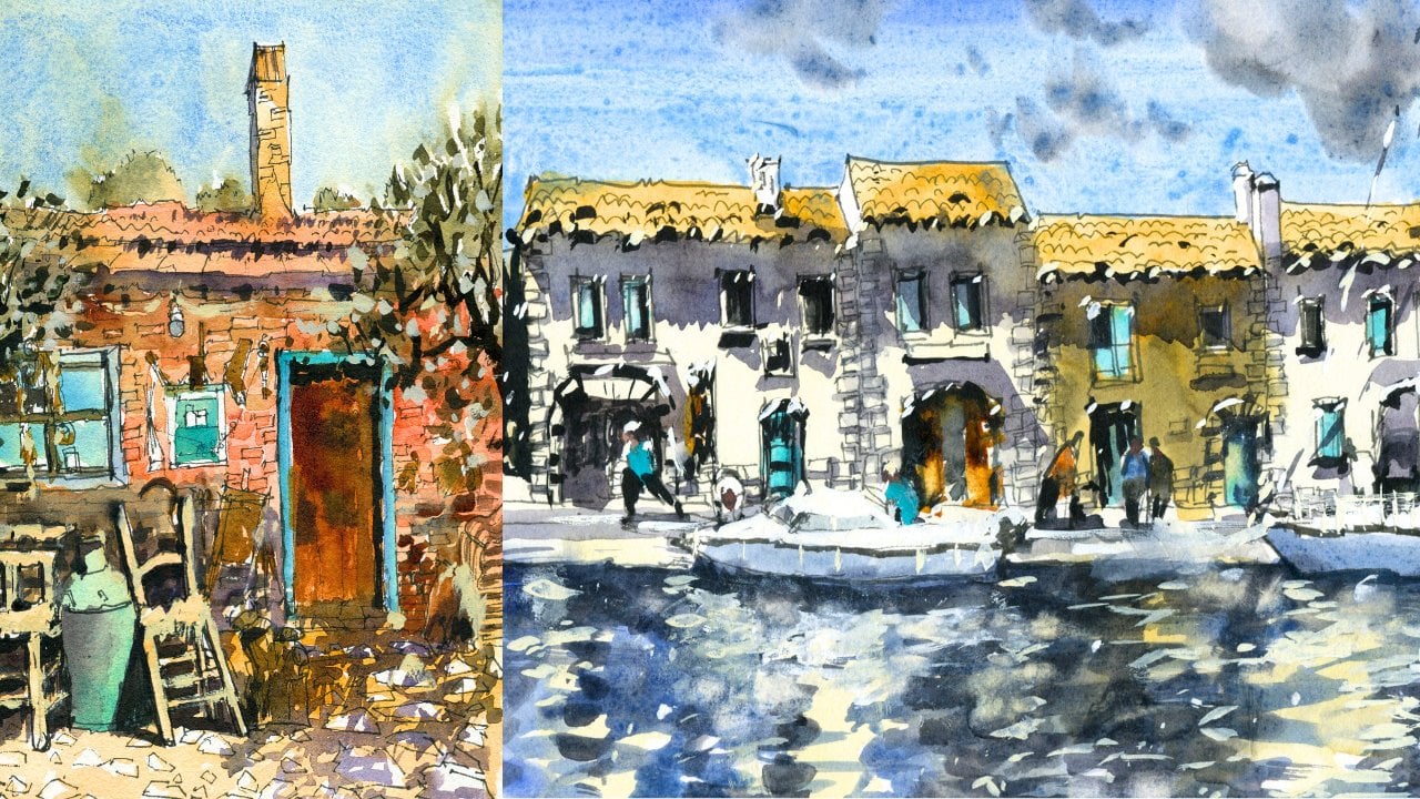
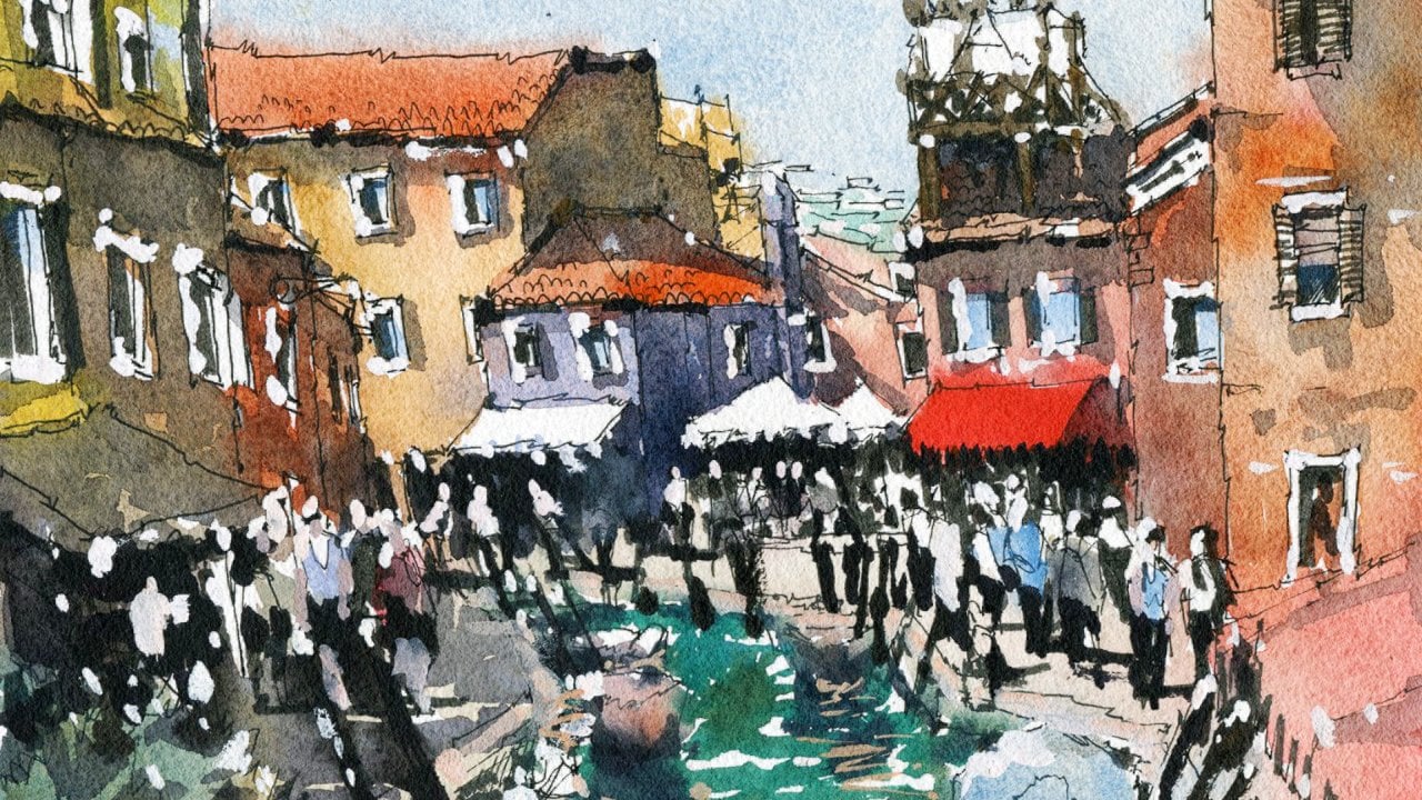
1. Introduction: Hi and welcome. In this class, we'll be drawing and painting a coastal landscape from
Copenhagen, Denmark. You learn how to draw in
pen and also how to use a variety of wet and wet and wet and dry watercolor
techniques. Planning your painting
is important. We'll go through
how to simplify, emphasize an MIT areas in your reference photo to create a more interesting and
unique composition. In this scene, we use
wet on wet techniques to paint the colors
and soft details. And the first one, this can
be a challenge for beginners, but don't worry, I'm going
to show you how to time your brush strokes to
create soft blended washes. It's implied light. You learn how to gain
control and layer effectively to create a
soft atmospheric seen. It's easier than you think. Trading fine, sharp details. Just as crucial as it creates shadows, contrast, and interest. But understanding when
to add them is crucial. I'm excited to get started. So join me in this class. We'll be painting
this beautiful scene of Copenhagen in no time.
2. Materials Required: Before we get started, I want
to talk a little bit about materials that you're going
to be needing for this class. And let's have a look
firstly at the paper. Now the paper I use here is basically cotton
watercolor paper, 100% cotton watercolor
paper, fine. That is really the best material to use if you can get
your hands on some of it. And the reason why I like hundred percent cotton
paper is that the washes blend together more seamlessly. You can use wet-in-wet
watercolor techniques without the paper
drying too quickly. It's where we get this
nice granulating effects, especially when you're
painting water as well. Being a drop in some paint in layers over is really important. You don't want that previous
layer of paint to lift off. And that can happen
when you're using some cheaper types of paper. Okay? So this is in a medium texture
or cold press texture. So what you want to get to stay away from hot press paper, I think that's just to smooth
for what we're doing here. It does dry inconsistently. Of course, you can just
use other types of watercolor paper
as long as you've got a bit of texture in it, that's, that's the
most important thing. Let's go ahead and talk
a bit about brushes. So if you check out
these brushes here, I have a bunch of these ones, these mop brushes
and the mop brushes, as you can see, have a larger
belly down the center. And this allows the brush
to pick up a lot of water. And why is that important? Well, because when we're
painting large areas like this, we don't want to be going
back and continuously to keep picking up more paint. You want to go
back every now and then to make sure you've
got enough on the brush, you wanna go back unnecessarily. So if e.g. I. Use this little synthetic brush, this is not going to pick
up much water at all. And I'm going to have to go
back 20 times 1020 times, paint this same area
and it's going to make an area often
look overworked. So I tried to paint
any type of area, whether it'd be a
boat, be awarded, be some water, some of the sky. Try to use as few movements
on the paper as possible. If I can paint something with fewer brushstrokes,
that's ideal. So I've got three of them. And for this, for
this demonstration, I'm going to use
mainly these two. And the reason why is because they are pretty
much small enough, but at the same time hold enough water so
that I can get in large areas if I use this
one does still work, okay, but you just
gotta be a little bit more careful as you can see, wherever you touch
onto the paper. And you just kind of
to make sure you cut around bits and pieces
with more carefully. Okay. The tips of these brushes become quite pointing when
you put them into water. And that's a really
important thing when you're looking for a watercolor brush, mostly work is actually
done with those brushes. Here is a little
synthetic brush. Talked about this for
a little bit as well. This is great for
getting tiny details. Maybe you just want to
sharpen up in the air. I put a bit of darkness
in the background. You might want to put in a
mask or something like that. I've got this one here, which is great for that
little rigger brush, doesn't pick up much paint, allows again, legal details. I've used that there to get
in some of these these areas, these sales and mass
ropes running around, little highlights
on the windows. That kind of thing is excellent. This here. Little flat brush
and the flat brush, I use this to get in shadows, little washes anywhere that I want to create a bit
more of a sharper. Contrast works well too. As long as you're not using this to paint a very large area. Because again, it just doesn't
hold much paint at all. So let's talk a little
bit about paints. And a lot of the paints here
in the water and in the sky, basically cerulean blue and
a bit of ultramarine blue, maybe a little bit of
purple in there as well. Just a tiny bit of
purple or neutral tint is too dark and down
the base. Okay. But I would say they're
more on the cooler end. I've dropped in a tiny
bit of a grayish color in the sky there just to try
to indicate some clouds. Can see what a warmer colors
here in the buildings. I've got some yellow ocher
bit of quinacridone, burnt orange up the top there. Again, just a bit of
yellowy orange color. So very warm colors
on the building. This one here is more
of a teal color. And of course here I've got some color which
is buff titanium. Ok, But don't get to bob
down in terms of the colors. Just remember in terms
of the buildings, they are more warming color. An earthen color like burnt
sienna is also really good. I use that at times for the
roof so that it doesn't look too warm and it's just a little bit of
the earth and color, but it's still, again, it is a warm color, but just a little bit
more muted down. And another thing
you want to know as well is I use a little bit of this
stuff, bit of whitewash. This is how I get
in little areas of highlights and the
water in the mask, these little bits of rope here
on top of these umbrellas. And the window sills
really depends on how much detail you want
to, you want to add in. But it's great for these
little finishing touches. Right at the end
of your painting. Neutral tint is a
color that I use for a lot of the dark areas and a
little bit of neutral tint, little bit of purple as well. I tend to mix them
together or just use purple or a very muted down, purple or blue for
some of the shadows, especially because
we've got a lot of this warm color
on the buildings. So if you pair that with
a bit of a cooler color, it actually contrast and it looks quite nice to
complementaries. In terms of the pens that
I'm using for this class, you have a couple of options. So you can use a pen like this is a uni-ball Eye Micro pen. It's a 0.5 millimetre
nib, very basic. One thing to keep in mind, it's a liquid ink pen, so it's quite watery inside, waterproof and fade proof. Really important because
you don't want this to run when you go into
it with the watercolors, you want the lines to remain stable and visible
through the watercolors. I actually have another
set of pens here. And there's so
many of them here, but they basically just
come in different nibs. These are pigment liners. And they are a
little bit different from ballpoint pen in that
they have a felt tip. Good to see here, but
ever felt tip like that. So it's softer, little bit more loose when you're
drawing on the paper. Whereas if you compare
this one, metal tip, more rigid, so the line work
looks slightly different. Okay. You don't need all
these pens really, if you're just going to 0.5 pen, you can do absolutely fine. Makes sure that
it is waterproof. Of course, if you've got more, just gives you
additional options to get in different types of lines. I use a thicker pen as well
to get in some of the shadow, the darker areas
in there as well. Okay. But that's pretty much
it for materials.
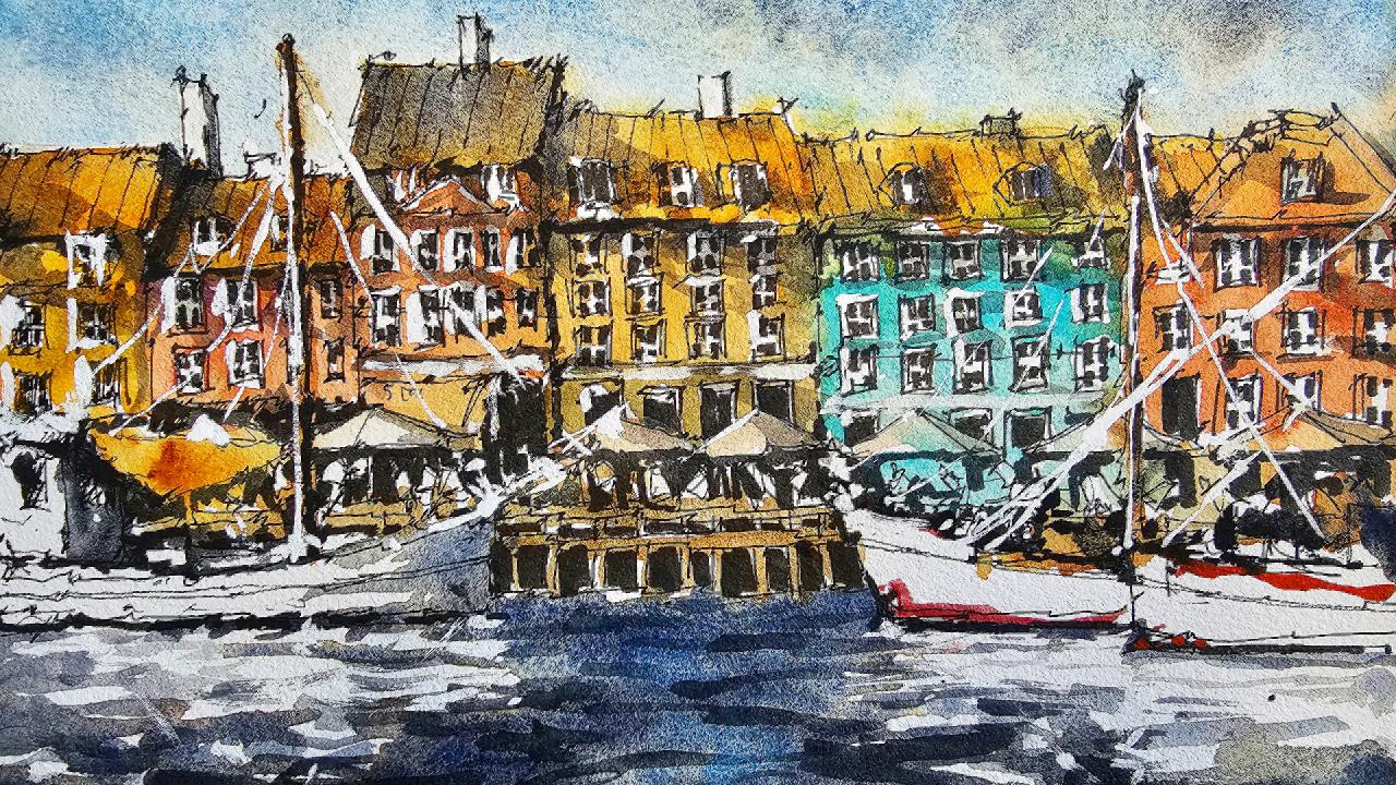
3. Drawing Steps: Hello and welcome. Today
we are going to be painting this amazing scene. It's quite complex, but we're
going to simplify it down. We've got these boats
here in the front and we've got a bunch
of these houses and buildings in
the background and a few people walking
in that area as well. So what I wanna do
is start off by working on the really basic
components of the scene. And we're going to put in roughly roughly where the
water starts at the bottom. And I'm going to use
the pen to start with. And what I do is that I use the edge of the pen
to just sort of scratching quick
little line and I'm not concerned on
accuracy at the moment. We just want to put in roughly
where the water starts. So yeah, I would say it's about a quarter of the
way through the scene. It's maybe got a little
bit less in there. But I think that
should do the trick about a quarter of the
way through the scene. And what we're gonna do now is work a little bit
on the buildings. And again, just put in roughly where the buildings
start and finish. Okay. So I know there's
like another one that comes up here, like that. There's another one here. And we're not even putting
in details really fold. These buildings were just
putting in some basics, more sort of guiding lines. So once we put in
the buildings later, it's gonna be a lot easier. Big shapes first. And of course we've
got 123456 buildings, so we do need to separate
these out a little bit. 123456, we can probably extend some of these
out a little bit wider. The bit of paper
that I'm using is wider than the reference photo. So there's really no way
else to get into this, but to just go for it. The other little gardening thing I'll put in is just here. So this is the area where the
buildings hit the walkway. Now, let's go ahead and get in. Firstly, these boats, I'm going to just start
putting it in and it comes in like this and it
starts to go upwards like that. How far does it come in? It's nearly halfway
through the scene, but in this particular on
this particular bit of paper, it's actually wider like
I mentioned before, so I don't wanna go into far, something like these
should be fine. Okay. It's getting the bottom
of the boat like this. That there is something
here in the water, but I'm not going to
bother with that. I think it just sort of
obscures what I'm trying to do. And I'll put it in
this little side of the boat like that. It's kind of a it's like a box. If you just look at it, there's really just a box and there's a top here, greenish
looking top. But the other side of that
box is around about here. You can see some little
windows and things. So just etching a
few little windows perhaps running through
the side there like that. Basic Windows,
nothing too fancy. And we've also got a mast
that comes all the way up. Okay. It's really goes
all the way up to there. And I'm only just going
to mark it out for now. I'll put in more of
the details later on. But I want to make sure that the i've I've gotten some of the details for
the buildings as well, but just a little
indication like that. There we go, should be fine. There's even
something over here. You can see on the on the boat there's
these little bits and pieces near the sides of it. There's even little
boxes and things. So again, this is up to you just in terms of how much
detail you put in here. But as long as you've
got the shape, the basic shape of the boat, you will be absolutely fine. Even on top of the birthday, these little bits of material
and things like that, It's all just sort of
suspended and going upwards. Even this part of the boats
that the ship isn't it? It's really got something
coming out the front there. I think part of the mast
and the sale here as well, which is just connecting on. I'm not going to really
indicate that too much. Attempt that a bit later. And let's get in the
other boat here. I'm starting with
everything in the front first so that when we do
the stuff in the back, we can just cut around it
rather than draw over the top and cause a bit of a mess. So here we go. Let's
get this one in. I'm going to start roughly
here. This bodes bigger. And just getting the
rough indication of the way behind like that. This one here, there's another
little boats like here. I'm just going to put
that in there like that. Here we go. It's actually a bit of a
marking on this boat as well. You can see an essay 98. I don't want to spend
too much time on this. Just some little indication. Say 98, something like that. There's even some
red bits and pieces floating around near
the top. Like that. There's a bit here at
the base of the boats. This one has it as well. The other boats to the
left has that too, just to kind of a
darker section where it hits the water like that. Anything on this. But really it's a little more
sparse over here. I'm going to make some things up and boxes and stuff like that. But we do have roughly
here with the two boats intersect a mass that
just goes straight up. Again, roughly the same
location as the other one, but a little bit lower. Something like that. That just simple,
simplified there. This burden front
actually has got some kind of It's like a, a poll here at the
front of it as well. That's again connected
to rope that runs up all that stuff I think
I would just do later. I don't want to spend too much time fiddling
around with all that stuff. Just fill that up with a few
bits and pieces in here. Okay. Good. Now I can just start putting in some of these walkway thing
here in the back. Roughly put it around here. We'll start it here. Okay, so this is where all the people we're
gonna be walking. Just behind here. Okay. Because that they'll show
you a little trick later. We can go over some of
the lines in the front these boats with a
thicker pen, this 0.7. And we'll make it
just look a bit more. Bring it forwards a bit more. Here we go. Just another, again plank
going across like this. And of course there's a few
running down like that. Tend to be more careful with the details in the
foreground and closer to you or just
anything closer to the front and take a bit
more care with it. Because there's gonna
be more detail. Things are closer. It's really just quiet, dark
under there is nothing else I think I need to imply. I want to get some nice
little reflections here underneath the
boats of the white, white section of the boats. And the sunlight is
seems to be coming from roughly the left
top, left hand corner. Top left, you see a
bit of a shadow here, but mostly from the top. So there's a lot of
these white reflections here in the water
that we can do. Firstly, let's separate
out these buildings. Again. We do have one slide, just sort of building here. I'm just going to put
this one in like this. Okay. Just the roof top
of it. Starting here. Just to the building here to the left is two
buildings still left there. And you got to remember
as well, this building. Again, it probably goes
right in the center, but I've shifted it over
a little bit to the left. Okay. But if you want
to make it exact, just divide the paper
roughly into half. And this building ends
that taller dark building. The darker roof ends just slightly left to
the center of the page, which is approximately
where I've got it anyhow. So I've always had to
adapt my reference photos. No way you can get something
that looks already perfect. I also like to just mix
them around if possible. Just to be to that
rooftop as well. This masking tape is not
the best quality masking tape and it does not stick
properly to the paper. But we will make do another
bit of the rooftop. There is even window or something
like that here as well. For Windows here, 121234. I probably could have
had more space at the bottom, but that's fine. We will make do and bring that side of
the building down like that underneath this window, just putting a bit
of this kind of shade or something
there as well. Something just sort
of cut off there. It's hard to see,
but it's a bit of this part of the
roof sticking out. Your shadow to the running to
the right side of the roof. And you can start putting
in things like e.g. you see these these windows, There's actually some nice
darker spots and the windows. And these darker spots are fantastic for just getting a little bit of the
detail of the windows. I'm just putting them
in very roughly. Mind you there's not Much
thought going into them, just tiny little
windows that you get on the inside of the frames. You can also just draw out the frames a bit
better if you've lost some of them as well. Like that. This just depends on how much time you want
to spend on it. And then you can see my style
is a pretty loose style. I try not to fiddle around
too long with things. Just like to make
sure I've gotten a basic indication
of what's happening. There is a chimney of some sort here. I'm just
going to put that in. It's really just a
rectangular shape, square, rectangular shape, whatever just on top
there like that. So what we need to
do to imply it. We've got the rooftop here. They are cutting through that. And this building kind
of runs down like this. And again, you've got a bit of this little window up the
top of the building there. You've got another one here. Just kinda squarish
shaped window like that. And there's actually a thing running to the right-hand side. A bit of a shade sticks
out of the roof top, so that's going to
cause a shadow later. Okay. So again, putting some of these windows for
little scribbles like that and that should do, should do the trick. Now is another chimney here. It'd be sort of saw
that one there. Again, you don't have
to put everything in. It just depends what you want. You want three there, four rows. Four columns. 1234, okay, for Windows. Then this four
directly underneath. Okay, so just putting
these windows in. There, we go from some
windows and underneath, you've got just a darker area. As you can see by
the reference photo, it's a fairly, fairly
dark in there. What speeds things up
is if you've got one of these darker pigment liners that not a dark, it's
more like a bullet. Zero point on the front. Sort of play around with
this one a little bit. And two smaller ones as well. They're not necessary. It just for me, it just
saves a little bit of little bit of time, especially with these
dark sections like this, as you can see, I
can now getting nice little indications of
darkness running through. It's probably best
I go with the I go with some of these
pen first the pen work. Not only that, but we've
also got some umbrella like shapes that I
have to indicate. Okay. It's an umbrella there. Simplified down. There's a shade. Oops, just getting this
side of the building here. There's a shade here as well. The front of that
restaurant or what have you coming down
around about there. Okay. Split that building
into half like this. And just putting the roof top, the bottom of that roof
like this as well. Let's start sketching away. We've actually got another
part of the building here. Again, it's kind of
a triangular shape. This is just shapes. So just looking at it
as shapes, I mean, these rectangular shapes here don't know what
they are exactly, but they are rectangular. There's a chimney here
even on the roof. So just putting
that in like that. Okay. Sitting on top
of the roof like that. Is that Chez and I've actually
drawn that line a bit too high up there,
but that's okay. We can just go over
the top of that. Again, there are how many rows? 123455, windows. 12345. Perfect. I'll just draw this line coming down the page and we'll go
these ones as well, one to five. There we go. Some windows. Getting some of the inner part of
the Windows quickly. This is why I'm using this
pen again, it's just quicker. So I don't have
to shade the mean with the other marker,
with the other liner. I mean, it's just faster. We do the redo the frames
a bit later as well. There's even a darker
sort of what you call it, darker sort of entrance here. Just running down the building. So get some of these
in on top. Like that. I mean, there's really a
lot of stuff going on this. There's people walking
through this scene as well. There's umbrella thing that runs down all kinds of
shapes in here. And I think just putting in a few people will get
is going to be good. Okay. Just the bodies of
them like that and just maybe they're walking
through the scene. Busy. Okay. Underneath
that umbrella there, you can see some of
them just walking through a lot of
overlapping stuff going on. Okay. Yeah. This one kinda just
covers the walkway a bit. And I'll put it
in another person or something here in the back, perhaps just underneath it. Okay. To have a look, Let's get into the other
the other bits and pieces. So I'm just going to
extend this one out. So we need three more. One. Make the center one
a bit larger to k. Here. Again, I'm going to
have to just widen. These are touched because of
the paper size I'm using. It is just a bit wide, wider than the reference
photo is anyway. So I'm going to have
to just do this to improvise what
I have going on. Even this building here, I think I'll just make it
up part of it because I've lost part of that
building already. So just you just make
it up like this. So actually more space than I need and here, but that's okay. Getting top of these
roof, the roof areas, you've got these kind of
square looking with rounded, with a rounded top like
this little windows. And they sort of stick out
of the roof like that. You've got some more here. Let's get in this
rooftop, roughly here. There's even a rooftop here, another Rooftop,
a chimney there. A few more of these bits
and pieces on the roof. This there, There's one.
There's another one. Here's another one that I got a window open
to the left there. That 12363 sets sets. Windows. Probably started here around this pen
downwards like this. 123. This is going to be
interesting one, again, you don't have to make everything look like
the reference photo. I'm just doing it to show
you how I estimate it. So I've drawn a few
little indication lines here to indicate
indicate the flaws. So I've got enough room for the floors and also
for the Windows. You're making sure you've got
enough room here as well, is to put all three rows and three columns
of these windows. I keep referring
them as columns, but it's pretty much how it is. Just three squares,
sorry for four. Columns and three rows. Okay, They are these
umbrellas which we got to put in first so that I don't
accidentally colored them in. Okay, there's another one,
there's another one here. That these umbrellas, beautiful. Umbrellas sort of add a bit
of interest and it's nice. It's this sunny feel to
everything that came. Maybe one we'll just put in another one here
while we're at it. Barrier. Got all these people just again, walking around underneath
and just a matter of indicating what's happening
without too much work. And all I need is
just an indication of the bodies and what I do, I put the head facing forward
so it looks like they're walking forwards or in
different directions. As you can see, head
facing that wave moving to the left kind
of thing, simplifying it. Down. There we go. We've got another doorway here. There's actually four doorways, 123 and they just go directly
underneath these windows. So it's actually
quite easy to do. These are actually windows. I think they look like doorways, but these ones to the right, these three here,
another set of windows. Okay, so let's go ahead
and do this building now, separate that one out. And they actually little bit shorter than the
reference photo again, because the reference photo that we're using
is a bit taller. That's okay. I may have to just change
this around and add two rows instead of four. And I can just change, change a few of these around as well just
so that they're not too out of place and have too many
little windows in here. I just want to simplify
this down like this. A third, let's put in a third, one, third row here. That just little squares or rectangles to mark
out what's happening. Here. Again, I've had to
improvise and make up a few extra details here on
the right, but that's okay. We can put in some
windows like that. I'm more windows again,
just connecting up. And I find as you get to
the edges of the paper, you don't have to worry
about the details as much anymore you have to do is yeah, I tried to sort of
try to blend it out. It's sensing the edges
so that the focus is more on the the
actual scene itself. Simplifying these down
or just putting in a few little areas or doorways at the base.
Speed things up. I'm going to again use this pen to put in a few
bits and pieces for the windows that I have another one. Smaller. Better. Takes just a little
bit less time, but yeah, if you don't
have one of these, just use a normal normal
pen that will suffice. Okay, it's just gonna
take a little bit longer than how I'm doing it
here at the moment. That's why I use this little pen just for little dark
spots on each window. Mostly trying to be as accurate. I can only going through
with it in one stroke. Okay. You'd be surprised just how much of a
difference this makes. Just to indicate the
detail of the window, give it more of a identity. That now even on these top ones, you've got also similar
sort of story here. But there's not as much as
many windows like these ones, that one there, this is,
this one's just dark there and then you've got
a couple of spots there. You just Just taking it easy really. This window here is
also quite dark. I mean, if it's all quite dark on this whole
building up the top, but we'll do that later
in the watercolors. I don't want to start detailing everything to excessive,
excessive point. But I do like to use these
pens and what have you to get in darkness and obvious
areas of contrast in here. Before we actually start
painting the scene. This is like my most, one of my most fun parts of it. Just going through and trying to add in a bit of extra contrast, as you can see here. Which is cutting
around these figures. Makes it look like there's
something going on in there. Even underneath here. Now you've got pizza
of shadow in here. And underneath here as well. Simplification. Just almost two times. Really light, which is a white area of the scene
and then all the dark areas. And you can also see where here there's a door
behind this character, character, this
person walking about. That. Here as well. You can see just a bit of
darkness run through here. Now the other bit here, it's cutting around
that umbrella. Again. Peter, the
bottom like that. There are people looking like this people anyway, just
walking underneath. And that's gonna be just implied through cutting
around them like that. Okay, there's even a doorway
here or something just behind the little
bits of darkness. They draw out all the
light without the, without these bits
of darkness in here, it's not going to
look quite right. Just trying to outline some details of this
boat bit better. No matter if the numbers
disappear a bit, but just something,
something more interesting. Maybe anchor that these
boats to the ink in them, but sort of connect them to
the water a bit like this. A lot of this will be done
with the watercolors later. So don't spend too
much time here. Just a little shortcut
so that you don't have to do all of it later. Okay. Coming around here to
the right-hand side again, there's some more
dark bits here. A person walking around, maybe add in a few more doorways and things in the
background like this there underneath
the umbrella to help draw out the
umbrella attached like this. Little bits and
pieces like this. Underneath the umbrella, I will just outline some
of them are touch. It gives it a bit more
strengthened presence. Thinking also in here there's
darkness behind this boat. In this section. Only way I'm going to
have to do it is through this shading with the
pen underneath the top. It's also some darkness
behind the boat here as well, but it's just cutting around
the white of the boat. Want to leave some
of the finer lines and the boats as well. They just give it extra detail. Darkness in that boat. A little bit underneath
this rooftop. I can just feathering and
a touch of darkness here. Something like that. Good. You can see just underneath is little bits of
shadow and things. And I can just put in
some of that in areas. Just helps to match
up what I've done. Below, so there's not so much, all of a sudden,
it's thicker lines. We want some thick, thicker lines up top as well. Okay. But the shadow is, I want to get in without proper watercolors. K edges of these buildings. There. There are little lines on the buildings as well. These kind of comb the tiles. The pattern of the tiles, which I will indicate
some of like that. This one here is more sort of slanting towards the viewer. They could have indicated a sense of perspective,
funny enough. Okay. Buildings just look a bit
more three-dimensional. As you move towards the edges, the lines start moving more towards the sides of
the right-hand side. You can see here the lines
are moving more towards the right and just trying to
increase that effect of it. Here they start to slant
more towards the left. Okay. You don't have to draw
all the men as well. See how I just skip a
section like that as well. Maybe this one
needs to the left. I'm going to be sharper
towards the left, curved more towards the left
is what I meant to say. This part of the building. Let me have a window
there as well. Just didn't draw in. Okay. I mean, here's the time. If you'd like to just
go in and I'm adding a few extra frames and things
for some of these windows to detail the touch more. Okay. I mean, I don't have to
draw them all in, but just a few here
and there if you want a little detail. In areas where the frames
kinda stick out of the window, touch these white frames. It's hard to get the mean. But they actually do
make a difference. Try to cut around them in
the watercolors afterwards. So it's good to leave a bit of room in between the windows. So when you go back and do this sort of thing,
there's enough space. Some of the doors I
think could be noise, so with a bit of a
frame to them as well. I mean, they don't
all have frames, but I think I'd put
some of them on. Manually. Kinda makes
them look more realistic. Going on here. Really should be darker in this
section like that. Little detailing on the boat that some of these little lines and things are
running through it. And I didn't really
quite pick up before, but they help to you just
add some detail to it. Very light. Touch
with this stuff. Good. Okay, so that should be
good for the drawing.
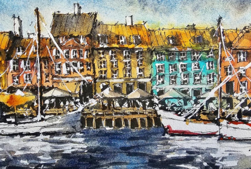
4. Painting Steps: We're going to start off with
some light washes of color. And I'm going to use
a bit of orange. First bit of orange for this house here,
this building here. Round a bit of the frames
and things like that. So you just leave a bit
of the white on the paper and use probably about 20
per cent paint or less, 2010 to 20 per cent paint. The rest of it just
water for this because we want to make sure
that it's very light. We preserve that light
on the building. Effective. Probably gone too dark here, but doesn't matter. Just make sure you've got
lots of water in there. Ten per cent paint
probably be good. Concentration c, I'm just cutting around a
little bit of that. Shade. The frames
of the building. Okay. I can see all
types of colors. And this one to the
left, it's kind of, I'm going to make it a pinkish
or more reddish color. Maybe with some burnt
sienna in here as well. Light. Just water that down
if you feel like it's too dark while
you put it in, just make sure you just
lighten it while you can. Okay. It's dries very quickly. This here is probably
just burnt sienna. I could do a little
bit of yellow ochre. Doesn't matter a whole lot, just as long as you've
got some warm colors in here and even here, just a beautiful warm color for the shade that
humming along there. Okay. We just really putting
in a bit of color in there. Warmer color. I had to just drop in a bit of other color running
through it as well. Keep it more interesting. Maybe some green touch of
green running downstairs here. So that's just connected up. Notice how I blend
the colors as well. I don't like it to sort of
blend together if possible. One to the left. That's really quite
a vibrant yellow. I'm going to use
some of these color. This is hansa yellow. And you can see already
it's very vibrant, but it's not going to stay
completely like that. I'll just add in a few
bits of this other yellow. Otherwise it will detract from what's going on in
the rest of the scene, but I do want it to
be pretty light. But you just drop it, drop some of these
dive of coloring to dirty it up a touch. All the rooftops are kind
of this burnt sienna color. Most of them are anyways, so I can just put in
a touch of that color while while I'm there. Okay. Touched color there. This rooftop is
not burnt sienna, but I'll put some of
it in there anyway and go over the top of
some darker color. But we can almost use the
burnt sienna as a base color. And then to finish it all off. Other darkening it down or darkening it down and or cooling it down
or warming it up, but still docking at
darkening it down as well. Okay. So example
here would be this. I'm going to put in a touch
of purple or something. Okay. Touch of purple
color. That building. The top area. It just comes down with as well. Just let it spread in
there if possible. Problem. What we're doing here
is we're just getting in some colors, lighter colors. We're not trying
to detail at all. We're just looking at the general tones that we have
and thinking to ourselves, well, some parts of
it need to be darker. There's some parts of
it needs to be lighter and that's the main focus here. You're looking at there. So these two little
roofs here are darker, whereas the rest of
them the kind of lighter, especially that one. That said, I do
like to just add in a few other just messier bits of color in there
like this at times. And that it just makes it look more interesting rather than have the same
color going through the whole scene. Whole rooftop. I mean, we've got a
bit of blue here, a little bit of relief
for the eyes or this warmth using
turquoise light, wash of turquoise again, the washers here are very light. They're even just
ten per cent paint. Mostly just water. Okay. This one's a little
bit more paint, but keep it light. Very light. The buildings and
the sky are pretty much the lightest
part of the scene, except for the umbrellas. The down umbrellas, I'm going to get in a
light wash of some kind of a light wash of color. These buildings. I'm gonna go grab
this orange and red, mix up a bit of an
orangey red color, more, more orange in there. Okay, It's quite a strong
warmth, really, isn't it? Let's just do this. I don't want to
spend all day on it. Some more on the
rooftop actually. Maybe. Okay. Little umbrellas. Pick up a bit of, I'm going
to pick a bit of white. This is, this is a color
code, buff titanium. It's basically basically a bit of yellowy white,
off-white color. And I'm putting in a light wash of this over the umbrellas. And this is top here as well. I think we could add
in a bit of brown and top of that top
there like this. What else do we have these
little cells as well? Brown for this area. I can see that these poles, these mass and the
ship a darker. So I'm gonna just,
while I'm here, just darken them off
the touch like that. Also, the area underneath the walkway has some darker
bits of wood like that. So I'm just mixing
a bit of brown, tiny bit of brown
in this section. Just to get rid of the Give, get rid of the
white of the paper. A bit of color in there. Okay. Some more. This turquoise
color through here, actually. Good. Some more orange,
something down this side. Good. Okay. Let's have a look at what
else we can work on. I'm going to put in the sky with some cerulean blue light
wash of cerulean blue. You want this just really
ten per cent water, sorry, 10% paint. The rest of it just water. I just want a thin, nice thin wash
running through here. No funny business. The top bit I tend to just
do a bit slightly darker, give it more
concentration at the top. Like this. The reason being is
that this is usually the closest part of the sky. Then as we move downwards, it just starts to be
watered down and we've got more nice lights,
cerulean, blue color. I'm going to cut around some bits of the houses
and things as well there. This is just water.
I'm not picking up any more paint as I move
down towards this area. If anything, I'm just trying
to shift some of that down. For some reason.
Cerulean blue just dries so quickly as well. So you for me anyway, I really go to work quickly
to carry this down. Picked up a bit of
paint like that. There. Some of it, you can see it's starting
to spread a touch, but don't worry about that. Just getting that wash
nicely, you'll be fine. Let's have a look.
Double-check if it's smooth enough up the top. If you need to add in
any extra paint to help create a bit of a gradient. Sometimes that top
part of the scene, it just starts to look
too light. There we are. A bit more here. You can put in some
clouds as well if you'd like an anticipated doing this, but I'll mix a bit of purple. And I can just do something
like that and maybe put in a bit of cloud or something, just a lighter sort of cloud, I suppose, like this. Here as well. Not too much. To keep the sky a bit
more interesting. Just melt in nicely
and create a bit of But with activity up
there in the sky, bit more interests
in granulation. Good. I think I'll leave that. I don't want to mess
around with it too much. It's getting some of the
ground and I'm going to, we're just going to mirror
the sky with this cerulean, but also with the
purple as well. I want to just getting
a bit of that darkness. And what we wanna do
as well is I also want to just create some little reflections in
the water of the boats. You see the reflections of
them come out a bit like that. Is just white in the water. So we have to preserve that and make sure that we
kinda got a bit of a mirror image
of the boat there. So you can see these waves and reports and things running
through the water in areas. Tough, toughest part is just the toughest part is just getting the
concentration right here in the water
as well because we need it to be darker. Darker out the back here. I'm just going across and
feathering this through, leaving some of that
white in there. And K. And this more
darker looking colors here in the front. Even pick up a bit
of this other blue. This is a bit of ultramarine blue as well here for the base. Purple ultramarine color. That's fine. This reflection is
probably a bit too much. I'm just going to
reduce it down a touch. But you can actually see a
lot of it here in the water. These bits of white, tiny bits of white anyway. So we're just leaving some
bits of white in there. I'm just trying to make
sure that I've got enough color in
the water as well. Okay. And pick up around a flat brush. Flat brush just gives me more wiggle room in
terms of the detailing. Detailing and that sort of getting in touch with
this coming through. The same, same old purple. Okay, but trying to blend these waves on
reflection water better. Oh, joins together a bit more. On the side of this boat is
kind of a bluish tinge here. Bluish purple tinge. I'm going to get in This
guess that little shadow, I suppose, are cast on the
right-hand side of the boat. Maybe. Kind of dark, but not as dark as the water, makes me think we
probably could do with extra paint here in
the back section. These few little darker
strokes here and there to increase the sense of these waves and
things as well. So have a look, small little
waves and that here as well on this section
of the reflection. Now wanted to look sharp, but still have
natural looking waves running through it as well. And making sure the
waves at the back, a smaller little
waves at the back. And as you move
towards the front, you get more sharper
looking waves and darker waves as well. That is literally just
building this up, but keeping that white of
the paper there as well. Really important. Some more darker waves
surrounding this area to know. Quite important. Here on top of these
lighter looking ones, just darken off some of
these waves a bit as well. Adding some sharper
and darker waves. And putting some more out here, the left-hand side of that
button underneath it as well. The neat the boats, you
actually going to find a bit of extra darkness in
terms of that shadow? And that's why I went
through the pen a bit earlier to indicate
some of that, to save me some time. Putting it through this, a few more brushstrokes. And they'll come a point where
you think to yourself that actually looks that actually looks fine now I
don't want to don't want to go into there anymore. Finished. Okay. I think that's looking okay. I'm going to work a bit on
this boat that's putting a bit of shadow here on the
right side of this cabin. There, I'm going to darken off. It's just purple and maybe a
bit of black mixed in there. Purple and black to
get in that cabin. Should it be darker?
I think that's the K like that on
the boat as well. There's just some
darkness in there. I can imply with extra
brushwork, please. The edge of the boat as well, the sides of it. I want to just darken off a
bit more this window touch, touch a bit of that
color onto that window. This is just pure black. Here. You can just kinda flesh out little
details of the boat. You want to imply. Like that. This masked as well. You've got bit of
darkness in there, just running up
vertical vertical mast, leaving a bit of the brown on the left
side of it as well. The shadow is more on
the right-hand side. The mast to work a bit on this other area
and the other boats. Here on the right. There are some little
colors in there. Like I've noticed
a bit of red here, just a touch of red. So let's put in a bit of that
straight off the pallet. I've mixed it with
about 50% water, 50 per cent paint to get a
bit of darker color in that. Orange here as well. And I'm wondering detail, some areas that are
mainly just getting some darkness around the
edges of the boat like this. Kind of like what we
did there for the left. One. Just adding some
darkness to the inside. This is a bit of black. And I've got making
stuff up here, really much in there. But you do find there are these little masks and things which I'll use a
rigger brush here. Just a little rigger brush. Cleaners, more
popular that paint. It's moved over. Now. I want to add some
shadows to the buildings. And all I'm using
is really just some purple and a bit of
black mixed together. I know that this building
here does need to be a little more in darkness, especially this rooftop of it. So this is just a bit of color. I'm adding in here to
the top of the roof, but I'm being careful
to just leave some of that background
wash on there as well. Still. You're getting all
so these sharper looking shadows on
the right-hand side, but I don't know if it will still get a bit
of a shadow there, but it's kind of a softer one is the paint hasn't
completely dried here. Further down. Um, I will get more of
a sharper shadow here. Okay, so if the
paint is still wet, you're going to get these
type of r10 shadows. But here e.g. or
may not have eaten, may not be completely
dried as well. Same deal that they
kinda runs a bit. But that's okay. Rooftop. It's little shadow on the right-hand side. Shadows coming through
here like that. Underneath here. Lighter wash of purple
for this stuff. And here's, we'll see that little
shadow running towards the right-hand
side of these windows. Just a touch of color for that. The exaggerate some of the shadows underneath
the rooftops. Here. It'd be like that. Here. They're sharp, a shadow
there and there. Those ones. Give it a quick dry. Just some more quick
little shadows. I'll redo. Redo these quickly. Make them sharper. Shadow underneath the windows. Get that from time
to time as the light hits the top part, the
building like that. Another something we
can put in there. There's not really many
exaggerated shadows running through the scene. And you can do stuff like make it come over a
bit more towards the left. I'm thinking if the sun is
a little more to the left, you might get some more. Some of these shadows like this, more dramatic shadows
with an angle. I will change it up just
to do, just to show you. And also, I think it just looks
better with some of these dramatic I'm affects the
shadows just coming over a bit more like this. Look, we can just
imagine that part of the part of the building casting a shadow to the right side of the building like
this here as well. That just looks
more interesting. Maybe to keep it
very light as well. Very, very light. Was just giving it a quick wash. That's all you're doing. Maybe there's a shadow in
that building as well. From a building to the left. Obscuring part of the rooftop. Important thing
is just a member, you're keeping this sort of
sense of light in there. So you don't want to get rid of all the really light sections. You just want to
imply bit of shadow on the side where
there isn't light. And I think that looks a bit
more interesting already. Okay. Final, maybe some little quick brushstrokes
through the water. The front, some sharper looking brushstrokes that
just run over the top. And I'm just picking up
bit of darker paint, darker purple paint and
just putting feathering in a few brush strokes
here and there. And hopefully this will
create some extra contrasts. Then we'll go in with some. Gouache. Just a few little
bits and pieces like this. I don't want the waves look to all over the place as well. And I like this, the
calmness of the water. Remember if you want to make the waves at the front
little bit bigger as well. As you can see what I'm doing here, you make it a bit bigger. As you move towards the front, they just become to the back. They they become smaller. Randomize a few of them, otherwise it looks too neat. Water I think just
looks a bit more realistic if you do it this way. Some feathery bits. Okay. Finally, some white gouache. And I'm going to pick
this straight up the pallet with a
tiny bit of water, ten per cent water
to activate it. We'll use the flat brush again, a bit of that white gouache. This is to bring out
some tiny highlights. E.g. here there's
a bit of the book coming out and it really just
disappears off to the left, like that. Like that. There's bits, few more
running through the scene. I'm going to be running down with it since
I couldn't bring myself. Let's get a bit of this
rigger brush and k, and we'll start
off here and just bring some of these
down like that. We don't have to draw
them in completely. We can skip over the
surface of the paper. And it just makes it
look more realistic as if it's catching bit
of the sunlight. That's the trick to it. I kinda went a bit overboard with
the other, that one there. Let's do this. It's funny the most, the faster you do it, the better it looks. Now, we're doing this all, all with the stuff in the
fog in the foreground. Because it's the
final step, really. Just highlight the mask to bid with a bit of white
highlights to the left of it. This. What else can we do? Little things like this? The umbrellas, bit
of highlight on the left or the top of
the umbrellas as well. Just bring back some of that light areas anywhere that you think you can
regain a bit of light, sometimes even in
the reflection. So e.g. here, I wanted to
make it a bit sharper. So I can just create a bit of light here in
that reflection here. See, not only that we can get the reflection of the mast and the water as well. Wee little windows you can
see this like leaves frames and really it's up to you
how if you want to do this, even you don't need to. But I'm now as you can see, you can bring out little
highlights for the frames. Not doing it to all of them. Just a few here and there. Especially where we've got maybe extra darkness in
the background. I just want to bring
out the touch of light. Without too much phos. These can be great, little way to do it. Some of the building as well, these division areas
of the building. You can put in a brief
indication of those. Right. And I'll call that one finished.
 Watercolour Mentor (Darren Yeo Artist), Art Classes, Mentoring & Inspiration!