Transcripts
1. Introduction: In this class, you will learn an easy step by step way to turn busy market photos into loose watercolor urban
sketches in Procreate, perfect as gifts or travel
memories to hang at home. Hi, and welcome to a new class. I'm Iva, and I'm a
full time illustrator. And we'll create
two main projects. First, we'll work from
one detail market scene, full of stalls,
fruits and people. And I will show you
how you can make your design choices
and simplify all that cares and turn it into a relaxed watercolor
illustration in Procreate. In this second project, you will learn how to combine different references
into one sketch, just like when you
draw on location. You will see how to pick your favorite parts from
several market photos and arrange them into stronger composition and
build your own scene. And you can use this
simplification technique when you draw on location, so the real world feels
less overwhelming. One of the things that
we will practice is the simplification
and how you can make your design choices and
focus your attention and detail into illustrating
your favorite element and using your favorite
colors and ignore everything else unless it's critical for
balancing the illustration. Also, we will practice, and I will show you how
to easily paint and draw people poses while using this simple
watercolor technique. And by the end of the class, you will have to finish
market illustrations and workflow that you can repeat for any travel memory in Procreate. So I hope when you follow
and watch this class, you will feel super happy
about what you created, and you will feel like, Oh, I can't wait to share my
illustration with others. And when you are sharing
it on Instagram, please make sure that
you tag me in the image, not only into description, because that way I can see your illustration and maybe you will see it in one
of the next videos. Like these amazing
illustrations, made by wonderful creative
people who watch my classes. So if you don't know yet, you can find even more drawing
tutorials and classes. There are Procreate
and other tutorials, and I have more than
30 classes there. There is a variety from beginner level to
more advanced levels, and you can also find
different topics. So without further ado, let's start and see
you in the class.
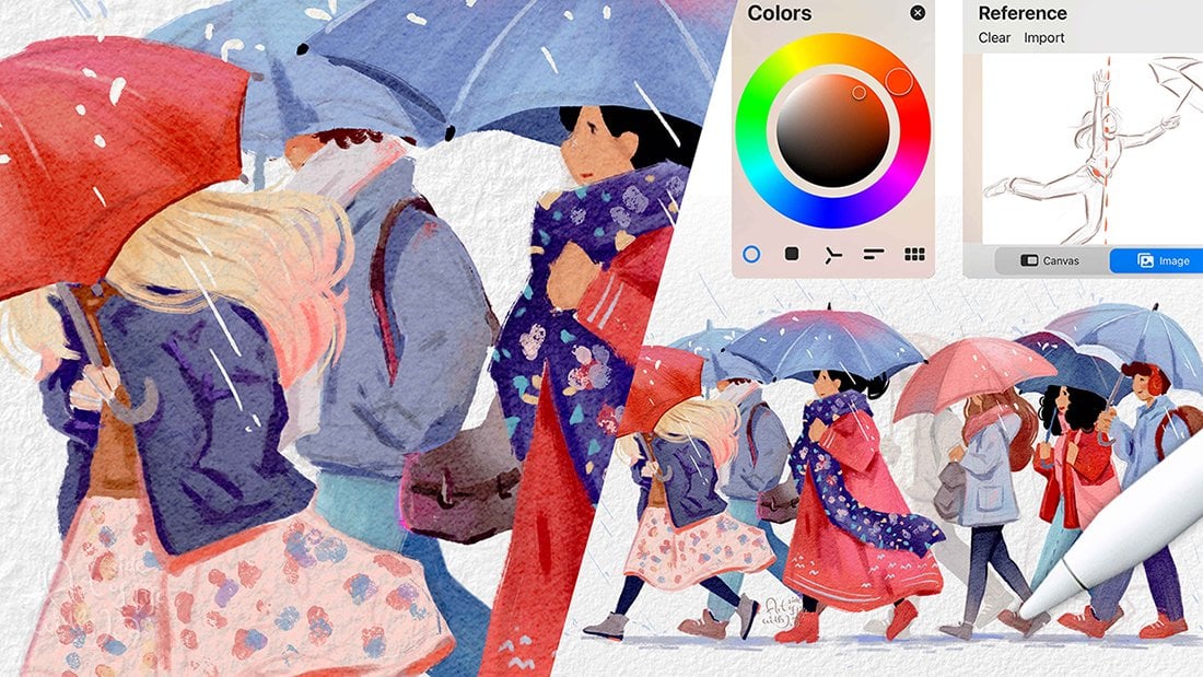
2. Class Overview: So this first part is like a decision making process
where we look at references, and you can decide which elements you
are mostly drawn to. So basically, what are
your favorite elements in your references? Because the references are busy and you can
draw everything. So we'll import our
first reference, and I will show you two
different techniques. So let's import the
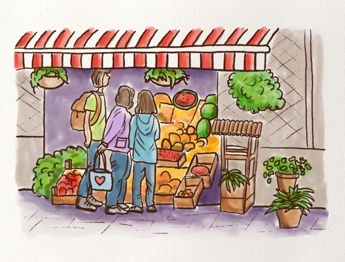
first reference. So this is our first reference, and as you can see,
it's quite busy. But also the perspective
is not too difficult because we are looking at
it kind of from the front. So the lines in our references are not
distorted by perspective. So we will look at some of the other references
later on as well. So in this part, I will show you how you can translate one of your travel photos or travel references
into an urban sketch. And then in the second version, I will show you how you can
combine different references. So you can create kind of unique view of your experiences. So maybe you want to combine three different references so when you are sketching
on location, you can do that
selection right there. For example, you see
people on one side, then you see baskets with
fruits on the other side, and then you can combine
all of that in one scene. So again, this part is about translating this reference
into an urban sketch, and the second part is about combining
different references. So if you don't want to
practice with this one, you can skip to
the other version of combining
different references, and I will show you how you
can approach that as well. But while we are here, let's translate this one
into an urban sketch and how you can approach looking at this type of scene when
you are on location.
3. Sketching a Loose Composition: I'll make this a
little bit smaller. And also, looking
at this reference, you have different ways
how you can approach this. So when you're a beginner or you just want to do
a warm up sketch, you can import this
reference photo onto your canvas and mark the approximate
proportions in that way. If you are more
intermediate or advanced, you can sketch directly from
your reference and measure the proportions by just looking and comparing some
of these objects. So let's do that first version right now where we can sketch over our reference
because we can take advantage of using iPad
and sketching digitally. So you will go to wrench icon, then you will go to ED, then you will go
to Insert Photo, and from the photos, you can import your
photo reference, or you can use the
same reference as I'm using now for practice. Alright, so now we have our
photo on a separate layer. So from the canvas, we can just close the
reference or you can swap the canvas so you
can see what you are drawing in a smaller scale. And now from the layers, you will reduce the
opacity of this layer, so it has lower
contrast and opacity, so you can see what you
are sketching on top. And I'm drawing in my aquarl paper template to have extra texture on
top of the colors, but that's just optional
look and texture that you can use on top of
your watercolor sketches. So now I will create a new
layer, and from brushes, I will use a soft
sketching brush, and you can use any other brush that you prefer for sketching. From the colors,
I like to sketch with orangy brownish color tone. So the sketches are
a little bit softer. So now I will zoom out, so I don't focus on
all the details. And as I mentioned, here, this is your decision
making process, which parts of the image
you are mostly drawn to. So for example, I really like this part with the
stripy texture. So we have this type of awning, so we can softly sketch how
these stripes are positioned. So here you can see
some of the stripes are going down and
some are diagonal. So this helps with
the perspective. And if you want to draw
another one later on, you kind of know how you can approach this type of
shape with stripes. All right. The next part, what I'm noticing and I definitely want
to have in my sketch, are the humans and some of
these baskets with fruits. But with the basket of
fruit or other veggies, you don't have to
draw all the details, so you can just
suggest the shapes. So for example, here, the
shapes are quite round, as well as here,
and here we have, like, melon cut in half. So that creates
already nice shape, and we have another
one just here. So these shapes are
quite interesting. And you can play
around with them later on if you want to
add more fruit. For now, I can actually close the reference so you
can see it better. And now I will just softly sketch some of the
shapes for the humans. Here you can also notice how
these jackets are kind of curved and what are the creases and bends
in the clothing, so how they are folded. So you can notice
it on the pants. So you can create these
type of interesting shape. But overall, the human has
kind of that herot shape. So we are simplifying
the humans already here. So carrot because it's a
little bit wider on the top and more narrow
on the bottom. And as you know, I have more character drawing
classes if you want to explore different ways
how to draw characters. And here we have the kind of flower pot covering the
head of this character, but we don't necessarily
need it because I think having the head
of the character here, it's more interesting
than the flower pot, and we can draw the flower pot
actually right next to it. Having a backpack, I think, adds to a story, so I will keep the
backpack on the character. Here we can add
maybe like a hoodie, so it doesn't have to be exactly the same shape as we
see here on the reference, but just approximately, and now onto all of these
baskets of fruit. So here with some of the fruit, it's more just
like a suggestion. As I said, it doesn't
have to be perfect, but more of these half
circles you draw, you can suggest that there is basically more pieces
of fruit, obviously. Here I quite like this half
melon and I will not draw the plastic eing because
I think it's nicer when it's open and you can
see some of the seeds, and here we have another melon, but this one is yellow. Here we need to add
those crates so the fruits are not
floating around. Here we don't see the crate, but this object is tricky, so we can just suggest some of the shapes
because it looks like some old wooden kind
of well maybe or something, you know, where maybe there
was a bucket in the past. Who knows? So here, pay attention to
these shapes here. So here we see kind of half
circles or, like, ovals. And on the top, they are curved, so it already looks
like a wooden piece. So I think when you pay
attention to some of the lines, how they are curved straight or how they connect to each
other in the image, then easier you can simplify
some of the shapes. So for example,
here, I can simplify the grass just into these kind of banana
shapes, let's say. So yeah. So you can test out different
shapes for simplification. So we can do that here
as well with this plant. So you can just do
something like this, like swirls and round shapes, and it will already
look like a plant. With these leaves, we can
play around with triangles. So some of the plants have a
little bit different shapes. So kind of like squiggly shapes in combination with triangles. I don't need to draw
all of these details around because I want
most of the details here. So now I will just add
some of the circles and half circles here. No. So we have all of
these details now, and now we can add a little bit of that
suggestion of the floor. So here, it's a
little bit tilted. We have more crates
here in the foreground. But we don't need
all these details. And from the tiles or floor
tiles here, the path. We can just do a little
bit of that suggestion. We are not drawing all of them, and we can add that with color. Here, I will add
some of these lines, and I think this
gutter looks nice, so it frames the
image quite well. And overall, we can just
add the frame here. So we will not draw kind of
completely to the edges. So we will not fill
the page completely. That's what I meant. And we can add maybe
rounded corners. I think that's quite cute. So we will have
this type of base already for our drawing, and you don't have to be so precise with this
initial sketch. I want it to be a little bit
more precise and show you more details what you can think about when drawing
scene like this. So, for example, if
you are drawing on location or you want
to do it very quickly, you can just suggest these shapes, for
example, like, Okay, this will be a pot, and this
is the plant when you know already how you want
to draw kind of this type of flower or
hanging plant, you know? So that's the one we
just looked at here. Then here is another one. So you can be very loose and abstract when you're sketching
something like that. And here I think some of
these are quite nice. So maybe we can
edit that later on, and here we can just add a wall, and we will just avoid this other human, which
is in the background. So kind of doing the decision making process, as I mentioned, choose objects and
elements that you are drawn to and you
find interesting. So as you can see here, there are also lots of
details in the background, but we are not drawing
all the details. Alright, now let's
move to the next part.
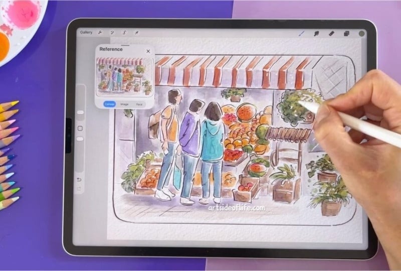
4. Refining with Line Art: Now when we have the
oral sketch finished, we can hide our reference
photo because we don't need it right now
and we don't want to focus on all the details. And now we will create a new
layer where we will create more defined linework
or this loose line art, almost like a cleaner sketch. For that, you can swap to either inking brush or
another pencil brush, which has more of a harder edge, so you can create more
detailed line art or cleaner line arc. So for this type of line art, I either like to use another sketching brush
or I kind of like gritty, sharp guh type of line art. So for now, we will swap
back to the sketching brush, and again, you can use different
brush that you prefer. So now I will make sure that
I'm on the correct layer. I will reduce opacity of this layer that we
prepared previously. Now I will just create cleaner
lines with darker color, so you can either go for black or for dark brown for this step. Now you can test out your brush
and the size and opacity. I will make it a
little bit smaller. And for the effect, you can also make two lines or you can play around with
one liner brush strokes. And also when
lifting the pencil, you can create some
of the brush strokes thicker and some
thinner like this. So I'll do that and I will just follow some of these
lines that we created. I think this kind
of one liner effect is quite nice for
some of the shapes. And as well, making
the lines thicker on one side and thinner with a lower pressure
on the other side. So now I will just continue
outlining the sketch, so it's more readable
for our audience. So here we are adding
also some of the fault, like in the previous sketch. And other than that, I'm just following the lines
that we created. Here, I want to make sure that the characters have legs
or feet on the floor. So this one doesn't work, so I will do that one more time, so to make sure that the character is kind of
standing on the floor. So the heels should be kind
of aligned with the floor. The same goes here
just to fix that part. So here, the character
was holding a phone, so I'm adding the
phone there as well. Here, maybe I can add the
bag for this character. Just like a simple citation of the bag because they
are on the market, right? As you might have noticed, I'm changing the angle of my arm and the hand because
some of the lines are easier to create in this direction for me and
some in this direction. You can try out different
placements of your hand, how you can create
more steady lines, easier within your process. And if you want perfectly
straight lines, you can just hold and
tap on the canvas and all the lines will
be perfectly straight. And I'm using it mainly for
the frame if I want to. Here we need to make
sure that the plants are behind the awning
because it didn't go over from this point of
view and you can hide your tools with four fingertip if you want to hide
and unhide them. You can clean up
some of these edges. As you can see, I'm trying to
use the one liner technique here and I'm not lifting
the pencil or the pen, and I think that creates
interesting effect and you can lift it once in a while to test out if you like this effect, so you can make
these small loops. But as well, if you don't
want to add too many details, you can just make
these half circles as suggestions for this part. Here we have that giant melon. We can add one more
here in the background. And here we can just suggest some of these crates
here at the bottom, and a little bit of that fruit here and we are almost
done with this part. We still need to add some of the suggestion here on the floor and add some of
these last details. Perfect. Now, with our
line art finished, we can move to the next part where we will start
adding colors.
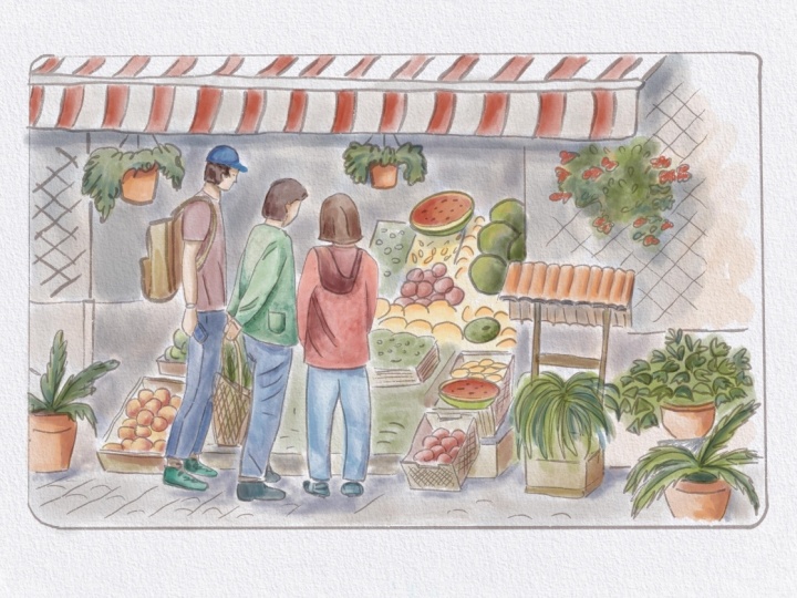
5. Adding the First Layer of Color: Alright, so now when we
have our line art finished, we can start adding
colors and you can move your reference
photo to the side or keep it here in the Canvas reference window by just swapping to
the image preview. And when you are
looking at the image, here another decision making
process kind of takes place. So here you can
look at the colors that you would like to
emphasize in your photo. For example, I really like
the colors on the awning. The red color, it's very nice and the stripes
are quite cute. So here you can either
paint them red or you can also decide to paint them blue if you are into
blue color tones. Then I want to emphasize some of these yellows and reds of the fruit and also some of
the greenery of the plants. So let's just make our
reference smaller, and we can start with some
of the colors that we chose as our kind of main
most vibrant colors. We need to make sure that
we are on a new layer and this new layer will be
under our sketching layers, and we can set these
layers to multiply. Here just slide and
select multiply, and you can also
reduce the opacity if you want to if it's too
strong for your taste. Here again, making sure you
are on a separate layer, and now you can go and select your favorite
watercolor brush. From my favorite
watercolor brushes, I will use the brush number 17 from my set and you can use different watercolor
brush that you prefer for this exercise or this coloring
part of the illustration. So from the colors,
as I mentioned, I will choose warmer
yellowy color tone in combination with a reddish, orangy warm color tone. So I will start with this
reddish, warm color. And I will softly start
adding it to the left side of the object because I'm imagining that the light is coming
from the top right, even though our
reference is quite dark. So I will just paint this with kind of like approximate
look to these colors. So I'm not keeping the
colors exactly the same. But what I'm noticing here on the reference is that some of the red on the bottom part or this part is a little bit darker than the
one on the top, obviously, because the light
is coming from the top. Now I will hide the reference
so I can paint this part, and I'm not doing exactly
what I see in the reference, but being inspired by the reference more or
less and the colors. So we are still
simplifying that. We are loosely sketching
and you can add kind of soft brush strokes with a soft pressure and
then stronger pressure, just like adding more paint
to the paper kind of effect. So that's why I kind of like this brush because
there is that variety, like painting almost
with real watercolor. So that's why I kind of like
this type of effect because I like the traditional
look of watercolor. And I don't worry too much
if I come out here from the linework because I think it adds to that nice look and feel. Kind of that traditional look, but kind of keeping some
of these lines here. All right. And now here, you can decide where else you
want to add the red color, even though it's not the
same on the reference, but I will add the red
here on some of these. So we have the melon, and then we can add
more red and kind of tapping and creating
these small shape, so it's not precise. Perfect. I think this is enough
for the red color, and now we can add the
yellow color tones, and I will add it mostly
to the fruit here. And using lower and
higher pressure. So I'm kind of combining that and sometimes also
lifting the pencil. I can add some yellow also here because
they were peaches, some of them were more red
and some more yellowy here. Mm. All right. And now we can add some green colors because we have quite a lot
of plants here. So from the greens, I will go for less
saturated green color tone, and then we can still add
more colors later on, kind of in more hues. So I am softly adding
the color here, and then with more pressure, I'm adding more color
to the bottom part. So we have more pigmentation
on the left bottom part. And here with some
of the melons, I think I can make this
one maybe more green. We have some color variety
here in this part as well. So it's not only
yellow color tones, but we have some
green here as well. Alright. When we look at the reference, we have some of the
crates in wood material. So we can use
lighter brown color for this part of
the illustration. So all the wooden
crates can be kind of this orangy or less
saturated brown color tone. So let's test kind of this
shade. I will add that here. And again, I can just quickly add it to the left
side of the crate. I can also make the brush
a little bit smaller so I can fit into
all of these shapes. And like with real watercolors, you are trying not to
touch the other colors. So it's okay if there are like, gaps between some of the
shapes and color areas. And here, I'm creating a little
bit of variety by lifting the pencil and using
lower pressure and also using stronger
pressure for darker colors. So it's quite quick
way to add color. H. Now when looking at the reference, you can see that some of
the people have jeans, but also the jackets are in
these beige color tones. So I think we can add
more color to this area, so we can use some
of the blue and maybe we can kind
work from that blue and use purple color tone for maybe this jacket and this
one can be maybe turquoise. So we can work with the blue color tones
for the characters. They stand out against all of these warm colors
in the background. So if these jeans
are light blue, I can make these two maybe
a little bit darker. I'll just move the slider and
I'll add that color here. So we have already a
little bit of variety. All right. And now let's select nice purple and turquoise color. So to turquoise, you can move the slider here towards greens. So let's test out maybe
something like that. I think that works well. You can make the
brush bigger as well. Now for the purple, we just move the slider here towards the
warm color tones, and I think reducing the
saturation here works better, so it's not too saturated next to the other colors,
so we can test it out. Yeah, I think this
one works quite well. We can make it a little
bit more saturated. It's always good to test out the colors next
to each other. And here for this guy, we can maybe take yellow color just to work with
similar color tones. For the hair, I think I'll
just go for darker colors. And I'll add that
brown here just to keep the color
palette more simple. But you can test out some of the other colors if
you would like to. All right. And for the skin tone, I think I'll just use similar color to what we
already have on the canvas. But again, you can test
out different color hue depending either what you see in your reference or maybe if
you are drawing your friends, then you can use more
likeness in the colors. Here we can just fill in some of the areas
that we didn't. I think here would
be nice to add maybe some greenery because
it's quite empty here, so we are already
improvising a little bit. In order to do that,
I will need to delete a little bit
of that line art, but I think it will fill
the composition nicely. So here I just need to
delete a little bit of this. And then add the detail
with the brush that you were using before. Perfect. Now I will go back
to the color layer, swap to the painting brush
that we were using until now, and to fill some of these areas, we need to add
maybe neutral color which will work together
with the rest of the colors. For that, I thought we can use maybe warm desaturated brown, it will look almost like gray
next to these other colors. We can test it out and
see how that works. All right, I think it
can be even warmer, so we can move the slider slightly to the top right
and test it out again. I think it can be still
a little bit lighter. I think this works
already quite nicely. But I think it needs
to be less saturated. I'll just add it to the palette. This kind of warm gray wash. If you are painting
with real watercolors, this one will be almost like a dirty water just to fill
in some of these areas. Um, uh, And here we can just fill
some of these areas, which we didn't color until now. Perfect. So now we have
all the base colors done, and now we can add
more color variety and also create more
shadows in the next step.
6. Adding Color Variety: So to add more color variety, we'll still work
on the same layer. So from that, we just
need to sample some of these colors that are
already on the canvas. And I'll just move the slider. So here from the brown colors, like with real watercolors, you can mix it up and
move it around on the palette so you can mix it kind of with
yellow color tone. So that's why we
are moving here. So this brown will be slightly lighter here
on the top right, and I'll add it to all
of the brown areas. Now, I can add that there
and move the slider again, a little bit higher so we
can add a little bit more of that yellow and also kind
of less saturated brown. Perfect. Let's do that also
with these green tones. So with the green, we
want to move towards the warmer yellow tones so the greens are not
overly saturated. And I will basically
choose something like this warm
yellowy color tone. You can imagine that kind of light is hitting these
plants on the side. So kind of warmed
up by the sunshine. And you can just add these random shapes
of the color there. And you can also swap
to a different brush to create different shapes
with these additional colors. For example, if I take
the brush number 29 and now I will go
to the green tone. Now I can move the
slider a little bit darker and more towards
the bluish tones. Now we can add some of these random marks
on the bottom part. So we are creating
that texture still on the same layer. Perfect. And we can also add some
marks with this type of warm green color
tone, almost yellow. So you can test out what type of green you kind of like here. So it's very nice
and warm green. So I can just add more marks with this
light green color tone. Just random brush strokes. And we can also add
a little bit of pinkish color tone
to these red hues. So to do that, I will just move the slider here towards
the purple colors, and I will keep the slider
in the top hue here, so kind of keeping the
color quite light, and then we can test it out. So I think here, it works quite well. So we have some variety in
color within the fruit. And we can also add
some saturation here. I can save the pinkish
color here for you as well. And within the yellow colors, let's move to the more
saturated color tones and little bit darker value. And I will swap back
to different brush. I can have another texture. I can test out the
brush number eight for more texture here. So it will add a little
bit of the texture there and I can go
to darker values, so it's a little bit more visible and just add a little bit of these
brush strokes there. The same goes for
these red color tones. Just to have more
contrast there. But you don't have
to do it everywhere, and you can just stick to one
brush that you quite like. Alright, I think this
works quite well, and now we can move to the
part where we add shadows.
7. Let's Add Contrast, Shadows and Highlights: Alright, we are
getting there and it already looks quite nice. But I think we can bring more
contrast to our characters, and you can see
also more contrast in the reference that we
looked at previously. So we can make this part
a little bit darker just on the left side and
behind the characters. And we will still do
that on the same layer. And I will take darker,
warmer color tones, so similar to what
we already used, and I will still use the
same brush for this part. So I will just softly glaze kind of around
the characters. I can make the brush a
little bit bigger and just vary the opacity when painting around
the characters. And here when I press harder, the opacity is a
little bit higher. And you can also lift the brush. So we have some of these kind of more natural looking marks, and again, a little
bit more opacity, and I think it works
quite well in this part. So I will do that here as well, a little bit softer
and here too. Also, to ground the characters, I will add a little bit
darker color around their feet and just
under the awning. Here Perfect. So I think this works very well, and it's, I think,
quite nice already. And we can add, I think, a little bit of beige because maybe we have too
much white here. So I will just go to this
light desaturated beige color, and I'll just add it to the awning here just
to have more color there. A Perfect. And now onto shadows. To do that, we can add
new layer so we can play with the opacity and
intensity of the shadows later. For the shadows, you
can choose a brush that has less opacity from
your favorite brushes. And for that, I usually
like to use number 32 or 35 from my brush set. But again, if you prefer
different brushes from your own favorite
brushes, you can use that one. So I will use the
brush number 35. And from the colors, I will go for more
saturated purple tone or bluish tone because when you
look usually in real life, sometimes you can see the nice contrast between
warm light and cooler shadow. You can amplify the blue
or purplish color tone. Cameras usually can't get those colors exactly
how you see them. So try to notice them
when you are drawing a location or just taking
your photo references. So from here, I can just make the brush a
little bit bigger and add some of these shadows just under the character's feet. And again, you can vary the opacity here
and the pressure. So this brush has this
kind of softer edge. And if you use, for example, brush like this type of brush, it has harder edge. So it depends what type of look you prefer when you are
creating the shadow. So you can test out
different brushes and see which look you prefer. So this one has a harder edge. So this is number 36. Or if I take brush number 32, I can create a little
bit different shadows here on the character, again, with a little
bit more opacity, but kind of harder edge. So you can test out some
of these kind of So here, I can just add the shadows. I quite like this higher opacity shaddo because we can always reduce the opacity on the layer and the
adjustments there. We can be a little
bit more loose here. And here I can add more of that shadow on the bottom
part of that awning. And when you see I
don't press too hard, we can still see the
edge of the brush shape. So we can add more shadow here. And just bottom
part of the fruit. And here we don't
have to add a shadow everywhere on the left part, kind of left side
on the characters. All right. Now I think this
is good enough and I can reduce the opacity and see
what kind of works well. So I think in this case, maybe 38% works quite nicely. And if you want to
intensify the colors, you can swipe left and duplicate the color layer and you can see it's already more vibrant. Another optional step is to use the paper textures and additional textures
to your illustration. When you are happy, you can also reduce the opacity of
the duplicated layer. One is on full opacity and the second one has lower opacity if you don't
like the full intensity, you can play with this part. Now I can merge these
and if you would like still the shadow layer
to be more intense, you can play around with that. I will leave it around 40%. Now I can merge the layers
when I'm happy with these, the color layers, not the
ones with the sketches. And now I can blend some of those areas which look
a little bit less natural. I will select the blender
from the watercolor set. So just to keep the similar
style brushes, right. And here I will go for this
number 43 smudging brush. Select a brush for this
smudging and blending from the same kind of brush family that you
were using until now. And then you can blend
some of these areas. So there is not too
much contrast there, especially when we want to have more contrast around the
characters and not necessarily, for example, here in this part. Perfect. Now because we are working digitally,
as you can see, compared to the
traditional media, you can use the marker
with acrylic white color. So you can add highlights. But what we can do
here in the digital, we can erase some of the edges around the right
top part to imagine that we have light
hitting some of our objects or kind of subjects where we
have the humans here. So make sure that you
are on a correct layer. And from the brushes, you can go to eraser
and select one of the brushes that is similar to the one
that you are using. I will use the brush number 30, which has a little
bit harder edge. So the highlights are
a little bit stronger. So you can test out which
brush you like for this part. Again, you don't have to use the same brushes as I am using. So here, I will activate
the reference window, so we can see our canvas
from Zoomed out version, and then we can add some of these lighter areas
on the top right. On more of the fruit, and then you can see
here maybe if it is too much or you can
add a little bit more. I think it kind of works here. So we can do this. And the same also
on the characters. We can also add few dots kind of in these
bigger areas of color. And Perfect. I think it looks
already quite nice. And if you want to
add more realism, you can add some
water splitters, like you would do with
traditional media by just tapping the brush or just tapping that
against your finger. So you can try that on
a separate layer to see how it works with
our illustration.
8. Let's Add Details, Textures and Adjustments: Perfect. I think it looks
already quite nice. And if you want to
add more realism, you can add some
water splitters, like you would do with
traditional media by just tapping the brush or just tapping that
against your finger. So you can try that on
a separate layer to see how it works with
our illustration. So from the splitter brushes, you can use either the ones
that you have or I also created my own splatter brushes so I can have more variety. So you can use the
ones that you have, or you can get this
splatter brush set as well if you want
to use the same ones. Here, I will use some green splatters
just around the plants, and I can reduce the size
so they are not so huge. And I can use kind of different color of these
splatters as well. So we can add some darker
green and some lighter green. And we can also use
different splatters. So you have kind of variety, and it looks more natural. I will do the same with
these reddish colors. And also the orange tones and also a little bit
with this purple here. I think this one maybe
doesn't fit there so well, but otherwise, I think
that's pretty nice. Perfect. Here I it
a little bit of the darker hues to some areas, which I overdid it a little
bit with erasing the edges. And now I'm quite happy
with all the colors. So if you are happy
with all the colors in your sketch and some of the
details and the splatters, what you can do now is to reduce the opacity of the
original sketch because we don't
need it anymore. And also, you can set the
line art to normal color. Because here I sketched
with dark brown color. So it creates this softer look, and you can also play around with the
color of the sketch. If you would like, you can go to adjustment and you can go to hue saturation
and brightness, and you can increase the brightness and you
can add the saturation. So it's a little bit
warmer and more brown. And here I can also move
around with this hue slider. Perfect. I think it
works quite well. I'm quite happy with all
of these saturated colors, and even when you zoom out, the sketch, I think,
looks quite nice. All right, so I
hope that you are happy with your
illustration project. And if you would
like to share it, I would love to
see your version. So if you share on social media, please tag me or you
can upload here, so you can share with others. And in the next part, I will show you how
you can combine different references and
use the same technique. When you want to combine
different photo references to create your own
memories or basically create some unique sketch based on one location from
different photo references. All right, let's do that.
9. Create YOUR Own Unique Layout: Alright, so now I
opened new Canvas, and here I wanted to
show you how you can combine different
references to create your own unique reference and your own kind of unique look
at what you are drawing. And in this part, we'll
practice combining these references rather than
practicing proportions. So as I mentioned, you can use the reference in the
reference window. So we can import the image
and you can draw directly by looking at the reference here and measuring
the proportions. But now we will do a quick
sketch so we can move faster. But I have different
classes where you practice proportions
by observing and looking at the reference
only without checking the proportions by importing
the image onto the canvas. So we'll use this image
as one of our references. So I will zoom out so I
can see the whole setting. So we have all the humans
here in the background, and we have one character
here on the side. So we have the character
walking here with the backpack. So here you can measure the size of the head
versus the hair, the backpack, the arms, what is aligned with what? So you can check out some
of the other classes, how I approach drawing
the references. But now let's just
import this image, so I can show you how you can
quickly just sketch this as a guideline and adjust some
of those perspective lines. So most of your pictures will
fit approximately together. I will close the
reference window, and now I will import
the reference photo. So here you will tap
on insert photo. I will select the photo, and I'll just add that
here to the side. I will reduce the opacity. And if we want to match it
with our sketch already, we can make it a little bit
smaller. I think that works. I'll delete this
sketch for now and we'll use a different
technique, as I mentioned. So we'll be sketching on a separate layer
on top and I will be using the soft grain
brush for this loose sketch. So what works here, I think is the character and some of these people
in the background, and then some of these
fruit and veggie baskets. So now I will add another reference which we
will match with this one. So this one I think
works quite well, but now we have to
flip it because we want to match it
here on the side, so I can just move it here and we can imagine that some of these vendors are kind of
closer to the humans here. I need to move it
slightly higher. So we have the humans
in similar size. So if you didn't guess, this is me walking on
the market in London. So this is just my
photo reference, and this is a photo reference
that I found online. So you can kind of combine some of the
references like that. So I will reduce the opacity
of this one as well. And here, I think
we can add some of the characters from the
reference that we already used. So I will need to
make it smaller, kind of similar size as some of these humans
here in the middle. Perfect. And we can add some of the lines one by one because now it's a
little bit hard to see. So you can cut part of
the photos as well. But what I like to do
here is to just sketch on a separate layer
the parts that I want to add to my illustration. So now we will do only loose
sketch as a guideline, and then you can add
details later on. So I need to change
the opacity as well, so we can see the line
art a little bit better. And here we'll just
do this kind of like a loose sketch, as I said, it doesn't have to
be very precise, approximately to kind of see where these elements
would be placed. We can make the
backpack smaller. Perfect. And then just some of these baskets with the
fruit and veggies. And there is asparagus or what is it here
kind of tied together, which is quite nice detail
and a little bit of these. Baskets and crates. I think that's quite nice. I will not draw this human here because we will
have the other ones. But what I like on this
reference is this bonding. So we can see if that fits into our
illustration later on. But we can add that
there as a reminder. Perfect. So now I can hide this reference and unhide the other one and we can sketch
on the same layer. So now I'll just do this. So here, this character
will be in the foreground. So I need to delete
parts of these fruits, and I can see here
it doesn't fit. So I'll just delete this part. But again, it's very loose
sketch, so it's fine. I think here it's enough
to have one person, so we don't need to
sketch the second one. So it depends how much of the realism you
would like to keep. So here, the important part is the human and some
of these crates. And I think here
the tree is nice, but we can place it
more to the left, just kind of like
suggestion of a tree. As you can see here, it's split, and then we can add a crown of a tree here. I think
that's perfect. For this reference,
that's enough. And then I will hide this
reference and again, unhide the original one. And here we just have
these few humans. We can add them as kind
of like a carrot stick, or you can also copy some of those that
you already sketched. And we have all these
fruit crates here. And we can add this
awning here on the top as well and then attach
that maybe to a building. So let's see how all of
this will work together, so I can add that so
suggest this part, and we already
know how it looks. So I don't have to
be very precise. Okay, I think that's perfect. So now I can hide this part. And here I need to clean it up a little bit because we don't
see what's happening. So this will be just
some veggies in crates. And we can move
everything a little bit to the side to
kind of center it. Obviously, here we
have some fruits, so we can add that
to the sketch. Now I will also open a reference
and import another one. This one is from a
different market, and here you can see this
nice building on the side. We can use maybe that type of building
as a reference here. We can add the building here, add that nice roof. This one would need to go
lower and maybe smaller, so we can see maybe it
doesn't fit there anymore, maybe it would need to be here. I think that's quite
cute, you can do that. You can still keep that
part there in your sketch. Here, we can maybe add some greenery just
to keep it simple. Then we will just
frame the image. So like this, you would create unique
composition for you. So I think maybe
this layout is good. I kind of like it. And here you can add those windows
with shutters, just simple windows here
because they are far away, so they are much smaller. And here we can already add that roof. I think that's nice. So we are kind of looking frontal kind of front
view on this building, and these humans are still quite big compared to these
ones in the foreground. So we can't basically make this roof this small and the windows compared
to these humans. So that's something you can pay attention to, for example, in this reference, how big are these humans compared
to the windows? So I need to go back. I can make the windows bigger. Here the human is a little
bit taller than the window. I can add these type of bigger windows and then it
will look more realistic. We are not going for realism
on this one, just exploring. So here I can add
the middle part of the window and see
if our sketch works. Here we can add maybe some
greenery in the background, and in that case, I will make the tree here on the left side slightly smaller. And here, there is another
building right here, so we can test if that works, maybe we can just
add another bonding here and then just add
greenery in the background, and maybe we don't even
need the stop part, so we can cut it here. So we can focus on this
part of the image, and we can cut it even here. So kind of slightly lower. And that means we need to add kind of pens
for this character. We can check how it was in the reference so
we don't see it. So we can just simplify Here you can add the
shutters for the windows. These characters because they
are further away from us, we can select them and make them slightly smaller. All right. I think that works. So we will have baskets
with fruits here. Perfect. And now we just
need to clean up the sketch, and then you will have your own unique layout
that you can color the same way as you did as I showed you in
the previous lessons. All right, so now I
will just clean up this sketch looking at these
variety of references, which you can also
get or use your own. All right, see you
in the next part.
10. Part 1: Refine Your Layout with Line Art: All right. So after we have
the rough sketch done, we can reduce the opacity
of this loose sketch, and then we can create more defined sketch
on a separate layer, switching between
these references. And I will speed up this part
of the process because it's the same type of process like we did in
the previous lessons. Here, I will swap the reference. I will swap it back to this reference that we
looked at previously. As you can see, we have our reference or our
drawing here the other way. What you can do is to flip horizontal when you go through Vang icon and Canvas setting, and then you can
just draw within the same angle or the same view. As you can see
here in this part, I'm trying to use the one liner because I think it
creates this nice effect, but you don't have to use the one line line the whole
time that you are drawing. You can always pause and you can redraw certain parts if you feel like that you
want to adjust them. So you don't have to feel
so rigid about it that oh, I messed it up, but
it's one liner, so you can't change it. So you can play around with
these things for practice. And then when you are
drawing on paper with pen, you can practice that one
liner that you can change. Those are two different
approaches that you can test out when testing out or
practicing this method. Now, with this tree, we kind of have to invent it, so you can either find
the reference for a tree or you can kind of draw a tree trunk and the bark and then some random
suggestion of leaves. You can always zoom in and out from the reference if you
want to see less details, if you want to simplify more, and you are kind of thinking, Okay, how can I simplify this? So this kind of zoomed out
version helps you to see less details as you can probably guess because
here from the distance, we don't see all the details, and we can focus more
on the silhouette. All right. Now I can swap
to the different reference. So now we can swap
to this reference, and I will flip the canvas again so we can follow
this reference. From this point of view. So here I want to change
probably the backpack. So I will adjust
some of the details, so it doesn't look
like this one, but maybe from the
warm brown color. So kind of it can still
look like leather, even though this is not leather, so it's fake leather. So this one can be adjusted. Maybe we can make it a little bit more round at the bottom. I will swap to
Canvas so I can see the amount of details
that I'm already adding. And here I can see that I
didn't throw the fruit, so I can always go back to it. Here I need to check how
the hand continues to this part B the backpack
is covering the shirt, we can add the end of the shirt simply just
with these type of lines, curved like we practiced
with these figures. Now let's add the head. Here we can be a little bit
more loose with the hair. Here we need to add the ear and just a little
bit of the face, so not a big part. Then you can add the necklace. And if we zoom
out, we can check. Maybe we can add a little bit
of volume here on the here. So from the distance, it kind
of reads easier, I think. Then a little bit of, like, loose hair here. I think that's quite fun. And here, we can go back to the fruit and we can kind
of freestyle the fruit, so we don't have to
use the reference. So for example, here, we can just throw
maybe some circles. If we add apples, so try to create
different shapes if you are not looking at the reference when you are freestyling, so kind of they look
more realistic. So we are not creating
just bumps like this because that can
look kind of boring. So here we are creating a
little bit different shapes. Then we can add
some of the stems, maybe a little bit
of the leaves. Depends really how much
detail you want to add. Then you can swap back
to see the reference, so you can import
the reference again. And then flip the canvas. And here I can see that
there are also pairs. So we can actually add the
pairs to the crate next to it, so it doesn't have to be
exactly if you don't want to. All right. And now let's
move on to the background.
11. Part 2: Refine Your Layout with Line Art: So now, it's the same image as we practiced in
the previous lesson. So maybe you have some of
these shapes memorized. But as you can see, compared
to the previous drawing, we are adding less details to these characters because they
are more in the distance, so we kind of need to
balance the amount of details within the
same illustration. And And here we will just suggest the crates, which we drew more in detail in the previous
illustrations. So I'll just do one
of the bigger fruits. So for example, this melon, I think it looks
nice and some of these rounded fruit shapes
that they are in these crates. I will swap to canvas
because I don't want to add all the details that
I see in the reference. So now I will just freestyle
some of these crates. And then we can just add some flowers here like we
saw in the reference there. Here we will try to keep the
windows in the same size, so we will not adjust
them too much. So comparing the top window
with the bottom window. And here in the middle, we can just add
some rounded grates with fruits and vegetables just to fill in this space
and separate these two areas. So we have the characters on the left and character
on the right. So we can have one rounded
crate and one maybe angular. Or we can keep all
of them more rounded and you can always import the
reference to double check. So either we can
use this reference with the asparagus and
some of these signs, or we can look at
the other reference as well and combine those. So on this reference, we can use these shape, so the beans are here
in the foreground. So we can also do that. But maybe those are not very
kind of readable vegetable, so maybe people will
not know what it is. But you can always
a random shapes. So they will be more green. So maybe they would
be recognizable. But I kind of like these
shapes because we don't have these kind of shapes in the
whole illustration just yet. So we can add that
there and you can also write kind of on the sign like what it is, if you want to. So it's always nice to maybe
add some of these signs because that kind of adds to storytelling and you
can try different languages. For example, if it is
a market in France, you can add French or
whereever else in the world. So you would add a
different language. We also have artichoke here. So maybe we can add
that also behind just here because that's quite nice shape
that you can add, and it kind of looks
like a flower. So I think that's pretty nice. So I will just add
another basket here and you can
see that there is this reference like
weaved basket maybe from wood or kind of the material. So that's nice. And
then we can also turn some of these
references and objects, so they are kind
of facing upwards. All right. So now I can close the
reference and I can zoom out on the
overall illustration. So here I can just
add the bunting on the side and a little
bit of the greenery, and then it will be kind of finished and we can
start adding colors. Perfect. So I think
this illustration is finished or kind of this line
art for the illustration. So now the next
step is just to add color and some of
the details the same way as we created in
the previous lessons and in the previous example when we just followed
one reference. All right, so see you
in the next part.
12. Add Base Color to Your Layout: All right. Now when we
have the drawing ready, we can start adding
colors the same way as we did in the
previous lessons. So we will create a new layer just below the line art layer, and you can use your
favorite watercolor brush, and I will be using my
favorite watercolor brush. So again, you can
use any brush that you prefer for this look. And from the colors, I will start with some of the green color tones because that's one
of my main two kind of go to colors for
this composition in combination with some
yellow and red tones, similar to the previous lessons. So I make sure that I
am on a separate layer, and then I can just make the reference window kind of
smaller here on the side, and then I can just
quickly start adding green colors to the greenery
here in the background. And I'm trying to vary the pressure and I'm
also lifting the pencil just to get a little bit more of the texture here because I
quite like this overlap. I feel like it's creating
very nice effect, and then you can also blend that together with other colors. Let's just fill in the
green colors first. And I'm trying to keep
some of the areas without color the same way as you would do when you are using
traditional watercolor, so you can keep the kind of
highlights or spaces for other colors free so you
can add the colors easier, and then they don't overlap and blend together the way
you maybe don't want. So here we have some pears, so we can make that more green, and then you can also
change your mind later on if you want
to change it maybe to orange color in case
you want to basically balance the colors in
the overall composition. You can also do thumbnails, as I mentioned in other classes, because when you do thumbnails, it kind of lets you to test
out the colors much quicker, so you don't have to maybe
adjust or change things. So when you are kind of practicing and creating
your own compositions, you can just look at the
reference and kind of see like, Oh, okay, so there is green
here, there is orange here. So you can make more kind of design decisions
along in the process. So you are making it your own
and basically more unique. When I'm looking
at the thumbnail, I think it works quite well. I mean, it's a thumbnail kind of smaller preview of our artwork. So when you look here, I think that will be
nice to have maybe some greenery here in
the corner as well. That's what I will add there. And right away, at this
step or at this stage, I will add more color
variety to the greens. Now we just need to add some warmer color tones
as well because I like that effect where you have some basically different shades
of green within one area. So I think it makes
it quite interesting. And now you can move to
adding your favorite color. So maybe it's the red from this area or kind
of orange color from some of the other fruits. So now choose your
other favorite color that you want to distribute
in this illustration. So I will go for this
orangey yellow color, and I will add to parts
of the illustration. So we have more of
these nice warm colors, and I think I can add it to the shirt of this
character as well. Now off to another color as we used in the
previous lessons, some of the Biji browns. And I can add the brown color
also to some of the crates. So I will distribute this brown color across the other objects in the
illustration as well. So there are crates here. And then also the tree. So kind of using
loose brush strokes. Now, we can also take
turquoise color and use it on characters like we did in the previous exercise because I think that worked quite well. We can use it also maybe on the shutters or on the shutters, we can use a light blue
because they are maybe the colored or they lost the pigmentation
from the sunshine. Kind of that paint is
now much lighter because there was a lot of sunshine
probably a lot of shutters. You can see discolred or the pigment or the paint is not as vibrant as maybe it was before. And then we can also add light purple just to have a little bit of
variety in colors here. And we can also swap to a different brush so you
can have more texture. So I can take a brush with
a little bit more opacity, and I can add that to some of the bunding on the
side of the building. So with these smaller objects, it's easier to color with
maybe a different brush. So you can test out what type of brush you like for this part.
13. Add Color Variety to Your Layout: And I can also add a little bit of texture
to some of the greenery. I will change the color. I will make it a
little bit darker and kind of colder
or more turquoise, and then I can add some
texture on top of the trees just to add a little bit
of that visual interest. Here I can adjust some of
the line art in the corner. And then I can sample some of the lighter color and just
add it there as well. Perfect. I can also
smudge it with some of the watercolor
smudges in some areas. So we can create some
of these kind of shapes like when the watercolors
are blending together. So you can play
around with amount of texture and color within
these bigger areas. You can make the brush bigger. And test out different smudges kind of to create
different effects. So you can see what look you like when you want to experiment within these bigger areas. And as you can see here, I can push also some of these whiter or lighter areas into the darker
ones and the same. So if I want to push some of these darker colors this
direction, it's like, kind of smudging the watercolor pushing around the paint on your paper with
water down brush. Now I can swap back
to more opaque brush, and then I can just add some pigmentation here
on the bottom part. So it's kind of more
dry brush effect. So you can play
around, as I said, with a look that you want to achieve in your illustration or a drawing with this
Watercolor effect. So just test out different
brushes to find your favorite. Oops. Okay, so just
move this back. So now I will just continue
adding more colors and textures to this illustration until I filled
most of the areas. I will still keep some areas without too much color
because I want to still have that watercolor look where
you keep the white areas or areas for highlights without any paint when you are
creating and adding colors. And you can also
recolor parts if you decide that you want to
maybe change the look of it, and that's kind
of nice advantage when you are drawing
digitally because, of course, you can just recolor things that easily when you are
painting in real life. So this is one advantage
of digital art, obviously. Now when I change
the window to blue, I think the shutters or the window shutters would
look nicer if they are red. So we have more red
and orange here. I will just recolor them and test out how they look with
this type of coloring. Here we need to adjust the threshold by moving
from left to right, or you can just paint
it over by hand. Just make sure that
you don't have too much of that blue paint leftover if you
want to have that cleaner look on the shutters. And you can swap to a different brush which
has more like flat edge. If you don't want to kind of worry too much
about the edge, how it's kind of going
over the line art. So this brush, I
think it's easier to control in these
areas because it has that flat edge and
it's not round. Like you would change brushes when you are painting
in real life. But it's still organic looking. So I like to use different brushes when I'm
painting these bigger areas. So it still looks white, wonky and handmade, but you can control some of these
brush strokes easier, I feel like Alright, I think we are almost done
with this loose sketch, and you can experiment even more if you want
to add more colors. But I feel like that this
is quite nice and you don't have to spend too much time just to capture your memories. So here, let's just add
maybe some skin color. So I'll just go for
lighter pinkish color. So if I'm basing this
character on me, it's easier to add that type
of color because, you know, when you are using
the same colors as you kind of see
in the mirror, it's easier to choose
use, I feel like. But as I said before, it's great to add more variety. So kind of, like, different types of people, not only what you
see in the mirror, so you can add that
for a simplicity, I'll just use the same skin tone here everywhere as I started with and what was in
the photo reference. But depending on the
reference that you are using, you can add more variety. Okay. Maybe this one is blending too much together with the tree. So here I can add kind of the hair color
in the background, so we separate the silhouette
from the tree easier. All right. So here I just
need to add darker color. All right. Now on
a separate layer, I can add the shadows
in more purply, maybe blue color tone, kind of contrasting
sunshine and shadow. And then I can just again, make sure you're on
a separate layer so you have more flexibility. I can test out a different
brush for the shadow, so we have this
more defined edge, kind of this watery brush. And then I can just add the shadows here also
on the characters. And in the areas where there would be basically less light. Then I would blend some of the areas where it
looks less natural. Like there was too much overlap with the brush that I used. So here, I'll just do a
little bit of blending. And I can adjust
maybe the saturation, so I can test out a little
bit more saturated shadows. I think that works well. And then I can reduce the
opacity of the shadows. I can set it to
darken or multiply. I think darken works
better in this case, and then I'll just
adjust the opacity. And I think here it's maybe
a little bit too dark. So I can go to these
colors and smudge some of these darker colors because it doesn't have to
be so dark here. So I can add kind of maybe more orange or
brownish hair color here. So here, maybe
orange brown color. So it's easier kind
of to seed here. Perfect. Okay, now let's add some
splatters previously. So I'll just add some water color splatters just to have more color variety. So I'll just add it
to certain spots. I think that adds a nice detail. Maybe some of the blue. I think that would be nice. And you can change the
different splatters. So there is variety
in that as well. And also adjusting the
size of the splatters. Here I will remove a
little bit of the chado. I think maybe it's too
much in this area, creating too much contrast here. Also I will adjust
a little bit of this darker color
because I don't think it needs to be that dark. Let's make it a little
bit warmer and lighter. Perfect. Also here, I think the shadow
here is too strong, assessing and looking at
the whole illustration. And now we can erase some
of the edges to mimic that highlighter mode kind
of here where you can add maybe with acrylic
marker or a pen, just on top of the top
part of the planes. If you imagine that
the light is affecting all the objects or humans in the illustrations
from the top right corner. And within our shadow, we can also add some splitters, maybe with darker blue color. So we can make it a
little bit more vibrant. So let's take darker blue color, and we can test it out
with more vibrancy. So I can make the
splatters a little bit smaller and just Okay, so let's take these. So they are a
little bit smaller. Then I can add kind of like
darker blue splatters there. And you can also adjust the color here in the
background in the middle for blue and test out that kind of look that
it's more like a window. If that works better. I like it. So maybe we can keep
this part more blue. And then we can add maybe
like a window frame. So there is some variety, so it's not just a lot of blue. And like this, you
can play around with your composition and
smudge it a little bit. Then I can add a little bit
of that green in these parts. And as a last detail, we can duplicate the layer
with all the colors. So it's more vibrant. And after duplication,
you can see that the colors are more
vibrant, have more opacity. So it depends on the
look that you prefer. So I can put it to 34%. And I think overall, this illustration already
works quite well. We have some nice light areas, some highlights, some splrs, little bit of texture, and you can play around
with more brushes and more textures in some
of the bigger areas. You can add more color
variety and so on. So I hope that you like your project illustration and hope you can also
share it with others. So thank you so
much for watching, and I will see you in
the next class. Bye.
 Iva Mikles, Illustrator | Top Teacher | Art Side of Life