Transcripts
1. Intro: Hi, I'm Julia Henze
urban sketcher, watercolor lover, and the person behind Brave Brush Studio. I teach sketching through my online membership
workshops, retreats, my YouTube Channel, and my blog, all with one simple goal. Helping you create sketches you're actually proud to share. In this class, I'm
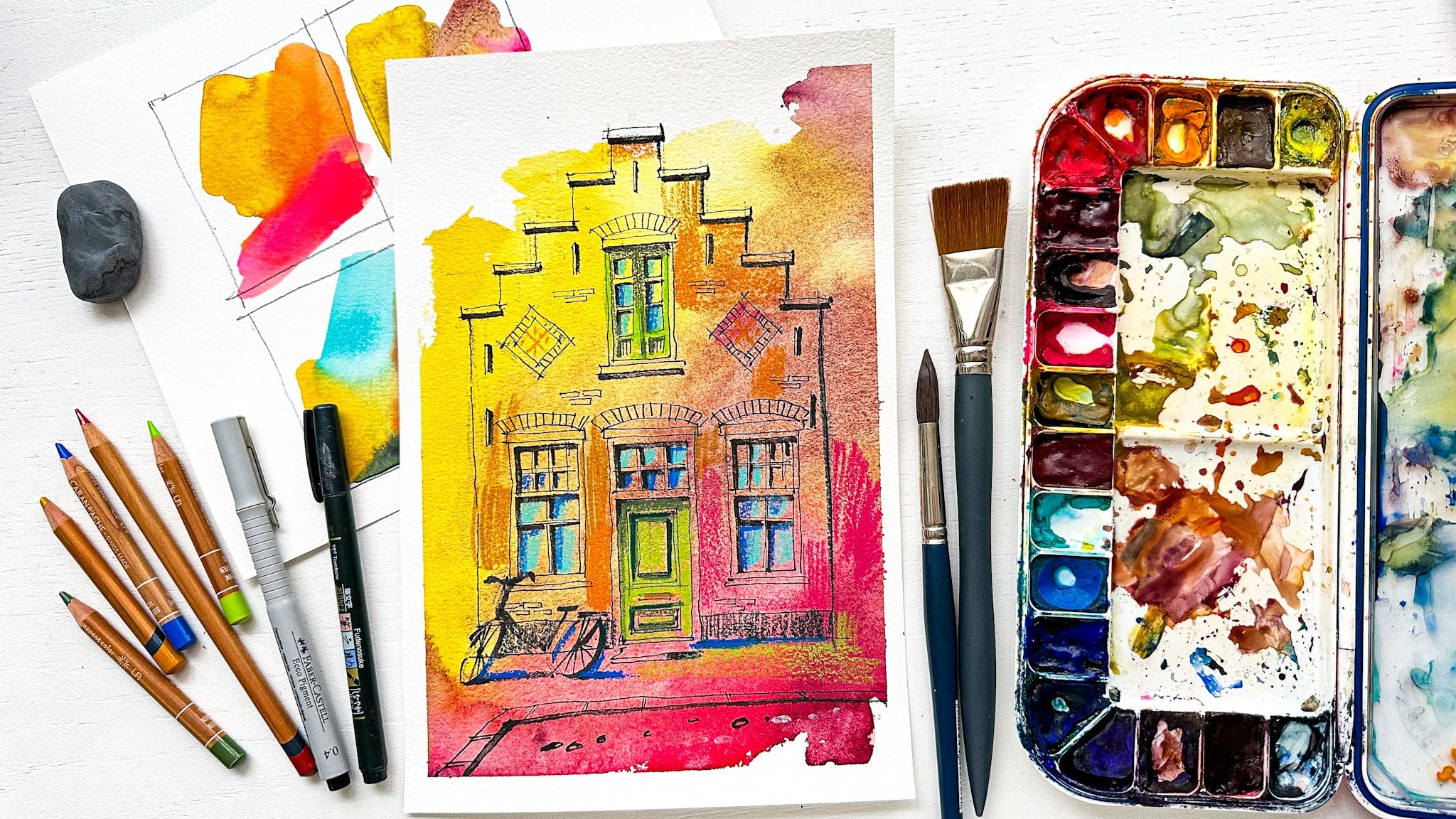
going to show you how you create this
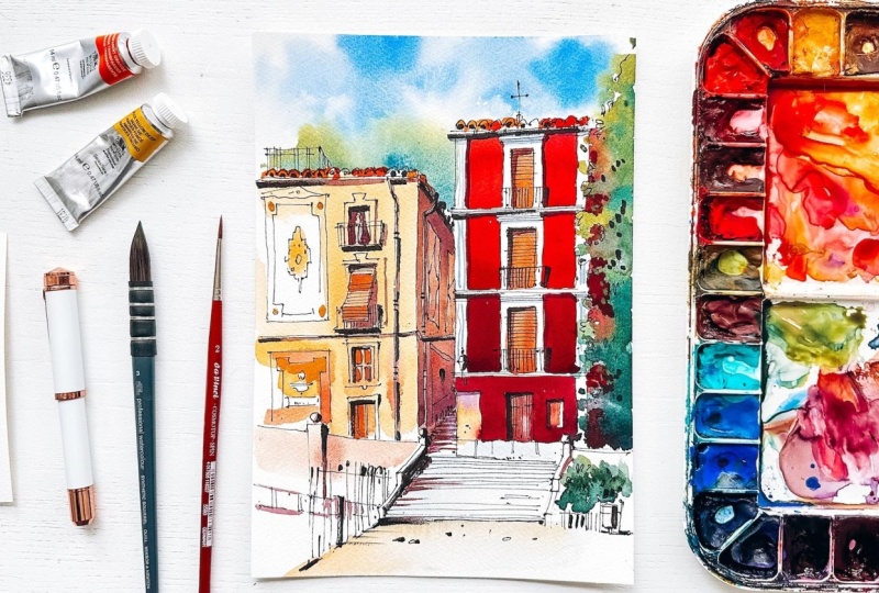
colorful urban sketch. Made it earlier this
year in Granada, right after my
sketching reread them. When I shared it online, I got a lot of questions. How did you choose the colors? Why does it feel loose
but still so controlled? How do you know when to
stop and more questions. I thought instead of answering those
questions one by one, let's turn it into a class. So this is a relaxed step by step sketching process where
we focus on strong shapes, confident lines and
playful colors. Without getting lost
in tiny details. You'll see how you
can keep control over your sketch while still working
loosely and intuitively. It's colorful, expressive, and honestly just so much fun to do. This class is best suited
for intermediate sketchers, especially if you already
sketch buildings, but want your work to feel
more lively, more intentional. Less overworked. So grab
your sketching supplies, get comfortable and let's
skege this scene together.
2. Materials: All right. Speaking
of the materials, let's take a look
at what materials do we need for this class. First of all, we will
need some paper. I'm going to use cotton paper. It should be watercolor
paper anyway, by the way, but I think it's clear because we're going to work
with watercolor, it's very important that you
paint on watercolor paper. I'm going to use cotton paper. If you don't have color paper, you can use cellulose paper. It's perfectly fine as long
as it is watercolor paper. The format is this, so something between the
A five and a four format, not very big, but perfect
for a sketch like this. Further, we will need
a graph head pencil, I need a razor, three brushes or four brushes
I'm going to use four. I will use this quill brush. It's from Winson Newton,
synthetic squirrel. It's absolutely my
favorite brushes. Actually this moment,
I have two of them. The larger one its size three, and the smallest one they
have is a size zero, but it's still quite large. I also use just a
normal round brush. It's size six. Further, we will need
a smaller brush, the smallest one, and
this is also my favorite. It's a little bit stiffer. Brush size two, perfect. We will need a fountain pen. If you have one. I have this
one from Ellington pens. If you don't have anything
like a fountain pen, you can also use
a fine liner 0.3 millimeter or 0.5 is
absolutely perfect. I wouldn't recommend to
take a thicker one or a thinner one because it's
not what we want to use here. Further, we will
need a brush pen. I have this one from
Tombo a very nice one, a little bit stiffer tip than they usually
have a shorter one. My favorite brush pen, actually, I use it all the time for
different sketches from, I don't know, markers
to watercolor. Yes, we will also need
watercolor, of course. And I'm going to use
colors like naples yellow, transparent orange,
or Windsor red, Allison Crimson, Burn
Sienna, or whatever. Many colors, I will put a list with the colors under the video
so you can find it there. If you don't have colors like that, don't
worry about that. By the way, it's for
all the materials if you don't have the materials, the same materials as I do,
don't worry about that. Use whatever you have at home. You don't need to buy anything
special for this class. Um, it's important
that you just enjoy your sketching rather than
use exactly the same colors. And of course, your
own colors will make your own sketch, your own style. Yeah, I think that's all
about the materials. Oh, of course, water
and the paper towel. This is also what we will
need for this tutorial. And that's all, so
let's get started.
3. Step 1 - Pencil Sketch (Structure & Proportions): Okay, so let's get started. I want to start with
a graphite pencil. And usually I do
just a few lines. I don't throw everything out in first place because
it's not really necessary to do
so it's much more important that we know
where our objects will be. In this case, the main
objects are two buildings, the red one and the yellow one, and this part with a staircase at the
bottom of the picture. Staircase is not as
important as the buildings, but I think it's a nice
detail to show in our sketch. Also, a nice detail
here, a quite big one, by the way, is the tree, but I don't want to
throw it very large. I will put it here,
just a suggestion of a tree somewhere
on the right side, not too much, not too present. It will be all
about the buildings here in the middle
of the picture. I'll start with the line where the buildings touch the ground
and it's somewhere here. I'm not very interested in the foreground of this picture. It's not very beautiful
or something, so I keep it much smaller than what I see
in the reference picture. And then we draw
the right building, the red one, somewhere here. As to also, I don't
care that much about, like, I don't know, the layers yet or the floors. And I see that the yellow
building is a little bit lower. It's about this difference and we need some
space between them. Maybe it's a little bit
too much space now, so let's make it a bit smaller. We now have two rectangles. Let's add the tree, and the tree will be a very suggestive shape,
like I don't know, like this, maybe I look at the branches at
the counter of the tree, but I don't follow it exactly. It's not very, very important. It's more like a suggestion, so we don't care that much
about the exact shape. Let's draw this part first. Here we have an inclined line for the railing and we
have the steps here. I think that I don't want to draw this
part in perspective really, so I don't focus on that much. I just try to see
the right angle for that and the right
angle is like that. We look actually in the picture how the vertical or the horizontal line
relates to this line. To an inclined line. Okay? So now we just draw a
suggestion of the railing, we skip the people because I think they are
not very important. Maybe they are. I
mean, if it's more, um, If we want to include people
in our sketches, we, of course, can
decide to add them. But in this case, I don't care that much
about these people. It's more like I would make digital a
bit more complicated, but we don't want it to happen, so we will keep it
very nice and easy. Here we don't see this part, but we can guess that this
ailing goes like that. Okay. And here I draw the line, the bottom line and will
be something like this. And I don't care that
much about the steps. I just throw a few lines.
It's a suggestion. It's a sketch, and
it's important to understand that when
we are sketching, we don't throw everything out. We create suggestions
of objects rather than try to draw the
exact exact shapes. Okay, one important thing
here, we have perspective. We can decide just
to draw a line here, looking at the
reference picture, but we also can decide just to pick a vanishing point
somewhere here, for example. Maybe it's not
exactly right one, but just a reference point, vanishing point that will
help us to draw this site. Usually, I use the
vanishing point that I see in the picture here, it's a little bit
difficult to find it. So we will just pick one
and and draw these lines. I choose to use a
vanishing point here because there are quite
a lot of not quite a lot of, but a few lines that are in perspective here
and it's easier to use a vanishing point rather than just guess where
the lines will go exactly. So we go back and forth to
this vanishing point to create this ornament
on the wall. And here we actually have
everything, but maybe, maybe let's Let's make
like two lines here. Okay, so we have
some steps here. And I don't know. I don't really care about
how they go, draw a few. The next thing that I want to
draw are the floors. Okay? So let's look at this, here we have the roof and
I just draw it like this. This is just for now, later, I will definitely refine it with my fountain pen, no
worries about that. One thing before we go
over to the floors, I want to draw this
little detail here. And for this, it's
also nice to have the vanishing point because it, again, helps us to draw
the perspective lines. Okay, so the floors. The floors, the one
will be here, I guess, I look at the top of
the of this building. And I see that this line is a little bit lower than
the top of the building. Okay? The next one will be, I think, let's see. I think this is more guessing than the real we can
also measure by the way, the floors and say, Okay, so this line will be here. The floors are pretty
much the same. And the last one will be
a little bit shorter. Okay, here we will
have this white part, and then the roof, of course, and let's draw here, we will have this other
white part of the ornament. I do it as pretty
much as one line, and we can do the same with The windows. And by the way, these are doors,
not the windows. So they are larger. And this one will be smaller
than the other ones. And here are some elements. This one is a bit bigger. Okay. I just threw a suggestion. Of the door. Like this and then I stop. I don't draw all
the balconies or all these beautiful ornaments are not important
at this moment. Now, let's draw this
line as we can see, this line is pretty much in
the middle of this part. This is how proportions
work very often, we don't need to to
measure everything. Sometimes we just look at the place where a
line is related to another line or
one object related to another object and
draw it like that, very very easy way
to draw things. Here we have a pipe. Let's draw that first, it's somewhere here and
then we have a windows that is somewhere here and
don't be afraid to make the windows a bit bigger
or a bit smaller. It's not very, very important. The most important thing
is that it's recognizable. We create still, we create a suggestion of the
picture or impression, not the exact very realistic picture. Here we have this door. This is a door and maybe here it makes sense to
draw this roll up blinds. Like I like this
because otherwise, maybe we will forget it. And here we have a
window and a door. And this door is looks a bit like a window because we
don't see the bottom of it. Okay? Here we have
this little fence, and it goes to this
vanishing point. Maybe not exactly. I'm not sure. But when we use this vanishing
point for more things, then it just works. But I think let's try. Let's try to do that.
By the way, it's lower. I don't know. We don't need
to draw the whole thing. Just a few. A few lines. Okay, here we have the
railing with this. I think the bows should
be a bit bigger. I made them very, very small. They were really
bigger like that. And here we have an
ornament on the wall which is maybe more complicated than that, but we will start with
just two rectangles and maybe this is not an ornament like that and
maybe here like this. We actually already
have enough here. Let's go over to the
fineliner because we already have everything we need here to go over
to the fineliner. If we add more details, then we will do just
the same work twice. We don't need to do that.
4. Step 2 - Sketching with Ink (Loose but Intentional Lines): Okay, so the fine line, I'm going to use the
FomtonPen as I said, and that's because the
fountain pen gives me the possibility to create
a more interesting line. And now I will do
actually pretty much the same work as I did
with a graph and pencil, of course, but I also
can add more details. Let's start with
I don't know why, but I usually start
with the top of the picture just because I
don't know, it feels right. But if you want to start
somewhere else, it's okay. It's not a problem at all because there is
no I don't know. From here, there is
no reason why you wouldn't start somewhere else. If it feels right for you, just start where you want. These are the details that I Oh, at here, there is a little
cross on the on the building. Let's or maybe
behind the building, I'm pretty much
sure it's behind. We can see it, and
I think it's nice. It's a nice detail. Okay, so let's draw
the this line. And here we have
a line like this. You can see that sometimes
I rotate my pen, and that's because when
I draw with this side, the line is thicker than
when I draw with this side. We actually have two
different sizes in one pen. That's very funny. Okay. You draw with a fine line
or you have only one. Okay, so here I add
some extra lines. Maybe I make the shape of the window a little bit
different or bigger, not very different, of course. I will add a railing
to the balcony here, very small small one also. I rotate my pen to draw with thin lines and add
some textures. So the larger the objects, the thicker actually the The line, but I only have two thicknesses. So I use the thicker lines for them lunar more important lines. And the thinner lines for foot textures,
for example, like here. And also here, we have a railing. And if I press harder on my pen, you can see that the range of
thicknesses is even bigger. I can also I actually have
three thicknesses here. Okay, maybe I want to
add this little lamp just to add more character.
To the building. As you see, I didn't I
forgot to mention it, but I didn't draw this
big lamp in the middle of the picture because
I think it will distract the attention from
the beautiful buildings. I can't remove it
from the photograph, but I definitely
can remove it from my For my picture,
for my own picture. So this is why drawing is
such a nice thing to do. We can just create
our own reality. And I think it's so nice. Also here. So now, it's much more detailed, but still we keep
it quite light. Like, I don't want to
draw, for example, all the details, all the beautiful curls
of the balconies. Maybe I can add, I don't know, a few like this, but I don't want to draw
everything in detail. It's so not important
in a picture like this. Okay, so let's add some
captures to the tree and here. Again, very suggestive.
It's the contour, but it's not a continuous line because we are going to
paint it and we don't need to to draw too much with a fine liner. It's actually for
the whole picture. When we paint something, we will cover some of the
parts of the with paint. So they will disappear. And, you know, why would we do all this hard
work sketching here, and then it will disappear. It's not not very
clever to do that, I think, especially when you know that the color
will be dark, for example. We just skip parts because they are not necessary
to do. I don't know. Do I want to throw
this pipe here? I don't think so. It's
not very important. Okay, so let's draw this door. And this little
whatever it is thing. I think it's just Fun. Not because it's important, but because we will create a little bit
more interest here. Okay, let's go over to the
next building, the yellow one. And here I will use
the backside of my pen because I think it's not very important detail
and I don't want to draw I don't want lines to
be very thick here, okay? As you can see, I draw these roofs in a very,
very simple way. I don't to find the
right shape or whatever. It's just, like,
creating a suggestion of the something that represents represents that object
that we want to show here. And it's very important that you understand
that sketching is not about drawing everything out, about
showing everything. Actually, it's not that at all. It's all about creating your own impression
or what you see And trying to focus
on the things that are very important for you
to show to your viewer, it's not about drawing things just because they
are here in the picture. I mean, in the
reference picture. Okay, here. We have this. Oh, it's a door, by the way, also a door, not not the window. Maybe some some ornaments here. Skip some parts. Otherwise, it will it will maybe be boring. And as you can see, sometimes
I don't draw the, like, the bottom of the balcony, and it's because I will add
it with a brush pen later. I already know that
there will be a shadow. Which is quite important. And there is also a shape of
the bottom of the balcony. But I know it will
be easier for me to add it with a brush pen. It's just, like, one
movement instead of drawing this whole The exact shape, like it's in perspective also, but I don't care that
much about that. It's it's not I don't know. I just wanted to draw
someone in the window. Okay, so what we have here? What we want to draw this pipe is maybe interesting
and I already had it here. All these ornaments and again a cretgestion,
something like that. And check, check if
the lines right. M But I also see that this part is it's
not exactly in perspective. It's just the ornament. So like, the same as the steps. So they have their
own perspective, which is quite complicated
to draw. So I don't do that. Just create a
suggestion like that. Don't bother too much
about the right shapes. Here also the same story. Sometimes I don't
finish the whole line. I just draw apart. So it's enough to make
it clear that there is a line that goes
in that direction. Here we have something
the street name, I think, and maybe a little a little I don't know what
it is a little ornament. Okay, here. Now we can
also draw shape Oh, by the way, maybe it
would be better to add it with a thinner line. And if the shape isn't right, don't worry about
that. My isn't either. Just create something
on the wall which is maybe quite recognizable
if you see the picture, Oh, it's this building, but not exactly
what we see here. It's all about the the main, the most recognizable
lines, objects, shapes. Here is a kind of little fence and
the garbage bin. I don't know,
something like that. We will add more color here, so it will be, maybe not here, but general, so it
will be right here. Keep using the banishing point. And maybe draw actually the
line for that we have here. It's the line of
the I don't know. I think it's where I
don't know, this line. There is a line that we can
draw. It's a suggestion. Sometimes it just makes sense to add some more
interest to your picture. Even if you don't know
what it exactly is, you draw a suggestion
of something. Here, we have some quinoi I
guess it's like that behind this guy maybe add some
lines to to this door. And at the bottom
of the building, I don't know, I see
something like this here. There are some
stones and he would throw the top The top of the steps. And I don't know. I
just throw some lines. Maybe skip a few here. Otherwise it will be two too much to present and just add a few textures to
the floor. Okay. Okay. I think we actually
have enough here. And let's erase
the pencil lines, and we can go over to the
most fun part painting. It
5. Step 3 - Painting with Watercolor (Color & Mood): Okay, let's start painting, and I will incline my
paper a little bit, so paint the water and
paint will flow down. It will create a better look, and I will start with
wetting my paper. Repaint from top to the bottom, and I will wet it
here like this, it's important that
your fine liner or fountain pen is completely
dry and of course, that it's waterproof ink. Otherwise, it will
be a mess right now. And now we can start
adding some blue colour to the sky and maybe you don't want to add anything blue and want to paint your sky, I don't know, whatever
color you prefer. I will just tap with the color here. I don't paint the clouds
or whatever, just just create a very abstract sky. A here and there are
some more color. We also have some
trees here and I didn't draw them on
purpose, actually, because I don't think
it's a good idea to draw the background. Like this. So here I use a thinner
brush middle size. No, yeah, it's one of
the middle size brushes, and just paint like this over the This is a bit too bright, but I think when it dries, it will be to white. So I mix I mix my yellow with
my blue ultramarine blue. And this way, I got the fresh green color
and added more blue to darken the the greenery. Okay, now I need another middle size
brush that I have here, and I will paint the rest of the greenery just
because I have already started with green colors. Let's keep using them. So again, here I I
need, by the way, a little bit more yellow here to start closer to the top. Everything is much every object is lighter than
closer to the bottom. So we start with lighter
colors and add more yellow than blue and gradually add more
and more blue color to make it darker, closer to the ground. Maybe some darker spots here. Just here and there to
create more interest. But the main or maybe it's a bit too much
darkness, by the way. However, I don't know. We will move a little bit here. Okay, and to make it even
darker at the bottom, I will add pains gray here. Paint gray, very
dark blue color. And when we mix it with yellow, it gives us a very, very beautiful dark green color. Okay. And before everything starts to to dry, I will use some
red, ism crimson, dark or red with some
purple for this part. So because I want these colors to mix a
little bit. Not too much. But here, So that we're going to have this
suggestion of colors. Look, the red colour is coming through the branches
of the tree, which is very, very nice. Maybe we move a little bit
of red here and there. But this is actually the idea. Here it's don't need it here. So we can also use more green color. Okay. That's enough. Let's call
it this corner here, and then we can go over to
the rest of the colors. It's quite a dark corner because it's in the
shadow from the railing. So we use dark colors to
make sure with paints gray, yellow, blue, paints gray, all these colors
and especially dark or closer to the bottom to create a suggestion
of a shadow. Okay. So I think that
looks very nice so far. Let's now color the
building. The red part. And I will use red
it's wins and red. And let's start with this color. Here. There is very, very
thin line here, a darker red color, but let's start painting. Here, maybe add a little
bit of ism crimson just closer to the
bottom of this part. What we're trying
to do is to create more interest here by
starting with a light color, light red tone closer
to the top and adding more dark tone closer
to the bottom. This section is a bit
darker than the first one. I added more isu crimson here. Then let's try to make it even darker by adding
pearl and violet. If you don't have a color like pearl violet, no
worries about that. You can also use a color
just add some purple. Pearline violet is
a very nice color. You can see that it's
it creates a very, very nice dark red color in combination with red. And even without red, is a very beautiful
color, by the way. And the nest port
is the darkest one. So even more pearl
and violet or purple. Try To keep it red, when you use purple, there is a chance that your color will get,
like, really purple. We don't need a
purple color here, but something between
just like dark red. That's the color
that we need here. Okay, I think that
looks very, very nice. Already. We can now
color the brown parts. I will use some orange and add a little bit of
burnt sienna to orange. So it will be a bright color. If you use only brown, then sometimes it looks
it looks just boring. And here we want to have
a nice bright color. So we need maybe a little bit of pearl in let that
we want to add here. Just to drop like this. I also want to paint
this part right away. It's not exactly that color. Let's try to add some. Purple. Now I use purple myself. I create a quite
dark color here. Maybe we move a little
bit of it here, just to create kind
of I don't know. A kind of highlight
for the interest. And here we have. This little thing on the wall. Don't paint it paint it. Entirely. I want to use yellow. This is my neighbor's yellow. And let's paint. Let's add just a little
bit of purple to create this shadow and
just a bit more interest. It's it's not exactly for the shadow because this part is not really yellow
in the picture, but I want to make it
quite bright though. Okay, for for the building for the
second building, I will use my naples yellow. I don't have that much
space anymore here. Remove this blue here. We don't need it anymore
or not that much. And we'll just grab some of this beautiful Naples
yellow and paint. Actually, let's paint the
whole the whole thing, the whole building. Oh, except maybe the parts that are lighter
than this color. Or, I painted this part on that. That's okay. Not very important. Okay, so like this, maybe So this color here. And so we don't paint the
white parts, of course, but we can color everything that is darker than our yellow,
the naples yellow. And here I don't
care that much about the colors of the ornaments. It's less important here. And here we have let's add
some of the potters pink. Well, maybe here as well. Waters pink or I don't know. Maybe we can add some orange
here as well, for this part. There was some light inside, but not that bright, so Something like that
will be all fine. Okay? Also, here we have this brown maybe here or some. And I don't know, here it will be darker
so I don't I don't want to to paint it. Now, here for the
ornament I use. Some red, don't worry about it. If some colors flow
into each other and create a little
mess, that's not. It's a good thing,
actually. Sometimes Okay, okay, okay. Now, let's paint the roofs. And they are not orange, I know, but I love I really love
bright colors in my picture. So I try to avoid too much brown colors
or brown shades. So I make my roofs orange
even if they are not. When they have born colors, I make them orange. Maybe with some red
here and there. Otherwise it will
look a bit boring, even if it's bright. Okay, so this is
good. This is good. It starts to look very
nice, very bright. And here I actually want
to paint this part. The foreground and
the foreground is the colors are also very, very fun, not very bright. So I use potters pink with
this mixture of yellow and orange, not very interesting. But a bit more interesting
than I see in the picture, maybe some spots of dark color. This part is Color. There is some kind of I don't
know bluish color in it. This is green. I really
want to add more. Yeah, that's better color. But it's too much here. Here, I want to have some cooler color in contrast to the bright, warm colors of the
of the buildings, and maybe just a touch of
a warmer color here on the ground like this to connect the colors
to each other. Okay. Okay, okay. Okay. So let's
start adding shadows. And shadows, we can
they should be, of course, quite dark, but not too dark here. We don't want very, very dark shadows here. So the shadows that I will
add here are on the roofs, for example, here on the wall. Let's start with that, actually. So I will put some color
here and add some purple. To create the shadow. So it's it's my yellow color
with a touch of orange. Not too dark. But I will add some purple
here and there. It's too much. Purple is very intense
color, which is nice, but sometimes you get too
much of it just by accident. Too much purple is
not a very good idea here because it's not purple. And here just a
little bit more on the steps maybe at some brown, some burn sienna or the steps like this. We can use the same color like
burnt sienna with purple. By the way, I need a
thinner brush now. I want to add some I
need a little bit of orange to add The shadows to the doors here. You can see that they
start to pop right away. So beautiful. Shadows are so important. They are so important. Here we also can add a little
bit just to make it more. Prominent. Here we also have a shadow, and this is the color
of the door as well. Well not the door,
but what we see here. But here, we have I
guess a shadow here, maybe some on the wall from some elements like
the pipe, the balconies. Here a little bit of Bnciana again
too much purple. Okay, we need to Okay. Beautiful color,
but not too much. Maybe some some shadow
here and there. More than we had before. Um. And I would want to add um Oh, I painted over this thing, okay? Not very important. I want to add some
finishing touches to the watercolor
finishing touch here. If I see some spots
that I think oh, they can use a bit more a bit more color or
a bit more definition. Yeah, I want to I
wanted to paint this The background here, there is a person standing on the balcony like this, maybe. And I want to add also add some shadows here, for example, from the ornaments. Because these are painted, they don't have ana. Depth. But here we
have some depth. There is some difference
between the ornaments are. They have some thickness. So it's important to show that. Here we can also add
maybe just a few dots. Okay. And then for
the things like that, here we have some So shadow. I use paints gray mixed
with a little bit of ultramin blue to
create a shadow under some parts where
we see a shadow. Um, And here we have this three lines. I don't want to I don't
want to paint all of them, all three of them, but something
like this. I don't know. Is it a good idea? Maybe not, but I have already started
maybe however it's there. Otherwise, it's too empty. And if you're worried about how straight your lines
are, look at this. They are not straight at all, and I don't worry
about that because it creates an interesting look. I think.
6. Step 4 - Finishing Touches: Okay, so the finishing touch. I'm going to use a brush
pen here in this part. But before we can do that, I think this part of the
building is a little bit too light for the shadow. So watercolor dries light. And in this case, I think it's a little bit too light for what
I wanted to achieve here. Shadows are usually
quite dark and especially comparing to
this part of the building, I think we really need to
make it a little bit darker. Maybe your shadow is
already dark enough, then stay away from it. But if it's too light as mine, then I would suggest adding
a little bit more color. Okay, so how can we do that? Just apply another layer. It's very important that the
paper is completely dry. So it won't become a big mess. And now we can we can make it darker. And I will use the same mixture of Burnsiena and purple, but a little bit. A bit darker tone of it. Okay, so maybe Oh, that's too much purple, maybe, however, for this part. I guess it's okay. A here and I now can make
it even more interesting. As you can see, I
skipped the pipe. I don't paint the
whole surface at once. Now, this time, I will try
to keep some parts lighter. There will be this sense
of the decoration element. Or the ornament on
the wall, actually. And also here, I don't know, maybe some red or
something like that. We can play a little bit
around here with what we see at different colors to our to make sure to make it even more
interesting, like this. I think the The decoration is a bit weird now, so we can add it's too light
for what we see there, so we can make it a
bit less present, maybe even even less. Otherwise, it looks it
doesn't look right like this. Okay, so I think we are almost ready to go
over to the brush pan. But first, I want to add some
extra extra shadows here. And now let's go over to the brush pan. So very carefully
because this part is still wet, let's see, I would add some darker
parts here, for example, to create a little bit
more contrast also here, Not everywhere, but just a
few thicker, thicker dots. Here a thicker, darker
line could be a good idea. To emphasize the shadow maybe here and it
is already dark, but we can make it even more even more interesting,
even darker. And sometimes we can
also refine the shape of something like for example, as I said, we can add
shadows to the balconies. Here I want to add a
thicker, darker shadow. Let's make the pipe a bit
a bit more interesting. Because we already have this first layer with
watercolor with darker paint, it looks more interesting than
if you use only brush pen. However, sometimes I do
that too when I don't have that much time
to finish my artwork, I skip this part with
adding darker shadows. With watercolor shadows, I mean, and then I just add
them with a brush pen. That's also an option. Okay, here we have this fence, which is let me let me see, maybe some So more
darkness here. And I don't know.
Kind of decoration. So textures on the tree. It's not really
signs or something. I can't really tell you where
to add all these shadows. However, yeah, the
shadows are shadows, so you add them where they are. But you don't need to
add them everywhere. I mean, not every detail
has to have a shadow. With a brush pen, sometimes you can leave it like just a dark, what I call a shadow. Okay. Or lamp. And I think we're
actually done here. There is maybe here we can
add a darker, thicker shadow. But for the rest, it looks very good to me, so I would say, let's keep it light and
not too overworked. And here we are with our beautiful sketch very
loose and very colorful.
7. Final Thoughts: And that's it. I really hope you enjoyed sketching
this scene with me. I hope this class show you
that you don't need to overthink every line or detail to create a strong
lively urban sketch. A few clear choices,
some playful colors, and trust in the process can
already take you a long way. If your sketch doesn't look exactly like mine,
that's perfect. It means you already finding
your own way of working. I'd love to see
what you created, feel free to share your sketch
in the class project or on social media and tag me at
Julia Underscore handsome. I always enjoy seeing
how the same reference turns into so many
different interpretations, and if you'd like to
continue sketching with me, you can find more classes
on this platform, and you are also very
welcome to check out my brain Brusss community on my YouTube
Channel or my blog, all linked below this video. Thank you so much for
drawing along with me. And most of all, keep sketching. Keep it playful and don't
forget to enjoy the process. Have you sketching, my friends.
 Julia Henze, Artist | Teacher | Urban Sketching Lover