Transcripts
1. Introduction: Hi, my name is Eva, and I'm an illustrator and embroidery artist in love
with all things nature. I like to explore
organic shapes and transform them into abstract
patterns and compositions. Forest is one of my biggest
sources of inspiration. There is something
magical in the woods. Tall, majestic trees
forced us to slow down and let go of
distractions of everyday life. Observing sunlight filtering
through the leaves, breathing in the fresh air, and listening to the
branches whispering in the wind allows us to immerse
in the beauty of nature, the stress, and clear our minds. In Japanese culture, this
meditative practice of connecting with nature is
called forest bathing. It is started to be crucial
for our well-being. Living in a big city
means that I rarely have a chance to experience
nature in all its glowing. However, I can still
get the benefits of it by exploring it in my art. It's substitute, of course. But when you get into
the flow of creating, you can experience a similar
sense of glaze and joy. When I'm stuck in
my tiny apartment, I take out our supplies and
escape into the woods in my imagination by creating
playful and relaxing artworks. That's precisely what we
are going to do today with the mixed media projects
inspired by the forest. In this class, we will
look at the forest in a more abstract way by focusing
on the overall shapes, colors, and textures
of the tree crowns, rather than on individual trees. First, I will guide
you through creating an abstract watercolor base
for your illustrations. Then I will show you two
different techniques for adding leafy doodles to
your prepared backgrounds. We will experiment
with loose patterns to achieve a delicate,
hazy summer effects. Later on, we will focus
on building layers of dense greenery to create an illusion of a dark,
mysterious forests. Whichever technique you choose, both exercises will allow
you to relax and unwind, even in the middle of
a concrete jungle. Grab your art supplies and
let's escape into the woods.
2. Class Project: Your project for today
will be to create a magical forest illustration using one of the techniques
you'll learn in the class. The first exercise will be great for you if you don't have much time on your hands or
you prefer loose messy link. Choose the second
one if you love details and you
have patience for creating intricate
compositions or if you want to challenge
yourself a little. Know that you don't
have to commit to preparing a full-size
illustration. You can also create
smaller versions to test out these techniques
and see if you enjoy them. Also remember that
you can customize these exercises to
your skills and needs. Feel free to use
different patterns, colors, and even
different mediums. You can make your
forest blue or violet, you can add details
with metallic pens, you can create an
abstract layer in procreate and doodle
on your iPad, or prepare a traditional
paper collage and throw your patterns on it. You really don't have to
copy what I'm doing to a T, I'm only giving you
some ideas which hopefully will spark
your imagination. When you're ready, take
a photo of your artwork, then go to the ''Projects
and Resources'' tab. Click the ''Create Project''
button and upload it. You can share what
you have learned and encourage others
to give it a try.
3. Supplies: Let's go over the supplies
you will need for this class. To create a background
for your illustration, you will need some watercolors. I will be using blue, green, and yellow hues for a
lush summer forest, but feel free to choose your
own color palette here. We will be preparing an abstract wash full
of random blobs. So I'd recommend you use a
big round brush for this. I have Number 12 here, but you can choose even
bigger one like Number 20. You will also need a pallet, a water jar, and
some paper towels. As for paper, make sure it is
at least £140 or 300 grams, so it can handle a lot of water. I'll be using even heavier
acrylic paper in this class, but a standard
watercolor one will do. When choosing your paper, also take notice of the surface. A smooth hot pressed paper
will be best for this project, as we'll be using gel pens and ink pens to embellish
the background. It will be much harder to do
if the paper is too grainy. Speaking of pens, for
the first exercise, we will be using
a white gel pen. This uni-ball Signo is
currently my favorite. For the second exercise, you are going to need
some black ink pens. I will be using my trusty
micron Number 5 for line work, and micron Number
10 for filling in the smaller spaces
between the elements. You will also see me using a
thicker black tumble marker, but it's not necessary to have unless you want to really
speed up the process. If you're feeling extravagant, you can also add some
metallic details to your composition. That's it. So let's jump into painting our backgrounds
with watercolors.
4. Painting: Watercolor Background: In this class, we will be looking
at the forest in a different, more abstract way. Instead of painting individual
tree trunks and branches, we will focus on masses of
greenery as seen from afar. Take notice of
different shapes and sizes of leaves in this footage. Look how different areas
blend into each other. Forget, these are three
crowns for a moment. Just let your eyes relax and that is the blocks of
color and texture. We will try to emulate this effortlessly and recreate
the overall feel of a lush forest by
building layers of simple leafy patterns upon
a watercolor background. The first step is to create an abstract color base for
the entire illustration. The key here is to paint a
background interesting enough, with many blobs in different
shapes and colors. Ideally, you want your blobs
to match with each other, so you should work
pretty quickly adding subsequent layers while
the paper is still wet. Try not to overthink it. I rely a lot on happy
accidents here. Believe me, I have no idea how this background
will turn out, while I'm painting it. It's a really enjoyable
process because it's impossible to mess it up no
matter how hard you try. The bottom line is, even if you are not happy
with a particular area, the whole background will be covered with patterns later on. You can mask any issues then, so don't be too
precious about it. You just start slapping paint on paper like a kindergartner
and enjoy the fun. Clearly, I am doing just that. As you might notice, the paper is
buckling like crazy. The paint is pulling
on the sides. What I'm doing here would give every watercolor
master a heart attack. Technically, you should
use masking tape to tape down the paper to a flat surface before you start painting, especially if you
plan to use a lot of water and cover most of
the page with paint. It's a very basic and
very important rule of watercolor painting. If you want to have
any control over what you're doing and how
the paint is behaving, you should stick to it. But that's just it. In this case, I don't
need any control. I won't random things to happen, and even if I end up
with some ugly leaks, or weird blobs, they will disappear under the
patterns in the end. Also, I don't want any white borders in
these illustrations. I want the paper to
be fully covered. That's another reason why I'm
not using the masking tape. Of course, you can use it and trim down the
borders afterwards. Or maybe you love your borders and you want them to
frame your artwork. It's totally up to you. The paper will flatten after it dries and if it's
still slightly curved, I can press it down with some books and live
it for a while. That's not an issue for me. One more thing you
need to take into consideration is
your color palette. If you're about to use a white gel pen for
your illustration, watercolor layer
needs to be dark enough so the patterns can
stand out from the background. On the other hand, if you
want to use black pens, your background should
be fairly light. Otherwise, the
patterns will blend in and won't be clearly visible. I've created two
backgrounds here and we will be
exploring both options. In the next lesson, we will cover our
dark background with white patterns
to create delicate, abstract, hazy summer forest.
5. Doodling: Hazy Summer Forest: Now that we have our dark background ready, we will start adding
white patterns to it to emulate
masses of greenery. This is the part I love the most because you
can just go with the flow and let these messy and chaotic background
shapes guide you. There is no right way
to do this exercise, which outcome will be unique? So you can just focus
on filling areas with chosen patterns and unwind doing this calming and
meditative practice. I'm starting with a
simple pattern just outlining some
basic leafy shapes. I draw them at different
angles so they fit together nicely and create an
illusion of a tree crown. During this class, I will
show you some ideas for leafy patterns but you don't
have to stick to them. If you like geometric shapes, you can draw a bunch
of tiny triangles and achieve a similar effect. If you have your favorite
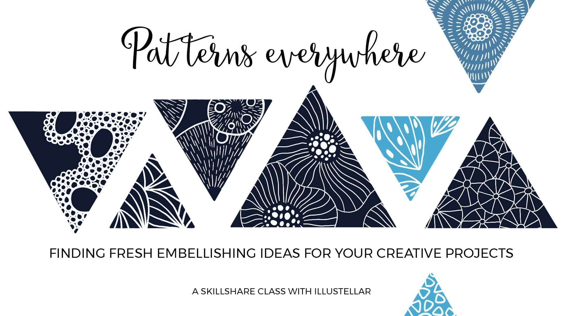
motifs, go for them. On the other hand, if you need some more inspiration
for creating patterns, I encourage you to take my
class patterns everywhere, finding fresh embellishing
ideas for your projects. Now I'm jumping to
another blobby area and I repeat the same pattern, but this time I'm filling the outlines with
solid white color. This simple addition completely changes the look and feel of a pattern and allows for a nice contrast between the
two neighboring tree crowns. For this third pattern, I'm drawing clusters of
dots in different sizes, and afterwards, I will also add some loose
dots between them. When creating such
a busy composition, try to differentiate
neighboring patterns, otherwise, it will all look
just too flat and dull. Juxtapose outlines
with solid shapes and bigger elements
with smaller ones and use at least several
different patterns in one illustration to
add interest to it. During such creative practice, you can light a
forest-centered candle or listen to the nature
of sounds on YouTube. The more senses are involved, the more pleasing and
deeper the experience. It's worth going the extra mile and doing little
stuff like that, so we can truly unwind and turn your drawing session
into self-care time. Now I'm going to fill
this whole strip of lighter green paint with tiny shapes that look
like butterfly wings. These minuscule elements will be contrasting nicely with
bigger leaves below them. Of course, you didn't
have to stick to the borders of your
blobs exactly. Nothing terrible will happen if you go outside these areas. Sometimes you might
even want to do it so the overall shape of the
tree crown looks nicer. But in case you want
to stick to them, you can start with
marking the border of the whole area with the elements
of your chosen pattern, and then fill in the
rest of the blob. Even if you get lost
in thoughts and spaced out during your practice, you will have more precise
boundaries to stick to. Now I'm filling this area
with tiny butterflies. I even go down between spaces of the previous pattern so they blend with each other and create an effect of chaotic
mass of greenery. As before, I'm rotating
the elements so they face up and
down and sideways. This makes the pattern look
more messy and organic. Notice that in this technique, the elements of each pattern
are not touching each other and subsequent layers of patterns are also separate. This is a deliberate choice
on my part because I want to create an illusion
of hazy clouds of greenery, leaving some breathing room
between elements and using white color mixed from aery
and delicate composition. Now I will repeat the second pattern to make the
composition more cohesive. After all, in a mixed forest, different types of
trees grow next to each other and they
repeat quite often. So don't hesitate to do that. Again, I'm making these
leaves bigger so they don't blend too much with the tiny butterflies below them. It just makes the
whole arrangement more pleasing to the eye. In This next layer, I'm combining the first
and second patterns. Some of the leaves will be just outlined and some will be
filled with a solid color. This blob was not
distinctive enough, so I just established
borders myself. I left this little pocket
of free space in the middle for another pattern to make
it even more interesting. When adding subsequent layers, remember that the drop and
marks need a moment to dry. Be mindful of the direction
in which your hand is moving so we won't smudge the freshly
drawn shapes by accident. When the border of your
blob is as sharp as here, you clearly see
the area to fill, and you don't have to
mark it in any way. Here I'm combining lots
of these whole flowers and I'm rotating them so they
fit together like a puzzle. If there is a space left between the elements
that I don't like, I fill it with
similar-looking but smaller shapes or parts of them. I'm filling the last layer with
some wavy snakes consisting of little dashes going in different directions. This is an easy way
to quickly cover a bigger space and create the illusion of large
masses of greenery. I will finish this
off with a bunch of tiny dots at the
top, and that's it. In the next lesson, we will dive into building leafy patterns using
a black pen and try a different technique to create an abstract forest illustration in a completely different mode.
6. Doodling: Mysterious Dark Wood: In the previous lesson, we've avoided placing
pattern elements too close to each other. In this lesson, we will
do exactly the opposite. Not only will most
elements be touching, but we will also fill any of the spaces between
them with black ink. This will allow us to
create an incredibly lush, dense, mysterious
with illustration. I'm dwindling a bunch
of elongated leaves here using micron
pen number five. They are not touching
but they are placed really close
to each other. Now, I'm switching to
micron pen number 10 to fill all these spaces
between them with black ink. I find this step incredibly satisfying and also
meditative because your only task for a
little while is to get to all those nooks and
crannies with your pen. You can focus on the
shapes of your leaves and observe the ink
flowing onto the page. I'm finishing this
part by drawing a thick black outline around the entire leafy
cluster so later on, it will stand out from
the layer above it. For my second layer, I have chosen similar leaves, but they are even more elongated and thinner
with sharper tips. I'm putting them
together in the sets of two or three leaves
converging at one end. I will fill any
bigger spaces between such clusters with
smaller singular leaves. I try to stick to this
line more or less, and I fill all the
gaps with leaves so the pattern is really
dense and interesting. If at any point you realize
that layer looks too flat and boring because of how the watercolor
blob turned out, feel free to draw outside this imaginary line to make the outline of the whole
cluster more irregular. These watercolor shapes
are here to guide you, but not to constrict you. Again, I'm switching
to micron number 10 to fill the gaps with ink. If I notice too much free space between some elements during the filling process and I see I could squeeze
another leaf there, I don't hesitate to do
it so the pattern looks well-balanced and there are no unnecessary big
black gaps in the end. I'm adding elements to such
space intuitively as I go. I think this is actually a
much better way to work. If I try to plan
every single leaf, it would be much harder
for me to find a way among the chaotic lines to see which
spaces to fill with black. Again, I'm outlining
the whole cluster with a thick black line to create a border between this
layer and the next. On a side note, don't worry if you
accidentally fill the leaf instead of
the space next to it. After you finish
the illustration will be so intricate and busy that no one will notice
such minor mistakes anyway. I specifically designed
these exercises to help you relax, unwind and get into
the state of flow. However, if you do
not have patience for such details and you are
in here for quick results, the first technique will be
much better suited for you, and you can try it out
with a black pen as well. Of course, you could speed up this process by drawing
much bigger leaves. However, the results will be very different and it will be harder to achieve
this illusion of dense greenery we're
going for here. The other thing you
can do is to use a much smaller piece of
paper for this exercise. The patterns will
have to be smaller as well and even more intricate, but overall surface to cover
will be less overwhelming. Now, let's take a break from
tiny details and create a layer that will be nicely contrasting with
the previous ones. I'm going for a micron number 10 here straightaway
because there will be a few spaces to fill afterwards and the elements are big
enough to allow that. We will draw a
pattern consisting of slightly bigger leaves that will be superimposed on one another. As you can see, I'm
not sticking to the shape of the
paint blob exactly, and I will even stretch this
layer to the left to create a buffer between
the bottom layers and the one I'm
planning on next. Now, after creating a layer of big leaves without much
black between them, I will play around
and make a layer containing a lot of
black for a change. I'm drawing a bunch of
smaller scattered elements, leaving quite a lot of
space between them. It's a similar pattern
to the one we've created in the first exercise, but here we will add a
black background to it. I went ahead and started filling spaces with a lot of black ink. To speed up this process, I switched to Tombow
marker number 15. It's pretty thick, so it covers the spaces
fairly quickly. This amount of black
provides a great contrast for the layer below and
makes both of them pop. Occasionally, I add smaller
leaves between spaces, but generally I keep this pattern pretty
loose and scattered. Now, let's start
with the new layer. I will be filling this
nice cloudy blob with teardrop shapes connected
in sets of three, four, or even five so they look a little
like chestnuts leaves. I will also incorporate these tiny butterfly wings to
fill the whole area nicely. We've worked with similar
patterns in the first exercise, but here I will allow them to touch and I
will differentiate the size of the elements even more so they all fit
together like a puzzle. I'm squeezing single
leaf elements into these tiny spaces
that are left just to minimize the amount of black
backgrounds I will be adding later on because there is so much of it in
the layer below. The spaces here are
so tiny that I'm just using Micron number
five to fill them. Now, I'm repeating these
big leaves to create a contrast with the incredibly busy and intricate layer below. It will give the
whole composition a little breathing room. Now, I will try to
add some interest to the illustration with
these new oval shapes. Notice that I'm
filling the spaces between them with black
right away as I go. It's easier to do with
circles and ovals when you naturally build the layer by
gluing elements together. Now, I'm embellishing
these ovals with vertical stripes for fun. I decided to repeat the
chestnut and butterflies pattern to finish off the top
layer of the illustration. To add a little bit more
interest in the end, I will fill this last area with circles and ovals
in different sizes, and filling the spaces
between them for a strong black
accent on the top. That's it. Our dark
mysterious forest is ready.
7. Final Thoughts: Thank you so much for
joining me today. I hope you feel
relaxed and inspired, and you will create
your own magical forest with a little bit of
watercolors and some doodling. Remember that you can
dive into this exercises by creating tiny versions
of the illustrations. It's a great way to incorporate art practice into
your daily routine, even if you don't
have a lot of time. If you're curious about the strategy and
you want to learn more tips and tricks
that would allow you to create on
a regular basis, checkout my class called
Pocket-Sized Creativity. Make time for art
despite a busy schedule. If you love doodling and you crave more nature-inspired
exercises, you might enjoy slow drawing, slow living, get in the
flow with ocean doodles. As always, I would love to
see what you will create. Please don't forget to share your project into the
project's gallery. If you enjoy this class, I would appreciate it if
you'd leave me a review. If you want to stay tuned
for my next classes, follow me here on Skillshare. Happy creating, and
see you next time.
 Ewa Rosa, illustellar | Find Bliss in Making Art