Transcripts
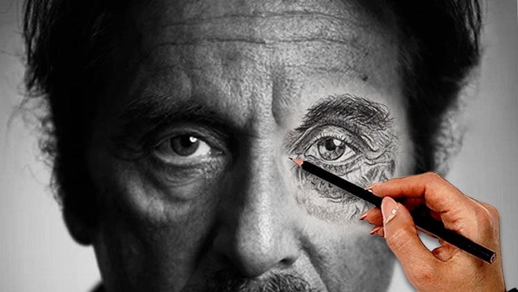
1. Ultimate Beginner to Advanced Pencil Drawing and Shading: Hello and welcome to the
ultimate pencil drawing, and shading from beginner
to advanced level course. My name is Ava Moradi, and in this course you will learn important
pencil techniques, starting with an introduction
style lesson that will teach you about pencil
pressure, value and gradient. You will begin practicing
the techniques you have learned by applying them
until you still live objects, then we will learn how to create different textures with pencil. Once you have learned
the fundamentals, you will then move on to facial features, and
portrait drawing. Let's learn how to observe
the facial shapes of different portraits to make sure your work look realistic, then we will go through
pencil measuring techniques and learn all the
tips and hacks. These methods will boost your life drawing skills in order to draw without
guidance tools. You will learn how to draw
and shade different eyes, how to draw it freehand style, and how to shade with different hyper-realistic
shading techniques. Then we will move on to do's, and don't s and how
to avoid mistakes in pencil drawing and what
is a good practice. I will also teach you
different ear styles, how to apply realistic
hatching techniques. You will have free access
to outlines of drives, and further assignments
in your project. You will also learn how
to draw beginner to advanced portraits from all
masters start to celebrities. These materials will
teach you how to shade freehand
advanced portraits. [MUSIC] This course is for everyone, art lovers, students, and anyone who is
interested in drawing. Come and join us,
and learn more about pencil drawing from
beginner to advanced level. [MUSIC]
2. Learn the Basics of Pencil Drawing: Welcome to this
ultimate pencil drawing and shading from beginner to advanced level course
and I'm really excited to go through this
art journey together. The most important factor of a pencil drawing course
is using right pencil. You don't need a lot of
materials for this course, but only one or maybe two could be enough for
everything you will learn throughout
this course so make sure you understand
you don't have to buy a lot of materials. We have different HB pencils
and how to use them will determine the art exercise of
creating a pencil gradient. Practicing this lesson
is very important as this practice will reflect
on all your artworks, either here or when you
are doing other courses. As you can see on my hand, each pencil has a
certain hardness. We're going to go
through each one of them and then start doing it. Have a look at my
hand movements. As I was mentioning,
each pencil has been made from graphite and
it's combined with clay. This is why it has a
hardcore or a softcore. H they have a lot of clay, B they have much less clay. I can just say what is
the hardest pencil grade. The hardest pencil
grade is actually 10H. We are using a 2H
pencil right now. If you refer to the table
of the graphite layer, you have to say how much
percentage each have, so it's 38 percent graphite
and 56 percent clay. We don't need to
know these things, maybe not even fun fact, but good facts to know when
we start a pencil course. As I mentioned, we are
using a 2H pencil. We are having four squares here, starting with 2H, we also have 3H, 4H, 5H, and that determine its hardness. When it goes much higher, it's harder and it's really
difficult to work with. They don't have enough
power for your drawings. Also, for this course, make sure your pencil are
always sharp before starting because we are going for a very realistic drawing course, and everything we do
it's a little different from my other course
that's been uploaded, which is the color course. The other one, we had lots of whiteness of the graininess of the paper stay on our
model when we're drawing, however on this one no. Have a look what we are doing. Actually, we are going from
really dark, to hard ones. This is a great
practice for you. As you can see, the first part that we could draw
and we draw here, t This is the hardest
one that we are putting a lot of pressure. The first square that you saw, this is the most
pressure we could add on to our HB pencil, and it won't give us
more color than that. If you put on more pressure, it will leave pencil
traces on your paper or even tear up some
parts of this paper, so make sure you're careful. This pencil is very hard, so it moves harder on
your paper as well. Doing a second layer as you
saw on our paper before moving on since we are
studying with the F pencil. If you are talking about F or H, they're not that different. You will see the
hardness right now. Have a look how
it's going to go. This is also a hard pencil, but it's easier to use it
comparing to H pencils. We are having a lot of
pencil pressure and good stable hand
movement and this is the ultimate color we
can get from F pencil. You can see adding a few
more layers again from different direction won't
change the lightness of this, but it's much darker
than the previous one. Still giving a lot
of pressure here. You have to make
sure you don't leave pencil traces on
your paper surface. It is very important
then gradually, smoothly from the
very beginning, from the edges you
start drawing, going back and forth. Look at my hand movement, how I go back and forth and how different layers I'm adding. That is the important part. This is also a great
shading practice. Make sure you practice
this hand movement and how we use sharp pencils
and shape these boxes. It's going to read help you with the future models
we're working on. Now, slowly from the
other direction, we're going to make
sure that we are happy with all the pencil
traces because I don't want to see anything leftover or any whiteness of the
paper to be left out, so make sure you go around. No shaky lines. The very fast outline, the main outline
it's very important. I can see a lot of my students, they care about like how
they shade inside but they neglect the main outlines, and some of the outlines
are very shaky. So make sure that you take
care of all the main outlines. It will make your drawing more sophisticated,
more professional. You can see this is
almost a third layer I'm going through it and
then a fourth layer. Keep going around. Make sure the surface
is done perfectly. The reason I'm showing you
this with a real-time speed is because I need you to
know that I'm not pacing up, I'm not going faster than this. We need to be more
relaxed, having fun, and then take our time while
drawing is very important. Again, make sure
you don't leave any obvious line-drawing
behind smooth and then very smoothly
fade the color together. Now later, for all four squares, I'm going to do a gradient bar. You can see from the
darkest version of our pencil right now
to the light version. This is a great practice for your hand pressure and pencil movement but
mainly hand pressure. Look how we are going. I expect the same from you because you need
to practice this. I'm doing one gradient bar, I would expect you to do, for instance, 5-10.
Keep practicing. Make sure you understand
from the very first outline. The beginning of the outline is darker, always near deadlines, they're darker and
then you go away, becomes lighter and yes I
believe, that's would be. The next pencil we're
going to use is HB pencil. This is the most normal pencil that we can have. We use it even in daily life either when
it comes to writing, drawing, doing some small notes. For everything, we can't
use it, not just drawings. Is a brilliant pencil
and it's great for the first sketch of
every drawing that we do. For instance, if
you've started doing, let's say any outline, I would start with HB. HB can really help me to come up with subtle line drawings, so keep using it. However, as you can see, this is the darkest you can get, so for the absolute dark areas, you cannot use it. For initial pencil drawing
is a brilliant color. I can't say this
pencil or HB pencil is not too soft nor
too harsh or hard. Please pay attention to the shading technique
that I'm doing and how my hands should be
moved on a white paper. The first pencil layer is very important and then now
this is few layers after. They're still more important, but if you layout the very
first layer correctly, the rest would be
much easier to do rather than keep correcting
the first layer. This will determine your work will look realistic or not, so it is very
important to do it. Now, you can see we have started bringing the most
pressure on the pencil, creating few layers; second, first, and fourth. Now I've lost count because when it comes to
realistic drawings, you have to keep adding guys. Don't think it's
only two layers. Two layers will not create a realistic feeling so you
have to keep doing it. If this practice is easy for some of you
and I understand, obviously you can skip through these parts and go to
the more advanced lessons. We do have a lot of advanced lessons that we're
going to go through. Freehand drawing of
portrait and even shaded in a very hyper-realistic style when it comes to the
end of the course. But I still suggest it is very important
to practice these, even if you know it
warm-up your hand. Make sure that you're happy with your
hands being warm-up, how you do sport, even your professional
football player, at least you have to
warm up your body before actually start playing in
the field, this is the same. I suggest you do practice this. Look at the gradient bar of the HB pencil and compare
it with the previous two. I know I keep cleaning
around and go and make sure that everything's done properly, I want you to, from now on, get this cleaned
for your papers and make sure the darkness of the pencil they don't go around and just stay stick
on your paper. You can see how
sharp the pencil is. I've even mentioned
it on the screen to make sure that you understand, the sharp it is, the more hyper it gets to
your drawing, of course. Slowly start going
through our first layer. The hand movement
is very important. You can do this with
either 6B or HB pencils. Continuing, whenever the
pencil degree goes higher, such as this pencil, when you try to bring the darkest color
from this pencil, the shinier the surface you get. The shininess of the
result is because of the graphite exists
in this pencil. Pencil B collection have
more graphite than clay. We won't see any shininess
in H collection, but they're as I mentioned, very hard to work with. Continuing, this is the
darkest color I can get from 6B pencil without damaging
the texture of the paper. Now continuing for the rest of the layers. Really try to show this
in real-time for you. Even though some lessons
might get really long, I understand you can
always pause in between or continue a lesson
in the next sitting. However, as an instructor, I'd really try to not speed up too much
to be honest with you. During my courses and
also the future courses coming up because we do have other courses like
different way, different techniques
of pencil courses or digital watercolor, all those mediums that
they are coming up, I'd really prefer not to
speed up the process for you. Even though it gets long, I understand it is
hard for someone in this day and age to
sit down for so long, like one hours, two hours watch and
practice at the same time and of course you need to
pause and follow along. But I'm really trying not
to speed up so you can follow along following
my hand movements. That's one of the things
I'm really trying to achieve with you my dears. Hopefully you don't mind
the long lessons because as an instructor I want
you to get the best out of the course
you actually buy. You need to get the
best results out of it, so real speed is one of them. As we're going through the
gradient bar of our 6B, just bear in mind even the darkest color
of HB pencil such as HB won't give us
ultimate black color. No graphite pencil that create dark areas but only with charcoal you can get
the absolute black. You just saw on the screen that what kind of
eraser that we have. One of the erasers
that I have in hand is called kneaded eraser. Even though the box
is really hard, I'm really struggling to open it for you However, let's have a look how they are. What brand you buy this from? Any brand would be okay, except the one tip, always go for the
gray color version and they have for some
reason the best quality. This came with experience, even though I use other colors, It's okay if you
have for instance the yellow ones or
the other colors, but for some reason
the gray ones, they have the best
qualities that give you the best results. Just a tip that not
so many people know. Don't comprise the whole pack. Just tear up a little part from the pack that
I just showed you, wrap it up again and
put it back in the box. In this way you will be
able to use this for a really long time
without a need to spend more money
and buy it again. The kneaded eraser
are very soft, and see how it can be
stretched and compressed. When the eraser gets
dirty after being used, you can stretch
it and turn it to the cleaner side and
keep using it like that. Keep practicing like this and try it on your
paper as I just did. One of the most amazing
thing about kneaded eraser is that you can mold them into any shape that you
can see which is great for detailing work
such as our portrait, skin textures,
hair drawing, etc. and after making it to
the shape that you need, this is how you can use it making it sharp or
tapping it to the paper. This is called a mono
eraser, the round one. Let's have a look
at how it works. I know you might be familiar, especially for my
existing students that have taken my other courses
but this is the refill. Let's see how it works
for my new students. If you know it, please
go forward and it'll move to this lesson I mean. However, I just want you
to see how it works. It is an excellent tool for hair drawing and
absolute delight. You can use it and
create highlights, perfect highlights
for eyelashes, eyebrows, certain like wrinkles. Also the main
important part would be the main hair drawing. The way how we hold it and
also how it's been used, I'm showing it to you, the do's and don'ts of
the correct way. The difference between this and the kneaded eraser and
not a good point for the kneaded eraser it won't
create scraps from it. That's good. You can
use cutter or knife and go through with it and
cut the T part of it. Let's see what else you can use. You can use also sand block. If you're afraid of
knives or cutter, use sand block and
see how I'm circling around onto the
sand block surface because it's very sharp. It makes it clean and sharp. Your pencil eraser will
get clean and sharp, and that's how you
can work with it. The next eraser is actually
called electric eraser. They have different
brands on this, but this is one of the
best ones and a lot of people they can actually get [inaudible] in
different countries, so maybe I suggest
this one the same way that the mono eraser refill, the same way it works this. There's a bottom on the side, make sure you press it
and keep pressing it. It keeps working until
you lift your hand. This tool is mostly used with charcoal rather than
graphite pencil, but you can work
with it as well. With the help of
circular movement, your hand on your
pencil, you can use it. Now let's try on our paper and use the electric
eraser on it. Don't let it slip
from your hand. It's just at the very beginning because we have like
physical classes too, I see lots of students for the first time just slips away, go on the floor, be careful. If you know how to use this
eraser, that's perfect. But if you haven't first, try something else rather than using on your
main model drawing. See I keep putting my hand on the bottom part on next
and then keep pressing and then it moves as just
see how actually it's taking the
color of the paper. Now slowly, we could
start working with our kneaded eraser
that you just saw earlier and see how it works, and try with tapping
technique on your drawing. This tapping technique, it's very important to have a look. You just go on it and tap, or maybe you just want a little take off some parts
of the pencil, that's how it works. This is for the most
delicate areas. An excellent way
of just reducing the pencil pressure idea that
you brought on your paper. The next one that we
got to use would be the pencil mono eraser
and see how it works. The one I mentioned,
look at the line, look at that beautiful
line we can create, it's excellent for
hair and highlights. I cannot give more example
than this because you will see all of them on this course. This is a normal eraser, I use it a lot. You still can use this and replace this
one on all of them, like cut it and use
some part of it. It is good to use this
eraser when you draw the first outline and need to erase them at the
beginning of your drawing. But this is not a suitable
eraser for delicate textures, guys so make sure you
bear that in mind. You keep going around. Add one more
example, as you see, there is an obvious line between the dark part and the cleaner
that we want to create. That's why you cannot
use the normal eraser, which we cannot have that
in realistic drawings, so make sure you
go on it and add more layers onto it so you avoid the obvious outline created
in between your shading. That's very important.
What is this? It's very important to use a pencil holder or
pencil extender, I have problem with these words. Have a look at how it works. Many of pencils are very short after you use
it so many times. Don't throw them out yet. We have a solution for you and this is not advertisement, it's just for you not
to spend more money. Have a look how we do it. In a lot of my color courses, I use it a lot because
this small part, as you can see, is smaller than the other one and it's used for normal pencil such
as graphite ones. The larger part used
for color pencils and pastels or charcoal ones that you can't see and you
want to draw with them. We do have, this was in different frames
version like wooden, plastic or metal so it's your personal
choice which one to use. Let's see how we
actually use it. A lot of my students
have problem with that. Try like this and make
sure it's stable. This is how we use it. I always make sure that the pencil eraser
that we use would be from the good quality because if suddenly you want to buy
everything expensive, but you say, I
don't want to spend more money on the sharpener. That's not good guys
because a lot of your expensive
pencils can easily get ruined and you can actually break the core with
bad sharpener. Just imagine you're having
a bad sharpener and then you damage expensive like Caran d'Ache color pencil or your favorite castle
color minutes so make sure that
you don't do that. Of course this is masking
tape is great ones. If you don't want to tear
up your paper to use it, just going to show it
to you how it looks like for those of you
who haven't used and you keep using normal
ones on your paper. This is much better
if you have it, but it can get dry
out really soon. The next one we're
going blending stump. We're not going to use a
diagram for this course, I just want you to get familiar with what are they and
how they are used. The tortillons and the blending stumps they're different
because tortillon is much smaller and have
harder scratchier paper. They're made from sheet of
paper in a tightly roll stick. Blending stumps are molded from paper pulp and have
a softer texture, and it's better for soft
blending for realistic drawing whereas tortillons are better for obvious textures
on your paper. The next tool, as you can
see, we use this one. Again, they are made from
paper so very easily you can make it yourself
as DYI if you can. I will just prepare
to get one very cheap and they're going
to stay with you forever. If you have sand block that
you just saw for the T part, you can just use the
one dark side of it with the pencil and
the other side maybe for watercolors and
don't mix them. The size does matter, guys. The size matters because it's important that you
use them for details. Again as mentioning
one more time, make sure one side, you use it for the black part, and one side for the non-black ones and
look how they look like. This is how it should we done. Now I'm going to see the
darkness faded away from the tip of the stump while cleaning
it on our sand block. Look at the hand movements. Circle around while
moving it as well. This is a tip, in order to make sure it's
completely clean, use it once on your spare
paper before applying it on your actual model so you're 100 percent sure
that it's been cleaned. Now, look and compare
the both sides. Let's look how sand
block can be used. Now, I'm just
cleaning it actually, you can use it like this, I have used it like this, holding it in my previous
courses for some of the stone texture-wise or when I'm
actually applying it on a very old master model. Now let's see how
stump can be used. We're going to draw
with our HB pencil. Then slowly, we're going to use this
stump blending on it. It takes away the
whiteness of the paper, it just smooth out
the whole area, and it makes sure
you get very subtle surrounding when it
comes to your drawing. You can see I'm circling around the edges
so we don't have obvious line or
obvious ruler line, we call this things in there. Now what I'm doing here, we have an extra
paper somewhere. You put some pencil
gradients on it, and then you apply your stump blending to get some darkness on
your stump blending. Now slowly go on your
main model and apply the grayness on your
stump blending. This is for the area that
you want to have darkness, but not really a lot. That's how you use it. You saw how we used it, now looking at a tortillon, see how we are going to use the tinier version of
our stump blending is smaller but it won't
create soft surface, so don't think
anything is small. They are cute. These all you have
to be extremely careful while using it. My preference every time, all the time going
to be some blending. Again, on this course, I'm not going to
use a lot of these and maybe I won't
even use it that much because pencil itself
can create all these effects. I want to make you understand that you don't need
materials to use them, I'm just teaching you about
the tools and materials related to pencil
so you know it. As the arrows shows, you can see the
difference between this one and the
previous version. We're going to try
it with tortillon. Look at the texture. It's
not going to give us any soft texture so you have to be extremely
careful with that. I hope you enjoyed this lesson. We are trying the tortillon
for the last time to see the effect on the paper without
actually applying it straight, apply the darkness. In the meantime, I
hope you enjoyed it. We have a long way to go. Again, welcome to this
course. See you soon.
3. How to Draw Pears in a Still Life Composition: Hi everyone, welcome back
to another tutorial. In this lesson, we are going to draw a few pears in a certain setting with pencil techniques that we have learned in
the previous episode. As you can see, we are starting this
lesson with our main line. This is very important to understand the
importance of this line. Try to draw this line as
straight as possible. Since we are going
to draw three pears, we're going to start
with main shapes. As you can see on the screen, look at my hand movement. The hand movement is
very important here. Practice your circling before
drawing your actual model. Have a look at the screen. Here should be a circle. You always draw from
whole to detail. It's better not to
start from details. They go through the whole thing. It might not come
out really accurate. The main point is drawings is when you draw from
whole to details. I mentioned first a
circle and then an oval. Now we have drawn
the main shapes of our model, as you can see. Then we are going to
start adding details. Never forget the importance of the two lines
crossing each other. In drawing, vertical
and horizontal lines crossing each other in
symmetrical crossing. You can see that both
sides very symmetrical. This is an important
symmetrical line, everyone, so pay
attention to that place. Either at the beginning or
afterwards you have to make sure you have drawn these
two crossing each other. Practice this one more time. Now we have drawn
the main shape. Then we are going to go
through the details. Please have a look at the hand
drawing and repeat after. Make sure you don't
press the pencil too much when it comes
to the outcomes. I'm going to go speed
up this area a little, but it doesn't mean
that you have to move your hands in a speedy way. Just take your time. Make sure your
lines are correct, especially if this is the
beginning of your drawing. We need to make sure that you have enough practice
with lines drawing. It's okay. Draw a
few different lines. Make sure you go on your
shape and go around on it. Not just once, two, three, four times like how
I'm doing right now. Here, correct any outlines
that needs to be corrected. We're going to start
adding details. Going through this part first. I'm just debating where
to put everything. Look at my model and then go
around and add the details. Now it's time to
draw the other pear, the main outlines again. As you can see, the first
shape is another oval. Looking at the
picture right now, this is the one
we're going through. It's necessary to have
or draw the main shape, but it doesn't mean
we have to stay within the shapes and
restrict our movements. Sometimes we have to get out of those lines or stay within. It all comes with experience
and practicing more. Follow the hand movements. Look how I try to draw
them in a neat way. It's very important to
have a non-shaky lines. We need to eliminate the
lines that are extra with our pencil eraser that we learn about it in
the previous episode. In the meantime, let's go
back to our main picture. One practice T. At the beginning
of any drawing course, always try free-hand practice and apply the
circles and ovals on your main picture so your hands gets more familiar
with the outline drawing. This way when you apply
them on your paper, the sizes will be more accurate. You can see on the picture, we have drawn the circles
and the ovals how to do it. Again, exactly like that we are going to demonstrate
the same thing that you can see on
the picture and apply them on the the pears here. You just have to analyze
the picture for yourself. Then before you
start any drawing, make sure you look
at your reference and then start the
main outlines. Now we are going to start
drawing the third pear here. Have a look at my
hand movements. Even though I started
going a little bit here, but I'm still using very
slow hand movements. I just has so many
comments from my students that they don't want to
see really long lessons. I would love to actually hear
your comments on this if you want to watch the whole
lessons in real time, or you prefer some
speedy movements in order to move forward. If you could let me know in the comments section or
message me directly, I would really love to hear your comments to create
better courses for you. As you can see, we have created almost the whole shape and ready to start actually
cleaning up and shading. Take your time while drawing. As you can see, we have drawn all our free models figures, and now it's time to color their proportions
according to each other. At the same time,
we might come down to a few questions that you need to actually ask yourself. Some of them would be if
they are correctly placed, are they positioning right? Are the sizes, they're all similar
to their main model? Make sure you have answered
all these questions. After you have erased all
the additional lines, make sure that you
created up in a way that the pencil doesn't
get smart on your paper. Now let us see if we need to
change the main outlines, how we should do it. As you can see on the screen, we are trying to make the
first one a little bigger. Don't be afraid of
changes when needed. Just go over the outlines
and draw it again. Therefore, make sure you don't
draw your lines too bold. They need to be erasable later. But if they are too
bold, too dark, you won't be able to
erase them on your paper and the trace of your pencil's going to
stay on your paper. Now the next part is to go
through the main details. Before moving on to
the shady on coloring, make sure you are happy
with the outlines. Always look at the pencil
such as using your 2B because we change it from HB now so going to solve from
the darkest color. It's a little more
colorful than HB so it's advisable to use 2B here instead of for HB because
with hand version, you can reduce your hand
to the degree of HB. Don't use 4B or 6B for the first shading layer
of a star lighter. Look at the hand
moment, the corners, one of the darkest areas
that we just showed you. You can see from the dark
to light we start shading. Don't forget to take it slow and use gradual pressure
with silver hand motion. Look at the pencil barely
touching the paper. We reduce the pressure when getting away from
the dark parts, which would be the corners. Now we are going through additional layers,
keep adding layers. That's the aim that
we have to go for. Continuing with the shading. Again, this is speedy,
however, the speed, it's very quick, so make sure that you
slow down from your side. Now let's use a
very dark pencil. This is darkest one
HP that we can use. One of the reasons we are
placing the darkest areas, because it would be easier
to navigate around and draw the lighter areas accordingly
using 2B I get around it, to make it stand out more. Control your hand pressure
and also add pencil pressure. After the second shading layer, we keep adding
until we are happy. According to what we
see on our model, please keep following
the hand movements, a little speeding up. Since you have learned how
slowly you have to move, we can actually go around more. From here, let's look at
the shading and follow. We are reaching to very
important technique that not so many people know or they follow this hand
traditional technique, it is very important. Now I'm going to tell you, please bear in mind that we're going to use
this a lot and it's a very, very effective technique
for realistic drawings. What is it that I'm telling you? It's called using H pencil. Using H pencil is
like a miracle. This is to organize the shading, a little and blend the colors and create the lightest area. This is a great
blending technique without using stump
blending or brush, and organizing the lines and the shading layers
that you have done. Look at that, when
I'm using it on the area that they're
a little a darker, you can see it's blends them. It just, it goes there variable usually
when drawing model. If all the lighting
are very light, they are the most
difficult to draw. When it comes to
choosing your model, pay attention to the lights and the shadows from
the very beginning, like how we are doing and
I know where I should use the H pencil and where
I should use it less. Look at the even hand direction, and how I'm moving
my hand around, especially each one will have
different hand directions. That's important
to pay attention. We're going through all. As we're going
through this part of the shading is a little
extra more important, because the shading has a shape, and that will determine if
your work will get noticed. Make sure that, like now
this part is very important. You live this area out, make sure it stays
white and then the base shade from
here, slowly go out. Let's go, slowly go round, it can be movement
going a little faster. I've mentioned the highlight of the middle part is
very important. We're creating more
contrast here, so later with 2B pencil, we will create even
more contrast, dark contrasts I have to say. Keep shading around here. Look at hand movement with circular hand motions
going around. Keep layering from
the main outline, keep going back and
slowly go around. I look at my hand
movement again. Still, we're going to go up. I can't do this in one go, like a lot of people
that they do this, when they start drawing, but you can see how many times I layer it with
minimum pressure, and keep adding layer and
keep adding layer and making sure the outlines have
been done correctly. I don't put any pressure. I don't press the
pencil too much. Just I keep add layers until we are satisfied
with the darkness. We're satisfied with all the
outlines being not shaky but being satisfying,
I have to say. We're going around the area that we need to give highlights
with our pencil eraser. Have a look. This is not only for erasing our
symmetrical line, but also create the shadows, the highlights that
we need around. Before pointing
at the highlight, make sure your hand
is this direction, because you don't want to
go from the other apart, and then create smudgy surface. Now, this is the
area we're going to give more highlights even, and then go on with more
shadow with more layers. We need an eraser for that part. It means like we have to understand the shape
of the needed eraser, and then when they shaped it, we can create textures
as highlights. Make sure you play with your needed eraser
as much as you need. You understand the shape. Use it on different surfaces, with different pencil
gradient bars, that they have different
gradients from dark to light. Then understand more
how you can apply it, it all goes back to
your experience and a lot of experiments
that you have to do. I keep shading around, even though I have highlighted that area
with our kneaded eraser, you'd need to go on
it because you cannot keep letting it
go, just as it is. You are going to add
the last part of the shading before moving
onto the second one, making sure of
your pencil degree you use and your
pencil pressure. Now, we're going to
start the second pair. Have a look how our
model looks like if you make it into
black and white. You can see on the
screen, this way we can't see the
details much better. This is what we're
actually can do. If your pictures they
are really colorful, you can also use
your phone filters, if your phones they have it or ask someone
to do it for you. On this part, we have
been busy drawing the seeds and created
needed dimension on them. It means a darker area then go around with them
with your HB pencil, and make sure you
shade around them. Now, we're going
to start drawing from the knife-cut parts. Also, as you can see, this is a realistic
pencil drawing, so it's important how
to choose your paper. Try when you need to work on
hyper-realistic technique, choose very smooth papers
suitable for pencil drawing. We're still using H pencil, since our paper is very
light for this area, as you saw on the black
and white pictures. Almost white this area. We don't want to keep
it empty however, but we shouldn't also use dark pencil such
as B collections. HB would be suitable
choice for here. If you recall earlier, I mentioned about
hand direction. You can see now it's
different every time I go onto each one
of the subjects. Like even in different angles, you have to have a certain hand direction and hand movement. Using 2B pencil, and then change it
to H pencil after this in order to try not
to create harsh lines. Gradually, with patience,
keep going around. Have a look how patiently we
are creating the textures. Usually, I advice you not
to go from the beginning, but because this middle
part needs more colors, more texture feeling,
as I promise you, on this course, we're going to go through a lot of textures. This is one of them,
so make sure that while you're watching,
you follow along. These details makes your
drawings really realistic. In the meantime,
don't forget to go through your
downloadable resources. I have created a lot of
practices, assignments, and also all the lessons, they have their own outlines and also the reference picture
and also the grades, so full of different surprises. Make sure you download it. As we are continuing, again, make sure when you start
with your 2B pencil here, and we start from the part
that we know it's very dark, and go around it from
the very beginning, and then keep
adding more layers. Since this is our
second drawing, from here the hand
mobile should be slow. However, I suggest that we go
a lesser speedy for you to understand and see the
whole lessons in one go, so you won't get tired. I'll still wait
for your comment, if you really want to say this
in real time, let me know. Slowly go round,
gradually add them. Near the line,
always the darkest. Never forget this standard
ultimate gold rule. So far I hope you have followed and practiced
at the same time. Whenever you need, pause
and practice while you can. Gradually with more patience
and near the lines, start shading these areas. Always, you can
see near the line, I have way more shading, and then when it goes
to the middle part, I leave a little highlight. Again, I'm going to emphasize, make sure you don't get it off the highlight of the paper, especially for the
small white pieces such as these areas. Now, what's important would be the circular hand movement, and then layering, especially
near the other lines. We're using 2B pencil
one more time to add a little darker
shading on this. Where and how we
placed this shading. Now, we're using H pencil, the same technique to
create that fading blending texture on our subject. Now, we're moving
to the next one. I hope you have
followed on these two. Now, what matters, you go back to your subject,
analyze the highlights, the shadows, where you have
to put the dark areas, and then step-by-step how you are watching
this applying them. Here we have to go
from dark to light. Make sure that you follow my hand movements and
practice at the same time. Slowly reduce the pressure. Let's go a little faster here. As always using our
H pencil to blend. The areas that I
create the shading, please make sure
that you understand that areas and apply the same. If you want to use
the same reference for practice, please do so, but if you want to have
different references for these kind of practices, still pick up your
favorite fruit and send me your practices. Now, this is another
important area. We have to make sure
we compare it to the subject next to it, and see which one
should be darker. Is it the one behind or
is it the one forward? Of course the one behind
should be darker in order to give us the dimension that we
need, the 3D feeling. It's very important that you pay attention how I'm going to fill up the first pair here. These dark areas behind both the previous two would
be the most important one. These three areas that
I just pointed at, very important that you follow the same shading and
practice. Gradually. How slowly we saw at the very
beginning of this lesson, make sure you start
from the line. Again with our 2B
pencil, go forward. Look where we have started, we gave a hint of highlight next to the line and then
started going around. You will see the
reason really soon, however, keep following. Look at how we shape our subject with one single pencil and
with right-hand movement, it's very important guys. The texture that we
have created here, how we colored it, it's very realistic and
old master feeling. So you have to make sure
you're practicing right. You might think that these are really easy
subjects to draw, however when you
start drawing and practice after this lesson, your technique, and your practice hand pressure going to be much better for the future portraits that
we're going to go through. It is an extremely
important practice in this lesson so I hope you really follow along
and don't take it lightly. I know a lot of other
instructor might have still-life examples
or fruit examples. But each instructor, they create their own
technique and style. But what we are following is a general technique that will help you with
hyper-realistic. For the previous
layer we used 2B, now with HB pencil, we're going to apply
the certain technique we have learned to use H pencil or F pencil. You can use both and then go
on it and blend the area. Really one of my favorite
technique and texture is that you could
actually practice. So the area that we left white, use a lighter pencil to
fill it up. Go round. Circular hand movement. In every course, I use the same hand movement. Even here or my color
pencil courses, even sometimes my oil
painting courses I don't change this except my digital courses which would be Procreate
and Sketchbook, I use different methods, but when it comes to actual color pencil holding
and sometimes brush holding, they're almost the same. However, I do have
courses up with marker of my fashion courses, they're all with marker
and of course pencil. Marker is quite different
technique as well. But the rest of our mediums, they can be very similar. So you practice one, you can get better at
the other one as well. But one thing that is
very interesting when you know this technique, for instance, you want
to practice this on a digital platform
it's the same. I'm not saying the
technique is the same, but the shadow and
everything that we have, all the layers,
they are the same. You cannot go and create, for instance, the first
pear that we did here, wherever you put the
shadows and the highlights, it will be exactly the same on your digital program
that you're using. This thing is important
to learn and understand before especially analyzing
your model before starting, one of the things I really
suggest you learn from this course until we go
through the whole lessons. Slowly circular hand
movement, add more. The way we keep adding layers is almost the same as the previous two
examples we have done. You can see I keep changing the direction of
my hand movement. I mean different
sides I have to go through and that's normal
you have to do the same, don't strict yourself that okay, the paper is in front of me, my hands should be this
direction and that's it. You can see that I keep
changing my hand and go around. Keep adding layers. It feels like unlimited
layers we keep doing, but that's how you
should do like go round, up and down then left to right. Just hint of a pencil would
be enough satisfying. Then go back. Even though some parts absolutely feel
they don't have any shading, but that's enough and this is
how it makes it realistic. So please follow as well. Looking at our subject
pears a little closer and make sure that
we understand the texture. I will wait for your practices, you can submit
your practices and projects anytime that
you have done them, I look forward even the
moment that you start, even one line, I don't mind you send me so I can see your progress
the very first step that you have started and help you at the very
beginning of your art journey. That would make me
really happy to see your practices so I
hope you don't be shy, say, no it's not still good
for me to send it, no. Even your practice lines, anything that you have, would be okay to send. As you can see, we have a
subtle little bit of details. We have done this once, but it's really good
to look at it from closer point of view. Look how we are
adding the colors. This technique
that some parts of the line is darker
than the others, I will teach you way more
in the next few lessons. I'm not saying it is
a hard technique, but it requires
practice and I have all those lessons for you, so make sure how we move
the pencil and the lines. I will let you know
how to practice those in order for you
to understand this. For instance, where your
line should be darker, where it should be lighter
without even shading, you can create
beautiful artworks. We will have that all
especially when it comes to, I can say when it comes
to portrait drawing, you will see how it's been done. Not just a line, but also when it goes down
the pressure gets less. This one is now H pencil, the previous one was
still 2B we were using. So with H pencil, we're going to use
the technique of our blending to smooth out the whole area and take
away the wideness, the graininess of the paper. Even here, we go on the dark parts and then
reduce the pressure. Again, start, then go. You can do this few times, start from the line and
then go until the end. Again, using our 2B
pencil to create a little more darkness here
with minimum pressure. But it still has such a dark
atmosphere there I can say. I have seen some of your
practices that say, "We cannot get to the dark level that
you draw in practice." It all comes to your hand movement and pressure
and of course, practice. We just use our H
pencil a little to make sure that we
create enough highlights. One of the main elements
of shading is to draw good shadow and
create perspective. Make sure you understand
where are the shadows, where are the highlights
in order to create that prospective that we
see on our main model. The next step would
be creating shadows. So each subject really need
good shadows to be created. Going to start using 2B pencil. The darkest color we
have used so far is 2B and 1H pencil. So with two pencils easily, you can create so
many different layers off from dark to
lightness and blend well. You don't have to really
spend a lot of money. Not just in this course,
I'm going to teach you all freehand drawing, portrait drawings,
different subjects, but you can only
apply few pencils, like one 2B and 1H would be sufficient for most of the
lessons, or maybe like, if you really want
to go and buy a lot, maybe four pencils; one HB, one 2B. I just want one 6B or 8B. We don't have to get both, so we do have the
maximum darkest, and then of course H, that's it. You don't need more. Slowly from the dark line
we go into the light one, gradually go down, make sure you cover
all the details, and now using H pencil
in order to blend, look, we're creating
almost an oval shape. As you can see how
we go around and create many oval
shape for the shadow, and keep adding layers
from really dark to light, and we should know
where to stop. If you go a little further
from there for the shadow, it is not going to look good, so make sure you
know where to start, but when to stop as well. This goes for your
layering as well, even though we do
unlimited layering, but at some point you
should stop doing it. The areas that I'm
going to show you now that you can see on
the picture these areas, they have the shadows. So you have to look
at your subjects, the shadows, and
slowly go around them. Now with the same technique
that we did previously, with the combination of 2B and H we start from the lines,
gradually go around. Make sure you see the highlight. Even I leave a line on our shadow parts in order to
create a realistic style. The two lines between the
subject and the shadow, you can see there's
a white lines there, and I'm not going
to fill that up. That's highlight will make
our drawing to stand out. So make sure you
don't get rid of it. Continue practicing
at the same time. Keep moving your hand, know where to add pressure and where to reduce the pressure. This is HB pencil our
2H and 2B pencil. We can add in layers. Make sure you know that you have to add
from dark to light, and how we should do that. Keep adding layers
to all the parts. Never be satisfied
with one layer. Make it a habit that you have to go back and forth adding layers. That's very important. These details, the shadow coming out a little
with a certain shape, like the oval-shape and
how it goes around. It is quite important. These bonds, this line, we cannot have an
obvious line in the middle of the
shading surface to the next and the area, so make sure we go around
the area and create very good atmosphere
to make sure that the subjects they stand
out as I mentioned before. But the lines should be very
subtle around our shadows. Now, we are almost at
the end of our tutorial. Before we go towards the end and add our last shading around, I really hope you enjoyed
but at the same time, I really hope you followed. Because this is just a
beginning of our course. We have a lot of other
lessons to go through. Make sure that you understand
the layering, shading. All those highlights,
the reflection, the shadow core, the cast
where the light's coming from. All this, and what you
just saw on the screen, they are all
available for you to download from your
downloadable resources. You can find a lot of different information
available for you to get a better idea
of why we are doing this, what's out there, and
get more into drawing. Maybe some people just
start this as a hobby, but some actually take one step forward like us and
create career out of it. If you like the course
so far and the lessons, I really hope you
rate it and review, so I really love to hear
your comment and practices. Now, we still adding layers. Unlimited layers, we have
to say it doesn't finish. These are really the
last layers of ours. If you don't have enough
highlights and you have like not too much
highlights in-between, you always can use
your kneaded eraser. Previous lesson, I taught
you how actually I use kneaded eraser and layers, and how not to create a bad effect while using pencil and eraser
at the same time. Before we really finish, it will be really good to
watch with real-time speed. You recall our main speed here, you can see the
alternative composition we have on the left side, it can get really challenge way and add a lot of
different fruits, and also looking at our
first shape and model, this is how we started and
this is how it's ending. Make sure you actually
print out your reference. Draw the shapes on it, each shape, even if
it's fruits, animals, human beings, everything, they have certain shapes
created by a wall and circles. So practice that, and I'll
see you in the next tutorial. Send me your practices
and well done. Bye-bye.
4. Cherries Still Life Drawing and Shading: Hello and welcome to
another tutorial. We're going to start drawing the main outline from
the very beginning. Please have your paper and pencil ready and follow
at the same time. You don't need to rush when it comes to
the main outlines. I do have a lot of
students that they actually practice this on
their digital platforms, like they have iPad
or a digital pad, so it's okay that you apply the same course
on those paths, so don't worry about ideally using paper or
digital pads for this course. As I mentioned, don't
rush the main outlines. Go through the first
circle for the cherry. Whatever we see
on our reference, we're actually applying it here. You can follow, but
at the same time, you can go to your downloadable
resources and look at it. Also, do the tracing. However, I advise you to do free-hand drawing
all the time. As you can see, we are going
to start with the details. You can see how barely we are touching the paper, just a very, very initial outline
we have to start with and then this sketch is not
done with really bold lines. You have to make
sure that your lines are quite very subtle. Going through the second cherry. Look at my hand movements,
circle it around. Make sure you just realize
the outline should be first, map it out for yourself, and then go around and
look at your reference. Keep looking at your reference. They're all available on your downloadable resources too , don't worry about that, and then go through the details. I do have some students
they asked me if I could keep the lessons a little shorter because you do want to sit down and at
once to finish it. I really understand. However, when it comes to
realistic drawings and you want to put more effort, you have to understand that
it's going to take a while, at least between one hour. We need to go through
the drawing parts, make sure the
outline is correct, and also when it comes to the shading or
realistic hatching, it's going to take a while. You can see we're correcting
the outlines because if the lines that we have
drawn they're not really damaged the texture of the paper and
it's not too bold, we can easily change it, so make sure you do the same. Keep measuring your
reference from either with your eye
or hand measurement. We do have hand measurement
in this course. When we say hand measurement, I mean pencil measurement that
we're going to go through, especially this is the exact
standard pencil measurement that you can be taught in universities
or when you go to Italy for a special classes
for master classes, the same technique is going to be and they're
going to teach you. After realizing which outlines
need to be retouched, we changed it accordingly
and then we draw the shadow and then
completed the outlines. Then we're going to
add more details and the leaves going around. Make sure that, again, I cannot emphasize more
that you keep looking at your reference and
then later on, when you go to your downloadable
resources and projects, you will actually
download the grids, and also because we have put already the refresh on
grids for you guys, so you can actually see
where they are placed and apply them on your drawings. The initial sketching
part is almost over. Now we have to draw
the main sketch, so you'll see what
I mean by that. Get your pencil, it
can be F pencil or 2B, any of them that you
have would be fine. Either with F pencil or 2B, let's just start the drawing and drawing the main outline. What's really important
when it comes to drawing the outlines is not just
go and bold the line. How we're going to actually
bold the line is important, that I'm going to emphasize
a lot on it in this course. Which parts should be bolder? Which one's lighter? That's going to makes
your drawing way more beautiful and way
more professional. So how you give more color, when I say color,
I mean darkness. Where you get more darkness, you see from the maybe next to the edges or next to some parts, we do have darker
or lighter colors, but in this course, you will learn a lot about line drawing. So I'm going to call
this method line drying because it is
quite important and it's very essential
that you practice your line drawings as well as your main outline drawings
that we did previously. So when I erase the parts
that we have drawn before, it doesn't mean I
cannot see them again. It's just I want to
get rid of a lot of the extra lines that we draw at the very beginning
in order to have a very neat and clean surface
like how we are doing. Make sure that you understand
where are the highlights. Highlights and shadows
are very essential, as important as the shading. If you correctly place the shadings and where
are the highlights, you will create
vary beautiful and more realistic either fruits or in still-life or portrait, all of them will become very much better
when you draw that, so look at the line drawing
where we are adding more pressure and where we are reducing the pressure,
very important. Continuity. So again, explain the whole process. We have this process as
whole in drawing courses. So the first comes sketches, then drawing the main outline. Even if you want to
work with digital art or another medium
such as color pencil, this can be the
standard way to do it. It's not just only
with pencil drawing. So never draw to
the main outliers before initial sketching. Now if you're adding
more details and it started the second cherry, please follow on practice
at the same time. In order to find, as I mentioned highlights
very important in order to find out where are the lights
or the highlight. Very important to look at your reference and make sure you analyze it before starting. So this course is not
just a drawing course, but it will boost your base and build up your
drawing experience. So if you wanted to
move to another medium, you know, all the
basic fundamentals. That's very important
so you know. Especially when it comes to the initial sketches,
line drawing, when it comes to where the
darkness or the light part, detailed drawing, but
more importantly, how to use your hand movements
and pencil pressure. These are all the
elements that you will use in all mediums, even in digital or
in color pencil. I do have all those classes coming up or we
already have them. So if you would like,
check them out, see any of them really a
course that will boost your level with the medium
that you love or you want just as a hobby or even
in your career is helpful. I do have them and
I'm really tried to teach them in the easiest
way as you can see here. So do check them out, if you had time. So going through the shading, make sure to figure
out where are the shadows near your subject. So then we move to the details. Please pay attention
during the whole process, we are taking our
time and not rush even when it comes
to the outline. I have experienced it
with lots of my students. That's why I keep insisting
on doing it slower. So look at the details
where I'm adding more color and where
I'm reducing the color, even on the outlines you
can see these differences. All of us erase the extra lines. We don't need them when
it comes to the shading. As I mentioned, in digital
art we do the same. We always draw the
first outline and then as slowly we erase it with digital razor and go
on it with our main brushes. We call the pencil the
digital pencil brushes. So now start using 2B pencil,
starting the shading. One important point I
keep telling you guys, maybe in some of my
coloring pencil courses when I don't want them
to be too realistic, I don't do this
factor and it's okay. But when it comes to realistic courses that you
are doing, such as these, your pencils needs
to be very sharp, like how mine is right now. Look at the sharpness
of the pencil. Make sure you do the same thing. Always start from the outline, from the very
beginning, the edges, and then slowly go inside never start
from the middle part, you will create
scratches like scars. So as you can see I do write few notes for you to keep you engaged with myself
on the screen like the 40 degree ones and
how to apply pressures. The pressure ones, so
you can follow along. I'm just deleting
the extra pressure that we have on the
screen on our paper. So you can actually notice
it and do the same. If yours didn't happen, you don't have to erase it. This part instead of I
keep explaining by words, it's very important to look at my hand and pencil
movement and follow along. With this practice,
you will make your shading come
really advanced level. Maybe it's a very two
simple cherries here. But these techniques
will be applied to a lot of the upcoming
lessons we have, tutorials we have
on this course. So the hand pressure
we are applying here is not too soft too hard, it's a medium pressure
we are going through. Some point make sure
to remove extra colors that you have on your paper with kneaded eraser
as I showed you. I'll keep doing it even more. So follow my hand
movement and how I'm handling the
pressure at the pencil, you see, I keep circling
it around so I have the sharper parts of the
pencil on the paper. We're continuing and slowly progressing through the cherry. The way you hold the pencil,
everyone's very important. Look how I'm using the
kneaded eraser now, in order to reduce some extra pressure that
I brought onto the paper, but it was wrong to have them
going around the highlights never eliminate the
whiteness of your paper. For this paper, I'm not
using the usual white ones. I prepared to have a very
old feeling of style on it, and be honest with you, it is a very cheap
paper I'm using. So you have all the papers names on your
downloadable resources. However, this one, you can find a whole
pack very cheap, maybe $1 or maximal free $. It's quite a cheap paper. When I said the whole
pack, I mean the whole and maybe 40-50 of them. As you can see, we've started from certain part of the cherry. We went through the other side and then the middle
part to make sure where the darkness would
be should be placed. Again, this one is important, how I take off some of the
areas that I don't want to stay on the cherry before
we add more color onto it. So it will be really hard
to delete them later. When we're going through
the curvy shading and the lines, it's just going to give us the dimension that
we wanted to have, look at the hand movement and where we are
actually placing it is completely we change the
direction of the pencil and is from the top to the
bottom part, how it's going. I assume that you are going to follow along and do the same. Even if it's with
another medium, either a digital pen
or with color pencil, it's the same hand
movement and pressure. The pressure is a
little different, but with the other pencils
or color pencil is the same. See this area we are actually reducing the pressure to get the hand movements is actually our cherries
shaping right now, and it's all thanks to the way we change
our hand position, the pencil direction
movement is very important. Follow and please practice
at the same time. Going a little faster. We keep changing the
pencil movement and make sure that is according to
what we see on the reference. Little speeding up
this part, but still, it's not that speedy so you can watch it with almost
real-time and follow along. Let's remember again that
using kneaded eraser is very important when it
comes to lifting some colors in a natural way. We are using HB pencil here
right now to blend it. Right now we picked up the
HB to blend the colors. Again, I'm going to go on the F or 2B pencil
that I've done. With a lighter color, either HB or H, I'm going to correct the
lines, blend the colors. This is a technique that
we have learned already. It's an important technique
that we're going to keep use. We will be using
throughout this course. If you always wonder
how some peoples are pencil drawings
without any other tools, it becomes so realistic
is because they use correct pencil
at right time. Like they use a darker one and
then a lighter one such as H or HB and makes sure
they have been blended. Now with kneaded eraser, we should go near the line and create a white lines that
we have already done. We can see the pencil is
not sharp anymore so we have to make sure the pencil
sharpened after this. The tip I told you, when you use a darker color
such as 2B at the beginning, we need to use a
lighter color to blend it and make
it look smoother. Make sure the blending part or second layer drawing or move the pencil direction exactly as the first layer so
they won't look like crosshatching but
this smooth shaving. Remember your hand drawing. You can apply the second or
the third layer the same way. Get the tip of the
pencil is sharp now. This is the real speed. I'm going through very slow, taking my time. Practice my shading. The hand movement, the direction of the
hand is very important. Look how I'm going through the third and the fourth layer. Make sure all the previous
layers are blended together. Keep adding same direction
that I mentioned to you guys. You have to understand where to reduce the pressure
and where not. Keep reducing the pencil area. That depends on shading
area that I've done before. Don't go out of
the lines please. Respect the outline
that you have drawn. If you do that, it's not going to look like natural
or realistic. Please respect not going out of your main outline
and keep reading. Let me show you where
should be the dark parts, the mid-tone light,
and the highlights. This is very important in
any example you follow this you understand it and
analyze it before starting. I'm going to show it to you. Many realized this before
starting your drawing. These are the highlights, the main, and dark
parts, the mid-tone. You can actually follow
along and make sure that you're drawing
become more realistic. You won't be like, where
should I put more, where should I put less pencil? The question marks will be answered at the very beginning. Your drawings will
have a direction. It's not just drawing
without any goal. That's very important. Even in drawing, you
need to have a goal, which you know where you
are putting which part. Shading more, going around. I'm barely adding more pressure. It just adding layers
with the same pressure. It's very important that I go around and reduce the outlines. The obvious lines like here. Now, we're almost
done with this one. The next step would be the
details for the leaves area and also the shadow area so pay attention to how I'm
going to go through this. When it comes to the leaf's
area and the details, make sure you don't take
away the middle highlights, which I will show it to you
in a minute after we're done with this part
of the shading. Moving away a little
from the shading, going through this part. These are the very last touches. Now, this word is very
important so start paying attention to
where I'm actually putting the shadow
and where I'm not. Please do not just shade
the whole thing at once. I've seen a lot of
you doing this. So I'm really requesting you pay attention to
my hand movement, where I'm adding the color, and where literally I'm not putting any color
next to the shadow. A half of this area is white. It stays white and I assume
that you keep it white. Have a look. We reduced the previous outline
that we have. Now we're going to add
the main parallel line with better outline. Now going through the shadow, look at the hand
movement, left to right. We keep doing it very smoothly. We are going to start
shading this one. It reduces at the very end. It has more color when it's near the cherry and reduces the
color when it goes away. Very important that
you follow this, and when it go up, how we reduce the
pencil is even more. Look at the hand
movement, we keep adding second and third layer in
order to smooth out the area. After this, we're going to go
through the second cherry. I could fasten this
part and speed it up. Anyone, they don't want to
watch the second cherry and you believe that
you have learned enough with the second
and the first one, you're more than welcome to speed this part and go
through the leaves area. However, for those who
wants to practice more, let's go through this one. Have a look at my hand movement. As I mentioned, the
leaves shading will start around 35 minutes onto the video so you can
speed up and go to that section if you don't want to watch
the second cherry. The way we are moving our
hand again from the outline, we have to make sure
where are the highlights and make sure we go around it and add the first layer. Exactly the leaves are shading. We'll start at 34, party suit at two seconds for who around wants
to go through this. I hope you're going to enjoy the second cherry as we are
going to speed up a little. You can see where I'm adding more color and
where I'm reducing. Again, didn't
important factor here, how my pencil should be sharp and also how I'm holding it and the
direction of the pencil. I'm going to keep changing
it and please follow along. Really looking forward to
receive your assignments in the common section that
all the students post in. As soon as you draw, just post them so I can watch them and comment
on your practices. I'm always online
so don't be shy. Just post them. We all of us, we're going to
enjoy our practices together and most of
us the same level. Don't worry about like
am I good enough? No, because miss
my first practice I don't want to post it. No it's lovely. It's more than great. Just make sure that you post
them so we could have a look together and go through this
all the lessons together. I'm reducing the
hand pressure here. Now you can see
where I'm applying. How is more towards the tip
of the pencil or some areas. Sometimes like here's
45 degree holding it. More circular hand movement
here and then line drawing. Make sure that you reduce the areas that you
don't want to be so dark with your kneaded eraser rather than normal eraser. Going a little faster. However, the pencil
pressure in this part, the middle part, it
would be the same. Again, using the kneaded
eraser and going around. From the other side
of the cherry I start from the outline
one one more time. Keep going back and
forth again from the lines then go
into the middle part. Respect in the outline, I wont go out of the outline, its very important you
do the same please. Your practices are all
lovely. All level. However, if I could
make sure that you stay within the parts that
you have drawn like here. I go from the outline and
then go into to middle part. Make sure when it comes
to your practices you go, you actually apply your to enter techniques
that you have learned within the main outline and your references
that you have seen. There's no harm at the
very beginning if we couldn't go through freehand
drawing, you do a tracing. I do insist that you make sure that your
eyes getting stronger, visually stronger
when you're looking at and draw freehand. However, I have provided you
all the references you need, so don't worry about it. Just have fun and learn the techniques and
apply them one-by-one. Again, you can see from the
outline, circular motion, I blend the colors with
each other when its comes to this part
of the shading. Keeps circling around. Just sharpen the pencil and then continue deep
blending area. Take your time,
sharpen your pencils, make sure they are good
enough for the drawing, go in-between the
whiteness of the paper and get rid of some
of the graininess that really needs
to get you often. The areas you believe you have done too
much, you can get it. You can take them off
video kneaded eraser. I told you in the introduction when I was
introducing you to the tools, how you can shape your
kneaded eraser in different shapes and
what brand to buy. And also mentioned that the gray kneaded erasers are always the best ones rather than the yellow
or the pink ones. They're just better in
quality for some reason, which I don't know either. Just coming from experience. In a circular hand motion
also hand movement, we go around the highlights, making sure there's no obvious highlight
outline stays there, and we get rid of them with
our blending technique. You're almost done with
this part as well. Happy with the direction
and the cherry shading. As you can see again
from the main outliers and then starting with the same way that we did
the previous shadow, we're going to go
through this one. Left to right from dark parts when it's near
the cherry and then reduce the line shading towards the
light parts of the shadow. Make sure they're clean. We don't go out of the line. Continue this part. Please practice
at the same time. To get my hand moment, I'm reducing the pressure
when I go up. Here, I added making sure in-between
the shading, we blend them together well and connect them well
with each other. Just getting rid of some of the rubbers part and go on with our kneaded eraser to
clean the whole thing out. Even if you at some
point decided it wasn't, placed correctly you
can always go on it. Again from the
outline and shade it. We're done with shading area. Again, going through the
detailed parts the same way near the outline add more color and make sure that you leave
some highlights in-between. This part is very
important where I'm adding the darkness
where I'm reducing it using HB pencil to
do the line drawings. As you can see erasing the parts needs to be
eraser and B2B pencil. Go through the rest
of the leaves area. The leaves details are
very important everyone, and should be done correctly
from the very beginning. We have to create
the leaves veins, the details on it. Let's have a look
and follow along. Follow the hand
movements where I'm adding the line drawings. Going through the middle part. Again, for the shading area, we have to start
from the outline, either is a middle
outline or its from the domain outlines. Then the hand direction for the shading is
very important. Look at the details, I look at my reference, making sure the areas needs
to have actual highlights, where we can reduce it. The patterns I'm creating
here is very important guys. Create your highlight with our pencil eraser, MONO eraser. Add a bit more pencil exactly next to the
white highlights, and create the leaf's veins. As you can see, we are
creating more shadows, and more highlights with both
pencil, and pencil eraser. Leaf's drawing is a
combination of these two. Like how we are adding the
second line drawing here. Adding darker color. Almost near the lines
the darker it gets. Either the line drawings
or the shading. You get the details
drawing how we are adding. The areas needs to have the details like the
previous leaves. We are adding the line drawings. We don't need to add
too much pressure but only simple additional layers. Keep being consistent
throughout the shading part, one point about the last part of the shady keep shading in the same direction of
the previous layers. That's very important. Near the lines always
add it darker. I'm really excited
we went through this lesson even though it's quite a lesson that other instructors
advise you to go through when it comes
to fruit drawing. However, it's something
that essential with any course study of SAR. Because every instructor's
technique is different. Our techniques is quite
different because the shading, the line drawing, and the pencil measurement we go through is different
from others. I hope that you practice. Even the layering we
do is quite different. We are really diverse
more old masters drawing, and realistic. I hope you follow along so you can apply
these techniques on other lessons that we're
going to go through, especially the portrait
ones we are having later. We are creating
highlights in-between. Almost towards the
end of this lesson. Just the last part, and these areas we're
going to go through. For the leaf's shading, this is completely enough. You don't need to add more
in order to say like, wow, I added some much shading
so that's brilliant. You have to understand
where to start, how much pressure you
bring onto your paper, and when to stop. When to stop is very important, and it actually
requires experience, and practice so you know, now this shading is enough. I don't need to add more. If you apply the correct
shading, the correct areas, you don't have to keep
going on it over, and over again,
and keep shading. Like how we are
adding shading here, it means that it wasn't enough. We have to go
through the shading. This part needs more, this part needs to
stay with highlights. Look at the hand
movement I'm going, because of the cherry was
in different position here, even our hand movement is different from the first cherry. Keep adding the layer. Even now I changed my
hand movements up, and down, and left to right when it's
nearer the outlines. We're adding the last parts. Up, and down hand movement. In the next tutorials, we're going to go through
some more of still leaves. More other subjects
that we have in mind that is important for
you to learn, and apply. You can see the front
cherry is darker than the one that a
little further away. That's actually one of
another technique the one that is where, and which one you
add more pressure, and more color is very
important as well. Which one looks a
little further away. Which one of them you want
to looks more forward. These are the last touches. Just a little added layer, and some details for this
part would be enough. Look at the hand direction. I really hope you
enjoyed this lesson. Don't forget to practice
at the same time, and submit it when you can. Don't forget to use your kneaded
eraser when it's needed. That's why it's
called kneaded eraser because we need to use it a lot. I'll see you in the
next tutorial, again. Don't forget to submit bye.
5. How to Draw and Shade Macaroons: Hello and welcome back
to another tutorial. Starting with our HB pencil, we're going to go through
this lesson together. Today, we're going to draw a few different
delicious macaroon. The texture of these drawings would be very important since it has a very soft texture
mixed with spongy textures. We have four different
color range, purple, pink, orange and green. Each one will be different
when we turn them into black and white as you're
going to have a look. This is a perfect
practice when we need the real color of our subjects turn into
a black and white. With different gradients
practice on real subjects. As you can see, as always, we started
with a sketch. Like the previous
tutorial, the cherries, we started with a sketch and
drawing part of our subject. First, we draw one of the ovals, the second one and
the third one. For the last one, would be a different angle. Even though we're going
to do free-hand drawing, but still we can do this with different
measurement tools. Make sure you follow
the hand movement and also go through your
downloadable resources. With the last macaroon, please pay attention to the degree position and then
go round them one more time. Make sure they're all
being done correctly. As the main sketching
part is over, we're going to add more details on the macaroons as you can see. As we are drawing the details, we'll add the middle lines. They should not
be very straight, but more curvy as well. We are almost done
with this part. The lighter shading
would refer actually, the certain macaroons, this one, as you can see because
it's orange and the color range would
go from orange to pink, almost purple and our
green would be the same. The same almost
darkest in shading. This will start going from
the dark one actually. You will see step by step
when we are reducing the black shading range how it's going to go through
the initial main outline. Again, it's initial
drawing still. We're just adding more details. Make sure you keep looking at your reference subject and look for details and accurate sizes. The lines are quite important. This area needs to be very spongy with like shaky feeling. Draw them like shaky lines. Again, the oval is
not symmetrical. You have to look at them. They are really not
both [inaudible]. They're symmetrical feeling. Follow my hand movement and
practice these outlines. If you recall, the first
oval shape that I drew, I'm just going on to them and we do have lots of different lines drawings on the
screen on our paper. You just have to
erase them later but get the main
outline out from them. You will understand
where the main outline, and then gradually you delete
them with your eraser. This second drawing,
the second macaroon. When I was teaching this, my fellow instructors,
they were asking me, "Why you're teaching macaroon? We always teach this in
color." I was like, "Why not?" The students need to
understand the difference between colors and how
to turn them into black. It is quite important to do different
versions of examples, not keep following the standard. We are having black and
white macaroons here. What we are going to
learn in this lesson would be not just
free-hand drawing, but texture drawing, soft and spongy and how to
color in different range. Have a look. You
should be familiar with these drawings by now as we have done in previous tutorials. Please pay attention
to the forums. Just sketch out,
don't be afraid. However, make sure your
lines, the main outlines, I know the middle
parts, they are shaky, but the main outlines, they shouldn't be shaky. Try to draw, I'm not
saying perfect lines, but try to be as
accurate as possible, as precise as possible. Look how I'm holding the pencil. Holding the pencil is another
important factor that you will be taught in
all my tutorials. You'll see different versions
of how to hold them. You can see, even
though at the beginning I draw the different degree, this macaroon, now we're
changing its position just because we are
more into details now. There's one extra delicious
cream layer on this one. That's the extra one we
draw in the middle part. When you are drawing
realistic style, make sure you look at
all the details of the picture and see the
additional staff such as the middle line like the
cream part and draw them. We are almost done with the
top part of the macaroon. Just make sure the
lines are accurate. I'm just looking at this space, the measurement between
the two macaroons and if they are being
done correctly. Try not to speed up
the drawing part. It's very important
you understand how to draw with
free-hand drawing, even though you do have
your reference, your grid, and also the outline for
you to print out and trace. However, this is my
favorite part to do. What I'm doing here. In the previous tutorial, we learned how to draw and clean the sketch with pencil eraser. This time we're going to use normal eraser and really
fade the outlines. I still can see where are they, but I just want to clean it as quickly as possible
and then go on it. We still have them on the [inaudible] It's just not
that I'm now seeing them. Maybe because of
the lighting you won't be able to see precisely, but they are still there. Now the second time, this is the line drawing we're going through with our B pencil. You can use HB as well, depending on what you have. The line drawing is what we talked in the
previous tutorials. Some part's going to be lighter, some part's going to be darker. How you come up with that. Right now is important
you follow this tutorial, the ones that I'm telling you. Step-by-step, you will learn how to do this on your
own and where to add the darker lines
and the lighter lines, and how to mix and match. However, right now, if you look at the first line, we draw for the top
part of the macaroon, you see where we put more pressure and where
we reduce the pressure. Now, we're going through
the spongy part. You can see it on screen, how it looks like and which part should be done like layers, which part has darkness,
complete darkness, and which one has
some textures that needs to be done since we are
not using stump blending, which is recommended for people who wants to
finish this fast. However, we're going to
finish this with our pencil. Make sure your pencil is sharp
and the drawing outlines, unlike the previous
version is neat and more patiently being done. Comparing this part
with the spongy part, this part is being done
with more care and neatly. Going through the
second macaroon. The same way we have to see
where they touch each other, like the bottom part
of the previous one and the top part
of this one here. It's quite important because
this area is going to have some shadow and
it's going to be dark. If you don't give those textures it's not
going to come out realistic, so bear that in mind. Even for our soft texture area, we are going to use certain technique and
hatching and shading style. Please look forward
to the shading part. After the drawing, don't
forget to add the details. The details makes the difference between a good drawing
and normal drawing. We really need to be
careful with these areas. After this, we're going to a little speed up
since the others would have the same process. Look at my handlebars, just add all the details
in the middle parts. Those are the cream
part of the macaron. Don't be afraid to use your
eraser and redo your lines. The same process. Now we're almost doing the same thing that we just did with the previous two macaron. It just when it comes to the
shading, the shading wise, the technique would be same, only the hand pressure and the hand direction
would be different. Make sure you understand where each part of the macarons
they are touching because those areas going
to be a little darker. I know I always
tell you near the line's the darkest,
however here, near between two lines, even darker compared
to the previous ones. Using 2B pencil. Hope you have followed so far. After this, we're going
to change it to 2B, in order to start our shading. With our 2B pencil, let's look at our
reference and start from the top part of the macaron and go slowly
through all of them. Make sure you look
at my hand movement. Your pencil is sharp. Of course, I know that
I keep saying it. Now, what we have to do is to start with mid-tone shading. We should start from the side
and gradually go towards the middle part and
reduce the shading parts, you can see, compare the very left side
from the outline. Now from the middle part, it's the hand pressure
is being reduced. You're almost done. The first layer is complete. We are not going to go
only with first layer. You can see how smooth and slowly we draw the first layer. Now with HB pencil, we create some hatching
texture on the first layer. Look at it. Beautiful
and organized lines. We're going to go shade another layer with
different hand direction. Understanding the shading degree will depend on your
subject and how much you have familiarized yourself with the B
collection pencils, which I'm going to tell you all. You can see the difference
between HD, a hatching style. Now we are using between
B pencils and 2B. Look how I'm changing
my hand direction. Look how sometimes we are doing vertical direction and
sometimes horizontal. I'm creating and drawing the
soft texture here, however, with line and mixing
with shading style. It's very different from the previous cherries
that we did. Here, I'm just taking off some areas that is
too much to make sure I'm creating those
mid-tones highlights and create a soft texture
that we intended to. Look at the highlights
we are putting on. You cannot do this
with anything else. It's only kneaded eraser that you can shape in
any way you want and create the highlight and
lift up the pencil layers. After we created
some mild texture, we're going to continue with
our 2B sharp 2B pencil. Now it's time to clean up the top part with pencil eraser, really care about respecting the line and not go
outside the line, anything, all the textures. Make sure that you respect your main outlines and you stay within unless your drawing
has those on them. Please respect your outlines. Going towards the
middle part, now, here for the first time, we are going to create this spongy texture
for the middle part. For these areas, for
the first macaron, we going to see it with a
little more real speed. But for the next ones we
can speed up a little. Let's have a look. Some areas I add some circles,
certain textures. I don't even know how to call
these, are these shapes? Are these no shapes? However, what I really appreciate if you
could actually follow my hand movements and create the exact thing going around. Some areas, put more pressure, some more like black dots, and some areas with
line drawings, circular hand movement,
and go around complete it. It's quite hard to explain
this part, these textures, but the best way to learn it and practice it is by looking
at my hand movements. This is the cream area
in the middle part. Make it really black so
the middle part stands out and separate the top and
bottom part of the macaron. Very slowly move
your hand and go around the texture,
the spongy part. How to create a texture is you have to become a
little creative. Give highlights, reduce the
highlights in some areas, as you can see with
your kneaded eraser. As you saw, with kneaded eraser I removed some of
the extra shadings. We could add more
shadings later. Just with mild
pressure at this part, you're just going through some dark and light
shading currently. Look at the hand movement,
from which part, how we are actually
creating the texture, the direction of the pencil
movement is very important. Then on those shadings we
going to add textures, and create more textures around. You can see, even
with the texture, the bottom part of the
texture is dark here and we have some highlights
around it, like here. Add more details around it. I'm really trying my best to explain the texture
here however, it all depends on how you precisely looking at
this tutorial and follow. Just we change our pencil
to HB pencil so we could shade the
area we are going. It's almost a second
shading layer, which would be on top of the
texture we just created. It will create a
natural feeling. Then one more time you have
to with your darker pencil, either 2B or 3B
pencil to go on it and touch base all those areas that you created the texture
before, and add more. The more texture
feeling you create, the more natural your
drawing will look, so please follow up
and keep adding it. We're going to do the
same for this area. As I mentioned, we're
going to follow the same standard movements and shading ways we have done. The last layer we draw
above the texture. It just is there in order for our texture not to feel raw. But after we revisit
the textures for sure and give more color the same way we're going
to do for this area. For this one, we started
from the left corner, this is because we are
drawing with right hand. If you saw from the right side, our paper might get really
dirty from the pencil traces so it's better start from the left and slowly
go towards the right. I will advice you
to have a piece of paper underneath your hand. Again, exactly like previous
layer with our HB pencil, we're going to go on it as the first layer
and shade the area. Have a look at the
hand movement. Keep creating that texture. Really small details. These small details determine that your texture looks
natural and good or not. Again, go on it and
shade another layer. Leave the white
highlights out, please. As you can see, it's not just the area that I
pointed out right now, but a lot of those areas
we're using kneaded eraser, actually has lots of
light and bright areas. One more time, retouch all
the textures because we have shaded the area
with our HB pencil. With a darker pencil like
2B we go on it and create the texture in order to feel more dimensional,
more feeling. Again, the way we're going
to go through starts, the first layer,
obviously with HB or 2B pencil depends
on what you have. We are using a 2B pencil, the hand movement
is very important. We have finished shading
layer part of the macaron. We're going to use HB pencil. Then after the second layer we have to change
our hand direction. Even the position of
the hand is different. Look at the texture
being created it's between shading
and hatching. One more time with our
kneaded eraser, we go round. Leave some of the shading. It should be near the texture drawing part then
we go on it with HB pencil only on those areas. Near the lines, have a look. These technique is going to be done for the rest. The only difference
would be we just going to change the pencils to either lighter ones are darker ones depending on the
color version we are doing. For instance, as I
mentioned to you pink would be much lighter
than purple and green, and orange would be
the lightest one. If you have other
references and you couldn't understand which one should
be lighter and darker, please do ask me, it is very important you ask me this question
and I guide you, so from the beginning
you get familiar, you get used to go through
the shading in a right away. If you keep shading
in a wrong way, you will learn it
like that and you feel like that's
the way to do it. As you can see here,
another technique we have learned is not
just hand direction, but going on the
shading with H or 2H pencil for what we do
have both would be suitable. We can continue with this. This is a great technique to give more subtle feeling
to your drawing, makes them looks like
more natural and blend the previous layers
perfectly with each other. We're using it on different areas right
now, just not one. We haven't used the 2B. This is a 2B pencil, you started using flushing
of the places, the textures. Look how more
naturally looks like, just by refreshing up the black parts of the
texture, this spongy part. We either go on at
them, refresh them, or add more details such
as dot drawings on them. It's not likely dot
so don't make it like crazy dot drawing. But just if you could make it how we are going through
and follow the hand movement. I would really like to see
your practices on these, using the pencil eraser in order to create
absolute highlights. It's important to use
this at some point. Just lifting up some areas in order to give the
natural feeling. Even if you do want macaron and send me the practice,
that will be enough. The rest, they are like bonus. For this one, we're
going to go a little faster for those. I just want to do
one really quickly. For the next one,
as you can see, we are going to
add sesame seeds, and it has a texture of the sesame seeds that the
previous one didn't have. Just taking off the rubbers. Now, let's see how this
one is different from the previous one and
from color wise as well. Now, using 2B pencil. However, this macaron is not
as dark as the previous one since this one is pink and
the previous one was purple. Obviously, it should
be like less dark. Careful not to go to sesame
seeds going around them, but not changing the
pressure of the pencil. Just create the texture, look at the hand movement
and how I keep changing it. Now, we're going
not just shading, but the hatching shading, lifting up the areas
that we want to leave, especially near the lines. I don't know how many times I have said it so
far and you might get, she keeps repeating. I don't want to repeat a lot. I don't want to see
it in your practices. Respect the outlines, do not go out of it. If you say why do you
say so many times? I'm going to say, show
me your practice. I'm expecting all your practices because we are going through this course together
to get better at realistic drawing, shading, and creating stylish, free
hand, amazing artworks. That's why I keep
insisting I'm being a little strict here.
Hope you don't mind it. Comparing to the previous one, you can see I have reduced my hand pressure
even with the texture. The texture and the cream parts, again, the middle line, we will add more darkness, more pencil pressure,
but not now. We have to see because if you suddenly add
a lot of darkness, it would be too much and we cannot reduce a lot of it
again with kneaded eraser. Now with 2H pencil, we are going to go through
the hatching or hachure, which is called in French, for the tonal and
shading effects and closely going through
the parallel lines in different hand direction. This is the same technique. However, design with a
line drawing that we use B collection pencils such as HB or 2B and then you blend the
colors with H colors. This part, we haven't
learned before. In between the two macarons, at the very beginning
of our drawing, I mentioned when two outlines from two
different markers they touch each other, you have to darken
that area more, and that's what we're doing. As you can see, we keep
going next to the line between the lines that have cross each other
and add more color. We just reduce the color
from the outline and it goes down so we can create
that depth between them. Please pay attention
where we are adding more shading
and darkness. We're going to use a pencil
eraser to make sure we still know the placement
of the sesame seeds. The reason I can bring them
back is because I didn't add too much pressure with our parcel in order
to destroy them. Now, we're going to
go around it with either B pencil or 2B pencil. We're going to go through
the sesame shading slowly and without
too much pressure, go around the small oval shape. Just complete the
small oval shapes, but they're shaky
versions of them, so they're not perfect ovals. Then again, go around them starting with near the outline. This time, I'm going between
the sesame seeds place. Between the lines, these
area it's much darker. The hand movement is important. Darken the areas
in the right way. For this area, as you
saw on the screen, we can use either
B or 2B pencils. Really personal choice and it depends what pencil
you have been using and what pencil you have purchased
because I don't want to ask you to purchase a complete
set if you don't want to. Always with maximum
2 or 4 pencils, you can complete this course. If you buy a small pack
of HB, Faber Castell, like pencil set,
you're good to go for the whole tutorial. You don't even have to
get anything else except like if you have mono
eraser and kneaded eraser, you're good for so many months. They are really not expensive. I think it's worth it. You have like minimum amount of tools and materials and you can complete
the whole course. That's our main goal here. You don't have to
buy lots of stuff. You don't have to damage
your pocket for this course. Just whatever you have,
that's good enough. It doesn't have to be brand. I keep saying this brand because it's a
brand we're using. But if you have another one, like [inaudible]
or any other brand that they have B
collection from HB, like 4B or 8B, is good enough for you. Please follow my hand movements where I'm adding the darkness, which would be this part
is a spongy texture. However, still with
a spongy texture, I add more color near
the lines and slowly reduce it when it goes a
little above the outline. Look at this line between the spongy and the lower part of
the macaron that I created. 2H pencil, go on it
and add another layer. Again, we start shading
the lower part. One point here. That's
how with one color we can create different range
of shading from light to dark while adding
different layers. That's what we're going to do. We're going to create a
lot of the lower part with our 2H pencil and then
we're going to add with 2B. Now, that's the difference between this one and
the previous one, that our focus wasn't on 2H
but it was an HB and 2B. Now, we have shifted to lighter colors in
order to reduce the color range we needed
for between purple and pink. Even though with
less color pencil, which is either H or 2H, between the two macarons, it should be darker, so don't forget this. You can see it's like a
standard way of drawing, you keep repeating it and
this is a great practice. I could have just chosen
one macaron and do it, but just we're going through
different color range and dark range and
also the texture. You keep practicing. This practice will make you
to get better and better. So far, we have been
using 2H pencil. However, even with 2H, you can create different
dark gray range here, near the line, near the outline, the
lower one still darker. We have created that
shadow we needed to. After that, we're going to use 2B pencil right now. Make sure the pencil
is sharp enough. Look at the difference
between 2H and 2B right now, very different. It's softer. You have learned
the difference between the DH collection and B collection and which one has more graphite and which
one has more clay. If you haven't go to the introduction parts and
watch one more time, also, you can find them on your
downloadable resources and projects because you
need to go through them. I added a lot of bonus there
so you go through them, get a lot of different
information and enjoy. With 2H pencil change the principal direction
and add more. The system is seats
with our mono eraser, didn't go on down with a pencil. I'm mildly outline them. Not too much, please,
I said mildly. I have seen some of my previous
course similar practices. I'm not saying macaron,
but it was during portrait drawing that I saw the outline that you
send me as your practice. They are so dark
that I have to keep saying the same thing
to most of my students. Please reduce the pressure. That's why maybe
I keep saying it all over because I keep seeing the same mistake and I want
you guys to get progress. So keep mixing the
B pencil with 2H. I'm starting the
new one again with the 2H pencil because this one is orange so
it needs to be lighter. For our third example,
our hand direction, the texture, and the way we move and create
all the details, they are all the same. It's only the pencil pressure
that is different and we can use either the same
pencil 2H and B or 2B, but just reduce your pencil. You don't have to go onto your free H or 4H
and suddenly to HB, goes lower and lower. You don't have to do that. You just can reduce
your hand pressure and pencil pressure and that's going to give you the
results you need to, these areas near the
lines, add more color. You can see I'm increasing the pressure a
little between the two lines. Slowly we are doing it. Our crosshatching
the opposite way, we keep continuing this
to add more layer, a little even though
now is crosshatching, but sometimes make it
more circular movement when it's near the lines, especially the middle one's. The more layer with
our crosshatch and add more details around here so it looks more realistic like the
previous two that we draw. You can see how easy
it is to create macarons with different dark
range colors and of course, soft texture and
the spongy texture. It needs you to practice
and get yourself familiar with your
pencil colors. We can keep using
2H for the shading, so this stays lighter, but we can add a layers
in different places, so they will become darker
but with the same pencil. We go back between HB
pencil and 2H pencil. Whenever we want the
texture part to get darker, always use HB which is
darker than H ones. Look at here, the corner. It should give you that
feeling that is empty. That's why we are creating
really dark point over there. Circular hand movement. You're creating texture
exactly like the previous two. It just we are reducing
our hand pressure. Please follow the hand movement, really looking forward to
seeing your practices. No pressure from this side, however, do add pressure
on this part right now. After this, you going to add 2H pencil
little by little, to cut the lower part
of the macaron follows the same movement like this. Look at my hand, how I'm holding it and how
I'm moving it. Now you are very familiar
with this hatching, I can't say very
well after doing 2.5 we are almost
completing the third one, you know the drill, you know how to do it and I expect to see the same
texture from you. No, excuse, you have seen it so many time so you can do it. One tape. You just saw how
I showed you the pencil. Hold the pencil from the 1/3 of its end part and
free your hand. Make sure you're having a
very free hand movement. The more you shade, the
more organized they become, especially the end-part
because maybe let's consider this a table or a surface
that our macarons under. This part needs to
be darker obviously. Organize your colors
with 2H pencil. Now it's time to draw
the macaron shadows. First we start with
the main outline darkening as you saw and we arrowed it few seconds ago. Now the area should
have more line strokes. We draw from the main outlines
and go towards the left. Draw free lines. As you can see, just hold your pencil
from the bottom part, the blunt part of the end and draw more spacious line. Now, the last one, we're going to go
through the last one. By this, it means we are almost close to end this tutorial. However, the shading for this one is going
to be different from the other three
macaron that we have done. It's very important you pay attention and go
through this one. Practice at the same time
and start from the outline, always darken near
the main outline. The direction of the hand
movement is quite important. Some might ask why we hold
the pencil like that. Because if we hold the
pencil very close to the T part is creates
darker color with too much control and a little unnatural feeling
so I suggest you practice holding the pencil
we have showed you the way we changed the hand direction
and add more pressure. Going between 2H and HB pencil, shade additional
layers for this area. Look how we are adding it
from another angle, again. A great different from
the other three of them. Slowly go towards the texture, the spongy part, the middle part of our macaron. Again with our kneaded eraser, lift off some of the areas
and add some texture. Look how beautifully
it lifts off the color pencil from our paper. The hand direction
from top to bottom. Do pay attention to
the hand movement and practice after the same from horizontal
to vertical, to different degree, 20 percent. Right now, we have completely
change our hand direction again with 2B pencil. We're going to add more
circular hand motion. Not touching a star. We will add more texture over there because it's
close to the table. It needs to have darker
parts over there. As you can see,
compare this one to the macaron next to it
because that one was orange, it was very light, and this one either between
the purple or green, the two of them were the
darkest that we had. They need to have
similar color pattern. For this part, we can
go a little faster. As we are going through
the texture faster, we know that we are going to
use a few different pencils, such as HB and 2H or 2B. What's important, you follow my hand movement and
the pencil direction. Now we are adding the middle
part, spongy textures. Again, don't forget to blend
the colors with 2H pencil. Lift any area you need to. Don't be afraid to do that. Just don't add too
much pressure so you cannot lift them up later. The other part of this spongy. As you can see, we
are going fast, but you have seen
the real speed so I assume that you actually
not going to go this fast. Two different pencil
direction adding a second. This is almost a third layer. Both direction you go adding
more texture in between. Circular hand movement
and dot drawing, creating highlights with
our kneaded eraser. Let's look at it some
real speed so you remember not to speed
up when you're drawing. Slowly, blending hatching
textures with each other. Going faster again,
one more time. At some point, we have to start
adding the shading the same way we did for the
previous version with very subtle color, however, from dark to
light free line drawings. I keep saying different
colors on the screen is only because you need to know that
you can use any of this. It doesn't have to
be one or the other. Choose the one that you're comfortable with and
you're happy with your hand pressure and the pencil pressure
and keep using it. Everyone, I really hope
you enjoyed this tutorial. These are the last
details we are adding. Just feel more dark
shading and is done. This was a very, very important tutorial that covered using different pencils, different shading
and hatching method, and how to analyze colors from actual colors to
black and white. We add more details around
here and we are almost done. I expect you'll practice this after you have
watched the lessons. Please do send me them. Any last details
you want to add, you're free to do, but just don't over do it. Know when to start
and when to stop. These are the last touches. We go around and create
the parts we want to. See you in the next
tutorial and bye bye.
6. Drawing a Modern Still Life Composition: Hello and welcome back
to another tutorial. This time we are going to
learn a still life drawing. Starting with a light
sketch as always, let's go through our
sketching with our HB pencil. Look at my hand movement, how I'm holding the pencil
and how I'm going to start. The photo reference of
these are still life. You can find it within your downloadable
resources and project, and also assignments,
you will find it. As I mentioned with
lighter sketch, we are going to go through
in each of our sketching. The material of our
first object is steel. Therefore, the light
reflection would be much more than other objects that we are going to draw here. The reflection means we can
see and also should draw a symmetrical version
of our subject as well. In a still life drawing, we have to draw them in a normal and natural
size of how they are, or a little smaller. Drawing a big version
shows exaggeration of any subject drawing and is not suitable for
realistic drawing, especially when it
comes to still life. So far we're up and going
for the first object. We have drawn actually the main shape of
our first object. Let's add the rest
of its details. All this, the first
shape and its placement, very important as it will
determine where would be the rest and how we can place the rest
around this object. Look at my hand well when
I'm holding the pencil. Making sure it's
very symmetrical, of the same size. Look at the importance
of pencil holding. The way we are holding it here, it will give us more freedom and also the sketches are so mild, so it's easier to
correct them later. Almost done with this part, going to start the rest of it. Make sure you take
your time well while drawing the first
sketch outlines. They are very important to draw symmetrical
lines in between. Again, this is the
space between them, the negative space
that I'm going to show you, these areas. You need to make sure you understand where are
the negative space, where the three main
outlies the middle one, and also the two
lines on the side. While we are drawing
freehand here, but you can draw a guideline, again, as I showed
you on the screen. Then the middle line and then continue to go and
draw in between now. Keep drawing the two
lines on each side. Our negative space that
I showed you before will determine the rest of the space, the rest of the object, and where they should be. So constantly, draw the two
sides at the same time. We have to pay attention
to the curviness of our object as they are not
as straight, as you can see. We do have our fruit here. We have a mandarin here. In a still life placement, if you have fruit
or other examples but the numbers to be
odd rather than even, this creates harmony in the whole scene of
our composition. It doesn't mean we cannot
do even color and numbers, so don't be mistaken. But when it comes
to the beginning of our still life drawing and
learning about composition, always odd numbers looks better when it comes to these drawings. Another point that is
important is the shading between the objects next to each other and
how you place them. For instance, if you have mandarin this size
and this shape, it's better to place a
strawberry or another example that their shape is different from mandarin or
even their colors. However, this doesn't mean
using even numbers or equally using the same colors are not suitable
for a still life. At the end it's all about how you place them as
you saw on the picture. Different famous
still life artists. The first one I showed you
was Henri Fantin-Latour. Also, you can look at how he has placed
all the subjects, the fruits next to each other. If you want to practice
not from what I have given you but
practice from masters, I assume that you go through
the ones that I introduce you and it's correct
composition and coloring. Always get your
example from masters, so you do have the best ones next to
you as your reference. Now that we have
drawn the mandarin, we can now to go through
the rest of them. Make sure you notice
the sizes and compare each one of them
inside the fruit bowl. So we are drawing the rest of them that we just
saw on the picture. All will go back to your
practice and observing old masters works and how they have placed their scenes
and drawn from them. I will like you when
you take on a course, I know maybe you're busy
and you have lots of work, but it's good that you do a little more
research around them, get the best reference. I have tried my best to
give you more reference on your downloadable resources, but of course, you
can search more and get the examples that really interest you and
practice from them. Because if you love
your reference, what you are drawing from, your drawing is going
to look so much better. I have seen that from
my own drawings. Even the mandarin placement
on a plate is very important. As you can see, we are
drawing in order not to make them look like a mountain
or on top of each other, but give them a sense
of neat harmony, place them in a way
that it feels they are placed very naturally,
but not forcefully. Why creating a still live scene? Even if you have placed them yourself for your audience
or for your ideas, it should feel like they
happen just to be there. You haven't forced it. So make sure you just
do it naturally. Pay attention to the
negative space of the mandarin and also
how you draw them. As mentioned previously, we
are drawing a freehand style, but you can always use
center line measurement. Just doing some touching
on our sketch and I'm going to go through
our reflection now. Look at the reflection of
the mandarin on our steel. Here we started drawing and not only we have
mandarin reflection, we have its light
reflection as well here. Make sure you look at where is the shadow of everything
and how they're placed, since we don't know when is the sunlight is coming
from on our subject, so we can assume it's
from a certain place. I'm going to show it
to you in a second. But one thing we have to
understand is because all the objects
shadows verifies this. Have a look at the shadow
we're creating here. From here, the sun
actually coming in. Actually, we have to make sure the
shadow in comparison, and according to what we have, both the reflection and
also the one on the floor. Have a look at my hand movement and where I'm actually
placing the shadow. Just making sure all the
outline is correctly done. Now, moving on to
the second subject, we are having a blue water
pitcher behind the fruit dish. We just started drawing the
background horizontal here, which can be our table. We have to understand
our distance, guys. Make sure that you understand your distance while drawing. I'm going to repeat myself. Either when it comes
to still drawing, you draw exactly the size
that you see or smaller. If you draw bigger, that's
called exaggeration. While I'm drawing
the freehand sketch, please keep practicing
and draw your outlines. Look at my hand
movement and how I holding the hand [inaudible]. This is the jar or the
pitcher for the water. It's blue in our main example. The color is going to
reflect the black and white, the shadows, the highlights
that we're going to draw. Like how we learned in the previous tutorial about
different color tones, which we had green,
purple, pink, orange, and here we do have different styles
and different textures. This is a great practice
when it comes to line drawing and
shadows hatching, and especially
differentiating layers. Going back while watching this, as I mentioned, please
keep practicing. Look at my hand movements
where I'm connecting the two, the handle part. This is the initial drawing, so make sure that
as much as you can, connect them correctly, we will actually go through them one more time with our line drawing. Look at the shadow over here. We know Verizon is coming from. From the top left part. Now, we do have lots of
flowers coming out of these. We have to go draw
our flower and make sure how they are placed
in a natural way. One thing about the handle, we have to make sure
the top part of the handle is featured
than the lower part, as you can see, and all their
reflection being drawn. We just occupy ourselves in order to draw the
flowers for now. The flowers should be
drawn in an organized way, both from size and
also the height. Continue sketching
in the meantime, and again, do not put them or draw
them in unorganized way. Make sure you understand how to position them
in a correct way, which would be a natural way. Go with your feeling, however
your feeling is your God, is the best way to
place everything. Now, we are going to
speed up and go through the line just one more time and make sure that they
are all correctly placed before actual
drawing lines. We can see how we are going, and just touch base all the lines to make sure
they're correctly drawn. Now, with our fabric pencil, 2B pencil, if you have yours, your H or HB pencil, that's perfect for
initial drawing. However, for the first shading, obviously is good to use 2B or 4B depending on what kind
of pencils you have. You still can use HB, but I suggest you
give more color, you pick up something that
has more color onto it. You learned about line drawings in the previous tutorials, we're going to go through it
a little more into details. I will try to do more professional outline
drawing in this tutorial, comparing to the
previous lessons, and have a look where we have
thicker or thinner lines. It's extremely important
that you follow these and practice exactly
how I'm doing here. It will help you tremendously in your future examples
and drawings. Just erase the extra lines, the sketches that we have
done at the very beginning. Continue your line drawing. Your pencil needs to be
very sharp, everyone. The drawing part, the
outline should be done very calmly,
and this colors, the tone variation from, which I mentioned to you, a line too dark is very important. Do it as slow as
possible and calmly. Follow along and
practice, if you can, because if you see and draw, you're going to
remember how to do and your hand gets warm up
and gets used to it. Obviously, we need to correct all the sketches before
going into the shading. This is a great practice. Let's watch this together, and I will come back within
in a few minutes while we are done with the line drawing
of this specific subject. Hope you're enjoying
the music in between. I have more music, which they're my choices, hope you like them, if not, you can always either put it on silence or go fast forward. Rather than commentary, sometimes I prefer not to speed up and let you
watch the whole thing. However, I'll let
you know how many minutes the music
is going to play and when I'm going
to stop actually commenting because some parts
they're almost the same. One point that you have
to note is this area, the objects and the subject in our reference that we have when they are
touching the surface, the lines would become a little thicker and bolder and darker, so you have to notice
that like this part. Make sure the curviness and the lines are being
done correctly. This skill that I'm showing
it to you will help you to draw a portrait or any
other subject as well. When you are drawing
the oval shape, it needs to have some dents
in order to look natural. Again, even with a
meandering the areas that are lighter we obviously we draw
lighter and thinner, but the areas touching
this surface should be darker lines and a little
thicker comparing to the rest. Here we added the peduncle and then go through the shading. Continuing with this
shadow part around here. We already know we
draw the sketches, we just have to
confirm it one more time and then draw with
more accuracy here. Look at the reflection
that we already drew here, these are the details
and the points makes your drawing more
professional, more mature. As we mentioned before,
the meandering reflection can also be seen here. We are just drawing that part, the circle, what you
see in the reflection. You can see them on the table, so you have to bring them onto your subject as well since this is still the texture
and the table. Look at the line
drawing on its own, it's a beautiful drawing, it can be like, say,
that it's completed. We don't even have to go
through hatching or shading. While you have done your
line drawing impatiently, you can say that I'm done with my drawing and
that's acceptable. You can go a few steps
forward and actually shade the parts, however, you can stop the moment we have actually finished
the line drawing, which I'll tell you
when we have done it. Still, I would like you
to watch the whole thing. Let's not speed up for now, and go through the
details of everything, and where I put thicker and thinner
lines, very important. I'm going to continue
this line drawing for now until we go through
the whole thing. You're more than welcome if you would like to fast forward, I strongly recommend don't do it and watch the whole thing. But it's all about looking
in my hand movements and actually following
at the same time with your pencil and paper. Let's watch it together in around 27 minute
onto the video I'll come back to you when we start the shading from the
meandering part together. Let's have a look together, and I look really
forward to receive only even this part of
the drawing from you. If you don't want to
go into the shading, that's still okay, that will be until
27th practice for you. If you don't have time to
go through the whole thing, that's still acceptable
as I mentioned before. Let's watch together,
and without skipping this part,
practice together. I hope you enjoy the rest of the music I've picked for you. I hope you enjoy so far, and also the music. Next hour I will try to go on to different music for you
guys, a little different. I'll pick different ones. Here we have to add textures
onto the handle of our vase. It's very important from now
on you understand where are the details and where
we don't have details. Before I actually
start the shading, one point you need to know
that it's not necessary to shade this in [inaudible]
way if you don't want, and also you need to know that only with 2B or 4B pencil, we are about to start this. You can use any
other material you have either it's
charcoal pencil or brown color pencil
and draw the outline without even shading. Up to you. Therefore, sketching
is very important. What material is
used for it depends on your style and
personal reference. Now we have started
the shading area. You should remember the details are the most important part. Here make sure we create those
details while looking at our model and analyze the
gradients bar in each subject. Here, while we are learning
realistic shading, we're also going to touch up
on unrealistic hatching as well so you get more familiar
with both techniques. Also, make sure you don't darken the surface too much
for the first layer. I mean like going
through the first layer. If you look at the hand
and pencil movement, we keep slowly adding layers
and not all in one go. Do change the direction of your pencil movement while
you're reaching the area. Look how we are changing
since it's important, and know the sunlight direction
on the subject as well. This way we can draw
more precisely. The way I'm drawing
I'm trying to show not just as a normal shading, but I'm trying to show the texture plus
shading techniques. They're both coming together. It's a mix. Again we changed
the direction of shading. We are creating a three
dimensional subject and all depends on the pencil
gradients and highlights. I'm not darkening the
whole area just in one go. Some area is darker, some area is lighter, and some area is
completely blank, like the highlight of the paper should actually
stay on your paper. I know these are the facts. These are the techniques I keep repeating on every lesson, but if I repeat them, at some point you're
going to memorize them, and for sure you're going to
use them on your drawings. Look at this area
which we considered the darkest area,
as you can see. Also, this part that I'm
drawing, another dark part. [inaudible] the
surrounding of it, you need to realize where
are the highlights. Keep repeating. Very
important to look in my hand movement and
where I'm adding shadows, how I keep changing the
hand and pencil direction, where I'm giving more
pencil pressure, when I'm reducing
the pencil pressure. If you go all in one like
shade the whole layer, the same pressure is not
going to come out like this, so make sure that you
remember to follow. This kind of shading for the shadows we have learned
in the previous episode. While we learn this
with our macarons, we're going to go and practice
them one more time here. This is the real
speed, as you can see. Please do not try to
speed it up too much and go according to the same
shadow and the color around. We have a great deal of highlights and
shadows around here, so we have to keep some
areas completely empty. We have negative
space, as you know. We are shading the rest with the same color
range and darkness, then later we come back to it. I'm going to add more
layers on there. This is the first layer on
everything we are doing. We'll go back to
even the shadow, the mattering even
this fruit bowl. Let's first give the shading for the first layer and then
we go back onto them again. Another rule. I know
that you know it by now. Make sure near the
line is darker and gradually go to highlight,
then again dark. Like around here, have
a look how I'm doing. If you practice this shading on this fruit dish
that I'm teaching you, you will be able
to draw and shade anything that has
a steel texture on the surface as well as a
highlight and reflection. Really important
to practice this while we are going
through the whole lesson. Also, if you have noticed, we didn't turn the photo model into black and white this time. This is another point of view that you can learn
from this tutorial, and that's how to learn and understand the
colors and turn them into black and white drawing without using any
app and program, and that's your
understanding of colors. When you look at a
colorful example, to find the darkest
and lightest area and there is how they will be different via mid tons. One more point,
never forget to keep your pencil sharp for
realistic techniques. I keep changing the direction of my hand movement and also add the darkness certain area with the tip of our pencil, and barely it's
touching the paper. Even if this is the
first shading layer we are doing so far, it looks very realistic. Quite happy with the result. From left to right, drawing shading, you
can go up and down. Have a look, I keep warming my hand left
to right before I actually applying it on
to do the double here. We are going to shade
the area as well. Keep using 2B pencil. The same way we drew the previous shadow the same way we are applying
the technique here as well. It starts from darker tone and goes on to
highlight and fades. How smooth and free we
are shading the area. You should do the same thing. This is the same shading
technique we use for life drawings because
you want to have the best result in the
shortest amount of time. That's why we have to learn
this shading as well. When you're drawing
a whole body, like anatomy drawings
or portrait drawings, still life drawings,
botanics, anything, this shading will
help you to achieve the realistic result in the shortest amount of
time that you want. Look how we are adding it. Every moment that I go
through a section, please, if you need do pause, draw it, watch it one more time, see how my hand works. Is it from left to right, is it going to shade this area, are we shading some other parts, and then resume it and complete
while you're practicing. It's the best way to
practice this one since it's one step forward from the previous lesson that
we've been through. It's extremely important you, I'm not saying master your
shading, but actually, it's one step towards advanced shading because in
the next future lessons, we are entering our skeleton, we're entering anatomy
and face drawing, portrait drawing
eyes, lips, nose. This is the last lesson on these to help you
through your shading. Now we are ready after
the shading and after, of course, we practice ready
to move on to the subjects. Let's go through
these mandarins now. As I mentioned, this
technique definitely will improve your speed while
drawing live drawing, bearing fruit and meandering
reflections and then the ones inside the bowl. As we are going for
the rest of the fruits make sure you understand
where are the midtones, the highlights and the
extreme blackness, the dark parts, as I'm just showing it
to you on the screen. You'll have to make sure you place the dark parts correctly because that's going to determine if it looks
natural or not. If you noticed, until
now we have used only one pencil and
also we are done with revamping the midtones and even some dark parts
with it and that's to be either the line drawing
or the first layer shading, so all done with one pencil. I didn't even use another. I could have even drawn
these sketches with this. If you are suddenly
going to the park, you want to draw, say, I don't have any materials,
I cannot do that. Just pick up your notebook, your drawing pad with one
pencil and start drawing. You've put so much effort, you've got the lessons, you do have my guidance, and any time you want to ask
questions on anything I'm always online and
on time, hopefully. I just want to see
you guys progress. Therefore, your practice is what really makes me happy
when they come through. The shadings of all these areas depends on your pencil
pressure and hand movement. I'll let you watch
for this area, and after we have finished the flower jar we will
go through the surface, the table, and then we will start this second
layer shading with a little stronger pencil
which I will not tell you yet until you watch and
go through this area. I'm going to pick
up another one of my music choices and we're going to go
through the shading one more time together. Do not escape please. Watch, at the same
time enjoy the music. As far as we know the
dark part is important, the midtones and where we
are having the highlights. Understand them from the screen, understand them from the hand
movements and follow along. Let's watch together until we
go through the whole thing. But one thing about the jar, the hand movement and the pencil pressure would
be very important here, how you go through that. Is it horizontal,
vertical drawing? You have to understand your
subject while shading. That's very important
because I can not suddenly go left or
right for this area. I have to see if I'm going
from top to bottom part. Is it horizontal, is it vertical shading? Those are really important
factors you have to understand both from the
tutorial and also your subjects. I will come back to you
with more techniques, introduction and also
the second layer around 40 minute 48, so let's watch
together and practice. Hope you enjoyed so far. As you can see, we have gone
through a lot of the areas, changed a lot of the pencil
movement in our direction, and the handle where it should be darker
comparing to the base part. Also, the flowers where
they should be more black, and where they
should be lighter. Also, the petals, make sure that you follow
the petals of the flowers. Now with our pencil
4b or you can use 6b. We're going back from the
beginning and start shading and keep continuing what we have
done just with more color. Pay attention which area was darker and which
area was lighter. I'm going to compare
these areas dark, so I have to go through
them with much darker like this 4b and add
our second layer. You will see the difference
now from the line drawing, from the first layer. Now we are going through
the second layer, how they're going to look like. I just showed you the area
that should be darker and now I'm going to cover
them both now and later. The shading is
exactly the same way we have done for
the first layer, it just adding on to it. You have to remember your hand movement and how
you have applied them before. For the first layer
whenever you need to use kneaded eraser lift
some of the areas with a kneaded eraser and
then continue shading. You can see how much I like
even the second layer, but we are going through
the third and fourth layer. That's the importance
of layering. You can also do it with some hatching lines as
well, not just shading. It's a very personal choice. However, do please follow the same technique
I'm using here. Look, where I'm adding
more color and less. That's a reflection
of our mandarin on our fruit on the table. This is definitely it's not a wooden table because we can
see their reflection on it. See because we have used a
good amount of pressure, we can lift up with our pencil eraser and create the highlight
that we want to. What we just did with
our pencil eraser is the obvious light we needed
to have for this area. These details
shading going on it even on the obvious
highlight a little hint of black and that will show how much you
care about details. Look at the reflection here. First I cared about the same size of the mandarin
of our fruit to be drawn. I respect that not our
outlies and not go out, while shading not to
go out of the line. Also, I drew the shadow of
the reflection as well, not just the fruit itself. I made sure that the black point on the mandarin and on its reflection
on the table, they're on the same side
and almost the same size. Very important you pay
attention to this point and still how I'm
handling the pencil, how I'm holding it's
very important. Look from left to right,
then above horizontal. It's a cross-hatching technique
what we are using here, instead of I say left to
right or up and down. We are doing
cross-hatching details around here. Keep layering. It's a combination of shading
and hatching style here. See how in a curvy way
I'm shading the area. If you compare just the left
side that I've been working for the last few minutes and compare it to the other
part of the drawing, the shading, you can
see the difference. How livelier it looks like, how more realistic
it looks like. It all depends on
your effort and how much time you put
for your drawings. You're going to add
much more darkness now around here, have a look. However, I'm not going
to press too much. You don't need to, your pencil has enough color to do the job. You just have to go on a right part and just add
few layers like this. Do not tear apart on your
drawings by pressing too much. Just layer up. Exactly the same areas, I'm going to add more darkness. Look how in a delicate way, I added dark parts. Pencil movement is
very important here. Keep your highlights, please do not get rid of them. This absolute highlight makes your shading look
absolutely beautiful. Now, look at the difference. If you go a few
seconds back before I created the highlight with the pencil eraser
looks completely different. Keep adding layers. I'm not going to change the direction or add
anything crazy suddenly, I'm just adding the second
layer exactly how we did within the first layer. Here we're going to add
another absolute highlight with our pencil eraser. One more time look at
the difference now, and few seconds ago. Instead of hand, I
advise you to get rid of the rubber parts with maybe
a clean brush or a tissue, rather than your hands. Just I don't have it next
to me in order to use it. Because it's going to
be smudgy all over, and you're going to ruin
the beauty of your drawing. You have to use a
lot of more eraser in order to get rid of
those smudgy parts. I just sharpened the
pencil one more time, that's why it took me a while. Quickly sharpen your pencil
if you feel they are not. Because if the tip part of the pencil is a
little not sharp, it's not going to
give you this effect. I was about to say try it, but hopefully, you won't try it, you will actually
sharpen your pencils while drawing this tutorial. Just going back and
forth on some of the areas that needs
to be darkened. You have to really
enjoy what you are drawing and creating
different textures, creating well, obviously anything from a white
paper should be enjoyable. I hope that you're actually
enjoying this tutorial, going through your
downloadable resources, read about all the
materials I put there, and create your artworks. When it comes to the
areas that it feels like 3D even way more than others use the advantage of your dark
parts of the pencil pressure. Like here and also the parts that we just did a few
seconds ago near the fruits. Look at the shadow part. Precisely next to
the fruit bowl. Very freely keep adding. I have mentioned
hundreds of times, and you're going
to be like, she's mentioning one more time. Do it freely without
any pressure. Just enjoy the shading rather than just
struggling to shade. Really don't force your shading. Just let it flow. Let's go through another. The music that I picked for you. The reason I picked
this certain music, because it really helps me
to focus while drawing. I'm just wondering if it
actually helped you as well. Do let me know if you like
or don't like this type of music so I actually can
change or make it better, or hopefully keep the
ones that I have. Before we actually go
through the music, one more point that
you have to note is make sure that your
shading is not too strong, even your second or third layer, so you can clean it up and make some rooms for
the highlight of the rest. You can see we do have some
shading left on the table, but the highlight
of our water jar, it's going to look
so much better. [inaudible] Have a look how I'm going through
it one more time. It looks like we
have dark areas and also midtown and
highlights on both side, on top and the lower part. Now it all depends on, the [inaudible] pause this
screen and pause this lesson, draw at the same time and
complete your drawings. I'll come back to you around
Venice in today one hour, and three to four minutes to the course. I'm back and I hope
you enjoyed the music. I actually enjoyed it while I go through the
shading with you guys. The meantime, I practice again, this one with you. I hope you practice at
the same time as well. Now going through the
petals of the flower. This one, it's really
a personal touch. You want it to be more realistic or you want to
leave it as less realistic. If I work on it, like way more, it's going to take
us a few more hours because realistic
drawings you need to at least spend around
only on the petal, on the flowers, maybe one to two hours if you want them to look extremely hyper realistic. Since we don't
want to spend like one to two hours on that, because I did have a lot of
comment from you that you want to finish your practices
within one sitting. We keep it short and I am trying to do my
best to keep it short. Let's go through the
shading a little faster for now for these areas. Why I'm going a little
faster, however, let's not forget near the
line should be darker. Also, don't forget
about the textures. The only thing I'm doing it
just adding another layer. You could have done
this the same time you were doing the second
or different layer. Now, this is just good
behavior from us. Just keep adding and
adding more layers. Because if I go on it one
more time, even after this, which we are not, its going
to even looks more realistic. The more you add with
minimum amount of pressure, you will create a much
better version of realistic drawing and the
subjects that you have chosen. Have a look. We are just
creating some cross-hatching, adding more layers around
exactly the same areas and lift some of the past to give even more highlights
the same areas. Keep out layering. My hand movement and pressure
haven't changed a bit. The same calmness,
the same minimum pressure all over the areas. This are the places that
we have done before. As for these areas, we are going extremely fast. You can actually stop. You don't need to add more. For now, let's see if you
add a little hatching and also cross-hatching
behind our subjects. How it's going to look like, it's completely a
personal choice. You do it. I just want to show it to you how
they will look like. If you want to apply,
you can apply. If you don't want to apply,
you don't have to apply. Let's have a look how I'm
doing. I'm going around. Entirely we use maximum two
pencils if we eliminate the first H or HB pencil
for a sketching because you can actually use HB or 2B. Especially 2B, and entirely going around
the whole thing. Do not limit yourself
when it comes to mediums and especially
when it's pencil, you can only use two to
three pencils and that's it. I hope you really
enjoyed this tutorial. It was Log 1 and I see
you in the next one to start a portrait.
For now, bye bye.
7. Facial Human Anatomy : Hi everyone, welcome back. Today we are going to learn
about human skeleton anatomy, focusing on the head part. Let's start the sketching
part as always like the previous tutorials in
freehand style together. What we're going through as
usual would be sketching, line drawing, and
correction, then shading. Have a look at the screen, I have compared the real face and this skeleton
with each other. As we are going to
learn different part of human head skeleton and why
it's important to learn this one before
actually going into the human feature face drawings and also complete portrait
drawing and shading. As always, you will
find more information on the assignments
section, your project, and downloadable resources such as this that you're
seeing on the screen. All these outliers
they're available that you could like,
print and follow. Have a look, I have already
started the freehand. You can always pause and follow the hand
movement and continue. It is advisable you
print out the picture and also the outline, but if you're in rush to
go ahead with the drawing, the freehand drawing
that I'm showing it to you on the screen on this
paper would be the best. I'm using right now Cass Art
paper, which is cartridge. It's a very heavyweight
paper like 300 gram and GSM. I have already even put a lot of outline of different
skeleton and the comparison between a skeleton
and human head with details on your project parts. Please go through those. Knowing the knowledge
of a skeleton, it's very important and help later to draw more accurately, so please maybe you say
why I need to learn this. It's okay to actually
skip this part because in the next few
tutorials we're going to go through facial features and details such as
eyes, nose, lips. We're going to go through them one-by-one freehand drawing, shading and how to combine them together and do realistic
portrait at the end. We're going to complete
the initial sketch first. As always, please follow
the hand movement drawing it with my HB pencil, which is suitable for
a pencil drawing. These are the initial
sketching, of course, make sure to draw in a subtle
way. Look at the lines. I always make sure
that the two lines they're parallel,
so symmetrical. If you draw in a subtle way, whenever you wanted to erase, it will be really
easy for you and your paper won't
get dirty later. Our first sketching part is over now I'm adding the details. You can either follow
this or download it on later and
trace it from that. But I still advise you
to go through this one. We draw where the eye
is going to go and showed you how they
should look symmetrical. Don't press the pencil
please, too much. Also, the nose part, how they should look like
comparing to the eyes. Now we're going to draw
the jawbones after this, which goes onto the mouth. Follow the sketches
closely, please. Have a look, they're
almost symmetrical but no face even from the
bone point of view, they're going to be 100 percent
completely symmetrical. However, let's have a look how this is going to turn out. In the previous tutorial, we talked a lot
about how to hold a pencil and when it comes
to sketching or shading. I'm holding the
end of the pencil so it's too far of
the beginning from the tip to where I'm
holding it should stay like empty and the last
one for it, you hold it. Make sure to add the details. I always try not to speed
up the drawing parts. The initial sketch and
the drawing parts after the initial sketching
is quite important for you to follow with
the real-time speed. For shading, because shading has a certain technique that you keep following
and practicing, that one you can speed it up. But when it comes to drawing, I even prefer that you slow it down if you have the
program that slows it down, even do that or pause the screen and draw
it, and then resume. Follow my hand movements
and connect the lines. When it comes to even sketching, I do a lot of redoing. It doesn't mean even if you are a professional instructor, artists, you need to
correct your sketching. It doesn't mean your sketch can be 100 percent sure perfect. There's nothing wrong to go and change your outliers
to correct them. The important part is the
correction of the outline. When you're shading, you don't shade on some
paint that is wrong, you shade the outline that
has been drawn correctly. It's quite important. Now I'm putting a little more
pressure onto the pencil. We are now almost done with
our initial sketching. Make sure all the areas
are being done correctly. You can see actually on
the screen that how this looks like with a real
skeleton on the screen, so compare it with each other. Drawing of course, is
quite different, however, when it comes to real skeleton, this is what we encounter. Where are the eyes, the nose, the teeth, the jaw, and the cheek parts, which between the
main cheek parts and the upper part of the lips, those areas empty, as you can see, and the
jawlines, obviously. This is how a real
skeleton looks like. Now how we're going
to actually do the facial feature on this, that's the interesting
part and how we apply it. Really looking forward myself
to go through those with you guys and show it to you how to do it with a freehand style. Not a lot of
instructor, they do it, so I'm really looking
forward without any grid or tracing we go through that
and you'll learn it. Although I have prepared all the outlines and
the grids for you, however, you do have them, so don't worry about not having anything on your
downloadable resources. But in the meantime,
as your teacher, I'm quite excited that we're
going to go through a lot of freehand style and pencil
measurement method really soon. Learning this is important. For the shading parts, I'm going to go fast forward a little so we don't
spend too much time. As long as you learn how
to do it, that's enough. I didn't use the
eraser that much, that's why I just
eliminate that part. This is our line drawing. Obviously, so far, if you have
followed all the lessons, you're familiar with
the line drawings, that we do have a thicker
version and a thinner version. Where we're adding
more pencil pressure and when we are reducing it, and this is one of those parts. One more time while we're going through this
and you're following my hand movements and practice at the same
time, hopefully. It's very important to
practice at the same time. I'll review how we
should do stuff. How we should start a drawing? First, you need to look at the end result for
a few minutes, for a few seconds,
depending on you. You need to look
at it, analyze it, understand the dark points, the mid-tones, and
the highlights. These three factors
that I mentioned, you have to analyze them. Either you have a color version or you have the black
and white version. If you cannot figure it out
with a color version so far, you can either ask me or
with your iPhone app, or if you have Androids
with another app, make it black and white and look at your
reference and analyze it. That's the very first step
of any of our drawings. The second point that
we have to follow after analyzing your reference would
be the initial sketching. It doesn't mean with details, you have to figure
out where is it, where everything is being
placed, and go for it. That's quite important
you understand it. You actually draw it and
get the matter in hand. That's what we should say. You have analyzed
your reference, now you have done your
initial sketching. Be free, have fun
with your sketch. Don't force yourself
to be perfect. Draw and make sure it
looks like your reference. With the second part of the
drawing that I always go, I go make this sketch looks
better and add the details. Then we do have line drawing, which would be now we are
adding the line drawings. A thicker part and
a thinner parts, which you can see
some parts they don't have the similar boldness, pencil pressure, and
some parts have less. The reason we have to do this, it's another drawing techniques that you don't even
have to shade it, you can leave it as it is even in the previous
lesson I mentioned. If you don't want to go
to the shading part, that's still okay as well. While we are drawing
the line drawing part, the reason we draw it is
because we are creating dimension and the
subject will look like more
three-dimensional style. Here the nose is not exactly
the same style. They can be. It all depends on your reference you're going through with it. So far this is a simple sketch, just adding the lines, create a beautiful
piece on its own. Now, we are almost
done with the eyes, moved onto the
cheeks and the nose. We can see some of the size differences are
different because people have different skulls and no
one has the same size. But in traditional way, they can be symmetrical
so that's why we try to make it as
symmetrical as possible. You also saw the real skeleton
on the screen a while ago. We're almost done with
the drawing parts. We're going to start
shading really soon. Just going to go
through the details so let's finish the jaw
lines and the cheek parts. Almost symmetrical. Now, later with very dark pencil, such as 6B or 8B, because we need to have
really dark areas. We're going to
start our shading. We picked out our 6B. Going to start with eyes and all these areas
need to get really dark to fill they are empty. We can use either 6B, as I mentioned, or
8B for this part. Starting slowly from
the coronary left side and gradually go
through with it. Please pay attention
to the pencil and how we move it for shading, which the pressure
reduces towards the end. How we should
reduce the pressure from this area towards the end. You have to make sure this part, and then gradually go to that [inaudible] light
area around this part. Now looking at the line drawing
from the opposite side, we can see the same movement
and later we shall see both sides reach each other
and create a nice balance. I know this is
absolutely darkness, but we should not be hasty
when we are shading it. We are having an absolute
dark areas around here. Might layer black color we take it until the
mid part of it. Then the circular
hand motion we go on it so there won't be any
white paper trace left. Follow the hand movement. Going a little
faster on this area. Always start from the outline, create the dark areas, the midtown and leave alone
the highlights please. Look at the hand direction
and follow along. Now, let's start adding some 2B. Whenever you use a very
dark shadow shading, you need to choose a lighter pencil to blend
the previous layer. It's an absolute technique
that you have learned so far. You have lighter
colors like 2B or HV. H or 2H would be preferable
pencils to blend the areas. Have a look at the hand
movement, how I'm shading, changing our pencil to 2B because it's a
lighter graphite pencil. The reason we changed it
to 2B, as I mentioned, is we want to draw
it blend area and drive in hatching style
so please follow along. Pay attention to the pencil
movement and practice after. You can see that the sizes between the hatching
lines are more than the previous layer
when it comes to the 2B pencil but the hand pressure is
the same as before, like from the main outline
towards the end of the line, we keep reducing the pressure. Free your hand across
your pencil and your practice so your line
drives becomes more confident. You really need to practice your lines so you
confidently draw this. Going with 6B one more time. You're on your way towards
[inaudible] drive so this is absolutely necessary
to practice more. Whenever you need to hatch more and give more black color, please do so around this area. Now using this different
pencil and technique on this section which would be stump blending in a second. Personally, for this course, I don't want you to face
stumbling, lending, or brush. However, since at the
very beginning of this course we introduced
you to these tools. I would like you to see
how they work and how we can make our work faster to
finish the shading area. Because pencil when it's
comes to realistic drawings, it's going to take
a really long time, even more than color
pencil to finish, because it's one
color you have to make sure the shading
comes out right. However, we do stump blending. We're going to go on
it and shade the area. Look how we are doing
circular motion. Slowly go around and see how the texture is
going to take shape. We had a certain
texture. It was obvious. Now is fading away and getting smoother which for me is not
really ideal for this one. I do have a course that I use a lot of stump
blending over there. However, sometimes for
specific courses such as this, which is 100 percent sure
realistic pencil drawing. I'm not going to
suggest stump lending, so you do not need to buy
this for this course. It just for you to understand
and learn this technique. This is a mono eraser. When it's mono it
means the tip of it is round better than the square version
ones. Add highlights. Because we didn't add
too much pressure, we can easily go ahead and clean and give
highlights to the area. Have a look where we are
creating the highlights. Now, let's compare
the electric eraser. We are using it on the
absolute dark area, which is so hard to do it with
our previous pencil eraser and then we soften the outlines of the electric eraser with it. Now with 4B pencil, we can darken the area in order to manage these sketches and their closure
at the same time. At some point we are
going to stop working on this eye and
start the next one. We will come back to it. However, for later on
for additional layers. If you add too much, but maybe it will be even a lot, we have to stop at some
point and move on to the next one and later come
back for the second layer. Since we have learned
one of the eyes, we can speed up this part
and go through it faster. It will be exactly
the same technique, starting from the outline
for your hand drying, the same area has to be darken. Later on we're going to
use 4B and 2B pencil, makes it this stamp
blending. Then we continue. Make sure you know
where the highlights and where are the shading the absolute darkness and go
through it a little faster. At this part, you can see my
hand moving and follow it. From each direction I go through and always
start from the outline. Slowly go back. Now again with the
blending stump, we're going to go on
it and shade the area. If you want to keep the texture of the pencil, please do so. You don't have to use
this. Again. You can continue this trend
of using your pencil, such as 4B or 6B for the
really dark area and go on a bit blending and stump. Even in the darkest
areas that we shade, we need to have some highlights. Mid tones and very dark tones. We are almost done with the
first layer of the eye. If you want to reach
a better result put more time and effort
on your shading parts, especially first the initial sketching parts
and then shading. Now we're going to start
darkening the nose area. Then we're going to use a lot of stamp
blending on its own. You learn how to use just a stamp blending
without actually shading. Now let us go through that technique and how
it's going to look like, especially the texture
and the color wise. Look at how I'm holding it. My stamp blending,
the tip part of it, it has enough color on it. If it doesn't, you can create an additional pencil
layers over on a paper and put some blending on it
and get some powder, some darkness pigments on the tip off your stamp blending. Obviously stamp blending, it's very good when it
comes to large areas. Even when it comes
to creating details, stamp blending would
be really great to create those details
quicker than pencil. We keep working on the area
with the stamp blending. We still have enough
pencil pigment on it in order to
create the shadows, the shading parts we need. With the help of the pencil
around the outlines, we create more effects,
the dark effects. Now again, we're start
going on in one more time. You can use 4B here or 6B
would be fine as well. Going to start the temple
sites with this 4B pencil. Next to the lines
all this are darker and moving away it gets lighter. After we created
enough black surface, we going to use stamp
blending on it. Look at my hand movement, how from dark to light
and smoothly go around. I'll try not to speed up
this lesson too much. However, it's in one
hour and a half lesson. For those of you who
don't have time, you can fast forward
and go through the parts that you need
to watch and practice. This is a lighter pencil
we are using here, 2B. More towards hatching and
crosshatching technique. As you can't see it's
not complete shading. Then we going to go on
it with stamp blending. Have a look how I
changed the direction of my pencil and hand open. Now do both vertical and
horizontal cross hatching. Look how many times I've
changed my hand and how barely the pencil
is touching the paper. Follow it accordingly and
practice at the same time. Keep doing hatching and crosshatching and
using blending stump. Again in few times
you have to do this. We will do the same thing
for the other side. Half we shade it from the line, dark and towards the light part. Because we have done this once, let's move a little
faster on this area. Even though we are
going a little speedy here at the same time, we haven't actually speed
up the real process. You move with the
same speed that we have started this tutorial
and follow along. After we have done
the other side, we're going to do
some hatching on this area with our
blending stump. Let's go through the hatching and crosshatching on this area. If needed, you can
change the size of both the hatching lines and also the blending stump so you
could cover a bigger area. Have a look, we're going
through with it right now. Slowly go around. Just don't go all over. If possible, please follow my hand movements and where I'm actually adding
the shading parts. The smile line area towards the cheekbones with
hatching techniques and previous stamp blending layer. It's good to know that we could have the smile
line here as well. You can see from the line, I added more color
and then move towards the temple side of the
head, reduce the pressure. We do have more light on the left side rather
than the right side. Even for a skeleton
we have here, depend how it's been
photographed, our model. Depending on the photograph, you do have a certain lighting. Starting in the nose area, we shall have black parts
mainly like the eyes. We could go through this area
a little faster as well. Shading the nose area, it's really similar to the eyes shading
that we have done. We do have really dark areas, mid tones and highlights, and you can use your
blending stump and go on it. This is only the first
layer that we have done. We can go on it later and add a few more layers
to make it really dark. Completed the first
layer for the nose with the 4B pencil and also stump
blending or blending stump. You can call it both. Again, you can see from the line, I add more color. You can do this few times, even add the correction. Go on your outlines
and correct the area. If you have followed me, you can do the
correction here as well. It's good for practice. You can see even for the area, I keep my highlights. I don't go all over my
highlight and blacken the entire surface
making it looks neater. The line looks more organized. The jaw parts at the
jawline needs to be darkened more especially
next to the line. There are some darkness
shading under the lips part, so let's go and create
those dark areas using blending stump
on the lips to darken it and also soften the
texture of the pencil. If you're my previous student and you have already purchased the ultimate portrait
drawing course, you do have all the
materials including the suitable brushes and also blending stump in order
to soften the textures. However for this course, I still advise just
because of one lesson, you do not need to buy this
and these ones unless you really want to try them for your portrait drawings that we're going to go through,
and for this one. They're extremely
cheap, you can buy the whole pack with really
not a lot of money. Maybe maximum between $2 to $5 so depending on where
you're buying it from. It is very personal choice
if you want to go with it. As you can see, we use the stump blending
around the lips area. The reason you're working
like this is that we're determined to where
everything should be, so we'll understand where are the dark parts, where
are the light parts. That's why we put some areas darker and put some
highlights and now go ahead with the onto
the eyes one more time and blacken it again. It was just a general darkness. Now we're going to go
keep using our 4B pencil. Keep going back to the
eyes one more time and create a second
layer of the darkness. I'm going through circular
motion, look at my hand. They're all
circular/oval motion. Mildly, we're going to
go into the whiteness, but do not overdo
it for this part. Mildly, it's like a touch base
and that's it. Let it go. Look how and where we're adding the dark parts onto these areas. The darkness next to the
nose should be more. When the pencil goes towards up, we should have less color going from here until the top,
so reduce the color. Now we have to understand how to get all these parts
mixed together, the previous layer and
now the new layer. Have a look. This
is important when you're mixing two
layers together. One pass layer which
especially being done with blending stump. Now we're going with our pencil 4B and we will go around
darken more areas. You just have to refresh the darkness and
add more pressure. Please do pay attention
to my hand and direction and darken the
area and continue it. Since you're going a
little speedy here, look how I'm filling
up the area. I mentioned once the left
side is not the same tone, the same darkness as the right side so make
sure you follow along. You haven't officially
started the second layer yet. From here we're going to add some details so please watch and follow the eyebrow parts and also the lips and
the teeth parts later. Even though I have
mentioned this at the very beginning of
this tutorial, first, you need to have
an understanding where everything needs to be and do not add
too much pressure. Keep adding next to the
line more gray area. Let's move faster a little. The hatching parts has its
own direction as well. Now we're adding the
details for this area. Every time from the middle part, we go towards right or left
the teeth becomes smaller. Have a look now, how you're
going to give the detail for the lower one and also pay
attention to the sizes. You can see both sides, both upper and lower
will have the same. I was about to say, same
issue but it's not an issue. It's actually natural. I would like to go onto
this area a little with real-time speed
so you can follow because this detail
is quite important. Slowly adding the rest. After we are done
with this area, later on we will complete a more accurate
drawing and shading. We just placed the sketch, later we'll go on it
and do a better job. Let's watch together
and enjoy some music. Welcome back. I hope
you enjoyed the music. For this area, we have to get rid of the
previous sketch of the teeth part in order to draw better and
harmonized parts. We'll start and go on
the previous sketch, but this time with more
detail and accuracy. For now we're going
to look on this part. The upper part should go behind shading so they feel
they belong to the same area. Look at here, I'm adding more
shading on the left side. You can see we're
not really putting too much pressure
on the teeth part, just making some of them disappear with our
hatching technique. For you to draw on jaw areas, jaw lines. According to the
whole proportion, we're going to continue this
area and shade it slowly, then with the eraser technique, we give some whiteness. Then more shadow around and
also the more shadow around the eraser parts
to make it really come out and looks more
three-dimensional. Slowly, from the
line and lower part, we're going to add shading. While we are shaping this area, we can go a little faster. Look where we have
the dark areas, mid-tone, and the highlight. Now we are having both light and dark shadows in this area. We need to reduce the high
pressure when we go up. After we have drawn it with
hatching and line style, we're going to go on a
bit circular motion; circular hand movement
on this area. Add more pressure on the
line drying so it pops out. I hope you followed and also enjoyed the music
at the same time. We're going through the rest of the drawing it our
fabric castle HB pencil, now hatching lines and blending the greenness
around here. Create more depth. You can use either pencil eraser
or an electric eraser. It just because we use
lots of dark areas, we need to create highlights
bit more a powerful eraser, which that will be
electric eraser. We reduce some of the
black parts and we are adding some grayish
area around there. Have a look how we are
cleaning the area. Every time you use an eraser on a pencil surface
makes sure the border lines in the middle
once they harsh, but you soften them with your pencil and less
hand pressure and create a smooth border between the highlight and
the shading area as we are doing right now. Now using some blending style
brush for smooth purposes. For now, I'm going to pick up another one of
my favorite music. Instead of speeding up, we can go through
these together, and you can listen
to some nice music while practicing exactly
how we are shading. Just make sure that you
understand how to use your pencil and where you should erase it and how you
should soften the area. These are the points that
we're going through right now. As you can see, you will have to make sure the pencils
are sharp as well. Let's watch together and
I'll come back to you soon. I hope you enjoyed
the music so far. The music that I listen myself while drawing
and painting. I draw on paper or Canvas or digital art that
you should do. It really help me with focusing. While we are going a little
faster onto this area, we are almost done
with the layers. The layers that we're
going to add would be like more shading,
but same areas. You can add them and I'll let you watch it and follow along. The technique is the same. We are almost 18 minutes away
from finishing this one. Instead of not showing it or going even
faster than this, I'll let you to go ahead, watch it and practice
at the same time, and I'll come back to you at
the end of this tutorial. We'll listen to music for awhile and watch
and follow along. Really looking forward to
seeing your practices. You can see how much
layer I have added. The left side, more shading, more layers, right side, less. Some parts you have
to let it have some absolute highlight
as you can see. Go ahead in different
direction, add everything. Try to lift up some of the
areas with kneaded eraser. Make sure you go on it again so it doesn't feel we haven't
worked on those areas. Even if you feel like it's not necessary to have this
eraser, that's fine. But kneaded eraser it's
such a great tool to have for many mediums, and not just this for
color pencil, pastel, etc. Going with real speed
for the end part, we are almost really close
to wrap up our skeleton. Also, we're really close
to start facial features. I'm really excited
going for those, learn about how to draw eyes. Freehand style, you do have all the outlines ready
for you to download. However, I'm going
to, as always, draw it in freehand
style and shade it in a realistic way
so you can follow along and get better how in old times masters
used to draw and practice. We're going to go through
the same techniques. The hatching for the draw parts, I'm really happy with it. It's the texture
that I really like, usually the real
texture of the pencils, really beautiful without
either adding blending stump. Going to shade in between the lines and add
more dark shadows. These little details
that we are adding, the midtones are going to make a lot of difference on
our drawings and shading. Continuing. These are really last touches wherever is needed. We're adding our pencil. If you wanted to only use maybe two or three pencils,
that's still fine. You can use maybe HB, 2B, and 6B maximum, you don't have to
go more than that. These are the last highlights we are creating which are needed or as a lifting
some Some layers. This practice not just helps you with human face anatomy, but also we're happy with
the techniques introduce you to shading step-by-step
and boost your practice. Going through some of
our lines drawings. You remember how we actually
start our drawings? It's been initial sketching, how we figure out the
freehand drawing, and also then we realize
more detail sketches. Remember this area that
I'm showing it to you needs to have a
certain highlight, dark areas and
complete darkness. The area that is dark, it's the two eyes, the temple size,
and also the nose. These lines that we created, you can see the line, it's not really rough. We went on it with a different hatching
shading style that you can see all over the areas. Make sure you understand the symmetrical shading
for both sides. Make sure you analyze
which area should be darker in these areas, and which area
should be lighter. I hope you enjoyed this
tutorial for now. Bye bye.
8. Learn the Different Face Shapes: Hello everyone.
On today's topic, we are going to
work on how to draw different shapes of
different faces. You must have heard
that some people have brown or diamond shape faces and different
hairstyles and makes up with two different people. It all goes back to
shape of the face. What shape of the face
do we call round? What characteristics does it have when it comes to
drawing and painting? I'm going to explain it to you based on the sample pictures. As we are looking at the sample that we are having
in front of us, we do have oval, triangle, round, and square. Have a look at them.
Slowly one by one, we're going to go through them. The first one, round face. In a round face, the length and the width of the face are almost equal and a circular
shape can be seen in the overall shape
and format of the face. Have a look how it feels
like in a round face. The cheeks are full and the
chin can hardly be seen. If you're going to determine an overall form for
the round face, it will be a circle
with equal length and have a look while
I'm drawing for you. We are actually
drawing a circle and showing you the equals
to symmetrical feeling. This is a great practice for the future freehand drawings that we're going to go through. The next shape of the
face will be oval shape. As I have mentioned before, the oval is the ideal
shape of the face. Different hairstyles
and makeup school really well with this. You can see it here
on the picture. In this face, with
the oval shape, the width of the face is
less than the length of it. The face is actually longer. The cheeks are a bit
wide and a bit of the chin is less
than the round face. Actually, it can be seen. The forehead is the
widest part of the face. It can be said
that the oval face has the oval shape of an egg. Practice these shapes with
me on a piece of paper. Or you can just have a look at this lesson and practice
at the same time. You can see if they have
more length and less width. The next form of the face you are going to discuss
the heart-shaped, as you can see in the picture. If you pay close attention, the way the hair grows in the heart-shaped faces has
the shape of the heart. In this type of the
face the forehead is wide and the chin is
pointed and sharp. The cheekbones and the width of the forehead are almost equal. The jawline are very
thin. Let's have a look. This is the jawline. You
can see how thin it is. If you draw a heart, it determines the overall
form of the heart shape. Now, after this, the next shape of the
face is a square shape. As you can see in
the photograph. Also, this square-shape
face is actually a square, can be seen in the overall
shape of the face, making the face
shorter and wider than the other shapes and
the format of the face. In the shape of the face, the jawline is actually bold. The forehead is wide
and the face is angled at the four
corners of it. Look at the angles of the chin, even though we draw a square, but the draw lines looks
like square as well. The view of the
forehead almost equal. The bit of the
jawline that gives a face it's a square-shaped. The width and the lengths
are equal in this shape. The next one that we're
going to go through and discuss is a diamond
shape of the face. Then you can see in the photograph as well in
the diamond-shaped face, the forehead is thin and narrow, the cheeks are wide
and the chin is small. In contrast to the heart shape face in which the
forehead is wide, the forehead is not wide
in diamond shape face. Let's compare them
with the heart. Have a look at the
forehead and this one. You can't see the difference. The forehead is not as wide in the diamond-shaped face here. This is the diamond
shape face in which the face is also long. If it draw a form like this, here's the length, and here's
the width of the face. After that, we're going to go through a
rectangular-shaped face. The face with a
rectangular shape would be something
like this photograph. While I'm going to
show it to you. The jawline has a square shape, the length of the face is
more than the width of it. The jaw is actually the
widest part of the face. If we are going to determine
a geometrical shape for it, it will be rectangle with
more length and less width. These were the different shapes of the face view
we went through. We are almost ready
to go through the portrait drawing
and learn more how to draw freehand purchase in the next tutorials. See you soon.
9. Learn the Unique Pencil Measuring Technique for Portraits: Hello. Welcome back
to another tutorial. Here we are going through one of the most exciting lessons. Well, for me, it's
very exciting. Every beginner's
fear might be being precise when it comes to
face or portrait drawing. There might be lots of questions when it
comes to this lesson. These are the questions that
we have received so many times in the past
of couple of years. Today with this tutorial, let's get rid of all the fears, all those fear
feeling and see how precise our freehand
drawing [inaudible]. As you can see, we have a model. Let's see with our
normal pencil. Let's go through our penciled
measurement technique. We're going to learn how to divide the one-to-one feature. It means exactly what we see, we're going to draw it. I'm
going to start drawing. You don't need to
start with portrait, but with simpler shapes such
as square or rectangular. But let's start
with a challenge. The key to this tutorial is
practice and persistent. Now, let's learn how to measure
and apply on your paper. Of course, we have
other methods as well, such as grids which
we need to have exact rate the sizes that we have on the model to have
it on the paper as well. But today, this pencil
measurement technique, you will both train your eyes
and hand on how to draw. As we talk, the questions
I have heard a lot, how to start, where to start, do we need ruler, measurement? Should I just trace
it? What should I do? Do I need my pencil to be a specific brand for me
to do pencil measurement? No. Just go through this lesson, this tutorial and you will
learn the most exact, precise way of how to
do pencil measurement. We are going to start
with guidance lines would be our horizontal
and vertical line. Make sure they are straight
and not shaky or curvy. As you can see, we have
placed the pencil in the middle of the photo in order to make sure
of your line being a straight compared to
the edges of the paper. But if it's your first time, maybe just use ruler. It depends on your personal
preference or choices. Compare all sides of the paper to make sure of
the straightness. After a lot of practice, you won't even need a pencil
even let alone a ruler. Now, we're going to go
through the line drawing with horizontal and vertical
lines and make sure that you use the same pencil for
the pencil measurement. Either is HB or 2B for the
beginning of this tutorial. Find the approximate
middle part of the page and draw a line. Compare and analyze
the face degree as well before
drawing. Make sure. Look at my hand movements. I suggest you really print out this reference that
I have put it on your downloadable
resources of your project. Make sure that you
have it in order to draw on an A4 paper. Like normal, look at
my hand movements. How are we going
to draw the line? This is the line and
this is how it starts. I know it's not completely
symmetrical and it's not supposed
to be symmetrical. You have to find out the middle line and draw
it, whatever the cost. Even if it's not the
middle, that's still okay. You can make your line more visible by going on it as well. Draw the same exact line on your drawing paper. Go with it. Have a look at my hand
movement, draw the line. What is important that
at the end of the line, the lines did match both
and be end of the chin. I'll just show it to you by actually drawing
it what I mean. Look at the chin part. Here, you have to match the chin
part on the other side. Look at my hand movement, how I'm actually measuring
from the tip of the nose. Your nails and fingers, very important when it comes
to this pencil measuring. Make sure you actually
look at my hand movement precisely and do not fast-forward
this tutorial at all. Let's size and see. Always double-check everything. One negative point about rulers, you will get used to numbers instead of trusting your eyes. For instance, realizing a two-centimeter
distance not like this, but only by ruler's numbers. If you need more guidance lines, you will add them
throughout the process. I know I have emphasized this a few times so far,
very beginning, but every line even how I'm
measuring it with my hand, in my nails with the pencil, really want you to
follow at the same time. This is an extremely important
tutorial for everyone who wants to get better
at freehand drawing, pencil measurement, and how actually old
masters used to do how. In university, you learn all these things
I'm going to teach you. Next one is to learn the eye
distance and measurement. Look how I place the pencil and ruler and don't forget to
print out this model again. What we have to do to draw a line underneath
the lower eyelid. Have a look. I'm
going to actually show it to you with a line. Now, we have to draw it
exactly on the paper as well. Please have a look how
I'm going to measure it. The tip of the nose should be measured by the middle point. Now, we can measure
the next part from the start of the
hair root growth. Now, what we have to
measure from the corner of the eye with respect
to the middle line, see how we're measuring
on paper now. Look at my hand movements. Very important to
understand how I'm exactly doing this here.
I always double-check. Look at the size exactly from
that point and the line. With your HB pencil, gradually start drawing the eye. Also, measure the middle of the eye and where is it
based near the line. Again, we have to
compare the distance of all the eyes with the main lines such
as upper eyelashes, upper line, and upper eyelid. There is this
negative space which have been created
here, look at it. Keep comparing both sides. If we keep comparing correctly, it will help you to reduce line drawings and come up
with more precise sketches. We have talked about
negative spaces a lot and applied on several
previous lessons examples. After we measure the area from the upper line
to the lower line, we have to draw the
eyes distance from both corners and then quickly
apply it on your paper before you forget
the size that you measured with your pencil. Even your measurements
are accurate. Make sure you draw it few
times without shaky lines. Now, it's time to measure
the right side of the iris. One important tip that you
should keep in mind is that don't forget to keep your
pencil tip the same size. Keep sharpening it the way it was before we
start the tutorial. Now, let us start
measuring the iris. I really hope you follow along. Right now, I'm
sharpening the pencil in order to make sure the
tip is the same size, but make sure you follow
at the same time. If you need, pause the screen, look at it, watch one more
time and then apply it. Another advice for
complete beginners, if your drawings and
sketching is not as strong yet and you are
just starting this course, I suggest you draw with
more guidance lines and make sure your eye, it looks rectangular for
better understanding. After a while, you won't need
any guidance lines anymore. Follow all the lessons
specifically from the beginning until the end to make your
drawing and shading strong. You can see how
I'm going through the eye, the upper eyelid, how we have to measure the
top part, specifically here. Keep measuring both sides and look at the distance
from the two lines. Make sure the two lines, you understand it and
you size a few times. You can see where we are adding
the tear duct right now, the corner of the eye. It is time to make sure
all the measurements and lines drawings are
accurate before moving on. Double check everything, please. If at the beginning your
drawing is not accurate, not precise, like how we
are doing, don't worry. It's the first step. First
steps are always the hardest. Again, follow my hand movements. Make sure that if you draw extra lines and you're not happy with them, you erase them. We're going to find out where the eyelashes should
be. Measure it. Even the eyelash line, you have to measure it, how thick they are. This model has a very
thick eyelash line. We need to make sure the size of the makeup line to be precise. Look at my hand movement. Making sure the eyelashes size one more time from different positions,
from different angles. Look how I'm connecting
the end part. I'm even sizing the end
part of the eyelash line. Even if you think it's easy, I don't need to size
it up. That's okay. All depends on you,
but I do it like this and it usually
becomes really precise. Hopefully you will follow and double check all
your measurement. Have a look at my
finger where I actually double check everything from
the right side of the iris, and from the corner of the
left side to the iris now. One more time. Making
sure they're all precise. I changed it a little, small change, but
I still did it. As we are measuring
the lower eyelid, make sure to line is accurate. We can always use pencil
eraser to make sure of it. Don't worry about
erasing the lines. Just go for it, correct
it, and then continue. Be patient guys. Make sure that you have the patience
when you start drawing. This is the thin
line below the eyes. Some might call it
the eye wrinkles. We have to measure
that one even too. Now we're measuring and
then I'm going to draw the upper eyelid once
from the middle part. I'm going to start
from the middle and then go to the size, the left and the right and measure from the corner
side of the eye. Look at my hand how
I'm measuring it, and here, one more time. Real time speed, one of
the tutorials I will never ever speed off
for you guys because you have to even
pause sometimes, watch it a few times
and then continue. Maybe you're still doing
initial sketches here. We're going to go on it and
do our line drawings later. Pay attention how
much I spend my time. Already 10 minutes and just
simple sketching on one eye. Make sure that while
you're going through it, even if it takes one hour to measure it, it takes one hour. No worries. Give it
that amount of time. Still checking, skilled
double-checking, triple checking
before moving on. Now let's start to draw
the pupil placement. I'm going to show the exact measurement
of inside the eye. We have done the
first eye sketch. Now we just draw the highlight. The highlight of the eye
is really important. Measure the pupil size one more time from both
sides of the iris. Look how I'm measuring. Even if you're not seeing it, it means the middle part of
the pupil, I have a dot, and then I measure
it until the end of the right side of the iris and the left
side of the iris. Let's see how we should measure this one from the other side. We start at the right side eye. Let's make another
measurement here from the center line until
corner of the eye. Now from the corner of the eye until our main horizontal line, we have to make
sure where we are drawing the second
eye is correct, and therefore the
horizontal line will be our main asset here. The two eyes are not very
symmetrical photographed, so they are not on one line. Therefore, this is how
we should measure it. Look how I'm actually
going from here. I measure it one time
going towards here. See how different they are. Exactly here would be
our iris placement, but we need more confirmation. We will get help from our
vertical guidance line, one more time to
make sure about it. I can confirm the left
side of the iris and also, instead of guessing
the other side, I'm going to measure it. Now, here is confirmed. Now it's time for the pupil and the eyelashes line,
the thickness of them. Have a look at my hand movement
and how I'm placing it. This is the thickness
going through. The size from the
whiteness of the eyeballs until the iris will determine where would
be the tear duct, the corner of the eye here. Now we have to go through that lower eyelid
and size it up. Follow along slowly. We're going to complete our
right side eye measurement. This is the pupil measurement
from the iris. Have a look. We have to pay attention to
the whiteness if the eye from the iris lines are
close or far away, and then make sure that
you draw the highlights. Highlight is really important because it's actually
going to bring out the emotion from the eyes
and makes the eyes livelier. After this from the corner of the eye until the
nose edge part, we should keep measuring
it from the corner here. Look at the corner
and how I go for it. Complete the other side of
the eye, the corner side. From the right side iris until the exact edge of the
corner of the eye. Please be very careful
when it comes to portrait measurement because with one
single wrong measurement, everything can go wrong. Measuring the eyelashes
length after this. Go on it, make sure of where
you're are placing it. One point that maybe we
all have heard a lot is that there is always one eye size in-between
the two eyes, and that is the middle
part measurement that I showed you earlier, but it's not like
that all the time. It's not like a third eye
exists in the middle. In a standard face, yes it does, but not all are like
here between these two. We might have actually
another eye size like here. I keep measuring the middle
part, the third eye, I have to say, with our
organic measurement. look at the corners,
the tear duct. Doing the line under
the eye right now. Bear in mind just everyone's
face can be different, so it's not possible all
the sizes in-between, especially the third eye, imagine your eye would be
the same for everyone. Pencil measurement is the best when it comes to measuring. Just complement the lines, especially the upper eyelid, which is here from
the middle part. It's very wise when you want
to draw the upper eyelid, the lower eyelid, you
start from the middle. You measure the
middle part then you go towards the corner
sides, both sides. If we draw a straight line here, you can compare the sizes. Let's look at the
sizes one more time. On both sides, I'm going
to add some details. You have to look at the angle and where are the
details placed. Let me measure one more time
making sure it's correct. From the tip of the pencil
until my tip of my finger, my thumb, or its nail,
that's how I measure it. Look how I'm doing
my correction. Adding more lines around and just taking my time when I'm going through and
sharpening my pencil. To draw the eyelashes, the way we should look at it, if we divide the face
into three sections, eyebrows should be placed in the first one-third
of the upper section, we have talked about this exactly here and here. Look at how we have divided it. With the help of our
horizontal guidance line, we will size eyebrows
from different places. Follow the hand mover
and measurement here and start applying it. Now going through the exact size for the eyebrow and now
in the middle part, the corner part, our model, even though she's
a beautiful model, her eyebrows are quite
close to the eyes. It's quite not usual, well, not for me
if I'm comparing, which I should not
compare myself. However, a lot of
us our eyebrows, they're not so close
to our upper eyelid; however, our model, it is like that, so it
is quite unusual for me to draw such eyelashes so
close to the upper eyelid. However, the measurements should be accurate and go
through with it. Look how I'm measuring the
middle part and add it. Measure all around the
eyebrow and don't guess it as it's your first
time practicing. So measure so many
different parts of it and then draw it. Don't give it to the chance in a miracle way it's
going to come out, no, you have to
measure all sections. We are measuring
the size between. Now we can draw some of the eyebrows hairs,
the hair strokes. Follow how it looks
like on our model. We have tutorials on how to do, the do's and don'ts, how not to do and we use
eyebrows as our example. You can go to that tutorial, and make sure that that's the correct way of
drawing eyebrows. Now I'm measuring one more
time, double-checking. I think this time it's
even triple-checking. Compare it to the horizontal
and vertical lines. Make sure that you keep comparing it and
measure a few times. Now, after this,
after we made sure, and make sure that
our pencil is sharp, I'm going to size
the middle part of the eyebrow where the left
part starts actually, and we're going to start
drawing the left eyebrow. We'll go through the
same measurement as we did previously. This is a great practice,
but the other side. Interestingly, I
do have, myself, even my previous students, we have a certain preference. Do we like the right
side or the left side? Either when it comes
to eye drawing or eyelashes or even eyebrows, we do have a side that
is our preference. For me, interestingly,
is the right side; right side eye or eyebrows, eyelashes that I prefer to draw. Left side is not the one that I prefer
to draw interestingly. Maybe it's not that interesting. But let me know on
the comments section if there is a side that
you prefer to draw. However, it doesn't
mean we're going to do lack measurement. We are going to do
our best to put in even more effort on the
part that we don't like to make sure absolutely it
comes out the way it should. After this, we will start
sketching the nose, so let's finish making sure the eyebrows have
been done correctly. The middle part, especially
one more time here. Now we can go start
from the corner side of the eyelashes and the
tear duct of the eye. We're going to start
drawing the nose. And make sure that
you compare it with the horizontal and vertical
line where it should start. Those lines that I introduced to you earlier on this course. As we are going through
the nose sketching, the top part of the nose in
a standard nose should be placed in the top of one-third. Nose has different sizes
and shapes on everyone. Now let's do another
measurement from our guidance. You should do both sides at
the same time for a nose. It's not like right side
eye, left side eye. It should come at the same time. We should measure it
at the same time. Look where I'm placing
the corner side, the wings and also the tip part. It's very important
to look at the nail, the thumb and the pencil, the tip part of the
pencil, how I measure it? Just drawing additional line. The corner side
from the two wings, the nose wings, look here. Usually this is
the standard way, from the corner of the eye and
the edge part of the nose. There will be a
line on both sides, even though for this one, it's quite not symmetrical, but usually, it should
be symmetrical. Now let's measure one more
time and draw the nose wings. Understand the sizes from
a few areas, not just one. Do this several times if needed. Do the correction
before moving on. Even probably this part, the middle part of the nose. One more time we are measuring, really taking my time, to make sure that everything
is correctly placed. We are going to watch together, practice and draw
at the same time. However, I have to
mention now the tip of the nose will determine
where are the nostrils, like how here from the tip. Exactly this area which is
not really in the middle, so we should not expect
the middle line. Look at my hand,
this part exactly. After that, we'll go through
the corner of the nose. How we're drawing the nostrils, look at my hand movement
where I'm placing it. One thing about pencil
measuring is memory. Because when I'm measuring like here right away, I
have to place it. Because if I don't place it, I'm going to forget where
does my movement go, so I have to make sure I
remember and apply it right way. Even the angle side, look how I'm actually measuring this part,
it's very important. Eliminate the extra
lines you don't need to. All of my hand movements,
taking my time. If you draw a
straight line here, the nostrils are
actually not in line. You can see one of the nostrils stands higher
than the other one. While I'm completing
the other nostril, I'm going to measure
a few times, and also from the
other corner side. This way, the way we are
measuring the overall shape of the nostrils and from the
nose plate and the nostrils. This way we can see
how important it is to measure every part very closely. If we draw our lines slightly upper or lower compared
to our reference, the whole shape of
the face will change, actually will not look the same. It will look good, but it's
not going to look the same. We are doing realistic
drawing course. Let's give it a try. Check one more time and do the
adjustment on the nostril. We need to make sure
even if we erase it, we draw it one more time. Even if we'd have
to triple-check it. If you draw a straight
line from the bottom, it can cross from the underneath
of the nostrils here. Make sure you correct it. As your instructor,
I won't expect your very first drawing and measurement to
be exactly the same. You should not expect the same. It will be lovely if it happens. However, what I'm trying to say, do not force yourself to say, it doesn't look
like that, is okay. Practice the second time, the third time and few more
times when you're practicing, you're going to see the results. After this, we have the
overall shape of the nose. We can start drawing the lips. Let's go through this part. Make sure first, the pencil's sharp.
Sharpen your pencil. Then measure from
the center point of our horizontal
and vertical lines, that one until the very
beginning of our lips. First outline. As I
mentioned, for the lips, we are going to draw from this central point and understand almost where
the lips should be. To draw the lips, we should use that exact central point and the axis line as our guide and find the right place from it. Look at it, have it
go from the side of the eye and measure from the corner side of the lips
and where it ends on the eye. This is exactly where it ends. Now I have my
measurement, so here. These would be the corners
of the lips as we draw, and if we draw a
straight line as we did, we can exactly determine
the corner of the lips. Drawing the lines
is a great help to make sure each parts
placement's correct. There's no limit in
drawing these lines, how much you need to draw them. I'm not drawing a
lot because I want you to get used to not drawing
a lot of guidance line. But if you need to draw like 5, 6, or 7 of them,
that's still okay. Look how I'm measuring
the rest of the parts. All these pencil measurement will help your drawing
skills tremendously. You'll see the result after
a few times practicing. Continuing drawing
the middle line, please follow the hand movement and go through both sides. As you can see, we
have more volume on this side of the face, both on the nose and on
the lips, the right side. You should also measure the
length of the lips as well. Follow my hand
movement where and which part I'm trying
to double-check. The distance between
the lip triangle and the guideline is a bit more, so we draw it higher a little. You can see we changed it
and draw higher right now. Erase the areas that you
felt it should be erased. It will all come
together at one point after we have finished
the overall sketch. Look how I'm correcting it. Actually it's good that I
showed you the correction. Even my measurements, after so many years practice, still has flaws, so I'll have to
double-check, triple check, and make sure that it's
been done correctly. We fill this space that
creates lips like this. Try to be precise with
your measurement here. This is the middle line. Making sure I go through the
rest of the measurement. At some point, you have to erase the
unnecessary lines to avoid making mistakes. We don't need them.
Not just a sketchbook, we want to create
realistic drawing, so erase the extra lines. We measure the length of the lips again to see
if it's accurate, which it is, and we move
on to the lower lip part. Again, we will use
our guideline to see where exactly it is placed. Here, in a second, I'm
going to point at it. Start drawing the lower lip. There's an empty space between the lips, and
because of the teeth, which we should consider
and measure it, this is where it should be and we erase the
additional lines. Then we're going to go through the side that actually
connects the two; the upper lip and the lower lip. Still eliminating the lines
that I don't need anymore , cleaning the surface. Here, this is the middle part. Even though it's not
in the middle of the paper is still okay. Connecting the two parts
here and here would be the rest of the lips drawing. As we observe, we should just do the adjustment and move to
the corner of the lips. At some point, it feels like it should be a little higher so we clean it up. To determine where the chin is, we should draw
from the middle of the central line and
then start drawing it, also check the distance
between the lower lip and the chin to make sure that
the measurement is correct. After that what we
should do now is to draw the overall
shape of the face. Let's finish chin part now it will come
the overall shape. I can even see the resemblance
is really close so far, even we haven't
started our hatching. In fact we learned about different shape faces and
how many shapes we have, like we do have heart-shape, square-shape, this is one of the rectangular one
and in fact the jaw lines equals the
length of the forehead, we have talked
about this before. So if you don't remember you can go from here guys before I actually explain which tutorial we should watch, make sure that you
measure it like here , exactly this area. As I was saying, the tutorial about different shapes
even though it's just explaining what is it is good to have a look,
study different shapes. Have a look at my measurement, so the length of the face can be seen starting from
the bottom and then beneath and then make sure
that you size the other side, especially the jaw line. We should do our
measurement one side at each and also from the
corner of the eyes, make sure that the jaw lines, the corner of the eyes
and from the lips. You do have a lot
of different and there are a lot of
potentials of where and how to do measurements like beneath the
line of the nose, the ear from the lips, the corner of the
lips to the jaw line. Here is from the tip
of the nose until the main outline and
also the other side. We're going to do a lot of
correction so don't worry, if the jaw line is done
is still not correct, we're going to go
through it and make sure it's been measured correctly. Again as you can see we are
measuring different parts of the face and then draw slowly
connect each part slowly, having different
angle, angle for the, look at my hand movement
where I'm placing the pencil then slowly
measure it on the other side. So if we need to measure
it again and how we should adjust the carrier side of the face we should
do it a few times, you saw previously we just
measure from the corner of the lips to the point we
could see the jaw line. Every time we measure
we do the same thing from both sides and
repeat the process. We go to the upper
part and we start working on where the
hair should be drawn, again where I'm placing the
pencil measurement here exactly is where the hair
can start growing hopefully. The hair grows from this
exact middle point that we draw determining the
overall shape of the face, the way the hair is standing and where it starts growing, so the roots part I mean. Look where is the angle of the
ear and it's ending point. The ear can generally be
drawn in the space between the nose line and the line
underneath the eyebrow, we should consider the length
of the ear and its details. Of course the hair goes above it so we don't have
the full size of the ear. The measurement is almost
correct we just have to eliminate some of
the extra parts later. From every corner, every angle you believe that you should measure
it please do so. I repeat the same process
on the other side as well, please repeat after me. From the corner and
the tip of the, especially the wing side, the part, the nostrils
are the wing side. You can measure and make sure your measurement
is correct. The oracle of the ear and the inner bone needs to
be measured as well. So while we are going to draw
the details for the ear, we're 90 percent through
for the drawing parts. The next step would be actually more precise
measuring and line drawing. Line drawing is the
same the thickness and the thinness
of our lines and where you put more
pencil pressure and less pencil pressure. So I keep measuring the
ear from the center line, make sure it's been
done correctly. This one again is
covered by hair, we should be aware of the hair
volume because it affects the overall shape of
the face and we're going to measure the
length of the neck as well which would be somewhere
like around here. Let's look from which side of the eye I started measuring. From here until the jaw line
and also these two lines. These three points is quite important to determine
where is the neckline. The same thing goes
for the other side, we check one more time and
if it's correct we move on. Even though the face is not
really symmetrical it's such a great model for drawing. So the top part of the hair as I mentioned the volume of
the hair is quite a lot here so we have to make
sure that even for the hair drawing we're
doing it correctly. Now almost the
sketching part over, we're going to make just
some final adjustments. Look how I'm actually
holding the pencil here, it's quite different when
I was making sure I'm being precise and holding
it for exact measurement. Now the right side here. We're just adding
the hair details, the strokes where we're having more obvious hair
strokes and where we done. Then our sketching part is over. We're going to move
towards the hatching part. Just making sure the
tip of your pencil is sharp as always or it's the same size as it was
when you started drawing. Follow this part as well. Simple pencil measurement
we never expect that, wow, it's going to really
come out correctly. Now actually we change
our pencil to 2B pencil. You could use like H or HB
pencil for the drawing parts. But now we can go for our 2B pencil which
is a little darker, and with the sharp tip, we can draw the final dark
lines on our sketches. Starting with the iris, but we are actually going to just point is
adding line values. The line drawing that I always mentioned is our
line value drawing, which is the last
step before hatching, starting with the upper eyelid, and the corner of the eyes. Where I'm adding more
pressure and less pressure. I will really like you guys
so you could repeat after me. Again, make sure that your pencil is always
sharp that's the most. These are the top part
of the eyelashes. We just draw where the eyelash is located and the corner of eye using the hatching
technique on the eye, we try to determine the
overall shape of the iris before moving to
the upper eyelid as we are doing right now. Understanding the space between the line of the upper eyelid, and the space between
the nose and the eyes. We can hatch it right now. We can also determine
the line of the lower eyelid and where are
the eyelashes are located. The lower eyelid eyelashes, which is the exact
overall shape of them. We can draw them later as well. Have a loop from placing it small just a hint of
where they can be. Because actually
our model doesn't have as much lower eyelids, eyelashes, more
hatching on the iris. This is the pupil.
Then we can just raise the guiding lines after
that because we've got to go through the main hatching
parts and we don't need them to stay there and
keep staring at us. Whenever we are happy
with our sketch, we can just erase
our guiding lines. Then slowly after the
outline for the nose, we're going to go
through the nostrils, and the nose blade which are located from each other
using hatching technique. Right now I'm going for the
iris part of the left eye exactly the same way we did the right eye we're going
to do this one as well. You should consider the corner, of the pupil of both eyes, the light, the
darkness of the iris, the color of the iris as well, where the eyelashes are
located and the overall space in which the
eyelashes covered the eyes. All these factors are important in general,
portraits, sketching. We have to care about
details as well. Look how slowly I'm going to add more line
value around here. Slowly going through the corners of the left eye on both
sides, the tear duct. Just complete the
tear duct whenever you feel this is a right time. After we completed
the line value of drawing for the left side, we can delay the guideline
for this area as well. Then later exactly how
we did the other side, darken the nose, we can
do the left side as well. However, if you look
at our model on the right side and comprehend
to the other ones. What's going on here, the left side doesn't
have that special shadow. Look at the model like
it's so bright that we have to consider this
fact that the right side, we have to hatch more, we have to have more darkness
comparing to the left side. We're going to draw the hair
strokes on the eyebrows. We have learned about eyebrows and all other facial
features drawing. We're going to quickly
demonstrate it for you. But in order to go
more into details, don't forget to go through all the shadings and
also previous tutorials. You're not going to spend
so much time on the eyebrow just to show you the general
shape and the lines, do line value is our
main point here. That's why we take away
some of the darkness. Whenever we can with our eraser if this has been drawn too much. Why we are going for
the second eyebrow. We have to start hatching the white part of
the eye after this. Again now, we can actually delete all the
guideline lines around here and use either pencil
eraser or normal eraser. Then we're going to go through hatching the nostrils area. Now we can move to Dorothy lips after
that. So have a look. Hope we are not actually
adding another line on the nose for the left
side because there's no shadow on our model. So we are not going to add that. A little soften the lines
take away the darkest, then I'm going to go on and
get our line value drawing. Look how I'm going to complete the upper lip and the lower one. Then of course, the middle
line is quite important. Keep deleting the
guidelines step-by-step, and go through the
details of the lips. We try to make sure we get rid of the sketches that we
don't need anymore. We could draw a more
beautiful line, and more value onto it. Now it's starting to go
through the cheekbone and the jawline and after that, we're going to go through
the neckline as well. This part is quite easy part. Obviously and the right side, darker rather than
the left side. Now it's time to go
through the ear. We did a very thorough
measurement for the ear, so just going through with it and going on the
lines is enough. Now because we have
drawn the entire face, the sketches, we can give ourselves the benefit
of the doubt. Just go round, either
go towards the neck, towards the ear,
the lips suddenly. So you can move around
because you don't have to be so precise anymore. Still, you have to be precise, but not when comparing
when we were doing the pencil measurement. Make sure you sharpen your
pencil every now and then. We move on to the other side of the face and complete
the ear section. As mentioned before, this
is line value drawing and technique has been thought
in the previous tutorial, so make sure you follow
all the practices. Slowly going through
the hairlines and then the hair part,
the hair strokes. Look how loose I draw
it just without fear, but it's not that I don't look at my reference
when I draw them. I try to trust the
practices I have done and keep looking at my
reference and draw what I see. So going around the
face, a little hatching. We are not doing complete
hatching as long as we give it a little
color that's enough for us. But I will request
that please put the hatching for now exactly where you see
on your tutorial. More curvy hair strokes, we draw that like
hair strands and complete the rest of the
hair section right now. This sketching as I mentioned to you is called
one-to-one portrait sketching for which
I have given you all the needed information until now in the previous
tutorials as well. Using this technique
you can draw anything from portrait to stay
alive and landscape. As you saw usin
10. How to use pencil measuring for front and side view portraits: Hello everyone and welcome
back to another tutorial. In this lesson that I
want to teach you today is about understanding
sizes in portrait drawing. We're going to learn
front view and side view approaches and see
how this can be done. In the previous tutorial, you have learned about the front view portrait
and we have drawn. This time we're just going to
show it to you and compare. The most important
point here is when it comes to the front view
and side view angles, if you want to talk about
most ideal form of the face, it will be an oval-shaped. Now, as we know oval is
the most ideal shape, we need to divide it. We divide it from
the middle part in which then would be the upper
part and the lower part. Have a look how I'm
going to divide it. This part and this part, upper part and the lower part. The eyes are part of stay exactly in the
center of the face. Our model picture has
been cut therefore, if we consider the upper
part and lower part, the eyes will be placed
exactly in the center. This is the same for the
side view portrait drawing. It doesn't have the
top part because the picture has been
cut, but it's okay. Have a look, this
one, and this one. It's exactly half, half. We draw the straight
line and you saw I said the eyes in the center, you need to understand
these forms in order to draw better. In a standard portrait size, the distance between two eyes
can be filled with one eye. But most importantly, we should notice standard faces
based on mathematics. But in reality, everyone's
face is not the same. It's possible to have
more distance between the two eyes in some people
or they can be even closer. This is not a definite
size for everyone, but with this measurement
we are going to improve and be able to
draw a standard portrait. Look at the iris ones, and very easily located in
the center of the eyeball, the pupil located inside
it and it's always dark. The eyelashes are located at the edge of the upper
eyelid and lower eyelid. Upper eyelashes are always
more than the lower eyelashes. Let's have a look. You can see if you take a look at
the side of your photo, you can see it too. This is an eye which has makeup on and the lower eyelashes
has been made up too. But for a natural faces
without any makeup, we see the lower eyelashes
very pale and thin, despite the upper
eyelashes they're long. For women, the eyelashes are
much more compared to men. Now let's learn
about the eyebrows and where they should be placed. If we divide the face into 3 sections from hairline
until the chin, the eyebrows locate in
the 1/3 upper section. You can see if we
go and count them. That's how it looks like. Now look at the eyebrows is actually in the top part and one part of
the upper section, both of them so equal. If you memorize this, it will be really easier
for the next tutorials coming up and how we're going
to go through with them. The eyebrows crown
is slope downward, eyebrows arch is
here as you can see. Very in front view or side view, and at the end of the eyebrow, which is more recognizable
in side view, we can draw a straight line. It passes from the
upper of the line and makes our eyebrows archy. The eyebrows places in
the first 1/3 of the face after that distance between
the two eyebrows is variable. We can say that they are all the same as you can
see. Have a look. The closer these eyebrows
are to each other, the more eyebrows
are like continuous. Generally in men, we see more fluffy hair
around the eyebrows, but in women the
iris are more in arch shape and clean
with less fluffy hair. When it comes to actually
the nose drawing after this, we go for the nose. It places in the second
part of the face, the upper part was eyebrows
and nose in the second part. It means that if we
draw a line here, it should exactly
pass from below the nose and ends at
the end of the ear. Especially on the side
view, have a look. I explained all the
nose drawing before. This part is nasal cartilage
and here's nasal bone. The cartilage is like
that you can move with, but if you touch the bone part, it's hard and cohesive. Have a look at the
Javier drawing and going through the T part and the top part of the nose and where all of
them should be placed. After placing the
eyebrows and nose, we reach to the final part. The final part is from the line under the nose up to
the end of the chin, which lips are
placing in that part, and a line under
the chin is here. Keep actually
having this picture in front of you
and compare them. If I divide under the nose up to the
chin into three parts, here's one part, two
parts, and three parts. The upper line is
where the lips start, the line between the two
lips which we have at here and the line that forms
lower lip and chin line. This is the middle line, and this is a middle
line for the side view, as I showed you a
few seconds ago. Look at how it has been divided and where
everything goes. If you memorize a
standard face shape, it will be really easy for you. From here, we divide the under nose to below the chin
into three parts. The lips place
here in this part. After the chin
part, which we see is longer than this part, this means this part will be
1/4 and 4/4 for the part. Now the ears. How to measure ear is from under the nose until tip
of the eyebrow. If you draw a vertical
line from corner of the eye towards down from a front view should be parallel with the
corner of the eye. Have a look, they're
actually parallel. Generally the edges of the lips passes from the
corner of the iris. It means that if suppose the corner of the
iris and come downwards, it's where the lips of
our mouth is placed. Have a look, I'm actually
pointing at them. This composition, our variable, some people have wider lips, so the distance of
this part can go lower and chin gets smaller. Some have concave chin and
some have convex chin. Even for the form of the nose, some have arch under nose, some have a deep concave. All these that I told you, you can see in any
standard faces. For specifying the hairline, if we consider nine parts from under the chin, so for instance, if you go from the hairline, and we go under the chin to
the beginning of the skull. We've got the chin in here, which here on my picture doesn't fit completely in the frame. The first part from
those nine parts is the hairline and
where hair grows. These are all the description of how they should be placed and
how they should look like. In the next few tutorials, we're going to go through
real face drawings. Good luck, and I'll see you in
the next tutorial. Bye bye.
11. How to Draw and Shade an Eye: Hello and welcome back
to another tutorial. Right away, we're going to
start with our HB pencil. First, with the help of a
vertical guidance lines, we are going to start and then draw a horizontal
line crossing the vertical line
in order to create our center point,
so have a look. As always, have your
paper and pencil ready. Either HB or 2B is okay. Draw this cross here, and before starting
I'm going to draw another crossline or plus line to show you
smaller version of eye drawing before
starting our model. Please while practicing, process in these ones at
the same time as well. This eye is just a warm-up. It's not our main practice. I just want you to bear in mind it's going to just show you how an eye should look
like in a standard way, but it's not something we
actually follow all the time. Just let's draw the
standard point. Well, we're going to go through
the circle in the middle, then as you probably know by now because we
talked about it before, the anatomy of human being
eye is similar to a sphere. That's why we always spend a lot of time and draw a
lot sphere for you. From size point of view, it's almost the size
of a ping pong ball. When we start the
front of the eye, and where the iris should be, have a look at my hand movement. I'm just going a little
faster for this area because I draw it very slowly, so you guys have more
time to go through the main eye drawing and shading which is going
to be in real-time. We can now start from the
right corner side of the eye, which is on the main guideline, and then drop off eyelids. Here you can see the shape
on the screen and we draw another two-line
cutting the circle in half, which will become a square. Now we are going to draw
a square inside it, here. You can see this square
is more visible now, look at the size of it. Now we're going to
start going through the iris and then
the pupil drawing, which should be in the center above the main guideline line. Eye drawing is like a signature. None of the eye drawings
that you do looks the same, so don't worry about it. Try to practice as
much as you can. We're done with the
main eye drawing. This is a very normal, or we can say standard
way of drawing eye, and now after this, we will apply this
eye-drawing technique and draw and shade
a realistic one. We are almost done with it, just going through the
lines and bolden it. I really don't like to
leave shaky lines around. Either if it's a simple
practice or our main practice, make sure that your
lines like being done neatly and with more confidence. That's very important guys. Now, let's get ready
understanding the sizes, and move on. Let's start. Now, we're going to start
drawing the main eye sketch, and after we finish
the drawing parts, we will start with
our pencil shading. Unlike the other
shadings that we have done in the
previous tutorials, we did learn in our
introduction how to draw and how to shade
different subjects. However, this time
we're going to apply those techniques on our real eye and very
realistic style. For now, let's start
drawing the main eye. We start drawing
from the corner, making sure the line
is not too bold, and follow the hand movement. On your project or
downloadable resources, there are all these outlines
available for you to download and have a look. This complete the main outline. We are following what
we have drawn before, a few minutes ago. We are going through the iris. If you need guidance, you can look up from the eye
just we previously looked. We just brought the lower line a little up as we mentioned before on the examples you
can see and compare them. Now we're going to understand
where the pupil should be, which should be in the
middle and the center. After that, we have to start
drawing the upper eyelid. We are going through
the upper eyelid now. As this is a drawing
without having models, it will help you to
boost your memory and imagination of how to draw
eyes without reference. So we are not having
any reference, however, the reference that are
available for you to download actually is
a finished work of this eye drawing and eye shading both the outlines and the grid. Tear duct here. Just follow my hand movements please
and whenever needed, use a pencil mono eraser to
correct any of the lines, because we don't want to
have extra lines around. Always clean your surface. Now slowly we're going to
do more value-line drawing. As we just make sure that
the lines are correct, we should place the
line under the eyes. Let's erase the
guiding lines for now, and then after that,
you're done with the main eye drawing, so simple. This is a 6B pencil. Very easily, we're
going to go towards the darkest part of the eye shading which
would do the pupil. Make sure you leave out the highlight and also
sharpen your pencil. One point that we need to make sure of it is that we have to have highlights for sure for
drawings inside the eye. It will really help your eye drawing and
shading to become more realistic because eyes, part of very emotional
section of our drawing, it will be really
important to have those emotions showing through the pupil and the highlights. We have to leave it empty
and not blacken it, and it will be hard because when you go on to do your highlight, it could be really hard
to get the whiteness of the paperback and that
shiny feeling will be gone. Even for this area, do not press too hard and
slowly blacken the area. Again, still careful not
to go to the highlights. Look at the difference
between having a sharp pencil and a
non-sharp 6B we were using. Now slowly we are
going to start drawing the iris after I
finish the pupil. This part important how we are giving texture to the iris part. Since this is our
very first time, going through the shading
of the eye, really careful. Even if you need to watch
it twice, slow down, pause the video, practice, and then resume. Have a look. This area, the top
part of the iris, always is the darkest, and the reason is the
shadow of the eyelashes. I've mentioned that a few times, either on this course
or my other courses. Any course, either it's
digital, color pencil, oil painting, watercolor, these facts can change that
this part should be darker. You learn this, you can apply
it on any medium later. Also a few tips
for iris drawing, if you are having an iris
that it's black or brown, you need more shading
but if you have a lighter eye, for instance, blue or green or honey color, or even light brown, you need to use
less pencil on it and making sure that your hand pressure
according to the color. We've been through a lot of color learning in the
previous tutorials. I taught you how for instance the Macaron lesson was really the purpose of you
to prepare you for this. Any of the lessons
that I put here, they all have a reason, so I hope we follow
them one by one. Go ahead and making sure
that you actually practice. It will help you to
get to the point to do realistic facial feature
drawing and shading. Still, you can see we left
the highlight area empty and using our 6B pencil going for
the rest of the iris part. Drawing medium pencil layer and minimum pressure for
the rest of the iris. Have a look line drawing from the pupil towards the
outline of the iris. Keep changing your
hand direction. Look how I'm adding and
going through between the dark area and the top part
of the iris and the rest, making sure that they
blend well together. Keep adding layers and keep
blending the previous layers. You can see this is second and third time I'm going
through with it. Then we will add the eyelid
line and start giving some color to the whiteness
of the eye this way, it will not stay feeling so raw, even there are some, you feel there are
whiteness on the eye. There's never white.
You always need to shade those areas to make
it feel more realistic. Like here, minimum pressure, do not add a lot of pressure
and make it completely gray. We just want a hint of
our pencil color on it. You see, I don't shade
it all the same. Start from the
little darker hint and go towards more lighter. Now we've started
drawing the tear duct, the corner of the eye. A little bolder line here. Later, here we're going to start blackening lower eyelid, don't darken it too much please. Just control the pencil
pressure all the time. The parallel line
for the eyelid, this is the space, this is the area that the
eyelashes actually grow. From here, keep practicing
while watching. Look how I go back and correct the areas
needs to be corrected, making sure they're all placed perfectly
before moving on. How much I spend
time on one outline, or here two outlines because the iris has two
outlines on the side. However, what I'm
was saying is that, you have to do the same
and make sure that you take your time, practice and don't be hasty when it comes
to outline drawing. Its very important. I keep
sharpening my pencil. For a realistic drawing,
always sharpen your pencil, even if it's taking
your time for, for instance, 10
seconds, that's okay. Making sure we are having
a perfect blending part. We're going to go through the
iris parts one more time. We didn't completely darken the area at the very beginning, we went through the
upper and lower eyelid. Why we didn't do it
purposely is because it's better to shade
around the iris as well and know our overall color
and get familiar with it. Then add more color
and layer to the iris. This way, we won't overdo it. With our mono eraser, we give some highlights
and texture in between. Again, even if you use your mono eraser
and pencil eraser, again, use your dark
pencils such as 6B. From the pupil, start drawing
and add line shading. Look, on some of the lines a little more pressure
when I'm going, so this is like hatching
style and shading drawing. When you draw the iris, you're almost half through. The rest, much easier. Just make sure your
iris becomes perfect. There are some
highlights in between the outline and the
shading inside the iris. However, from the iris outline, give a hint of thickness
to the iris outline. This way it will
become more natural. Gradually, please do it. It will make it a 3D style, and feel more natural
as I mentioned. Look how I changed
my hand movement. This is almost feels
like now cross hatching. Never forget the
minimum pressure. Do not rush yourself to
finish this as it will affect the overall
drawing result. At some point for the highlight, if you need to use
electric eraser to make sure your highlights stays
intact, please do so. Have a look how I'm doing. You bring back the highlights that it's lost while shading. Even though you're
not seeing it, try it on your drawing and
you'll see the effect, how different it is. You can see, I'm giving some
shading even in-between the highlight to make it look natural and blend
its surrounding. This little details are the ones that makes your
drawing to look different. Again, all these detailed
drawings will help you to create more
realistic style. After this, we have
to still using our 2B pencil a little
less color because, iris is a part of the eye shading that should
be a little darker comparing to the rest except when it
comes to the upper eyelid and the ones between eyebrows
and the eyelashes line. Slowly have a look
how I'm giving more shading with our
less color pencil, 2B. Make sure you follow and
maintain the same speed as me. Don't rush at all. Adding color to the
white part of the eye. As we're shading this
part a little more, you can see there's absolutely
no pressure at all. After we're done with this part, we're going to start working on the eyelid. Prepare yourself. I'm really happy with
this area so far. Just cleaning up a little because we're going to
shade the lower eyelid. We need to make sure
our line is perfectly done for our realistic
drawing and treating. It means we have to try
to avoid shaky lines. Try and make sure your lines are being drawn in a confident way. Drawing the upper eyelid now. Look how I try to make the
line looks confident actually. Eliminate the shakiness
from the line, you go on it one more time. Then after that,
we're going to start using Faber Castell HB pencil to shade around it and
fade it because you know this technique so far when
you're using a darker color. Later, either with HB or H, you're going to
go on it and fade the line and shade
throughout that segment. Let's see, you can see it's
becoming even more real. Follow my hand movements the way I'm drawing and where
I'm placing the shading. Usually, the middle part
above the iris is lighter and more highlight comparing to the sides and the
corner of the eye, like dark, light, dark. As you saw, we can divide
it into three parts, two parts darker and the
middle part lighter. How we have to create
the eyelashes. This is the way the
curviness should go. A lot of my students
draw this part really quickly and without any
care with hair strokes. I would really like to ask
you to slow down this part, practice the eyelashes before applying it onto
your main model. Make sure the direction of the eyelashes is
maintaining an a curvy way. Drawing eyelashes it has a
certain technique as well. From how the curviness, how it should go and how we have to draw eyes like is it
like curvy towards left, curvy towards right or straight. It means how you hold
the pencil and how you apply it on your paper
is very important. You have to follow
these rules that I'm showing it to you on the screen. Look how natural it looks like. None of them look similar. None of them are too
bold at the beginning. Look from where I'm starting, this is the area you have to start drawing your eyelashes. This dark front
is from the line, not like somewhere else, to make it look natural. While I'm going
through the eyelashes, I do get a lot of
this question like, how long it takes us to master this style or how long it
takes us to finish this style? It will all go back to your
practices first and also how long do you want to give yourself and your
drawing to finish it. For instance, if this one, one eye drawing
and hatching takes half an hour if you want
to do the whole portrait, obviously it's going to take maybe 2-4 hours
depending on your speed. So I advice you give
yourself that many hours. Our last two advanced portrait that we're going
to go through they're really long ones and even though I prefer
not to speed it up, some parts we might do, but most of them I'm
not going to do it, so you can watch the real-time. Even though you cannot do it in one sitting, that's still okay. Just try to divide it into few areas like I'm
going to do the eyes today, I'm going to do the hair
today and finish it. Give yourself time and I'm
not going to speed it up, so you can actually
go through with it. Looking at it at the
lower eyelashes, they're smaller and
how you're doing it, some of them smaller, some of them are a little
longer and some of them more triangle feeling. Start shading around the line. Please follow the
actual pencil direction and hand movement here, how we are going through and observe the pencil pressure
that I bring onto the paper. We're going to work
on the shading for 10 more minutes and we are almost done
with this tutorial. Slowly one by one we're going to go through facial features, how to draw them, how to apply hatching techniques on
them, or shading style. For this area from
left to right, make sure you create a texture but at the same time,
a soft texture. Right and left-hand movement, very important when it comes to great technique and creating
smooth shading surface. You can use 6b, you don't
have to use 5b here. When you buy a certain
pack of your pencil, any brand that you buy, I have some preferences, you can ask me and show me the brands you actually
have already and I'll tell you they are
good or maybe you need to rethink and maybe
buy a new pack. However, do tell me and show me your materials so we can
start with the right ones. You have to refresh some
of the shading areas, you see just by retouch and
giving a little more shading, it will become way
more beautiful. Don't let paper graininess
to stay on the pupil area, make sure your pencil is sharpened when you're
working on it. We're almost done with
the eyes dark areas, just going to go through all the dark parts that we want and we
are done with it. Now let's see how much
darkness we need to give to the eyelashes outline and please follow along
and practice here. Look left to right, do not go
in one line and finish it. Left to right and
create that depth. Back here, left to
right, left to right. I don't want to keep
saying left to right, so please follow along and practice and change
your hand direction still left to right
but minimum pressure. Your pencil is dark enough, it's going to give
you that darkness that the eyelashes line needs. We're done with the eyelashes, now starting with 2b. Working on the eye lashes again with 2b pencil adding some more nice color
in an organized way. The more natural and better quality eyelashes you have the better your
drawing will look. If you do a perfect shading, even iris is perfect
in a picture, the skin looks perfect, however, your eyelashes
looks very unnatural, the whole drawing can get ruined, so be careful of this. How much time I'm spending
on it is quite important, I'm spending more time on it
rather than the skin even. You'll see how
important it is to take your time around detail area. If you're really happy
with the shading, just have to go through the skin and the lower eyelashes. Eyelashes direction
is very important, some of the attach some of them they cross each other. I'm going to show you some
eyelashes at some point. That is the first and I'm going to show too how lower eyelashes position looks like. Look at this triangle v, most of the lower eyelashes, they have this part
that feel like, they're having fixed
together in front of it. I'm using a HB pencil. I like the console than
before than go around. Look here from the line, I shade more towards the eyelashes and
reduce the pressure. You have to keep some
of the highlights in-between the shading. So far we have been watching
it in real-time no speedy, so you will have time
to actually look at it, and stop whenever you
want and practice. Such a color is very good to go even on our previous layers, even if it's like eyelashes. Painting the line to make
it look more natural, minimal pressure, barely
touching the pencil, and just going left to right. I'm adding those
layers I need without having too much pressure on
the texture of the paper. Keep adding more layers towards the upper eyelid
until it's darker. The technique of left to
right is quite important, you have to make sure
that you actually follow, and not just go any other way. So far we added more, we skip through the part
that we keep adding. At least at those part at
home while you're practicing. It means that you
had to work around maybe 10 more minutes on that area left to right
to add that darkness. You can use kneaded
eraser to create more natural highlights
without being too harsh. Using kneaded eraser, as you know by now, it's very subtle. I hope you really enjoyed this tutorial, we
are almost done. After we created the highlight. We can go ahead, go
to the next lesson and start learning
more facial feature, how to draw them, and
how to shade them. Make sure you remember you can shape the kneaded eraser
however you want, making it really sharp, making it less sharp. That's the beauty
of this eraser. Just add a hint of light highlights makes
so much difference. Again, I hope you follow the long practice and enjoyed this episode
as much as I did. I'll see you in the next
one and for now. Bye bye.
12. Realistic Eyebrow Drawing Do’s and Don’ts: Hello and welcome back
to another tutorial. Today we're going to go through
some do's and don'ts and apply all those techniques and different eyebrows drawing. Have a look and we're going
to start with our don'ts. We'll demonstrate the
don'ts on eyebrows drawing then we'll go through a perfect realistic eyebrows, which is going to take some
while unlike these ones. I think can see started
the first example. This is the worst way that
you can draw an eyebrow. Why? Is because you will see the main outline is flat
without correct layering and hair strokes are too similar to get passed
as a natural eyebrow, hair strokes, very bad. One of them is adding dark
frame around the eyebrows. It means like whenever you have dark outlines,
please don't do it. Have a look at the
second don'ts. Another example of this wrong
ways is when we've work on the initial sketches
and actually doing a very good job as well
at the very beginning. But when it comes to drawing
the hair on the eyebrows, instead of drawing them in
a dedicated and smooth way, we draw all the hair
in the same direction without taking our time with
a lot of space between them, and also without using
any line value or creating shadows and dark spots in between the hairs, very bad. This is the next mistake that
you should avoid doing it. The third one that
after these two we're going to go through is when we are not considering drawing
the hair and not drawing hair strands and only darkening inside the eyebrows
outlines with pencil. This way we cannot show the
texture of the eyebrows, neither it is going to look great and we don't
have any texture, it will only look like
we're having a dark frame. These are the common
mistakes that I can see while drawing eyebrows in many of the my
students like practices. Once for all, I wanted to create these
do's and don'ts for you guys and make
sure that you don't repeat any of these
few mistakes. In the next few tutorials
that we going to go through and we have
advanced portrait coming up, we do not want to
see any of this. Make sure even though
you do curvy crown of the eye line fully
and make it look like a circle, still very bad. Do your best, still these are not going to
be sufficient for us. However now, what
is a good version? Let's on to the real drawing and real hair strokes, the do's. Starting with our HB pencil and later I'm going to add the
darker layer using QB pencil. The first thing we have to do
is sketching the eyebrows. Have a look how I'm doing
and follow along this one. The previous one,
please do not follow, that's why I didn't say that. As I have told you before, we use the minimum hand
pressure while sketching. See how slowly with no pressure, I'm going to go through it. Hold the pencil however you feel comfortable
to be able to move your hand freely
while you're sketching. Some people are more comfortable
working in like this. I'm going to show it to how
we should hold the pencil, some in this way, and some in this way. Holding the pencil like this makes you put too much pressure on your pencil when it's too close to the tip of the pencil. I usually hold it
like this so I could control the pencil
and dark parts. Have a look at how real eyebrows should look like from the
thickness, the arch, the tail and they curviness, and where hair should be the end part and become
thinner and moves downwards. After that we start adding
the hatching lines, very slowly that can depict the approximate location
of the hair strands. Then direction of
the hair strand we're drawing depends on
the curviness that we have, and the form of the eyebrow. Start with minimum pressure, just place them where we see. Follow my hand movements. For one I eyebrow, I'm going to take my
time really slowly, and it's going to
take us 10 minutes to go through this eyebrow. Prepare yourself for
the next 10 minutes, we're going to draw one
eyebrow and shade it, but that's going to be a
hyper-realistic shading. That's when you
really need it to learn for this course
and how to apply them because eyebrows is one of the points that I have seen
a lot of mistakes on it. For once let's go
through it really slowly and learn all
the tips and tricks on how to draw hyper-realistic
eyebrows and shape it. Drawing a woman's eyebrows, which we do not
have any makeup on, depends on the shape
of the eyebrow, and the ethnicity of the eyebrows would
be looked different. But in general, the eyebrows
with make up on would be similar and seems regularly
placed, the hair strands. While drawing eyebrows
with makeup on, we might have a frame
over the eyebrows, which have been carefully drawn, and colored by makeup tools. But in general, it will keep drawing an artificial feeling. Removing the natural feeling of the whole portrait drawing, and this round I'm going to erase those outlines, therefore. While drawing men's
eyebrows with generally do not
have clear cuts, scissor lines on these parts and the thinness of this
parts compared to women, unless the eyebrows
of the man had been trimmed or have makeup on. You can see how it looks
like comparing it. Shorter ones, short art might be seen on
around it in places. Usually the hair
is usually thicker compared to female ones,
as you can see here. This is a baby try like I say, maybe when we haven't
hit teenager days. How finely eyebrows would
look like the hair strokes. Still following my
hand movements, you can see how slowly I'm
shading it, the lines. I really expect one
single eyebrows drawing, and shading from you guys. Look at the blonde
version of the how it looks like no
outline, nothing. This is the real
version of how we should go through the
eyelashes and eye shading, which just looks lighter. Look at more towards
Middle Eastern eye, or when you have a lot of
makeup and brown features. Now I have started up and down. How I draw the hair strokes
is extremely important here. This one is very
important, you practice, you pause the screen, practice a few times
and resume it. As I showed you a
brownish eyebrow, we're going to go
through the Asian ones, maybe through the China
or Japan, or Korea. The hair on the
eyebrows are usually shorter with less
volume and care, as they generally have
the crown of the eye, which moves upwards
rather than go down, like how we are
drawing right now. We do not see the tip
of the eyebrows most of the time unless they
do a lot of makeup. But generally, they
don't have that part. What we are doing
right now is sketching a simple eyebrow that most
likely a female style. We are going to draw
each strand of the hair individually using back and
forth movement of our pencil. Look at the back and
forth, how we are doing. Back. I cannot say
left to right, that's okay, but we're going
to call it back and forth. At some point we can
change the pencil we are using and start
using 2B to create darker lines and use more
without using pressure, actually, we can use
a darker pencil. The original frame
that we draw at the beginning can
still be seen because we are going to fit all the hair on the eyebrow
within these outlines. Before we really reduce the
hand pressure to create the shading surface
now we can increase the pencil pressure in order to create these hair
strokes that we can see from the first to
start thicker parts, then it's slowly go up
to thinner hair stroke. When it's reached to the
top it should be very thin. Also, we want our hair
strands to be seen better, so that's why we
have to increase a little our hand
pressure in-between, not all the way, but in-between. Draw the lines separately while the hand pressure decrease and increase from the starting
point to finish line. Which means more pressure
near the root and less pressure near the
tip part of the eyebrows. The most important part is not to exaggerate while drawing the dark hair as it may move the work away from
looking realistic. We never draw the
initial line of the eyebrows and then fill
the empty space between them. We need to draw the
hairs one by one with the same pencil pressure and all in the same direction. Try using lines in different
ways while shading it. But be precise when
it comes to light and shadow in between the
eyebrows, the hair strengths. It is not a complicated process, we just need to be patient
to achieve a good results. The eyebrows hair and
the crown would be here, like you're drawing
are facing upwards, that is why we are
getting to the bottom. From the bottom to the top and from the top to
the bottom movement. We should pay attention
to the shading and diversity of our lines while drawing the crown
of the eyebrows. At this point, I'm
going to remove the guiding lines some
of them while I do the beginning because I can clearly see the initial lines of the eyebrows at this step. Going to consider the
tip of the eyebrow to be lighter and make it darker here, as I reach this part look how I'm adding even
more pressure here. We are going to draw
some more strands around to look more natural. The hair direction from here and to the crown
or the tip part, if you compare
them they all have different hair and
drawing direction. Please pay attention
to those and follow. If you look at your
face in a mirror, pay attention to
your eyebrows and how the hairs are located. Study your own face, see how the crown of
your eyebrow looks like. Also take care of your eyebrows, the direction in which the hair grows and where everything goes. Slowly we are going to get
rid of the main outline, the very first mistake we did while we were
doing the tones. Some hairs are darker and thicker in your
eyebrows and some are exactly the opposite and are
more smooth and delicate. Study different
pictures as well, pay attention to the
eyebrows on different faces, not just only yours, maybe your parents,
your partner, anyone around you have a
look at their eyebrows. Not in a weird way, just ask them if you could
look and study their eyebrows. This will help you
become more and more aware of how eyebrows are and eventually get better
in drawing and in sketching portraits and
achieve better results. For more practice,
you can either start drawing from drawings
or photographs. I suggest that you start
doing it from drawings, it will help you to understand
and then photographs. This is a perfect
course for you, start from the drawing, from actual drawings and then we go through the
references and the photographs, which would be a
little harder for you to analyze at the
very beginning. If you look at this
eyebrow right now, it looks extremely
hyper realistic. This is what you have to
do and how much effort you should put when you want
to do realistic drawing. It's not hard, actually you're learning all
the techniques here. The only thing you need
to do is to practice, continue with the lessons
and the guidance and send me your practices so we
could go through it together and then step-by-step, you will become a master. Continuing here. How I try to use references of actually good
masters following the best footsteps rather than
find some online drawings. Say, this is good, I'm going to follow whatever
he or she is drawn, I'm going to do, it is better you
know who you are following and who's
the model it is. If they have done mistakes, you don't practice
from mistakes, you actually practice from someone who knows
what they're doing, that's one of the other
tips that I ask you to do. Another do's and don'ts point. If you ever wondered, how can you find best samples
to work on these days, we all have access to
the Internet and we can easily find out who are
the best portrait masters, those who know facial
features very well. This is a good practice
from those type of masters that they had
years of experience. For example, among
European masters, I have to say Leonardo
da Vinci sketches can be amazing for your practices. Don't be afraid to start from his sketches because
I'm not saying paintings or other masters
that he has done so far, I'm talking about his sketches. That's really good to go
from and keep working. What works of art you choose to practice from is very important. Now we have sketched
this type of eyebrows, draw the hair of the
eyebrow by controlling our hand pressure and the
direction of the line. You can see some parts gets much darker and some parts no. This is how a realistic
drawing should looks like. I myself really enjoying drawing this and also looking at it again and
practice even from it. I hope that you guys enjoy watching and
practice at the same time. Drawing should not actually makes you furious or
make you like say, why can I not do this? It has to make you say, I'm started practicing,
it makes you happy. We have reduced
the hand pressure. When we reach the
curve of the eyebrows, the direction of the
hair should change. Use the back and
forth movement of the pencil on the spaces above
the curve of the eyebrow. Now have a look, like here, see how I'm doing
from here to here. Make sure you follow this
direction, this hand movement. When we reach the
tip of the eyebrow, the direction change from
the top to the bottom, this curviness, and at the very end of the eyebrows we reduce the hand
pressure here. There are some soft
hairs on this part, which we are going to draw using the minimum hand pressure. We create a small, delicate and irregular assures or hatchings. I'm quite happy with
the results so far. However, as you practice more
and more you will like to keep working on the pace to
make it look even better. We're going to later
on use our eraser on some areas and draw
maybe some highlights, you can do that as well. However, you can use the
whiteness of the paper as your highlights and not just
go on down with your pencil. You can keep the natural
highlight of the paper. Have a look how we
are going to use, add more hair strands
and use some highlights. It's better to use the mono
eraser rather than this one. However, we didn't
have it in hand, so we are using electric
eraser at some point. See how we are reducing
the colors at some point, you don't have to do this we are almost done with the area. After we cleaned up a little, we can even use it and put more pressure on it
and clean the whole surface. I hope you enjoyed
this tutorial, a very realistic hair drawing and I'll see you
in the next tutorial. Practice and send me your practices and
for now, bye bye.
13. Drawing Ears from Different Angles: Hello and welcome back
to another tutorial. Today we're going
to start drawing different ears from
different point of view. First we're going
to start drawing the human ear from
the side view. We should know that
human ears can be similar to the shape
of a question mark. Our drawn line is
similar to oval-shape that becomes thin and
slender at the end. As we had started, look
at this question mark very curvy lines from here. We have a very soft spot
circle line at this point. From that we call the
Oracle or Oracle. We are following
all masters as well as you can you just
saw on the screen. You can pause the screen, study the picture
and then follow. This is the place in which the ear the hole is
located and we go up. Draw the rest of the lines. Make sure you're following at the same time and practice few times before starting
our hatching point. Follow my hand movement. It's almost like a
heart shape here. Since this is a
free hand drawing, make sure that you do
it freehand as well. In my other courses, I have taught how to do it with circles and ovals
and with guidelines, but this is a free
hand drawing course. Again, this is how
we should draw it and each point it should be exactly how we draw right now. While drawing more details, we are going to complete
our sketch now. We start from the upper
part of the ear that has a curved and soft texture
after this. Finish the side. Let's start from here. This is the line drawing, the value line drawing. We always tell you to
do it either with 2B or 4B after you use your
previous sketch. There you're going to put more pressure and less pressure. Make sure you go this, even this small
curviness that I draw, they're all details
that we need to follow. They're not there just by
chance so make sure you actually go through
the curviness, even the small parts
that you can see around. If you studied
different types of ear, for example, on men, women, and children and also among different
ethnicities, you can see different types
of curves and curviness, especially when it
comes to this 4B area. This soft parts
some of them it's like they're connected and
some parts they are not. The soft part of the ear
in some people this is attached to the head and in some people is
actually separated. It means that the oracle is
either free or attached. Difference that come from different genetics
in different people. We're going to go through
the rest of the drawing. The nostrils or the ear hole is going to be here actually, and from this part we enter the internal parts of the ear that's why
it should be darker. Let's shade this area so
we can see it much better. Slowly connect the curvy
lines in each other. Going up, you can see my speed not going to speed
up this tutorial, it's quite important you
follow along at the same time. I'm using my 2B or 4B pencil on a very novel A4 printing paper. We don't have to use
expensive paper for this or any specific paper, with this one is okay. I use hatching for
these areas that needs to actually show some dimension. Look how I hatch and the direction of my hatching
and follow along. This is for the time you see the human ear from
the side view. That's why it feels like it's actually a
profile but is not. Look at here, this is
actually the front view. We were working on
the standard face types of human and
portrait if you recall, it was mentioned that the ear is located at the
sides of the head, on both sides, and it
goes from the bottom of the eyebrow to the
bottom of the nose. We're almost done.
The next one would be three quarter ear drawing. The next angle
we're going to draw is there and you see
the ear from the, as I mentioned,
three-quarter over in the face when you face them. As a person are standing
in front of us. How much of the ear we can actually see in
this angle depends on how much the head is
tilted or turned to the side. When we see someone's ear
when we are in front of them, there are some people
whose ears are popped out and there are some people whose ears
are actually flatter. Now we're going to
start drawing it. As we are sketching, we have to follow
along the details. Look how they're being
connected with each other. Which look the same
here in the previous. While we're going through
more details here. Connecting the lines. Look how I'm going through and the difference between the
two of these with each other. This is how actually even
though it's three-quarter, this is how we
can't see it maybe even your mother who's
standing in front of you. Slowly going to go round. These are the lines, goes towards the neck line
and also the hairline. We have drawn these parts
as they are supposed to be, so we have a glimpse
of what is actually going to look like when
placed in the right position. We are going to start using
our line value drawing. You are pretty sure are
familiar so far what is a line value drawing and the upper part of
the leaves, the helix. Hopefully it's called the helix [LAUGHTER] if I'm not wrong. We going to start at
the same time doing simple hatching where
they should be. You can compare to the next
model on the left side. Increase the shading between. Look at this part, which
is almost a heart shape. Here actually let's
find out where is that shape on the
side, which is here. This is how it looks like. It is almost like
a distorted heart [LAUGHTER] I can't say. I'm adding more pressure here, the curviness add some hatching. The main point here
is to practice while watching and not just one
time, but many times. I've connected lines
with each other. This is standard way of
actually creating these things. One-by-one shade the right area. The rest of the ear that
leads to the ear oracle, which I have mentioned
area it can be attached to the head or it can be free, so we have two ways
almost how it looks like. Behind the ear now.
The next angle, as I mentioned, you're going
to go start drawing it. When we look at the
ear from the back, we do not have the shape
of the question mark. We did previous example. Look at the ear
from the side from here and compare it to this one. How it looks like when
we're looking at it from the behind the ear
or from the back. You call it the ratio
if you feel is correct. However, let's see how
it should be drawn. Compare this is the same
area we are drawing. I can keep showing it
to you and you can compare it with the
models next to this one. We draw the oracle
and the neck line. Hopefully it's called
headline around here. As I mentioned, back of the ear, which has the overall shape
of a teardrop. Have a look. This one looks like a tear, that is curved of at some point and has a very sharp ending. Any how is like a teardrop. [LAUGHTER] This was ear anatomy from three different
angles side view, front view, and from the back. Hope you enjoyed this tutorial and I will see you in
the next tutorial. Bye bye.
14. How to Shade an Ear: Hello everyone and welcome
back to another tutorial. Here today we're going to sketch and shade
the side view ear. As you can see, we're going
to start using HB pencil, we start the overall
sketch and the ear shape. In the previous tutorial, we learned about
different versions of ear drawing and now today we
are going to draw this one, this outline that you
can see on the screen, and you can find it on your downloadable resources or projects being attached to it. Please follow the hand
movement here to draw. There's the ear is located
and the cartilage, and we also determine, where is the oracle of the ear. Slowly going to sketch, have a look how I'm holding the pencil and going
through different areas. We learn about
different ear drawing in the previous tutorial, and you'll learn about
the lobe or the oracle, or where are the bones
are, where are the shapes, the heart shape of the ear, which we are going
to have again here. Now have a look. This place that we are going to draw, after this would be lead towards the nostril, the ear hole. This is the general sketch
that we are going through. Of course, when drawing
you can use eraser, and areas that you
feel like needs to be erased, go
through with it. Don't limit yourself if you
don't have enough materials, we don't use a lot of materials. Instead of this,
you can always use normal eraser instead
of electric eraser. Any kind of materials you have, it's fine, especially
for this course. Now I'm just getting rid of the extra lines the sketches that I have done
at the very beginning. This is very loose sketching. Remove the rubbers if
you can with your brush, a brush that is not dirty, it doesn't have black
pigments on it or a tissue. After erasing all
the extra sketches, all the lines, I'll start
drawing our line value. You know about the line value
of wherever we should have put more pencil pressure
or less pressure, the thickness or thin lines. Follow my hand movements, and we're like here, I'm adding more pressure. Then I'm going to reduce
my hand pressure. This area is quite important that you
follow at the same time and draw it in the same way. We are determining also
the hatching areas, we'll know later where
we are going to hatch or shade in realistic way and I will show it to
you, such as here. Now we're just going
through with it slowly, the first layer. This is more hatching
rather than shading. You have learned very
realistic shading, but we actually were
doing the eye drawing and shading in this course
even with the eyebrow, so you know how to do a
hyper-realistic shading. But now we have to do
a realistic hatching, which we are going
to learn here. This area, we have
to do even use more black hatching comparing to the rest this area will
have more black pigments. I believe this is called tragus, and then this is the inner canals of the ear
we're going to go through. Look where I'm actually adding the hatching at the very
beginning, near the lines. All those near the
lines would be the darker parts of our
drawing and hatching. Look at the shape and
how we're going through, like a shape of a question mark. I have a question about drawing. I know it's not funny, but I
hope you can see the art and drawing refreshing,
so can continue. In these lessons in the
past tutorials I tried not to speed up at all so
if this is a 20 minutes, both sketching, line drawing, and hatching, if you feel
this's a long lesson for you, obviously you can make
it into a free section, like this sketch parts and the line value drawing part
and then hatching part. However, if I were you, I would have done it
in one sitting and finish all these three different
elements and practice. Look at the direction of my hand move and the hatching
that I'm going through, please follow the same. You can watch it a few times
before actually applying it. We talked about these
hatching techniques before. You can study it after you have downloaded them and see which ones you want
to experience, which ones you want to
add on your drawings, and actually just after you obviously you follow these
and practice your shading. You can go through those
ones, new techniques. Using 2B pencil right now, going to create
even darker shadows after HB starting
from this part, and at the same
time, we will add darker and hatching layers. Again, the tissue
or a clean brush, get rid of the rubber parts. Look at the difference
between this hatching and the previous tutorial
hatch that you can see above this and how
they are different. Look around this here. Here I'm adding more pressure. Almost you can see they are, I'm not saying they're parallel, however, the same areas. You have to make it darker because here we have
a concave point, so it definitely needs to have some hatching layers few times hatching layers in
order to create that. When I say these areas are dark, it means the between the line when it goes up and
from the other outline when it goes down and create
that concave feeling for us. The areas that should be
darker I'm adding right now, so please follow along and
how I use the hatching, please do the same. Make sure that your hand
direction is the same as well. Look at the pencil movement, and we are adding more
pressure left to right. It's up and down however
it's still left to right. More hatching so when they actually get close to each other it will be crosshatching, however, we still adding
different direction. It will all come
together at some point, we have started the
first layer of hatching, and this is how it
should be done. Since we are starting
shading near the helix cartilage area, we will try to use
medium shading, so we can add our various
layers of shading if it was ever necessary. Look how I'm changing the
hand movement near the lines, both sides of the nights
and lines darker. This is very important
that you follow along. Now we have passed
that crosshatching. Now even though it's
called medium shading, we haven't started really
giving a lot of color, but also you have to make
sure that the heart shape and actually the heart shape is the area of our highlight. We have to careful how are we going to shade those
areas so still they stay as white as possible but still
they're not too raw. Raw it means it doesn't stay as the
whiteness of the paper. Look how we are going through. How I'm using the pencil is
barely touching the paper. Then here when we add a little more pressure
it's completely obvious. Using free lines. Do please pay attention to the direction of
each shading area. Here from now on, it's all about adding a
more layer of shading. From medium shading
is going to go through like complete hatching. Let's go make sure that we have enough color on the
areas that we need to have.Very softly and calmly, I have to say we add
now more darker layers. You can see this area
should be much more darker, we increase our hand pressure
and pencil pressure. Look how much darker it got. You're still using
a 2B this area should actually get
darker as well. We have created a wide range of dark and light shadows
using just one pencil. It all goes back to your practice layering
and be patient. You can see me change the
angle of our hand if needed. We are going to
darken this part as well in order to
show a better form. A curvy form that should
have been created here. Then in-between you
can see we'll reduce the pressure in order to
blend the colors well. We have the technique
using darker hair and then with H or HB we go
and blend the color, blend the black layer. You can use the same pencil. This is another technique for those who doesn't have
a lot of materials. This is another technique. With one pencil you can add more pressure and pencil
pressure and hand pressure. Create a layer and
with the same pencil, use less pressure and
blend the previous layer. For now, we both darken
the lines and next we will be creating more hatching in order to ensure
a better form. Look at the areas that we have to
create dark layers as we're moving from this part, we are slowly going down, slowly at the dark areas. Make sure you
understand where the highlights [inaudible]
dark tones and [inaudible] the mid tones. If here is light,
here should be dark. In the middle, we do have
some mid tones in-between. We should have those things. It cannot be from
black to white. I would need those different
mid tones in-between to create the perfect
drawing and hatching. Which at some point is
called a realistic drawing. We're going to add dark
layers to this work completely to make it
looks concave as possible. You have to understand where
are the concave feeling, where are the convex feeling. Moving our pencil back
and forth, add layers. While doing this, look left
or right as much as needed. When I say as much as needed, with practice this comes to you, however, for now, you can see
how many times I do this. Pause the video, practice
the same, and then resume. Adding more dark areas in
this point, which obviously, even when we look at ourselves
or people around us, we know that these
areas should be darker. It's [inaudible]. Keep adding darker layer. Then it goes up, reduce it. So far we have darken
the areas that need to, we are just towards the
ending of this tutorial. These are the last
touches, last hatchings. Adding more layers to the
edges parts helps us creating the dimension that we
need in a better way. You can see near the line, we add small hatching, really small tiny lines. Almost it's between hatching and shading.These are the
details we need to create. Line details. Adding
more layers around them. Minimal pressure here, minimal, so try not to add too much. Otherwise, all the
area's surface is going to look like are
very dark parts. You can't see it I
keep consistency. When I go around the areas, I change my hand movement to how I actually started doing it
from the very beginning. If I see a section that
needs to be layered up, I'll do the same like here
or here, or even here. Adding more of darker links, the whole point of going
through these areas. If you see that there
are areas that we really need highlights such as this. Obviously, we can create
them with eraser, which would be three areas. Look where I'm
going to add them. Then when you add
them, obviously you have to go around them and reduce the harsh edges that have been created
by pencil eraser. As I mentioned,
after using eraser, we shall leave the
areas too white. As I call them raw, so we need to go on them and get the sharp edges away from
those shading areas. We're almost done
with the eraser now with our pencil maybe 2B, go round and fade those edges, like how we are doing. It's more natural. I hope you enjoyed this tutorial and while practicing alphabet for your assignments to
come through so I could see them and we share
with our fellow students. Even practice more.
We are done as soon as we have completed all the
highlights and their edges. We can say goodbye
and see you in the next tutorial. Bye-bye.
15. How to Draw an Old Master Style Portrait: Hello everyone and welcome
back to another tutorial. In this lesson, we will sketch and shade a human
portrait together. In order to start sketching, we will draw some lines that are going to guide us
throughout the sketch. First, let's draw the
guiding line here slowly. After we are happy with our
guiding line such as this, the portrait we're going to draw for this tutorial is going to be a three-quarter angle wise. However, this is a very old
master drawing feeling. I'm going to introduce
you to the artist who drew this later on. Stay here, start practice at the same time and
then we will go through those
information one-by-one. Patiently and slowly
using very light lines, minimum hand pressure with the sketch deeper at this part, starting with the eyebrow. You have access to
the outlines and the reference on your
downloadable resources and projects, please
download them. Be ready whenever we
start any tutorial. I think now you know all these steps because I
keeps saying them, every time. As always, we will
have two sections: a drawing sketching section
and shading section. Now we're going through the
freehand part, follow along. If still you have some
hard time going through a free hand drawing and
create similar drawing still, even after looking
at this tutorial, I'll advise you to go
through the outlines I prepared for you to draw an
outline, not just a grid. You will have access
to the grids as well. The grid means the picture, the regular reference on
the grid so you could draw with your own measurement. However, you do have access
to the outlines as well. You start from the
corner of the eye here. First we start with eyebrow, determine the approximate
location of the upper plane and we should do
it very lightly in order to be able to fix
anything afterwards. After that, we move on to the edges up there
appropriately, upper eyelid where the
eyelashes are actually located. Then we draw the corner of
the eye and draw your eyelid. Now we are moving towards the next eyebrows
and eye drawing. As I mentioned, this is a
three-quarter face drawing, so make sure that you pay
attention like the angle wise, and if it's a smaller
or bigger the size and how it should be placed. Those are important
factors to follow. Determining another
approximate location of the eyebrows and also the eyes. Of course, after we draw the
eyebrows and the eyelids, we're going to go
through the cheekbone and then later the whole thing. Slowly look at the iris
drawing, how we are placing. Look at my hand and how
I'm holding the pencil. How I move my hand around
and how I complete it. The location where I'm drawing
now might change a bit later so we have to add other parts in order to
understand the whole thing. That's why we are using
minimum hand pressure. Now this is the cheekbone
that I mentioned to you, we have to go through. Let's go through the forehead and we're going to start
drawing the hair part. Have a look how the eyes and also the
forehead should look like, the highlights where
we going to hatch and body position and everything. Now we have started the
hair lines going slowly towards the entire hair area. After we placed this part, let's make sure is done
correctly first because the initial sketch is always
the most important part. You have to make sure
everything's sketched properly before you go through the line value
drawing and shading, which I assume you know by now because we have been doing this throughout the whole of
this course journey. Now we're going to go
through the nose drawing, where approximately
can be placed. We're going to
sketch the nose area and then where the
nostrils can be placed. Since we have already done a lot of nose drawing
in a sketching, you should be familiar with this special one which is a
three-quarter angled ones. One of the nostrils
are completely visible and one of
them we cannot see. If you haven't been through
those lessons I advice you, before you go through a whole main advanced
portrait drawing, complete those tutorials and
then come to this lesson. Your hands are warmed up, you are more confident to go and place all the
facial features. Also, this is another one-to-one drawing
that we talked about. What is one-to-one drawing? It means when we
see a picture of reference or in real life
drawing that we are doing, we're going to draw exact size. If we do exact size or we do a little less smaller,
that's okay. But then we do a
bigger size from the reference that we have that's more towards
exaggeration. Now, we are going
through the lines, the middle lip line. When it comes to shading, this area should be
darker, the middle line. Slowly, then lower lip. I'm still holding
the pencil in a way that is easy to sketch
and it's not going to be so strong that
is going to damage the texture of the paper
and also is erasable. Now, what I just did, I actually doing the size from the corner of the
eye until the lips. You have learned this in a standard portrait
drawing that we have done and you should be
familiar so far like how everything
should be measured. Even if it's like
a side profile, a three-quarter profile
or portrait ones, they're all the same
standard we've to do. Have a look from the
side from the ear. How ear and where it
should be placed, we have learned this as well. Now we're going to slowly cover. Be careful when it
comes to sketching, try to make sure that
everything is placed perfectly. If you have done anything
in an incorrect way, try and correct it. We can see where the jawline, and where the neck part, the line neck goes. I'm trying to make sure that
it's been done correctly. Follow my handbook and try to
practice at the same time. Have the screen in front of you, have the reference
in front of you, maybe print it out or
somewhere else on your phone. Keep looking at it and try to pause the screen
whenever I draw it. After I draw, you can follow and practice
at the same time. Now we have a sketch, overall placement of the whole portrait
and these features. Just going to make sure I go around and see anything needs to be more precise. Almost our initial
sketching is over, so we are going to slowly to start darkening the shadows, and the areas that needs to be darkened starting
with the pupil. Now, after that, have a look. Even now, I'm looking
at my reference, making sure that I understand what I'm seeing in front of me, study it, analyze it, then I start on the
main paper, main model. This part always the darkest one when it
comes to the pupil, we have done eyes drawing, so you should be
familiar how actually we should shade it, which area needs to
have more highlights, which areas needs to be darker. Don't forget the
highlight inside the iris and above the pupil. Usually the highlight
is very important to make your work
looks realistic. This is quite a long tutorial, it's almost two hours. So if you feel like you need to have some
rest in-between, I suggest you divide this
into three sections. The first section,
obviously it was like a 10 minutes
that we just did. It was drawing parts. For you, it might
takes a little longer. So it means you need to
analyze your reference. Now as you can see, we're going through the
outlines of the iris. This is a little, not really focus on some parts. I'll try to focus, but the camera might
really lose its quality. So I prefer to show
you overall shape, and how is it, but you know how we should
shade that eye. In the meantime, we
always start from the iris of the eyes. Whenever I actually
put my hands in front, it means trying to look
at the reference more, and try to take my time to see where actually we need to
place more dark areas. Continuing the shading
of the upper eyelid. I had the line that the
eyelashes actually grow. We create medium and shading
an overall part of the eye, and then later we will add intense dark
shadows as we move on. What really matters here is
doing this part but with your patience as a
portion we are working on have a lot of
layers and shading, instead of just hatching lines. Parts like a cheekbones
and the upper eyelid, the format of the eyebrows, this ones we can actually
apply hatching styles. This is a mixture of shading
and hatching together. We do have to understand the
hairstyle and that one will only be understand by the
highlights and the dark parts, the same way goes for the eyes as I just showed
you on the screen. Where the highlights can
be placed either a head, eyes, the nose, the
cheekbones, really important. You have to have
that patience in order like nothing
goes wrong later. Slowly we continue shading. I'm just going to place a
paper underneath my hand so that the work doesn't get messy while we are
working on it. Slowly continuing the shading, look at my hand, left to right. Then without any
pencil pressure, we continue going up. We are now moving
towards hatching instead of shading,
upwards slowly. From shading, I slowly changed the technique towards hatching. Then we have to see
this area should be lighter, the middle part. The distance between the eye and the eyebrows are
a little too much, but because its initial
sketch we have done lightly, we can fix it quite later. We'll shade the edge
of the upper eyelid as well using hatching
technique still. You will see that middle
part above the eyes, in the middle part
should be lighter, that's why we are not using
that much hatching for now. Slowly going on it in order to maintain that
highlight areas. From the corner of the eye, we've reached a place
near the lower edge of eyelids part,
the corner part. Look, I even slow
down the technique. I slow down my hand movement to make sure the detail
comes out correctly. Move on towards the
hatching part of this area as we are adding more layers of
shading underneath the eye. Have a look how
we're slowly adding this areas. These are layers. Now we're up to third, and continue going back, and we're going to maybe
even add a fourth layer. But you have to understand, you need to go
round and consider the darkness around the
latter part of the surface, and then gradually add more
layers rather than just in one place add as
much as you can. Add darkness as much as you can, then you are like, "Oh, I shouldn't have done that." We don't want to hear that, so it's better to gradually
add shading part. Now as I mentioned, we need to correct
the eyebrow a little. It's okay because we
did it in a subtle way, so it's easy to place
it correctly later. Erase it with the pencil eraser, so it doesn't affect the hatching areas,
the shading areas. Look how we're changing it, we brought it a little lower. While we are doing it,
we just shaded a little. However, I told you once that when it comes to really
realistic shading, be careful of the outline. We did have a do's, and don'ts lesson
for the eyebrows. Make sure you go through
that and follow. This is not quite
hyper-realistic eyes , it's realistic ones. I'm just going to make sure
that it's dark enough, and then slowly add the
hair strokes on it. Minimum pressure. Do not add anything extra that it
doesn't need to be added. As you recall, we've
worked on the skeleton, the human head anatomy once. The place where this
area should be done. During that lesson, I've explained this areas
too completely, above from drawing points
and also shading points. If you don't forget, and it's been a while
that you have done it, go through it and let me know which area you do find
easy or you have problem, and I can explain to you more. Using very light
and soft hatching here in order to be able to add highlights later on it. You will see how we're going to add those highlights, placement. For hatching these
areas are pencil tip, doesn't need to be very
sharp because if you recall, I always tell you
that you need to have the sharpest pencil when
doing hyper-realistic. However, first, this is a different technique because
this is all master style and you need to give
that antique feeling to your drawing. That's old master feeling with a certain technique and certain hand movement,
slash shading. It doesn't need to be
precise and make it look so modern and so detailed, so it doesn't need
to be very sharp. We are using softer
hatching techniques that are at the lines
are closer to each other, a bit more here. Eliminate the guideline lines whenever you don't
need it anymore. We will not leave the
white parts of the eye untouched so we should use
a little shading on it. It looks more natural, I think I mentioned this a lot in
the previous tutorial. Sorry, my apology, I
keep repeating it. When it comes to the
whiteness of the eye, especially on both sides, you need to add some
shading layers on it. I'm not saying like too much, but enough that it
doesn't stay raw. It feels like you have to spend enough time on it and
looks more mature. We just added it and work on the iris outline a
little more so it pops out. Always make sure the
top part of the iris is darker because of the
shadow of the eyelashes. We will work on it
even more later. Bit more reputation and
while you are doing slowly, each areas results going
to come out better. Never hurry give yourself enough time make sure before
you start the drawing its first half divided your time so you don't have
to do the whole thing in one sitting because I'm used to finish drawings in one sitting and you have to say you're
used to do something. You don't mind to sit for
a long time somewhere. However, if it's like your first course of trying
and you haven't done my other courses it's okay
to give yourself some time. As I mentioned, make this lesson into three section and
then go through each one. You don't have to hurry and
finish the parts faster, this way you haven't applied the techniques you
have learned before. we've work on the
eyebrows again, moving our pencil back
out for and using darker shadows in order to create those hair
strokes that you need. This is one of the actually don'ts that I mentioned to you. However, our reference, it's like this that's why
we are following this way. However, if you wanted to do a hyper-realistic
style of eyebrows, which he said do's
version for me, you can't go through
that tutorial and practice after that. Make sure you study
your reference and also when it comes
to the detailed areas, you need to have a sharp pencil. Don't get confused between
the hatching areas on the surface on the skin and the areas which should be very detailed drawing
such as eyes to nostrils, lips, they all needs
sharp pencils. Adding more shadows, starting
to remind the place that the nose is located in order
to shade it correctly. I'm just making sure
it's done precisely. Please keep continuing
my hand movement, we are shading day
second eyebrow. We have to keep comparing
the two eyes together, if they are placing
correctly or not, and if they're aligned as well. Begin hatching above the eyelid, and below the eyelashes so they get blend
well with each other. This part we have to
keep it much lighter. After we cleaned the area
a little more we continue. Keep looking at my hand movement how I'm creating the eyelashes. We should draw the eyelashes slightly curved towards outside. After that, we have
to start shedding the forehead a little bit. For now, look at the iris
outlines that you're trying to complete
like the left eye. As you can see it,
I'm going through the process a little
faster, after this. For awhile, we are going
to watch how we're doing. Again my hand movements
left to right, slowly going through
the whole thing. Now since we are really
familiar with one side, we did it very slowly
with real time speed. It is okay to go a little
faster so you can progress and you don't have
to sit down for three hours for a lesson. Let's see if we
can go through it. It's going to take
one and 1/2 hour even with this speed,
but that's okay. We still have to
correct our lines, make sure none of them is
shady. I have my hand. We are still going
with the same speed, so do not change from your side. It just is good that you see and progress a little quicker. The outlines for the nose. It should be mildly done, so it's not too bold but
it's still is showing. The width of the nose
has some more darkness. Let's look at how we
are shading the lips. Shading of the lips should be similar to how we
shaded the eyebrows. The feeling of what we have throughout the whole
drawing would be the same. We are not really
putting a lot of pressure so we call
this a medium shading. Again, as I mentioned
to you, this area, your pencil doesn't need to be sharp even though we are
going for the hair section. But the outline for the hair, we have to be extremely careful
because now it's going to determine which part
should we crosshatching, which one should
be only hatching, how we change the direction
of our hand movement. Anytime you can
pause the screen, follow the hand
movement and continue. Look how many different
direction I'm using my hand changing the
pencil movement around. Now this is almost
a second layer on the cheek area;
the cheekbones. Now layer by layer, one part, darker,
one part lighter. Just correct any
lines that you feel is not done precisely. Now we change from HB
pencil to 2B pencil. The fact that whenever you
want to add a darker layer, you can use either 2B or 4B depending on how much you
can control your pencil. If you don't have
that much control, I suggest you use 2B pencil. Almost we have started
completing the right side eye. We have a long way to go in
order to color the eye part. You can see now the right side looks much better than
the left side because we are adding a 2B pencil on it and we haven't added that
one on the left side yet. Look at the difference just by adding a few more layers and taking our times and keep layering will make
lots of difference. Keep using the same direction
that I'm teaching you here. Look which areas I'm leaving to have more whiteness on it. You can see there's no
harm in correction. The nostrils, darken it. This part should have a
little sharper pencil. Make sure when you're going into details your pencil is sharp. There are the eyes
highlights quite important, especially
upper eyelid. Now we're adding the 2B on the left side of the
eye, on the left side. Let's see the difference
what we talked before and compare it
to the right side eye. Feels like it's coming out, it just makes it becoming real. Now shading the
lips a little more. It feels we're applying
lipstick on it, but just make sure, you know where to apply the
highlight in-between as well. Again, apply more layers
on the hair area. You have to make sure you show the curviness on the hair part. Now, any area on the
hair that needed to be darker for the first
time, I added it. Now you can either keep using
your 2B or start using 4B. 4B would be better for
this area if you have it. If you don't have just put
a little more pressure on your 2B pencils. Look how I'm holding the pencil. It is where your drawing will
look more old fashioned. After this, since I really
like my students to watch in real time and also I have explained to you how actually we should shade
about the hand movements, hand pressure, and
pencil pressure. Also if we have gone through the drawing and the
first few layers, I'll let you to
listen to some of my favorite music
that it makes me focus and go through this
drawing with real time. Then I come back
to you almost at the end of this tutorial with more comments of what
we have done and what we learned so far. Before we actually go through some lovely music and watch together and also practice
at the same time. Do not just watch this, practice at the same time. Look at the needed eraser, you can actually shape
it in any way you want and you require. Adding correct highlight
in-between the lines. This part, you need to
keep it empty guys, it makes your drawing look more realistic than you
keep the highlight. I really look forward to
receiving all your projects. Whenever you apply
your projects, I can guide you better, tell you what it needs
to be done and what it needs to add on, especially when it comes to this curvy lines
that I'm showing you too on the screen or any other questions you have when it comes to pencil shading or hatching and even the brands. You can ask me what kind
of brands can you can buy or the existing
materials you can have. You can actually let me know
and I'll guide you better. You have to make sure
that you go very softly around this
area and get rid of those sharpiness around. Look how I'm adding
the pencil eraser. In these areas you have to
make sure as I mentioned, you get rid of the
sharpness of the outline. As I mentioned, let's watch this in real-time
with each other. Now I have just went
back to the real-time, slowly going to continue adding layers and
complete our shadings. Enjoy, and I will
continue our comment and what we have learned
during this real-time time. At the end of this tutorial. Enjoy the music, and
keep practicing. I hope you enjoy so far the
sense of some nice music. Hopefully, you liked it. If you didn't really my apology, try to choose some of my favorites and some
of the ones that actually is okay for
studying and focusing. A little looking
at it from further away to see what we
have done so far. Again, going with a
little speedy speed. You need to spend this amount
of time on it in order to create such old master feeling. Otherwise, it's not
going to really reach to that level you want to. Slowly this area and
this top highlight, I'm just pointing at the areas that need
to have highlights. Adding more color next to the pupil and inside the
iris and around the eyes. These are the last touches
that we're going through. Very detailed drawing
and shading right now. You need to create this white and highlight
effects on your eye. If you wanted to watch these
parts complete in real-time, it will be around
three to four hours. Do comment me on the
comments section say that if you really want to watch some of the
areas in real-time, and I will send you those links so you could actually
go through them. They're all free links that
are available for you. It's just, I do have
lots of comments that when it's too long, it will be hard for you guys to do the whole thing in one
sitting even though this might be too much
for a whole sitting because the real thing is actually around
three-and-a-half-hour in drawing and shading. As this is completely Old
Master realistic style, it's quite different, so it
needs to give lots of time. Therefore, I look forward
to your comments. Anyone that wants to get access to the real-time,
please do send me. Now, these are the main details. We're going to make
our drawing looks beautiful, hopefully. The areas that you
need to add much darker will be the
middle line of the lips. Make sure you keep
the highlight. Continue with the lips. We need that eraser. It would be the best medium, but the best tool you can
use to create highlights, to lift some pencil layers, and if you dealt creating
harsh outlines around it. Because for instance,
just imagine you're using pencil eraser and you still you can
use it for highlight. Or you can use normal eraser. You still can use it. Or even electric eraser. They're all completely defined. However, the kneaded eraser, if you haven't created really harsh surface and
there still can be lifted up, I will suggest you do
it with kneaded eraser. I'm just adding the very
last shading layers. Make sure you do it so many
different areas curvy shape. Just add more layers. Again, since we are almost
through the whole this part, if you had any questions, do let me know because this
was a very long tutorial. If you require complete
real-time videos, just either message me or tell me in the
comments section while you're sending your projects
and also your assignments. When you're posting
them say if you require the real-time
speed of this, I will send the link
of those videos. Almost done with this part as well. Look at my hand moving. I'm going a little slower for the very last part to see
how it's going to go. I just did a pencil
measurement technique here. Even though you cannot
see the reference, but I had to make sure
how long is this area? Is it going to come out? If you don't know what is
pencil measurement technique, you can go through that lesson. See how we use our pencil, our hand, our reference and measure everything and bring those sizes onto our main model. I really enjoyed this tutorial, I hope you enjoyed as well. Really looking forward
to hear from you guys. Whenever you send me
your practices or even if any comments
that you have, it makes me really happy. I'm going to go through them. I get the chance to be on this journey with you
guys because it's quite rewarding to see
you going through my tutorials and liking it and
progress at the same time. See you, everyone.
Next episode will be our last tutorial
of this course. I cannot wait to go
through that one with you. It's not a long tutorial
so I see you soon. Practice and bye-bye.
16. Learn How to Draw Keanu Reeves: Hello, everyone. Welcome to the last tutorial
of this course. First, I have to say
congratulations before we start. Right away, let's jump in starting with our
sharp HB pencil, and the rest of the
pencils that we are going to use today such
as HB, 2B, and 6B. We are going to go through
this last tutorial together. As always, I'll try to start very slow, real-time speed, with these pencils that you
can see starting this sketch, making this into a
few different parts. First, start with a sketch
and pencil measurement, and then slowly, we are going through
different materials. I'm showing it to you
right now on the screen such as electric eraser, mono eraser, monatomic eraser
because it's quite round. We do have other parts
that are square. We might use a little
blending stump. However, you know
that I don't advise it a lot for this
course. We do have them. You can see they're
quite not used because for this course we
didn't use it that much, so it stayed untouched. Our kneaded eraser, one of the best erasers that would be out there,
so we could use. Right now, as we're going
through the very last episode, one point that I would like
to make is that we are going through a pencil measurement that you have learned in
the previous tutorials. However, in this course, because it's such a long course, a long lesson, I do
have it real time. While we do have the real-time, I'm going to go a little faster on this one for people who want to finish this
in one sitting. As you can see, I've started
a pencil measurement here. Whoever wants this
tutorial real-time, just message me or leave a comment and ask
me for the video; the link that leads you to the real-time experience
of this tutorial. Now, let's officially start. These two points that you
can't see on top from here to here is
our guidance line, the center line that I always tell you we
have to have it as our main guidance line to help us throughout our
pencil measurement drawing. Have a look how
I'm going through. This is the line. If you need
ruler, please use ruler. It's just because I've been
drawing a straight line from here to here a lot and
even not just practice, maybe sometimes for tutorials
for myself or for you guys. I practice this a lot. If you want your
lines to come to you in a very straight
way, practice as well. Look how I'm holding
the pencil here. This way, I'm just going
to make sure the forehead, where the lights going to be, and also, later on I'm
going to show you to how to measure everything just by doing pencil
measurement method. You do have the references,
and because this is the last tutorial and you
have learned how to do this, I'm going to show you
the sizes on the screen. But it's your time
to actually go print out your reference
because it's available to you. Print out the reference, and then do the
pencil measurement that I'm showing it to you here. I don't have the
reference next to me, like the tutorial that I
put the reference next to the model and I showed
you how to actually do it. Now you know that, so I
assume you know that. I'm just going to show it
to you how to determine the locations with my
pencil and my thumb. Look how I'm doing. You can see the actual sizes. While I'm doing
this, every time I'm measuring the references
is in front of me, and I assume you
do the same thing. You can't see it on the
screen how it's being done. Either follow it
with our reference, follow the screen, that
will be fine as well, or actually do the same thing. Get help from my
own measurement, but have a double-check
with your own reference. Continuing with this part. We have already
drawn the hairline. We know where is the forehead. Now we have done the eyebrows with the
help of our pencil. Look how I'm actually making sure all the
measurement is correct. The previous tutorial, before
we go through this one, we learned how to do
free hand and also I have to say free eyes drawings because we didn't
do a measurement, but we draw it with how
we look at the stuff. Now, this is completely
realistic drawing and very different from the
previous one that we did. A lot of just looking at your
reference and drawing it. No measurement. See, it's like complete
life drawing, see and draw. Now here you can see the tip
of the pencil and my palm, how we're actually
measuring everything and how we should hold the pencil
in order to do it properly. Some arches draw the basic
sketch on the paper and then transfer it on paper board
the other way around. If you're afraid of doing it on paper board or you think that you might use eraser a lot,
you can try it this way. Just bear in mind
excessive cleaning might damage the
texture off your paper. This area that you
saw is the area that we have to
have our highlight. Just make sure you do
the correct measurement. I just showed you a
black rectangle shape in the middle of the forehead. We're entering the other side of the face which is from the
minus space that I showed you. It's triangular
shape. Look at it. What I'm doing, I'm just
simply measuring what I see on the main reference
and just apply it here. It is very easy, it's not hard. It just really needs practice. Assume for the first practice, it's not going to
come out exactly looking like your
reference. That's okay. However, later on, after a few practice,
you will get there. As you know, the
most common tool for measuring is actually ruler, but it does have
some advantages. You see numbers on the
ruler and it makes your eyes not to get used
to the size measures, but they're only numbers. If you don't actually see numbers anymore,
you're like, "Oh, I cannot draw anymore, I really need something." It's really not good when it comes to creative
stuff or anything. You make yourself to get used to something
so much that you cannot actually live without
it or draw without it. Look at my hand movement, keep measuring now, going
through the eyebrows. As I mentioned, we are going through a
real-time speed here. In a while, I'm
going to speed up and let you listen to some of my favorite music that keeps you focused but you still can
practice at the same time. You already know all
the techniques so far. There is both
one-to-one measurement. I have talked to you
in previous lessons, you know how to do shading and hatching or all
of them together, and also even when it
comes to facial features, you have been through
all of it as well. From then, it's just a
matter of practicing. All the skills that you acquired through this course
which I'm really happy. I cannot wait to see all your assignments,
all your practices, and your artworks, to
see how they look like. I'll let you to listen to
some music with real time. However, after that,
I'll come back to you to go through some speedy
parts and some comments. Again, if you needed
the whole paint, which is a four-hour tutorial, I'll send you the
real-time speed so you can just watch it without
comments obviously. Watch the whole thing,
how everything is done, but everything has been
explained on the screen for you. Starting with the nose, look how shape, what is the
shape that we started to go? The reshapes and also
the side widths. This is the approximate spot
for the nose that I chose. Make sure that you measure
the nasal blade spot and also the nostrils
quite detailed, do it few times when
it comes to measuring. Look how careful I am when
it comes to this area. We want our sketch
to be exactly like a model that we have
in front of us, so make sure that you
measure every detail. Because we are drawing from
one of my own drawings, I will make sure that
you have access to that copy and you can print
it out and draw from it. Measure the distance
between the two nose pings. Doing the measuring both
partial and general, so it means both detail
and in a general way. I'll make sure that both
the detail is correct but also they are placed
in the right location. Look at the sizes,
how I understand the length of the nose, which is the bone side
nose bone we call it. Maybe it's called nasal bone. Really not good with the
names when it comes to these things but from drawing
parts, I know it's correct. Hopefully, you forgive me for
my lack of sometimes words. We had a complete nose
anatomy at tutorial. Have a look at the measuring
for the eye started already. After finding exact
spot for the eye, we start from the corner of the eye and go down from there. Create our curve a line. For more accurate measuring get help from the guidelines
that I left for you. Which is exactly in the
center of the paper. Now when it comes to the eye, I really take my time,
not even moving a little. Slowly with patience, measure every inch
and start drawing. Make sure from both sides, both are detailed and
general and also from the guideline and also
from the hairline. You understand the eye and also the little details on
the eye like the eyelids, the eyelash lines, the upper
eyelid and lower eyelid, which we're going to go through. I didn't mention, he's one of my favorite actors maybe
that's why I chose him as our main model for
the last tutorial. I'm not sure if you
like him or not, so hopefully you enjoy this drawing as much as I did when I was doing
it for you guys. This is what I'm
talking about guys. Drawing needs to be enjoyable. You need to enjoy
actually drawing. When I have physical classes and I do have students
come into my classes, I asked them, "What
do you want to draw? What do you want to
paint?" They have iPad. What do you want to
actually animate? We do have digital courses
that teaches animation. If you wanted to know
more about them, do ask me, I'll
send you the links. Going back to the topic. You really need to enjoy
what you are drawing. After you learned
all the techniques, obviously these are the
models I chose for you. But you do have access
to a lot of this. Internet is millions
of references out. We do have royal free references like Unsplash or Pixel Bee. If you want to actually
access to those websites, do ask me for the link as well. I'll send you the ones that
you can download the pictures without being worried
that it belongs to someone else, so
you can use them. When you draw if you feel
they're not done correctly, make sure you
correct them before entering your shading part. This part, you need to
measure up and down, left to right, and make
sure it's correct. Eyes doesn't come out right. If they don't come out right, the whole drawing is
going to looks bad. It's okay that eyebrows
a little like not okay or even the lips but make sure the eyes you take your time. Look how slowly I'm actually moving from the center line, both understand the measurement until the eyebrows and the line. What shapes you see actually? If you see circle, you see
triangle, you see oval, you will understand
those shapes around. Usually, when I start
I analyze, I study. Not just depends on
measurement once. First obviously, I'll
tell you one by one, which one I understand. When I look at the reference, first if it's colored,
obviously I have to realize with myself that
if it's black and white, which colors should be darker, which color should be lighter, and how I'm going to play with the black and white color
on a colorful reference. That's the first
question. If you struggle do turn your
picture black and white. There are lots of
ways to do this, either online on the
Internet or on your phone, a bit different apps.
That's the first thing. Second, before we actually start measuring
and realize that, it's just where we have
absolute blackness. For instance, here on the hair, we have areas that
you need to use 6b. There are areas like pupil, you need to use
absolute darkness. So, you understand those things. You come in peace
with yourself like, okay, I know this area should
be like this or like that. For instance, I just mentioned the eyes is brownish
black, so it means I have the understanding that
the eyes needs to be very dark because
it's not green. It doesn't show colorful on this specific
reference for me. If it's for the complete colorful mine is
black and white. I would have come to another
conclusion, but this is not. Then the last step
that you need to analyze would be actual
pencil measurement. At the beginning, you don't
need like me straightaway, just draw a freehand line in the center and that will
be your only guide line. You can draw actually
a lot of guide lines. It means first, understand
where is the center on your reference picture and
draw it on your paper, then at other guidelines
or even use your grid. The grid can really help you and you do have free access to it because I've already
done it for you guys on your downloadable resources. These things will help
you to go through this drawing much easier. The only thing you
need to do is to do your analyze,
to do your study, then start with one paper and
three pencils, that's it. Even two would be okay. For instance, if you use only 2B and 6B, that will be enough. You don't have to sketch with
HB if you don't want to. Making sure that the
lower eyelid is correct. The way our actor are looking. His eyes quite shows small here because we are
doing canneries. We have to make sure that we capture the intensity
of the eyes and how he's looking at
us, so keep measuring. Again, since we are talking, make sure you understand
the negative spaces. Where are the negative spaces? I have already talked about
what is in negative space. You need to watch
all the tutorials if you haven't and
understand those points. Don't actually skip through. That's the only thing
I'm asking you. Slowly we did the
corner of the eye which is would be here
and here dark later. Now from here we have to start
looking at our reference. For the other eye size
and measurement to see where left eye that we see should be placed
almost symmetrical. Have your placing it. Slowly measuring from the
eyebrows to the eye part. From here, it's
very important to follow my hand movement and also follow what you see and follow
your own hand movement. It's good to actually
change this sentence that I keep saying follow
the hand movement. It's because you have
learned so much so far, and I assume you can, you have the ability if
you have followed actually all the tutorials and went through all the assignments and done all the practices. Now, you can follow what you see and follow your own hand
movement and pencil measurement. Any questions, do let me know. I'm here always to answer you. From here is double-checking,
even triple checking, that will be fine, going
through the corner of the eye. Look at the differences between the right side and
the left side. We haven't done the
pupil ones yet, and you will know the reason
why is because even though we're doing very realistic
drawing and shading here, but it's still the
eye that I'm drawing, it's not that realistic, not in terms of our
drawing, but what we see. It's showing all the details, it's just a way we draw
because it's resembles so much to what we're looking at we are
calling a reality. All these descriptions look like what we are doing and
how everything looks like, it means we might not have a normal pupil and iris drawing, as we always have, like how we create details for the iris, ringing out the textures. I think lots of tons
of highlights onto it, either with pencil, minimum
pressure or maximum pressure, and a lot of highlights around. All those things, actually
going to make sure we do have realistic or
hyper-realistic drawing. However, this is a realistic, but it doesn't mean we will
have all those details. How we measure and how we create the resemble,
that's important. Double-checking, making sure all the lines being
done correctly. We need to keep comparing
the two eye sizes and also measure the
distance between the eyes, the end of the eyes as well, both from the corner and also the end past the
other coordinate sides. This goes for both,
you need to measure left eye end line
towards the right eye, and after that,
measuring the end line of the right iris, and the
end line of the left iris. Just double-check, go on
your already drawn lines, measure the degree of openness of the eyes and
measure the eyebrows. Also at some point we have to
measure at the top part of the eyebrow until the
under the eyelid. Now, a little, we're got to move faster
through this part, look at the size from
the upper eyelid and the hairline and a lower
eyelid and the hairline. Keep measuring, look
at my fingernail, actually where it holds when
I'm holding the pencil. Because when you do
so many times check, you will actually
come to the main, how should actually looks like. We are here, we are
drawing the iris. We had to determine
approximate spot for the eyes and then measure the distance from the nose
and the eyes as well, and also from the distance of
the eyebrows to that nose. You have two points. Like here, the way you do, you do have lots of
different ways to measure, it's not just one line. From that single line that at the very
beginning you start, you can start easily to go
through the main hairline. That hairline going to give you a lot more guidance line, and from then you
can do the eyebrows, the eyes, the nose, for
instance, the nose, then the size between the tip of the nose and the eyebrows
and the tip of the nose and the eyes can give you the guideline for other
part of the drawing. How we look at it, and
do the measurement, we have so many options. It just you have
to understand this and do practice few times and you will get the hang of it. Even if we do a complete
measurement few times, we still happens that we need to erase our mistakes
and do it one more time. Now it's time to go
through the lips area. Let's see how we can start
measuring from the tip of the nose in the
nose up blade area. We start going
through this part, start with really
minimum pressure. Slowly add the details. While we are going for the
real-time face drawing because it's all about pencil
measurement and everything is very
obvious from the screen, so I would like you to follow. Let's go through it until
we start shading the eyes and I will come
back to you when we start the eye shading. I hope you follow so far and enjoyed some really nice music. Even from the nose until the hair you need
to do measurement. We're really close
to complete our face measuring and drawing
this sketch part and move towards the shading, the exciting part,
create the real thing. Just double-check everything,
complete your sketch. When happy you can either with your 2B or 4B and start drawing. While we complete it I
prefer to start with 2B pencil because I
can control it better. But again, it's personal
choice if you want to start with 2B or 4B pencil, whatever you have is fine. You can complete this
drawing even with one pencil and that will
be 4B and a little 6B. However, it's your decision
how many pencils you use. If you want to do
really professional, I suggest you sketch it
with HB or H. Then you add some line values and the
first layer with 2B or 4B, and do the maximum
dark parts with 6B. As I mentioned, the iris for this eye is not like
a very realistic eye, so we can darken the area. We just have to be careful
where the dark parts, the mid-tones and
the highlights. Where I'm placing each
area is quite important. Even though you see
a lot of dark areas, it doesn't mean that you have to darken everything so quickly. Just take your time. Make sure you place the dark
areas in the right place. Don't take away the whiteness of the paper for the highlights. But when it comes to the
white part of the eyeballs, you need to actually gray those areas so they
don't stay too flat. Look how slowly we
are adding layers. Even slower than that, we're going to go for
the line drawings and give some value
line effect onto them. Slowly go for the eyelid. One point I would
like to mention, especially to whoever and draws really advanced
portrait right now. When you start and you feel you're drawing
doesn't look good. It doesn't mean it's
not going to look good. You need to have the
patience until the end part, until the very last layer of shading that you're
bringing onto your model. For instance, right
now you might feel this is not going
to come together. What did I draw, is the
eyes look even correct? Yes. It will be. It just if you have done
everything correctly, especially from the
eye measure part, you will see that all of
this going to be correct and very hyper realistic
drawing and shading. Especially when I have
students in oil painting, because I do have
course has been there in oil paint
and they send me their oil painting
artworks and also acrylic. They are, we could have finish it because
it doesn't look good. It just they didn't have the patience until
the last layer. Even though this is a
completely different medium, however, the feeling
is the same. You might think that this is not going to look
good because of this, because of x, y, z. It does as long as you trust your pencil
measurement and you keep correcting the
measurement and double-checking everything,
you will a big fine. I might even think of myself, is the left eye correct,
is a nose okay? Did I draw the lips
in the right place? Yes. Because we checked a lot
and we followed every step. Though everything will be
correct at some point. We started shading the eyebrows. Slowly, slowly at the layers, when it comes to eyebrows area. Look how I'm holding the pencil, when I go up I reduce
the pressure so I can create depth feeling of the shading around the skin and also those small hairs
around the eyebrows. Not connecting the skin. When it comes to drawing
these areas is quite easy. It just does practice
and making sure that you understand how to
hold the pencil. For most of the skin part, I'll let you watch
and we go through a very long video tutorial
with lovely music. However, I will come back to you around the hair drawing
course, hair shading part. Let's see how we are
going to create the skin. Slowly go around the eye and create the 3D version that
we need for this area. Look how much we
grade this area. Contemplate with
yourself if it's okay, or you need to correct
it at some point. Whenever you want
to lift some areas, use your kneaded
eraser as always. This skin for this
model, I can erase. It's very different from
the previous lesson because that was, first of all, old master feeling and also we did hatching technique skin. This one is realistic
shading technique. Slowly keep adding layers. Just reduce the areas
you don't need to. Maybe because it was too much or you want to
actually correct it. It depends on what's
your need and you go through those
areas and lift up the skin with your
kneaded eraser. These parts is all
about going around the skin and how
we're going to add. Let's watch the rest together. If you couldn't
understand any part, message me and screenshot the area and I will
explain to you later. I hope you really
enjoyed long time music and also practiced
at the same time. With our 6P pencil, we're going to go
for the hair area. Until now, we've
watched with real time. However, this is the
easy part because we have already done the
main part for the hair so we're going to make sure
that it's dark enough, the areas that needs
to be darkened. Look how I'm going through and sometimes we circle
our hand movement, creating a highlight, look
how we are creating it. Then we're going to
go round and we have to make sure which part needs to go to the
right and left. Slightly start
adding the shading. Keep being persistent with your
pencil measurement. This area should
feel like it's been done properly and
it's complete dark. However, I have mentioned
in the previous tutorials, even though you give
a lot of darkness, it doesn't mean it's
going to be black because graphite pencil will not
give you utmost black color. Near the lines always the
darkest part and this actually proved my theory but
I keep saying it, darkened whenever you
are near the lines. The extra hair we draw
next to the main part of the hair will give you that realistic effect
that we need to. One more time, if you need
this tutorial in real-time, do let me know, please. Slowly creating the highlights, you can do this with
pencil eraser as well. Look how I'm adding
sometimes shading surface and sometimes just hair strokes. It feels like we are filling up the gaps that needs
to be filled. But however with different
pencil pressure. Here move a little slower. Look at the real
speed of the hair, how slowly we are going through, so if I want to
actually show you the whole process in slow
motion like in the real-time, it's going to take 4-5 hours. That's why I go a
little fast sometimes. But this is the real speed, I just wanted to remind you what is the real speed
we are going through. Now going back to being speedy. For this one, either
your pencil is sharp, but it doesn't have to be that sharp except when it comes to the last layer of the hair and you needed to create
those hair strands. Your pencil can stay
the same way it is. However, make sure you
do have highlights, the highlight needs to stay
around and if you don't put too much pressure
on your pencil and you can keep creating
those highlights, that's the important part. Look at here, I keep
adding black and highlight black and highlight different
areas on organized way. If you keeping
organized all the time, it's not going to look natural so try to keep moving around. See, okay, does this
area needs more, the other area needs more? What should I do? What do I see in front of me
on my reference? Do that like here, the hair
strikes that we add here, requires to be extra careful. Even change the pencil to
HB for a second to create those hairlines and
then you can go back to 4b or 6b for the other
really dark parts. I suggest 6b or even
HB for this area, but if it's 8b, do not
overdo it because it gets too dark if you don't
have control on it. Slowly creating the highlights. You [inaudible]
pencil measure and pencil eraser because we want the highlighted strands to
be more delicate thinner. Take care every
part of this area, you need to create it bit a really black areas
and mid-tones and highlights using HB pencil
for the extra hairs around. Using 6p pencil for
the really dark areas. Sounds almost like working between 4b and 6p now we
can go through this one. Just look at it real-time and
see how it's going to feel like reminding ourselves of
the real speed at some point. Slowly, left to right different
hand direction creates that depth and dimensional
feeling over here. Look how sharp my pencil is when it comes to
drawing detailed hair. Slowly going through the area. Creating hair strands over and over again without
rushing myself. That's how your hair going
to look realistic later. You can create
these really fast, even in five minutes or
spend one hour on it. It's really personal choices, how you want to go
through this drawing. Well, I decided for
you guys to go through the one hour only on hair. If you do that in real-time and spend one hour on your hair, to do your hair for one hour, I think few people
might say, hurry up, but here I will say, don't
hurry up, just take your time. Look how we are creating
the curvy part here. It's lovely creating
that feeling between the forehead and
also the hair parts just by adding more pressure. Drawing can be very
simple if you know the techniques and you know
how to implement them. First is starting
with sketching, then line value drawing, and then applying either
shading techniques or hatching techniques that you have learned all of them, and if you do them right and
after all these practices, I promise that you can draw anything especially from
a live drawing versions, because a lot of us
wants to go somewhere, sit down and draw so that's actually give
us the advantage. It gives us the opportunity to learn all the techniques in one class and go through
the rest on our own. Start going in so
faster here again, so we are going a little faster. The reason I said all these
things is that if you had other practices
that was close to this and you want it to show me and ask my opinion and how we should do it even others
in pencil measurement area, the shading area, the hatching, and which part you
should do more hatching, which part you should
do more shading, I would love to be
there to help you. One of the actually things
that really makes me happy is to hear your
positive feedbacks. When I feel that what
we have done had a very positive effect on you and you're like timed when
you were practicing this, it just the best gift that
I could have received. [LAUGHTER] I really
hope you feel the same. You enjoyed so far and learned at least
something from it. I'm not saying like I'm
teaching everything out there. However, I try my best to
give the best results. I hope you've enjoyed it. Here make sure that your hand direction
is quite important. The curviness that
you create and the unorganized way that you create a hair strands is
quite important here. Completing this area,
slowly going around. After we're done
with the hair area, we're going to complete the neck parts and the close bars. However, I believe
that how much I could tell you all the details and all the techniques
I've talked to, so I prefer to play you some really focused
music and let you go ahead and practice while
you are watching this. Even when it comes
to hair drawing, make sure you do
pencil measurement especially when it
comes to curly areas. Adding more layers, creating
dimension, [BACKGROUND] slowly, and filling the gap either with shading
or with hair strands. If you practice this hair, I don't think there would be any hair that you won't
be able to do it, so this practice will make you a hair drawer professional. Look how we're still
measuring everything. Even now, we made a mistake because we've wanted
to do hyper-realistic, we want it to exactly looks like what we are seeing,
and draw that. I'm not saying it's not
creative, it is still, it has creativity
in it because we are creating something
from blank paper. However, you want to
do every replica, this is not something from imagination so that
replica needs to do maximum measurement
techniques, so do make sure that even when it comes to this
simple hair drawings to do your measurement. The end parts you need to add more pressure. I'm almost near my commentary end because we still
have a long way to go, we still have at least
another half an hour to work on this drawing. However, I will let you to watch it more in real-time at some point and
sometimes with speed. But lets you to practice while listening
to some focus music. The more you apply layers the better your
drawing will get. Left to right, sometimes less
pressure sometimes more, or on organized way of drawing is very important when
it comes to hair drawing. Look how much better it goes
from like 20 seconds ago. This is a real speed, so
even if we were going speedy and I fill
up with this area, but this is the real way you
have to go left and right, keep moving your hand,
and pencil like this. Minute goes near the skin, you have to make sure
there's no extra color, the pigments should disappear around here because
this part are really tiny hairs that actually appears
on the men's skin. For those like shadows,
and tiny hairs, you need to make sure you do not apply too much pencil pressure. [inaudible] how
it's going forward. If you wanted to learn
any other medium at the same time,
do let me know, I do have other color pencils drawing or even pencil drawings. We do have pencil
drawing courses that they focus on
different subjects. Sometimes they're only purchased drawing and realistic
like facial features. Sometimes it's more towards
still life drawing and also, I do have quite advanced
classes which is going to teach you a lot about
perspective architecture, and also fine line
drawing because there's nothing better than
drawing with watercolor, and fine line, and create
really beautiful artworks. We do have all of that, and also digital arts if
you want to have a look and see how actually
you can learn digital. I have taught with Procreate, IbisPaint X, and
also Sketchbook, so any of those that you
really love to draw, drop me a note and say where
we can find this course, and I will lead you to the link. The more we know
about our media, the better, hopefully. However, if you want to
stick with one medium, that's okay to get from
beginner to advanced level. But however, when it comes to realistic drawing with
pencil, if you want to learn everything up in
this course is sufficient, you just have to keep doing it, and keep practicing it the same. Even the same references until
you get really good at it. I just want to create
some textures that's why I eliminated some of the areas in order to add
layers on it one more time. For this part, we will continue, and I will let you
watch the rest. I really again enjoyed this
course with all of you, so drop me a line, any questions and any comment. For now, bye-bye.
 Ava Moradi, Art and Design Instructor