Transcripts
1. Introduction: I would definitely consider
myself a creative, but I've also always
been interested in organization and
processes and systems. Efficiency, consistency,
and clear communication are huge benefits that
you'll find from getting on the same page
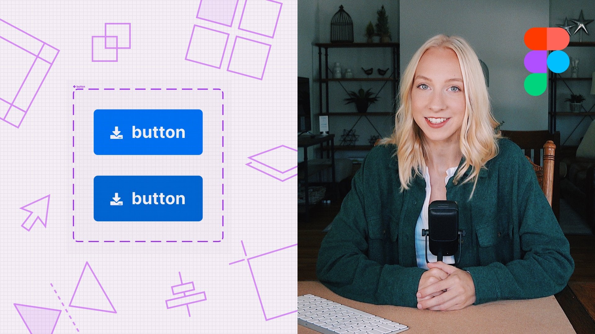
with your team in Figma. [MUSIC] I'm Maddie Beard. I'm a UI/UX Designer and
today's class is all about tactics for developing
an organized process with your team in Figma. Usually, I'm one
of the people on the team who's rallying
everyone together to try to improve our workflows, processes,
and communication. Like most designers,
I love Figma. So if you also love Figma or
if it's brand new to you, then this is the class for you. I've been working
professionally as a designer since 2017, both for tech companies, big and small, including Adobe. I've also worked for myself as a freelancer
and entrepreneur. Systems and processes are so powerful in the
modern workplace. Applying them in Figma will not only get designers
on the same page, but also product managers, engineers, and other
cross-functional partners. We'll go through
six tactics to get you moving towards a
process that works for you. When you're done
with this class, my hope is that you'll walk away understanding how to work smarter and not harder
with your team in Figma. This class is for any
designer on a team, whether you're an
individual contributor or you manage other designers. Especially if you're new
to working on a team, or if you've noticed that your team could use
some improvement when it comes to processes and workflows and collaboration. I know you're going to feel a surge of confidence in how you work and communicate
after these six lessons.
2. Outlining Your Team: When coming up with a
process for your team, it's really good to keep in mind who you work with so that you can make sure the process is beneficial for
everyone involved. In this lesson,
we're going to do a quick fig gym exercise to
outline your stakeholders and figure out what
their goals are when it comes to this process that
we're about to develop. You can do this alone or with a few other people on your team. If you prefer a more
traditional method, you can also just do this with sticky notes on your
wall or whiteboard. Start by creating sections
using the section tool for each small team
within your larger team. Who's going to be hopping
into your Figma files every day or just
once in a while? For my team, it's designers, project managers, design
managers, and engineers. Next, grab some
sticky notes and jot down the goals for each
one of these disciplines. I'll show you what
I came up with, though yours might
be a bit different. Fellow designers need to be
able to pick up where you left off without too
much explanation. Developers need to know
where to find designs, understand how the
screen should behave, and how to ask questions
or bring up concerns. PMs need to know where
to find designs, how to provide feedback, and how to write requirements
based off of final designs. Last, design managers
should be able to know the status of a
project at all times, get an idea of how designers
under them are progressing, and if there are any areas where they might need to improve. All of these things might
also apply to your team, but also teams are so different. Make sure to go through
these and think about your specific use case. Now it's your turn. Go ahead and complete
this exercise either by yourself or with
someone on your team. If you do complete
it individually, you might think about sharing it with someone on your team to get their thoughts and bounce some ideas off each other. The most important thing
about this exercise is really to shed the
perspective that Figma is only for designers. At least in my experience, the relationship between design, engineering, and
product management all starts with communication. Now, as you move through
all of these lessons, you'll be able to
keep these folks and their goals in mind,
as well as your own.
3. Setting Up a Template Figma File: When you're starting
a new project, do you ever freeze up looking at a blank Figma file or maybe you're totally comfortable
starting from scratch, but every designer on your
team does it a bit differently ultimately resulting in
disorganization in the long run? Well, either way, I
can tell you from experience that
creating a template Figma file is one of the
best things you can do for your team which is why I made it the project for this class. If you're a fan of
consistency and speed, then this is a perfect
place to start. If you're a fan of shortcuts, then I have good news for you. I've actually already
created a template that I'm going to be sharing with you
guys to use for your team. This is something
that's worked really well for me and my team, but you can go ahead
and download it in the resource section and make any changes that you
want for your own use. In this lesson, I'm
going to be walking you through each part
of it one by one. Let's start with the cover page. This is the cover page, and what we have here is
really just the cover that's going to appear in your Figma homepage like
your thumbnail image. I just really like
to have this be super straightforward
so that someone knows exactly what they're
jumping into in terms of which project it is
and what the status is. You can put your
project title here. You can put your team name here. This is really only relevant
if your design team is broken up into
separate teams. This is a component, so you can switch up the
status really easily here. Once it's launched, then
you can change it to that. Or if it ever
becomes irrelevant, then I like to
change it to archive just so that someone knows
they shouldn't be like building based off of these designs or
anything like that. That's super easy
to switch here. Now, let's go into the
rest of these pages. Handoff. I always have this page first and I haven't broken
up by a title called Handoff so that dev knows that
this is for them. There's a green check mark, it says Ready For Dev, and then the date that it was
most recently updated. This is just where
you're going to throw any of your designs that are ready for development
and it's really full-proof. This is the first
thing someone should notice in going down on the left-hand panel and don't put anything in here if
it's not ready to be built, that's basically
the bottom line. You can also break this up
into multiple sections if you want based on maybe phases, MVP, and then a next iteration. However, you want
to do it works, but I just really like
having this at the top. Then we move into Design. Wireframes, this is where you'll keep
all your wireframes. The next section is
for a design crit, and you can make as
many of these as you want if you have
crits all the time. But I like to have this
as a separate page just so I can copy and paste screens
I'm working on and one feedback on into this page, keep it more neat so
that during the create, I don't look like a hot mess. Then the Sandbox. That really is where you
want to keep your hot mess, where you want to
keep anything that you're just playing around with, maybe some inspiration, just things that you're
still trying out, this is where that can go. Then Maybe Later. This is if I'm coming up with designs and it gets pushed to
maybe launching after MVP. I want to keep these
screens, I really like them. Maybe they're finished screens, maybe they're just ideas. I'm going to put
them in Maybe Later so that we can come back to them at a future iteration. Then Research. Discovery, I might put in here some competitive
analyses or any research that our UX researcher did, but this could be
bullet point notes, this could be screenshots, whatever it might be. Then Prototypes. If we're testing prototypes
for a research as well, then I want to keep those in these separate pages so that they don't
confuse developers because sometimes, at least for me as
a designer, I'll do quick little hacks to get my prototype to work
well in order to test it. Those types of things will
add shapes or add confusion to designs that you don't necessarily want
engineers to see, so that's why I have
this especially broken out as part
of our research. I've published this template
to the Figma community, so it's totally free
for you to go and duplicate and change
anything you want, whether you just change some pages, entire sections. You can change out emojis or
status options and you can even brand that cover page to be more in line with
your company's branding. In the next lesson,
we're going to talk more in detail about labeling and annotating your
designs for consistency.
4. Labeling & Annotating Your Designs: We all know that good
asynchronous communication is essential for teams to produce high-quality
work efficiently. In my experience, two
ways that designers can communicate asynchronously
are through loop, which we'll talk about
in a future lesson, and through labeling and
annotating our designs in Figma. Labeling is all about giving your teammates and your
future self the lay of the land when
hopping into a page in Figma sometimes
for the first time, while annotations are
more about communicating an intended behavior that might not be obvious just by
looking at the designs. Let's go deeper on
this and look at it in action starting with labels. There are three levels of
labels I use in my process. Starting with the title,
then the subtitle, and finally the name of
the individual screen. As you saw briefly in
the previous lesson, this template I created
has a component you can use to title and
subtitle your flows. The goal of the title is for it to stand out if
someone zoomed way out on a page so that they can hone in on the flow
that they're looking for. The subtitle or
description is more to set context on
what this flow is, who should see it, what triggers it, and
things like that. There are infinite ways that a design team can choose to use naming conventions to
title individual screens. Every single team I've worked on has done it a bit differently, but I will say that
for the most part, the more specific and granular
you can get with this, the less confusion there
will be between designers, engineers, and PMs. Let me show you an example of a naming convention that I
used at my most recent company to show you what I mean, and then you can use this example and tweak it a little bit so
that it works for you. Here's a series of screens
showing the flow for a new user ordering ASAP
pickup from a restaurant. For this project, we used a naming convention
with this structure: Screen type, User, Order type, Screen, State. You can see that structure in action with all of these
screens within the flow. This way, each screen has a unique name based on a
consistent naming convention. Honestly, your
naming conventions will probably never be perfect, and that's totally okay. Remember the goals of each of your cross-functional
partners as you define how to name
your frames going forward. Consistent naming
conventions will also help immensely when people are working with links to your Figma designs
in external spaces. More on that in the next lesson.
5. Getting Granular with Figma Links: In this short lesson, I'm going to show you how to get the right level of
granularity when it comes to generating and sharing links to
your Figma designs. As much as us designers
wish it weren't true, not everything on our team
happens within Figma. You may often need
to link out to Slack, Jira, Confluence, Asana, Trello, Google Docs, Drive, and many more. Depending on the scenario, you might want to
link the entire file, just a page, or even
an individual screen. So let's walk through
how to do each. Here, I have an example of a few screens that
are ready for dev. Let's say that I want to share
this whole, entire file. This is really easy. All I'm going to do is come up to the big blue Share button. Once I click on it, then I'll be able to
either share based on someone's email or
get a link to copy. Usually, I'll just get a link, but I can also edit what
this person can do: edit, view, view
prototypes only. That is simple. You probably already
know how to do that if you're at all
familiar with Figma. But what if I just want to
link to a specific page? What if I want to
send someone to a more direct place so that they don't have to figure
out what page they need to be looking at? Let's say that this page here, I'm just going to
control click on this page and then hit
"Copy link to page". Now, anytime that
someone hits that link, they're going to come
straight to this page and not automatically to the
cover page or any other page. Now, what if you want
to send a link to a specific frame or like
a very specific screen? I'm going to hone in
on this modal right here and I'm going to do
is hover over the title. Again, control click, and you're going to do
copy paste as copy link. Another just fun aside
here is that you can also copy as a PNG, and then paste that into maybe
like Google Slides or something like that so that you don't
actually have to export. It just makes life
so much easier, so fun fact. If any of these are new to you, go ahead and
practice copying and checking if the link is sending
you to the right place. Everything we've been
talking about so far has been all about improving communication and getting you on the same page as your team. But what have written
annotations aren't enough? Sometimes it's very
necessary for a designer to walk through their designs and speak to them in real time. That's where one of my favorite
tools comes into play. We'll be talking about
Loom in the next lesson.
6. Leveling Up Async Communication: One tool that's really
helped me level up my communication is Loom. If you haven't heard of it, it's basically
asynchronous video to help teams cutback on
unnecessary meetings. In this video, I'm going to
show you how to use Loom to communicate with your
team as a designer, but before I get into it, I just want to say
that if you're someone who gets a
little bit nervous seeing yourself on
camera or hearing the sound of your own voice and the idea of using Loom to communicate with your team
makes you a little anxious, I just wanted to say
that I totally feel you. I used to be very, very nervous on camera and even when it comes to
presenting my work, I found it so much
more daunting to do it on camera than I did in person. There's just something
about the camera and hearing the sound of
your own voice that's really unnatural at first, but I'm just here to encourage you that
the more you do it, the more comfortable and
confident you're going to be. With every Loom video you make, you'll get more and
more comfortable and it will just feel
easier and easier. At this point when I
make a Loom video for a client that I'm working
with or someone on my team, it literally feels
like second nature, I don't even give
it another thought. Just trust me on this
and after this lesson, you can even send me in a practice Loom video
to someone with no judgment whatsoever
just to get over the fear of
sending your first one. I've found that's given me
more confidence to present my work in other
scenarios as well, like in person or over
a Zoom in real time, and so I would
just encourage you to really lean into
it if you can. You really have nothing
to lose because Loom is totally free
to get started, you can have up to 25
videos that are each 5 min in length before
you have to start actually paying
for a membership. If your team wants to
use Loom as a whole, that's probably
something you could get a budget for from your company. Once you have your account, go ahead and download
the extension for a Mac or Windows computer. This will allow you to start recording with just
a couple of clicks. When you click on the Loom
icon in your status bar, the app will open and let you configure the recording
that you're about to make. First, decide if
you want to record just your screen or your
screen and your camera. Choose what portion of
the screen you want to capture and make sure you're using the correct
webcam and microphone. Then start recording. You can move your face cam around at anytime
throughout the recording, which is really handy, you can also use the
little toolbar on the left to pause or stop the recording or
this pencil tool here to draw on your screen, call attention to things or show your ideas further in real time. I've included a link in
the resource section of this class for you to watch
a real Loom video that I created for one of
the teams that I worked on in the
past couple of years so that you can actually
see a real design problem instead of me just making something up for the
sake of this class. I thought that that
might be helpful for some real contexts,
a real-world example, so feel free to check that out if you think that
might be helpful. It's just four minutes long. Now, let's get into sharing
the Loom video with your team, which is super simple. Once you hit the stop icon, your video will automatically
stop and start uploading to your Loom library and a browser window will
open to show you that. All you have to do is click, copy link and voila! You can paste that
anywhere you want to show it to your team
and get comments. Anyone with that
link will be able to comment directly
in Loom either by just typing a comment or by actually recording a
comment back to you, but of course they can
also just leave comments in a Slack thread or whatever
works for your team. Loom has tons of
other cool features, but for the purpose
of this class, just getting comfortable
sharing your work this way is the most
important thing. It's really a time-saver. If you want to get
some practice, go ahead and record
a Loom video for me and send it over to my email, maddy@maddybeard.com, and I will make sure to reply.
7. Documenting Your Work: You've finally finished
the project that you and your team have been
working on for months. That's the end of your process? Nope. There's a one more step, but I would highly
recommend doing. But don't worry, super
simple and easy. I created another template for you to make it even faster. Documenting all of the
projects you've done is more a tactic for yourself
than anyone else on your team, but it's still
equally important. It's a great way
to keep track of your impact so that
when you go to apply for a promotion or
update your portfolio, you have somewhere to begin. Let's jump right into the
template which you can find in the resource
section of this class. As you can see, this template is basically so that you can catalog all of the projects you've worked on
at your company. I've included spaces for
a title, description, your role and who you
worked with, dates, times of the project, when it launched, links
to documentation. Like designs, confluence docks, the live project, a prototype, anything that might be relevant. As well as a place
to put visuals or just a quick screen grab so that you know which
project is which. I think it's
important to include all of the things
you've worked on, not just big projects. If one of these line
items doesn't make sense for one of your projects, you can totally get rid
of it or change it. I'd even recommend including
extra curriculars in this. Basically anytime you made
an impact at your company. Maybe you've started a book
club for your design team, participated in a hackathon, wrote a couple of articles for your company's website
or even organized an offsite to help
your team bond include any and all
of that stuff too. Go ahead and grab that
template and start filling it out with all the projects
that you've done so far. It's easy to forget all of the little things that you
spend time and energy on. Tracking this is going to be impactful for you both
professionally and personally.
8. Final Thoughts: Congratulations on making
it through this class. I really hope that
you guys walk away with the tools you
need to work smarter, and not harder with
your team in Figma. Don't forget to download
the templates from this class in the
resource section. If any questions came
up during the lessons, feel free to leave them in
the discussion section below, and I'll make sure to reply. Thanks so much for
spending time with me today and hopefully
I'll see you in a future class or over on my YouTube channel. Bye. [MUSIC]
 Maddy Beard, Product Designer & Educator