Transcripts
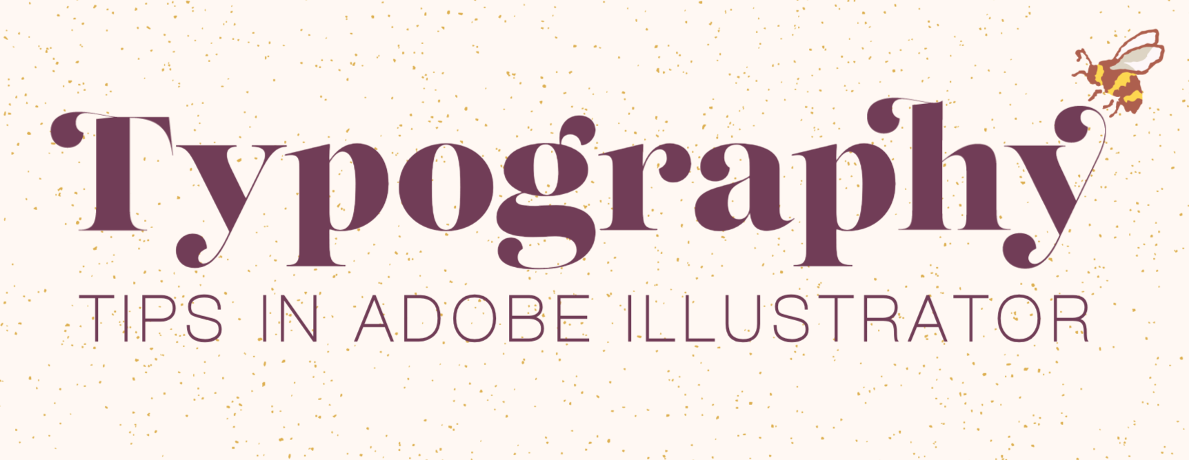
1. Introduction: O
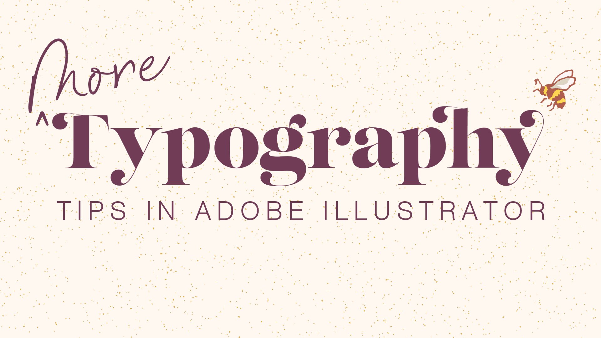
2. Typography In Illustrator Demo: Hi, everyone. Thanks
for joining me. You can do a lot with text
in Adobe Illustrator. But we're going to
start out super simple with the Type tool. So select the type tool
here in your toolbar, or the keyboard
shortcut for that is T, and simply click anywhere on your workspace
and start typing. We have some handy
panels for editing text called the Character
paragraph and Glyphs panels. You can access character and paragraph via the control
bar here at the top, or if you have it open in
a panel already like I do, you can open these panels
via the window menu. I have mine situated over
here in the panels minibar. So in order for character and paragraph to show up
in your control bar, you need to be selected on text. So if I activate my
selection tool, oh, whoops, I hit the keyboard
shortcut for it, which is V and just typed a V because I forgot that
I was still in the text. So when you're using any of the type tools and you want
to switch to another tool, you have to click the tool in the tool bar in order
to activate it. Keyboard shortcuts don't work because you'll just type them. So anyway. So now that I don't
have the text tool or the actual text on my
artboard selected, the control bar looks different. It changes based on
what tool you're using. So it's contextual, just like the Aptal named
contextual task bar, which is sort of like a
mini portable control bar. So that's also in Window. So see, it just has fewer options and you
can move it around. I'll turn that off
for this demo. Okay, so if I switch back to the text tool and
click inside my text, I can now access character. Here is where you
can do a bunch of useful things like
changing the font size. Changing the spacing between lines when you have paragraphs, changing the kerning or spacing between all of
the letters, et cetera. Glyphs isn't in the control bar, so I'll go over to my
panels to show it to you. This is where you can access symbols and alternate
versions of letters. Some fancy script fonts have multiple different versions of the same letter or
fun embellishments. So, you know, this is where
you would access those. We'll go over
paragraph in a minute. You can also scale and rotate your text with the
scale and rotate tools. Next is the area type tool. Use the rectangle tool
to draw a rectangle. The long press on the type
tool in the tool bar to select the Area Type tool and simply click the rectangle
to fill it with text. You can thread the text
to another shape as well. So click the black arrow
selection tool first. See these little white boxes in the upper left and
bottom right corners. Click on the one you need, and this little symbol on
the cursor shows up. It's basically showing
you what it does. So move your cursor over and click and drag
to make another shape. Now when you tap T to
activate text again, you can click and type it threads over into the
second shape automatically. Nido, huh? You can move these around and
change the scale. And if you want to edit
them simultaneously, just make sure you've
selected both boxes. Next is type on a path. If I use the pencil
tool to draw a path, I can now select Type on a
path and click on the path. If I make a circle, use the scissor tool
to cut it in half. And click on it with the
type on a path tool. You can use these little
handles on the path to move the text or flip it down. And then for more control, go to Type Type on a Path. Type on a path options to
change the text alignment. Make sure preview is checked so that you can see the changes. Center puts it right
in the center, and so on and so forth. Flipped can be pretty
helpful as well. You can thread text from most of the text tools,
including this one. So here's the little box. I've clicked on it, so the
Thread text symbol shows up, and there you have it. There are vertical type
variations for all of these. They function the
exact same way, only, you know, in vertical. Next up is one of my favorites, the touch type tool. So I'll just type my name. Select the touch type
tool or use the keyboard shortcut Shift T, and
click on a letter. From here, you can
actually individually edit the positioning and rotation of each
individual letter. And as you can see, it affects everything
else automatically. The really cool
thing about this is that you can still
edit the text. Previously, the
only way to do that would have been to
outline the text, which turns it into
filled vector shapes that are no longer editable
with the text tools. So I'll just demonstrate
that really quick. With this selected, go
to type create outlines. And now, these are shapes that I can edit
with anchor points, but which are not
technically text anymore. So that makes the touch
type tool really useful. Outlining your text can still
be pretty useful at times, though, too, so that's a good
thing to know how to do. Next up is text wrap. I'll move over to
my second artboard. You can quickly switch artboards via this little button
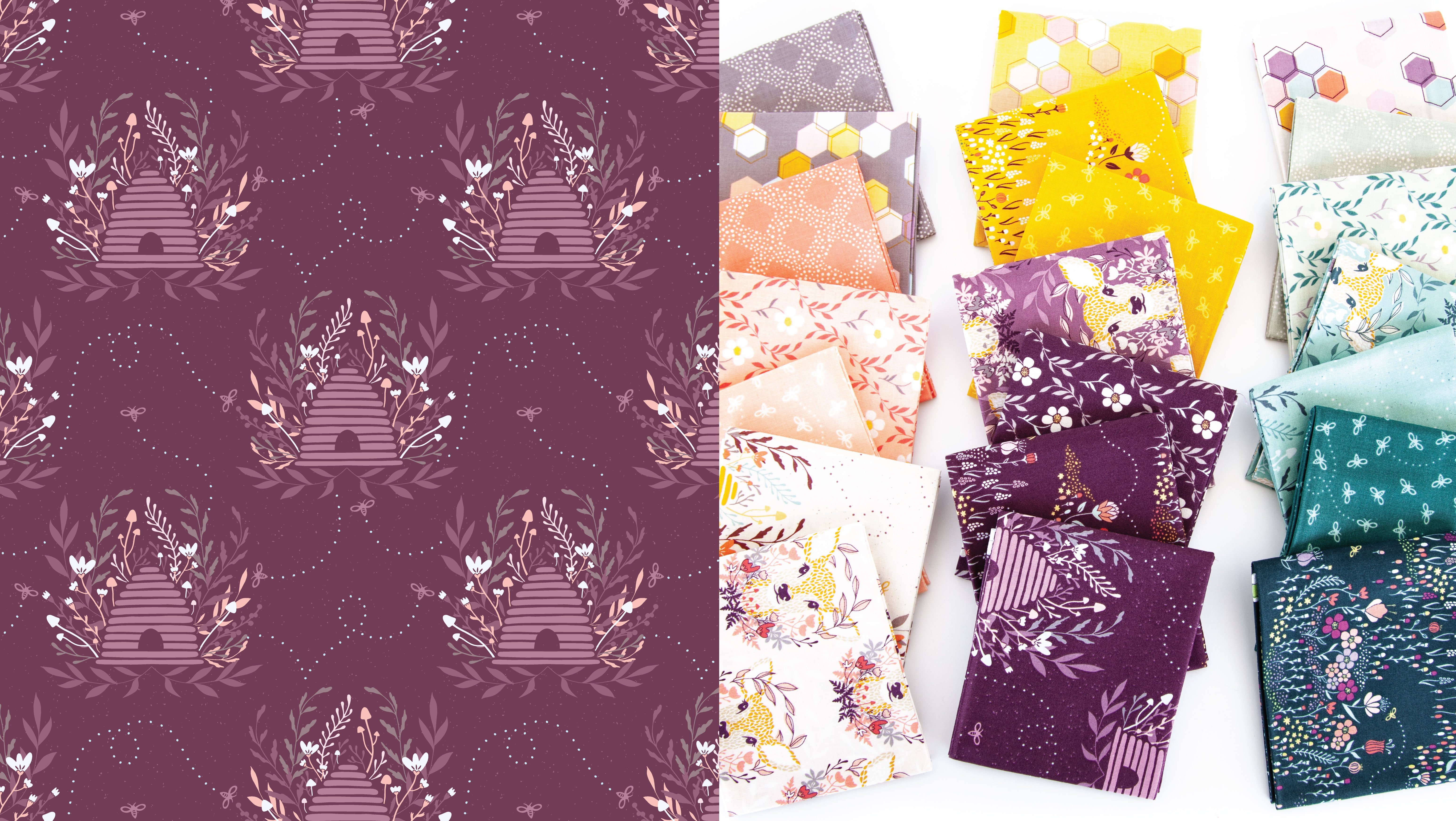
down here at the bottom. Just a fun fact. This
is an intro page and or promotional flyer that I made for my next
fabric collection. I want to add some
text here about the collection theme and story, and I want it to wrap
around the floral motifs. I need to make sure all
of the objects or motifs that I want the text to wrap
around are grouped together. I'll select all of these. And I think I'll try it with
the B two and group them. Just like with clipping masks, you want the thing that dictates the shape you're constraining, or in this case, wrapping
the other thing too. In this case, the text. You
want that to be on top. In other words, because I want the text to wrap
around the flowers, I need to bring the
flowers to the front. The object on the top dictates the shape of the wrap or
the shape of the clip. Right click on the motifs, go to a range and
bring to front. Or you can use the keyboard shortcut Shift command or
control right bracket. Now select both the
motifs and the text and go to Object Text Wrap, M. Click Okay, and boom. Yeah. Isn't that cool? I don't like how close
this is to the flowers, so to edit the space between
your text and the objects, go to Object, extra
Text Wrap options, and change the offset. I think I like eight
points. Yeah, that's nice. Click Okay. You can still
select the text and edit it. So if I go to the paragraph
panel, which, again, is always in the control bar
when you have text selected, I can change the
paragraph alignment. I can indent the whole paragraph or just the top left line. I can uncheck hyphenate, so none of the words are
hyphenated, et cetera. There's a couple more quick
things I want to show you. I don't like the spacing or kerning in between
some of these letters, but most of them are fine. You can edit the
individual kerning between two letters at a time
instead of the entire text. So if you click in
between two letters, hold down Option or Alt and use the left and right arrow keys on your keyboard to
adjust. There you go. That is super, super useful. And last but not least, I want to very briefly touch on optical illusion in design,
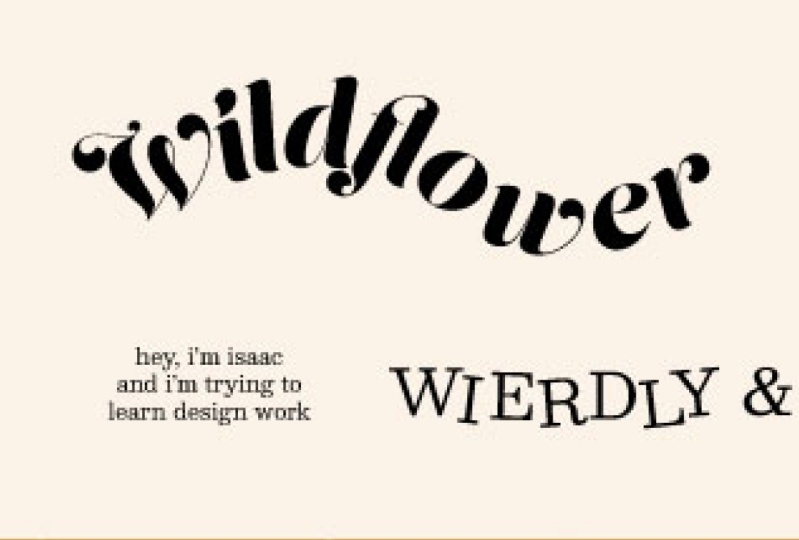
specifically in typography. I have margin guides
up, and as you can see, I've got the F in fabric lined up perfectly
with the margin, but wildflower meadow is not. If I were to line it up like so, and hide my margins. Optically, it doesn't
look like it lines up, right? I'll undo that. And if I select both of
these and go to type, optical margin alignment,
I have it checked. I'll uncheck it and it
moves over slightly. I'll go back up to type and recheck optical
margin alignment, and it looks a lot better. The stem of letters. So this part here and here, and here they should line
up with the margins, not the serifs in serif fonts or the embellishments
in script fonts. It's kind of hard to see in
a script font like this, so I'll show you in a more
traditional serif font. Okay, so when the serif is lined up with the
margin like this, it appears not to line up
nicely with the bottom text. The line weight
distribution looks off, even though these are
technically lined up perfectly. If I turn my guides back on and line it up so that
the margin touches the stems and the serifs overlap it, it
looks much better. If I change this to a P and move it over so
that the stem lines up with the margin and hide my guides
again, that looks better. If I select all of
these and go back up to type optical
margin alignment, that budget over just
the tiniest bit. There are a lot of spacing optical illusions
like this in design, and knowing how to spot them and fix them can make
a huge difference. Don't doubt yourself if something looks
optically off to you. It might be an optical illusion, but if you feel that
it looks better, even though it's
technically not lined up, I would go with your gut on that because I think
most of the time, what you're seeing visually is looking better to
you for a reason. Alright, those are
my typography tips in Adobe Illustrator. Be sure to download the Practice Illustrator file I provided titled
Typography Practice, which has all of the steps typed out for you in the
documents so that you hopefully don't have to
go back and forth between this video and Illustrator
when you go to practice. All downloadables
can be found at the bottom of the Projects
and Resources tab. I'd love to see
any screen caps of your practice in a
class project or even graphic design projects where you've used some of
these typography tips. That would be so awesome
to see in a class project. Please show me all the
cool stuff you make. If you enjoyed this class, please leave a
review so that you can help me and your
fellow students out. I really cannot express how grateful I am to people
who leave reviews. I read all of them and
they bring me so much joy. If you want to stay up to date with what I'm posting here, like if you want to know when my next class is
coming or when I post updates to old classes
or do membership giveaways, don't forget to hit
the follow button. You can also follow me at
Melissa Lee Design on Instagram or sign up for my
monthly newsletter on my website, Melissa esign.com. Thanks again, and take care.
 Melissa Lee, allow yourself to fail before you succeed