Transcripts
1. Class Intro: Fonts are a crucial part of every single design because they are the ones who are
telling the story, guiding the user where
they need to click and where they need to go
inside of your design. So choosing good font family and choosing good
for waste is really important and really
a key to having a good readable design
designer Alex here, welcome to this Skillshare class all about fonts
and font families, font weights, and
how to use them. I am a digital design products
creator and so far I have created over 500 different
design products. I'm also a course creator, and so far I have created
over three different courses with over 60 thousand
students enrolled in sight. In this class, we're
going to talk about different font and
font families. What is the difference
between them? What are serifs and sans serifs, different font weights
and how to use them, different fonts, scales,
and how to use those and create your own bot to choose
fonts for your projects. And finally, how to pair fonts. Your project depending of the project complexity
in the project topic, your Skillshare class
project is to create a font scale using the
template I provided. Makes sure to check it out. And I have a dedicated video in this class all about
the class project. So make sure to check that
out for more information. Knowing how to use fonts in your design is really going
to benefit you as a designer. And it's really going to benefit your users because it's going
to give them more value. They're going to stay
there for longer because it's more enjoyable
experience for them. So I look forward to
seeing you in this class and let's create some
awesome font combinations.
2. Typefaces VS Fonts: One of the main mistakes
I see young designers make is they're calling fonts, typefaces, which is
not really true. Typeface is really
a family of fonts. And font is just a variation
inside of that family. Let me give you a quick example. Just imagine you are using
Roboto font for example. And then inside of
the other water font, you have bolt, regular,
thin, ultra bold. All of these are fonts, but report itself is a font. Family in debt is the key misconceptions
that designers have. They're trying to
push this notion that font is everything
when it really isn't. What you can have is different kinds of font
variations inside of the single-family or
a bottle is really a good example because
you have Roboto regular, Roboto normal and then you have something called roboto slab, which is completely take font, really fat lines, and it's
really used for print mostly, but you can also use it in
some kind of bold web design. But that is the
point right here. Don't try to mistake fonts
with font families because font families can have multiple different
fonts inside of them. And fonts are just variations
inside of that font family. As I said, there can be multiple fonts inside
of a single-family. So just keep that in mind
and don't be confused. You can use the entire family or font inside of your design, or you can just use one
variations such as, let's say in this example, Roboto regular or Roboto bold. We're going to come to it in just a few videos in this class. But I just wanted
to point that out.
3. Font types: Oftentimes when I interview young designers on
when I speak to them, they don't really know what's
the difference between Serif and Sans Serif
when it comes to font, It's really super simple. And I went ahead and found
a really good article. I'm going to link it in
the class resources file. So make sure to check it out and read it for yourself
because we're not going to dig too deep
into it into this video, but I just want to
quickly show you what are the differences
between serifs, sans serifs, and when
each of them is used. So here we have that
article which I mentioned and it's
from Adobe.com, Creative Cloud design discover. And I'm going to leave
the link to this article, as I said in the
class resource files. So you can see some
examples right here. Perhaps this doesn't look
to distinguish to you. Maybe you saw fonts like these. Maybe you saw fonts like these. But what is really
the difference between Serif and Sans Serif? So here we have the clue in the name and the main
difference between these fonts. So these things at the end of
the letter itself are surf. And you can see right here, we don't have them
that sand surf, if I'm not mistaken,
that's French. So without these
serifs at the end. So that's the main difference between serifs and send serves. Now, when can use them, you can see when to
use serif fonts. So it's going to
go really in depth about when to use them
and how to use them. You can see them in
print right here. So make sure to check out this article to
learn more about it. And of course, you can explore further about when
to find these. But in a nutshell, when to use serifs and sensors, it's really super simple. It's, it all comes down to
the topic of your design and to the design direction of your design and what
you are designing for. So for example, if
you are designing bold website design,
maybe something new, something fresh, something
for younger generation, You're not going to use serves, which are the fonts
with those things. At the end of each letter, you're going to use sans
serif fonts because Cera fonts are really attributed to something
which is old. And if you're designing for something which
is old, for example, you're doing some kind of
vintage website or you're doing some kind of a vintage car show maybe or something
they resolved. Then you are going to
use the Serif fonts, which have those things at
the end of the letters. But generally the
rule of thumb is if you're not designing for
something which is traditional, which is elegant, which is old, then you're going to use these sans serif fonts
because these are more modern fonts and
more available to use, especially in web design, because they are working online and they are optimized
for working online, for readability,
for accessibility, for scalability, for
all these reasons, sans serif fonts are
much better to use, especially in website design. But as I said, you can still find thousands of different serif
fonts if you want to use them in your web
design or app design. All of this depends
on your topic, what you are designing for, who is your target audience, and what you're
trying to convey, what kind of emotion, what kind of fulfilling with
the font you are choosing. So just keep those things in mind when you are
designing for the web.
4. Font weights and how to use them: When you start using
a font family, depending on the family itself, you will see it has many
different fonts inside, which are labeled
different names such as regular teen bold, extra bold, italic,
bold, italic, and many, many, many more, depending on the
font family itself. These are called weights. And how to use these weights
in different scenarios. That's what we're going to
talk about in this video. And I'm going to show you
an example and give you just an idea as
where to use them. So here is the example, and I am in Adobe XD, this is the design file from
one of my previous courses, and I just using it as an
example just to show you all of these different font
weights and how to use them to accentuate what you want
to show in your designs. So what we have right here
inside of the hero section, if I select it and come right here to the
right-hand side. So let me just choose
this one. There we go. You can see the
font name is Open. Sans, size is 24 and
the weight is regular. So why is it regular? Well, because I would just
want people to see this first, which is obviously bigger, more pronounced and it
has different color. That's called point of
attention because I want to point their attention
to this white text first, because I wanted them to
read this text first. Therefore, I want
to make it look different than this
text at the top and the bottom while
they're here in the center reading this
heroin is boutique hotel. I want him to see that there is another text up top
and at the bottom. And then I want to read them. I want them to read it
because they are there. So if I go and quickly launched
the prototype right here, you can see how that looks like. So here I am in the hero section and all they can see is this. So your eye is naturally drawn to the
middle of this page, to the middle of this image. And you can read this heroin is boutique hotel after debt. You can see all there
is another texts there. Welcome to Helen's
boutique hotel. Okay, your home, away from home. So that's the font weight. That's how to use them. And you can notice that
this font looks different. You can see it's surf, as we mentioned in
a previous video. So why is that? Because the branding of this hotel and of this
design really requires it. And that's why I went
for this sort of look. So if I choose that, you can see it's called
Playfair display 70, which is the font size, much bigger in this case. Because not to mention, again, all of these things
which I mentioned, but to draw attention to it. And then you can see cold bold, italic is the weight. It's Italica. So it's kinda lean towards the right-hand side
and it's bold. It's more pronounced
than in regular font. So that's how you can balance your font weights in
many different examples. And if we scroll a bit down, you can see once again, here is that same font now
in a different color to achieve the contrast between white background
and font itself. And you can see your
home away from home. So once again, we're going
back to that tagline perhaps. Then you can see something
really interesting right here. So if I select this one, you can see it's
Open Sans 24 bolt. And if I select this one, Open Sans 24 regular. And you can see
just by selecting bolt and regular and
choosing different color, I am pointing their direction into and pointing
their attention into a different direction. In this example, you can see, I've wanted to read this subtitle because
it's really important. I want their mind to just pay attention to
these three things. So king size beds, food included beach
access because these are really important key
selling points for this particular website to attract new visitors
to come to it. And then if they
want, of course, they can read the text below it. So that's why this one is
bold and this one is regular. This one has a slightly
darker color to it than this one because I
want her eyes to be drawn to this text first. Same story like with this
and with this right here. If you scroll a bit now, we can see the same
texts right here. Headwinds boutique
hotel is fine. And here we have a
quote from one of our previous customers to this
website or a testimonial, you can see Jenny from London, but this one is much
more pronounced. It's much bigger. So if I select it
and come right here, you can see it's
Open Sans 36 italic. And it has this darker
color than this one, which is Open Sans 24 irregular. So once again, I want
them to read the quote first and then see who
is the quote from. The name in this case doesn't
really matter too much. You can get rid of it
for the layout segues. It doesn't matter what matters is their experience
with this hotel, because the next customer you
are trying to acquire for your hotel is going to want
to see that experience first. Didn't really care, is it Jenny, use it, mark, is it whoever? They don't really
care, they really care about the experience. And then you can
see the contrast below it with the
book now button, which is blue and it
has white text inside. Once again, for the
contrast sakes, if we scroll a bit down, you can see this
throughout this design. And not just this design, but every single
design I create. Because I always think
about these things. What's more important? What's less important? What people are
going to see first? And how can I accentuate that with my fonts and font weights? You can see right here. So for the names of the room, font is much bigger than
all of these down below. And you can see this with
the features, yes and no. Of course we are then choosing different colors to show
which features are available, which ones are not. And then we have the
different styling once again with the link below. So learn more, they can click
that link, it's different. So when the, how're, they
are going to see the change. So you have to think about
all of these things. Here. You can see the features. So we have private pool, we have beautiful garden, we have private parking. All of these are super easy
to read that with a purpose. That's why I chose this
font, which is much bigger, which is a bit different,
which is boulder, has darker color than
the font below it. Once again, I was using
Open Sans as the main font. This one right
here, and Playfair display for this big bold font. Once again, if we
scroll a bit down, you can see this
happening again. So visit Delos,
which is the title, and this is the text. So if I don't want
to read this text, all I can see an all I need to know really
is visit Delos. So there is something
to do at displays. And if we scroll a bit down, once again, book
your stay with us. So it really invites them to book their
stay with this place. And once again, you can see
this contrast right here happening with the
white background and this dark gray text. And final example is
sign up for newsletters. So it's really calling you
to action, to take action. And then this is what you see. First, sign up for a newsletter. This is what you see second, and that's once
again with a purpose because I want to
pronounce this, sign up for a
newsletter because that is the action I
want him to take. And then once I have their attention with
sign-up for newsletter, sign-up and receive news
and updates and blah, blah. That's really secondary
because I want them to stay on this part of the
page as long as possible. So that's how you can use fonts, font ways, and different colors, and perhaps even different
font families to accentuate what you want your
users to see in your page. You can explore this
in a lot more details. And depending of your color
scheme for your project, this can be really even more complex or even simpler than the example which
I just showed you, which just has a
few colors in it.
5. Choosing fonts: When it comes to choosing
fonts for your project, there are really two
main considerations. You should have existing fonts and the main theme
of the project, existing fonts are
obviously the fonts that your client was
using previously. Then you can take a
look at those fonts. See entire font family, see what it has inside, and perhaps think about how you can accentuate it
a little bit more. What we talked about in a
previous video of this class. How can you use them a little
bit differently to show some main features
of the product or a service that your
client is offering. And then you can take
a look at the colors, see how the previously used that font family with
these different colors. Perhaps if you have
the ability to do so, maybe you can change
those colors. Maybe you can include
some darker colors, are some lighter colors. Maybe you can add shades of these different
colors that they're already using or introduce new colors entirely to
the project to bring more life and to bring more adept to the project
that you're working on. The other way to do
it is with new fonts. And when you're
choosing new funds, make sure to pay
attention to what I already mentioned in one
of the previous videos. Deemed of the project itself. Obviously, you're not
going to use these bold, bright, wacky fonts. If you're doing
website for a bank, maybe because bank is trying to convey a feeling of trust, of security, of stability. I don't know nobility
in some cases. So you want to pay
attention to that. What is your project about? What is it tried to convey
to the users themselves. So therefore, you have
to use these fonts which are going to correspond well with the team of the project. Of course, if the
project is fine, Let's say you're
doing a website for comic book company
or toy store or any kind of children
related contents such as games or flushes or furniture, whatever it has to do with kids. But even with kids, there is still some limits as to when you can
use certain fonts, how you can use them. Because heritability
is really the key, especially online,
you want to make sure that your fonts are
readable at the end of the day, no matter who is your
target audience, no matter if it's
serious or playful, if it's colorful,
all monochromatic, you still want to be able to tell if it's readable or not. And how you can do that is to test it out on
different devices. When you create a
website, for example, you have to test it
out on big screens such as desktop screens
and laptop screens, but also you have to make
sure that it works nicely and that is readable on
smaller screens such as Forms. If you're using
something like Webflow, it's super easy to do. Just create a
responsive page from your design and simply
send yourself the link, perhaps send that link over
to somebody who is older, the new maybe, and
see if they can read easily if the
color contrast is good, if the font weights are good, if your color rhythm is good. So they can really read it out. They can really understand it, and they can see
what you were trying to convey in that
particular page. So make sure to always test, make sure to always
think upfront. Who are you speaking with? Who are you talking to? Who is your main audience? And are the font readable using these colors
against this background?
6. Font Pairing: Sometimes in some examples, you want to use
different font families, like in the example which I previously showed you
with that travel website. Maybe you want to show
different section of that page or a mobile app
using certain font-family. And then another section, perhaps you want them to feel like they're
reading an article. Therefore, you're not going
to use some wacky crazy font. You just want to sum a regular, plain old font that's
really readable, understandable, and super easy for them to see and to read. So therefore, you
have to know about font pairing and how
can you pair funds? Well, there are
different online tools which can help you with that. And I'm going to show some
in this particular video. So here we are with the first of these cold
types variation. And I already created
a YouTube video. I'm going to link it in
the class resources. You can just click and watch that entire video where I explain all of these
different tools. But I'm just going to give
you a quick overview. In this particular video, you have inspiration
and you have guides, guiding you how to pair
these different fonts. Once again, it all comes down to what it be already mentioned
a few times in this video, the topic of your project and the audience you're
trying to speak to. So therefore, you're
not going to use some wacky fonts as it keep
mentioning to bankers, for example, or some
serious audience. But you can go the other way
around with children and use some more playful colors and
use some more playful fonts. So type inspiration is the first website and you can choose many
different styles. You can see Open Sans and cream. Some texts are the
fonts used right here. These are the colors. You can choose
different colors from. Here you can choose
heading fonts, you can choose body fonts. Heading font is this
one right here on top, which is used for
headers or for titles. And the body font is
this one right here, which is used basically
for paragraphs and for all of the contents
which has more text in it. And it's more intended
for longer rates. Basically, titles
are more glands, but also you can read them
any glands really quickly. But paragraphs, you
can really have to spend your time reading them. And that's the main
point right here. With paragraphs, you can explore with various different
fonts and font weights. But with paragraphs,
you want to make sure that your font is readable, that the color has nice contrast
against the background. And it's really not
too much strain on your eyes to spend a longer
time reading this article, especially if there
is a longer article, if you're doing a website for, for news for example,
that's extremely important. That's the key
problem you should tackle first and right away
in that particular project, because the whole point
of a news website is people spending a lot of
time reading these articles. Therefore, you want to have a great font which
is really readable. And these titles
which are really glanceable because
you don't want them to stick out too much, especially in those
types of websites, because you want
them to keep moving into read these
articles down below. So explore this website. As I said, I'm going to
point to the video which I already created on
my YouTube channel all about this stuff. And I explain this
in more detail. And I'm going to leave
the links in that video, so make sure to check it out. Font pair is another one. So you can see right here
we have sensory serif slab. So you can see it's kind of fat monospace
Display Handwriting. So there are bunch of these
different font styles that you can choose from. And you can see all of these Important
fonts and main font. You can see combinations
right here, you can see more font pairing. So let's choose
display fonts and it's going to show you all
of these display fonts. You can explore them. Then we have this, which is font pairings,
dot py people.com. You can select a font
family right here. And then after you do that, you can choose different
texts style and the style. So this is regular,
this is bold, this slab secondary texts, which is that paragraph texts
which we just mentioned. And then it's going to give
you available pairings. And finally, font joy, which is super,
super simple to use. So we have Generate
and it's going to generate a different
font pairing. You can choose more
contrast or you can choose more similarity
or balanced contrast. You can go between black and white to see how it's
going to look like. Especially if you're designing a dark mode on your
website or your app, then you can see font pairings
and different text sizes, different weights and
so on and so forth. So here we have Montserrat, which is this one right here. Here we have this
mocked-up Varney font, which is this one right here. So you can see H1, H2 and paragraph or heading one heading two paragraph or a main title, subtitle and paragraph. Sanchez is the text for
the paragraph itself. So you can click. It's going to take
you to Google fonts, which is what this
Sanchez font is four. And then I can click right
here and I can choose, I don't know, maybe this one just to see
how it looks like. If I don't like it, it's going to go ahead
and switch this. So let's say, I don't really
like these or this one. Perhaps I can go
with something a bit brighter like this one. I can lock it here. And it's going to
lock this Montserrat. I don't really like this one, so I can go ahead
and generate more. You can see
Montserrat is locked, perhaps I like this one, but I don't like this one. We can get to the point. You can still scroll all the way down. And at the end, when you find the perfect font combination that
you want to use, as I mentioned, you
can click here. It's going to take
you to Google fonts. Make sure to download
Montserrat in Montserrat font family,
then cut them around. And pylon Quinn in this
particular example, makes sure to download them all, installed them to a machine. So you have all of these
different font weights, like I mentioned, regular bold, and so much more. There you go. That's how easy it
is to Font Pair. Make sure to pay
attention to the following, to the contrast, to the readability
and to the topic of what you are designing
for in the first place. You get all of these sorted out. Then it's going to
be really easy to design and it's barely
going to be easy to test. And speaking about testing, make sure you always
test with your audience, especially if you
have access to them. So for example, if you are
designing for children, maybe you can have
access to children and see how they're interacting
with the prototype, how they are interacting with the website, with
the mobile app. Is it easy for them to understand where they
need to click our than stumbling across these different
elements of your design. Maybe something is dragging
too much attention from them. Or if you're working
with the older audience, maybe as I keep
mentioning the banks, perhaps you have access to the people who are
working in the bank. If you're working for a bank
in this particular case, maybe you can test
it out with them, give them a concrete task, see how easy for them
is to find that task, how easy it is for them to navigate around
your app and how easy it is for them
to read the text you're trying to show on
that particular page.
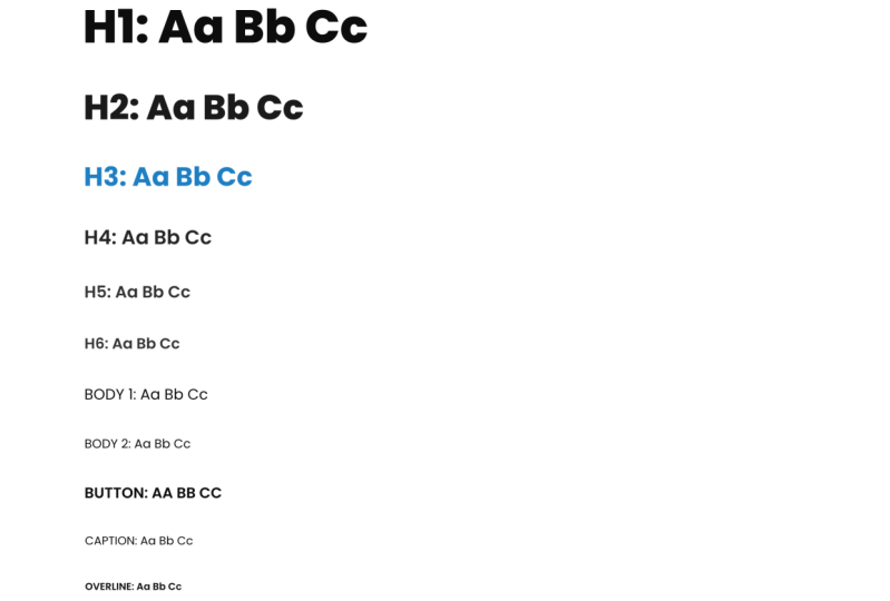
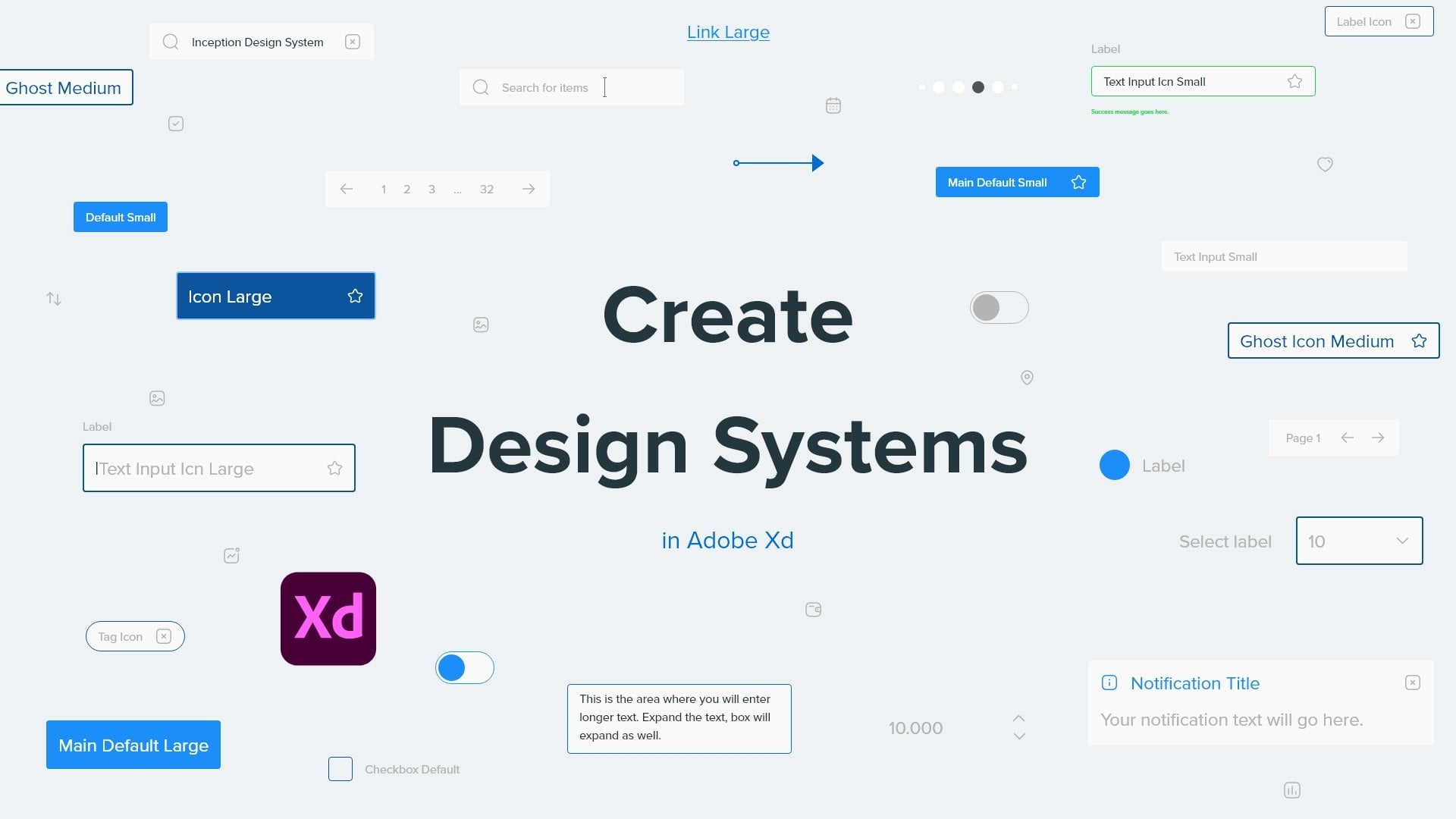
7. Font scale: When you are designing for
the web or for mobile apps, you want to have
consisting scaling across your font sizes
and font weights. And this can be achieved
with a font scale. You can create font scale, so it's much easier for
developers later to understand which kind of
font size is for what, and that's what you can
include in your style guide, just to show them
alongside your colors, alongside your imagery, your
styles, and so much more. So in this video, I'm
going to show you how to create an
easy font scale. You don't have to
use this approach. You can find other
approaches online. There are literally dozens of different approaches online. See which one works for you, your project and your
scaling purposes. So let's get started. So here we are in Adobe XD and
I'm just going to show you how to create a quick font
scale using Adobe XD. If you're using Figma Photoshop, whatever you can
create that there. But for this purposes, I'm going to use x
D because I really like it and use it
every single day. So I'm going to click T to
create H1, for example. Then what I'm going to use is, let's say a bottle like that. Instead of regular,
I'm going to go with, let's say black. And I'm going to go
with size of 80. So really huge. And this is going to be my H1. Perhaps, maybe even greater, maybe 88, something like that. There we go. Then I'm going to hit
Control D or Command D, and lower this down to
maybe something like 64. There you go. Instead of black, I'm
going to go with bolt. And instead of H1, I'm going to call it H2. So what are created
right here is a clear distinction
between Heather. Heather. Heather one is something
which I'm going to use in my hero
images, for example, in the center of design itself, in the center of
this hero images. Unlike the example which
I showed you previously. But this is just
more accentuated, bigger, bolder,
black in this case, but this one is bold because
perhaps I want to maybe use it as the title of my sections maybe or
something like that. So therefore, it's bold and
not black and it's 6488. So if we move down
a bit further, you can create an
H3 in this case. And instead of 64, maybe we can use
48 for this case. And instead of bolt, actually no, let's
keep it bold for this. Then if we go a bit down, we can create something like H4. And instead of 48, maybe we can go with
40, in this case n. Let's use a regular this time. So you can clearly see the
distinction between these. So if we go a bit down H5, and in this case maybe we can use something, I don't know, 24. Maybe, there we go. Perhaps we can use
this as paragraph text or some examples or
something like that, something which is a bit
smaller and H6, let's go with, I don't know, 16 maybe in my cases are really don't want
to go any further than 16. So we have H1, H2, H3, H4, H5, and H6. Perhaps you can rename this H6 and call it
paragraph texts. Perhaps you can show something like that to your developers, see what they think. And what you can also do is hit Control D One more time on each of these and type in alphabet. So a, a, B, B, B, C, C, D, D, E, and so on and so forth. So you can type in the
entire alphabet and show font weight and the font size in this particular example
about the alphabet, or something else
that you can do is you can use something like, I don't know, Lorem Ipsum
text or something like that. I don't have the keyboard
shortcut right here, and I don't have the plug-in
installed right here. So let's go with this. So Lorem Ipsum ROC met, perhaps I can copy this text and then I can do the
same with this one. Simply paste it in. And what this is
going to allow you to do is show to your client and to your developers how
particular text is going to look like in
particular use cases. So let's say that I purposely started with
this particular color. And why I chose to do so is just to show you main
differences between these texts. But in this particular case, what I would do purposely
is I would quickly go ahead and change this color to something much,
much, much darker. And perhaps save it right
here as a color swatch. Or I can go ahead and edit
right here to my colors. Then what I can do is. Get rid of this one. Perhaps I can go right ahead
and choose the same color, but go a few steps up
to something like that, then choose it to be
a different color. And what you can do is give your swatches names right away. So this one is H2, color. There you go. This one is H1. And maybe we can
go even further. Sorry, Let's see
if this is an H2. So I can go back and use the H12 and then go a step up,
something like that. Save it out right here, save it out right here, call this age three. There we go. And then finally,
maybe I want to go with something even brighter. For this one, perhaps, maybe not, but it's
all really up to you. Perhaps something like this. There you go. And I can give it a name of H4. In this particular case, you can see they're
really similar. But there is the
point of this video, but your clients perhaps
have the main color, let's say the blue is
their main colors. So in this case, we can go with something
like three C6 FF perhaps. So really bright
and strong blue, maybe that's their main color. So how can you incorporate
this color into your design? Obviously, you're not
going to use it for this. This is really for hero sections and stuff,
which I already mentioned. Perhaps you're going to
use it for each three. So three is C6, F, F. And as you can see straightaway, it looks much better
in this example than it was in this
example. Why is that? Because if you use it for the biggest text size that
you have in your design, It's just going to steal the user attention
from everything else. That's not something
that you want. Text is really there
to explain things to guide your users to
what they need to do next, and to really help them out, achieved the goal for their visit on your particular
website or mobile app. So in this case, I would use color for text,
something like this. And I would not use it for paragraph texts because as
I mentioned previously, you want your paragraphs
to be readable. You want them to be
easily understandable, and you want your
users to be able to navigate easily
throughout your design. So one final thing
which I forgot to do is I want to save this color. We already have it. There you go. So H5, I want to save it out. There we go. H5. And we're going to use the same color for
the paragraph itself. And one final thing which
I want to do is to select all my font sizes and come right here to the character
styles and click there. So you can see it's going to assort them,
something like this. But what I can do is go
Control or Command Z. Click right here to save this
one to be the first one. And then like this, and then like this, and just go up and up and up. There we go. And of course you
can rename them. You can come right
here and type in H1. And you can do so with
all of these other ones. So H2, H3, and so
on and so forth. I'm not going to bother
you too much with it. But the whole point right
here is to rename these. So as I said, it's much more easier for developers
later to understand what you were
trying to convey if you are not going to develop
this design yourself. So there we go. That's how super
easy it is to use. And you can see if you mess up like I did just previously, you can simply see arcades
in H1 selected right here. Or if you accidentally
changed the color, you can go ahead and see, okay, it's an H1 click right there, and it's going to go and use
that corresponding color. So you can see how
super simple this is. And I'm going to
provide this file, which I just showed you as a practice file for you
so you can test it out. Poke around, exploited
for yourself, perhaps playing around with these different colors
which are just showed you, or maybe different font
families entirely. So we use Roboto in
this particular case, maybe you want to
use something with a surface inside like
Playfair display font, which I previously mentioned, or do you want to go
even bolder than Roboto? You can do so right. There. There we go. Those are the font scales, and that's how to use them. As I said, you're going to
have this practice file, make sure to exploit it, make sure to play around to
achieve a perfect result. Or if you don't like this
eight pixel approach a part, as I said at the
beginning of this video, you have bunch of these
different examples online. Makes sure to explore them for yourself and see what
works best for you.
8. Your Class Project: Your class project is to
create your own font scale, save it out as an image and upload it to
your class projects. So both myself and
everybody else in the course can see
what you created. So you can use this template which I'm going to provide a in the
class documents. You can download it and
play around for yourself. Make sure to use
different fonts, font families in
different colors just to achieve your
different results. And you can explore
with two fonts. I would not recommend going
above that because I don't really like when people are
using more than two fonts, I don't really think
it's necessary, but you can do whatever
you want with it, or you can even add more sizes. You can play around
with different sizes and you can poke
around to what I created right here with all of these different colors
and character styles, make sure to play
around with them to achieve your perfect result. And then, as I said, upload
it to your class projects. I look forward to see
what you guys are going to create
and I'm excited to see how you are going to adapt this template which I
created in Adobe XD.
9. Conclusion: So there you go, That's
it for this class. I really hope you got
some better understanding about font families, about fonts, different
font weights, how and when to use them, as well as to what
is Sarah for a sensitive and when to use these, as well as finally, what is a font scale
and how to use it. I really hope you
enjoyed this class. Make sure to check out the PDF with all the resources
which I mentioned. Make sure to check
out the practice file and see how it looks like. Poke around and play
around for yourself. Thank you so much for
watching this class. If you want to make sure to
check out my other classes, especially in my masterclasses, which are courses which
are over 20 hours long, going into many
different details about all of these things. Thank you so much for watching. And finally, make sure to
check out my YouTube channel, which is full impact
of free content, all about your UX design, passive income techniques
and so much more, all done inside adobe XD degree, so much for watching this one. And until next time, take care.
 Aleksandar Cucukovic, Improving lives, one pixel at a time.