Transcripts
1. Class Intro: Design systems are
used to create experiences which
are easy to use, easy to scale, and easy to consistently create
in the future. The main point of a
design system is to beat the bridge and the gap
between designers and developers and to be
easy to integrate and developed for further use in the future as the design
system skills and as the company skills kids, I
didn't know my name is Alex. And in this Skillshare class we are going to
talk about what are designing systems
and how to create design systems in Adobe XD, I am a design products
creator and so far I had created more than
500 design products. I'm also a course creator
and so far I had created more than 30 different
horses all about your UX design in Adobe XD, we're going to talk about design systems and their purpose and what is a good structure
for a design system. Then I'm going to show
you some industry leading examples
and standards you should follow when
you're creating your own design
systems in Adobe XD. And after that, I'm going
to show you how to create your own design system
using the WASD. And I'm going to show you
my inception design system, how I created it and what
you can learn from it. Then we're going to talk
about design tokens, what they are, why they are useful for creating
your design systems. And finally, how to scale your design system
and went to scale it. And what you should
look out for when you are actually scaling
your design system. Your class project
for this class is to create your own in system, but nothing too major, just a few components
here and there. And I'm really excited to see
what you guys can create. There is a video in the class explaining more of your class. Project design systems are more useful than ever in
today's day and age when we have these
multiple screen sizes and devices we need
to design for. So we have to keep track of the consistency
as to what we are creating for which
screen sizes and how it all works at
the end of the day, for our end users, using a design system to keep
track is really important, especially if you're using the tool which is
awesome as Adobe XD. Look forward to
seeing you inside and let's create some
awesome design systems.
2. What is a Design System: Design system, as
the name suggests, is a systematic approach to
creating UI and UX designs. The main purpose of area
design system out there is to keep track as to what everybody
in the team has created. The main purpose of design
system is scalability. Whether that's the
immediate scalability or the scalability which is
going to come in the future. But the design
system's main job is to keep debt scale consistent. What that means is every change that you make is going to
reflect through the rest of your design is going to be coherent and it's going
to stay in the look and feel of what's determining at the very beginning
of a design system. Every good design system
consists of two tanks, rules and standards
and pattern libraries. Rules and standards are there to every teammates
to follow them to the t because
that's the only way that the design system is
going to scale evenly, that it's going to grow
and it's going to be consistent throughout
its lifetime. Because the lifetime of the design system is the
lifetime of the company. It is never done, it is never finished. So as long as the company
or the product exists, the design system can co-exist with that
product or company, while the pattern library, on the other hand is there, and it's going to scale all the time depending
often needs, Kubrick needs and
future needs of every particular project and
every particular company. The main misconception
out there is that design systems are just for the big companies
which they are not. You can use a design system
for smaller companies, you can use the
design system with fewer number of components. We've fewer number of
guidelines and standards. And those guidelines can be a
bit rough at the beginning. But as the project goes, as the company grows, the rules and standards
are going to tighten and the design system
is going to finally take its shape and its form, intended form from
the beginning and it's just going to
grow with the company. Design systems can be for designers and for
developers as well. And that can be
achieved with using something which is called token. We're going to talk about them
a bit later in this class. But basically, collaboration
between designers and developers is the key for every good design
system out there. As soon as the change
is made or propagated, designers and developers
have to be on the same page in order
for that design system to work and in order for the change to be
implemented straight away. And it's easiest as possible. That's extremely
important for startups, but for established
companies out there as well, because you don't want
to break the design and functionality of
the product by simply changing the design
system too much with something which is not aligned with everybody
in the team. There are a few things
that every good design system out
there should have. And in the next
video we're going to talk about just that. What is the good structure for every good design
system out there?
3. Structure of a design system: As I mentioned in
the previous lesson, structure of a
good design system really consists of two things, rules and standards
and pattern libraries. Roles in standards can be
there in many different forms. For example, every
rule has to be, coincide it with
something that you are doing inside of
that design system. And let's say that the rule
can be about grid at all, can be about typography. Rule can be about color, about spacing, about
horizontal or vertical rhythm. It can be about anything. And rules can of
course be broken, but they can be broken
at the very beginning of a design system because later on when the
project is developed, when the project has grown, It's much difficult to
break a rule than it is when you're just getting
started with the design. System. Standards can be something
like company values. They can be something
like a tone, like a mood of the
project and off the client's website or
your client's brand. And that should be followed
to the t inside of a design system because you don't want to deviate too much, especially in the design system which are really Corporate. You don't want them to
change too much because corporate crowd is really
used to that kind of atone, that kind of a design
doors scholar types, those topographies,
hierarchies and so much more. Second part of a good design
system is pattern libraries. And you can change
these pattern libraries as you grow along
the main tip right here is as soon as you start building design system
pattern libraries, you don't need to
create elements which are not necessary at the moment. For example, if your project
does not have a dashboard, you will not create
elements such as graphs and charts because they're just
not relevant at the moment. You're not going to fill your design system with all
of these useless components because just remember you as
the designer are there in, your design team, is there
to create those designs. But those designs should be accessible and easy
to understand for developers who have
to develop all of these elements for that
particular project. So just create
elements which are needed at that
moment and let the design system scale over time
as the project requires it. Now how can you divide all of these components in
the component library? Basically, there are
three main categories. There are atoms,
molecules, and organisms. And you can of course
add templates. You can, of course expands to how many other
variations you want. For example, flowcharts or wireframes, high
fidelity wireframes. But basically atoms, molecules, and organisms are there to every good design system and they're scaling
with the project. And you can always add
more of these elements, as I said later on down
in the project align. Now as the name implies, atoms are the smallest one of the bunch and they can be
something which is quite easy. For example, color or text size or bottom width or
something like that. Then molecules are
created from atoms, went to atoms, combine. Basically you are going
to create a molecule, for example, a drop-down
menu or something like that. And then organisms
are, let's say, a form which is created from
various different elements, for example, input
fields and buttons. And then you're going
to get a form which is organism created for various and from various different atoms and molecules combine into
a single organism. This is called the atomic
structure and it's really our industry
standards for decades now. But you can create your design
system however you want. But if you're using
this atomic approach, is going to be much more
simpler for you to create your elements and to scale
them down in the future. The main point of
every design system out there is consistency. So you have to think about
consistency all the time. Wherever you are just
creating a simple button, you have to think about how
that button is going to scale through various
different screen sizes. Is it going to change the width, is going to change the height. Is it going to change
the color is going to be with rounded corners,
without rounded corners. So you have to think about
all of these elements as you're building
your design system, you have to think about
rules and standards, which we mentioned at the
beginning of this lesson. And you also have to think about other elements in
your pattern library. How they're going to
coincide with each other? Are they going to look
good on the page? So whenever you create a new element inside of
the pattern library, you have to put it on a page, you have to put it on
a test straight away, see if it works with the rest
of your pattern library. And then if it does, you
can keep it and if not, you can always scrap it. That's the whole point
of our design system. It's always going to evolve, it's always going to change
and it's never going to look the same like it was yesterday. In the next lesson,
I'm going to show some great design systems example from the industry
leaders and industry standards. I'm going to show you
what to look out for. And then later on in this class, I'm going to show
you how to create your own design
system in Adobe XD and what you can achieve with creating design
systems in Adobe XD. I'll see you there.
4. Design system examples: The best way to create your
own design system is to learn from industry standards
and industry giants. And to do that, I'm
going to just show you a few examples and you can find these examples in
the attached PDF. You can just click
on those links to access all of these
examples which I'm going to show you
and simply learn from them what
they are creating. But the key thing
before we get started, don't feel obligated to take
every single component that these companies are creating because as I mentioned previously in the
previous lessons, these components are
there for a reason. So unless you are
using any one of these components,
don't create them. When you start creating
a design system, It's really important
to start small. Then as your project evolves, then you are going to add all of these
different components. Because what's the point
of creating components if they're not necessary
at the moment, they're just going
to slow you down and you're not going to
optimize your time on that particular project if
you are creating components which are not necessary
for your project. So let me show you all
of these examples. First example that we have
is Google's material design. Of course, this
material design is used in their Android
operating system. Apple has their own, It's called human
interface guidelines, and you can find it as well. I will link all of these design systems
which are mentioning with few more design systems
which are not going to mention in this video
inside of the PDF. Once again, open up the PDF, click on these links to access
and browse for yourself. What we have right
here is introducing material you at the moment
of making of this video. This is the brand new and the industry standard
in the Android world. So basically, continue
using material design too. You can see guidelines,
components, icons, components for the web, accessibility guidelines
and developer tutorials. You can learn more
from their blog. And let's quickly go over these elements and I'm
not going to go into too much details
because majority of these design systems
are basically the same. They're using the
same standards, they're using the
same guidelines, but they just look different. Because, for example, with
this material design system, it's for Android, so
it's for mobile devices. While other design systems
are there are, for example, websites or for web projects or for a dashboards or
elements like those. Of course, all of these
elements are going to be different between mobile
and desktop design systems. But the key is the same, standards are the same. So let's say you have
these guidelines, principles, styles,
and best practices. What that means is for
every single element, when is the best time
to use that element? In which case
scenario, for example, you're not going to use certain, let's say date pickers. In certain examples,
you're going to use different kinds of date
pickers in those examples. So that's why those principles and best practices are there. If you ever looked at
a branding project or at a branding
presentation from a brand, you can watch those on Behance, For example, you can search
YouTube videos for those. Basically best
practices are there. And that's the key
reason, for example, why you use logo in this orientation rather
than this orientation. Why you use white images
here and not here. That's why these best
practices are there. To achieve these best practices and these principles and styles, you have to start small. You have to start
from the beginning. You have to create these
various buttons and experiment. See what works, what
doesn't, what does work? Make sure to upgrade from there, make sure to add new elements, make sure to add new styles, new components from
those elements and see what works
and what sticks, what doesn't, throw it
away and simply move on. That nicely brings me to
components, design guidance, and developer documentation for interactive UI building blocks. And you can see them right here. These are buttons,
images, forms, input fields, icons,
and so much more. These components are there
to make it easy for you. And I'm going to show you that in a later lesson in this class. Once we actually
get to Adobe XD, components are there to speed
things up a lot because components can be
used throughout your design system,
throughout your project. And they can be used by various different
designers in your team because of core editing
feature of Adobe XD, various different
team members can be on various different
sides of the planet. And they can all be using the
same design system and use the same components from that
particular design system. Of course, you can always
change components. You can always update them. You can add different
components, styles and so much more. But that's the key right here to create components which are going to be reusable
throughout your design system. We are going to explain
that a little bit later, but for now, let's move on. Icons are key resource for every good design
system out there. Of course, because
this is Google, they have their own
material icons. When you're getting started
with your design system, you're probably going to use some other icons in
your design system. But as that design
system evolves, as you'll find a
voice for a brand. As you find the direction and
guidelines for the brand, you are going to evolve
those icons as well. If you're not expert
in Icon creation, perhaps your client can. Hire somebody who is, and then you can use those
icons in that design system. Then we have components
for the web. So implements and customize material web apps with our
code and documentation. Of course, this is scaling from mobile devices up to the web. Finally, we have
accessibility guidelines which are extremely important. Learned how to help users of diverse abilities to navigate, understand, and use your UI because not everybody
has the same vision. Some people have
vision impairment, for example, some people
have difficulty reading. You have to think about all of those people because
there are a lot of your users who are going to sadly have some of these issues, who have to think about them
all of the time when you are creating your design system. Finally, we have
developer tutorials, implement material with Java,
Kotlin, Objective-C, Swift, and wherever father bit, depending of the design system, depending of the developers, you're going to use this
or that technology. So basically there is no right or wrong
answer right here, you have to speak
with your developers. You have to speak with
your client, once again, depending of what your
client is going to use. In this case, for material, it's majority for mobile
devices, for Android. So of course they're
going to use different technologies then
if you're, for example, using, I don't know, PHP or something like that
for WordPress or whatever. So those technologies are
going to be different and depending of which technologists who are developers
are going to use, you're going to form your design system for
those development purposes. So basically, you
can jump right here, you can click on the
design, you can see. So foundation, overview,
environment layout, navigation, color, typography, sound, iconography,
shape, motion. So as I said, and
I'm going to keep saying this throughout
this class. Don't be intimidated by all of these different elements because once again, this is Google. They had literally
billions of users throughout their devices and
throughout their company. Of course, they're going to use all of these
different elements which will not probably ever
heard of, let alone use. So don't be intimidated. Too much width debt. Then we have components. These are buttons,
card checkboxes, chips, data tables and so on. Then we have developed
for Android, for web flutter iOS. We have resources and you can read all about
these resources. So hyper type, scale, creator or shape customization tools and so on.
They have the blog. So make sure to check
it out once again, I believe the links to
everything which I mentioned in this video and more
in the PDF file. Click on those
links to access it. Then we have Atlassian
design system, end-to-end design language
to create simple, intuitive and
beautiful experiences. So once again, you're
going to notice that we have components,
we have patterns. So brand, they have mission, they have personality,
and they have promised, which is what I mentioned
in previous video. You're not going to talk
the same two people who are using this in their underpants
on their mobile device. And two CEOs of big
companies who are, for example, in some
expensive office. So tone is just not the same. So you have to speak to your user in the language
they will understand. Then we have foundations. So color, iconography,
typography, once again, depending
who is your user, you're going to use
different colors, different icons and
different type, content, language and grammar,
vocabulary, writing style. So once again, we are
talking to the user. Who is your user? You have to talk to your user in debt language they
are going to understand. You can explore this and here we have brand foundations content. Let's click on the content so you can see inclusive language, grammar, vocabulary, you
can click right here. Components. We have our term, outer group, badge,
and straightaway, you're going to notice that this looks quite a lot different than this because there are two completely
different things. So if I click on the
banner, for example, right here, you can see how
this banner looks like. And straight away we
can see the code, we can see the error, we can see the announcement. How does it look like? How does it scale, how does it shrink or grown? And you can see usage. How does it work? So anatomy, we have the
icon, we have the message, and we have the actions which
are optional in this case. So feel free to browse through all of these categories
to learn more about how they are used and how they are
integrated right here. Next up we have Shopify
polarised design system salt. Let's go with foundations first. Experienced values, which
is what I mentioned. Their approach, what
to consider it. They are empowering, crafted, efficient, trustworthy,
and familiar. So those are all the values they're aiming for
with their brand, therefore, their design system. Then we have the content. So voice and tone, Shopify is voice reflection
of who they are. So who are they simply put there the company
built by real people who understand this
business and care about helping others succeed. So those are their values. We have the design. Once again, design
colors, principles. Communication is key. Colors have meaning. Colors follow
accessibility guidelines so you can see color roles. So surface basically
elements which are behind other
elements on surface. Those are the elements
such as texts for example, primary, for example,
for the elements, let's say button secondary
for the elements which are, let's say checkmarks or icons or something like
that, interactive. Maybe there is an
animation happening. So all of these colors
are there for a reason. Once again, I'm coming back to every single time for the
point which I made previously. And don't create
elements which are not necessary in your design system. So you can see color
variance and you can see these colors
implemented right here. Once again, I encourage
you to check out all of these elements and
to learn more about them. You can see illustrations. They're using these
illustrations, but why, why they are using this
particular illustration in this particular style, using this particular colors. So you can learn more about all of that right here on this page. Next up we have
carbon design system, which is created by our IBM, which is a huge corporation. Love this design system because
you can click right here and you can click on the design kits and you can
get the sketch version, but you can also get
the Adobe XD version, which is somewhere around here. And you can open up
in XD, here it is. But it's built by the
carbon community. So it's not exactly spot on
because it's not created for Adobe XD rather than
for sketch at first. Then they moved on to Figma, but they also support
Adobe XD and Azure. So you can get to the
kids right there, open it and you can
also do the same for shopify, design system, polaris. And I'm pretty sure that you
can get Atlassian as well. You can open it up and you can learn more about
how it looks like. But back to carbon, basically, open-source or design system for products and digital
experiences. Design language is
its foundation system consisted of working code, design tools and resources, human interface
guidelines, and a vibrant community
of contributors. So there we go. A lot of different designers are contributing to
this design system. That's why you can download those files and
exploring them for free. So start designing. You can see all of these
different elements, what they are using, but I'm more concerned
about guidelines. This, they're starting
with the grid. Grid is at the heart of every good design
system out there. If I just play this video, like so, you can see two x grid and how
does it look like? Basically, it consists of a box and that box can
expand to other boxes, which can be bigger or smaller. But basically it's in
the increments of two. Everything snaps
nicely to those boxes. Basically, you can see
the spacing right here. Two boxes separate the text, the images, the layout
and stuff like that. So make sure to
explore all of it. And you can see how
the vertical rhythm, Brooks right here
and how the scale work right here in
this particular video, I really encourage you
to explore it more. You can see icons, pictograms, motion, which is
really important. So how did they use animation? So if I click right here
to play this video, you can see how they
are using motion inside of their design system, how the animation work, how the transition works, how the things work. For example, ease
into the animation is out of the animation
and so much more. So explore it, download it, and make sure to check
it out for yourself. Finally, we have Salesforce. You can get started. You can see which platforms are currents or lightning
visual forests, Heroku, Android and
iOS design guidelines. So overview, builder,
chart data entry, displaying data and so
much more accessibility, which is what we spoke
about component blueprints. So overview, let's
say accordion, I want to check out
the accordingly, how does it look like? So this is a great thing. I can click here and understand what was the intention
behind this accordingly. So in this particular case, you can see that this
accordion is closed, but when I click,
this entire section is going to expand down. How much is going
to expand down? For example, if you're
using that to pixel grid, which you mentioned in
IBM's carbon design system, then it's going to expand
by the increments of two. And you can use those
rules and standards and guidelines throughout
your design system, whatever you are creating. So once again, you can
click on the alert, for example, you can click
on the avatar or badges. Let's click on the cart and see how their
cards look like. So this is the car, this is the new, smaller cards, shorter cards, wider cards. So you can see how all of these
elements are implemented, how they're laid
down on the page. And if I click right here, so we have action 123, we have the tooltip of
these different elements. Finally, we have this
which is utilities, margin, text sizing
function, vertical list. And lastly, we have
designed tokens. Design tokens are amazing. Think about design systems and we're going to talk
about them in one of the later lessons
because they are truly at the heart of
every good design system. And they are really
the bridge between designers and developers
to get to know the design system
and to use it to his most extent and to continue
using it in the future. And that's why we are using design tokens in
our design systems. And I'm going to show that in Adobe XD as well in
the later lesson. But for now, checkout these
links, as I mentioned, they're going to be in the
PDF mixture to explore as much as possible and to
learn as much as possible. Because you can see
design system is not something that you're going
to learn in a day or two. It really takes months and years for a good design
system to develop. But don't let that the
material you from creating your own design system because the benefits are huge
as you are designing, as you're building
and developing, you're going to expand
your own design system. In the next lesson, we're
going to talk about Adobe XD. What can you create in
Adobe XD in terms of design systems and
how can you scale your design system in Adobe XD? I'll see you there.
5. Creating a design system in Adobe Xd: Adobe XD is an
awesome tool because in one single tool
you can design prototype and share with your clients, developers,
and stakeholders. This is great for
creating design systems, and this is what we are
going to talk about in this lesson of the class, how to create your own
design systems in Adobe XD. And later on we are
going to speak about scaling those design
systems in Adobe XD. Let's get started. Here I am in Adobe
XD and I open up the 1280 by 800 art board. This is just a basic art
board that you find at the start screen right
here on a D Adobe XD. How to create your
design system? Well, you have to start small. Let's get started
with the grids. So if I hide myself
so you can see it instead of
firing this layout, I'm going to switch it to square n. This is what we talked about previously for
IBM's designers system, they are using this
iteration of two. So it's going to be really
small squares right here, but I'm going to use it. Number of eight, for example,
something like debt. And then I'm going to fire up my calculator and I'm going
to bring it right here. So we have 1284, the width. So 1280 divided by
eight, it's 160. What that means is when I
zoom all the way right here, you can see that
these squares are eight pixels by eight pixels because that's the square size. If a lower them down to two, you can see that they
went down in size button. I'm going to increase
them back to eight because eight
pixel is kind of an industry standard or
8 grid if you want to. And that's what we're
going to use for our imaginary design
system right here in Adobe XD to get started, what we can create
is something small, like a button for example. So let's get started with
the topography first. So I can say something
like click here, maybe. Let's use something
like Open Sans maybe, because it's free Google font
and you can find it online. And I'm going to position
it roughly around here. Let's go with 24, because 24 is divisible by
eight, of course. And then I'm going
to create my button. So I'm going to create
some spacing around it. I'm going to right-click, send it to back just so
that we can see our texts. And now I can start playing around and positioning
to my grid. So if I hold my Alt key, you can see I'm 16
from this side, 16 from this side
by 78 on this side, it is good, but seven
is not so much. So what can you do right here
is not a lot really because Adobe XD text tools
are not really older developed like Adobe Illustrator for example, or Adobe Photoshop. But it's going to work
quite fine in this case because we're just creating our startup project right here. First thing to consider, is it your type too big? If it is, then you can increase the spacing to 16 on each side, for example, but you can
still see 1515 right here. So if we start like this, It's going to still
be 15 because the way that Adobe
XD treats the texts. So once again,
what can you do if you are working with brand, which requires that language, what we spoke about previously, then you are going to adjust this corner radius to something
like eight for example. And now we have the
rounded corners. So 64 is the size of our
button divisible by eight, of course, 144
divisible by eight. So we can now proceed. Next up is the naming
convention sub this button is quite big. Salt for example, you are
going to name it btn. Let me give you another shot. Btn dash, BG, button,
background, dash large. And you have to do
this throughout your design system for all of your elements because
that way you are going to know and designers from
your team are going to know, developers are going to know, is this for our website, tablet, mobile watch, or
whichever size it is. So next up is to group them. So the thing to consider is where this text
is coming from. In this case, it
goes for the left. So if I hover right here, we can see it's left
aligned and it's out of it. So it's going to
automatically scale the button and expanded
to the right-hand side. Or you can make it
fixed if you want to, you can click fixed
sites and it's not going to expand the button. Depending off the
buttons purpose, let's say BTN, large variables. So we can use VAR for example, something like that, or
just call it btn large. And then if we want
it to be fixed, then we can call it
btn large fixed. So once again, keep track of that BTN background
large, btn large. If you're using
fixed, for example, it's going to be for
the button background, btn BG large fixed, or BTN BG. Fixed larger however
you want to call it. So naming convention is really crucial because as soon
as you start adding more and more of these
elements is going to be much more complicated for you to keep track as to what
you have created next up, because we want this
button to expand, I'm going to turn on padding. So next time when somebody
says something like by now, you can see that the
button is going to expand. But once again, because of that gradual element that we created, if I
click right here, you can see 16161516, it's going to expand, but you can always override it. So if I click right here, and if I extend this
even more right here, if I click right here
and extended to 20, maybe it's going to snap
to migrate much better. So you can always make these changes to make
sure that we are 3664 all the way it is
divisible by eight in our case, if you're thinking
about grids and how to create grids,
you can of course, use this eight pixel grids
for your grids solid, say 12 columns for
this large size, eight columns for
the tablet size, four columns for
the mobile size. And depending of the
sizes that you choose, you're going to choose
the number of columns and how wide are big
these columns are. Of course, we are
just getting started. You can see how this looks like. And before we move on, I
will click right here, jumping right here to
my libraries and add color because this is
the color of my text. In this case, I'm going
to add character style. So what can you name this? And this is really important
because now we're coming in to the design tokens territory. And I'm going to explain
design tokens in the next lesson of
this class a bit more. But basically I'm going to
call this h four for example, because that's the
size of this text. Here for the color, I'm going to rename it to
something like, I don't know, regular gray or whatever, regular dash and gray,
something like that. So everybody from my
team knows that, okay, this is H for its open cents 24. And when they hover,
you can see opposites, 24 character spacing,
the size 24 points. So you are going to be able
to tell straight away. Next up is the button with the border or
without the border. How you're going to treat this, how all of these elements
are going to stack up, does it has, doesn't
have the dash or not. So you have to think about
all of these things, but make sure to create multiple
copies of this pattern. See what works, see what doesn't end when you start adding
elements to this button, make sure to start
with the components. So Control or Command K on your keyboard to
create a component. This is the default state. So the first component to create is perhaps
the horror state. So I'm going to call it hover. And the next time somebody
hovers on this button, maybe it's going to
change the color. Instead of white. Maybe we can change it to
something light like this. Click right here,
hit Control Enter to preview what we are creating. And now when I hover
on this button, you can see that it
has hover state. So that's how easy it is to create your beginning
of a design system. And now I'm going
to show you what I have created over
the past two years. And it took me six months
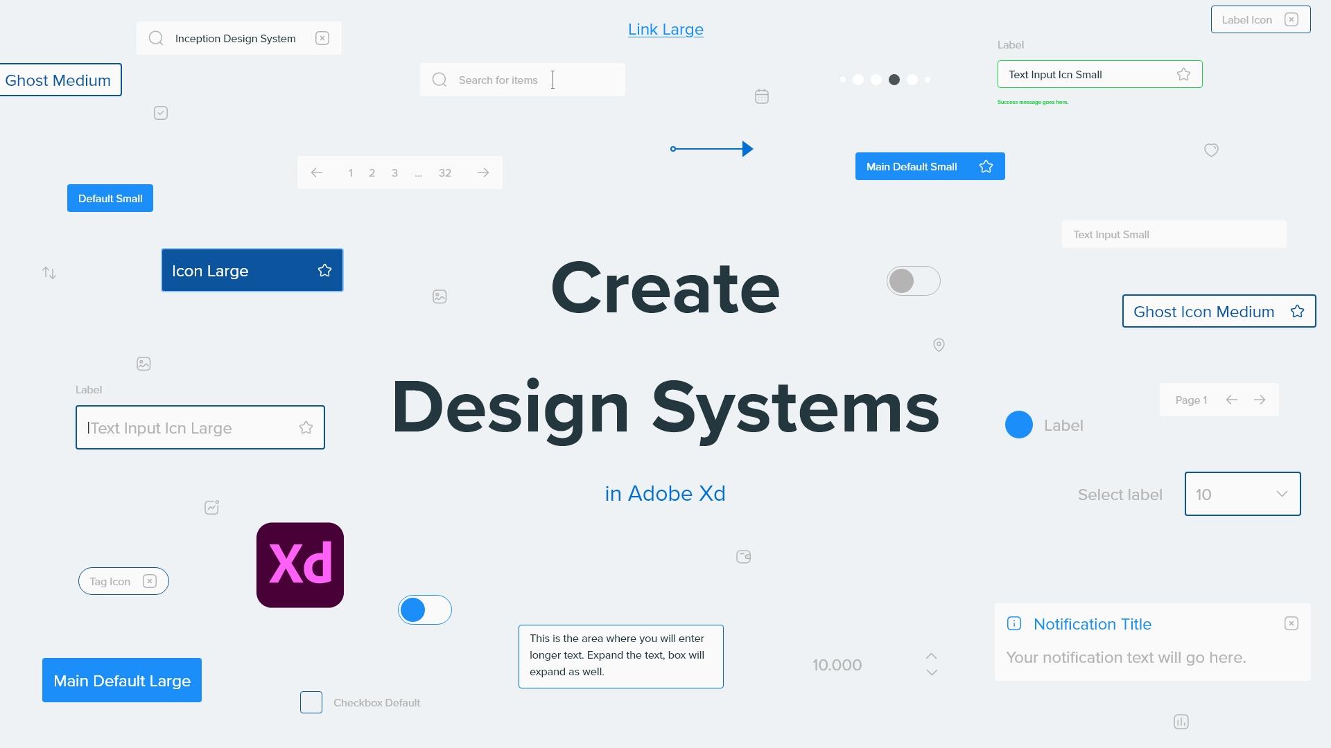
to create in Adobe XD. It's called Inception
design system. And here it is. This is the inception design
system master file. This took me six months of
continuous work to create. And you can get this design
system if you want to. I'm going to leave
the link in the PDF. This is the page for
inception design system.co. And once again, I will
leave the link in the PDF. You can click right
here and go to my YouTube channel to
watch the free course. In it. I go through every
single element. I think it's something
like an hour long or something like that. It's on my YouTube channel
and you can watch it there to learn more how it works
and what's included. You can see, you
can design faster. You can read some reviews. It's crafted for scale
using eight pixel grid. It has molecular structure
like we mentioned. It's local and clouds
who can work both locally and in the Cloud
with your teammates. It has flowcharts,
template and Lottie icons, which are animated icons. It's made using the
latest features like stacks component states
in Document assets. So let me go back to Adobe XD and to show you
first things first, what's included in
this design system. Here we have some
basic information and guidelines about the
design system itself, how to use it and
where to use it. Then here we have the grids, we have three different it
basically screen sizes. We have large, medium and small, or desktop, tablet and mobile. And depending on the size, we have various different color. Column number. For the large, we
have 12 columns. For the medium, we
have eight columns, and for the small we
have four columns. Here we have the guides
and you can easily copied these guides and
paste into your art board. Then we have
topography and you can see that I divided
the topography two headings and body
headings are coming in these different sizes and body in these different sizes. Then we have the colors, main colors and
supporting colors. You're going to notice that I don't have any shadows here. And that's with the purpose because when you get
this design system, you can add your own shadows. They're going to scale with
the design system itself. Then we have the logo which you can replace with
your clients logo. We have these different
logos which you can use in your projects. We have icons and straightaway, you're going to notice
this eight pixel grids. So square size. And if I hide it right here, just so that you can see the design system
itself a bit better. Then we have icons right here, and these are static icons. And of course, design system comes with animated
icons as well, which work natively
inside of Adobe XD, which is fantastic
for prototyping. Then if I zoom a little bit, what we have right here
are atoms and molecules, and you can find
them right here. If you open this up, you can see we have grids,
icons, avatars, drop-downs, images, models,
pagination, line of education according on
Search and so much more. So all of these elements right here are atoms and molecules. And if I zoom in just a little
bit closer, you can see. So we have buttons, we have text inputs, selectors,
textarea, checkboxes, radio date pickers, selectors,
content switchers, tabs, progress indicators,
number inputs, accordions, images which
are extremely important. We have Blobs, drop-downs, we have various
different devices, notifications,
pagination solid or is model and so much more dense. On the left-hand side
we have flowcharts, which are located right here. So if I zoom in, we have desktop flowcharts, we have mobile flowcharts, then we have task flow elements. Obviously for task flows, we have flowchart
elements which are used to connect these
different flowcharts. And then what we are right here, we have these paper sizes. So here we have
A4 size portrait, landscape, US letter
portrait and landscape. And every single one of these, if I switch to the Layers panel right here and click inside, it has various different
elements which are used to help you create faster using
this design system. So if I select it, you can see what we have
right here is dot grid. So if I switch on this dot grid, you can see how it looks like. So I even have up a paper right here which I'm
going to show you right now, which are used for one of
my live streams recently, and you can find it
on my YouTube page. So if I bring this closer, this paper was actually created inside of
this design system. And it was actually
print it out and then drawn on using
the regular pen. So you can see how versatile
and useful this is when you create elements like
this in your design system. So going back to it, what we also have the phones. So if a show that you
can use these fonts, obviously print them
out like I showed you with this particular paper. And you're going to notice that they're going to be
positioned right here. And obviously, if the paper
is landscape like this, they're going to be positioned
differently and they're used for paper wireframing
if you want to. Then we have browser
for responsive, we have desktop browser
and mobile browser, and it goes the same
for all of these sizes. Then we have flowchart
information. We have client project
name, deadline, number of website pages, number of app screens, and you can of course combine dot grid and the flowchart in
for you can switch places, you can position them,
print them out and create basically components
and flowcharts on them. And finally, what we have
if I switch right here, we have the templates. Here we have templates in
three different sizes, as I just mentioned previously. So we have large, medium, and small, and those
are right here. So these are templates large
in 15 different categories. These are templates small in those same categories but just adjusted for the tablet size. And these are templates, small, so it is a medium and these
are small for phone sizes. So how does all of this work? Basically, if I open this up, we have colors, so we have main colors and
supporting colors. As I said, these are
main components. If I change the color, this ocean blue right
here, for example, I can simply go edit right
here and change the color. It's going to update
that color in real-time everywhere where that color is located in this design system. So going from here and this swatch all the way through here, through here and through here, it's going to
update in real-time and change and
update that color. If you decide to get
this design system and you get started working on
a project for your client. You can simply change these
colors to your clients colors it's going to change
throughout this design system. Same story goes for
the character styles. So for headings, for example, if I decide to change this, it's Proxima Nova
at this moment. But for example, if you decided to change it to open science, as I said, then you can
update it in real-time. It's going to change
throughout your design. Next up, we have what I said, atoms and molecules,
flowcharts and templates, and how can you use them? It's really quite simple. So let me actually use in
this large drop it to here. And I want to show you
if I click right here. And let's say that
I want to hide these columns just so that
you can see what I'm doing. And let's say that I wanted to drag and drop some
elements inside, so it's good to
atoms and molecules. And let's switch this
layout on actually. But let's go with the
square right here, just so that you can see
what I'm actually doing. So let's go with something like dropdown, drop down large. Let's drag and drop it inside. And you can see how
it looks like so I can position it
wherever I want. And then let's bring
our columns back. Click on our dropdown, position it right here. And you can see it
works straightaway because this is a component
with multiple states. Let's check out the focus state. For example, let's
checkout opened. And I can of course
jump in science and adapt and change any
one of these states. So instead of saying
drop-down large, perhaps it can say your shoe
size or your shoe color or whatever your project requires that the beauty of
this design system, these are atoms and
molecules in short. Basically you can adopt them and use them however you want. And let me quickly
show you templates. So here we have the templates
and let's use large. So what we need is navigation. Drag and drop my nav
one for example. I'll snap it to the position. Close this. Let's use hero section. Let's go with here on
number four for example. Let's position it right
here and right here. Maybe do something like this. Then what we can
do is use call to action may be so let's
use call-to-action five. Snap it, make sure it's in the center position is
right here until it meets with our hero section
and you get the idea. You're just going to drag and
drop these elements inside. You're going to build them. The great thing about all
of the templates and all of the flowcharts is they're
coming in two different modes. Default state, which is the
light mode and dark mode. So if I click on my navigation
switch back to dark mode, click right here,
switch to dark, click right here, switch to
dark in just a few clicks. And if I hide my grid just
so you can see we have this. So if I preview it
really quickly, you can see how it looks
like in real-time ETO, it has these horror effects. And of course, when you change and adapt all of
these components, for example, this logo and you change it to her clients logo. You can add different icons, you can add different images. It's going to adapt
in real-time. And this is the whole point
of a design system is to save you thousands and
thousands of hours of creating these boring tasks. Because there is nothing
in the world I hate most. And to create footers, and I have my
footers right here. Click right here, drag and
drop footer positioning there, for example, snap to
dark mode, like that. Position it here. Hit preview one more time. And here I have my
footer in place. That's the beauty of
these design systems, is to create with speed, to create width scale. And that's what you can see with this particular
inception design system, which I have created over
the past six months, is I created all
of these elements. So let me delete this. I created all of these elements, but I can easily scale them. I can add more elements here
using existing elements, I can reposition them, reorganize them,
change their colors, change their corner radius. Because if a zoom in really closely to one of these buttons, you can see that
the corner radius is four if a show
you right here, but maybe I want to change
the corner radius on this main button to
something a bit bigger. Let me assume so
you can see all of the states bit bigger
to something like 20. Press Enter. And you can see
in the real-time, it's going to change
throughout wherever it, this button is located. Wherever this button is used, not just here, but throughout
my templates as well. So it's going to
update in real-time. That's the key thing about
design systems in Adobe XD. You have to change them in the
default components and all of these components
that you drag and drop which are showing
you our child components. We can change and adapt there and use these
local changes. For example, in
that hero section which I just showed
you previously, you're going to update the text. You want to add your own
text, your clients texts, whatever, then it's going to
change in debt component. But if you want to make more global changes like
the background color, like to font and whatever, you are going to make
those changes right here inside of the
main components, inception design system
comes with two files, master file and light file. Basically the only difference is inside of the master file,
which I'm just showing you, you can see all of the elements
right here in one place, inside of the light file. You cannot do that because I purposely deleted all
of them from the canvas to keep as much of
the canvas free as possible so you can design
without any instructions, like looking at them right here. So perhaps it's the
wisest to start with the master file to learn
all of these components. And I of course provided
images of all of these components
who can browse at a glance as to how the
component looks like, how the template looks like before you start
working with those. The last thing which
I wanted to show you about this is these flowcharts. So let me open them
up right here. So let's close templates, open up the flowcharts. Let's go with
desktop flowcharts. Let's use the
header, for example, drag and drop it right here. Let's use content. Maybe I wanted to
position it right here. Let's use something
else like a slider. Position it right here. Then what's great about
these components is you can simply duplicate them
positioning right here. And because these are the
components, as I said, you can simply click
drag and it's going to replace that component
in real time. So portfolio, drag
and drop it here. Maybe I want to use
the form number five. My client says, I don't like how the formula
of a file looks like. Maybe you can try
something else, okay, for number
three, there you go. You can see how super simple
this is to create them. When you want to connect all of these elements,
Let's close this. So let's use the
flowchart elements. Let's use, for example, numbers. So let's go with number one. Maybe this is the first page, for example, let's close that. Let's use arrows. So I'm going to use this arrow, drag and drop it into place. Perhaps when users click
on this button right here, they're going to
go to this page. So I'm going to simply extend this and select my
line and dare you go. This is how super simple this
is to use and to create. For example, if you drop this, Let's say arrow by mistake. I wanted to replace it. I wanted to do it with
this one. There you go. This is the arrow which
I wanted, for example, from this pair, from
this slider right here, I want them to go to
this portfolio piece. You can see how super-simple
this is to create. So that's the beauty of
these design systems. Obviously this is an extreme, as I said, it took me over six months to create all of it. It took me more than
two years of research. And if I show you some
of these templates, you can see how they look like. So we have hero, we have
futures call to action. So I did my research
as to what's the most used inside
of the industry. What are some industry
standards and what's most used? Content grids, pricing. We have the blog, we have login and
we have forums, contact us and so much more. And all of it is responsive
as a short right here. And all of it is using
x easily to speeches. So if I click right here and
jump inside of these images, you can see that we have the
stack, we have the padding. So if I choose to change
the stack, for example, I can click right here, and it's going to
change this direction of this stack to this direction. And you're going to
notice it's going to push this content down
and it's going to scale evenly to whatever I'm creating on my design system. Once again, if
you're interested, designed the system is inception
design system.console. There is a YouTube
course for it. Everything is explained
in a lot more detail and you can check out this page so you can see the futures
as I mentioned, atoms or molecules,
organisms, flowcharts, template, dark mode, animated
icons, course included. So all of it is inside of
inception design system. If you want to create
your own design system, just make sure to pay
attention to two things. Make sure when you start scaling
to scale with a purpose. Don't just scale for the sake
of scaling and make sure to use only elements which are necessary in your design system. For my design system right here, I used elements from my research which majority of
designers are using. But for your design system, perhaps you're not going to
use these elements when we are going to use some
else, something else. But basically, it started with small elements like buttons like I showed you and then
expand from there, add components, but make sure to add just the
components which are really necessary in
your design system. In the next video,
we're going to talk about design tokens, what they are an elaborate
a bit more about them, and how to use them in your design system. So
I'll see you there.
6. Design tokens: Design tokens are
at the heart of every good design
system out there because they are a great tool for collaboration
between designers, developers, and stake holders. In this video, I'm going
to show you how I do it and how some big
companies out there do it, and what are some best practices
regarding design tokens? So let's get started. Here we are back
again in Adobe XD and once again in my inception
design system master file, which I showed you
in previous video. And design tokens are located
right here on the left. Basically what I mentioned previously in the
previous lesson, they have the name. This name is really
useful because when you are collaborating
with other designers, let's say I wanted to use
this ocean color for, let's say, background color of our model or
something like that. And then I have to tell that to my design collaborator
on my design teammates, Let's say use that blue color inside of that model background. But we have multiple
blue colors. Which blue color? Use? One BAT F9. Once again, it's going to be
really difficult for people, especially if you're working
with them far apart. If you're working from
home with your teammates, is going to be difficult for them to implement that change. And it's going to be
difficult for everybody in the team to remember this
hex code, for example. So that's why we
are using names. In this case, I can
just say to them, use the ocean blue for the
background of the model. And everybody's
on the same page. Ocean is much more easier to
remember than for example, hashtag one, BH EF, EF nine or whatever. So developers can use the
same function and I'm going to show that in just a second in one big design system out there. But basically this is the
whole point of design. Tokens use them wisely and use them as your
design system scales. Of course, you can
use them for text. In this case, I only have headline and body,
but for example, you can use the
specific characters size for specific elements. For example, if the character
is just below, let's say, animations or
illustrations even better, then you can use them in conjunction with
those illustrations. For example, headline
illustration, large, headline illustration
is small or whatever. And then when you said
to your developers, make sure to change the headline
large illustration tool, let's say 64 points. Everybody on the team
is going to be able to understand that much
better than if not, what I mentioned
previously about the components and
different component names. So if we zoom in right
here to my buttons, for example, switch the layers
panel, click right here. You can see that we have
button default large, because these are large buttons, then we have button default, medium, button default small. So these are default buttons, but if I switch to
something else, for example, right here
we have a selectors. Selectors, inline value, large
selectors in line value, medium selectors inline value, let us say small or whatever. So you have to pay attention
to all of these details. And we have images. We have imaged large
and how many columns does your image
stake in this cage? Image? Large, two columns, image large, nine
column image large, 10124 with full-screen medium, the same story, small
the same story. Then we have devices,
for example, device dash, browser
or whatever. So you have to use these design tokens to
explain what you are creating in your
design system and what each design token is designed
to do in the first place. So I will now show you this, which is a Salesforce Lightning Design System design
tokens already showed you that in the
previous lesson where we talked about all of these
awesome design systems, how they use it is
basically exactly the same. So we have brand
accessible dark variant of brand that is
accessible with white. So they are using combinations and they are using
these support. So you can see global access available to use
on the platform. Or if not, I can hover
right here internal, so available for internal
Salesforce developers only subject to change. So they have all of these rules put in place when it's released, version number 1234 and so on, T-Mobile, so hard to
using it with a team. Do you use it with an app? Do you use it for
front-end or back-end? Do you use it for what
visitors are seeing or for internal dashboard
or for visitor dashboard, you have to label all
of these elements. And here you can
see another thing. So they're using RGB first
and hex value second, majority of brands are
using the other way around, so they're using hex value
first, RGB value second. So you have to factor in all of these elements regarding
your own design system. So that's why I created
this simple structure in Inception design system because majority of people are
able to understand it. We have focused, so
it's just for defocus, but if I'm creating a variation
on focus, for example, different shades of focus, maybe I'm going to
say something like focus 80 per cent or
focus button or focus. I don't know, hero
section or whatever. You are going to tell that inside of the design
token itself. So everybody in the team is going to be able
to understand it. And if I show you
here once again, if we scroll a bit more down, you can see how many
different colors they have solid choose one at random. For example, this one, pallet cloud blue, 15. So they have 15 different
variations of this palette. Cloud blue color. No, it's not T-Mobile and here they're
using it internally. This is version 2.14 and you
can see palate cloud blue, so how they are using
it and how they work. So basically, as I
keep mentioning, it's all down to your
project, your need, you're not going to have all of these different colors
if your clients, a project does not require them. So why bother in
creating and spending so much time in creating
all of these colors, shades, variations
and so much more when you can get away
with something like this. For example, just a few colors
here and there and then, and this is the crucial
thing and Keating, when the project expense, you can always add more colors. For example, let me
show you that as well. Let's click select that. Let's change it to, I don't know something,
whatever right here. And if we want to
add this color, I can simply click right here. And I can say
something like rename, maybe call it blob purple,
something like that. Is this my main color
on my secondary car? I will call it main colors. So put it right around
here, blob purple. And then when I select my blob, next time I can click Blob. Purple is going to
apply the same time. For example, if we
have these blobs in the hero section
of your website, for example, or of your app, you can tell your design. Teammates, change
the blob number five to blob purple color. Click, click Done. That's why design
tokens are awesome. That's why they are useful, because you can use
them to create all of these elements in your
design systems much faster. And everybody on
your team can be on the same page and
understand what you're creating much faster
than if you're not using this design tokens
in the first place. In the next lesson,
we're going to talk about scaling your
design system. When should you do it and
how should you do it? I'll see you there.
7. Scaling your design system: When you're scaling
your design system, you should always do
it better purpose and you should always
do it step-by-step. Why are you scaling it? Where are you scaling it to? Four? Which pages
for which sizes, for which devices you
have to think about all of these things
as you scale along. Let's jump into Adobe XD and
I'll show you and give you some tips about when and how to scale your design systems. Here we are in Adobe
XD once again inside of my inception design
system master file. If you want to check
out this design system, makes sure to click the link
in the PDF and there it is, You can check it out
if you're interested. For this case, let's say
that you just created these buttons and you have
chosen these three sizes, large, medium, and small. And from here maybe
you want to add extra large size.
What should you do? You have to consult with
your developers first, should I create
different buttons for that extra large size, or are you able to scale
them and reposition them? Encode, for example,
maybe the extra large size for the button itself
is not really necessary. Maybe the spacing should be adjusted and it's going
to fit to a bigger size. So that's why
communication between designers and
developers is the key. So you're not investing
your time into these changes which are not really necessary and mandatory. So if they are not
mandatory and necessary, you're going to end up with
a clean look like this. But if they are, then perhaps you're
going to have 20 different buttons sizes. And then later on down the line, you're going to decide
that, for example, size number seven is
not really necessary. Which sizes to use. That's quite simple. You'd have to speak with
your client and you have to speak with the company
you're working for. Which sizes do your users use? If they are using, for example, just one size majority of them, that makes sure to focus all your attention
on that single size. And then when you're bringing more users down the
line, for example, those users are coming, majority of them are coming to, I don't know, desktop sizes. Let's majority of them are using laptops and then
all of a sudden, vast influx of new
users are using iPhone. How to adopt this desktop
size to iPhone sizes. So you have to speak
with your clients, your developers, you have to do your research
all the time. And then when you scaling, it doesn't really make too
much sense to scale to tablet if your users
don't use tablet sizes. So think about all
of these things, but think about these
things as you go along and as you're creating
your design system, because there is
no point of scale. For the sake of scale, there is a whole point behind this is to scale with a purpose. And that's to either attract new users or
accommodate new users, accommodate new users
needs and wants. And therefore you have to
scale with that in mind. Also, as I keep mentioning
throughout this class, don't create elements
which are not necessary. For example, if you are
not supporting avatars, because maybe you don't have
profiles in your project, in your product, in your
dashboard or whatever. Maybe you don't
have the option for them to login into
create their account, then why would you
create avatars? It doesn't really
make too much sense. Don't create them
just to be here, creating because they are
necessary for your project. And don't be too afraid. If you, for example,
just created one tool tip and didn't
create 50 different tooltips. Maybe they're not necessarily. And Tooltip, like
the name suggests, it's really that simple because it's just a
bit of information. So don't pay too much attention to all these small things. Make sure to get the big things
like layout, like grids, like spacing grid and
horizontally and vertical rhythm, all of these things before
you worry about tooltips. And one final thing I
want to tell you about scaling your design system
is with these templates. So if we zoom in
right here and show you right here is Futures
call to actions teams. Maybe we have content grids, maybe we have portfolio,
we have pricing. And for example, you're
creating a dashboard. Inside of that dashboard, you're going to have
one single page which is just an
overview, for example. Inside of that overview, you are going to give them
the ability to see Madonna, let's say monthly expenses
or something like that. Don't go into too
many details in adopting new components
to work with this, maybe you can use existing
components and then just lets developers integrate the
solution which is not Native. If it is native, unlike for example, Charts, then you have to
create a design for a single chart and don't bother with creating
multiple charts, doing multiple things just
for the sake of having all of these charts makes sure to focus on what's necessary
for that project. And then as new features
are added later, make sure to scale along with those new features and
your design system. Don't bother creating
those elements which are not needed
or not necessarily, because it's just
going to clutter your design system and it's
actually going to slow down your progress on this particular project and
your developers progress. Because remember,
whatever you are a designer's designing inside
of your design system, developers have to developer, so don't use their
valuable time if those elements are not
necessarily at the moment. And you can create a backlog. So for example, these elements, let's say, are needed
at the moment. These elements are
needed in three months, these elements are
needed in six months. So you can create
backlogs of elements. And as the project progresses,
as you move along, then you can tackle those
elements a bit later because they're not
necessary at the moment. So once again, and
finally, scale, as it needs to be scaled, don't just scale for
the sake of scaling.
8. Your Class Project: Your class project
for this class is to create a design
system of your own and to upload an image of
it to your class projects. Now, don't invest too much
time in this design system. Just create a few elements here and there and
tried to organize them and think of it like
a design system. You can create a screenshot
of them or you can export the entire
artboard like a previous, show you in one of
the previous videos and simply attach it to
your class projects. I would really love to see
what you guys have created. So if I switch back to my inception design
system must have file. Maybe you can create
something like this. So for example, you can create three different buttons in
three different variations. Or you can create a text
input, for example, maybe you can show
different variations of that text input or a selector opened and closed
in three different sizes. So don't invest too much
time in this project, but I will still love to see what you guys
can come up with. So I look forward to see your designs in your
class projects.
9. Conclusion: So there we go. We have
reached the end of this class. Thank you so much
for watching it. I really hope you got some value out of it and I really hope you understand how
design systems work. Don't be intimidated
by these big companies are doing when
you're looking for inspiration about
design systems, makes sure to start small and make sure to evolve over time. Even if you are creating
a design system for yourself to work
as a freelancer, for example, on either website projects
or mobile projects. Make sure to create just the elements
which are necessary. Do your own research, which are the elements that
you're using all the time, which are the elements
that you never use. Perhaps you can
create a backlog like I explained in previous
lesson and then tackle that backlog of
elements as you progress and as you move along and
build your design system, you have all of the
resources, which I mentioned. So all of these
design systems for inspiration and a lot more
information inside of the PDF. And you also have the link
to Inception design system. If you are interested,
you can check it out and adapted to work for your
needs and for your project. Thank you so much for
watching this course. Thank you so much
for enrolling in it and until next time, take care.
 Aleksandar Cucukovic, Improving lives, one pixel at a time.