Transcripts
1. Welcome to Class!: Hi, I'm Kelley Bren Burke. I'm a digital artist. I love collage and combining elements to create something
beautiful and new. I worked in a bookstore
for 20 years, so I also love words
and typography. So it's no surprise that I
love to pair words and images. In this class, we'll be
combining two images. There'll be connected by a
word or two of your choice. You can use your design
in all sorts of ways: social media posts, marketing, greeting cards or invitations. By the end of this class, you'll understand text
and masking in Procreate. Masking is a non-destructive
way of editing. It's a super useful
technique that has many applications beyond what we're exploring in this class. All you need for this
class is an iPad, the Procreate app, and a stylus. Since we're using free
fonts and images, no drawing or hand lettering
skills are needed. But you certainly could
use your own photos, art, or hand lettering
if you'd prefer. We'll be using some of
my favorite sources for free images and free fonts
online to support you. I've compiled a selection of freely usable images that will
work well for this class. I also created a free list of fonts to download to Procreate. I hand-picked these fonts
specifically for this class. I love adding a bit of
texture to my digital art. My favorite way to
add texture is with Uproot Overlay brushes
by Abby Nurse. And Abby has
generously gifted two of these brushes to
us for this class. You'll find all of
these resources under the class Project
and Resources tab. Are you ready to explore text
and masking in Procreate? Let's get started!
2. Class Project & Resources: For the class project
will combine two images. There'll be connected by a
word or two of your choice. Here's the class roadmap. First, we'll browse one of my favorite sources for
freely usable images online. Next, we'll explore using
fonts and procreate, including sourcing free fonts and downloading
them to procreate. Then we'll review how
masking works in Procreate, it's easier than
you might think, and I'll walk you through
every step of it. After that, we'll create two different illustrations
to practice our skills. We'll also create easy
shadows for our text, which will boost the legibility
of our illustration. Are you ready to
take the next step? Access the class resources by clicking on the project
and resources tab, you'll find texture brushes
from Abby nurse at uproot, a list of free fonts
to choose from. A selection of curated images
to spark your creativity. As always, I love to
see what you create. So please upload
your class project by clicking the class
project and resources tab. I know you'll inspire me and others with
your illustration. See you in the next lesson.
3. Choosing Ideal Images: In this lesson, we're
gonna look at some of the illustrations that
I've already created. I think some of the
illustrations I've created a more
effective than others. And I will talk you through my thought process about that. And also tips for what
makes a good photo or what makes a good font or word for you to choose
for your class project. Here, I'm using multiple words, which is more difficult
than using just one word. And that's because it's
best to make sure that your words are connected while having them
still be legible. So right here I drew a line
between the E and the end, and then I drew a
line between the end and the M. And I believe I also drew little
lines here between the M and the a and
the T and the Y. And that's just so
we have the font and making a solid line
across the canvas, we'll look at other images
that I have created. If you go to the gallery and
you open an image like this, you can scroll through
your canvases. It's a nice way to browse. This is what we just looked at. This is another version of
that and it has the same font. And the difference
is this one has the cloudy sky in
the background. This one, I like. I think it's pretty I
also think it's the least legible of all of them
if we scroll back. And that's because I think
there's not enough contrast. The sky is light and
the white is light. The trick here at this class is balancing the legibility of your font with the beauty
of the illustration. So that's what
we'll be trying to balance during this class. I don't love this. The word and is spelled out and I didn't attach the letters. And I don't like how that looks. I did this in a different
kind of illustration. The same sky and
the wild flowers. Here. I did it with the
same sky and flowers. I like it a lot
better here the words are bigger and I'm pretty sure I also connected the letters
here between the y and the V, maybe between the V and the I. I made that little mark, but I'll show you how
to do that in class. Here's a bloom
illustration. I like this. I like the contrast between
sky and the flowers. And in this one, in the empty bits, there's probably a word for it, but I don't know what it is. Of the B and the L and the 0. I have the sky. And I think that is more effective than the
way I did it here. It's the wild flowers that are filling up the open spaces. I think it's a lot more
effective this way, which is another thing
for you to keep in mind when you're doing
your illustration, which one is going
to look better? But it's fairly
easy to try both. And I will show you that
in the class as well. This one did not work. I don't know how to sugarcoat
that any other way. The bloom is not very
legible against the women. I still really like
the concept of the vintage gardeners
and the colored roses. It just doesn't work. You can't read the bloom. And that's one thing
I've found difficult, is using a black and white
photo with a white word. And I've tried different
colors for the words and nothing has looked good
to me other than white, but you're free to experiment
with that as well. Of course, this one, I really like, I like the font. I like the palm trees,
I like the whole thing. I think it's very pretty. And then in the mood I think
is all very consistent, which is another thing for you
to think about when you're pairing your font
with your images. This is another
version of breath. I also like this a lot. It's a different font. The Bible is again very similar. I think I googled Zen images to find these when I
was in Unsplash. Unsplash is the
website where it will be getting our photos
from for this class. We'll go over that
in another lesson. In the next lesson,
we are going to browse photos to use
for our illustration. See you then.
4. Sourcing Free Images: Welcome back. In
the last lesson, we looked at some
illustrations to help us get inspiration for
our own illustration we'll be creating
in class today. In this lesson, we're
gonna be looking at free photos that you can
use for your illustration. And we are going to be
looking at Unsplash. These photos are freely usable, except for the ones that say Unsplash plus that
would be a membership. Those photos are in the
minority and there's lots of other options to use. So you can search for
different things. Let's say you wanted
to do autumn. Let's search autumn and
see what we come up with. This one's pretty I already have that saved to a
different collection, but I'm definitely saving it to our background texture one, I think that would work well. These pumpkins would work well. Maybe I will do a fall one for our class project.
I'm linking these. I like this one right here, but I don't think there's
enough contrast between our white font and these
leaves. It's a fine image. I just don't think it's perfect for what we're doing here. I'm also going to search autumn background to see
if we get anything else. This is nice. I like this one. This is a fun fall image. And we'll add this one
to the collection too. Speaking of collections, that is the other place where
you can look for images. I will link my profile in the class project
and resources. I have an album here specifically for
background textures. And a lot of them I chose
for this class specifically. But other ones I didn't. So they might not all be
perfect for our purposes today. But I would say the easiest
thing to do would be to choose images that are
simple, like this. Water is simple. These rocks. I like the sand, that's pretty the water. These would be good. I've used them before. So browse through and see
what you would like to use. You could use a personal image. And I also have some curated images saved
for you and Google Drive. And again, you'll
be able to access that through the class
project and resources. Now that we've explored
some ideas for images, Let's explore fonts
in the next lesson. Again, we'll be using
free fonts that you can download from on the line. I will see you in
the next lesson.
5. Finding Free Fonts : Welcome back. In the last lesson, we explored free images to
use for our illustration. In this lesson, we are going
to explore free fonts. And my favorite place for free fonts online
is Google fonts. You can find it
just by typing in Google fonts into
your search engine. Here it is. And this is the main
page of Google Fonts. There are lots and lots
of different options. But what we're looking for here are letters
that are connected. So the category that Google puts that into his handwriting. So we're going to
narrow our categories by clicking off
these other ones. So we just have handwriting and some of these will still
work better for others, e.g. this font, Pacific co, all the letters are connected, which is what we want
for this project. Where this font shadows
and delight is lovely, but the letters are
not mostly connected. So it wouldn't work
great for our project. If you know the word you want to use for your illustration, you can type it in here. Like let's say we wanted
to type in celebration, like if we were
doing invitation. So then we can see exactly what the different fonts look like
with that specific word. And I have a list of recommended
Google fonts for you. You'll find that in
the class assets. And some of these right here, I believe in their
dancing script, I believe is in the
list as well as Pacific CO. We're looking for a font that is legible and
the letters are connected. Satisfy may be in there. I think that would work well. Yellow Tail is another font. There would be some
connecting to do there between the B and
the R and the a. So maybe not the best choice. This is a nice font, but again, the letters are not connected to the n is one that
would work well. So you can choose one from my list or you can use a
font that you already have. You can get your fonts
wherever you want. But I'll show you real quick
how to download the font. I'm just going to
find a font that I like that I don't think I have. Which is easier said than done because I have a lot of these. So let's just download
this font emphasis, maybe how it's pronounced. I'm not sure. But to download it, we would tap Download family and then
we get the message. Do you want to download it? Yes. So we tap download. It goes right into our
files and here it is, it will show up
as a zipped file. So you tap on zip and then two items show up
within this folder. You tap on the folder and then it goes right
into Procreate. Let's just make sure
that font is inherent. I'll show you how to do that. So I'm going to open up
Canvas so we can explore. It can be any Canvas you want. You can tap on screen size. And we'll just look briefly
at fonts and procreate. To do that, I am just going
to tap wrench and add texts. The default texts that procreate always pops up with
is called Ina 01. And that is a Procreate font. If we want to see if emphasis the font we
downloaded is there. Indeed it is. It is right there. And we can make it
bigger. By doing this. We can also change
the size by clicking on this arrow here and
stretching the bounding box, making it smaller or larger. We could center it by
tapping, snapping, and making sure magnetics
and snapping are on. And then you could center it when you get this gold cross, you know that it's centered. You can change the font
to something else. By hitting edit text. You want to make sure that
you tap on it and select all. And then you go to
this AAA again. And you can look at
different fonts. I'm just going to
change the word so we're not looking at text. Let's go with summer. And I'm glad this happened. The box isn't big enough
for this big font. So what you would do
is just stretch out your bounding box and
then edit the text. If you have a typo, let me hit Edit Text
again, select all. I'm just going to make it a
little bit smaller this way. Different fonts or
different sizes, even if it's the same size, e.g. if there is a font, this font is size to 97.4, which is really big. But if another font
was that size, it might look smaller or
larger depending on the font. You can also change
the font by writing in this box like let's
say we wanted it specifically to be 275
points for the size. You can change the font that way to change to
a different font. I'm going to start at the
top here and look for a font that I think I've
recommended for this class. Alex Brush may have been a
font that I recommended. That looks nice. Again to edit it, tap on it, tap this AAA. You could also change the
fonts by selecting it. And once it's selected, it'll have the blue around it. And you can browse
the different fonts up here by tapping on the font. And what's another font that might work well for this class? Birth stone and
birth stone bounce are two free Google fonts
that are on the list. Another font that was on
the list is dancing script. Some fonts will have more
than one option within there. E.g. if we look at sins L, which is a font we
wouldn't want to use for this class because the
letters aren't connected. But just if you look at it, if you tap on it, it comes up with
different options, bold extra, bold black, regular. So that's another thing
to look out with fonts. So that is a brief introduction to using fonts in procreate. In the next lesson, we will quickly explore some masking basics
and Procreate. And it is easier than
you might think. I will see you in
the next lesson.
6. Masking in Procreate : Welcome back. In the last lesson, we discussed finding free fonts for you to use for your project. In this lesson, we are
going to review masking. So let's get started. I am going to tap gallery here, so I can go back to my
gallery for this class. And I am going to
create a new canvas. I'm going to hit
plus tap up here, procreate defaults to pixels. So you'll want inches, and then you'll want
the width to be 12 " and the height to be 16 ". And 300 DPI is an
excellent print quality. This leaves me with my
iPad with 34 layers, which is way more than I need. I'm probably using just a
few layers for this class. So let's tap Create. The first thing I'm going
to do is download an image. And I'm going to show you just masking before we get
into the project. So I'm going to tap
wrench and insert a file. And if it was from
my camera roll, I would tap, Insert a photo. But I'm going to
hit Insert a File. And I'm gonna go
to recents here. I am going to use a
celebration theme. So I'm going to be
using this image as well as this image. The balloons are
going to be on top. Turn that off. And here is my confetti. And I'm bringing
that to the bottom. And I think I'm going to want that stretched up a little bit, so I'm just going
to stretch it up. I'm going to grab
the edge of it and just stretch it out like this. And I just want this to be
about two-thirds of the page. Let's start with our balloons. Masking in Procreate is kind of like erasing, but
it's non-destructive. If I had these balloons
and let's say I wanted to, for some reason a race the
sky that's around this edge. I don't know why it'd be doing
that, but let's say I do. So I'm gonna go to a race. I'm going to erase
with the monoline. I'm just erasing
around the balloons. That is fine to erase. But what if we wanted that back? We could do a two
finger tap to undo it. But not if we closed out of Procreate and
went back later, we couldn't get that back. So we tap on the layer, we want to hit Mask, tap mask, and then this
white layer comes up. The colors you'll want
to use for masking are a pure white and
pure black because those are the only
ones that are going to conceal or reveal your
image completely. Let's say I grab this
gray and I'm masking. It is only kind of masking. You can't see the white below because masking
is non-destructive. I'm just going to hit
clear here and undo it. So instead you want to use
black and white for masking. And a true black has a value
of six zeros as a hex code, and a true white has
a value of six f's. In order to get those, you can double-tap on the
bottom of this disk right here. So there we got our hex code
that we're looking for. It takes a little practice. Sometimes think this might
be a pure white right here. Let's go to the value. Yep, It's all F's. If you wanted to
enter it yourself hit value and let's say I
wanted to do black instead. So it hits 000 and there
I get a black color and I could add it to my
palette by tapping there. If I masked, it would give the same effect by drawing
in black on the Layer Mask. And let me show you what I
mean with the same brush. So it looks like it's a race, but really it's just masked. We can undo it by clicking
this box on and off. If we wanted to bring more of the color back
around this balloon, then I would go back to a pure white and I would
draw on the mask, and I would reveal the green
by drawing with white. So when you draw with black, it conceals whatever
is on the page. And when you're
drawing with white, it reveals what's on the page. And if you forget
which one is which, just start drawing and
you can see what it does. This is non-destructive. You turn it off, turn it on, it's gone, it's back.
It's very handy. You can also get rid of
it by clearing and it all comes back and
then your Layer Mask is all white once again, that is a quick
intro to masking. You can also mask
with two elements on top of each other in a way where they're
interacting with each other. I go over that in another
Procreate mask in class, which of course I recommend. It's a very helpful
class on that technique. For now, we're only masking
like this with one element.
7. First Masked Illustration : So I'm going to delete my
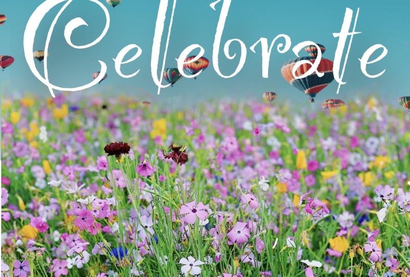
mask because I don't need it. It brings my balloons back. I'm going to bring
my confetti back. I think we are off to
a good start here. Here we have the two
images that I am going to be using for our illustration. And the word I'm going to
be using is celebrate, because I want the balloons
to be a little bit more straight up rather
than angled, I think. So what I'm gonna do, I'm
tapping on the arrow and I get this little green
nodule so I can spin it around like that
and I'm just going to stretch this out. I'm unfree forms, you see that? So I don't want it to be
on free form right now. I'm going to undo all that. I'm gonna go back
here on the balloons, hit the arrow, go to uniform. And I'm going to grab
this little green nodule and I'm gonna kinda twist it. And then I'm going to stretch
this out so the Greens still covers the canvas. I kinda want that orange
balloon in there. So let me see if I can
do something here. Okay, hopefully
you won't have to do this with your image, but I want to cover
this over here. So I'm just going to show you
how to do that real quick. I would go to the selection,
which is this little ribbon. I would go on free hand and
I would grab a chunk of sky. I'm gonna do a three-finger
drag down for copy paste. I am going to hit Copy. And then I'm gonna do
a three-finger drag down again and hit paste. It looks the same, but I
have on a new layer here, a portion of that green sky. And I'm just going
to stretch it out. I'm going to drag
it behind here. So there won't be
any ragged edges. And there we go. You would never know because I want those
two layers together. I'm just going to
pinch them together. The next thing I'm gonna
do is choose my font. I want to be writing in white. Then I'm going to hit
wrench and then add text. And it will default to Ina. As I said before, that's
when a procreates fonts. And I am going to
type, celebrates. Its kinda hard to see
the font on top of here. So I'm going to group
these two photos together by going to the
left and hitting group. And I'm going to just
call these images. And then I am also going to add a new
layer under celebrate. And I'm going to choose
a different color so it doesn't blend in. I'm just going to do this
light blue color and I'm going to fill the layer
with this light blue. And since it's on
top of the images, you can't see the
images anymore. And this is just so we can
get a good look at our fonts. I'm back on the font layer and I'm going to hit Edit Text. I'm going to tap on it twice, and then I'm going
to hit Select All. And then I'm gonna go to AAA and we get these
different options. It doesn't really matter,
but for somebody to have it justified to the left, just so it's easier
to work with. And I'm gonna make my
text box bigger by tapping this selection arrow
and then dragging it out. And that's good enough for now. I'm going to hit
edit texts again, tap on it, hit Select All. And then we'll start looking at different fonts that
we want to use. So I'm going to try and stick to the ones that I
suggested in the class, but I don't 100% remember all of them because
there was a bunch. Arizona was one. That is a font. I could use that,
but I don't know if it works with the vibe. If we have it, then that blue
outline goes away. I don't love it
for this instance. I'm going to select it again and we're going to keep going. Birth stone balance was one. I like that. It's pretty connected. It's kinda illegible. It's pretty legible. Let's see. Burstein bounces one and then
another one is birth stone. I like that. What I'm gonna do is rename
this to birth stone. That's the font's name. And then I'm going to duplicate
the font by swiping left. I'm going to turn off
the birth stone layer and I'm going to go to
my new vista layer, hit Edit Text, and then
select it all and keep going. So then we could compare them
in the end if we wanted to. Corinthian was one that looks too fancy for what
we're doing here. Dancing script was another one. I like that, that's
a possibility. So I'm going to label
this one dancing script. Okay, so I'm gonna
duplicate dancing script. I'm going to turn
off the original. I'm going to go to the
new layer, hit edit text. Yes, that indeed was
dancing script bold. I really liked that one. We might have a wonder it, but I'm just going
to keep looking. Grand Hotel is nice. I like it, but I liked
the other one's better. Gwendolyn may have been
one of our options. I do like it, but I
think it's too fancy scrolling scripty
lobster and lobster two, those are definitely in there. That's nice and thick. I'm going to quit looking. I mean, I could do
this all day and I do. But let's just look at what
we like best for our images. Let me just turn on the, bring up the confetti here. We have celebrates in Labster, we have celebrate
in dancing script, and we have celebrate in birth stone if we just
stretch them out here, which is what we wanna do. So Bridgestone, I'm going to tap on this arrow and stretch it out so I can see what it
would look like really big. Here's dancing script. I'm going to tap on that
arrow and stretch it out. I think this might
be the winner, but let's just look at lobster. I like lobster. I'm gonna go with
dancing script, but just in case
that doesn't work, I'm going to bring these other
ones down to the bottom. That's just the way I work. I like to tuck things that
I'm not using in the bottom if I think I might want
to use them again. Okay, so here is our word
celebrate and dancing script. If I tap it on the arrow, I can stretch it out
so it fits the page. I also want it at
a bit of an angle. So I'm going to tap on this
green little nodule up here, and I'm going to tap seven here, so it will tilt seven degrees. And this is really handy if I wanted it to tilt the other way, I would hit negative
seven for an angle. But instead I want
positive seven. And there we go. So you can have it tilted or not tilted however you
want to do it. I just like a little tilt. And I'm bringing the
letter just to the edge, so we'll have a clear outline. And here's an instance where you might want
to turn snapping and magnetics off because it wants to snap to
a specific place, but we wanna kinda glided
into a just right place. So if we zoom in here, that's cut off a little bit. It's okay. This does not touch the edge. So what I'm gonna do is take this box and just tap over here to move it
subtly over here. And that might fix
both of our issues. Almost to the side there. It's still a little over
their selection arrow tap, tap, tap to move it
this way. Zoom in. Here we go. We have a winner. Of course right here we
have this little gap. But I'm going to teach you
another way to fix that. But in order to do that, we would have to
rasterize our text and that would make it
no longer editable text. So what I'm gonna do is I'm
going to duplicate this. This text is not rasterize
so we can edit it. And when I hit rasterize, it just turns it into pixels
in the page like this. So we can't make the
E and I anymore. It's just pixels on the page. So I'm going to tuck this under here with this rasterize script. We could have done it
before we rasterized it, but it would have rasterized
it in the process. So I just kinda wanted
to talk to you about it. So I'm going to tap Liquify. I'm on push. My size is 56, my pressure is 47. None for distortion
and momentum. It doesn't super matter what your options are here
because we're just doing a tiny little push right here to make that
white meat the side. It's perfect. Now that we have celebrate just
like we want it. We're gonna look at our images. Here we have the confetti, and here we have the balloons,
which I need to bring up. So what we're looking for here is we want the images to
overlap with the words. And I think it's easier
just to show you what I mean. Right here. It wouldn't work
because these green, this green layer doesn't come all the way
down to the word. So I could move celebrate up, which is probably
what I'm gonna do, but I often like it
to be like thirds. So maybe this would work. I'm going to turn
off these balloons. And I'm gonna go
to this confetti, and I'm going to
grab this arrow, and I'm on uniform, and I'm going to move
the confetti up just so it's covering all
of this right here. Because when we mask, we may or may not
want the confetti to be within the insides
of the letters. And then this will go all
the way down to the bottom. This is what it looks
like right now. It's set up. Well, so now that
our Canvas is set up and no worries if
yours isn't set up perfectly or you can't
grasp it quite yet. We'll be going over it in more detail in the
next lesson where we begin masking
our illustration. I will see you in
the next lesson.
8. illustration One Continued : Welcome back and
congratulations because you are more than halfway
through this class. Excellent job sticking with it. And let's keep going. So now we have our canvas setup and now
we're going to start masking. We could either mask the
balloons or confetti. But I'm more sure of the confetti than I am of
the balloons right now. So I am going to turn
off the balloons and we are going to mask the
confetti and the balloons. Then we'll be able to switch. We can switch out to
different balloons. I'll show you what
I mean in a second. The balloon layer is underneath the confetti and turned off. And we have our script
that's there perfectly. I am just going to lock it. I don't lock things a lot, but I just don't want
it to move around. So I'm going to swipe
it to the left and hit Lock. Well, it's locked. We can't move it around or do anything with
it until we unlock it. We are on the confetti layer
and we're going to mask it. So we tap on that
layer and we hit Mask. We have this mask,
it's all white. So we know if we
want to change it, we want to use the color black. And you can mask with any brush. The monoline is a great
all-purpose brush, and it works well for this, but you can get
different effects from masking with
different brushes. We have our monoline brush, we have black, and we want
to draw on the layer. If I drew on the
confetti instead, you will see that
I'm just really drawing on the confetti
and I don't want that, so I want to go to the mask and it will default
back to pure black. I have my mono line
sizes up pretty big. And for now I am going to keep the confetti in the open letters and just start erasing
everything else. So by erasing, I'm
revealing the background, which is a different color. And I'd like the
background actually a more different color to make it easier to see a
more different color. I'm on the blue layer. I'm going to tap magic wand. I'm going to go to hue
saturation and brightness and just change the colors on
that purple is pretty good. Okay, Back on the mask layer, we want to be on the mask layer. We want our model
line, we want black. We're just going to keep going. So masking is essentially
just erasing. When I'm doing this, what I first do is I
erase big chunks of it in the areas where I
don't need to be precise. And then I make
my monoline brush smaller when I need
to get in closer. But I'm just doing some
rough erasing here. I'll just go back over here, make my brush a
little bit smaller. This how I make my brush
smaller and larger. And your opacity should
be all the way up at 102 because otherwise it would make your black
kind of a gray. So that's the cursor size. I go back to my mask and
I just keep masking. So you can be like quick
with this until you get to the edges where you want to
be careful not to go over. So using a thicker font
makes it a little bit easier because if this
is a really thin font, we would need to be more careful when we got to these edges. But let's just say real quick
that we went too far and we went into that area and we
wanted it to come back. We would tap on here and it'll
bring up the last color, which is a white. And we still have our monoline. We go back to the mask and
now we're making this area white again to bring
back the confetti. That's how you would fix it. We might do that a couple more times while we're
going back-and-forth. But now we want the black again. We want to make sure
we're on the layer mask. Just going to keep tracing. What I might do now is do all my tracing and then
come back and tidy up. So what I'm doing
right now is leaving the confetti in these
little closed loops. But we can easily change that. I just want to do
it this way first so we can see what's
the most legible. It might be the other way, but we're just gonna
keep going like this. It'll be easy to
switch back and forth since masking is
non-destructive editing. There we go. Now, we can bring
back our balloons. And there they are. I like this. It's a lot of confetti and
not a lot of balloons. But I kinda like it. You could also do the
words in the middle, but I like it better when your screen is
divided into thirds. So this would be one-third,
one-third, and one-third. I like it like that. So right now we have
the confetti in this area and I think I
don't want the confetti in the open parts
of the letters. I'm going to turn off
these balloons again. And I'm gonna go
to the layer mask. I get black and I still
have my mono line. And what I'm gonna do is just mask out these confetti areas. So we'll be seeing right
now it's the purple. And it's going to be the balloons in the
background there. Let's bring back our balloons. So this looks good. I mentioned earlier that we have texture brushes from Abby nurse. I use them in 99%
of my projects. So there's one called mumble and there's one
called softy paper. And what you do is you
put it on any layer. A lot of times I'm
doing the top layer. This is mumble. This is my black texture layer. It's on and all of these
layers are on n or normal, that's what it will default to. But these brushes are meant
to be overlay brushes. So you scroll down to overlay and then it says zero there. And you can see it changes
the color a little bit, but it gives a nice
texture that is mumble. And then I'm going
to add a new layer. Grab softy paper. I love how big
these brushes are. And you might be able to
see the texture here so you can kind of get an idea of what the texture will look like. And then you tap n and scroll
down to overlay again. So you'll get two
different sets of colors. And so you might want to
take that into account. This is softy paper. You don't have to
name your layers, but I find it to
be really helpful, like if I revisited
this later and I wanted to know what the
font or the brush was. This makes it really
easy for future mean. This is softy paper
and this is mumble. I kind of prefer softy paper, but I wanted to
change the colors since that darkens
it a little bit. So this is another thing I do for almost all of
my illustrations. I tweak the hue,
saturation and brightness. So I'm on the confetti
layer and I'm gonna go to Magic Wand hue,
saturation and brightness. And let's see if I
brighten this up. I like that. What if I desaturate it? I don't really want to
mess with the hue of this, but you could slide that around, but I don't wanna
do that for this, I'm going to keep the
hue at 50 per cent. So I brought the
saturation down 10%, I brought the brightness up 57%. So if you wanted to see if it looks good before you change it, I'll show you how to do
that next with this one. So we're on the balloon layer. Magic Wand, Hue,
Saturation and Brightness. I want to desaturate x. They kinda look like
retro balloons to me. I brought the saturation down 41% and I'm going to
bring the brightness up. But I still want it
to be legible, right? So like if I do it, I mean, obviously I don't
want it that bright, but you can see that it's
harder to read the white, the lighter this is. So I'm just going to
cruise around here. Do it without looking 53%. And I'm gonna do it again, just see where it looks right? 52%. And if you want to see if it looks better
or worse your eyes, you can put your finger down
on the screen. Hit Preview. This is the change we're making. This is the change. This is now changed. Yes, I like that better.
So I'm going hit Apply. Another thing you can
do if the overlay is too much for you is you can bring down the percentage here. So it always starts
on max opacity and then you can slide it down. I like it the way it is
after we changed the colors, but that's just something
to keep in mind. So now if we take that off, you can see that it's
a lot paler because we changed it to
accommodate this texture. So this would be
perfect for an invite, for a celebration or a
birthday card or anything. I like the way it looks or something kinda retro about it. I like it. So we've done our
first illustration. In the next lesson, we're going to review a
quick way to add shadows to make your texts more legible. So I will see you next lesson.
9. Adding Easy Shadows: Welcome back. In
the last lesson, we created this
celebrate illustration. In this lesson, we're going to review a quick way
to add shadows. And adding shadows will make
your text more legible. So let's get started. So our text is right here on this layer and it's in white. And the first thing we
wanna do is duplicate this layer by swiping to the
left and hitting duplicate. And now we have a
second version of this text and you can't see it since it's underneath
the first one. But what we're gonna
do is alpha lock this layer and turn
this layer black. So I already have a black
selected up here in my palette. So I'm going to alpha
lock and then fill layer. And so now we have a
black layer below. And again, you can't
see that because it's right below our white layer. The next thing I'm gonna do is on the alpha lock this layer, because if I tried to apply a Gaussian blur when it's
alpha locked, it won't work. So the next thing we're gonna do is apply a Gaussian blur. So I'm going to Alpha lock it. And then we lose the little checkerboard pattern here once it's not alpha locked. And then I'm gonna go up to Magic Wand, tap Guassian blur. And then we have this
new menu up here. And when you move your Apple pencil or your
finger across the page, you can make it more
or less blurry. I have found that
a Guassian blur of about six or seven per cent
often works well for me. That is a seven per
cent Gaussian blur. And the next thing
we're gonna do is tap the shadow away
from the highlights. So if you look at
this illustration, you can see the highlights on the balloons are right here, which means that the
light source would be coming from this way. So we want the shadows to fall
opposite the light source. So what we wanna do
is make sure we're on our Gaussian Blur layer and we're going to
tap on this arrow. And then by tapping like this, we will move it like one pixel away from
the light source. So I'm moving it this
way and this way. So to the left and down, I usually do like
maybe six taps or so. And then that will create
the shadow effect. Now that we have
our shadow effect, I'm going to change the
blend mode of that layer. And blend modes always
start at N for normal. And then there's a lot of different things we can
do with blend modes. But for our purposes right now, we want a multiply blend mode. I always put my shadows
on a multiply blend mode. And that way, the shadows will interact with
the existing colors. It's subtle, but it
does make a difference. And then I will turn off
my shadows and see what the effect is because shadows
can look good at a glance, but then you turn it off
and it might look a little bit too harsh or a
little bit too intense. So I have also
found that I liked my shadows at about 55% opacity. So what you do
here is you tap on your layer and the opacity
starts at max 100%. And then you can scroll this way and try different effects. So this is a 55% opacity. I like that. It's pretty subtle. We can also try, I like my, I like double digits, so I'm
always doing like 55%, 44%. That is just purely me being me. But this is a 44% opacity. And I think that looks nice too. We could also be wild and
go right in the middle 50%. That looks pretty good. So that is how you can apply a subtle shadow to text to make the text a little
bit more legible. And the next lesson we'll be creating a second illustration. I will see you in the next one.
10. Second Masked Illustration: Welcome back. In
the next lesson, we're gonna do one
more project to just go over masking again. So let's go back to the gallery. I'm going to hit plus. And I am going to create a
new canvas that's 12 by 16. And I'm going to redo
this spring vibes one. So here is our field of daisies. I'm going to copy it by doing
a three-finger drag down, hit copy in this picture as either from Unsplash or Pexels, which is another website I like. Here's our new blank canvas. I do a three-finger drag
down and hit paste. And here it is. And it doesn't quite fill
the canvas, but that's okay. We can stretch it out. I'm on uniform, I'm just
grabbing the edge of this to stretch it out
to fill the canvas. So there are our flowers. Here. I have a blue sky. There's lots of BlueSky options on both Unsplash and pixels. And this is actually
on two layers. Right now I have a sky
and the background. So I can get both the
clouds and the sky. If I do a three-finger
drag down and hit Copy all it will copy
everything that's currently visible on the screen. And I'm going to
bring that back to my canvas and I'm
going to hit Paste. And it was on a 12
by 16 Canvas before, so it fits perfectly. So the next step
is finding a font. And I'm going to turn this
one off because it'll be easier to see against
this blue background. I'm going to go and
choose a color, white. Again. I'm gonna go to
wrench, add texts. I'm going to select all, and it turns blue. And then I'm going to tap on
AAA in this menu comes up. I'm going to have
it justified left, just to make it a
little bit easier. And then I'm going to
bring the bounding box in. Smaller. We can always make it bigger or
smaller as we want. And so I said on the other ones, spring vibes, this will be two words so
you can see the difference. Or what we do with two
words on this one. So this, we need the
bounding box bigger so it's all there.
That's good. Start. Tap on it again. Select all AAA. Go
down to the bottom. Yesteryear is a free font. It's a little retro. I like it. Maybe not necessarily for this. I think this was 12
up doc I like it. Sacramento. Ruse script was one
and that's scrolling, which I do like, I just
don't love it for this one. Here's a good example. You can't see here what
the font is called. But if you tap on it, you'll see that the
font is radical Hollis, radical Alice, and that
is not a free font, so I will not use it, but I
like it. I like it a lot. Oh, here's lobster
again and Lobster Two. This is dancing scripted. I use that last time. I think I did, but
what the heck? I'm just going to use it
again. I'm liking it. So I'm going to
bring the size down so it fits on one line. And then I'll also show you how I would connect
the words but for someone to get it sized right. So I'm stretching it out and I'm going to turn
snapping off again. So there it looks pretty good. I'm going to tap this
little green thing and we'll get the angle up. Let's do seven degrees again. I like that. I think I might want
this up a little bit. And then maybe I can
stretch my sky out. I'm on the sky layer, I tap that arrow. I'm just going to bring the clouds a little
bit up for legibility. I am going to duplicate
this again because I know I'm going to want
to rasterize this, so I'm going to tuck the font under there and then I'm
gonna hit rasterize. And then we're going to start connecting the words
and the letters. So the first thing I'm gonna
do is I'm going to bring vibes closer to spring. So it's selection, freehand, and I'm going to just
draw around vibes. That area is selected
and I'm going to bring it closer to spring. I want it far enough to make it look like it's its own word, but close enough that
we could connect it. And I also don't
want to be changing the size of the word
while I'm doing that, I think that looks pretty good. Then what I'm gonna
do is I'm going to add a layer above spring vibes. I'm going to grab my monoline, I'm going to bring it down. This shows you how
big the cursor is. I want it to be pretty small, and I'm on the layer above. That way it can
easily delete things. And I don't have
this stretched out perfectly to the sides. I'm just gonna do
this step first. I'm just going to pretend I
was I'm writing and I'm just kind of I don't know how
easily I can do this. Bring this over. I don't like the
way that's looking. Actually, I'm going to
choose a different font. Goodbye to this. Let's bring this backup. So let's find it easier
font to connect. So select all that
was dancing, script. Cry Cynthia, birth stone
and birth don't bounce. Those are very nice. Bridgestone, Bridgestone bounce. The bounce is a little
bit less legible, but it's more fun. I think that'll be
easier to connect. So we are going to switch
to birth stone balance, which is a free Google font. So I'm stretching it out here. I like the location of it. I like that it's white. I'm going to add a
new layer above it. And first I'm going to
duplicate this as I do, tuck it in the background. And then I'm going
to rasterize this. So it just turns into
pixels on the page. I'm going to grab the Selection ribbon free hand and bring the vibes a little
bit closer to spring. I'm gonna do a new
layer above there. I have the monoline and white. Again, I'm going to bring
the cursor size down. I'm just doing it on another
layer to make it easier. That looks good. I'm not a hand letter and you don't need to be
either for this. I just think about what the natural flow
would be for this. That's good. I think I'll clean it up once the layers are merged together. This, I'll just
connect like this. In this zoom out. This isn't connecting over
there, but that's fine. I think this looks good enough
to connect the two layers. I'm going to pinch them
together and then I'm going to do some cleaning up. This is just ever so
slightly not connected. I think that looks good. And I'm going to
stretch out my layer again by tapping that arrow. And I want it to be
just to the edge. To the edge there. It looks good. What I'm gonna do
here is I am going to mask the sky instead
of the daisies. And then I'll show you how
we can pop different flowers in there really easily
if we do it like that. So I want to get the clouds
the way I want them, maybe bump them up a little bit. I'm on the cloud layer. I think that looks good. In this case, the daisies
are going to be below this, but they're turned
off now that's fine. Let's get a different
background color in here. Because when we
erase away the blue, we're just going to have
white behind there. So I'm going to fill
in this peachy color that we'll be able to see
once we start masking. Okay, So now we're
masking this layer. So we're hitting mask. This white layer comes
up right at two on top, it's attached to that layer. I have a pure black, I have the mono line. There's an easy way to get
rid of all of this blue. It's the opposite of
Color Fill, Color Fill. So what I'm doing
here is I'm just going to bring up
this monoline cursor. I'm going to draw a big box, and it's all connected here. So I'm going to fill this. Didn't work. It has a leak here. So the color leaked out. So I'm filling it with black. And that is just a way to do a quick masking of a large area. So we could, if that
doesn't make sense to, you can just do it
by the other way. But I'm gonna do it like that. I'm just going to draw around
here and I'm going to keep filling in with black. I could just cut it
out or erase it. But again, this is a
non-destructive way of editing. So I'm just doing
it in big chunks. So I'm grabbing the monoline again and making
a little bigger. And then I'm going up here. Here's something, there's
this little space here. So I think I'm just going to
connect these two together. And I'm taking this S, grabbed my mono line and I could just
connect it like that. I'm going to keep on going. I'm gonna make it a
little bit thicker yet, and I'm just tracing
around the outside here. Just keep tracing. What it did here was quick
shape came into play there. I held down too long so
it made it a specific shape that I didn't want.
Just keep that in mind. I went over here. So I'm going to grab white, I'm on the mask and
that's how I undo the black on the mask with black two finger tap
to undo and procreate. I went a little bit over there, but I'll clean up afterwards. So let's zoom in here
and see how I did. That looks good. Little spot there. Little spot here. Okay. So it looks pretty
clean on the inside here. Now we're going to
switch to white, still on the mask
to take care of these peach areas that
went up into the blue. Alright, I think
that looks good. Let's turn on our daisy layer. I like that, I like that a lot. Let's finish this off
with a texture by Abby. Let's try a softy paper overlay. These are meant to be used
with black on a top layer. Just swoop it on there. And then you change
the blend mode to overlay and it makes it
a little bit darker. So then we go back to our
colors and we adjust them. Here's our sky. We go to Magic Wand, hue, saturation and brightness. I'm going to
brighten up the sky, maybe desaturate
it a little bit. This as d saturated, this is highly saturated. It's a little desaturated
and a little brighter. And if I want to see if that
looks better to my eyes, I would put my finger down preview, let's
definitely better. So I'm going to apply it. And now I'm on my daisy layer, Magic Wand, Hue,
Saturation, Brightness. Want to brighten that up. What I'm gonna do,
the saturation, it looks kinda more vintage
if it's less saturated. And a lot of times, Let's
see if that looks better. Definitely. I like that. There is a really easy
way to switch out those bottom flowers
since we masked the top. I'm going to show
you what I mean. Let's grab these flowers. Three-finger drag down. I'm on the right layer.
I'm going to hit Copy. I'm going to go right here. I'm going to tap Plus on the
layer above the daisies, I'm going to hit Paste. And this is dark again
because of the texture layer. And the texture layer, you
might not be able to tell what it does so much
from watching this, but believe me, it adds
a really nice texture. It's really dark again. So hue saturation and
brightness on our new flowers. Turning up the brightness down the saturation
a little bit. Preview. Definitely better. So there you go, because the sky is
the mask layer. You can switch this into
whatever you would like. So there you go, you
could keep switching out over and over again. So usually I will mask the
layer that I liked the most, that I'm the most certain nerve or the one like a blue sky. You could use that
with anything and you can switch out what's below there really easily once it smashed so you can
just go back and forth. All right, you guys,
we are almost, almost done with this class. Congratulations. And I will see you in the next lesson for
a quick wrap up. I'll see you there.
11. Congratulations!: Congratulations, you've
completed this class. Thank you so much
for joining me. I hope this class has
expanded your knowledge about the Procreate app and
sparks your creativity. If you'd like more
resources for digital art, check out my website, Kelly Brian burke.com also check out my other
Skillshare classes. They're all about creative
play in the Procreate app. As always, I love to
see what you create. So please upload
your class project by clicking the class
project and resources tab. I know you'll inspire me and others with your illustration. Want to be the first to
know about new classes, giveaways and bonus lessons. Follow me on Skillshare
by clicking here. Thanks again, and
I hope to see you.
 Kelley Bren Burke, Artist & Educator