Transcripts
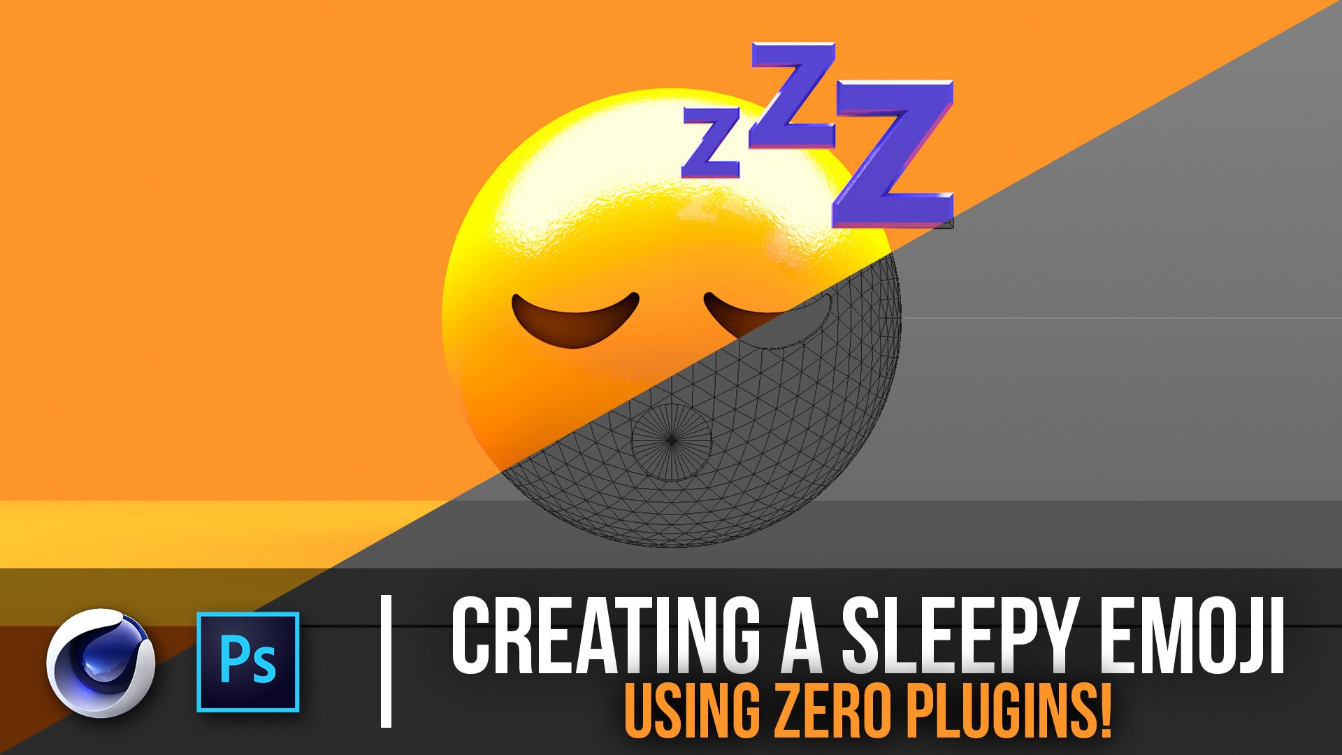
1. Introduction: What's going on, guys? This is Patrick again. We've got another sweet class to you today. Recently, I came out with a logo series on my social media and it got a lot of buzz. Pretty much our take, really iconic logos, and gave it my own direction, 3D extrude them, and put them into their own environments. It's really useful for brands if you're working with smaller companies to larger companies making entitled cards, whatever. So you're able to take really any 2D logo and 3D extrude it and do whatever you want with it. So we're going to go over how I went about that process and we're going to need three programs. We're going to need Adobe Illustrator to take the 2D logo on vectorize it. We're going to need Cinema 4D to extrude it and make the whole atmosphere, and then we're going to finish off in Photoshop, where we color it and mess with the colors and bring it to life. So we're going to go over that, it's a pretty hefty class, so let's get ready. Let's do it.
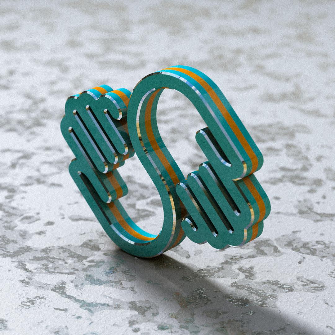
2. Prepping 2D Logo for 3D: All right guys, welcome to the first video here. The reason I'm making this class in the first place is because I got a lot of requests for it, and two, I got a lot of good feedback of my latest logo series. If you guys aren't familiar, I took a really big company logos and took the 2D png image or converted it into 3D and some of them are put into environments like this. Some are more straight out, but it still gives them a very good 3D look. So I'm going to do something in between with this one I think, and what better company than skill share for this video? So what we're going to do is jump into Illustrator. You're going to need Adobe Illustrator to start off here, and really what we're going to do is create a new template here. I have one already set up here, this is just called film and video. I think it's a preset already made. It really doesn't matter because these are vectorized images. But I'm going 1080 by 1080. If you want to copy some of these settings here, and we just click Create and I run it without a background. So we don't have to worry about that. As you'll see, it gives us like these guides here and we can move these around, do whatever we need to do, by holding spacebar and clicking and dragging. The next thing we're going to do is get our logo. I was lucky enough to get a logo from Skillshare. They're able to send me one. This is actually a pretty small png image. It's not too big. Usually we want bigger files for this because we're going to either way vectorize them but if you zoom in, you see these pixel base. When you zoom in, we're getting a lot of banding here and a lot of distortion which we don't really want. So what we're going to do is just try to mess with this a little bit. So we're going to drag this into Illustrator. We see it pops right in the center here, and that's what we want. You'll notice if we enlarge this a little bit, taking the selection tool, we see the same problem because this is pixel based and we're getting the distortion I was talking about. I think illustrator tries to do a little bit of blurring, tries to compensate for some of that, but that's really not what we want. So we want to keep this at this size for now. Once we have this selected, you'll see we have some options at the top here, and one of those is image trace. We have to do an illustrator, it's pretty brief. It'll just give us the the tools we need to upload this into Cinema 4D because you cannot upload a png. I mean you can, but that is not what we're going for. We're trying to upload splines into Cinema 4D. So there's a couple things you got to do here. We got an image trace function here, and we're going to click the presets. You're going to click three colors. What that's going to do is right there and just vectorize the image. Because they sent me a pretty decent looking image, it wasn't too distorted, Illustrator was able to kind of figure out the line segments and how to fill in the gaps here. So now if we actually enlarge this, It's pretty flawless. And with other images that are more distorted, there are other settings you can use to out certain properties that didn't really fit well. But this is good so we can Command Z to undo. Once we have this selected, we need to convert these so we can select multiple parts of it because right now it's just a single flat vectorize image. So we're going to click expand. As you can see, all these outlines have appeared. And I've made the decision to make this inverted. So what I'm going to do is click the direct selection tool and select the white area here and delete that, select the White here, delete that, and select the blue and delete that. So we're really left with just one piece here and it's the hands. We can check here on the layers. Right here's the little icon for the layers and we can select the group here. And we can see there's only one PC selected. I think we're good. So once we've got that there, if you want to enlarge it, you can, but since it's vectorized, we're looking good and that's all I really need for this. So what I'm going to do is File, Save As and save to Logos folder here, and what I'm going to do is just title this skill share spline, something like that. When I click Save, it's going to have these options here, and an important thing to note, at least I don't think they'll fix this thus far but what you have to do is go down all the way to Illustrator eight. And that's pretty key because for whatever reasons, Cinema 4D, up until now at least has only been able to read, illustrate on eight files. So we're going to click okay and click okay again, and that's it. We're done with illustrator, so that's really all we need to be worried about in this segment. So I will see you there in Cinema 4D.
3. Converting 2D Splines to 3D Extrusion: Guys, we're in [inaudible] now and we're ready to embed this logo or the splines for lack of a better word. What we want to do for that is really just click file, merge and find the logo that we saved Skillshare and the Skillshare spline. It's an illustrator eight file, as we mentioned earlier, and we're going to click open. Everything here is fine. We're going to click okay. Because it always starts at the top left corner, or what you'll have it is, that's how it starts off as. You're just going to want to click here and go to coordinates and you can see they're not zeroed out, so you want to zero those out. There's the logo. For whatever reason, it always attaches some art boards or some outlines that are not necessarily needed. There's a way to turn them off, but I have not done that. I forgot to do that. I'm going to take this line here and just delete it, this spline over here and delete it. Now we should be left with, if you click zero or, O my apologies. We should just have the spline that we need for this video. What we're going to do first is extrude this thing and we're going to make sure these splines are set correctly and they're ready for our actually 3D extrusion. But we can dust that out literally just by going to display, making your display settings gouraud shading lines. Once we start to add geometry, we'll be able to see the segments correctly. We're going want to do is, go over here and take, my apologies right here, and get the extrude deformer. After that, we're going to take this and really separate this path from this folder here, because we don't need the folder, we can just rename the spline to logo. Once we do that, we can just drag it inside as a child of the extrude. Now you can see this thing has been X3D extruded. It's really easy. A lot of people think I just had to model from scratch all of these logos and that's really not the case. You'll see that the segments are not even with each other. Notice where they're more curves, they are more segments divided. I believe that's because it's set to adaptive. It is, and for many logos, what I usually use is uniform because, really makes everything normalized and even easier on the eye. I'm much more comfortable editing with something like this than something that has segments placed all weirdly. You can see there's some deformities here that maybe could look a little better, but when these are zoomed out, you really can't notice. If you wanted, you can mess with these yourself. We're going to test a few out. I didn't prepare this. As I know exactly which values to go in. What I wanted to do is make this from scratch so you guys can see the process that I go through and see what works and what doesn't. It's really different for each logo. We're just going to check uniform and we're going to bump the segments, see if that helps. It looks like it does help this edge a little bit. I might keep it with that. Because it's a logo, bumping the segments up a little bit is not really going to hurt this render. It's not going to kill the render time. We're not animating this, at least in this instance. I'm going to get the camera set before we start moving forward anymore. This is still zeroed out. We don't have to worry about, actually we can move this a little bit up, making sure those are all zeroed out. This is all zeroed out here. We should be good. The next thing we're going to do is bell these edges so light can catch on these edges a little bit more. Something I've been doing lately with the logos is having the beveled edges, be goldish or shiny reflective. It really boost the quality of what these things actually look like. What we're going to do is go to extrude tab and go to caps. We really only have to mess with the top, because I believe I know where the camera's going to be set up. We can take the end cap and turn it off, which means the bottom will be hollow and it doesn't look the best, but because we're never going to see it, it just eliminates one of the segments that we have to worry about. The next thing we're going to do is go to the start and go to fill it cap. As you can see, it is now bevel the edges. This looks pretty nice, but I think it's a little bit to beveled. We're going to take this down to maybe three or two, maybe even one. This is where you actually get to decide if you want these edges to be rounded. Bumping up the steps or flat. I think for this I'll be going with flat. I think one should be good, I mean two maybe 1.5 is the trick. Yes, we can stick with that. 1.5 we'll stick with and after that we're really done. I mean, people don't want to edit destructively. We'll take this right-click and do current state the object, which will keep the original and make everything editable for us here. You can see the preselections here. If we wanted to edit just the beveled edges, we can. That's going to become really useful, because we are going to use those. We can turn off these non destructive options here, because we're not going to be using those unless you make a big mistake, which I don't think we will. We can rename this as inside. Then when you double-click this, you can see, we can call this bevel. This is self-explanatory cap. That's really all we have to worry about right now. The logo is pretty much set.
4. Camera Settings / Render Settings: The next thing I'm going to do here is set the camera so I know exactly what's going on and add a floor. Before I do anything, I'll add a floor just to ground plain, simple. You can find that by clicking down here and clicking the plane holding down. I've just moved my plane a little bit easier, so it off to go into that option menu. I'm going to move this down. I like keeping the logo stationary and not moving the logo and moving things around it. Just so when I add certain elements to it, it's easier. The next thing I'm going to do is just fill this out, see where everything is. Maybe I can turn off the display mode. Looks nice so far. I'm going to frame this camera how I want it and I know I'm going to want some depth to fill on this thing. I'm going to take the camera and go to the focal length and the objects panel, and I'm going to go to, I think tally for this and notice it zooms way in because that's naturally if we increase the focal length, that's what it's going to do. I'm just going to select anywhere and drag this way out to where maybe something like this and it's decently centered. If we can't really tell where we are, notice these bounding boxes are faded out and it's hard to see where you are in relation. If you click ''Shift-V'', it takes you to the viewport window and under the ''View tab'', you can take the opacity and boost this way up, so you can see where you are in the frame. Something like this should really be good. We can save this for now. I'm just going to save this as. We'll go back to logos actually. Skillshare and then class. This should be good. This is saved so far. It's got a constant shading. I'd like to see the segment's every once in a while. Let's make sure this floor is hitting this logo, like we see it here. What we do is select, and to get to this window, my apologies, is to just click the middle mouse button or this guy right here. Once we're in this front view, we can see where this floor is in relation to the logo. If we just move that up, we know indefinitely this thing is touching the ground. We don't have to mess with that anymore and the ground doesn't have to be centered at all. If you move it on the x and z-plane, you know that it's always going to be touched in ground. We can just move this up. Depending on really what we want to do with it, just scaling this guy up as much as we want. We know this thing will be covered by all sides and there won't be any blank spaces. We're looking good. I like this perspective that we got going on here. I think we're ready to start lighting this thing. I like to light my things before texturing them. Some people may do the other way around, but there's really no point in texturing it for me before I now how it looks bounced off the lighting conditions that we want. This is good. Before we even start messing with lighting, let's go over some render settings just so you guys don't get too confused here. I'm in the physical render here, you want to make sure you're physical, because we are going to be using depth the field. My output settings are 600 by 600 until we render out because I want a really small image, so the pre-render doesn't have to calculate anything too crazy. You can copy these settings. We're not going to mess with the frames at all, so these right here. We're going to save them as 16-bit TIFFs PSD layers. Leave it out this here. A lot of the stuff you can do after you bump it out, so it really doesn't matter. You can ignore everything here to leave these as default and go to the physical tab. Make sure you're set to progressive. Make sure all these values are set to two. You may be able to put the subsurface scattering, so division to zero depending if we use that or not. Again, I don't know. But that's because I'm doing this fresh for everyone here. Ambient occlusion, you're going to want to check on, so we can check that on, leave these as default. You can check evaluate transparency because that helps when you're working with glass sometimes. The next thing you want to do is check on global illumination. You're going to go ready in its cache. Secondary method, none. Gamma 1, custom sample count, 20, and 20 is very low number. You're going to get some splotches early on, but it really doesn't matter because once we start rendering, we're going to bump this to like 100-200. Depending on what we got, we'll mess with that when we need to. We're going to bump out the interactive render region here and get some nice lighting. To do that, we're going to click option and that's going to pop up this box here. We're going to drag all sides and notice there is complete blackness, and that is because we have global illumination on. If we turn it off, we would be able to see this with default lighting and some shadowing thanks to ambient occlusion. What we're going to want to turn this on eventually. If you want to leave this off until we actually add a light, that's totally fine. The next thing you want to do is click view on this window here. For those of you who don't know or this is the first class you've watched, right here is a second panel. I have four constant rendering, almost like octane, but it's like the makeshift version that you can use when you only have the native program. If you guys are curious about how to do that, I might go in-depth in another class. It's actually free class called layouts. You really just got a panel and New View Panel. I explain in the other class more in depth about how to get that, where and how to manage those. To make sure you're selected in this viewport, before we have this camera, we're going to click ''View''. Make sure this is highlighted in blue like it is currently, and we're going to jump out of the camera. That's good because we can mess around with other objects in the scene. But also leave this as it is. That's really useful. If you're not crazy about looking at the camera, you can double-click this little bubble top bubble here. It hides it from the render view or the viewport window, not the render view. But I like it there for now because I like to know when I place lights later where the cameras and sometimes easy to forget.
5. Lighting (HDRI / Area): What we're going to do is, we're actually going to add an area light to give it some nice shadowing because this is looking okay, but it's pretty flat and we're using default light. Because once we use global illumination, that'll be turned off. The first thing we're going to do is add an area light. Just hold down on this guy, click "Area light", and you'll see this gives us some really weird results, but that is because you we're literally inside of this thing, and it doesn't know how to react. There's a couple of things we can do. One, you can just move this manually, move this how we can, rotate a little bit, holding down shift, moving it back here up, moving this around, trying to fill it out, and moving around that way. For some people it's definitely you got to have a feel for moving these guys, moving around the viewport, but there's another way that's actually much easier and much more preferable. If I exit this out and go back to where I was originally, the first thing you're going to want to do is locate this button here, which is not a guarantee, is not on your panel, but this is very clutch for when you're moving lights around, especially area lights or spotlights, and what that does is exactly what it sounds like. It allows me to hop in if I have this viewport selected, and select the light, and I click this button. I am now looking through the light. Anything I'm looking at in this viewport , I'm moving as the light, and you can see from this window if I zoom in, I'm zooming in the light, if I want to look. You literally have to pretend you're the light and go wherever you think the light would look good in. That's what we're going to do here, and I'm going to redo that for you guys. I'm going to delete this light, and right now I'm back and space here. A way to get that, I'm not going to go too in depth about how to customize your menus here. I actually go through that in another class, I think it was layouts again. You guys might want to just watch that in general, but you're going to window customization, and I believe it is customized palettes and you're just going to search for the set active object, that's camera. If you just type in camera, you'll see it's camera here, and notice all these things get blue. Just drag this thing here and I drag it here because it's useful,I use it a lot, and it cuts down the time to make all these things significantly. Once you've got this button figured out, we're going to create this light, this area light here, and if we have this panel selected and this light selected, you're going to click, we're going to do what we did last time, zoom out sometimes because it's zeroed out, it takes a while to function properly. We're going to go all the way back here. I like to give these things a back key light. If you know anything about lighting, sometimes these are really good options. The next thing we're going to do is click global illumination. Just that it's going to give us a little bit of a boost in here in a second, and if we jump back in the camera and jump back out, we can now see this light is where we wanted it to be, and then we get back in there is literally just click on the button again. We're going to want to make sure shadowing is set to area, so that'll give us a nice realistic shadow. It may look greedy because that's the only source of light we have. There's nothing for it to reflect, so these shadows are pure black, but in just a second these things are going to look pretty nice. What we're going to do is create the HDORI, and this is really what's going to make this thing look realistic, so we're going to want to do is just grab a sphere and scale this thing's bigger than everything including the light, and if you zoom in, as long as everything's in there were good. You can tell here we're barely getting in here. We don't want anything other than the floor showing and we don't want the background showing here, at least for this image, as long as these things are not going past. It gets clipped off there you know we're safe. Same with here, and right here and right here. So we're good here. We're going to get our first material let's make it. This will be our HDRI. It's going to create new material, and we can double-click the name and call this HDRI. Next thing you want to do is drag that on the sphere, and you see already because we've got global illumination on it's reflecting the sphere, the shadows are not as harsh, but it's still a little bit flat, a little bit unrealistic because not too many environments are just pure white. What we're going to do is go to within this material. We're going to kill the color channel and kill the reflection channel and check luminous channel, and now this thing is actually giving off light. Next thing we're going to do is click the illumination tab down here, click GI area light to diffusive any splotches we get. More so that works with if you're using plain lights or something like that, but we're going to go to luminous tab and go to load the image, and here's my HDRI folder here, this is comprised of different Internet images and images I've taken by myself. As long as you find a good image that works for you, that's really the best option. I'm going to take this image that I took a while back, this is just my rooftop here. Should work just fine, and I'm going to click Open, and I'm going to click Yes here, and once we do that, we see that this lighting quality has just boosted and it's much more realistic reading different colors and it's reflecting this thing naturally. We're just going to move this up so it looks like this thing is actually sitting on the ground here, and this looks pretty good. We're actually in this dome here with the reflection, and I'm happy with the reflections I'm getting here.
6. Texturing (Logo / Ground): Next we're going to want to do is mess with the textures of the logo. I'll show you the first one I usually do is mess with the beveled edges. I'm just going to double-click here and creating another texture, and you can type in trimming, or just trim. Now that we have our logo, we know that the beveled edges here, use double-click this pre-made polygon selection tag, and it'll highlight all of the trimming image going to drag this on here. We've textured just one aspect of this thing, and it looks nice. We got that. We know that's going to be set for the trimming. We'll leave that later in a second. We'll come right back to this in two seconds. We're going to make the other material, and this is going to be the whole body of the thing. That we'll just call body. We'll just drag this on the logo here, and we'll drag that on the face as well. If I'm not mistaken, the beveled edge overrides everything. If I go to trim and kill the color, the trim is still sticks out as the trim. We have all sections colored in here how we want. What we're going to do is go to the reflections tab after we kill the color of the trim, and add reflection legacy. Now, this thing is completely reflective, completely chrome. We're looking good, and we're going to make this gold. We're going to go to layer color, and a lot of people make the mistake of, this is gold, let's go all the way to yellow, way to gold. That's never what we want. At least not for this image. We really only need about this much, and that's much more of a natural gold. If you wanted it to be more reddish, that's more of a reddish rose gold, but that looks good to me. Now, we're ready to mess with the other part of the object. Depending on what you want, we're just going to add this cool. I'm going to make the grounds reflection. I'll save this one. Let's see what I'm going to do for this. I think what I'm going to do is add a reflection. This now is should be a 100 percent chrome. We definitely don't want that. We're going to take this down to about 8 percent. It's like a reflective thing. I guess we can actually use the colors of the skillshare logo. I had and idea, I think I'm just going to use the skillshare logo colors, which happened to be like this, bluish turquoise, which I eyeball it here, brighten this up a little bit, desaturated a little more green. It's actually a little bluer, [inaudible]. It's a darker blue. If I grab this up interest, try to eyeball. We're getting there just a little bit brighter. Now, for the trimming, I think what would work actually is, maybe you can do that like orange trim. If we go to the layer color, and go to straight orange, [inaudible]. What I will do is, matter of fact, let's take this back maybe two straight chrome. I think that's what we might want to stick with. For this, I may have had another idea to actually add an orange background to this. Let me see how this works out. If I jump back into the camera and I select a cylinder, and go to the selection and drag the faces down, and rotate this 90 degrees holding down shift, and then we make this a little bit bigger than the logo. Select E moves this back. I'm wondering if this might be a cooler thing to do. Let me play with this for two seconds. I think that might be cool. Either way, adding a cylinder there, and beveling the edges. We're going to click fill it, and we're going to take this down to maybe three. That might look cool. I think three will look good, and then taking the rotation segments to a 100, maybe even 150. Because I do want a decent amount of segments in there, and adding another material, and adding that to this background here. Because in our own version of this logo, can be more stylistic. I know orange is another one of their colors. Just having fun with it because this is to a certain extent abstract. If we had some reflection on here, reflectance add, and drop the default specular all the way down and take this down to like five. We're getting a little bit of reflection from the back in here. We're here, we got this nice lighting giving us shadowing here. We might be able to do is add a cool little streak on the side of this thing. If we go to the inside, select that. Now if we click this and do command a, the whole insides are selected. If we go to extrude enter, and we just create a line here, this will give us a cool way to add a little streak. If we go to this other material we created, a matter of fact, let's creates a new material. We're going to call this streak. We can make this the secondary color of the logo. If we drag that in there, we're now getting a streak. We can copy this reflectance we have here. We've got a reflectance layer one copy, so it's really just a percent reflection, and copy that to the reflection here. Also killing the specular. We can change the color of this thing to this to orange thing we have here. Now it's the two trimmings of this logo and our own cool way. I actually like that. I think it fits with the logo and it looks good with the skillshare vibe. The next thing we can work on is the floor. Everything looks good. We just got to work on the floor and the camera settings a little bit more. Let's work on texturing floor. We're going to add another material, we can call this ground. Might as well give it all caps everything else does, so ground and we're going to drag it on here. As you can see, it actually really looks cool because skillshare I know is a very clean cut company. It's a new company, relatively new. This vibe right here gives us this cool look. A lot of times I give more grungy floor textures and what not. I think overall this looks good. But I think maybe we can add some different cool tricks to this image. What we're going to do is jump into this texture here and we can mess around with some subtle reflections. We're going to add a reflection legacy. What that's going do is mirror the image, and that is not what we want. By the way, another cool feature, if you wanted something to look pristine but not just blank white, you can make it 100 percent reflective but add some roughness. If you go to like 20 percent roughness, it just looks like it's on this mirrored surface that's really rough, and reflections don't really distract you from the image. Plus it gives you some greediness over here. You could do that. But for this, we're going to keep this set to zero for now. But under the Layer Mask, we're going to go to texture and layer. Because we're going to be stacking some layers now. We're going go to layer tab and we're going to go to noise right off the bat. It's going to give us this noisy, half done mask of the reflection. Because it's like this sloppy noise that looks pixelated almost and distorted. We're going to jump into this procedural noise here and change it to something like noodest or whatever this is called. Right off the bat, it looks better. But I think we can mess with this a little more. If we take the ground scale and boost it to like 600, these things are all going to be much bigger. It looks marbled now. That's pretty cool. You can change how much this texture is fading off and distortion wise by changing the low clip and the high clip. As you can see, this is taking a lot of it away to give it only certain streaks. That maybe if you want something that looks imperfect, that works. But we're going to mess with a little bit of this, but a lot of this, we get these cleaner edges and less of these tapered edges here. This looks good to me for starts. Again, we're layering these things so you don't have to worry about if this looks amazing yet. This looks fine to me. If you want to add maybe a little bit of roughness, totally fine. Maybe three percent, just it's not a 100 percent clean, give that little realism to it. The next thing we're going to do is go back a step here. Another step back till we're in this Layers panel here. We're going to add on top a gradient. Obviously, this gradient mass everything and even this looks cool, looks clean. We're going to do is take this gradient and go to radial 2D, not 2D radial. Let's go to circular, I believe. After that, what we're going to do is go to the turbulence and take this up to 50 percent, and as you can see, it looks cloudy now. What happens is once we get a little bit of a cloud, we can take this and go from normal to darken. What that does is take away some of the reflections from the certain areas and vice versa, if you want to go to screen, that also makes a heavy difference, and what is seen we're just masking these things and seeing the effect. We don't have to go with that and go to another layer blend that we wanted our layer type. 2D you looks fine. Let's let's pump this turbulence up to a 100 and see what happens. Totally fine. It looks like this dirty ground thing going on. But instead of a gradient, we can delete that. Let's go to another noise. Within the noise, let's make this thing harsher, let's go to poxo. I don't know what that name is? If we go back, we can take this noise and set this to screen. As you can see from this noise, it screens out certain things. Let's go to 500 global-scale. See what happens there. Because it's grayed out, you can't see too much. But we're going to adjust this low clip and adjust this high clip, and these are very subtle differences. But if you want to see more of what's going on here, we can get this to render faster and boost this guy up so we can get a 100 percent of what's going on here. What we got going on here. looks good for now. Let's see here, let's go back to the reflection tab and come out of this. This is pretty cool. Let's just keep stacking on different noises. This one we can set to darken. As you can see, this is affecting the reflection already. When you go to noise. Let's go fire this time, and within the fire we can remove some of this low clip and take some of the high clip down. Take the low clip back a little bit. Let me take this back. We can get more of these chunk showing. That looks good. Let's go back to this. We can really take the opacity of this down 50 percent to reveal the others now. Now, we're getting layered patterns here. That look really cool. Depending on what you're going for, maybe you're going for something a little bit more subtle. You can take this original pattern down or take them all down a little bit, and you're getting this faded texture. Especially once we start using depth of field, it does start coming together even more.
7. Camera Settings Part: II / Render Settings Part: II: Let's use some Depth of Field. Let's go to the Camera right here. Once we're inside the Camera, which we are in both viewpoints, we're going to go to focus distance here and click the point at which we want this to be focused on. You're going to click here. You'll know it's focused, because zooming out the Camera, the bounding boxes will be set exactly aligned. Then you can always do it manually, but let's keep that how it is and we won't see it unless we go to the Physical tab and enable "Depth of Field." Once we have that enabled, you'll see the background fades away a little bit, but to see it fully, you got to adjust the Camera Settings. We're going to go to Physical tab, take the f-stop down to, let's go one. Now, the background is super blurry and this thing has some nice Depth of Field, so I'm pretty happy with that. We can add some Bump now to this Floor. Not completely satisfied, but let's see what the Bump does. Go to Bump. Let's add some Subtle noise and you'll see this adds some ridiculous noise which just ruins it for me, kind of cottage cheese looking. Let's go to the noise and go all the way down to something like [inaudible] again. I'm a big fan of this noise and we can actually take this global scale down to 65 and take the Bump down to 10 percent because you don't always want something to be too obvious or too fake almost. We're getting some really good textures here. I'm really happy with the shadowing we're getting and I think this looks really cool. I really don't want to mess with it too much because this is a Skillshare logo. I think this almost wraps up what we're going for here. This is a cool ground texture and again, a lot of the stuff. I appreciate you guys watching this. I appreciate you guys watching all of these episodes. We still have one more section which is Photoshop, making this thing really come to life, but I think we're done here. I'm just going to go with the Render Settings, but if you'll see I went back and forth a bunch times because that's how I do it in real life. I think there's something to be said for me going through my actual motions instead of actually having these buttons that I already know what the values are going to be. I wrote them down already because you guys are only learned the process from that. You just learn. It's like a test. I don't think standardized tests or anything like that are the best way to actually learn. You just got to do it for yourself and see what works. Things that I may have scratched or taken back previously in this class, you learn it just from me messing up. Just to get to this stage was I think really good. The Render Settings, we're going to go through are Physical. We're going to take this to Fixed. Right now, since we know this is done, we can kill the Render preview. We're going to go to Fixed, take this Rendering subdivisions to five, blurriness subdivision to 4, 4, 4, and 0, because we did not use anything with Subsurface Scattering. For Ambient Occlusion, you can leave this as is. Global Illumination, we're going to take this all the way to 150, because since we are using a white surface, sometimes it can be sketchy with splashiness and lighting issues. We're going to make sure we get all the samples we have and the Output, let's set that. Let's look at the Ratios since it's already squared and go to 1080. This will be 1080 by 1080, 720 is fine, and we're good to go here. All these settings, as long as you've got them, you should be good. It didn't change anything else. Once we've got that, we're going to go ahead and "Render" this out. Just make sure you're hopped in the Camera here. Not too many Layers and we're going about to see how long this takes.
8. Post Coloring (Photoshop) / Outro: It looks like this only took just over seven minutes to render out and that's not bad, but it's easy to see why because it looks like, because we didn't have any subsurface scattering for one, no displacement, deformers, and no sub-polygon displacement, and we kept it fairly simple with the logo, we didn't have any crazy scratches or any bumps like that because I want to keep, at least this logo pretty clean. It just felt right. We got some greenness in the bottom, that contrasts, but I'm happy with this. We're going to take this, right-click it, Save as, and this looks good, 16-bit tiff, "OK", save that to the logo series, so we can call that class, I guess, call it whatever you want. We're going to take that and go to let's go, where's this? Should be under Skillshare classes. Once we have this logo here, the bumped out logo, we can take the Photoshop and we can start making the stuff. We just duplicate by Command-J, and we're going to go to, I think what we need to do here, just by looking at it, anything else? We should just go to Camera Raw. Duplicate it to edit non-destructively, go convert for smart filters, so you can go back after changing and manipulating color, Camera Raw Filter, and anyone with somewhat updated Photoshop should have Camera Raw. What we're going to do is just mess with this, so we're going to take the vibrance up. It's pops out a little bit more. Look at the histogram here to make sure we're not clipping in the blacks or the whites, which were not. Next what we're going to do is we're going to take some contrasts to boost this, make it a little bit more realistic. Next thing we're going to do is because this is so smooth, I want to add a little bit of texture because we didn't add a lot of texture in Cinema 4D. This will give it a little bit more of a photorealistic quality. We're going to take the grain up. Notice this area right here, completely one color, and that changes when we start to add grain and, we obviously don't want it a 100 percent, but I think around maybe 20, 20 looks good when viewed from a far, and maybe like 16 or something like that. Because zero, I think is a little too smooth, but 16 definitely gets the job done for me. That looks good there. Other subtle things we want to do is split toning. I usually boost the reds a little bit here in the shadow. Unless something else sticks out, maybe a little bit of olive color, and then for the highlights, go towards the blue, is usually working nice from me. Depending what you're going for, if you are going for more sunset this looks good if you're going for more daytime-ish, that looks better. But it really depends on what you're going for. This may not even need it all. What I'm looking at. I don't want it too olivey here, so I'm going to bump that down a bit and go towards the blues. I'm not even really looking at this. I'm messing with this looking at the picture to see what looks right. That looks right here. See if I want to add a little bit more. This looks pretty good, it's pretty even. If we want to mess a little bit more with the shadows to bring those down a little bit. Well, upping the blacks, sometimes that's the move. But I think that's good where it is. You see we're getting a little bit low in the blacks here, but that's totally fine. You'll see if we move this up, we're still actually clipping. We're actually going to keep going down. We're going to have pure black areas. I don't know if that's here or maybe in there, but that shouldn't be a problem. I'm happy with that. The last thing is just hitting the temperature in 10. If you think any of these just need a slightly warmer bluish 10 or green, or last minute goes, this is the time. It all depends on what vibe we're going with here. But as long as you're getting something you're happy with, at the end of the day, we're recreating a logo, but the reason I started this account in the first place is because I like to abstract stuff and making stuff my own quality, something that you would never think about. This looks cool. We can go where w had us. I'm happy with this right here. I think we're ready to go further, so we can click "OK". What I like about this is you can see the before and after. If I go click the Zoom tool, zoom in a little bit, and just hide the original layer, the one we have. If you'll notice, we click Command-Zero, we zoom in as much as we can, and just toggling on and off. This looks so much more like a photo than this, at least to me, because we're getting correct shadows and we're getting some noise in there as if this was like a film camera or something like that. The last thing I usually do, which I'll go over and every class is add an adjustment layer of hue and saturation and moving these to see if any other colors work. It defeats the purpose with this one because I really wanted to go with the Skillshare logo colors. But it's still fun to look at other kind of combinations. Like if they wanted to go for a retro-vibes, something like this might be really cool because it really changes everything you've done with few slides of some sliders here. This looks good for me, and I think we're done here. I appreciate you guys watching this class. It's another Sunday, so I had to release one. Please let me know what you guys want to see more. I love hearing the feedback you guys have for me, whether it's constructive or just complimentary, so please give me a review on this class. It really helps get my name out there, gets the class more exposure, and it really helps other artists out there who don't even know about learning about this stuff, find it because that's how I found out about this stuff in the first place. A friend mentioned it to me. I'll give it a review, check it out, show your friends, and we'll see you next class. Thank you.
 Patrick Foley, 3D Artist