Transcripts
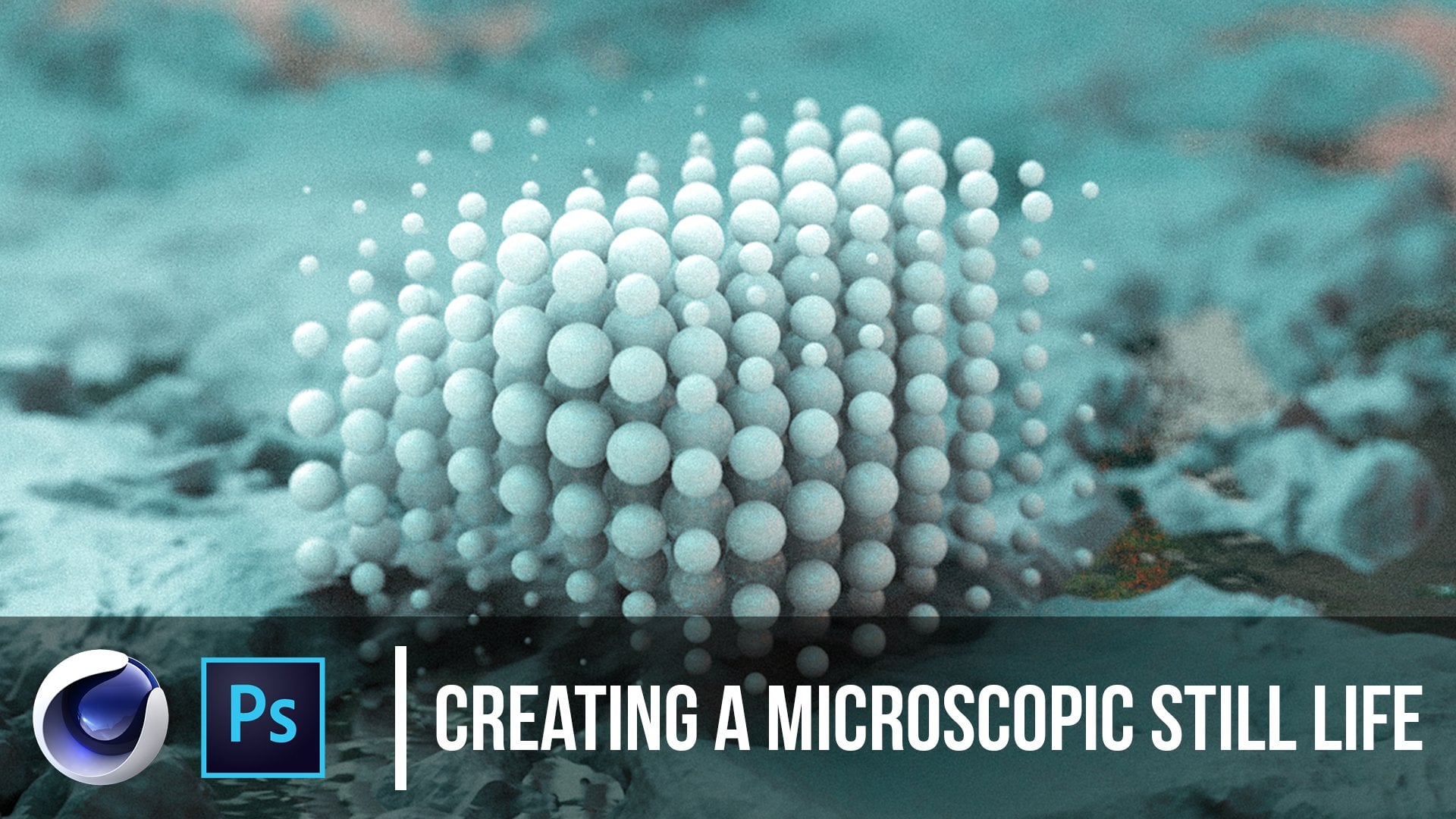
1. Introduction: What's going on, this is Patrick Foley again for another Skillshare premium class. I'm very excited to show you this one because I think this is out of all of the classes, one of the most highly requested. Instead of making something very small which we usually make, we're going to be making something very massive. What have you seen? My work on Instagram making this things that are kind of secluded, these management structures that desert or whatever. This class is going to show you how to make that and really go over what makes these things with massive in the first place. As someone who was actually a director of photography in the film industry, I've had an easier time understanding why certain lighting angles and certain camera angles make these things look bigger. We'll be going over how that works as well. There's something that's happening and these renders that triggers your mind into thinking these are massive versus small, and sometimes they're not always very apparent on why that is. We're going to over why that is the camera settings. How to place the camera, using these tricks that fluoride and making this thing look very nice. We're going to start in cinema 4D and work our way into Photoshop implementing this alpha image or PNG into our own composition and mixing it with an actual photo reference and stitching it together like that. I'm very excited to show you this one, and I think we're going to get on into it. Let's go for.
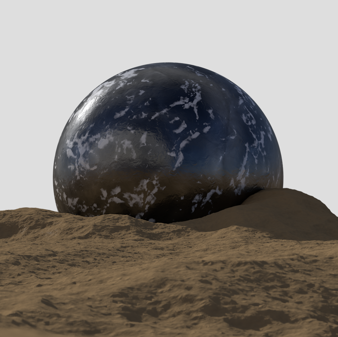
2. Explanation: All right guys, we're back here and I want to do a quick little demonstration or give you a reasoning on why, first of all these things look the way they look and how we actually are able to achieve this like massive structure looking technique. Because I think you guys all know it but for something like this, I think 99 percent of us realized that this is not massive but there's nothing actually telling us this is big or small when you think about it. Stuff like this. I assume we all just imagine this thing is like can fit in the palm of your hand or pretty small but things like this obviously look like these bigger structures and there's definitely some things that make it obvious, like this little guy standing here. There's other things that, why does this appear to look big why does this appear to look smaller, even something like this so we do have the guy here, but even if he wasn't here, I think this is striking as a pretty big looking image. When in reality it's just to mean, nothing with the movement, nothing with the modeled parts here actively make it look big but we're going to go over why these things look big in the first place so even some like this may look big, and this one's actually in the middle and a big reason for this is, so these things look like, normally big objects would podium. We got to be like okay I know how big a podium is which gives you a sense of how big this thing might be. Just like, okay, this thing is big but if you'll notice the background's actually blurred out. Which gives us whole piece of a illusion of being smaller because that's one of those things that people who are not photographers may not even understand but it gives the illusion of it being small anyway so usually anything you'll have a shallow depth of field, aka the background is very blurry will give you the appearance of being very small which is why something like this, very blurred out background gives you a sense that this camera is probably close up on the sky using a focal length, more like a 50 millimeter and thus the aperture is wide open, allowing for the background to be way blurrier and for the people who are not photographers, who have no idea what I'm talking about, that's a little bit, that's kind of the reason so photographers can understand what I'm talking about here and that's again why I've been able to have a little bit of an edge here because I started doing photography and videography much before the 3D stuff. If we take another example like this, this one inn very stylistic but you can tell this thing is a pretty big one because you actually have some atmospheric fog going on which gives you the illusion of distance, so this stuff is going way back there. You have things hinting and mountains which to people who understand what mountains are, those are usually very big and notice how even that far back, these things are not really blurred out so we have a, a larger depth of field. Usually everything and landscape photos are in-focus, which is why people like the things like this, so again, very big looking object here. Mega structures are the things that you call it and again, we've got this atmospheric fog going on here and even this thing way up in the sky is still in focus. Nothing is out of focus but of course something like this. Even part of the subject, even the middle sphere here is half in-focus and half out because there's such a shallow depth of field. The cool thing about 3D programs such as cinema 4D is you can dial down the aperture or camera settings so far that it's not even realistic so you can get some really cool looking results, usually camera stop at like 1.4,1.2 but you can go all the way down a 0.1, Like something insanely crazy that isn't even physically possible but it will still give you a realistic looking results and cinematic looking results. But something like this, the object itself could be very huge. If you're asking yourself why this thing may look small, that's because this background is looking very blurry and context clues so like if this were to be a desert, let's say the camera in this sense is coming from an upper angle looking down. That again shows this thing to be less dominant and not like a figure from below. Let's say, let's go back to this one. This camera is on a lower ground. It's not looking down at this object we're looking up at it, it's like this camera was taken from a human's point of view from way back so that again gives another illusion of it being big, but what if you said okay, what if I took pictures of mountains from a plane that's still big. That is very true but because we can actually use context clues in this example and say this looks like a microchip. Microchips are very small, mix with the shallow depth of field. This thing looks very small. We could have made this image look 100 percent way bigger using the same materials, same object, same everything, even if we just change the camera settings, I'll show you in this video exactly how we can achieve these settings and show you the difference between making something very big and very small using literally the same structure. I think one of the ones that did very well is this guy right here. You guys seem to like this. Couple reasons why I'm going to make something like this is because it'll show you guys how I make these desert looking field areas here and because we're working with a very simple object here so I won't have to go too much detail in creating these complex shapes and make this class too long but I'll still show you how to give this illusion of like really big objects. I'm probably actually going to show you how I implement these humans in here as well so without further ado, let's get started here and start making this thing. Of course if you look at the background completely in focus, this dies is in focus and the humans is in focus, everything is in focus. Mixed with all the context clues on these grungy textures, this service we got here. It creates for like a pretty massive looking image so you guys seemed to like it. We'll make something like this right now.
3. Composition / Object Placement: So guys, we are here in Cinema 4D, blank template here, let me actually get a 100 percent blank template in, I think it's start-up. We're in start up here and we're going to start fresh. I'm going to break things down a little bit simpler for you guys on this one. We're going to start with popping out are render settings window. Of course I'm not going to go over literally everything because I assume if you're taking this class, you know, generally how to get around Cinema 4D. We're going to start with these render settings here, we are going to I want this out just so we can make sure our dimensions are correct and we're going to be going back and forth a couple times throughout the tutorial. I think we can drag this guy by this corner, and just drag him somewhere like right here. Now we can have this guy fully open, and we're able to adjust these settings without having to open this from all the way in the menu. The next thing we're going to do is, let's create our dimensions here. Usually what I like doing is even though this guy didn't have a longer dimension, usually I like making the bigger pieces have longer aspect ratio just so that you can further the narrative that these guys are very big like this one, it fits the proportions more correctly. But I guess because we're using a sphere for the main object, we don't have to do that in this sense. That's just another hint into making stuff look a little bit bigger. I'm going to drag this stuff out here just so I can see more of the render settings and pick and choose what's going on more. What I'll actually do is pop out the Material Editor and drag that over here. Just so when these things pop up and I click "Material", they'll pop up immediately and I don't have to keep bouncing out a new window. Sometimes I can get confusing, so I can delete the material, but everything will still be here. So render settings, before we get started here, we're going to look at our output here, and we're going to lock this ratio because we do want to square ratio, we're getting a square right here. We're going to go with, let's go 1080, and because we locked it, it'll be 1080 by 1080. The next thing we'll do here is, I think before we start messing with render settings, we're going to start with the ground. Usually what I do is, start with a plane right here, click a "Plane" here, and this will be our desert floor. For this I usually like go into Gouraud shading lines just so you can see the segments because that is super key. We're actually going to be doing some sculpting here around this sphere, and notice I have a camera here we can delete that yet. What I think we'll do here is we're going to rotate, see what's going on here. Pretty standard setup going on. Before we get started and we can see back and forth between renders. I'm going to clap at a new panel here. If you click "Panel", "New view panel", we're going to drag this guy right here. Now we've got two versions here. We can see our render view here and our modeling view or viewport right here. Because this will be our render view, we don't want these things to be quite equal, we want this thing to be much smaller, just so we can get a sense of what's going on here, and the render times will be much faster because of that. From that point we can actually make a camera. From scratch we're just going to click a "Camera" here, and that'll make a camera within our layers here. What we want to do is, go to the coordinates before we do anything else and center everything out besides the z-axis, let's go to 00. With the z, let's go minus 1500, and that's way back there. Let's go zero to all of the rotation coordinates and you can keep the scales at one because that's just by default, that's going to stay like that. Now if we were to hop in the camera, notice that we are evidently in this viewport, so if we hop in and out, we control this one. So that's good, we want this viewport to definitely be within the camera view, and to hop into this viewport, we've got a "View", "User's render view", and not just by clicking on the square here we're hopping into the camera. If I were to hop out of this camera, I can still move around and model, do what I got to do, but the camera stays there and the camera still in effect in this viewpoint. That's really what we're trying to get across here, but if I jump into the camera here and move this floor down, notice that this floor is tiny, because of course we're so far away. But that's not going to be the case because we have to go to the camera settings, and a huge part about what makes these things look real is the focal length. Right now we're on a 36 millimeter, which is okay. I mean, people take pictures of big things with a focal length of 35, 24, whatever you want all the time, but the thing that really doubles down and makes these structures looks much bigger is if you were taking a picture with something like a telephoto lens and the objects still appears very big, so not only does it give the object a appearance of being huge, let's say we have a sphere here, but it'll also in turn make it look like you're very far from the object and it still is huge. So those things together make this thing look like this massive skyscraper object even when it's not. We can actually keep this view here because I think that's really what we're going to build off of. The floor here we can scale up. We are in the camera, and because we're in the camera, we can see exactly our portions here, what's going on, and if I were to enlarge this, let's just enlarge it until it goes beyond the boundaries of the frame because of course, we don't want these things to be floating in mid air. As you'll see, we're actually dead on this sphere, we're dead on looking at this thing, which is okay, but if you were to think of this realistically, where at the eye level of this thing, which means humans are probably this big or whatever, and we are technically this tall. That's unrealistic and it's not going to make us look that much smaller. What we're going to go do is, go to the camera settings and go to the coordinates and just take the Y down. Right now we're taking the camera. If I hop out of this, you'll be able to see I'm literally taking the camera. When I take this Y down, it's moving the camera down, and of course moving us in this viewport as well because we are inside the camera. So I can go all the way up, all the way down, and it's moving with us. What we want to really do is make it go down as far as we can, and notice how the sphere is getting unnaturally high. We still want the sphere to be centered, but instead of being centered on the y, we're going to take this rotation here and tilt the camera up. If everything is going on here we'll make the sphere in turn look bigger, and because we don't really need to see too much of what's going on in the background, I don't want to make the plane too big, where we are not using our segments wisely. I'm just going to go middle mouse click into this four viewport window view, and take the top plane here. Notice this is the camera and this is the object here and anything behind the object is really invalid. We don't really need it because we're going to end up bumping this image out as a png in the background, we're not going to render. We can move this up and notice we are filling the viewport again, and that's exactly what we want. To see these things easier, notice that you can barely see the restriction boxes here. What I'm going to do is, click the "View port" here, "Shift Y", and then in the view section right here, I'm going to go to the "Opacity", I'm going to make it 90. Now you'll be able to see a much clear frame. I don't make it a 100, at least not now, so I can see how far these edges are going. But I'm going to continue to go past here even farther and then scale down. So it's all about finding the right amount of- as small as you can have this, you won't have to bump out nearly as many segments. So something like this, where it's still going past, maybe a little bit over here. It's still going quite past this sphere. If we have to model around it, we can still use some geometry, but it's still going past the camera as well so we're in a good position here, maybe a little bit bigger. There we go. We can see the segments here. But now we're actually getting some good results here. Now you can just start playing with the camera settings. If you go to the camera, let's go down even more. Remember we want to make it look like we're very small, and then tilt up a little bit, so tilt up to like four maybe, maybe three, okay. Something like that, and then maybe zoom in a little bit, go down a little bit, and now you see we are under the ground, that's too far. Something like this where you can see the cross-hairs here we are centered again. But you can see this looks much more realistic. It looks like we're looking at this thing far away and much bigger than if we were to, let's say duplicate this camera, and let's go to a regular 36 millimeter, and to zoom way in, and let's see. We don't want to control that, Y up, here we go. Technically the same stuff is in the frame, but if you were to look, here just so we can see what's going on here. Notice the difference here between this and when I hop back in the other camera. Pretty subtle, relatively, but already a much bigger, this camera is much closer with the shorter focal length, and this one's much farther with a larger focal length, and you can see just the mixture of being farther away with the other focal length really creates this, it literally bends it and morphs these things into just different types of shapes that to our eye naturally just look bigger, and you guys who are not photographers don't actually know why that is, but this is why. It works with everything in life. This mixed with the depth of field, that we'll be using in the future, we can delete this camera, but will be a massive help to us in the future in this tutorial. The next thing I'm going to do is start working on, let's see what I want to work on first. I think we can start doing is working on the ground.
4. Ground / Sculpting: Let's go to something like maybe Constant Shading Lines, it might work well, let me see. Let's go Constant Shading Lines for this. Just easier to see, and we're actually going to be doing a little bit of sculpting. Before we do that, let's take the segments here and go to something like 200 by 200, so that'll give us a little bit more geometry to play with here. When we zoom in here, what I'm going for is the same thing that we saw in this render. If you'll see these things are forming around this thing, and that's ultimately what we want to go for. It almost gives the impression that this thing landed here and just caused a bunch of ruckus and formed its own indentation in the earth here, and that's what we're going for. The next thing we want to do here is make this editable. If you want to play it safe, just duplicate and drag it down and just turn it off because we don't need it and make this one editable. We can click C, we can also rename it Ground, and the next thing we will do is, it's not necessary that we happen to these sculpting view-port for this because we're just going to using one tool, but because it's editable, we can go to Sculpt, click Sub-divide to give it this sculpting tag here. Then once that's set, you can either sub-divide it again and it'll give you more segments to work with or because I think for some like this, it's not necessary to have too many segments. You're going to go to the brushes and let's go to Inflate. Just using this stuff, we can morph around this object. You can see in this view point we're already getting hills forming around. The cool thing about this thing is, if you were to just, here are your settings here so you can select the size, pressure and all that. More pressure the less size or if you hold down Command, it sinks in. There's a bunch of possibilities here, some of the things I like doing is sinking in originally because let's say that's where this thing landed, and then maybe take down the pressure a little bit and start building off of it. It can look as natural as you can, just go around it, let's go around this thing, select this guy over here. Go back to the brush with the ground selected and make sure you don't want to have to subdivide it again, at least not for this instance. If you make some sculpting errors where the segments are getting to drawn out, you might want to redo it. Just be mindful that this stuff looks okay. If they're intersecting a little bit and the geometry looks a little bit messed up, especially back there, it's not the end of the world. I'm sure on my render previously I did a little bit of that. Let's see. Maybe I have it writing up a little bit at one part and then all throughout the, because we can still see this stuff here. If we do anything too crazy is going to mess up the camera or block the camera like that. We don't want that, maybe indenting the thing a little bit, something like that. I was getting really funky with it because even though it doesn't look like we're doing a lot, especially from this view we are, and especially from this view we can see what we're doing here. Even something like that I think works for me. We can hop back into the camera and we can get back into our regular tools. I'm happy with this, if you really want to subdivide it by all means, do so. But before we can actually put displacers or do anything else like that, we're going to have to flatten this again. We're going to just go Current State to Object and it bakes the thing there. We can take this Sculpt, let's call this one Sculpt and then we'll hide it. That's the one we can keep sculpting on. Again, all we did is just mess around with this ground and very simple edits, nothing too crazy but that'll give us a start here. I'm pretty sure we actually have all the geometry we need. If we want to make this a little bit bigger, just for the effect of having it look massive and then push this back so you can still see these things forming over it by all means, that's great. While we're here, let's take the Type and go to Icosahedron. You've got even segments here and change this to maybe 60 for now. This is looking good, if we were to render this out right now, nice. It hasn't been lit or texture obviously, but we're looking good with these segments. If we wanted to increase the segments, we can always put it in subdivision surface, which will round out some of those things. Maybe what the play is, is just not having it be too crazy, so just something like that. Then, for your render again it's not making the scene too intense, but it is rounding out some of those edges that were messed up before. Before we add displacements, this thing will look organic. Maybe unnaturally organic, but I think we're good enough to move on to lighting. I like doing lighting before texturing just because I don't see a point in texturing anything until we see what the lighting will look like, bouncing off of all that stuff.
5. Lighting : We can get to lighting this thing now. Right off the bat, let's go to the render settings. You can see our frame here and here. The first thing we're going to do is just have your mouse over this guide you don't have to click it. But if you hover your mouse over this viewport here and click option r, this will pop up the interactive render region and we're just going to scale this down to the dimensions. You don't have to go fully over there, but just enough so you can see what's going on here. You have it. This thing is just in a black void, which of course what you want unless you go for something like Space, which is not bad. A couple of things we're going to do now is make sure we're on the physical render, which I already was. Make sure these are your dimensions which we already went through. Let's go to the physical tab here and make sure all your settings are set like this. Progressive is fine. Make everything down to 2. To be honest, I don't think we even need any subdivision surface, not for this one. Those settings are fine. Let's go to ambient occlusion , which you can find over here and highlight that on, already getting some natural shadowing. This next tab, global illumination, we're going to add as well. We're going to click that and you're going to see everything's going to go away because we do not have a light source. It will not be acting on the default lighting anymore. The next thing we're going to do is within the global elimination tab, go to samples, custom sample count, and the custom sample kind go to 20. You want something very small so that these images don't have to take 50 hours to render just to see what you got going on. Of course we'll change this later on with new Render settings at the end. In the ambient occlusion, let's also check value transparency, we will want that too in case we start working with transparent glass materials or anything like that, which I'm not even sure we will, but looks fine for now. We got to good composition here. Notice we can't see anything because we don't have any lights. The first thing we're actually going to do, which is going to give this thing, actually the first taste of realism, because we went to have over here and pick a sky. Right off the bat, we're getting some much more realistic lighting and something we can actually work with. I'm happy with this. We can get on to adding a sunlight or something like that. What I'll do for that, very simple two steps is, go just see the lights and go to infinite light. Right off the bat, this infinite light looks whole because we're not getting any shadows and it's coming from straight on, which is never a good idea. What we are going on here is, the Infinite light is technically starting at the center and just facing forward, coming from our position now. We want to make this a little bit more cinematic, realistic and have the light come from a realistic working angle. A lot of times I like going with an angle like this, the sun would be coming from this direction, way out here. Then just adding some shadows. Let's go to the light settings, go general shadow area. Now let's see what we're getting. Now we're getting some realistic shadows coming from the sunlight and that's one thing, shadows, they are not soft boxes. With sunlight, you'll get really harsh shadows like this. You won't get anything too soft with direct sunlight. That's part of the things that make this look pretty realistic. The further you move this, the more shadows you'll see coming off of this thing. It really just depends on what you're going for here. Then we'll use an HTRI in this thing. Let's create our first material and call this HTRI. We're going to drag this guy all the way to the sky. Of course this is giving it a lot more life because it's reflecting all white and everything. We'll take the color off, take the reflectance off, and turn on luminance. With that, go to the illumination tab, click key area light, which will prevent some splashiness. Let's go to luminance tab and click a texture. These are just some my [inaudible] that I have. Let's see some of these I got from online, some of these I took for this perspective since we're working with a desert, something like this, is a great one I found online. Of course, if you want to know how to make your own HTRIs, I have a class as well on that. We'll just use something like this and reflect good, decent image. Right now we're looking much better with this stuff. We can actually rotate the sky a little bit. The sunlight you can see is coming from this direction. Our sunlight is coming from this direction as well. So if you want to move it somewhere like here, which will be much more realistic. Looking good. We should be good for lighting as far as right now. The one thing we want to do is erase this sky, all giving us the same effect. Because we don't want to render out anything with the sky. If you go to the sky and right-click it and go to cinema 4D tags and go to compositing. This will allow you to say, I want all the effects. I want the HTRI to give off light and all that and reflect the HTRI, but I don't want to see it in the render. Just check off seeing my camera. Now we're looking pretty decent here. I think the next step that we can actually start doing is texturing this thing. 90% of this whole thing will be the texturing. Not 90%, I'd say 50%
6. Texturing: I think we're going to start texturing. Let's start with the ground material and let's go all the way here to the material, we can call it ground, and drag it on the ground. Of course, if you're going for snow, white is the option. But for us, we are going for this more deserty looking material. Just by eyeballing it, if you want to for now, turn this scene by camera on and then color using the eyedropper tool, literally picking color from the background. That's probably one of the easiest ways to do it right after that. Then we can take the camera back off so we still retain the color of the ground. This looks, of course, 100 percent fake because it's smooth as hell. It looks like peanut butter almost, which is a cool idea if you're going for that. But the first thing we want to start doing is adding a bump. We're going to try to make this using zero image textures or anything, just procedural noises. So we're going to go "Bump" and we're going to go to "Noise". Then we're going to go to, within the noise channel, we're going to click one of the "Presets" here and go to "Poxo" or poxo, whatever you call it. We're looking at least a little bit more realistic here with the noise. I'm going to actually boost this up here. This is the interactive render region quality, boost it all the way up and then drag down here so we can get a clear sense of what's going on here. That looks pretty cool to me. Maybe have it be a little bit smaller. Maybe 70. Cool. Next thing we want to do is let's go back up here. This ground's looking a little shiny for me, so we'll go to the reflectance tab. Take the specular down by 50 percent and take the width down to 29 percent. That'll get rid of some of the shine we got going on. Now is the big kahuna, we're going to go to displacement and turn this guy on. Nothing adds in because we're not displacing anything yet, but we're going to go to "Texture" "Noise", up in the noise again. Let's just first see what's going on here. We're at least getting some noise here. So we're getting some realistic. This is forcing the light to create some shadows and when there are shadows, it looks more realistic. We're going to switch the noise up. We're going to go to, let's say, displaced Voronoi and go to the global scale of 250, see what happens. A little bit better. We're getting some better results here. Let's go down to 150 see what happens. It's all trial and error with the stuff guys. Just going to take some time. This is where you really got to choose how big these debits are going to be and that really has to do with how big the stuff is and how much farther. Things look smaller the farther you are. If you real close to it, maybe these things would be poking out a lot more. But for the height, I think for this we can go to two. I think we're going to sub-polygon displace it by maybe one level. We don't need too much. What that's doing is pretty much taking the segments we have here in pretty much adding more. There's much finer details in our displacements. I'm going to actually try to go to maybe 350, see what happens because I do want some effect here. Because we used sub- polygon displacement, it's giving us a much longer time to render, especially with the settings popped so high. We're looking actually much better. I think what we can do is just take the height up a little bit, maybe three or four. Let's see what happens. This is the only part of this process that's a little bit lagging based on your machine. I don't have the best machine for this stuff, but it's also not the worst. Based on your machine, you can figure out the best options for you. We're starting to get somewhere here. This looks pretty nice. If we take this subdivision up one level, this is going to be a while. If we can okay, this last step, just to see what it's going to look like for a few seconds, we can take the tag off and reapply it later so we can work on the reflections and everything of the actual sphere. Of course, this hasn't even rendered yet, takes around 15 seconds to even start up. Just be mindful on what your computer can handle. Something like this. To me, that looks fine. I think I'm going to stick with that. Doesn't have to look amazing, but for this process, I think I'll stick with that. Looks good to me. What we can do is just take out the displacement and we can reapply the displacement once we're done with the sphere. Right now we can hop back on over here, and start working on the material of the sphere. We're going to create new material, drag it on the sphere. We're looking white now. This really just depends on what color you want, because we're not really going to mess with the sphere too much as far as modeling it. But for this, let's see here, you guys did like the black one so maybe I can go a 100 percent black. Add a reflection layer and you'll be able to see that the HDRI, even though it's not showing, it will reflect everything the same. If you go to a mirrored HDRI or a mirrored reflection, you're getting pretty much this perfectly reflected image here.The sun, in the image, is right around here because we controlled it just like our sun earlier in the process. Yeah, we're going to take this reflection down to like six, let's say. Take the default specular off. Now it should be like this shiny, black, ball-looking thing. Now we're getting there. We're going to add another reflection layer on top of that and use a layer mask to give some grunge to it. Right after that, we can use a noise texture. Within the noise texture it, let's go to something like, it's called Luka. Cool. Then bump this up to 500. Again, I'm just messing around just by what I'm thinking here. Then go 28. Then maybe take the roughness and boost this up to 26, see how that works. Of course, now we're getting like this metallic looking sphere thing, which also has no bump. Let's add some bump. Let's go with the noise and let's go within the noise and do something that'll work well. Let's go to nauseous. I'm just using a lot of these things for one of the first times. Let's see what happens when we boost that up to 250. Cool. We're getting some cool displacements there. Usually, if you're this far away, you'll have much more subtle textures unless you go way up to it, but we're pretty far away, so let's bump that down to eight. That looks pretty good. We can probably take this down, this reflection layer to 20 and this to four. Cool. Then see if we bump this guy up. I was testing these things out. Yeah, now we can take that back down to six. The next we can do is let's say, of course, I'm just trying to figure out if I like this and I am not going to delete this section of the video because I do like having you guys see the process here. I'm really just thinking what I'm going for here. I may add an alpha channel here. I'm going to create a whole other material, actually from this material. We're going to call this alpha and we're going to drag this on the sphere. Of course, nothing is going to change because it's the same. But if we were to make this white and then activate the alpha channel and, let's say, go to a noise, now we're revealing the stuff below it. Let's go to something that has a little bit more contrast. Let's go to "Luka" again and then go to 250. Then boost these levels up in some areas and down in some areas and see what happens. That looks pretty cool to me. It's revealing the stuff below. Let's move that down a little bit. Cool. That's a cool texture being revealed. Let's see, just messing around with the settings. I like that. Cool. Almost looks like Clouds on the Earth or something. That looks good to me. I think that's good to go. A lot of times I like rendering it out in this view real quick, just because we get a bigger idea of what's going on here. That looks pretty cool. Let's see. It's not too shiny, it's more matt, but I'm not mad at that. Maybe just taking the the bump and making it a little bit less so something like 150. Then let's see what happens there. Boosting it up a little bit. Let's see. That might be a little bit too much. Maybe going to a 100 and down to eight, maybe six, five. Let's make it four. Let's check it out. That looks pretty good to me. I think that should be good to go. I think maybe if we go to one of the reflections and go to the base reflection and give it a little bit of a roughness texture. Let's go to like 10 percent. Yes, I don't like that, we want this thing to look hardened. 20 percent. Maybe like 12 percent. Cool. Yeah, that'll be that. That'll definitely give us the result we're going for and then mixed with, of course, the actual displacement we have with the ground. I think this will work very well. What we're going to do here is activate the displacement again and kill the render view. Option R. Everything's affected here. We don't have to worry about the ground. We know that's going to look good. We know this is going to look good. It really comes down to bringing this whole image back together in Photoshop.
7. Camera / Render Settings: I think we're ready to work on camera settings. What we're going to do is finish this off, finalize it with the camera settings, we're going to go to the physical tab and checked up the field. We're not going to have too much stuff to field. But we do want a tiny bit of it, so it is unrealistic to have zero left the field. We're going to go to the camera and go to focus distance and just click on the sphere as the easiest way to do it. You can see by jumping out of the camera, it is 100 percent set right there and I can change it manually. As you can see, the numbers changing on the right. Or I can do it like I did. That's why the best way for the f-stop providers are going to use something like 10, something like that. We know everything will pretty much be in focus. But just to make sure, let's go render out a frame. Let's make sure this thing is the displacement is off. Didn't mean to hit the glow there. Let's see what happens there. Actually, let's render this thing out like this. The stuff at the very front is being a little bit blurred. Maybe a little bit too much. We don't want this to be too blurred. We're going to set the f-stop up to something like 22 and see what happens. It takes away some of the blur. Let's go to like 33. This is where we're getting on the high end. But anything we can do to minimize the blur here, 33 will work. That should be good. Everything is in focus to the point in which we need. We can make sure we activate this displacement tab here and work on the Render Settings. Let's go to the physical tab here. If you want to do this, you can make multiple Render Settings here so you can click and drag with the command selected and this can be called render. Then this can be called pre-render and with the render one selected on, obviously the one we have been working off is pre-render and the settings are all the same for both now because we duplicated it, boating or the physical tab, go to fixed. In the sampling subdivisions, let's go five and then for everything else, let's go for except first subsurface scattering and go to zero. Global illumination sample counts go 150. Everything's fine here. Everything should be good besides saving, let's save this as a PNG, go to 16-bit and just enable Alpha channel. Everything back here will be transparent. I think we're good. Everything is selected, displacement is set to on, and I think we're going to render this out. Let's do that now. It'll take a second for the displacement to turn on. This one, because there is a bunch of polygon displacement, some reflections and mostly the displacement, this one, I'll take no idea, maybe around 20 minutes or so, maybe more, maybe less, but we'll see what happens. We'll see you guys when we get back on.
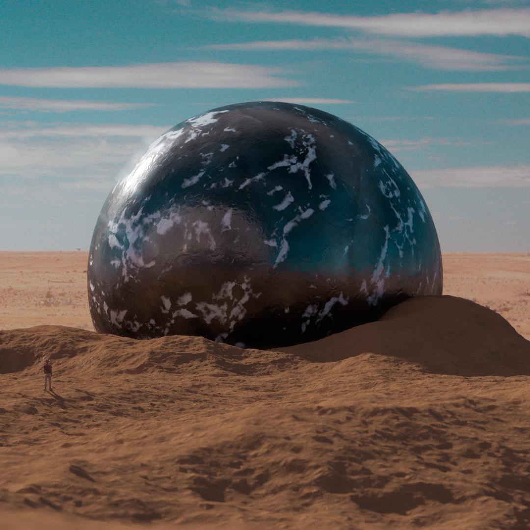
8. Photoshop / Working with Alpha: Now guys, we're back here, and it looks like it only took about 14 minutes, almost 15 minutes. But that's fine for me to get this alpha channel. It's transparent in the background. If your render view looks a little bit different that's because I changed the color here to black, so you can't really see that border-box, but I'm going to right-click on the image here, Save as make sure it's set to PNG 16-bit with the alpha channel selected. That would just pretty much make it so, it is transparent for when we bring it into Photoshop. The 16-bit, Make sure it's selected because we're getting mess around with the colors and we don't want to distort anything, so we want maximum latitude here. We're gong to click "Okay" and save it, already brought it in here to Photoshop. This is what it should look like, after you bring it in and actually just brought. The other image we're going to be using is right here that I found online. As long as you find something that generally looks the same, and of course you can see that the colors by no means match at all. We're going to take care of that in a second. First thing I'm going to do though, is placed this behind. We can get a sense of what's going on here, and maybe just scale this up a little bit, depending on the proportions we're going for here, maybe some like this, nothing too big, and just scale up. That's looking good for me, drag it maybe this way, and to be honest, I don't think I need the bird songs, you're going to take the bird out, I'm just going to select this guy with the Eraser Tool, Shift, Delete content aware colored option, and it goes away. Easy-peasy, we're looking good. The next thing we're going to do is make this backdrop a smart object, because we're going to be editing the colors here. If you want to go back, we want to have that option. We're going to go to Image Adjustment, and let's try Hue and Saturation because already you can see this is much darker and much less saturated then this image so let's take the saturation down, and see what happens. That's too much, let's see something like that. Again, it's got to be much darker because this whole image is just looking a little bit gray and we're actually dumbing down the image. But as you can see, we're modifying it to look more like the image we have here, going backwards. The next thing we're going to do is must put the hue. These two hues of rock are not looking the same so we're just going to mess with this slider until we can eyeball it. Still looks somewhat similar, so taken something like that, maybe a little bit saturation, a little bit darker. Let's see, we don't want it too dark. It'll be good for that. As you can see, it looks much, it looks like it blends with the image much more. Not saying it looks better because it does not yet. But we can definitely take care of the rest of the image from here. The next thing we're going to want to do is bring in maybe a little human. A lot of things I do, revolve around this little picture I took on my brother a while back. I'm skipping the step of me actually masking him out, but he's already masked out, so we can place him their, place them above everything, oops, and drag them over here. Obviously if we were to place them like right here, the object doesn't look big. Let's scale the guy down to something like this. You back here, something like that. Just placing them somewhere strategically. Of course, taking into account what he's looking at it so maybe some like right here, scaled down a bit, and it looks fine for me. Then all this stuff is just settled so notice he's much more saturated, it has much more contrast and the rest of the image. We're going to do is make him, he's already a Smart Object, so we're going to go to Image, Saturation, drag that down, something like that. Then we're going to go to Adjustments and go to the levels, and makes sure notice the blacks on him, are way darker than the blacks, the shadows, and the image. We're just going to boost this up a little bit to make them more faded, and take the whites all the way down. We're pretty much just flattening him out a little bit to the point where he actually looks like he belongs in this image a little more. Then just playing with these sliders to making sure he fits in the image. He really looks like he fits more than he did. Next thing we'll do is, we can notice that if this image is correct, the lighting is coming from over here, so the shadows are over here, we're going to add his shadow. I'm just going to duplicate him, like that, command J, and just take the copy and put it below. This will be his shadow, so we can title is shadow, and then just command T transformed. Hold down the command button and just drag down, just drag down once we have this guy selected. Just like that, we have like a little bit of a shadow. Even if this isn't physically accurate a 100 percent, it definitely gets the job done for what we're going for. Then for this, all we have to really do is double-click or "Layer Styles". We double-click the Layer, and Color Overlay and make it the same color as the shadows down here. Again, these are not by any means perfect, but for someone who's looking at the image like this, they work just fine. That's all I really ever have to worry about, and all we have to focus on for this class. Then just composition that array, and maybe blurring the shadow a little bit, so adding a little bit of a motion blur. Obviously not like that, let's start at one, and making the direction the way the sun's aiming, I guess. Something like that might be cool. There we're looking pretty good, and then just to make some really subtle shadows next to his feet. If we go above the shadow and below him, if we take the color of the shadows, and paint, obviously we're painting with the totally wrong brush. But if we get something that's just a soft round brush, and scale it way down, he's going to be the shadows of his feet. Something like that, just to give them a little bit of a some weight on the ground, so it's not like we just stuck them there. Then they have it, he looks somewhat like he's supposed to be there. Again, when we stitches together calling the whole image as a whole, that's where everything pulls in place. You can see there's a lot of tricks here that we're doing here. If you'd like, zoom into this image as a whole, this looks nothing like this, and you can tell he's not supposed to be in here. But when you stitch all this stuff together and color it, you're really messing a lot of these fake, things don't really exist here. Next thing we're going to do is blur this image, and add some realistic blur. We're going to Command Option Shift E, that's a long one. We just made the whole image right here as a whole. We're going to turn this blending mode to lighten, and what that's going to a do is, everything that all the highlights will pretty much blur, when we want them to, so let's go to Motion Blur, and drag this up. Now we're starting to get on the highlights and blurs. This is good for like, one stitching the image together, and to adding that glow that you'll see like bouncing off of like stuff in the desert or whatever. Even something like that'll be fine, what we'll do is to this image, will go Image, Curves, and just bring down the shadows a little bit so only the light parts of the image will be glaring. Every time we take a little bit more the shadows down, we see less going on there, and even some like that. You can see before and after we are getting some glue's on that only the peak of the highlights, and even some stuff over here which add for the realism. Then let's do the same thing again, Command Option Shift E, which will duplicate this image as a whole and then go to Camera Raw Filter. We're going to edit this image as a whole, I like to look at the image not this far close, but more down this area. First we're going to boost up some vibrance, pumped that stuff back in here. Of course it helps when you're working with an image and a background that is also a raw image, and not just a JPEG file online. But for this, I think it's by all means. Let's go to Split Tones, add some red values to the shadows, and let's take the HSL adjustments, go to Hue, and bring the blue's a little bit to that lake teal color, at least that's one of my favorites. Do that and then take the yellows and get them more red. These are the color schemes I'll gone with. Interstitial staying together, we're going to go to Effects, go to green at a little bit of green here, maybe like eight. In this image is actually getting in. It's been stitched together here. Let's take some contrasts and boost it into the image and see what else we can do here. Maybe take the highlights up a little bit, and the black up. Just brightening this image here, and we should be almost their. Take the shadows down a bit, and this might be a little bit orangey for me based on if you want to send a look like Mars or Earth, doing stuff as you please here. Maybe desaturating that a little bit actually. Something like that, and I'm actually pretty happy with this image that is still looking good to me. We have some color in here, add some clarity if you want, but I'm pretty happy with this. We can click "Okay", and you can see from the very beginning. We're really doing a lot of cheating here so like this looks nothing like the original image. Adding the human stitched together, bringing these layers out, and then the final image. A lot of this is cheated in Photoshop. A lot of people think, you got to make it look exactly right in cinema. If you know how to use Photoshop, you can get away with a lot of stuff. This is literally how I made this image, I used a few different textures and but I notice you guys want to know exactly how I made that one image, so I had to do it. I appreciate you guys watching and we'll see you in the next one for sure. Take it easy guys.
9. Outro: There you have it guys. I really appreciate you clicking on this video in the first place. I hope you got something out of it and if you did, I'd love to see what you made, submit it in the project settings in this video. I'd love to give you feedback and as always, if you did like this video, please give it a thumbs up. It always helps to get my name out there even more to help more students to eventually find me on this site. Until the next one, I'm listening to you guys feedback and what classes you want to see. I'm already making another ones as we speak. Stay tuned. We'll see you in the next one. Appreciate it.
 Patrick Foley, 3D Artist