Transcripts
1. Introduction: Do you like the idea of making vector art but
feel like it's too rigid or complicated for your expressive
hand-drawn style. Hi, I'm Mary Rose. This last year, I
challenge myself to open my very own Etsy SVG shop to sell vector art
as a fun experiment. In the past, I always felt like vector art was incompatible with my art styles as I like
sketchy layer texture work. But then I tried to Adobe
Illustrator on the iPad. And with the minimal workspace combined with the pressure
sensitive Apple Pencil. The first time I actually
started to draw in the app and get used to its
features and functions. In this class, you will learn to draw and create vectors with a more traditional look
and feel ready to be used in commercial or
cutting machine application. We will start with a very
quick overview of the app. Complete beginners are welcome, and then using the lesson
activities as a guide to learn the tools and the sketches to
get comfortable with them, we'll cover things
like the pencil and brush features that help get that hand-drawn look and feel and make the program
more comfortable. Traditional experience. I prefer to draw on paper. I will demonstrate how
to turn clean raster art into vector r using the vectorization tool
native to this app. I've also included my entire
Procreate liner process so you can understand
how to optimize my workflow for vectorization. Finally, the last step is cleaning up our vectors
for commercial use. I'll show you how to check your work in cricket
design space. So you know your
clients will be happy. All you need for this
class is the iPad, Apple pencil in,
Illustrator on the iPad, downloaded and ready to go. Alright, let's get started. The next lesson.
I'll cover what you can expect for your
class project.
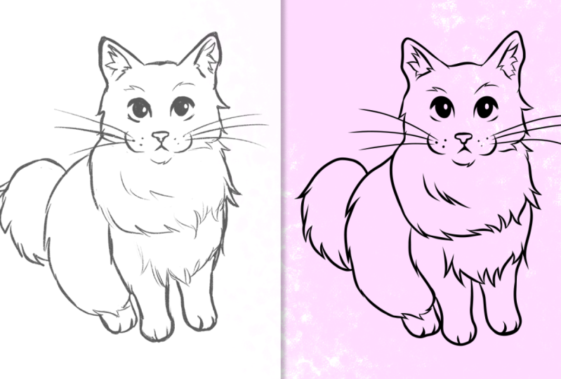
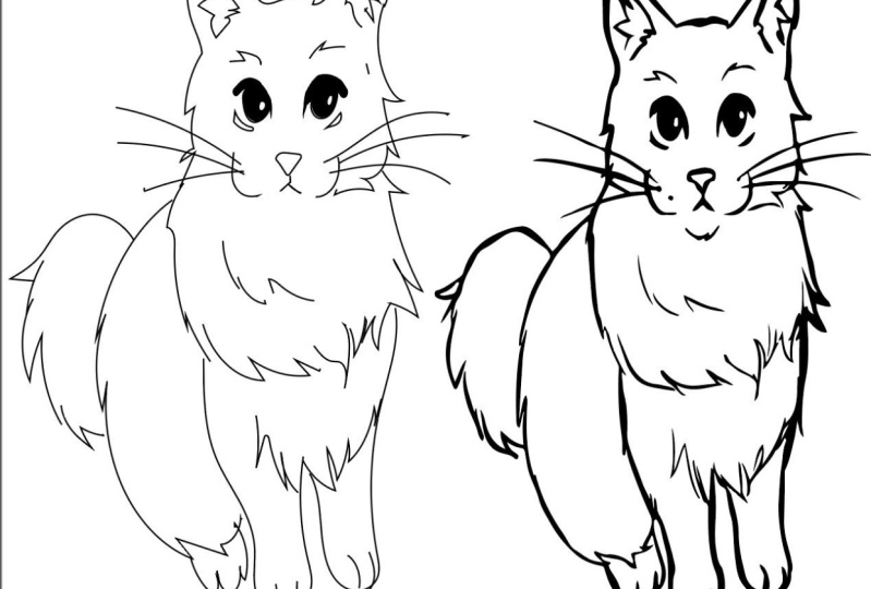
2. Class Project : Welcome back. The goal of this class is to get comfortable drawing
directly inside of the app and to
learn to vectorize our raster art into vector r that maintains
our hand-drawn quality. The combination of these
techniques produces reliable, easy to produce commercial
ready SVGs for your projects. I simply want you to create
an SVG from a sketch using either the drawing
inside of the method or vectorizing arrest or sketch. You can follow along
with me and use the provided sketches to end
up with some cat vector art. Download the sketches and lesson activities from the
project resource section. Use the provided is like a
template to trace over in the vector program or simply
use your own sketches. It's up to you. I've also included a written
SVG guide that covers the techniques and settings for the vectorization feature
inside of the app. You can use this while you're working or for future projects. When you're finished,
remember to upload your project to the
project gallery section. We all want to see your work and I'd love to give
you some feedback. Upload a screenshot, or
export a PNG or JPEG, and make sure you
show the before and after the sketch and
finished vector. Alright, maybe in
the next lesson we're all cover
everything vectors. So you understand the difference between raster and vector art.
3. Vector Basics: So we're all starting
out on the same page. Let's cover the
basic information you need to know about vectors. What is the difference between
a vector and raster image. Raster images use a
rectangular grid made up of millions of assigned
color blocks or pixels that make up an image. That's why when you zoom in on images, they become pixelated. You can see the building blocks. So you have to make
sure you start with a large canvas and the correct resolution
for the project. The scale restriction limits the applications of
pixel-based art, but makes it easy to mimic a traditional style like
drawing and painting. Since you are just changing
the colors on the pixel grid. Vector graphics,
on the other hand, are lines and
curves connected by plotted points defined by
mathematical formulas. Because there isn't a grid or set limit vectors can
be scaled infinitely, making them great for
billboard ART, large decals, commercial pattern
design, and of course, vector-based cutting
machine software. So how do vectors work? When multiple points
are connected, we call this a path. A path only be opened or closed. So to create a solid shape, you need to connect
the path to close it. E.g. an open path
is just the line, while a circle is a
closed path or shape, the points that connect the
segments are called anchors. When you directly
select an anchor, handles will appear
on each side, which can be used to
change the angle of the path segments
it's connected to. There are two types of anchors, corner and smooth point. Smoke points are where both
sides are connected in a smooth curve with the handles
following along the path. Corner points are where the path abruptly changes direction
like in a corner. You can toggle between these options and I'll
show you that more later. I know this can feel odd or to mechanical for traditional
artists, don't worry, the methods I cover in the
following lessons let you draw first and think about how to fine tune the
anchor points later. One last important
element, the stroke. Stroke, is the
outline of a path. When creating the
color panel always gives you stroke
and fill options. You can change them independently
to be empty or filled. Alright? That should
be everything you need to know
about vector basics. Meet me in the next lesson for a quick overview of the app
and how to get started.
4. Getting Started: Welcome back. This is what you should see
when you first open the app. Not going to cover
every feature, but I am going to show
you everything you need to know to
complete our project. You can create a new document or import a document down here. And up here you can
choose the canvas size. Makes sure to choose letter. That's the size of a
lesson activities, but this can be
changed at any time. So create a new document. This is what you should see. Now, this app does use
the Adobe Cloud service, so you can jump from desktop to your phone back into the iPad. So everything's
saved in the Cloud. It's really nice to utilize the Adobe library
feature that way and keep your assets
close at hand. Just so you know, everything
will be saved in the cloud. Alright, let's cover
the settings first. That's this little
gear icon up here. You want to hit app settings. I'm just going to walk
you through mine. You can change which
side the toolbar is on. It doesn't really matter. I have my program in dark mode. You can choose the light
mode, whatever suits you. I do have Scale Strokes
and Effects turned on. This is so my strokes will get bigger as I scale my objects. Automatically update the links. For the Apple pencil you want
to turn on palm rejection. I find that helpful. And the double-tap
is the button on the second-generation
Apple pencil around here. It's just a tapping
feature and you can decide what that
does in the program. I wish there was
an Erase option, but for now, de-select object
or path is really useful. If you have my tabs with
blue dots turn-on for you, but you might want
to turn that off. And of course I allow
my canvas to rotate. Blob brush. We'll come back to them. We cover that section. And I keep all of my
units and points. Use the help feature
to quickly look up tutorials or other
Adobe resources. And the about section helps you find any of illustrators
social links. All right, That's the settings. Let's start with importing the lesson activity
for this section. On the left side, you have all of the tools, mostly for creating and
adding things to the canvas. You want to use the
place tool here. It looks like a picture. I'll use the files here to import the lesson
for the Pen tool. If you're like mine, kind of puts it randomly in
the middle of the canvas. I want to show you another
feature real quick. Right here on the right
side of the Canvas. Most of these tools
act onto what you place on the canvas so it
can modify what you do. We want to choose the Align, make sure that we have everything we
imported selected and we can hit center and center. And now everything is
right in the middle. This is especially useful
if you chose a document or canvas size different
from the lesson activity. That first tool on the left
is the selection tool, the arrow, the image
on the Canvas. You can use this tool to
manipulate it in any way. But you might want to undo
that and you can do that with the undo and redo
arrows right here. The second arrow is the Direct Selection
Tool or path tool. This shows you the
anchor points, letting you select
them individually, which gives you more control when you're editing your shapes. Before we get into the activity, let's cover some of the panels. On the right side, the
layers panel works like any raster drawing program where the content
is separated it and you can move elements
forward and backward in space to create depth and
keep order in the process, you can lock or uncheck the
visibility of any layer. I'm going to lock the activity and add a new layer for the art. Let's cover the most
basic tool, the Pen tool. You can find that third down
on the left, the little pen. But before we get started, I wanted to make sure you
check your color panel. The color panel is right here. You have two options
at all times, the fill and the stroke. I'm going to make sure
I have my stroke on with a eye-catching
color like green. The pen tool is mainly used to placing connect
points to make paths. When you close the
path, you get a shape. With the pen tool,
you can add or remove points and modify the
shape you've created. I only typically use
the pen tool when I'm refining my art at the
end corner points. Do you remember those? To create the square? You just want to tap
on one of the corners. Tap, tap, tap. Then close it by
tapping the first one, and then you have
a closed shape. Use the button to de-select. All right, points to
create smooth points. Tap and drag the handles. Start anywhere you want to drag a little bit before you
move on, tap and drag. Tap and drag. Tap and drag. And drag again. To use both corner
and smooth points, you can easily
combine the two to create any shape
like this flower. I'm just going to tap, drag, tap and drag, tap. Dr. And so on. Enclose it out and
you have a flower. But what do you do if the curve isn't
following the sketch? Let's try it the regular way. Tap, drag, tap and drag, tap and drag tap. Do you see it's not really following the gray lines
like we'd like it to. I can't get that sharp point. And it just kind of not going the direction
we need it to. But first, I need
to introduce to you the primary and
secondary shortcut. I'm sure you've noticed
this floating circle here. This is the primary and
secondary shortcut. To use the primary shortcut, touch and hold, and you
will see it expands. To use the secondary shortcut, simply move your finger to the outside and you'll see
the circle is now filled. These are two different
functions that will allow you to have more options
when using the tools. Now we can attempt this example. So tap, drag, hold
the primary shortcut. And what we're
going to do is move these handles to go the direction where
we want to be headed. So I'm letting go, tap, drag, tap drug, use the
primary shortcut and move the handle
towards the direction we want it to tab drag. You can modify the
handles as you go. Zoom in to get a better picture. If the handles don't appear, simply tap on the anchor and then you can modify the handle. And there you have it. Here are some other
pen tool tips for the primary and
secondary shortcut, e.g. to move the anchor point
along the path when drawing, enable the secondary shortcut, and then select the
anchor you want to move. It will move along the path
so you can edit it quickly. To add anchor points. Tap anywhere on the path to add a point with the pen tool. Convert a corner point to a curve point by double
tapping on the points. These are some quick tips
for using the pen tool. Use the property panel to modify and fine tune the stroke. Change the color
and blending mode, or fine-tune the
transformation property like the width,
height, and rotation. To modify the
relationships objects have with the canvas
to each other, use the Precision menu. Here. On the Precision menu, you can turn off the grid, turn on Smart Guides, and change the color
and add new guides. Notice when you use the
selection tool on an object, this menu pops up down here called the Common Actions menu. It's pretty straightforward. It allows you to modify the opacity of the
selected object. Change the stroke quickly. You can change the
layer stacking order, and this only matters if
you have multiple objects. It will change the layer order in which they are in
front of each other. You can quickly move an object. Lock the object, unlock
with the symbol. Here you can group multiple
objects if they are selected. Duplicate, and delete. Some other features
you might want to be aware of are the touch gestures shortcuts for a list of all the touch gestures
shortcuts find them up here in the question mark on the touch bar and then
choose view gestures. Here is the list of all of the gestures that you
can utilize in this app. The most notably being undo, redo, and the rotate
and pan and zoom. But makes sure to really look at the options that this
program has to offer. You might be surprised. Alright, all of the basics
have been covered up. Next, I'm going to
walk you through my lesson activity
for the pencil tool. See you there.
5. Pencil Tool: Alright, now we can
finally get comfortable with the tool with more
intuitive quality, the pencil, just like before, make sure you have imported
the pencil tool lesson. So you're ready to
go. Alright, right under the pen is the pencil. There are multiple options
if you hold and select, but we just want the
top one, the pencil. You can see that there are different types of
pencils you can use. But I'm just going
to use the thin one. The pencil is great for tracing defined
sketches and making quick custom shapes like hair line thickness
or large shapes. Pencil creates straight
or curved segments that are connected by anchors. Just like the pen tool, you can tap to create a shape. Starting at the corners. When you close the path, it will automatically
de-select and create a new path so
you can keep drawing. Now for more
hand-drawn experience, just drag and drop. My initial. Be careful if you tap away, this will just be
a line segment. So double-tap with the Apple
pencil to create a new path. If you hold while
drawing in continue from that point you can create
a corner point, e.g. I'm drawing and then I pause, and then I just keep drawing
and complete the shape. There's a heart. The pencil has a feature called smoothing. Smoothing adds a
mechanical quality of the lines that keeps
them from looking too jagged or traditional. It also reduces the
amount of anchor points. So this is why you
might want to keep it somewhere mid-range
so you can get that perfect amount of hand-drawn quality with reduced
amount of anchor points. I like to keep mine
lower around 234. Here, Here's an example at zero. And then 100 or ten to them the same, but they look quite different. And then for free draw, this is an example
I really like to draw fur or hair
with the pencil tool because it handles
large spikes and quick random repeating
marks easily. Like so. You'll notice when
you use the direct selection or path tool, a separate common
action menu pops up. I call this the path
common action menu. Here you'll see a couple of different options that you
might want to utilize. First is cut path. This option delete
the anchor point on the path to cut the path. So if I select just one anchor point and
select that, then you zoom in. You'll see that the
path is no longer connected and we actually cut
a section out of the path. Only use this when you're
trying to modify the path. Otherwise, you'll end
up having a lot of open tasks that you
didn't intend for. You might notice the
corner round symbols here. Here you can convert a point to a corner point or back
to a smooth point. Just either or. Now let's say I cut the path. I wanted to join it back up. Tap this option to join two paths together
through an anchor point. Simplify path is an option
you may use the most. It actually reduces
the amount of anchors, but it can drastically change the look of the
shape. So be wary. I use it a lot
though when I have really overly
complicated drawn paths. And it can really help to reduce the amount of
anchors when needed. Smart delete will delete an anchor without
breaking the path. So tap on an anchor
point and smart delete will keep the path close while getting
written upsetting her. I also use that option a lot. Delete is pretty obvious
and you can just use that to delete
the entire selection. Also. Select an individual
anchor and delete it that way and delete an entire
section of the path. Alright, that's everything you need to know about
the pencil tool. Up next is my very
favorite, the blob brush.
6. Blob Brush Tool: Welcome to the final lesson
activity, the blob brush. Make sure you import the blob
brush activity and lock it. And you'll want to
hover over the pencil. And the other options come up. Select the blob brush. Use the blob brush tool to paint filled shapes that you can intersect and merge with other
shapes of the same color. For the best
traditional approach, the brush needs tweaked
and practice with. All right, so I've selected the blob brush and I want to just use the
basic round here. And down here under
the smoothness, which works just the
same as the pencil, we have the brush settings. I have all of the
selections turn on, but for now let's turn them off. I have the roundness out 100% and the angle doesn't
matter when it's round. You want to turn off the stroke. In turn the fill
to a bright color. I'm going to choose
that green with 100% round brush and none of
the selections turned on. Let's just sketch what I have. Like the pencil you just
want to drag and draw. This should feel like any
other drawing software. Let's go back to the settings. We can see what a basic
round brush looks like. But what happens when we turn
the pressure dynamics on? And once you do, there's an extra arrow
from even more settings. In this, I want to pull the dynamics up to
100% instead of 40. You'll notice the
harder you press, the thicker the line. In, the lighter, the thinner. Before we move on,
I wanted to mention the last setting here,
merged brushstrokes. You'll notice in
the last drawing I did that each
section is separate. So if you want to easily modify the different elements of
your drawing, you can. But I tend not to need
to do that for my work. So I like to make sure that
I have this box checked. Alright, with tapers turned on and merge brush strokes turn-on. Let's do that. This might be more
what you're used to with a pressurized brush
and drawing program. It feels intuitive and
it's quite responsive, although not 100% real-time. Some interesting features
I wanted to talk about is changing the taper at
the beginning and the end. When you're working on a
sketch and trying to mimic a really interesting
thin to thick line. It can be hard with these very tapered lines
to duplicate this. Like e.g. if I wanted to duplicate this look with
the tapered lines on, you can see that
where it connects, It's just too thin and
it doesn't look right. So when I go back in, turn the beginning taper off. I can now connect the
solid elements to each other so it looks more complete and have some of
that tapered look. But it's just at the beginning. So you have to
keep that in mind. Let's go back in and instead
of the beginning taper, let's change the ending taper. It's a little bit of
a different process and gives us similar result. But you might choose one
or the other based on how you like to approach
a drawing or a sketch. So here are some of
the different options. My preferred brush would be something with
both tapers turned on round merge strokes and with a smoothing
somewhere around 20% or less. That allows me to have a really intuitive look
and feel with my drawing, without feeling like
I'm using vectors c. Now that I have merged
brushstrokes on into one solid object, becomes a lot more
easy to create cut files from this
type of drawing. I did want to mention
the taper mode. I choose a link
velocity will change the length of taper based
on the speed you draw. So you can get really
long tapers if you draw quickly or short
ones if you draw slowly. I don't like to think
about my speed, so I just put on link. Alright, now I want
to cover the eraser, which is very similar
to the blob brush. You can tap it here right
underneath the blob brush. The eraser also
has smoothing on, so you can mess with that. And there are a little bit
of the same settings with roundness and angle
and pressure dynamics to turn on or off. Of course, like to
keep that turned on and keep a round brush. Be careful that you don't just paint and erase wildly though, it can be tempting to just throw our down like normal
onto the canvas. But this adds lots of
extra anchors in layers. And then it makes the refining process a
little bit more tedious. So let's say I want to
erase a little bit. It works just the same. And creates a
really clean eraser and separates each shape. This is a really
nice way to just simply separate the sheep. Make sure you have the object selected that you want to erase. And then erase.
It makes it super easy to create two
separate elements. I often use the eraser
instead of like the pen or other precision tools because I just want to
quickly make an edit. Lastly, I wanted
to quickly mention the standardized
paintbrush tool. You can find it in
under the blob brush. It reminds me of the Pen tool more than one
of the other brush tools. I don't typically use this brush in my workflow because it's slower and less intuitive
than the other brushes. You can use the
paintbrush tool to stylize the appearance of past. There are some pre-made
stylized brushes that have texture that look and feel like art
mediums, like e.g. charcoal. But you will notice that
you don't get to see the preview as you
draw and you can end up with a result that's not exactly what you had in mind. But the best part
about this brush is how easily you
can edit things. E.g. you can still independently
change the size of the stroke and it will edit the texture as it changes size. Which can give some varied
results. You can use. It's very highly
textured looks to make a chalk script or other types of art to mimic your favorite
traditional methods. In the Properties panel, you can choose which
brush you use. After you've drawn it. So quickly change an
entire illustration to an ng-click charcoal look, or just the size of the lines. I find this very powerful
and intriguing and I definitely want to get more comfortable with
it in the future. There's a Settings panel right
down here that can really fine tune the brush in
all of its settings. You can even create your own. Alright, in the next lesson, I'm going to show you
my real-time process, drawing directly in the
app. See you there.
7. Vector Lineart: Welcome back. I've
imported my cat sketch. I've locked it on its layer and reduce the opacity
to around 30%. Now, I'm going to ink in real-time to show you
my full process for creating a hand-drawn look similar to inking
with a pen or marker. I'm going to be
using the settings we talked about in
the last lesson, 100% round with all of
these boxes checked. I like to keep my pressure
dynamics up to the max 100% and have both of
my tapers turned on. And the mode is the length. You want to make sure you have merged brushstrokes selected. So you are reducing
the amount of anchors and the objects
you're creating as you go. I'm going to draw just in black, single color, with the size turned down small to
around somewhere 2-4. We'll go with three. And I like to keep the
smoothing at or around 20. I do change my size based
on the element I'm drawing, but I don't like to
change it too often. I like to thicken lines
by simply redrawing it in the program combines your
marks to reduce the result. You can use the eraser to
clean it up as you go. I like to use the
simplify feature with the direct selection tool to turn some of my shapes into
more simplistic elements. And then just go back
to the blob brush tool. Keep the eraser
smoothing up quite high. So I get really crisp edges when I use it for like
let's say the circle, then you get more
of a perfect circle instead of a jagged edge one. See if I turn down this
smoothing a little bit more, I get more of a custom shape
that you can see the edges. But if I turn it back up, more of a streamlined oval, you can just copy and paste these elements to
make the second, I take my selection, duplicate. You'll remember the align panel here and you can easily flip. But the highlights not the same. So let's take the
blob brush again, fill it back in and create
a matching highlight. There we go. You'll notice as you add elements, so layers, it will just create groups under the main layer
and you can look at the individual parts that you draw by just keep going
through the arrows. If you want to modify or
select my new elements, it can be hard to select them sometimes when they're
on the Canvas. Remember you don't have
to hold your pencil down. I like to just make quick
marks for areas like this and then clean it
up with the eraser. I have a more unique
look and feel. Now from the notes, it's a unique shape that's not easily drawn with
the blob brush. I think it just ends
up all but two. Bobby, I wanted to show you another method with the pencil
to the Phyllis turned on. And I'm going to aim to draw
the outline of the shape. Keeping that bumpy,
hand-drawn look, I using the eraser, I'm going to erase the middle
part. You can Merck move. I just selecting it like
that and I'm going to now redo the line thickness
with the blob brush. Just do a few passes and it
will merge into the shape. Mimicking the original sketch. I like that it hasn't been
about bunk be not so perfect. Look. There's the nose
and then for the mouth, I want to use the pencil again and just
draw that outline. Make sure Phil is turned on. If it ends up to bumpy, remember you can turn
up the smoothing. But we have two objects now. We went everything together. So it's quite easy to do that. You just want to
select both of them. And I'm going to introduce to
you the combined shapes are Pathfinder panel as it's
known on the desktop. That's right here with these two shapes that look
like they're merging. And I especially like the, I've had version
because it gives you a preview of what to expect. So if I combine, it's going to
combine Minus Front, removes the front shape from the back shape,
removing the overlap. Intersect will only leave behind the intersecting
section between the shapes. So that little bit
there, we don't want that exclude overlap. We'll get rid of that
little bit of overlap. All of these options definitely have their
purpose in time, but I mostly and you will probably only be using combined. I'm just going to tap that and make sure you
hit Convert to path. And now it's one solid shape. As you can see. I'm just going to keep
drawing with the blob brush. When I'm trying to recreate
circles and other obvious. Turn up the smoothing
a whole lot. So the program will refine my shapes to
look a bit more clean. Still have some personality. You can select multiple
little shapes and use the Simplify to get rid
of any wonky edges. Like these little
bumps right there. So I'm going to select them. Track, select, Simplify.
And there we go. Let's keep going. I'm going to do the head outline now. I run the sections that
connects to be thick enough. Let's say if this was
going to be vinyl art, you want this to be
completely connected. So I just make the
lines thicker as I go. I don't like to make the points like this
because you end up with a rounded edge, a lie. So I just go down, down and down and use the
eraser to clean up my points. You can periodically check your vector is to make sure
they're exactly how you want them by going up into the top corner and
choosing Outline View. Now you will only see
the vectors you've created and you can see if there is open shapes are just extra points that you need to merge basically
just to make sure right here, I would have never
known that there was a little divot there that I need to clean if I wasn't looking at outline to you. It's how, you know, you've got really clean looking vectors. So let's go back to preview. I'll probably save the
whiskers for the end because they will
overlap my lines and I don't want them to overlap unfinished lines because that
means more cleanup for me. Now I'm focused on maintaining
the outline shapes. I'm probably going to
do this way buffer. And then the entire outline
of the body just kinda slowly going through
the illustration, one piece-by-piece. I'm not trying to mimic
the sketch entirely. In fact, I'm more worried
about drawing what looks good. And now I can go back and
refine with the eraser. I want to add curve where
there maybe isn't enough. Erase extra lines, clean up intersections,
stuff like that. During this adds a bit more of a hand-drawn look and
feel back into the lines. When you're done with
the overarching shapes, I like to go around and thicken some lines or add some details. Remember, you don't want
to add too many details in too many unconnected elements because all of
those will be cuts. For cutting machine file. Let's add the whiskers. Let's use a thinner. Remember to toggle the
outline view to make sure there's some elements
like this that are a little bit too detail
that probably should just erase and combine elements and make it as
simple as possible. Make sure everything is merged. Can also go into a line, highlight everything,
and flip the canvas. Turning the visibility
of the sketch off. So you can make sure
everything looks balanced in normal,
especially the face. Like this ear looks a
little bit shorter, so maybe I should edit that. I'm not sure.
Alright, with that, I've finished the
vector lining process. What do you think?
The next lesson, I'm going to ink a
different cat sketch in Procreate to be vectorized. So we can compare the two
methods. See you there.
8. Lineart in Procreate: This isn't a Procreate tutorial, but I wanted to show you my workflow for creating
optimized raster art. To become vector. You want to start
with a large canvas. The bigger the better. This is an
eight-and-a-half by 11. At 300 DPI, I could
definitely go bigger, but I found this
works really well. I have my sketch on one layer
and I'm on a new layer, I'm going to reduce
the opacity just like before, to around 30. I'm using black. And what matters
here is the brush. I use a brush with
a similar look and feel to the blob brush. So these techniques are very
much the same. Sarah brush. Here in procreate, there are brush settings for
stabilization. Both streamline and
stabilization will control your lines a lot like the smoothing
feature in Illustrator. Turning them up over, move the nuance of the mark
and help keep the line clean. But I only like to keep mine
a little bit stabilized. Just like an illustrator. I also use the eraser
in the exact same way, making it the Sierra
brushes as well. Unlike Illustrator,
I'm just going to draw in my regular way, trying to mimic the
smooth and clean lines, you want to draw
out a full opacity. There is a lot of thin to thick quality to
this line as well. Do you see how the edges
are a little jagged though? That's because the resolution
is 300 at this canvas size. So at this size you
don't see the edges. And if you zoom in, you
see the pixelated edges. So that's what we're trying to prevent for our illustration. So I'm going to blow
the catapult little bit bigger to prevent that uniform turned on. There. I treat the
furnace similar way, creating that same
jagged texture. Can drag and drop to color fill. I bring my liner above my inking so I can see
the negative space. This is an important element in my illustration
because you want to constantly be aware
of the push and pull of negative space in
your illustration. Zoom in and refine edges. I like to keep things minimal. I can always add
details in Illustrator. Make sure you think about
the outline as you draw. I know it's easy to get carried away in roster programs and add details because it's easier. And just like before, after I get done with the face, I'm going to move on to
the outline of the body. But Morris time you spend
on your edges and points, the last time you'll have to spend on them in Illustrator. So you can decide if you want to refine fine details or not. Remember that vectorizing
process will eliminate a lot of information if it's only
a couple of pixels wide. So trying to make everything
at least five to ten pixels wide so you
maintain your details. I have to decide if I wanted to leave certain elements open. Vector art is a
constant push and pull between positive
and negative space, especially if you're trying
to create cutting files. I have to decide if
this thin the line is preferable to a open
gap in the line. But since there are
a lot thinner lines, I will keep that since
there are similar weight. Alright, the
whiskers. Over here, you'll notice that the
whiskers fade to black. So I'm going to use the eraser
to meet halfway in kind of an illusion effect of
changing from white to black. Same thing here with
the side of the face. It kind of merges
into the white. You can more easily see
this effect by turning off the other sketch and
the background element. Now you are just left with the actual ink on the screen
and you can more refine it. I like to think of this as the outline view
from Illustrator. And then turn it back on. Make sure everything is even. You want to make sure
the line thickness here is similar to overhear. Use the eraser to
carve out details. Make sure you analyze your work. You wanna make sure everything reads well, it makes sense. I don't like this
area right here, so I'm going to work on
that a little bit more. Remember, you're
trying to reduce and simplify and make
everything easy to read. If certain things just
don't come across, write, erase, and try again. There. I think that's a pretty
decent simplified result. Remember to always
flip your canvas to make sure everything looks
right and proportional. And nothing is a little wonky. Export. By sharing your work as a PNG or JPEG
to be vectorized. Alright, that's everything for
the line art in procreate. Up. Next, I'm going to
vectorize this using the vectorization tool in
Illustrator. See you there.
9. Vectorize: Alright, here we are
back into Illustrator. I'm going to walk
you through how to vectorize this raster
liner we just did. There are a lot of settings
in this section that I cover in my SVG guide. So remember, you can
always refer to that if my examples don't look like yours or if I'm going
a little too fast. But remember, you can always rewind and watch
the video again. You'll want to place your
art onto the Canvas, makes sure that you have
everything selected. You don't want the layer locked. So I have the art board
in the art selected. Over here we have
the object panel, tap the object panel
and select vectorize. So here in the Properties panel, you have all of the settings for the vectorization process. The first step is
choosing the source. The program auto detects the source file when
vectorizing the image, you can modify the
source to sketch, line art, logo,
painting, or photograph. The most detailed
option photograph will create the most anchors and color options while
sketch in line art will produce a more
refined, simplified result. Since sketch really reduce some of the details in my work, I'm going to try and line art. It will reprocess
in re-vector eyes. Obviously this is not the
look I was going for. So the first thing I want
to change is the output. I do not want strokes,
I want fills. And now we have
something that looks remarkably just like the
original piece of art. Can you tell it's
not raster anymore? After you make sure
your output is Phil's, you want to make
sure your color mode is set to black and white. Color or gray scale will
give you values in-between. And that will
increase the amount of information in your vector. So we want as little
information as possible. So black and white color mode is disabled when the
source image is sketch. Now, there are settings
you will need to play with every time to
get the best result. Thresholds specifies a value for generating a black and
white vectorized image. The threshold
slider is available when the color mode is
set to black and white, or when the source
is a sketch image, I like to think of threshold
as line thickness. The greater the number, the thicker the lines
and less detail I get. So I like to keep the threshold
in the middle value that tends to be most accurate
to the original sketch. For this, since I am not unhappy
with the line thickness, I will keep threshold, as it is. Path controls the distance
between the vectorized shape in the original pixel
shape of the raster image. Lowering the value creates
a looser path fitting. More cleaner, less
hand-drawn look. So I tried to keep path low but still maintain the nuances
that make my art, my art. For path, I like to
zoom in on elements that may be around or jagged. Or I want to make sure has the amount of
information to sell it. Well, I'm looking
at the face mostly. If you see if I go all
the way up with path, it looks like it's a zigzag. There's just anchors everywhere. So you want to reduce it until you start to lose
critical information. Like the little chin thing and the whiskers have
now rounded out. The ears are still fine and the eyes and
the face are still find that some of these details are no longer coming through. Let me bump that back up. Now we're starting to
get those details again. Alright, so obviously
I need to keep my path 40-50% to maintain the details that I think are crucial
for my illustration. Corner specifies the
emphasis on corners and the likeliness of sharp bend turning
into a corner point. A higher value results
in more corners. This depends on your art style. If you want a more rounded look, choose a lower number. But for crisp art, I tend to keep the value high. I found that it really depends on the art for this amount. So just play with
it back-and-forth to get the result you like. As you can see, the spikes of the hair become very
subdued when I have it at the lowest
value and when I make it 100% things,
Chris, backup. So I'm going to keep the
value high since I'm actually trying to make
things look sharp and pointy. Noise refers to the
area in pixels that is ignored when vectorizing a higher value results
in less noise. Noise will reduce the
fine points and edges that don't read well and
end up becoming gaps, bumps, or just extra anchors. I keep my normally
around ten pixels, but higher value will start
to eat away at your details. E.g. I. Lose information with
a high level of noise. With a lower-level, it's subtle, but I get information back. I'm going to keep
mine at ten pixels. Just to make sure that there's not to find the
details in my work. There are two
options for method. A budding creates cutout paths. The edge of one path is the same as the edge of
its neighboring path. This may end up
with spiderweb like gaps and a highly detailed
image like a photograph. But for our purposes, this is the choice that
works best for wine art, illustrations, overlapping
creates stack paths. Each path slightly
overlaps its neighbor. Always check Ignore White. This will remove all the
background information from the canvas and give
you less to edit. When you select Ignore White, the method option becomes a little bit more obvious
because now there is not this white
background to separate the objects so readily and
there is negative space. So when I choose overlapping, I lose information
now that there's no longer white to
fill in those gaps. So going back to a budding, we'll make sure we maintain our line art with
some negative space. Alright, when everything
has been tweaked, look over every part
of the illustration. Some areas will look better than others
with these settings. So it is a bit of give-and-take. Sometimes I have
to sacrifice like the crispness of the
details in the face. And that's just
something we'll have to fix in the cleaning
up section next. So when everything is done, you just hit Expand
vectorization and now you have a vector file. See no more white. And you can zoom in infinitely. With the raster
example finished, I want to quickly show you what happens with a few
different types of media, like a picture or a drawing
or a more primitive sketch. Here is a basic sketch. This is normally
use if I didn't do my line art path
object vectorize, it did not maintain the subtle flowy texture of my sketch. You have jagged marks. So let's try line art. Remember it change
the output to fills. And here we have something that is more similar to
my mark making. But it obviously it's not going to work as a
vector art file. Let's up the threshold
so we can see more of the line work and we
get something closer, but it's never going to be clean and it wouldn't
make a good cut file. But if you just want to
vectorize your sketch and use it as a print
or something like that. This is a method that
would work well. How about something a
little bit more detailed with color and more texture? Like these watercolor
sketches, deck vectorize. It will take longer if you
have more information. And surprisingly, it
doesn't look horrible. I think that this program
handles color very well, but it can be a very large and
complicated file that obviously doesn't
work for cut files. But if you just need
vectorized art, I think it looks pretty decent. You can see the spider webbing
we talked about earlier. If I put overlapping on, we might be able to
get rid of that. There that filled
some of the gaps. We have a color mode on. Now you can see what I mean when I talk about the color slider. This is at all color to colors. Obviously that doesn't work
very well. Let's go Midway. Midway looks pretty decent. It looks just about as
good as all 50 colors. That's one way you
can really reduce the information if you need to for more simplified
vector art. So your file doesn't lag
or so it's easier to send off to a printer and do a bulbar scale pattern print. But let's put it back up to 50 so you can see the full details. Yeah, a lot of these will
not largely in dramatically influence the end result for highly detailed
color images. It's going to be
the amount of color and the source that will
really change the end product. Let's say we tried
painting instead of logo. Would it look really different? Not really. So you really want to play
around with these color modes and see what kind of results you can get for your art style. Let's try a photograph. Here's my lovely girl, umami. Object, vectorize. Alright, if vectorized it, can you tell it's
fairly highly detailed? I would say that this
is a humongous file. It took over a minute
to fully vectorized. So I don't really want to
mess with it too much, but it shows the
source properly. It's a photograph,
has 255 colors. So if I start reducing that, the information will start
to be reduced a lot. Actually, I think reducing the colors really helped stylize it and make it look a little
less overly detailed. I really liked the way that
it vectorized her for. Alright, with that, That's
the vectorization tool. In the next lesson,
I'm going to go over my process for cleaning up the vector line art and how to check it with cutting
machine software. See you there.
10. Cleaning Up: Welcome back. In this lesson, I'm going to show you my methods for cleaning up my vector artwork so it's
ready for commercial use. I'm mostly just going to use the path selection tool and the Pen to clean up the artwork. You don't need to refine like crazy if you want to publish your art on
print-on-demand sites or use it like you
would raster art. This step is for those that
want their vectors ready for cutting machines or other
production ready needs. Alright, the first
thing I wanted to say, no paths, just shape. As you can see, everything
has been outlined. It is not just a line
with a stroke on it. If you have shapes that are just a path line with a stroke, I want you to go to the
object panel, hit Expand. And that will create lines
that look like this. They are expanded. Where are the anchors
are on the outside? All of these lines are
considered shapes. They are filled. Same
goes for any text. If you, if you've incorporated texts in
your illustration, you'll have to outline
and expand that as well. A path will appear as a line and not the shape you see it
unless you outline it. Another quick way to check
that is with the outline view, so you can see where
this is just a wine or an actual expanded shape. Now, I want you to go with
the path selection tool, zoom in and look for any
weird bumps or edges. Maybe delete an extra dip or divot of an anchor
that doesn't belong. Here. I'm just going to modify
thickened certain areas. You can quickly
remove anchors with the quick action menu to
delete unnecessary extras. You will find those pretty much everywhere and how
refined you want to be depends on you and how much time you
want to spend on it. But mostly I'm just looking for anything that looks
visually upsetting. Like there's like a
sharpened Nick here. So I'm just going
to select that and remove select this, remove it. And now I have a clean line. You can spend hours
doing this if you want or just give it a
five-minute overview. See situations like this
is what I wanted to avoid, where it's kinda like
a jaggedy little area that you might not be able
to see from far away. Just remove them until everything looks the
way you want it to. There's certain areas you
might want to reduce just for the sake of the application. If this is a cutting
machine filed, this little chunk
of white might be annoying to someone
using this for vinyl, let's say so I'm
gonna get rid of it. Just hit Delete
and there it goes. You can check if you've
accidentally left anchors behind by turning
on the outline view. Sometimes you can
delete things and didn't actually get deleted. And the outline
view can actually helped me newness when there's those little pinches
in the paths. So I'm just going to go through and delete what I need to. Simple as that. You can also select
your artwork and use the pen to add or
remove anchors at will. The goal is to have one
solid shape of Wiener. If you do have your elements on different layers
or not merged, make sure you use the object
panel to expand anything. And then use the
Combined Shapes panel to combine any separate elements you want everything
to be combined. If you want to have, if you want to have
different elements cut on different layers, like let's say, a
colored bow tie or different colored eyes. You wouldn't make a separate
group for just the eyes. So that way in the program they will appear as multiple cuts. Otherwise you can weld
the selections in that software for the
cutting or commercial use. Just for now know that
you want to group everything and make it one layer to export your work
after it's ready to go, you can use the
Share tab up here. You can quickly export as a PNG. But to use it in vector format, you want an SVG, so you want to click
Publish and Export. Ai is also a vector file, but that is specifically
native to Illustrator. So choose SVG and the
dropdown options. I choose full document and
the font doesn't matter. And then you want to hit Export. And then I'll show you in cricket design
space to make sure that it looks good and it actually works as
we intend it to. There are a lot more options in the desktop version of this
program for things like CAD, EPS, DXF, and other
types of files. If you need that for your
project nodes, look there. You can also use
different types of online converters
outside of this program. Alright, here I am in
cricket design space. Here's the version
number right here. I wanted to show you how
you can weld together sections of the artwork
to use commercially. So I've uploaded the work here. And you want to select,
add the canvas. This will make the
artwork appear in a working Canvas
so you can edit it. But one thing I wanted to
mostly show you is when you upload the vector
to a program like this. On the side here you see
many different, like, let's say layers, but these represent different cuts
the program I'll make. These could represent
different colors, are just different
cuts entirely. You may not want
all of these cuts. I know that that can be
a little bit troubling. So what you can do is simply
hit Combine and weld. And now there's only one result. When the program
decides to cut the art, it will cut it as
one entire piece. You can also choose
to specifically, well just some
selection of the cat. Like let's say e.g. I want to do just the elements of the face. So then I would come
down here and hit Weld. And now you have an outline
and a face selection. When you're using
the cutting programs so you could change
the color and whatnot. And so it's good to know
how you can use the vector. I've provided my artwork
from each step of this process so you can follow along and compare
your methods to mine. Thank you for taking this class.
11. Thank You: Congratulations, you've made
it to the end of the class. By now, you should
feel comfortable tracing a sketch directly in Adobe Illustrator on
the iPad or using the vectorization feature to turn your raster sketches
into vector art. In this class, you've
learned all about vectors, how to approach them with a more traditional
look and feel. And the best practices for
creating fallible, clean, vector art that works
well in cutting machines and other
commercial applications. I hope you continue to
explore this wonderful app and learn all of the features I didn't have a chance to cover. There is so much more you
can learn about vectors. Let me know if there's
anything else you'd like to learn about Adobe
Illustrator on the iPad? Is there something I missed or anything you'd like to
see for future classes? If you have any
questions at all, don't hesitate to ask them in the discussion
section of this class. Feel free to leave
me a review and let me know what you
thought of this class. I'd love to hear your thoughts. If you liked this class, make sure to follow me. Just hit that follow button right next to my
name at the top. And you'll be notified
of any future classes. Remember to share
your project and the project gallery
section of this class. I look forward to seeing
your work until next time.
 Mary Rose, Illustrator & Designer