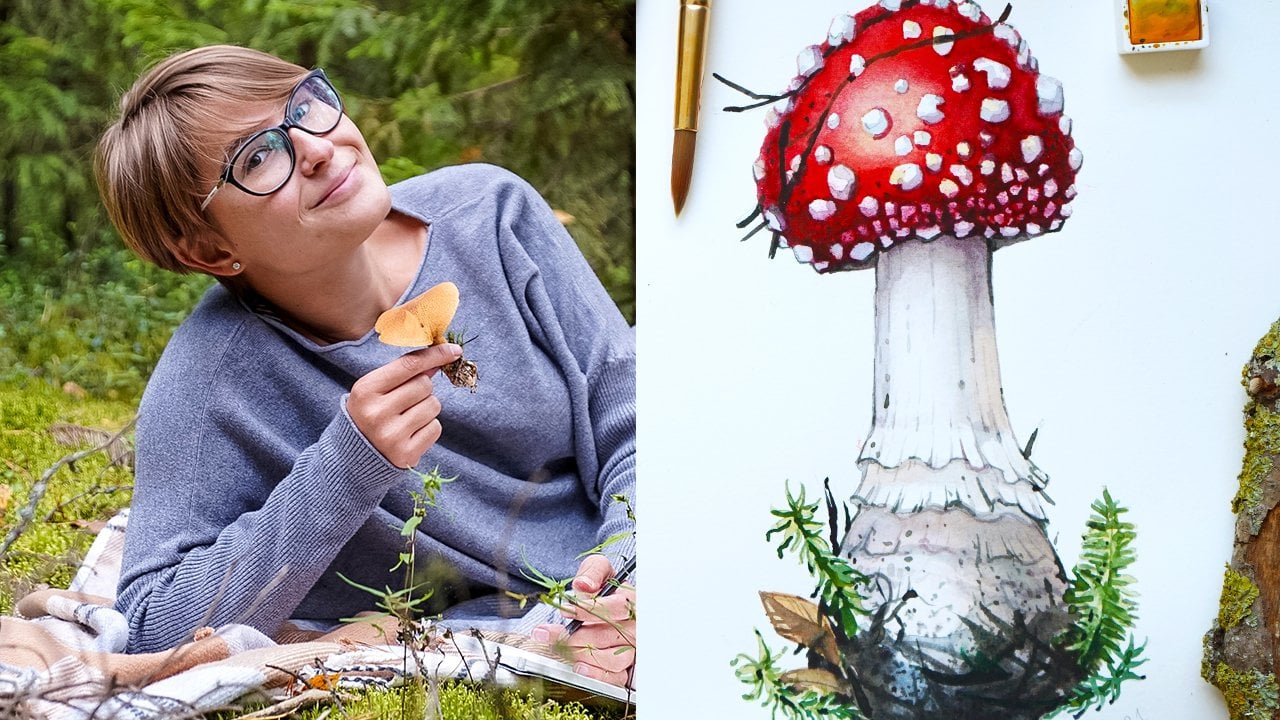
Transcripts
1. Welcome to the Class!: The world around us is a fascinating place and
if you're a creative, you have the power to capture your favorite things, moments, and places on paper, and the sketch book is
a perfect place for it. Travel. Sketching has been
my playground since I left for a five month long
trip in the Southeast Asia, where I document my journey on the pages of my
sketchbook daily. I've learned a couple of
things on the way and I want to share them
with you in this class. I'm Anastasia, a
full time artist, content creator, and nomad. And I have one rule, one sketch a day. No excuses. Just imagine opening
your sketch books years from now and saying, oh, I remember this place or I remember this
special moment. And the good news is
you don't have to travel the world to start
your own sketchbook. I will share with you
some creative ideas on how you can make the most of your sketching journey and transform it into
a real adventure. In this class, I will teach
you my approach to travel, sketching, how to
choose your subjects, in what method to use, how to represent
subjects in motion, such as animals or human beings. How to organize your spread, and how to use composition
in your advantage. Best are supplies for
travel sketching. Finally, I will show
you how to paint a beautiful sketchbook
spread using watercolors and three
different approaches from a reference picture from
life and a combined method. This class will give
you all the tools to start your own
sketchbook journey, elevate your creative skills, and make some amazing memories from your trips or
your daily life. Are you ready to start this
new creative adventure? If yes, then I will
see you in the class.
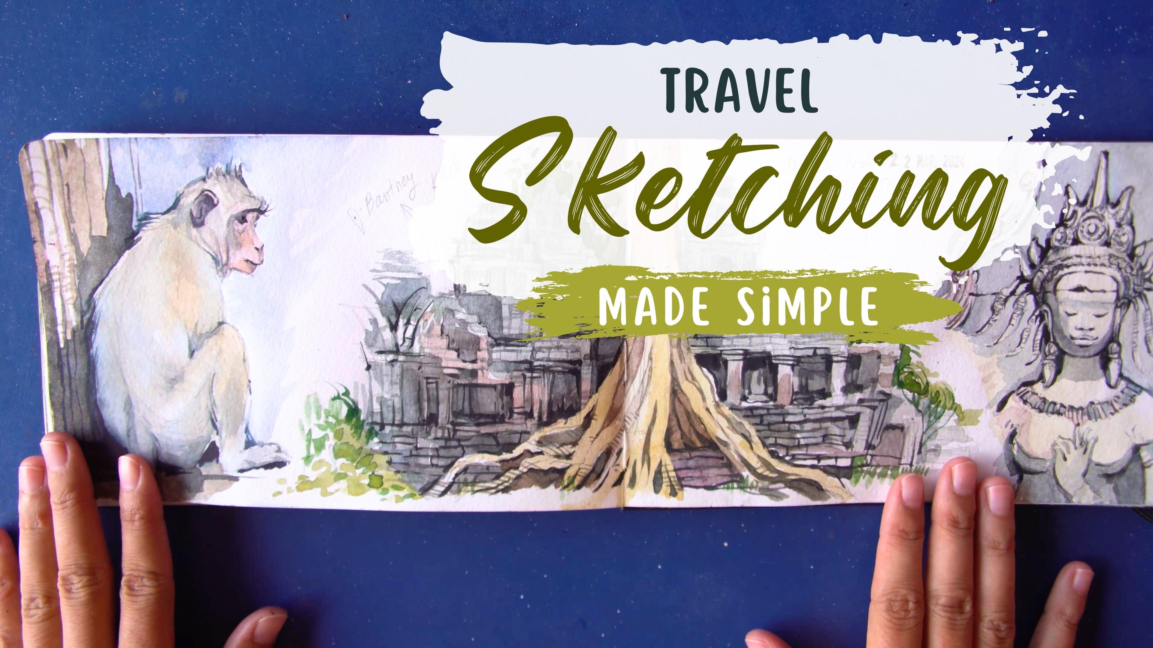
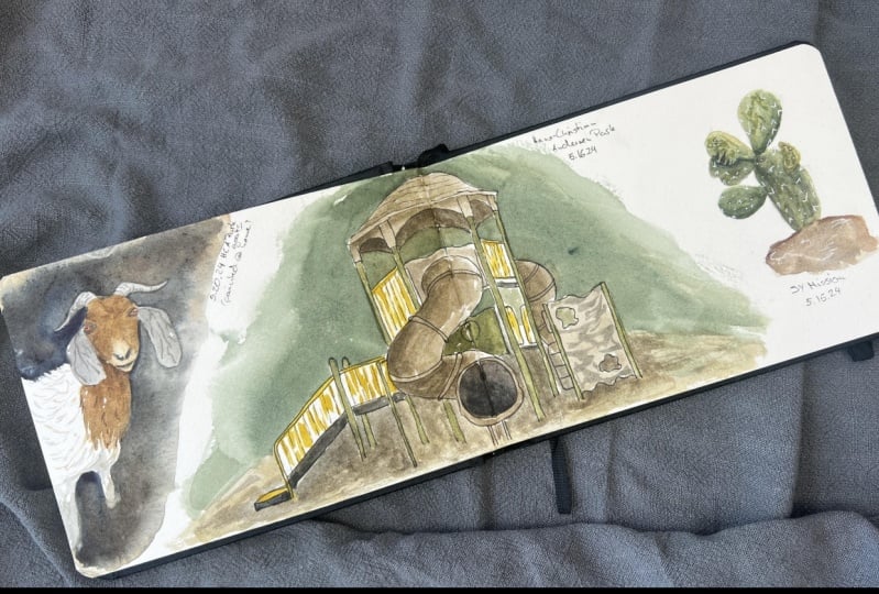
2. What is Travel Sketching: In this lesson, let's
dig a bit deeper into what travel
sketching actually is. I'll have an example of my
own travel sketch books here. Yours can be different
depending on your taste. For example, I'm not someone who likes to write a lot of things. I tend not to write my
thoughts or something, but I just limit myself to maybe write the name of the place
where I made this sketch, put a stamp with the
date, and that's it. But if you are
someone who likes to write and like to journal, you can totally make an
illustrated journal. Again, there are no
rules in Sketchbooks. So Sketchbooks are for fun. Travel sketching can be
different for everyone. For example, I like to
document everything I see from objects
like here to scenes. This is my husband
playing pool to, you know, this one I
sketched during a concert. I just like to add these
little texts to give the whole composition a
bit more interest and also remind myself where this
sketch book was actually made. Also, one more thing. You
can combine techniques in your sketchbook
so you don't have to do only watercolor
if you want. You can totally do
watercolor and pencil. Or in some sketches, I did watercolor and line drawing with fine
liners for example, or this spread
over here as well. Again, I combine
water color with this botanical drawing that
I made with fine liners. Travel sketches are
really about experiment, having fun, experimenting
with compositions as well. For example, like in this one, I decided to put the scene with people on the left side and
then fish on the right side. You are totally allowed
to do whatever you want. You see things like here,
some decorational elements, some sketches from a concert, a landscape, and then an animal. I personally think you can
mix it all if you want. The most important
thing is to have fun. Probably also, this
was the time when I wanted to experiment
with different techniques. I experimented with fine liner. Here, again, also
architecture and food. Why not? Also, you can make
pages on a certain theme. For example, this page here, I decided to pick a
theme of markets. I visited a very interesting
and very cool market, and I decided to dedicate this page to the
market entirely. So you see I've sketched
some highlights, some details of the market that kind of were
interesting for me. And then I decided to paint
a scene with this lady here. That is for now, with pencil. I'm not sure if I will
color her, probably I will. But I think even at this stage, this sketch is look,
looking good already. These sketches here,
pretty random things but I think they convey the atmosphere of
the place really nicely. So this was in Lao, we have this scene with the person carrying
stuff on a bicycle. We have these bananas. Bananas are everywhere,
so why not? And then I decided to
paint these roosters, roosters running around
everywhere in Lao. I think this spread right here also conveys the atmosphere
of this place really well. It's really up to you what
you want to represent. And sometimes you see I am covering the whole
spread with the drawing. I'm leaving the other
page more empty. We can totally experiment with how you want to
organize your spreads. In one of the next lessons, I will be giving you some tips and ideas on how you can
organize your own spreads.
3. What is Alla Prima Approach: One more important thing
about travel sketching is the approach I will be showing
you here in this class. I am someone who likes
to work with layers. Usually I like working
with layers to obtain realism and get
all the nuances of color. If I'm painting
something realistically, let's say a fruit or
an animal, or a leaf. But for travel sketching, it is essential to capture
the essential things as quickly as possible and
with less layers as possible. That's why we will be using
the alla prima method. Translated from Italian, alla prima means from first attempt. The difference here is
that we will try to do the maximum things possible
on one layer or two layers. As you can see here
on this painting, I did everything on
only one or two layers. Here, I started with the
weton wet technique. I added the general tone,
painted everything. Once it was still wet, I added final details. You see with these
brush strokes here, the difference between
this method and the multi layer techniques on the layering technique
is with layering, you can have this a more
relaxed past pace of working. It means you can make one layer then get back to it tomorrow, make another layer get back
to it tomorrow, and so on. You can go with layering with sketchbooks and
with travel sketching. We want to sketch
things quickly, we want to capture memories, We want to sketch
things on a go. That's why we need to think
more about how can I achieve the maximum realist
and the maximum give the maximum I can give in
only one or two layers. Basically, that's it. You see, I've added only one layer
to paint the water. I've added only one
layer to paint the sky. This is the principle
that we will be using for travel sketching here. Only a couple of layers to
paint these buffaloes here. Also, what I think is nice for travel sketching is the way you can play around
with your strokes, with the expressiveness
of your strokes, and also with backgrounds. For example, if
you're someone who is afraid of backgrounds
of colored backgrounds, this is your chance
to experiment. And this is your
chance to, you know, get better at it because travel sketchbook is the
perfect place for it. So this is the place for
experiments you see. You can totally add a messy background and
it will look nice. This is the way I
decided to paint these electric lines here. And it turned out a bit messy, but I think it captures the
atmosphere of the place. It's not about
perfection here again, these palms are not perfect. They're not perfectly realistic. But they are realistic enough to make the
viewer understand what it is we need to
capture the moment here. Same thing about the roosters. The roosters are not
perfectly realistic. There are not all
the details there, but we can still understand
that these are roosters. And again, you see
this was painted in one session with
only one or two layers. Again, same with portraits. This portrait was
painted in one session, and I will add some details, some final details to it. But I think it actually
looks good even this way. Minimum effort, minimum
brushstrokes, maximum result. This is what we are going
for with travel sketching.
4. How to Pick Your Subjects: One thing I really
wanted to mention, and that relates to
travel sketching, is how to actually pick your subjects when you
see a beautiful view, a beautiful scene, it's
very natural, I think, to want to represent
everything you see, all the details, all the colors, all the elements that
we see that inspire us. But if you are
sketching on a go, it's important to
consider the time you have to obtain a good result. This is what you need to do. Consider the amount
of time you have at your disposal and think about what kind of result
you want to obtain. Let's say if you only
have 30 minutes and you are looking at this
beautiful landscape here, let's say I'm showing
you this example here. You have the sea view and
you want to paint it, but you have only 30 minutes. Instead of painting
the whole scene, you can just get concentrated on one particular
element in that scene. For example, for me
it was the boat. You see that on the picture. I actually have plenty
of things going on. I have these two
ladies having a swim. I have the landscape, I have the whole
surface of the sea, and then I have the boat. What I decided to do, in my case is just to
get concentrated my effort on the boat and paint the boat
realistically, a little bit. Paint the sea realistically. And that's it. Even though I
like how these ladies look, it was not realistically
possible for me to paint everything in
this short amount of time. That's why think about what you want to achieve,
how much time do you have? Or the other option
is consciously start the drawing on a spot and then
finish it in your studio. This is another option. I will be talking about these different approaches
in one of the next lessons, but I just wanted to
mention it now as well. Also, it's important
to be selective. Let me show you
this other example. Here I have this spread with these two people
and with fish. This is the original picture. Actually, I was
working from life, but I decided to
take a picture in case some of these
people decide to leave. So I suggested to do the same. Actually, you see that I decided only to paint
these two figures, but actually there are plenty of more people on the picture. It's up to you whether you want to keep all
the details or not, or if you decide to
get rid of them. You are the artist and
you have the power to decide what you want to
focus your attention on. I could have painted only
one figure or all of them, but I decided to paint to actually these three,
and that's it. Another example, I have these beautiful lanterns
here that I wanted to paint. But instead of
painting them all, you see there are a
whole lot of them. I just decided to paint three. So you can see on
the sketch that I picked three and I
decided to paint only them. Again, this is how you
can simplify things. Instead of doing a
very long sketch that will take you probably hours and paint
all the lanterns, you can just paint one or two, or three and make
it much quicker. One more example is again
about this scene over here. We were in the restaurant
and I really like this lantern and I
decided to paint it. Instead of painting the
scene the restaurant room, I decided to get
concentrated only on this particular element
and this is how I did it. So I decided to paint
only the lantern. You see that there
is a tree behind it. So I painted the
leaves a little bit, so to give the idea there's
something over there. And then I also painted
the second lamp behind. And that's it. So no ceiling, no table, nothing behind, Just these two main elements. Also, you are free to
decide what kind of background you want to give
to your illustrations. For example, I wanted to paint this pumpkin here.
This is where it is. I painted this one entirely
from picture and I decided to give it a
dark blue background. You see, it's not the
same thing we see on the picture even though
the dark color is there. But you can interpret the background
differently, for example. So I did here with
this market scene, I decided to paint the background with these
expressive brush strokes. And then give the scene itself more details and make
it look more refined. This is one more
approach that you can use in your travel sketches.
5. Composition: How to Organize Your Spread: In this lesson, we
will talk about different ways of
organizing your spread. Composition is a
very important thing for travel sketching, and I will show
you some examples of my own travel sketchbooks just to give you
some inspiration and ideas on how you can
organize your own spreads. Let me start with the
small sketchbook here. This one is square and this one is horizontal long sketchbook. Also, the way you
organize your pages will depend on the format of
the sketchbook you have. In my square sketchbook, I tried different things. I tried to fill the whole
page with the painting. Sometimes you can
leave the borders as I did here or you can fill the entire page like I did
over here, for example. You can also divide your
pages into smaller areas. For example, you can choose
to paint one scene on the right side and then divide the left page in two parts. So I decided to paint
a landscape here and then a detail next to it. Again, it's
completely up to you. You can decide that some
parts of your sketch will go beyond the limit of
the first page and will affect the second
page. This is totally fine. Again, it's up to
you. Sketchbook is here for you to
play around with, so you are allowed to
try different things. If you don't like
it, don't worry. You don't have to
show it to anyone. You don't have to
blame yourself. Sketchbook is the
place where you can express your
creative freedom. You can totally use both pages or half of the second page if you want. You can
do things like this. For example, I made a study of these waves on the left side, and then I made these two smaller scenes on
the right side. So really there are
no particular rules. You can make
something like this. Here I decided to put the landscape on the
left side and then make a botanical study on the right side with a
totally different technique, and I think they look
pretty nicely together. Also, I added this watercolor element here on the right side. Sometimes I make
these entire spreads, For example, like here, I decided to paint
the landscape. And I even invented
some elements here. I decided to put this plant across the page in
this walking figure. Of course, this was not
there in the reality, I just decided to
paint it this way. Some other examples also.
This is a good example. I think again, your illustration can affect the second page. And I was thinking, what can I put on the
second page so that it fits nicely and kind of repeats the shape of
the first sketch. So I decided to paint to draw
this sculpture here that I saw in Thailand
that I think fits really nicely into this
particular spot here. So I think when thinking
about how filling your pages, it's important to imagine how two sketches
will look together. That's why before
starting a spread, you can actually start
planning it in advance, especially if you're a beginner. I think it can be
really helpful. For example, I will show
you some other ways of how you can plan your spread. So you can, for example, divide your pages in three parts. I especially like doing it with the smaller skin sketch
book just because I have this nice and big area. So I think three
sketches fit really nice within these pages. You
can do something like this. And this is something
that I will actually be showing you during this class. So the final result of our
class is the following one. So I will be painting this
spread with the scene in the center that we will start painting from life
and finish in the studio. This element here painted
entirely from life and then this monkey painted
entirely from reference picture. So because it's moving as usual. So this is one more
idea of the spread. So three illustrations on three different topics that
will look nice together. This is the other
option, a landscape, a portrait, and some
drawings on the lower side. So you see, you can totally play around and decide how
you want to position your elements and if
you want to introduce some lettering as well or maybe some text if
you like to journal. So my suggestion is, especially if you're a beginner, if you don't feel very confident
to start a new spread, is to kind of think about
how you can organize it all or just decide on
the first illustration. For example, for
this spread here, I wanted to put the
landscape here, and then I said I will pick
something to fill the rest. One more option is
to start painting the big illustration and then decide what it can
be completed with, so what you can add to that
existing illustration.
6. 3 Methods for Travel Sketching: In the previous lesson,
I already told you about the possibility
to sketch from life. So to sketch on a spot, to start sketching from life and finish your sketch at home, or to sketch entirely
from a reference picture. I wanted to explain
you the difference between these three approaches
and which one to choose. First of all,
sketching from life, I highly recommend you trying
this method just because this is something that
will really help you to develop your
observation skills. And this is just the
best way to practice sketching anything and getting better at drawing and painting. That's why if you have time, if you are somewhere in the beautiful place and you have time to sketch from life, I would highly
recommend you doing so. The second method of
starting on a spot, then taking the picture, and maybe finishing
in the studio is appropriate when you think
your subject may leave, for example, like
it was here for me. So I didn't know whether this boat will stay
there or leave, so I decided to start
the sketch on a spot, but take a picture in
case the boat leaves. Also, same thing with people. Human beings are unpredictable
subjects to paint. They move, they can leave. They will not wait
to paint them. That's why if you want to
sketch landscape with people, let's say I highly recommend
you to take a picture of it, start on the spot if you want. But it's nice to have
a picture so that you can continue
the process when you're at home in case your subject leaves
the third method. So, sketching entirely from reference picture is very
useful when you sketch humans. So, for example, it's not realistically possible
to sketch this man, you know, on a spot. So this is just a
picture I took of this man while he was
passing on a boat. So this moment was literally
a matter of seconds. So I captured his smile and I
knew I wanted to paint him. But of course, it was not
realistically possible to get out my watercolor
set and start to paint. That's why for these kind
of portraits, of course, you need to work from reference pictures or the
other example is animals. So I already showed you this
painting of water buffaloes. So water buffaloes are the same. They will not wait for
you to paint them. So that's why it's not realistically possible
to make the sketch, get out the paints
and start to paint. That's why for animals, I just suggest you to take a picture and paint your
animals from the picture. Of course, if you want, you can always try to make
quick sketches of people or quick sketches of animals with pencil
or with watercolor. But don't expect to get something very refined,
very detailed. So it's an excellent exercise. For example, this one
here was made on a spot. So you can sketch something really quickly with
pencil, for example. But again, this is
much more difficult and it requires much
more experience. So if you are just starting out, I would suggest you to use reference pictures in your
advantage in this case. So now, when you know all
of these three methods, you know how to use
them in your advantage. It's important though to make
everything look cohesive. So even if you paint
from reference picture, and then the sketch on the same page is
painted from life, they should have
a unity of style. So for example, let me
give you this example. Two of these sketches, two of the three sketches were
painted from life. So these two and one sketch was painted entirely from
a reference picture. Because, of course, it
is very complicated to paint a hot air balloon
while it is in the air. You know it's moving, but
the style is the same. You see, I use the
exact same approach, the exact same brushstrokes. And nobody will ever know what kind of
method I use there. But this is what I want to
tell you. Same thing here. These two illustrations were painted from a reference picture and this was painted from life. And I will be finishing it after using my
reference picture. So this is a mixed method. You see, I started on a spot, I did not have enough time. I knew I did not
have enough time. So I took a picture
of this scene on purpose so that I can
finish it when I have time. Same thing over here, if
you are on a spot and if you want to sketch
a scene or an element, but you're not sure if you are going to be able to
finish it there. What I can suggest to you is
just to prepare the drawing, that you can then paint at home. Again, don't forget to
take reference pictures. In this case, using these three methods can
really make your life easier and can
really help you to achieve good results in
a variety of subjects. Just because animals or
human beings are moving, doesn't mean you should
not sketch them. You just need to use
another method here. But again, if you are on a spot, I highly recommend you to
try sketching from life. So just make sure to
sketch something simple enough if you're limited in time and if you want to finish
the sketch on a spot. So maybe instead of
painting the whole scene, paint one tree from that scene. Or instead of painting
the whole cityscape, paint just one
building for example. Or prepare the drawing, start to paint, and then
finish the drawing at home.
7. How to Use a Limited Color Palette: Now let's talk about
limited color palette for travel sketching, we are pushed to use
limited color palette. First of all because of the
size of my palette itself. You see I have only
15 colors here, and this is what I have
on hand when I paint. I think it's a really good thing when you have a set
amount of colors. But that you choose
yourself when you don't use a pre existing set. But when you compose
your own set, that's why I showed you how you can do the same
thing for you. So you just buy a
palette like this. You buy some colors in tubes and you select the ones you will be using for your
travel adventures. I also have my big
watercolor set. I took it with me
for my travels, but I ended up never using it. So I have a lot of
different colors here, but I think this set here is more than
enough for everything. What benefits limited color
palette can give you? First of all, it will allow your sketches to
look more cohesive. When you are limited
in color choices, you will be using same colors across
all of your sketches, which will help you to make
them look nice together. Example, let me show you some examples of
my sketches here. This spread here we
see the same greens. We see the same blues
across all the sketches. And this is what makes
it look cohesive. Let me find another
example for you. This one for example. Again, we have same greens
across the whole page. We have similar blues. Again, this is what
will contribute to make your sketches
look cohesive. This example right here,
it's not finished yet. But just to show you
the greens here, actually this is
Cascade Green by Daniel Smith will make
this spread cohesive. That's why I think using a limited color
palette is very beneficial.
8. Best Art Supplies for Travel Sketching: In this lesson, we
will talk about the art supplies for
travel sketching. I will show you everything I use for travel sketching and I will start from
the sketchbook. I currently use
Moleskin sketchbook, so this is how it
looks when it's used, and this is how it looks
when it's brand new. So I will open one
with you right now. I also have this square
sketchbook from this brand here. I always forget the brand. The name is Tumuarta. This is the name
of the sketchbook and it's really cute as well. Let's open the
Moloskin one together. This one is from art collection. It's called watercolor album, it's 200 grams watercolor paper. The only downside
of this sketchbook, I think, is the
thickness of the paper. I prefer working on 300 grams. For example, this one is
300 grams sketchbook, but this one is only 200. The paper is a bit thin to me. I will show you how it
looks like when it's used. You see some pages get a bit distorted when
you use a lot of water. I think this is probably the only downside of
this sketch book, but otherwise I really like it. I think the format is perfect. I absolutely love this
horizontal long format, actually prefer it
to the square one. I think this one gives
you a bit more space, a bit more flexibility, and gives you more creative
room for experiments. I can totally recommend
this sketch book. Let's open it together.
This one is brand new. Actually, I bought three of
them for my trip so far. I am happy with this
choice. There you go. When you open it, you can take the paper thing away
and it's ready to use. Let's read about
the paper quickly. We have 72 pages here. The paper is 200 grams. As I said, it's 20% cotton
fiber, which is pretty good. It means we have 75% of
cellulose in 25% cotton, which is pretty good. I usually prefer working
on 100% cotton paper, but I've tested this one, and I think this is a
pretty good compromise. It's cold pressed on
both sides of the page. It means you can use every
single side of the page. So you can paint on
one page and then turn the page and paint
on the other one. You can paint on all
sides acid free. The size is 21 by
13 centimeters. It has an expandable
inner pocket, which is quite cute. So we have this pocket where you can put some of
your travel memories, for example, your tickets or
receipts or something else. I think it's a nice thing
to have and that's it. As for the other art supplies, let's pass to watercolors. Now, this is one of the
most common questions I get about this small
color palette. So I will open it to show you. This is how it looks
like when it's open. It has these, these
magnets here. I can stick it this way, and it remains as one piece. The magnets are not
that strong, though. I like using this clip to hold the palette together and to actually clip it
to my sketchbook. I will show you how that works. Let's try on the new sketchbook. Let's say I'm opening it. Let's say I want to paint
on this side of the page. In this case, I will clip the palette here
with this clip here, just very simply like
this. And that's it. You see, it stays in place. I can even change the
position of the sketchbook. I can hold it like
this vertically. The palette is not
going anywhere. It stays where I clipped
it and it's handy. Very convenient. The eclipse
is not included in the set. This palette. I just
found it on Amazon. You can search for
something like a small portable
travel color palette, and I'm sure you will
find something similar. One side of the palette
is for the colors. It comes in empty with these empty pants that you need to fill with
your own colors. Then on the right side, you have this area where you
can mix the color. So I first was hesitant. I didn't know I would
like this palette or not, but at the end, I loved it. I can totally recommend it. And you kind of get used
to this small area here. In the beginning, I
thought this space here will be too small
for mixing colors. But actually it is
perfect for traveling. As for the colors, I'm using colors in tubes. So let me show you
the colors right now. So I will put this palette aside and I will show
you some colors. So I filled this palette
with my own colors. I mainly use colors
from Nievskapalitra. It's a Russian brand. Nievskapalitra White Nights,
this is how they look like. I also have a couple of colors from Daniel Smith,
again in tubes. There you go, some
Daniel Smith colors. I also like Windsor Newton, for example, I have indigo
from Windsor Newton. But basically any professional
watercolor will work out. If you have other brand on hand, it will totally work. I will walk you through my favorite colors
for travel sketching. Because we have only 15
pans in this palette, I'm limited to have 15 colors. I will tell you which
ones I'm using. My must haves first of
all, are primary colors. It's very important to
have primary colors. By primary colors, I mean
yellow, blue, and red. These colors are very
important because this is the base to mix a lot of
different other colors. If you know color
theory a little bit, know that primary
colors are those that compose the whole
spectrum of other colors. These are the colors you cannot obtain from anything else. Let's say for example,
green is a secondary color. It means you can obtain green
by mixing yellow and blue. That's why green is secondary. This is not primary,
but you cannot just mix two colors
and obtain a yellow. Or you can two colors
obtain a blue or red. That's why blue, red, and yellow are primary. It means you cannot mix
them from any other colors. On the other hand, purples, browns, oranges, these are the
colors that you can totally mix from other colors. That's why you see, I don't
have oranges here because orange is very easy to
mix. You just mix it. We just mix yellow with
red and you get orange. Purple is also very easy to mix. You just mix blue and
red and you get purple. That's why I don't have
them here in my set. I prefer having a pretty nice
choice of primary colors. Of course, yellow, I have
my cadmium yellow here. So it's a very
simple warm yellow in Nevskpaltris,
called cadmium yellow. But in other brands it can
be colored differently, but just a basic,
normal yellow also. I have Okra here, you see it on top of my yellow, which is not exactly
a yellow color, but it's still yellowish. If I mix an Akra here, it will look like a little bit like a pastel
yellow or something like this. Two yellows. Also I have reds. As for reds, I actually
have three reds. Here I have my cadmium red, which is a warm red. Just a very basic warm red.
This is the one actually. Then on top of it,
here I have carmine. Carmine is a cold red. It tends to look more pinkish
if you make watch this, the cadmium one will look
more orange and more warm. Carmine will look more
pink and more cold. That's why it's very
important to have at least these two reds of different tones,
warms and colts. And I also like this third red. This is completely optional, but I just like this color. This is called ruby
again by Nevskepalitra. This is the one you have
in the middle here. It's just a neutral, very vibrant red that I like. But again, this is
not necessarily, this is just my personal choice. As for the blues, I have two blues here. Actually I have ultramarine. Or you can use cobalt. These are quite similar. You can choose the
one you prefer. Ultramarine in cobalt doesn't
really matter for me, the color I suggest you to have. This is the color all
the time, is indigo. Indigo is a dark blue color, very intense, complex dark. I use this color to
darken my colors. If I want to a green
color, I will use indigo. If I want to darken my reds, a lot of times I
will use indigo. Personally, I use
this color a lot, and I find this color
very versatile. I can totally recommend it also for other blues. Let me see. I have, this is not
a really blue color, but I like how they look. These two are from Daniel
Smith and I have Lunar blue. It's color with granulation. I think it's very nice
for travel sketching. I also have this other
color which is moon glow. Moon glow tends to purple
color, so it's more purple. These are not necessary. These are just my personal
colors that I like. But you don't have
to have these. As for the other,
must have colors. I like to have a green color
that is already pre mixed. So as I said, you can
easily mix a green by using blue and yellow. But I just like to
have this green. It's called just green
from Nievskapalitra. In other brands it may be called like something
like sap green. So it's a very neutral green
and it is very versatile. So I just like to
grab it and use it, you know, as a green
for everything. So if I want to make
it a bit lighter, I mix it with Cadmium. If I want to make
it a bit darker, I mix it with indigo, for example, or with cobalt. And I just think it's a
very handy green to use. And it's very neutral
and it's very natural. I also have another green here
that I don't use as often. You can definitely see that this tube with green
is almost empty. And then I have
this green that is called green light. This
is how it's called. This is a very strong color, so I don't use a lot of it. But sometimes if I want to
paint the Sea, for example, I like to mix this color
with cobalt or with ultramarine and obtain
a turquoise color. So that's why I like
having this color as well. For painting the sea, for example, or something. Very intense colors such as maybe like very
particular flowers or insects for example. Sometimes insects have these very bright, very strong hues. I will make a swatch for
you of these colors. I present them all,
so don't worry, but let me finish
with the colors. After that, I also have actually two more
greens that I like. Again, these are optional, but I am really in
love with these two. By Daniel Smith I have Cascade green and I
have Paroline green. Cascade Green is a
very complex color and I just love how it looks
right from the tube. It's much more complex
than the one by Nevskra, The green one, the cascade
green. It's hard to describe. So I will just show
you the Swatch. And then the Perlin green
is also a very nice green. And this one is very good
to paint something like forest or the greens
that are far away. Because again, it's very
nice right from the tube, and I don't have to
mix it with anything. It just looks gorgeous as it is. Just to finish with
presenting you the colors, I also have my browns. So I like to have pre
mixed browns again, because I think it's
just convenient to have them mixed already. That's why I have two browns. So I have a light brown
which is this one. And I have a dark brown
which is this one over here. And these are by Nivkepalitra. Again, I have my raw sienna. So this is the lightest color. So it looks a bit
like Khaki color, like Okra, something
more orange. And then I have this other
color, which is sepia. So this is a dark brown. And this is all for the colors. And let's do the swatches now.
9. Swatching and Color Mixing: Let's do some swatches
so that you can see how these colors
look in real life. And this will already
allow me to introduce you my other art supplies such
as this spray bottle. This spray bottle is one
of my favorite tools, so it's a very simple one, it's a very cheap one. But I love it how I can use it. Usually to wash my
brush, all I need, I just spray some of
it on my palette. And then I just do this movement to get the
color out of the brush. I take a napkin
and I dry it all. Or you can take a piece of old cloth instead of a
napkin if you prefer. If you need to repeat
this action until the water is clear, it's transparent and that's it. The other way you can use
this bottle is to open it and to wash the brush
directly in the bottle. Sometimes I do this as well, but usually what I prefer is
just to spraying this way. This avoids me to carry a water container
with me and water. In the beginning, I think there is this moment when
you need to get used to it, just like with the palette. But once you get used to it, it is life changing basically
because it fits in any bag. It's super light and you don't
have to worry about water anymore before I start
to show you the colors, because I have my brush
in hands already. I will also speak
about the brush. This is the brush I
use for everything. This is by Niska
Palitra White Knights. Again, same brand
as the watercolor. And I am completely in
love with this brush. So it's a mix of
Kolinski and synthetic. So it means it's half natural
hair and half synthetic. And the synthetic is
used for the tip. You see how sharp the tip is, So when you put this
brush in the water, you see that the body is quite round and like big and chunky. And then we have this tip
that is super pointy. So it allows me to
create both big washes, like big brush strokes, but at the same time,
tiniest details. So I'm in love with this brush. You don't have to use the
exact same one though. If you find something
similar by other brands. I think it's amazing
mix of natural hair and synthetic hair worked
really well for me at least As for the number
I'm using number four, I also have number six. But I realized that I
use number four more just because it is a
medium sized brush. It is suitable for everything, especially when you work on
these kind of small formats, like this sketch book over here. I think this brush
is just perfect because I usually don't
need to cover like, huge areas of color. So this medium brush is more
than enough for everything. So both for filling
big areas of color, but also to make the
tiniest details. And now let's pass to swatches. So I'll just have my
watercolor album here, so just, you know, random paper to show
you the colors on. And I will start
from my yellows. So let me just grab
my spray bottle. I will grab some of
this cadmium yellow, and you can see it is just a
very neutral yellow color. So I think it's a
little bit dirty because I had some
green into it, so I will try to grab
a more pure version of it. So there you go. Now you see really well, I think it's a
warm yellow color. As for Okra, you wash that, I think you all know what it is. It looks quite
similar to yellow. You can see it, but it has this more brownish
orange hue to it. I think you can see
it. Okra is very nice. It's a very neutral color. You can use it for a lot
of different things. So this is an absolute
must have for me. So yellow and okra
are my must haves. As for the other must haves, let's look at the
primary colors. So the reds. Let me
show you the difference between carmine and cadmium. Now this is cadmium,
Cadmium red. And I was telling you
that it is a warm red, so you can see it tends
to look more orange. So I will take the
pure version of it and you see it's just a
ally, basic red color. As for the carmine, I told you it is a cold red, so it will look more pinkish. Let me show you how that
works, how it looks, Just grabbing some, you see the difference is
quite visible, right? So this looks very different. It's more pink, it's more cold. We definitely see
the difference here. And in its more
saturated version, you see it's kind of a. Strong, very strong,
vibrant pink color. For me, at least you should
have these two colors. So something warm
and something cold. These are the must haves. If you want, you can add an additional red of
your choice if you wish. I personally have
this Ruby color here. I will wash my brush again
and show you how Ruby looks. And it's kind of the
color that is in between. So I would say it's something
similar to both of these, but it still looks different. This is how it looks in a
more saturated version. So I think it's more
on a colder side, but it doesn't tend to be
purple like this, like Carmine. I think this is
something in between. Again, this is just
my personal choice. You don't have to have it. So I think these two are
more essential. As for the other,
must have colors. Let's talk about blues now. We'll wash my brush again. There you go. I could take a
proper water container now, but I just prefer to show you just the tools I'm using
for travel sketching. And this straight bottle is
what I use as for the blue, this one is cobalt, I believe. Yes, I can actually show you the difference between
cobalt and ultramarine. But for me, these
are interchangeable. This is how it looks in a
more concentrated version. So this is cobalt. And then let me show
you the ultra marine. So I will grab it right from the tube because I
don't have it here, and we'll see how that looks. This is ultra marine. So it seems pretty
similar really. There's not a huge
difference there. I think ultramarine is
probably a bit more saturated, but the difference
is not very obvious. You can pick one or the other
one, whatever you prefer. Also, my must have blue is, as I said, indigo. This blue is different. I have it right here. This
is the tube on the palette. It looks almost like black color because it's
a really dark blue. And you will see that the
hue is already different. So you see that it is darker even when I
dilute it with water. But when I take
the strong color, so more pigment, you
see how dark it looks. So this color, again, is perfect for darkening colors. You see how saturated, how deep this color is. I absolutely love it. And again, it's very versatile. I use it for a lot
of different things. Let's pass to my other must haves that are not
primary colors, but these colors are must have. At least for me, because I
just think I tend to use these colors a lot and I love to have these
colors in my palette. So first of all,
green, be palitra. I will show you how
that looks like. So as you can see, it's a very neutral green,
very natural looking. That's why I just
love it because it's good for anything that is green, trees, plants,
basically anything. This is how it
looks when it's in more saturated
version, more pigment. You see it's getting
pretty dark actually, we have this nice
possibility to use. You see the light strokes, the light version of this color, and then the very dark
one, I think it's awesome. And then if you mix it with
let's say cadmium yellow, you can obtain
more grass colors. I think it's a very versatile
color. I just love it. As for the other greens
I told you about, I will show you the
light green that I use for painting the
sea, for example. So this color is very strong, so you just need a tiny
touch of it to get the idea. You see it is not
a natural color, it looks a bit unnatural. There are not a lot
of things in nature that have this colors. But as I said, for
painting the sea, for example, I like it. Let's mix this color. Let's say with blue, you will see what
effect it gives me. If I mix it with cobalt, I will obtain
something like this. You see it's a very nice
color for painting the sea. I personally like it, this
is what I use it for. But otherwise, if you're not
planning to paint the sea, you don't have to have
it in your palette. I just want to encourage you to understand what
you will be painting, what kind of places you're
going to if you're painting, what kind of season
you are painting in. If it's winter, you
probably don't need a lot of these kind of colors if you are living by the sea, If you go on vacation
near the sea, you will probably
need these colors. It's a lot also about
what you want to paint and what
environment you will be. So that's why you can choose
your colors accordingly. As for the other greens, I told you about, Cascade
green by Daniel Smith. So let's try it out. This is how it looks like with just a
tiny touch of water. You see it's a very
neutral color. It tends to the blue color. And then if I use more of it, it's a very complex color. And I think it's
very elegant noble. I absolutely love it. And it's very nice because it's different from this green
right here that is warm. This green is
colder, much colder. So you see it looks
very similar to blues. And also this color
separates in two pigments. So you don't see it
probably on video, but I see it
sometimes you can see these grains of blue
color that get separated. It just creates
very interesting, very nice effects that I think look very
nice on sketches. Personally, I love this color. It's my must have
for my palette. But again, it's up to you
if you want to test it out. And then I will show you one
more color by Daniel Smith. This one, this time
it's paralling green. It's called green,
but you will see that it's a very complex
color once again, and I think it looks very, works very nice
with cascade green. You see again, it's
a very noble color and it's a very muted green. I think it's awesome
for painting the forest or the trees
that are far away because we don't want very intense greens for the
trees that are far away, we want something
more like this. And again, I think it's just perfect for these
kind of things. As for the other must haves, let me show you the browns. The browns are my must haves. As I said, I like to have those already mixed
for me on my palette. I use Rosiena again.
This is the one. I will show it to
you right here. It looks orange, it's very
neutral, it's very versatile. I use it for a whole lot
of different things. Absolutely recommended
this or something similar. Also, you don't have to
have the exact same colors. I'm showing you if you
have something similar, you can totally use that. As for Pia, I will show
you how that looks. It's just a very normal brown. Nothing special when
I use more pigment. This is how it looks. Just a very normal brown. Again, you can replace it
with anything else you like. But I personally love
having two browns. I love to have a light
one and a dark one. This way, I have at least two
very dark colors in my set, which is this indigo
and this brown. These are the darkest
colors I have. I usually use them
instead of black. You see, I don't have
the black on my palette. I don't like using black. I think black is
really limiting. I know a lot of especially
beginner artists like to use to make their
colors darker, to darken their colors. But personally, I don't
recommend this approach. And I think you obtain much more interesting
and rich colors if you use something
else instead. So for example, if you
use indigo instead, or if you use this
sapia instead. As I said, this is just
my personal choice. I don't like blacks,
I don't use them. As for the other optional
colors that I told you about, I have my moon glow. This is a color by Daniel Smith. And it, it's a purple
color, I would say. It's a very interesting,
very noble color. Again, like all colors
by Daniel Smith. I like this brand
and I will show you how it looks like.
So there you go. It's kind of a pastel purple. Again, it looks awesome
right from the tube. It's a very interesting
color, very beautiful. That's probably it. This is all for the colors. Again, as I said, color
choices are very personal. So you can totally tweak
this up to your own needs. According to your own needs. Just what I suggest to you and
what I think is necessary, no matter what kind of
style you're painting with, or no matter where you're going, is to have at least
the primary colors. So yellows, reds, and blues are absolutely necessary in
any kind of watercolor set. I would also highly recommend
you having the green. Something like a neutral
green and a brown. Two browns, probably. So this will be my must have. And then if you want
some, you know, more elegant shades
of green or blue, such as these colors
by Daniel Smith, Cascade or pearling green. If you want something
more complex, more beautiful, you know you can choose moon glow or
something else you like. But again, make sure to have at least yellow, blues, reds. So that was it for the colors. And let me finish with the
other art supplies here. So I want to talk about
pencils right now. So before painting, before to pass to the painting process, we actually need to
sketch our subject. That's why I'm using regular
graphite pencils for that, I usually use soft
pencils for sketching. And I have B and two B
pencils here by Kochenor. It's a check brand and
I absolutely love it. These are my favorite pencils. If you have other favorite
brand, stick with it. But I would suggest
to you picking something not harder
than H B, actually, I would prefer going
with B or two B, not more than two B, because otherwise it's just
going to be too soft. And you will just be staining the other pages of your
sketchbook with pencil. And if you want to
color your sketches, it will make your
sketches look dirty if you use a very soft pencil. So that's why I think B and two B are perfect for
everything. What else? I have my eraser, actually I have this needed
eraser again by Genre, so I don't have a new one here. But usually when you buy it, it is a square piece, and when you start to use it, this is how it will look
like a chewing gum. Basically, you see
it's very soft and this is the trick
of this eraser. It is very gentle for the paper, you see if I draw something, there are different options. You can use it, so you
can make a sausage of it and roll it on your paper. It will help you to make the
drawing lighter if you think your lines were too bold or you're just going to
use it as a regular eraser, just like a normal eraser. The difference is
that this one is more gentle to the paper than
a regular hard eraser. I already told you
about my spray bottle. And the last tool
I want to show you is this dating stamp. I like to use it to
date my drawings. For example, let
me show you one. This one, you see I
have the date here. I think it's just a
really fun way of holding memories and remembering when you did this sketch. Again, this is optional, but I am having a
lot of fun with it. Usually you can have
like an ink pad that you can use it with, but because I don't have
a lot of space, again, I just use my marker
to create the stamp. What I need to do is I'm
using this brush marker. I am just covering the
letters with the marker. There you go. You can put a date on your
paintings this way. That was all for the
art supplies and I really hope that it will help you to choose your favorite and your must have art
supplies for travel sketching.
10. Let's Map Out Our Spread: So in this lesson,
let me show you how working on planning your
spread can look like. Let's say I want to
plan the spread. We will be painting
during this class. I know I want to have
three illustrations. As I said, I will
paint one from life, one from life plus reference, and one from reference. And I know I want to
have three of them. I want the main illustration
to be in the center. So I will outline this area
where I want to place it. And this is something like this, so I don't need paint
anything or draw anything. I'm just putting
a big shape and I know that my biggest scene, so the landscape will
be here this way. I have these two spots
for other two elements. So I know maybe I will
put the element I will paint from life
here and then I will paint the animal somewhere here. I'm just adding, you see
these shapes, these blobs. So that they can guide me
where I need to place things. And then I know these two
spots are for the text. I don't have to outline
them, but if you want, you can so that you have
everything planned out since the beginning and you
see that it's pretty similar to what we
obtained at the end. So we have the main
scene over here, just like we outlined it. We have the monkey over here, and then we have the
architectural element over here. And then text placement. If you feel a bit overwhelmed about the composition and how to place the elements so that they look nice and cohesive, I suggest you to
create this scene before starting to work
on your final spread. And this will just help you
to have a plan in mind, and this will help you
to stay consistent and have a plan before actually starting to
work on something.
11. Sketching a Landscape from Life: In this lesson, we will start our first sketch
from the spread. I will be sketching from life. First of all, I'm just restoring
the lines to guide me. While sketching, I position these shapes to let me know where I will be
putting the sketches, and now it's time to start to
outline the sketch itself. I'm starting from
the basic shapes. As usual, I'm
sketching this temple here with this huge
tree in front of it. My first goal here is just to capture the basic
shapes right away. So I'm not going into
any details just yet. I've just outlined
the first tower that is on the right
side of my paper, and now I am outlining the tree. So I decided to
position the tree somewhere in the
middle of my page. Not exactly in the middle, but a bit more on
the right side. Now I am sketching the
left part of the drawing. I have other two
towers there and a lot of other architectural elements that I would like to
showcase on this sketch. Once I am happy with the
left side of the sketch, I make it a bit more detailed. I can then proceed with
the right side and give it the same amount of details
as I did on the left side. Sketching architecture and especially old architecture
can be tricky, but if you think of it as
it should not be perfect, these blocks of stones are old. For me, it was important to
give the viewer the idea that what is the material
of these buildings? Stone, But I don't
want it to be perfect. You see my lines
are pretty organic, they are not straight. I'm not using any
measuring tools, any rulers, nothing like this. I'm just using my hand to
outline these elements. Now I'm working on the tree. I already have the rough
shape of the tree, and now it's more about
defining the roots better. If you see on the lower
side of the tree, we have a lot of
different roots. And I think it gives
a lot of interest to the tree and will give a lot of interest to the sketch. That's why for me,
it's important to outline these roots already at this stage so that it can guide me during
my painting process, making the outline of
the tree a bit better. And now it's just about
adding some final touches, final touches on the tree, final touches on the
architecture, maybe some details. You see, I'm outlining these columns here,
these separate bricks. I will do the same
thing on the towers. The towers are quite detailed, there are a lot of
things going on, so I wanted to give them
just a bit more detail. Now let's proceed with painting. I just mixed a very light color, it's a mix of okra
and cadmium yellow. I'm also introducing
some rosy llena to it. So I've added some
rosy llena to my mix, and now I've added some sapia to my mix to obtain this
darker brown color. You see, I'm painting on a spot, so I don't do any layering here. I am just going and filling the area of the tree
with these colors. I started with the
lightest color and then I'm proceeding
with the darker ones. Now I'm working on
the right part of the tree with the first
light brown color, and then I'm gradually adding the darker details to
mix this dark color. I just used more sepia. I introduced more
sepia to my mix, then I can then use this color for the
shadow areas of my tree. See that in between the
roots we have shadows. That's why it's important for
me already at this stage, to outline these
shadows over there. Once the first layer got dry, you see it's pretty hot here. The paint gets dry
really quickly. Then I can start to
introduce a second layer. Now I've mixed a
light gray color. I added some indigo
to my mix and obtained this light gray
color for the architecture. It's a cool color and
I think it will be a very nice contrast
between this yellow, warm tree and cool
blue architecture. So I think it's a good color. And I will just proceed with filling the area
of the building, so of the towers and of the other architectural
elements with this color. I'm working with the whole body of my brush at this stage. I'm just filling the
area of architecture without thinking about the
details at this stage. Now. It's just about giving all the building this
uniform look there. After that, I will be adding some details at a later stage. I have just added more indigo to my existing mix to make some of the parts of
my building darker, especially in
between the columns. Because I see this darker space, though, there is a room there. And it is naturally darker. So that's why I'm
darkening this area already with my brush
working on the right side. Right Now, outlining these
elements a bit more, I've just mixed this pink
color, so it's a dirty pink. I just introduced
some cadmium red. You can also use
carmine if you want. And I'm adding this colors to
some elements of my sketch, such as these columns. For example, I am also using this color to outline the
left side of my sketch. And I'm using more indigo to obtain this dark brown,
brownish gray color. It's similar to the
initial gray we had, but just in its darker version. And I'm using it for the
lower part of my sketch. I want all the contrast
to be concentrated there. That's what I'm
using, this color. I've just mixed my
pink color and I think it will support the initial
dirty pink color I've mixed. It's purplish color. You see these colors
are quite complex. I'm not using any simple, straightforward blues, or reds. All of these colors
are mixed together to obtain elegant and
beautiful shades. Now for example, I'm using this dark gray color for again, the inner part of my building, where I see most shadow
is concentrated. As you can see, I'm
not using any black, simple colors to
darken my colors. As I explained previously. To darken my colors, I always use indigo or sapia. This is exactly what I used to darken my gray colors here. Also, as you can see, because we are sketching on the spot, I don't have the possibility to mix all of my colors
beforehand to obtain my mixes. I'm usually adding a bit
of this and a bit of that. And I am modifying and
changing my mixes on a go. Right now, I am adding some
details to my architecture. Already added them to the
right side of the sketch, to the right tower, and now I'm adding them
to the left tower. You see how am changing the
ways I'm doing my strokes. If before I was filling big areas and using the
whole body of my brush, now I'm working with the
tip of my brush to add finest lines in details
and outline these bricks. But I'm also using
the body of my brush. For bigger brush strokes, it's important to diversify your strokes And use
your brush this way, so that you can show tiniest details but also
big areas of colors. Now I'm mixing a green color. I see that behind my building
there are some green trees. I've mixed this
light green color by using green and
cadmium yellow. I am just adding these
spontaneous brush strokes, you see first on the
right side of my sketch, I see some bushes over there. You see, I'm not
being very precise. I did not sketch
them beforehand. I am just going and free handing the bushes because these
are far away anyway, so I don't want them
to be very detailed. That's why I just want
to add a couple of spontaneous and
lively brushstrokes and I think it will be enough to give a bit more interest, more charm, to our sketch. I think greens, plants, and trees always give some
interest and some charm. I think it will be a nice
element to add to our sketch. Now I'm proceeding with
this dark brown color. I just added some sapia
to my mix to obtain it. And I'm using this color to darken some
areas of my sketch, such as these details of the tower, other
architectural elements. I'm also adding these details especially to the foreground. I don't want the background
to be very, very visible. And if you know the rules
of air, perspective, and perspective in general, what is closer to us
should appear darker. That's why I am using
this dark color, especially on the foreground. I'm not using it on the
elements that are very far away because I want the
viewer's attention to be on the foreground. I'm just keep adding these
details with my brush. I also diluted this
color with water. And now you see I am using
the same color but in a more light version
to give some details of the tree and also to some details on the
foreground of my sketch. Now I'm outlining the bricks, these individual bricks with
the very tip of my brush. Again, you see my
lines are pretty irregular and there you go. We finished our
sketch on the spot, and now it's time to
finish in the studio.
12. Finishing the Sketch in the Studio: Welcome back. After our
plan air sketching session, I am ready to continue the work on this sketch in my studio. I will be using the
exact same supplies we used for the
outdoor sketching. I have my little palette here, my colors and the
palette itself, where I'm mixing the colors. I have my exact same brush. I have my spray bottle that I can use as a water
container if I open it. And then I can also
spray on my palette and wash my brush
this way as well. I have my napkins, so my tissue paper that is
always nearby when I paint, and I have my reference picture. I took this picture on a
spot when I was sketching. I uploaded it to my ipad so
that I can have it nearby. When I sketch, I
will be using it as a reference picture to
finish this sketch. I think we're ready to go, so let's get started. First of all, I think I
will start with the tree. I already had some water
on my palette and I can start mix some
colors for our tree. I think now it looks a bit light and I think it's
lacking some details. I will mix this color containing okra and I
will add some blue to it. Now it looks a bit greenish. I'm adding some brown. As for the brown,
I'm just some sapa, something brown. More brown. I will use this color to give
some shadows to the roots because I see that the lowest part of the
tree is quite dark. There are some roots there, and I want to highlight these. I've mixed this color again containing
two kinds of brown. I use Raena Spa. I also used some indigo. And, and I obtained this a dark color
that I will be using now for the dark
details over here. Because the tree is
in the foreground, I want to make sure
that the tree is nice and detailed because
a lot of attention goes to the tree because this is the subject that is the
closest subject to us. I'm not really satisfied
with the color I got. I think it looks
a bit too green. I just erase it from my palette
and I will mix something else you see sometimes
when you sketch on a spot, you are more into the moment. You don't have a lot of time to think about the exact
color you want to mix, but where you are in the studio, you have this privilege. You see, I just quickly
mixed another color. I used sepia and ruby instead. I think I prefer something
more warm for these shadows. And I think this
looks much better. Actually, I think the previous
color was a bit too green. This is more neutral. I am happy with how this
color turned out. I can use it to visually separate these roots
from one another. Again, I want to give
these roots some details. Just because I think
it's on the foreground. We really want to make this
tree stand out a bit more. It's important
though not to over darken the shadows either. You see, I'm using
quite of a light color, so it's not very dark. And I will gradually add these
shadows until I'm happy, but I'm not going crazy
dark at this stage. If I want to dilute the
color a little bit more, I just spray with my spray bottle once again and you see my color is lighter. Now, you can adjust
the intensity of your color on a
go. It's really easy. Now you see I'm
using the same color but in its lighter version. I think I'm quite happy
with the tree right now. So I gave it some details, but I'm not getting crazy with details because I still
wanted to look as a sketch. So I think I'm happy right
now with it at this stage and I will maybe keep working on the
architecture right now. Before I maybe add a couple
of other details to the tree. I would like to make
this part here darker, the lower part of the building, I would like to make it darker, so I will mix a color for that. Again, I'm using indigo. I will take some
brown and I will add, just to touch of blue
again, a bit more brown, because I think now it's
missing more water if needed. Again, more blue. Sometimes
you see in the studio, the process of mixing color can be a bit more long than
during plenary sketch. I got this gray color, it tends to the blue color. So I think it looks bluish
and I'm quite happy with it. I just wanted to give this
lower part of the building more shadow just to visually separate the temple
from the tree. I will keep using this
color on this lower side. I think it's nice if
we give this part of the sketch just a bit
more contrast my color. You see it's light enough, it's not crazy dark, so we can still see what's going on underneath this color. And this is exactly what I want. It's important not
to ruin your sketch when you are adding details because there is
the risk of doing it. There is a really thin edge between making it look better
and adding final details. Make it look more
finished and everything, and between starting to ruin it, because sometimes we can be satisfied with what
we did on a spot. And then once we start to dig deeper into the
details and everything, we can start losing the initial, you know, freshness
of the sketch. So that's why it's very
important to work gradually, I think, on these details and
observe what you're doing. So if you think that the details you're adding don't add up, but actually start to make, look your sketch more crowded
or unnecessarily detailed. Then maybe that's the
moment to actually start, stop the process, and just
say, okay, that's it. I will try to keep this balance and not get carried away
by the small details I'm using the same color
and adding just a couple of thin lines to make the sketch
look even more detailed. And then I will add the
darkest details at the end. I'm not trying to paint all of the details
I want right now. I'm just playing around adding
these lines because I see these are the details of
this part of the temple. I want to show them and I think at
this stage I can do so. I'm just playing around
with these lines. I think I am pretty much
happy with how it is going. Again, you see I am using
both the whole body of my brush to make
big brush trucks and then I use just the tip of my brush to add
these thin details because I see that
our building is made of these blocks of stone, and I want them to be
visible on my sketch. I want the viewer to understand that these are stone blocks. That's why I am creating this texture on some
parts of my sketch. To create this texture, I'm using the very, very tip of my brush. I'm grabbing the
same color and I'm also darkening this
area over here. And also this one, you see, I'm not trying to be
photo realistic here. If you look at my reference, you see that some of the
things are different. There is not to actually create a
photocopy of the picture. Our goal is just to make the sketch look nicer
and more detailed. So it doesn't really matter
if what you're doing now is the exact same thing
you see on the picture. So some elements on your sketch can be
different from the picture. If it looks good,
it's totally fine. So no one will control you and go and see how this
brick was not over there. You know, like this architectural element
was slightly bigger, might light and smaller. These kind of details
doesn't really matter as far as it looks trustworthy, your goal is to make
things look realistic, but how you make it
doesn't really matter. You see now I'm adding these lines because
I think it will give the idea that there are some bricks and some
things going on there. And I don't necessarily see them on my
reference, but I still. Paint them because I
think they will give details and this
is how I can show that these towers are complex and they have
plenty of details to them. So I'm not trying to repeat the exact same thing
I see on the picture. I'm trying to replicate
the impression that we have like by looking
on at this scene. You know, I think we're ready
to add final details now. I think I am pretty happy with how this sketch turned out. I will add a couple of details here and
there to the towers. I will adjust the shape
of the tower slightly, and also this one over here. Now, I will mix the darkest
color using the same colors, but in a more
concentrated version. So same indigo,
same sapia color. But I will mix a
much darker color, so you see it's very,
very dark, almost black. I'm not sure if I am going
to stick with this color, but I will try it on paper
and see if I like it. Think it may work out. Probably I will use this
color but very carefully. C not putting it everywhere, just in some areas where I think details are needed because this is the darkest
color we're using. It's going to grab
a lot of attention. I need to know where
I want to put it. We want the viewer to look here, That's why I will use this darkest color only
on the foreground. Because otherwise
it will attract too much attention to the
details that are far away. And we don't want that, want the most attention
to be on the foreground. You see, I'm choosing the
areas I want to highlight. And this is where I'm
adding these thin strokes, but not everywhere.
This is important. I think I will
concentrate my effort on these details right here because they are quite close to us. And that's why you see I've
added these lines over there. I will let you watch
me adding the details, the final details to the sketch. Now I can start to add the
final details to our sketch. I've added these darkest
details on the foreground, and I think it looks quite
nice with my lady here, we sketched from life. I think these two sketches
look really good together. Now, all I need is just to add the final touches
using the same color. I will add last
details to the rem, I will underline some
dark shadows and I am using the same color I was
using for the architecture. Now I am going to mix a different color. I think for this purpose, for the inside area of the tree, I will use something more brown. I will get a touch of Siena and introduce
it to my existing. It will make my mix look
a bit more brown instead of just a black color. I will use this color to add the final touches
to the roots. You see now I am working
with the tip of my brush. I think I am almost done here. I think I will give the
tree some texture so I can make the texture just
by making these tiny lines. This is something I see on
the real tree and this is how I will show the
texture somewhere. Not everywhere, just in
some places, in some spots, for example, maybe here on
this route probably as well. Just use these lines to give the tree a
bit more interest. I think I'm quite happy. Make the outline
just a bit bolder. I will wash my palette and just give the greens some
details as well. You can see in my reference, I have these trees
on the background. I think I would like
to give the trees some just an additional
layer of details as well. I need to wash my brush first, so see it's dirty from
the previous color. I just spray on my palette, rub my brush against
the palette, and clean everything with my
paper towel, with my napkin. If I need, I do this
thing again until I obtain water or almost
clear water when I spray. And you see now it's
pretty much clear, so I can then mix a new color. So I will mix some
yellow with green. I'm just using cadmium yellow and green color green
bincpaltras just called green. And I will use it to add these final touches
to my greens, to my bushes here. So I don't want the bushes
get too much of attention. But I think it's still nice if we make them look
just a bit darker. You see, I'm using these
spots and dots to make my greens look quite
spontaneous and organic. I will darken this
color just a bit more. Just making the same color but a more intense
version of it. And I will use this
color to darken these lower areas where the
bushes meet the architecture. I think it's nicer
if they're dark. Again, as for the bushes you see I've invented
them a little bit, so they're not exactly the same as you can see on my reference. But again, it's up to
you what you want to create on your sketches. You don't have to blindly follow the reality
if you don't want. That's why I think,
especially for the greens, for the bushes, these things, you can be flexible and you can invent
things a little bit. All right, in the next lesson, we will start to paint
our final illustration. We will add one more sketch on the left side of the page
to complete the spread. I will see you in
the next lesson.
13. Drawing a Portrait from Life: In this lesson, I will
show you how to make a sketch from start
to finish on a spot. So, I selected what
kind of subject I want to place on the
right side of my spread, and I decided it
will be on Apsara. You see her on the right side
of the screen right now. Apsara is a spirit, so it's kind of a nymph or a goddess in Cambodian religion. And I thought it will be a very interesting
subject to sketch. These female figures are everywhere here in Cambodia
where I am sketching it. I think it was one of the most typical elements that I've encountered in
these ancient temples. I decided why not sketching it. Now you see I
already proceed with the outlining of the general
shape of my female figure. I started from the head, just general proportion
of the head, and now I'm adding some elements to the
crown of our lady. If I need erase, of course, sketching
is a process. Nothing is carved in stone. If you see that you made a mistake or
proportions are off, you can totally take
your eraser and erase. I'm proceeding with
the face features. Now you see I'm putting
these guiding lines. So to guide myself where
the necklace will be, where the face features will be. Before painting the mouth
or drawing the mouth, the eyes and the
nose, I need to put these guiding lights that you
see me putting right now. Also for the nose. It's
a very gradual process. I switch from one part of
the drawing to another one. After the face I may proceed
with the crown and then get back to the face
again, for example. Now it's time to outline
the face features better, like the eyes, for example. I'm doing it with these
short strokes and now I will gradually add other
face features such as the nose and mouth. You see that it is
a gradual process. As I said, I don't
start my sketch with these final
touches such as eyes, mouth, and other face features. But I always start with
general shapes and big shapes, such as the whole
oval of the face, the proportions of the
crown of the face. Only after that, I
can dig deeper into the details like I'm doing
over here, for example. Now I'm focusing on these
earrings and I'm getting a bit more precise with the
proportions of, of the face. I can also add some
details to the crown. I see that the crown of this
Apsara is very interesting. It has a lot of these
very interesting, typical elements that I would love to share to
show in my sketch. This is exactly what
I'm doing here. I'm first outlining
them on the left side, and then I'm doing the same
thing on the right side. These are pretty symmetrical. It's not very difficult to
do these kind of things. Now, I am proceeding
with just adding some details to the crown
and to the face again. First things first, when
I'm pretty much happy with how the general outline and general features
of the face look, I can then proceed with
other secondary elements. I see that there
is this frame that surrounds my lady and now I think it's time
to outline this frames. I'm giving it a little bit of details because I see there are these interesting elements to them that I would like to
paint with watercolor. I am already outlining
these things with pencil, also on the right side. Now it's time to give just a bit more details to
the crown and to the face. It's important not to give too much details
to your sketches because you will be painting
your sketches anyways. But I think it's
important to add the general details and the important elements
with pencil already, because otherwise you
can easily forget them when you will pass
to the painting process. I think it is necessary to
add some of them already. At this stage now, I'm outlining the
body a bit better. I will not paint the whole entire figure
but only a detail. You see, I decided to
concentrate my efforts on the head and the upper
part of the body. This is just my personal
choice and I think this is what fits
my page better. I am now proceeding with adding some details to the
hand and to the face. The face is a very
important part. I'm really taking my time
here and trying to get the features as precise
as I possibly can. Again, if I need to raise
a little bit, I do, so I definitely take a little bit more time to get these proportions
and the details right. You see, again, I'm working
on the eyes right now, making sure they are in place. I'm also giving the lower edges of the eye this darker outline, same to the chin, and
same to the earrings. I already like to
give my outlines a bolder look when I think
it's needed at this stage. For example, I use
the bolder outline to outline the face
and the earrings. Now I will draw the
hand a bit better and also some other elements of my female figure and I will
proceed with the painting. Very soon. You see that
my sketch is now ready.
14. Painting a Portrait from Life: After we're finished our sketch, I can then proceed
with painting. I am refilling some of the pants that
were missing colors. For example, I added
this cobalt to my palette and I'm
mixing the first color. I'm mixing a light
yellow color here. It's a mix of Okra
with cadmium yellow. Or you can just mix
only okra with water. And I'm adding it to the
left side of the face of my lady and to the left
side of the body as well. This is just the first
light wash I'm making here. I want to give the light
areas some color right now, that's why I'm starting with this very light yellow color. After that, I mixed
a darker color, this time a bluish one. I'm used some cobalt
to obtain this mix. You see that I will be using this color for the background. Basically, I want my figure, my female figure to stand
out from the background. That's why I want
it to be lighter. I'm using the principles of negative painting right now and you see I'm painting everything
but the female figures. I'm painting the
background and this will allow me to make the figure
pop out of the page. Negative painting
is a very nice tool that you can use in
travel sketching. This is the exact
demonstration of it. If you want something
to appear lighter, one of the ways of doing it is to make the background darker. This is exactly what
I'm doing here. I'm using the same blue color. Also here on the left
side of my sketch, I am delicately covering
the background with it. You see, I am avoiding the details of the
crown of the body, but I'm still leaving some visible brushstrokes on the left side because
it's a sketch and I want to give it some of
this lively, sketchy look. I think some visible
brushstrokes are nice to see on the sketches, and now it's time to
introduce a darker color. So I've added some sapia
and some indigo to my mix. And when my paper is still wet, I start to add these
darker details. And you see that they blend with the rest of my
painting very nicely. Because I'm using the wet
in wet technique right now, I'm using the same thing
on the right side. You see I'm doing it
in correspondence of the outline of my
Apsara, my lady. I'm adding the
darkest color now. I just added a bit more
indigo to my existing mix. And you see, I obtained
an even darker color. And now I'm using
it to underline the outline of the
female figure you see. Especially on the top
where I see the crown now, a little bit on the
right side as well. Because I want to give the
face a certain tone right now when the shape and the features of the face
are starting to pop out. I think it's important to
give some volume to the face. I'm starting from the chin, You see I gave the chin and I'm giving the face a
bit more volume. This is the stage that
will take some time. Phase features are usually
the longest ones to obtain. It's a gradual process. Again, you see I just added a basic shadow now and I will continue
this process later on. Meanwhile, I'm working on the chin and I'm
working on the neck. And also some other
details with faces. With these elements
that involve faces, I think it's important to
have a gradual approach. You see, I don't use very
dark colors right away, but I prefer to
add them later on because I know I will
be able to do it now. For example, I'm adding the darkest tone
I used until now. I'm being very
careful and gentle. You see, I'm using
the very tip of my brush and I'm adding this dark color only to some areas of the face
and of the crown. It's the same color I've been
using for the background. It's a mix of sapia
and ultramarine. And I'm also using
it for darkening the body of the female figure, also making the outline
a bit more visible. And I think now it's
time to proceed with introducing a new color. I see some pink hues on my
real sculpture in front of me, so that's why I decided
to mix this dusty, muddy, pink color, similar
one that I was using for the architecture to
recall it a little bit. And I introduced this color
to some parts of my lady. Now I'm covering the
chin and other parts of the face with this
dark gray color. Basically, I'm using
the exact same colors but changing them slightly. If I want to lighten
them up a little bit, I'm just adding some water. If I want to darken
them a little bit, I'm just adding
ultramarine or Sapia. Now I'm using this dark gray
color for this left element. I'm adding some lines to this frame because this is
what I see in front of me. I just want to give this
frame a bit more details. I think now it's
time to take care of the body of my female figure. And this necklace, I
think this necklace is a very characteristic element. I think it's very
beautiful and gives the figure a lot of
interest and charm. That's why I will work on
this necklace right now. You see after introducing
the mid tone, I am proceeding with
the finest details. I'm using a dark color, so a darker color and
the tip of my brush. I will also add the same exact details to
the crown of the lady. I'm being very careful
at this stage now. It's about refining. I work with the tip
of my brush and you see how calculated
my movements are. I'm adding this dark
color, not everywhere. I don't want this
outline to be very bold. I don't want it to
be very uniform. I selecting the areas I want to add this
color to, basically, it's mainly the outline
and some inner parts that I think are the
most important ones or that I want to highlight. So you can notice
how I am doing it. Basically, I am just
thinking of how I can make this sketch more interesting
and make it stand out more. I think this dark outline
really helps me to do so. But as I said, it's
important not to add this dark line everywhere, because otherwise it
will flatten the image and it will ruin what we just
created there a little bit. That's why I am being quite conscious and quite careful
with the dark colors. And remember that you can
always add more dark, but you cannot just erase
what you did with watercolor. With watercolor, you
need to be mindful of these dark details. Because once you put them on
paper, there will be there. I usually add them
at the very end, at the end of my process. And I am giving these details a bit more attention
and I am adding them with a bit more
care and delicacy. Now I'm proceeding with the
same exact thing on the body. Just darkening some areas that I think need to be darkened. For example, near the breasts and a little bit
on the right side. Then I'm using the
exact same color to add final touches
to the crown. You see I'm adding these dots, using these dots and lines to add some
interest to the crown. You can add these patterns, these things such
as dots or lines, to add interest
to your subjects. Now I am outlining this line that is on the face
of my female figure, because it's made
of stone blocks. I outlined this line
that are separating the two blocks from
one another and I'm using the exact same color
for the face features. I just made lips, nose, and eyes darker. But again, be very
careful with it. I'm using the same color to give some last touches to the
body and to the crown. This is the darkest
color I'm using. You see it looks quite dark, so it's almost black. But again, I'm not
using any black. It's just a very concentrated
mix of indigo and sepia. Again, same exact colors. I'm using only 15 colors in my set and two
dark in my colors. Sepia and indigo are
my favorite colors. So this is what I used
to obtain this mix. I'm adding last
touches to the crown, and I think at this stage, our sketch is almost ready. Just a few more lines to
finalize this process. And I think I'm happy
with how it turned out.
15. Drawing an Animal from a Reference Picture: Let's start with the drawing. I will use my regular pencil. So I have pencil here, but you can also use
two if you want. I will sketch the monkey here. First of all, I will sketch the general outline how I want to position the monkey
on the sheet of paper. I don't think the tail will fit. I will probably draw the
tail until a certain point, but I will not do
it all for now. My goal is to position
the animal on the page so that I know that
all of the body parts fit. I need to outline, you see the borders within which I need
to fit the monkey. Especially because
I have already a sketch on this
side of the page. I need to be careful
of making sure that all the body parts
fit within this area. I am dedicating to this sketch here something like this, but I think I've probably
positioned it too close to this sketch right here. So what I will do, I will actually erase it and move it more
to the left side, because otherwise there's
a lot of empty white space here I will duplicate. You see these lines I've created so that I don't start
entirely from scratch. I will move the monkey that
side to the left side. I need to grab my eraser. You see that? Now I already
have something to work with. I don't have to, again,
start from scratch. I will just erase
this right part of the sketch and complete it. I think there's not
a lot of space for the head here, let me think. I think I will actually
move the monkey even lower. The tail is not that
important, but the head is. That's why I prefer to sacrifice
the tail a little bit, but give a bit more
space to the head. Actually, I will
move everything. Once again, sketching
is actually a research. If you did something, don't think that it's carved in stone. And you have to go with
what you just drew. You can erase, and you can start over if you're
not satisfied, because the phase of drawing is actually the
most important one. And this is what will determine whether it's a successful
sketch or not. By a lot of means. If I'm not happy,
and especially if I am painting using a
reference picture, so I'm sketching using
a reference picture. I know I can move things
around until I am happy. So this is the privilege
of working from pictures, not from real subjects. With pictures, you
have the privilege of tweaking things until
you are happy with them. So I think now I am more happy with the
position of the head. I think we have more space on top of the head
and it's much better. I think we needed
some air there and I'm quite happy
with how it looks. And once I have the
general position, so the general outline
of the monkey, I can then start to give
this drawing a final look. As you see, I'm giving
more details to the face than anything else. Because as we discussed, the most detailed part of the sketch will be the
face of the monkey. This is exactly
why we are trying to direct the whole attention
of the viewer to the face. All I need to do now
is to outline the ear. I think that I will then be
ready to start painting. From here we can start
the painting process.
16. Painting an Animal from a Reference Picture: So first thing, I
will clean my palette here real quick from the
previous color I've used. And I will start to mix
the color for the monkey. So I will start with the fur. I will mix something neutral, so I see that the monkey has
this grayish brownish color. And I think I will start
from something like this. So just cleaning my brush, still have some green on my brush that I get,
I need to get rid of. There you go. And I'm spraying a little bit of water on my palette and I can
start mixing my color. So I'm starting
with cobalt blue. So just grabbing a little bit from my palette and mixing it, and I will mix it with
a little bit of sapia. I will obtain this cold
gray, this color right here. And I will make it light enough so I will spray some
water to make it lighter. And I will use this color as a starting point for my monkey. I will go and start covering
the body with this color. I am doing these
big brush strokes, working with the big
side of my brush. I'm leaving some
white spots for now. I will see then how
I can fill them. Actually, I think I will
cover this like this. Then I will then introduce
the brown color. I will just add some raw
sienna to my existing mix. That's it. I will not
pre mix the color. I will mix it directly on a go, as you saw me doing here. I will introduce this new
color to some areas where I want this color to be, on this side over here
to have the same color. You see it blends together
with the previous color. We've added very nicely
for loose painting. It's important to have this freedom of the colors
to mix in one another. So that's why you see I'm
painting really quickly and now I've added just some water to this
upper part of the monkey. And I think before
I paint the head, so I will actually start
painting the head. So I will give the head of the
monkey this uniform color, but I will not touch
the face just yet, actually, a little
bit over here. But I want the face to be more pinkish because that's
what I see for now. I will just leave it white and I will add this
pink color afterwards. I think I have a pretty nice
base here to work with. Now I can start to add
the darkest tones. I will grab some brown. Again, I'm just looking
at my reference and seeing where the
darkest areas are. And this is where I will apply this darkest color when
my painting is still wet. So it's important because
in loose painting, again, we want these
soft transitions. And it's a very
nice way to create expressive animals and
make them look alive. That's why I'm working
really quickly here. You see I'm working with
the tip of my brush now, so it's already the stage
where I add details. So as I said, we're doing everything on just
one or two layers. So that's why we
need to start adding these details already at
this stage if we want them. So I will just try to show
the fur texture somewhere. Not everywhere,
but in some areas, this is how I'm doing it. So basically with
these short strokes and with the very
tip of my brush, I'm just roughly showing
the texture of the monkey. That there's fur that is there, but I'm not touching
the body anymore. I will only touch, I
think this area near the tail just to underline
the tail a bit better. This is the only thing
I will do then now I can finish with
the texture again. I'm just adding it
here and there. In some areas I think it can be added and my paper is
actually already dry. This technique also will depend on the
temperature you're, the temperature of the
room you're working in. I'm working in a hot
climate right now. So my paper is drying
really quickly and you just need to
adapt to these things. Well, maybe I will add some
additional shadows over here. So this is layer
number two already and I'm just using the
same exact color. I'm using these more big,
you see, brush strokes. I use these big brush strokes
just to add shadows where I think it's needed here, For example, to
underline the muscles. And right here, the light and shadow
work is quite important. At this stage, I'm darkening the tail because I
see it's quite dark. Also, I will darken this part of the back a
little bit more as well. I think that's pretty much it. Again, if you want, you can add even more texture at
this stage somewhere. For example, I will add on
the arms of the monkey. I will add here on the legs
of the monkey as well. But it's up to you, this is pretty much it also. I can still add just a few more darkest details where I think I want them. I think I will already start
to outline the background. I want to have a little bit of a background for this monkey. I want this dark blue behind. I will grab the blue and start
painting the background. And also right here as
well, under the toe. Some painting really
quickly and kind of deciding how to place my
brush strokes on a go also. This is one more tip to
lose painting is to make some nice and expressive
brush strokes. I think this back side of the
monkey can be dark as well. I've created this
little background here. Before I finish the background, I actually want to
finish the monkey. I will maybe use
this darkest color. I just use for the background
in a couple of areas, like over the tail,
near the tail, maybe maybe over here as well. Basically, that's it
for the dark color. Now just a couple of
details on the tail. I think I will stop for now. Maybe I will already add
just a little bit of dark color here to
outline the fur. But that's it for now. I will pass to
painting the face. Now for the face, I need to clean my
brush and my palette. I've been using a
very dark blue color. Now I need to get rid of it. I'm spraying some water, using my dirty napkins to clean the most
part of the color. Again, doing the same
thing, spraying again. This is the method I usually
use when I sketch outdoors. I like this spray bottle, It's so convenient and this is how I usually
clean my brush. I think it's very easy. So sometimes you just need to repeat the process
several times, but now you see that the
water is almost transparent. So it means my
brush is clean and I'm cleaning the
palette one more time. And I can now mix a new
color for the face. I'm mixing something pinkish. So let's spray some water, grab some of this carmine red, and I will see how I can
mix this pinkish color. So I don't want it
to be totally pink. That's why I'm
adding some rosanna to my color because I want
it to be quite neutral. And I obtained this
light a bit dirty pink. This is what I will be
using for the face. So I will cover the whole face, including the eyes
with this color. Just trying to be careful of
not going beyond the area of the face with loose painting
with these loose sketches, The important thing
you need to be careful only when you
do these thin details, and especially on faces. With faces, I suggest
being a bit more careful then you can be expressive with the fur
and with the background, but with the face, you need
to be a bit more careful. But you see I just
roughly covered it with the pink color and I
am quite happy with it. At this stage, I
will let it dry, and meanwhile I will add just a few more details to
the hair of the monkey. So I'm mixing my sapia
with some blue again. So to create this
more brown color, it's more brown than blue, so something grayish
but tending to brown. And I will just add these few
strokes on the head to see. I just gave the idea that
there is this hair moving, but I'm not giving
any big details. Also do some the same thing under the ears and
also I will use the same color for this forehead area because
I see it's quite dark, so I'm using the
same color and maybe also creatums really
quick texture. You see just two lines. Two brush strokes
are enough to sketch the texture and sketch
such details as hair. Then I can use the same color for the shadows on the face. I see that the face has these
shadows under the eyes, for example, I am already using this color
to outline these shadows. I also see this shadow
under the nose. I'm touching really lightly. And you see it creates the shadows very
quickly for me already. Because my brush, sorry, my paper is still wet. So I just introduced
this color variation. And there you go. Now I think I need to wait for the face to dry a little bit
before I add final details. And now I will start already
to mix the color for the final details for the face features such
as eyes and ears, these are the darkest details. I will mix the dark color for
these and I will also use the same color for
the ear because I see the ear is quite dark. So for this purpose, I will
use again, brown and blue. So these are the same colors
I've used for everything. So I will remain within
the same color palette. And I will just probably
introduce some red there because it will recall
the color of the face. So I got this like
purple color and I think it's pretty close to what
we have on the reference. And I will start to
paint the ear already. So I just need to make
sure my paper is dry. And I started to paint and I see the paint remains
where I put it. So it means the paper is dry. I'm using the wet on
dry technique now, so I don't want my paint
to go anywhere now. I think the face is also dry. Again, grabbing the
same color and adding these deeper shadows where I see the neck because I see that
there's shadow there also. I see this where the chin is, under the nose and
again the eyes. Now, this is the time when
I need to be careful. I will take some time to
add these final touches. So you see, the
painting process of the body was actually
pretty, pretty quick. So the body, I wanted
the body to be like, nice, loose and expressive, and I did it very quickly. Now with the face,
I want to spend just a little bit
more time making sure that I'm not messing it up. So now we'll just add
a few touches here. On the fur of the head and
maybe same thing over here. I see there are like these
hair growing out of there. I'm doing this now. It's time to add final
details to do so, I just mixed a very dark color. I used indigo and sapia. Again, I'm working with
the very tip of my brush. I am now focusing on the eyes. I will also add these details to the
nose and to the mouth. I will let you watch. Now it's time to make
the ear even darker. I added one layer of
color to it already, and now I will darken it even more because I think this
is what we need right now. I just mix this dark
color again, same color. It's a dark purple color. I will apply it to some areas
of the ear of the monkey. I don't want the year
to be uniformly dark, but I want to underline this lower part of it because
I see it's quite dark. And this area inside
the ear as well, and I will make the outline
of the ear dark as well. So I just mixed
this darkest color. And I'm using the very, very tip of my brush. After that, I will
wash my brush, clean it with my paper towel. And now I have this bluish
color that I obtained. I will just put it in the eye. I want to make the eye
look a bit more uniform, will cover the eye
with this color. I think now it looks
nice and dark. This is what I
wanted. I will also use a similar color for the other eye that
we don't really see. But I want to make
these eye lashes visible so that we understand that the eye
is somewhere there. And I think at this point,
it's just about adding these final touches,
these final details. I think everything looks fine. It's important not to
overwork again the face. So we want to add a
couple of details, but we don't want to make
it too detailed either. Maybe now I will add
just a couple of final touches to some
spots I want to highlight. And I think that's it. And then I can add a little bit more background
here near the face. I think I decided to add just a bit more
color to the face, and I think I want
something pinkish again. I will mix my warm red, this time this is cadmium
red with some rasiena. And I obtained this
nice and warm color. I will apply it to some
areas of the face. For example, here under the
chin and under the nose. And I will blend them
nicely with the rest. So I think the face just needed this extra touch of color now. I think I'm pretty happy
with how it all looks. So you see sometimes just
a tiny touch of color. It can really change
things in a sketch. So I think now I'm
happy with the face. I will just do one
more last adjustment. I will make the dark detail in the eye a bit more visible
so that we can see the eye. There you go. And same
thing in the ear. So you see final details, just refining these
things a little bit. And now I think
I'm happy with it. Time to add the background. I see that on the
picture we have this nice blurry background
near the face of the monkey and behind
as well. I'm not sure. I will add the background near the face.
Actually, maybe I will. Let's try it out. First, I need to
clean my palette. I'm spraying on
my palette again. And I need to clean
my brush as well, spraying clean the palette. Cleaning the brush, doing it
several times. There you go. I can start to mix the
color for the background. I think because the
monkey is quite cold, so the color of the
monkey is cold, I will probably choose something
warm for this left side, some cooler for this
area near the face. Let's start from the warm color. Actually, I will spray and use some Rossi
Llena mixed with brown. Again, my sapia color. I forgot the name. Let's see how this color works for
the background here. Sometimes you can
actually try things. If you're not convinced
by something, it's okay, can try
something else. I will start to apply this color and then I
will see if I like it or not. I think it's actually not bad. I will use this color to outline these
architectural elements. A little bit over here, you see I'm using
both the body of my brush and also
the tip of my brush. I don't want to give a lot of
details to these elements, but I still want
them to be visible. That's why I'm using these big breast trucks and then left some of these areas white. I will maybe even give it some
texture to make the viewer understand it's
there's something going on there but I think
this is enough already. And then I will start to mix the cooler color for
the area near the face. Something's wrong
with my spray bottle. I think there's air inside. So it gets a bit hard to spray. Now it works better. I'm cleaning my palette
and we'll add this cobalt. I don't want it
to be too strong, so I still want it to
be a neutral color. But I think this
cobalt will work nice with the colors I have on
the face of the monkey. I want this fur to be white because this is how
I see it on the reference. I will leave the little
pieces of fur white. I will paint all around the face of the monkey
with this color. I'm leaving a thin line between the face of the
monkey and the background. I'm creating something like this, something expressive here, Not really just giving a few lines something to unite this sketch with the other
sketches on this page. I think the back of the
monkey needs to be darker. This area behind the monkey should be darker in
this area here as well. I just mixed some
brown with blue. I'm using this color
to this area here. It's going to look nicer
if we make this area here. Yes, I think I actually
like it because it gives more contrast and it makes the monkey stand out even more. Instead, I will underline some other architectural
elements here. Again, just adding a few lines just to make the
viewer understand that there's something behind but
we don't really see what. I think it's just going to give the whole painting a
more finished look. More of these lines. I think we see the background, that looks like a
sky or something. Then we still see
the monkey nicely. I will outline of the back
just a bit darker now. And you see at the same
time I'm adding the texture of the fur with these thin lines. There you go. I think at this stage
our monkey is finished. Now, I will just
see if I want to add a couple of additional
dark details to the head. Maybe I will add just a
few darker brush strokes, again to remind the
viewer that the face is the most important
part of the monkey. Just dark color
under the forehead. And I think we are pretty just adding the darkest details
behind the monkey. Continuing these lines to the lower area of
the drawing as well, just to again create
the idea that this architectural
element is there as well. I think I am happy with how
it turned out. There you go.
17. Final Tips and Class Project: And this is it. This is
the final spread we got. We have three different
illustrations here that we positioned
on the spread. We have the one we painted entirely from life,
this element here. We have the one we painted from life and then finished
in the studio. And then we have this
last illustration that we paint entirely
from a reference picture. The important thing is that you need to give unity
to the whole spread. No matter the technique
or the approach you use, you should obtain
the uniform look. I think we managed
to do it here. Also, one more thing about
the spread is it's better if you remain within
the same color palette. You see I've used browns, blues, and okra colors across each
one of these sketches. And then I added green as an accent only to
the central sketch, which attracts most attention. It's important that
you remain within the same color
palette if you want the spread to look
nice and cohesive. One more important tip is to have the variety of subjects. For example, we have
this landscape here. So architecture with the tree, we have a detail. So I choose this detail of this beautiful
portrait of a woman, and then I have an animal. So three completely different subjects that in my opinion, created a very nice
and varied spread that is interesting to look at, to see all the details, and I think it really captures the atmosphere of these
places really nicely. You see sometimes I also add some lettering
to my sketchbook, so in case you want to
remember the place where you sketched or a particular
thought during that day, You can also include these
elements in your sketchbook, and it can give an
additional layer of interest to the composition
into the spread itself. I usually like to use
these little arrows to indicate what place
I was sketching in. But of course, feel free
to do anything you want. Sometimes I also like to put
the date on my sketches, so that's why I've
purchased this date stamp. So I will put today's date and this will add a final
touch to my spread. I usually do it this way. I take a marker and I color the letters so I
don't have a separate pad, an ink pad, just because it's quite bulky to carry with me. So I just use my marker and then when I'm ready I
can put my stamp. I think I will put it over
here. And there you have it. Now, I also have a
date on my page, and I can tell that now
my spread is ready.
 Natura Illustrata, Anastasiia - Watercolor artist