Transcripts
1. Welcome and Who Am I: Hey there, I am so happy to welcome you to Lightroom CC Illuminated, where you're going to learn how to edit your travel photos like a professional content creator. This is designed to get you ready to edit your travel content to a professional standard and teach you how to use Lightroom CC on your mobile phone to transform your images the way travel content creators do. So whatever smartphone you have, whatever your level of editing expertise, wherever you are in the world by the end of this course, you'll know exactly how professional content creators like me edit their photos on their mobiles using Lightroom CC. If you're watching this right now, you're pretty awesome and chances are you're about to edit content that's going to inspire others to travel and help them see the world the way you see it. Who am I? I'm Mel from Illumelation and I'm a travel content creator and entrepreneur based in London. I've been looking and editing content for over five years now and my travel content has led me to work with leading brands and businesses in the tourism industry and beyond. But I didn't start my career off using the best equipment and software. What did I use? My mobile phone, of course. Back in 2014, I mostly used my iPhone 5 to take and edit my photos while I was backpacking. I even had a cracked screen and ever since then, mobile editing technology has just gotten better and better. I've used trial and error to get to where I am today and that's why in this course, I'm sharing everything I know about editing on mobile with you so that you can jump right in. The reason why I created this course is to bring value to people like you so that you can understand how and where the mobile editing magic happens. The most common question I've been asked throughout my content creation career is, "How do you edit your photos?" I know you might be an amazing photographer on your iPhone or hobbyists photographer who likes to take pictures of your travels with a professional camera. But you might not understand or know how to begin with your editing process yet. Either way, the opportunities are endless on mobile. It's so important that we overcome fear or paralysis to find the joy in creating and feeling empowered about your work, so that you can be proud of your content and maybe even make a business out of it.
2. What you will need: Here's what you'll need for this course. A smartphone, a RAW photo or a JPEG if you prefer, and the Lightroom CC app downloaded to your mobile. In this course, I'll be using the full version of Lightroom, as there are tools and functions that allow you to get very specific with your edit. If you don't have it already, I highly recommend you hit pause and download Lightroom on your mobile phone right now while we're watching this, so that you can follow along and learn the settings as we go. Or if you just prefer to watch for now, that's totally fine as well. What I'm really excited about, is seeing the end result, seeing what you've created,after watching this. I find it so inspiring seeing how others view the world, and editing is a way for us to share our visions with the world with others. It's time for you to create, experiment, and have fun. I've provided some resources including a link to Lightroom CC for mobile, the exact RAW practice asset I'm editing with today, and a free preset I created. Whether you prefer to use your phone as we go or just watch first, I'd absolutely love for you to share your work with me at the end so we can really see the before and after results of your content. Let's dive in.
3. The importance of RAW images: First up, let's talk about photo formats. I always recommend shooting in RAW because RAW photos capture uncompressed, unprocessed data, which gives you the perfect canvas for editing. You produce much higher quality images in RAW, than if you shoot in. You're also able to correct any problem images that might be unrecoverable if shot in JPEG. If you don't have any RAW photos, that's totally fine, a JPEG or a camera photo will work just as well. But even if you don't have a fancy camera, did you know that you can shoot in DNG or digital negative format straight from Lightroom CC? If you open up the camera tool directly within the Lightroom CC mobile app, it allows you to shot a version of a RAW image from your phone and give you pretty much the same capabilities as a RAW image. It's pretty cool.
4. Visual storytelling: It's really important to think about the story you want to tell with your image. Your editing style should always match the content and the edit is all about adapting to the travel story. For example, I recently went to Iceland for the first time and I took some photos inside a glacier cave which was very cool and blue-toned. My son subtropical presets didn't work on this image tool because the story is about being in an ice blue, freezing cold glacier in Iceland, and not being on a sunny beach island. See how much better the cool blue tones look? Next up, choose an image to edit. It's difficult sometimes to know which photo you should start off with. But I recommend starting off with an image that you are actually excited about editing. Is it a horse standing in a field or maybe it's a picture of you on the beach or maybe it's a [inaudible] on a mountain. I highly recommend choosing something with a subject or a focal point. This image of me walking along the beach in Shark Owl is the one I've chosen to edit in this course. I love that the trees are on one side of me and not the horizons on the other side of me and I know with just a couple of quick fixes, this photo will look really beautiful. There a couple of different options I could have chosen, but I really love the tropical sunset fields in this one. If you've seen my website, blog, or Instagram content, chances are, you know the world I like to create is very sun-soaked, warm, and golden. That's how I'll be editing today.
5. Importing RAW photos to mobile: Next, is getting the image onto your mobile. So let me walk you through the different ways you can actually send images to your phone in Lightroom CC. Firstly, as we mentioned, you can actually take photos from within the Lightroom app. Now, this creates a file format called the Adobe DNG, which is basically a raw image from your mobile phone. If you have a Canon camera, RAW files will come at the CR2. If you have a Sony, they'll come up as a ARW files. You can also download straight from Google Drive, or Dropbox, or Airdrop as well. What I like to do on the road, is shoot in RAW on my camera, and then use a phone to SD card adapter, to transfer photos to my phone. You can also use your camera Wi-fi if you have it, to send to your phone, and then open up in the app.
6. Benefits of mobile editing: More, and more people are consuming content on their mobile phone these days, and editing on your phone will mean your content is already optimized for mobile. Your mobile phone is a mini-computer that gets smarter, and better every year. I know some incredibly successful content creators in the travel space, who've built entire business empires, just with, you guessed it, their humble smartphone. Do not underestimate the power that is in your hand. One big benefit of mobile editing is that as a traveler, you might not always have time to bring out your laptop. Editing on mobile allows me to be way more flexible with being creative on the road. If I'm on holiday, bringing a laptop around also feels a bit like work. But I always have my phone with me. Lightroom CC on mobile is revolutionary, because not only does it have almost all the capabilities of Lightroom classic desktop, but it's also incredibly agile and accessible. Lightroom CC gives you the freedom to edit your content there and then wherever you are, just using your phone.
7. Lightroom Tools - Part 1 (Selective, Healing, Crop): Let's open up Lightroom for mobile. This is how it looks and it's got a nice dark interface for minimal distractions. If you'd like to add a different photo all do you do is tap this import icon, click from "Camera roll" and you can choose an image from there. When you import a raw image into Lightroom for mobile, it will usually automatically enable lens corrections. If we scroll to the second section here and click on "Optics", you can see that enable lens correction has been automatically enabled. If we toggle the slider off, you can see the image becomes more distorted again in its natural form and if we toggle it on, you can see that Lightroom has automatically worked to counter balance that and pull out the corners a little bit more. It's down to personal preference, but I prefer to enable lens corrections whenever I import a raw image into Lightroom. I'm going to show you exactly what each of the tools do and how they'll affects your image. Let's start with the first four. The tools in this first section are the tools that will give me professional editing capabilities and that's why I personally recommend and use the provision of Lightroom for mobile. First up, we have the selective edits tool, then we have the healing brush. We've got the crop, and we've got the profiles. Let's start with the selective tool. Once you click on the "Selected tool", the selective edit toolbar pops up. If we click on the "Plus" sign, you're given the option of the selective brush, the radius, and the gradient tool. If we click on the "Selective Brush Tool" in the panel below, you're given options for adjusting your brush size and for adjusting the feathering, which basically gives your brush a hard or a soft edge. To adjust the size, hold down and drag up to make it bigger, and drag down to make it smaller. Same thing with the feathering. You can drag it down for a harder edge, or drag it up for a very soft and muted edge. So let's try this out. I'll make my brush a little bit smaller and I will just trace over myself in the center as the subject. It's not an exact size because when you edit on your phone you don't have the same capabilities you would if you're using a mouse or graphics tablet on Lightroom desktop, but you can get some incredible edits just by using this tool. If I go and crank up the exposure, you can see just this part of the image in isolation has been brightened. I can go into color, I can up the saturation a bit for that area, I can go into detail and I can opt the sharpness. I'll go through the properties of these specific tools later, but this is an example of what selective edit can do. If I click the "Tick" button and then I hold down on the image you can see your before and you let go and you can see your after. Already you can see what a difference just having the selective adjustment tool makes. The subject previously is in shadow, use the selective adjustment tool bring it into the light a little bit more. That is a really great tool and one of my favorites for making edits. If your brush has selected parts of the image you don't want to be in the mask. Simply tap on the eraser icon again, adjust the size of the feather, and then go ahead and just trace over it, tap again and the area's been cleaned up. Tap enter now. [inaudible] One billion. There you go, selective edit. Next up is the selective radius tool. I like to use this for creating sunlight or bringing clarity to a certain part of an image that's maybe in the background or to a subject. For this demonstration, I'll show you how to create an area of light. Obviously this area looks very sunny and I'm going to drag the feathering up so that it's a very diffused edge and not hard. The edit will be very obvious otherwise. I'm going to go into color and I'm going to warm up the temperature and I'm going to add a bit of pink tint. I'll go back to light and then I will just drop the exposure and then I will bring down the highlights and make that a little bigger. But you can see a simple, selective radius addition can just infuse an image with so much more light and give the illusion of hitting a certain area of the image. Again, if we go to our before, we go to our after, that's another effect added. Now last but not least in the selective edits, would be the gradient filter. Another one of my favorite tools for very quickly applying a certain look or effect to part of an image. For example, the bottom half of this image is quite dark. So what I'll do is I'll grab a radiant filter and I will click and drag up from the bottom of the image like that, go to the selective edit toolbar if I get the exposure, brighten it up and voila, that is much brighter, simple and easy. By going to saturation I can up the color as well, if I going to sharpness I can make it sharper again. If we go before, much darker, after much brighter. Again, sometimes I feel like the only tool you would really need is the selective edits tool. If there are just very specific things you want to change to an image and not alter the entire tonal color. That was the selective tools in a nutshell. Next up we have the healing tools. When you want to edit out a distraction, the healing brush is great for automatically picking up the area around the distraction and masking it completely as though nothing ever happened. If I go down here, I'll just adjust the size again, make that a little bit bigger and all you do is tap on an area and the mark is gone. If we go before yeah, after the mark is gone. You just do that again and again with the healing brush. Within the healing brush, you can also use the clone stamp tool if you click down here, which is a little bit different. The clone stamp tool will literally clone and another part of the image, whereas the healing brush will automatically patch it up according to the colors around it. For example, if we are to use the clone stamp tool, you tap, move over there. You can see that it's literally cloned the shoe so let's get rid of that. That was the healing brush Tool. Next up is the crop tool and within the crop tool are a bunch of other functions which are really important for straightening up your image and also cropping it to the right size. Especially if you are going to be posting on a platform like Instagram. The first option within the crop and rotate tool is the aspect ratio. As I said, if you'd like to go for a square you can do that. If you'd like to go for the four by five, which is Instagram's ratio you can choose that there too. Click "Enter". This is also where you can straighten up your image. You can either click down here on this semicircle and just automatically eyeball and straighten it up, or you can use the straighten tool which automatically straightens the horizon. Excellent. Next up is the profiles. Now we're not actually going to be using the profiles in this, but I hope one of this tutorial is to show you how to master your own editing style. If you do want to explore some of the artistic profiles that Lightroom mobile provides you with, then you can try out, for example, black and white and you can adjust the intensity of these as well. Now I'm going to reset the image and take you through the second section.
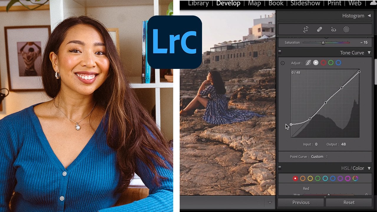
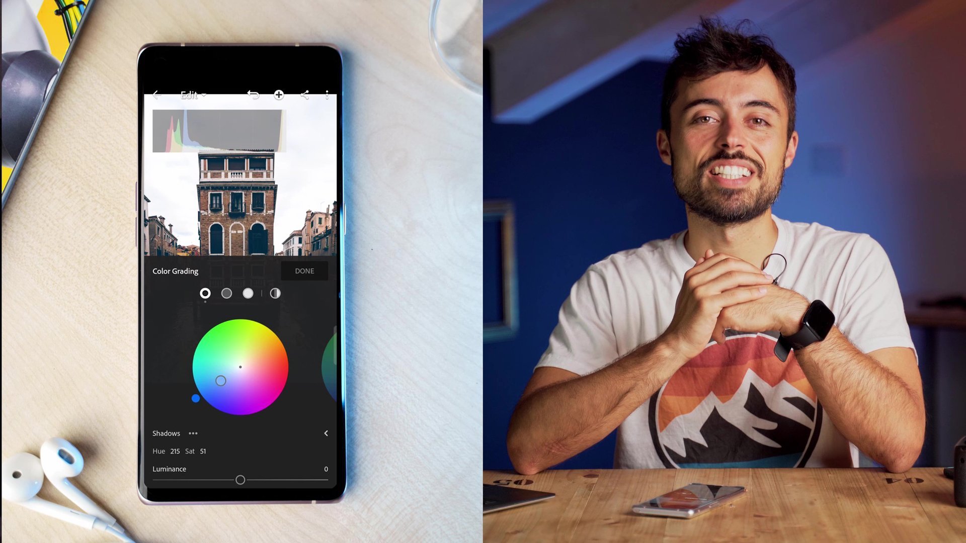
8. Lightroom Tools - Part 2 (Light, Colour, Curves): The first tool in the second section is the auto function. Now, we're not going to be using this, but if you tap it, this is Lightroom automatically fixing areas of your image and balancing out the shadows and the color so that everything looks quite uniform. As I said, we're not going to use this, but if you'd like to see what Lightroom would do automatically, then auto is a very quick function and it's very efficient as well. First up, we have the light panel. Within the light panel, we've got the exposure slider, the contrast slider, highlights, shadows, whites, and blacks. Right here in the top right corner, is the curves graph. The curves graph allows you to control the tones of red, green, and blue, and the complimentary colors within that. But we'll go more into depth with that in a minute. Focusing on the exposure slider first. If it's a dark image, you can pull this all the way up. You bleach out those shadows. But then of course, your whites become overexposed. If it's a brighter image you have, we can pull the exposure way down and create that darker moodier feel. It's always worth double checking if your images are overexposed because you want to fix that right away and bring the exposure down from the start. The way to check if your images are overexposed is by tapping on these three dots in the top right corner, clicking on "View Options", click on "Show/Hide Histogram" and enabling show info overlays, that if we go back here to the image, you'll see this toolbar has now popped up with the histogram graph. The histogram bar is divided into four sections. you can see the peaks are in the second section or the first two boxes of the bar. This means our image is properly exposed. You always what your histogram peaks to be in the first two boxes. Because if your image is overexposed, all your peaks will end up on the right-hand side. If that's the case, you can manually bring the exposure down and adjust it until the peaks are in the right area. If you made a mistake on the slider and you want to reset it, simply double-tap and it will reset to zero. Next, we have the contrast slider. Now, contrast tends to make an image more punchy, defined, bold, and a little bit more saturated. If we bring the contrast slider up, you can see how the image becomes more contrasted in that guard. If we bring the slider down, the image becomes less defined and less saturated. Reset that to zero. As in the name, the highlights work on the brighter parts of the image. If you bring up the highlights, the brighter parts get brighter. If you bring down the highlights, the brighter parts get darker. I personally tend to use the highlight slider more than the whites, because the whites doesn't actually have much image data within it, is technically colorless, and same with the blacks. I tend to stick within the highlights and the shadows myself. The shadows is the opposite to the highlights. If we bring up the slider, the shadows get brighter. If we bring down the slider, the shadows get darker. It's very straightforward. As I said before, this is the whites and the blacks, but I tend not to use these too much because I'd rather use the curves panel. Last but not least, is the curve panel. At the top right of the light panel, click on the curve and you're showing this graph with a straight line. This tool is really important, and this is what lets you adjust the tones of the image and edit the lighting very specifically in your image. On this curve panel, you can see the colors red, green, and blue. Using these, you can play not only with light, shadow, and color, but you can experiment with their tonality. It gives you full control of the way your entire image feels. Towards the left of the grid, shadows are affected. If I move this up and down, and towards the top right of the grid, highlights are affected. If I tap and pull the line up, the whole image gets brighter. If I pull the line down, the whole image gets darker. Let me reset that and instead draw three dots on the grid here. Drawing three dots on the grid gives you greater flexibility and control over the curves to really affect the tone of the image, which is a crucial part of developing your editing style. The curves impacts your photo a lot better than the light sliders can. I'll show you a really popular curve with professional content creators called the S-curve. You can mute highlights and shadow and create a faded look, or you can go the other way if you want to, making dots punchier. In this S-curve, I will bring the shadows up slightly and I will bring the highlights down slightly. This is a great tool to play around with because it really gives you control, as I said, of your image. You can do the same thing with every single color. If we hit the reds and I just drag this up and down, you can see it pulling it to the right, makes it more blue toned. Pulling it up, makes it more red toned. With the greens, pulling it down makes it more pink, pulling it up, makes it more green. With the blues, pulling it down makes it more yellow, pulling it up makes it more blue. With the S-curve, you really get to adapt and shift the tones and color and light. That is the tone curve. A lot of travel content creators like to blow out their lights and make things very exposed and bright. Whereas, other travel photographers tend to create more shadow and mute their highlights. That in a nutshell is the light panel. Next up is my favorite panel, the color section. Following on from the curves tool, essentially the color panel is where the magic happens. When you import a raw image, sometimes the sliders will automatically adjust, and that's just Lightroom doing it's thing. But of course, you can always adjust these as we are going to do today. First, we have the temperature slider, cooler or warmer. If I bring it up to the right, you get very yellow, orangey tones. If you bring it down, you get very cool blue and purple tones. We can hit reset on that. Next up is the tint, which alters the coloration and the tone of things. If you have a cooler blue temperature and things are starting to look a bit too green, you can bring up the magenta tint to even out. The temperature and the tint essentially work to balance each other out. If you want to go warm, but then not too reddy and pinky, you can bring it back down and make it more green. Next up are the vibrance and saturation tools. There's a slight difference between vibrance and saturation. Vibrance will bring up the color profile of the colors in your image in a more subtle way whereas, saturation will saturate whatever colors are present. If we bring vibrance all the way up, you can see the main colors brought out here are yellow and pink with a hint of orange. If we bring them down, then they are slightly desaturated. Whereas, if we use the saturation, all of the colors in the image are cranked up, which can lead to a bit of an over edited feel. If we bring the saturation down, then eventually your image will turn completely black and white. I prefer to slightly desaturate my images so that I can edit each of the colors myself using the color mix, which is the next tool I'm going to show you. With the color mix function right here on the top right, you can fine tune the hue, saturation, and luminance of each color specifically. In the color mix panel, you've got red, orange, yellow, green, blue, purple, and pink. Let's go through the sliders. The hue allows you to adjust the shade of a color. Let's go to pink. If you want a more purpley pink, you can adjust the hue that way. If you want a redder pink, you can bring it up. If you bring up the Saturation, just the pinks will be intensified, and if you bring it down, just the pinks will be desaturated. If you up the luminance, you'll either bring out the highlights in the color, or you can darken it and flatten them or make them more shadowy. This gives you a lot more control over the colors and the intensity of each of them within your photo. You can really get specific with editing different colors and working on specific skin tones and making the image look as natural as possible. Meanwhile, having greater control over the image. If we hit this little compass looking tool up here in the middle, this introduces you to the target adjustment tool. All you need to do is click on a specific area and it will adjust the color that you've tapped on. You can saturate or desaturate, make the color warmer or cooler, darker or brighter, but be careful as this can affect different parts of your image if there's color in more than one area of it. For example, if we click on the pinks here, we can drag it down, which is making it more purple, or we can raise it up, which is making it more reddy and orange. If we click here on the yellow, we can bring it down to make it more orange like a blood orange or a red. If we bring it up and we can make it more acidic like a lemon or a lime shade. It really depends on preference. Again, this allows you to get very creative with your edits. That in a nutshell is the color mix panel. This is a really great space to explore as you can really push the boundaries of the color palettes and the schemes that you create on your photos.
9. Lightroom Tools - Part 3 (Effects, Detail, Presets): Next up, is the effects and details panels. These effects are awesome. This is where you can really play with a sense of reality in terms of: adding grain, making something more faded, look more vintage, to sharpen and clarify your image and so on. Let's open to the effects panel fast. The first tool we have here is texture. If we pull the texture to the left, you can see the image becomes very blurry and undefined. Whereas if we bring it out to the right, it just adds a little bit more definition and texture to the image. Next up we have the clarity slider. If we pull it all the way to the left, things tend to get blurry, and if we pull it to the right, everything gets very high-definition. With my own images, I like to bring down the clarity a little, if I decide to sharpen the image, because otherwise it can give the illusion of your image being over edited. I like to start subtle and not subtlety is fine too, but a softer approach is generally better with editing, and with selective edits, you can put a little bit of clarity on your subject using the selective adjustments. It might not be good to apply clarity to the image as a whole as it can get a little bit distracting. Next up we have the Dehaze tool. Now if you have smuggle smudges on new lens and things on as crisp as they could be, slide the Dehazer to the right and our image will get a little bit more crisp undefined. Then if you pull it to the left, your image becomes a little bit more hazy and faded. Again, if I'm using the clarity function or the sharpen function, I like to reduce the Dehaze. Again just to balance it out and not make my image look overly edited. Next, we have the vignette. The vignette is great if you want to draw the eye into a central focus point. But I wouldn't go too crazy on this unless you wanted to emulate an old-school vintage photograph from the Victorian era. But if you've got a person or for example, a boat floating on the ocean, you can vary slightly, do a vignette to coax the viewer's eye towards that. If you are going to use the vignette, then other tools become available for you to really adjust this. You can change the feather, you can change the roundness, and you can adjust the midpoint of the vignette. But again, if you reset it, then those options disappear. I don't usually touch the vignette. Because when I enable less corrections, Lightroom automatically does that for us. Last but not least, we've got my favorite tool, which is the grain, because I love that vintage postcard look. I do like to crank up the grain quite a bit. I add roughness and grit to an image. You can also adjust the size and the roughness of the grain. This is really down to preference. Having too rough and too big a grain can really ruin your image, but a subtle amount of grain can really add personality and texture. The split toning allows you to bring color into your highlights and your shadows. If you've ever wondered about that really cinematic look, the Hollywood look, that tends to be orangey shadows and blue highlights. I'll give you an example. Just drag your highlights over a certain color and you can infuse the brighter areas of an image with that color. By going up, you can increase the saturation by going down, you can decrease it. Let's do some blue highlights around 31. Then we go to the shadows and the exact same thing. The higher you go, the more saturated the shadows, the lower you go, the less saturated they are. Let's go for a warm orangey shadow type. The slider at the bottom is the balance, and you can use this to make more or less of a color. I'm actually going to change this and reduce that. Now, if I quickly up the exposure, you can see what that does to the image. Before the image is flat and dark, after, you can see the shadows now have a tint to them and so do the highlights. If I reset this, 00, we can experiment with putting in some more green-blue shadows. Let's go for some orange theme really warm up the entire image. You can adjust the balance, the knob. Let's have a look at the before and after. You can see that just by adding some yellow highlights and some orange shadows, you can really infuse that image with some warmth. Great, let's reset that. Next up is the Details panel. Straightforward tools here: Sharpening, and Noise Reduction, and Color Noise Reduction. When you activate the sharpening slider, more options will become available for you to really get greater control over the level of sharpening you do and whether how much detail is sharpened in the process. Next up we have, noise reduction. Now, you can opt the luminance here with the noise reduction, but I use his very sparingly as your image can start to look like a ZGI, if you're too heavy handed with this slider, less is more and you should build things up slowly rather than a walking on an effect of full maximum for the sake of it. Instead, building up to the look that you want to create. To finish up this panel, we've got the geometry and the distortion here, which you weren't really need unless your image is whooped or unless you might have been shooting with a fish eye lens or a very wide angle like a GoPro. If we click on geometry, you can distort your image. You can change the angle vertically, as well as horizontally, and so on. I don't usually need this section. Next up we have the presets, which again allows you to apply edits that Lightroom has built already, and get creative in a single tap. I'll talk more about the presets later on. That's it for the toolbar run through.
10. Things To Look Out For: Now that you understand the tools and before we start editing a photo, I thought it would be really important to quickly share some common editing mistakes on mobile. Number 1 is, make sure you have enough storage space on your phone. Lightroom is pretty robust on mobile, but if your phone is lacking memory, there is nothing worse than you're phone crashing and you losing a beautiful edit you spent a lot of time working on. Make sure your brightness is turned all the way up when you're about to start editing a photo. Sometimes as you're editing in the dark or in a sunny area, you might realize you're phone screen brightness has been way down and when you double-check your edit, it's actually got much more muted colors than you realized. Always double-check your phone screen brightness is up.
11. Live Editing Demo: In this module, you're going to see me edit my photo from start to finish. Now this is my free hand workflow on Lightroom Mobile, and this is literally what I do for every single one of my photos when I edit in the app. So here's the rule image I've opened up in Lightroom. The first thing I'll do is go into the crop and I'm going to straighten up the horizon. If there's only one thing you do when you edit, it should be to straighten the horizon. Nothing is worse than a wonky see scrape or a landscape. While I'm here, I'm also going to crop the image for posting on Instagram, so, I'll make it vertical and I will choose the 4 by 5 aspect ratio, and now I'm just going to adjust it until I put the subject in the center of the frame. I think that works best as being in the center of the frame means I'll get a beautiful balance of ocean as well as greenery. Next up, I'll just go to optics and I'll double-check that lens corrections is enabled, yeah, it is. Okay. Back we go. Now I'm going to take the healing brush and clean up the sand. There's a few different patches I want to go four and make it super feathered, so, the edits on obvious, I'm going to increase the burst size a little bit, and I'm just going to start clicking over areas of the sand which I want to be smoothed out, so we can have a nice, clean sandscape. This process can be a little bit time consuming if you're very perfectionist about where you heal, but again, generally the healing brush tool is quite accurate. I'm not going to use the clone stamp in this because the sand is all a uniform color, so, the healing brush tool will be just fine. The difficult thing about healing certain parts of an image, is sometimes it can pick up other areas around it, for example, my foot, so, you just have to play around with the feathering and the size of the healing brush so you don't pick up any other random parts of the image. Okay? So you can always zoom in a little bit more specific. I am just going to clear this little patch of sand by my foot because I find it a tiny bit distracting. See now, that looks okay. If we do a quick before and after, you can see how much we've edited out already. Next I'm going to adjust the light. I'm going to under contrast the image slightly around minus 19, and then I am going to bring the highlights down so that the clouds can pop out a little bit more. I'm going to bring the shadows down just slightly. I'm going to meet the blacks a little bit, so, the image looks more faded and not so contrasted again, and I'll bring down the whites as well. I'll bring down the exposure just to smudge, bring the highlights back up a bit, and then I will bring the blacks down just a tiny bit to mute out any harsh shadows. Great. Now I'm going to hop into the curves, I'm going to draw my three dots on the graph, and I'm just going to have a little play around to see what looks good. If bringing down the shadow a little bit and flatten them, than the trees kind of fade into the background a little more, which I quite like, and if I play around with the highlights, I can mute the sky a little bit more and bring down those clouds, so, they're not so obvious. Okay. I think I'm happy with that for now. If we hop into the reds, I'll do my three dots again, I think I'm going to spend a bit of time here because when I play with the red curves, it gives my images very red, pink, brown tones, which I like, so, I'm just going to emphasize the idea of a vintage sunrise. Now we've done the red curves, I'm going to hop into the color mix and adjust my reds. I'm going to slightly desaturate the reds so it doesn't look so artificial, and I'm going to give it more of an orange hue because otherwise, I think bright red might look a bit too jarring. Next I'm going to go to the oranges where I can adjust my skin tone. The skin tone requires a little bit of playing around with, but of course, because I'm on a beach, I'd like to give that idea of a warm brown or golden skin tone. So maybe I'll increase the saturation a little bit and maybe bring up the luminance a bit more. Next, let's hop into the yellows. Now, the yellows are going to control color of the sand and the way the lighter areas and the highlights come out. I like to make those very luminous and reduce the saturation a bit so that they're more white than yellow. Next, we're going to move on to the greens, I'm going to up the luminance and I'm going to up the saturation a bit, because I want the trees to let healthy and luscious. Moving into the light blues, I'm going to up the saturation quite a lot because there's so much lovely blue sky, and I'm going to make the hue a little bit darker blue. Moving into the dark blues, I am going to up the saturation by about 21 and bring down the luminance just minus 1. Now I will bring the saturation back down to about plus 8, and I'll keep the heat around plus 3, I don't want it to look to purple. Moving into the pinks, I will up to saturation and then luminance leading into the purples, I'm just going to crank up the saturation quite a lot, 53 as, as a bit of a purple tinge in the sky, and up illuminance as well. Next I'm going to hop into the effects panel, I'll bring down my clarity up D hayes, bring down the texture, and I'll leave the grain for later, and I slowly bring up the sharpening. Next going into the effects and the split tone tool, I'm going to make my shadows much more orange and I will bring my highlights into a yellow orange, play around with the balance, that looks good to me, hopping back into the color now, I will desaturate a little bit, and in the effects, I'll just do some fine tuning. Next, I'm just going to use a selective brush tool to trace over my silhouette, roughly is fine, and I'm just going to up the contrast and the clarity and sharpen up a little bit. Again, the central subject focuses reinforced, so, sharpen up, clarity, some D Hayes, bring the highlights off a little bit more, so, my skin so to glows, and the contrast as well, and if we do a quick before and after that, you can see how far we've come. Yeah, I'm happy with that, so, I'll zoom out now, I head to the curves, go to the blue curve, and I'm going to play around with these sliders to bring a little bit more yellow in to the image. As I think, I still think it's quite cool toned, so, give that sand yellowy glow as opposed to a bluish halter, and to on the yellow, looks about right, so, it's a bit more golden now. If we go into the greens, play on the sliders, so, things look a little bit more red than they do, green. Yeah. I think I'm looking pretty happy with that. I'm going to knit back into the effects and I'll bring down the highlights just a little bit more, I think it's too yellow, I'll make them more orange, and I'll just nip into healing brush, because I've noticed it, I'm just going to get rid of the cell spot. I'm going to get rid of one more pole in the sand so that there's really no distractions. I'm going to increase the size of the brush, so, it fully gets rid of the distracting sand hole, but this before and after is looking much cleaner. Yeah. I think I'm happy with that. So this is where we are now, and I'm feeling pretty happy with the edit. I've been staring at the screen for quite a long time now. Sometimes our creative I or creative energy can take a bit of a dip when we've been focusing on something for too long. So I'm going to now, put my phone down and go make a cup of tea, and what I come back, I'll have a way fresher perspective on the edit and see if I still love what I've done. Let's go boil the kettle. Okay. Now we've taken a break, let's open it back up. It's looking good, before, after. I am going straight into the grain, and this is my favorite part of entertainer photo, is adding the grain to really give that vintage developed film work, so, I'll up grain about 19, bring the roughness down a little bit so it doesn't look too obvious or noisy, and I'll make the size a little bit smaller as well. I'll just sharpen up the subject a little bit more to make it pop, bring up the currency again. Going into the crop tool, I'll just make it a little bit smaller and re-frame, so, I'm dead center, her head into the blues, and I will make that sky slightly punchier, and I bring the oranges down just a little bit more so that the brown when he comes through, then I'm going to save, I'll do the smallest resolution and it should be in my photo album. As I said before, this is not an exact science and I always find myself going back and tweaking little things until I'm happy with it. But there we have it. That is how I edit a photo on my mobile phone using Lightroom CC.
12. Transformation: Before and After: In this module, what we're going to look at our before and after photos and recap what we've learned. Here is our before and after image. As you can see, I straightened the horizon, cropped the image vertically. I applied lens corrections, cleaned up the sand. I warmed up the tone, and used orange-gold shadows and muted highlights to create a sunny vintage feel on the image. Some top tips, even though there is no such thing as perfect, practice does make quite and quite perfect. Do your edit as much as you can and don't feel restricted by anything.
13. Summing Up: Hopefully, you now feel like weight has been lifted off your shoulders and you're inspired to get cracking on your own edit using Lightroom CC on mobile. The more you practice, the more you develop your own editing style. As I said before, please do share your before and after photos with me, as I truly love to see them and share them with our community. You can tag at Illumelation on social media so I can check them out myself. Thanks for learning with me, and I'll see you on the next course.
14. Bonus: Installing a Lightroom mobile preset: Downloading a mobile preset is pretty straightforward. The first thing you need to do is download the file named Free Preset.dng.zip available in the course downloads. It might take a minute or two to download the file because it's rather large as a DNG file that means it's roar and it's layered. Once the file has downloaded, your phone should automatically unzip the file and show you the DNG photo within it. You can either import this DNG photo directly into Lightroom from either your photos or downloads folder or you can open up the Lightroom app and import the photo from there. Once the photo is added, opened up and you can access the menu by using the three dots on the top right corner. Click "Create preset" and here you can rename the preset to anything you'd like. Once you've renamed it, use the tick in the top right corner to save it. Now, you'll be able to find the preset you've created in the presets folder. Go ahead and try it out on a few different photos to see how it transforms the mood and feel of each visual, and that's it. You've officially installed and downloaded and mobile preset. If you have any questions, please leave a comment. Otherwise, happy editing.
 Mel Legarda, Travel Blogger and Content Creator