Transcripts
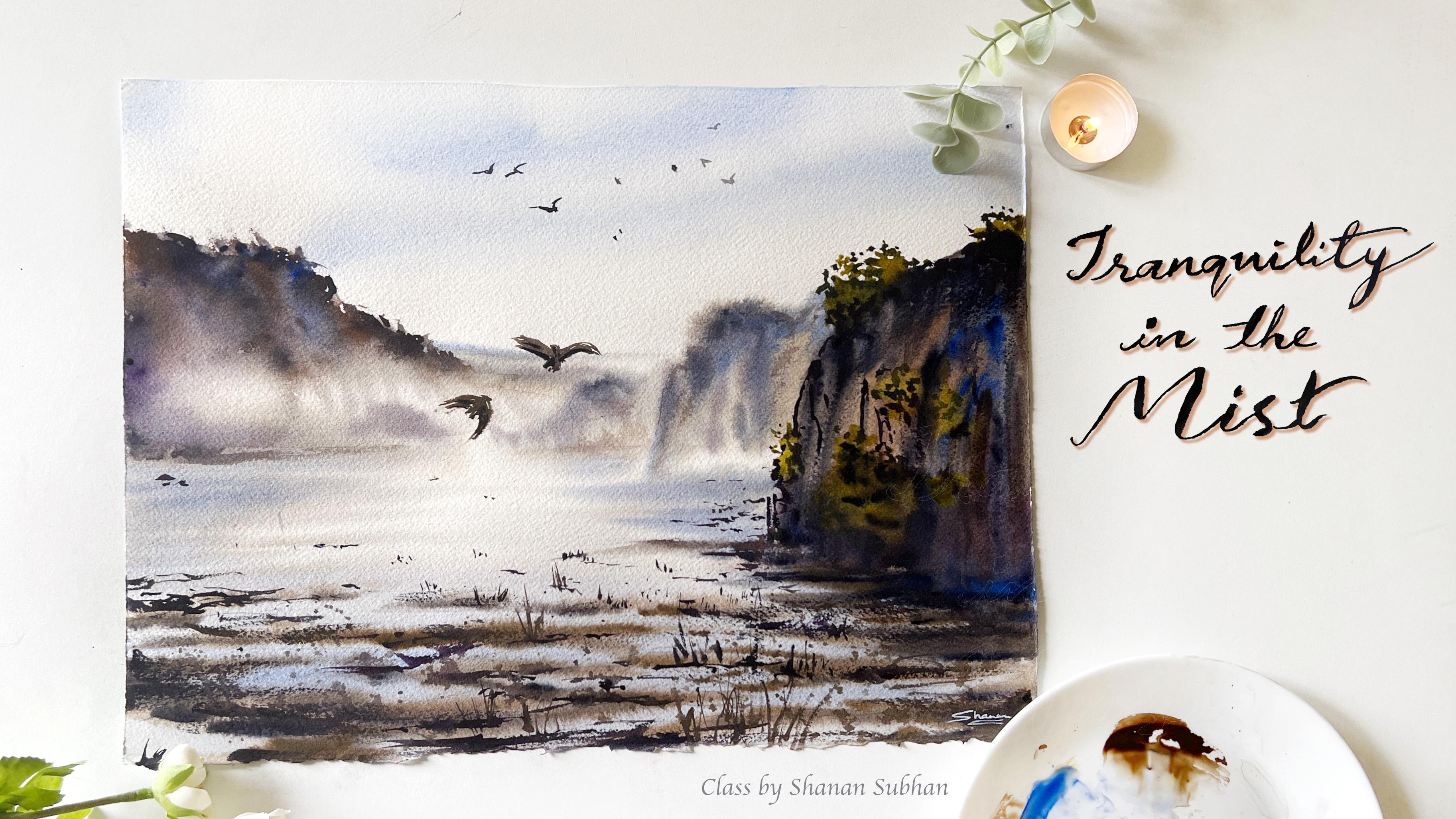
1. Tranquility in the Mist - Watercolor Landscape : Hello, I am Shanan Subhan, an artist and an art educator
based in Bangalore, India. You can check out my
works on Instagram. I go by the handle,
whatacurls Welcome to my painting class, tranquility in the Mist. I will teach you to paint this tranquil Mist
watercolor landscape, following very
simple techniques. I'll walk you through
the supplies and all the colors that you'll
need for the class. Also, we will have a small
practice session though. Brush up your watercolor skills. I'll be teaching this
painting step-by-step with detailed instruction to
achieve enriched outcome. Join me. I'm much excited to see
you inside this class. Let's get started.
2. Art Supplies : Let us talk about
the art supplies. First off, we'll
talk about paper. I'm going to use arches, 300 GSM, a 100% cotton paper. This is cold press texture, which means it is
slightly rough. You can use any alternative
watercolor paper, which is at least 300 GSM and 100% cotton to get
the best results. The size of this paper
is 12x 22 inches. Now let us talk
about the colors. I'm using. Watercolor,
artist grade paints. I'll have a separate chapter mentioning all the shades
that I'll be using. Next, we will talk
about brushes. I'm going to use
these four brushes. First is o Princeton
mop brush size six. Then silver velvet, size 12. Size eight. Size two. These brushes are
of different sizes. You can go ahead with whatever or similar
brushes you have. Next to place the
paper while painting. I'm going to use this
piece of the plywood sheet. I'll be wetting the paper
thoroughly and placing it on this sheet so that I can move it around
while painting. Next, we would need tissues, are all napkins to wipe off the pains and water
of the brushes. We would need two
jars of water for cleaning the paints
and taking Clearwater. Using single container will
result in muddy paintings. Have two separate judge. We would need a plate or a
palette for mixing colors. Blow dryer to speed up
the drying process. And I'll also use a
water spray bottle to wet the paper and also
to soften the hard edges. That's all about the supplies.
3. Why no masking tape?: In this class, I'm going to
paint on a larger paper. So I'm going to use this hard
surface to place my paper. This will allow me to move on the paper while the painting. I'm not going to use
any masking tape. But if you want, you can go ahead with
masking the paper. The reason why I'm not applying masking tape on a
larger paper is because when we apply what it is going to stretch
to certain extent, which makes it go or buckle up in the center if we
have applied masking tape. So in order to prevent the paper from buckling up in
the center part, I'm going to use
another technique. So what I'm going to do is wet both the
sides of the paper. I'm using or re-usable
napkin to wet all the sides. You can even use a clean cloth or anything that's
available with you. Do not use tissue papers as it might leave its
fiber on the paper. Now, I'll turn the
paper upside down. The water on the paper will help the papers
take onto the surface. Remember that the sketching should be done before
applying water. Once the paper is wet, you won't be able
to sketch anything. Notice how the paper
stays intact and flat three means the same throughout the
painting process. And this is the usable
napkin that I'm using.
4. Colors used: Alright, let's talk
about the colors required for the sky. I have used diluted version
of ultramarine blue. You can even go with cobalt blue for the distant
cliffs over y'all, I have used various colors, like raw, umber, burnt umber,
wallet, ultramarine blue. So these four colors, I have applied it
in diluted version. Similarly, for the
foreground cliff, I have used the same colors
in concentrated tone. Now for the darker shadows
on both that lifts, I have used Payne's gray. You can even go with
black for the water. I have majorly preserve
the white areas, but for the sides, I have applied very
diluted version of raw umber and
ultramarine blue. For the ground part
around the water puddles. We'll be using raw umber and then for the shadows will make small number
and Payne's gray. For the glasses on the cliffs. I'll be using this
yellowish green. If you do not have this color, then you can make sap
green and orange. It will also result
in similar shade. That's all about the colors.
5. Thumbnail: Before we start painting, let's draw a thumbnail
to understand the flow and elements of the
painting. In a simpler way. Atmosphere of this
painting is quite misty. In the center area. The foreground here has a cliff which IPOs in its true colors. Since it is in the
darker colored, it helps to glorify the midst
in the background area. Then we have water puddles on the ground area
and Yoda foreground. So we will draw some
random elliptical shapes, something like this. So as we move away
from the paddle, it tends to appear smaller
due to the perspective. So you can notice this yard, these puddles appear
smaller because it is slightly away
from the viewpoint. Then we have some
grasses and debri, across this foreground
paddles area. Then we have another
cliff which is slightly away from
the foreground, comes in and around
the midground area. Next we have another cliff, which is very far from the
viewpoint and it is though furthest cliff you're
in this painting. Then again, on the left side, we have another glyph. So this is present somewhere around in the midground area. The tonal value of the cliffs
determines its distance. He was a closer look
of the thumbnail. So before starting the painting, draw a small thumbnail with a basic sketch and try
to paint it on your own just to get a basic understanding and also to feel confident
about the colors. Lastly, we have free
flying birds in the sky. So yeah, that's all
about the thumbnail.
6. Practice - warm up: In this chapter,
we will practice some of the elements
in the painting. First, letters spin
this distant cliff. We will go with wet on wet
technique for the base layer. So we will be applying lighter colors on
the upper part and the lower area will
be preserved for the midst, apply diluted colors. Then for the next layer we
will apply some darker colors, like violet, ultramarine,
want Dumbo, et cetera. The colors really
don't matter here. We really need to
preserve the whiteness of the paper to suggest
the misty appearance. In the lower area. Again, we will apply
diluted colors. For the final details. We will use concentrated colors. In the actual painting. We will be working on
the elements one-by-one. Next, let us practice
the water puddles. I'm going to draw these shapes. Apply clear water on this
area to perform wet on wet. Then I'm going to apply with ultramarine blue
for the base layer. Now I'm going to apply, but all on board, resolving
some empty areas in-between. Next, we will add
some darker colors, suggesting the darker
shadows on the ground area. Use a blow dryer to speed up the drying process because the next layer will
be wet on dry. So we need the paper dry. Next we will add some grasses and darker shadows
around this area. Since these paddles are
closer to the viewpoint, it needs some detailing work. In the midground area, we will add some tiny dots
and horizontal lines. If you look at the painting, this is what I'm
trying to create. These tiny dots and lines. You have to apply very little
pressure to get it right.
7. Part 1 - Tranquility in the Mist: Alright, let us prepare
people for the painting. I'm going to apply clear water on the
backside of the paper. So here I'm using
a reusable napkin. You can also go with a
clean piece of cloth. Apply a generous
amount of water. It is better if you
place this paper on any hard surface rather than
placing it on the table. Note on the paper
to the front side. The front side of the
paper is still dry. So I'm going to mark the
composition of the painting. We're going to start by drawing a cliff on the right side. Then we'll draw a
slightly smaller cliff. This will be further
away from the viewpoint. On the left side of the frame, we have this thin gloves, which will have
and miss TOP RNs. In the foreground area, we have these partly dried-up
signed or the ground area. I'm drawing these random
elongated shapes. So these are supposed to be the water puddles
in the foreground. Sketching is done. Now let us start
inside of the people. If you do not want
to follow this step, you can also go with
masking tape method. Since the size of
the paper is larger. So it might stretch or
buckle up while painting. I'm re-wetting the
backside of the paper just to make sure
it is enough wet. I've played generous amount
of water on the sides so that it sticks onto the surface that we
are painting on.
8. Part 2 - Tranquility in the Mist: Let us get started
with the pinky. I'm going to mix the
colors on this plate. When you start with this guy, loosely apply the brush
strokes in diagonal manner. Since the paper is. So the colors are going
to spread really well. And it will create a sense
of softness in the sky. No paperboard around in
different direction. The water will flow towards the gravity, creating
stunning effect. Next, I'll take raw umber. If you do not have this color, then you can use bond
Dumbo or burnt sienna. Mixed this color with
ultramarine blue. On the wet surface, I'm going to apply
two horizontal lines. So this is going to
be the distant cliff. This is the base layer
that we're painting. Going forward, we will
add multiple layers in order to create a sense
of depth in the painting. So leaving white
areas will depict, though missed in the painting. Use diluted color. It could be any brown color. Next we have another cliffs, which is in the mid ground area. So we will use slightly
darker tonal value of the same colors. That is umber and
ultramarine blue. Now I'm adding this meal then blue on the edges
of the water body. Moving on, lead to spin. There'll be Skyler
for apartments. Use a diluted tonal value. We do not want to very dark and prominent color
for the water. Moving on, we will paint
the foreground cliff. So this is going to be a darker cliff since
it is closer to us. Start with bond Dumbo, and then also add some raw
umber and ultramarine blue. So yeah, I'm loosely painting this cliff, adding
multiple colors. You can use darker colors like violet, Payne's gray, blond, Dumbo, indigo, or any darker color that's
there in your palette? For the foreground, cliff, I'm not following any
particular step or any such. I'm just randomly
adding the colors because I know
that after drying, this is going to look
much lighter and I would still have to work
on the detailing part. So for timing, just focus
on filling this area up with multiple colors here. And I'm preparing the base for the reflection of this
cliffs in the water. So I'm applying these
horizontal strokes. These darker values are going to depict the shadows. No cliffs. We will apply another layer of ultramarine blue on
the foreground area. And make sure to retain the whiteness in the
area of the painting. So that it suggests the
mist or forget most fuel. While the paper is still wet, we will apply another
layer on the cliffs. So here I have mixed
violet with one Dumbo. So it is like a
purplish brown color. Notice how I'm preserving the
white areas for the missed. In watercolors, we do not
apply white color explicitly. We need to save the
whiteness of the paper. Moving on, we will paint the reflection of these
cliffs in the water. I'm using ultramarine
blue with a tiny bit off. It makes it a muted blue color. On the upper areas of the cliff, I'm applying some
darker tones in order to create the illusion of
sharpness on the cliff. So this in turn will signify the midst in the lower
part of the cliff. What colors you
use, don't matter. Pay attention to the values. Here. I'm using a
combination of blue, violet, one Dumbo bunch Yana to build a nice
contrasting balance. So hard I used only one. It would look very
boring and flat. Well, you can go ahead
with single color as well. Where did the use
of multiple colors brings a sense of jam and appealing look
to the painting. Now you can see me adding these darker colors
on the top part of the cliff automatically enhances the lighter areas
in the bottom part. We can see the midst
being formed here.
9. Part 3 - Tranquility in the Mist: Moving on, we will paint wet
land around the paddles. No paper is damp currently. So we will apply
this as wet on wet. So take raw umber and apply
the veins, leaving some gaps. Genuine, go with burnt umber or any brown that you already have. For the pencil markings
for your understanding. It go to medium, medium to pinch and do not apply watery paint as it will run into the blue areas creating
Medea be orange. As we move further away
from this foreground area, we will apply smaller lines to create a sense
of perspective. Next, to create depth
in these partners, we will add darker brown color. By mixing Payne's gray
to the brown color. Apply these darker shadows across all the models
that we have created. Next, we will go back to
the foreground, cliff. Moving on, we will paint some
more grasses on the cliff. So I'm using a warm green color. You can also mix orange with some green to this
similar shade. The brush to create the
impression of leaves and grasses. I'll also apply this on the
lower areas of the cliff. So we're going to leave
it to dry and then come back later and
add the details. Now I'm working on the
texture of the leaf. So apply some vertical
brushstrokes using darker colors. When the tip of your brush
add some tiny dots and on these grasses to create
smaller leaves and twigs. With the help of my blow dryer, I am drying the distant cliff.
10. Part 4 - Tranquility in the Mist: Once the paper is dry, we will apply another
wet on wet layer. So we will apply
clean water again. Now, you might wonder why wet the paper again when we
already had the wet layer. This is because
earlier the paper was almost 60 to 70% dry. So if we had applied
the pain's there, it would have created some
backgrounds and wild blooms, which we do not want
at this point of time. So to avoid that, I chose to dry it. Then again apply the wet layer. Now on this wet surface, let us apply some darker shades. You can go ahead with
any of these colors. No compulsion on that. Main intention here is
to have darker tone on the top of the cliff and
lighter tone on the bottom, highlighting the midst
in the lower areas. On the top of the cliff, we will paint some
leaf-like shapes, suggesting the trees
in the distance. Irregular leaf-like shapes. Now, with the help
of a clean brush. And I'm softening these land on the leaf-like shapes
that we have been good. Let us go back to
the foreground leaf. So as you know, we have already painted the base layer
for the grasses. Now let us add some
details there. Being darker green color and add some dots and
leaf-like shapes. And on the lighter colors, the North completely
covered the lighter areas. We need them to, because it is important to have lighter and
darker colors to bring out a sense of contrast and depth in
what are we being. Next M logging on the
detailing part of the cliff. So I'm adding darker
colors will create a sense of what actual
highlight and shadows apply, tiny vertical lines. Next, using darker brown color. I'm going to add some details
around these puddles. Just have to use the
tip of the brush, apply them tiny lines. Next we will use dry
brush technique. Damp brush. I know Payne's gray. Now with this thick color, lighter brush and
on the corners. So this creates a sense of noise and make sure
I don't go by this. It makes on floor
ground look busy. Oh, no. I'll go back to the distant. Live with clean water and
just pull the paint down, creating some glyph extra. Back to the foreground. Adding these tiny,
very tiny lines, you can use a fine liner brush and apply a very little
amount of pressure. So here if you apply
more pressure, the lines are going
to be thicker. Next, let us create the ground
for the distinct lifts. It will create a sense of
aerial perspective, right? Any similar color and blend
it well with the background. This will create the
base area for the cliff. We will repeat the same for
the one in the left side. Next, I'll add some mild
texture on the distant cliff, your diluted color and glide
the brush over the surface. Here on the left Cliff, I add some random dots creating or pattern and
some irregular shapes. Or adding some darker colors on the bottom part of
the right leaf. Using water spray, who
spread the color as well. This will create a sense of inept at the
bottom of the cliff.
11. Part 5 - Tranquility in the Mist: We are almost done. But before that we will add some tiny details
here and there. So take any last paper, the upper part of the painting. Now we're going to take
any darker color and splatter the paint on
the water puddle area. Just tap on the brush to
sprinkle some paint here. Moving on, we will add some tiny grasses on the
World Cup or delirium. So these gases will be partly
submerged in the water. And partly seen on
the upper part. There are some tiny wobbly lines depicting a surface that is
speaking through the water. So these surfaces that
are peeking through, We either rocks or debris
or any other thing. But we just want to
make it look busy. Being these lines with
minimal pressure. The moment you apply more
pressure on the brush handle, you will see thicker lines. Also. We read the tonal
values so that you have a nice balance in the elements. My next aim here is to make the foreground bubbly area
look crowded and busy. Since it is closer
to the viewpoint. So it demands some
attention, right? So let us just randomly add some glasses and not
making it look fuller. I think some more darker colors on the distinct glyphs here. Next I'm going to paint some
distant ports in the sky. So I'm just going to add these simple shapes
like alphabet, we are inverted V. So this
will make it look like boards. You don't have to
put much effort rolling on under distant cliffs. I see that is an hard edge here. So I'm just bringing the water to spread the colors evenly. I'm also adding
some darker colors in the foreground and
the main villain. Towards the foreground,
we will add some grass blades using
a fine liner brush. Next, at the bottom
of the misty area, I'm going to apply
some diluted color to suggest to the horizon line. Makes sure that you do
not get any hard edges at the horizon area because that is going to spoil the misty APRNs. Suppose you have any hard
edges on the horizon area. You can add water and blend
it well with the background. Now, I'm going to fully
blow dry this area, especially the mid area, so that I can pay
him some boards.
12. Part 6 - Tranquility in the Mist + Conclusion: Alright, we are almost close
to finishing this painting. But before that, let us add
some more midground books. Which means that these birds are flying somewhere around
with ground area, which is much closer to the foreground when compared
to the distinct boards. So these birds appear
slightly bigger. I have used raw umber as the
base color for the board. Now, I am adding Payne's
gray for the darker shadows. Let me add another board. You can paint as many
votes as you want. So when I painted these
mid ground birds, it automatically
glorified though misty appearance
in the painting, right? Don't do feel that. So I will dry the
first layer in order to add the details using
wet on dry technique. Alright, so the base layer of these words are completely dry. Now I'm taking my
fine liner again, adding some details
using Payne's gray. Okay. So we are done with
this painting. No peeling the masking
tape, nothing. Just lift the paper. That's it. And notice
how our paper is still flat and there is no
buckling or any such thing. Okay, there you go. This is the final
look of the painting. The paper is still damp, so I just leave it on the table. And lastly, I'm going to add my signature
on this painting. So I am begging white weekend, I'm sorry, white gouache paint. And just signing it
on this right corner. The signature makes it complete. So we are done. Thank you all for
joining my class. I hope you enjoyed watching, are painting along with me. Do share your class
projects under the Projects can re or
tag me on Instagram. I would love to
reshare your works. Also, please don't
forget to leave your review or feedback
for this class. That would really
mean a lot to me. Alright, then, whereby
happy being thing.
 Shanan Subhan, Watercolor/Gouache | Art Educator