Transcripts
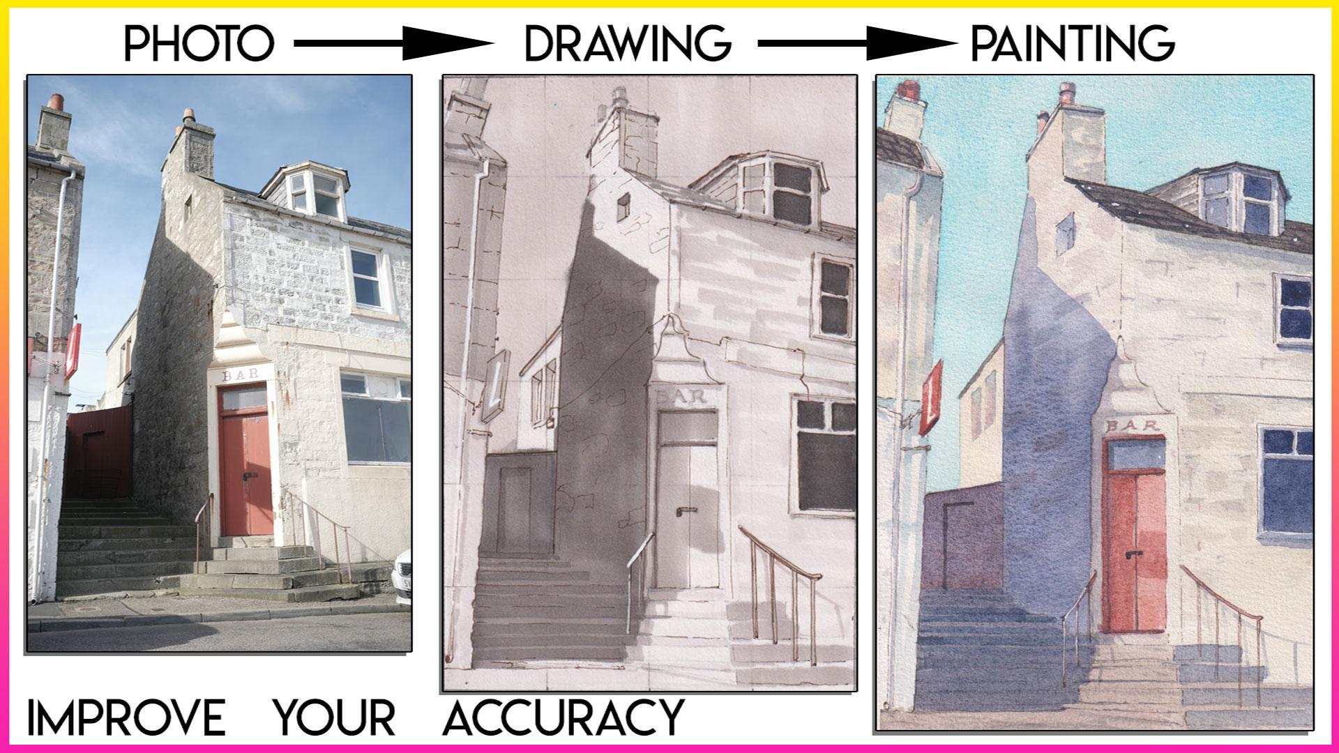
1. Intro: This class is all about growing your drawing and watercolor
skills to improve accuracy. These foundational
skills are important for any kind of
representational painter, so it's important to study as we continue our artistic journeys. So in this class, I'll show you some repeatable strategies for accurately painting
from reference photos. I'll show you the classic
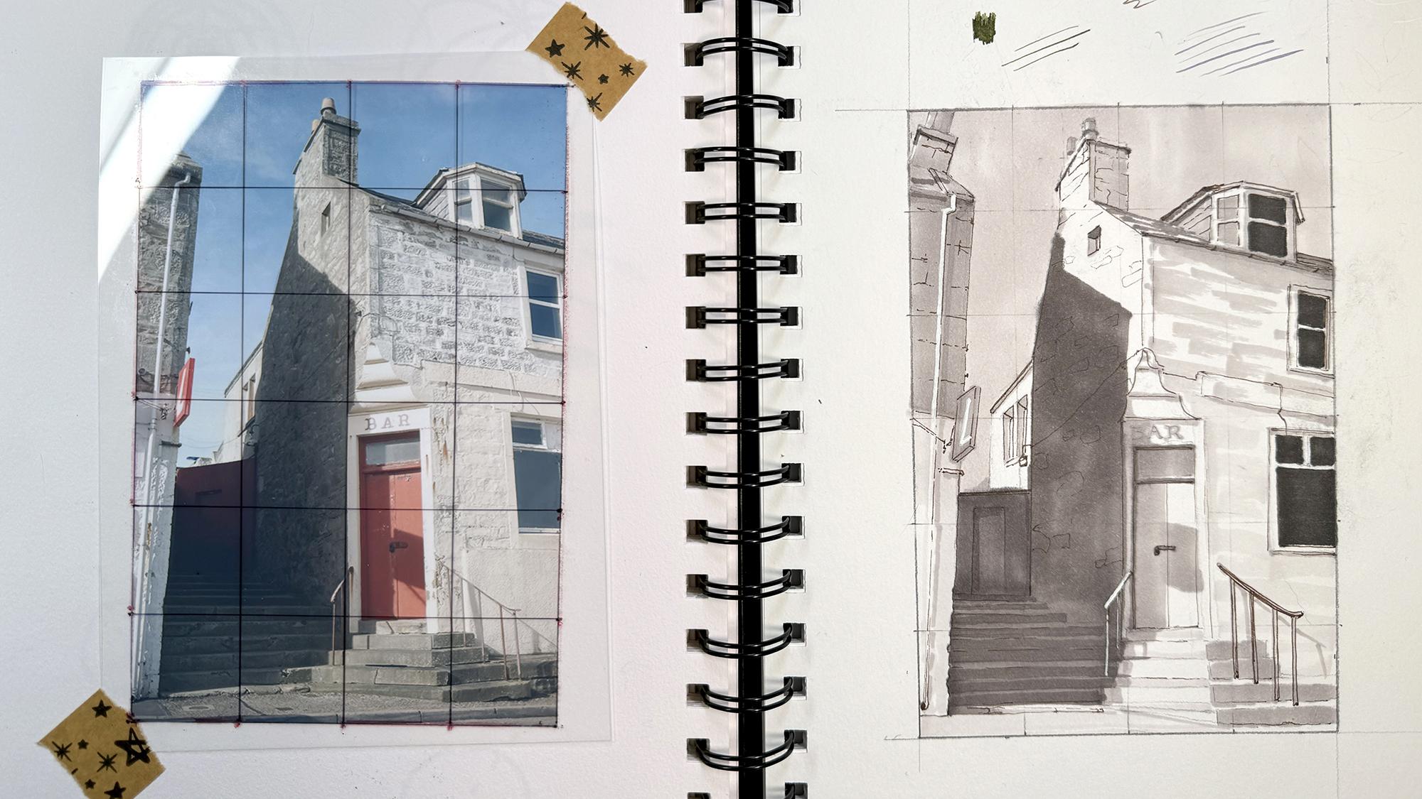
approach of using a grid system to create
a very accurate drawing. Next, we'll discuss values, which are the backbone
of our painting and do a value study
together with markers. Finally, we'll create
a color strategy, and we'll use watercolor
to paint our scene with accuracy while also having a bit of fun with
color and texture. As always, my goal is to provide repeatable strategies
so you can use your skills to paint
anything you want on your own. So let's get started.
2. Materials: Just run through the
materials really quick. We need some kind of
paper to draw on. It could be anything.
One pencil, probably a sharpener is good. And you're going to want to
print your reference photo at a four inch by
six inch ratio. You can use the photo
that I've provided. It's already in that ratio. And you're also going to
probably want a piece of transparency paper like
this or tracing paper, anything you can see through. You don't absolutely need
this because you can technically draw on
the reference photo, but we're going to use
this to overlay on top of our photo
and draw a grid. So, yes, you could just draw
straight onto your photo, but I like using this just in case I mess up the grid
enough to change it. That means I don't have
to reprint my photo. And it just makes
it a lot easier. For this first
portion of the class, we'll also need a ruler and a fine tip sharpie or similar. An eraser, and I preferred
to kneaded eraser because it allows me to pick
up a little bit of graphite without
erasing my lines. A few gray scale markers. I like the ShinhnTuch
twins because they have a big chisel tip as
well as a fine liner tip, and you only need a
few shades of gray, a white posca pen or some
kind of white gel pen, and finally, a dark, fine liner pen with a small nib.
3. Learning the Grid System: The first thing I'm
going to do is cut my transparency film just
slightly larger than my photo. If you're drawing
in a sketchbook, it's kind of useful to
use the back side of the page next to what you're
doing to tape your photo. Otherwise, you can
just use, like, a loose sheet of paper
or some kind of board. As long as this is going to be we just have to
attach it to something. First thing, we need to
secure our photo down. So what I like to do is you can use any kind
of tape for this. I'll just put one piece of tape on the back because it doesn't need to be super
sturdy or anything. And then for the transparency, because I cut it slightly larger so that it doesn't
interfere with the photo, I'm just going to use teeny, tiny little pieces
on the corner. I don't need to do the
whole thing around, like we normally would for
a painting or something. Even just that's fine. Next, we're going to draw the outline of our photo over here. I could have just traced it, but it's kind of good
to get in the habit of getting accurate with drawing straight lines and just
making your outline accurate. So what I typically
do is, I mean, this is already a four
inch by six inch photo, and basically, you need to copy that exact dimension over here. In the future, if you use
a different size photo, which obviously
you probably will, you just need to make
sure that you use that exact size and ratio on your paper that
you're going to be drawing on. I have coined a bit of space to play within
my paper here, so all I need to do
is make sure I draw the four by six inch within
the center somewhere. What I typically do is just give myself at least an inch
from the edge of the paper, so I will put my ruler down. Maybe I will do 1
" from the edge, maybe 1.5 because I
have plenty of space. And then I'll just draw a line
between those two points, and I'll do the same on the top. I think on the top,
I'll give myself 2 " cause I have plenty of room. 2.5 " up there. One, two. 2.5. One, two, 2.5. And then connect those points. And then I can just
measure over 4 " because the paper is 4 " wide. Connect those and measure down 6 " because it's
four or 6 " long. I didn't quite center
it, but that's okay. Use the top or bottom
for notes or something. Oops. Make sure it's straight. There we go. So now
I have my outline. And I'm just gonna darken it
so I know exactly Perfect. And I kind of lined it up with my photo,
which helps a lot. So you could even
do this before you tape this down to make
sure it's kind of aligned. And now we are going to
draw our grid on our photo. And again, this is
why I love having the transparency film because it's the smooth slick surface, and I like to use dry
erase markers for this. So if I mess up, I can
erase it much easier. First thing I'm going to
do is draw the outline of my photo because I want to
make sure that's very bold, so I definitely can see it. I'm actually going to use
a red marker for this so that it stands out a bit
against the dark photo. It might be a little bit
light in the camera, but I definitely can see
it really easily here. Now we have to decide how
tight we want our grid to be. You could just use
a very wide grid. So even just cutting
this in half both ways, that alone can be
really helpful, but I like to do at
least a couple lines. Since this is four by 6 ", it's so much easier
to divide up evenly. If you use a very strange size, it can be a little trickier. You have to do some maths, and I am terrible at that, so I always try to make
it as easy as possible. You could sing centimeters
or millimeters is even better because obviously you can get smaller increments
a lot easier. But I'm going to be just
using inches for this. So to make it really easy, we're just going to use
1 " by 1 " squares. And to do that, all
we need to do is mark every 1 ",
draw a little dot. I usually draw my little dot slightly off the outside
edge of the border just so I am not interfering with anything
that might be on the photo. I just realized that I am going to be closing the
sketchbook in the future. So that means this is probably going to get
rubbed or smudged. So I'm actually going to
switch to a permanent marker because I don't want that
to get moved in the future. However, usually, I'm not keeping this kind
of thing in my sketchbook. I'm just using it, and
then I recycle it later. And I'm going to keep
this in my sketchbook for my own future reference. I like to do that with all
of my paint along stuff. So let's switch. I got a really skinny sharpie. It's like a fine point sharpie, so that my lines
won't be too bold. But sometimes I just
use the regular ones. But I already did
my little grid. So now I can just draw my lines. I did all my measurements. Actually, I should probably redo the outlines just so
they're very, very clear. Okay, now we have our grid, and we can do the same thing
over here on our paper. I'm going to use a very
sharp point for this, so I can get really
teeny tiny lines. And I'm going to draw
very lightly because I don't want to worry about
smudging this grid.
4. Drawing Part 1: Once we have divided everything, the rest is pretty
straightforward. We are simply going to look at each individual square and draw it almost as its own thing. Right here, this square, there's, you know, the chimney,
that's pretty much it. We don't really have
any blank squares. There's always seems to be something going
on in each one. But all I'm going
to do is look at these exact shapes
that I'll draw in the same corresponding
square over here. Something that I do that helps me even more, or if you need to, you could divide
each of these in half visually is what I
try to do it visually. And I also try to think about mostly how big is this
negative space to start out. So I think about how the chimney is not centered. It's
off to the left. There's a little sliver
of blue sky here. And most of this half is
blue. It's just blank. So the chimney is off to
the left, and down here, the brick meets almost the
center line of the square. So I look at little visual clues like
that as I draw in my square. So just to be as
accurate as possible. At first, you don't have to
worry too much about detail. Just draw, like, basic shapes. And then once you get the
majority of things plotted out, you can come back and
do even more detail. So after maybe I draw
the whole thing, I would come back
and draw some of these little tiles or little individual brick
lines and things like that. But at first, I'm mostly
just trying to get the overall painting laid out. This is something I did a lot when I used
to do commissions because most likely it was something that someone
wanted to be very accurate. And yeah, just really helps, especially
with architecture. This is why I'm using that
as the example today. I liked this image because
it was a great example of when you're looking if
you're at the bottom of a building looking
up at a sharp angle, things are kind of skewed
and tilting in strange ways. So something that
helps me is I can hold my ruler up and match this angle of the
building on the left. This whole edge is lined up
with that entire building. At first, I maybe thought the
angle was more like this, but in reality, it's
more like this. And you can kind of see at
the bottom of the page here, there is a sliver of the bottom
of the building visible. So even just drawing that in
right here, that can help. And now I know I have to connect this point
to this point, and I can use my
ruler to do that. If this doesn't feel like
an extreme enough angle, it's probably because
this top section, I did not draw
perfectly accurate. So what I can do is this
happens all the time, but that's why it's really
good to do a small sketch of a building before you do a
larger finished commission. There's always going
to be something that catches you off guard. When I was doing
more commissions, I would do at least two or
three practice drawings like this to get really familiar
with the structures. In the second square here, we have more chimneys. Like I said, sometimes
it's helpful to visually break it
in half, even more. And I don't even have to. Sometimes I'll just make a little middle point
with my pencil there. So I know that's
the middle point. And now I can kind of
compare everything to that. I think that really
helps whenever there's some extreme angles involved, because those can
really throw me off. I'm not sure what
it is about that. So this strategy
is excellent for first figuring out kind of the proportions of the
building, the angles. If you do this a few times with a few different buildings, you really get used to seeing things a little
bit more accurately. Obviously, if you
do it for years, you're going to get
even better and better. And eventually, you won't
even need the grid. But most of us aren't
architectural students, and we aren't drawing
buildings constantly. So this kind of
thing really helps. So once you do your first
sketch, your first attempt, you've probably learned a ton if you want to then paint it, I recommend doing this again. But when you draw your grid, your initial grid, do
it very, very light.
5. Drawing Part 2: End up drawing your grid
a little bit too dark, you can use kneaded
eraser and come back with very light pressure
and just lift it slightly. And that will kind of make
it disappear a bit more. If you're using
watercolor versus guash, that will also sort of dictate
how dark you do your grid. With Guash, it's
going to be opaque, so we can easily cover it up. But with watercolor, usually you don't want all
these lines showing up. So that's another reason
you would want to use very, very light pressure. Or use a less divided grid. So maybe less lines, maybe divide it in thirds
or something like that. So it's a little bit
less. But I think doing a 1 " by 1 " grid is
even within that, there's still so much detail. So it really helps to do this at least a couple times
to get used to it. I think it also makes
it less daunting because instead of looking at this as a whole and thinking, Oh, my gosh, where
do I even start? You can literally go
square by square. And in this third square here,
there's barely anything. And I think I only have, like, a tiny little
corner of a window here. It just makes it
more approachable. I think. And, of course, it's not even doing this, it's not gonna be perfect. But that really isn't the
point anyway for most of us. I think we want to have a nice, accurate skeleton
of our drawing. And then when we do our
watercolor or our guash, we can have a little more fun and loose and painterly style. At least that's my strategy. But having a strong underlying drawing
really, really helps. And then you can
decide from there how playful you want
to be with your paint. So this square I'm already
going down into it. Slightly above halfway. There's a bit of an angle. If I try to draw this
without this grid, I definitely will have issues
with scale and proportion. Like, our eyes just can't
see everything all at once, at least not the untrained eye. So if you're an architectural
student or if you are doing tons of urban
sketching and drawing buildings every
day or all the time, of course, you're going to
get more used to seeing the subtle angles
and proportions. But just like with portraiture, I feel like it's
one of these things that you need to
practice constantly. And this is, to me, one of the best ways of learning how extreme some of
the angles can be, or how just a tiny little
shift in the angle or a tiny, little adjustment to
one of the proportions makes a massive difference
in the overall accuracy. Started to get really dark. I had to turn my other light on. One other thing that can help is to think about plot points. So if you think about
this line here, the chimney pretty much
intersects that in the center. So I know I have a
little.in the center there, and then I come
straight down and I see it intersects
to the left there. So on this square,
I can think, Okay, it's in the center, and then it kind of comes
down to the left here. So I have two
little plot points, and I can just connect those. It's kind of similar to
doing the ruler thing, but a little bit faster the
more you get used to it. And if you do this and you
use really light lines later, you can see your whole
picture kind of forming, and you can see, Op, this
angle's really wrong. I can make a little adjustment, and it's not a super dark line that you have to mess with. That can be one of the
frustrating things in doing this is you do
your whole thing, and then, like, two squares
won't exactly line up, and you're like, Wait a
minute. How did that happen? And then you have to
make slight adjustments. But that's exactly what teaches you about those proportions. Those moments of Oh,
that's a little bit off. It's just like aha moment. Um, after I plot out the
majority of my drawing, I'm then going to grab
my grayscale markers, and we're gonna do the shadows. This is another great
way to practice seeing and also just doing those value studies is really helpful before you jump
into the painting. So for now, I'm going to maybe put on some music
for you, finish drawing. If I think of anything
else, I'll chime in, but let's see how far we can
get in the next few minutes. Okay, I got 3 minutes
into that and realized I do want
to lighten my grid because I don't
want to worry about that being super distracting in the end before I get too
many of my detail lines in. I did draw it a little darker, specifically for
the demonstration. But now that I've
talked about it, I think it's okay to
erase it just a little. Can still see most of it. And that's 'cause I did
use I used a thin line, but I used a decent
amount of pressure. So pretty much everywhere, you're still gonna see a little. But like I said, the
initial pass of my drawing, I'm just focusing on plotting things out as
accurately as I can, especially getting
the major elements, like windows and doors and roof lines and
things like that. I don't have to
worry about any of the teeny, tiny little details. Like, there's little wires, and there's you can
even see some, like, nails in the wall here
and there, roughed marks. That's the stuff I'm ignoring, but I do want to make sure
I get my major shapes. And one of the
distracting things in this specific example is how this edge of the door lines up almost
perfectly with this grid line. Because I'm not painting over this with opaque
paint right now, I'm just going to be doing
the markers, the grayscale. That can be really distracting. So it's especially
important that I make that grid line
really, really light. Okay. I've plotted pretty
much the entire thing out. There's little details
like the railing and the sign and the pipes and yeah, little things I can still add.
6. Value Study Part 1: I'm using my touch
twin markers for this. I love these because I can
get really bold marks with the chisel tip or really tiny fine marks
with the fine tip. I do have a couple that
are brush markers, but, um, I don't know. I just really prefer the chunky marks, overall, with markers. If you're brand new to markers, I highly recommend using
the Tambo brush pens because the brush tip is
a little more forgiving, and it does also have
the tiny fine point. It's water based. It can technically be a little
bit less finicky. It doesn't bleed quite as much. It still little
depending on your paper. I think you can actually
even water it down and move it around with a
water brush or something, but I usually use these
when I'm outside. They're a little bit
lightweight, as well. They're a little less bulky. But yeah, when I'm
in the studio, I love my touch twins. When it comes to
deciding the values, I typically like to use maybe three to five
depending on what I'm doing. I have more markers than I need. One thing that really helps
is to make little mark make a mark or two on your paper to know how dark or
light something is. So I'll go down the line from my lightest to my darkest. And then I can decide if I want to use all
of these gradients, I can. Otherwise, I typically
choose a couple. So maybe my really light one, the second lightest, I'll skip this one and go
down to the dark dark. And then maybe at the end, I'll use the really dark one. The other thing is,
when you layer markers, they will get slightly darker. So I use this color and then I let that completely dry
and then layer on top, it will get a little bit darker. So I don't need to have
every step of the gradient. Um, but it's really useful
to have a couple light ones, and then maybe one
or two dark ones. When I'm drawing
with my markers, I always keep them
in order so that I don't accidentally grab one
that's the wrong shade. But I will always start
with my lightest one. We have a decision to
make about where we want our brightest brights to be because that'll be the
color of the paper. So for this scene, I definitely will need
to add some color to the sky because if you
squint at the picture, you can see the sky is actually darker than the highlights
on the building. So this part right here, this light gray section
is lighter than the sky. So I'm going to use this.
This is going to be white. And maybe I'll add tiny little touches of the
shadow where necessary. But I'm going to
use my light color in the sky that will make this building stand out the
highlights of the building. Like I said, it is a lot easier to start with the light
colors that you need. Oh, when you're doing markers, especially alcohol
markers, I find that moving quick is good. Even though it looks streaky
at the first few marks, if you move quick along, they kind of blend
together as they dry. But when I do the sky or
any kind of background, I typically try to keep all of my marks in the same direction, so vertical, or I would choose horizontal
depends on the scene. So it's not going to be perfect. There are going to
be a little bit some streaks here and there,
but that's okay. We aren't focused on
that the background. Now, that's my lightest color. The other shadows that I'm playing with are a
little bit darker. So this is this shade here. So it's a pretty big jump. If I look at those two next to each other, that's
a pretty big jump. I'm gonna use this
deep shadow on the building and the stairs
here and then stop and see, kind of assess the situation. Then I can come
back and play with either the mid tones or
the really dark darks. But when I look at the sky
compared to this shadow color, it is a rather big
jump in shadow, and my temptation is to use my next lightest one
and just drop that in. But then I know from experience, it won't feel dark enough. So I'm going to jump down a few shades and
use my number five. And I'm ignoring all
the detail that I see. When I look at the shadow
that's on the door, because it's
overlapping the red, it feels a little bit lighter, so I'm going to ignore
that just for now. Same with when it
overlaps this white. I can use a lighter
shade for that, but where the shadow
overlaps this dark stone, it's very dark, and
this whole section is going to be one
chunk of shadow. I'm still using the grid to guide me along to know
where the shadow is. So if I want, I can draw the outline
of my shadow in, but I'm just going
to eyeball it as I go based on what I
see in each square. Oops. Sometimes I'll come back and overlap my marks to make them kind
of bleed together. This is definitely
a tricky reference. There's a lot of
strange stuff going on. So I think that's
pretty good, though.
7. Value Study Part 2: That dries, I can come back with maybe another layer and do
the shadows on the stairs because there definitely is a difference between the top of the stairs and the front
side of the stairs. Now that I have my pretty
intense shadow there, I can kind of gauge
where I'm at with the rest of the values I need. So when I compare this shadow to the shadow that's in that little window,
it's pretty close. So I think I'll use it for that. There's also the underline, the undershadow on the edge of the roof and a couple deep
shadows in the stairs. For the windows, I'm
actually going to use my darker shade, my darkest dark because
when I squint at it, I want there to be
a visual difference between this shadow
and this shadow. And I want the windows to feel a little bit darker
and more recessed, whereas in here, I want there to feel like there's a little
more light bouncing around. So even if I do think these look the same
when I squint at it, I'm making the choice to have a little bit more light in here. So this is my darkest
dark and just on the windows that are facing out this direction on the right
side, using this dark dark. And then for this window that's facing
slightly to the left. It's a little lighter, so
I'll use a different shade. This paper isn't
ideal for markers. It does bleed a little bit. So my lines are a
little bit fuzzy. I have to take that
into account when I draw these lines 'cause they
do kind of spread slightly. But when I come back
with my dip pen, I can get a little
bit more fine detail. So for now, I'm just having
fun making bold marks. Even if my lines
aren't perfect, um, and my lines are a
little fuzzy and maybe not perfectly straight in the
exact spot they should be, I can be a little more
careful with my dip pen. Going back to this shade, I'm going to do some of the darker details that I see that need a bit
of chunk to them. Anything that is really, uh, tiny fine lines I'm kind of ignoring
right now because I can do that with my dip pen. And this is more for marks that need a bit more that need a bit of
presence, I should say. There's actually some shingles
here I should have drawn. So I'm going to
just do some loose, chunky marks with the roof of this one definitely
is a little thicker. Okay, now I'm gonna
switch to my mid tone. So this one is a little
bit darker than the sky, but I still consider
it a mid tone. This building over
here is a dark gray, but it's not quite a shadowy, but it's definitely
darker than the sky. So I'm going to
fill most of it in. As a reminder, if
there's anything where, you know, you paint or you draw your shadows and
then later realize, Oops, that should have
been a highlight. You can use a Posca pen. It's
not the end of the world. The pipe here is one example. I could draw around the pipe or I can just come back with the Posca
pen and do that. So that's in this situation, I think the posca pen makes
more sense because otherwise, I'm trying to draw around
a long skinny pipe there. I think it's a lot easier to
just fill this in with nice, bold marks and then come
back and do that pipe after. I may also need to do
the L on this sign. I definitely will, actually, because it's lost now. The light on this bottom part of this building
is pretty light. There's a lot of white,
but there is a shadow. And because now this is visually
separated from the sky, I can use my sky color in the shadows here and
keep them really light, but it still will be
it won't, like, bleed. It looks like it's
fading into the sky. So basically, what
I mean is I can use that shadow color here. So it's not pure white. It's really There is a
bit of shadow there. And it'll make we can add more detail when we come
back and with the Posca pen. But next we are gonna do we need some shadow
on the chimney. Especially the right side. There's some shingles here, which are actually darker
than the building. The Oh, yeah, I was gonna use a light
color for this window. So pretty much that window and this side are
the brightest part. This building the light is still hitting this
side pretty strongly, but we do have some brick
shadows here and there, and kind of a shadow that comes down underneath
this on the roof line here. So I'll just drop those in. A lot of it is stylistic choice,
I guess I would call it. And I could use a very light dry brushy
effect on the bricks here. So maybe just a
couple another reason I love the chunky marks. This is a very interesting
architectural detail. It's like a curved Oh, now I can do the shadow on
here with a lighter color. So I'm trying to think about the overall shadow shapes
and not focus on detail. There's definitely some
shadow on these steps. The actual material
is pretty dark. This stone material,
but I'm trying to capture the sense of
light falling across it. So I don't want to make it all dark just because
that is a dark material. Again, the style
choices come into play. There's a couple
details in here. There's a little
doorway back there. The steps have a bit of
shadow on the front of them. So this is the same
color I already used, but because I'm laying it
over it, it's much darker. Lots of steps in there. But the main the important thing is just to capture a bit of a sliver of light between
some of those dark marks. Otherwise, it gets
a little lost. It's definitely a darker shadow on the edges of
this door and some, like, lock details there.
8. White Pen Details: Let's do the white posca
pen before I forget. I like to do a little
test on the paper because it always takes a
bit to get it warmed up. Typically, I'll
start my Posca pen by shaking it and just
pumping the end because that's how you get
the And then I can even test it on top of this
to see if it's opaque. Okay, now, let's do the pipe. It's following the shape of the building
for the most part. Can barely see it on
here on this part. I want that dry and then come back with another
layer if we need it. And if there's anything else
that I think I may be made, if I, like, lost
a bit of shadow, I can make adjustments now too. Um oh, there's a railing. That actually should
have been a highlight. There's my grid. So kind of lost my grid a
little bit here. So At this point, if I have anything that's
a little bit inaccurate, I just have to go with
it because obviously, I have my marker.
Can't erase that. I'm just gonna catch
some light on this edge. Just a little. Just
a little sliver of white helps with that. And then we'll just do
a little more here. And now that I have that, I can maybe do some more shadow slightly
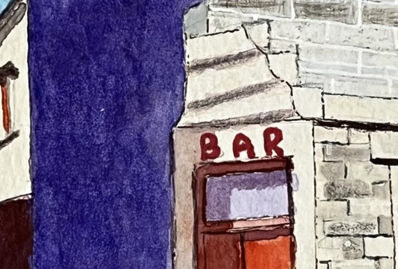
offset the shadow here. I really like the font on
the bar sign. That's cute. I wonder what you
call that. Okay, I think I'm pretty much ready.
9. Final Details: Okay, I just
remembered that I have this dark sepia fine liner, and I love this color. It's a really deep brown
tone. It's a bit warm. And since I used warm gray, I think it will be really nice. It'll be a good combination. So what I'm going
to do is focus on, um, kind of defining some of these edges
that got a bit lost. So especially because
my markers were bleeding slightly
since this paper isn't great for markers, I lost a bit of the
sharpness on this roof edge. I can also use it
to define some of the architectural
details or stonework, but not like outlining every single stone,
just a couple of them. And anywhere like in here, where this dark shadow kind of bleeds across all the surfaces, I can use the fine liner to get a bit more detail and
find some edges in there. So I think I'm just going to start from the top
corner and just work my way down just in case, you know, I
don't want to smudge it. So up here, what
we can do is get a kind of a nice
crisp edge on this. I can also use it to very lightly indicate that
there's stonework here. And in the end, I want the
majority of my darker areas, my darker marks to
be kind of here. That kind of draws the focus in. So up here, I may
not do too much. I just want to get some of these edges that got
a tiny bit lost. So this is where having the grid there
still really helps. And like I said earlier, doing this a few
times before you jump into a final commission
is so helpful. And then as you translate from
the photo to the drawing, this is what should guide
you in your painting. You're you're learning
how to make decisions, making it more uh, you know, taking there's no way you could copy
every single detail. So translating what you see to your own drawing in the drawing, pinpointing the things
you want to focus on, then using that to guide your painting. I hope
that makes sense. So I'm just gonna capture
the right edge of this pipe. Just now and then my line will be a little bit
broken, which is okay. But because the pipe
was very light, it was lost right
here, especially. And the sign Once I do all of this line work, if there's anything I
notice that I want to come back and, you know, add mark or two or shading
or anything like that, that would be that's
completely fine. I don't know what these
little wires are for. I just assume it's
the electrics for this. Just kind of make it up. Little bits and bobs sticking off the edge
of the building. Now I can also use this as
an opportunity to define the edge of this if it got a little lost. Very, very fine. And I can use marks
for the stonework. I don't want to outline every single piece of brick or stone that I
see in this drawing. S in the reference, I
want to just hint at it, so I'll maybe do a couple horizontal and a couple
vertical marks here and there, especially on the edge because that's a good way to define it. This building is kind
of whitewashed here, so there's not a ton of
lines in the brickwork. If that's enough
detail for that side, let's come over here
to the main building. So the the windows. I don't think it's necessary
to outline all the windows, all the details, kind
of pick and choose. But it's hard to see
in the original photo. But on but right here, even though the shadow kind of creates this big shape
along the whole side, between this little
back building and this stone building, there is a line here. So I am going to add that because it helps define the building. And I
need to make sure It is slightly angled. So it kind of starts where
the about here where this back building
meets this building. So that's it. That's just
one little line that helps. And because it's a dark sepia, I really like how
it's not overpowering my drawing, whatever
I've already done. I can just use these
little fine lines to enhance whatever
I think needs. I definitely needs some
definition on this railing. There's a little lock on the
door here. So I'll add that. The center line of the door
comes down about here. It's almost lined
up with shadow. The door The sun is definitely coming
from up here somewhere, casting the shadows
down this way. So my darker marks, I start at least
with drawing them under or on the shadow side. From there, I can
then decide if I want to do anything more, like, on the highlight side. In terms of the brick work here, I'm just using my
very fine marks to emphasize little bits of it. I'm adding this wire. I kind of like the scraggliness
of this wire. Interesting architecture here. So, yeah, I think by now, I mean, I can definitely see there's bits of
mine that are off. They're not absolutely
not perfect. So, like I said, if I was
doing this as a commission or really trying to
get it super accurate, I would want to do this at
least three times, probably. And that might sound
tedious, but, I mean, if you're excited
to draw something, that kind of homework,
as I would call it, is it's a choice. Like, you do it because you want to do it.
You want to do well. And each time you do
it, it will get better, so there's that to
look forward to. You could also try
different materials, different mediums, use
those first few tries as a way to decide
what you want to use. Okay, so I'm sure someone's
gonna have questions. Let me know in the comments
if there's anything. But I really hope this
strategy helps you. And if you're going
on vacation or just you really like
urban sketching and you're going to go
out and do some of that, draw from life, but take some reference photos of
whatever you're drawing, and then go back home and
do it with the strategy. So you can see your
life drawing next to this study at home and really to be able to critique yourself
because you'll see, like, some of the
inaccuracies very obviously. And that's not a bad
thing, obviously. We all learn as we go. So, of course, there's
going to be inaccuracies. That's part of it,
and it's okay.
10. Enlarging the Grid: First thing we need to
do is figure out how to enlarge this so that it
stays in the same ratio. And a four by six
inch drawing like this is a two by three ratio. So to keep that, I mean, you could figure it
out if you're really good at mass, but I am not. So what I do is find
calculators online. This is probably the
best one I found so far the Bellevue Fine
art Reproduction. They have an aspect ratio
calculator on their website. So if you scroll down
on the left here, we have a space we can type
in our current dimensions, which is four, by six. And it shows your aspect
ratio is two by three. Yes, we know. And on the right, it'll say the same thing until you type in what
you want it to be. So if I want my short side
to be 1 " bigger, like 5 ", I'll type five, and it
will automatically adjust the next value so that I know
my height has to be 7.5 ". And that will keep the aspect
ratio of two by three. This makes it a lot
easier so that you don't have to crop anything
you've already done. And we can just do the
grid and stuff afterwards, but we have to at least
start with the same ratio. I'm using a block of the Bao hang Academy
watercolor paper, which is a lot of fun to do
practice on lots of studies. And what I'm going
to do first is measure in at least
1 " from the side. So if I go 1 ", is
that going to give me. This will give me enough space, and it will kind
of center my box. So 1 " by 1 ", I'm gonna draw a line. And now I know I can
measure over 5 ". And the other way is
going to be 7.5 ". That's like about 1.5 "
up from the bottom, 1.5 Now we just have to
make sure this is 7.5. Something I find helpful if you don't love this
side of art, like, the whole grid
measurement accuracy side is to do this and
then go take a break, maybe go for a walk or do something to clear
your head because I find doing stuff like this
gets me feeling a bit rigid. And when I go into
the painting process, I want to feel a
little more free. So I often need to
take a little break between this and a painting. Next thing we need to do
is to divide this up in the same amount of squares
we used for the drawing. So if you look at your
drawing, you see you have one, two, three, four squares over. So we need to divide
this by four. And the same thing
going up the other way. There's various ways
you could do this. What I typically do is obviously
I made this 5 " evenly, so I can simply five
divide it by four. I mean, obviously, you
can do that in your head, but I keep it very simple by keeping that
number on the screen. And just doing all
my measurements. So 1.25, that's one
and a quarter inches. So pretty easy on this ruler, just one and a quarter,
one and a quarter. And what I typically do is draw all my little measurement
dots before I do the lines just in case I did my measurements
wrong or something. It means I don't have a
ton of lines to erase. But I can see that all lines up. Perfect. So now I
can draw my lines. I'm going to be using very, very light lines for
my interior grid. So extremely light pressure. And then once I do my drawing, I'm going to lighten these or erase them as much as I can with my needed eraser. Okay, let's see what the next the squares
going this way are six, one, two, three,
four, five, six, just double check, six squares. So now, because this is 7.5 ", seven point 5/6, 1.25, you'll get lucky sometimes. Someone really good at mass
is watching this and is like, Do Sarah Okay. Just keep as accurate as you possibly can in the
ruler in your placement. Really light lines.
Barely see it. We'll go with it
for now. At least I can see all of my little dots, my measurements just in
case I need to do that. Redo that. And now I'm
going to tape off my edges. He go. Okay.
11. Drawing on Watercolor paper: Now we've got
everything taped off. Our grid is ready to go, and we are going to do the
same thing we did last time and simply copy
it square for square. And since we already
made the effort to translate what we saw on
the photo to our drawing, if you like how
your drawing turned out, copy your drawing. I find that really helps because when you're
looking at your photo, it's easy to get distracted by all the tiny little
details and figuring out, you know, how you make
that into the drawing. Once you have your drawing, if you can still see
your grid, that is, if you can't see your grid, you could probably draw
another one on top of it, or you'd have to use
your original photo. But I can still see
my grid over here, so I can easily copy
that square for square. I definitely recommend using an HB pencil or
something lighter. You don't want to have a pencil that's going to
be easily smudge, especially we don't
want to go too dark. So for this first
pass of drawing, I'm just blocking things in
very, very light pressure. It always takes me a
little while to kind of feel loosened up and
confident in my marks. So the first couple squares, I tend to erase a
little bit more. Something that also might help if you're
feeling a bit timid to make a mark is to use
dotted lines or dashed lines. So rather than drawing each of your lines
and trying to make them perfect, just dash. And then later, if you feel
like it's an accurate shape, you can come back in and
make it a little more solid. Such good practice for
confidence, line confidence, and, uh, hand eye confidence,
is that what you call it? Hand eye coordination confidence.
No, that's a mouthful. That would be a really
fun workshop name. Hand eye coordination
confidence. So this is a moment
where I'm looking at my reference photo because my grid is kind of lost
right here in the shadow. So um, it's taking me
a bit of extra time. To adjust my eyes.
Back and forth. We don't have to draw
everything perfect. Part of the charm of
architectural rendering and especially when you're
outside doing urban sketching, is that hand drawn feel. Some lines can be a
little bit wonky and, like, a little bit wavy, and the evidence of
the artist is there, and I think that's beautiful. But obviously, this is a whole different
type of exercise. This is where we are
training our eye and building that muscle memory and getting building a strategy really for when we do go
out and paint from life. So don't worry if things
aren't perfect right now.
12. Drawing Part 2: Sometimes as I go, like
in this area where I have to do lots of
little window details, I will erase my grid
lines now and then draw those in so that I don't have to erase around my
crazy little lines. I'll also erase
some of the lines that are not really
useful, like in the sky. And instead of
using my finger to brush away the
little eraser dust, I will use a big brush so that I don't smudge
the papers quite as much. Alright. I've worked my way pretty
much from the top down, and now I'm down
here by the stairs, and it's probably one of the trickiest
parts of the scene. So I'm just lightening the grid lines as much as
I possibly can so I can barely see them just so that
I can use them till the end, but they won't be visible. And since this is a
very shadowy area, it's pretty much
gonna be covered, but this one's a little lighter, so so, yeah, I can
barely see that anymore. And I'm gonna keep my
pencil extra sharp in this section because it's a
lot of fine repeated lines. And I remember when I
did the first drawing, it's easy to get a little lost. Um, if you're feeling
a bit frustrated or nervous about not being
able to get anything perfect, just remember that well, what is perfection, anyway? If you're trying to
match the photo, that's a whole different story, but we want to tell
a believable story. We want to capture the
likeness of this place. And that actually does
not require perfection. So right now, while we're doing the base
layer of our drawing, like, plotting
everything out, it's better to focus on accuracy. But then when we come back with our ink and our watercolor, we can be a little bit more
free and loose and I mean, like I said earlier, to me, that's what makes it
interesting is when you can see evidence of the
artist in there. The reason I'm doing
this first layer super super light is because I want to do my Sepia pen
again in the final piece. So I will have these lines. Once I do my pen, I can actually erase more of this if
it's still visible. But I need to make sure I
don't go too dark now and, you know, when I erase a lot, this paper kind of
slowly degrades, so I have to be really
careful that I don't ruin the surface too much because I haven't even
done the watercolor yet. So, for now, really,
really light lines, and then we'll finalize
everything with our CPA pen or whatever
pen you want to use. Fountain pen could be great, but this paper is a little bit more textured than
what I usually use, and I don't want to
mess with any kind of pen that could leak or
burp onto my paper. Like, fountain pens could
technically do that. So, let's continue on. I've been very, very hesitant
to draw anything dark, but that makes it
a little tricky. I find that it's actually easier to just commit to
a line and go a little bit darker than it is
to draw something really, really light and
then find it again. So all these stairs that I
drew, I can barely see them. It's gonna be
tricky to make sure I draw the correct one later. I find it a lot harder
to do this part of the process than going
from photo to drawing, going from drawing to painting. Well, I'm still
doing the drawing, but for some reason,
there's, like, added pressure whenever I
use nice watercolor paper. Like, knowing that
this is going to become the final painting just puts that
extra pressure on. And so I'm a lot more reserved. If you're a bit nervous
about the stairs, I'm actually realizing
it's easier to start from this side of the
stairs and move left because, well, at least when you
look at the original. These are a lot more
obvious, these big steps, and then you can see
how they connect to the left side and then the
left side going back up. But again, if you
follow the grid and just draw grid
by grid box by box, it should align or at
least get really close. I think we're almost done. I just need to do the railings. I think my doorway
is slightly off, but it still works
with this drawing. It's just not absolutely
perfect within the squares. But since I've kind of based everything
else, like the stair, the steps, I'm gonna go with
it because it still works. Well, this goes down one step.
13. Inking: Now you have a
decision to make when it comes to doing the
pen, the inkwork on top. You have to decide if you want thick ink lines or
very, very thin. And that is going to change
the final look of it. I find that using thicker ink lines always feels
a bit more illustrative. Whereas if you use something
that gives you really, really thin lines, you can be a little bit
more painterly. You let the watercolor
show through a bit more. Um, I like this kind of dark sepia color because it's not too black or overpowering. It's got a tiny bit
of color in it. And even if you have something that's a
little lighter brown, it could be really
good for this. Um, but I've also used fun ink colors like
orange and neon green, and they all have a
different feel to them. So just choose something that you like to play
with, and, of course, you can do this
multiple times and see how it changes
the overall effect. But I'm going to
use this one again, just like it did in
the last drawing. And I'm going to use really, really tiny lines to start out. And then if I see anything that could benefit from a
bit of a bolder line, that's when I'll come back
with a second layer of ink. So it is kind of more of
a tentative approach, and you could also do the watercolor first and
then do your ink lines. But since I plan to erase some of this to
get it out of the way, I'm going to start with my ink. There are certain
things that I'm not going to outline with my pen. These background elements here, I'm not going to outline. I'm just going to draw them slightly darker with the pencil
so I can see them better. I'm not going to
outline the chimneys, and I'm not going to draw in the brick work or the stone
work that I did before. So the reason for that
is those elements, I can tell the I can do better with
watercolor than with ink, and I like having some
things in the drawing in the painting that aren't
outlined or drawn in. I like to have some things
that are just watercolor. Um, yeah, okay. Kind of, oh, and last thing, of course, maybe
this is obvious, but always test your pen
on a piece of paper or, like, I have a little
bit of space up here. Do a couple lines
and see how to get your pen or the nib flowing on the specific paper you're using because
if it's really, really textured,
it's a lot harder, and you want to
make sure it's at least gonna give you
the lines you want. Also, this could be
a really good way to test the waterproof aspect. If I put some water on mine, I can see that it
doesn't move at all. And that was pretty much
right after I drew with it. So some inks, you
have to draw with it and then let it dry for
like an hour or whatever, depends on the ink.
Always do a test first. And one final thing
with the pen is that I'm not going to
use my ruler anymore. Now it is up to me. It is up to my hand
to do all the work. Um, again, like I said at
the beginning or earlier, I like seeing evidence
of the artist. Every single line doesn't
have to be perfect. And the more I use the ruler, the more stiff I feel, it also just gets me out
of a creative mindset or away from my kind of free
flowing artist mindset. And that's what I want to access when I do my watercolors. So I'm going to
use my eyeball and my hand eye coordination to try to get things
as straight as I can. But I know that not everything will be
perfectly straight, and that is completely okay. So, here we go. Let's go just dive in. I always feel a little bit hesitant when I first
do the first line. Just like with the
pencil, I'm like, I got to kind of ease into it. By the end of this
outline phase, I feel way more confident and
I kind of just go for it. Um, I always err on the side of using less
ink or less bold lines. So, because you can always
come back and add more, you can make it more intense,
but you can't undo it. Some of these really shadowy
areas like underneath the roof and some of the windows and things like that are gonna be
really dark watercolor. So my lines don't matter too
much in those areas, but
14. Inking Part 2: Regarding the edge of
the brick wall here. So this wall, actually, any of the any edge where you know it's
made of stone or brick. I kind of did it
here, but I will use a slightly broken line and try not to make it perfectly
straight because it isn't. If you look really
close, the stone, the edge of the stone
is slightly jagged, especially where 2 stones meet. It will have, like,
a slight indent. So that's a really fun way
you can use your pen is to make that line a
little bit less perfect. So I'm going really light first, and then I'll come back with any more solid
lines if I kind of miss something if I went
a little too light. But since we've done
all that work with the drawing and making the
drawing really accurate, now we can have more fun and we can decide where to make things really sharp and nice and where
we want to leave things a bit more playful and loose. But now once I start
getting these ink lines in, I can see how light
my pencil was. I can barely see any
of it on this section. So I may not even have to
erase anything. We'll see. The fun thing about doing
this part is that, you know, if you see a little bit of an error in your
drawing at this point, you can do the correct version
with ink on top of it. So if I see a line that's
maybe a bit too off kilter, I can just make an
adjustment with the ink and not have to redo the pencil and then do the ink. You know, it just
saves a little bit of time and a couple steps. Oh, remember, I'm not going to draw this
background section first. I think I'll do a
little ink on this one, but not this guy. So that will show
that that's behind. And the ink lines help bring them for the
other lines forward. So just a very light
version, though. And I'm not drawing
my chimneys in. I said I was gonna do
those with watercolor, making the edge of this chimney kind of rough 'cause
it's all stonework. Oh. This doorway and the stairs makes me
the most nervous. I may just draw these
foreground steps with ink and leave these background
shadowy ones as watercolor. And then if I need to, I can
come back with any kind of deep line color, detail color. I think I've got the majority of the steps in the right spot. Um, so I'm going to do the railing and then
assess the situation. I think that's it for the
beginning. Oh, this window. I drew this one slightly larger.
15. Making a Color Plan: Now that we have everything drawn out and some ink on there, everything's pretty much
ready to be painted. I've erased most of my grid
lines as much as I can. I think the next
best option is to swatch some colors that we think can represent
what we see here. So what do we want
to use in the sky? What color of brick
do we think this is, the door, the shadow
colors, things like that. For this one, I'll try to
be pretty accurate to this, but I probably will
have a bit of fun in the shadow colors because
I just love that. To me, the shadow areas are
where you can really play and express yourself or just let the watercolor
kind of sing. So I'm going to use this
little swatch card. For the sky, I
think I'm going to stick with one of my classics, which is manganese blue hue, which is very
similar to serleim. It's just a nice light blue, and I can dilute it
down as much as I need to to lighten that sky. I'm not really going to be doing anything fancy in the sky or, like, big fluffy clouds
or anything like that. It's gonna be pretty simple. For the building, it's kind
of like a whitewashed, but it's also got a
bit of beige in it. So I actually think buff titanium would work
really, really well. So if we just swatch the buff, that's a nice beige color. We can also, like, really dilute it down. And lighten it a lot more water. I I I kind of lift
some of that up, the really diluted
buff titanium, I mean, it's probably barely
visible in the video, but I can see it in person, but it's just super, super diluted, and it's kind of
the perfect match to the beigeh color I see here, the very light cream color. And, I mean, anything white is obviously going to
be the color of the paper. We're gonna let
that show through. So I'm mostly speaking
about anything that I see that's slightly
tinted in the original. Um, for the door, I think I think I'm
going to go with, like, an English Venetian
red or actually have this color called Minnesota
Pipestone Genuine. It's very similar
to English red, I think, but it's very granulating, and
it's a lot of fun. Or I think, actually, like a hint of
quinacridone magenta with anything that's similar to English Venetian red
would be really nice. So that would lean
it towards pink. I think that still works
really nicely with the rest. I mean, you could
go even more red. I have a color
called scarlet red, which I love because
it's a nice earthy red. That could be a fun pop. So I may use a bit of that. A lot of times what I do with architecture
in the shadows, I'll use ultramarine mixed with Potter's pink because it just combines into the most
beautiful violets and depending which
one you lean towards, it has so much character. And of course, the potter's
pink is granulating. So you can either use something
like that, or this time, what I'm going to do is go with ultramarine for I I
do pure ultramarine, that's a bit too intense, right? So what I'm going to
do is add a bit of bronzte genuine and
gray it down a little. And it's also got a bit of
granulation and sparkle in it, so it's really fun for shadows for playing with a variety. I also will probably
touch in a bit of amthys genuine,
which is purple. But it's a really deep,
kind of grayish purple. I think it has a tiny
bit of black in it. But these three, I'm going to
play kind of between those. So the really,
really deep shadows, I'm going to lean towards
amethyst genuine. You could use any
deep purple for that. For the lighter areas, I'm going to use
somewhere up here, which is the ultramarine with
a hint of bronze genuine. If you don't have bronze, you could use Burt umber or any kind of
light brown color. And if I kind of dilute
that and stretch it out, you can see in the
lighter areas, I can still that
color mixes really well into the lighter areas and leaves me with some
really lovely textures. And so how you can
utilize that is to just pick up some excess
water so it doesn't drip off. In the areas that are
a little bit lighter, you can put down
a bit of pigment, but then drag a damp brush across the surface and
lift some of it off. Or if you see how up here, the shadow is a little lighter and it gets really
dark down here. So what I could do is
put lots of pigment in here and then drag
it with clean water, damp brush upwards
along this wall, and it gets a little bit
more diluted as it comes up. So I'll have a beautiful
transition like this. And then on the second layer, we can come back and do any
dark details we need to do. So for the first layer, we're going to use, you know, whatever shadow
color you want to. I suggest doing at least one of these little test sheets
where you choose your colors, and then whatever
shadow color you use, knowing that you're
going to do one layer of the shadow color and then do the darkest darks on
the second layer. So you don't have to go
overboard on the first layer. You don't have to get everything perfect
on the first layer. We will be doing
more than one layer. And on the shadows, so if I preserve my dark
shadows for this area, anything on this side
that's bright and sunny, I'm going to use
lighter versions of my shadow color, so
much more diluted. I could maybe lean towards the blue rather
than the purple for those because the sky is reflecting off this
wall quite a lot. So it's like a lighter shadow. And yeah, and then from there, we'll just keep adding in the detail like bark
not bark textures, brick or stone
textures and anything, really, any of these
little details we see. The door shadow is actually more a very saturated version
of the red that we choose. So where the sun hits the door, it's maybe something like this. But then the second layer where the shadow
falls over the door, I would do something like that, maybe with a tiny touch
of ultramarine mixed in. So it would be a darker
version of the color.
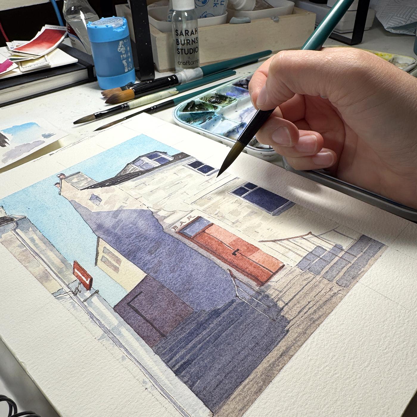
16. Starting the Watercolor: So that's kind of the game plan. We're going to go with
that and see how it goes. The fun thing about
painting the scene is we can use color in either a more realistic way or a very fun, loose
expressive way. And I like doing both. So if you want to
really practice, you can do one scene where it's very detailed and
we're being very careful with placement and then do
another version you maybe use a slightly bigger
brush or one that you can't control perfectly
and get bigger, more expressive marks and kind of compare the two and
see which one you prefer. Okay. So this is so this is we're going to be looking
at the original photo, as well as our
grayscale version. So have it somewhere nearby so you can
quickly reference it. This will just remind
you, you know, where you decided to put the darker darks and the
bright whites and all that. And yeah, we'll
just kind of bounce I bounce between these two
when I go to paint the scene. Okay, so the first thing
I'm doing is the sky, so I'm gonna get my blue ready. Just dilute that a little. And I like to tilt my paper, turn my paper so
that the point of my brush is pointed towards any solid edge I need to paint against because
it's a lot easier to control this
side of the brush, this pointy tip as the
hard edge than this side. So that's just my preference. Obviously, you don't
have to do that, but I can get a much
sharper edge that way. And I'm just painting
around all of my edges. I'm gonna work pretty
quick because, you know, as soon as it sets in the paper, it can start drying,
and after that, I want to touch it as
little as possible. If you have 100% cotton paper, you have a pretty good
amount of time to play. But if not, if you're using
the student grade stuff, the stuff that's
not 100% cotton, it can be you got to
work a lot quicker. Otherwise, you can end up with streaks or splotches and
things you don't want. So one thing you could do
in that case is to get the whole sky wet first and
then drop your pigment in. Still working as
quick as you can. But then you do have a
little bit of extra time. Okay, so we have a
very simple sky. It's not too dark,
not too light. I don't suggest touching
it after this point. I did notice I missed
one little edge here. But the more you touch it, the more noticeable it's gonna be, you'll be able to
see these marks, but at least I know it's gonna it's not gonna
be a white mark. So don't do what I'm doing right now because you can mess it up. Another thing that I like to
do sometimes, not always, but you can introduce a bit more pigment
in certain areas. So this will kind of make it
look like there's clouds, but they're gonna
be soft and wispy. Anyway. Okay. That's
enough of that. Not gonna touch it
anymore. It is what it is. Something that I've
seen people do is to continue painting
that sky color, more diluted, though,
into shadow areas. It depends how many
layers you want to do. Like, I could do
that for some of the lighter shadows that I see, maybe under this
edge or on here. But I'm I wanted to approach this in a
more step by step way, but I just wanted to mention
that because, you know, if you don't want to
just sit and wait for your sky to dry before
you do the next layer, you could just continue
right into your shadows. The only tricky part
about that is, you know, if I painted this shadow
right now against this line, the skyline, that would
bleed into the sky, and it would not I
wouldn't want that. So you'd have to
be very strategic. You'd have to maybe work in here rather than anywhere next to where you've already painted, that definitely needs to dry before you touch
the edge there. So I find it's just
easier to wait. And if I'm outside, I am doing it mostly
in one layer. So I will drop my
sky coolor in. I'll I'll probably tilt my paper,
which helps a little bit, and I'll start doing
the rest right away, knowing that there is
gonna be some bleeding, but not worrying
too much about it. And then I come I
try to let that dry, and then I come back in
with my second layer, which is a bit deeper
and more detailed. But it's a very different
approach outside because it's usually working quicker. You don't have a hair dryer
to let to speed it up. You just have to be kind of
aware of your surroundings, is the light changing
or is the weather gonna change and work quick,
if you need to. Make you kind of come up with your own strategies
to deal with that. Since we're inside, we have the luxury of speeding this up, so I'm just going to blast that with my heat gun and get it dry. Now that this is completely dry, I'm going to do my
building color. I've got my little
cheat sheet here, so I know how dark
or light it is. Of course, I have lots
of cat hair in there. But I'm going to avoid anything that I want
to be bright white, so that if we look
at our value study, we can find those areas. So the pipe here,
I'm avoiding that. Some of the highlight
on this wall here, the window that's
facing kind of to the left here is white because
it's got white trim on it. It's a little more
shadowy on that side, but still has some white. Um, and, yeah, just little bits and pieces
of this building, the side here are white. And in the value study, I left this mostly white, but I am going to tint it slightly because
I'm going to have more variety of values
in this painting. So I'm going to just
start up on the left. And the roofs are going
to be much darker, but I can easily paint
over this color, so I'm not worried at the
moment about leaving that. I've already painted
over my pipe. Realized what was I just saying? But it's okay because it's a really easy to a
really easy color to lift. I can even use a paper towel
now to soak up some of that. And because the brick or the stonework has
so much variety, it's okay if you have a
little more pigment in some areas and that it's
not completely even. In fact, I think it's
better to have that. So now and then you can drop in a bit
more here and there. I'm avoiding the Um, the roof on this one, just because I know
it's gonna be darker, it's a little easier
to paint around. The building back
here is quite light. I'm going to use the
beige color for that. It is a little watercolor dries lighter usually than what it
looks like when it's wet, so it's a little tricky with
these lighter tones to know, like, if it's light
enough, basically. So I suggest, you know, when you do your test sheet, you can kind of see how it's gonna dry when you use
a lot of water versus not. And the other thing
is you can also drop just splotches of
clear water into what you've done and let it just
kind of bleed and flow. And that will also
make some variety. Or you can come back
with a damp paper towel, just make sure it's clean and kind of pick up
little bits of it. And that will also
add a bit of variety, which is perfect for stonework. This is such a light
color that you can almost not even tell
I've done anything there, but it will just subtly
make a difference. I'm using a lot less
pigment on this side, the sun is really
hitting this side. And I'm gonna let the I'm leaving the windows alone for now because
there's white trim on those, or at least this
one and this these. And I'm painting
around my red doors. I don't I have to worry
about that with the red, the stairs are definitely
a kind of grayish color, so I'm just ignoring
those for now. Um, just got some. Yeah, I think that's
probably okay.
17. Watercolor Shadows: Depending on how much
you want to play with, like, expressive marks, you can already start
that if you want. If you really want
to have fun with textures and just letting things bleed and
flow, just go for it. I don't want to stop you. I'm going to do that a little
bit in the stone walls. So on this one, there's quite
textured stone work. I'm using just remnants of
my pigment from earlier, which is a bit of the browns
and reds that I mentioned. So it's just, like, a warm tone, and I'm just dropping it in
so it can dry all splotchy. And I'm also going to
do that on this side. Since we're going to
be adding some um, darker shadows on this wall, I'm not going to do too much. Oops. I I I drop too
much pigment in, I'll just lift it
with my paper towel. I'm not going to do too
much texture on this wall. I'm just trying to
use very light marks. It's already kind of dry, so I'm using a dry
brush technically. It's like a dry brush effect. And also, when you're
making your brick, any kind of lines you're doing, make sure they work
with your perspective. So if the perspective of
the wall is like this, you should do your line work
of the bricks that way, too. This may or may not show up
underneath the shadows later. We'll see. But just a bit of that. And on this wall, oh, one color that I should
have mentioned that I love for architecture
is lavender. So it's like, you know,
classic lavender tone. But I usually mix it with something else or I
like dilute it quite a lot because it is a bit power it's actually
quite powerful on its own. So maybe I'll mix it with
one of these or just really, really dilute it, and
then I can use that. Next, I'm going to do the
base color of the door, which will be one
of my lighter reds. So whichever one of
these I go with, that's gonna be the base layer, and then later once that
dries, we'll do the shadows. Probably do the shadow of this
and that at the same time. So first, let's make our mix. And I want to make sure
it's pretty diluted. I don't want it to be too dark. I mean, again, it is
going to dry lighter, but the shadow will
definitely be much darker. So painting around the window. If we make this colour, kind of like a dusty red, I don't know what
else to describe it. It just looks like
a dusty red to me. Then we can it makes it feel
like the sun is hitting it. It's a little bit weathered, the paint is a bit worn. So making it nice and diluted
helps tell that story. And then later with the shadow, that intensity will
come through a bit. Also going to do the
base color of this wall, and the shadow
will overlap this. What else? We have
the sign here. I'm gonna use the same color, maybe just a bit more saturated. You could either paint around
the L that's on the sign or do a solid color and then
white posca pen on top. It's a little tricky.
I think I did it. Kind of. Let's see. I think that's
that's the only red. Oh, there's a bit of red
in this little chimney. And these are also kind of red, but much more diluted. So very subtle red, like I guess it's terracotta. I didn't do a great job with
making that line straight. Okay, so we're
gonna let that dry. I'm trying not to be overly perfectionist with
all of my edges. Typically, I am much looser when I paint,
but like I said, I'm trying to show
everything step by step and take it area by
area, I suppose. I think next, let's fill
in the stair color, the base stair, which
is pretty gray. Kind of like a muddy gray. So burnt umber mixed with ultramarin makes
a really lovely gray. And if you use a bit
more burnt umber, it will be a warmer gray. If you use more ultramarine, it'll be a cooler gray. So for the base, I'm going to add a bit more
burnt umber so it's warmer. But I definitely want to
dilute it because I don't want the steps to be too dark and
too heavy in the painting. And this might even be too,
I think that'll be okay. Just carefully painting in And I don't mind at all if
this bleeds into the red. Because it's so light, it won't overpower it. We're gonna have
that strong shadow. And also, it's okay if there's, like, more color in one
area versus another. Like, it's okay to be splotchy and messy in that base layer. We don't have to
make it perfect. This is just the lighter
version of the steps. Since we're waiting
for that to dry, let's work up here
because we have time. So I'm going to do my ultramarine
with burnt umber again, but lean it more
towards ultramarine. So that's a dark, cool gray. So that's pretty dark. And I want it to be dark
because the roof is, like, a kind of a slate color. It's really, really deep. And if it dries too light, we can easily come
back with more. We don't want it to be pure
black or anything like that. It's just has to be
a nice deep gray. It's a little hard
to see on this one, but there is a bit of I'm gonna fill this tile
in on this side. There's a slightly lighter
version of this on this side. So I'm gonna keep I'm
gonna let this dry, though, and then come
back with a second layer. There's a bit of that darkness. Using a teeny brush now, there's a little bit of
that Roof color here. I have such a shaky head. You know, I took
a lot of care to do those lines and make
everything accurate, so I don't want to ruin it
now by just going too fast. There is a gutter here, and it's kind of
like a white gutter. I didn't really draw it in. I figured I would just paint around it to make that show up. So when I come back on top of this wall with some textures, that's kind of when
I'll make that shape. There's a little bit of a lip on this top edge where the
roof sort of peaks over. I definitely simplified
a lot of edges. Like, there's much more happening
in this, uh, roof here. But I'm keeping it a
little more simple. There's a little bit of
some darkness here where the wires are. Under here.
18. Watercolor Shadows Part 2: I think this isn't
quite dry enough, so I'm going to now do the
windows, and for that, I'm gonna switch to
some of my amethyst genuine and ultramarine to
make a deep shadowy color, which is still a little bit
blue, a little bit bright. It's not as dark as, like, the roof color we used. And on this side, I'm going to use a slightly
lighter version of this. I lute it just a little, just like we did in
the value study. The marker sketch, we
used a lighter gray. Oh, almost forgot this one. Not quite so deep a
shadow color for this. The same window color. Kind
of more like that one. Even though this is pretty
much hidden, from view. There's tiny sliver there. Now, we need to decide
on the shadow color for this the upper
areas of the building. The shadow color here is
gonna be much deeper, but I think I mentioned earlier, I like to do maybe the sky
color mixed with some of my shadow color for these areas. So maybe some of that manganese blue hue or
just diluted ultramarine 'cause there's a bit more
sun bouncing around up here and maybe the sky color is
showing through a bit more. And I'm just using a
dry brush so that I can get some textures easily. This side of the building,
there's, like, a bit of, like, a edge to it, which seems shadowy,
even down here. But in using a lighter
bluish shadow for this, it's a I'm actually gonna make a
stylistic choice and do a shadow for this
pipe all the way down. Um, yeah, using a lighter
blue shadow for these areas, it instantly separates it from the shadows that
we're using elsewhere. Maybe lighten it a little. So dry brush now and then, I'll just kind of add a
bit of rough texture. Even up here, there's Some of
the brick work has shadow. And then I'll dab it
with my paper towel, which also roughens it up a bit. So, yeah, I play a
little bit with that. This one. And the same thing
on the other side. There's more This face
here has more shadow. It's still really light, though. I'm not going too dark yet. Now I'm just being careful
not to touch anything. I did the windows
because the windows are still gonna be drying. So I'm just trying to use a careful touch here and there. So I'm just still going
with a dry brush texture. And I'm just sort of mimicking
the shapes of the bricks, but not in any,
like, obvious way. I'm not trying to
make one solid line be a brick or anything. But lots of little marks
like this kind of looks reminiscent of the bricks and visually gives
us a little clue. On the little, like, ridges we have here, it's
a bit of a warmer shadow, so I'm going to use my buff titanium with
a little bit of, like, a tiny bit of the red and maybe a little bit of my
shadow color for these. So it's like a warm
shadow underneath these lips. Kind
of messed that up. Starting again. Drybush is just your friend when it
comes to brick texture. The siding here is kind of
like a light grayish color. It might be the
same as the roof, but the lighting makes it
look a little bit lighter. There's some shadow
on the, as well. There's some shadow
underneath the window sills. There's right side
here is shadowy. Just really look closely at the reference and
find the edges of your shad where most of your lines are
around the windows. I'm simplifying
mine quite a lot. Just letting bits of white
show through here and there. So I think we're almost
ready for the big shadow. There's a bit of shadow
under these windows. I'm using really light version of my shadow color on these. Interestingly, I
think the windows in here may be trimmed with red because it looks to be there looks to be some
red reflection happening. So if I take a bit of
red and just use that, it's like a very light version, though. See how that dries.
19. Large Shadows: We want to be ready for
this. This has to be dry. Definitely. Make sure
all of this is dry. This is I haven't used much
water in my shadows yet, so it's pretty
fast, dry and fast. We definitely want a good
game plan going into this. We want to know where
exactly our shadows are. So if you need to, you can draw the
edge of your shadow. I'm going to just be
looking at the reference as I go, kind of winging it, but that's something I've
done before is I'll just draw the edge of my shadow
shape, which falls. I mean, we already
did it in the um, block the gray scale. But basically, this
is all one big shape, so I'm gonna paint it as such. When it overlaps the door, I'm going to stop at that edge because where it
overlaps the door, we have a bit of
a shift in value. And again, on the door
itself, that shadow, I'm gonna make it
more of a deep red, and then we can
jump over here and do the shadows on these stairs. So first, we need to mix
up enough shadow color. I'm going with ultramarine
with my amthystGenuine. And like I said, I want to do the majority of
the deep shadow here, but as I bring it up the wall, I'm going to maybe
shift it slightly lighter so that this
happens a bit of variation, but I still need it to
be pretty dark up there, so I won't make it too light. Alternatively, I could dilute it first and then bring it down into the darkness, if you
want to call it that. So yeah, let's just go for it. The moment of truth. So when
I look at the reference, kind of Well, I'm just
eyeballing everything, really. Now, as I get closer
to the bottom, I'm gonna start touching
in my deeper shadow. Oops. Splashed a bit. I
guess that's fine. And I can also tilt it. I'm gonna go directly
over this and my stairs. The stairs kind of
have an edge or the shadow edge steps
down in a way like that. I'm talking to myself. Talking myself through
it all, really. Okay. So that actually might
not even be dark enough. I'm just going to jump over to these steps and fill
this shadow in. With the same color that
I've got mixed up already. And if there's any other
shadows that I want to kind of touch up or darken,
now's my chance. Well, I have this lovely
color all mixed up. Whoops sake. There's a bit of shadow in, too.
20. Watercolor Details: I dried that with my heat gun, so now I can just play. For the shadow that
overlaps the door here, it's a lot lighter than what is on the
wall here because it's, like, a slightly different
angle and material. So I'm actually going to
mix my buff titanium with that shadow color
and just make it like a lighter pastel version. You could just dilute it really, really lightly and
make sure it's not too dark and paint that shadow. Oh, down this edge. I just want to show
that it's a little darker than this side. Okay. And I also need to mix
up my door shadow color. So we'll go with my deeper red. It's not even that deep. It's just, uh, the Um, it's I'm gonna use
my deep scarlet with a little bit of my Minnesota pipestone genuine only because I like the
granulation in that. And, um, again, I could
add a touch of, like, the blue or the
purple to deepen it, but I'm gonna maybe
just a little purple. Just a hint. And paint that in wherever I see the shadow. And the sign, I guess, is making this happen here? Sometimes it's fun
to try to figure out what is causing
certain shadow shapes. Pretty sure this little square here is from the sign up there. And now that that's in,
I'm going to touch more of my purple and just hit
this left side with it. Maybe the underside
of the door here. Okay. No, not touching that
anymore. What else can we do? Let's do some something I
like to do is I'll take, like, a really
deep shadow color, so it could be anything. I'll just use my blue and
purple mix together again, 'cause that's a nice dark, maybe even a bit of
burnt umber mixed in, so it's really, really dark. And I'll do any kind of
little detail lines I see, so maybe add a bit more
depth to the roof here. And this is where
I'll be maybe a bit not spontaneous or loose. Well, yeah, actually,
that's what I mean. This is where I kind of let my grip go a little bit looser, and I try not to be perfect. So maybe the roof
the tile lines here. You can actually see more roof in this perspective
than you can in the reference
because I liked this having this black or dark area kind of separating the top edge. So I'm just trying to break this shape up a bit without being too
perfect on any one spot. These are just some roof tiles. I mean, we spent a lot of time
making it perfect, right? So you can keep it that way. Or you can loosen up a bit
and just play a little. So, if this is dry, we can also do didn't
mean to use that black. We can also make the
shadow on this door. So the top edge of that
and the left side of that. And we also have just, like, a hint roof there. Steps have a bit of shadow. So you can use this exact same shadow
color you already used, but because you're glazing
another layer over, it's going to show up
and darken it slightly. So for these steps, the side that's facing us
will be slightly darker. So I can just leave, like a tiny sliver showing through
for the top of each step. And I'm gonna try to go quick. Dragging the brush quick. I find straight lines
are easier that way. So I just wanted, like, a couple little slivers of the steps showing
showing through. And then anywhere that I think maybe there's a crack in
the stone in the cement or, um, yeah, just I can, like, just touch a tiny bit of
this really dark color. Here and there. Especially
on this left side. But even have cracks, like coming across
this whole length. So I could do little tiny marks, tiny dots here and there, could even do a vertical
one now and then. And you also have
it in the door. So at the base of the door, there's a bit of a dark
line down the center, which I kind of did with ink, but I don't think it
showed up enough. So I'm just almost
outlining that door again. And the lock
21. Final Details and Results: We still need to
draw the bar sign. So let's get some of
that red pigment again. Oops, because it is red.
This is going to be tricky. Wow. Okay. Very shaky hand. I'll do. Yeah, and
then there is, like, little rust marks on the
brick here and there, so you could now and then
add stuff like that. But usually what I do is, like, I touch it and then lift it slightly 'cause I always
go a bit too much. Oh, the railings
are red themselves. So just add a bit
of color to those. I say red, but I mean, that
kind of terractta red Oh, and we need to do the
shadow of the um, railings. So Um, also, I should have mentioned, I actually, I'm
gonna lift that up. Don't paint this railing
until the stairs are dry. Mine started to bleed as I
did that, 'cause I forgot. So I'll do that after. But the railing here does have a bit of
a highlight on it, so I'm just gonna
use my Posca pen for that because
I didn't want to, like, stop the brush stroke, stop the flow, just
to get that in. But if you're a purist,
as they call it, if you don't want to ever use white Posca pen or white
guash or whatever, you obviously have to
paint around that, and that takes a lot of control. Just think about
that ahead of time. Okay, so there's a
little lip there, color. Bit of shadow here
that I missed. Bit of shadow in here. Okay. There's so many tiny details
you can keep adding. Um, you could even come back and add more brick textures
in the shadows here, depending how yours dried, a flat brush like
this is great for brick because it's
already the right shape. Depending on the size, it could be the perfect way to get some quick
brush brick marks. So it's up to you
to decide how far you want to take
these little details. You could keep going
and keep going and keep going and just painstakingly fill in or take it to the level. I mean, to do some of these, like, final little brush
details brick details, I'm just using the edge of my flat brush with a tiny bit of pigment and
dry brushing that in. M Um, so the final bit maybe is just a bit of
roughing up these steps. Actually, I missed a
bit of shadow here. So I'm gonna do a little
highlight on this railing. Oh, and we have to do the
shadow of the other railings. So I'm just using the same shadow
color I was using before, maybe a little lighter, more diluted and paint that in, which we kind of added
to the line drying. You pretty much just want to have count however
many vertical lines. You have and mimic that, um, and then the top one has
to have a shadow, as well. These ones coming off of this are kind of angled
here and there. So make sure it's
dry before you do the posca pen because it will definitely bleed
into your watercolor. And sometimes I'll also
do little, like, uh, lines or dots on my
windows or any like, maybe there's something
metal on the roof, little speckles here and there. It can work really
well for that. I think I pretty much preserved the rest of my
brights that I needed. So I'm not really
doing much with this. And I think that's
pretty much it. So we are going to
do the tape peel. Let's peel this and hopefully
get a nice clean edge. Nice. I truly hope you enjoyed this class and that
it helps you along in your journey of translating
images to paintings. You can use this strategy
for any image you have. I would love to see your
results if you'd like to post them to the skill
share class section. It's really fun to see
the variety of results, especially when people use different colors and
even their own photos. So please do share. So thank you all for watching
and Happy painting.
 Sarah Burns, Painter / Photographer / Youtuber