Transcripts
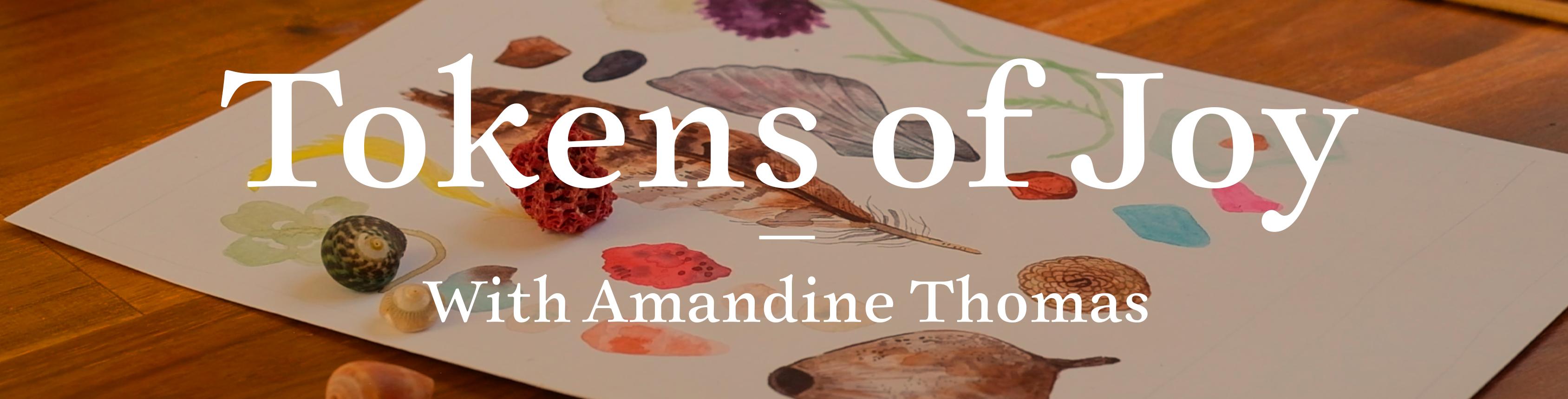
1. Token of Joy Intro : What embodies joy and
happiness for you? Is it the smell of
your favorite flower, a seashell from faraway shores or the brush you used
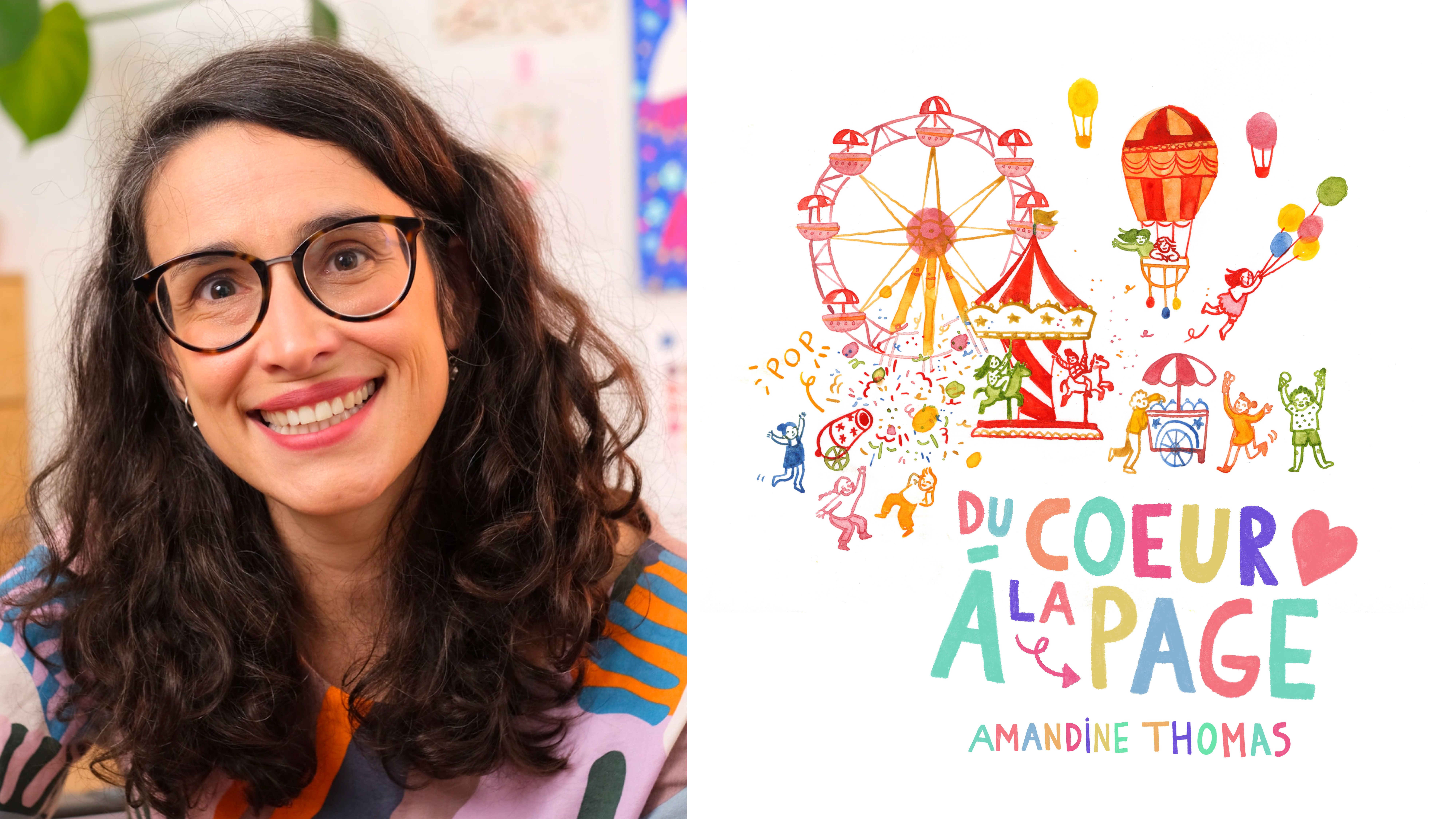
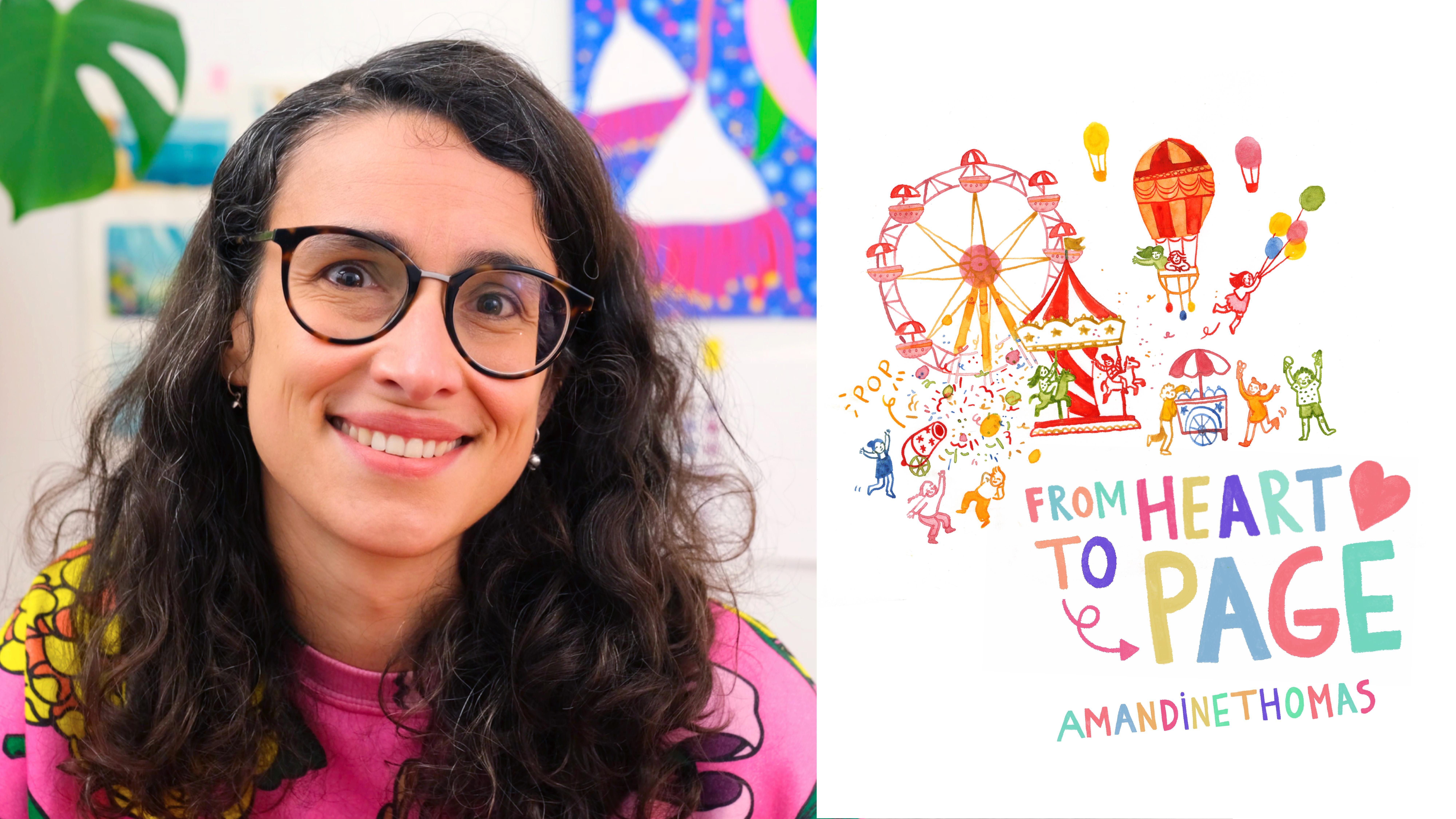
to express yourself. Hi, everyone. I'm
Amandine Thomas. And as a children's books
author and illustrator, I am endlessly
inspired by nature. Illustrating our
planet's wonders is something that brings me
a huge amount of joy, whether it be animals or
plants or amazing landscapes. I just love diving in
nature through my art. In life, this manifests with me gathering what I like
to call Joy tokens. It could be a pretty rock or a piece of seaglass
or a pressed flower. I love collecting
these little reminders of the happiness I find in nature and sometimes paint or sketch them in my sketchbook, so I can re spark
that initial joy when I flip through its pages. Today, I'm going to
help you identify, gather and illustrate your very own collection
of Joy tokens, unearthing personal
visual metaphors for celebration,
gratitude or happiness. Using modern
watercolor techniques, we will create a beautiful,
intimate piece of art. That will be sure to spark
joy whenever you look at it. I will take you through a detailed but never
prescriptive demonstration because this is going to be a really personal piece of art, so it should reflect your
own style and ideas.
2. Project: For this project, I will help you collate your
very own tokens of joy collection, from finding your tokens, to creating a
final piece in your own style. I will give you plenty of tips
along the way from picking your concept, to planning and sketching your piece,
to color scheme. And finally, painting
your illustration. So what do we need
to get started? For my illustration, I will be using my favorite
art supplies, which are my watercolor, my faithful Sergeant Major nib, which if you're familiar with my work, you've seen before. A couple of round brushes. These are size two and four, but this is just my
personal preference. A simple pencil and eraser. And, of course, a piece
of A4 Bristol paper.
3. Concept: The first thing I'm going to do is think about the
tokens I want to include in my
collection, and come up with a bit of a concept
for my illustration. As I mentioned earlier, I do get a lot of joy
from being in nature, and I'm really lucky to live in a wonderful part
of the world where I am surrounded by incredible
landscapes and creatures. While outside, I often collect little tokens of happiness,
like feathers from the Tawny frogmouth that
occasionally sit right outside my bedroom window, or flowers from a plant I lovingly
tended for months, or often my daughter will
contribute a special rock, a gumnut, or a pretty leaf. These simple tokens
remind me that the most precious things in life aren't necessarily
those we can buy, and that's a lovely message I want to capture in
my illustration. So now I'm listing
all the joy tokens I want to include
in my collection. Of course, your tokens don't
have to be nature related. You could be including
jewelry, a lock of hair, an object from your childhood, a photograph, whatever might embody that feeling of
joy and light for you. Now, for this particular
illustration, I want to borrow the codes
of natural history posters, as I love the vintage aesthetic and the ordered
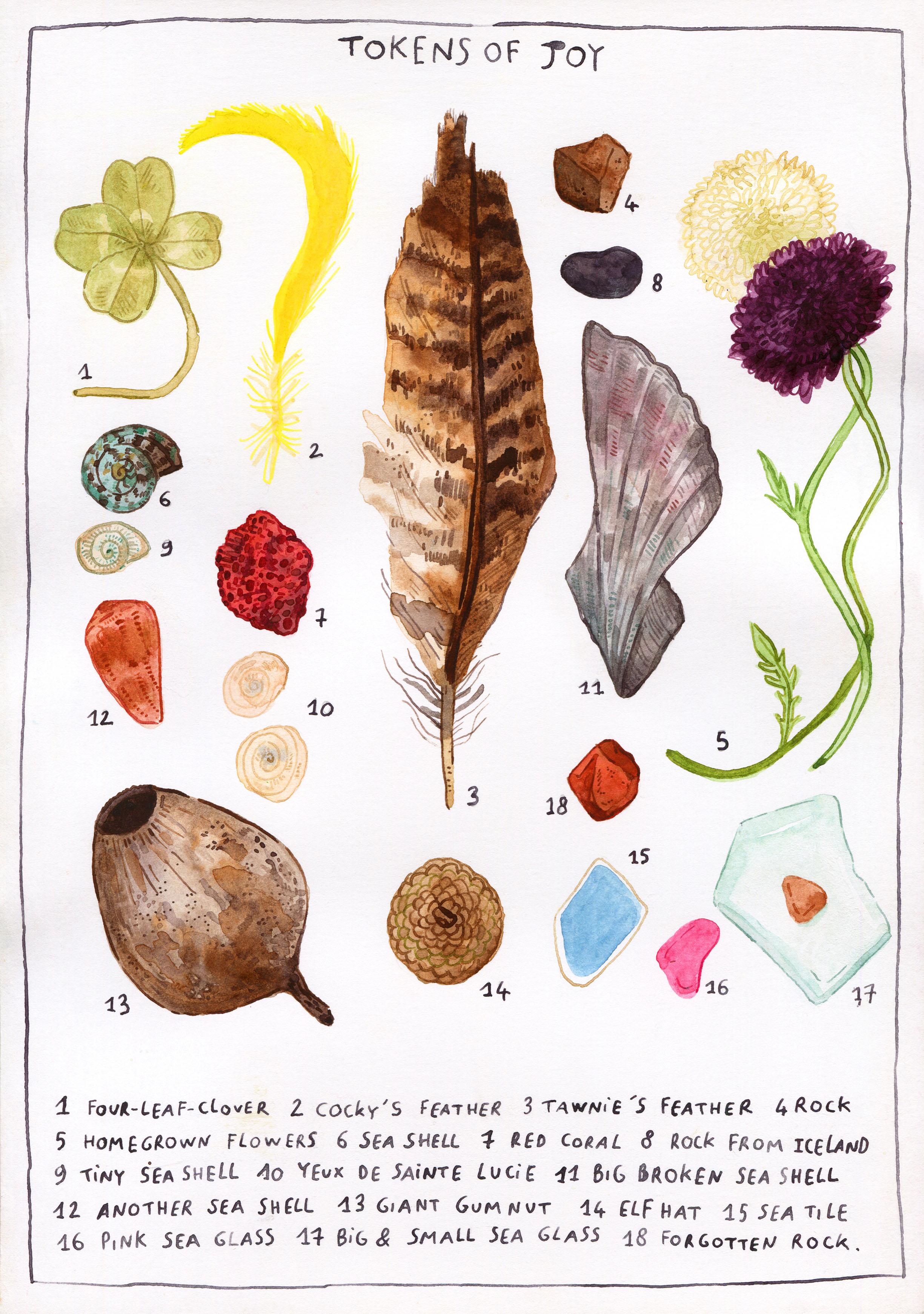
chaos of the layout. Perfect to document
a collection. I will even label each item, no matter how mundane. For example, I will simply title the poster tokens
of joy and give a simple line description
for each item like homegrown flowers
or cocky feather. Of course, you can come up with a different idea to
house your collection. You could illustrate a
cabinet of curiosity, a trinket shelf, or just have your objects
pell-mell on the page. That's entirely up to you. What I am doing with
my little tokens now is physically arrange
them on a piece of paper, so I can get a sense of
how they fit together. This is a great
practical way to work out my layout with
immediate feedback. If I don't like something, I can immediately
swap it or move it. Of course, I'm keeping
in mind my inspiration, the vintage and Natural
History posters. Like I mentioned, these have an organized chaos feel to them, where the objects are
laid out somewhat neatly, but without any
discernible logic, if you see what I
mean? Here we go. I'm happy with that as a layout. Now that I'm happy with the way I have arranged my collection, I can take a couple of photos, which will become my reference. But because I love
sketching from real life, I'm going to keep all
my elements handy. That way, I can pick them
up or bring them closer to my page as I sketch and paint without messing
up my reference, which I can consult
anytime on my phone.
4. Sketching: Now it's time to sketch. I have decided to work on
A4 to give each token in my collection plenty of real estate, since they'll
be drawn at scale. But of course, you can work on a smaller or a bigger
piece if you'd like. The first thing I'm going to do right now is lightly sketch my margins and block out space to add my title
and text later. I don't really mind personally
if my lines are wonky. This is an intimate
whimsical piece, I feel like those little
wobbles add warmth to the piece while also
showcasing that human touch. Now let's get sketching. I'm going to start with
my four clover leaf, obviously a great metaphor
for luck and good fortune. Now as I draw, I like to
keep my movement loose and free and my strokes really light since we are going
to erase this later. In fact, my strokes are
so light that you might struggle to see them on
camera, but bear with me. Every time I'm done
with one token, I bring the next one closer, keeping my photo reference handy so I can easily recreate my layout. Here moving on to the
cockatoo feather. This is a crest
feather, by the way, and you don't come
across them that often. I don't know how well
this will show on screen, but the color is
just incredible. It's almost fluro. As I move through my tokens, I like to keep that sense of free, dynamic movement
without overthinking. Otherwise, I know I might lose some of that
lovely spontaneity, which is so important
when sketching, especially when
working with nature, which is always a little bit wild with organic
lines and patterns. Another good thing
to remember is that nothing is set in stone,
not even your sketch. As you move forward
in the piece, you might suddenly
decide to swap two tokens or get rid
of one altogether. A piece of art is in
constant evolution, don't place too much
importance on this step. There really is
no pressure here. Similarly, don't stress too much about your sketch,
being too realistic. We are not doing photo-realism
here, and once again, those little mistakes or
quirks are actually what is going to bring personality
and charm to your piece. It's better not to get too
caught up at this stage. Because the essence
of sketching, in my opinion, is to capture a snapshot of what
you're seeing. It's up to you to curate
what you want to highlight. So it's okay to ignore superfluous elements and only include what you're
interested in, or sometimes take shortcuts, like I am not going to
sketch every single hole in this piece of coral or
every vein on this leaf. But of course, if
that's your thing, then please go for it. Here is my completed sketch
with all my little tokens. I have left some
space around for a little description
of each totem, I think there are 18 of
them, and for the title. So here at the top
and at the bottom. So I can move on
to the next step, which is planning the
perfect color palette.
5. Colour Scheme: Since I am painting from real life here and
furthermore from nature, I am going to lift colors
directly from my tokens, starting with burnt umber
a warm, lovely brown, perfect for my gum nut, please bear with me on my
pronunciation of these colors. Then I'm going to
add Jane's gray, a lovely cool gray
which I can mix with my burnt umber to get a
darker shade of brown. This will be perfect
for the pattern on the Tawny frogmouth
feather, for example. I can also use it on its own as a great base color for
a number of my tokens, like the seashells or the rocks. You can see it's already almost a perfect match
for the broken shell. Next, we have a whole bunch of lovely pinks, reds, and
oranges to work with. To make these colors,
I am going to be using quinacridone
rose as a base, and yes, that's a mouthful, but it's also a really bright, really vibrant pink, and some burnt sienna to
tone it down a little. It's a tad warmer, redder than burnt umber
but really complimentary. Then, of course, we
can mix those two, a little bit of rose and
a bit of burnt sienna, and we get a beautiful
coral red, perfect. Then there are a few
different shades of blues and aquas to
cool down the palette. My go-to colors for
these types of hues are pthalo blue and pthalo green, which I love to mix to
get a rich deep aqua, rather on the warmer side. It's perfect for this little
seashell, for example, which has a lovely
aqua gray tint to it or my big piece of seaglass. With it, I can create
a nice spectrum of hues and I can even tone it down by mixing in
some Jane's gray. Again, Jane's gray is amazing. I use it a lot in case
you couldn't tell. Finally, we have our
greens and yellows. Obviously, the cocky
feather is going to need some undiluted
pure pigment, so I'm using hansa yellow light. Not only does it have that almost floral quality I'm after, but I can also use it
to create other colors, especially once I mix
it in with my blues. So instead of picking
a pre-mixed green which might be jarring, I'm going to create it with the colors already
in my palette, and this will ensure a
more harmonious scheme. Since there are a
range of muted greens and yellows in the
colors of my token, I'm also going to add some ochre for that earthiness
and grounded feel. This is another super
versatile color that can easily be mixed with any of the other hues in the scheme to tune them
down a little bit. Like this green for
the dried clover. Here is my color scheme. Burnt umber, Jane's Gray. burnt sienna, quinacridone rose, pthalo green, pthalo blue. Hansa yellow light and ochre. Now I can of course
mix and match all eight base colors to create pretty much
any hue I want.
6. Painting: All right. Now it's
time to paint. The first thing I'm going to
do is create a base layer, starting with the background
and building up in layers. For bigger elements like my
Tawny frogmouth feather here, I like to start by
wetting the paper first. I'm using a size
four round brush, but you could
definitely go bigger. This just comes down to
personal preference. I don't like switching
brushes too often, so I tend to use the
same one for everything. Once the whole shape
of the feather is wet, I'm going to pick up
some burnt umber, make sure it's well diluted, and drop it in onto the paper. Using a wet on wet
technique that is going to make the color
bloom on the page. And this is great to create
organic textures for fur or feathers or any natural element with
a bit of a pattern. Because I am using
Bristol paper, I get almost no grain
coming through, which creates a really
soft flowy effect that I personally really love. Once I have filled
the whole shape, I can come back with my darker
brown and drop more color, still on wet paper to bring a bit of depth and richness
to the background. Then we can start hinting
at the pattern of the feather without
too much detail. This is still the base layer, so we don't want to
go too hard too fast. You can always make
something darker, but with watercolor, you
can't make it light. We do have to be a little
bit cautious at first. You can see that the
paper started to dry. So while my strokes
are still fuzzy, they are a little
bit more defined. Now, the base of the feather here is a little bit
grayer in color. I'll bring more Jane's
gray into my mix. And because I used only two
colors to paint this layer, everything is quite harmonious and blends nicely together. That's why I recommend limiting
your palette somewhat, especially when painting nature. And we'll repeat this
process for each token, making sure to wet
the paper first, then drop the diluted coloring. Here once again my mix of burnt
umber and Jane's gray and a tiny bit of burnt sienna to reflect the hint of
warmth on the gumnut. I tend to move between
elements that share a similar color just
for convenience's sake. Onto the acorn cap, which my daughter
calls an elf hat, to this random rock she put in my pocket. Because it
is a smaller element, I don't wet the paper first, but I go straight
in with the color. I just keep moving, following the natural
progression of colors, almost like if I was working on a gradient from brown
to orange to red, to pink, et cetera. Just like with the
sketch, remember that reality is open to
your interpretation. So don't feel like you have to absolutely stick with
what you see here. It's all the micro choices
you make along the way that will define your own style
or your own point of view. I'm still creating
every hue you see of those eight base
colors, by the way. So this is rose
and Jane's gray in case you're wondering how to
make that velvety purple. Here is my bright yellow, muted green and creamy white
with green undertones. That's it. That's my
entire base layer. Now, it just needs to finish drying and we are ready to
move on to the next layer. If you're not a patient person, you can blot the water
with absorbent paper. It will dry quicker and it
will create great textures. Before moving on
to the next layer, I'm going to erase my
pencil sketch very gently, making sure the
paint is 100% dry. Now I'm going to start adding more precise and fine
detail onto my base layer. For that, I am
going to switch to a number two round brush for a little bit more
control and precision. Still using the
same color scheme, but slightly more
concentrated paint, I'm going to work on the details in the texture of the feather. I like to use a mix of wet on dry and wet on wet
techniques here, which means I might add
water before I paint or not depending on how precise I want my
brat strokes to be. Because feathers, just
like fur or bark, have fairly organic
random patterns, I can be quite loose
in the way I paint, and that's one of the
things I love about nature. It's really forgiving
to us artists. Just keep building
your layers without stressing too much until
you're happy with the result. You don't have to
repeat this process with every single token. Some of them won't need
that second layer, especially the
really small ones. But for the bigger or
more complex ones, this step will add depth and richness into
your illustration. This is also the
opportunity to add beautiful transparencies
into your image by layering your watercolor. For example, here I
am layering petals to reflect the delicate
texture of the flower. This is one of my favorite
things about watercolor, and I love to take full
advantage of it in my work. Now it's time to move on to the last layer where I
like to add line work. For this, I use my
Sergent Major nib, filling it with the color
of my choice with a brush. Then I basically start drawing
directly onto the paper, which allows me to add super
fine, super sharp details. The Bristol paper once again is perfect for this
because it's so smooth, the nib just slides on it. Usually, watercolor paper is just too grainy for
this technique, and it will get caught and spray color everywhere.
You've been warned. You do, of course, have to refill the nib fairly regularly, but I just love the
variation in color and opacity that it
creates in the strokes, which makes the tediousness of the process worth it for me. Now, while I put the finishing touches to
the feather in real time, so you can have a
better sense of this technique and the graphic
effects it can create, I want to share the reason
why this token brings me joy. I live in Australia
with my husband and daughter, and our house
sits upon a hill. Since our front yard
slopes gently down, the top branches from
trees that sit at the bottom of the hill are
level with our bedroom window. On these branches, every summer, we have a mother Tawny Frogmouth
come and raise her baby. A Tony frog mouth is a
bird that looks like an owl and is a
champion in camouflage. Usually, they are
really hard to spot, which makes us incredibly lucky. Sometimes these birds will preen and drop a feather, and to me, finding one kind of embodies that privilege
that we have to be living on this land
and to be able to observe these amazing birds
right outside our window. So that's why every
time I find a feather, I just feel so happy. It is a great reminder that
it's the little things that bring light into our hearts and that deserve
to be celebrated, a reminder to acknowledge the good things in
our daily lives, even if they are really small. Every token in my collection represents one of
those reminders, especially the ones that have been shared with
me by my daughter, who is three and who innately knows how to find
wonder in the everyday. Now I'm going to swap back to
my fine line brush and add a
final layer on top. I'm still using only
my limited palette, but you can see that
I'm able to achieve quite a large
spectrum of color by varying both the
mix of burnt umber and Jane's gray and the
concentration of the paint. Here is my final feather. Now I just need to apply the same technique to
my 17 other tokens. Cue montage. And that's it. 18 tokens, done and dusted. Each one a lovely memory to reflect on when
looking at this piece.
7. Lettering: Now it's time to add
the hand lettering. I am going to use my nib to
ink the text, but first, I like to write
everything lightly in pencil to work out the
size of the letters, the leading, et cetera. First, my title, Tokens of joy. I'm not going for any
particularly fancy fonts. I'm just using classic
block letters, but feel free to show off
your calligraphy skills here. I do love to use my
actual handwriting in my work because it does feel a bit more
personal and warm. Next, I am going
to number each of my token because of my
vintage poster inspiration. Three, four, five. Well, you get the gist. Each will have a key at the bottom with a
little description. As I mentioned earlier
in this lesson, I'm keeping the descriptions
simple and matter of fact with a few little nuggets of whimsy, courtesy
of my daughter. Because I want this
piece to evoke the joy to be found in simple
ordinary things. To show that happiness doesn't come from the object itself, but from the memories or the
feelings attached to it. For the same reason, once again, there is nothing too special about the way
I'm writing this. It's just my regular
handwriting. And yes, I write everything
in block letters, but that's a story
for another day. I had actually forgotten to number a little
rock, so here we go. Number 18, forgotten
Rock will end the list. Now, all that's left to do is inking, starting with the title. I picked Jane's gray as a color to match
the general scheme, and also to avoid black, which traditionally isn't
really used in watercolor. Just like... Oh! Little mistake. Well, I don't mind too much if my letters aren't
perfect because it's the element of human
error that brings its warmth and character
to a piece of art. I don't worry about the
wobbles and the mistakes. Honestly, with the rise of AI, the human hand is actually
a really special thing, go ahead and embrace its
shortfalls. Now the key. Remember, if you don't
want to use a nib, you can always swap for a pen. This isn't a prescriptive class. Now all that's left to
do is inking the border, remembering to
embrace the wonkiness that reminds us
that we're human. I will spare you
my painstakingly inking the border and go
straight to the final result.
8. Conclusion: Congratulations. You've
completed this lesson. I hope it helps you reflect on what makes you happy
in your daily life. I'm actually really
happy with this, and I do hope that
you are just as chuffed with your own tokens of joy, whatever they may be. And, of course, I
hope that looking at your piece brings light
into your daily life. For me, I know that I will continue to gather my little joy tokens to remind me to appreciate not only
nature and its wonders, but those I get
to enjoy it with. And I hope you discovered
some new techniques and maybe banked some ideas for your
practice beyond this lesson. I hope you enjoyed
painting with me. You can see more of my work on my social media or my website. And in the meantime, thank you so much and happy creating.
 Amandine Thomas, Award-winning illustrator