Transcripts
1. Introduction: Emotions are at the
heart of human nature. You can't tell a good story without adding a
little bit of joy, a little bit of fear, or sadness even when your story
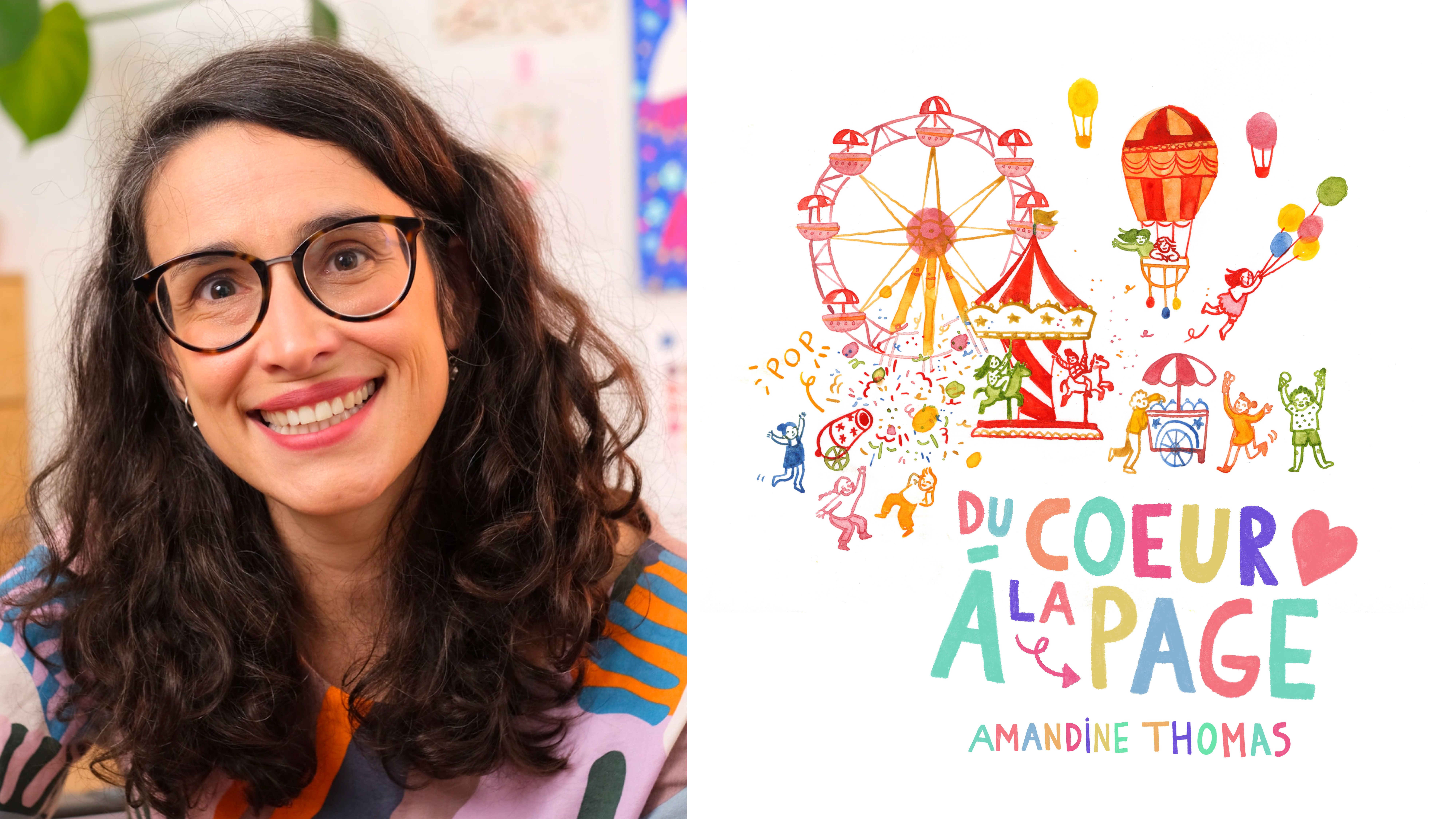
is told for images. I'm Amandine Thomas. When I was four years old, I announced to my entire
family that I was going to become a children's
book illustrator. Well, a few years later, nothing has really changed. I'm an award winning
children's books author and illustrator. What I like most about my
work is telling stories that are good for the
planet and for its people. To tell any good story, there is, in my opinion, one essential ingredient, and that's the
palette of emotions. From anger to joy to melancholy, emotions can influence
our actions, our relationships, our beliefs. They can reconcile
us or divide us, inspire us or disheartened us. That's why you can find
them in all of our stories, from Greek mythology
to Disney movies. In this class, I
will share with you all my tips and tricks to
master the palette of emotions and explore its amazing
potential in your illustrations. Through each lesson,
you will learn how to harness the
emotional power of colors, how to compose an image
to evoke emotion, and how to use a
well-chosen visual metaphor to tell your story. We'll also talk about
how to use emotions as a powerful connection tool whether it be in
children's books, magazines, or commercial
illustration. By the end of the class,
you'll be able to apply all this
knowledge to your work whether you are budding
illustrator or a seasoned pro. With detailed but
non-prescriptive demonstrations and a clear and easy
to follow method, you will have all the
tools you need to complete your project and create an original illustration
that will capture the emotion of your
choice, in your own style. All you need to
do to get started is to gather your
favorite tools, whether it be your iPad, your colored pencils,
or your gouache. Don't worry, although
drawing skills always come in handy, the concepts we'll
cover in this class are accessible to everyone. That being said, if you want
to get some inspiration and boost your confidence
before we start, don't hesitate to check
out my other classes. In the meantime, let's
move on to the next lesson where we'll cover the
project in more detail. See you there.
2. Project: Are you ready to hear
about the project? In this class, I will
help you choose, interpret, and illustrate
the emotion of your choice. You will learn how to
use colors, composition, and symbols as a way to better communicate emotions
in your illustrations, but also how to tell stories and convey compelling
messages for engaging and impactful images. Because
emotions create reactions. For example, there are
many stories out there that would have way
less of an impact without the strong emotions that move the plot forward. I'm part of the generation that was a little
bit traumatized by the death of Mufasa
in The Lion King. It's a scene that, of course, creates anger and sadness, but it also brings
us closer to Simba. In Romeo and Juliet,
it's the opposite. The joyful young love at
the beginning of the play only serves to accentuate
the tragedy at the end. It's thanks to these
strong emotions that we get to embark
on many adventures and travel alongside
their characters. Of course, there are many
emotions to explore, but in this particular class, we'll focus on three
fundamental ones: joy and its variations
like optimism, cheerfulness, euphoria. Fear and its nuances
from shyness to terror, and sadness with its subtleties such as melancholia or grief. Each of these emotions
will be explored in depth with three
demonstrations. From color theories to the
basics of composition, you will have all the tools you need to create an original, meaningful illustration,
in your own style. What do we need to get started? Personally, I'm going to use my favorite tools:
watercolors, brushes, a simple Sergent Major
Nib on Bristol paper. For my sketches, I also have
a basic mechanical pencil, an eraser, and my sketchbook. Of course, feel free to use
your own favorite tools, since the method and the
principles in this class can be adapted to any
style of illustration. Once you've applied
the skills taught in this class to your project, you'll be able to use
my method to translate a whole range of emotions
in your illustrations, whether it'd be in children's
books, in magazine, or for a client with
a specific vision. Finally, in the Resources
section of the class, you'll have access to
worksheets that will recap all the key points
from the class: choosing your color scheme, composing your image, adding key elements to
better tell your story, all the essentials to
create your illustration. Of course, once you've
completed your project, feel free to share it
in the project gallery. I can't wait to see
what you create but for now, let's dive in with the main tools
in your toolbox, colors, composition,
and symbols.
3. Colours, Composition, and Symbols: Before we start, you
might be wondering, what is the palette of emotions? Well, in the '70s, American researcher
Paul Ekman identified six universal emotions
that supposedly could be recognized even by the
most isolated populations. These six emotions where joy, sadness, disgust, anger,
fear, and surprise. Since then the theory has
been revisited and developed by many other researchers who went on to create their
own version of the theory. Some of them adapting it to include more nuanced
emotions. But everyone tends to agree that there are at least
five base emotions; Joy, fear, sadness,
disgust, and anger, each with their own variations, which is by the way, the basis of the
movie inside out. And these key emotions are central
to telling any good story. Not only do they move
the plot forward by giving meaning to the
character and their journey, but they also encourage
empathy by allowing the reader to identify with the character
and their experiences. Finally, they help convey
strong and impactful messages. Think of moral
stories like the boy who cried wolf, for example. So now that we've established
the importance of the palette of emotions
to tell a good story, we'll explore different
ways to illustrate it. First with colors, then
composition and symbols. Of course, there are other
more or less effective tools, but mastering these
three will be a really good start, trust me. Let's jump in with colors, a real goldmine when it comes
to communicating emotion. You've probably already
seen in color wheel, which is a chart showing
the relationships between colors. Without going
into too much details, the colors on the right
of the wheel are called warm colors and
their evoke passion, energy, excitement, but
also anger or hostility. The colors on the left of the wheel are
called cool colors, and they're often described
as calm and serene. Although they can
also evoke feelings of sadness or indifference. These warm and cool
colors actually have a physiological effect on us since they're able to increase or slow down our heart rate. No wonder then that they're so useful to evoke
a whole range of emotions. In fact, they have even
entered our vocabulary. You can be green with envy, you can see red with anger. You can have the blues. That being said, no color is 100 percent positive
or negative. For example, blue can represent both tranquility and sorrow. Red can evoke love and anger. Orange can mean energy, but also a danger, etc. Different color
combinations can also communicate different emotions, for example, the
contrast between cool and warm colors evokes activity, agitation. Vibrant
primary colors will communicate fun,
excitement, energy. Pastel colors evoke softness, while dull colors can be
boring or depressing. Of course, we don't
have to stick with these established codes, as we'll see in the
demonstrations later. But these associations are
so ingrained in our minds that they give color of
real emotional impact. After color, another really
effective tool to communicate emotions is composition. In
photography, for example, it's a well-known fact that
the way we build our images, their structure, can have a huge impact on what
they communicate. Well, it's the
same in illustration. Composition and perspective
will influence the way we react to an image and define its rhythm
or its atmosphere. For example, we as humans, are naturally
attracted to symmetry. A symmetrical composition will evoke harmony,
balance, pleasure, while an asymmetrical,
overloaded or unbalanced composition will produce a
feeling of chaos or disorder. We can also use the
guiding lines of an image to convey a feeling
of openness, of lightness or on the contrary of
confinement and oppression. We can also vary the
framing to evoke freedom, spaciousness, or rather
imprisonment or anxiety. Of course, we can utilize the relationships between the different
elements in an image. Close or distant, small
or large, equal or not. This will help the reader
position themselves in the image and appeal to
their capacity for empathy, which of course is
really important when trying to tell a story. The third tool we're going to discuss in this
class is symbols, or what I like to call
visual metaphors. What does that mean? In any image, one or
more elements can be used to represent
an abstract idea. These elements become
visual metaphor for that particular idea. The symbolic meaning could
be embodied by an object, a person, an action,
even a place. Of course, if you want to evoke a strong emotion for your images, you can use the
common symbols that are already associated with it. For example, a heart for love, a rainbow for happiness,
rain for sadness. These are almost universal
emotional symbols that we all share
unconsciously. But we could also
choose less obvious visual metaphors, for example, joy can be represented by that feeling of lightness
of taking flight. So drawing hot air balloons, confetti or birds can also evoke that emotion in a more
subtle, less cliched way. Of course, we can use
our own metaphors based on our experiences
and the associations we have built ourselves. This will allow us to evoke emotion without
being too literal and create a more meaningful,
original illustration. Of course, we're
going to go into more detail on all
of these tools in the next few lessons with in-depth demonstrations
for each emotion. Before we get started, you might be wondering
which emotion to choose for your illustration. In this class, I will use joy, fear, and sadness for
my demonstrations. You can choose to illustrate
one of these three emotions, or you can apply my method to
the emotion of your choice. If you want to go for anger, melancholy, or terror,
please go for it. If you just can't decide, you can ask yourself the
following questions; What is the message you want
to convey with your image? Is there a story
you want to tell? If so, what is the
dominant emotion behind this message or story? For example, if you want to
illustrate for children, you can try and think about recurring moments in
many children's stories. For example, do you
want to illustrate they lived happily ever after? Or would you prefer to
focus on the big bad wolf? Personally, I chose
to illustrate joy with a bit of
a chaotic scene, with a lot of
energy, excitement, and a sense of euphoria. For fear, I picked a classic,
a night in the forest, just the right amount
of fright and mystery. For sadness, I
chose to represent a lonely scene with a touch
of turmoil and melancholy. But I'll tell you more
in the next lesson where we'll start
working on joy. See you soon.
4. Demonstration: Joy: All right. In the
next three lessons, I'll be sharing my method for creating an
illustration in general and how I go about translating emotions into images
through color, compositions, and symbols. Even if you're only going to illustrate one emotion
in this class, I still encourage you to
watch all the demonstrations, only because I share
different tips and tricks in each video. I'm going to start with joy, an emotion that is central
in many children's books, usually either at the
beginning of a story before the drama or at the end
once the adventure is over. For this particular
illustration, I want to illustrate the
scene that you might find at the beginning of a story
before going on an adventure. Everyone is happy,
running around, there is excitement,
color, movement. I want to capture some
exuberant childish joy. Now, whatever emotion
you choose to represent, I really encourage you to start by setting your intention. To do that, you can ask yourself
the following questions. Who is feeling this emotion? In my case, it's a
group of children. Why are they feeling it? Here, they are
completely free to do whatever they want
without adults around. Where do they feel it? In my case, it will be at
this colorful fair. For these demos, I'll be using
watercolors with a brush, but also with my
sergeant major nib. It's my favorite technique, and it's actually
the one I use in almost all of my illustrations. However, I encourage you to pick a technique that suits you. The principles in
this class can be applied with any
tool or technique. Don't go for watercolors if
it's just not your thing. Whatever technique you choose, we'll start by creating
a color scheme. Of course, for joy, we
immediately think of yellow, but also other warm colors
like orange or gold. These are warm,
vivid, dynamic colors that evoke light and the sun. But don't feel like
you have to follow any pre-established codes. I like to use bright
colors like pink, electric blue, or bright green. With these colors, I can create a feeling of
fun, of unbridled happiness that can be exploited
to evoke joy. Here are the colors
I plan to use. Red, yellow, and orange as dominant colors and
touches of pink, blue, and bright green
as secondary colors. It's a palette that's fresh
with a lot of energy, just like the scene I'm
trying to represent. Once I have my colors, I always start by
creating a mini sketch, very quick, very simple, which allows me to work
out my composition. Here, I really want to
focus on abundance, which is very often
associated with joy. We celebrate happy moments with an abundance of friends,
family, food, gifts, so I'm going to have
lots of little elements all over the place
to give energy and movement to my composition. Joy is also often associated
with a feeling of lightness, as we saw in the
previous lesson. I'm going to favor an
open, breathy composition with elements that are going to take flight, to lead us up. For the same reason, I'll also make sure I keep
some white around the page to avoid weighing my image
down and to keep it light. Once I have my little sketch, I like to create
a color vignette, which will guide the
overall mood of my image. This is something I
do with all my books, it's really part of my process, and it helps me define the atmosphere of each illustration a
little bit better, which is especially important when you want to evoke emotion. Once again, I don't go
into too much detail, the vignette is really just a quick way to test
my palette before I start. It's allowing me to check how
my colors are interacting, whether I want to use
watercolor washes, versus line drawing. Here, I think line
drawing is better to represent joy and exuberance. It's just that little bit
more lively and dynamic. Once I have my mini
sketch and my vignette, I'm ready to jump into my final illustration
with clear intentions. I like to start my
illustration by tracing the different elements of my composition very
lightly with a pencil. The idea is to structure the
page a bit before I start. Sometimes I even
just draw shapes to delimit the space a
little bit, but that's all. Now I'm jumping in with my nib. As we saw in the vignette, I want to use color
in a dynamic way without losing all the nuances
that watercolor brings. The nib is just
the perfect tool. Plus it allows me to
work on lots of small, very fine details with
lively, animated strokes. Now in the previous lesson, we talked a lot about symbolism. I think many of us have
happy childhood memories associated with a
summer fair or a carnival. We get to eat ice cream, we go on rides, there's
color, movement... I'm going to use this
positive association in my illustration to reinforce the message I'm
trying to convey. Of course, what better way
to suggest joy than by using the expressions and body
language of my characters? Lots of smiles, jumping, clapping hands, running around. Again, I wanted to
capture an exuberant, slightly unbridled energy here. I'm also going to use the
association we mentioned before between euphoria and
flying or floating, with more or less obvious
visual metaphors. Here we have a confetti cannon that explodes with
lots of color, we also have a Ferris wheel that gives us a bird eye
view of the whole scene, and then of course,
the hot air balloons to not only pull the
composition upwards, but also to allow the characters
to literally fly away, like their feet are not even
touching the ground anymore. Oh quickly, another thing I like to do in my illustrations is to create mini scenes
within the main scene. Behind each of my characters, there is a little story that
will enrich the message I'm trying to convey. Here you can see the
kids have detonated the confetti cannon and they
are just having a blast. You may also have noticed
that thanks to the nib, my style has a bit
more visual impact than soft washes
or a mellow line. On the other hand, if I wanted to represent a
more tender, delicate joy, I could dilute my colors
or go into pastels. But for this scene, which is full of energy, I want to use pure colors,
straight into the nib. If you use other tools, the same principle also applies. You could vary the pressure when you draw to have a
softer or harsher stroke, you could have assertive
or flowing movements, your textures could be
more or less graphic, all of this will have
an impact on the colors and on the emotions
they will convey. To finish with
this illustration, I'm adding a bunch of balloons that will carry one of my
characters up and away, a last little nod to joy, which can sometimes
give us wings. These small details
will also give the image a touch of fantasy, a little bit of magic, which works really well in the context of
children's literature, where almost everything
is possible, even taking flight with
a bunch of balloons. Another advantage of
having my vignette and my sketch
prepared in advance is that I know when my
illustration is finished. Because otherwise one
of the risks here is to keep adding details,
colors, textures, etc. This could not only
muddle your story, but also make the
image look heavy and sometimes even
just plain ruin it. I'm going to stop here
before going too far and finish by erasing my sketch. Because if you know me, you know I could go on
embellishing for hours. Here it is my final
illustration for joy. If you decide to
illustrate joy as well, whether it'd be the sweet and tender bliss
of hugging a baby, or the simple pleasure of
drinking a great cup of tea, I can't wait to see what you come up with
in the project gallery. If you prefer to
illustrate fear, then I'll see you
in the next lesson.
5. Demonstration: Fear: [MUSIC] Ready to
illustrate fear? In this lesson, I'm
going to go through the same steps as
the joy's demo. First, we're going to
pick our color palette, then we're going to
work on our mini sketch before moving on to our color vignette and then obviously our
final illustration. Of course, fear is
an emotion that's prominent in many
classic stories. It's fear that's going to make a story exciting and without it, there can't really
be any adventures. For this image, I
decided to stick with the classics with a chilly
night in the forest. Obviously, the forest has its
own mysterious symbolism, which is really present in
mythology or in fairy tales. Then, the night, which has always been associated with danger and the unknown. By associating the
forest at night, we have the perfect
recipe for a good fright. For example, it's
in the forest that Snow White is pursued
by the hunter, Hansel and Gretel meet a witch, Little Thumbling
escapes from an ogre, Little Red Riding
Hood from the wolf. My intention is to recreate
that particular atmosphere. Starting with the color scheme. With fear, we immediately
think of black, the color of the unknown, the absence of light, the night where monsters
could easily hide. There's also that touch
of mystery, of danger, of adventure that we can
find in many stories. For this illustration,
I'm going to use an almost-black green. Knowing that in watercolor
traditionally we don't use either
black or pure white, so you have to create
your own black with the colors
at your disposal. Here I'm mixing a sea green with Jane's grey and a
touch of burnt orange, which will give me a
beautiful colored black. Beyond black, we can
include other dark colors, a very deep purple, for example, which can
be contrasted with warmer colors like
yellow or red. Of course, for a different
scene, for example, the creepy laboratory
of a mad scientist, we would pick different colors, like a fluorescent green, an aggressive yellow,
a metallic gray. It's important to remember
that the color palette is an essential element of the
story we're trying to tell. For this particular scheme, I'll be using a deep
blue, some purple, my colored black of course
and to contrast it all, I'll be adding a touch of
yellow and some bright orange. Once I have my scheme, I'm moving on to my sketch. Here, unlike the
composition I used for joy, I'm going to be using enclosing,
oppressive guidelines. I want the reader to feel
a little uncomfortable. Even the moon hangs heavy and the trees are coming
in to choke the image. There are also these
small evil eyes scattered all around the tent,
creepily watching. The composition will be
supported by the use of color, as we'll see with the vignette. I know that some artists
like to jump right into the illustration
without actually going through these
research phases. Before working in publishing, I actually used to do the same. I liked to see the illustration emerge by itself in a way, but having sketches and vignettes
to present to an editor or client is really helpful. It's going to allow you to share your vision and give
the other person the opportunity to come in and improve on your original ideas. I find this collaborative
process particularly positive when I'm
working on a book with my publisher, for example. For this image, I'm going
to make full use of the textures that
watercolor is famous for. I want to leave a little
more room for imagination and therefore keep the
details blurry, nebulous, except for some key elements
like the tent for example, which is not quite swallowed up by the night and its mysteries, and which will serve as a
beacon in the illustration. On the other hand,
I want the trees to become a dark, mysterious shape. I'm going to use my
brushes to evoke threatening shadows that
can't really be identified. By the way, here
you can really see the green tint I
gave to my black, which is perfect for the trees, and which will darken as
I add layers of color. In the end, the only
elements we'll be able to see clearly
in the forest are the yellow and
orange eyes that are reflecting the light
from the tent. The rest is fully left
to the imagination. Here is my vignette. Once the vignette and the
mini sketch are done, we can move on to the
final illustration, starting by placing our elements slightly on the
page with a pencil. Let's go for it. I'm going to
start with the little tent, this fragile shelter
against the night. That light in the dark is another very strong
universal symbol. It represents hope, and security
in a hostile environment. Naturally, the reader
will feel like they can relate with the
people in the tent, even if they don't see them. They might want to warn
them or to protect them and this is where the empathy we talked about earlier
in the class comes in. That's how readers invest
themselves in the story. By identifying with the
people in the tent, the reader is also
going to feel observed surrounded by hidden
unknown creatures and their shiny eyes. Of course, it's way
more frightening to reveal only parts of what's
hidden in the forest, rather than illustrating a
literal monster, for example. That's how we give more
power to the imagination, which is extremely potent
when associated with fear. It also allows the threat to be slightly different
for each reader. Then we have the full moon, which in this context
is also associated with werewolves, magic, witches. It's at full moon that a lot
of strange things happen, like the appearance of these
creatures we just discussed. Just a quick note here, you may have noticed
that I'm using more traditional watercolor
techniques here, like wet on wet. This will create the kind of textures I'm looking
for in this image. I'm working directly with a
brush on my Bristol paper, which will give me a
very fluid effect. It's not very common to work with watercolor
on Bristol paper, but I like to have
flowy, luminous washes. The way the water
reacts on the Bristol will give me the
effect I'm after. To come back to symbols, we have already talked about
the forest and the night, which have universal
associations. Think of fairy tales, Lord of the Rings, Princess Mononoke, etc. In terms of visual metaphor, we are on very rich ground, very fertile in our
collective imagination. That's why I'm giving
the forest and the night the
starring role here. As we saw in the sketch, I want the trees to dominate, to almost crash the tent. They will also be
silhouetted against the sky, which will emphasize the main closing
guidelines in the image. Unlike the previous
illustration, I'm leaving no margins at all, no white to breathe, just the moon and the
snow shining in the dark. I love to go back to the
nib before finishing an image to add the final
details like here in the trees, it will give more texture to my illustration and
refine it a little bit. You will remember that since I planned before starting
my illustration, I know when to stop before
I go too far in my big creative flaw, embellishment,
but I'm working on it. Before finalizing
my illustration, I want to work on
color a bit more, since the mood here
is really important. To make these subtle changes without starting from scratch, Photoshop is a great tool. I often work on only two
layers of adjustment, the levels, and the vibrancy. Usually, with the levels, I just bring the black-and-white slider back to the edge of the histogram and I bring
the vibrancy up to 20. That's enough and it's much
more subtle than saturation, for example,
especially when you're working with an
analog illustration. All of this will
be enough to give a little bit more depth
and richness to my colors. That's it for fear. Remember, if you do decide
to illustrate fear, I encourage you to share not only your final illustration but also the process behind it, the mini sketches, the
color vignettes, all of it. In the meantime,
I will see you in the next lesson with
the final demo, sadness. See you there.
6. Demonstration: Sadness: Here comes out last
demo; sadness. Once again, we're going
to be moving through the same steps, same method. First the color scheme, then our mini sketch, then our color vignette, and then finally the
actual illustration. But I'm sure that by now you're very familiar with all of these, so I will be moving a little
bit faster in this lesson. I'm sure that you're aware
that sadness is also a very important emotion
in many stories. Often, the narration will even
start with a sad event, to better accentuate the positive
trajectory of the heroes. For this image, I want to
focus on my character herself without adding too many
details in the background. I want to create a bit
more of an introspective, emotive image without
unnecessary bits and bobs. We'll have this one
character alone, tormented, depressed in the
rain, the whole lot. I know it sounds cliche, but sometimes cliches do work. Just think about the number
of rainy scenes in movies. Now that I've set my intention, I'll get my watercolors,
my nib, and my brushes, and I'll start by
creating my color scheme. Obviously, they are very
strong associations between cool colors and sadness. Blue in particular and all its nuances
will evoke loneliness, indifference, but also
promote introspection. That being said, we can
also represent sadness by using dull washes
out grey-ish colors, which will symbolize loss,
mourning, or depression. For this image, I'm going to use an almost monochromatic
scheme with green, blue, and gray tones, not only to capture the
mood of a rainy day, but also to evoke loneliness, melancholy, and a
touch of a stormy mood. To do this, I will use a
limited number of colors which I will mix together
to create all my hues. This will allow me to
get a harmonious palette without getting too boring. Here I am mixing
turquoise, Jane grey, and ultramarine blue, to
create a water green, a colored gray and
two shades of blue. A dull and washed
out one and a much richer and brighter one to
bring depth to the scheme. For my sketch, I want to keep the composition as simple
and uncluttered as possible. The few elements I'll have on the page will be a
little unbalanced, a little chaotic, to evoke
turmoil or upheaval. A simple composition will also really focus the
attention on my character and reinforce the impression
of solitude, of isolation. I will also position her
at the bottom of the page to create a sense of
weight, of pressure. Once again, with
my color vignette, I'm aiming to support
the composition. The feeling of turmoil, of
pressure will be accentuated by sinister blues and grays, to add weightiness to the image. The texture of the
watercolor will play the same role with a
tumultuous, chaotic feel, which of course reflects the
inner thoughts of my character. For this part, I want
to favor the abstract; let the colors mix a little
randomly to create a more natural, organic cloud. On the other hand, I
would like to give my character as
somewhat fragile feel. She's alone at the
mercy of the elements, so I will draw her with my
nib and give her an ethereal, frail look that will
contrast with the cloud. I'm also using the
nib for the rain, which is fine and delicate, yet a little aggressive, almost stabbing at my character. I'm done with my
vignette and my sketch so I can move on to the
final illustration. I'll start once again
by roughly placing my elements on the
page with my pencil. Then I'm going to tackle
my big dark cloud, which of course is a very
powerful symbol for sadness. The clouds usually announce
bad weather, bad news, and they also constantly
change shape and color, which helps reflect the inner
turmoil of my character, her grief, maybe not
fully processed, for example, after a loss. Plus mourning is actually the starting point
of many stories. Think of all those orphaned
heroes for examples. You will also notice
that for these clouds, I'm using wet on wet
techniques again, to create interesting textures. I'm also using my
colors a bit randomly and really letting the
watercolor do its thing without worrying too
much about the result. This technique lends itself
very well to a stormy sky. What we end up with
is a very delicate, sensitive emotional effect, which of course is
perfect for sadness. Then it's time to focus
on the character. Just like with joy, the expression and the
position of the character will play an important
role to evoke emotion. You could have exactly
the same image, but communicate a completely
different feeling just by varying her
position and expression. She could be determined and powerful, braving
the elements. She could be happy and full
of life dancing in the rain. But here she's hunched over,
dejected, demoralized. I'm going to try to
capture that feeling with my nib in a few simple strokes. I don't want to do too much and fall into caricature here, so I'm trying to be as
sensitive as possible, with a slightly poetic vibe. Line drawing to me is the
perfect technique for this particular purpose and to represent
emotions in general. Even for the face, which is
kind of a canvas for our emotion, I want to keep my strokes
refined, delicate. No need to overdo it. I'd rather barely
hint at the nose and the eyes and
rely on the rain an the storm to express the character's feelings in
a more demonstrative way, because, of course,
the symbolism behind the storm is very strong. We associate rain with tears and storms
with inner turmoil. Once again, you only have to think about the number of scenes in Hollywood movies that
take place in the rain. Not only does it add drama, but it also reflects
an accentuates the character's emotions. Funeral scene: rain,
heartbreaking goodbye: rain, shocking revelation, you guessed it: rain. Now I could keep adding
rain, puddles and clouds, but my original
intention was to keep the composition simple
and uncluttered, so I'll stop here. That's it; my
illustration for sadness. I do hope that these
three demonstrations have been helpful and that
you're coming away from it with plenty of new ideas on how to capture emotions
in your illustrations. Now of course, in
the next lesson, I'll recap all the key
points from the class and I'll give you some
tips and tricks on how to take the palette of
emotions to the next level, whether it be in children's
books, magazines, or in commercial illustrations. See you in the next
and last lesson.
7. Where to Now?: Congratulations, you've
completed this class. I do hope that it has helped you better understand and master the amazing potential of the palette of emotions
in illustration. Now, in this lesson, we're going to recap
the key points from the class and we're
going to explore some ways you can apply all this knowledge
to children's books, magazines, commercial
illustrations and wherever else you
want to tell stories. First of all, we have seen how important emotions are
to: move the story forward, by giving meaning to the
characters and their journey, encourage empathy by
allowing the readers to identify with the characters
and their experiences, and convey strong and
impactful messages. Now, to better harness
the power of emotions, we can use colors,
which are so connected to our state of mind that they have an impact
on our heart rate. We've seen that with
a well-chosen scheme, we can harness the
emotional power of emotion in a very effective way. Composition, which allows us to define the
atmosphere of an image and promote empathy by putting the reader in the
character's shoes. Thanks to composition, they can feel trapped
or liberated, strong or weak, heavy or light. Symbols, or what I call visual metaphors, which dig into our
collective imagination to evoke strong emotions. Whether we use cliches
or subtle metaphors, symbols can get strong
messages across without actually having
to say too much. With these new tools
in your toolbox, how can you take your
illustrations to the next level and exploit the amazing power of emotions in your
professional work? We've established
that emotions are key to connect with your reader, but this is even true
of a younger audience. This means that if you want to illustrate a children's book, whether you're the author
of the story or not, you will have to translate
emotions into images. A sad beginning with
an orphaned hero, a scary scene with a big bad wolf, or a happily ever after ending, these images will be essential to engage a younger reader. Being able to create meaningful, expressive illustrations is a big advantage as
an illustrator. Including an image like the one we just created
in your portfolio will show a publisher
that you can illustrate a story
in a sensitive, thoughtful, and effective way. Of course, it's exactly the same when working on
editorial illustrations. Whether you're
illustrating for an adult or a kid's magazine, your job is also
to tell a story. It may be a shorter one and you might only have
one image to tell it, but it is still in fact a story and often it will
have a super strong, powerful message behind it. To communicate that message, you will more often than not
have to rely on emotions. It's that strong
emotional impact that will hold the
reader's attention, that will challenge
them or move them, and ultimately will allow you to establish a connection quickly. Once again, including in
your portfolio illustrations that will show that
you can convey emotions loud and clear will prove to an
art director that they can trust you to
create meaningful, thought-provoking illustrations. Finally, more and more
brands today are relying on storytelling to
communicate about themselves or their values. The aim, of course, is to catch the attention
of the consumer, and a good way to do this is, you guessed it, emotions. Illustration can be a very
effective communication and storytelling tool
for these brands to embody a particular emotion. It could be unbridled,
childlike joy, a spirit of inclusion
and collaboration, or a feeling of well-being. Capturing these emotions in your illustrations
is a great way to make your portfolio stand out for these potential clients. In conclusion, I really
encourage you to work on highlighting emotions
in your illustrations, and to include in your portfolio images that are going to have that super strong
emotional impact, no matter who you want to work for or what medium
you're working with. This will help you better
respond to a brief, whether it's from a publishing
house, an art director, or a client, better tell
stories or get messages across, and create more
impactful images. Before you go prospecting with your brand new illustrations, don't forget to share them in the project
gallery of the class. I'm really looking
forward to seeing how you interpreted emotions
in your illustrations and the process behind
your graphic choices. If you want to see
more from my work, don't hesitate to follow
me on social media and on Skillshare and
check out my website. In the meantime, thank you so
much for taking this class and congratulations again
for completing your project. I hope that this will be
helpful in the future and I'll see you soon.
 Amandine Thomas, Award-winning illustrator