Transcripts
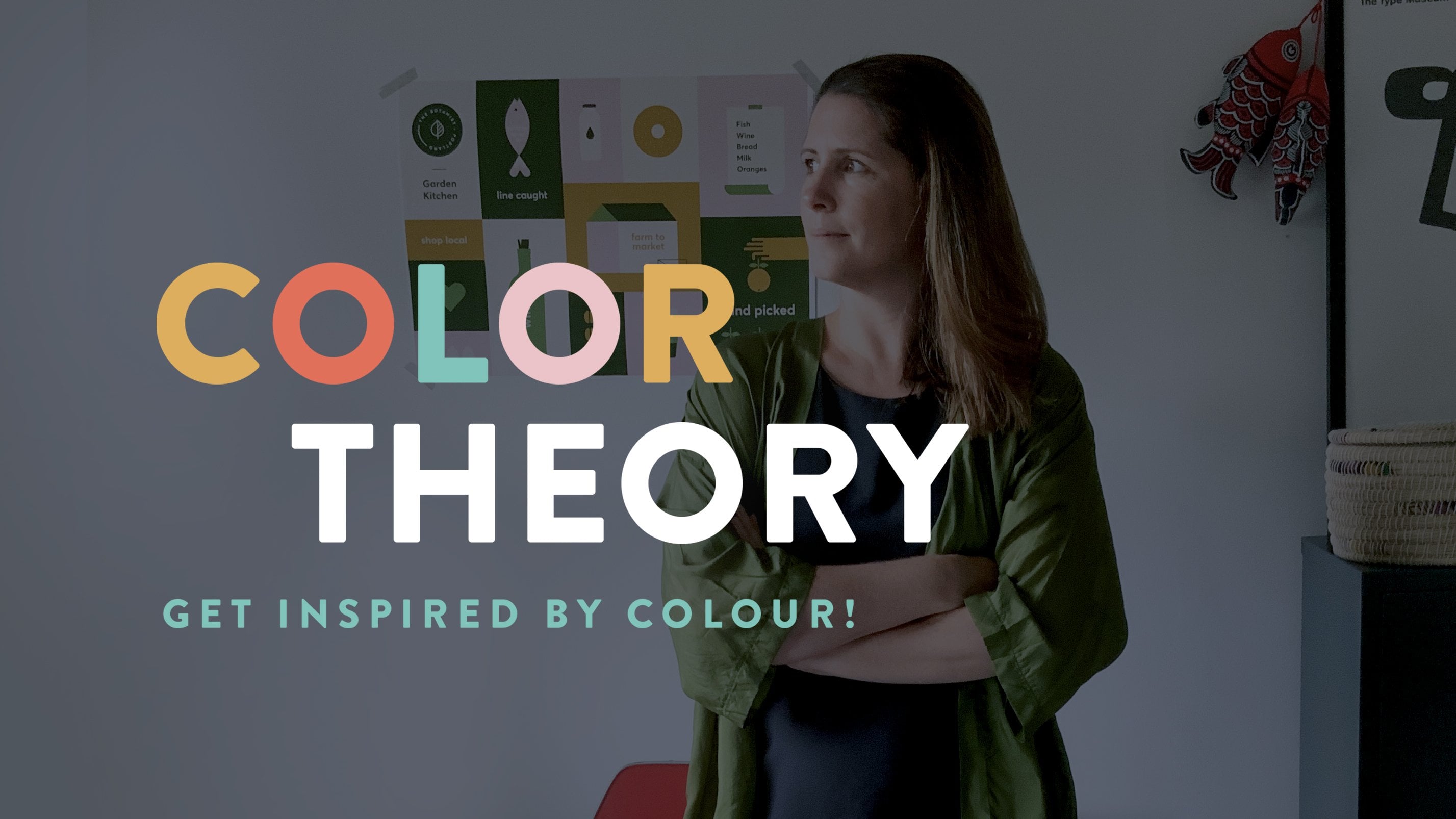
1. Things Organised Neatly: Introduction: Hey, everyone and welcome to things organized neatly learn design principles and the essentials of Victor Drawing and illustrator I Love Adobe Illustrator. It's definitely my second home and the program I spend the most time in as a graphic designer. The skills you learn in this class are essential and creating unique icons, illustrations and s. It's for your projects. No pinto required. I created this class to help beginner designers see how easy it can be to create a beautiful composition of elements, working only with the basic shapes in the Pathfinder. Cal it as well as the design principles off balance. How Iraqi alignment. In contrast, sometimes you just need a little project to follow along with to practice and hone your skills. We will work through some research and a bit of theory to help you understand why you're making certain choices in your design. You'll choose a theme that could be the items on your shopping list. Your favorite biscuits, fert. Anything you like, really, the challenge will be to reduce those items to this simplest form. We will work with minimal colors in a petting swatch to fill the drawings with the final output being all your illustrated elements organized neatly in a square composition perfect for sharing on instagram. I love seeing what my students create, so please share your projects or let me know if it's anything you're having trouble with, and I'll do my best to help join me in Illustrator and Let's get Started.
2. Research: welcome to check to one research a very important part of any design project. This phase is we get to explore your subject matter. First up is to make a decision on the theme or the elements you want to draw for this class . We're reducing those items to this simplest form. So when collecting your images, try and get a few angles top down, side on front on It's not a sin show that playing with angles can be quite fun. Think simple, inflect some items you'll be able to draw straight from your head, and some will be more complex. So it's good to have plenty of reference. I've decided to draw the items on my shopping list. I'm going to jump into Google now and search for my first images and collect them into a folder. Did about six or seven items more than you think as well need to play around a little to get them footing to give her. So it's nice to have some options. So first of all, I'm gonna go for my coffee cat. Ah, and I'm gonna go to images, and I think I quite like this sort of take away style cap or like a keep cap. So I'm just looking for that nice sort of lead shapes, and it was quite a good one. So I've created a folder called Research. You can do the Same, and I'm starting to just save those images into the I quite like the size of this one. So I'm going to right click, save image and call that coffee take away and it's safe. Next up, I'm gonna look for my wine bottle. I think I might get a rid and a white shaped bottle. Well, that's quite interesting. I love that little shaking there, so it's quite cool when you're doing your research cause you start Teoh, find things that you might not necessarily draw out of your hit. So when you actually start to look at this wine bottle and see the shapes within as so, it's really good idea to do your research face. Always. It's Uncle Night watch wine. Quite nice to see how the label, um, so split, so that's quite common on red wines. So again, these kind of really simple shapes that help describe an object and then I need to get some eggs in the line of the brown ones Much I am. So that's quite a nice EEG shape. Sort of it. Quite classic Egli. And it's more of a classic egg shaped. We've got this sort of slightly weightier bottom. Yes, I'm gonna save it. Bronek. That was pretty good. One, too. Shape place. Now, I guess I could look at the inside of the need as an option. Who? Maybe I just type in the eggs. Um, So you like this kind of thing? We see half the EEG could be quite sweet as an option. So what you can do now is jump onto Google, grab sexless, even items with research. And then I'll see you over in the next video, and we'll stop sitting out now. File season.
3. File Setup: Hey, everyone, and welcome to check to to where we learn about Adobe Illustrator's essential drawing tools . You should have Adobe Illustrator open Now I want to make sure that everyone is working in the same workspace. So if you could or got to window works nice and we're going to go to essentials. If you've already got that selected, you'll be able to go to reset essentials. Eso you can see mind hasn't recieved for some reason. So I'm just gonna pop up and just do that reset essentials and you see everything tax beckoned nicely so you can see from here there's not much on display. We've got our toolbar down the side here, and we've got our properties layers in libraries. But what we need for doing our basic drawing and illustrator, we can get down from our windows. So if you click on window and we're gonna go all the way down to Pathfinder, I made up, and what comes with Pathfinder is also you're lying, which is really important. We know drawing to be upto a line and distribute your objects, and what we might do now is save that workspace so you can go to your workspace and we can create a new workspace from there. I'm gonna call this scoring. You seem chills and OK and you can see at the top here and also within my workspace that I've created drawing essentials now. So that's quite, um, handy if you like to work with your palates in particular places. So that's a good one. So we are going to start a new file. So we're gonna go file and new, and we get this new document pain, and it may look a little bit scary, but don't worry too much. You can see at the top here all the different options or presets for print working and Prince. So you're a four tabloids. A three x Itera with that gives you your common web sizes. What we're going to do is create a square document that's gonna be perfect for sharing. L knew Illustration on instagram. So at the moment I'm working in pixels. We're going to create 18 80 by team 80 and obviously it doesn't matter about orientation, cause it's a square orientation. I'm not gonna worry about bleed because we're just going to export this at the end, is a Jay Peak and we don't need a bleed for going to digital. And here, if you don't have this, open this advanced options and see that little arrow. If you click on that, you've got the option here off changing your color mode. So currently, minds on RGB, which is perfect because I am going to export as a J pig to share on instagram, which is on a screen. So RGB is screen based color mode seem like a is for print. If you don't know much about color, I've gotta cover theory class out as well, which is really worthwhile doing. I'm not gonna worry about these other options here, and I'm simply going to hit create. So one of the best things to do once you've created a new file is to simply save it right away. So we're gonna go up to file and save, and I'm gonna call this my shopping list, and I'm gonna say that into the correct folder, and I'm gonna save it as an adobe illustrator file and I'm gonna hit save, and we're gonna leave this as the illustrated 2020 vision or whatever it is that you're working in and say, OK, now that you've got your file saved were actually going to duplicate or add another couple of outboards just to put out, um, different icons or images are so over here in your properties palate, you can see it. It outboards. If you click on that, you'll see that this becomes selected and it's got a name here at board one. So over on this properties pallet under at boards, you can simply add a new outboard, and it will add the same size outboard as the one that you have already or the last chosen one. You can then actually change that to any size that for us today, we're just going to add a couple off the same size at ports, so I'm happy now. Ella select the other way you can do that is by holding old Option and you'll see you'll get a double black and white arrow, and you can simply click and drag another outboard. So I've had a quite a few now,
4. The First Illustration: So the first item I'm going to draw is the orange. So I'm going to go file and place, and I'm going to grab the three oranges here half orange, orange and this very long winded name, and I'm going to simply place by clicking and dragging those oranges. And I'm gonna zoom in so you can use your zoom told the by pushing Z or just sitting it here or I'm on my mech using command and space bar and I can click in zone into my orange. So I'm really loving this one. Actually, I think this is the winner. I love the two leaves, and I can see how I can quickly easily simplify that. So I'm gonna just take that over to my board over here, and I'm gonna resize it by clicking and dragging bounding books. Now, it's quite, um, you can work in a couple of ways you can draw over the top oven image, or you can simply place it above and knowing that it's quite simple, you're going to create an ellipse or circle a stork. And in these two leaves, So we, um, understand, use mine after the side there, so First of all, I'm gonna introduce you to this. Uh, here is the rectangle tool. If you click on the hold, you'll see that there's some other options off very basic shapes. Underneath out the side Here is a little arrow. I'm just going to simply click on there and you'll see that it just pops those out so you don't have to keep going back. Um, so I want to go for the Ellipse tall. So I'm going to click on that, and I'm gonna come out onto my outboard. I'm gonna hold shift and then I'm going to click and drag. Now, you may or may not have those lines that you saw. Can you see them flicking around? Those are what we call our smart guides. So if you go up to view and you'll see here smart guides minds currently checked or checked on and you can see that the quickie for it is command you. Now. I love using smart guides, cause it's a really easy way of lining up your objects and your anchor points. And it's very easy to find the middle off a shape and things like that. But they can get annoying from time to time. So it's quite good to remember that quickie command you. So I'm going to keep that kicked on. So right away we have a circle. Now I'm just gonna commands it, which is to undo that. And I'm just going to talk about when you click and drag and you don't hold down shift. Your object will not necessarily be a perfect circle. When put the shift key down, it creates a perfectly constrained circle. Now I'm going to go up to window and I'm gonna get my swatches palette down so that I can just quickly Phil the circle with some color. It's not worried too much at this stage about what colors were popping in. You can keep them true to life if you like. By using the I drop it'll and you can simply slicked on books, your orange or anywhere on that to select a nice color. So now that I've got my circle drawn, I'm going to use that ellipse tall again and I'm gonna click and drag this time I'm going to draw a sort of overall shape. Now I'm going to zoom in and you'll see that you've got a bounding box here. If you select your direct selection tool, you'll see just the notes or the anchor points that creates the shape. So I just want you to simply click on one of those that sorry. Click on one of those and you'll see. You'll get these two handles, which won't create these curves. If you pull them out, you can see you can start to create some pretty interesting shapes. So I'm kind of getting pretty close to my egg shaped there already. So I'm just gonna commands the that because we're going to create our flower. So these nodes are currently all curves. These are called handles out the side, and you can move those handles to create interesting shapes. You can also convert these anchor points from curves to corner, and you can do that by selecting underneath the pin. Toll is the anchor point tool, so I'm going to simply click on the top and bottom of this, and I think I'm standing to get a really nice leaf shape. I'm going to just pull in the sides a little bit, zoom out, and I'm simply going to come out to the corner off my bounding box and I'm going to rotate . If I hold shift, it'll go in 45 degree increments and being going to use my eye, drop it'll and fill it with some color. So I've got a leaf. I mean, I can hold shift and created toe what size I would like next. We're going to create the little stork that sits in here, so I'm gonna choose the rectangle tool for that, and that works in the same way as the ellipse. If you hold shift, that will give you a perfect square for this exercise, though I want a nice long stalk. So I'm simply gonna liquor what might be nice. As if I round off the stork edge. Now, that's what's wonderful about Illustrator, as you can now select individual anchor points and create curves. So I'm gonna select my direct selection tour, which is a on my keyboard, or you can choose it from the toolbar and I'm gonna simply click and drag over those two anchor points and you'll see inside you get these little curves icons. If I pulled down now, you'll see that that will create a curve out of each of those corners so you could do it individually. Or you can do many together by selecting over and changing that curve by simply dragging. You can also enter end the pixel, which is great if you're trying to keep things consistent across all your illustrations. So I'm pretty happy with that. It could potentially be a little bit shorter. Uh, and I think instead of just one, I might create by sickened leave. So to do that, I'm simply holding down my old option and I get that double ero off black and white and then a click and duplicate, and you can see as I move over and getting these little Pinkel lines flashing that shows that I'm perfectly lined or intersected with their other nice I'm going to bring my orange on top because I don't want to have this little stork coming in here, although, and suppose it could be quite sweet. Um, but I'm gonna show you how to bring your orange or that ellipse to front so you can right click and arrange and you can see here bring to fund seemed to back. So we're gonna bring to front. So that's quite a lovely little orange. I might just add a small. Maybe I'll make that a dark green, a little orange there. So I'm going to group these elements to give up by simply clicking and dragging over the top of them and you got to object and group so they will now move as one complete object. Then I'm going to select over or off these items, and I want to align them to give us so that they're all seated because I'm not sure I've put this in a seated position. So I'm simply going to go over to my online palette and I'm going to horizontally a line to center, and it looks like everything's in the right place. I'll just show you how that works. It isn't so. I'm pretty happy with my orange. It's looking pretty cool. I'm just select over there now and just resize it, and I'm also going to group it so that war moves as one object. So I have my first item drawn. I have reduced the orange down to its simplest form without losing visual interest. I could choose to have no StoryCorps leaves, but it may not be as quick to recognize. I often think about what I would draw in a game of Pictionary. So what is the simplest and quickest way to communicate a particular objects form? This orange uses bilateral symmetry, or commonly known as reflected or married symmetry, where the object is the same on both sides, often excess like a butterfly. Symmetry is often found in nature, and as humans, we are drawn to its sense of balance and order. As you draw your items. You may use this principle a lot, but it pays to have one or two items which are not symmetrical to create some interest because we're putting lots of items together. There will be a certain amount of visual interest anyway, but once you start you arrangement, you can make those decisions.
5. The Pathfinder & Shape Modes: What I'd like to do now is get you to all follow along with drawing. Some shapes were going to draw a heart and then a fish. So we're going to look at the Pathfinder palette and a little more detail. I'm going to use my space bar, which gives me this little hand icon. Then I can simply click and drag to move around my outboards. It's a really easy way off moving around and zooming and by holding the command. Okay, so first of all, I'm going to draw a rectangle. I'm going to click and drag that rectangle, and it will fill with your previous color that you had selected. I'm gonna move back to my black selection tool. So that's your back to base. If you're ever in trouble, just click back onto that and then simply click off your icon or whatever it is that you've got selected. So I'm going to now move on to my white our and I'm going to click and drag over the top two nodes off that rectangle, and I'm simply going to go to the corner radius icon and I'm gonna click and drag till I get a beautiful art here. I'm now gonna move on to my black selection tool. I'm going to come out to the corner off my bounding box and I'm gonna simply click and you'll get this sort of act double ended. Arum, that means that you're now rotating that object. So I'm gonna hold shift and you can see that it's snips to 45 degree increments, which is great. So I only put that at 45 degrees. Now I want to copy and paste or duplicate this element. So if I hold down Olt option on my keyboard and then stopped to drag, I get a double white and black error. If I hold down shift, that's going to keep me in a perfect straight line. So I'm gonna release now, and you can see I've now got two of those objects. I'm just gonna fill one with a different color. I'm gonna come out to my bounding books again, holding down and dragging and then holding shift and you'll see that I can rotate in those 45 degree increments. Now, you should be starting to see that we're creating Ah, heart shaped here. Now, I'd like you to slicked over those objects and hip D on your keyboard. So D just takes you back to your default Phil and stroke here. I just thought it would be quite good if we were in that so you could see what was happening with our object. So at the moment, we've got one object sitting over the top off the other. So we're gonna have a look at this path, find a tour now with both of thes selected, click and drag over the top, and I'm simply going to show you what each of them do. So this one is unite so you can see that that's united both of those shapes together to become one path. So that's quite a complex path from very simple shapes. I'm just gonna come on me that now the next one is two minus front. So the object that is sitting over the top is going to punch through the object that sits on the bottom. So you're left with these two shapes where the front object has intersected. The next one is to intersect, so we'll be lift with. Were those two items into seek. So we're left with a diamond I'm just gonna commands it. I'm gonna skip this one for the moment, and I'm going to go down here to the Pathfinder. So divide is the one that we're going to use to create our heart. So I'm simply going to click on that, and you can see that these lines have drawn in throughout this heart. What we're going to do now is on group, because what that does is that young groups, all the elements that have been created by dividing those two objects. So I'm simply going to click on both of those objects by holding shift and delete them. And you can see I'm lift with my heart shape or outline. But I've still got this sort of line through the middle here. So I'm going to select over the top off all of those objects, and I'm going to use my unite option. Ah, hot. So simple. Drawing a rectangle, changing the radius off the top, rotating and duplicating and creating ah heart using the Pathfinder and shape modes. So simple. I'm going to now fill that with color. I'm gonna take off the stroke to none. What's so great about the Pathfinder is you can have a shape like this heart that with created and add more interest to it. So I'm simply going to select my line segment toe. I'm gonna draw a straight line by holding shift. I'm just going to give it a stroke off black. Now you can see at the moment it's not perfectly aligned, so I'm going to slick those objects by clicking and dragging over the top of thumb. Go to my align palette and I'm going to centrally align those horizontally thin. I'm going to use that. Divide a tall again, and you can see it's divided my heart and to her. Ah, then I can simply add another color. And I've created quite a visually interesting object and a few simple steps mixed up. I would like everyone to draw a fish again. We're going to be using our Pathfinder palette and basic shapes. If you were slightly more advanced than a beginner and you have an object you want to get started with, then go ahead and start drawing but is quite good to watch along at the same time and get some tips and tricks. So I just wanted to show you the research I collected for my fish before we start drawing it. The reason why I asked you to research quite a few examples as it helps you see what the recognizable aspects or common visual features are. You might also take ideas from several images and bring them to give it in your illustration. For example, I really like the shape off this body. I like the curve and almost heart shape off the tail, which I might exaggerate. And I think the open mouth and I will be quite important. I also got a few fish scale textures, which I might include for decoration. So let's get started. So I'm going to go to my lips tall. I'm going to simply draw out Lie my lips now, like the leaf I created earlier. I'm going to go to my pinto and I'm going to get that anchor point tool, and I'm simply going to convert my rounded anchor points or curved and points to corner points. Now I'm gonna go back to my black arrow, which is also V on your keyboard. So if you see me flicking back to it, I may well be pushing the on my keyboard and I'm just gonna bring that in a little bit. And I'm just going to resize as well. Okay, next I'm going to grab, uh, the stuh So if you click and drag you'll see that you've got a star You may not have the same amount of points is may I've got five. What you can do is without letting go. So if you've let go, you'll get your full star. If you click and drag and you don't let go and you use the up and down arrows on your keyboard, you can add and minus points on your star. If I hold shift, I can perfectly constrain my shape. So I've gone for a three sided star, which is a triangle, and I'm gonna release that now. And I'm just going to change the color to black. Now I'm gonna go out to my bounding box and I'm gonna hold shift and I'm gonna completely rotate that 1 80 degrees. Now, over here, you'll see on your properties palette that things are kind of moving around as you're you're doing things. So those air showing your exam, why excess so whereabouts? This triangle sits in relation to the outboard and also the width and height, which is eso how wide and how high that triangle ear's, but also the rotation off that. So you've got some options there. I'm going to go black, hop back onto my black arrow and I'm going to move that into place. Now, this is going to be the little mouth on my fish. So I'm going to select the body off my fish now, and I'm going to use the minus front option simple. Next, I'm going to create another circle, which will be the I off my fishy. You can just feel that with any color at the moment Now we're going to create the tail. I'm going to get the rectangle tool. I'm simply gonna click and drag and hold down shift to create a perfect square. I'm just gonna fill that with a color for the moment. Then I'm going to go to my selection tool, and I'm going to simply hold down, option and drag a second square. Currently, that square is sitting on top. I'll just change the color so you can see that and I'm going to punch through the dark green square through to the light green square, so minus the top, I'm going to rotate that 45 degrees, and I'm going to place it down here on my fish. Now, if you're using your smart guides, when you bring it close to your fish, you'll see that you start to get these flashes of purple that shows that you're you're in the middle or the complete alignment with the item about If I go command you, which has determined those smart guides off, you'll see that that doesn't necessarily happen, so it's a little bit harder to get that perfect. But obviously you do have your align palette here to make sure that you are perfectly aligned. Did you see that? Ah, whole object jumped. That's because I've got my aligned to sit to my art board so more. If they're not, you'd want it just a line to your selection. So I'm just going to command Z, and I go to change that toe a line to selection, and I'm going to align horizontally so you can see my little I also aligned, and I probably wanted off to the side a little bit, so I prefer to work with my spot guides on. So I'm going to go command you and you can see that now they're flashing around and I can get that perfectly and sick did. I'm going to slipped over the two base nodes on that new shape has created, and I'm going to drag in the radius. So I've got a big so to keep see fish tale. Yeah. Now I'm going to use my I drop it all in, select the same color as the body off my fish back onto my black arrow and click off. So now we're going to start creating a few shapes that sit inside the fish to give it a little more decoration. I'm going to go to my rectangle tool on my toolbar, click and hold down and select my lips store. I'm going to click and drag and hold down, shift an option which draws from the middle. Now there's a couple of ways you can get 1/2 circle. You could draw a rectangle over the top and punch that through. Without pathfinder. You could also simply select the base node and a late but because we using our path, find that I would like you to choose this way. So the moment I'm now going to resize that and I'm going to create or duplicate a couple more, so I'm gonna hold down Option, click and drag, or you can go to eat it copei, eat it paste, and then you can move that up. Another really great way of duplicating is to do your first movement. So you're clicking and dragging, holding down your old option. If you hold down shift to get that perfect constraint, and then you can continue to duplicate and it will use those same constraints will the same measurements. So that's great for quickly creating patterns. So run through that again. So you select your Icahn or your image that you want to duplicate. You'd hold down, out option and you click and drag, and if you hold down shift, you'll get up. If it constraint, then you can command day to duplicate another way off. Doing that is to simply duplicate. Did you select over all of those items and in your line palette you could, A line knows, and then you can also distribute the center, so the gap in between each of these items if you want them to be close together like this one, it's a little bit more trial in era, so you can just pull in the left and right and who you feel like. You're kind of somewhere where those start to look some of that in terms of the distribution. What I want you to do now is to group those elements and you put Kate and then come on day and duplicate them a couple of times, and we're simply going to use a white arrow to dilate some of those to then create scales or out fish. So I'm pushing the horizontal align cinta, so I'm going to now drag those onto my fish. I'm going to make them what, and I'm going to click and drag until I'm sort of happy with the placement off those items . If you want to create more space between these scales, you can simply drag down that base scale. Then select all of those rose that you have grouped and you can change the vertical distribution. So the center between these items vertically and you can see that it's spaces those out. How awesome would it be to have one of those in real life. Um, so I'm pretty happy with how my scales are looking. I'm gonna delete my exists elements there, and I feel like I want to add something extra here to the tail. So I'm going to copy, command, see or eat it and copei. And then I'm going to paced in front. So paced in front means it takes the element and then paste another one directly in front of it. So that's command. If on your keyboard now, you probably can't see it, But I'm just for the sake off this going to turn a different color so you can see that it's definitely landed there or you can eat it and paste in front. I use this all the time. I really recommend you learning that quickie command. If then I'm going to simply come to the top of that fish bounding box fishtail bounding box . And I'm just going to create a smaller version off that little tail, and I might color it a little color there, and I might make my scales that same color so you can see we have created a little fish. I'm just going to group that now object and group. I'm simply going to spin around so we can see a little fishy
6. Final Illustrations: next, I'm going to draw my coffee cup, so I'm going to go file place. Gonna go to my research, fota, and I'm going to select my coffee cups. I think I got to in the end, simply click and drag team. Okay, So looking at both of these coffee caps, I like the height of this one, but I prefer the lid off this one because it's a lot simpler to execute. So I'm going to start by taking my Rick tangled tool, and I'm gonna zoom in and I'm simply going to draw a couple of brick tangles to get me started. I'm going to change the color of this one so you can see where I meant. Now it's a bit annoying having this in the background, so I'm just going to remove it now. I'm simply going to go on to my white, ever so that's a as the quick key on your keyboard, and it's really good to get used to using your quickies because it will really speed up your drawing process and make you way more efficient. So I'm simply going to select on one off my nodes with my direct selection toll and you can use the arrows on your keyboard to nudge that into the scene Tap now, depending on how you're illustrated preferences a seat up, those are pretty small increments. So I'm just gonna commands a And what you can do is you can hold down, shift and use those, and it will do it and bigger jumps or bigger increments. So just count out how many did so you can get the same on the other side. So this is starting to look like a coffee cap will read A and we can make a few little tweaks. I'm simply selecting on my nodes and I'm going to give this a slightly rounded talk, maybe a little bit more and the same for this. So if I want to do all the nodes, I simply click on that shape. And if I grab one node, it will do all of thumb because I've slipped it their whole shape. So that looks pretty good. I think this could probably be a bit shorter, so I'm going to do that now. Just by dragging that up, I'm going to add a band by dragging with my rectangle tool. Just fill them with any color at the moment. I want this to be slightly bigger. Did I'm gonna select all of those objects and align them. So once you have your basic elements drawn, you can start to tweak your drawings. So I feel like these come out maybe a little bit too far. So I'm gonna let close back again. That's already feeling better. I'm just gonna like that slightly bigger. I think this here also needs to bay a little bit bigger. So I'm just gonna go into my black arrow and drag that down a little bit and bring both those objects to front. So I've used my quick key shift command and the square brackets and exciting to look pretty good. Now, I think, and I might just slightly round the base here. Lovely. I think I'm pretty happy with that now. The colors are awful. That will change those a little bit later. Okay, Now I've got my coffee cap drawn. I can delete these. Now. I'm going to bring in my egg file in place, So brown eggs. So if you've got something similar, you can stop drawing that now on and using Power Finder in the line pallets, or you can continue to do the same as me. I'm going to grab my lips tool now and it's pretty good. You just kind of draw and get something as close to the shape as possible. And then from there we can do our tweaks. So I'm gonna swap around my stroke there, and I'm gonna get something a little bit stronger using my strike. Yeah. Now you can see it's the base here that I probably want to change a bit. So the thing about illustrator is you have to be really careful about which arrow told your on either the black or the white, which is the direct selection. I'm on the black at the moment cause I'm just going to change the height of the egg. And I think what I'm going to need to do is just pull out this angle here and this angle here. So I'm gonna select on my direct selection tool now, and I've got these two handles. Now you can see this object here is flicking around in the background, and it's really annoying, but I want to keep it there. So there's a couple of things you could do. You could put it on a separate layer or you simply select it and go toe object and lock selection. And that will just look it in the background. And to release it from that lock, you can simply go object on lock. Or so Now that I've got that locked, I'm gonna click on my bottom note, and then I've got these handles at the side, and I'm simply gonna pull out my egg. If I hold shift, I get that perfect constraint. I'm going to do the same here, but I'm going to pull it in, and I'm just going to pull both of those down. Maybe I need to bring that out and you can see how I'm getting that purple line as I move. And that's really helping me to stay on, um, Trek in terms off the overall alignment. Okay. I think I'm pretty happy with that egg shape now. Maybe it needs to be a little bit more squat. It'll take ages, um, to get it when you want it to bay. But as you get better, you'll see what you need to do. Um, to quickly make those changes another great one. I love as we you select two off the nodes and you know that you've got those selected cause they're filled in with blue. These ones are interdicted because they've got white inside, as you can simply bean pull them to give up. Do you know that you're moving them at the same height, which is pretty good. So I'm feeling like that's probably looking maybe a little bit. I'm pretty happy for that. With that, for now, I'm actually gonna select this big color using my I drop it'll, uh, because it would probably be quite hard to create that color. I'm not sure what colors I'm gonna go with it, but I'm gonna delete that now. Got to object and unlock. Next, I'm going to place my wine bottle. We're gonna look this in the background object and look section. So I'm again just going to go in and stop drawing around the shapes that I have here, and I'm gonna slipped over them and give them a felon stroke. A really good quickie is D on your keyboard and it takes you to your devote Fill in stroke , which is a white fell in a black stroke. I always find that really helpful. I love using that. Quick A. Now I'm gonna align niece, because at the moment they're sort of wall out of alignment. So I'm gonna take this object in this object, and I'm going to unify them so they create one shape. I'm just gonna change the color off my stroke so you can see it would be that. Now, I'm going to take this in this, and I'm going to slightly raise those elements. Then I'm going to select on all four of those nodes and you can see here. I've got that radius corner which it's going to change the inside of that radius in the inside of this radius and you can see it's already giving us a pretty nice shape. I can maybe move this down a little bit. We'll take you a little bit of tweaking. I mean, I'm gonna sleep moral and see what I get now. Yeah, that's feeling pretty good. So selecting a node and using the corner radius is a way that we can create some pretty incredible shapes. They didn't used to have this beckon illustrator and you had to do all of this work with the Pimental and learning the Pimental was the only way you could create complex objects. Now, with a few basic skills, you can actually do some really incredible illustrations. I think I'm going to just draw and the label here. It's quite nice to just get a couple of things drawn, and you may not use them, but it's quick call to get those in place. So I feel like that's like ridiculously long and it's often we knew, start drawing things that you'll see. You want to make your own little tweaks, race it a little bit. It was like It's ready skinning. I'm also going to just draw and they talk off the wine bottle. It was quickly create K. So I'm gonna make, um, those ages round. So I've got two elements here. I've got the wine border that I've drawn, end the top. If I select over both of them now, you'll see that it will do both elements in the same kind, which is really awesome. I'm going Teoh, give these and little rounded each as well and I'm like this. Make them and see if it's full of. I've been lying everything up. Now there was a really interesting shape in some of the other wine bottles, so I'm just gonna have a look at those now. So I love this little kind of shape that was in here. I may not do exactly that, but I'm going to do something pretty similar. Even just 1/2 circle would look quite cool in there. So I'm gonna go to my elapsed, all going to go to the center off this, and I'm gonna click and drag out, holding down coat and shift, and it will draw your circle or your element from the center. So that would happen if you're on the Ellipse told or any of the others as well, then I'm simply going to select that base and deleted. Now, this is not a closed path. You can see if I move it to the stroke that this path is still open. It's not a big deal. Back in the old days, that used to be a real issue. But now, um, illustrator handles it pretty well, and it will still fill if it's like that. But just to keep things in full shapes, it's a good idea to join that. So you can select both of those nodes and hit command Jay to join. Or you can go up to objects and path and join. So I'm just gonna pop it into place now and reduce the size a little bit. And village, Um, sorry about my awful colors. Another really great thing to help you really line up your artwork to get it looking really polished is to go into outline mode. Eso if you got to view an outline and you can see there the quick keys Come on. Why? And I flick into this all the time and you can say you've got your circle and your wine bottle anything get that perfectly lined up. Obviously, you could use your line tour, but as you're drawing, it's kind of good practice to flick in and out of that to just keep things looking nice. So I'm just going to color my label in now. Sorry, my colors is so awful back. I'll sort them out later. Um, but, you know, it's always nice to be working with something that looks like you. Okay, I'm gonna group that object, and I'm gonna delete these now object, unlock and looked. So there is another object, a wine bottle. So that was simply made out off Rick tangles and 1/2 circle to get the shape here. Pretty amazing, right? Pretty amazing. Once you have your object, it's quite nice to just do a little few tweaks or try some other other things so you can select over the entire object and then holding down old option click and drag to duplicate , or you can simply in it. Copy unit Christ, and it will paste another version. I'm going to put a little cork in the top off my object as another alternative. I'm going to speed up the video now so that you don't have to watch me do that. - So things are starting to come together. I've got quite a few off my illustrations completed, mixed up. I'm going to draw my shopping list. So a piece of paper with a bit of type. Okay, so I'm going to draw my piece of paper all my shopping list. I'm going to bring in my research file and place, So I quite like this little corner here. And also the idea of having these dots on a few lines, so I'm gonna bring those. And so this one's gonna be pretty simple to do. I might just click on that and lock it in the background. I'm going to get my rectangle tool. I'm going to slick between my stroke and fell by pushing shift and seeks a really grateful cat. Can I get my little ellipse? And I'm simply going to Sorry. Draw a little circle. I'm gonna come out a little bit further from it, BJ. Think on and I'm going, Teoh, hold down Option And I get, um, a duplicate. And then I'm going to continue to duplicate that by going command D poor object and duplicate. So I don't think I need this image in the background anyone more. What? I'm going toe unlock there and delete it. And I think I might just space these out. So this is a great opportunity for us to use our distribution tool. So I'm gonna slipped over those circles and d select the paper. So I've just got the circles, I'm going to go to my alignment palette, and I'm going to distribute vertically so it feels like they might be a bit too many circles. I might just take a couple out that's feeling a little bit better. Because if you get too much going on, um, you're over complicating something or you're bringing more attention to it, and I don't know if I necessarily want to do that yet. So I'm gonna group those circles, and then I'm going to align them within this piece of paper. It was pretty simple. So I quite liked this little fold here. So I might create that in this corner. And the way I'm gonna do that is by grabbing my rectangle toe, drawing a square on a rotating at square, and it's going to decide how big I won't bitch fold. And I'm simply going to use my path, find it all and amusing Divide. I'm gonna I'm group shift command G. And I'm gonna delete what I don't need. Dean unleashed with my little triangle here, and I'm going to copy that triangle. Come on. See where you can go up to get it and copy and it it and paste. And I'm gonna rotate that and place it down the Yeah, so next I want to take this away and I'm going to now fell this object and the subject and it wouldn't take off the stroke. And I'm just going to seem to back. So I've just used my quickie glia where you can right click and arrange seem to pick. So what I'm gonna do is I'm gonna punch these circles through this piece of paper because I want whatever this piece of paper sits on the color to come through. So I need to angry that right, um, and select over my circles and just the piece of paper and punch. Then I need to seem everything to back, and I'll still see my piece of paper here. Something a group that Now I'm just gonna zoom out and show you what I mean by those circles being punched through. So if I pop a color on now, well, that wasn't very easy color for you to see what's happening so you can see the holes will change to be the same color because they're effectively have got a hole, punched freedom. So that's one option for my shopping list. And then I've got a little line dear in my head of the kind of bit of a fold or, um, a sort of nicely hanging piece of paper. So I'm just going to put color into their. So I think if I maybe do something here, bring them to front. So I'm going to select that node. And I think if I punched out Oh Long one who's in front So that one's in front now and punch and I'm gonna bring this it all the way down and select this corner radius and make a change to that. So I think that probably needs to come out a little bit. He needs to be a little bit bigger, but you start to get the idea. Maybe put a little bit of take on there, connect front. Maybe it doesn't need to be as high might just bring in this age. Spring that back for a second. It's kind of me to match that could even bring this out a little bit more stuck saturated. Set. Suppose that should be a similar link. Make sure that's all looking good. Okay, so that's my couple of options for my piece of paper. Sometimes it takes you ages to do you think something's gonna be really simple, but I think it might and she just be the color because it's some kind of pushing forward. Um, And you think I yet that would take me a couple of minutes to draw, and then you just end up having, like, a real nightmare. Maybe it's too wide. Maybe I get signed. Feel better? Yeah. Cool. I'm happy with it. Next, I want to add a little bit of type so you're type talks. It's over here on your toolbar. Or you can push t on your keyboard if you click once you get a little bit of NorAm ipsum here and that will just allow you to keep on typing and the big long line If you click and drag your type within a box so your text will flow with a neck box, I'm gonna start adding in my type now, and I'm going to select it'll using command A or simply clicking and dragging, increasing the size off my type. So the moment you're on your type tool, you'll notice that the Properties pal it changes to suit what you're selected on. So all of a sudden my character palette has opened up here on the right, so At the moment, the typeface is myriad pro, which is a default typeface in regular. So the front style and then it's 27 points, Um, and then over here, this is the leading. So in the old days, they used to put strips of lead between the rows of type, and it was the measurement of that lead, which has given us this number here. So if you increase that, you can see that it gives a space between those lines of type. So I'm going to choose a nice typeface now and finalize my design. For those of you who are still with me, it's time for you to start working up your illustrations in the Knicks checked out. We touch on the design principles we will use when thinking about our final arrangement. Happy drawing.
7. Design Principles: Hey, everyone, and welcome to check to three design principles. As a designer, you may intuitively work with these principles without realizing it. It becomes intuition after years of practice, but it's good to remind yourself off the theory in your practice from time to time as a new designing. You may spend hours pushing your illustrations around until something feels right, and you're often not sure why it feels right. So let's have a quick look at some of the principles we might use an out at work today. First up is balance. Balance is an arrangement of visual elements so that the visual weight is in harmony with each other. Visual wait just means and objects power to attract the viewer's eye. Every element you design has what is called a visual Wait. If you have a dark color next war like color, the dark element would feel heavier or stronger. Now there are a few different principles of balance. But to keep things simple, we're going to look at symmetrical and asymmetrical balance, symmetrical balance, often known as formal balance, as when you arrange objects or elements in the same way on both sides of an excess This is an example of reflective balance. The elements are the same on both sides. Off that line, this is an example of symmetrical using an inverted balance with the elements on one side of the excess I'm mirrored and inflict along the opposite. The other is asymmetrical or informal balance. When you arrange elements that vary in size, shape, color and pattern on both sides of an excess while maintaining equal visual wait. So will be more than likely working with asymmetrical balance today in our design, as all our objects will be different sizes, shapes and colors will limit the colors and the petting throughout, which will help us create some harmony between the elements. Next up is contrast now. Contrast is created when two or more elements are opposites so big or small, thick or thin lines, warm or cool colors, dark or light, well horizontal and vertical elements. This allows for one of the objects to stand out more, while the other support. We'll be thinking about contrast a lot. Now design as there will be one or two objects that will want the viewer to see first. Next is alignment. A Lyman allows our eyes to see order, and we, as humans love order. Alignment is basically just lining things up. It could be that you seem to realigned were many objects with a large or small airline to the object middle. It could be a lying top or bottom or left or right. Remember out a line palette and illustrator. It's all in there. Often alignment goes hand in hand with distribution. Now, distribution is the space between the elements and how they're arranged across the page or design. Designers will often use a grid system to design to, which allows for objects toe a line over several pages. When you align your design, it's an easy way of making your project look polished. And once you know the rules, then you can break them when appropriate and finally, hierarchy. So this is when an element appears more important in comparison to other elements in a design. So it's a way to visually control the information the viewer sees first often this maybe a pop of color, the scale of an image or an element. Iraqis very important win type seating, so making sure there's enough difference between headings, first paragraphs and body copy for example, or on our artwork. It may be a single element that you want to sing while the other support, so it's a way to lead your viewer around the design. Now you're familiar with the design principles of balance, contrast, alignment and how Iraqi we're going to arrange out illustrations with him in mind.
8. Adding Color & Final Arrangement: Well, hello, my fine friends. I know you must have been very busy getting your illustrations to give. I hope you took in lots of info on the design principles. Tector is we're now going to put some of those into action and start arranging our elements . I have all my illustrations to give the now and they are all very awful colors. So I'm going to show you a few little tricks that I use to start getting some nice color schemes in place. First of all, I'm just gonna move this little fishy app, and I'm just gonna leave one of my outboards blank so that I can work on that. And because I've got my palette open on the side here, I'm just going to reshuffle my outboards a little bit to make it easier for everyone to see . So I go over to my properties palette and I'm gonna select it outboard. And I'm simply going to click on this art board, and I'm gonna just move it down here saying Click on that one and just move it a little bit closer. Same with this one. And then I'm gonna go back onto my black arrow, which takes me out of there, idiot outboard mode. So there we go a little bit bigger and a bit easier for everybody to see there. So what I'm gonna do is I'm gonna take a couple of colors. I quite like the color of this bagel down here. I think that screams really nice that have chosen for the milk. So I'm just going to click on that bagel, and I'm going to just add it until my swatches palette here. Now, this is an RGB color. If you mouse over it, you'll see the break down there. I'm gonna double click on that and I get the swatch options. So at the moment, it's a process color, which means that it's made up of red, green and blue. It's not a premixed color like a Pantone color, but just below that, this is the little box we want. It's called Global. So global means that this color, when applied to lots of different objects, will be updated. So if I decide that I don't love the mustard anymore and I want to tweak it if I tweak it from within the swatches palette here, it will update all variances off that color, so it will do it globally. So I'm gonna say OK, and you can see that there's a little white sort of triangle and square around it, so that's indicating that it's a global color. The other color that I quite liked with this cream, I think that could be quite nice as a sort of background color or a sort of color alternative toe white. So I'm just going to go on my white arrow, my direct selection tool. Click that, and I'm simply going to edit as well. Double click and check the global. They're so I'm not sure what some of you may have done my color theory course, but I'm just gonna give a little quick run down about working with the color guide, which is a really wonderful way of working with your color harmonies and illustrator. So I'm going to go upto window and get down Color guide. It doesn't look much, but it's got some incredible functions in it. This color guide. So I'm going to slicked on this mustard color here. Don't worry, it's changed that, but I'm not too bothered about that at the moment. I just want to show you how powerful this actually is. So I've selected this color here, and at the moment it's it's sitting here, and then there's a bunch of other colors around it, including shades and tints. So if you just click on this drop down box, these are all your harmony rules. Now you may have heard of these words complementary, split, complementary and analogous. Monochromatic. You probably learned about the color wheel in school, so all that theory is right in here, which is just brilliant, and you can start to get some really lovely color schemes just by using this drop down menu . So I'm really loving the look of that. I will do some tweaks to it, but I think there's some really nice colors sitting in there. So what's great is you can click on that, and then it gives you that color palette here, centrally and then to the left and right, other tints and shades. You can also get woman call based on that which is beautiful and vivid and meted. So some really nice colors coming together in there. I'm just gonna pop backed by tints and shades, and it's recommending a sort of pinky color. Uh, so I'm gonna choose maybe this pink here, and I'm going to add that to buy swatches palette. I'm gonna double click on me and set it to Global. I might just add a touch more pink in there and then the other color that I thought might be nice is some sort of grain. Um, I'm not loving that particularly so I might just double check what else they've got in here . So high contrast, some quite liking. Maybe something here, a dark green. I'm going to add that for now. And then I might choose a sort of brighter green. That's quite nice. I might add that for now. Maybe just maybe, just make it slightly brighter and so Okay, I can't gonna close that color guide down now. I'm just gonna pop that back into the color. So what I'm going to do is I'm going to quickly tune all of these elements, um, into this callous game. So I'm gonna select these color swatches by holding shift. I'm gonna come to my fly out, me new, and I'm going to create a new color group. Now it is important to put these into a group because off the next step. And it's also really nice to just have everything looking lovely. Entirety. It's particularly good practice. If you're a graphic designer in your sharing files between other work colleagues, I'm going to get you now, toe, select all your illustrations. Now that you've got your colors, the're we're going to go to the color guide, which I've just closed down and down here we have what we call it or apply colors. So I've opened up my color guide from my windows. And down here is this little color wheel. You're gonna click on that. As you can see, the thing that's annoying about this re color at work is if you can't see your outwork. So, for example, that's in the way. So I'm just gonna cancel that, and I'm just gonna move it over here because, um, I find that really irritating, and then I'm just gonna click on that again. So for the sake of it, could you all just click on this? I drop it'll, which is basically taking your colors back to the default colors that they were before we clicked on it. So this re color outward panel is actually really powerful, and it's great for quickly manipulating color. I'm just gonna give you a little bit of a run through. This little eyedropper takes us back to the original colors that we had in our artwork before we started down here. We have any color groups that we had in l swatches palette. And then these are currently allow the colors that I have within this artwork. So currently, 20 which is a lot. We've got our seem like a sliders down here, which we can move to manipulate color up the top here. Now, this is really interesting. So we've got you can sit based colors. So say, for example, I like that mustard. I'm gonna sit there is my base color. And from there I can work with those harmonies again, which is really cool. But what I want to do is I just want to click on my shopping list, and you can see that it has changed all of those 20 colors to be what's on my shopping list . We still have some rogue ones here, so I want you to just click back on the get colors from selected art, and I want you to select shopping list now. It doesn't necessarily put them how you would want them. There's a lot of mustard going on there, but you can also randomly change the color order. So will flick between all the different versions of that color. Now, at the moment, you may have something that looks slightly different here. Ah, and all that is is you've got exact preserved tents and scale tents. So if I preserve tense, it just means that if they were colors in there that were a lot lighter, it gives a a tent of that green. To those I find that a little bit annoying when I'm working in global color to start with. I just like it to be exact. So I'm just gonna select back on that and then click out so you can see here. You can randomly turn those colors on it just flicks between all the versions, so that's pretty cool. There's other really exciting things in here as well, which are not going to go into too much detail. But there's it it now. This is brilliant because you can either lock or unlock, and then you can simply twirl this around and see all these different amazing colors in here. And what we'll do is after we've put our colors into our composition and we're really happy is we'll do another version with a different color scheme and because by then you'll have all your color balances and things, right? This will look really, really good. So for the moment, I'm just going to go back to a sign and I'm simply gonna click on my shopping list and I'm gonna say, OK, so I might just quickly change some of the colors, the bigger kind of things. Uh, just quickly, um, that one, Yeah, might make those same. And these colors will change, especially if it's made, because I take ages choosing colors. Um, but everything else is fine. Unlike turned my little fishy, I think, um, in my paper, my paper, What it does just mean that if I'm not happy with this pink, for example, I can simply double click, and I can start to tweet the colors. And if I check my preview on, you can see that it's changing their color wherever it is. So if I decide I want it to be blue, then updates all instances off that color. So I'm just gonna go back to my pink and say OK, so rather than spending too much time with the colors now we're gonna just jump into our composition because we will start to wait the composition using color. So I'm going to move on to my available out board. That's got nothing on it. And I'm going to go to that rectangle tool, and I'm just going to give myself a little guideline around the edge. So I'm going to go into my black arrow and I'm gonna hold shift and hoped option. And I'm just gonna pull in to create a little border. And that's gonna be to help me keep my elements within that, just as a nice little structure. What's great in Adobe Illustrator's? You can set up your own guides so you can drag them out. If I had my rulers turned on, I could drag them out. But this is a really nice, precise way off creating your own guide. So you go to guides and you can make so you can make guides out of anything. You could make it out of a square or a circle Ah, star, for example on. And that's a really helpful way just to give you a little bit of guidance on do give you a little space to work within. So I'm just going to start adding my elements onto my page. Um, I've got this nice little shape here, which an Igor the bagel orange might fit nicely into, and I would suggest just kind of quickly putting things to give up. And then we can start to, um, really tweak and two different versions off them. So I think my fish probably would look quite cool that way. So another design principle is repetition. So repetition is a really nice way of kind of grouping elements while making them feel like part of a group. So, for example, this hot. It might be nice if I repeated that, so it's two elements, but it feels like a group, or that it's grouped together. But repetition could also be this kind of vertical movement through, um, my image, and it will take you a lot of moving around and scaling up and scaling down. That's a good idea to make sure your objects a group so that you don't accidentally pull them, uh, around. So I quite like that this shape here iss mimicked by those little circles. Um, it's quite a lot. And here haven't got my shopping list in you either. So maybe those little hats could pop over here. People did group those ones, so this little ear is starting to look pretty good now. And it's quite nice to just sort of get things in place. But don't be too pedantic, which I've just done by lining things that perfectly. Um, I can't stop myself. I might do a little repeat off this EEG, which could be quite cage. So that is using, like, command D. And then I'm just going to horizontally distributed eyes and I'll group them together so they may be nicer in a lighter color. Um, so I might have a bit of room in here for my shopping list. My little fishing might need to be a little this fat, but I can work on him. It's just if this looks good. Yeah, there's something kind of nice starting to happen there. Um and what else did they got? School. Something missing here. So It's always nice to have little elements or things that you can add if you need them. Perhaps some coffee beans or something. I quite like this sort of repetition. That's happenings and maybe some coffee beans in a row. Now, that's all. Just quickly do that. And we all know how simple it would be to draw coffee Bane now. So I'm just gonna pop it into a different callous. He can see what I'm doing and bring it to front. I'm gonna one line that I think it might just need to be a little bit more like that. And a punch through that'll punched through, gets a lot of action. What's gonna go into my white error and just bring that together? Um, maybe they need to be yet, So that's pretty good. I think they could maybe be a little bit better. So I'm just going two out on my error key. Yeah, so I'm pretty happy with it. Maybe there, but close to give up. Oh, coffee beans. See something so simple? Yeah, it does need a bit more of a gift, I think, just in terms of, um, the other elements being lodge. It's on a group in The Duplicated duplicated so that space between lives will be the same. And then what change a little bit, depending on how I goes. So even though those air a repeated object, they start to feel one in the same part of the same thing. Uh, you know, the little repetition, uh, starts to feel like a petting, Um, which is really nice. So I think I'm kind of getting their Sorry. I'm just obsessed with us. No. So I think I'm kind of getting there. I'm going to put that into the cholera. I might make this. Now, that is the light of green. Might change that green to be a little bit more punchy. Maybe you won't like that. Yeah, I think that green could maybe be a little bit lighter. I'm finding it really hard to work in. Seem like acres under so used to working. And, um, so it will give me the same sort of color earlier. There we go. That feels about right up. Um, okay. So just quickly check a few colors in. It's starting to feel pretty good. Obviously, this feels very heavey, um, at the moment, so Perhaps I need to create a little bit bit of weight over the side. I'm just going to carry on doing some tweaking and you can start to do yours. What you start to notice is you get these sort of Well, I've I've ended up getting these two lines here so I can simply line those up perfectly and same a days and this is kind of becoming a line, and this has sort of become a line. And I just take that over to the inch, but to give a bit of spice So it's starting to look pretty good. Is that sort of gives a bit more white? Maybe my little milk. I grew up e I'm just going to under my fish. The other thing, actually which you may or may not know about an illustrator, is you end up doing a lot of grouping and I'm grouping all the time. But illustrators also got a isolation mode. So if you click on an object in the new double click, you may have come into this before and be like, Oh, what the hell is going on? Why can't I selected? I think what it does is It takes you into that group that objects group. And it's actually really awesome, cause then you can just re color, you know, whatever it is you want to do, and you simply click back out. And that means that that object still grouped. So I'm gonna change that tail. So I find that really useful. Um, but some people find it annoying because they double click and they end up in it and it's really annoying. And then you can actually see those are grouped as well. I can even further go into that group. And you know, the rest of the fish is sort of locked, and at the top here, you can see, So that's to take you back to what they call level one. This is the layer containing the fish, and then we've gone into the group there. But we need to do is with your black selection tool is just double click, and you come back out of it. But it's just these little things that the developers and Adobe have thought about that Just make your life so much easier and yeah, I find it, um, a real joy to work with I love illustrator. As you well know. Um, So I'm just having a little play around now, trying to get a nice sort of balance. And I got some pink. Over the years, I feels like something over here needed to be pink, so I'm starting to get some nice little connections happening. I'm pretty happy with that for the moment. Um, I'm just gonna pop this over here, and I'm going to copy, slipped over and copy. Then I'm gonna click on this outboard, and it's a really subtle difference, but you can see there's a tiny black line which you would know, even notice if you didn't know to look for it. But it means that their outboard is now selected, and I'm going to eat it and paste in place. Awesome. Okay, so now if I select over this outwork, I'm actually really happy with my colors. Now, this Graner's quite punchy. Could maybe knock back. Slight bitch. Um, but overall, I think it's working quite nicely. Um, maybe I could do with a bit of mustard somewhere around down here. Perhaps I quite like that. That was the same much. Maybe those are enough. Anyway, you'll play around a lot. So if I select this now and I opened up this window and cut a guide and I flicked it or apply colors so I'm just gonna click on that, I drop it all and I'm gonna go to eat it now. And I'm going to link. Or so what? This means that it will stay within the kind of colors that you've got. See how they're all moving together. If I had that unlocked, I can move the individual one, which I I actually don't want to go. So I'm just gonna keep that locked, and I'm just gonna have a little go and see if there's some other color schemes that I like . Look off. Oh, my God. So easy to just Oh, that's kind of looking quite fun. They're quite like the blue. Um, you know, the orange doesn't have to be orange. Well, it's looking quite nice, So I quite like that. So I'm just gonna pop back to a sign, and I'm just going to click on this color here because I might just slightly tweak that so that it's not so greeny. Mm. And this isn't maybe a little bit too greens and take that science out. Well, maybe I need a little bit of something. It gets the yellow, but you can see just how easy it is. Once you get your colors global colors in place, you can start really manipulating your color scheme quite quickly and you'll happen upon something. And you think Oh, yeah, like the way that that green and that your oranges working. But unlike Nieto, tweak the pink slightly, Um, for example, so really nice, easy way to re color your at work. What I would recommend is that you do a couple of versions because you might think that you've got something really awesome, and I'm sure you have, But it might be that you want to challenge yourself toe work with the principles off balance hierarchy, in contrast, so at the moment, all my colors are filled with flat colors. I don't have any outlines, Andi. I quite like that. But you might, you know, wanna work with an outline and steered. So you're flick between your fill in your stroke, which will create some nice contrast. What I'm going to do shortly is, um, once you've got all your colors and things in place is we're gonna look at creating some pattern and we can add pattern little saddle Petain's to again give a little bit of contrast to out at work. So have a little play around and I'll see you back and a bit. - Okay , so you should have a couple of different arrangements made some different colors going on. I'm now going to show you how to create some little Petain's that we can add in to say our bottle here, or maybe our hearts or eggs. So I'm just gonna zoom in on this outboard here on I think you're creating a little dot pet , nor would be quite nice And here, So I'm simply going to go to my elapsed or well, I'm gonna click and drag out a little dosh I actually think I want I want this to be quite small. We're gonna put it in the cream color, and I'm simply gonna drop that by clicking and dragging into my swatches palette. Now, just to show you what's happening, I'm going to draw a square and fill it with that and right in and you can see all my dots. Thea next to each other, but I want to manipulate because I don't want them to be so close. So I'm gonna double click on that pen and it takes you into a patent swatch sort of area away from outwork. And you could see here on this petting options palette we've got now dot on there and it Currently we've got this grid selected, but we can select brick by brick now. It's a good job if you can see what's happening so you can see the other that is now brick by brick. So it's laid out the way that bricks I laid out, Yeah, see what's happening. It's a couple of different options there. So the moment the sitting really close to each other, I'm gonna go back to brick by brick, I think, and you can show off, see as well. So it could almost be slightly off seen toe. I quite like mine being at exactly half. So here is your width and height. Now, this is really important. So if I start, I'm just using my arrow up and down when you can type it straight in. So I'm giving more of a gap between my dots, so I'm gonna give it equal since my dot is a perfect circle. So I'm just going to double click now. And that should take me back out to my original artwork. I quite like that. It may still be a little bit too close to give up, but I'm just gonna show you what sort of a fixed we can have. Unlike take this coffee cup here. I've got my direct selection, and I'm just gonna copy, and I'm going to do that object eso I eat it paced in front. Okay. Said now I'm gonna fill it with that dot pet, and you can see that it is sitting in front off that grain. Now, the cool thing is, is, if you've created your dot pattern, you're thinking aren't massive Underneath your rotate tool is your scale toe so you can actually scale your pattern. So you double click on that scale tool, and you can see down here transform Petain's so I don't want to transform the object. I'm gonna turn that off, and I'm gonna go to 50% and I'm gonna put preview on, so that's looking pretty cool. I'm gonna say OK and then the other thing I might do because it's feeling quite intense is I might just go back and make that green. So that's looking really nice now, beautiful. So easy to create a little bit of subtle texture. So I'm gonna do the same on this little guy here cups, and you can see that it goes back to that original scale and that can be really in the way . But there's a really simple I drop it all and select the same scale as you have on one of your other objects. I'm really liking where I've got to on that one. I'm loving my pattern. I might duplicate that pen just by dragging it down to New Swatch. And I'm not gonna double click. I'm gonna make it dark cause I'm going to add one on here. So if I wanted to be the same scale, I can click on it and then click back on. Why you Keller So the u Heaven no pin tool required. Everything that we've drawn here today has been simply done by using l shapes out Pathfinder and the line pellets, adding beautiful colors and arranging without designed principles and lined I really hope that you share your projects with May. Because I love seeing what you guys do. You blow my mind sometimes, especially those who are beginners and intermediates. Some of the things that you guys come up with incredible. So do share your projects. And the way you can do that is by exporting your outboards as a J pig. I'm going to export just this board here. Now, if I go to my idiot outboard, I know that that is outboard one. So, for example, if you wanted to export this one, you would choose upward for, so that's just so that I don't know which one it is. I'm gonna go to file and export for screens because this is going on to instagram and you can see the export one. So I'm gonna uncheck these ones. I don't want any of those. I just want my outboard one. I could have also just typed in one year we don't have any blue bleed, so we don't need to include that full document. Just means that it's everything within that document. So it ignores ignores the outboards that can actually be really handy for some things I'm gonna choose my folder that I wanted to go into. So I'm going to put mine into a folder called Instagram instead. Really? Oh, yeah. And hit, Create. And I'm gonna choose that photo. Then we've got down here all the options. So at the moment, yours might say one time scale. So at the moment, that's teen 80 by teen 80. And you've got some options here. But J pig 100 will be fine. And then you simply push export and you will see you're beautiful composition really to share with May and to your followers on Instagram.
9. Things to Think About: Well, well, well, You made it. Hopefully you have a beautiful composition to share with me. Now I suggest trying a few layouts as you never know what will come out of pushing those pixels around. Practice, Practice, practice. I have a list of a few things to think about. If you haven't already, first up is balance. Does your composition feel balanced? Is there an equal distribution of color Patton and white in your optics repetition? This is a design principle which creates unity in your work. It could be about consistency, off color or weight. Or you may have objects repeated like my hat's in coffee beans. You will want all your objects to be created in a similar style to give immunity for this piece alignment. Are there ways you can align your objects? For example, the base of the big lines up with the base of the milk bottle and the rows of my objects are seen to realign. Contrast. Is there a good balance of contrast as some items bigger or stronger and color? Is he some visual difference to keep your eye moving around the design and lastly experiment change the colors. Change the layout. Add Petain's The most important thing is that you've had fun. I look forward to seeing your results so by
 Sarah Parkinson-Howe, Graphic Designer