Transcripts
1. Introduction: Hi guys, my name is Henri Goldsmann and welcome to the Cartoon Caricature Masterclass 2.0. You know, I've been drawing caricatures ever since I was around age seven. And I remember back then I had these aunt with his beetle type hairdo and this hawk type nose, and ask her to pose and it turned out to be really funny and lucky for me, she liked it too. And ever since then I've been drawing thousands of caricatures of people around the world. I traveled to places such as Rio de Janeiro Brazil, Tahiti, Hawaii, Greece. And simultaneously I worked for newspapers and magazines such as USA Today Weekend, The Seattle Times, Elseviers Magazine, the Telegraph. Ajax Pro Soccer Youth Magazine, Folha de Sao Paulo in Brazil, and also for Dutch TV shows. So with all this experience I gained over the years, I'm now ready to teach my skills to you. If you have humor, if you'd like to draw, if you'd like to draw cartoons and caricatures, then this is the course for you. Grab your pens, your papers, your pencils, your watercolours, or your digital tablet. And let's start. First, I show you the basics, to look at a face in a certain way. Then I show you how to quickly execute a sketch and form and established a caricature. I show you how to inking is done, as well as the cleanup. And finally, I show you how to colour the character in a quick and effective way. You know, a well-designed caricature and character design are the base of successful animated features for television and movies. And the funny caricature or brings a smile to anyone's face! So by the time we're done I've taught you, how to draw an hilarious caricature, whether it be with a massive nose, huge ears or bagpipe chin. I even teach you how to draw super ski nose! So if you want to learn how to draw very funny caricatures that make people roll with laughter. I recommend you enroll in a Cartoon Caricature Masterclass 2.O.
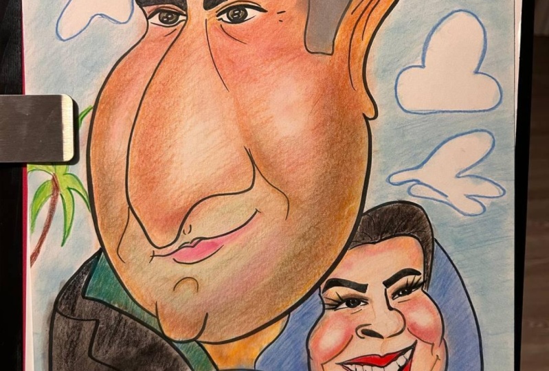
2. 1. Materials and Warm-up: Hi guys, welcome to the Materials and Warm-up lesson. In this lesson, I'm going to show you the best way how to warm up for a caricature and for the lessons to come. And I'm going to show you the best materials to use to create a funny cartoon caricature. I will also give you a preview as to when these Materials and Warm ups are applied towards the five full caricature lessons you see below in the course. So let's go. After I design a caricature in sketch, I have multiple options to colour it. With the caricature you see here that I made if the Dutch Prime Minister, I use paints and this one took me a long time to colour. But the caricature design always remains the same, meaning the same base sketch. And this one I created was of John Kerry and done in detailed watercolour. As you can see it was coloured more elaborate because the type use was different. So it doesn't really matter what type colouring style you use. And these two here are done digitally with flat colouring as these were used for a different purpose. Keep in mind it's all about the way I think up, design and setup the caricature which I teach in caricature lessons one to five. And for these five important lessons, we will draw a cartoon caricature. The design setup is the same as in a detailed coloring technique, but the aim is to make it look a bit... fow should I say it? sloppy, more cartoony and not perfect, which makes it perfect. I always use quality more expensive materials for much better results. Let me show you the materials that we will use for this course. I work either by hand or digital. When your work by hand, these would be the materials or similar that I would recommend. When I design a cartoon or caricature, I like to use a pencil to sketch it out. I recommend using a quality pencil. There's a difference between a pencil costing, say $0.50 cents and one costing $2.50. Same with the ink pen. I like to use a high-quality brush pen because it gives me a thin to thick line ability. Ideal is when they are refillable. It takes a little practice to master, but with great results. For colouring as well, I like to use superior quality watercolour. You can see the difference in quality and amount of pigmentation. And the result is that the strokes are beautiful and lasting. Eight colours are good. But you can already start with colour red, yellow, and dark blue, and you can mix them. For water colouring I recommend using a high-quality brush. Try a red sable. Before you start colouring, make sure you make the paper a little wet and let it dry again. Use a thicker paper that can absorb water colouring well. Ideal is a board that is more flat as you also need to ink. Use a thicker paper but make sure you can see through it when you stick it on a window as you need to be able to trace the pencil lines with the ink lines. And other very good option is to sketch on this final paper and erase the sketch lines once you have done the inking. So you do the sketching, the inking and water colouring all on one paper. Okay, let's do a little test cartoon illustration in stages, using all these materials. This will allow you to get into the flow of things and will make you more confident when applying a sketch line, an inking stroke or watercolour brush stroke when creating the caricature. It's just a warm up, a test and it's okay to make mistakes. It'll get you acquainted with the techniques of penciling, inking, and colouring. And for those of you who work digitally, I recommend using the same type, pencil line, ink brush line, and watercolour brush. Let's start with a pencil first. To warm up the wrist and the mind. On a separate piece of paper, Just do what I'm doing. Quickly sketch some lines, some number eights, and some circles, and do this from slow to a bit faster speed. Pay close attention as I will use this sketch technique in the actual caricature lessons later on. Okay, now did you are warmed up, let's sketch out and elegant woman here. Always fun to do. You can sketch with me or you can sketch out any woman from a photo. Let's make this a rich, elegant type of woman. It's important to know in advance what exactly you will draw and have to shape and form in your head already. This is just a warm-up cartoon type of illustration to get you acquainted with the tools and the speed in which to work. I will get into full detail about thinking up to caricature, the setup and full execution once we are into caricature lessons itself. When you sketch out the form and shape of the drawing, you want to do this fast. Meaning draw your lines quickly, and with confidence. Remember the warm up you just did. The lines the eights, the circles.. they are now useful. As you notice, I draw the lines cleaned up, but if you're less confident that this time it's okay if your lines look a bit more messy. However, the cleaner de lines the better, as it looks more permanent and thus easier when you draw the ink lines on top. As you know, the ink lines are permanent and cannot be undone. So you can also opt for tracing the sketch on a separate piece of paper, one that can hold water colour. Of course, watercolour is not mandatory. I like it because it's see-through and it looks quick and fits with this style, a cartoon style. But you can also use another colouring style if you prefer, like pencils, markers, et cetera, as the design of the caricature itself is more important. Yes, that looks good. Now let's draw her father in there as well. Old men are always fun to draw as they are very characteristic in their faces and very useful for a cartoon and caricature. Okay, let's design him really caricatured and make him older and well-established. Yeah, I liked this total design. It all looks nicely cleaned up. You can see that I'm warmed up to sketch at the right speed for cartoon.. and caricature. We're ready for inking. Just as we did with the pencil. We are now going to warm up using the ink brush. On a separate piece of paper, look what I'm doing. You see the first stroke is a bit hesitant. And this is why you need a warm up. And as you can see, the brush pen strokes are a bit dry. It needs to be refilled with ink. By warming up, you'll gain more confidence creating these ink strokes and applying them later in the real illustration and checking the status of the pen as well. And the same here, pay close attention when you see me ink as this is the type inking I will do into caricature lessons later on. So again, if you work on paper, you can choose to trace the sketch taped on a window, or perhaps better, ink right on top of the pencil lines and erase the pencil once you've done the inking for a cleaner result. As you can see now that I'm warmed up, I apply my ink strokes with much more confidence. So when you're inking, I suggest you draw the inked lines accurately on the sketch lines. Yet don't try to be too perfect. Use more the tip of your pen and don't place to ink strokes to slow as it may ruin the speedy look of the illustration itself. These ink lines are all important and are the form and shape of the cartoons. So you want to use the best quality ink brush, one that is based on alcohol ink, so it dries quickly and permanent. Here as well. You can see why it is important to warm up before. So you can trace with confidence as there is no way back because the ink is permanent. If you feel you're not inking well or not at the right speed or if you're not confident enough yet, no worries. I kind of suggests your warm up a bit longer on a separate piece of paper and just redo the warm-up as I explained. We're now ready to colour the illustration. Let's warm up first. Make sure you lightly wet your paper with a little water as the watercolour will flow much better later on. Make sure you mix two colours well, and that your quality brush is wet enough. As you can see, the watercolour flows nicely here. This means that paper is ready and you're warmed up and confident to colour quickly. Which is the aim. You want to apply to brushstrokes with relative speed and you don't want to colour it too perfect, as we aim for a quick, bit sloppy cartoon style. So it is okay to colour outside the black ink lines a bit. Here as well, this is the type colouring that will be used in the caricature lessons to follow, so warming up is a great way to do this, And that's what this lesson is for. As I mentioned, quickly apply the colour with a thick quality sable brush ending with a point, so we can go from thick to thin. Use the point of the brush for the details. But again, the aim is not to make it too perfect. And don't linger in one place for too long. Work from light to dark and if you need to colour lighter, just add a little bit more water and try to use one colour for each part. Use a certain amount of colours as well. Not too many. Make sure you hold the speed and remember, this is a test-drawing to warm you up for the big league! Before we will start with the first cartoon caricature, first a short lesson on proportion and form.
3. 2. Proportion and Form: Hi guys, Welcome to the proportion and form lesson. This is an important lesson because I'm going to show you how to take the form of a real face of the human face and turn it into the form of a caricatured face. This is important because this forms the base of the caricature. You want to think of a caricature as being a house. When you build a house, you start with a skeleton of the house first and then you add features like the windows and the door, you add that later. And it's the same with the caricature. When you start a caricature, you start with the skeleton first, the outline, and then you add features like the ears, the nose, the eyes later. Let me know if you have any questions throughout the course. So how do you turn this face.. into this caricatured face? Drawing a great caricature requires concentration and quick sketching. A well exaggerated caricature should look exactly like the subject. It is a proportional exaggeration of a face and body and achieving this can be tricky. Let me show you step-by-step how this is achieved. Let's split up the face and four outline sections. We'll name the outline of this head the 'base', and give this a green colour. Let's make the neck yellow and the body, or body pose, orange. And make the facial parts that are inherent to the facial shape in blue. With facial part, I mean the nose, the mouth, the eyes, the hair and glasses. Now let's analyze this face carefully. I selected this face because the outstanding features are much easier to detect. Now what do we see? A thin, long face downward from the eyes, a medium long chin, a small mouth with his teeth sticking out, a flat forehead, and a somewhat receding hairline. But the main feature, a massive and I mean massive hawk type nose topped off by huge barrel type glasses. Okay. Based on these assessments, and while we closely watch the photo on the left, will now start with exaggerating the green outline shape you see in the middle called the base. We'll sketch out the top of the head towards the cheekbones and then from below the eyes we sketch downward, forming the longer, thinner part of the face and ending in the medium long chin, and then we move back up. Next, we'll draw the blue inherent parts. These are the parts that are now inherent to the new caricatured base outline. Closely check and compare the sketch to the photo, but not copy the photo. And ask yourself, where is the position of the inherent parts in this new caricatured shape, meaning the eyes, the nose, the mouth, et cetera. Sketch out a massive nose, but not so massive that it goes way out of proportion and off the edge of the page. Though I must admit this did happen a few times with people who posed for me. I therefore recommend you always carry larger sized paper with you. And while you're at it carry some life insurance too. But at the same time, don't draw the nose too small either or it will look proportionately too small in the new base shape. Check the photo to see where the nose ends and translate that to the newly exaggerated version. And do this with all the other inherent parts like the eyes, the mouth, the glasses, et cetera. Sketch this all out quickly and stick to the facial assessments you made for this exaggeration. Notice the back of the head and its shape running down towards the thin neck and towards the therefore smaller body below. Now that we have the base shape, we quickly start perfecting by adding or shaving off small parts. We're not in the detailed phase yet. Keep an eye on the photograph on the left for details. But make sure you now stick to the newly made shape and the inherent shapes. Because if you now start copying the photo, the caricature design implode. So try to sketch quick because you want to translate your caricature assessment quickly onto the paper. Always remember, you draw caricatures and you're in charge. Think of yourself as a reverse Plastic Surgeon. All right guys, hope you enjoyed the technical sketch lesson about form and shape. Are you ready for the first caricature? Bring it on!
4. 3. Shape, Sketch, Ink & Color: Hi guys, welcome to lesson one. You know, caricature can be a very powerful way to defend yourself. I remember I was 16 and in high school and I had this history teacher who will for some reason like to humiliate me in class sometimes. So one day, during class of course, I grabbed my pen and I drew this hilarious caricature of him. And when I was done, I showed it to the guy sitting next to me that instead of giving it back, you pass it all around the class. And it went as far as that the last student, actually put it right on the teacher's desk. And coincidentally right at that moment as well, the Assistant Principal walks into the classroom and I thought, you know, I'm going to be kicked out of school for sure for this. And a teacher hands him the caricature and says, "Well, this is what they think of me!" And vice Principal takes a look and says, "Wow, looks exactly like you." And we were all laughing and ever since then, that teacher never bothered me anymore. You're in luck today as I have a prime caricature candidate for you. It's Mark Zuckerburg, CEO of Facebook. Oh and we're gonna give him a facelift alright. Let's analyze him first. If you look at the general shape of his face, you see he has, kind of a short forehead and a long face from the eyes downward and a truly massive nose. Buried underneath a bagpipe chin. And if you look closely, stuck in between, you see a tiny mouth with his bottom lip sticking out. That kinda reminds me of the spout of a teapot really. So let's keep all these shapes in mind when we make the quick outline sketch. Other important details or his odd monk type haircut in front and he has larger than normal eyes. Oh, and let's not forget his great sense of fashion, his trademark gray t-shirt. But these are all of secondary importance right now. All right let's grab your pens and paper and let's get started. So when we start the sketch, we want to think of the general shape first and do it rather quickly. Get the general pose down fast and add the details later. As I mentioned, short forehead, long face, massive nose, bottom lip sticking out and bagpipe chin. It's the best way I could describe it. Within this framework, we know quickly add some basic details, like the shape of the eyes, the too short monk haircut, his small mouth, all in rough outline. I know it's not perfect yet, but we have a base now. Notice I keep reshaping little details, adding or shaving them off here and there. Again, it's all within the framework of the basic shape we set up earlier. I am starting to get a little gray shadow on the face to give it a bit more 3D effect as I am working to establish the likeness quickly and deadly. Remember, no mercy. If a short nose is wanted, I recommend going to a Plastic Surgeon. Still adding more small details inherent to the base shape that are important details to the total likeness. Okay, I think the sketch is pretty much done and ready for inking. If you prefer. You can also leave it in sketch form, but I think that colour adds even more likeness. So now we carefully draw the black outlines and trace the sketch. Now you can also do this by taping your sketch on a window and stick another piece of paper on top and then trace it. Or if you work on the thick piece of paper, you can ink right on to the sketch lines and then erase the sketch lines, in that case, sketch light. Remember that you can choose if these black lines are perfect or less perfect. It doesn't really matter because at this point you have an organized sketch in regards to the look and form and the ink lines do not have to be super perfect. Notice that certain ink lines are thinner, like around the eyes and the mouth and could be thicker around to jaw or under the nose. Just to accentuate certain parts more, or less. Keep a small eye on the photo, but try to focus more on tracing the sketch now. Okay, let's zoom in for a moment. You see that I carefully place my lines. It is almost like a certain number of lines. There's no exact number of course, as each face is different. It's more of a feeling of less is more. If you place too many lines, even one line, a person can look older or make an old person look younger when you place too few lines. And this is not the aim. The aim is the likeness. This is a young person, so here the rule is: don't overdo it. Keeping this in mind, we are very close to finishing the inking. Just a thin line under the eye. Yeah that looks good. Okay, let's remove the sketch underneath as we don't want too many lines. And this gives us a better view of the total picture. We now have a much better view of the clear inklines and can see where we need to add more or take away. And I'm careful not to add too much hair in the front in this case because I do caricatures, not hair transplants. All right, ready to colour. Now, remember that colour, adds a lot more likeness and black and white tends to make a person look older. So we want to carefully check the person's skin colour and tones. You can colour it in any type medium, from pencils to paint, whatever you prefer. I personally like to use watercolour as it looks a bit more rough and see-through. Make sure you start light with the base colours and slowly add more layers and darker tones on top. I would say work with relative speed yet at the same time, carefully check where the shadows are in the face. Okay, let's carefully check the hair colour now. It's not really orange, but more a hazel brownish type orange. So when colouring, just like with the sketch, try not to get stuck in one place for too long. There, that looks pretty good. Okay, Now adding some more shadows in the face. As you can see, I'm working slower now because here I have to check some finer details all over. Let's make the t-shirt and a sweater two shades gray. Don't forget that all these little details add to the total likeness as he always wears the same smelly outfit. Okay, Now let's add the famous blue background for this one. This will also make the face jump out and give the total more contrast all over. Yeah, it's ready. Wait a minute, almost ready. Let's add a few finishing touches. Now let's sign it. DONE!
5. 4. Body-pose and Identity: Hi guys and welcome to Lesson 2. Today we're going to draw a frontal caricature as well as the body. And I'm going to show you the importance a body and the gesture off the body, to pose of the body, can have to the total caricature. I'm going to show you as well that focusing and concentration is very important to the success of the caricature and not to be distracted by anything. So what do we see with Angela Merkel, Chancellor of Germany? Notice that cleaning mop type hairdo, the small nose, the larger upper lip, that is sort of hanging over her bottom lip, her massive chin. And this is all squeezed between a pair of chubby cheeks. No hard feelings Angela. Again as in the previous lesson, Let's quickly sketch out the general shape first and do this quite quickly. Now let's sketch out the chubby cheeks and heavy chin area first and the general shape of the face. Don't forget; cleaning mop type hairdo, small nose, her larger upper lip area, massive chin, chubby cheeks. Now remember it's vital to concentrate at this important design stage. And you don't want to be distracted by anyone or you will mess up the caricature design. It's all about focus right now. Hello? Yes, this is Henri. Oh, hi Vladimir Yes. No, Sorry man you did not make the shortlist for this course. Yes, I know who you are. Well, Angela Merkel was just a more fitting Head of State in terms of caricature, that is. No, that amount is not enough, sorry, I have to go. Bye bye. You see? This is what happens where you are distracted. Now we have to start all over again. Okay, Let's also do a cartoon body at this time as this is a more classic part of her look. You'll see why later. All right, Let's focus now. We'll just start with a pear base shape with the cleaning mop hairdo on top and do the body later. I'm quickly adding some basic shapes inside. Notice the slanted eyes, this small nose and large upper lip area, and that chin the size of a boulder! Within the basic framework of the total face, notice is skewed upper lip sort of.. hanging over the bottom lip. Immediately we sketch this in. And let's darken the surrounding lines to quickly establish more likeness all over, in this important part of the face. As you can see, this upper lip part is an important expression that she is known for. And this is what we exaggerate. All within the framework we just set up. Now that I have to likeness down, I am quickly accentuating crucial lines to enhance and execute the design of the face all over. Time is of the essence here and you want to stick to the original design you just made. We are now ready for the body work. As you can see, her face and neck are lower into the body with high shoulders. Which is a vital part of her shape, form, and likeness. So let's observe this and quickly sketch out this typical body pose of her. Separately, it makes no sense drawing, a dress on her as this is the type of outfit that she is known for. Okay, let's give it a little shading and let's move back up to the face. Now look closely and notice the deep San Andreas type fault lines between the cheeks and the chin. Yeah, this is where we go bold! Hey, we're just witnessing and establishing a caricature and we're not taking any prisoners. So now that we have the body pose down, let's quickly enhance it all over. Don't slow down and linger into too many details as you don't want to damage the overall structure. We want to keep the total clear and simple. Yes, that looks good. We're now ready to trace it with a clear ink line. Same here; try to identify what is a detail. To me, a detail is a button, for example, but in a cartoon design like this, the buttonhole is irrelevant. So try to make a calculation when tracing. Remember that you have the original sketch and you can always start again if you feel that you have added too many lines. I know some of you trace the sketch while, this is taped on a window, or ink straight on top of the light sketch and then erase these sketch lines. As I mentioned in the previous lesson, keep an eye on the photo, but focus more on the image now and the tracing of the lines in order not to add too many of them. As we're tracing the sketch. Again, as I explained in the previous lesson, carefully use different thickness in your line. Like, thicker around chin and more thin around the eyes and the hair and the lips. Okay, let's take our sketch underneath and see if we need to add some more lines here and there. As she is more aged. Now this is the part where you want to be very careful and closely see where these final lines are going. If you see a line go wrong, you would want to correct it right away or you may get lost in a forest of lines. Okay, it's ready to colour Let's use a bit of a tanned skin color, or is it pancake, I don't know. Let's quickly add a darker tone shadow in her face and colour the lips and the hair. This all should add to the total likeness. Let's carefully check her colours again with the photo. As you can see, her total appearance is carefully crafted top to bottom. As we zoom out, we will pay close attention to her suit, which is her trademark. So carefully try to match the colours. Let's darken her jacket more and add some shadows in there to show the elegant contours of her body. Hey notice or trademark black pants on how much likeness it adds when you colour this. Now, let's give her a shadow underneath and some more between the eyes. And let's also soften the facial lines somewhat with a lighter colour. I think she needs some highlights in the face. Careful though where you place them, and don't overdo this. Okay, let's add a light background colour.. and readjust the line in the face a bit to where it comes more from the corner of the mouth. Hold on, let's add a bit more contrast on her legs and sign it. Yeah, it's done! Woof.
6. 5. Exaggerating the Facial Details: Hi guys, welcome to lesson 3. Remember that when you draw a caricature, always think wacky and crazy in your mind. Because if you let your personal feelings or outside influences, influence the caricature design, the caricature may collapse or turn in to a portrait. And that's not what we want. You're in for a Royal treat today. We'll make a caricature of Prince Harry, The Duke of Sussex As we progress, this one's going to be a bit harder. So pay close attention. When we analyse his face and study his facial features. You'll notice he has a long thin forehead, extremely small beady eyes tucked, behind his healthy red cheeks. And I also noticed a thick orange beard, which gives him rounder cheeks and jaws, Also, notice a pointy chin. But the main focal point is as long and I mean long Super-G ski nose. And all of the above is stuck on a long sturdy neck. Again, as in the previous lessons, and as I explain in the proportion and form lesson, we quickly want to sketch out the basic head shape along with the inherent features I just talked about. The thin forehead, the round white cheeks, and also quickly sketch his hair in, which is an important feature, especially on the side of his head. Quickly I sketch out the main feature: the nose. Notice the nose goes straight down first and then goes into a Super-G ski sloped shape. Let's first darken the sketch, such as the eyes and the mouth to get as many of the features in as quickly as possible and build from there. Notice the beady little eyes and awkward mouth inherent to the new caricatured outline of the head. We quickly move from one part of the face to another as if we are in a hurry. Why? Because I'm quickly trying to relay the assessment I made of the person into the caricature sketch. Let's now add some beard lines to establish the likeness further. As we darken the sketch, notice the aristocratic bottom lip and jaw sticking out, ending into a pointy chin. You want to think ahead to the colour version already as for example, the orange beard adds a lot of likeness in the end. Overall at this stage I focus more on the outlines rather than the details. So I don't linger in a specific part for too long. The shape of the nose is not perfect yet I think, but I let this linger as I know first focus on all other parts, meaning the total form. And let's not forget the typical stiff upper lip pointing inwards, which in this case is virtually no lip at all. Let's do the sturdy long neck and the shoulders. Now remember that the pose of the body is also part of the total likeness. I'll sketch in a bow tie for now, but ask yourself, is this what are usually wears? Now, let's finetune the hair and the bald spot on the back of the head. Notice that these small parts are all inherent to the new outline head shape. We're now in the clean-up phase of the sketch and I'm adding more and more contrast. Again, keep in mind the total, not just one part. Notice the little details around the nose and the mouth. We stick to the new base form and add the details inherent to this new shape and form. Carefully checking the photo. Let's adjust the details around the nose and the mouth and carefully re-adjust the detailed lines that form this expression. Perfect. That looks much better. Let's now change that bow tie to a plain shirt and jacket as this is what he usually wears and we want to get all these details into the caricature. Okay, you want to think in colour now so think: orange hair, orange beard, pale skin, blue coat, et cetera. This face is not easy to draw, so we carefully proceed with the.. how do I say it is.. reverse plastic surgery. We slowly add more detailed contrast into the face, the beard, and carefully reshape the mouth. Check the photo but don't copy what you see on the photo. Instead, make all these new shapes inherent to the new basic head shape. All right, the sketch is getting close to finish and I quickly keep adding details all over the place. Why quickly? Because the longer you linger in one place and the more you look at the photo, the bigger the chance of you reversing details back to the realistic version. And that's not what we want. Hey, let's add another ear. Okay, it's not visible on the photo, but since his forehead is thin, I think it will look very funny in the caricature. Just adding some posh gray tone now to his cheeks to get a more 3D type impression before colouring. The now detailed sketch looks pretty cleaned up and we're ready to trace the sketch with clean ink lines. And because the sketch is very detailed, I now know where to put these ink lines. As there are many fine and intricate ink lines in the face, let's first ink the body to get a feel of the ink lines. Inside the face itself we want to be very careful not to add too many ink lines because it could make him look older. Now you see why it was so important to get the shape of the mouth correct in the sketch. So when you ink, you know you have it down correctly. To give me a few seconds visual break, I switch to different locations inside the face like the hair, the ears, and then back to the lines in the mouth. These lines are very intricate, so pay close attention to inking these details. Use a fine brush for this. Colour adds likeness as well, so keep it light. Notice that thicker line marking the bottom lip. Check the photo and see if you notice more prominent lines under the eyes, light wrinkles, etc. I think this is looking good. Let's recheck the entire image and you can see that this black and white inked version does not have too many lines and his
age looks good. We're now ready to colour it in. Notice I added just a few thin black hair lines inside the beard area just to accentuate a little here and there. Why? Because it isn't a black beard, it is an orange beard. And the orange is a very important likeness feature in his face. Now it's time to add more depth into the face using a darker skin tone and add the rosy cheeks. You see? As soon as we add the orange colour in the beard and the hair, it suddenly adds a lot of likeness. We'll quickly darken some more areas in here. Now let's colour the mouth and make his ears more red. Let's make his jacket blue. Yeah, that looks good. As you can see, especially in this image, the colour add so much more to the total likeness. This is why you need to think in colour when you are doing the black and white version. Let's add a fitting gold color background and add a few details such as buttons. And let's also darken up the beard a bit more and then sign it. Hold on, we need a little surgical operation right in the middle of the Super-G ski slope
7. 6. Frontal Face, Pose and Gesture: Hey guys, welcome to lesson four. Did you know that the police actually used caricatures to catch criminals? And you know why? Because when you see a caricature, the features are so much more outstanding, and thus more recognisable to the general public. So these caricatures have been featured on wanted posters. Bit of a doubtful honour, that's for sure. Now, in this lesson we are going to draw the famous Dr. Phil. We're going to make a frontal portrait, and I say portrait because I'm afraid that if we draw a caricature of this guy, we'll need an extra large paper size. We're also going to draw part of the body as his gesturing arms and hands are an important part of his job. Okay. When we analyze the photos, we see a typical explaining pose. We see a straight frontal and a side view as we need to check the size of the nose, which, by the way is substantial. But let me explain the other parts first before we go haywire on that part. Notice the top part of his head smaller compared to the lower part below. And see to small beady eyes moving upward. And under the well-established nose, we see a broom type moustache, and under that.. hold on, hold on, go back. We see a massive bottom lip stretched out wide from coast to coast, yet squeezed between.. it looks like two bags of potatoes. No offense. Okay. Let's sketch him out. I don't know about you guys, but I haven't drawn for a day or so and I hope to be able to sketch out a good likeness, so please bear with me. Okay, small upper-head, large bottom part, like a pear. And let's quickly establish the broom type moustache. What's not to exaggerate. Okay, let's add his arm gesture in there as well. Don't worry about the detail at this stage as we're just establishing a quick pose at this time. Hey, notice his huge teeth as well. Let's add them in. Oh, hold on. This is going a bit in the wrong direction, let's do the sketch over again. Okay, now that I'm warmed up, let's sketch him out again. Remember, small upper head, pear-shaped bottom part. Let's zoom in on that massive bottom lip first. Now let's quickly add the small beady eyes. Notice the nose is large, but other parts are way more outstanding, which is pushing the nose back into the face. Weird but true! I'm quickly adding a moustache and darkening the lines all over to get a more definite line established and get the likeness in there quickly, based on the assessments I made earlier. Notice that wee little baby hair on the sides. Let's not overdo this! Okay, we'll add the ears and check their correct position inherent to this new shape. Now, let's firm the lines all over again. And notice this shape of the bottom lip and a typical Dr. Phil grin, which in fact is a caricature already. Let's quickly outline the body pose with the trademark gesturing of the hands. Okay, we'll enhance the bottom lip and jump to detail the eyes further. As I mentioned in previous lessons, I rapidly jumped from place to place to establish the likeness quickly, and I don't linger in one place for too long. All right guys, keep enhancing the lines now from place to place. Make your pencil due to fighting. Yeah, let's give this doctor or taste of his own medicine. While I'm sketching and looking at the face as a whole and look at the photo, I notice that something is wrong with the size and the position of the eyes. But I leave it for now and keep sketching and sculpting with my pencil on the outline and other parts in the face. I will redo the eyes now, make them smaller and place them lower and deeper into the face. Yes, that's beginning to look much better. Notice I keep the shape of the face; I am just repositioning the eyes within this shape. Now let's sketch in the hands a bit more and roughly form the body pose and the jacket and give it more contrast all over. Notice that the dark jacket, even in sketch, adds to the likeness as well. Now closely watch as I'm tweaking the position of the cheeks and the teeth. As I mentioned before, these are the subtle little details that all add to the likeness in the end. And also; think in colour at this time. Hold on. Even though the head is tilted to the right somewhat, notice the eye on the left is positioned a bit lower and he is looking slightly cross-eyed as well. Boldly keep going guys, we're drawing a caricature, we're not performing eye surgery. Notice I keep detailing the sketch without touching the general shape of the entire face. There are little details such as the gray in his moustache that all add to the likeness. It's important to have all these definite lines done before we do the inking. Notice a fine thin line on top of the head and heavier lines around to jaws and chin area. As we're getting closer to finishing the sketch, I keep reshaping and refining details all around. It's beginning to look very good. Almost done with the sketch. Just doing a few more checks here and there. Yeah, it's ready to be inked at this time. Let's start with the most prominent feature in his face; the bottom lip, and then work our way down. I do the easier parts first because he has a lot of fine detailed lines around the eyes and the hair. And it's kind of an inking warm-up as well. As I mentioned in previous lessons, you can stick the sketch on a window and trace it with a marker, or a felt-tip pen or a brush. The brush is great for thin to thick lines, but if you opt for one thickness in the line, I recommend you go with less details in the caricature, like simplifying the eyes for example. Okay, now we're getting into the more detailed parts of the face, so pay close attention. Detailed, yes, but don't overdo it as we wanna keep things rather simple. As you can see, I inked the lines around the eyes with just a few lines and used a very thin brush stroke for this. Now we're moving to the moustache. Again, don't overdo it. Focus more on the illustration and not on the photo at this time. But quickly check the photo for details and see if he has a short-trimmed moustache or not, as it would affect the ink lines within our illustration. Because I kept detailing the sketch that looks organised, the inking is now much easier to do. At this time. I'm just sharpening and strengthening the ink lines. Notice I go simple on the hands. It shouldn't be perfect as it is also a cartoon. So I suggest you ink the lines rather quickly and how do I say it.. a bit sloppy. But simultaneously, inside the face, you want to be very careful with the fine lines. You want to place them exactly at the right spot. For this you keep checking the photo from time to time, and as I mentioned before, remember that a single black line can make a person look older, or more tired for example. So you want to think of the likeness at all times, within the boundaries of the new caricature design. Okay, let's remove the sketch. It is ready to colour. Let's quickly do the jacket first and then establish more likeness in the face with a light base colour. Not that light as he always looks like he stepped straight out of a tanning booth. Another part I notice is that his bottom lip is a bit too red. Notice his ever tanned colour is a very important part of his likeness that we definitely want to see in this illustration. It only adds to the fun and it will ridicule that part even further. We're not here to be kind. People have asked me over the years, can you please make me look good? And I just tell them that I'll be happy to book an appointment with a plastic surgeon I work with. Okay, back to business, as we are working to enhance that graphic grin of his, I am now adding some extra short hairs onto his moustache using the ink brush. And of course some lip gloss to make that bottom lip stand out even more! We'll add some background, darken the jacket and add some light effects on there to make the suit look more expensive as the man is loaded. Okay, look what I'm doing. I am defining the lines in the corners of the mouth further, as I notice this is an important part of his likeness as well. And yes, he needs more tan, but notice I do this in layers as to not overdo it. Don't forget his very fine, neatly trimmed hairs on the side and make sure that this is translated to the caricature. Let's add some more shadow in the teeth and under the nose to give it more depth. Hold on. Checking the photo. Let's reposition the teeth a bit further. As that grin of his needs to be perfect. Hey notice the little gray hairs top-left in the trademark moustache. Let's add them in. Yeah, let's sign it. Add a little last minute shine on the tie and it's good to go.
8. 7. All-in-One Cartoon Caricature: Hey guys, welcome to the advanced lesson 5. Remember that when you draw caricatures live, always remain in firm control. People will try to come up to you and say: "do you draw portraits as well?" Because they really are afraid of a caricature and it may expose the truth. Or some people who will pose for you can say, "This doesn't look like me!"... Yeah, right. And that's when you kindly refer these people to: a Plastic Surgeon. Remember, you're the boss! In this advanced lesson, we're going to focus on the full body caricature, meaning of the body and face together in one design as a total caricature. We're also going to focus on the gesturing and the body pose, as well as the accessories and the details of the face. So pay close attention. Today, I will draw a caricature of Her Majesty Queen Elizabeth II. We're going to draw the entire body as well because her body pose and clothes are part of her iconic look. Okay, let's first carefully analyse the photos. Let's look at her body. We see her back kind of bending forward and her head lowered. And when we look at her profile photo, we see a large mouth with massive teeth, which actually make the nose look small. And check out the super small sized eyes. Part of her iconic look is the curly hair, the purse, the earrings, and the pearl necklace. And she's often holding flowers. Almost always she wears a hat, but the size will be inherent to the shape of the head. Notice the gloves and the brooch as well. So it's not just the face, but also these details that make the caricature complete in this case. All right, let's sketch it out. This time we begin with the body and her typical pose and make the head inherent to the cartoon body. Naturally, the head will be caricatured as well, but in The Queen's case, the caricature should be a combination of head and body. As I roughly sketch out the head and its size, I can now add the contours of the hat as well. Okay, let's add the shoes and purse to quickly establish all her features and build a good likeness all over. Slightly darken it, but nothing definite yet. Yeah, I like where this is going. Let's lightly draw in the face. And we'll take a quick visual break from that part and switch back to the body where we define the lines further. Hey, let's add that waving hand, which is only reserved for Royalty. I quickly sketch in a basic shape and go back to the face again. Let's now define the eyes and the lips more as well as her curly hair. As you can see, it's already looking like her, but we're not out of the woods yet. Proceed with caution and keep it simple. All right, I'm quickly adding more contrast to the iconic purse. Let's define the face further and add her iconic pearl necklace as well. The aim of a caricature is to make it look more like the person as they are in real life. And you achieve this by exaggerating in the correct way. So it is crucial that you concentrate at this stage. Now let's detail the coat some more and add the bouquet of flowers in the other hand. We'll go back to the face again and carefully detail the lines more. Okay, as you can see, I'm slowly building up the sketch from light to dark, defining the rough form and shape it into a detailed sketch. I detail the sketch so I know where to place the ink lines later on in whatever medium you like to use to trace the sketch. As I mentioned before, you can also use this sketch as a final, but the illustration looks cleaner and more like a cartoon when you remove the sketch lines. Notice the lining on the white gloves. It gives that posh, little 'Detail Royale" that we want. Let's add a little drop shadow to give it more of a 3D effect. And let's darken the purse a bit more. The sketch is beginning to look pretty cleaned up. Though I keep checking the photo for the likeness' I know focus more and more on the illustration; cleaning and defining the lines further and further. I'm detailing the brooch more. As I mentioned, these things are all part of her iconic look. Okay, back to the head and body, and tailoring the coat some more. Notice I keep switching locations as to give me a quick visual break from certain parts within the illustration. At the same time, I keep checking the photo. Okay, let's go back to the face again and also make her lips darker, just to give me an impression of how it would look with lipstick. It is very important to think in colour at this time. Let's reposition the necklace a bit more into the neck. As I'm getting closer to completing the sketch, I am now getting into the nitty-gritty details of the face, perfecting the likeness as much as possible. While keeping the shape of the new caricatured form, I keep checking the same details in the photo' Yet I'm very careful not to copy the photo. Instead, I'm distorting the details of the photo in proportion, into the new caricatured shape of her Majesty. For example, let's check her mouth and her huge grin on the photo. Now think caricature. Notice the mouth area is much larger. So as you can see in the caricature, that is exactly what I did. And at this time you just see me making subtle changes only. I'm not changing the shape of the caricatured form, instead, I'm perfecting the shape of the new facial parts all over that are inherent to this new caricatured shape. Hey, I just noticed something. Check out her waving hand and arm. It seems a little small compared to the other arm. So, let's redo this as this wave of hers is typical for a Queen of this magnitude. So we need to perfect this. Yes, is it looking much better. We're ready for inking. As in the previous lessons, let's start with the easier parts first, like the body and coat, and work towards the details such as the hands that require thinner lines. As I mentioned, you can trace the sketch on a piece of paper stuck on say, a window or ink straight on top of the light sketch and then erase these sketch lines. Now let's move over to the face. Crucial here are the amount of lines. Remember she is in her nineties, yet her skin looks remarkable. Meaning you don't want to add extra lines that aren't there in the photo. Keep checking the photo though, and try to stick to the lines in the sketch, yet be flexible to minor changes. Also watch closely which lines need to be thick and what lines need to be thinner. Now this is the most intricate part, the thin lines around the eyes and the teeth. Since her eyes are tiny and we are illustrating the entire body, you want to keep the lines there to the bare essentials and keep the lines in the teeth thin. As you'll notice, because we organised the sketch well, meaning the lines are well-positioned, the tracing is much easier and quicker to do. Allright, let's remove the sketch and start perfecting the ink lines and check all over if any crucial lines, especially in the face, are missing or if there are too many lines somewhere. Keep in mind that the colouring adds a lot of likeness to the image as well, and some lines are better off in colour or a shading effect can even replace a line. As you can see, I kept it ink lines in the face to a minimum and everything will look clear when you see the whole body with the face. Okay, we are ready to colour. Let's first check the photo. Her skin seems pinkish with a touch of pale yellow and bright dark pink lipstick. We want all these details in for likeness. Let's do the face first, her makeup, the lipstick, and the hair. Equally important in her case, is the colour of the outfit that she wears. Let's go with Royal Blue because that outfit is what she is most known for and in my opinion, most iconic. Yeah that's beginning to look really good. You see how much the colour adds to her likeness! Let's do the black shoes and the purse she usually wears. Remember, a lady at her age does not wear high heels. We'll add a little shadow. Hold on, some line perfecting his needed in the cheek line near the corner of her mouth, as well as her teeth. Let's do that. Yes, that is looking good. Let's also lighten the black line marking her jaw line as in the photo, it is much more light. This will make that part of the face softer and more subtle. We'll add a bit more contrast in the face. This looks good. Now let's add a background and sign it. Yeah, she is ready for The Royal Tour.
 Henri Goldsmann, Caricaturist-Cartoonist-Illustrator